Embed Size (px)
Citation preview
Preliminary front cover ideas
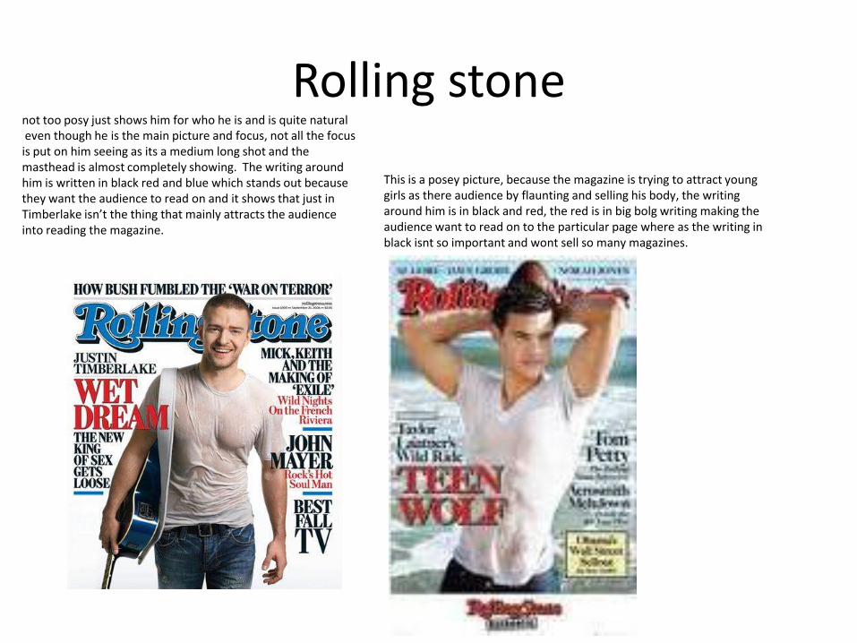
Rolling stone
This is a posey picture, because the magazine is trying to attract young girls as there audience by flaunting and selling his body, the writing around him is in black and red, the red is in big bolg writing making the audience want to read on to the particular page where as the writing in black isnt so important and wont sell so many magazines.
not too posy just shows him for who he is and is quite naturaleven though he is the main picture and focus, not all the focus is put on him seeing as its a medium long shot and the masthead is almost completely showing. The writing around him is written in black red and blue which stands out because they want the audience to read on and it shows that just in Timberlake isn’t the thing that mainly attracts the audience into reading the magazine.
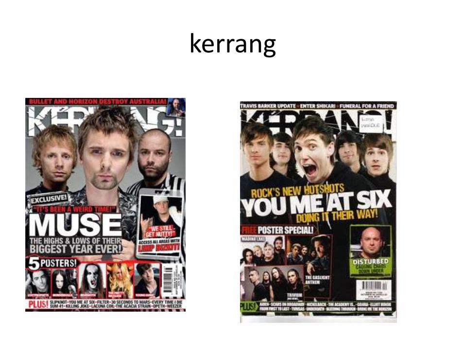
kerrang
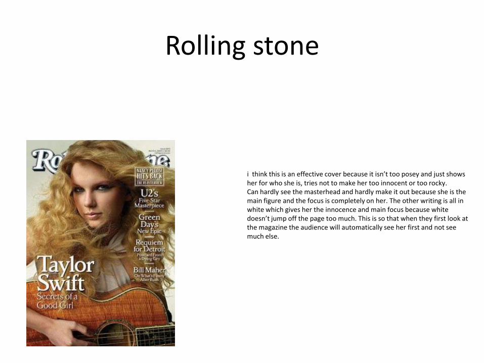
Rolling stone
i think this is an effective cover because it isn’t too posey and just shows her for who she is, tries not to make her too innocent or too rocky. Can hardly see the masterhead and hardly make it out because she is the main figure and the focus is completely on her. The other writing is all in white which gives her the innocence and main focus because white doesn’t jump off the page too much. This is so that when they first look at the magazine the audience will automatically see her first and not see much else.
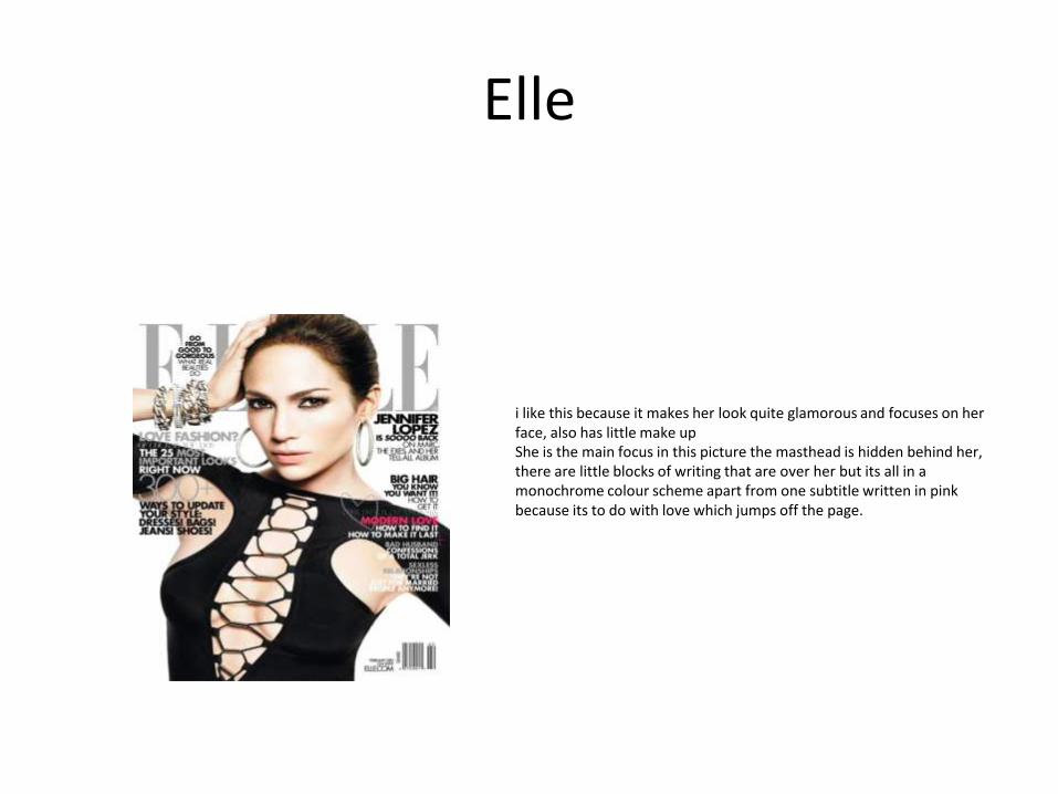
Elle
i like this because it makes her look quite glamorous and focuses on her face, also has little make up She is the main focus in this picture the masthead is hidden behind her, there are little blocks of writing that are over her but its all in a monochrome colour scheme apart from one subtitle written in pink because its to do with love which jumps off the page.
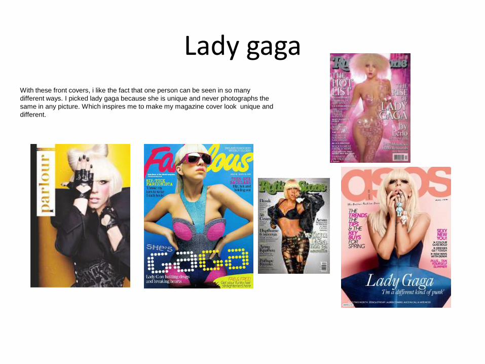
Lady gaga
With these front covers, i like the fact that one person can be seen in so many
different ways. I picked lady gaga because she is unique and never photographs the
same in any picture. Which inspires me to make my magazine cover look unique and
different.