Embed Size (px)
Citation preview
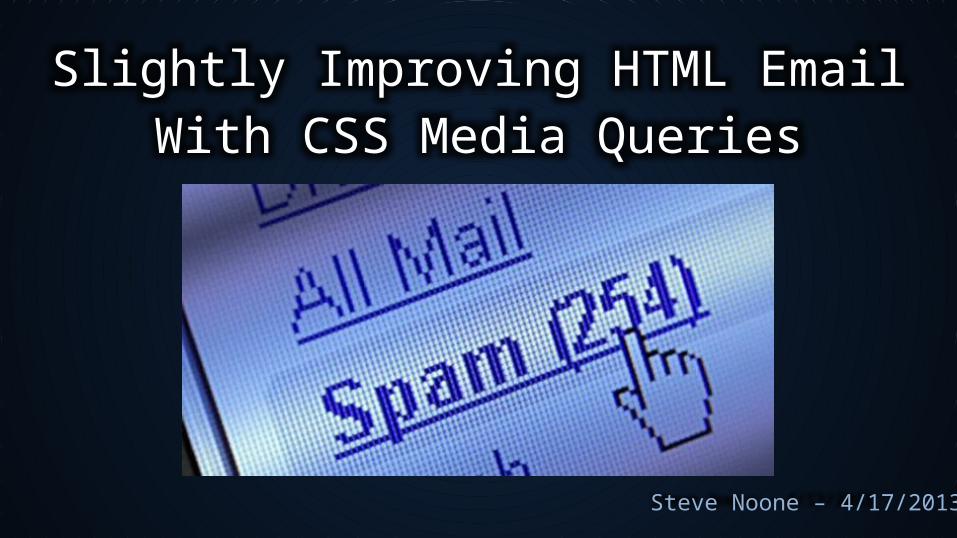
Slightly Improving HTML EmailWith CSS Media Queries
Steve Noone – 4/17/2013
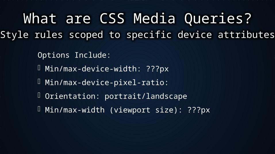
What are CSS Media Queries?Style rules scoped to specific device attributes
Options Include:
Min/max-device-width: ???px
Min/max-device-pixel-ratio:
Orientation: portrait/landscape
Min/max-width (viewport size): ???px

CSS3 Media Queries:Support added in FF3.5, Chrome 4, IE9*
@media all and (max-device-width: 480px) {
/* Styles for views not wider than 480px */
}
<link rel='stylesheet' media='screen and (min-width: 340px) and
(max-width: 640px)' href='css/medium.css' />
*Current versions are FF v21, Chrome v26, IE v10
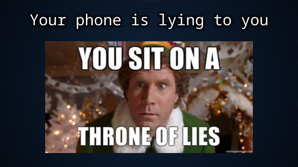
Your phone is lying to you
Your phone is lying to you (by design, per the CSS 2.1 specification)
CSS pixels now have nothing to do with the actual pixel density of the device. They’re an abstract construct created specifically for web developers.
It is recommended that the reference pixel be the visual angle of one pixel on a device with a pixel density of 96dpi and a distance from the reader of an arm's length.
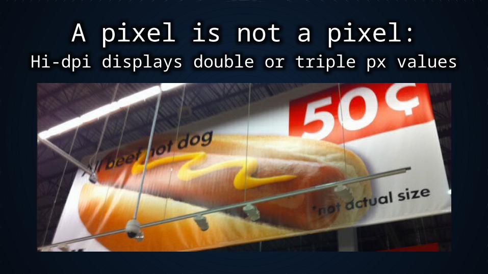
A pixel is not a pixel:Hi-dpi displays double or triple px values
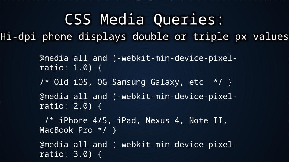
CSS Media Queries:Hi-dpi phone displays double or triple px values
@media all and (-webkit-min-device-pixel-ratio: 1.0) {
/* Old iOS, OG Samsung Galaxy, etc */ }
@media all and (-webkit-min-device-pixel-ratio: 2.0) {
/* iPhone 4/5, iPad, Nexus 4, Note II, MacBook Pro */ }
@media all and (-webkit-min-device-pixel-ratio: 3.0) {
/* 1080 Smartphones (HTC One, GS4, Maxx HD */ }
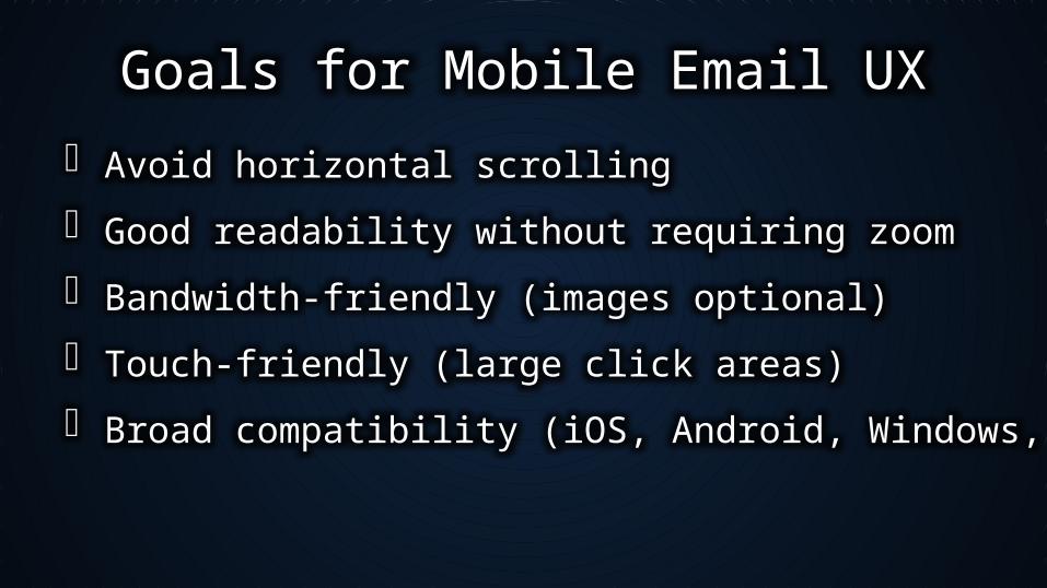
Goals for Mobile Email UX
Avoid horizontal scrolling
Good readability without requiring zoom
Bandwidth-friendly (images optional)
Touch-friendly (large click areas)
Broad compatibility (iOS, Android, Windows, etc)
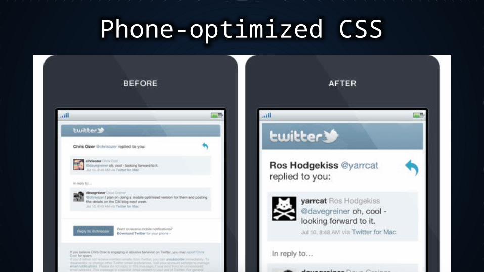
Phone-optimized CSS
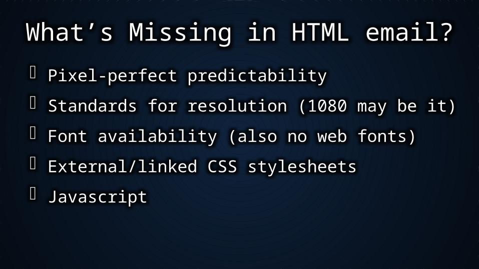
What’s Missing in HTML email?
Pixel-perfect predictability
Standards for resolution (1080 may be it)
Font availability (also no web fonts)
External/linked CSS stylesheets
Javascript
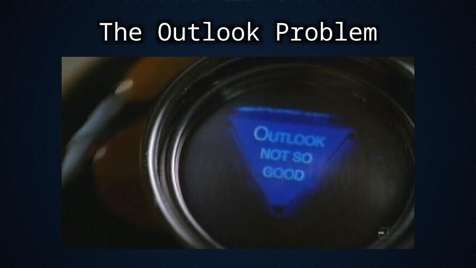
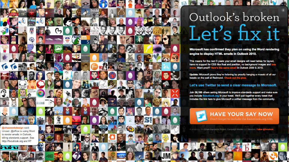
The Outlook Problem
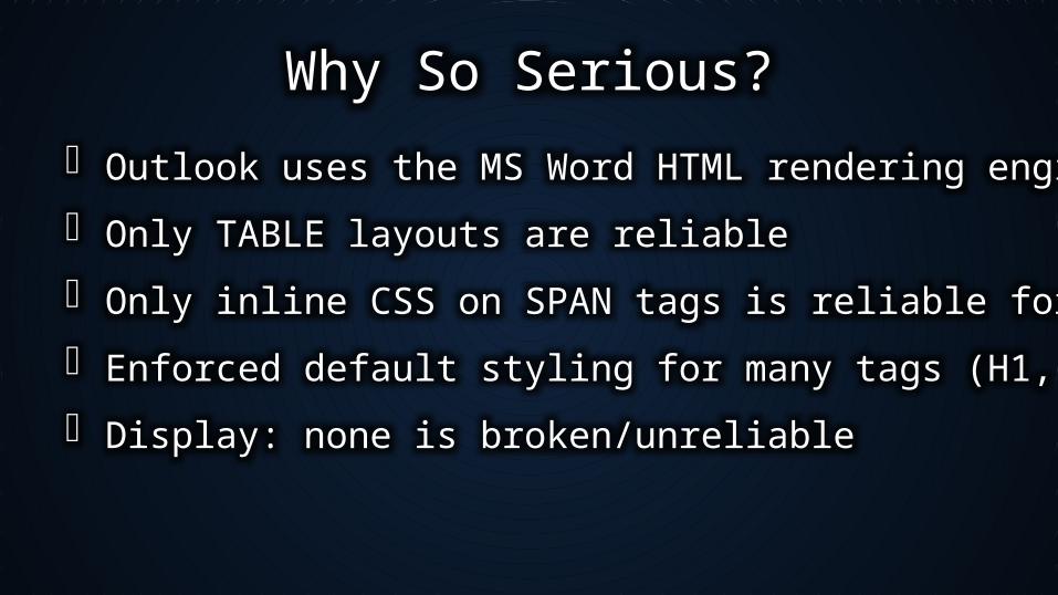
Why So Serious?
Outlook uses the MS Word HTML rendering engine
Only TABLE layouts are reliable
Only inline CSS on SPAN tags is reliable for style
Enforced default styling for many tags (H1, P, etc)
Display: none is broken/unreliable
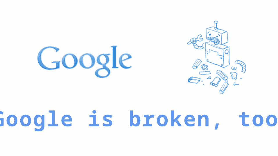
Google is broken, too.
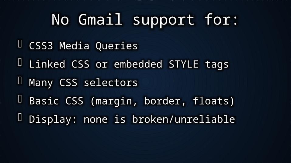
No Gmail support for:
CSS3 Media Queries
Linked CSS or embedded STYLE tags
Many CSS selectors
Basic CSS (margin, border, floats)
Display: none is broken/unreliable
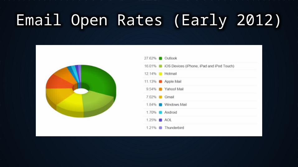
Email Open Rates (Early 2012)
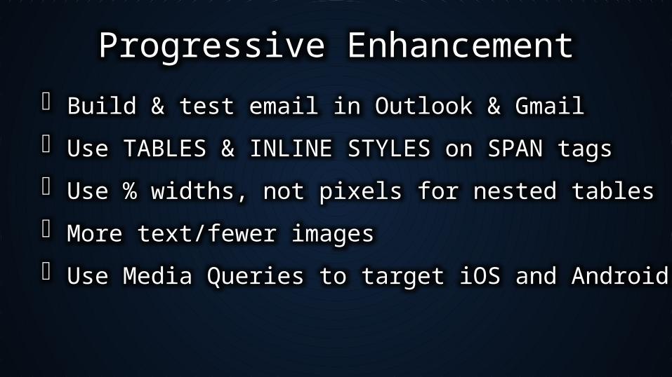
Progressive Enhancement
Build & test email in Outlook & Gmail
Use TABLES & INLINE STYLES on SPAN tags
Use % widths, not pixels for nested tables
More text/fewer images
Use Media Queries to target iOS and Android Mail
Things we can control
Reliably hide elements on iOS
Increase font sizes to eliminate zooming
Change parent table from fixed to % width
Override inline styles with !important
Use Media Queries to target iOS and Android Mail