Embed Size (px)
Citation preview
Responsive Web Design and Bootstrap
MIS 2402
Konstantin BaumanDepartment of MIS
Fox School of BusinessTemple University
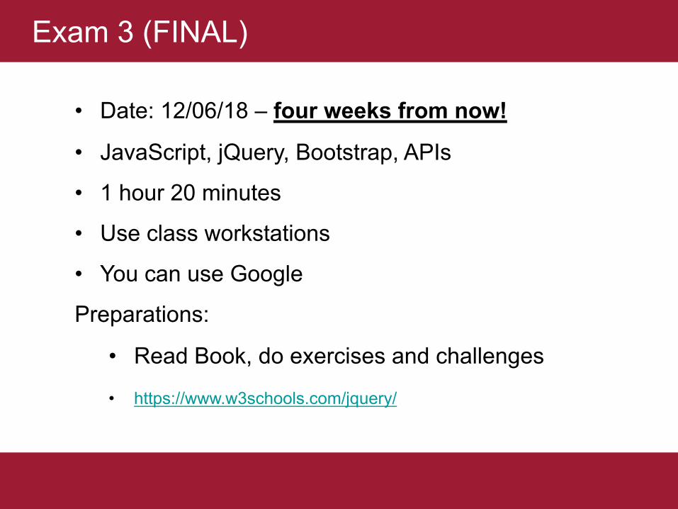
• Date: 12/06/18 – four weeks from now!
• JavaScript, jQuery, Bootstrap, APIs
• 1 hour 20 minutes
• Use class workstations
• You can use Google
Preparations:
• Read Book, do exercises and challenges
• https://www.w3schools.com/jquery/
Exam 3 (FINAL)
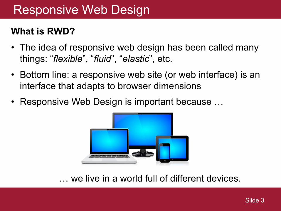
Responsive Web DesignWhat is RWD? • The idea of responsive web design has been called many
things: “flexible”, “fluid”, “elastic”, etc.• Bottom line: a responsive web site (or web interface) is an
interface that adapts to browser dimensions• Responsive Web Design is important because …
… we live in a world full of different devices.
Slide 3
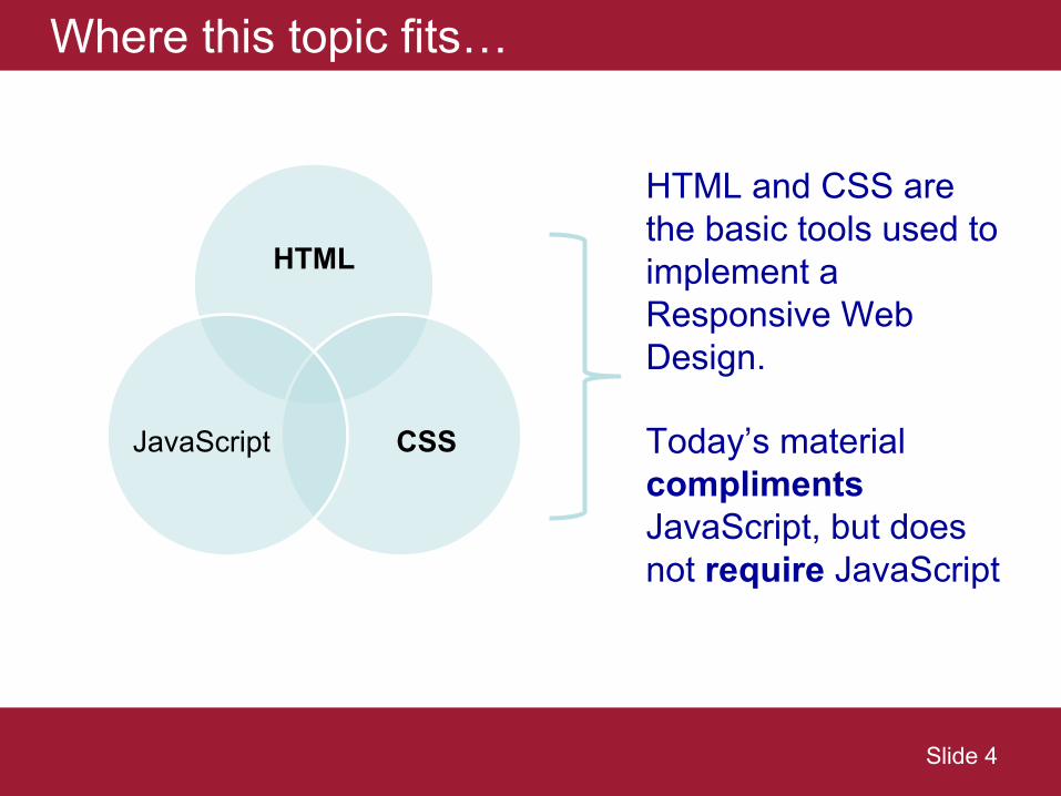
Where this topic fits…
HTML
CSSJavaScript
HTML and CSS are the basic tools used to implement a Responsive Web Design.
Today’s material complimentsJavaScript, but does not require JavaScript
Slide 4
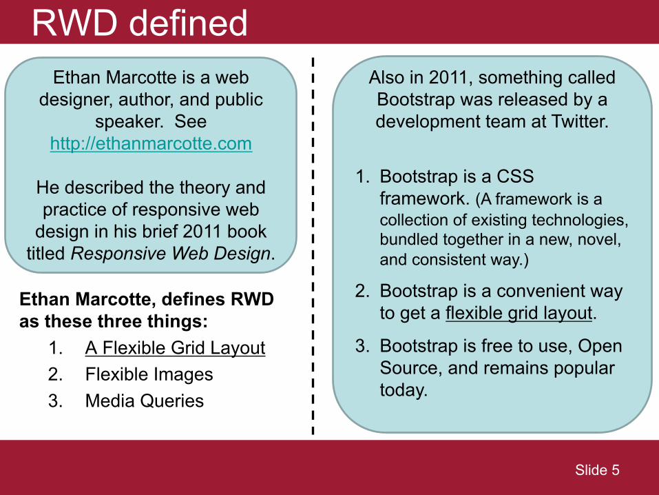
RWD defined
Ethan Marcotte, defines RWD as these three things:
1. A Flexible Grid Layout2. Flexible Images3. Media Queries
Ethan Marcotte is a web designer, author, and public
speaker. See http://ethanmarcotte.com
He described the theory and practice of responsive web
design in his brief 2011 book titled Responsive Web Design.
Also in 2011, something called Bootstrap was released by a development team at Twitter.
1. Bootstrap is a CSS framework. (A framework is a collection of existing technologies, bundled together in a new, novel, and consistent way.)
2. Bootstrap is a convenient way to get a flexible grid layout.
3. Bootstrap is free to use, Open Source, and remains popular today.
Slide 5
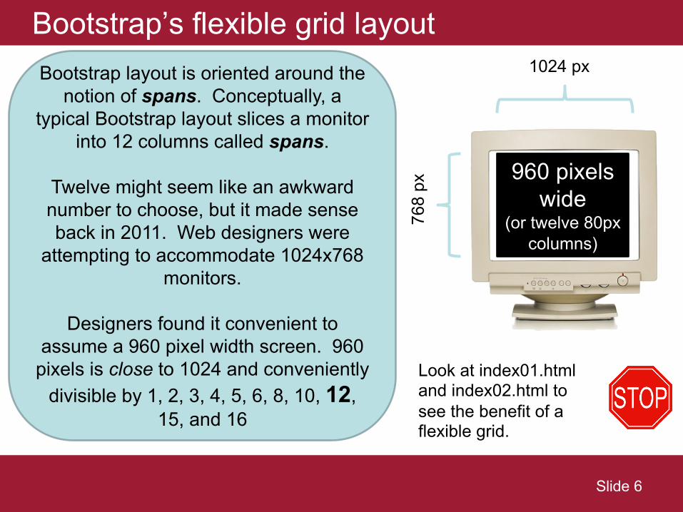
Bootstrap’s flexible grid layout1024 px
768
px
Bootstrap layout is oriented around the notion of spans. Conceptually, a
typical Bootstrap layout slices a monitor into 12 columns called spans.
Twelve might seem like an awkward number to choose, but it made sense back in 2011. Web designers were
attempting to accommodate 1024x768 monitors.
Designers found it convenient to assume a 960 pixel width screen. 960
pixels is close to 1024 and conveniently divisible by 1, 2, 3, 4, 5, 6, 8, 10, 12,
15, and 16
960 pixelswide
(or twelve 80px columns)
Look at index01.html and index02.html to see the benefit of a flexible grid.
Slide 6
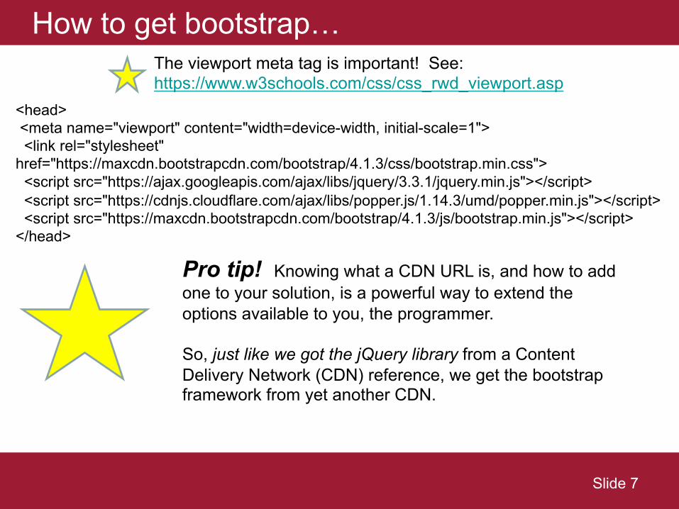
How to get bootstrap…
<head><meta name="viewport" content="width=device-width, initial-scale=1"><link rel="stylesheet"
href="https://maxcdn.bootstrapcdn.com/bootstrap/4.1.3/css/bootstrap.min.css"><script src="https://ajax.googleapis.com/ajax/libs/jquery/3.3.1/jquery.min.js"></script><script src="https://cdnjs.cloudflare.com/ajax/libs/popper.js/1.14.3/umd/popper.min.js"></script><script src="https://maxcdn.bootstrapcdn.com/bootstrap/4.1.3/js/bootstrap.min.js"></script>
</head>
Pro tip! Knowing what a CDN URL is, and how to add one to your solution, is a powerful way to extend the options available to you, the programmer.
So, just like we got the jQuery library from a Content Delivery Network (CDN) reference, we get the bootstrap framework from yet another CDN.
Slide 7
The viewport meta tag is important! See: https://www.w3schools.com/css/css_rwd_viewport.asp
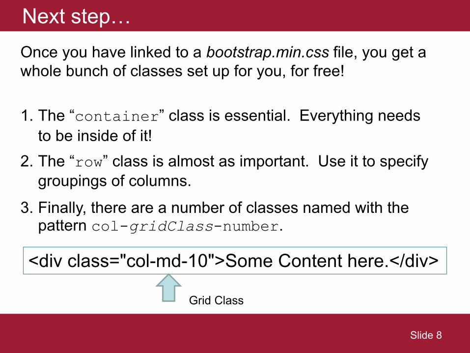
Next step…Once you have linked to a bootstrap.min.css file, you get a whole bunch of classes set up for you, for free!
1. The “container” class is essential. Everything needs to be inside of it!
2. The “row” class is almost as important. Use it to specify groupings of columns.
3. Finally, there are a number of classes named with the pattern col-gridClass-number.
<div class="col-md-10">Some Content here.</div>
Slide 8
Grid Class
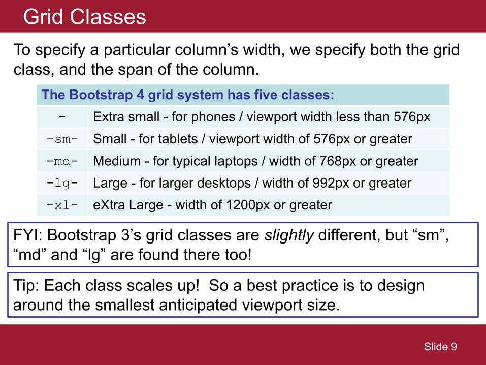
Grid ClassesTo specify a particular column’s width, we specify both the grid class, and the span of the column.
Slide 9
FYI: Bootstrap 3’s grid classes are slightly different, but “sm”, “md” and “lg” are found there too!
Tip: Each class scales up! So a best practice is to design around the smallest anticipated viewport size.
The Bootstrap 4 grid system has five classes:- Extra small - for phones / viewport width less than 576px
-sm- Small - for tablets / viewport width of 576px or greater
-md- Medium - for typical laptops / width of 768px or greater
-lg- Large - for larger desktops / width of 992px or greater
-xl- eXtra Large - width of 1200px or greater
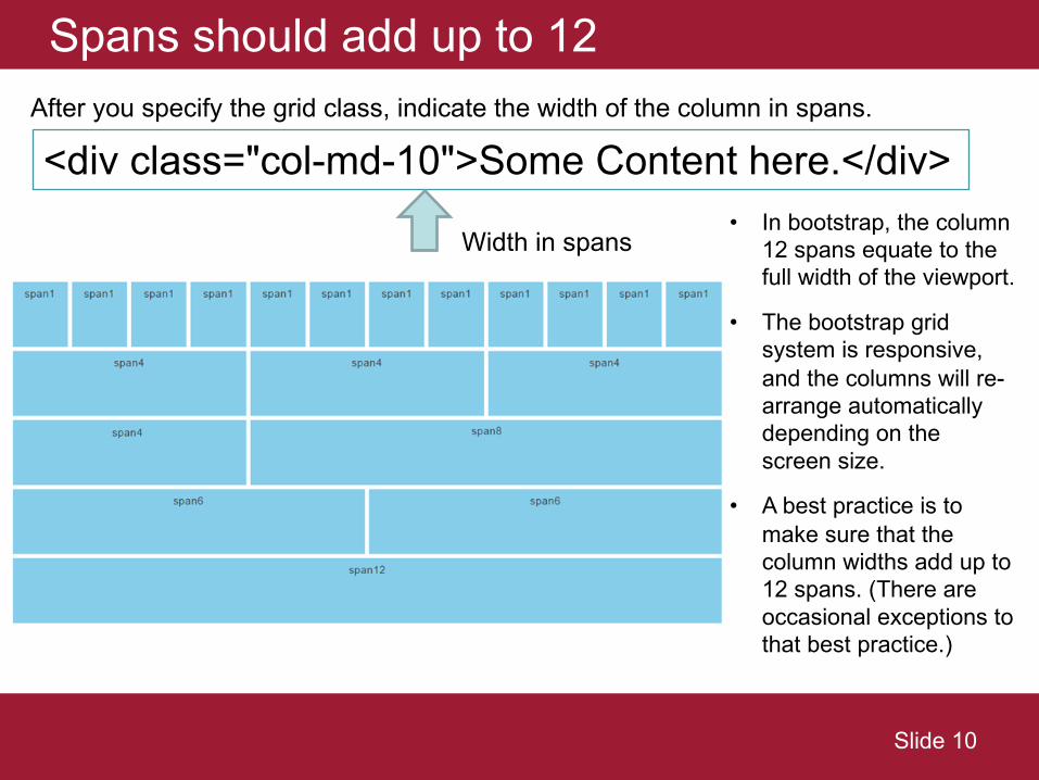
Spans should add up to 12
• In bootstrap, the column 12 spans equate to the full width of the viewport.
• The bootstrap grid system is responsive, and the columns will re-arrange automatically depending on the screen size.
• A best practice is to make sure that the column widths add up to 12 spans. (There are occasional exceptions to that best practice.)
Slide 10
After you specify the grid class, indicate the width of the column in spans.
<div class="col-md-10">Some Content here.</div>
Width in spans
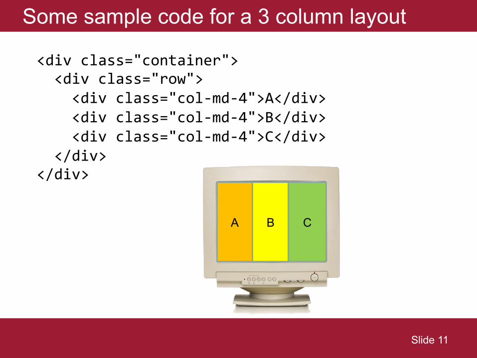
Some sample code for a 3 column layout
<div class="container"><div class="row">
<div class="col-md-4">A</div><div class="col-md-4">B</div><div class="col-md-4">C</div>
</div></div>
A B C
Slide 11
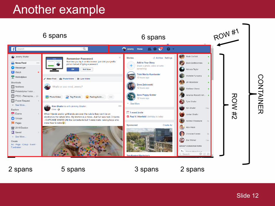
Another example
RO
W #2
ROW #1
2 spans 5 spans 3 spans 2 spans
6 spans 6 spans
Slide 12
CO
NTAIN
ER
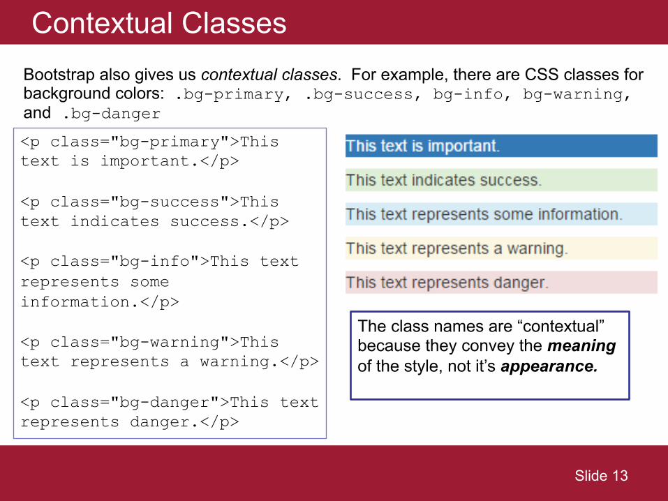
Contextual ClassesBootstrap also gives us contextual classes. For example, there are CSS classes for background colors: .bg-primary, .bg-success, bg-info, bg-warning, and .bg-danger
<p class="bg-primary">This text is important.</p>
<p class="bg-success">This text indicates success.</p>
<p class="bg-info">This text represents some information.</p>
<p class="bg-warning">This text represents a warning.</p>
<p class="bg-danger">This text represents danger.</p>
Slide 13
The class names are “contextual” because they convey the meaningof the style, not it’s appearance.
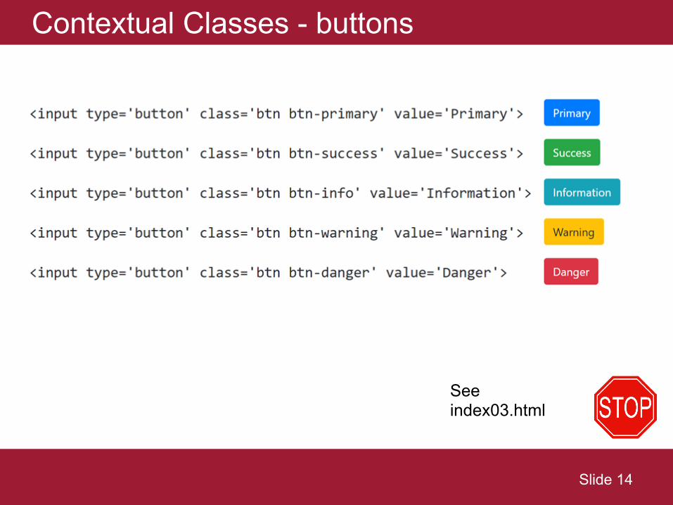
Contextual Classes - buttons
Slide 14
See index03.html
So far…
Slide 15
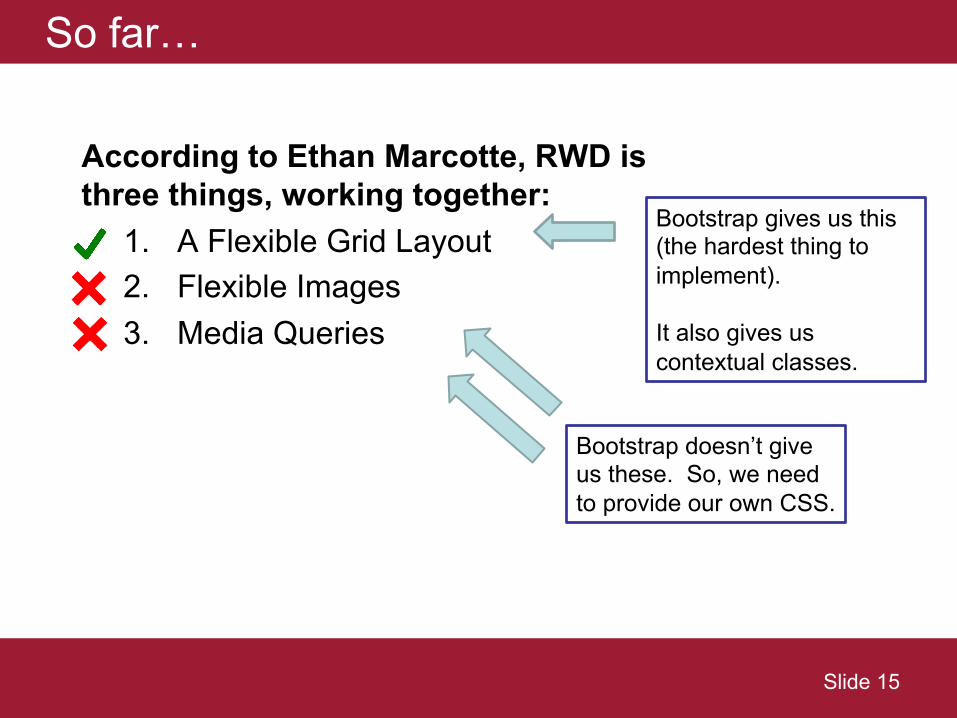
According to Ethan Marcotte, RWD is three things, working together:
1. A Flexible Grid Layout2. Flexible Images3. Media Queries
Bootstrap gives us this (the hardest thing to implement).
It also gives us contextual classes.
Bootstrap doesn’t give us these. So, we need to provide our own CSS.
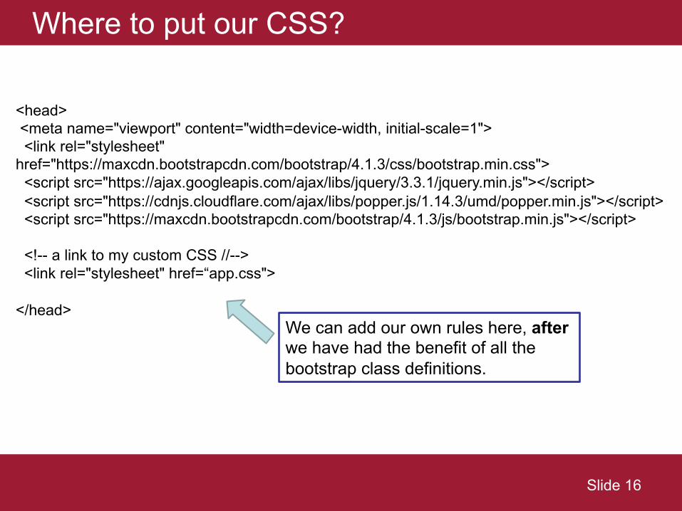
Where to put our CSS?
Slide 16
<head><meta name="viewport" content="width=device-width, initial-scale=1"><link rel="stylesheet"
href="https://maxcdn.bootstrapcdn.com/bootstrap/4.1.3/css/bootstrap.min.css"><script src="https://ajax.googleapis.com/ajax/libs/jquery/3.3.1/jquery.min.js"></script><script src="https://cdnjs.cloudflare.com/ajax/libs/popper.js/1.14.3/umd/popper.min.js"></script><script src="https://maxcdn.bootstrapcdn.com/bootstrap/4.1.3/js/bootstrap.min.js"></script>
<!-- a link to my custom CSS //--><link rel="stylesheet" href=“app.css">
</head>We can add our own rules here, afterwe have had the benefit of all the bootstrap class definitions.
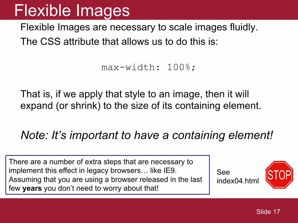
Flexible ImagesFlexible Images are necessary to scale images fluidly.The CSS attribute that allows us to do this is:
max-width: 100%;
That is, if we apply that style to an image, then it will expand (or shrink) to the size of its containing element.
Note: It’s important to have a containing element!
Slide 17
See index04.html
There are a number of extra steps that are necessary to implement this effect in legacy browsers… like IE9. Assuming that you are using a browser released in the last few years you don’t need to worry about that!
Media QueriesMedia queries allow us to override previously declared style sheet attributes using an @media rule.
The @media rules allow us to customize styles based on the size of the current viewport.
The @media rules allow us to deal with exceptions that can’t be gracefully addressed by out flexible grid.
Slide 18
Media Queries (2)
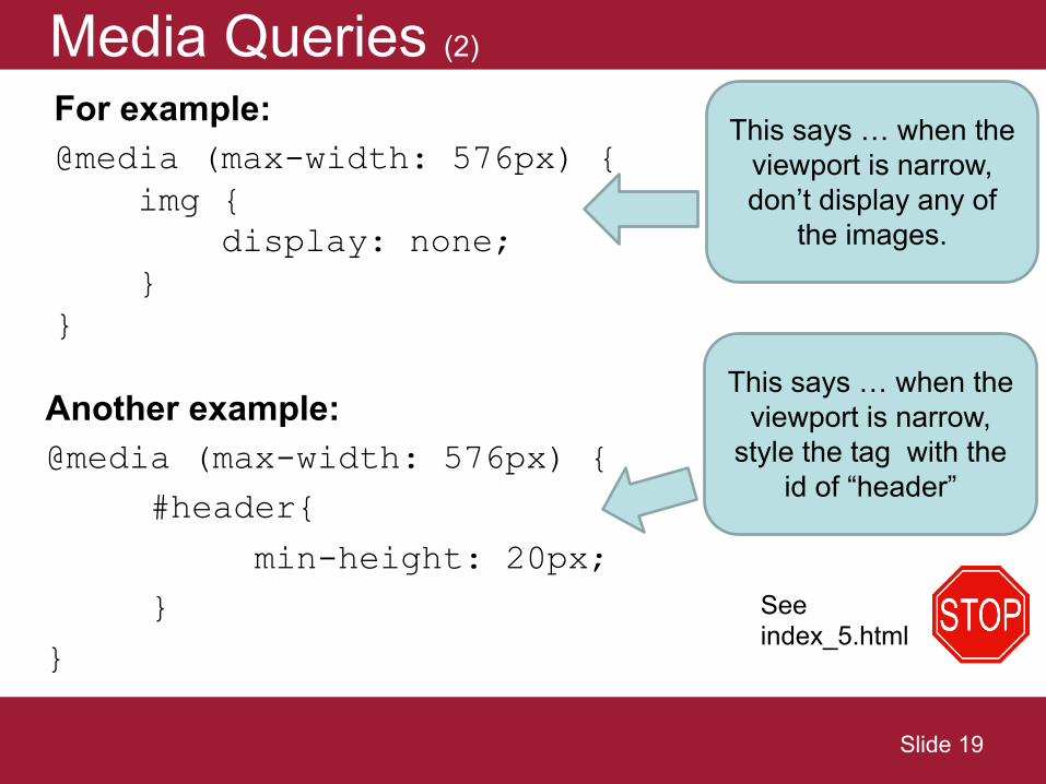
For example:@media (max-width: 576px) {
img {display: none;
}}
This says … when the viewport is narrow, don’t display any of
the images.
Slide 19
Another example:@media (max-width: 576px) {
#header{min-height: 20px;
}}
This says … when the viewport is narrow,
style the tag with the id of “header”
See index_5.html
Ok… now you try…
Slide 20


![Responsive design - Twitter Bootstrap [FR]](https://img.pdfslide.net/doc/110x75/58ce97ee1a28ab8c3b8b6b85/responsive-design-twitter-bootstrap-fr.jpg)