Embed Size (px)
Citation preview

Int. J. Healthcare Technology and Management, Vol. 7, Nos. 1/2, 2006 15
Copyright © 2006 Inderscience Enterprises Ltd.
Risk adjustment and risk-adjusted provider profiles
Michael Shwartz* Department of Operations and Technology Management, School of Management, Boston University, 595 Commonwealth Avenue, Boston, Massachusetts 02215, USA E-mail: [email protected] *Corresponding author
Arlene Ash Section of General Internal Medicine, Boston Medical Center, 720 Harrison Avenue, # 1108, Boston, Massachusetts 02118, USA E-mail: [email protected]
Erol Peköz Department of Operations and Technology Management, School of Management, Boston University, 595 Commonwealth Avenue, Boston, Massachusetts 02215, USA E-mail: [email protected]
Abstract: Provider profiles are an important component of efforts to improve both healthcare productivity and quality. Risk adjustment is the attempt to account for differences in the risk for specific outcomes of cases in different groups in order to facilitate more meaningful comparisons. The value of provider profiles, whether used internally or released to the public, depends both on adequate risk adjustment and on distinguishing systematic differences in either the quality or productivity of care from random fluctuations. In this paper, we discuss how risk adjustment systems can be used to predict outcomes for individual cases; methods for measuring and comparing the performance of risk adjustment systems; and how random variation can affect provider performance data and several approaches for addressing random variation in risk-adjusted provider profiles. In the last section, we illustrate the methods discussed by developing and analysing risk-adjusted provider profiles for 69 family practitioners responsible for over 68,000 cases.
Keywords: risk adjustment; provider profiling.
Reference to this paper should be made as follows: Shwartz, M., Ash, A. and Peköz, E. (2006) ‘Risk adjustment and risk-adjusted provider profiles’, Int. J. Healthcare Technology and Management, Vol. 7, Nos. 1/2, pp.15–42.
Biographical notes: Michael Shwartz is Professor of Healthcare and Operations Management at Boston University’s School of Management. His research interests include the use of mathematical models of disease processes to analyse screening programmes, studies of the relationship between severity of illness and hospital costs and outcomes, healthcare payment, analyses related to quality of care, small area variation analyses, evaluation of substance abuse programmes, and analyses of large databases. He was Founding Director of the Institute for Healthcare Policy and Research within the Boston Department of Health and Hospitals.

16 M. Shwartz, A. Ash and E. Peköz
Arlene Ash is a research professor at Boston University’s Schools of Medicine (Division of General Internal Medicine) and Public Health (Department of Biostatistics), and a Co-founder and senior scientist at DxCG, Inc., a company that licenses risk-adjustment software. She is an internationally recognised expert in the development and use of risk-adjustment methodologies and an experienced user of national research databases, especially for Medicare, where her diagnostic cost group models have been adapted for use in HMO payment.
Erol Peköz is an associate professor of Operations and Technology Management at Boston University’s School of Management. Working in the area of quantitative methods, much of his research has focussed on statistical models for understanding congestion and delay in service operations. Current research focuses on statistical models for geographic variations in healthcare usage and supply-induced demand for hospital beds. Other areas of interest include risk management, the theory of rare events, and Monte Carlo simulation.
1 Introduction
Improving productivity and quality requires changing provider behaviour. Although healthcare providers clearly want to ‘do the best’ for their patients, real improvement requires major cultural, structural and process changes in the healthcare delivery system. Documenting significant variations in either processes of care or outcomes is an important component of change programmes. As providers usually respond to credible data, many healthcare organisations routinely examine and internally share provider performance data as part of their improvement efforts. As market-based solutions to spiralling healthcare costs also require performance data on providers, ‘Intense enthusiasm for public reporting of healthcare performance continues unabated’ (Clancey, 2003). The value of provider profiles, whether used internally or released to the public, depends upon their credibility, in particular, how well they account for differences in the inherent risk of their patient panels and how well they avoid mistaking random fluctuations for systematic differences in either the quality or productivity of care.
Creating provider profiles consists of the following. First, one must decide how cases are defined, what outcomes are of interest and how cases are assigned to providers. For example, a case could be a hospital admission; outcomes could be cost or whether a complication or a death occurs; and, cases might be assigned to the initial hospital where care begins or to the hospital to which a patient is transferred. Or, a case could be a ‘person year’ of healthcare experience; the outcome that person’s healthcare costs the following year; and, each case might be assigned to their primary care provider. Second, a risk adjustment model is used to determine a predicted value, PRED, of the outcome, Y, for each case. For example, if Y is cost, then PRED is expected cost; if Y is dichotomous (that is, it equals 1 when a particular outcome, such as death, occurs, and 0 otherwise) then PRED is the estimated probability that the outcome occurs. Third, the individual Ys and PREDs are averaged for each provider, leading to an observed (O = average Y) and expected (E = average PRED) among that provider’s cases. Finally, discrepancies between O and E are put in context, that is, they are judged for their size

Risk adjustment and risk-adjusted provider profiles 17
and statistical significance. Large discrepancies might lead to certain managerial actions, such as publishing ‘physician scorecards’ and steering patients to better-performing providers.
This paper has four main Sections. Section 2 discusses how risk adjustment systems are used to predict outcomes for individual cases, that is, to determine the PREDs. Section 3 discusses methods for measuring and comparing the performance of risk adjustment systems, specifically examining how close the PREDs are to the Ys. Section 4 discusses how random variation can affect provider performance data and several approaches for addressing random variation in provider profiling. Finally, we apply the methods discussed in the earlier sections to real data and draw conclusions.
Productivity and quality have typically been conceptualised as separate dimensions. Managers have attempted to achieve gains in productivity without sacrificing quality. However, this formulation creates unnecessary tensions between managers and caregivers. Alternatively, the Institute of Medicine report, Crossing the Quality Chasm, views healthcare quality itself as consisting of six dimensions: safety, effectiveness, patient-centredness, timeliness, efficiency and equity. Three of these dimensions address productivity: effectiveness (matching care to science, avoiding both overuse of ineffective care and underuse of effective care), efficiency (the reduction of waste, including waste of supplies, equipment, space, capital) and timeliness (reducing waiting times and delays for both patients and those who give care). Aligning productivity with quality shifts managerial and policy focus: high quality care is by definition productive, and efforts to improve productivity raise quality. In this spirit, we consider methods that apply to a range of outcomes, including pure productivity measures, such as cost, as well as traditional quality outcomes, such as mortality.
2 Calculating expected outcomes
Iezzoni (2003) urges prospective users of a risk adjustment system to consider various conceptual and practical issues, including: the clinical dimensions measured, data demands, content and face validity, reliability, outcomes of interest (example, death, functional impairment, resource consumption), the population to be studied (example, older versus younger patients, those with particular conditions, those seen in particular settings), the time period of interest (example, the first 30 days following hospital admission, a calendar year), and the factors whose potential influence on the outcome is of primary interest (example, the type of therapeutic approach used, the provider or the type of institution at which the patient was treated).
After resolving these qualitative issues, a key question remains: how well does the system account for differences in patient risk? Comparing methods is easiest when the performance measure is a single number, where higher (or lower) is better, especially when previous experience suggests that values that exceed some threshold are ‘good enough’.
Some risk adjustment systems assign each individual a score that directly reflects the outcome of interest. For example, a version of MedisGroups assigns each individual a predicted probability of death (for those interested in the details of the particular risk adjustment systems mentioned in this article, see Iezzoni (2003)). These predicted probabilities were derived from the database MedisGroups used to develop its models.

18 M. Shwartz, A. Ash and E. Peköz
When using this system for risk adjustment in another population, the average predicted probability from MedisGroups may not correspond to the actual probability of death in that population. To the extent the MedisGroups database can be considered a standard, a difference between the actual and predicted death rate may indicate higher or lower quality of care. However, new populations typically differ from the particular population used to develop the risk adjustment model in ways both subtle and large that cast doubt on such a conclusion. Thus, even when using a risk score that directly estimates the outcome of interest, some form of ‘recalibration,’ that is, forcing the average predicted outcome to equal the average actual value in the new population, is usually a good idea. Recalibration, of course, eliminates the ability to compare the new population’s outcomes to the external standard. However, it enhances the ability to compare subgroups within the population of interest to the population’s own norm.
Some systems provide a dimensionless score that must be calibrated to create a prediction. For example, the DCG (Diagnostic Cost Group) prospective relative risk score (RRS) represents next year’s expected total healthcare costs as a multiple of average cost. A RRS of 1.2 means expected resource consumption is 20% greater than average. The easiest way to convert such scores into predictions is to multiply each score (RRS) by a proportionality constant, k, where:
k = average value of the outcome / average value of RRS,
with both averages being taken over the entire population of interest. By definition, the prediction PRED = k* RRS is calibrated to the new data and outcome, that is, both PRED and the outcome that it predicts have the same average in that population.
More flexible calibration methods may be especially useful when estimating new outcomes (such as, the probability of death as a function of RRS) or the same outcome in a markedly different setting (such as, the cost of care in a fundamentally different delivery system), when the best predictions may not be a simple multiple of the original score. One useful approach in this case is ‘risk score bucketing,’ where cases are first ranked in order of their risk scores and then put into ‘buckets’ or ‘bins’ with other cases with similar risk scores. For example, buckets could be chosen to contain equal numbers of cases (example, deciles of increasing risk), to focus on high or low-risk subpopulations, or to match categories that have been used before (such as scores that fall within pre-specified ranges). When predicting healthcare costs, buckets containing uneven percentiles of cases are likely to be particularly informative, example, buckets defined by risk scores at the 20th, 50th, 80th, 90th, 95th, 99th and 99.5th percentile. Since the prediction for each case is the average value of the outcome for all cases in the same bucket, buckets should contain enough cases to produce a stable average outcome in each bucket. For a highly skewed outcome like costs, this may require 500 or more cases.
The predictive models that underlie risk adjustment systems generally have one of two basic structures: categorical grouping or regression modelling. Categorical models (‘groupers’) use the information about each case to place it into exactly one of several categories (groups or buckets). To the extent that cases in the same group have similar morbidity profiles, they may be at similar levels of risk for various health outcomes. The Adjusted Clinical Groups (ACG) system, for example, assigns each person to one of 93 ACG categories, based on a morbidity profile, age and sex (Version 5.0,
Risk adjustment and risk-adjusted provider profiles 19
http://www.acg.jhsph.edu/). A prediction for each person is then calculated as the average value of the outcome of interest for all the cases in the same group.
In contrast, regression models move directly from patient profiles (containing demographic and clinical descriptors) to predictions. For example, the Diagnostic Cost Group, Hierarchical Condition Category (DCG/HCC) model assigns each person a score by adding values (called coefficients) for whichever condition categories are present for that person to an age/sex coefficient (Version 6.2 models code for 184 condition categories and a limited number of interactions among categories, http://dxcg.com/method/index.html). The Chronic Illness and Disability Payment System (CDPS), widely used by Medicaid programmes, also relies on regression (http://medicine.ucsd.edu/fpm/cdps/doc.html).
The distinctions between groupers and regression models may not matter that much to users, since most vendors of risk adjustment methods enable users to move smoothly from each person’s data to a medical profile to a prediction. However, even when presented with a direct prediction of the outcome of interest, the user may still face a calibration problem, which can be solved, as above, by replacing each PRED with NEWPRED = k*PRED, where k is chosen to make the average of NEWPRED equal to the average outcome in the user’s population.
It is also relatively easy to re-estimate the models on a new population. With a categorical model, a natural estimate for each case is the average value of all cases in the new population in the same category. The only limitation on this method arises when categories have too few cases to create a trustworthy average, in which case the solution is to combine (or ‘pool’) small categories with somewhat similar larger ones before calculating averages. A regression model can also be refitted to the new population. However, without ‘tweaking’, it may yield negative predictions for some cases, or inappropriate coefficients for rare conditions. The easiest way to recalibrate a regression model is via risk score bucketing, as described above. This simple technique enables the user to convert any predictive model into a customised ‘grouper’ with however many groups, of whatever size, seem most useful.
In general, it is important to recognise that whenever models are developed or coefficients estimated using a particular data set (the development data), its ‘predictions’ are precisely tailored to the particular outcomes that have already been observed. When these same models are used to actually predict what will happen in new (validation) data, the fit of these predictions to the new outcomes is usually not as good. Relatively simple recalibration of models, based on risk bucketing (or categorical groupings) with many cases per group, are the least subject to this problem.
3 Comparing risk adjustment systems
In this section, we discuss how to calculate and interpret the summary numbers commonly used to characterise the performance of risk adjustment systems.
3.1 Continuous outcomes
The standard measure of how well a risk adjustment system predicts a continuous outcome (like cost or length of hospital stay) is R2. This number is driven by the ratio of

20 M. Shwartz, A. Ash and E. Peköz
two sums, each taken over all cases. The first, the ‘sum of squares total’ or SST, is a measure of total variability in the outcome. SST is a property of the data and not of any model. It is computed as follows. Let Y-bar be the average value of outcome Y. For each case, compute the difference between its outcome and this average (Y – Y-bar) and square it. SST is the sum of these squared differences. The second, the ‘sum of squares error’ or SSE, is a model-specific measure of the variability of actual values from model predictions. For each case, compute the model’s ‘error’ in predicting the outcome, (Y – PRED), and square it. SSE is the sum of these squared differences. Notice that the closer the model predictions are to the actual values of the outcome, the closer SSE is to zero. SSE/SST measures the proportion of total variability in the data that remains after applying the model. R2, calculated as 1 – (SSE/SST), is said to measure the proportion of total variability in the data ‘explained by the model’. In a calibrated model (where the average PRED equals Y-bar), R2 can also be calculated as the square of the correlation between the actual outcome for each person and the predicted outcome.
What kind of R2 can one expect to find? The answer to this question depends to some extent on the particular data set used and to a large extent on what is being predicted. For example, various risk adjusters can use year-1 patient descriptors to predict either year-2 total healthcare costs (prospective modeling) or year-1 costs (concurrent modelling). The Society of Actuaries (Cumming et al., 2002) recently compared the predictive power of 7 major risk adjustment systems that rely on diagnoses found in administrative data. Their data set included almost 750,000 members of commercially insured plans. When the models were calibrated (through regression) to the population, R2 values for concurrent models ranged from 0.24 (for Medicaid Rx, a system originally developed for a Medicaid population) to 0.47 (for DCGs, version 5.1). When prospective predictions were made, R2 values ranged from 0.10 (for ACGs, version 4.5) to 0.15 (for 3 of the 7 systems). R2 values are much higher for concurrent models, which estimate expected costs for treating known problems, than for prospective models, which use the problems being treated this year to predict costs for the (as yet unknown) problems that will arise and require treatment next year.
As extreme values can have a large effect on model estimates, risk adjustment systems are often fitted to modified data, often by dropping ‘outlier’ cases. For example, Medicare uses Diagnosis Related Group (DRG)-based prospective payment to reimburse hospitals for admissions. The DRG grouper places each admission in exactly one of approximately 500 categories. Within each category, outliers are defined as cases whose costs are more than 3 standard deviations from the mean after transforming data to logs. DRG payment weights are estimated after dropping these outliers. Since dropping outlier cases reduces both SSE and SST, R2 could either increase or decrease, depending on which term decreases more.
A second approach that we prefer is to retain all useable cases but to reset extreme values to something less extreme. ‘Topcoding’ and ‘winsorising’ are technically distinct methods for achieving this, but the terms are often used interchangeably. To topcode a variable at a fixed threshold, T, all values larger than T are given the value T. ‘Truncation’ is also used in the same context, although in more standard usage, truncated data have cases with extreme values removed. We prefer topcoding values to dropping cases because the most expensive cases are important and should not be completely ignored. Topcoding is particularly well suited to modelling in a system that pays for cases above some threshold out of a separate (reinsurance) pool. The analysis by the

Risk adjustment and risk-adjusted provider profiles 21
Society of Actuaries examined models to predict actual costs when costs were topcoded at $50,000 and when they were top-coded at $100,000. Since it is easier to predict less-skewed outcomes, R2 values were higher with topcoding, e.g., up to 0.10 higher for some concurrent predictions when costs were topcoded at $100,000.
An alternative to the above approaches is to transform the dependent variable in order to ‘pull in’ the outliers, most often done by replacing Y with its natural logarithm. However, no real-world administrator cares about how well we can predict log (dollars); the predictions must be transformed back to dollars (via exponentiation) and, perhaps, calibrated through multiplication by an appropriate constant before asking how well the predictions ‘perform’. Duan’s smearing estimator is a theoretically attractive way to find the calibrating constant for log-transformed data (Duan, 1983). However, the resulting predictions are often too small. Simply multiplying by the number needed to make the average prediction equal to the actual average value of the outcome will produce better-fitting predictions. However, retransformed predictions, even when perfectly calibrated, often do not perform as well as predictions from ordinary least squares models that simply treat the original data as if it were normal.
Generalised Linear Models (GLM) provide an alternative, comprehensive framework for modelling non-normally distributed data. Buntin and Zaslavsky (2004) evaluate several such models.
Ultimately, R2 values depend heavily on features of the data set used, in particular, the amount of variation in both the dependent and independent variables. Hence, rather large differences in reported R2s for different risk adjustment methods may simply reflect the relative difficulty of predicting outcomes in a particular database rather than any inherent difference in the systems. This makes studies (like the Society of Actuaries report) that examine the performance of several different models on the same data particularly valuable.
In calculating R2, each difference between a person’s predicted value and actual value contributes to the model’s error and reduces R2. In many settings, however, the main purpose of risk adjustment is not to predict correctly for each person, but to produce correct average predictions for groups of patients. For example, in provider profiling, we want to know how closely average predictions for providers match with their average actual outcomes. Grouped R2 statistics, an analog of the traditional (individual) R2, are single summary measures that answer such questions. A Grouped R2 can be calculated for any way of partitioning the population which places each person into one and only one group; different partitions lead to different Grouped R2s. The Grouped R2 analog of SSE, call it GSSE, is computed as follows: for each group, square the difference between its average actual outcome and its average predicted outcome, multiply this squared difference by the number of people in the group, and sum over all groups. The analog of SST, GSST, is computed as follows: for each group, square the difference between its average actual outcome and the average actual outcome in the population, multiply this squared difference by the number of people in the group, and sum over all groups. The Grouped R2 is then calculated as 1 – GSSE/GSST. Note that its value depends not only on the data set being used, but also on the way the population is grouped. In calculating the Grouped R2, multiplying by the size of each group ensures that errors in predicting the average outcome counts less for smaller groups; for groups of equal size, say 10 deciles based on prior cost, the step of ‘multiplying by the size of the group’ can be ignored.

22 M. Shwartz, A. Ash and E. Peköz
Although R2 is widely used as a summary measure of risk adjustment system performance, neither it nor the Grouped R2 provides much intuitive feel for the ability of a system to discriminate among cases with high and low values of the outcome variable. To provide such insight, we recommend examining actual outcomes within deciles of predicted outcome. That is, array the data from lowest predicted value of the outcome to highest, divide the data into deciles, and calculate the average value of the actual outcome in each decile. We used this approach to compare different ways of predicting hospital Length of Stay (LOS) for pneumonia cases. To illustrate, a model with age, sex and DRG had an R2 of 0.10. Mean actual LOS in the lowest and highest deciles were 5.2 days and 11.9 days, respectively. The highest R2 of the systems examined was 0.17. For this system, mean actual LOS in the lowest and highest deciles were 4.1 days and 13.2 days respectively. Thus, the higher R2 translated into being able to find a low risk 10% of cases with lengths of stay that averaged 1 day less and a high risk 10% that averaged over 1 day more than the DRG-based model.
Finally, suppose that the goal is to identify a small number of high-cost cases (or ‘top groups’) for disease management programmes or other interventions. Ash et al. (2001) and Zhao et al. (2003) illustrate some approaches for comparing the ability of different risk adjustment models to identify useful top groups, for example, those that contain
• few ‘bad picks’, that is, people whose costs will actually be quite low
• many ‘good’ or ‘great’ picks (those with the highest costs)
• many people with potentially manageable diseases (example, diabetes or asthma).
3.2 Dichotomous outcomes
Logistic regression models are usually used to predict dichotomous outcomes, such as whether or not someone dies within a specified time frame. The most widely used summary measure of the performance of a logistic regression model is the c statistic. There are several equivalent definitions of the c statistic, one of which is the following: among all possible pairs of cases such that one dies and the other lives, the c statistic is the proportion of pairs in which the predicted probability of death is higher for the person who died. Note that c does not depend on the model’s actual predictions, but only on their ranks (for example, if all the predictions were divided by 2, c would not change). Thus, c measures the model’s ability to discriminate between those with the event and those without it. c achieves its maximum value of 1.0 when all predicted values for cases with the event are larger than any predicted values for cases without the outcome. When the model has no ability to discriminate (example, probabilities are randomly assigned to cases with and without the event), the expected value of the c statistic is 0.5.
Some of the best risk adjustment models achieve c statistics around 0.9. For example, Knaus et al. (1991) reported a c statistic of 0.9 for predicting death using APACHE III, based on the same roughly 17,000 ICU patients on which the model was developed. To examine the quality of surgical care in VA hospitals, Khuri et al. (1997) developed logistic regression models to predict 30-day mortality using data from over 87,000 non-cardiac operations. Different versions of the model had c statistics ranging form 0.87 to 0.89. The New York State risk adjustment model for predicting death following CABG surgery has a c-statistic of 0.79 (Hannan et al., 1997).

Risk adjustment and risk-adjusted provider profiles 23
Models can discriminate well (between those with the event and those without) without calibrating well. For example, consider a sample of cases with a death rate of 10%. A model that predicts a 0.2 probability of death for everyone who lives and 0.3 for all who die discriminates perfectly. However, it is poorly calibrated, since the average predicted death rate in the sample is over 20% while the actual death rate is 10%. Alternatively, a model that predicts a death rate of 0.1 for all cases would be perfectly calibrated, but have no ability to discriminate. Researchers differ over the relative importance of calibration versus discrimination. However, as we saw above, it is easy to recalibrate a model; it is harder to improve a model that doesn’t discriminate well.
The most widely used method to check for calibration is the Hosmer-Lemeshow chi square test, which, however, does not check directly for overall calibration, that is, whether the average of the predicted outcomes approximately equals the average of the actual outcomes. Rather, it assesses whether average and predicted rates are similar within subgroups of cases, most commonly, deciles of predicted risk. Specifically, within each subgroup, the following quantity is calculated:
(# observed alive – # predicted alive)2 / # predicted alive +
(# observed dead – # predicted dead)2 /# predicted dead.
These quantities are summed over the subgroups and the result, call it X, is compared to a chi square distribution; with ten groups, this reference distribution has eight degrees of freedom. Smaller values of X indicate better concordance between observed and expected values. Formally, the model is accepted if the p-value for this test is reasonably large (for example, when the subgroups are deciles, X needs to be less than 13.3 for the p-value to be 0.10 or larger). Unfortunately, this test is very sensitive to sample size, since with many cases, even small deviations of observed from expected yield small p-values (and with few cases, the reverse is true: that is, even large deviations will not be significant). For example, Khuri et al. (1997), in connection with the model developed on VA cases to predict 30-day mortality for non-cardiac surgery patients reported: ‘The only goodness-of-fit statistics that were statistically significant at the 0.05 level, were for all operations combined and for general surgery, primarily because there were a large number of cases in these categories’ (over 87,000). It is, however, possible for large samples to be so well calibrated that they ‘pass’ this test; for example, the New York State CABG model, fitted to over 57,000 cases, yielded a Hosmer-Lemeshow test p-value of 0.16.
4 Random variation and provider profiling
4.1 The effect of randomness
First, we briefly review the effect of randomness on the nature of conclusions that can be drawn from provider profiles. Initially, we assume that all patients have the same risk for the outcome of interest; that is, we assume that all providers have panels with the same risk and, thus, that risk adjustment is not an issue.
The most widely used summary measure of the amount of variability in a data set is the Standard Deviation (SD), which measures how far away data points are from their average. For variables with bell-shaped distributions, most of the data (often

24 M. Shwartz, A. Ash and E. Peköz
approximately two-thirds) will be within one SD from the average and few observations will be more than 2 or 3 SDs from the average.
Assume the outcome of interest is total healthcare cost during a year. The usual model underlying provider profiling views the costs of the particular patients treated by a provider as a sample of size n from some ‘parent’ population of cases that might have been treated by this provider. Let M (for mean) equal the unknown average cost of all patients in this parent population. Envision drawing many samples of size n from the parent population and calculating the average cost of patients in each sample. Let Ai = the average cost calculated from sample i. The Ais calculated from these samples will vary around the true but unknown mean M because costs in the parent population vary. For example, some samples will happen to contain a few more cases with large costs than others. In the same sense that the SD measures how far away data points are from their average, a Standard Error (SE) measures how much a statistic calculated from a sample (example, Ai, the mean of the ith sample) is likely to vary from the number in the parent population that it estimates (in this case, M). The SE of the mean depends both on the inherent variability of the outcome in the parent population (SD) and on the size of the sample (n).
Although we do not know the SD of the parent population, we can estimate it from the variability of costs among the patients of the providers in our sample. A reasonable estimate of the SD of the population, called the ‘pooled’ estimate of the SD and indicated by SDp, can be calculated by taking a ‘weighted average’ of the variance (the SD squared) of each provider’s patients’ costs and then taking the square root of this quantity. Once SDp is known, the SEi for provider i is SDp / √ni, where ni is the number of patients seen by that provider. In using the pooled estimate of the SD from a number of providers, we allow for the possibility that ‘true’ mean costs may differ by provider (i.e., there is a different M for each provider), but assume the inherent variability of costs for each provider is the same.
We observe Ai, the average cost of provider i’s patients and want to know how trustworthy it is as an estimate of provider i’s ‘true’ average cost Mi. Statistical theory tells us that if n is large enough, there is approximately a 95% chance that the interval Ai + 2 * SEi will include the true mean Mi; thus, this interval is called a 95% confidence interval. ‘Large enough’ is often thought of as 30 or more, but when the outcome distribution is very skewed, as healthcare cost data are, sample sizes of several hundred may be required before the interval Ai + 2 * SEi really has a 95% chance of containing Mi. Suppose a provider’s panel contains n = 100 patients. If the SDp is approximately as large as Ai (it is often larger) and if average costs were $1,000, the interval that goes from Ai – 2 * SEi to Ai + 2 * SEi would approximately range from $800 to $1,200. This $400 width broadly indicates the range of uncertainty associated with using Ai to estimate Mi.
To highlight the effect of randomness in the context of profiling, let A = observed average cost of all patients treated by all of the providers. We assume that this observed average over the patients of all providers estimates the ‘true’ but unknown average, M, with essentially no error (since the pooled sample is very large). If all providers really have the same average cost M (estimated by A), there is a 95% chance that provider i’s observed average cost Ai will be in the interval A + 2 * SEi. If provider i’s observed average cost does fall in this interval, provider i is viewed as performing ‘as expected.’ If provider i’s cost falls outside the interval, he or she is assumed to be performing better or worse than expected, depending on whether cost is below or above the bounds of the
Risk adjustment and risk-adjusted provider profiles 25
interval. To illustrate, assume again that overall average costs are $1,000, SD is also about $1000, and that provider i has 100 patients. If provider i’s practice really is ‘average,’ there is a 95% chance that his or her observed average (based on these 100 patients) will be between $800 and $1,200. As long as provider i’s costs fall between these bounds, we usually view his or her practice as ‘normal’.
Several issues should be kept in mind when using the above approach. Imagine we profile 100 providers, all of whom treat 100 patients each and all of whom have the same ‘true’ average cost of $1,000. Any provider whose observed average cost falls outside the interval $800 to $1,200 will be flagged, either as a low cost provider whose practice might serve as a benchmark for others, or a high cost provider who might be the focus of interventions to lower costs. However, because of the way in which the above interval is constructed, 5% of the providers whose true average is $1,000 will fall outside the interval just due to random chance. Among providers who fall outside the interval, it is not clear which really have outlier practices and which have normal practices but samples that looked abnormal due to random chance. In traditional hypothesis testing, mistakenly concluding that a normal provider has an outlier practice is called a type I error. With 95% confidence intervals, 5% of normal practices will receive type I error ‘flags’.
The other important type of error is not identifying a provider whose practice really is aberrant. Imagine that one of our provider’s costs actually average $1,200, 20% above the rest of the providers. There is about a 50% chance that this provider’s observed average will fall below $1,200 (and above $800), and thus an approximately 50% chance that the provider will not be flagged. Failing to identify an outlier provider is called a type II error. The more aberrant the data for the outlier provider, the smaller the chance of a type II error. For example, if the outlier provider had a true average of $1,400, the chance that the observed average would fall below $1,200 is only about 2.5%.
These same considerations apply when examining a dichotomous outcome. Using data on cardiac catheterisation, Luft and Hunt (1986, p.2780) showed that small numbers of patients and relatively low rates of poor outcomes make it difficult to ‘be confident in the identification of individual performers’. For example, suppose the death rate is 1%, but a hospital treating 200 patients experiences no deaths. Even using a lenient 10% chance of a type I error (which narrows the interval for concluding the provider is performing as expected), determining whether the hospital had statistically significant better outcomes is impossible. For another example: with an expected death rate of 15%, 5 deaths in 20 patients (25% mortality) would not provide convincing evidence of a problem.
Thus, particularly when sample sizes are small (as they often are in the types of condition-specific provider profiles most useful for improvement), provider comparisons need to address the fact that random chance strongly affects ‘raw’ rates.
4.2 Adding risk adjustment
It is easy to incorporate into the above framework the fact that providers often treat patients with different risks. As discussed in Section 1, risk adjustment models provide a predicted outcome for each patient. The average of the predicted outcomes for patients seen by a provider is their expected outcome (E). This is compared to the average observed outcome of the patients seen by the provider (O). If a provider’s observed (O) is much different than the expected (E), the provider is flagged as an outlier.

26 M. Shwartz, A. Ash and E. Peköz
Deviations between O and E can be assessed by comparing either (O–E) to zero or the ratio O/E to 1. Neither is inherently superior. Which is worse: a 2% complication rate when only 1% was expected (a 100% higher complication rate but only 1 excess problem per 100 patients), or a 50% complication rate when only 40% was expected (only a 25% higher complication rate, but 10 excess problems per 100 people). In practice, expected differences across providers will be far less than 1% versus 40%. If expected outcomes differ dramatically, the underlying patient populations or other characteristics are likely to be too different for meaningful comparisons; when providers’ expected outcomes are roughly similar, difference and ratio measures of performance produce similar judgments about the relative performance of various providers.
Common practice is to focus on O/E (referred to as the ‘O to E ratio’). This ratio is ‘centered’ at 1 (normative values are approximately equal to 1), but could range from 0 to infinity. Sometimes one examines the log (O/E), which stretches the scale, so that, for example, the distance between points with O/E ratios of 0.25, 0.50, 1.00, 2.00 and 4.00 are equally spaced, since each value doubles the preceding one. The O/E ratio is unstable when E is close to 0. When E is an expected number of events equal to 5 or more, O/E is reasonably stable.
Interpreting O/E requires a Standard Error (SE). Assume a regression model has been used to determine the PREDs, from which the Es are calculated. The SE associated with predicting a continuous variable is part of the standard output of regression packages. Let sj = standard error for the jth observation (note: this is the standard error for the individual observation not the standard error for the expected value of the observed outcome – regression packages typically provide both). Then SEi for the average of the ni cases treated by provider i is √Σj sj
2 /√ ni (where j is summed from 1 to ni). For a dichotomous outcome, SEi is √Σj pj * (1 – pj) / √ni , where pj is the predicted probability for the jth case.
The above approach for estimating the SE has a good theoretical justification when the size of random variation around a predicted value is pretty much the same for all observations. However, for healthcare costs, variation is usually substantially higher among cases with higher predicted costs. If random variation is a constant percentage of cost, then log (cost) satisfies the ‘constant variance’ (homoscedastic) requirement. However, problems often arise when transforming a predicted log (cost) back to a predicted cost in the dollar scale. Also, just because variation increases with the prediction does not mean that it increases as a constant percentage of cost. In our experience, random variation is a higher percentage of predicted cost when predictions are low. We have found it useful to estimate random variation within bins of predicted values, for example: bin 1 = the lowest 20% of predicted, bin 2 = those with predicteds between the 20th percentile and the 30th percentile, bin 8 = those with predicteds between the 80th percentile and the 90th, bin 9 = those between the 90th and 95th percentile, bin 10 equals those between the 95th and 99th percentile, and bin 11 = those above the 99th percentile. Within each bin, we calculate the standard deviation of actual costs and then assign that SD to each person in the bin. When calculating the SE for a confidence interval, the assigned standard deviation is used rather than the value determined from the regression model.
To portray the results for provider i, one could show the interval Ei + 2*SEi and a point for Oi. If Oi falls in the interval, the provider is assumed to be practising as expected. Alternatively, one could show the point Ei and the ‘acceptance interval’ that

Risk adjustment and risk-adjusted provider profiles 27
goes from Oi – 2*SEi to Oi + 2*SEi. If Ei falls within these bounds, the provider is viewed as practising as expected. Another common practice is to divide the end points of the interval Oi + 2*SEi by Ei, resulting in an approximate 95% confidence interval for O/E. If this interval includes 1, the provider’s practice is viewed as unexceptional.
Often profiles are presented by showing the intervals and points for a number of providers. The width of each interval is primarily a function of the number of cases treated. Providers with wider intervals treat fewer cases. In an attempt to simplify, sometimes profiles just show O/E ratios or (worse) just O and use a star to indicate if the O/E ratio is significantly different than 1 or if the O value is significantly different than expected. Unfortunately, this approach creates artificially large distinctions between providers whose observed experiences fall just inside versus just outside their intervals.
An alternative to comparing either O or O/E to some interval which reflects random fluctuations is to measure the difference between O and E in units of standard errors, that is, z = (O–E) / SE. For sufficiently large n, this quantity follows a standard normal probability distribution (which is why we call it ‘z’, the common designation for such a variable). If z has a standard normal distribution, it is easy to calculate the probability, called a p-value, that deviations from expected at least as large as what was observed are due to random chance. If this probability is small, the assumption that the provider practised ‘as expected’ is rejected. For example, a z-score of 2 corresponds to a p-value of about .05, a common cutpoint for identifying statistically significant findings. Flagging a provider as an outlier when the z-score is greater than 2 has the same theoretical justification as flagging them if their observed or expected falls outside the types of 95% intervals discussed above.
In the above, if a provider’s actual outcomes are statistically different from expected (outside the confidence bounds), the provider is flagged as an outlier. Two main reasons (other than ‘chance’) can cause a provider to be flagged: one, the provider is particularly effective (or ineffective); or two, the provider is the victim (or beneficiary) of case mix differences not accounted for by the risk adjusters in the model. Flagging the provider implies that patient management is the cause. Below, we describe a modification of the above approach that typically widens the confidence bounds, reducing the chance that a provider is flagged as an outlier. In essence, it gives more weight to the presumption that observed differences in provider outcomes are due to unmeasured case mix differences and randomness rather than the effectiveness of patient management.
R2 indicates the extent to which the independent variables in the model explain variations in the dependent variable. One can also examine the increase in R2 associated with a particular independent variable or set of independent variables. For example, after including all risk adjusters in a model, how much higher is R2 when dummy or indicator variables for providers are then added? Closely associated with this idea of ‘incremental contribution’ to R2 is the partial F statistic. The F statistic for the entire regression model is used to test the null hypothesis that there is no relationship between the independent variables in the model and the dependent variable. The partial F statistic associated with the provider indicator variables can be used to test the null hypothesis that individual providers do not affect the outcome, after the model has accounted for other independent variables (such as differences in inherent patient risk).
The partial F statistic has a very close relationship to the intraclass correlation coefficient (ICC). Imagine randomly selecting a provider and then randomly selecting two of that provider’s patients; the ICC is the correlation between their outcomes. A high

28 M. Shwartz, A. Ash and E. Peköz
ICC means that knowing the outcome for one of the provider’s patients provides information about likely outcomes for other patients of the same provider; that is, that ‘provider matters’. If A (n) is the average number of patients treated by providers (calculated by averaging the number of patients treated by each provider), V(n) = variance of the number of patients treated by providers, and N = number of providers, then n` = A(n) – V(n)/(N*A(n)). If Fp is the partial F statistic associated with providers, then the ICC can be estimated as
(Fp – 1) / (Fp + n` – 1)
If outcomes of patients treated by the same provider are dependent, estimates based on a provider panel of n patients are less reliable than if outcomes were independent. The decreased reliability can be measured by the design effect (de), which for each provider with a panel size of n is calculated as 1 + (n–1)*ICC. Assuming that the dependency between outcomes is due to unmeasured case mix differences, the effective sample size for a provider is calculated as n/de. If the ICC is large, the effective sample size for a provider will be much smaller than n, confidence intervals will be wider, and hence fewer providers will be flagged as outliers.
4.3 Hierarchical models
There are several potential problems with the standard approaches to profiling discussed above. One relates to how the ‘true’ mean value of the outcome is estimated for each provider (i.e., Mi for provider i). Traditionally, each Mi is estimated by Ai, the average outcome of provider i’s patients. However, especially for providers with small panels, Ai may not be the best predictor of what will happen to provider i’s patients in the future. In a population with a ‘historical’ 2% problem rate, do we really think that a provider who had 1 problem among 10 patients has a 10% problem rate; or, if there were no problems among 10 patients, the provider has a true problem rate of 0%. Typically, the set of averages is too spread out, with the highest ones being higher than their ‘true’ values and the lowest ones being lower. In addition, the traditional approach to estimating SEs described above may underestimate the amount of variability that is present, leading to confidence intervals that are too narrow. One reason for this is that traditional methods recognise only one source of variation in the data – random variation of patients within providers. However, it seems reasonable to assume not only that patients vary randomly, but also that providers vary randomly. Provider variability will increase SEs. SEs also may be underestimated because when considering providers, such as hospitals or health plans, patients may cluster within provider, example, by physician within hospital or health plans. Clustered data may result in dependencies between outcomes within the same cluster. As noted above, when analysing units within which there are dependencies in outcomes, effective sample sizes (in terms of the amount of information provided) are less than actual sample sizes. Approaches that do not adjust for clustering may underestimate SEs (Greenfield et al., 2002). Hierarchical models (also called multilevel or random effects models) provide a comprehensive approach for dealing with such problems. Greenland (2000), McNeil, Pedersen and Gatsonis (1992) and Shahian et al. (2001) provide non-technical descriptions of multilevel models. Normand, Glickman and Gatsonis (1997) is a good technical discussion in the context of provider profiling).

Risk adjustment and risk-adjusted provider profiles 29
Imagine a provider whose rate of problems we seek to understand and predict. Under the traditional approach described earlier, we use data from that provider to calculate the percentage of problems. Then, the 95% confidence interval is used to help us understand the accuracy of that % as an estimate of the true provider problem rate. For example, having observed 1 problem out of ten, the estimated problem rate would be 10%, but we would be restrained from viewing this as evidence of a deviation from a population-wide average of 2% by the fact that the lower bound of the 95% confidence interval is just barely above 0%. Absent provider-specific information, the hierarchical modelling framework leads one to believe that each provider is like other providers (technically, this is called the assumption of exchangeability). As more and more provider-specific data become available, we allow these data to (gradually) modify our expectation. For example, having viewed 1 problem in 10, our ‘best guess’ for Mi would now be a little larger than 2%. The assumption that the data of other providers is an important source of information for predicting the performance of each individual provider is the core of the hierarchical modelling approach. If, for some reason, the assumption does not seem reasonable (at least for some subset of providers), then a hierarchical model may be inappropriate.
Using a hierarchical model, we essentially begin by estimating provider i’s problem rate by the observed problem rate in the population of patients (what we earlier called A). Once some data have been collected on provider i, we can calculate Ai. Under common formulations of hierarchical models, provider i’s ‘true’ problem rate is then estimated as a weighted average of the two estimates Ai and A. The weight assigned to the observed rate for provider i (i.e., Ai) becomes larger as the amount of data available on provider i increases. A traditional approach estimates the provider’s true average as Ai, regardless of how much or little data are available for provider i; in contrast, the common hierarchical model estimate is a weighted average of the observed rate, which might be very extreme, and the rate for all patients, which is necessarily ‘in the middle’. Hence, the hierarchical model estimate is less extreme. If an Ai pertained to a provider with very few cases, the estimate would be far less extreme. In the aggregate, the ‘ensemble’ set of provider-specific estimates from hierarchical models is less spread out than the Ais. It is in this sense that estimates from hierarchical models are said to ‘shrink’ traditional estimates. By shrinkage we do not mean that all estimates will be smaller, but that they will be pulled in from the extremes towards a central value.
Hierarchical models provide a comprehensive framework for incorporating variation at different levels of analysis. The ‘hierarchy’ derives from nesting, which occurs when data are not generated independently but in groups. For example, in some settings patients can be viewed as nested within primary care physicians; primary care physicians may be nested within practice groups (example, physicians who work out of the same clinic); and practice groups may be nested within region. At each level of the hierarchy, there may be different independent variables that one wants to take into account when profiling. Explicit modelling of the hierarchical structure recognises that nested observations may be correlated and that each level of the hierarchy can introduce a source of variation.
Hierarchical models can easily incorporate risk adjustment. Rather than shrinking the estimates of each provider to an overall average, they can be shrunk to the expected average for that provider based on the risk characteristics of patients in their panel. Thus, the estimate is a weighted average of the provider’s observed average (Oi) and their

30 M. Shwartz, A. Ash and E. Peköz
expected average (Ei). The weight associated with Oi depends on the size of the provider’s panel.
In reanalysing CABG mortality data from the Pennsylvania Healthcare Cost Containment Council, Localio et al. (1997) used simulations to demonstrate ‘the dramatic reduction in the number of false outliers with the use of hierarchical statistical models. The hierarchical models maintained adequate statistical power for detecting true departures from expected rates of mortality’.
Hierarchical models allow consideration of outcomes with more policy relevance than just mean outcomes. Normand, Glickman and Ryan (1996) illustrated this in a study profiling hospitals for the HCFA Cooperative Cardiovascular Project in the early 1990s. Outcome measures included: the probability that hospital-specific mortality for average patients was at least 50% greater than median mortality; and the probability that the difference between risk-adjusted mortality (calculated for each hospital using a logistic regression model fitted to the hospital’s patients) and standardised mortality (predicted mortality based on a model developed from all patients) was large.
Hierarchical models provide an attractive framework for estimation when profiling providers. Shrunken estimates appropriately adjust for the influence of outliers and for the increased unreliability associated with estimates from smaller samples. Furthermore, the probability intervals from hierarchical models reflect the uncertainty associated with estimates better than traditional confidence intervals. Nevertheless, hierarchical models have generally not been used to profile provider performance outside of research settings. One reason is that they ‘require substantial statistical sophistication to implement properly’ (Shahian et al. (2001), p. 2162). Hierarchical models nonetheless offer substantial advantages, and over the next several years, easier methods for implementing these models will likely appear.
4.4 Comparing outcomes over time
The discussion so far has focussed on cross-sectional analyses, that is, information relating to a single time period. However, a very useful way in which to profile involves examining changes over time, that is, undertaking longitudinal analyses. As Berwick (1996, p.4), a leading healthcare quality improvement expert, observed, ‘Pick a measure you are about, and begin to plot it regularly over time. Much good will follow’.
Plotting over time highlights changes. With only a few time periods, it is difficult to determine if changes reflect random variations versus real changes in behaviour. In particular, not much confidence can be placed in any changes occurring over just two time periods. However, as the number of time periods increase, persistent trends increasingly suggest that observations reflect an underlying reality as opposed to random variation. Further, when provider outcomes that had been stable over time change after a managerial or policy intervention, this lends credibility to the effectiveness of the intervention. Unfortunately, since time periods for profiling have to be large enough to have a reasonable sample (example, often a year), longitudinal data for many periods may not be available. And, even when they are, the earlier data may be too old to be relevant for understanding the current situation or predicting the future.
Risk adjustment and risk-adjusted provider profiles 31
5 An application
5.1 Traditional analysis
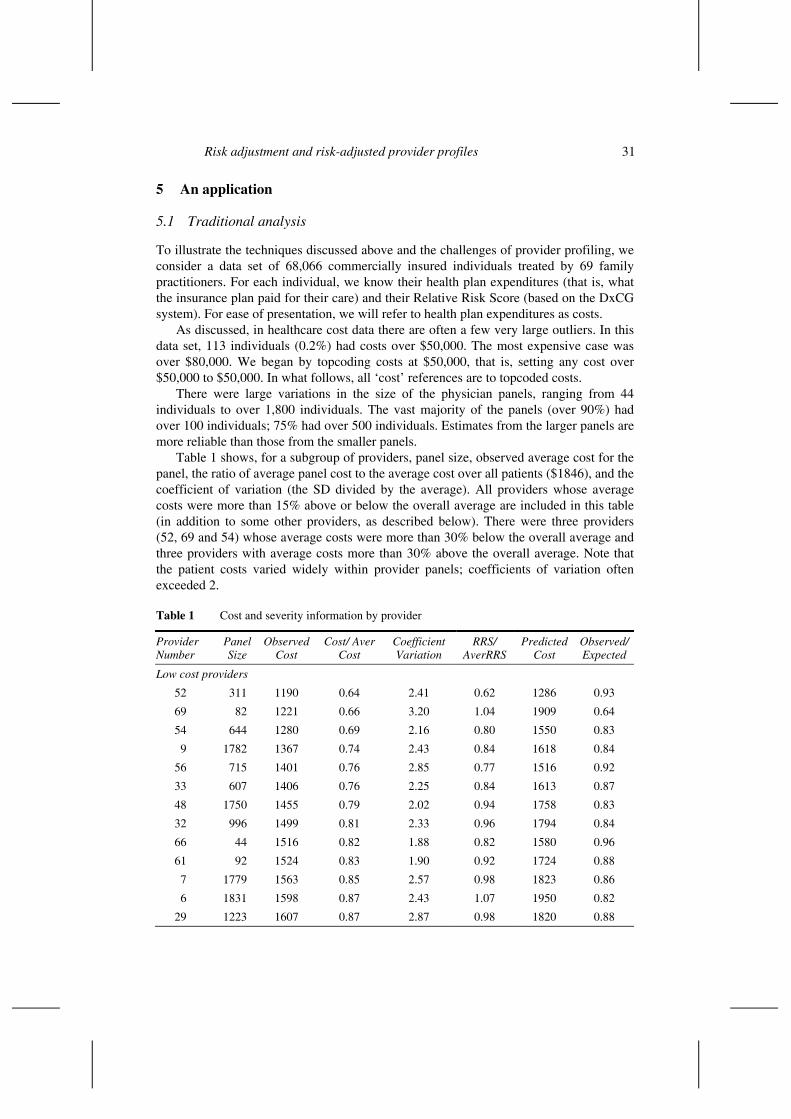
To illustrate the techniques discussed above and the challenges of provider profiling, we consider a data set of 68,066 commercially insured individuals treated by 69 family practitioners. For each individual, we know their health plan expenditures (that is, what the insurance plan paid for their care) and their Relative Risk Score (based on the DxCG system). For ease of presentation, we will refer to health plan expenditures as costs.
As discussed, in healthcare cost data there are often a few very large outliers. In this data set, 113 individuals (0.2%) had costs over $50,000. The most expensive case was over $80,000. We began by topcoding costs at $50,000, that is, setting any cost over $50,000 to $50,000. In what follows, all ‘cost’ references are to topcoded costs.
There were large variations in the size of the physician panels, ranging from 44 individuals to over 1,800 individuals. The vast majority of the panels (over 90%) had over 100 individuals; 75% had over 500 individuals. Estimates from the larger panels are more reliable than those from the smaller panels.
Table 1 shows, for a subgroup of providers, panel size, observed average cost for the panel, the ratio of average panel cost to the average cost over all patients ($1846), and the coefficient of variation (the SD divided by the average). All providers whose average costs were more than 15% above or below the overall average are included in this table (in addition to some other providers, as described below). There were three providers (52, 69 and 54) whose average costs were more than 30% below the overall average and three providers with average costs more than 30% above the overall average. Note that the patient costs varied widely within provider panels; coefficients of variation often exceeded 2.
Table 1 Cost and severity information by provider
Provider Number
Panel Size
Observed Cost
Cost/ Aver Cost
Coefficient Variation
RRS/ AverRRS
Predicted Cost
Observed/ Expected
Low cost providers
52 311 1190 0.64 2.41 0.62 1286 0.93
69 82 1221 0.66 3.20 1.04 1909 0.64
54 644 1280 0.69 2.16 0.80 1550 0.83
9 1782 1367 0.74 2.43 0.84 1618 0.84
56 715 1401 0.76 2.85 0.77 1516 0.92
33 607 1406 0.76 2.25 0.84 1613 0.87
48 1750 1455 0.79 2.02 0.94 1758 0.83
32 996 1499 0.81 2.33 0.96 1794 0.84
66 44 1516 0.82 1.88 0.82 1580 0.96
61 92 1524 0.83 1.90 0.92 1724 0.88
7 1779 1563 0.85 2.57 0.98 1823 0.86
6 1831 1598 0.87 2.43 1.07 1950 0.82
29 1223 1607 0.87 2.87 0.98 1820 0.88
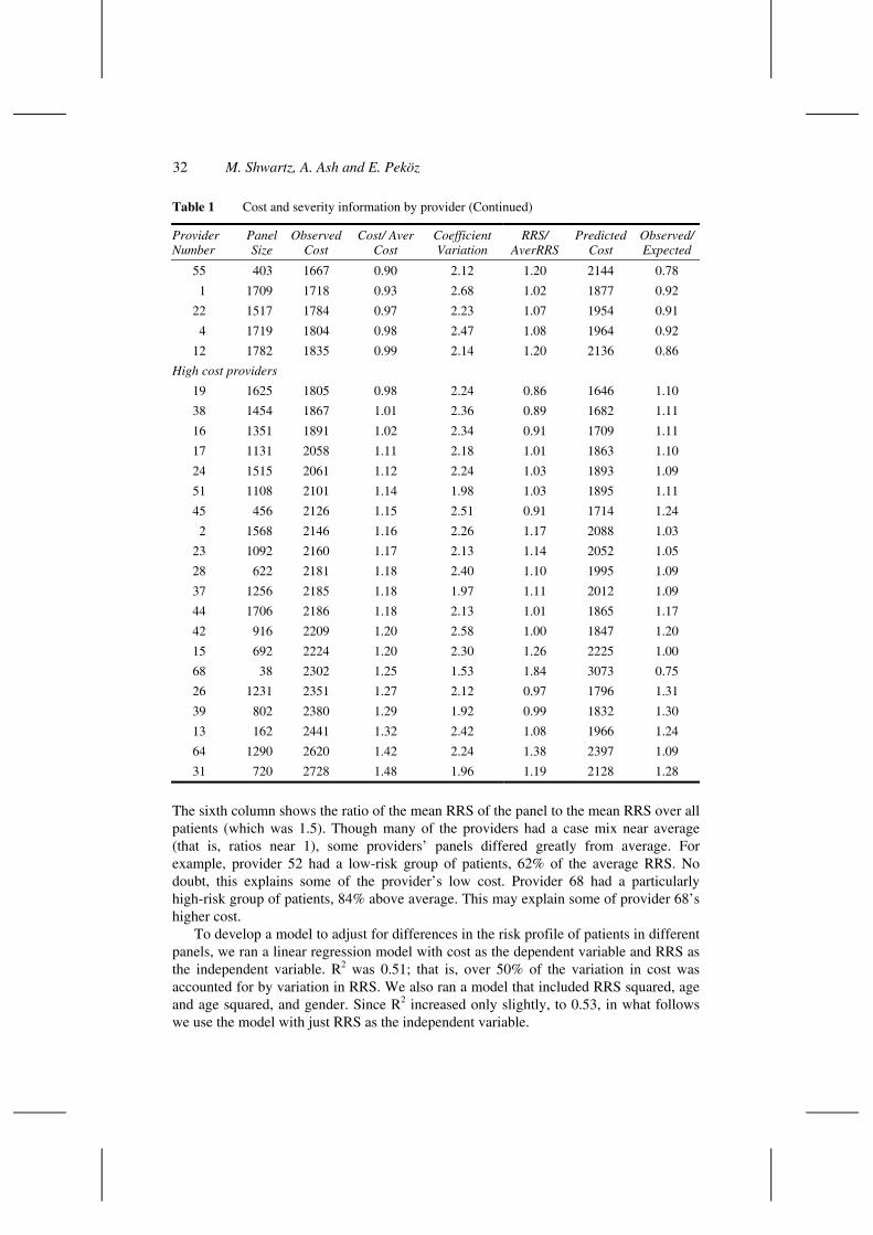
32 M. Shwartz, A. Ash and E. Peköz
Table 1 Cost and severity information by provider (Continued)
Provider Number
Panel Size
Observed Cost
Cost/ Aver Cost
Coefficient Variation
RRS/ AverRRS
Predicted Cost
Observed/ Expected
55 403 1667 0.90 2.12 1.20 2144 0.78
1 1709 1718 0.93 2.68 1.02 1877 0.92
22 1517 1784 0.97 2.23 1.07 1954 0.91
4 1719 1804 0.98 2.47 1.08 1964 0.92
12 1782 1835 0.99 2.14 1.20 2136 0.86
High cost providers
19 1625 1805 0.98 2.24 0.86 1646 1.10
38 1454 1867 1.01 2.36 0.89 1682 1.11
16 1351 1891 1.02 2.34 0.91 1709 1.11
17 1131 2058 1.11 2.18 1.01 1863 1.10
24 1515 2061 1.12 2.24 1.03 1893 1.09
51 1108 2101 1.14 1.98 1.03 1895 1.11
45 456 2126 1.15 2.51 0.91 1714 1.24
2 1568 2146 1.16 2.26 1.17 2088 1.03
23 1092 2160 1.17 2.13 1.14 2052 1.05
28 622 2181 1.18 2.40 1.10 1995 1.09
37 1256 2185 1.18 1.97 1.11 2012 1.09
44 1706 2186 1.18 2.13 1.01 1865 1.17
42 916 2209 1.20 2.58 1.00 1847 1.20
15 692 2224 1.20 2.30 1.26 2225 1.00
68 38 2302 1.25 1.53 1.84 3073 0.75
26 1231 2351 1.27 2.12 0.97 1796 1.31
39 802 2380 1.29 1.92 0.99 1832 1.30
13 162 2441 1.32 2.42 1.08 1966 1.24
64 1290 2620 1.42 2.24 1.38 2397 1.09
31 720 2728 1.48 1.96 1.19 2128 1.28
The sixth column shows the ratio of the mean RRS of the panel to the mean RRS over all patients (which was 1.5). Though many of the providers had a case mix near average (that is, ratios near 1), some providers’ panels differed greatly from average. For example, provider 52 had a low-risk group of patients, 62% of the average RRS. No doubt, this explains some of the provider’s low cost. Provider 68 had a particularly high-risk group of patients, 84% above average. This may explain some of provider 68’s higher cost.
To develop a model to adjust for differences in the risk profile of patients in different panels, we ran a linear regression model with cost as the dependent variable and RRS as the independent variable. R2 was 0.51; that is, over 50% of the variation in cost was accounted for by variation in RRS. We also ran a model that included RRS squared, age and age squared, and gender. Since R2 increased only slightly, to 0.53, in what follows we use the model with just RRS as the independent variable.

Risk adjustment and risk-adjusted provider profiles 33
Examining average cost by decile of predicted cost provides insight into the ability of RRS to differentiate groups with very different costs. In the 3 lowest deciles, average costs were $215, $358 and $573 respectively. In the 3 highest deciles, average costs were $2421, $3542 and $9609. Also, the 50% of people with the lowest predicted costs incurred only 9% of the expenses; while the 10% with the highest predicted cost incurred 48% of all expenses; and the top 5% spent 33%. Recall that we are ‘predicting’ costs from data that ‘know’ which illnesses were being treated to generate these costs. Prospective models – models that predict next year’s costs (before knowing what illnesses will arise) – cannot isolate high cost groups as well.
Columns 7 and 8 of Table 1 show the average of the predicted costs (E) and the little observed cost versus expected cost (O/E) ratio for the patients in each panel. Sometimes, adjusting for patient risk dramatically affected whether a provider looked extreme. For example, provider 52 had actual costs that were 64% of the overall average. However, this provider saw a relatively healthy set of patients. When this risk was taken into account, provider 52’s actual costs were only 7% below expected (O/E = 0.93). Provider 69 also had low actual costs compared to the average, 66% of the average. After accounting for the fact that this provider’s patients were somewhat less healthy than average, these actual costs were still viewed as low, only 64% of expected. Risk adjustment mattered little for this provider. Comparing columns 4 and 8 shows that risk adjustment affected the perceived efficiency of some providers only a little, while for others it mattered a lot.
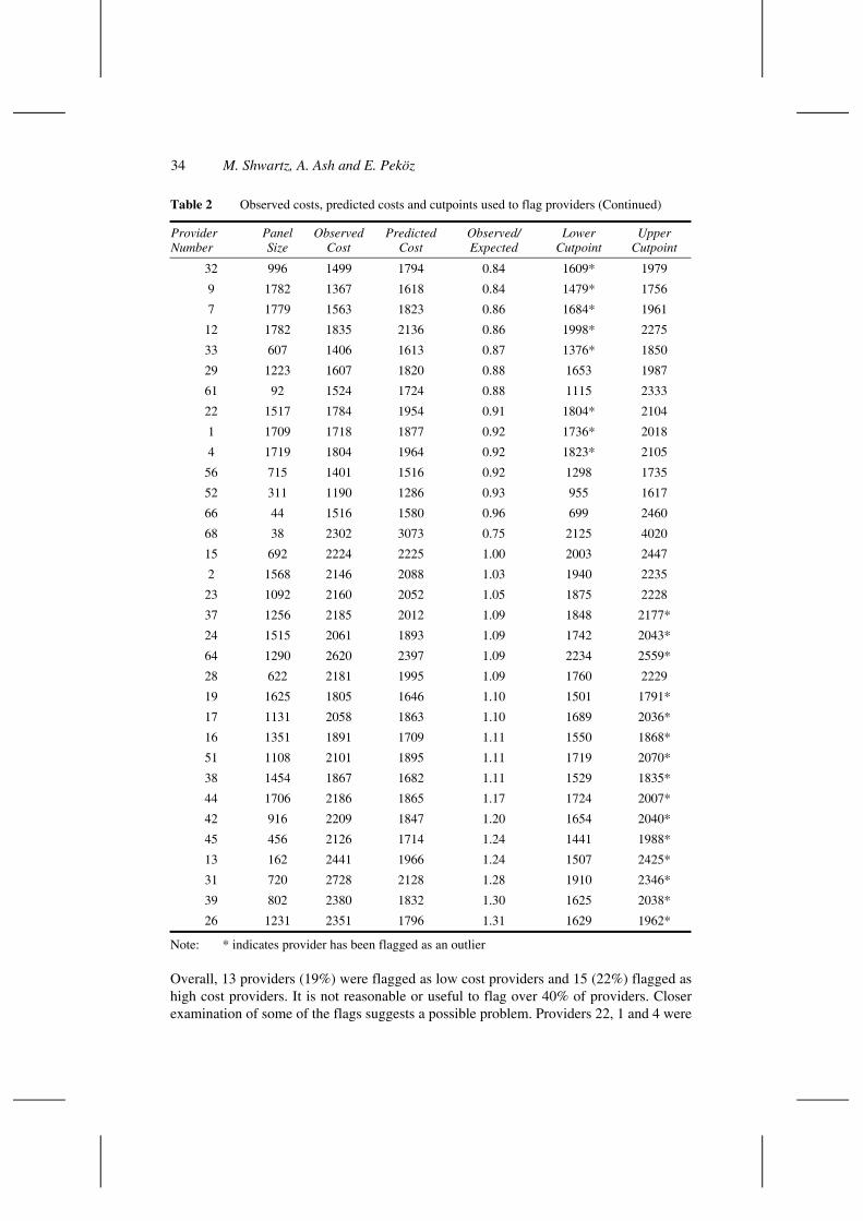
In our risk adjustment model (which includes only one independent variable), the SD associated with the predicted cost for an individual varied only slightly across individuals. For almost all people it was 2,980. Thus, the interval within which observed mean costs were expected to fall was ‘predicted costs + 1.96*2980/√n, where n is the provider’s panel size. (In this calculation, we used 1.96 rather than 2, the approximate number of SEs above and below the mean used to calculate a 95% confidence interval). Table 2 shows average actual costs, average predicted costs and the cutpoints around predicted costs used to identify providers as outliers. In addition to including providers whose actual average costs were more than 15% from the overall average, both Tables 1 and 2 include all providers flagged because their actual cost was outside the cutpoints (indicated by * in the Table). Of the 10 providers whose costs were more than 15% below average, only 5 would have been flagged because their observed cost was outside the range expected after risk adjustment. Among the 13 providers whose costs were more than 15% above average, only 8 have actual costs higher than expected.
Table 2 Observed costs, predicted costs and cutpoints used to flag providers
Provider Number
Panel Size
Observed Cost
Predicted Cost
Observed/ Expected
Lower Cutpoint
Upper Cutpoint
69 82 1221 1909 0.64 1264* 2554
55 403 1667 2144 0.78 1853* 2435
6 1831 1598 1950 0.82 1814* 2087
54 644 1280 1550 0.83 1320* 1781
48 1750 1455 1758 0.83 1618 1898
34 M. Shwartz, A. Ash and E. Peköz
Table 2 Observed costs, predicted costs and cutpoints used to flag providers (Continued)
Provider Number
Panel Size
Observed Cost
Predicted Cost
Observed/ Expected
Lower Cutpoint
Upper Cutpoint
32 996 1499 1794 0.84 1609* 1979
9 1782 1367 1618 0.84 1479* 1756
7 1779 1563 1823 0.86 1684* 1961
12 1782 1835 2136 0.86 1998* 2275
33 607 1406 1613 0.87 1376* 1850
29 1223 1607 1820 0.88 1653 1987
61 92 1524 1724 0.88 1115 2333
22 1517 1784 1954 0.91 1804* 2104
1 1709 1718 1877 0.92 1736* 2018
4 1719 1804 1964 0.92 1823* 2105
56 715 1401 1516 0.92 1298 1735
52 311 1190 1286 0.93 955 1617
66 44 1516 1580 0.96 699 2460
68 38 2302 3073 0.75 2125 4020
15 692 2224 2225 1.00 2003 2447
2 1568 2146 2088 1.03 1940 2235
23 1092 2160 2052 1.05 1875 2228
37 1256 2185 2012 1.09 1848 2177*
24 1515 2061 1893 1.09 1742 2043*
64 1290 2620 2397 1.09 2234 2559*
28 622 2181 1995 1.09 1760 2229
19 1625 1805 1646 1.10 1501 1791*
17 1131 2058 1863 1.10 1689 2036*
16 1351 1891 1709 1.11 1550 1868*
51 1108 2101 1895 1.11 1719 2070*
38 1454 1867 1682 1.11 1529 1835*
44 1706 2186 1865 1.17 1724 2007*
42 916 2209 1847 1.20 1654 2040*
45 456 2126 1714 1.24 1441 1988*
13 162 2441 1966 1.24 1507 2425*
31 720 2728 2128 1.28 1910 2346*
39 802 2380 1832 1.30 1625 2038*
26 1231 2351 1796 1.31 1629 1962*
Note: * indicates provider has been flagged as an outlier
Overall, 13 providers (19%) were flagged as low cost providers and 15 (22%) flagged as high cost providers. It is not reasonable or useful to flag over 40% of providers. Closer examination of some of the flags suggests a possible problem. Providers 22, 1 and 4 were
Risk adjustment and risk-adjusted provider profiles 35
flagged as low cost providers despite the fact that their actual costs were less than 10% below expected; providers 37, 24, 64, 19, and 17 were flagged as high cost providers despite the fact that their costs were within 10% of average. This illustrates a very important point about provider profiling: if sample sizes are large, relatively small differences between observed and expected can be statistically significant. To compensate, an oversight group may wish to adopt a ‘practical significance’ in addition to a statistical significance standard – only initiating action when the difference between observed and expected is larger than a managerial or policy-relevant cutpoint. For example, if we were to specify that to be flagged, a provider’s average costs had to be both statistically significant and more than 15% from average, then 7 providers would be flagged as low (provider 69, 55, 6, 54, 48, 32 and 9) and 7 as high (provider 44, 42, 45, 13, 31, 39 and 26). The downside is that this lessens the incentive for managers of large practices to push for continuous, incremental improvement.
Requiring that findings be statistically significant reduces the risk of falsely flagging small providers, where large deviations may just reflect random chance. However, it may also cause us to miss truly aberrant practices. For example, though the performance of provider 68 differs widely from expected, this provider is not flagged as an outlier.
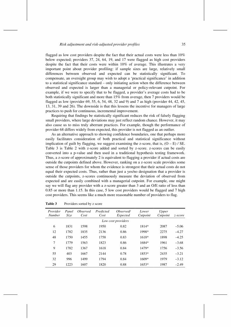
As an alternative approach to showing confidence boundaries, one that perhaps more easily facilitates consideration of both practical and statistical significance without implication of guilt by flagging, we suggest examining the z-score, that is, (O – E) / SE. Table 3 is Table 2 with z-score added and sorted by z-score. z-scores can be easily converted into a p-value and then used in a traditional hypothesis testing framework. Thus, a z-score of approximately 2 is equivalent to flagging a provider if actual costs are outside the cutpoints defined above. However, ranking on a z-score scale provides some sense of those providers for whom the evidence is strongest that their actual costs do not equal their expected costs. Thus, rather than just a yes/no designation that a provider is outside the cutpoints, z-scores continuously measure the deviation of observed from expected and are easily combined with a managerial cutpoint. For example, one might say we will flag any provider with a z-score greater than 3 and an O/E ratio of less than 0.85 or more than 1.15. In this case, 5 low cost providers would be flagged and 7 high cost providers. This seems like a much more reasonable number of providers to flag.
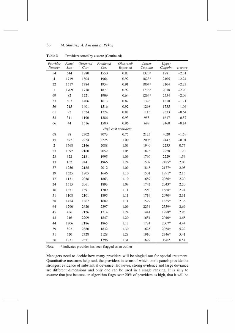
Table 3 Providers sorted by z score
Provider Number
Panel Size
Observed Cost
Predicted Cost
Observed/ Expected
Lower Cutpoint
Upper Cutpoint z-score
Low cost providers
6 1831 1598 1950 0.82 1814* 2087 –5.06
12 1782 1835 2136 0.86 1998* 2275 –4.27
48 1750 1455 1758 0.83 1618* 1898 –4.25
7 1779 1563 1823 0.86 1684* 1961 –3.68
9 1782 1367 1618 0.84 1479* 1756 –3.56
55 403 1667 2144 0.78 1853* 2435 –3.21
32 996 1499 1794 0.84 1609* 1979 –3.12
29 1223 1607 1820 0.88 1653* 1987 –2.49
36 M. Shwartz, A. Ash and E. Peköz
Table 3 Providers sorted by z score (Continued)
Provider Number
Panel Size
Observed Cost
Predicted Cost
Observed/ Expected
Lower Cutpoint
Upper Cutpoint z-score
54 644 1280 1550 0.83 1320* 1781 –2.31
4 1719 1804 1964 0.92 1823* 2105 –2.24
22 1517 1784 1954 0.91 1804* 2104 –2.23
1 1709 1718 1877 0.92 1736* 2018 –2.20
69 82 1221 1909 0.64 1264* 2554 –2.09
33 607 1406 1613 0.87 1376 1850 –1.71
56 715 1401 1516 0.92 1298 1735 –1.04
61 92 1524 1724 0.88 1115 2333 –0.64
52 311 1190 1286 0.93 955 1617 –0.57
66 44 1516 1580 0.96 699 2460 –0.14
High cost providers
68 38 2302 3073 0.75 2125 4020 –1.59
15 692 2224 2225 1.00 2003 2447 –0.01
2 1568 2146 2088 1.03 1940 2235 0.77
23 1092 2160 2052 1.05 1875 2228 1.20
28 622 2181 1995 1.09 1760 2229 1.56
13 162 2441 1966 1.24 1507 2425* 2.03
37 1256 2185 2012 1.09 1848 2177* 2.05
19 1625 1805 1646 1.10 1501 1791* 2.15
17 1131 2058 1863 1.10 1689 2036* 2.20
24 1515 2061 1893 1.09 1742 2043* 2.20
16 1351 1891 1709 1.11 1550 1868* 2.24
51 1108 2101 1895 1.11 1719 2070* 2.31
38 1454 1867 1682 1.11 1529 1835* 2.36
64 1290 2620 2397 1.09 2234 2559* 2.69
45 456 2126 1714 1.24 1441 1988* 2.95
42 916 2209 1847 1.20 1654 2040* 3.68
44 1706 2186 1865 1.17 1724 2007* 4.44
39 802 2380 1832 1.30 1625 2038* 5.22
31 720 2728 2128 1.28 1910 2346* 5.41
26 1231 2351 1796 1.31 1629 1962 6.54
Note: * indicates provider has been flagged as an outlier
Managers need to decide how many providers will be singled out for special treatment. Quantitative measures help rank the providers in terms of which one’s panels provide the strongest evidence of substantial deviance. However, strong evidence and large deviance are different dimensions and only one can be used in a single ranking. It is silly to assume that just because an algorithm flags over 20% of providers as high, that it will be

Risk adjustment and risk-adjusted provider profiles 37
worthwhile to intensively follow-up on all of them. External ‘sanctions’ should probably emphasize practical importance (large deviance), while internal managers with large panels should continuously push for small (statistically meaningful) improvements.
As discussed earlier, we usually determine the variation in a predicted panel average by assuming that the same variance applies for every case, even though random variations are usually larger for cases that are expected to be more expensive. In our data, for the 20% of cases with the lowest predicted costs, mean costs were $88 with a standard deviation of $298; in the upper 1% of cases in terms of predicted, mean costs were $23,422 with a standard deviation of $15,616. Thus, we recalculated confidence bounds using the binning approach described above. In most cases, the confidence intervals were wider, but usually by under $100 (for 65 of the 69 providers); as a result, two fewer providers (one high, one low) were flagged as having statistically significant costs.
It may well be that providers have little control over the proportion of their panel that actually visits them over some time period. This suggests doing the analysis including only patients with positive costs. When we did this (using the SE from the regression model rather than the binning approach just described), 12 providers were still flagged as statistically significant on the low side and 12 (3 fewer than before) on the high side. Most of the flagged providers were the same as before.
Given the many providers identified as having average costs statistically significantly different than expected, one might think that provider is an important variable explaining differences in costs. However, once RRS is in the model, adding 68 dummy variables for provider only leads to an increase in R2 of less than .01. The partial F statistic for provider is 5.3 and the intraclass correlation coefficient is .004. Adjustment for the design effect would have little impact on the width of the confidence intervals in this situation.
5.2 Hierarchical modelling (HM)
In the above analysis, the only source of randomness is due to variation in individual patient costs around each provider’s mean. As noted, hierarchical modelling allows one to formally incorporate the possibility that providers’ mean costs may also vary from their expected due to random factors. In our analysis, we used a relatively simple hierarchical model:
• providers’ true mean costs vary normally around their expected costs with some unknown standard deviation (which is the same for all providers)
• the SE associated with the mean costs for a provider is the SD of that provider’s patients’ costs divided by the square root of the panel size.
The output of the HM analysis provides two quantities of direct interest:
• an estimate of each provider’s true mean cost, which is a weighted average of their expected costs and their actual costs
• bounds within which one is 95% sure true mean costs will fall.
Table 4 compares the HM estimates to the traditional approach estimates. The first thing to notice is the extent to which shrinkage toward expected depends on the size of a
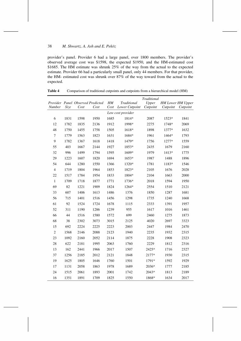
38 M. Shwartz, A. Ash and E. Peköz
provider’s panel. Provider 6 had a large panel, over 1800 members. The provider’s observed average cost was $1598, the expected $1950, and the HM-estimated cost $1685. The HM estimate was shrunk 25% of the way from the actual to the expected estimate. Provider 66 had a particularly small panel, only 44 members. For that provider, the HM- estimated cost was shrunk over 87% of the way toward from the actual to the expected.
Table 4 Comparison of traditional cutpoints and cutpoints from a hierarchical model (HM)
Provider Number
Panel Size
Observed Cost
Predicted Cost
HM Cost
Traditional Lower Cutpoint
Traditional Upper
Cutpoint HM Lower Cutpoint
HM Upper Cutpoint
Low cost provider
6 1831 1598 1950 1685 1814* 2087 1523* 1841
12 1782 1835 2136 1912 1998* 2275 1748* 2069
48 1750 1455 1758 1505 1618* 1898 1377* 1632
7 1779 1563 1823 1631 1684* 1961 1464* 1793
9 1782 1367 1618 1418 1479* 1756 1277* 1559
55 403 1667 2144 1927 1853* 2435 1679 2160
32 996 1499 1794 1595 1609* 1979 1413* 1775
29 1223 1607 1820 1694 1653* 1987 1488 1896
54 644 1280 1550 1366 1320* 1781 1183* 1546
4 1719 1804 1964 1853 1823* 2105 1676 2028
22 1517 1784 1954 1833 1804* 2104 1663 2000
1 1709 1718 1877 1771 1736* 2018 1594 1950
69 82 1221 1909 1824 1264* 2554 1510 2121
33 607 1406 1613 1486 1376 1850 1287 1681
56 715 1401 1516 1456 1298 1735 1240 1668
61 92 1524 1724 1678 1115 2333 1391 1957
52 311 1190 1286 1239 955 1617 1016 1461
66 44 1516 1580 1572 699 2460 1275 1873
68 38 2302 3073 3015 2125 4020 2697 3323
15 692 2224 2225 2223 2003 2447 1984 2470
2 1568 2146 2088 2123 1940 2235 1932 2315
23 1092 2160 2052 2114 1875 2228 1908 2323
28 622 2181 1995 2063 1760 2229 1812 2316
13 162 2441 1966 2017 1507 2425* 1716 2327
37 1256 2185 2012 2121 1848 2177* 1930 2315
19 1625 1805 1646 1760 1501 1791* 1592 1929
17 1131 2058 1863 1978 1689 2036* 1777 2185
24 1515 2061 1893 2001 1742 2043* 1813 2189
16 1351 1891 1709 1825 1550 1868* 1634 2017
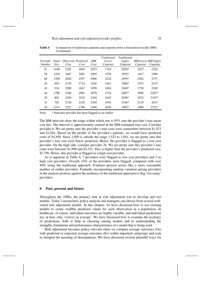
Risk adjustment and risk-adjusted provider profiles 39
Table 4 Comparison of traditional cutpoints and cutpoints from a hierarchical model (HM) (Continued)
Provider Number
Panel Size
Observed Cost
Predicted Cost
HM Cost
Traditional Lower
Cutpoint
Traditional Upper
Cutpoint HM Lower Cutpoint
HM Upper Cutpoint
51 1108 2101 1895 2023 1719 2070* 1827 2224
38 1454 1867 1682 1803 1529 1835* 1617 1989
64 1290 2620 2397 2506 2234 2559* 2282 2737
45 456 2126 1714 1836 1441 1988* 1572 2115
42 916 2209 1847 1999 1654 2040* 1758 2249
44 1706 2186 1865 2078 1724 2007* 1896 2267*
39 802 2380 1832 2104 1625 2038* 1875 2347*
31 720 2728 2128 2365 1910 2346* 2119 2633
26 1231 2351 1796 2104 1629 1962* 1890 2331*
Note: * Indicates provider has been flagged as an outlier
The HM intervals show the range within which one is 95% sure the provider’s true mean cost lies. The interval is approximately centred at the HM-estimated true cost. Consider provider 6. We are pretty sure the provider’s true costs were somewhere between $1,523 and $1,841. Based on the profile of the provider’s patients, we would have predicted costs of $1,950. Since 1,950 is outside the range 1,523 to 1,841, we are pretty sure this provider’s true cost were below predicted. Hence, the provider is flagged as a low cost provider. On the high side, consider provider 26. We are pretty sure this provider’s true costs were between $1,890 and $2,331. This is higher than the provider’s predicted cost, $1,796. Hence, this provider is flagged as a high cost provider.
As is apparent in Table 4, 7 providers were flagged as low cost providers and 3 as high cost providers. Overall, 14% of the providers were flagged, compared with over 40% using the traditional approach. Fourteen percent seems like a more reasonable number of outlier providers. Formally incorporating random variation among providers in the analysis protects against the tendency of the traditional approach to flag ‘too many’ providers.
6 Past, present and future
Throughout the 1980s, the primary task in risk adjustment was to develop and test models. Today’s researchers, policy analysts and managers can choose from several well-vetted risk adjustment models. In this chapter, we have discussed how to use existing models to create credible predicted values for each observation in a population. In healthcare, of course, individual outcomes are highly variable, and individual predictions are, at best, only ‘correct on average’. We have discussed how to examine the accuracy of predictions, both to help in choosing among models and in understanding the strengths, limitations and performance characteristics of a model that is being used.
Risk adjustment becomes policy-relevant when we compare average outcomes (Os) with predicted or expected average outcomes (Es) within important subgroups and seek to interpret the meaning of discrepancies. We have discussed several plausible ways for

40 M. Shwartz, A. Ash and E. Peköz
doing this. Although we have focussed on provider profiling, our discussion pertains to any attempt to understand the effect of a patient, provider or system characteristic on a health outcome. To learn where the system is, and how to improve it, we must compare Os to Es and act on what we see. The challenge is to neither over-react to the pseudo-precision that makes random noise look like an important ‘finding,’ nor to be paralysed into inaction by the certainty of uncertainty.
In 2004, the newspapers are filled with stories that rely on credible risk adjustment. The Centers for Medicare and Medicaid Services (CMS) makes risk adjusted payments to HMOs for the Medicare beneficiaries they enroll; the 2003 Medicare drug bill mandates risk adjustment to deal with predictable differences in the expected cost of drugs for individuals; consortia of purchasers rank hospitals, imposing surcharges on consumers for using facilities in ‘inefficient’ tiers; medical managers of provider groups produce, examine and supply profiling data to individual doctors and medical teams, seeking to identify and promulgate better modes of practice.
Though state-of-the-art risk adjustment models predicting continuous outcomes, such as costs, have R2 over 0.50 (when used concurrently) and models predicting a dichotomous outcomes, such as death, have c statistics approaching 0.90, much variation in outcomes remains unexplained. The most important concern is the potential for systematic bias. When a provider’s actual outcomes differ from expected, we can quantify the likely contributions of randomness, but it can never be entirely clear how much is due to unmeasured risk and how much to differences in provider efficiency or quality of care. Even after expensive and time-consuming medical record reviews, this key question may remain unanswered. Significantly worse outcomes than expected need to be understood; however, they are not synonymous with poor quality or low productivity.
Traditional approaches for identifying outlier providers that measure random variation only at the patient level, especially those that use standard cutpoints (such as z = 2) to identify outliers, may flag too many outliers. In our example, despite our attempts to create stable findings, about 40% of the providers were flagged as outliers. Managers should consider both the practical and statistical significance of deviant outcomes; one way is to focus on providers with the most extreme z-scores whose O/E ratio exceeds a managerially relevant cutpoint. This guards against flagging either providers with extreme O/E ratios and small panel sizes (their z-scores will be small) or providers with large z-scores but O/E ratios close to 1 (they won’t exceed the cutpoints).
Hierarchical models that formally incorporate variation among providers will be increasingly used in provider profiling. As we have seen, profiling based on such models flags fewer providers as outliers. Given the current status of risk adjustment models and the possibility that deviant O/E ratios are due to unmeasured case mix differences, cautious ‘flagging’ seems appropriate. Though hierarchical models are harder to implement, improvements in software and greater understanding of their value will likely lead to increased use. Finally, as longitudinal data become more available, longitudinal profiles should enable more reliable distinctions in the quality and efficiency of the care received from various providers.
Productivity and quality improvements in healthcare delivery require changing provider behaviour and credible provider profiles are needed for improvement programmes. However, as we have shown, analytical and conceptual challenges to developing useful profiles remain.

Risk adjustment and risk-adjusted provider profiles 41
References
Ash, A.S., Zhao, Y., Ellis, R.P. and Kramer, M.S. (2001) ‘Finding future high-cost cases: comparing prior cost versus diagnosis-based methods’, Health Services Research, Vol. 36, pp.194–206.
Berwick, D.M. (1996) ‘This year of ‘how’: New systems for delivering health care’, Quality Connections, Vol. 5, pp.1–4.
Buntin, M.B. and Zaslavsky, A.M. (2004) ‘Too much ado about two-part models and transformations? Comparing methods of modeling health care costs’, Forthcoming in Journal of Health Economics.
Clancey, C. (2003) ‘Quality improvement: Getting to how’, Health Services Research, Vol. 38, pp.509.
Cumming, R.B., Knutson, D., Cameron, B.A. and Derrick, B. (2002) A Comparative Analysis of Claims-based Methods of Health Risk Assessment for Commercial Populations, Society of Actuaries (soa.org/sections/riskadjfinalreport1.pdf)
Duan, N. (1983) ‘Smearing estimate: A nonparametric retransformation method’, Journal of the American Statistical Association, Vol. 78, pp.605–610.
Greenfield, S., Kaplan, S.H., Kahn, R., Ninomiya, J. and Griffith, J.L. (2002) ‘Profiling care provided by different groups of physicians: Effects of patient case-mix (bias) and physician-level clustering on quality assessment results’, Annals of Internal Medicine, Vol. 136, pp.111–121.
Greenland, S. (2000) ‘Principles of multilevel modeling’, International Journal of Epidemiology, Vol. 29, pp.158–167.
Hannan, E.l., Kilburn, H., Racz, M., Shields, E. and Chassin, M.R. (1997) ‘Improving the outcomes of coronary artery bypass surgery in New York state’, Journal of the American Medical Association, Vol. 271, pp.761–766.
Iezzoni, L.I. (Ed.) (2003) Risk Adjustment for Measuring Health Care Outcomes, Third Edition, Health Administration Press, Chicago.
Khuri, S.F., Daley, J., Henderson, W., Hur, K., Gibbs, J.O., Barbour, G., et al. (1997) ‘Risk adjustment of the postoperative mortality rate for the comparative assessment of the quality of surgical care: Results of the national veterans affairs surgical risk study’, Journal of the American College of Surgeons, Vol. 185, pp.315–327.
Knaus, W.A., Wagner, D.P., Draper, E.A., Zimmerman, J.E., Bergner, M., Bastos, P.G., et al. (1991) ‘The APACHE III Prognostic System: risk prediction of hospital mortality for critically ill hospitalized adults’, Chest, Vol. 100, pp.1619–1636.
Localio, A.R., Hamory, B.H., Fisher, A.C. and TenHave, T.R. (1997) ‘The public release of hospital and physician mortality data in Pennsylvania: a case study’, Medical Care, Vol. 35, pp.272–286.
Luft, H.S. and Hunt, S.S. (1986) ‘Evaluating individual hospital quality through outcome statistics’, Journal of the American Medical Association, Vol. 255, pp.2780–2784.
McNeil, B.J., Pedersen, S.H. and Gatsonis, C. (1992) ‘Current issues in profiling quality of care’, Inquiry, Vol. 29, pp.298–307.
Normand, S.L.T., Glickman, M.E. and Ryan, T.J. (1996) ‘Modeling mortality rates for elderly heart attack patients: Profiling hospitals in the cooperative cardiovascular project’, Case Studies in Bayesian Statistics, Vol. 3, Springer, New York.
Normand, S.N.L.T., Glickman, M.E. and Gatsonis, C. (1997), ‘Statistical methods for profiling providers of medical care: issues and applications’, Journal of the American Statistical Association, Vol. 92, pp.803–814.

42 M. Shwartz, A. Ash and E. Peköz
Shahian, D.M., Normand, S.L., Torchiana, D.F., Lewis, S.M., Pastore, J.O., Kuntz, R.E. and Dreyer, P.I. (2001) ‘Cardiac surgery report cards: comprehensive review and statistical critique’, Annals of Thoracic Surgery, Vol. 72, pp.2155–2168.
Zhao, Y., Ash, A.S., Haughton, J. and McMillan, B. (2003) ‘Identifying future high-cost cases through predictive modeling’, Disease Management and Health Outcomes, Vol. 11, pp.389–397.