Embed Size (px)
Citation preview

SHARE THE EBOOK 1
LAST UPDATED
JULY 26TH, 2015
CONTENTS
2SHARE THE EBOOK
WHAT’S INSIDE 3
HOW WE USE THESE DASHBOARDS 4
CEO DASHBOARD 5
MARKETING DASHBOARDSOCIAL MEDIA
CAMPAIGN PERFORMANCE
INBOUND LEAD GENERATION
1011
14
16
DEVELOPMENT DASHBOARDDEVELOPMENT
DEVOPS
1819
20
SALES DASHBOARDCURRENT PERFORMANCE
PERIODIC PERFORMANCE
CUSTOMER RETENTION
2324
26
28
SUPPORT DASHBOARDSUPPORT TICKETS AND RESPONSE
TICKETS BY TYPE
DOCUMENTATION WEB ANALYTICS
3031
33
35
UX DASHBOARD 37
HOW DO YOU TRACK YOUR PERFORMANCE? 40
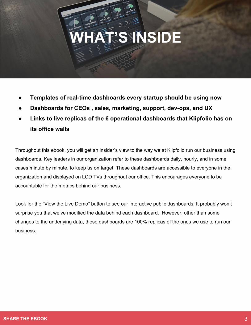
● Templates of real-time dashboards every startup should be using now
● Dashboards for CEOs , sales, marketing, support, dev-ops, and UX
● Links to live replicas of the 6 operational dashboards that Klipfolio has on
its office walls
Throughout this ebook, you will get an insider’s view to the way we at Klipfolio run our business using
dashboards. Key leaders in our organization refer to these dashboards daily, hourly, and in some
cases minute by minute, to keep us on target. These dashboards are accessible to everyone in the
organization and displayed on LCD TVs throughout our office. This encourages everyone to be
accountable for the metrics behind our business.
Look for the “View the Live Demo” button to see our interactive public dashboards. It probably won’t
surprise you that we’ve modified the data behind each dashboard. However, other than some
changes to the underlying data, these dashboards are 100% replicas of the ones we use to run our
business.
WHAT’S INSIDE
3SHARE THE EBOOK
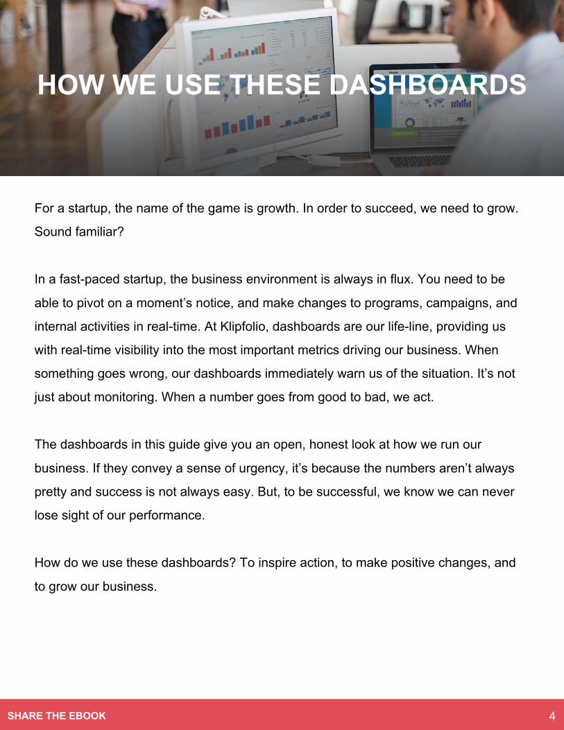
For a startup, the name of the game is growth. In order to succeed, we need to grow.
Sound familiar?
In a fast-paced startup, the business environment is always in flux. You need to be
able to pivot on a moment’s notice, and make changes to programs, campaigns, and
internal activities in real-time. At Klipfolio, dashboards are our life-line, providing us
with real-time visibility into the most important metrics driving our business. When
something goes wrong, our dashboards immediately warn us of the situation. It’s not
just about monitoring. When a number goes from good to bad, we act.
The dashboards in this guide give you an open, honest look at how we run our
business. If they convey a sense of urgency, it’s because the numbers aren’t always
pretty and success is not always easy. But, to be successful, we know we can never
lose sight of our performance.
How do we use these dashboards? To inspire action, to make positive changes, and
to grow our business.
4SHARE THE EBOOK
HOW WE USE THESE DASHBOARDS
CEO DASHBOARD
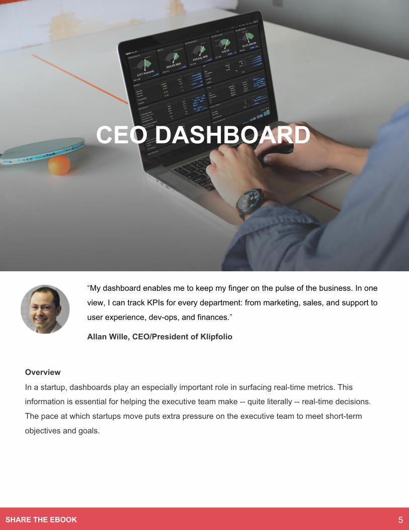
“My dashboard enables me to keep my finger on the pulse of the business. In one
view, I can track KPIs for every department: from marketing, sales, and support to
user experience, dev-ops, and finances.”
Allan Wille, CEO/President of Klipfolio
Overview
In a startup, dashboards play an especially important role in surfacing real-time metrics. This
information is essential for helping the executive team make -- quite literally -- real-time decisions.
The pace at which startups move puts extra pressure on the executive team to meet short-term
objectives and goals.
5SHARE THE EBOOK
CEO DASHBOARD
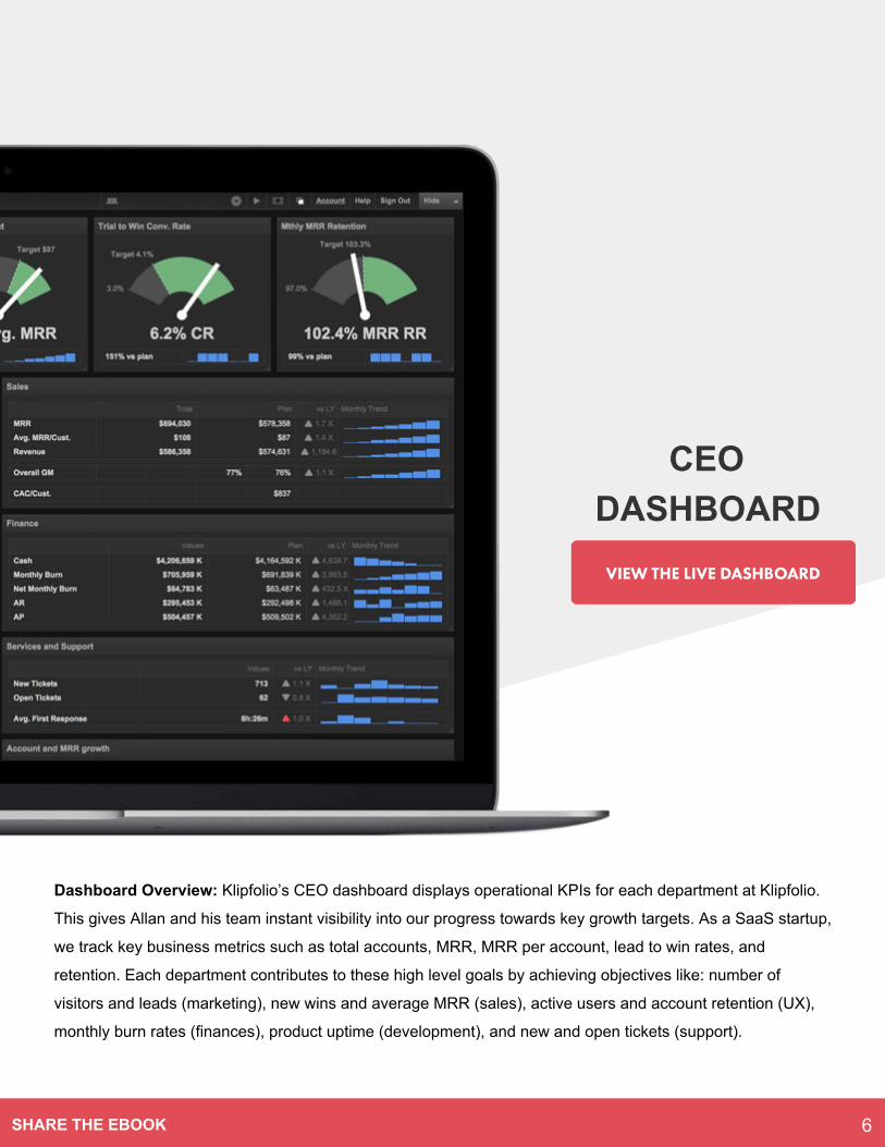
Dashboard Overview: Klipfolio’s CEO dashboard displays operational KPIs for each department at Klipfolio.
This gives Allan and his team instant visibility into our progress towards key growth targets. As a SaaS startup,
we track key business metrics such as total accounts, MRR, MRR per account, lead to win rates, and
retention. Each department contributes to these high level goals by achieving objectives like: number of
visitors and leads (marketing), new wins and average MRR (sales), active users and account retention (UX),
monthly burn rates (finances), product uptime (development), and new and open tickets (support).
6SHARE THE EBOOK
CEO DASHBOARD
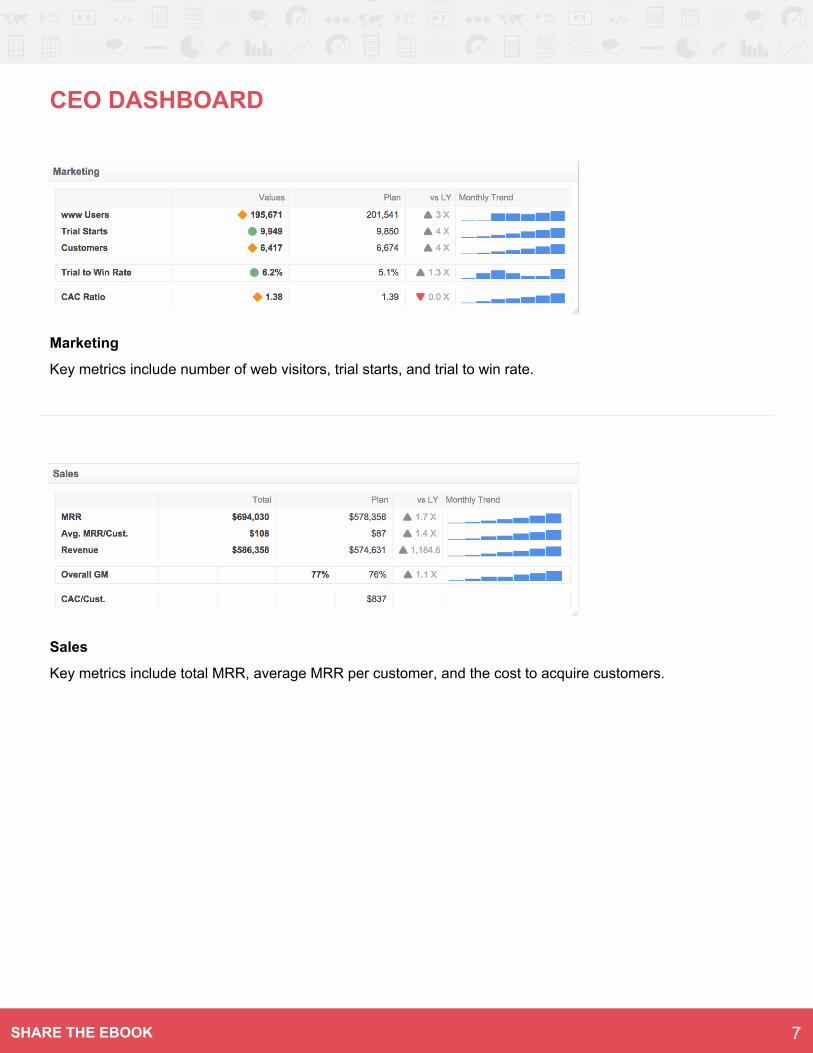
Marketing
Key metrics include number of web visitors, trial starts, and trial to win rate.
Sales
Key metrics include total MRR, average MRR per customer, and the cost to acquire customers.
7SHARE THE EBOOK
CEO DASHBOARD
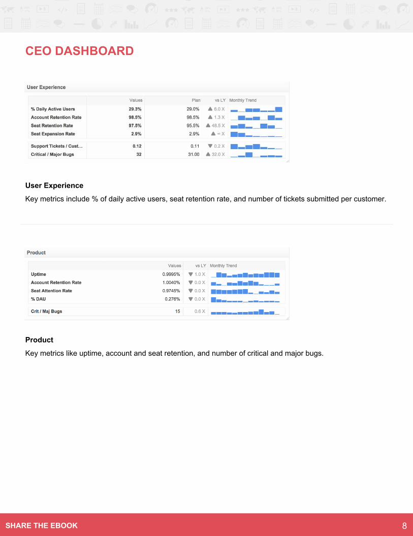
User Experience
Key metrics include % of daily active users, seat retention rate, and number of tickets submitted per customer.
Product
Key metrics like uptime, account and seat retention, and number of critical and major bugs.
8SHARE THE EBOOK
CEO DASHBOARD
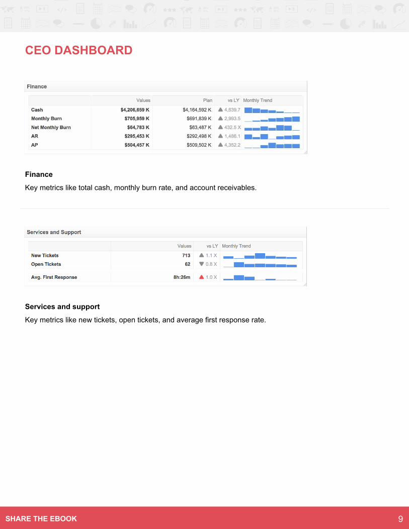
Finance
Key metrics like total cash, monthly burn rate, and account receivables.
Services and support
Key metrics like new tickets, open tickets, and average first response rate.
9SHARE THE EBOOK
MARKETING DASHBOARD
Overview
Like many of you, we’ve adopted the latest, greatest
digital marketing tools available. As a result, our
metrics are calculated by combining data from all
those services. Take, for instance, the marketing
funnel. It’s impossible to imagine creating a realistic
funnel without fetching metrics from two or more
services: web visitors from Google
Analytics, leads from Marketo (or your choice of
marketing automation tool), opportunities and wins
from Salesforce (or your favourite CRM), and
impressions from digital advertising services
(AdWords) and social media.
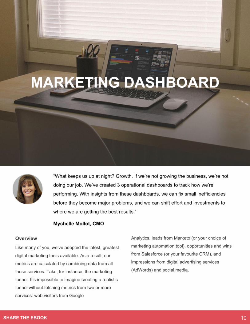
“What keeps us up at night? Growth. If we’re not growing the business, we’re not
doing our job. We’ve created 3 operational dashboards to track how we’re
performing. With insights from these dashboards, we can fix small inefficiencies
before they become major problems, and we can shift effort and investments to
where we are getting the best results.”
Mychelle Mollot, CMO
10SHARE THE EBOOK
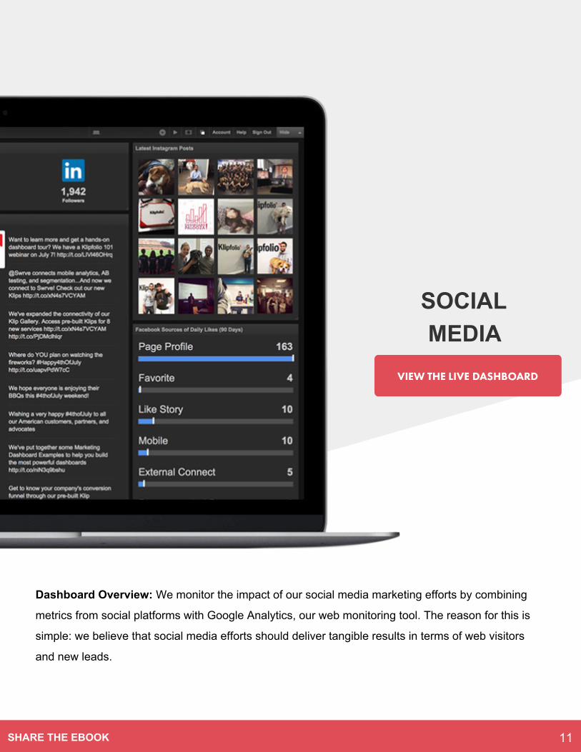
Dashboard Overview: We monitor the impact of our social media marketing efforts by combining
metrics from social platforms with Google Analytics, our web monitoring tool. The reason for this is
simple: we believe that social media efforts should deliver tangible results in terms of web visitors
and new leads.
SOCIAL MEDIA
11SHARE THE EBOOK

SOCIAL MEDIA
Engagement from Social Media (30 Days)
One of the ways we evaluate our social media performance is by measuring how effective we are at driving
visitors and leads to our website. This high-level Klip provides an overview of how many visitors and leads
came from social media campaigns, and tells us our overall social media conversion rate.
Conversions by Social Network (30 Days)
As a startup, we only have so many marketing resources to allocate to social media campaigns. Therefore, we
want to focus on social networks that are most attuned to our target market. The first way we assess this is to
look at the number of conversions coming from each platform. Quora consistently drives qualified leads to our
website, and we’ve invested in that network accordingly.
12SHARE THE EBOOK
SOCIAL MEDIA
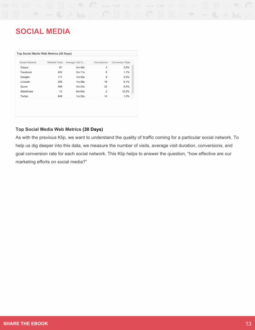
Top Social Media Web Metrics (30 Days)
As with the previous Klip, we want to understand the quality of traffic coming for a particular social network. To
help us dig deeper into this data, we measure the number of visits, average visit duration, conversions, and
goal conversion rate for each social network. This Klip helps to answer the question, “how effective are our
marketing efforts on social media?”
13SHARE THE EBOOK
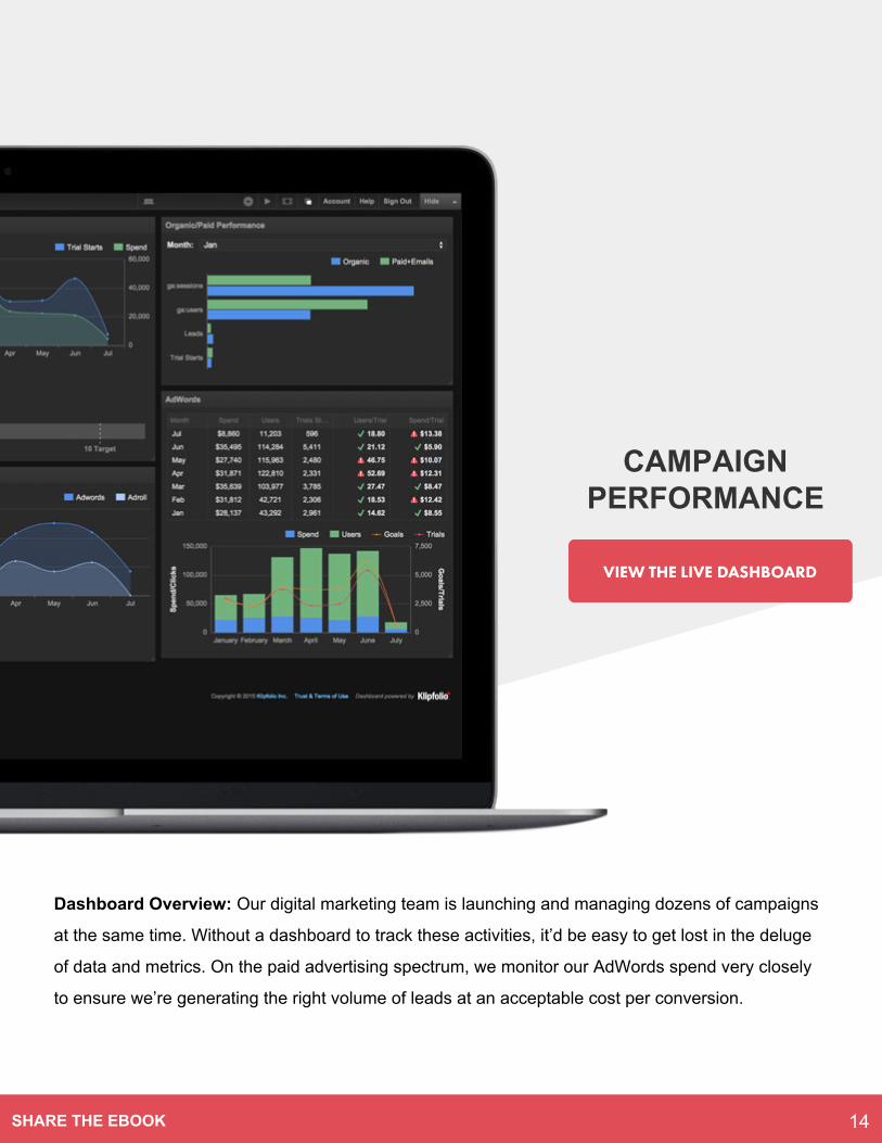
Dashboard Overview: Our digital marketing team is launching and managing dozens of campaigns
at the same time. Without a dashboard to track these activities, it’d be easy to get lost in the deluge
of data and metrics. On the paid advertising spectrum, we monitor our AdWords spend very closely
to ensure we’re generating the right volume of leads at an acceptable cost per conversion.
CAMPAIGN PERFORMANCE
14SHARE THE EBOOK
CAMPAIGN PERFORMANCE
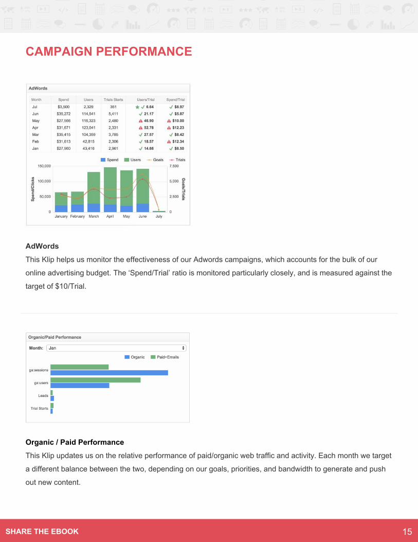
AdWords
This Klip helps us monitor the effectiveness of our Adwords campaigns, which accounts for the bulk of our
online advertising budget. The ‘Spend/Trial’ ratio is monitored particularly closely, and is measured against the
target of $10/Trial.
Organic / Paid Performance
This Klip updates us on the relative performance of paid/organic web traffic and activity. Each month we target
a different balance between the two, depending on our goals, priorities, and bandwidth to generate and push
out new content.
15SHARE THE EBOOK
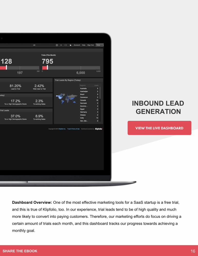
Dashboard Overview: One of the most effective marketing tools for a SaaS startup is a free trial,
and this is true of Klipfolio, too. In our experience, trial leads tend to be of high quality and much
more likely to convert into paying customers. Therefore, our marketing efforts do focus on driving a
certain amount of trials each month, and this dashboard tracks our progress towards achieving a
monthly goal.
INBOUND LEAD GENERATION
16SHARE THE EBOOK
INBOUND LEAD GENERATION
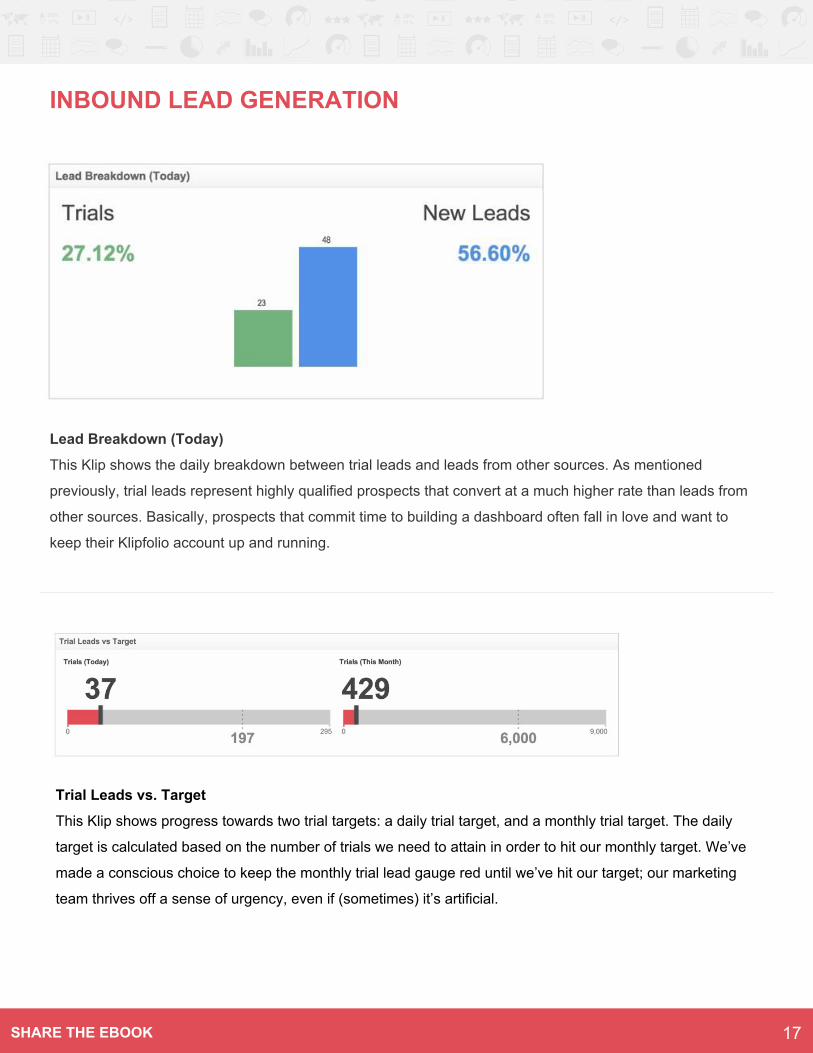
Lead Breakdown (Today)
This Klip shows the daily breakdown between trial leads and leads from other sources. As mentioned
previously, trial leads represent highly qualified prospects that convert at a much higher rate than leads from
other sources. Basically, prospects that commit time to building a dashboard often fall in love and want to
keep their Klipfolio account up and running.
Trial Leads vs. Target
This Klip shows progress towards two trial targets: a daily trial target, and a monthly trial target. The daily
target is calculated based on the number of trials we need to attain in order to hit our monthly target. We’ve
made a conscious choice to keep the monthly trial lead gauge red until we’ve hit our target; our marketing
team thrives off a sense of urgency, even if (sometimes) it’s artificial.
17SHARE THE EBOOK
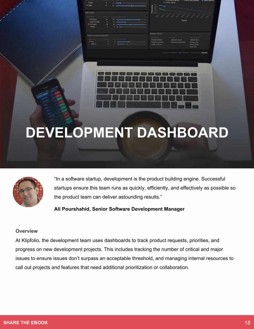
“In a software startup, development is the product building engine. Successful
startups ensure this team runs as quickly, efficiently, and effectively as possible so
the product team can deliver astounding results.”
Ali Pourshahid, Senior Software Development Manager
Overview
At Klipfolio, the development team uses dashboards to track product requests, priorities, and
progress on new development projects. This includes tracking the number of critical and major
issues to ensure issues don’t surpass an acceptable threshold, and managing internal resources to
call out projects and features that need additional prioritization or collaboration.
DEVELOPMENT DASHBOARD
18SHARE THE EBOOK
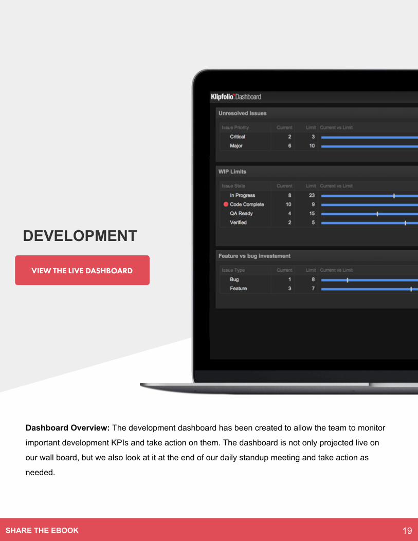
Dashboard Overview: The development dashboard has been created to allow the team to monitor
important development KPIs and take action on them. The dashboard is not only projected live on
our wall board, but we also look at it at the end of our daily standup meeting and take action as
needed.
DEVELOPMENT
19SHARE THE EBOOK
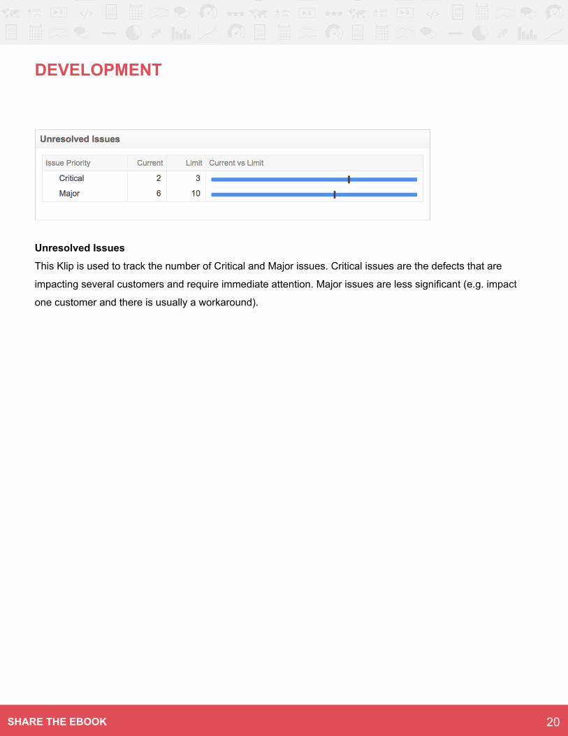
DEVELOPMENT
Unresolved Issues
This Klip is used to track the number of Critical and Major issues. Critical issues are the defects that are
impacting several customers and require immediate attention. Major issues are less significant (e.g. impact
one customer and there is usually a workaround).
20SHARE THE EBOOK
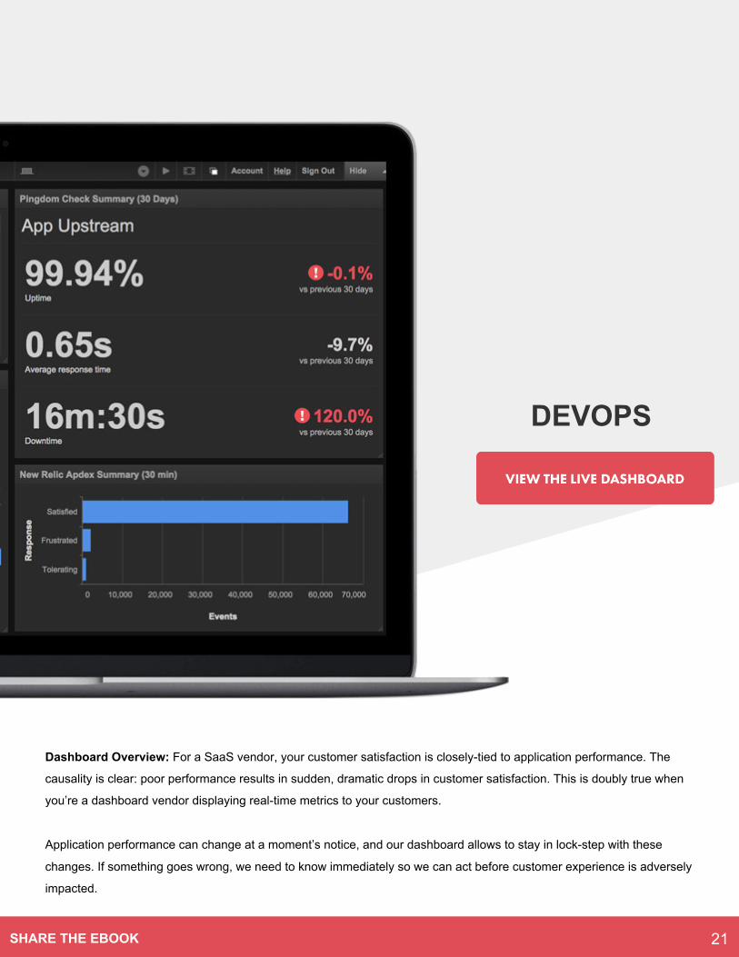
Dashboard Overview: For a SaaS vendor, your customer satisfaction is closely-tied to application performance. The
causality is clear: poor performance results in sudden, dramatic drops in customer satisfaction. This is doubly true when
you’re a dashboard vendor displaying real-time metrics to your customers.
Application performance can change at a moment’s notice, and our dashboard allows to stay in lock-step with these
changes. If something goes wrong, we need to know immediately so we can act before customer experience is adversely
impacted.
DEVOPS
21SHARE THE EBOOK
DEVOPS
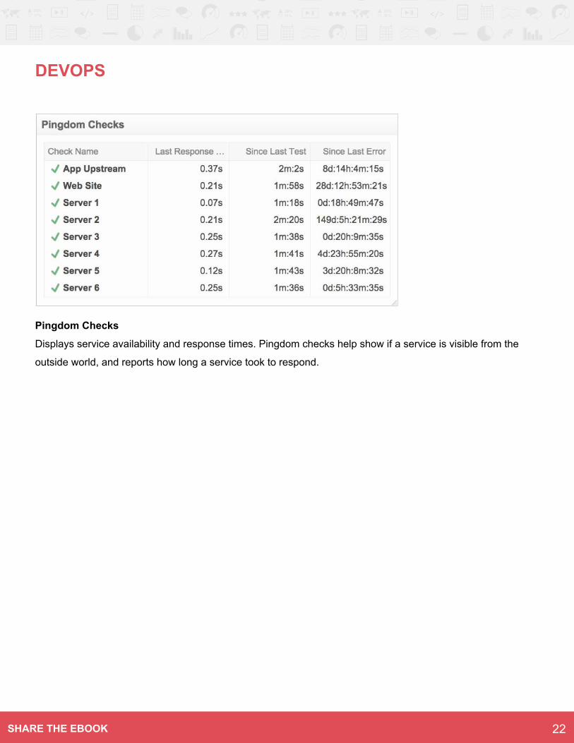
Pingdom Checks
Displays service availability and response times. Pingdom checks help show if a service is visible from the
outside world, and reports how long a service took to respond.
22SHARE THE EBOOK
Overview
For any startup, sales efforts are intimately tied with
the organization’s growth objectives; if you aren’t
able to hit your targets, whether they’re daily,
weekly, or monthly, you’re going to struggle to get
any kind of market traction.
At Klipfolio, our success team is charged with the
task of growing the business by turning qualified
prospects into Klipfolians (a term of endearment
around here).
We have set some ambitious, yet realistic, growth
objectives this year; however, we take it one day at
a time, and focus on hitting our daily and monthly
targets. Our sales dashboard reflects this, and
conveys urgency when we’re at risk of not hitting
our targets.
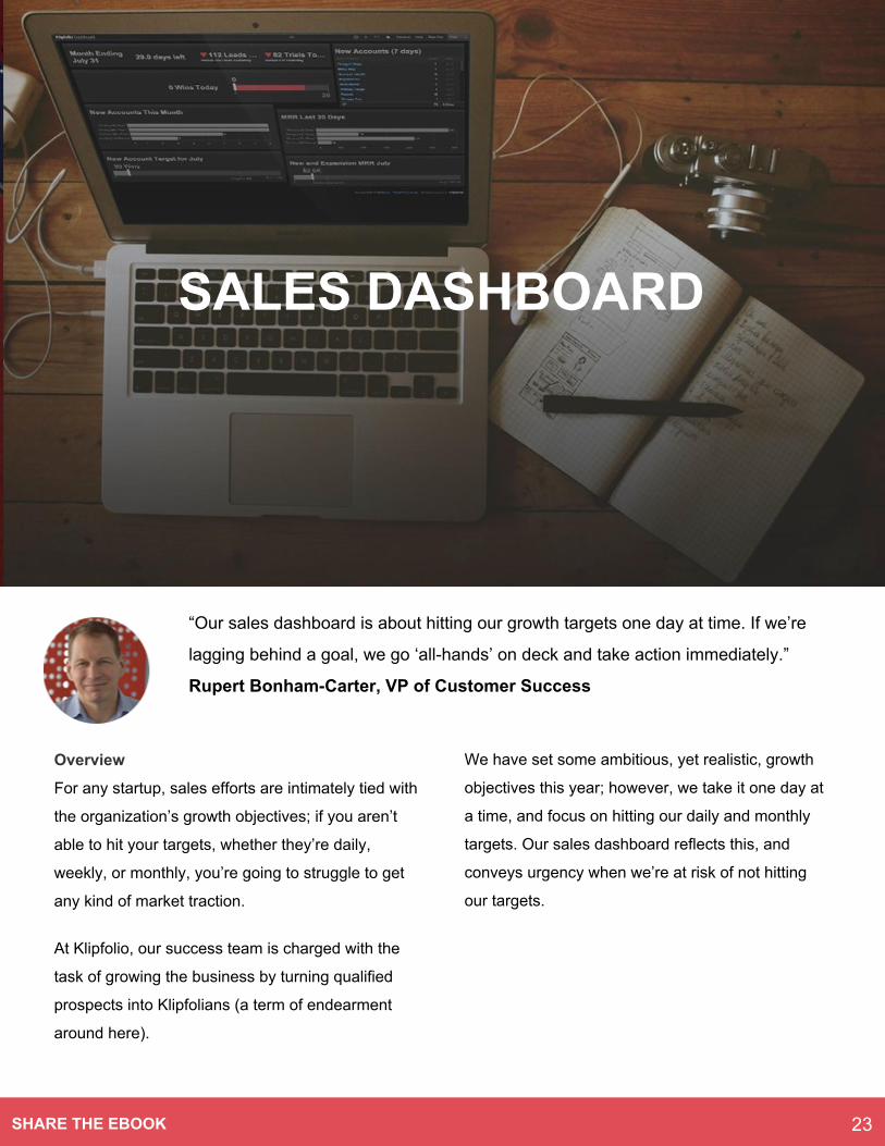
“Our sales dashboard is about hitting our growth targets one day at time. If we’re
lagging behind a goal, we go ‘all-hands’ on deck and take action immediately.”
Rupert Bonham-Carter, VP of Customer Success
SALES DASHBOARD
23SHARE THE EBOOK
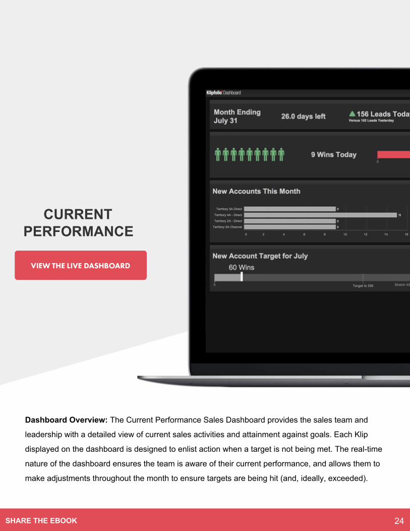
Dashboard Overview: The Current Performance Sales Dashboard provides the sales team and
leadership with a detailed view of current sales activities and attainment against goals. Each Klip
displayed on the dashboard is designed to enlist action when a target is not being met. The real-time
nature of the dashboard ensures the team is aware of their current performance, and allows them to
make adjustments throughout the month to ensure targets are being hit (and, ideally, exceeded).
CURRENT PERFORMANCE
24SHARE THE EBOOK
CURRENT PERFORMANCE
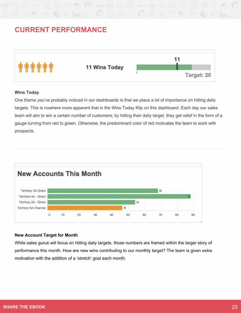
Wins Today
One theme you’ve probably noticed in our dashboards is that we place a lot of importance on hitting daily
targets. This is nowhere more apparent that in the Wins Today Klip on this dashboard. Each day our sales
team will aim to win a certain number of customers; by hitting their daily target, they get relief in the form of a
gauge turning from red to green. Otherwise, the predominant color of red motivates the team to work with
prospects.
New Account Target for Month
While sales gurus will focus on hitting daily targets, those numbers are framed within the larger story of
performance this month. How are new wins contributing to our monthly target? The team is given extra
motivation with the addition of a ‘stretch’ goal each month.
25SHARE THE EBOOK
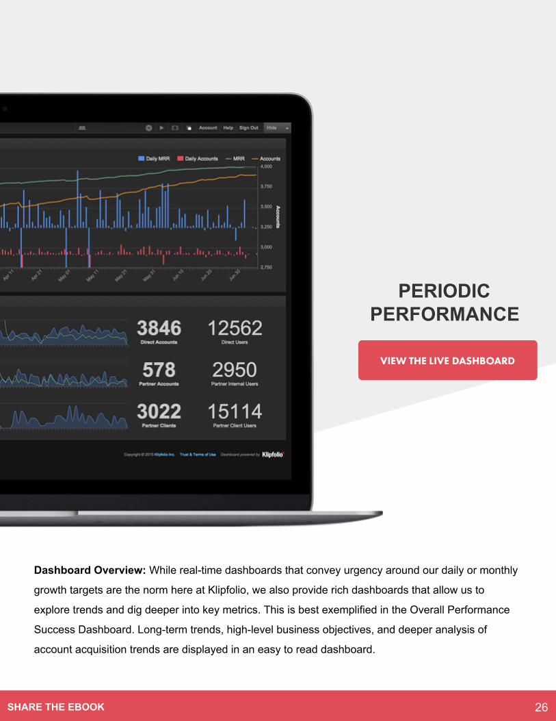
Dashboard Overview: While real-time dashboards that convey urgency around our daily or monthly
growth targets are the norm here at Klipfolio, we also provide rich dashboards that allow us to
explore trends and dig deeper into key metrics. This is best exemplified in the Overall Performance
Success Dashboard. Long-term trends, high-level business objectives, and deeper analysis of
account acquisition trends are displayed in an easy to read dashboard.
PERIODIC PERFORMANCE
26SHARE THE EBOOK
PERIODIC PERFORMANCE
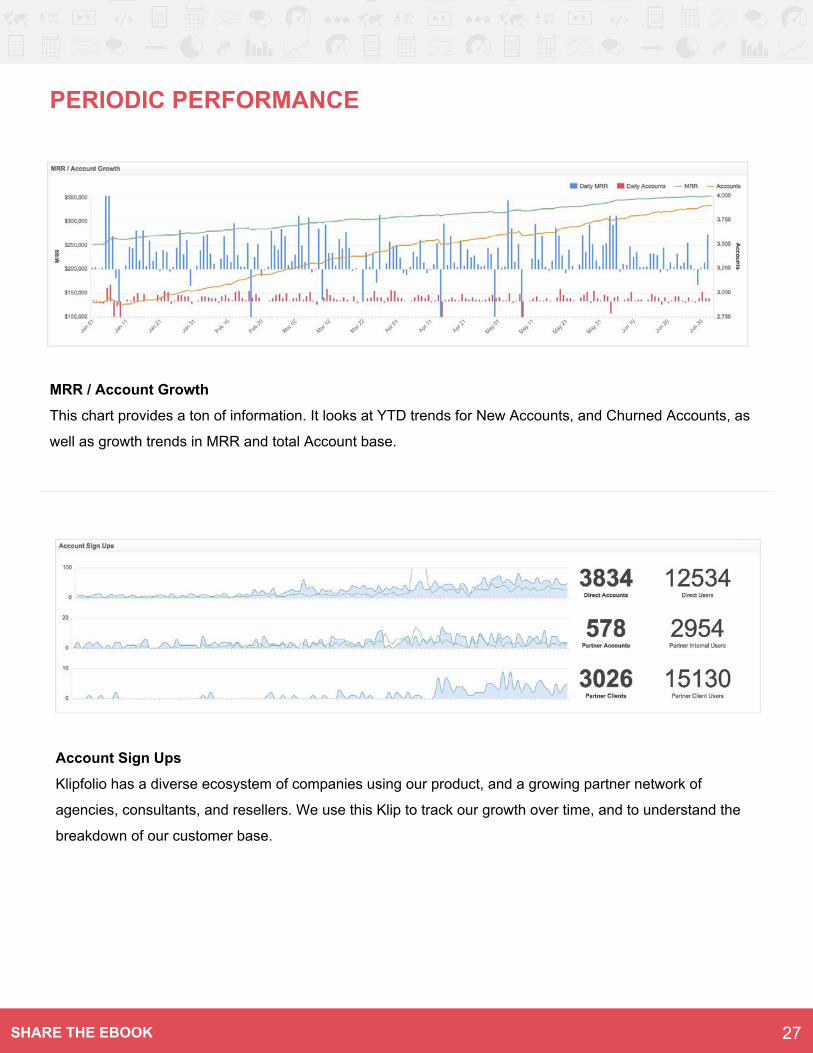
MRR / Account Growth
This chart provides a ton of information. It looks at YTD trends for New Accounts, and Churned Accounts, as
well as growth trends in MRR and total Account base.
Account Sign Ups
Klipfolio has a diverse ecosystem of companies using our product, and a growing partner network of
agencies, consultants, and resellers. We use this Klip to track our growth over time, and to understand the
breakdown of our customer base.
27SHARE THE EBOOK
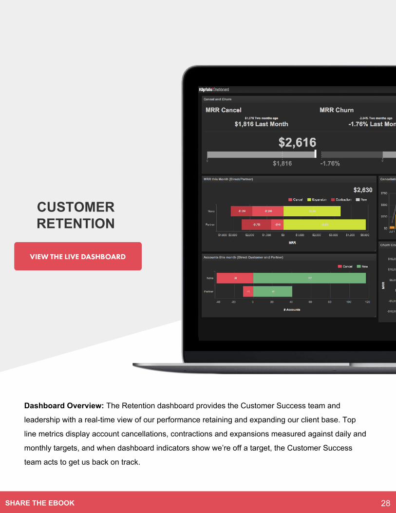
Dashboard Overview: The Retention dashboard provides the Customer Success team and
leadership with a real-time view of our performance retaining and expanding our client base. Top
line metrics display account cancellations, contractions and expansions measured against daily and
monthly targets, and when dashboard indicators show we’re off a target, the Customer Success
team acts to get us back on track.
CUSTOMER RETENTION
28SHARE THE EBOOK
CUSTOMER RETENTION
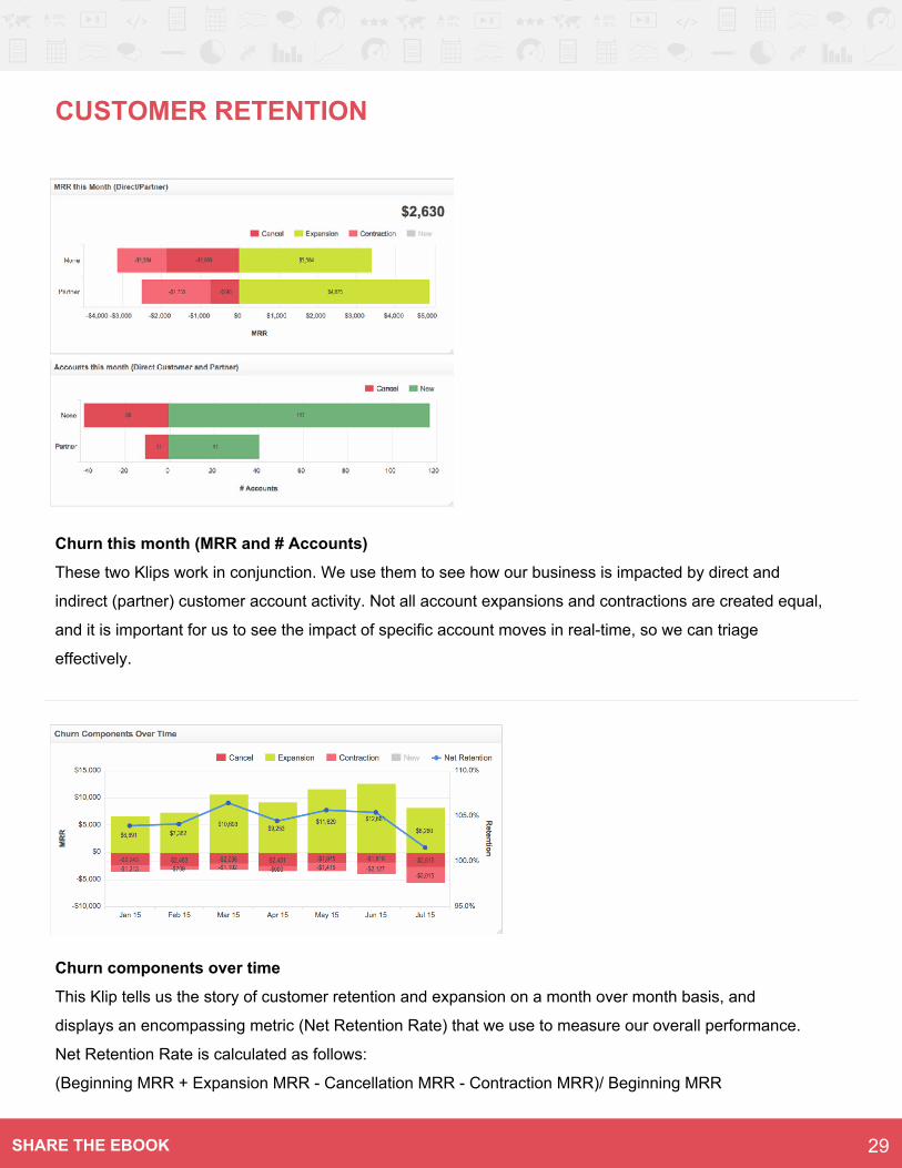
Churn this month (MRR and # Accounts)
These two Klips work in conjunction. We use them to see how our business is impacted by direct and
indirect (partner) customer account activity. Not all account expansions and contractions are created equal,
and it is important for us to see the impact of specific account moves in real-time, so we can triage
effectively.
Churn components over time
This Klip tells us the story of customer retention and expansion on a month over month basis, and
displays an encompassing metric (Net Retention Rate) that we use to measure our overall performance.
Net Retention Rate is calculated as follows:
(Beginning MRR + Expansion MRR - Cancellation MRR - Contraction MRR)/ Beginning MRR
29SHARE THE EBOOK
Overview
As a high-growth SaaS startup, our support
activities are intimately connected with our
customer success activities. Customers that work
with our support team are much more likely to
become paying customers. This is a trend we wish
to continue, and believe reflects very well on our
capable support team.
The dashboards our support team uses are focused
on the metrics that indicate customer satisfaction on
a daily basis: response times, ticket volumes, and
number of tickets closed. Since support issues can
arise suddenly and without warning, the team relies
extensively on its dashboard to get real-time
visibility into their activities.
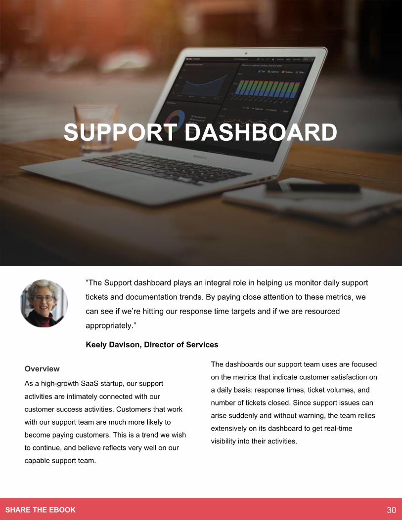
“The Support dashboard plays an integral role in helping us monitor daily support
tickets and documentation trends. By paying close attention to these metrics, we
can see if we’re hitting our response time targets and if we are resourced
appropriately.”
Keely Davison, Director of Services
SUPPORT DASHBOARD
30SHARE THE EBOOK
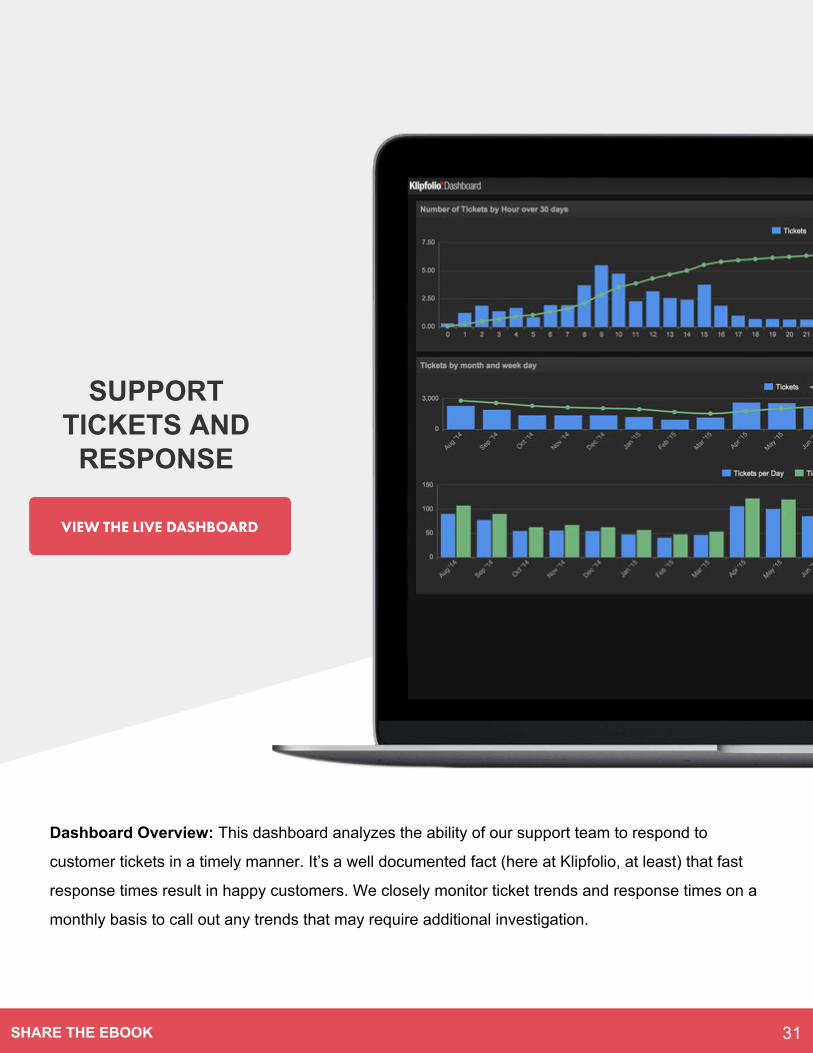
Dashboard Overview: This dashboard analyzes the ability of our support team to respond to
customer tickets in a timely manner. It’s a well documented fact (here at Klipfolio, at least) that fast
response times result in happy customers. We closely monitor ticket trends and response times on a
monthly basis to call out any trends that may require additional investigation.
SUPPORT TICKETS AND
RESPONSE
31SHARE THE EBOOK
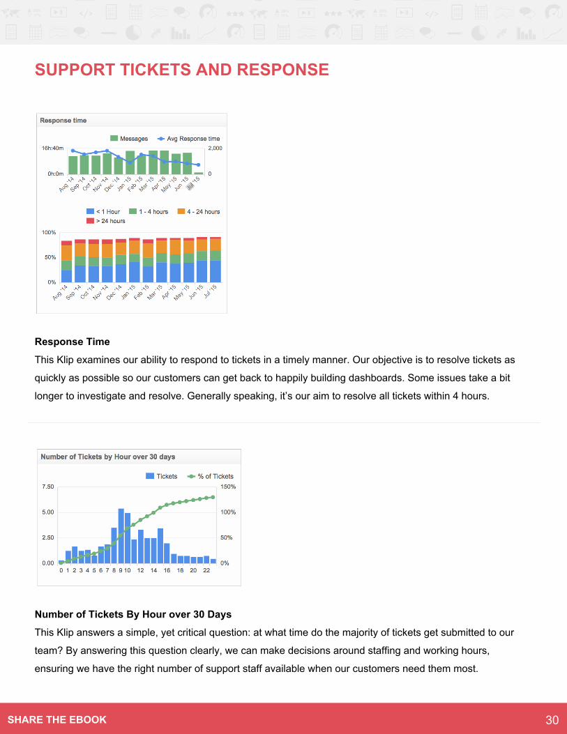
SUPPORT TICKETS AND RESPONSE
Response Time
This Klip examines our ability to respond to tickets in a timely manner. Our objective is to resolve tickets as
quickly as possible so our customers can get back to happily building dashboards. Some issues take a bit
longer to investigate and resolve. Generally speaking, it’s our aim to resolve all tickets within 4 hours.
Number of Tickets By Hour over 30 Days
This Klip answers a simple, yet critical question: at what time do the majority of tickets get submitted to our
team? By answering this question clearly, we can make decisions around staffing and working hours,
ensuring we have the right number of support staff available when our customers need them most.
30SHARE THE EBOOK
Dashboard Overview: This dashboard gives a view into the types of support tickets being
submitted, and the impact of resolving those tickets. We categorize tickets in two major ways: by
account type (Customer, Partner, Trial, or Other), and by ticket type (data sources, formulas, admin,
etc). This allows us to inform both our sales and product team of potential opportunities to improve
processes and customer experience.
TICKETS BY TYPE
33SHARE THE EBOOK
TICKETS BY TYPE
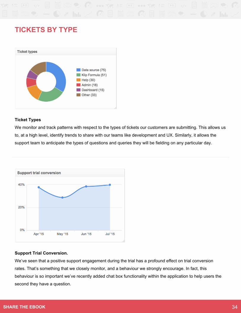
Ticket Types
We monitor and track patterns with respect to the types of tickets our customers are submitting. This allows us
to, at a high level, identify trends to share with our teams like development and UX. Similarly, it allows the
support team to anticipate the types of questions and queries they will be fielding on any particular day.
Support Trial Conversion.
We’ve seen that a positive support engagement during the trial has a profound effect on trial conversion
rates. That’s something that we closely monitor, and a behaviour we strongly encourage. In fact, this
behaviour is so important we’ve recently added chat box functionality within the application to help users the
second they have a question.
34SHARE THE EBOOK
Dashboard Overview: We’ve made extensive investments into our web-based documentation, and
diligently track its performance using web analytics. The two core stats for our team is number of
views to our Knowledge Base and our E-Learning modules.
DOCUMENTATION WEB ANALYTICS
35SHARE THE EBOOK
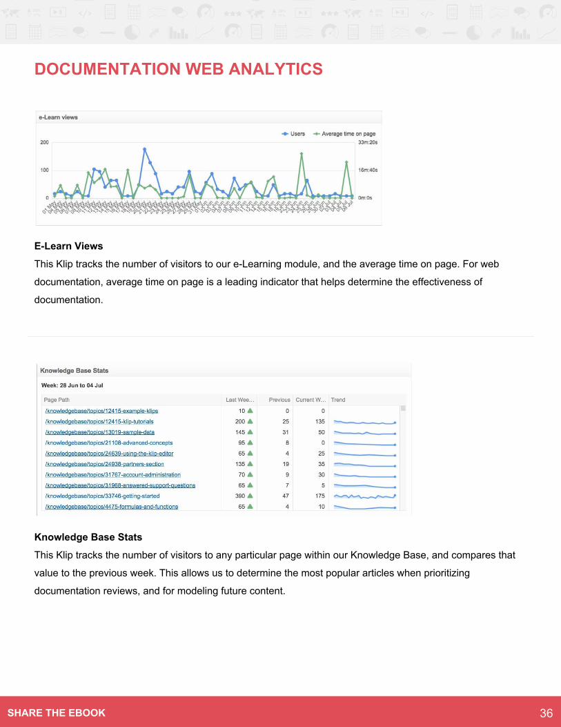
E-Learn Views
This Klip tracks the number of visitors to our e-Learning module, and the average time on page. For web
documentation, average time on page is a leading indicator that helps determine the effectiveness of
documentation.
Knowledge Base Stats
This Klip tracks the number of visitors to any particular page within our Knowledge Base, and compares that
value to the previous week. This allows us to determine the most popular articles when prioritizing
documentation reviews, and for modeling future content.
DOCUMENTATION WEB ANALYTICS
36SHARE THE EBOOK
Overview
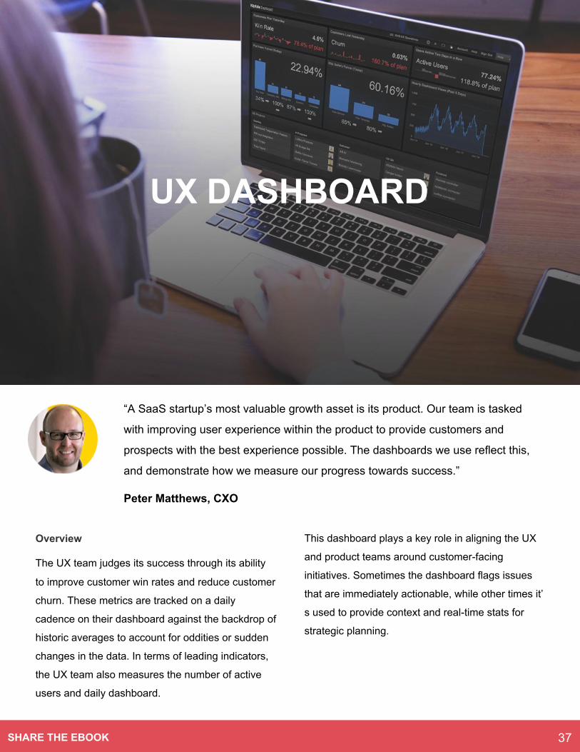
The UX team judges its success through its ability
to improve customer win rates and reduce customer
churn. These metrics are tracked on a daily
cadence on their dashboard against the backdrop of
historic averages to account for oddities or sudden
changes in the data. In terms of leading indicators,
the UX team also measures the number of active
users and daily dashboard.
This dashboard plays a key role in aligning the UX
and product teams around customer-facing
initiatives. Sometimes the dashboard flags issues
that are immediately actionable, while other times it’
s used to provide context and real-time stats for
strategic planning.
“A SaaS startup’s most valuable growth asset is its product. Our team is tasked
with improving user experience within the product to provide customers and
prospects with the best experience possible. The dashboards we use reflect this,
and demonstrate how we measure our progress towards success.”
Peter Matthews, CXO
UX DASHBOARD
37SHARE THE EBOOK
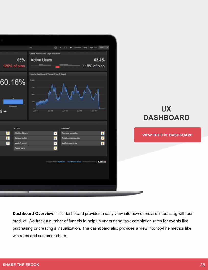
Dashboard Overview: This dashboard provides a daily view into how users are interacting with our
product. We track a number of funnels to help us understand task completion rates for events like
purchasing or creating a visualization. The dashboard also provides a view into top-line metrics like
win rates and customer churn.
UX DASHBOARD
38SHARE THE EBOOK
UX DASHBOARD
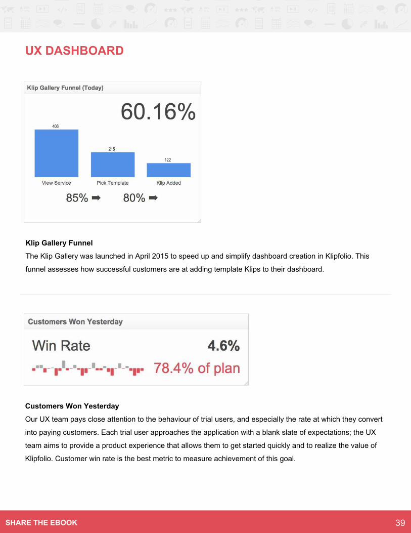
Klip Gallery Funnel
The Klip Gallery was launched in April 2015 to speed up and simplify dashboard creation in Klipfolio. This
funnel assesses how successful customers are at adding template Klips to their dashboard.
Customers Won Yesterday
Our UX team pays close attention to the behaviour of trial users, and especially the rate at which they convert
into paying customers. Each trial user approaches the application with a blank slate of expectations; the UX
team aims to provide a product experience that allows them to get started quickly and to realize the value of
Klipfolio. Customer win rate is the best metric to measure achievement of this goal.
39SHARE THE EBOOK
We hope you’ve enjoyed the tour of our
dashboards, and that it’s given you insight into
how we use operational dashboards to manage
our business.
We use each of these dashboards to monitor
our daily performance, make tactical
adjustments, and ensure we are hitting our
growth targets. The dashboards throughout the
ebook are decidedly startup focused, and
convey the sense of urgency that characterizes
the culture of many SaaS startups.
Even if you’re not part of a startup, the
dashboards in this ebook should provide some
good ideas for the types of real-time dashboard
your business can use. Our dashboards are
designed to encourage continuous monitoring
and to encourage everyone on our team to act
when a problem or opportunity is spotted. Why
wait until a monthly or quarterly report to find
out a project or campaign has gone off the
rails?
If you take one insight away from this ebook, it’
s that real-time dashboards answer the all-
important question, “How are we doing right
now?” For startups like us, that means
managing our growth numbers and always
being ready to act on good data; for any
organization, it means taking a proactive
approach to the numbers driving our business,
and, in a very real sense, grabbing hold of the
steering wheel to instantly act on changing
circumstances.
Start your dashboard journey with us
Did you like the dashboards in this ebook? We’
d love to help you with your dashboard journey.
One of the best ways to get started is with our
free trial. It’s easy to get dashboards set up
quickly, and quite powerful when you want to
build custom dashboards and visualizations.
HOW DO YOU TRACK YOUR PERFORMANCE?
40SHARE THE EBOOK