Embed Size (px)
Citation preview
SkyVisualEditor
VisualforcePage Import
User Manual
Ver 1.0.0.0
February 26th, 2015
TerraSky co., ltd.
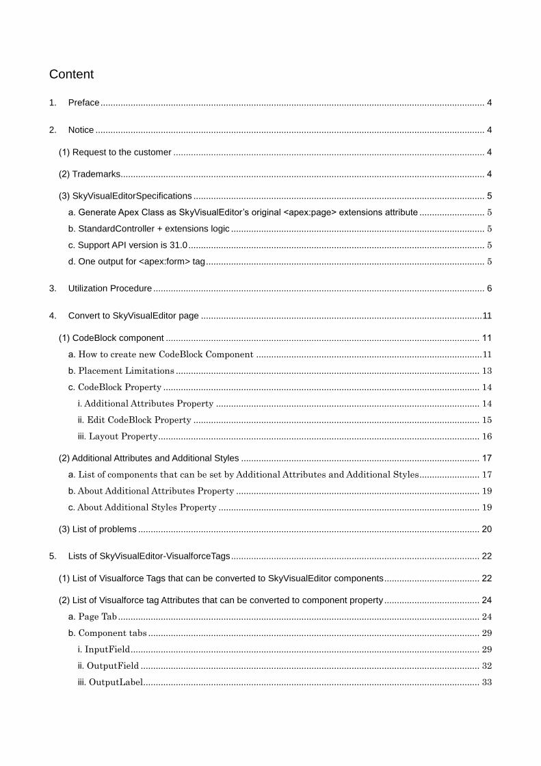
Content
1. Preface ......................................................................................................................................................... 4
2. Notice ........................................................................................................................................................... 4
(1) Request to the customer ............................................................................................................................ 4
(2) Trademarks ................................................................................................................................................. 4
(3) SkyVisualEditorSpecifications .................................................................................................................... 5
a. Generate Apex Class as SkyVisualEditor’s original <apex:page> extensions attribute .......................... 5
b. StandardController + extensions logic ..................................................................................................... 5
c. Support API version is 31.0 ...................................................................................................................... 5
d. One output for <apex:form> tag ............................................................................................................... 5
3. Utilization Procedure .................................................................................................................................... 6
4. Convert to SkyVisualEditor page ................................................................................................................ 11
(1) CodeBlock component ............................................................................................................................. 11
a. How to create new CodeBlock Component .......................................................................................... 11
b. Placement Limitations ......................................................................................................................... 13
c. CodeBlock Property .............................................................................................................................. 14
i. Additional Attributes Property ......................................................................................................... 14
ii. Edit CodeBlock Property .................................................................................................................. 15
iii. Layout Property ................................................................................................................................ 16
(2) Additional Attributes and Additional Styles ............................................................................................... 17
a. List of components that can be set by Additional Attributes and Additional Styles........................ 17
b. About Additional Attributes Property ................................................................................................. 19
c. About Additional Styles Property ........................................................................................................ 19
(3) List of problems ........................................................................................................................................ 20
5. Lists of SkyVisualEditor-VisualforceTags ................................................................................................... 22
(1) List of Visualforce Tags that can be converted to SkyVisualEditor components ...................................... 22
(2) List of Visualforce tag Attributes that can be converted to component property ...................................... 24
a. Page Tab ................................................................................................................................................ 24
b. Component tabs .................................................................................................................................... 29
i. InputField ........................................................................................................................................... 29
ii. OutputField ....................................................................................................................................... 32
iii. OutputLabel ...................................................................................................................................... 33
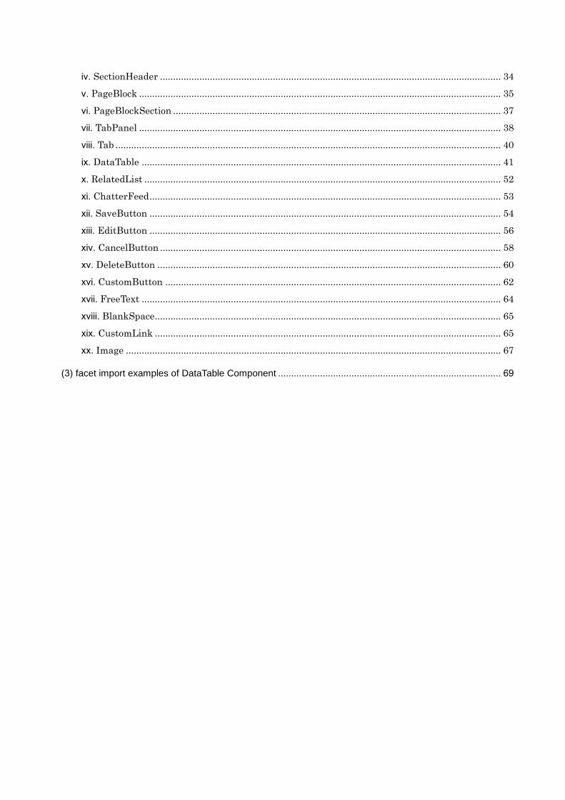
iv. SectionHeader .................................................................................................................................. 34
v. PageBlock .......................................................................................................................................... 35
vi. PageBlockSection ............................................................................................................................. 37
vii. TabPanel .......................................................................................................................................... 38
viii. Tab ................................................................................................................................................... 40
ix. DataTable ......................................................................................................................................... 41
x. RelatedList ........................................................................................................................................ 52
xi. ChatterFeed ...................................................................................................................................... 53
xii. SaveButton ...................................................................................................................................... 54
xiii. EditButton ...................................................................................................................................... 56
xiv. CancelButton .................................................................................................................................. 58
xv. DeleteButton ................................................................................................................................... 60
xvi. CustomButton ................................................................................................................................ 62
xvii. FreeText ......................................................................................................................................... 64
xviii. BlankSpace.................................................................................................................................... 65
xix. CustomLink .................................................................................................................................... 65
xx. Image ............................................................................................................................................... 67
(3) facet import examples of DataTable Component ..................................................................................... 69
1. Preface
This document covers information related to SkyVisualEditor’s Visualforce Import feature. This feature
will allow users to import and modify Salesforce Visualforce pages on SkyVisualEditor Studio.
2. Notice
(1) Request to the customer
Unauthorized reproduction of this manual is forbidden. Although every attempt has been made to
ensure quality of this manual, if you find any problems or errors please let us know. Please use the
contents of this manual at your own risk. TerraSky cannot be held responsible for any trouble, lawsuit,
etc. resulting either directly or indirectly from the use of this manual. We reserve the right to update
this manual at any time without warning.
(2) Trademarks
TerraSky, the TerraSky logo, SkyVisualEditor and the SkyVisualEditor logo are registered trademarks
of TerraSky co., Ltd. Salesforce.com, Salesforce and corresponding logos are registered trademarks
of salesforce.com, Inc., and salesforce.com owns other registered and unregistered trademarks.
Other names used herein may be trademarks of their respective owners.
(3) SkyVisualEditorSpecifications
Visualforce page generated by SkyVisualEditor will have four distinctive features as below. Please be
reminded that it will have the same effect to the imported Visualforce Pages.
a. Generate Apex Class as SkyVisualEditor’s original <apex:page> extensions attribute
The Visualforce Import feature will not import Apex Class extension attributes of the Visualforce
page. Please use Apex Class extension to define the logics of Apex class.
b. StandardController + extensions logic
Business logic is processed with Standard Controller and Apex class with extension attributes.
StandardSetControllers and Custom Controllers are exempt from this and will cause an error at the
import.
c. Support API version is 31.0
Supported API version for the Visualforce Page import is 31.0. Support will be the same as
generating Visualforce Page and Apex Class.
d. One output for <apex:form> tag
The specification of generated Visualforce page will be to have one <apex:form>tag. Visualforce
page code will be read within SkyVisualEditor’s output <apex:form>tag at the import process.
Therefore, every <apex:form>tag on the Visualforce will be deleted.
SkyVisualEditor Chatter feed or component which is converted to RelatedList will be moved to
locations below:
-if placed higher than the first <apex:form> tag, it will be moved to the upper section of the
<apex:form> tag in the Studio
-if placed lower than the first <apex:form> tag, it will be moved to the lower section of the
<apex:form> tag in the Studio.
*Note: If you would like to write the code or set the component outside of <apex:form> tag,
please move it manually.
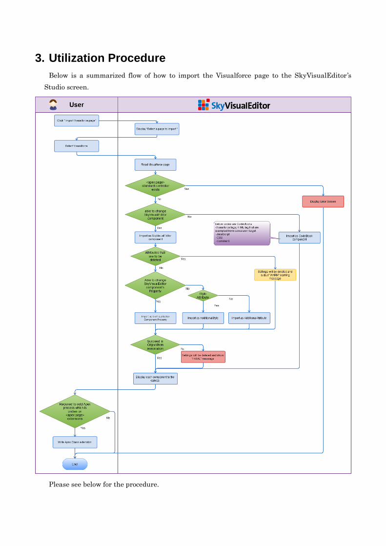
3. Utilization Procedure
Below is a summarized flow of how to import the Visualforce page to the SkyVisualEditor ’s
Studio screen.
Please see below for the procedure.
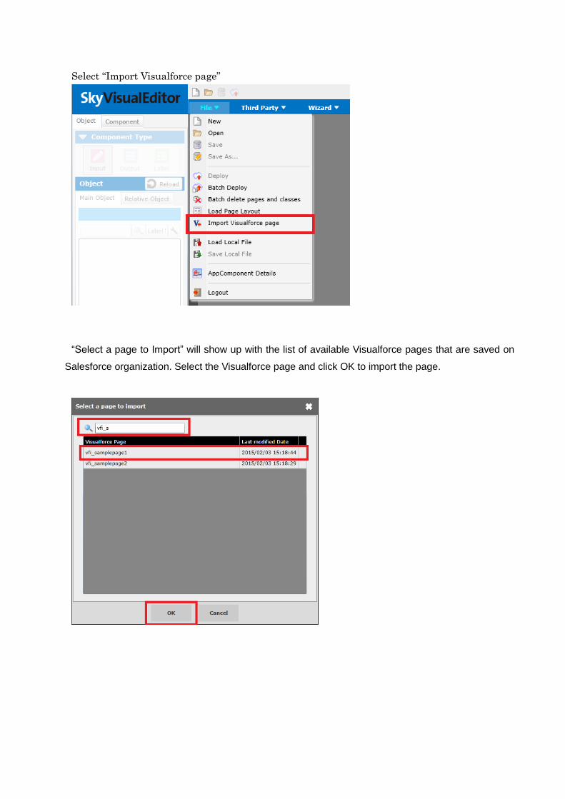
Select “Import Visualforce page”
“Select a page to Import” will show up with the list of available Visualforce pages that are saved on
Salesforce organization. Select the Visualforce page and click OK to import the page.
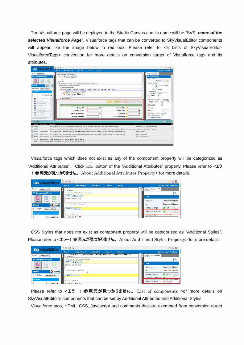
The Visualforce page will be deployed to the Studio Canvas and its name will be “SVE_name of the
selected Visualforce Page”. Visualforce tags that can be converted to SkyVisualEditor components
will appear like the image below in red box. Please refer to <5 Lists of SkyVisualEditor-
VisualforceTags> conversion for more details on conversion target of Visualforce tags and its
attributes.
Visualforce tags which does not exist as any of the component property will be categorized as
“Additional Attributes”. Click button of the “Additional Attributes” property. Please refer to <エラ
ー! 参照元が見つかりません。 About Additional Attributes Property> for more details.
CSS Styles that does not exist as component property will be categorized as “Additional Styles”.
Please refer to <エラー! 参照元が見つかりません。 About Additional Styles Property> for more details.
Please refer to <エラー ! 参照元が見つかりません。 List of components >or more details on
SkyVisualEditor’s components that can be set by Additional Attributes and Additional Styles.
Visualforce tags, HTML, CSS, Javascript and comments that are exempted from conversion target
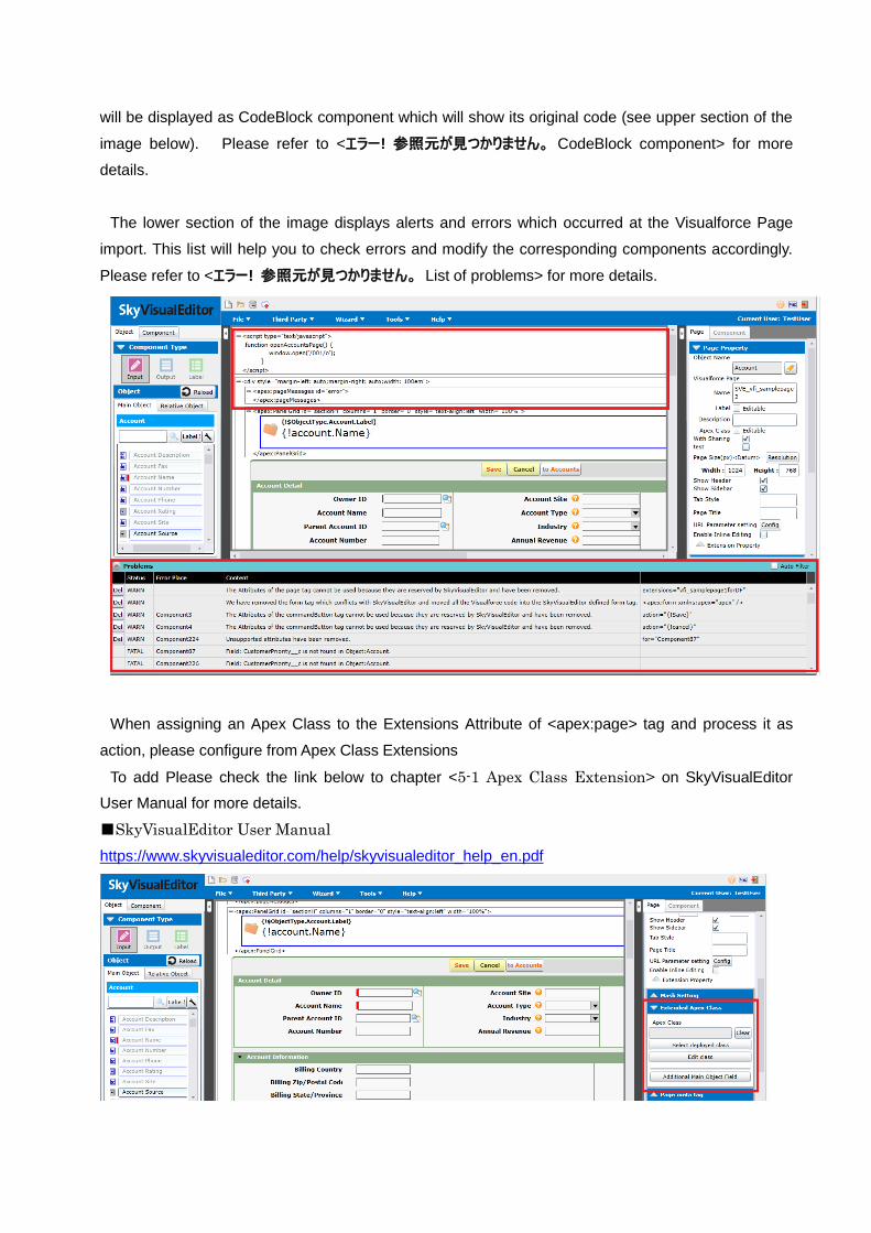
will be displayed as CodeBlock component which will show its original code (see upper section of the
image below). Please refer to <エラー! 参照元が見つかりません。 CodeBlock component> for more
details.
The lower section of the image displays alerts and errors which occurred at the Visualforce Page
import. This list will help you to check errors and modify the corresponding components accordingly.
Please refer to <エラー! 参照元が見つかりません。 List of problems> for more details.
When assigning an Apex Class to the Extensions Attribute of <apex:page> tag and process it as
action, please configure from Apex Class Extensions
To add Please check the link below to chapter <5-1 Apex Class Extension> on SkyVisualEditor
User Manual for more details.
■SkyVisualEditor User Manual
https://www.skyvisualeditor.com/help/skyvisualeditor_help_en.pdf
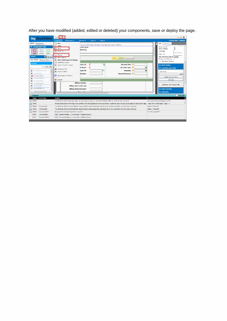
After you have modified (added, edited or deleted) your components, save or deploy the page.
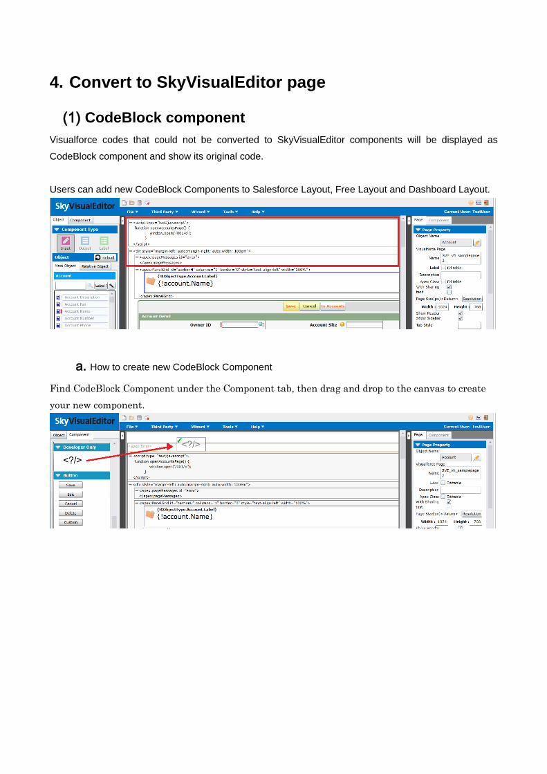
4. Convert to SkyVisualEditor page
(1) CodeBlock component
Visualforce codes that could not be converted to SkyVisualEditor components will be displayed as
CodeBlock component and show its original code.
Users can add new CodeBlock Components to Salesforce Layout, Free Layout and Dashboard Layout.
a. How to create new CodeBlock Component
Find CodeBlock Component under the Component tab, then drag and drop to the canvas to create
your new component.
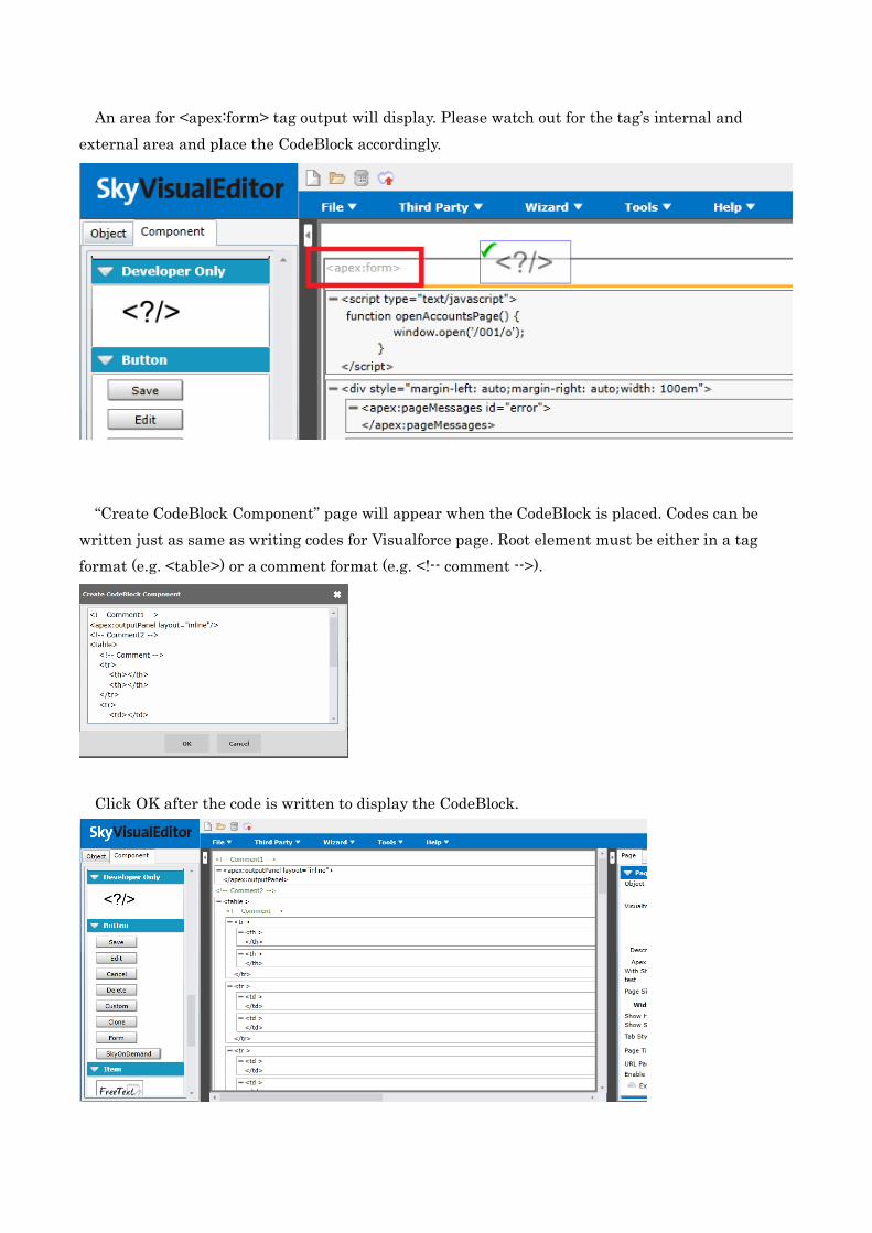
An area for <apex:form> tag output will display. Please watch out for the tag’s internal and
external area and place the CodeBlock accordingly.
“Create CodeBlock Component” page will appear when the CodeBlock is placed. Codes can be
written just as same as writing codes for Visualforce page. Root element must be either in a tag
format (e.g. <table>) or a comment format (e.g. <!-- comment -->).
Click OK after the code is written to display the CodeBlock.
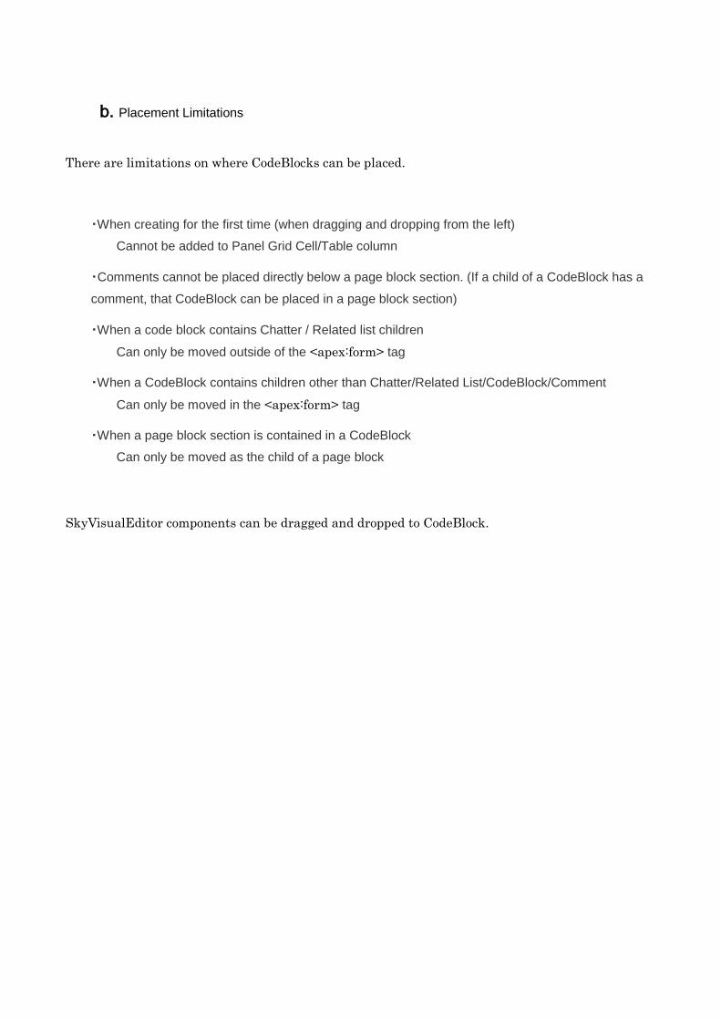
b. Placement Limitations
There are limitations on where CodeBlocks can be placed.
・When creating for the first time (when dragging and dropping from the left)
Cannot be added to Panel Grid Cell/Table column
・Comments cannot be placed directly below a page block section. (If a child of a CodeBlock has a
comment, that CodeBlock can be placed in a page block section)
・When a code block contains Chatter / Related list children
Can only be moved outside of the <apex:form> tag
・When a CodeBlock contains children other than Chatter/Related List/CodeBlock/Comment
Can only be moved in the <apex:form> tag
・When a page block section is contained in a CodeBlock
Can only be moved as the child of a page block
SkyVisualEditor components can be dragged and dropped to CodeBlock.
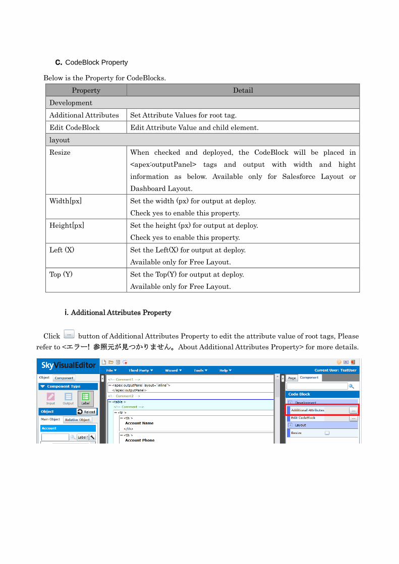
c. CodeBlock Property
Below is the Property for CodeBlocks.
Property Detail
Development
Additional Attributes Set Attribute Values for root tag.
Edit CodeBlock Edit Attribute Value and child element.
layout
Resize When checked and deployed, the CodeBlock will be placed in
<apex:outputPanel> tags and output with width and hight
information as below. Available only for Salesforce Layout or
Dashboard Layout.
Width[px] Set the width (px) for output at deploy.
Check yes to enable this property.
Height[px] Set the height (px) for output at deploy.
Check yes to enable this property.
Left (X) Set the Left(X) for output at deploy.
Available only for Free Layout.
Top (Y) Set the Top(Y) for output at deploy.
Available only for Free Layout.
i. Additional Attributes Property
Click button of Additional Attributes Property to edit the attribute value of root tags, Please
refer to <エラー! 参照元が見つかりません。About Additional Attributes Property> for more details.
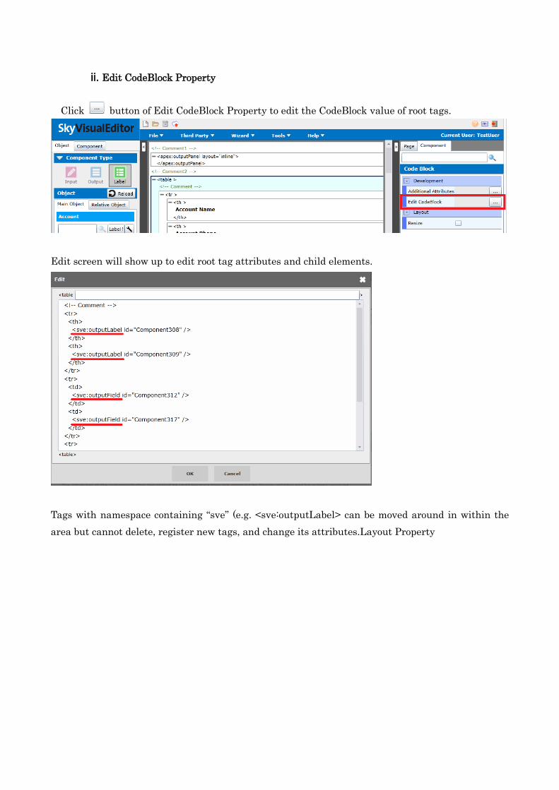
ii. Edit CodeBlock Property
Click button of Edit CodeBlock Property to edit the CodeBlock value of root tags.
Edit screen will show up to edit root tag attributes and child elements.
Tags with namespace containing “sve” (e.g. <sve:outputLabel> can be moved around in within the
area but cannot delete, register new tags, and change its attributes.Layout Property
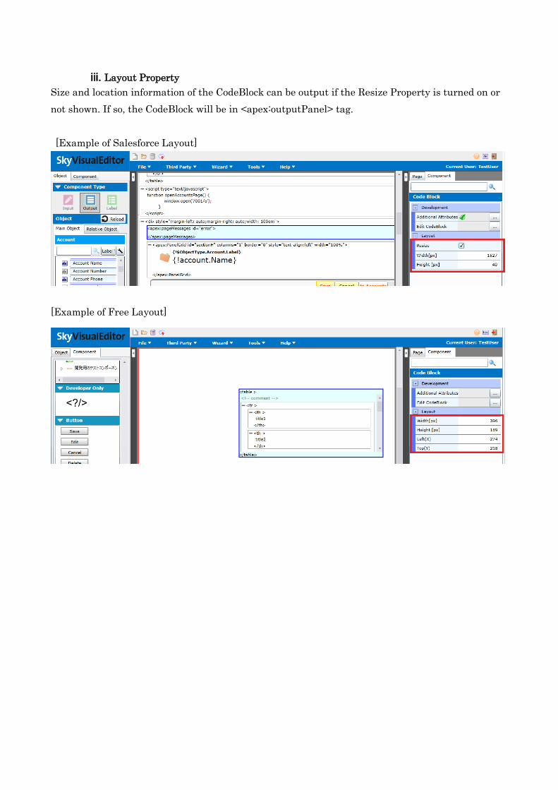
iii. Layout Property
Size and location information of the CodeBlock can be output if the Resize Property is turned on or
not shown. If so, the CodeBlock will be in <apex:outputPanel> tag.
[Example of Salesforce Layout]
[Example of Free Layout]
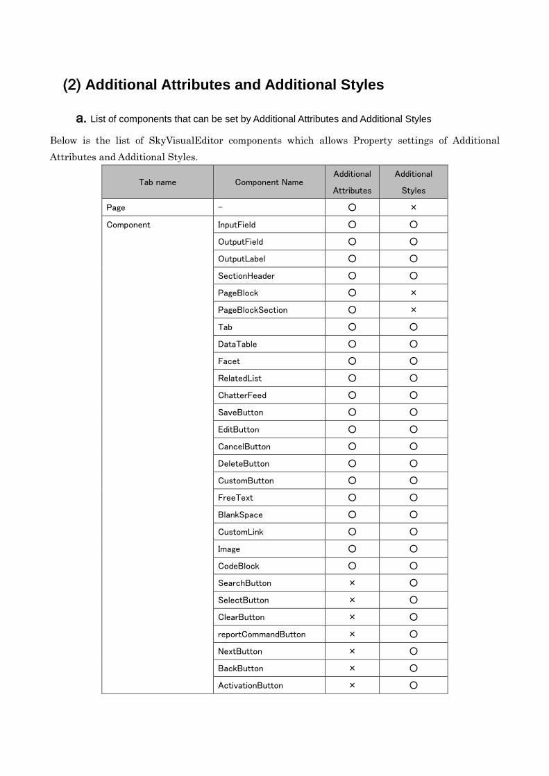
(2) Additional Attributes and Additional Styles
a. List of components that can be set by Additional Attributes and Additional Styles
Below is the list of SkyVisualEditor components which allows Property settings of Additional
Attributes and Additional Styles.
Tab name Component Name Additional
Attributes
Additional
Styles
Page - ○ ×
Component InputField ○ ○
OutputField ○ ○
OutputLabel ○ ○
SectionHeader ○ ○
PageBlock ○ ×
PageBlockSection ○ ×
Tab ○ ○
DataTable ○ ○
Facet ○ ○
RelatedList ○ ○
ChatterFeed ○ ○
SaveButton ○ ○
EditButton ○ ○
CancelButton ○ ○
DeleteButton ○ ○
CustomButton ○ ○
FreeText ○ ○
BlankSpace ○ ○
CustomLink ○ ○
Image ○ ○
CodeBlock ○ ○
SearchButton × ○
SelectButton × ○
ClearButton × ○
reportCommandButton × ○
NextButton × ○
BackButton × ○
ActivationButton × ○
DeleteOrderButton × ○
StartSyncButton × ○
CreatePDF Button × ○
LookUpButton × ○
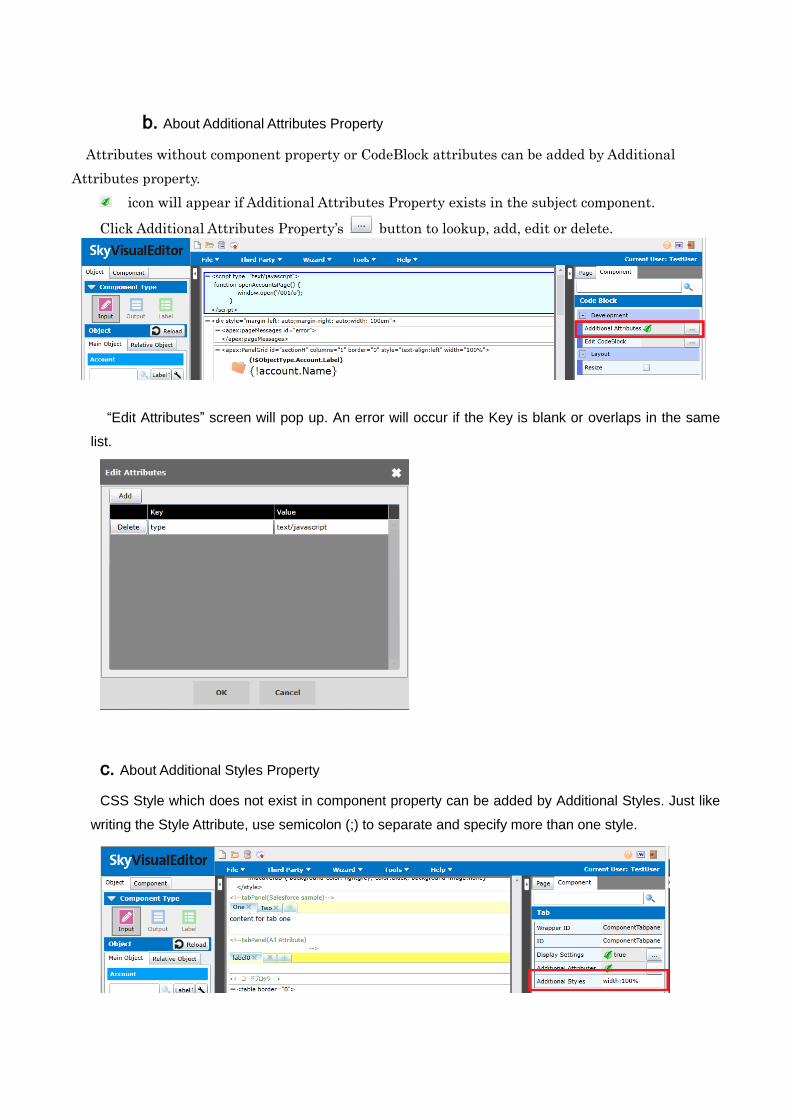
b. About Additional Attributes Property
Attributes without component property or CodeBlock attributes can be added by Additional
Attributes property.
icon will appear if Additional Attributes Property exists in the subject component.
Click Additional Attributes Property’s button to lookup, add, edit or delete.
“Edit Attributes” screen will pop up. An error will occur if the Key is blank or overlaps in the same
list.
c. About Additional Styles Property
CSS Style which does not exist in component property can be added by Additional Styles. Just like
writing the Style Attribute, use semicolon (;) to separate and specify more than one style.
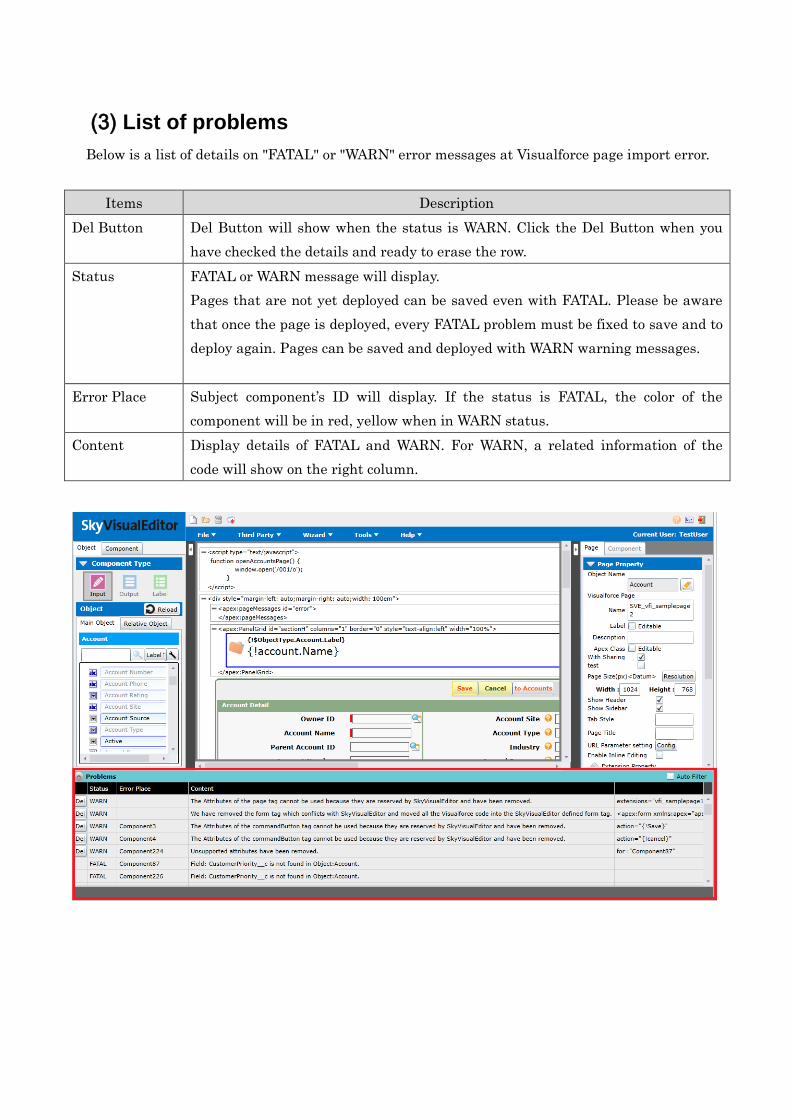
(3) List of problems
Below is a list of details on "FATAL" or "WARN" error messages at Visualforce page import error.
Items Description
Del Button Del Button will show when the status is WARN. Click the Del Button when you
have checked the details and ready to erase the row.
Status FATAL or WARN message will display.
Pages that are not yet deployed can be saved even with FATAL. Please be aware
that once the page is deployed, every FATAL problem must be fixed to save and to
deploy again. Pages can be saved and deployed with WARN warning messages.
Error Place Subject component’s ID will display. If the status is FATAL, the color of the
component will be in red, yellow when in WARN status.
Content Display details of FATAL and WARN. For WARN, a related information of the
code will show on the right column.
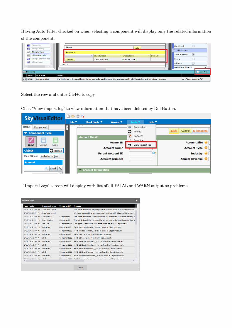
Having Auto Filter checked on when selecting a component will display only the related information
of the component.
Select the row and enter Ctrl+c to copy.
Click “View import log” to view information that have been deleted by Del Button.
“Import Logs” screen will display with list of all FATAL and WARN output as problems.
5. Lists of SkyVisualEditor-VisualforceTags
(1) List of Visualforce Tags that can be converted to SkyVisualEditor components
Below is a list of Visualforce tags that can be converted to SkyVisualEditor components after the page import. Please refer to < 5(2) List of
Visualforce tag Attributes that can be converted to component property> for the list of Visualforce tag attributes that are converted to related
components property. Exempted details will be output as WARN.
*Note: Tags with an asterisk mark (*) will be excluded at the point of conversion even if it has child element. Details on the excluded tags will
be an output for WARN.
SVE Component Name
Visualforce Tag
Special Conditions Element Subelement
Page apex:page apex:stylesheet,
apex:includeScript
Text child element directly under the page will be converted as FreeText
components.
InputField apex:inputField*
OutputField apex:outputField*,
apex:outputText*
OutputLabel apex:outputLabel*
Available when value is a MergeField.
If the object or item could be identified, it will be read as Label Component. If not
identified, it will be read as FreeText component.
SectionHeader apex:sectionHeader*
PageBlock apex:PageBlock apex:pageBlockButtons
PageBlockSection apex:PageBlockSection
Tab apex:tabPanel apex:tab
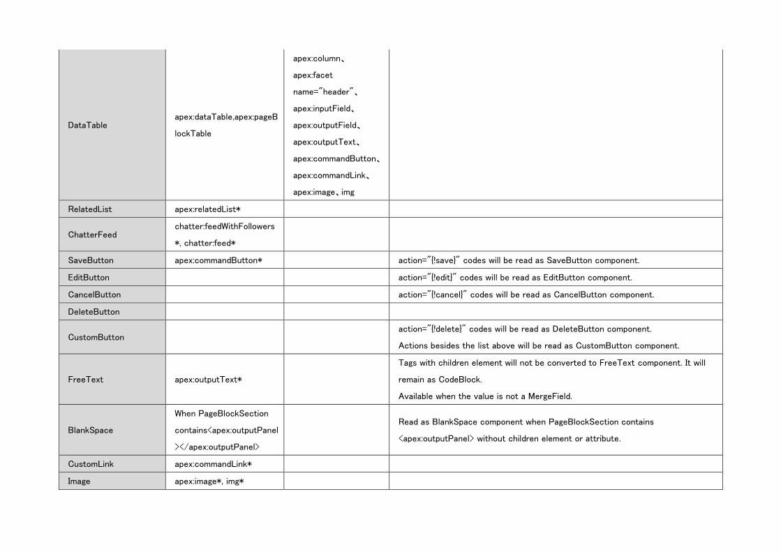
DataTable apex:dataTable,apex:pageB
lockTable
apex:column、
apex:facet
name="header"、
apex:inputField、
apex:outputField、
apex:outputText、
apex:commandButton、
apex:commandLink、
apex:image、img
RelatedList apex:relatedList*
ChatterFeed chatter:feedWithFollowers
*, chatter:feed*
SaveButton apex:commandButton* action="{!save}" codes will be read as SaveButton component.
EditButton action="{!edit}" codes will be read as EditButton component.
CancelButton action="{!cancel}" codes will be read as CancelButton component.
DeleteButton
CustomButton action="{!delete}" codes will be read as DeleteButton component.
Actions besides the list above will be read as CustomButton component.
FreeText apex:outputText*
Tags with children element will not be converted to FreeText component. It will
remain as CodeBlock.
Available when the value is not a MergeField.
BlankSpace
When PageBlockSection
contains<apex:outputPanel
></apex:outputPanel>
Read as BlankSpace component when PageBlockSection contains
<apex:outputPanel> without children element or attribute.
CustomLink apex:commandLink*
Image apex:image*, img*
(2) List of Visualforce tag Attributes that can be converted to
component property
SkyVisualEditor component property will read the attribute value of Visualforce tag as below. If the
attribute does not exist as SkyVisualEditor’s property, it will be written in “-“of the property name.
Additionally, attributes that are not on this list will be not supported and excluded with WARN warning
message.
Division Signs on the Division category are as below:
“〇”: Attribute of Visualforce tag does exist in SkyVisualEditor property, Therefore, it will be imported.
“△”:Attribute of Visualforce tag does not exist in SkyVisualEditor property. Therefore, it will be imported
as Additional Attributes.
“W”: Attributes and Child Elements that cannot be imported as Additional Attributes or Additional Styles
will be excluded with WARN warning message.
“×”: Visualforce tag or attribute does not correspond with the SkyVisualEditor’ property.
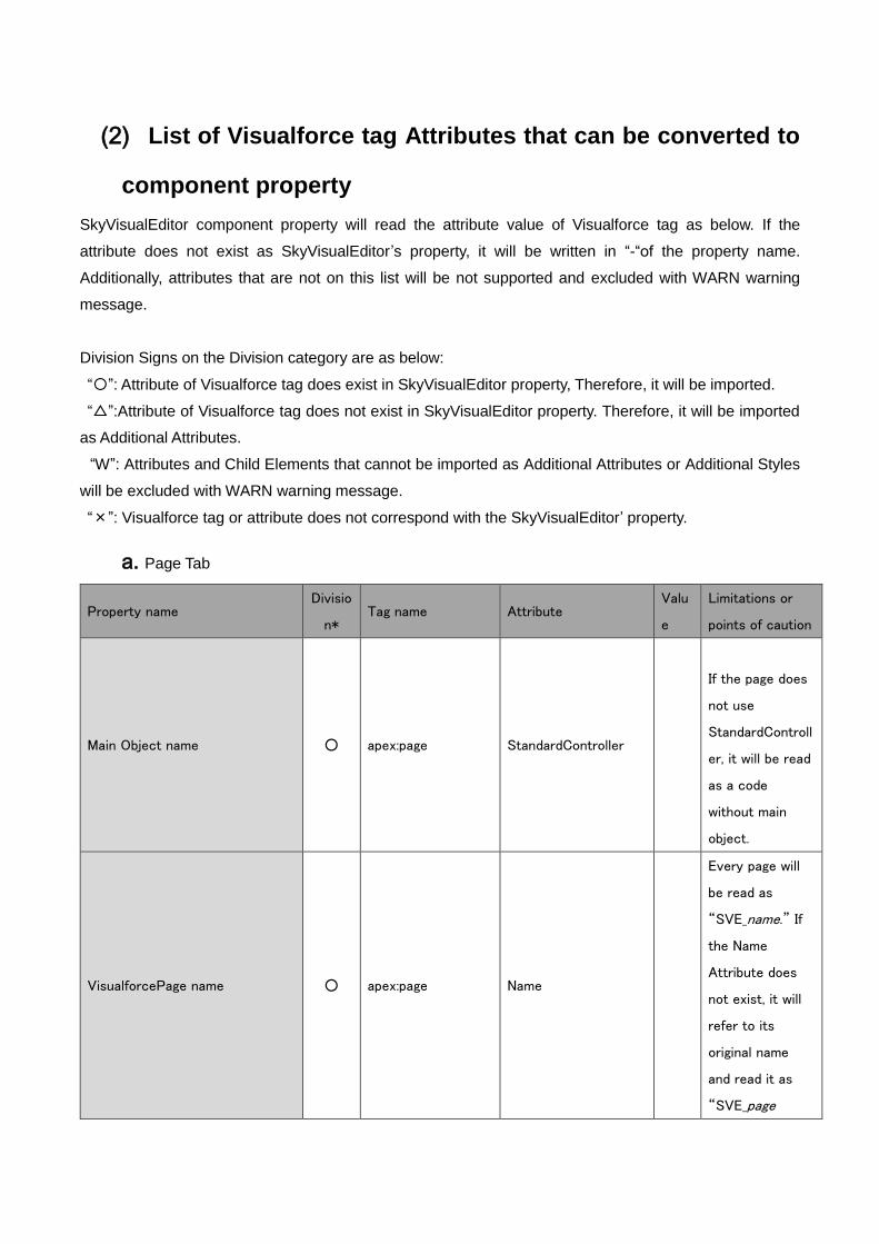
a. Page Tab
Property name Divisio
n* Tag name Attribute
Valu
e
Limitations or
points of caution
Main Object name ○ apex:page StandardController
If the page does
not use
StandardControll
er, it will be read
as a code
without main
object.
VisualforcePage name ○ apex:page Name
Every page will
be read as
“SVE_name.” If
the Name
Attribute does
not exist, it will
refer to its
original name
and read it as
“SVE_page
name”
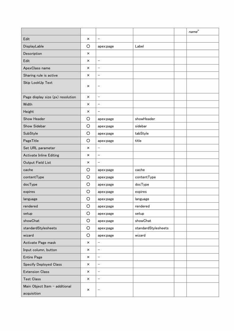
Edit × -
DisplayLable ○ apex:page Label
Description ×
Edit × -
ApexClass name × -
Sharing rule is active × -
Skip LookUp Text
× -
Page display size (px) resolution × -
Width × -
Height × -
Show Header ○ apex:page showHeader
Show Sidebar ○ apex:page sidebar
SubStyle ○ apex:page tabStyle
PageTitle ○ apex:page title
Set URL parameter × -
Activate Inline Editing × -
Output Field List × -
cache ○ apex:page cache
contentType ○ apex:page contentType
docType ○ apex:page docType
expires ○ apex:page expires
language ○ apex:page language
rendered ○ apex:page rendered
setup ○ apex:page setup
showChat ○ apex:page showChat
standardStylesheets ○ apex:page standardStylesheets
wizard ○ apex:page wizard
Activate Page mask × -
Input column, button × -
Entire Page × -
Specify Deployed Class × -
Extension Class × -
Test Class × -
Main Object Item – additional
acquisition × -
Edit meta tag × -
Edit page style × -
Include setting for stylesheet ○ apex:stylesheet Value
Edit pagescript × -
Include setting for JavaScript ○ apex:includeScript Value
Activate calculation formula × -
Edit calculation formula × -
Activate focus color × -
Pink, Blue × -
Destination after creating a new
page × -
Destination after editing a page × -
Destination after deleting a page × -
Create PDF ○ apex:page renderAs Pdf
Only for
renderAs="pdf".
Other setting
values will be
deleted and
show WARN
warning
message.
Page size × -
Orientation of the paper
[vertical] × -
Orientation of the paper
[horizontal] × -
Set margin × -
increase the limit of number × -
- W apex:page action
- W apex:page apiVersion
API version is
fixed to 31.0 and
will delete the
setting values
and show WARN
warning
message.
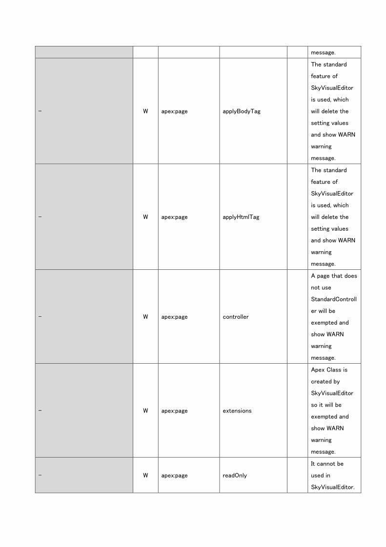
- W apex:page applyBodyTag
The standard
feature of
SkyVisualEditor
is used, which
will delete the
setting values
and show WARN
warning
message.
- W apex:page applyHtmlTag
The standard
feature of
SkyVisualEditor
is used, which
will delete the
setting values
and show WARN
warning
message.
- W apex:page controller
A page that does
not use
StandardControll
er will be
exempted and
show WARN
warning
message.
- W apex:page extensions
Apex Class is
created by
SkyVisualEditor
so it will be
exempted and
show WARN
warning
message.
- W apex:page readOnly
It cannot be
used in
SkyVisualEditor.
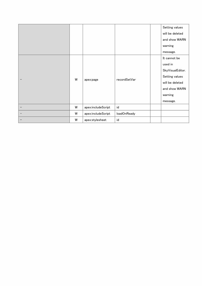
Setting values
will be deleted
and show WARN
warning
message.
- W apex:page recordSetVar
It cannot be
used in
SkyVisualEditor.
Setting values
will be deleted
and show WARN
warning
message.
- W apex:includeScript id
- W apex:includeScript loadOnReady
- W apex:stylesheet id
b. Component tabs
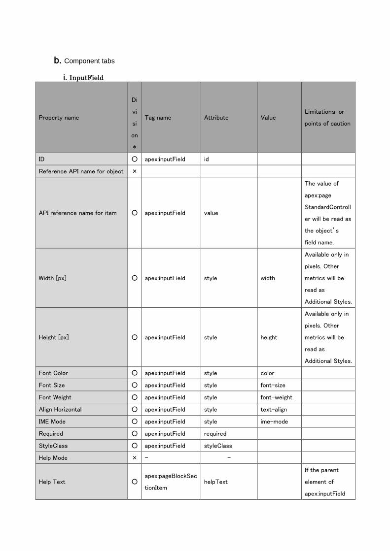
i. InputField
Property name
Di
vi
si
on
*
Tag name Attribute Value Limitations or
points of caution
ID ○ apex:inputField id
Reference API name for object ×
API reference name for item ○ apex:inputField value
The value of
apex:page
StandardControll
er will be read as
the object’s
field name.
Width [px] ○ apex:inputField style width
Available only in
pixels. Other
metrics will be
read as
Additional Styles.
Height [px] ○ apex:inputField style height
Available only in
pixels. Other
metrics will be
read as
Additional Styles.
Font Color ○ apex:inputField style color
Font Size ○ apex:inputField style font-size
Font Weight ○ apex:inputField style font-weight
Align Horizontal ○ apex:inputField style text-align
IME Mode ○ apex:inputField style ime-mode
Required ○ apex:inputField required
StyleClass ○ apex:inputField styleClass
Help Mode × - -
Help Text ○ apex:pageBlockSec
tionItem helpText
If the parent
element of
apex:inputField
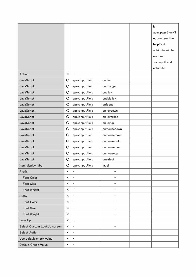
is
apex:pageBlockS
ectionItem, the
helpText
attribute will be
read as
sve:inputField
attribute.
Action × -
JavaScript ○ apex:inputField onblur
JavaScript ○ apex:inputField onchange
JavaScript ○ apex:inputField onclick
JavaScript ○ apex:inputField ondblclick
JavaScript ○ apex:inputField onfocus
JavaScript ○ apex:inputField onkeydown
JavaScript ○ apex:inputField onkeypress
JavaScript ○ apex:inputField onkeyup
JavaScript ○ apex:inputField onmousedown
JavaScript ○ apex:inputField onmousemove
JavaScript ○ apex:inputField onmouseout
JavaScript ○ apex:inputField onmouseover
JavaScript ○ apex:inputField onmouseup
JavaScript ○ apex:inputField onselect
Item display label ○ apex:inputField label
Prefix × - -
Font Color × - -
Font Size × - -
Font Weight × - -
Suffix × - -
Font Color × - -
Font Size × - -
Font Weight × - -
Look Up × -
Select Custom LookUp screen × - -
Select Action × -
Use default check value × -
Default Check Value × -
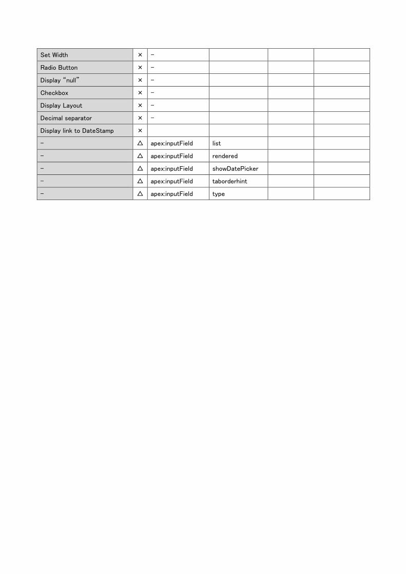
Set Width × -
Radio Button × -
Display “null” × -
Checkbox × -
Display Layout × -
Decimal separator × -
Display link to DateStamp ×
- △ apex:inputField list
- △ apex:inputField rendered
- △ apex:inputField showDatePicker
- △ apex:inputField taborderhint
- △ apex:inputField type
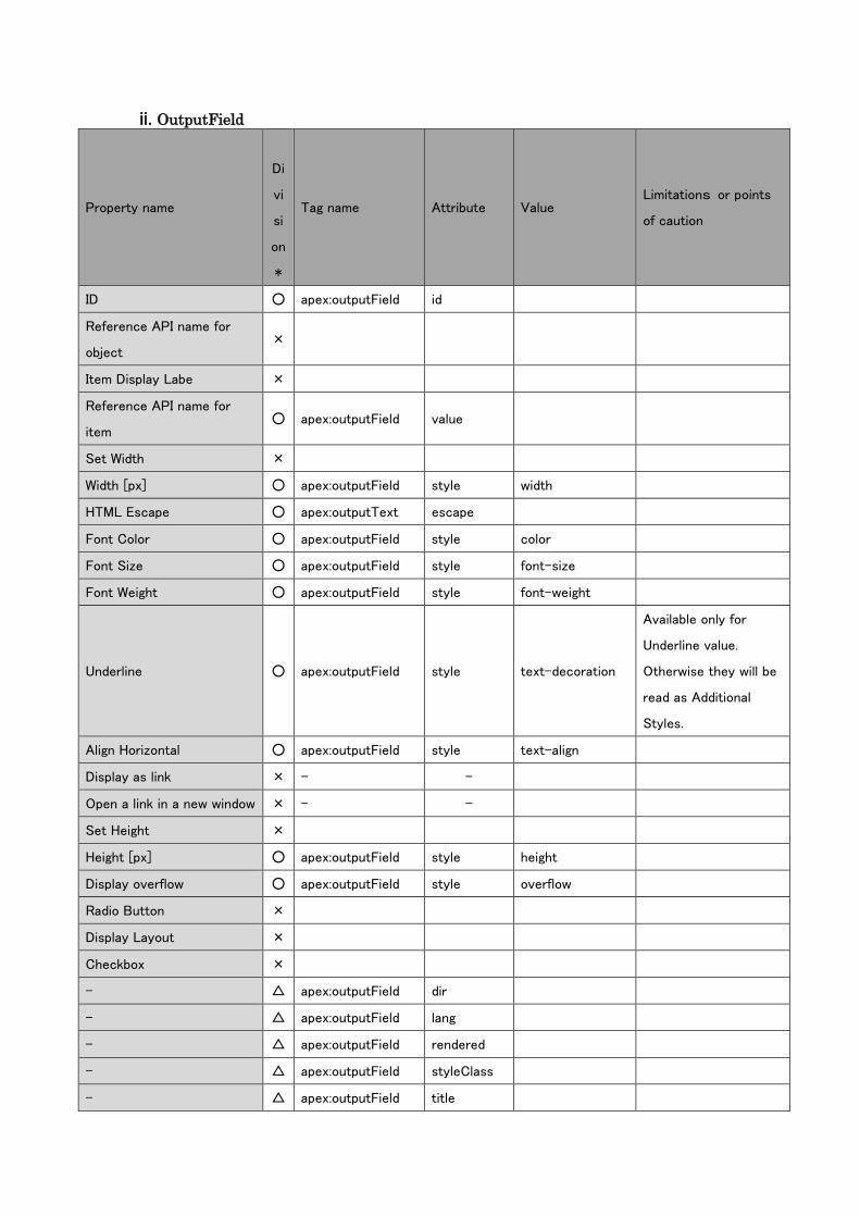
ii. OutputField
Property name
Di
vi
si
on
*
Tag name Attribute Value Limitations or points
of caution
ID ○ apex:outputField id
Reference API name for
object ×
Item Display Labe ×
Reference API name for
item ○ apex:outputField value
Set Width ×
Width [px] ○ apex:outputField style width
HTML Escape ○ apex:outputText escape
Font Color ○ apex:outputField style color
Font Size ○ apex:outputField style font-size
Font Weight ○ apex:outputField style font-weight
Underline ○ apex:outputField style text-decoration
Available only for
Underline value.
Otherwise they will be
read as Additional
Styles.
Align Horizontal ○ apex:outputField style text-align
Display as link × - -
Open a link in a new window × - -
Set Height ×
Height [px] ○ apex:outputField style height
Display overflow ○ apex:outputField style overflow
Radio Button ×
Display Layout ×
Checkbox ×
- △ apex:outputField dir
- △ apex:outputField lang
- △ apex:outputField rendered
- △ apex:outputField styleClass
- △ apex:outputField title
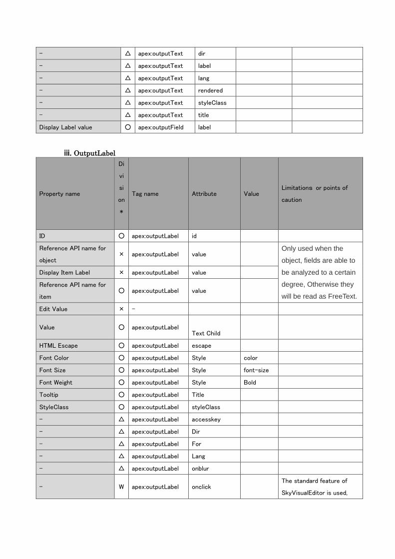
- △ apex:outputText dir
- △ apex:outputText label
- △ apex:outputText lang
- △ apex:outputText rendered
- △ apex:outputText styleClass
- △ apex:outputText title
Display Label value ○ apex:outputField label
iii. OutputLabel
Property name
Di
vi
si
on
*
Tag name Attribute Value Limitations or points of
caution
ID ○ apex:outputLabel id
Reference API name for
object × apex:outputLabel value
Only used when the
object, fields are able to
be analyzed to a certain
degree, Otherwise they
will be read as FreeText.
Display Item Label × apex:outputLabel value
Reference API name for
item ○ apex:outputLabel value
Edit Value × -
Value ○ apex:outputLabel
Text Child
HTML Escape ○ apex:outputLabel escape
Font Color ○ apex:outputLabel Style color
Font Size ○ apex:outputLabel Style font-size
Font Weight ○ apex:outputLabel Style Bold
Tooltip ○ apex:outputLabel Title
StyleClass ○ apex:outputLabel styleClass
- △ apex:outputLabel accesskey
- △ apex:outputLabel Dir
- △ apex:outputLabel For
- △ apex:outputLabel Lang
- △ apex:outputLabel onblur
- W apex:outputLabel onclick The standard feature of
SkyVisualEditor is used,
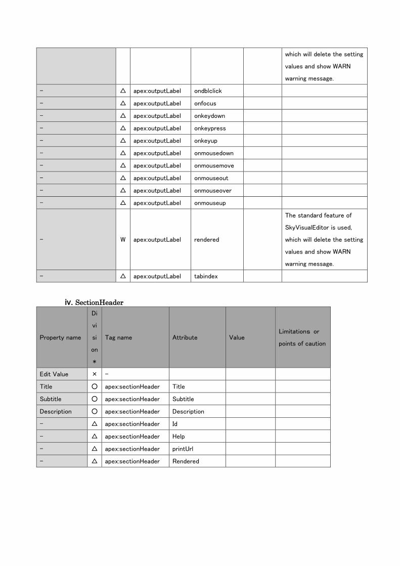
which will delete the setting
values and show WARN
warning message.
- △ apex:outputLabel ondblclick
- △ apex:outputLabel onfocus
- △ apex:outputLabel onkeydown
- △ apex:outputLabel onkeypress
- △ apex:outputLabel onkeyup
- △ apex:outputLabel onmousedown
- △ apex:outputLabel onmousemove
- △ apex:outputLabel onmouseout
- △ apex:outputLabel onmouseover
- △ apex:outputLabel onmouseup
- W apex:outputLabel rendered
The standard feature of
SkyVisualEditor is used,
which will delete the setting
values and show WARN
warning message.
- △ apex:outputLabel tabindex
iv. SectionHeader
Property name
Di
vi
si
on
*
Tag name Attribute Value Limitations or
points of caution
Edit Value × -
Title ○ apex:sectionHeader Title
Subtitle ○ apex:sectionHeader Subtitle
Description ○ apex:sectionHeader Description
- △ apex:sectionHeader Id
- △ apex:sectionHeader Help
- △ apex:sectionHeader printUrl
- △ apex:sectionHeader Rendered
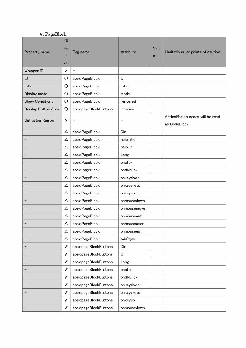
v. PageBlock
Property name
Di
vis
io
n*
Tag name Attribute Valu
e Limitations or points of caution
Wrapper ID × -
ID ○ apex:PageBlock Id
Title ○ apex:PageBlock Title
Display mode ○ apex:PageBlock mode
Show Conditions ○ apex:PageBlock rendered
Display Button Area ○ apex:pageBlockButtons location
Set actionRegion × - - ActionRegion codes will be read
as CodeBlock.
- △ apex:PageBlock Dir
- △ apex:PageBlock helpTitle
- △ apex:PageBlock helpUrl
- △ apex:PageBlock Lang
- △ apex:PageBlock onclick
- △ apex:PageBlock ondblclick
- △ apex:PageBlock onkeydown
- △ apex:PageBlock onkeypress
- △ apex:PageBlock onkeyup
- △ apex:PageBlock onmousedown
- △ apex:PageBlock onmousemove
- △ apex:PageBlock onmouseout
- △ apex:PageBlock onmouseover
- △ apex:PageBlock onmouseup
- △ apex:PageBlock tabStyle
- W apex:pageBlockButtons Dir
- W apex:pageBlockButtons Id
- W apex:pageBlockButtons Lang
- W apex:pageBlockButtons onclick
- W apex:pageBlockButtons ondblclick
- W apex:pageBlockButtons onkeydown
- W apex:pageBlockButtons onkeypress
- W apex:pageBlockButtons onkeyup
- W apex:pageBlockButtons onmousedown

- W apex:pageBlockButtons onmousemove
- W apex:pageBlockButtons onmouseout
- W apex:pageBlockButtons onmouseover
- W apex:pageBlockButtons onmouseup
- W apex:pageBlockButtons rendered
- W apex:pageBlockButtons style
- W apex:pageBlockButtons styleClass
- W apex:pageBlockButtons Title
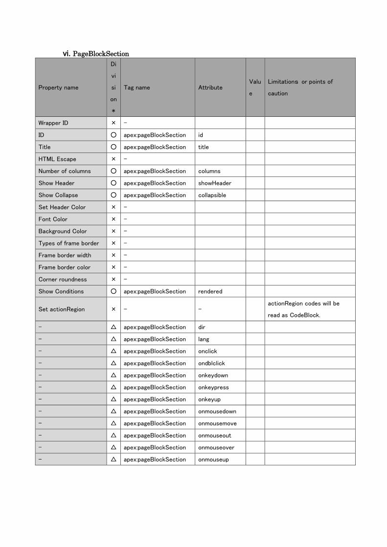
vi. PageBlockSection
Property name
Di
vi
si
on
*
Tag name Attribute Valu
e
Limitations or points of
caution
Wrapper ID × -
ID ○ apex:pageBlockSection id
Title ○ apex:pageBlockSection title
HTML Escape × -
Number of columns ○ apex:pageBlockSection columns
Show Header ○ apex:pageBlockSection showHeader
Show Collapse ○ apex:pageBlockSection collapsible
Set Header Color × -
Font Color × -
Background Color × -
Types of frame border × -
Frame border width × -
Frame border color × -
Corner roundness × -
Show Conditions ○ apex:pageBlockSection rendered
Set actionRegion × - - actionRegion codes will be
read as CodeBlock.
- △ apex:pageBlockSection dir
- △ apex:pageBlockSection lang
- △ apex:pageBlockSection onclick
- △ apex:pageBlockSection ondblclick
- △ apex:pageBlockSection onkeydown
- △ apex:pageBlockSection onkeypress
- △ apex:pageBlockSection onkeyup
- △ apex:pageBlockSection onmousedown
- △ apex:pageBlockSection onmousemove
- △ apex:pageBlockSection onmouseout
- △ apex:pageBlockSection onmouseover
- △ apex:pageBlockSection onmouseup
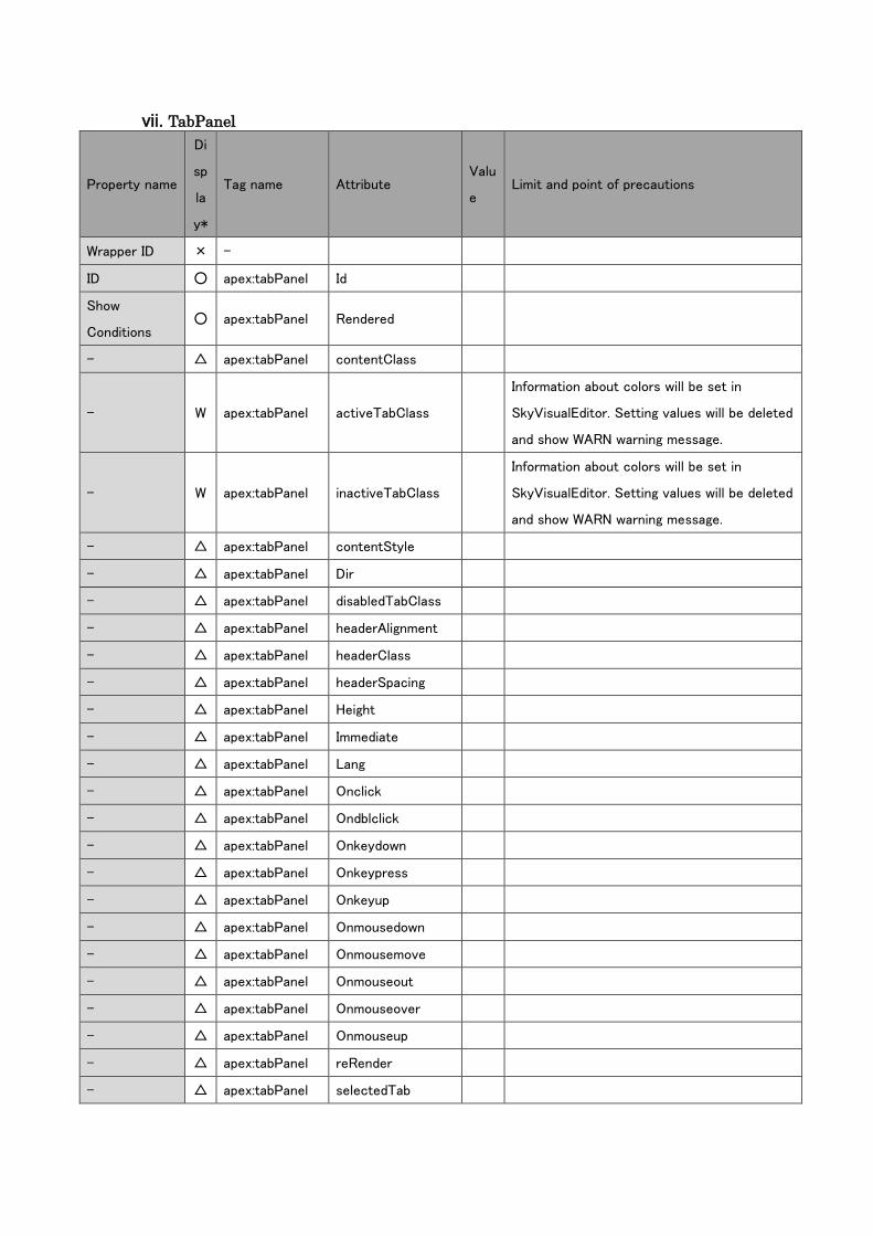
vii. TabPanel
Property name
Di
sp
la
y*
Tag name Attribute Valu
e Limit and point of precautions
Wrapper ID × -
ID ○ apex:tabPanel Id
Show
Conditions ○ apex:tabPanel Rendered
- △ apex:tabPanel contentClass
- W apex:tabPanel activeTabClass
Information about colors will be set in
SkyVisualEditor. Setting values will be deleted
and show WARN warning message.
- W apex:tabPanel inactiveTabClass
Information about colors will be set in
SkyVisualEditor. Setting values will be deleted
and show WARN warning message.
- △ apex:tabPanel contentStyle
- △ apex:tabPanel Dir
- △ apex:tabPanel disabledTabClass
- △ apex:tabPanel headerAlignment
- △ apex:tabPanel headerClass
- △ apex:tabPanel headerSpacing
- △ apex:tabPanel Height
- △ apex:tabPanel Immediate
- △ apex:tabPanel Lang
- △ apex:tabPanel Onclick
- △ apex:tabPanel Ondblclick
- △ apex:tabPanel Onkeydown
- △ apex:tabPanel Onkeypress
- △ apex:tabPanel Onkeyup
- △ apex:tabPanel Onmousedown
- △ apex:tabPanel Onmousemove
- △ apex:tabPanel Onmouseout
- △ apex:tabPanel Onmouseover
- △ apex:tabPanel Onmouseup
- △ apex:tabPanel reRender
- △ apex:tabPanel selectedTab
- △ apex:tabPanel Style
- △ apex:tabPanel switchType
Setting values besides switchType="client"
will be deleted and show WARN warning
message.
- △ apex:tabPanel tabClass
- △ apex:tabPanel Title
- △ apex:tabPanel Value
- △ apex:tabPanel Width
W apex:tabPanel styleClass
The standard feature of SkyVisualEditor is
used, which will delete the setting values and
show WARN warning message.
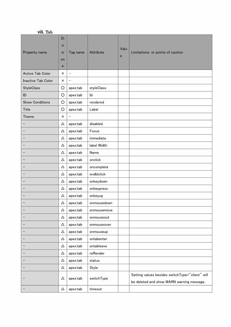
viii. Tab
Property name
Di
vi
si
on
*
Tag name Attribute Valu
e Limitations or points of caution
Active Tab Color × -
Inactive Tab Color × -
StyleClass ○ apex:tab styleClass
ID ○ apex:tab Id
Show Conditions ○ apex:tab rendered
Title ○ apex:tab Label
Theme × -
- △ apex:tab disabled
- △ apex:tab Focus
- △ apex:tab immediate
- △ apex:tab label Width
- △ apex:tab Name
- △ apex:tab onclick
- △ apex:tab oncomplete
- △ apex:tab ondblclick
- △ apex:tab onkeydown
- △ apex:tab onkeypress
- △ apex:tab onkeyup
- △ apex:tab onmousedown
- △ apex:tab onmousemove
- △ apex:tab onmouseout
- △ apex:tab onmouseover
- △ apex:tab onmouseup
- △ apex:tab ontabenter
- △ apex:tab ontableave
- △ apex:tab reRender
- △ apex:tab status
- △ apex:tab Style
- △ apex:tab switchType Setting values besides switchType="client" will
be deleted and show WARN warning message.
- △ apex:tab timeout
- △ apex:tab Title
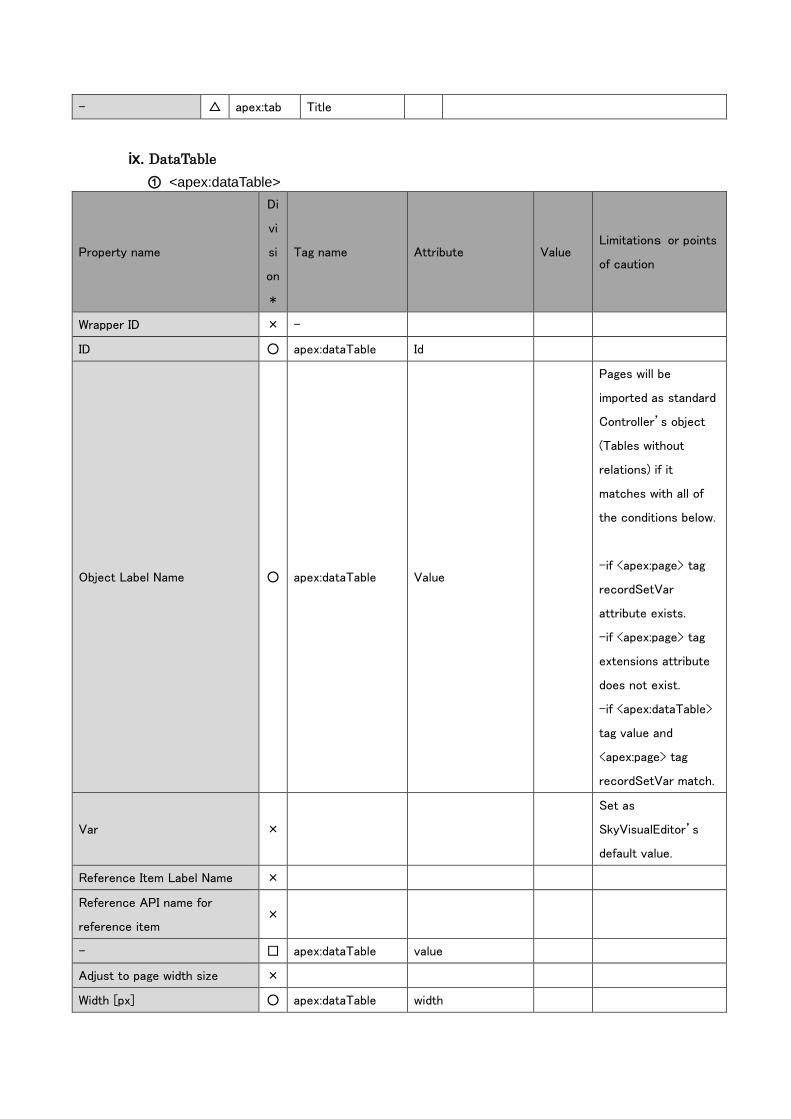
ix. DataTable
① <apex:dataTable>
Property name
Di
vi
si
on
*
Tag name Attribute Value Limitations or points
of caution
Wrapper ID × -
ID ○ apex:dataTable Id
Object Label Name ○ apex:dataTable Value
Pages will be
imported as standard
Controller’s object
(Tables without
relations) if it
matches with all of
the conditions below.
-if <apex:page> tag
recordSetVar
attribute exists.
-if <apex:page> tag
extensions attribute
does not exist.
-if <apex:dataTable>
tag value and
<apex:page> tag
recordSetVar match.
Var ×
Set as
SkyVisualEditor’s
default value.
Reference Item Label Name ×
Reference API name for
reference item ×
- □ apex:dataTable value
Adjust to page width size ×
Width [px] ○ apex:dataTable width
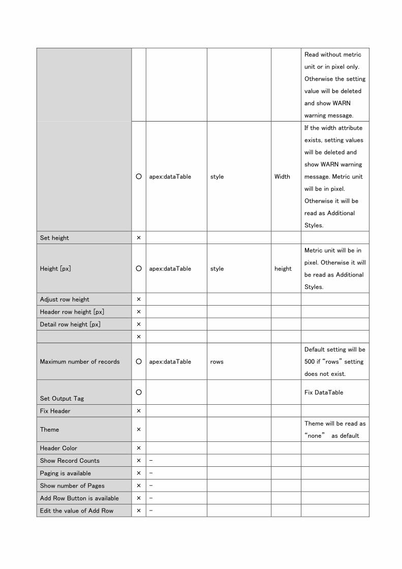
Read without metric
unit or in pixel only.
Otherwise the setting
value will be deleted
and show WARN
warning message.
○ apex:dataTable style Width
If the width attribute
exists, setting values
will be deleted and
show WARN warning
message. Metric unit
will be in pixel.
Otherwise it will be
read as Additional
Styles.
Set height ×
Height [px] ○ apex:dataTable style height
Metric unit will be in
pixel. Otherwise it will
be read as Additional
Styles.
Adjust row height ×
Header row height [px] ×
Detail row height [px] ×
×
Maximum number of records ○ apex:dataTable rows
Default setting will be
500 if “rows” setting
does not exist.
Set Output Tag ○ Fix DataTable
Fix Header ×
Theme × Theme will be read as
“none” as default
Header Color ×
Show Record Counts × -
Paging is available × -
Show number of Pages × -
Add Row Button is available × -
Edit the value of Add Row × -
Button
Add Row Button Value × -
Set the number of rows to add × -
Initial number of rows to add × -
Delete row button is available × -
Edit the value of Delete Button × -
Delete Button Value × -
Bulk Edit × -
Edit the value of Bulk Edit
button × -
Bulk Edit Button Value × -
Select Delete × -
Edit the value of Select Delete
Button × -
Select Delete Button Value × -
Clone Row Button is available × -
Edit the value of Clone Button × -
Clone Button Value × -
Show checkbox column × -
Show Table message × -
Set Table Message × -
Search inside Table × -
Release required Item × -
Filter condition × -
Lookup Item × -
Select Custom Lookup screen × -
Parameter × -
Edit value of Acquire Master
Button × -
Acquire Master Button Value × -
JavaScript × -
Object Item –additional
acquisition × -
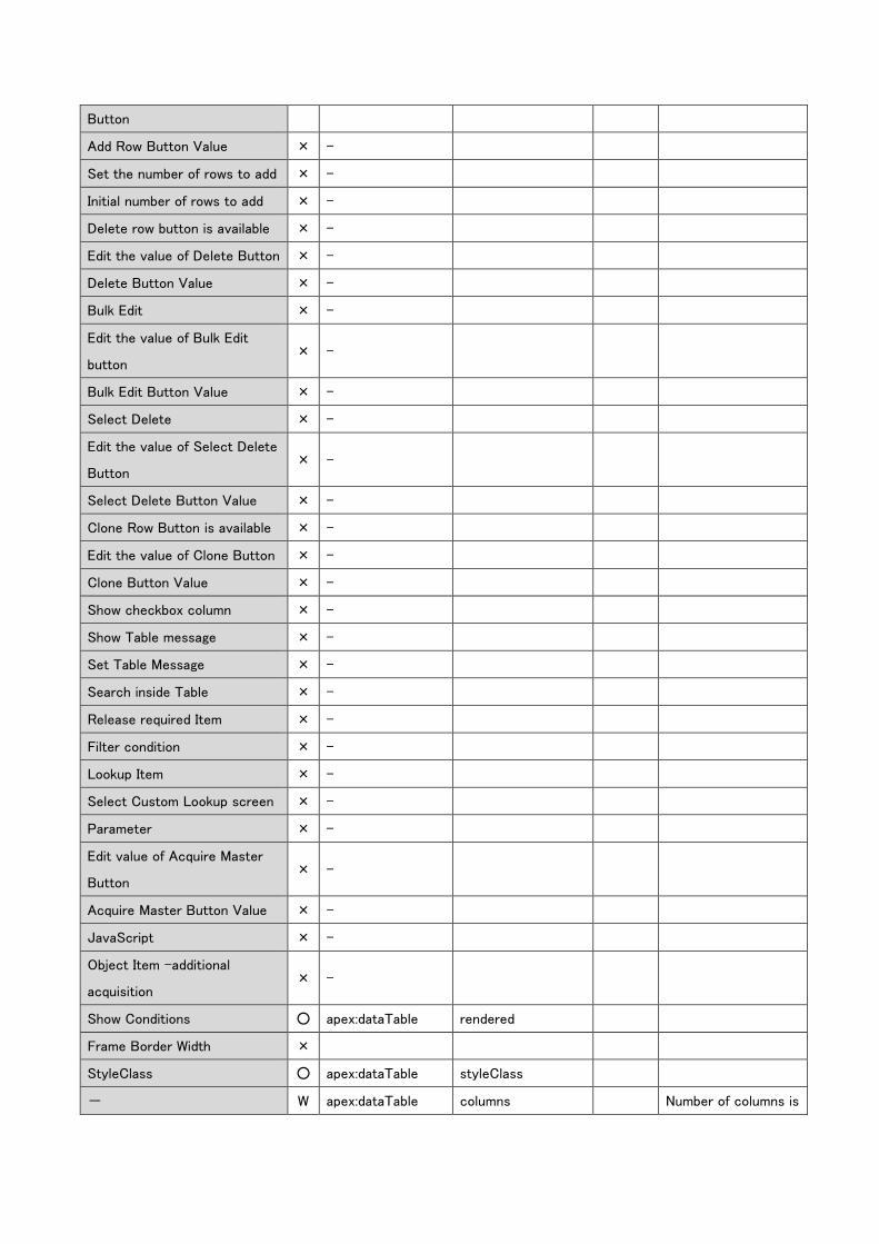
Show Conditions ○ apex:dataTable rendered
Frame Border Width ×
StyleClass ○ apex:dataTable styleClass
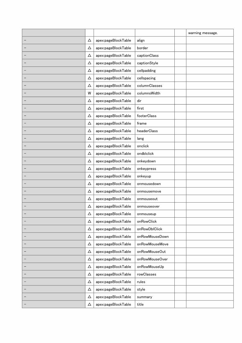
- W apex:dataTable columns Number of columns is
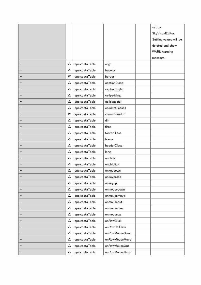
set by
SkyVisualEditor.
Setting values will be
deleted and show
WARN warning
message.
- △ apex:dataTable align
- △ apex:dataTable bgcolor
- W apex:dataTable border
- △ apex:dataTable captionClass
- △ apex:dataTable captionStyle
- △ apex:dataTable cellpadding
- △ apex:dataTable cellspacing
- △ apex:dataTable columnClasses
- W apex:dataTable columnsWidth
- △ apex:dataTable dir
- △ apex:dataTable first
- △ apex:dataTable footerClass
- △ apex:dataTable frame
- △ apex:dataTable headerClass
- △ apex:dataTable lang
- △ apex:dataTable onclick
- △ apex:dataTable ondblclick
- △ apex:dataTable onkeydown
- △ apex:dataTable onkeypress
- △ apex:dataTable onkeyup
- △ apex:dataTable onmousedown
- △ apex:dataTable onmousemove
- △ apex:dataTable onmouseout
- △ apex:dataTable onmouseover
- △ apex:dataTable onmouseup
- △ apex:dataTable onRowClick
- △ apex:dataTable onRowDblClick
- △ apex:dataTable onRowMouseDown
- △ apex:dataTable onRowMouseMove
- △ apex:dataTable onRowMouseOut
- △ apex:dataTable onRowMouseOver
- △ apex:dataTable onRowMouseUp
- △ apex:dataTable rowClasses
- △ apex:dataTable rules
- △ apex:dataTable style
- △ apex:dataTable summary
- △ apex:dataTable title
- W apex:dataTable var
Set as
SkyVisualEditor’s
default value. Setting
value will be deleted
and show WARN
warning message.
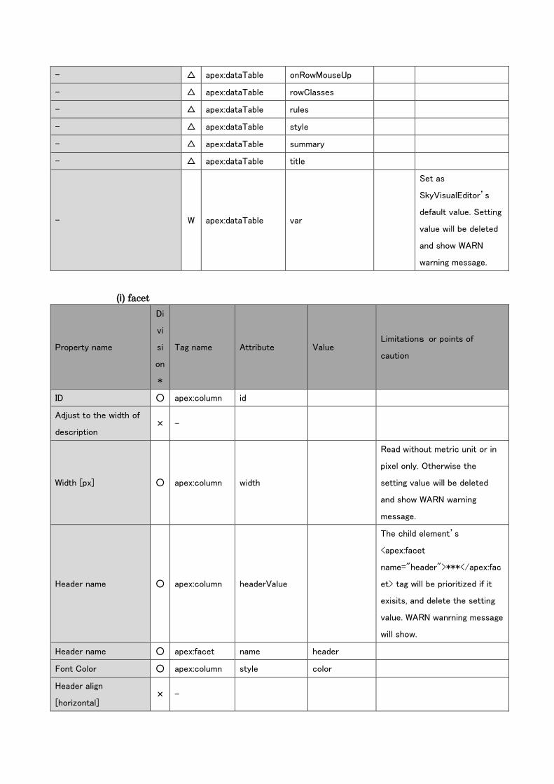
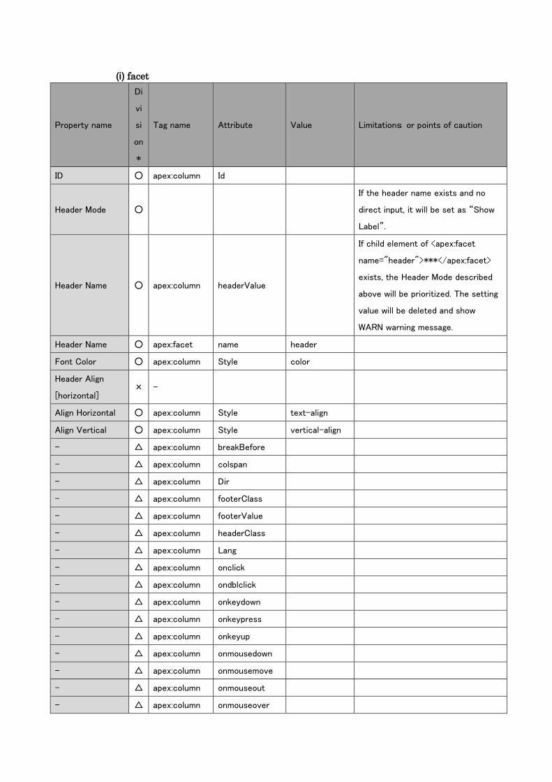
(i) facet
Property name
Di
vi
si
on
*
Tag name Attribute Value Limitations or points of
caution
ID ○ apex:column id
Adjust to the width of
description × -
Width [px] ○ apex:column width
Read without metric unit or in
pixel only. Otherwise the
setting value will be deleted
and show WARN warning
message.
Header name ○ apex:column headerValue
The child element’s
<apex:facet
name="header">***</apex:fac
et> tag will be prioritized if it
exisits, and delete the setting
value. WARN wanrning message
will show.
Header name ○ apex:facet name header
Font Color ○ apex:column style color
Header align
[horizontal] × -
Align Horizontal ○ apex:column style text-align
Align Vertical ○ apex:column style vertical-align
- △ apex:column breakBefore
- △ apex:column colspan
- △ apex:column dir
- △ apex:column footerClass
- △ apex:column footerValue
- △ apex:column headerClass
- △ apex:column lang
- △ apex:column onclick
- △ apex:column ondblclick
- △ apex:column onkeydown
- △ apex:column onkeypress
- △ apex:column onkeyup
- △ apex:column onmousedown
- △ apex:column onmousemove
- △ apex:column onmouseout
- △ apex:column onmouseover
- △ apex:column onmouseup
- W apex:column rendered
- △ apex:column rowspan
- △ apex:column styleClass
- △ apex:column title
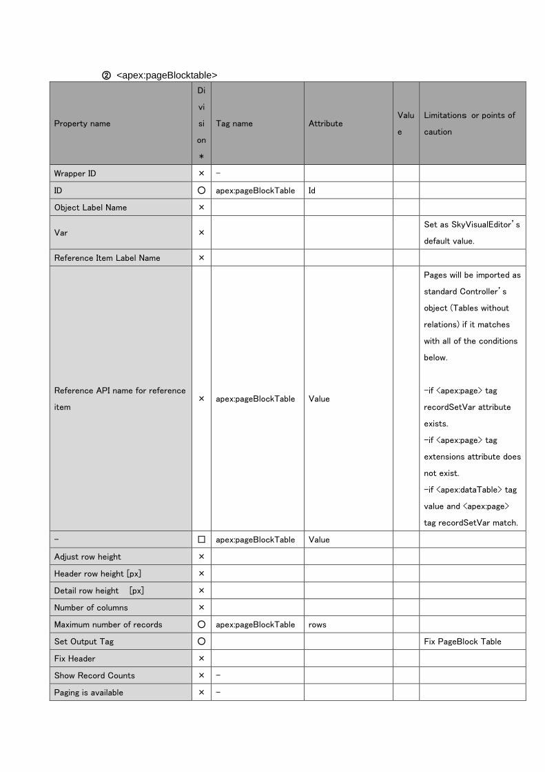
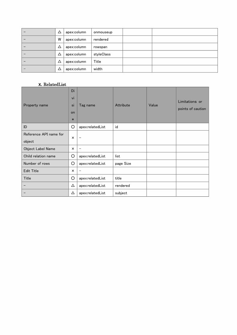
② <apex:pageBlocktable>
Property name
Di
vi
si
on
*
Tag name Attribute Valu
e
Limitations or points of
caution
Wrapper ID × -
ID ○ apex:pageBlockTable Id
Object Label Name ×
Var × Set as SkyVisualEditor’s
default value.
Reference Item Label Name ×
Reference API name for reference
item × apex:pageBlockTable Value
Pages will be imported as
standard Controller’s
object (Tables without
relations) if it matches
with all of the conditions
below.
-if <apex:page> tag
recordSetVar attribute
exists.
-if <apex:page> tag
extensions attribute does
not exist.
-if <apex:dataTable> tag
value and <apex:page>
tag recordSetVar match.
- □ apex:pageBlockTable Value
Adjust row height ×
Header row height [px] ×
Detail row height [px] ×
Number of columns ×
Maximum number of records ○ apex:pageBlockTable rows
Set Output Tag ○ Fix PageBlock Table
Fix Header ×
Show Record Counts × -
Paging is available × -
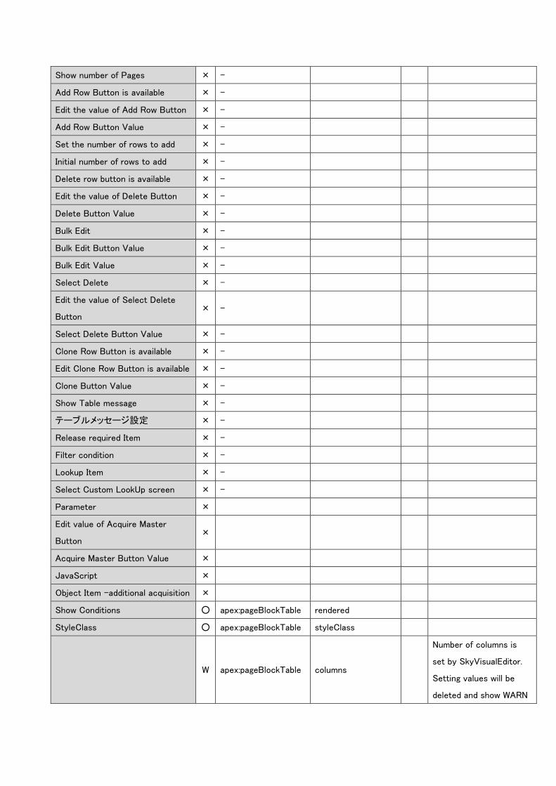
Show number of Pages × -
Add Row Button is available × -
Edit the value of Add Row Button × -
Add Row Button Value × -
Set the number of rows to add × -
Initial number of rows to add × -
Delete row button is available × -
Edit the value of Delete Button × -
Delete Button Value × -
Bulk Edit × -
Bulk Edit Button Value × -
Bulk Edit Value × -
Select Delete × -
Edit the value of Select Delete
Button × -
Select Delete Button Value × -
Clone Row Button is available × -
Edit Clone Row Button is available × -
Clone Button Value × -
Show Table message × -
テーブルメッセージ設定 × -
Release required Item × -
Filter condition × -
Lookup Item × -
Select Custom LookUp screen × -
Parameter ×
Edit value of Acquire Master
Button ×
Acquire Master Button Value ×
JavaScript ×
Object Item –additional acquisition ×
Show Conditions ○ apex:pageBlockTable rendered
StyleClass ○ apex:pageBlockTable styleClass
W apex:pageBlockTable columns
Number of columns is
set by SkyVisualEditor.
Setting values will be
deleted and show WARN
warning message.
- △ apex:pageBlockTable align
- △ apex:pageBlockTable border
- △ apex:pageBlockTable captionClass
- △ apex:pageBlockTable captionStyle
- △ apex:pageBlockTable cellpadding
- △ apex:pageBlockTable cellspacing
- △ apex:pageBlockTable columnClasses
- W apex:pageBlockTable columnsWidth
- △ apex:pageBlockTable dir
- △ apex:pageBlockTable first
- △ apex:pageBlockTable footerClass
- △ apex:pageBlockTable frame
- △ apex:pageBlockTable headerClass
- △ apex:pageBlockTable lang
- △ apex:pageBlockTable onclick
- △ apex:pageBlockTable ondblclick
- △ apex:pageBlockTable onkeydown
- △ apex:pageBlockTable onkeypress
- △ apex:pageBlockTable onkeyup
- △ apex:pageBlockTable onmousedown
- △ apex:pageBlockTable onmousemove
- △ apex:pageBlockTable onmouseout
- △ apex:pageBlockTable onmouseover
- △ apex:pageBlockTable onmouseup
- △ apex:pageBlockTable onRowClick
- △ apex:pageBlockTable onRowDblClick
- △ apex:pageBlockTable onRowMouseDown
- △ apex:pageBlockTable onRowMouseMove
- △ apex:pageBlockTable onRowMouseOut
- △ apex:pageBlockTable onRowMouseOver
- △ apex:pageBlockTable onRowMouseUp
- △ apex:pageBlockTable rowClasses
- △ apex:pageBlockTable rules
- △ apex:pageBlockTable style
- △ apex:pageBlockTable summary
- △ apex:pageBlockTable title
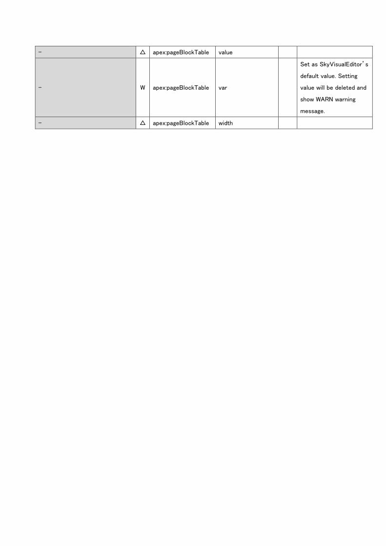
- △ apex:pageBlockTable value
- W apex:pageBlockTable var
Set as SkyVisualEditor’s
default value. Setting
value will be deleted and
show WARN warning
message.
- △ apex:pageBlockTable width
(i) facet
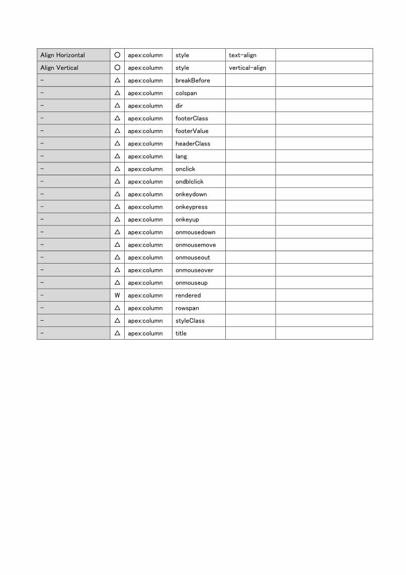
Property name
Di
vi
si
on
*
Tag name Attribute Value Limitations or points of caution
ID ○ apex:column Id
Header Mode ○
If the header name exists and no
direct input, it will be set as “Show
Label”.
Header Name ○ apex:column headerValue
If child element of <apex:facet
name="header">***</apex:facet>
exists, the Header Mode described
above will be prioritized. The setting
value will be deleted and show
WARN warning message.
Header Name ○ apex:facet name header
Font Color ○ apex:column Style color
Header Align
[horizontal] × -
Align Horizontal ○ apex:column Style text-align
Align Vertical ○ apex:column Style vertical-align
- △ apex:column breakBefore
- △ apex:column colspan
- △ apex:column Dir
- △ apex:column footerClass
- △ apex:column footerValue
- △ apex:column headerClass
- △ apex:column Lang
- △ apex:column onclick
- △ apex:column ondblclick
- △ apex:column onkeydown
- △ apex:column onkeypress
- △ apex:column onkeyup
- △ apex:column onmousedown
- △ apex:column onmousemove
- △ apex:column onmouseout
- △ apex:column onmouseover
- △ apex:column onmouseup
- W apex:column rendered
- △ apex:column rowspan
- △ apex:column styleClass
- △ apex:column Title
- △ apex:column width
x. RelatedList
Property name
Di
vi
si
on
*
Tag name Attribute Value Limitations or
points of caution
ID ○ apex:relatedList id
Reference API name for
object × -
Object Label Name × -
Child relation name ○ apex:relatedList list
Number of rows ○ apex:relatedList page Size
Edit Title × -
Title ○ apex:relatedList title
- △ apex:relatedList rendered
- △ apex:relatedList subject
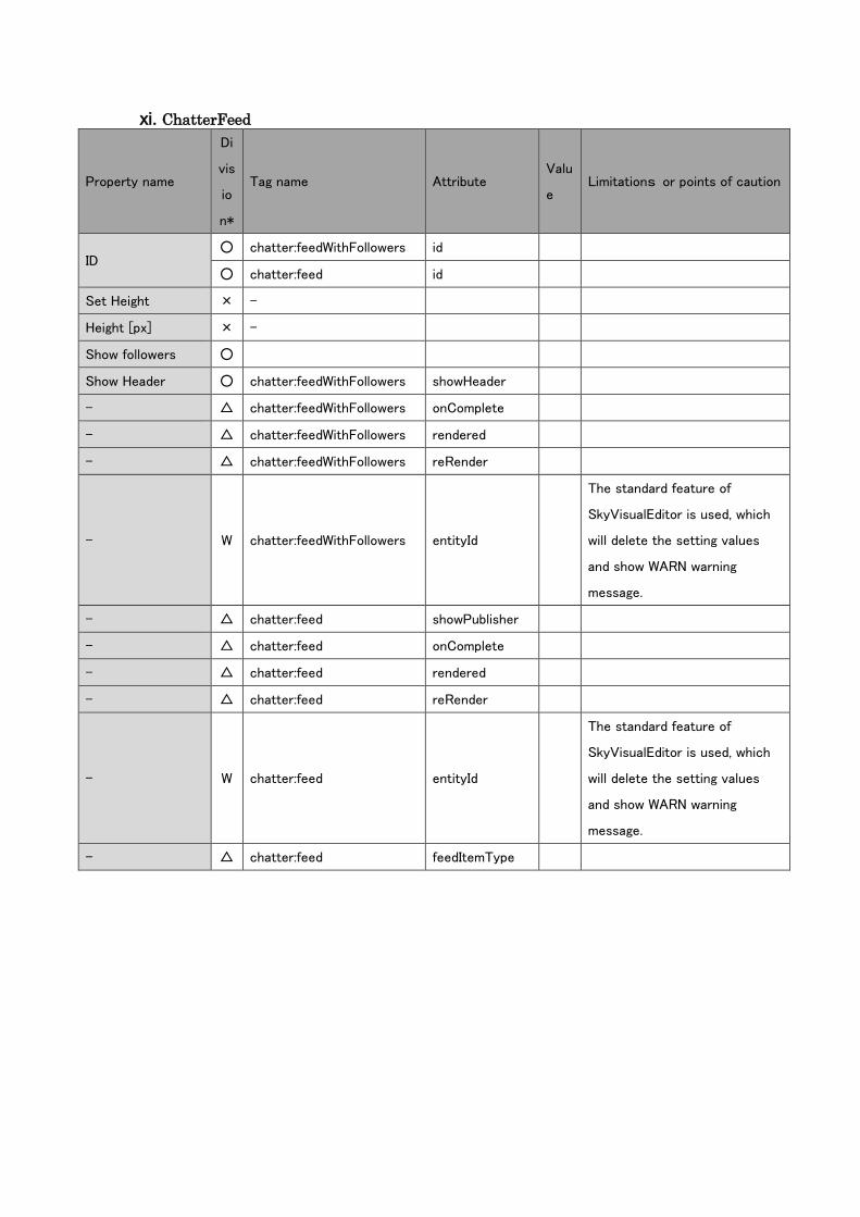
xi. ChatterFeed
Property name
Di
vis
io
n*
Tag name Attribute Valu
e Limitations or points of caution
ID ○ chatter:feedWithFollowers id
○ chatter:feed id
Set Height × -
Height [px] × -
Show followers ○
Show Header ○ chatter:feedWithFollowers showHeader
- △ chatter:feedWithFollowers onComplete
- △ chatter:feedWithFollowers rendered
- △ chatter:feedWithFollowers reRender
- W chatter:feedWithFollowers entityId
The standard feature of
SkyVisualEditor is used, which
will delete the setting values
and show WARN warning
message.
- △ chatter:feed showPublisher
- △ chatter:feed onComplete
- △ chatter:feed rendered
- △ chatter:feed reRender
- W chatter:feed entityId
The standard feature of
SkyVisualEditor is used, which
will delete the setting values
and show WARN warning
message.
- △ chatter:feed feedItemType

xii. SaveButton
Property name
Di
vi
si
on
*
Tag name Attribute Value Limitations or points of
caution
ID ○ apex:commandButton id
Edit Value × -
Value ○ apex:commandButton value
Tooltip ○ apex:commandButton title
Set width × - -
Width [px] ○ apex:commandButton style width
Metric unit will be in pixel.
Otherwise it will be read as
Additional Styles.
Button Style × - -
Font Color ○ apex:commandButton style color
Font Weight ○ apex:commandButton style font-weight
StyleClass ○ apex:commandButton styleClass
- △ apex:commandButton accesskey
- W apex:commandButton action action="{!save}" will be saved
as SaveButton.
- △ apex:commandButton alt
- △ apex:commandButton dir
- △ apex:commandButton disabled
- △ apex:commandButton image
- △ apex:commandButton immediate
- △ apex:commandButton lang
- △ apex:commandButton onblur
- △ apex:commandButton onclick
- △ apex:commandButton oncomplete
- △ apex:commandButton ondblclick
- △ apex:commandButton onfocus
- △ apex:commandButton onkeydown
- △ apex:commandButton onkeypress
- △ apex:commandButton onkeyup
- △ apex:commandButton onmousedown

- △ apex:commandButton onmousemove
- △ apex:commandButton onmouseout
- △ apex:commandButton onmouseover
- △ apex:commandButton onmouseup
- W apex:commandButton rendered
- △ apex:commandButton reRender
- △ apex:commandButton status
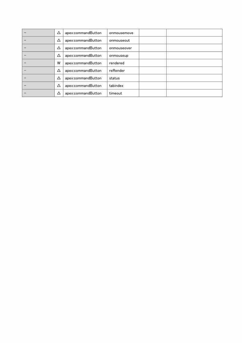
- △ apex:commandButton tabindex
- △ apex:commandButton timeout

xiii. EditButton
Property name
Di
vi
si
on
*
Tag name Attribute Value Limitations or points of
caution
ID ○ apex:commandButton Id
Edit Value × - -
Value ○ apex:commandButton value
Tooltip ○ apex:commandButton title
Set width × - -
Width [px] ○ apex:commandButton style width
Metric unit will be in pixel.
Otherwise it will be read as
Additional Styles.
Button Style × - -
Font Color ○ apex:commandButton style color
Font Weight ○ apex:commandButton style font-weight
StyleClass ○ apex:commandButton styleClass
- △ apex:commandButton accesskey
- W apex:commandButton action action="{!edit}" will be read as
EditButton.
- △ apex:commandButton Alt
- △ apex:commandButton Dir
- △ apex:commandButton disabled
- △ apex:commandButton image
- △ apex:commandButton immediate
- △ apex:commandButton lang
- △ apex:commandButton onblur
- △ apex:commandButton onclick
- △ apex:commandButton oncomplete
- △ apex:commandButton ondblclick
- △ apex:commandButton onfocus
- △ apex:commandButton onkeydown
- △ apex:commandButton onkeypress
- △ apex:commandButton onkeyup
- △ apex:commandButton onmousedown

- △ apex:commandButton onmousemove
- △ apex:commandButton onmouseout
- △ apex:commandButton onmouseover
- △ apex:commandButton onmouseup
- △ apex:commandButton rendered
- △ apex:commandButton reRender
- △ apex:commandButton status
- △ apex:commandButton tabindex
- △ apex:commandButton timeout
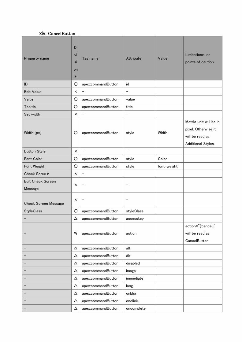
xiv. CancelButton
Property name
Di
vi
si
on
*
Tag name Attribute Value Limitations or
points of caution
ID ○ apex:commandButton id
Edit Value × - -
Value ○ apex:commandButton value
Tooltip ○ apex:commandButton title
Set width × - -
Width [px] ○ apex:commandButton style Width
Metric unit will be in
pixel. Otherwise it
will be read as
Additional Styles.
Button Style × - -
Font Color ○ apex:commandButton style Color
Font Weight ○ apex:commandButton style font-weight
Check Scree n × -
Edit Check Screen
Message × - -
Check Screen Message × - -
StyleClass ○ apex:commandButton styleClass
- △ apex:commandButton accesskey
- W apex:commandButton action
action="{!cancel}"
will be read as
CancelButton.
- △ apex:commandButton alt
- △ apex:commandButton dir
- △ apex:commandButton disabled
- △ apex:commandButton image
- △ apex:commandButton immediate
- △ apex:commandButton lang
- △ apex:commandButton onblur
- △ apex:commandButton onclick
- △ apex:commandButton oncomplete
- △ apex:commandButton ondblclick
- △ apex:commandButton onfocus
- △ apex:commandButton onkeydown
- △ apex:commandButton onkeypress
- △ apex:commandButton onkeyup
- △ apex:commandButton onmousedown
- △ apex:commandButton onmousemove
- △ apex:commandButton onmouseout
- △ apex:commandButton onmouseover
- △ apex:commandButton onmouseup
- W apex:commandButton rendered
- △ apex:commandButton reRender
- △ apex:commandButton status
- △ apex:commandButton tabindex
- △ apex:commandButton timeout
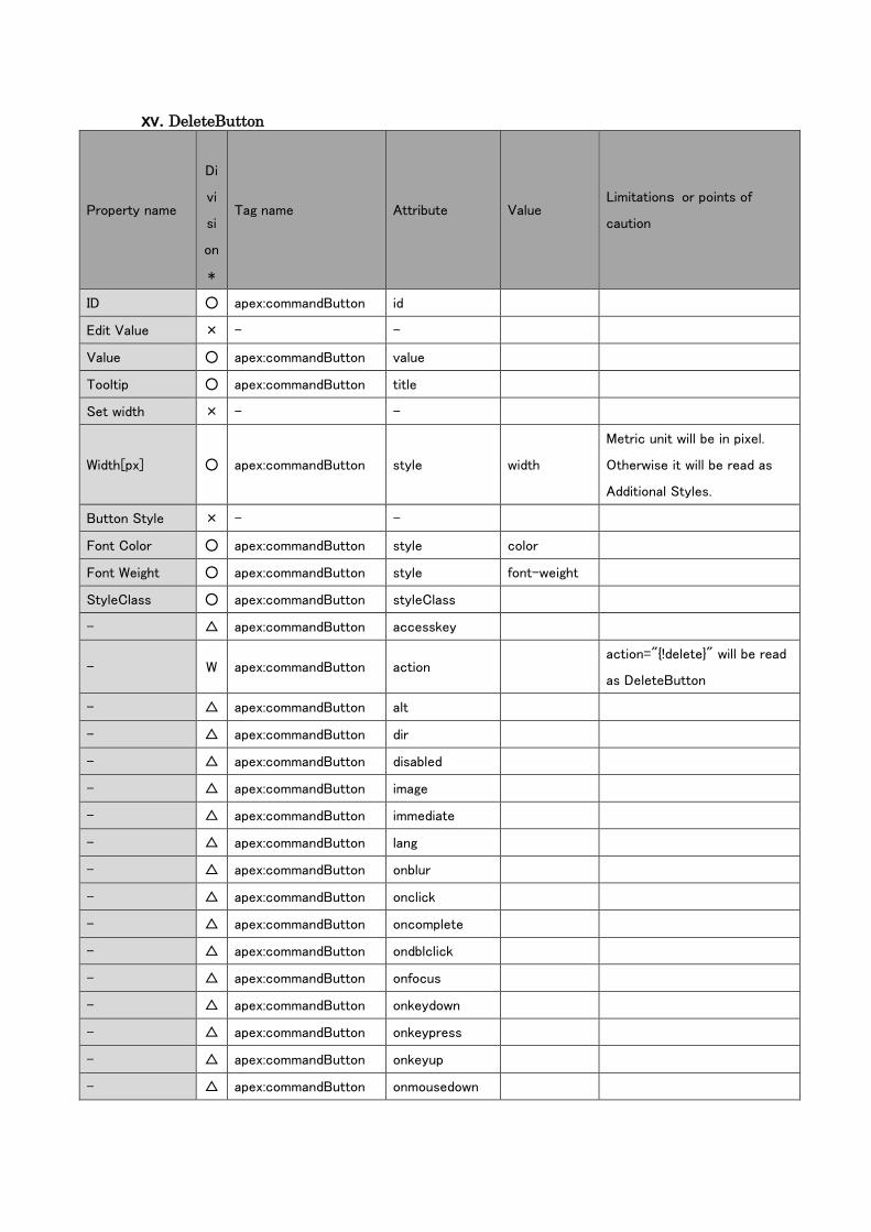
xv. DeleteButton
Property name
Di
vi
si
on
*
Tag name Attribute Value Limitations or points of
caution
ID ○ apex:commandButton id
Edit Value × - -
Value ○ apex:commandButton value
Tooltip ○ apex:commandButton title
Set width × - -
Width[px] ○ apex:commandButton style width
Metric unit will be in pixel.
Otherwise it will be read as
Additional Styles.
Button Style × - -
Font Color ○ apex:commandButton style color
Font Weight ○ apex:commandButton style font-weight
StyleClass ○ apex:commandButton styleClass
- △ apex:commandButton accesskey
- W apex:commandButton action action="{!delete}" will be read
as DeleteButton
- △ apex:commandButton alt
- △ apex:commandButton dir
- △ apex:commandButton disabled
- △ apex:commandButton image
- △ apex:commandButton immediate
- △ apex:commandButton lang
- △ apex:commandButton onblur
- △ apex:commandButton onclick
- △ apex:commandButton oncomplete
- △ apex:commandButton ondblclick
- △ apex:commandButton onfocus
- △ apex:commandButton onkeydown
- △ apex:commandButton onkeypress
- △ apex:commandButton onkeyup
- △ apex:commandButton onmousedown
- △ apex:commandButton onmousemove
- △ apex:commandButton onmouseout
- △ apex:commandButton onmouseover
- △ apex:commandButton onmouseup
- W apex:commandButton rendered
- △ apex:commandButton reRender
- △ apex:commandButton status
- △ apex:commandButton tabindex
- △ apex:commandButton timeout
xvi. CustomButton
Property name
Di
vi
si
on
*
Tag name Attribute Value Limitations or points
of caution
Wrapper ID × -
ID ○ apex:commandButton id
Show Conditions ○ apex:commandButton rendered
Value ○ apex:commandButton value
Tooltip ○ apex:commandButton title
Set width × - -
Width [px] ○ apex:commandButton style Width
Metric unit will be in
pixel. Otherwise it
will be read as
Additional Styles.
Button Style × - -
Font Color ○ apex:commandButton style Color
Font Weight ○ apex:commandButton style font-weight
Select Movement × -
Set Desitination × -
Open a link in a new
window × -
OnClick ○ apex:commandButton onclick
Action W apex:commandButton action
If the action is not
Save/Edit/Cancel/D
elete, it will be read
as CustomButton.
OnCompleate ○ apex:commandButton oncomplete
Set Table Region ×
StyleClass ○ apex:commandButton styleClass
immediate ○ apex:commandButton immediate
reRender ○ apex:commandButton reRender
- △ apex:commandButton accesskey
- △ apex:commandButton alt
- △ apex:commandButton dir
- △ apex:commandButton disabled
- △ apex:commandButton image
- △ apex:commandButton lang
- △ apex:commandButton onblur
- △ apex:commandButton ondblclick
- △ apex:commandButton onfocus
- △ apex:commandButton onkeydown
- △ apex:commandButton onkeypress
- △ apex:commandButton onkeyup
- △ apex:commandButton onmousedown
- △ apex:commandButton onmousemove
- △ apex:commandButton onmouseout
- △ apex:commandButton onmouseover
- △ apex:commandButton onmouseup
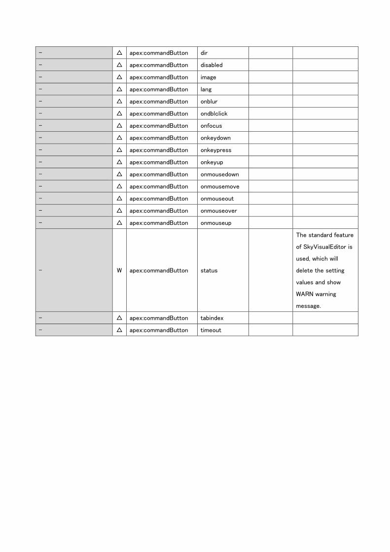
- W apex:commandButton status
The standard feature
of SkyVisualEditor is
used, which will
delete the setting
values and show
WARN warning
message.
- △ apex:commandButton tabindex
- △ apex:commandButton timeout
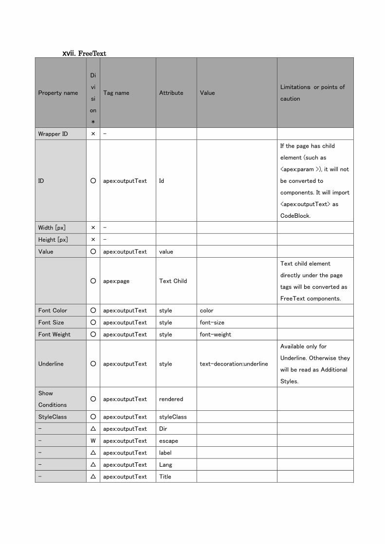
xvii. FreeText
Property name
Di
vi
si
on
*
Tag name Attribute Value Limitations or points of
caution
Wrapper ID × -
ID ○ apex:outputText Id
If the page has child
element (such as
<apex:param >), it will not
be converted to
components. It will import
<apex:outputText> as
CodeBlock.
Width [px] × -
Height [px] × -
Value ○ apex:outputText value
○ apex:page Text Child
Text child element
directly under the page
tags will be converted as
FreeText components.
Font Color ○ apex:outputText style color
Font Size ○ apex:outputText style font-size
Font Weight ○ apex:outputText style font-weight
Underline ○ apex:outputText style text-decoration:underline
Available only for
Underline. Otherwise they
will be read as Additional
Styles.
Show
Conditions ○ apex:outputText rendered
StyleClass ○ apex:outputText styleClass
- △ apex:outputText Dir
- W apex:outputText escape
- △ apex:outputText label
- △ apex:outputText Lang
- △ apex:outputText Title
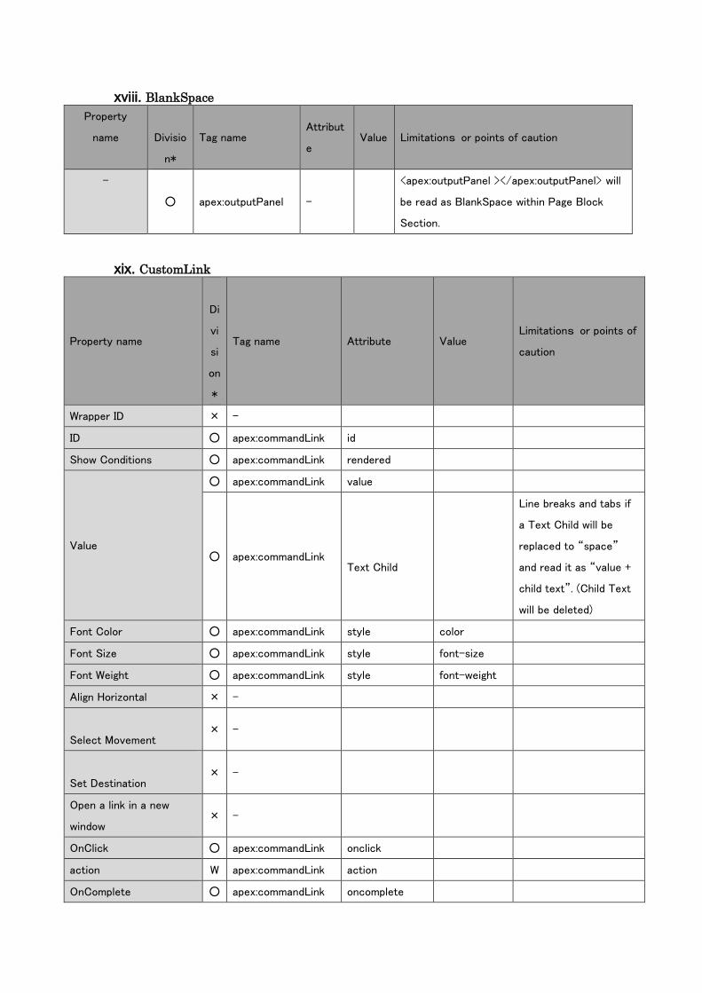
xviii. BlankSpace
Property
name
Divisio
n*
Tag name Attribut
e Value Limitations or points of caution
-
○ apex:outputPanel -
<apex:outputPanel ></apex:outputPanel> will
be read as BlankSpace within Page Block
Section.
xix. CustomLink
Property name
Di
vi
si
on
*
Tag name Attribute Value Limitations or points of
caution
Wrapper ID × -
ID ○ apex:commandLink id
Show Conditions ○ apex:commandLink rendered
Value
○ apex:commandLink value
○ apex:commandLink
Text Child
Line breaks and tabs if
a Text Child will be
replaced to “space”
and read it as “value +
child text”. (Child Text
will be deleted)
Font Color ○ apex:commandLink style color
Font Size ○ apex:commandLink style font-size
Font Weight ○ apex:commandLink style font-weight
Align Horizontal × -
Select Movement × -
Set Destination × -
Open a link in a new
window × -
OnClick ○ apex:commandLink onclick
action W apex:commandLink action
OnComplete ○ apex:commandLink oncomplete
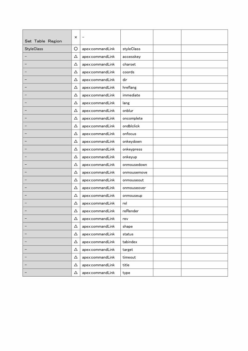
Set Table Region × -
StyleClass ○ apex:commandLink styleClass
- △ apex:commandLink accesskey
- △ apex:commandLink charset
- △ apex:commandLink coords
- △ apex:commandLink dir
- △ apex:commandLink hreflang
- △ apex:commandLink immediate
- △ apex:commandLink lang
- △ apex:commandLink onblur
- △ apex:commandLink oncomplete
- △ apex:commandLink ondblclick
- △ apex:commandLink onfocus
- △ apex:commandLink onkeydown
- △ apex:commandLink onkeypress
- △ apex:commandLink onkeyup
- △ apex:commandLink onmousedown
- △ apex:commandLink onmousemove
- △ apex:commandLink onmouseout
- △ apex:commandLink onmouseover
- △ apex:commandLink onmouseup
- △ apex:commandLink rel
- △ apex:commandLink reRender
- △ apex:commandLink rev
- △ apex:commandLink shape
- △ apex:commandLink status
- △ apex:commandLink tabindex
- △ apex:commandLink target
- △ apex:commandLink timeout
- △ apex:commandLink title
- △ apex:commandLink type
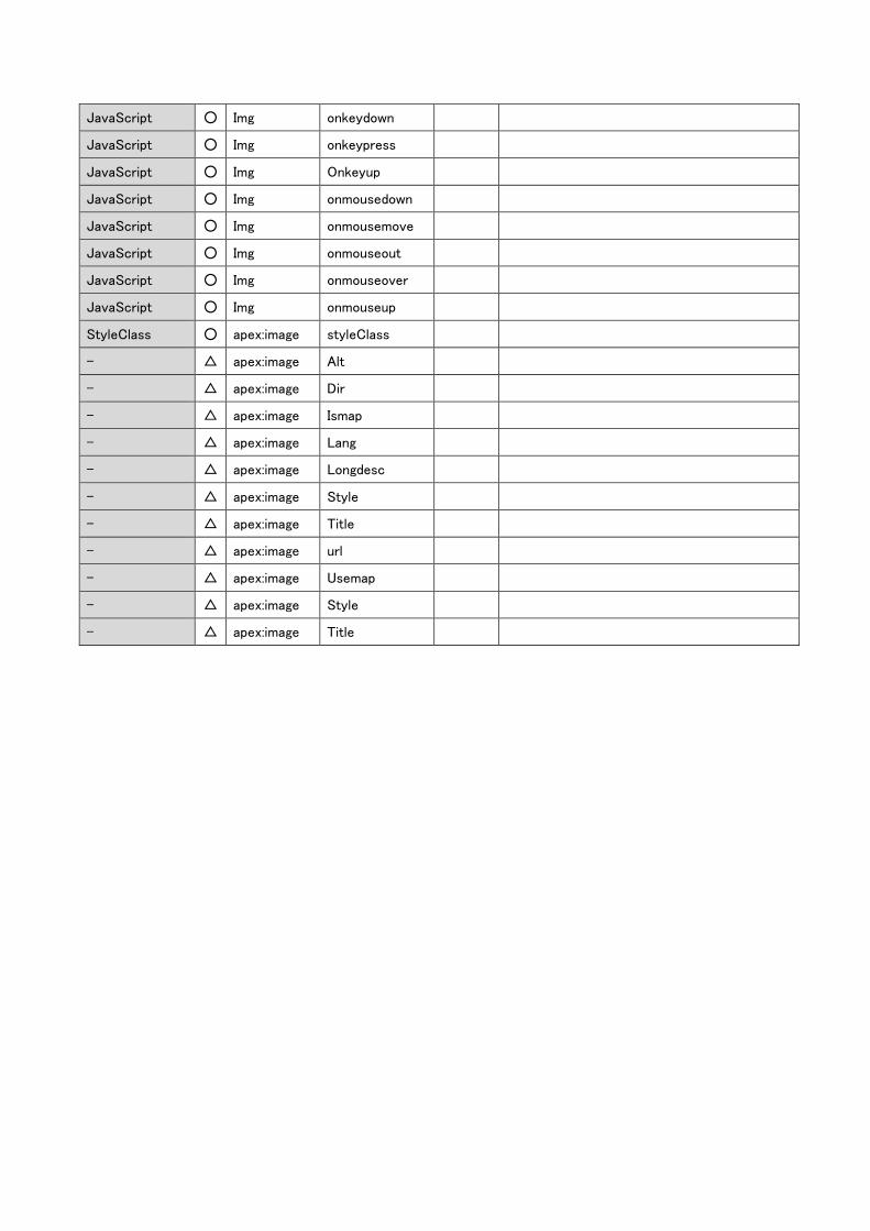
xx. Image
Property name
Di
vi
si
on
*
Tag name Attribute Value Limitations or points of caution
Wrapper ID × -
ID ○ apex:image Id
○ Img Id
Show
Conditions
○ apex:image Rendered
○ Img Rendered
Image Source ○ apex:image Value
Read as “select image from outside the Web
Page”
○ Img Src
Width [px] ○ apex:image Width
Read without metric unit or in pixel only.
Otherwise the setting value will be deleted and
show WARN warning message.
○ Img Style width
Height [px] ○ apex:image Height
Read without metric unit or in pixel only.
Otherwise the setting value will be deleted and
show WARN warning message.
○ Img Style height
Align Horizontal × -
Aspect Ratio × -
JavaScript ○ apex:image Onclick
JavaScript ○ apex:image ondblclick
JavaScript ○ apex:image onkeydown
JavaScript ○ apex:image onkeypress
JavaScript ○ apex:image Onkeyup
JavaScript ○ apex:image onmousedown
JavaScript ○ apex:image onmousemove
JavaScript ○ apex:image onmouseout
JavaScript ○ apex:image onmouseover
JavaScript ○ apex:image onmouseup
JavaScript ○ Img Onclick
JavaScript ○ Img ondblclick
JavaScript ○ Img onkeydown
JavaScript ○ Img onkeypress
JavaScript ○ Img Onkeyup
JavaScript ○ Img onmousedown
JavaScript ○ Img onmousemove
JavaScript ○ Img onmouseout
JavaScript ○ Img onmouseover
JavaScript ○ Img onmouseup
StyleClass ○ apex:image styleClass
- △ apex:image Alt
- △ apex:image Dir
- △ apex:image Ismap
- △ apex:image Lang
- △ apex:image Longdesc
- △ apex:image Style
- △ apex:image Title
- △ apex:image url
- △ apex:image Usemap
- △ apex:image Style
- △ apex:image Title
(3) facet import examples of DataTable Component
<apex:dataTable> tag and <apex:pageblockTable> tag will be imported as DataTable component.
Child elements that can be imported as facet are as below:
[Import pattern for header]
apex:column attribute value
Example: <apex:column value="{!item.Reason}" />
apex:column attribute headerValue
Example: <apex:column value="{!item.Priority}" headerValue="Priority"/>
apex:facet name=”header” child element
Example: <apex:facet name="header">Name</apex:facet>
<apex:facet name="header">
<apex:outputText value="{!$ObjectType.Case.Fields.CreatedDate.Label}" />
</apex:facet>
[Import pattern for value]
apex:column attribute value
Example: <apex:column value="{!item.Reason}" />
apex:column text child element
Example: <apex:column headerValue="Case Number">
{!item.CaseNumber}
</apex:column>
apex:column child element
Example: <apex:column headerValue="CaseNumber">
<apex:outputField value="{!item.CreatedDate}" />
</apex:column>


![Welcome [] · Zülküf Küçüközer TriangleCanvas.java import javax.microedition.lcdui.Graphics; import javax.microedition.lcdui.game.*; import javax.microedition.m3g.*;](https://img.pdfslide.net/doc/110x75/5d31f91d88c9937a3b8ccf67/welcome-zuelkuef-kuecuekoezer-trianglecanvasjava-import-javaxmicroeditionlcduigraphics.jpg)


![TOTO [ IMPORT ] RR [ IMPORT ] INAX [ JAPAN ] … · toto [ import ] rr [ import ] inax [ japan ] rbm - s 302 rzj - 11041 a-580 wc piston valve [ for rr brand ] toto [ import ] rr](https://img.pdfslide.net/doc/110x75/5b8fccf509d3f2c7748cde70/toto-import-rr-import-inax-japan-toto-import-rr-import-inax.jpg)


![[TerraSky Day 2016] エンジニアのためになる!実用的なSalesforceページデザインについて考えてみよう](https://img.pdfslide.net/doc/110x75/587198791a28ab044e8b5283/terrasky-day-2016-salesforce.jpg)