Embed Size (px)
Citation preview
SPSS 14.0 Brief Guide
For more information about SPSS® software products, please visit our Web site at http://www.spss.com or contact
SPSS Inc.233 South Wacker Drive, 11th FloorChicago, IL 60606-6412Tel: (312) 651-3000Fax: (312) 651-3668
SPSS is a registered trademark and the other product names are the trademarks of SPSS Inc. for its proprietary computersoftware. No material describing such software may be produced or distributed without the written permission of theowners of the trademark and license rights in the software and the copyrights in the published materials.
The SOFTWARE and documentation are provided with RESTRICTED RIGHTS. Use, duplication, or disclosure bythe Government is subject to restrictions as set forth in subdivision (c) (1) (ii) of The Rights in Technical Data andComputer Software clause at 52.227-7013. Contractor/manufacturer is SPSS Inc., 233 South Wacker Drive, 11thFloor, Chicago, IL 60606-6412.
General notice: Other product names mentioned herein are used for identification purposes only and may be trademarksof their respective companies.
TableLook is a trademark of SPSS Inc.Windows is a registered trademark of Microsoft Corporation.DataDirect, DataDirect Connect, INTERSOLV, and SequeLink are registered trademarks of DataDirect Technologies.Portions of this product were created using LEADTOOLS © 1991–2000, LEAD Technologies, Inc. ALL RIGHTSRESERVED.LEAD, LEADTOOLS, and LEADVIEW are registered trademarks of LEAD Technologies, Inc.Sax Basic is a trademark of Sax Software Corporation. Copyright © 1993–2004 by Polar Engineering and Consulting.All rights reserved.Portions of this product were based on the work of the FreeType Team (http://www.freetype.org).A portion of the SPSS software contains zlib technology. Copyright © 1995–2002 by Jean-loup Gailly and Mark Adler.The zlib software is provided “as is,” without express or implied warranty.A portion of the SPSS software contains Sun Java Runtime libraries. Copyright © 2003 by Sun Microsystems, Inc. Allrights reserved. The Sun Java Runtime libraries include code licensed from RSA Security, Inc. Some portions of thelibraries are licensed from IBM and are available at http://oss.software.ibm.com/icu4j/.
SPSS® 14.0 Brief GuideCopyright © 2005 by SPSS Inc.All rights reserved.Printed in the United States of America.
No part of this publication may be reproduced, stored in a retrieval system, or transmitted, in any form or by any means,electronic, mechanical, photocopying, recording, or otherwise, without the prior written permission of the publisher.
1 2 3 4 5 6 7 8 9 0 08 07 06 05
ISBN 0-13-173847-X
Preface
The SPSS® 14.0 Brief Guide provides a set of tutorials designed to acquaint you withthe various components of the SPSS system. You can work through the tutorials insequence or turn to the topics for which you need additional information. You can usethis guide as a supplement to the online tutorial that is included with the SPSS Base 14.0system or ignore the online tutorial and start with the tutorials found here.
SPSS 14.0
SPSS 14.0 is a comprehensive system for analyzing data. SPSS can take data fromalmost any type of file and use them to generate tabulated reports, charts, and plots ofdistributions and trends, descriptive statistics, and complex statistical analyses.
SPSS makes statistical analysis more accessible for the beginner and moreconvenient for the experienced user. Simple menus and dialog box selections make itpossible to perform complex analyses without typing a single line of command syntax.The Data Editor offers a simple and efficient spreadsheet-like facility for enteringdata and browsing the working data file.
Internet Resources
The SPSS Web site (http://www.spss.com) offers answers to frequently asked questionsabout installing and running SPSS software and provides access to data files and otheruseful information.
In addition, the SPSS USENET discussion group (not sponsored by SPSS) is open toanyone interested in SPSS products. The USENET address is comp.soft-sys.stat.spss. Itdeals with computer, statistical, and other operational issues related to SPSS software.
You can also subscribe to an e-mail message list that is gatewayed to the USENETgroup. To subscribe, send an e-mail message to [email protected]. The text ofthe e-mail message should be: subscribe SPSSX-L firstname lastname. You can thenpost messages to the list by sending an e-mail message to [email protected].
iii
Additional Publications
For additional information about the features and operations of SPSS Base 14.0, youcan consult the SPSS Base 14.0 User’s Guide, which includes information on standardgraphics. Examples using the statistical procedures found in SPSS Base 14.0 areprovided in the Help system, installed with the software. Algorithms used in thestatistical procedures are available on the product CD-ROM.
In addition, beneath the menus and dialog boxes, SPSS uses a command language.Some extended features of the system can be accessed only via command syntax.(Those features are not available in the Student Version.) Complete command syntaxis documented in the SPSS 14.0 Command Syntax Reference, available in PDF formfrom the Help menu.
Individuals worldwide can order additional product manuals directly from SPSS Inc.For telephone orders in the United States and Canada, call SPSS Inc. at 800-543-2185.For telephone orders outside of North America, contact your local office, listed on theSPSS Web site at http://www.spss.com/worldwide.
The SPSS Statistical Procedures Companion, by Marija Norušis, has been publishedby Prentice Hall. It contains overviews of the procedures in the SPSS Base, plusLogistic Regression and General Linear Models. The SPSS Advanced StatisticalProcedures Companion has also been published by Prentice Hall. It includes overviewsof the procedures in the SPSS Advanced and Regression modules.
SPSS Options
The following options are available as add-on enhancements to the full (not StudentVersion) SPSS Base system:
SPSS Regression Models™ provides techniques for analyzing data that do not fittraditional linear statistical models. It includes procedures for probit analysis,logistic regression, weight estimation, two-stage least-squares regression, and generalnonlinear regression.
SPSS Advanced Models™ focuses on techniques often used in sophisticatedexperimental and biomedical research. It includes procedures for general linear models(GLM), linear mixed models, variance components analysis, loglinear analysis,ordinal regression, actuarial life tables, Kaplan-Meier survival analysis, and basicand extended Cox regression.
SPSS Tables™ creates a variety of presentation-quality tabular reports, includingcomplex stub-and-banner tables and displays of multiple response data.
iv
SPSS Trends™ performs comprehensive forecasting and time series analyses withmultiple curve-fitting models, smoothing models, and methods for estimatingautoregressive functions.
SPSS Categories® performs optimal scaling procedures, including correspondenceanalysis.
SPSS Conjoint™ provides a realistic way to measure how individual product attributesaffect consumer and citizen preferences. With SPSS Conjoint, you can easily measurethe trade-off effect of each product attribute in the context of a set of productattributes—as consumers do when making purchasing decisions.
SPSS Exact Tests™ calculates exact p values for statistical tests when small or veryunevenly distributed samples could make the usual tests inaccurate.
SPSS Missing Value Analysis™ describes patterns of missing data, estimates means andother statistics, and imputes values for missing observations.
SPSS Maps™ turns your geographically distributed data into high-quality maps withsymbols, colors, bar charts, pie charts, and combinations of themes to present not onlywhat is happening but where it is happening.
SPSS Complex Samples™ allows survey, market, health, and public opinion researchers,as well as social scientists who use sample survey methodology, to incorporate theircomplex sample designs into data analysis.
SPSS Classification Tree™ creates a tree-based classification model. It classifiescases into groups or predicts values of a dependent (target) variable based on valuesof independent (predictor) variables. The procedure provides validation tools forexploratory and confirmatory classification analysis.
SPSS Data Validation™ provides a quick visual snapshot of your data. It providesthe ability to apply validation rules that identify invalid data values. You can createrules that flag out-of-range values, missing values, or blank values. You can also savevariables that record individual rule violations and the total number of rule violationsper case. A limited set of predefined rules that you can copy or modify is provided.
Amos™ (analysis of moment structures) uses structural equation modeling to confirmand explain conceptual models that involve attitudes, perceptions, and other factorsthat drive behavior.
The SPSS family of products also includes applications for data entry, text analysis,classification, neural networks, and predictive enterprise services.
v
Training Seminars
SPSS Inc. provides both public and onsite training seminars for SPSS. All seminarsfeature hands-on workshops. SPSS seminars will be offered in major U.S. andEuropean cities on a regular basis. For more information on these seminars, contactyour local office, listed on the SPSS Web site at http://www.spss.com/worldwide.
Technical Support
The services of SPSS Technical Support are available to maintenance customers ofSPSS. (Student Version customers should read the special section on technical supportfor the Student Version. For more information, see “Technical Support for Students”on p. vii.) Customers may contact Technical Support for assistance in using SPSSproducts or for installation help for one of the supported hardware environments. Toreach Technical Support, see the SPSS Web site at http://www.spss.com, or contactyour local office, listed on the SPSS Web site at http://www.spss.com/worldwide. Beprepared to identify yourself, your organization, and the serial number of your system.
Tell Us Your Thoughts
Your comments are important. Please let us know about your experiences with SPSSproducts. We especially like to hear about new and interesting applications usingthe SPSS system. Please send e-mail to [email protected], or write to SPSS Inc.,Attn: Director of Product Planning, 233 South Wacker Drive, 11th Floor, Chicago IL60606-6412.
SPSS 14.0 for Windows Student Version
The SPSS 14.0 for Windows Student Version is a limited but still powerful versionof the SPSS Base 14.0 system.
Capability
The Student Version contains all of the important data analysis tools contained inthe full SPSS Base system, including:
Spreadsheet-like Data Editor for entering, modifying, and viewing data files.
Statistical procedures, including t tests, analysis of variance, and crosstabulations.
vi
Interactive graphics that allow you to change or add chart elements and variablesdynamically; the changes appear as soon as they are specified.
Standard high-resolution graphics for an extensive array of analytical andpresentation charts and tables.
Limitations
Created for classroom instruction, the Student Version is limited to use by students andinstructors for educational purposes only. The Student Version does not contain all ofthe functions of the SPSS Base 14.0 system. The following limitations apply to theSPSS 14.0 for Windows Student Version:
Data files cannot contain more than 50 variables.
Data files cannot contain more than 1,500 cases. SPSS add-on modules (such asRegression Models or Advanced Models) cannot be used with the Student Version.
SPSS command syntax is not available to the user. This means that it is notpossible to repeat an analysis by saving a series of commands in a syntax or “job”file, as can be done in the full version of SPSS.
Scripting and automation are not available to the user. This means that you cannotcreate scripts that automate tasks that you repeat often, as can be done in the fullversion of SPSS.
Technical Support for Students
Students should obtain technical support from their instructors or from local supportstaff identified by their instructors. Technical support from SPSS for the SPSS 14.0Student Version is provided only to instructors using the system for classroominstruction.
Before seeking assistance from your instructor, please write down the informationdescribed below. Without this information, your instructor may be unable to assist you:
The type of PC you are using, as well as the amount of RAM and free disk spaceyou have.
The operating system of your PC.
A clear description of what happened and what you were doing when the problemoccurred. If possible, please try to reproduce the problem with one of the sampledata files provided with the program.
vii

The exact wording of any error or warning messages that appeared on your screen.
How you tried to solve the problem on your own.
Technical Support for Instructors
Instructors using the Student Version for classroom instruction may contact SPSSTechnical Support for assistance. In the United States and Canada, call SPSS TechnicalSupport at 312-651-3410, or send an e-mail to [email protected]. Please includeyour name, title, and academic institution.
Instructors outside of the United States and Canada should contact your local SPSSoffice, listed on the SPSS Web site at http://www.spss.com/worldwide.
viii
Contents
1 Introduction 1
Sample Files . . . . . . . . . . . . . . . . . . . . . . . . . . . . . . . . . . . . . . . . . . . . . . . . . . 1Starting SPSS . . . . . . . . . . . . . . . . . . . . . . . . . . . . . . . . . . . . . . . . . . . . . . . . 2
Variable Display in Dialog Boxes . . . . . . . . . . . . . . . . . . . . . . . . . . . . . . . 3Opening a Data File. . . . . . . . . . . . . . . . . . . . . . . . . . . . . . . . . . . . . . . . . . . . . 3Running an Analysis . . . . . . . . . . . . . . . . . . . . . . . . . . . . . . . . . . . . . . . . . . . 6Viewing Results . . . . . . . . . . . . . . . . . . . . . . . . . . . . . . . . . . . . . . . . . . . . . . 10Creating Charts. . . . . . . . . . . . . . . . . . . . . . . . . . . . . . . . . . . . . . . . . . . . . . . 11Exiting SPSS. . . . . . . . . . . . . . . . . . . . . . . . . . . . . . . . . . . . . . . . . . . . . . . . . 13
2 Using the Help System 15
Help Contents Tab. . . . . . . . . . . . . . . . . . . . . . . . . . . . . . . . . . . . . . . . . . . . . 16Help Index Tab . . . . . . . . . . . . . . . . . . . . . . . . . . . . . . . . . . . . . . . . . . . . . . . 18Dialog Box Help . . . . . . . . . . . . . . . . . . . . . . . . . . . . . . . . . . . . . . . . . . . . . . 19Statistics Coach . . . . . . . . . . . . . . . . . . . . . . . . . . . . . . . . . . . . . . . . . . . . . . 20Case Studies . . . . . . . . . . . . . . . . . . . . . . . . . . . . . . . . . . . . . . . . . . . . . . . . 28
3 Reading Data 31
Basic Structure of an SPSS Data File . . . . . . . . . . . . . . . . . . . . . . . . . . . . . . 31Reading an SPSS Data File . . . . . . . . . . . . . . . . . . . . . . . . . . . . . . . . . . . . . . 32Reading Data from Spreadsheets . . . . . . . . . . . . . . . . . . . . . . . . . . . . . . . . . 33Reading Data from a Database . . . . . . . . . . . . . . . . . . . . . . . . . . . . . . . . . . . 36
ix
Reading Data from a Text File . . . . . . . . . . . . . . . . . . . . . . . . . . . . . . . . . . . . 44Saving Data . . . . . . . . . . . . . . . . . . . . . . . . . . . . . . . . . . . . . . . . . . . . . . . . . 52
4 Using the Data Editor 55
Entering Numeric Data . . . . . . . . . . . . . . . . . . . . . . . . . . . . . . . . . . . . . . . . . 55Entering String Data . . . . . . . . . . . . . . . . . . . . . . . . . . . . . . . . . . . . . . . . . . . 58Defining Data . . . . . . . . . . . . . . . . . . . . . . . . . . . . . . . . . . . . . . . . . . . . . . . . 60
Adding Variable Labels . . . . . . . . . . . . . . . . . . . . . . . . . . . . . . . . . . . . . 60Changing Variable Type and Format . . . . . . . . . . . . . . . . . . . . . . . . . . . . 61Adding Value Labels for Numeric Variables . . . . . . . . . . . . . . . . . . . . . . 62Adding Value Labels for String Variables . . . . . . . . . . . . . . . . . . . . . . . . 64Using Value Labels for Data Entry . . . . . . . . . . . . . . . . . . . . . . . . . . . . . 65Handling Missing Data. . . . . . . . . . . . . . . . . . . . . . . . . . . . . . . . . . . . . . 66Missing Values for a Numeric Variable. . . . . . . . . . . . . . . . . . . . . . . . . . 67Missing Values for a String Variable. . . . . . . . . . . . . . . . . . . . . . . . . . . . 69Copying and Pasting Variable Attributes . . . . . . . . . . . . . . . . . . . . . . . . 70Defining Variable Properties for Categorical Variables . . . . . . . . . . . . . . 74
5 Working with Multiple Data Sources 81
Basic Handling of Multiple Data Sources . . . . . . . . . . . . . . . . . . . . . . . . . . . 82Copying and Pasting Information between Datasets . . . . . . . . . . . . . . . . . . . 84Renaming Datasets. . . . . . . . . . . . . . . . . . . . . . . . . . . . . . . . . . . . . . . . . . . . 84
x
6 Examining Summary Statistics for IndividualVariables 85
Level of Measurement . . . . . . . . . . . . . . . . . . . . . . . . . . . . . . . . . . . . . . . . . 85Summary Measures for Categorical Data . . . . . . . . . . . . . . . . . . . . . . . . . . . 86
Charts for Categorical Data . . . . . . . . . . . . . . . . . . . . . . . . . . . . . . . . . . 87Summary Measures for Scale Variables . . . . . . . . . . . . . . . . . . . . . . . . . . . . 89
Histograms for Scale Variables . . . . . . . . . . . . . . . . . . . . . . . . . . . . . . . 92
7 Working with Output 95
Using the Viewer . . . . . . . . . . . . . . . . . . . . . . . . . . . . . . . . . . . . . . . . . . . . . 95Using the Pivot Table Editor . . . . . . . . . . . . . . . . . . . . . . . . . . . . . . . . . . . . . 98
Accessing Output Definitions. . . . . . . . . . . . . . . . . . . . . . . . . . . . . . . . . 98Pivoting Tables . . . . . . . . . . . . . . . . . . . . . . . . . . . . . . . . . . . . . . . . . . . 99Creating and Displaying Layers . . . . . . . . . . . . . . . . . . . . . . . . . . . . . . 102Editing Tables . . . . . . . . . . . . . . . . . . . . . . . . . . . . . . . . . . . . . . . . . . . 104Hiding Rows and Columns . . . . . . . . . . . . . . . . . . . . . . . . . . . . . . . . . . 105Changing Data Display Formats . . . . . . . . . . . . . . . . . . . . . . . . . . . . . . 106
TableLooks . . . . . . . . . . . . . . . . . . . . . . . . . . . . . . . . . . . . . . . . . . . . . . . . . 108Using Predefined Formats . . . . . . . . . . . . . . . . . . . . . . . . . . . . . . . . . . 108Customizing TableLook Styles . . . . . . . . . . . . . . . . . . . . . . . . . . . . . . . 109Changing the Default Table Formats. . . . . . . . . . . . . . . . . . . . . . . . . . . 111Customizing the Initial Display Settings . . . . . . . . . . . . . . . . . . . . . . . . 113Displaying Variable and Value Labels . . . . . . . . . . . . . . . . . . . . . . . . . . 114
Using Results in Other Applications . . . . . . . . . . . . . . . . . . . . . . . . . . . . . . 117Pasting Results as Word Tables . . . . . . . . . . . . . . . . . . . . . . . . . . . . . . 117Pasting Results as Metafiles . . . . . . . . . . . . . . . . . . . . . . . . . . . . . . . . 119Pasting Results as Text . . . . . . . . . . . . . . . . . . . . . . . . . . . . . . . . . . . . 121Exporting Results to Microsoft Word, PowerPoint, and Excel Files . . . . 122Exporting Results to HTML . . . . . . . . . . . . . . . . . . . . . . . . . . . . . . . . . . 132
xi
8 Creating and Editing Charts 135
Chart Creation Basics . . . . . . . . . . . . . . . . . . . . . . . . . . . . . . . . . . . . . . . . . 135Using the Chart Builder Gallery . . . . . . . . . . . . . . . . . . . . . . . . . . . . . . 136Defining Variables and Statistics . . . . . . . . . . . . . . . . . . . . . . . . . . . . . 139Adding Optional Elements . . . . . . . . . . . . . . . . . . . . . . . . . . . . . . . . . . 142Creating the Chart . . . . . . . . . . . . . . . . . . . . . . . . . . . . . . . . . . . . . . . . 145
Chart Editing Basics . . . . . . . . . . . . . . . . . . . . . . . . . . . . . . . . . . . . . . . . . . 146Selecting Chart Elements. . . . . . . . . . . . . . . . . . . . . . . . . . . . . . . . . . . 147Using the Properties Window . . . . . . . . . . . . . . . . . . . . . . . . . . . . . . . 147Changing Bar Colors . . . . . . . . . . . . . . . . . . . . . . . . . . . . . . . . . . . . . . 148Formatting Numbers in Tick Labels . . . . . . . . . . . . . . . . . . . . . . . . . . . 150Editing Text . . . . . . . . . . . . . . . . . . . . . . . . . . . . . . . . . . . . . . . . . . . . . 152Displaying Data Value Labels . . . . . . . . . . . . . . . . . . . . . . . . . . . . . . . . 153Using Templates . . . . . . . . . . . . . . . . . . . . . . . . . . . . . . . . . . . . . . . . . 154Defining Chart Options . . . . . . . . . . . . . . . . . . . . . . . . . . . . . . . . . . . . . 160
Other Examples . . . . . . . . . . . . . . . . . . . . . . . . . . . . . . . . . . . . . . . . . . . . . 164Pie Chart . . . . . . . . . . . . . . . . . . . . . . . . . . . . . . . . . . . . . . . . . . . . . . . 164Grouped Scatterplot . . . . . . . . . . . . . . . . . . . . . . . . . . . . . . . . . . . . . . 176
9 Working with Syntax 185
Pasting Syntax . . . . . . . . . . . . . . . . . . . . . . . . . . . . . . . . . . . . . . . . . . . . . . 185Editing Syntax. . . . . . . . . . . . . . . . . . . . . . . . . . . . . . . . . . . . . . . . . . . . . . . 188Typing Command Syntax . . . . . . . . . . . . . . . . . . . . . . . . . . . . . . . . . . . . . . . 189Saving Syntax. . . . . . . . . . . . . . . . . . . . . . . . . . . . . . . . . . . . . . . . . . . . . . . 189Opening and Running a Syntax File . . . . . . . . . . . . . . . . . . . . . . . . . . . . . . . 190
xii
10 Modifying Data Values 191
Creating a Categorical Variable from a Scale Variable. . . . . . . . . . . . . . . . . 191Computing New Variables. . . . . . . . . . . . . . . . . . . . . . . . . . . . . . . . . . . . . . 197
Using Functions in Expressions . . . . . . . . . . . . . . . . . . . . . . . . . . . . . . 199Using Conditional Expressions . . . . . . . . . . . . . . . . . . . . . . . . . . . . . . . 201
Working with Dates and Times . . . . . . . . . . . . . . . . . . . . . . . . . . . . . . . . . . 203Calculating the Length of Time Between Two Dates . . . . . . . . . . . . . . . 204Adding a Duration to a Date . . . . . . . . . . . . . . . . . . . . . . . . . . . . . . . . . 208
11 Sorting and Selecting Data 213
Sorting Data . . . . . . . . . . . . . . . . . . . . . . . . . . . . . . . . . . . . . . . . . . . . . . . . 213Split-File Processing. . . . . . . . . . . . . . . . . . . . . . . . . . . . . . . . . . . . . . . . . . 214
Sorting Cases for Split-File Processing . . . . . . . . . . . . . . . . . . . . . . . . 217Turning Split-File Processing On and Off . . . . . . . . . . . . . . . . . . . . . . . 217
Selecting Subsets of Cases. . . . . . . . . . . . . . . . . . . . . . . . . . . . . . . . . . . . . 218Selecting Cases Based on Conditional Expressions . . . . . . . . . . . . . . . 219Selecting a Random Sample . . . . . . . . . . . . . . . . . . . . . . . . . . . . . . . . 219Selecting a Time Range or Case Range . . . . . . . . . . . . . . . . . . . . . . . . 220Treatment of Unselected Cases . . . . . . . . . . . . . . . . . . . . . . . . . . . . . . 222
Case Selection Status. . . . . . . . . . . . . . . . . . . . . . . . . . . . . . . . . . . . . . . . . 222
12 Additional Statistical Procedures 225
Summarizing Data. . . . . . . . . . . . . . . . . . . . . . . . . . . . . . . . . . . . . . . . . . . . 225Frequencies. . . . . . . . . . . . . . . . . . . . . . . . . . . . . . . . . . . . . . . . . . . . . 226Explore . . . . . . . . . . . . . . . . . . . . . . . . . . . . . . . . . . . . . . . . . . . . . . . . 228More about Summarizing Data. . . . . . . . . . . . . . . . . . . . . . . . . . . . . . . 229
xiii
Comparing Means . . . . . . . . . . . . . . . . . . . . . . . . . . . . . . . . . . . . . . . . . . . 229Means . . . . . . . . . . . . . . . . . . . . . . . . . . . . . . . . . . . . . . . . . . . . . . . . . 230Paired-Samples T Test . . . . . . . . . . . . . . . . . . . . . . . . . . . . . . . . . . . . . 231More about Comparing Means . . . . . . . . . . . . . . . . . . . . . . . . . . . . . . 233
ANOVA Models. . . . . . . . . . . . . . . . . . . . . . . . . . . . . . . . . . . . . . . . . . . . . . 233Univariate Analysis of Variance . . . . . . . . . . . . . . . . . . . . . . . . . . . . . . 233
Correlating Variables . . . . . . . . . . . . . . . . . . . . . . . . . . . . . . . . . . . . . . . . . 235Bivariate Correlations . . . . . . . . . . . . . . . . . . . . . . . . . . . . . . . . . . . . . 235Partial Correlations . . . . . . . . . . . . . . . . . . . . . . . . . . . . . . . . . . . . . . . 235
Regression Analysis . . . . . . . . . . . . . . . . . . . . . . . . . . . . . . . . . . . . . . . . . . 236Linear Regression . . . . . . . . . . . . . . . . . . . . . . . . . . . . . . . . . . . . . . . . 237
Nonparametric Tests . . . . . . . . . . . . . . . . . . . . . . . . . . . . . . . . . . . . . . . . . 238Chi-Square . . . . . . . . . . . . . . . . . . . . . . . . . . . . . . . . . . . . . . . . . . . . . 238
Index 241
xiv
Chapter
1Introduction
This guide provides a set of tutorials designed to acquaint you with the variouscomponents of the SPSS system. You can work through the tutorials in sequence orturn to the topics for which you need additional information. The goal is to enable youto perform useful analyses on your data using SPSS.
This chapter will introduce you to the basic environment of SPSS and demonstrate atypical session. We will run SPSS, retrieve a previously defined SPSS data file, andthen produce a simple statistical summary and a chart. In the process, you will learnthe roles of the primary windows within SPSS and will see a few features that smooththe way when you are running analyses.
More detailed instruction about many of the topics touched upon in this chapterwill follow in later chapters. Here, we hope to give you a basic framework forunderstanding and using SPSS.
Sample Files
Most of the examples that are presented here use the data file demo.sav. This data fileis a fictitious survey of several thousand people, containing basic demographic andconsumer information.
All sample files that are used in these examples are located in the folder in whichSPSS is installed or in the tutorial\sample_files folder within the SPSS installationfolder.
1
2
Chapter 1
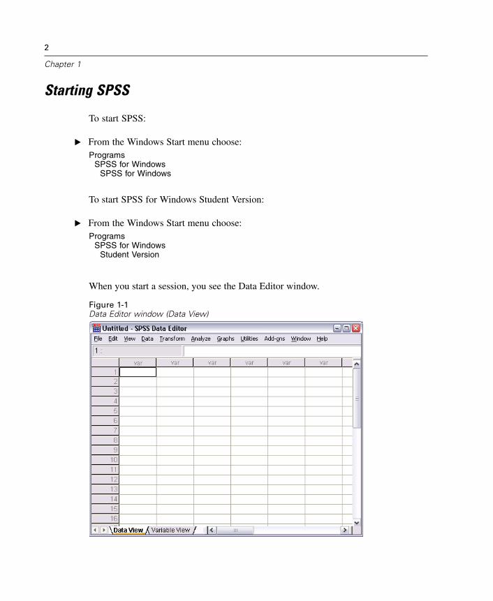
Starting SPSS
To start SPSS:
E From the Windows Start menu choose:Programs
SPSS for WindowsSPSS for Windows
To start SPSS for Windows Student Version:
E From the Windows Start menu choose:Programs
SPSS for WindowsStudent Version
When you start a session, you see the Data Editor window.
Figure 1-1Data Editor window (Data View)
3
Introduction
Variable Display in Dialog Boxes
Either variable names or longer variable labels will appear in list boxes in dialog boxes.Variables in list boxes can be ordered alphabetically or by their position in the file.
In this guide, we will display variable labels in alphabetical order within list boxes.For a new user of SPSS, this setup provides a more complete description of variablesin an easy-to-follow order.
The default setting within SPSS is to display variable labels in file order. To changethe order of variable labels before accessing data:
E From the menus choose:Edit
Options...
E On the General tab, select Display labels in the Variable Lists group.
E Select Alphabetical.
E Click OK, and then click OK to confirm the change.
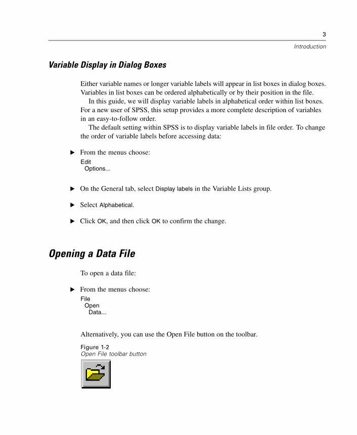
Opening a Data File
To open a data file:
E From the menus choose:File
OpenData...
Alternatively, you can use the Open File button on the toolbar.
Figure 1-2Open File toolbar button
4
Chapter 1
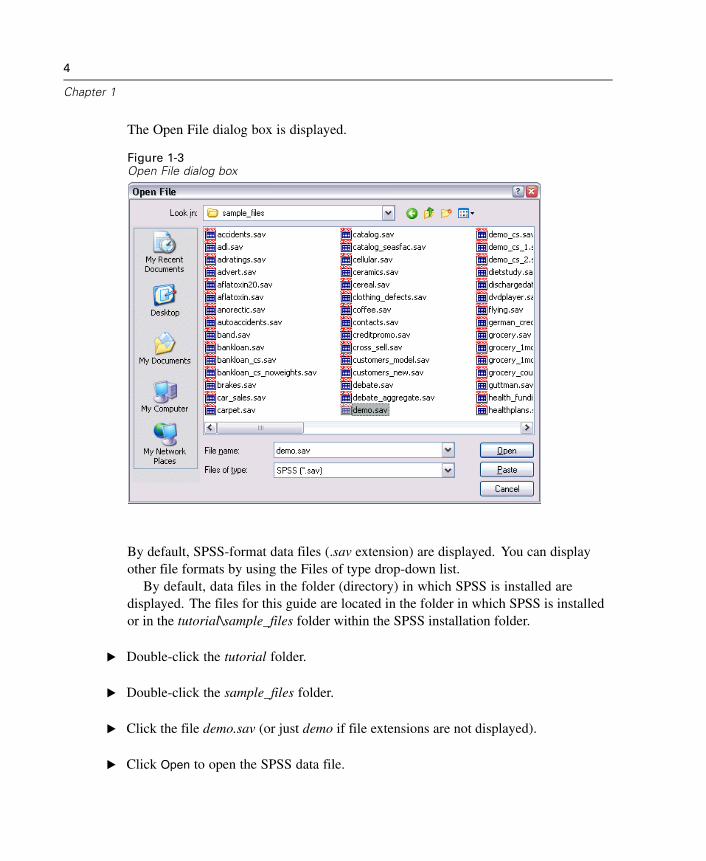
The Open File dialog box is displayed.
Figure 1-3Open File dialog box
By default, SPSS-format data files (.sav extension) are displayed. You can displayother file formats by using the Files of type drop-down list.
By default, data files in the folder (directory) in which SPSS is installed aredisplayed. The files for this guide are located in the folder in which SPSS is installedor in the tutorial\sample_files folder within the SPSS installation folder.
E Double-click the tutorial folder.
E Double-click the sample_files folder.
E Click the file demo.sav (or just demo if file extensions are not displayed).
E Click Open to open the SPSS data file.
5
Introduction
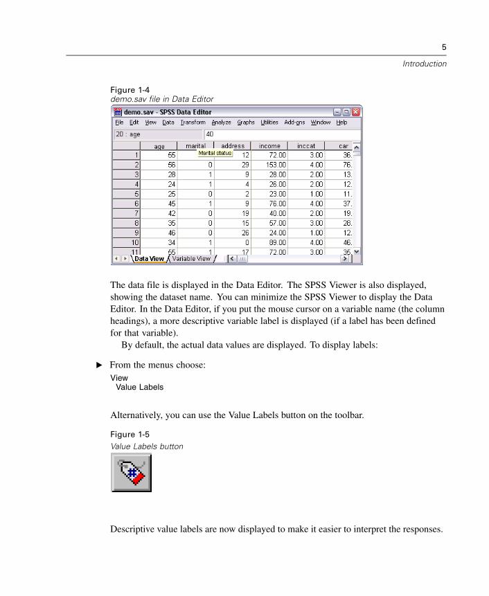
Figure 1-4demo.sav file in Data Editor
The data file is displayed in the Data Editor. The SPSS Viewer is also displayed,showing the dataset name. You can minimize the SPSS Viewer to display the DataEditor. In the Data Editor, if you put the mouse cursor on a variable name (the columnheadings), a more descriptive variable label is displayed (if a label has been definedfor that variable).
By default, the actual data values are displayed. To display labels:
E From the menus choose:View
Value Labels
Alternatively, you can use the Value Labels button on the toolbar.
Figure 1-5Value Labels button
Descriptive value labels are now displayed to make it easier to interpret the responses.
6
Chapter 1
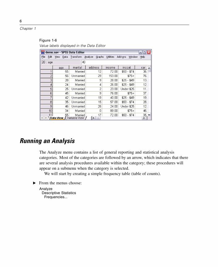
Figure 1-6Value labels displayed in the Data Editor
Running an Analysis
The Analyze menu contains a list of general reporting and statistical analysiscategories. Most of the categories are followed by an arrow, which indicates that thereare several analysis procedures available within the category; these procedures willappear on a submenu when the category is selected.
We will start by creating a simple frequency table (table of counts).
E From the menus choose:Analyze
Descriptive StatisticsFrequencies...
7
Introduction
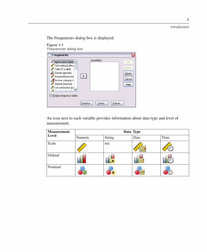
The Frequencies dialog box is displayed.
Figure 1-7Frequencies dialog box
An icon next to each variable provides information about data type and level ofmeasurement.
Data TypeMeasurementLevel Numeric String Date Time
Scale n/a
Ordinal
Nominal
8
Chapter 1
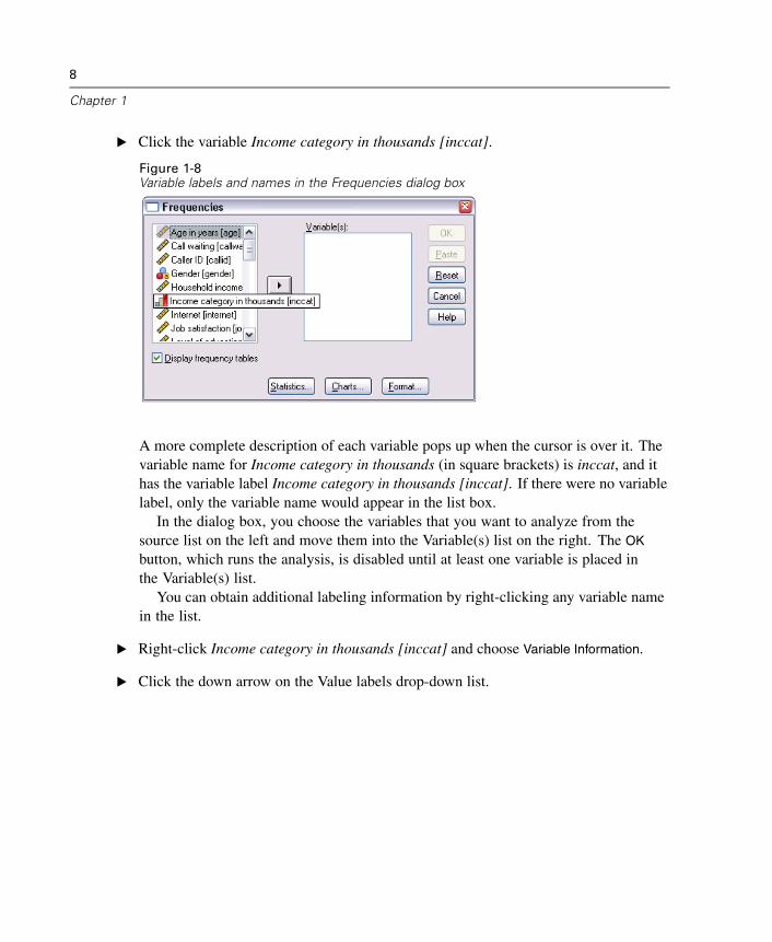
E Click the variable Income category in thousands [inccat].
Figure 1-8Variable labels and names in the Frequencies dialog box
A more complete description of each variable pops up when the cursor is over it. Thevariable name for Income category in thousands (in square brackets) is inccat, and ithas the variable label Income category in thousands [inccat]. If there were no variablelabel, only the variable name would appear in the list box.
In the dialog box, you choose the variables that you want to analyze from thesource list on the left and move them into the Variable(s) list on the right. The OK
button, which runs the analysis, is disabled until at least one variable is placed inthe Variable(s) list.
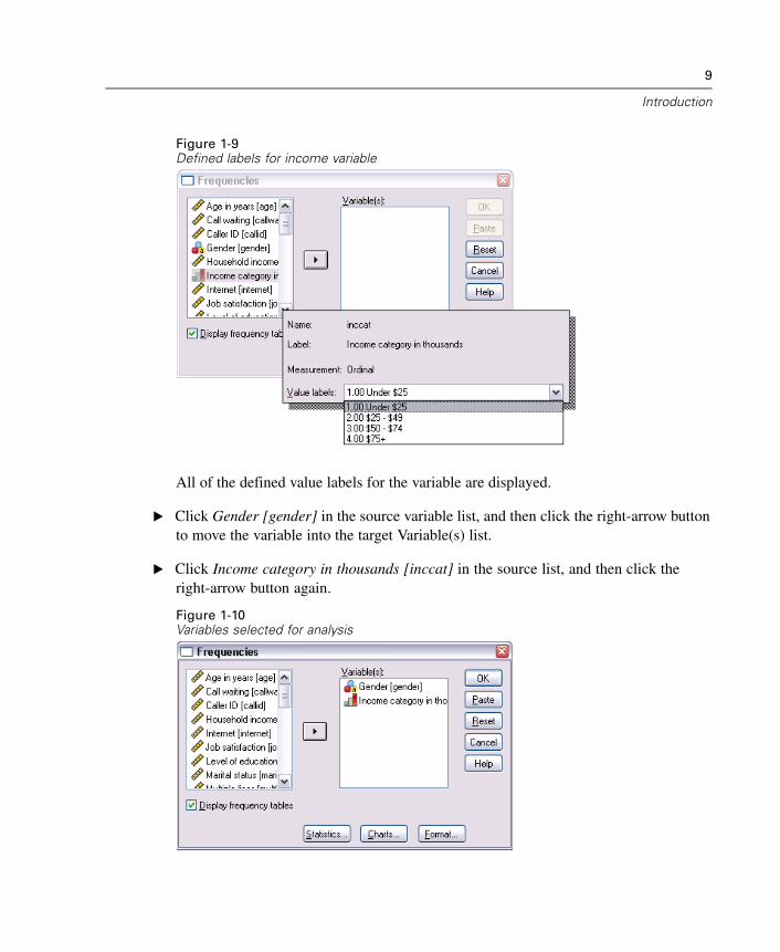
You can obtain additional labeling information by right-clicking any variable namein the list.
E Right-click Income category in thousands [inccat] and choose Variable Information.
E Click the down arrow on the Value labels drop-down list.
9
Introduction
Figure 1-9Defined labels for income variable
All of the defined value labels for the variable are displayed.
E Click Gender [gender] in the source variable list, and then click the right-arrow buttonto move the variable into the target Variable(s) list.
E Click Income category in thousands [inccat] in the source list, and then click theright-arrow button again.
Figure 1-10Variables selected for analysis
10
Chapter 1
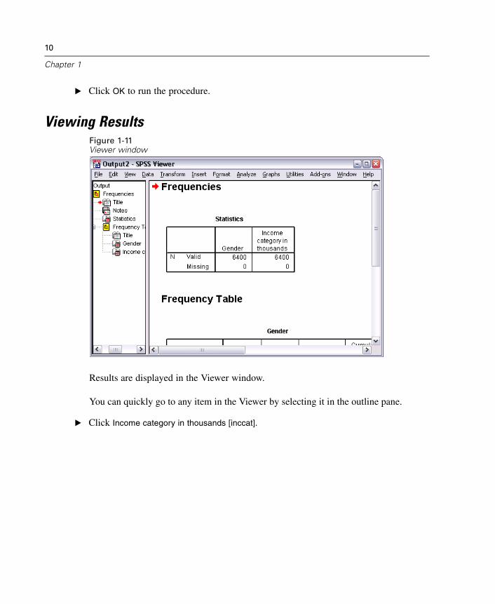
E Click OK to run the procedure.
Viewing ResultsFigure 1-11Viewer window
Results are displayed in the Viewer window.
You can quickly go to any item in the Viewer by selecting it in the outline pane.
E Click Income category in thousands [inccat].
11
Introduction
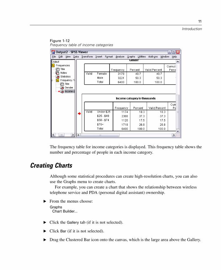
Figure 1-12Frequency table of income categories
The frequency table for income categories is displayed. This frequency table shows thenumber and percentage of people in each income category.
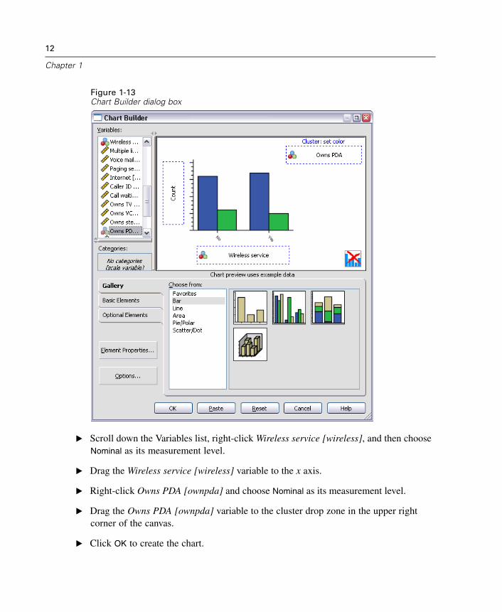
Creating ChartsAlthough some statistical procedures can create high-resolution charts, you can alsouse the Graphs menu to create charts.
For example, you can create a chart that shows the relationship between wirelesstelephone service and PDA (personal digital assistant) ownership.
E From the menus choose:Graphs
Chart Builder...
E Click the Gallery tab (if it is not selected).
E Click Bar (if it is not selected).
E Drag the Clustered Bar icon onto the canvas, which is the large area above the Gallery.
12
Chapter 1
Figure 1-13Chart Builder dialog box
E Scroll down the Variables list, right-click Wireless service [wireless], and then chooseNominal as its measurement level.
E Drag the Wireless service [wireless] variable to the x axis.
E Right-click Owns PDA [ownpda] and choose Nominal as its measurement level.
E Drag the Owns PDA [ownpda] variable to the cluster drop zone in the upper rightcorner of the canvas.
E Click OK to create the chart.
13
Introduction
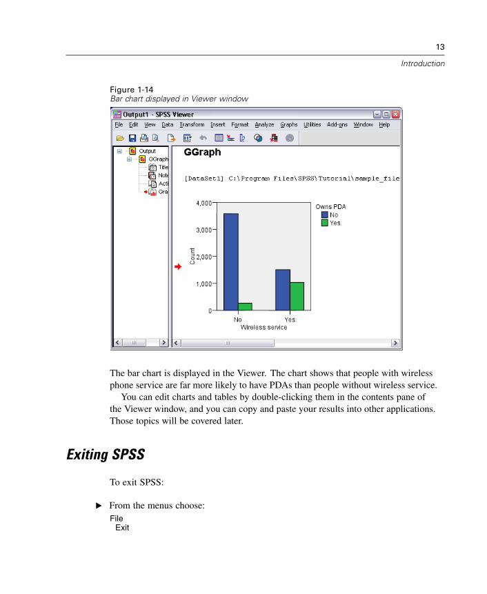
Figure 1-14Bar chart displayed in Viewer window
The bar chart is displayed in the Viewer. The chart shows that people with wirelessphone service are far more likely to have PDAs than people without wireless service.
You can edit charts and tables by double-clicking them in the contents pane ofthe Viewer window, and you can copy and paste your results into other applications.Those topics will be covered later.
Exiting SPSS
To exit SPSS:
E From the menus choose:File
Exit

14
Chapter 1
E Click No if you get an alert asking if you want to save your results.
Chapter
2Using the Help System
Help is available in a number of different ways, including:
Help menu. Every window has a Help menu on the menu bar. The Topics menu itemprovides access to the Help system, where you can use the Contents and Index tabs tofind topics. The Tutorial menu item provides access to the introductory tutorial.
Dialog box Help buttons. Most dialog boxes have a Help button that takes you directlyto a Help topic for that dialog box. The Help topic provides general information andlinks to related topics.
Pivot table context menu Help. Right-click on terms in an activated pivot table in theViewer and select What’s This? from the context menu to display definitions of theterms.
Statistics Coach. The Statistics Coach item on the Help menu provides a wizard-likemethod for finding the right statistical or charting procedure for what you want to do.
Case Studies. The Case Studies item on the Help menu provides hands-on examples ofhow to create various types of statistical analyses and interpret the results. The sampledata files used in the examples are also provided so that you can work through theexamples to see exactly how the results were produced.
Microsoft Internet Explorer Settings
Most Help features in this application use technology based on Microsoft InternetExplorer. Some versions of Internet Explorer (including the version provided withMicrosoft XP, Service Pack 2) will by default block what it considers “active content”in Internet Explorer windows on your local computer. This default setting may result
15
16
Chapter 2
in some blocked content in Help features. To see all Help content, you can changethe default behavior of Internet Explorer.
E From the Internet Explorer menus choose:Tools
Internet Options...
E Click the Advanced tab.
E Scroll down to the Security section.
E Select (check) Allow active content to run in files on My Computer.
Files
This chapter uses the files demo.sav and bhelptut.spo.
Help Contents Tab
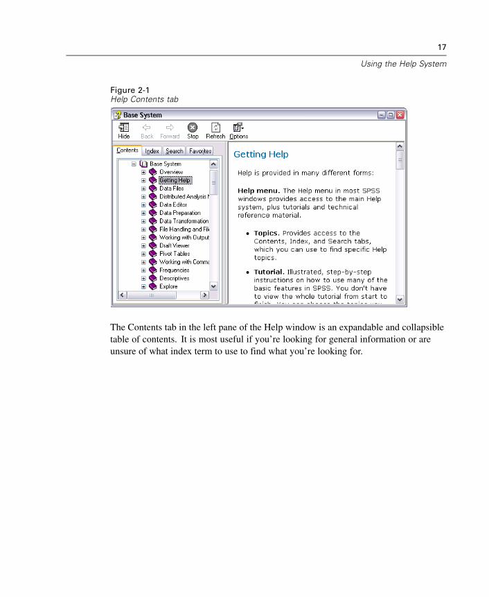
The Topics item on the Help menu opens a Help window.
E From the menus choose:Help
Topics
17
Using the Help System
Figure 2-1Help Contents tab
The Contents tab in the left pane of the Help window is an expandable and collapsibletable of contents. It is most useful if you’re looking for general information or areunsure of what index term to use to find what you’re looking for.
18
Chapter 2
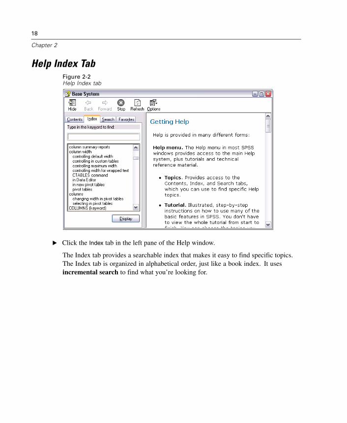
Help Index TabFigure 2-2Help Index tab
E Click the Index tab in the left pane of the Help window.
The Index tab provides a searchable index that makes it easy to find specific topics.The Index tab is organized in alphabetical order, just like a book index. It usesincremental search to find what you’re looking for.
19
Using the Help System
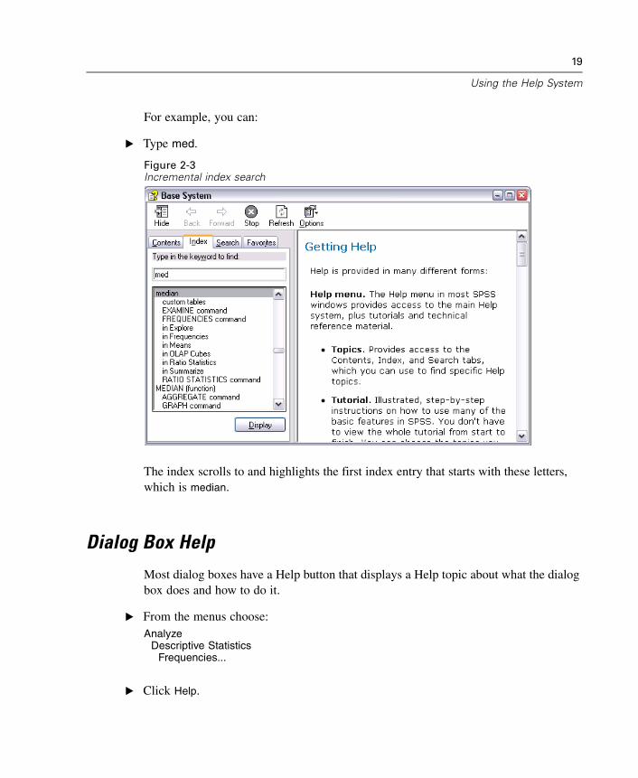
For example, you can:
E Type med.
Figure 2-3Incremental index search
The index scrolls to and highlights the first index entry that starts with these letters,which is median.
Dialog Box Help
Most dialog boxes have a Help button that displays a Help topic about what the dialogbox does and how to do it.
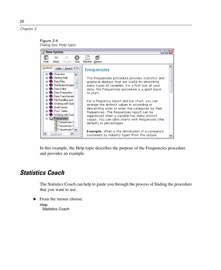
E From the menus choose:Analyze
Descriptive StatisticsFrequencies...
E Click Help.
20
Chapter 2
Figure 2-4Dialog box Help topic
In this example, the Help topic describes the purpose of the Frequencies procedureand provides an example.
Statistics Coach
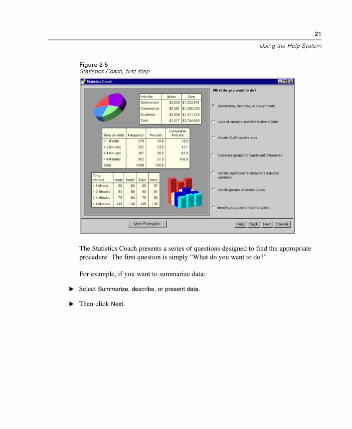
The Statistics Coach can help to guide you through the process of finding the procedurethat you want to use.
E From the menus choose:Help
Statistics Coach
21
Using the Help System
Figure 2-5Statistics Coach, first step
The Statistics Coach presents a series of questions designed to find the appropriateprocedure. The first question is simply “What do you want to do?”
For example, if you want to summarize data:
E Select Summarize, describe, or present data.
E Then click Next.
22
Chapter 2
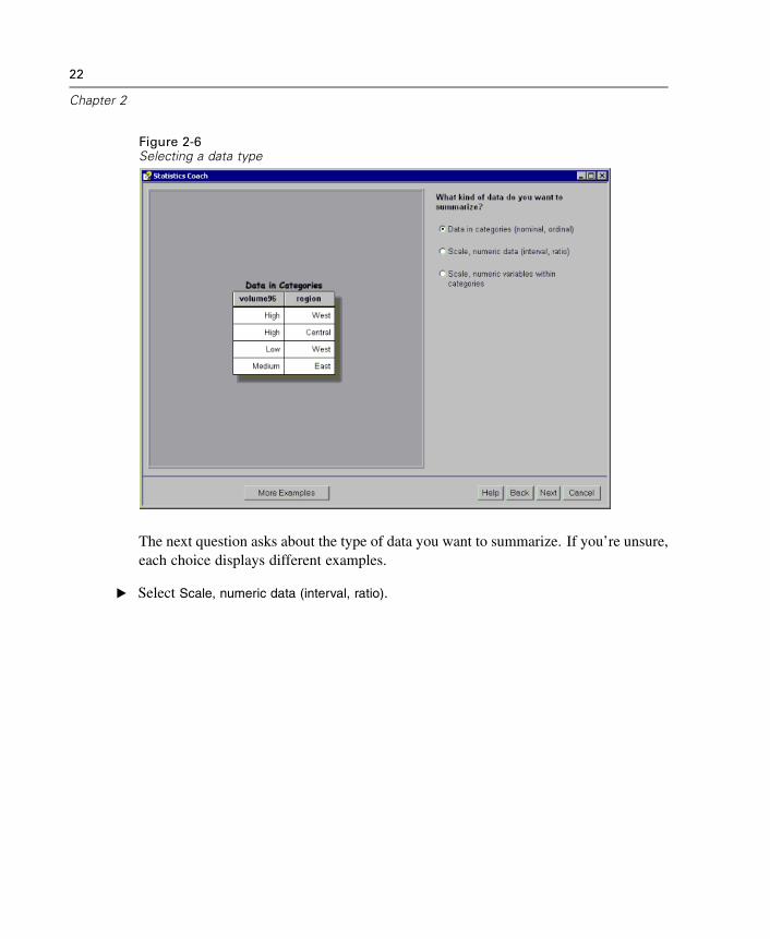
Figure 2-6Selecting a data type
The next question asks about the type of data you want to summarize. If you’re unsure,each choice displays different examples.
E Select Scale, numeric data (interval, ratio).
23
Using the Help System
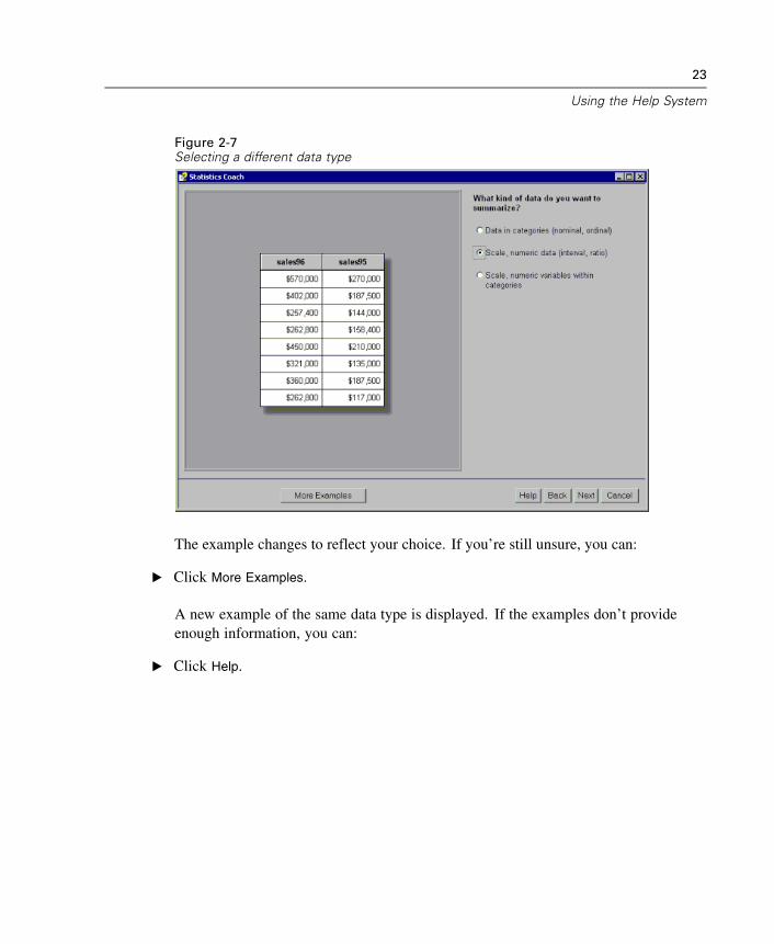
Figure 2-7Selecting a different data type
The example changes to reflect your choice. If you’re still unsure, you can:
E Click More Examples.
A new example of the same data type is displayed. If the examples don’t provideenough information, you can:
E Click Help.
24
Chapter 2
Figure 2-8Statistics Coach Help topic
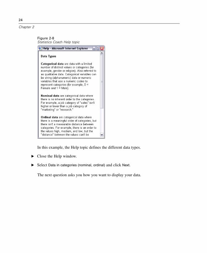
In this example, the Help topic defines the different data types.
E Close the Help window.
E Select Data in categories (nominal, ordinal) and click Next.
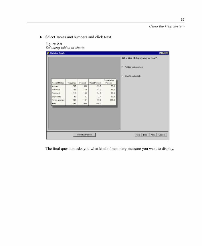
The next question asks you how you want to display your data.
25
Using the Help System
E Select Tables and numbers and click Next.
Figure 2-9Selecting tables or charts
The final question asks you what kind of summary measure you want to display.
26
Chapter 2
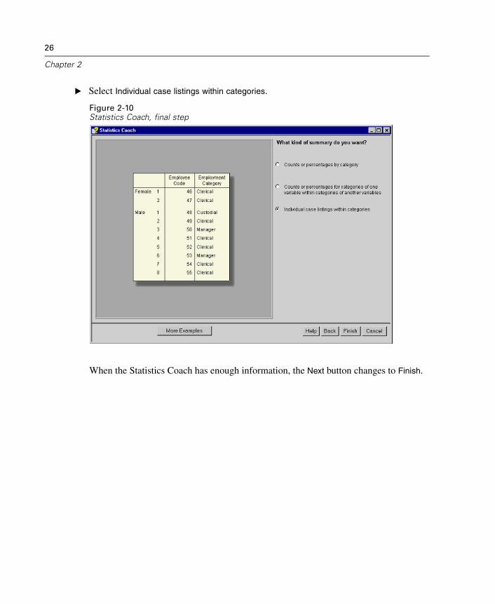
E Select Individual case listings within categories.
Figure 2-10Statistics Coach, final step
When the Statistics Coach has enough information, the Next button changes to Finish.
27
Using the Help System
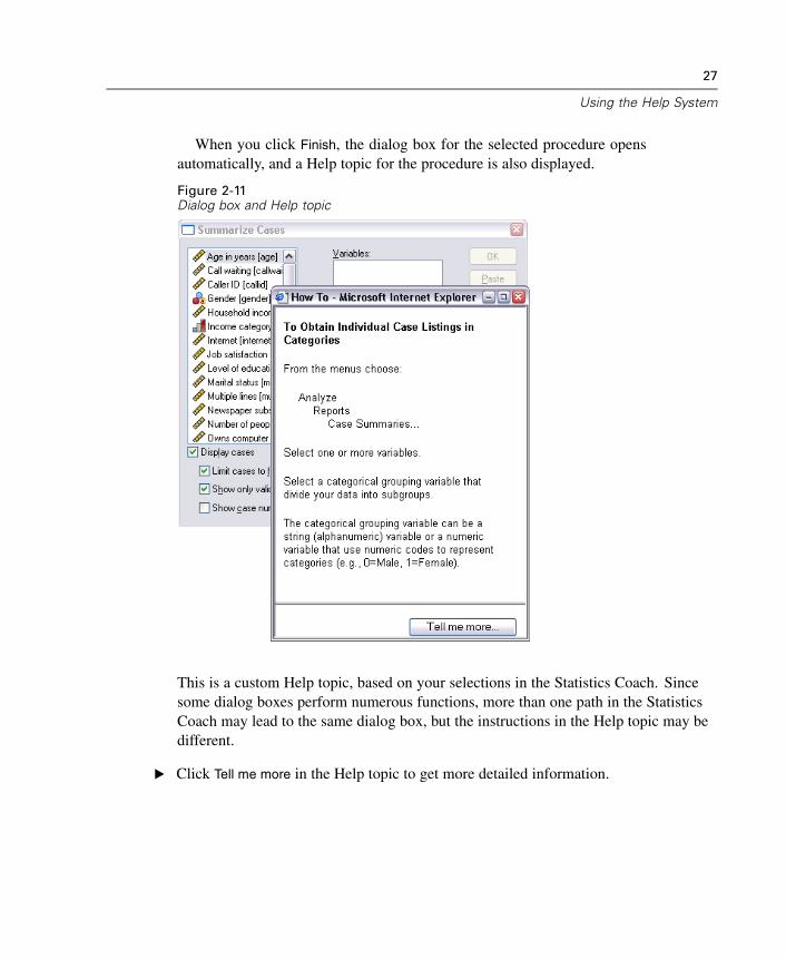
When you click Finish, the dialog box for the selected procedure opensautomatically, and a Help topic for the procedure is also displayed.
Figure 2-11Dialog box and Help topic
This is a custom Help topic, based on your selections in the Statistics Coach. Sincesome dialog boxes perform numerous functions, more than one path in the StatisticsCoach may lead to the same dialog box, but the instructions in the Help topic may bedifferent.
E Click Tell me more in the Help topic to get more detailed information.
28
Chapter 2
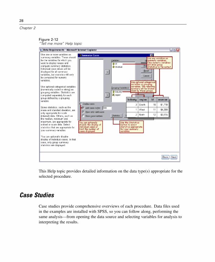
Figure 2-12“Tell me more” Help topic
This Help topic provides detailed information on the data type(s) appropriate for theselected procedure.
Case Studies
Case studies provide comprehensive overviews of each procedure. Data files usedin the examples are installed with SPSS, so you can follow along, performing thesame analysis—from opening the data source and selecting variables for analysis tointerpreting the results.
29
Using the Help System
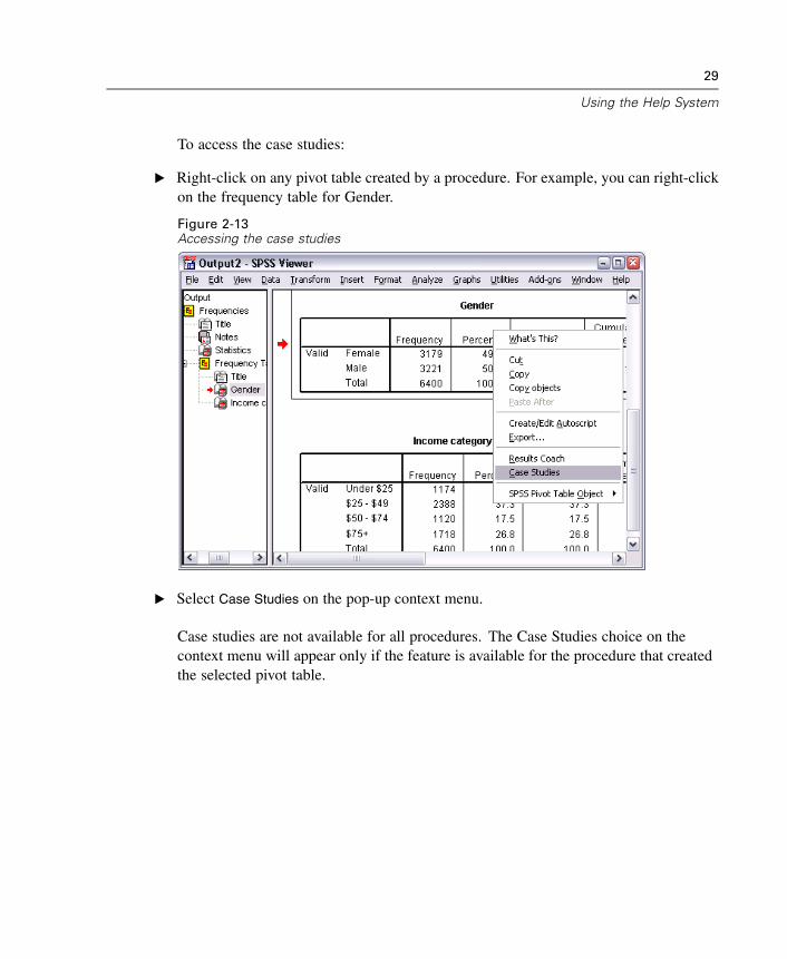
To access the case studies:
E Right-click on any pivot table created by a procedure. For example, you can right-clickon the frequency table for Gender.
Figure 2-13Accessing the case studies
E Select Case Studies on the pop-up context menu.
Case studies are not available for all procedures. The Case Studies choice on thecontext menu will appear only if the feature is available for the procedure that createdthe selected pivot table.

Chapter
3Reading Data
Data can be entered directly into SPSS, or it can be imported from a number ofdifferent sources. The processes for reading data stored in SPSS data files, spreadsheetapplications, such as Microsoft Excel, database applications, such as Microsoft Access,and text files are all discussed in this chapter.
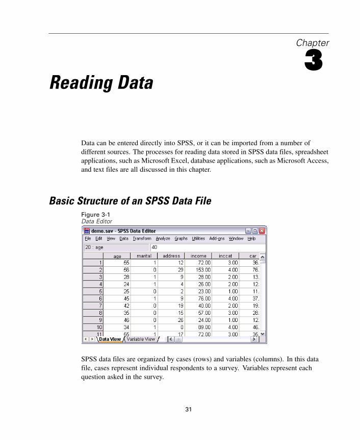
Basic Structure of an SPSS Data FileFigure 3-1Data Editor
SPSS data files are organized by cases (rows) and variables (columns). In this datafile, cases represent individual respondents to a survey. Variables represent eachquestion asked in the survey.
31
32
Chapter 3
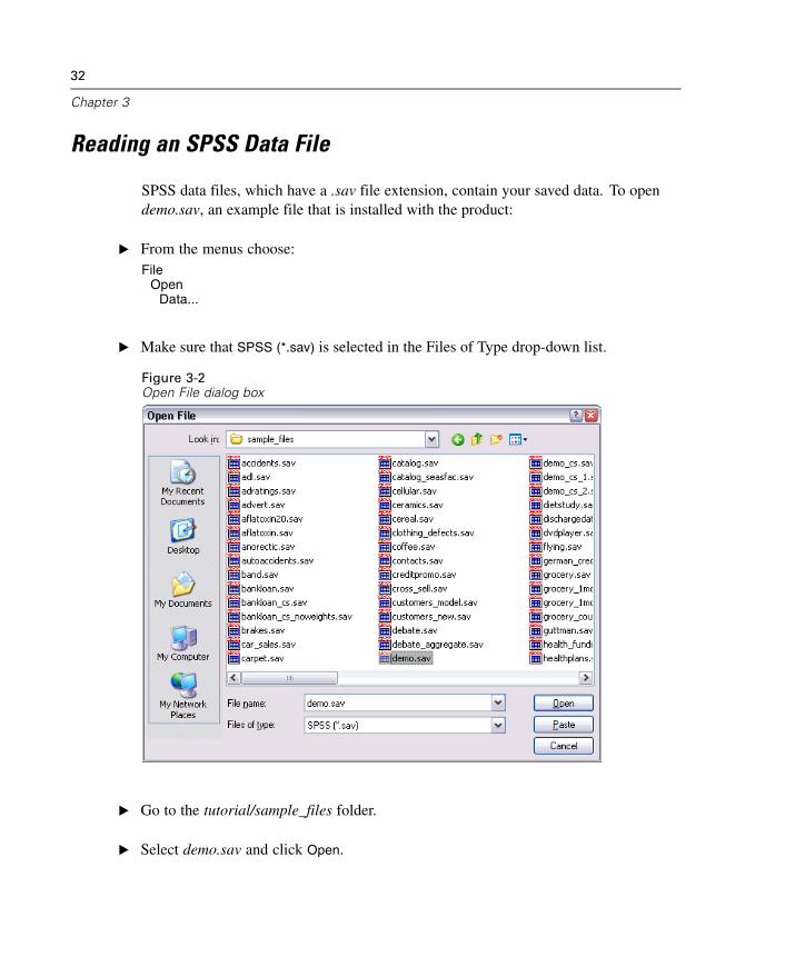
Reading an SPSS Data File
SPSS data files, which have a .sav file extension, contain your saved data. To opendemo.sav, an example file that is installed with the product:
E From the menus choose:File
OpenData...
E Make sure that SPSS (*.sav) is selected in the Files of Type drop-down list.
Figure 3-2Open File dialog box
E Go to the tutorial/sample_files folder.
E Select demo.sav and click Open.
33
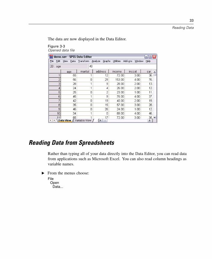
Reading Data
The data are now displayed in the Data Editor.
Figure 3-3Opened data file
Reading Data from Spreadsheets
Rather than typing all of your data directly into the Data Editor, you can read datafrom applications such as Microsoft Excel. You can also read column headings asvariable names.
E From the menus choose:File
OpenData...
34
Chapter 3
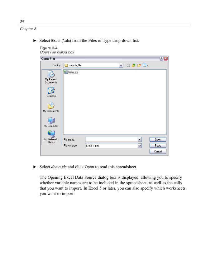
E Select Excel (*.xls) from the Files of Type drop-down list.
Figure 3-4Open File dialog box
E Select demo.xls and click Open to read this spreadsheet.
The Opening Excel Data Source dialog box is displayed, allowing you to specifywhether variable names are to be included in the spreadsheet, as well as the cellsthat you want to import. In Excel 5 or later, you can also specify which worksheetsyou want to import.
35
Reading Data
Figure 3-5Opening Excel Data Source dialog box
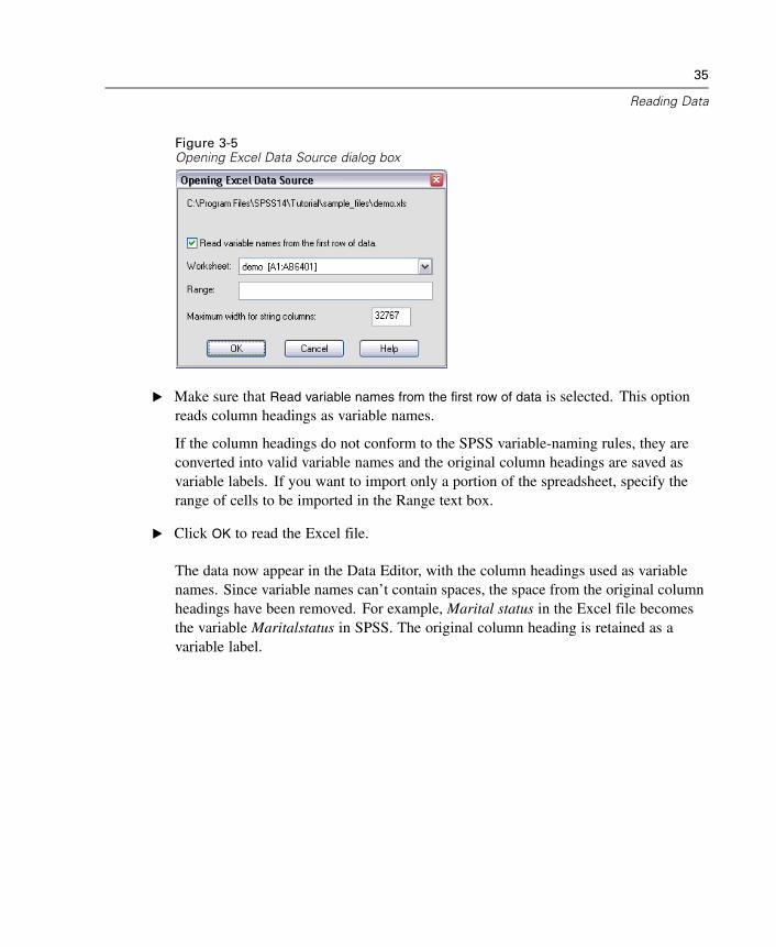
E Make sure that Read variable names from the first row of data is selected. This optionreads column headings as variable names.
If the column headings do not conform to the SPSS variable-naming rules, they areconverted into valid variable names and the original column headings are saved asvariable labels. If you want to import only a portion of the spreadsheet, specify therange of cells to be imported in the Range text box.
E Click OK to read the Excel file.
The data now appear in the Data Editor, with the column headings used as variablenames. Since variable names can’t contain spaces, the space from the original columnheadings have been removed. For example, Marital status in the Excel file becomesthe variable Maritalstatus in SPSS. The original column heading is retained as avariable label.
36
Chapter 3
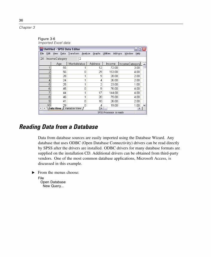
Figure 3-6Imported Excel data
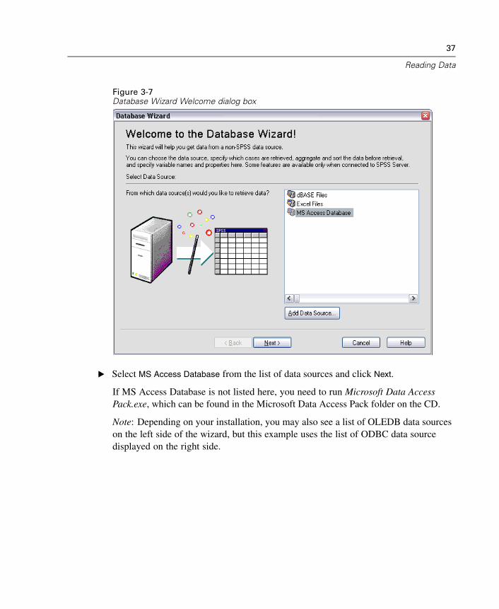
Reading Data from a Database
Data from database sources are easily imported using the Database Wizard. Anydatabase that uses ODBC (Open Database Connectivity) drivers can be read directlyby SPSS after the drivers are installed. ODBC drivers for many database formats aresupplied on the installation CD. Additional drivers can be obtained from third-partyvendors. One of the most common database applications, Microsoft Access, isdiscussed in this example.
E From the menus choose:File
Open DatabaseNew Query...
37
Reading Data
Figure 3-7Database Wizard Welcome dialog box
E Select MS Access Database from the list of data sources and click Next.
If MS Access Database is not listed here, you need to run Microsoft Data AccessPack.exe, which can be found in the Microsoft Data Access Pack folder on the CD.
Note: Depending on your installation, you may also see a list of OLEDB data sourceson the left side of the wizard, but this example uses the list of ODBC data sourcedisplayed on the right side.
38
Chapter 3
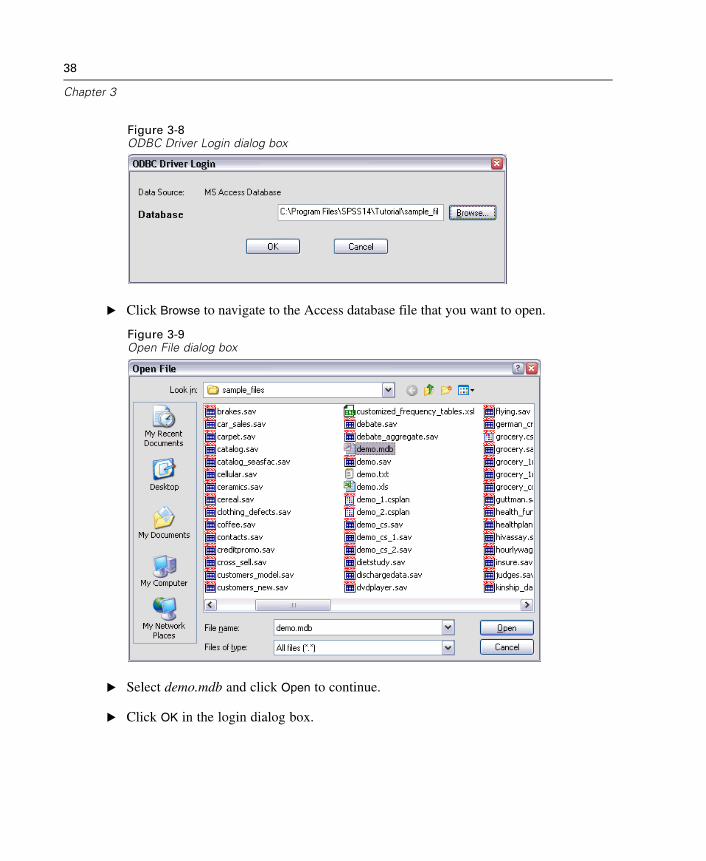
Figure 3-8ODBC Driver Login dialog box
E Click Browse to navigate to the Access database file that you want to open.
Figure 3-9Open File dialog box
E Select demo.mdb and click Open to continue.
E Click OK in the login dialog box.
39
Reading Data
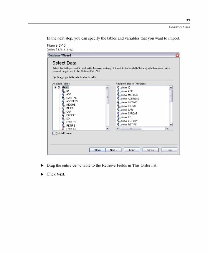
In the next step, you can specify the tables and variables that you want to import.
Figure 3-10Select Data step
E Drag the entire demo table to the Retrieve Fields in This Order list.
E Click Next.
40
Chapter 3
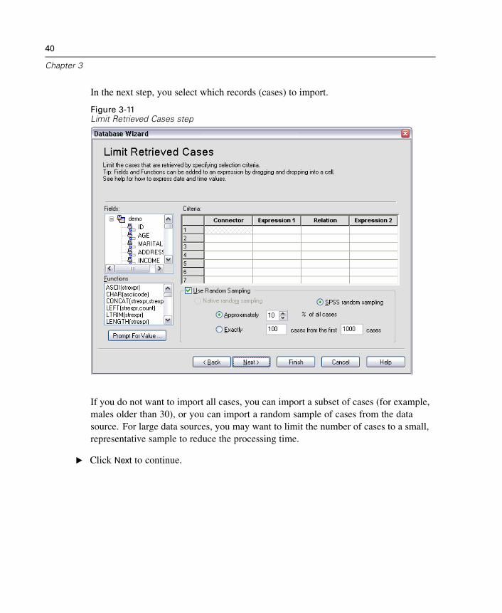
In the next step, you select which records (cases) to import.
Figure 3-11Limit Retrieved Cases step
If you do not want to import all cases, you can import a subset of cases (for example,males older than 30), or you can import a random sample of cases from the datasource. For large data sources, you may want to limit the number of cases to a small,representative sample to reduce the processing time.
E Click Next to continue.
41
Reading Data
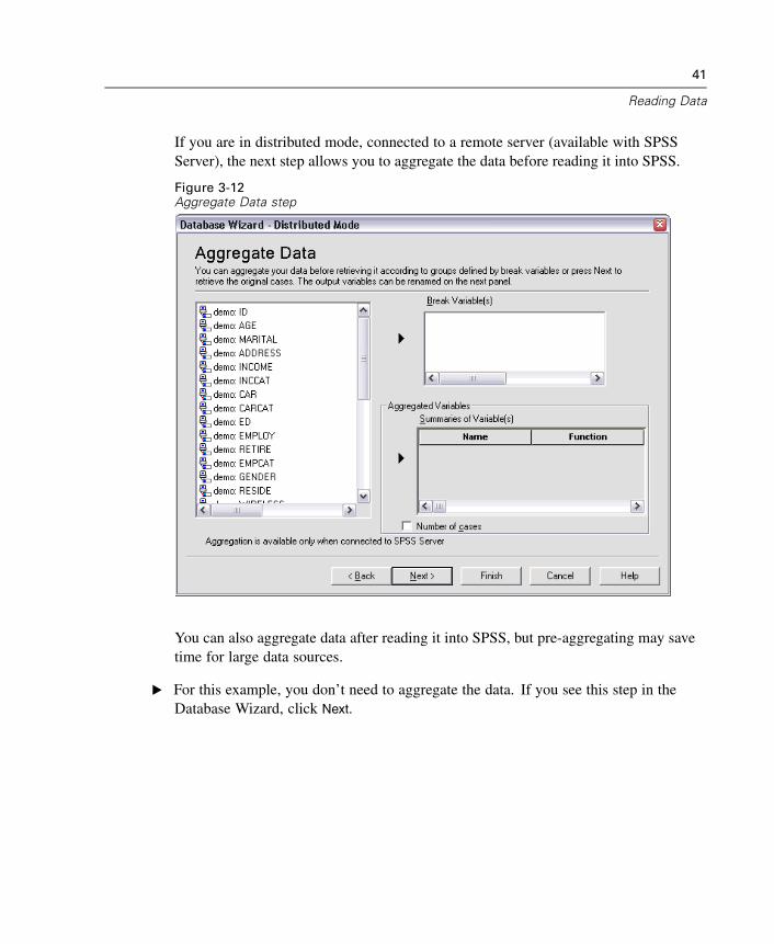
If you are in distributed mode, connected to a remote server (available with SPSSServer), the next step allows you to aggregate the data before reading it into SPSS.
Figure 3-12Aggregate Data step
You can also aggregate data after reading it into SPSS, but pre-aggregating may savetime for large data sources.
E For this example, you don’t need to aggregate the data. If you see this step in theDatabase Wizard, click Next.
42
Chapter 3
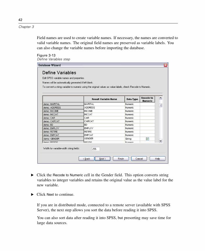
Field names are used to create variable names. If necessary, the names are converted tovalid variable names. The original field names are preserved as variable labels. Youcan also change the variable names before importing the database.
Figure 3-13Define Variables step
E Click the Recode to Numeric cell in the Gender field. This option converts stringvariables to integer variables and retains the original value as the value label for thenew variable.
E Click Next to continue.
If you are in distributed mode, connected to a remote server (available with SPSSServer), the next step allows you sort the data before reading it into SPSS.
You can also sort data after reading it into SPSS, but presorting may save time forlarge data sources.
43
Reading Data
E For this example, you don’t need to sort the data. If you see this step in the DatabaseWizard, click Next.
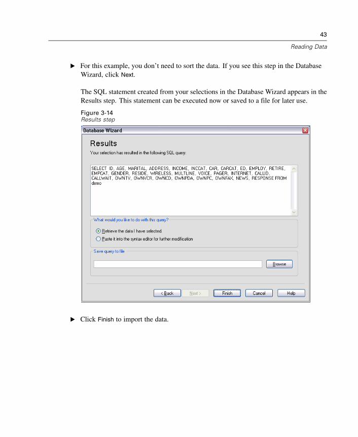
The SQL statement created from your selections in the Database Wizard appears in theResults step. This statement can be executed now or saved to a file for later use.
Figure 3-14Results step
E Click Finish to import the data.
44
Chapter 3
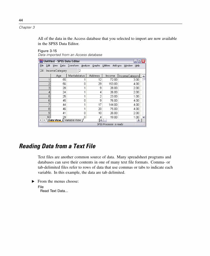
All of the data in the Access database that you selected to import are now availablein the SPSS Data Editor.
Figure 3-15Data imported from an Access database
Reading Data from a Text File
Text files are another common source of data. Many spreadsheet programs anddatabases can save their contents in one of many text file formats. Comma- ortab-delimited files refer to rows of data that use commas or tabs to indicate eachvariable. In this example, the data are tab delimited.
E From the menus choose:File
Read Text Data...
45
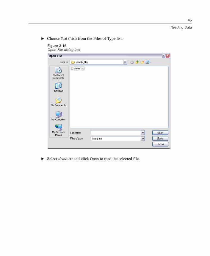
Reading Data
E Choose Text (*.txt) from the Files of Type list.
Figure 3-16Open File dialog box
E Select demo.txt and click Open to read the selected file.
46
Chapter 3
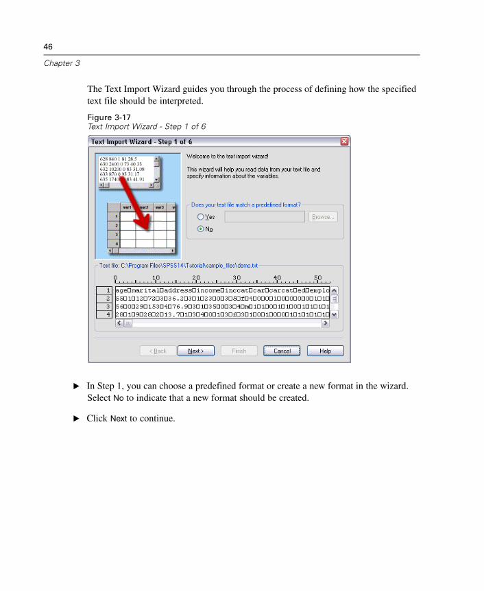
The Text Import Wizard guides you through the process of defining how the specifiedtext file should be interpreted.
Figure 3-17Text Import Wizard - Step 1 of 6
E In Step 1, you can choose a predefined format or create a new format in the wizard.Select No to indicate that a new format should be created.
E Click Next to continue.
47
Reading Data
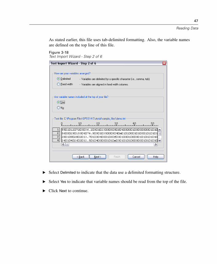
As stated earlier, this file uses tab-delimited formatting. Also, the variable namesare defined on the top line of this file.
Figure 3-18Text Import Wizard - Step 2 of 6
E Select Delimited to indicate that the data use a delimited formatting structure.
E Select Yes to indicate that variable names should be read from the top of the file.
E Click Next to continue.
48
Chapter 3
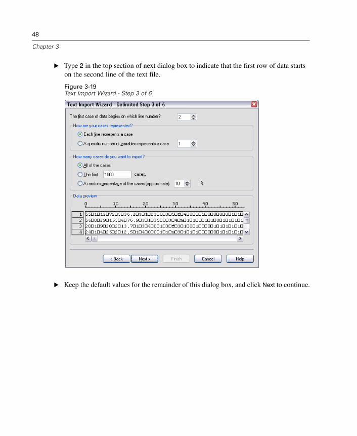
E Type 2 in the top section of next dialog box to indicate that the first row of data startson the second line of the text file.
Figure 3-19Text Import Wizard - Step 3 of 6
E Keep the default values for the remainder of this dialog box, and click Next to continue.
49
Reading Data
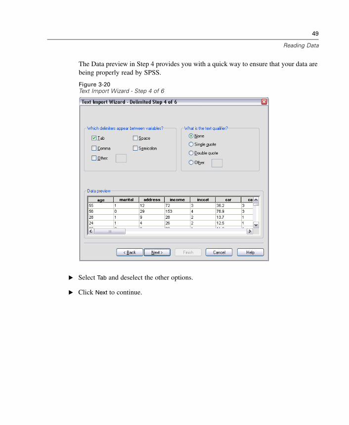
The Data preview in Step 4 provides you with a quick way to ensure that your data arebeing properly read by SPSS.
Figure 3-20Text Import Wizard - Step 4 of 6
E Select Tab and deselect the other options.
E Click Next to continue.
50
Chapter 3
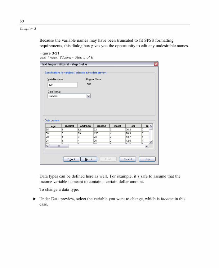
Because the variable names may have been truncated to fit SPSS formattingrequirements, this dialog box gives you the opportunity to edit any undesirable names.
Figure 3-21Text Import Wizard - Step 5 of 6
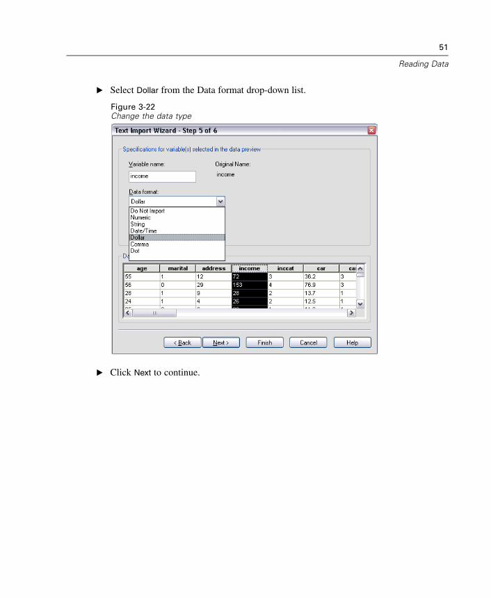
Data types can be defined here as well. For example, it’s safe to assume that theincome variable is meant to contain a certain dollar amount.
To change a data type:
E Under Data preview, select the variable you want to change, which is Income in thiscase.
51
Reading Data
E Select Dollar from the Data format drop-down list.
Figure 3-22Change the data type
E Click Next to continue.
52
Chapter 3
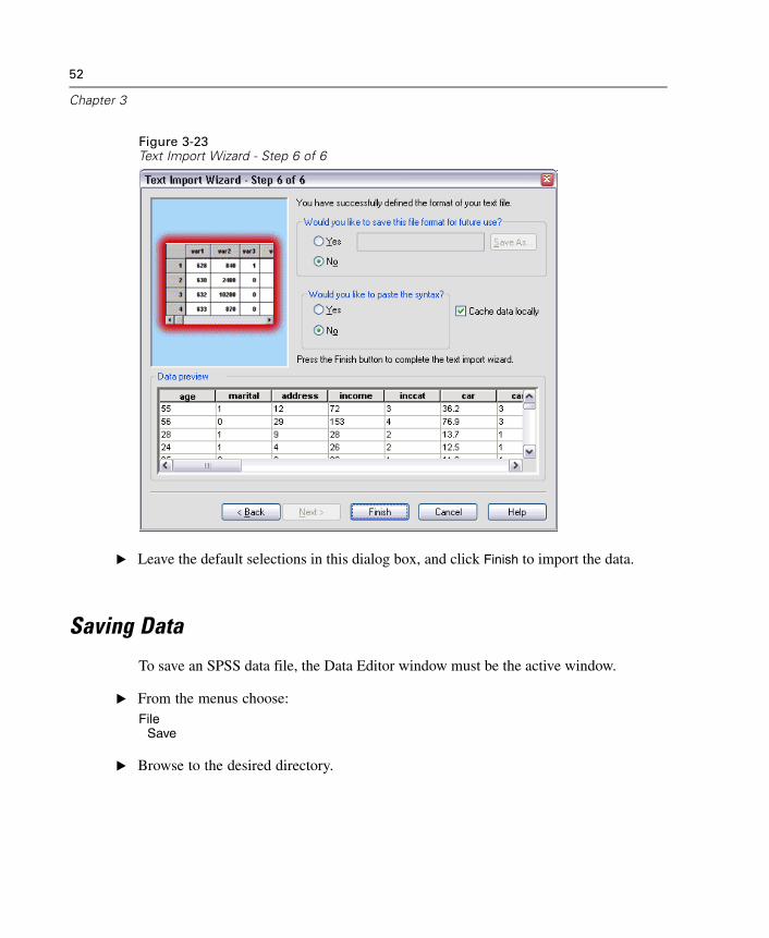
Figure 3-23Text Import Wizard - Step 6 of 6
E Leave the default selections in this dialog box, and click Finish to import the data.
Saving Data
To save an SPSS data file, the Data Editor window must be the active window.
E From the menus choose:File
Save
E Browse to the desired directory.
53
Reading Data
E Type a name for the file in the File Name text box.
The Variables button can be used to select which variables in the Data Editor are savedto the SPSS data file. By default, all variables in the Data Editor are retained.
E Click Save.
The name in the title bar of the Data Editor will change to the filename you specified.This confirms that the file has been successfully saved as an SPSS data file. The filecontains both variable information (names, type, and, if provided, labels and missingvalue codes) and all data values.

Chapter
4Using the Data Editor
The Data Editor displays the contents of the active data file. The information in theData Editor consists of variables and cases.
In Data View, columns represent variables, and rows represent cases (observations).
In Variable View, each row is a variable, and each column is an attribute that isassociated with that variable.
Variables are used to represent the different types of data that you have compiled. Acommon analogy is that of a survey. The response to each question on a survey isequivalent to a variable. Variables come in many different types, including numbers,strings, currency, and dates.
Entering Numeric Data
Data can be entered into the Data Editor, which may be useful for small data files orfor making minor edits to larger data files.
E Click the Variable View tab at the bottom of the Data Editor window.
You need to define the variables that will be used. In this case, only three variables areneeded: age, marital status, and income.
55
56
Chapter 4
Figure 4-1Variable names in Variable View
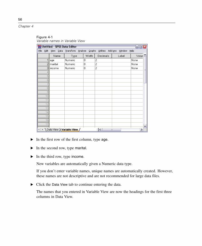
E In the first row of the first column, type age.
E In the second row, type marital.
E In the third row, type income.
New variables are automatically given a Numeric data type.
If you don’t enter variable names, unique names are automatically created. However,these names are not descriptive and are not recommended for large data files.
E Click the Data View tab to continue entering the data.
The names that you entered in Variable View are now the headings for the first threecolumns in Data View.
57
Using the Data Editor
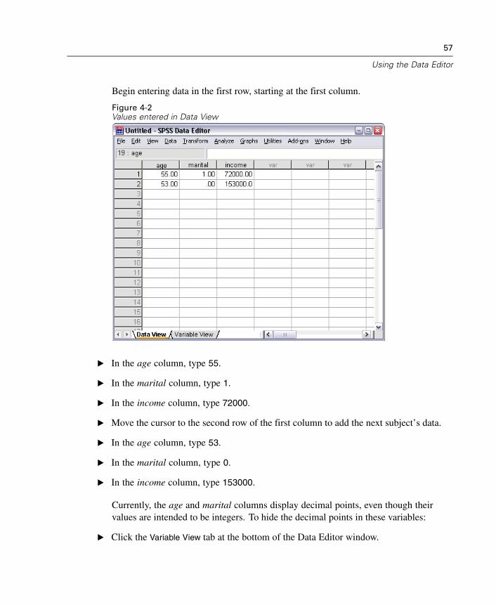
Begin entering data in the first row, starting at the first column.
Figure 4-2Values entered in Data View
E In the age column, type 55.
E In the marital column, type 1.
E In the income column, type 72000.
E Move the cursor to the second row of the first column to add the next subject’s data.
E In the age column, type 53.
E In the marital column, type 0.
E In the income column, type 153000.
Currently, the age and marital columns display decimal points, even though theirvalues are intended to be integers. To hide the decimal points in these variables:
E Click the Variable View tab at the bottom of the Data Editor window.
58
Chapter 4
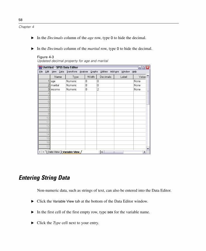
E In the Decimals column of the age row, type 0 to hide the decimal.
E In the Decimals column of the marital row, type 0 to hide the decimal.
Figure 4-3Updated decimal property for age and marital
Entering String Data
Non-numeric data, such as strings of text, can also be entered into the Data Editor.
E Click the Variable View tab at the bottom of the Data Editor window.
E In the first cell of the first empty row, type sex for the variable name.
E Click the Type cell next to your entry.
59
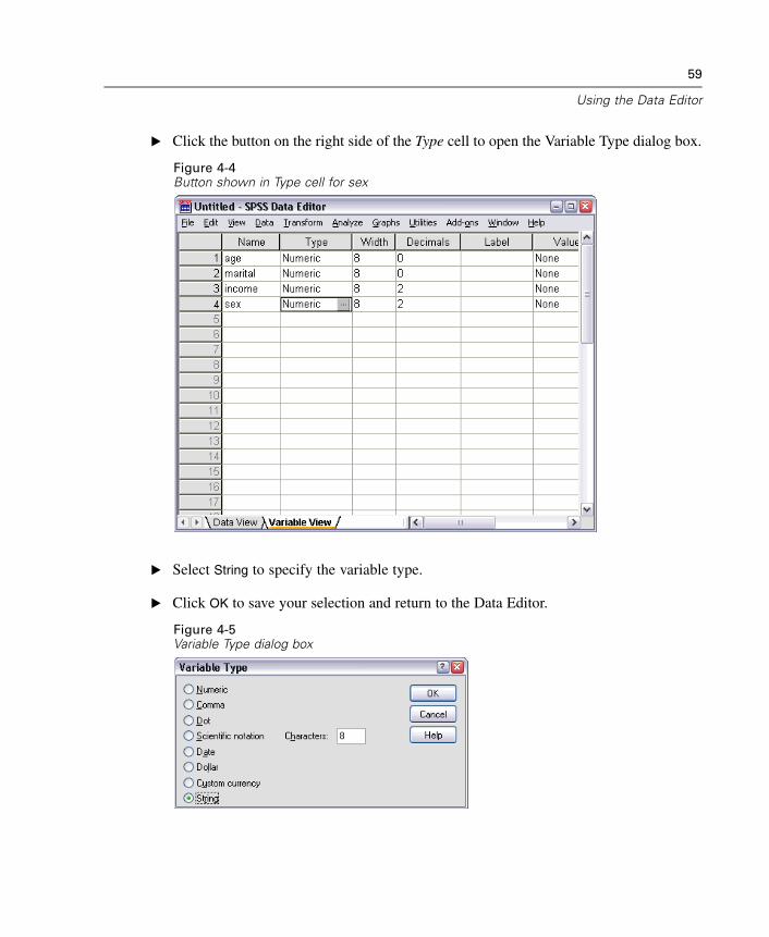
Using the Data Editor
E Click the button on the right side of the Type cell to open the Variable Type dialog box.
Figure 4-4Button shown in Type cell for sex
E Select String to specify the variable type.
E Click OK to save your selection and return to the Data Editor.
Figure 4-5Variable Type dialog box
60
Chapter 4
Defining Data
In addition to defining data types, you can also define descriptive variable labels andvalue labels for variable names and data values. These descriptive labels are usedin statistical reports and charts.
Adding Variable Labels
Labels are meant to provide descriptions of variables. These descriptions are oftenlonger versions of variable names. Labels can be up to 255 bytes. These labels areused in your output to identify the different variables.
E Click the Variable View tab at the bottom of the Data Editor window.
E In the Label column of the age row, type Respondent's Age.
E In the Label column of the marital row, type Marital Status.
E In the Label column of the income row, type Household Income.
61
Using the Data Editor
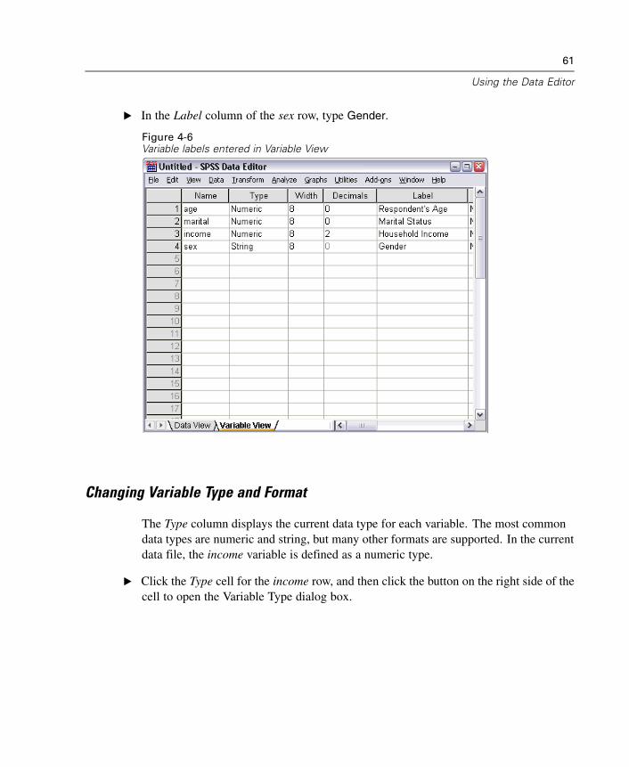
E In the Label column of the sex row, type Gender.
Figure 4-6Variable labels entered in Variable View
Changing Variable Type and Format
The Type column displays the current data type for each variable. The most commondata types are numeric and string, but many other formats are supported. In the currentdata file, the income variable is defined as a numeric type.
E Click the Type cell for the income row, and then click the button on the right side of thecell to open the Variable Type dialog box.
62
Chapter 4
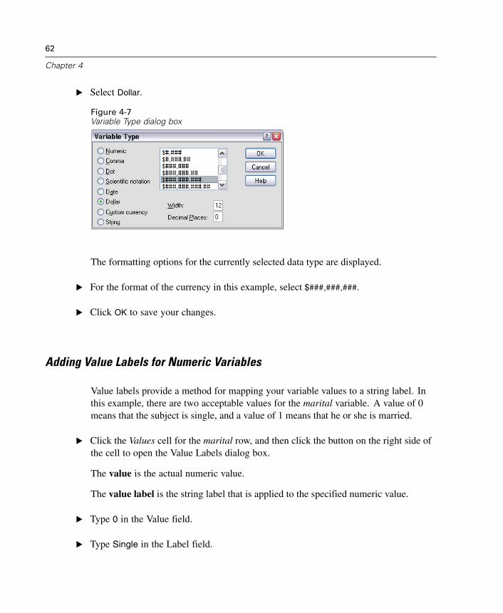
E Select Dollar.
Figure 4-7Variable Type dialog box
The formatting options for the currently selected data type are displayed.
E For the format of the currency in this example, select $###,###,###.
E Click OK to save your changes.
Adding Value Labels for Numeric Variables
Value labels provide a method for mapping your variable values to a string label. Inthis example, there are two acceptable values for the marital variable. A value of 0means that the subject is single, and a value of 1 means that he or she is married.
E Click the Values cell for the marital row, and then click the button on the right side ofthe cell to open the Value Labels dialog box.
The value is the actual numeric value.
The value label is the string label that is applied to the specified numeric value.
E Type 0 in the Value field.
E Type Single in the Label field.
63
Using the Data Editor
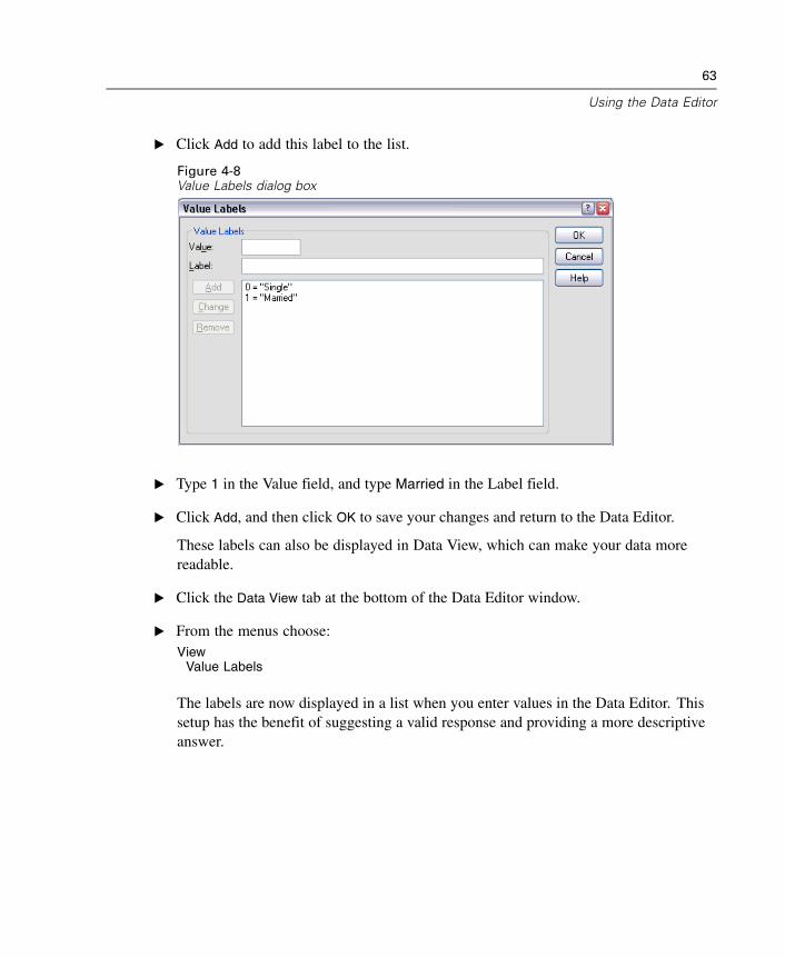
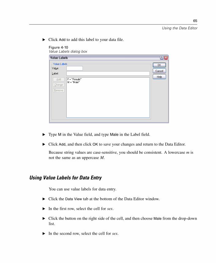
E Click Add to add this label to the list.
Figure 4-8Value Labels dialog box
E Type 1 in the Value field, and type Married in the Label field.
E Click Add, and then click OK to save your changes and return to the Data Editor.
These labels can also be displayed in Data View, which can make your data morereadable.
E Click the Data View tab at the bottom of the Data Editor window.
E From the menus choose:View
Value Labels
The labels are now displayed in a list when you enter values in the Data Editor. Thissetup has the benefit of suggesting a valid response and providing a more descriptiveanswer.
64
Chapter 4
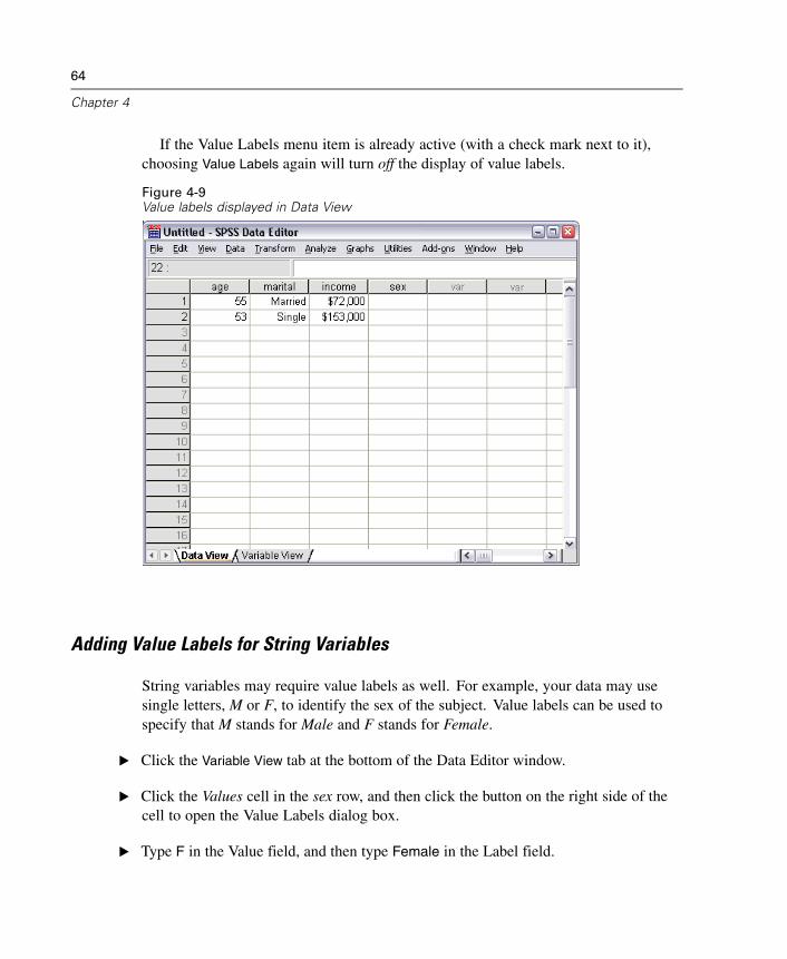
If the Value Labels menu item is already active (with a check mark next to it),choosing Value Labels again will turn off the display of value labels.
Figure 4-9Value labels displayed in Data View
Adding Value Labels for String Variables
String variables may require value labels as well. For example, your data may usesingle letters, M or F, to identify the sex of the subject. Value labels can be used tospecify that M stands for Male and F stands for Female.
E Click the Variable View tab at the bottom of the Data Editor window.
E Click the Values cell in the sex row, and then click the button on the right side of thecell to open the Value Labels dialog box.
E Type F in the Value field, and then type Female in the Label field.
65
Using the Data Editor
E Click Add to add this label to your data file.
Figure 4-10Value Labels dialog box
E Type M in the Value field, and type Male in the Label field.
E Click Add, and then click OK to save your changes and return to the Data Editor.
Because string values are case-sensitive, you should be consistent. A lowercase m isnot the same as an uppercase M.
Using Value Labels for Data Entry
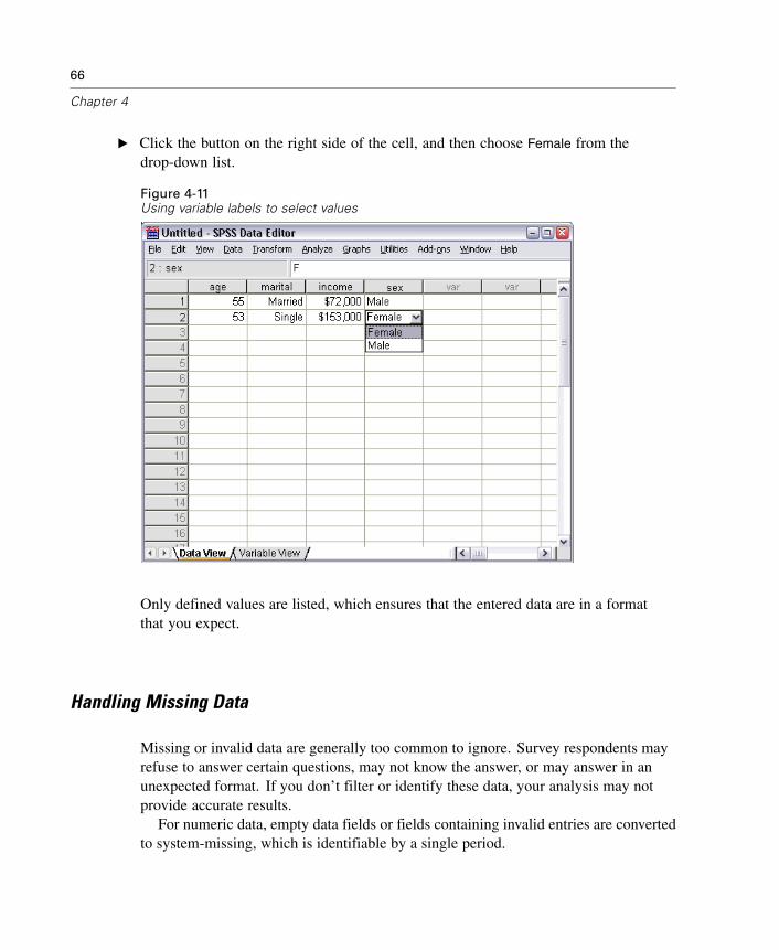
You can use value labels for data entry.
E Click the Data View tab at the bottom of the Data Editor window.
E In the first row, select the cell for sex.
E Click the button on the right side of the cell, and then choose Male from the drop-downlist.
E In the second row, select the cell for sex.
66
Chapter 4
E Click the button on the right side of the cell, and then choose Female from thedrop-down list.
Figure 4-11Using variable labels to select values
Only defined values are listed, which ensures that the entered data are in a formatthat you expect.
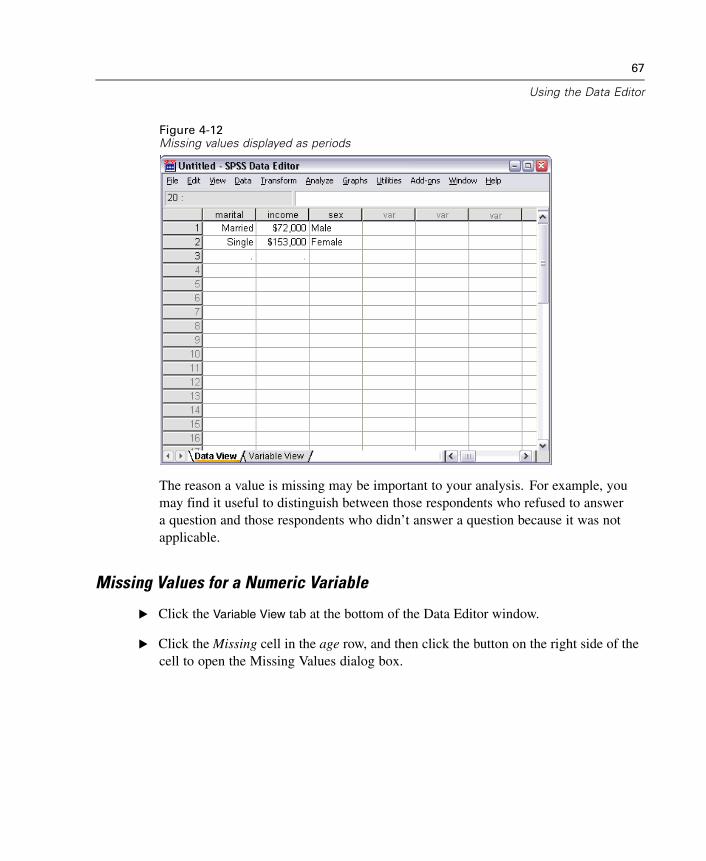
Handling Missing Data
Missing or invalid data are generally too common to ignore. Survey respondents mayrefuse to answer certain questions, may not know the answer, or may answer in anunexpected format. If you don’t filter or identify these data, your analysis may notprovide accurate results.
For numeric data, empty data fields or fields containing invalid entries are convertedto system-missing, which is identifiable by a single period.
67
Using the Data Editor
Figure 4-12Missing values displayed as periods
The reason a value is missing may be important to your analysis. For example, youmay find it useful to distinguish between those respondents who refused to answera question and those respondents who didn’t answer a question because it was notapplicable.
Missing Values for a Numeric Variable
E Click the Variable View tab at the bottom of the Data Editor window.
E Click the Missing cell in the age row, and then click the button on the right side of thecell to open the Missing Values dialog box.
68
Chapter 4
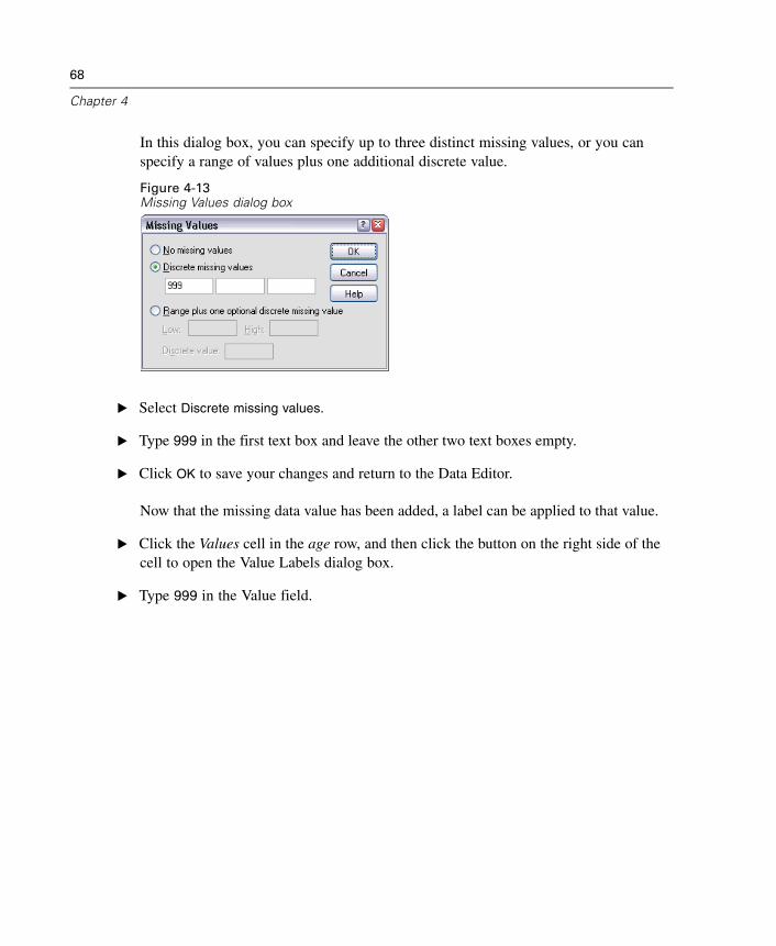
In this dialog box, you can specify up to three distinct missing values, or you canspecify a range of values plus one additional discrete value.
Figure 4-13Missing Values dialog box
E Select Discrete missing values.
E Type 999 in the first text box and leave the other two text boxes empty.
E Click OK to save your changes and return to the Data Editor.
Now that the missing data value has been added, a label can be applied to that value.
E Click the Values cell in the age row, and then click the button on the right side of thecell to open the Value Labels dialog box.
E Type 999 in the Value field.
69
Using the Data Editor
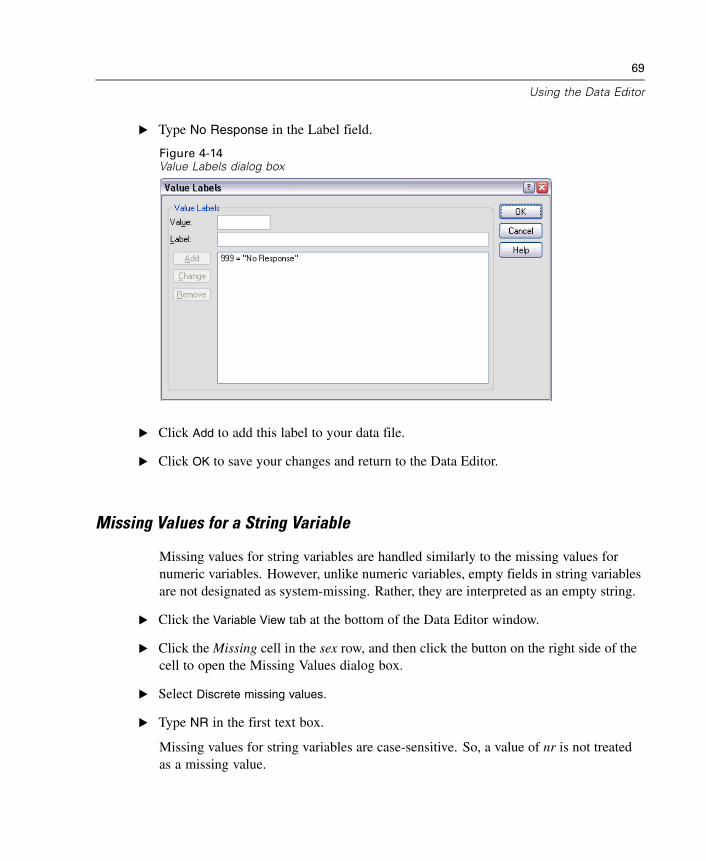
E Type No Response in the Label field.
Figure 4-14Value Labels dialog box
E Click Add to add this label to your data file.
E Click OK to save your changes and return to the Data Editor.
Missing Values for a String Variable
Missing values for string variables are handled similarly to the missing values fornumeric variables. However, unlike numeric variables, empty fields in string variablesare not designated as system-missing. Rather, they are interpreted as an empty string.
E Click the Variable View tab at the bottom of the Data Editor window.
E Click the Missing cell in the sex row, and then click the button on the right side of thecell to open the Missing Values dialog box.
E Select Discrete missing values.
E Type NR in the first text box.
Missing values for string variables are case-sensitive. So, a value of nr is not treatedas a missing value.
70
Chapter 4
E Click OK to save your changes and return to the Data Editor.
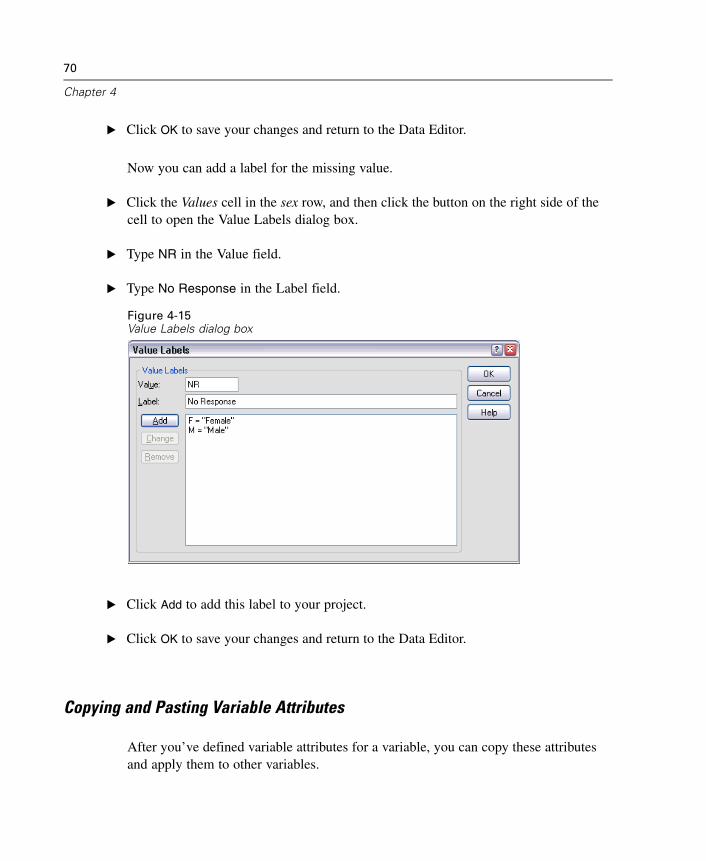
Now you can add a label for the missing value.
E Click the Values cell in the sex row, and then click the button on the right side of thecell to open the Value Labels dialog box.
E Type NR in the Value field.
E Type No Response in the Label field.
Figure 4-15Value Labels dialog box
E Click Add to add this label to your project.
E Click OK to save your changes and return to the Data Editor.
Copying and Pasting Variable Attributes
After you’ve defined variable attributes for a variable, you can copy these attributesand apply them to other variables.
71
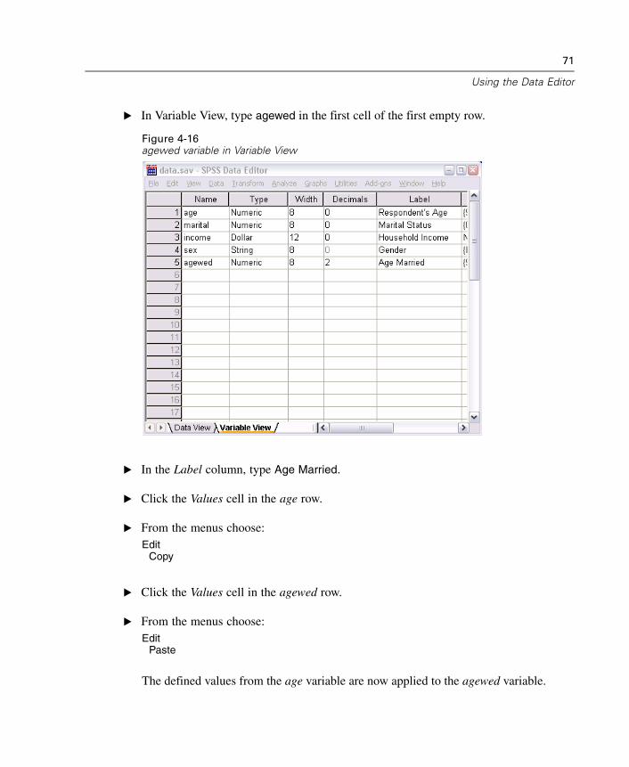
Using the Data Editor
E In Variable View, type agewed in the first cell of the first empty row.
Figure 4-16agewed variable in Variable View
E In the Label column, type Age Married.
E Click the Values cell in the age row.
E From the menus choose:Edit
Copy
E Click the Values cell in the agewed row.
E From the menus choose:Edit
Paste
The defined values from the age variable are now applied to the agewed variable.
72
Chapter 4
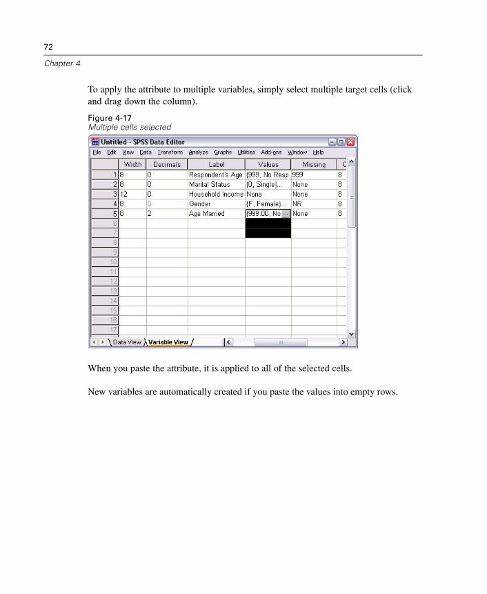
To apply the attribute to multiple variables, simply select multiple target cells (clickand drag down the column).
Figure 4-17Multiple cells selected
When you paste the attribute, it is applied to all of the selected cells.
New variables are automatically created if you paste the values into empty rows.
73
Using the Data Editor
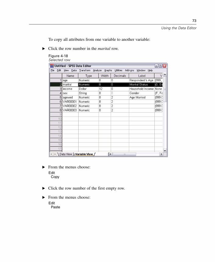
To copy all attributes from one variable to another variable:
E Click the row number in the marital row.
Figure 4-18Selected row
E From the menus choose:Edit
Copy
E Click the row number of the first empty row.
E From the menus choose:Edit
Paste
74
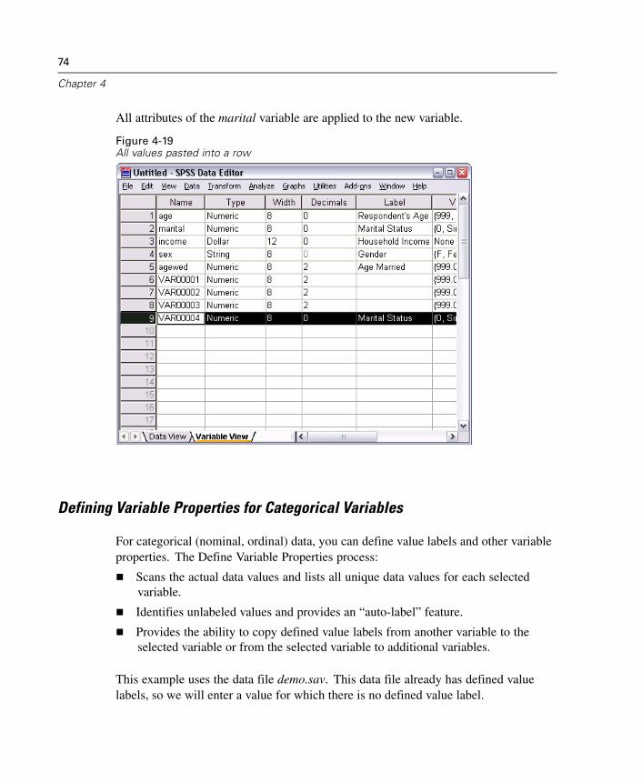
Chapter 4
All attributes of the marital variable are applied to the new variable.
Figure 4-19All values pasted into a row
Defining Variable Properties for Categorical Variables
For categorical (nominal, ordinal) data, you can define value labels and other variableproperties. The Define Variable Properties process:
Scans the actual data values and lists all unique data values for each selectedvariable.
Identifies unlabeled values and provides an “auto-label” feature.
Provides the ability to copy defined value labels from another variable to theselected variable or from the selected variable to additional variables.
This example uses the data file demo.sav. This data file already has defined valuelabels, so we will enter a value for which there is no defined value label.
75
Using the Data Editor
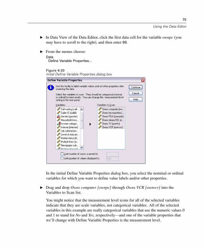
E In Data View of the Data Editor, click the first data cell for the variable ownpc (youmay have to scroll to the right), and then enter 99.
E From the menus choose:Data
Define Variable Properties...
Figure 4-20Initial Define Variable Properties dialog box
In the initial Define Variable Properties dialog box, you select the nominal or ordinalvariables for which you want to define value labels and/or other properties.
E Drag and drop Owns computer [ownpc] through Owns VCR [ownvcr] into theVariables to Scan list.
You might notice that the measurement level icons for all of the selected variablesindicate that they are scale variables, not categorical variables. All of the selectedvariables in this example are really categorical variables that use the numeric values 0and 1 to stand for No and Yes, respectively—and one of the variable properties thatwe’ll change with Define Variable Properties is the measurement level.
76
Chapter 4
E Click Continue.
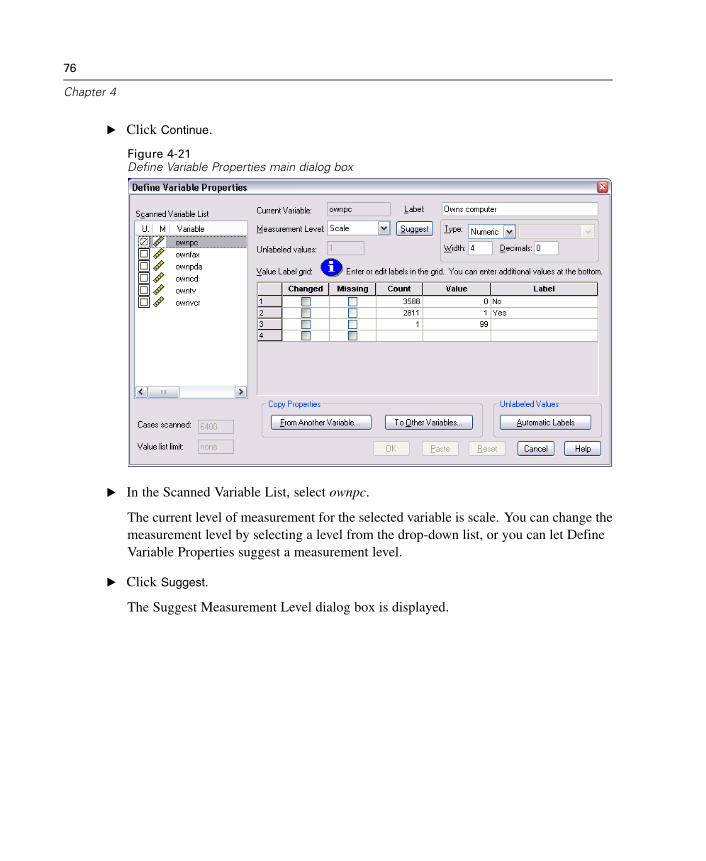
Figure 4-21Define Variable Properties main dialog box
E In the Scanned Variable List, select ownpc.
The current level of measurement for the selected variable is scale. You can change themeasurement level by selecting a level from the drop-down list, or you can let DefineVariable Properties suggest a measurement level.
E Click Suggest.
The Suggest Measurement Level dialog box is displayed.
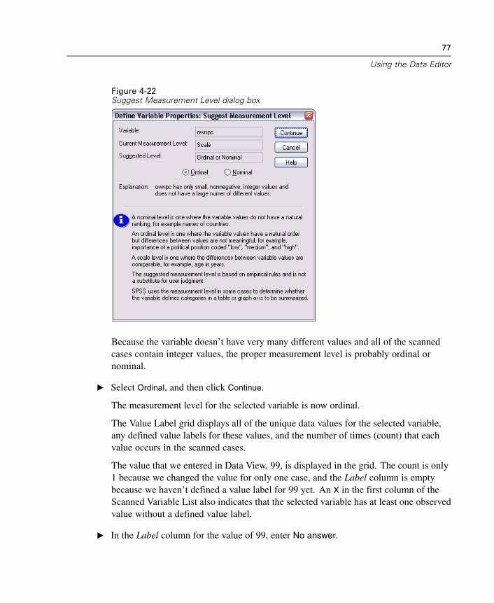
77
Using the Data Editor
Figure 4-22Suggest Measurement Level dialog box
Because the variable doesn’t have very many different values and all of the scannedcases contain integer values, the proper measurement level is probably ordinal ornominal.
E Select Ordinal, and then click Continue.
The measurement level for the selected variable is now ordinal.
The Value Label grid displays all of the unique data values for the selected variable,any defined value labels for these values, and the number of times (count) that eachvalue occurs in the scanned cases.
The value that we entered in Data View, 99, is displayed in the grid. The count is only1 because we changed the value for only one case, and the Label column is emptybecause we haven’t defined a value label for 99 yet. An X in the first column of theScanned Variable List also indicates that the selected variable has at least one observedvalue without a defined value label.
E In the Label column for the value of 99, enter No answer.
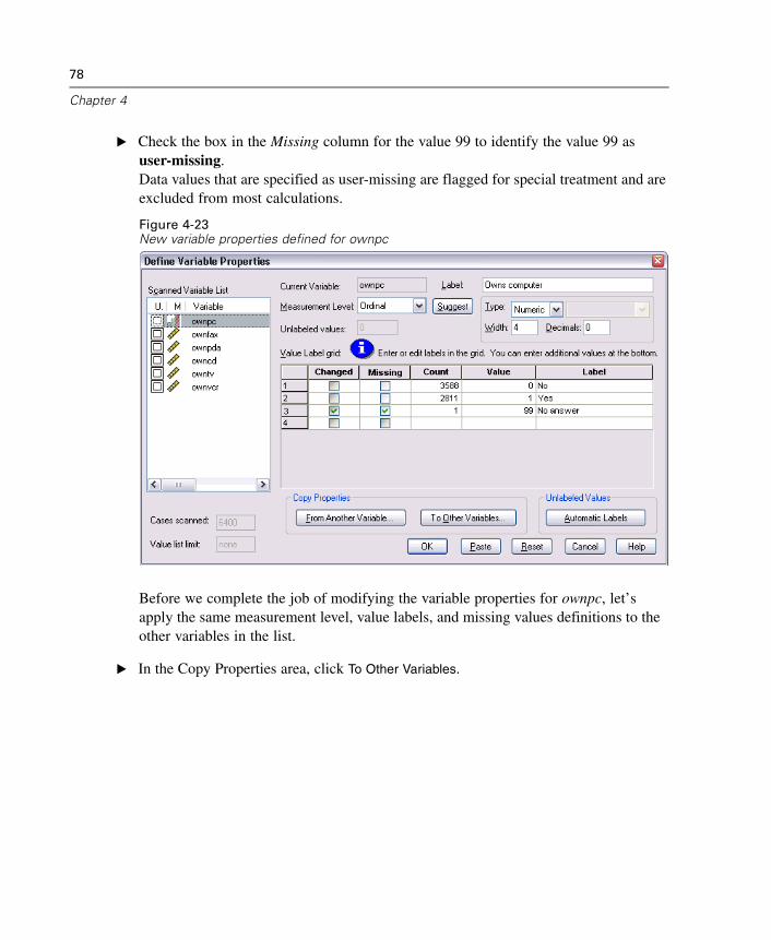
78
Chapter 4
E Check the box in the Missing column for the value 99 to identify the value 99 asuser-missing.Data values that are specified as user-missing are flagged for special treatment and areexcluded from most calculations.
Figure 4-23New variable properties defined for ownpc
Before we complete the job of modifying the variable properties for ownpc, let’sapply the same measurement level, value labels, and missing values definitions to theother variables in the list.
E In the Copy Properties area, click To Other Variables.
79
Using the Data Editor
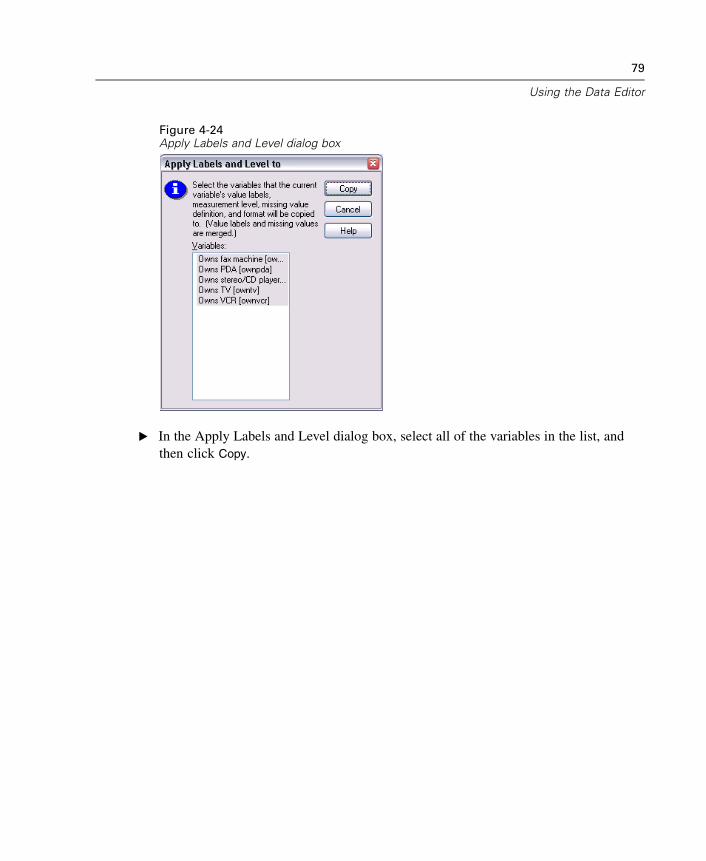
Figure 4-24Apply Labels and Level dialog box
E In the Apply Labels and Level dialog box, select all of the variables in the list, andthen click Copy.
80
Chapter 4
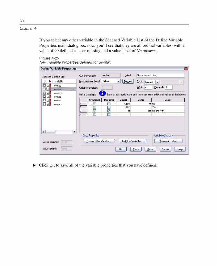
If you select any other variable in the Scanned Variable List of the Define VariableProperties main dialog box now, you’ll see that they are all ordinal variables, with avalue of 99 defined as user-missing and a value label of No answer.
Figure 4-25New variable properties defined for ownfax
E Click OK to save all of the variable properties that you have defined.
Chapter
5Working with Multiple DataSources
Starting with SPSS 14.0, SPSS can have multiple data sources open at the same time,making it easier to:
Switch back and forth between data sources.
Compare the contents of different data sources.
Copy and paste data between data sources.
Create multiple subsets of cases and/or variables for analysis.
Merge multiple data sources from various data formats (for example, spreadsheet,database, text data) without saving each data source in SPSS format first.
81
82
Chapter 5
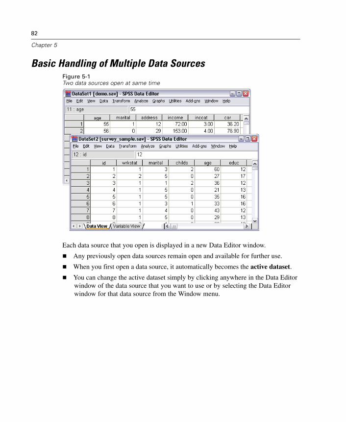
Basic Handling of Multiple Data SourcesFigure 5-1Two data sources open at same time
Each data source that you open is displayed in a new Data Editor window.
Any previously open data sources remain open and available for further use.
When you first open a data source, it automatically becomes the active dataset.
You can change the active dataset simply by clicking anywhere in the Data Editorwindow of the data source that you want to use or by selecting the Data Editorwindow for that data source from the Window menu.
83
Working with Multiple Data Sources
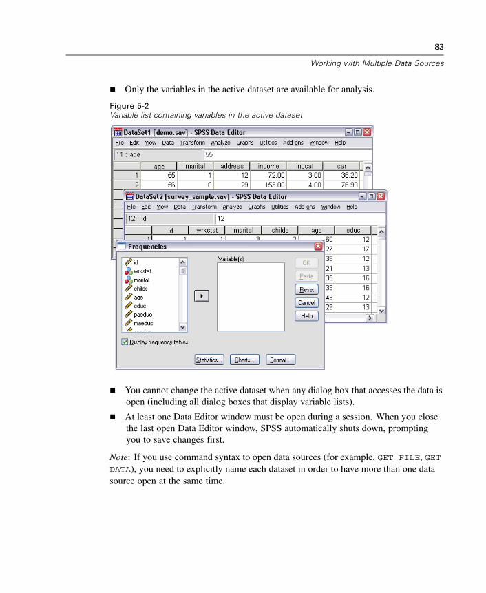
Only the variables in the active dataset are available for analysis.
Figure 5-2Variable list containing variables in the active dataset
You cannot change the active dataset when any dialog box that accesses the data isopen (including all dialog boxes that display variable lists).
At least one Data Editor window must be open during a session. When you closethe last open Data Editor window, SPSS automatically shuts down, promptingyou to save changes first.
Note: If you use command syntax to open data sources (for example, GET FILE, GETDATA), you need to explicitly name each dataset in order to have more than one datasource open at the same time.
84
Chapter 5
Copying and Pasting Information between Datasets
You can copy both data and variable definition attributes from one dataset to anotherdataset in basically the same way that you copy and paste information within a singledata file.
Copying and pasting selected data cells in Data View pastes just the data values,with no variable definition attributes.
Copying and pasting an entire variable in Data View by selecting the variable nameat the top of the column pastes all of the data and all of the variable definitionattributes for that variable.
Copying and pasting variable definition attributes or entire variables in VariableView pastes the selected attributes (or the entire variable definition) but does notpaste any data values.
Renaming Datasets
When you open a data source through the menus and dialogs, each data source isautomatically assigned a dataset name of DataSetn, where n is a sequential integervalue, and when you open a data source via command syntax, no dataset name isassigned unless you explicitly specify one with DATASET NAME. To provide moredescriptive dataset names:
E From the menus in the Data Editor window for the dataset for which you want tochange the dataset name, choose:File
Rename Dataset
E Enter a new dataset name that conforms to SPSS variable naming rules.
Chapter
6Examining Summary Statistics forIndividual Variables
This chapter discusses simple summary measures and how the level of measurementof a variable influences the types of statistics that should be used. We will use thedata file demo.sav.
Level of Measurement
Different summary measures are appropriate for different types of data, depending onthe level of measurement:
Categorical. Data with a limited number of distinct values or categories (for example,gender or marital status). Also referred to as qualitative data. Categorical variablescan be string (alphanumeric) data or numeric variables that use numeric codes torepresent categories (for example, 0 = Unmarried and 1 = Married). There are twobasic types of categorical data:
Nominal. Categorical data where there is no inherent order to the categories. Forexample, a job category of sales is not higher or lower than a job category ofmarketing or research.
Ordinal. Categorical data where there is a meaningful order of categories, but thereis not a measurable distance between categories. For example, there is an order tothe values high, medium, and low, but the “distance” between the values cannotbe calculated.
Scale. Data measured on an interval or ratio scale, where the data values indicate boththe order of values and the distance between values. For example, a salary of $72,195is higher than a salary of $52,398, and the distance between the two values is $19,797.Also referred to as quantitative or continuous data.
85
86
Chapter 6
Summary Measures for Categorical Data
For categorical data, the most typical summary measure is the number or percentage ofcases in each category. The mode is the category with the greatest number of cases.For ordinal data, the median (the value at which half of the cases fall above and below)may also be a useful summary measure if there is a large number of categories.
The Frequencies procedure produces frequency tables that display both the numberand percentage of cases for each observed value of a variable.
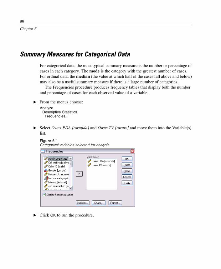
E From the menus choose:Analyze
Descriptive StatisticsFrequencies...
E Select Owns PDA [ownpda] and Owns TV [owntv] and move them into the Variable(s)list.
Figure 6-1Categorical variables selected for analysis
E Click OK to run the procedure.
87
Examining Summary Statistics for Individual Variables
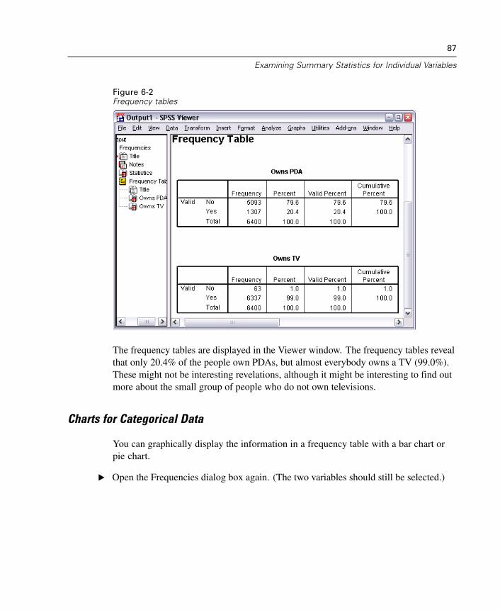
Figure 6-2Frequency tables
The frequency tables are displayed in the Viewer window. The frequency tables revealthat only 20.4% of the people own PDAs, but almost everybody owns a TV (99.0%).These might not be interesting revelations, although it might be interesting to find outmore about the small group of people who do not own televisions.
Charts for Categorical Data
You can graphically display the information in a frequency table with a bar chart orpie chart.
E Open the Frequencies dialog box again. (The two variables should still be selected.)
88
Chapter 6
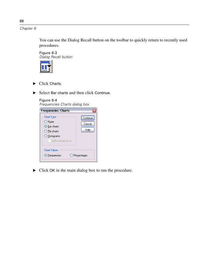
You can use the Dialog Recall button on the toolbar to quickly return to recently usedprocedures.
Figure 6-3Dialog Recall button
E Click Charts.
E Select Bar charts and then click Continue.
Figure 6-4Frequencies Charts dialog box
E Click OK in the main dialog box to run the procedure.
89
Examining Summary Statistics for Individual Variables
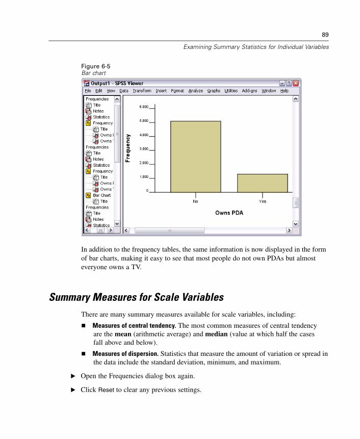
Figure 6-5Bar chart
In addition to the frequency tables, the same information is now displayed in the formof bar charts, making it easy to see that most people do not own PDAs but almosteveryone owns a TV.
Summary Measures for Scale VariablesThere are many summary measures available for scale variables, including:
Measures of central tendency. The most common measures of central tendencyare the mean (arithmetic average) and median (value at which half the casesfall above and below).
Measures of dispersion. Statistics that measure the amount of variation or spread inthe data include the standard deviation, minimum, and maximum.
E Open the Frequencies dialog box again.
E Click Reset to clear any previous settings.
90
Chapter 6
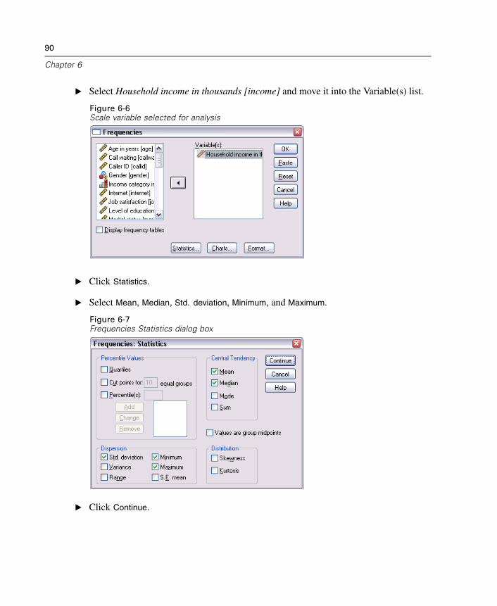
E Select Household income in thousands [income] and move it into the Variable(s) list.
Figure 6-6Scale variable selected for analysis
E Click Statistics.
E Select Mean, Median, Std. deviation, Minimum, and Maximum.
Figure 6-7Frequencies Statistics dialog box
E Click Continue.
91
Examining Summary Statistics for Individual Variables
E Deselect Display frequency tables in the main dialog box. (Frequency tables are usuallynot useful for scale variables since there may be almost as many distinct values asthere are cases in the data file.)
E Click OK to run the procedure.
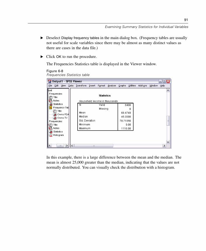
The Frequencies Statistics table is displayed in the Viewer window.
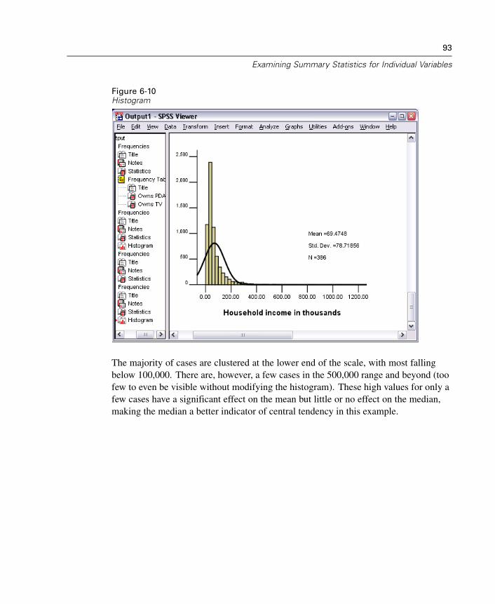
Figure 6-8Frequencies Statistics table
In this example, there is a large difference between the mean and the median. Themean is almost 25,000 greater than the median, indicating that the values are notnormally distributed. You can visually check the distribution with a histogram.
92
Chapter 6
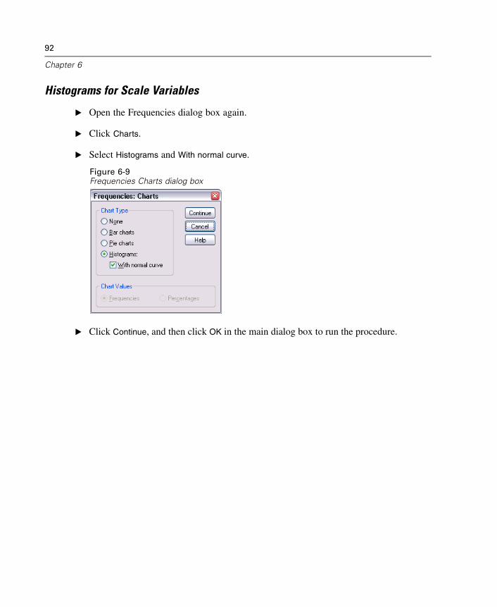
Histograms for Scale Variables
E Open the Frequencies dialog box again.
E Click Charts.
E Select Histograms and With normal curve.
Figure 6-9Frequencies Charts dialog box
E Click Continue, and then click OK in the main dialog box to run the procedure.
93
Examining Summary Statistics for Individual Variables
Figure 6-10Histogram
The majority of cases are clustered at the lower end of the scale, with most fallingbelow 100,000. There are, however, a few cases in the 500,000 range and beyond (toofew to even be visible without modifying the histogram). These high values for only afew cases have a significant effect on the mean but little or no effect on the median,making the median a better indicator of central tendency in this example.

Chapter
7Working with Output
The results from running a statistical procedure are displayed in the Viewer. The outputproduced can be statistical tables, charts, graphs, or text, depending on the choicesyou make when you run the procedure. This chapter uses the files viewertut.spo anddemo.sav.
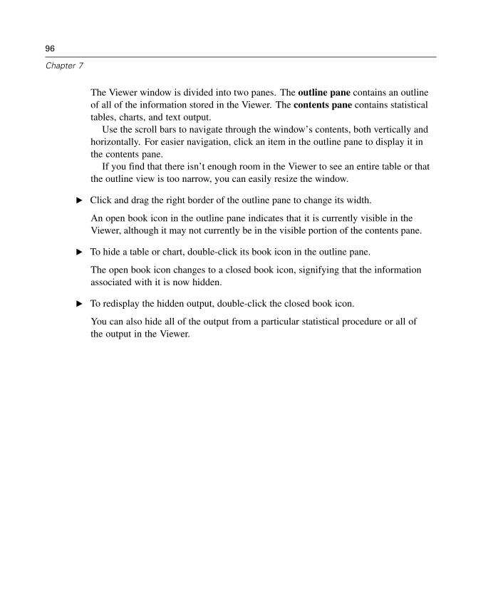
Using the ViewerFigure 7-1SPSS Viewer
95
96
Chapter 7
The Viewer window is divided into two panes. The outline pane contains an outlineof all of the information stored in the Viewer. The contents pane contains statisticaltables, charts, and text output.
Use the scroll bars to navigate through the window’s contents, both vertically andhorizontally. For easier navigation, click an item in the outline pane to display it inthe contents pane.
If you find that there isn’t enough room in the Viewer to see an entire table or thatthe outline view is too narrow, you can easily resize the window.
E Click and drag the right border of the outline pane to change its width.
An open book icon in the outline pane indicates that it is currently visible in theViewer, although it may not currently be in the visible portion of the contents pane.
E To hide a table or chart, double-click its book icon in the outline pane.
The open book icon changes to a closed book icon, signifying that the informationassociated with it is now hidden.
E To redisplay the hidden output, double-click the closed book icon.
You can also hide all of the output from a particular statistical procedure or all ofthe output in the Viewer.
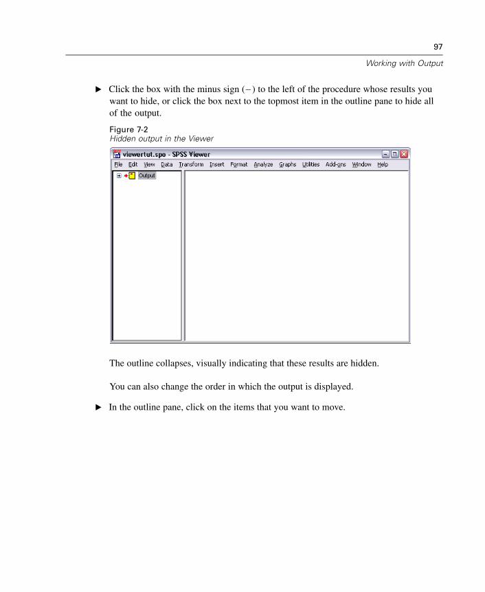
97
Working with Output
E Click the box with the minus sign ( ) to the left of the procedure whose results youwant to hide, or click the box next to the topmost item in the outline pane to hide allof the output.
Figure 7-2Hidden output in the Viewer
The outline collapses, visually indicating that these results are hidden.
You can also change the order in which the output is displayed.
E In the outline pane, click on the items that you want to move.
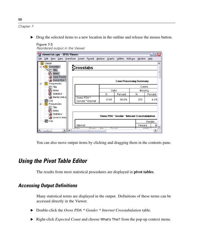
98
Chapter 7
E Drag the selected items to a new location in the outline and release the mouse button.
Figure 7-3Reordered output in the Viewer
You can also move output items by clicking and dragging them in the contents pane.
Using the Pivot Table Editor
The results from most statistical procedures are displayed in pivot tables.
Accessing Output Definitions
Many statistical terms are displayed in the output. Definitions of these terms can beaccessed directly in the Viewer.
E Double-click the Owns PDA * Gender * Internet Crosstabulation table.
E Right-click Expected Count and choose What’s This? from the pop-up context menu.
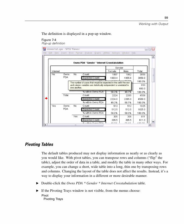
99
Working with Output
The definition is displayed in a pop-up window.
Figure 7-4Pop-up definition
Pivoting Tables
The default tables produced may not display information as neatly or as clearly asyou would like. With pivot tables, you can transpose rows and columns (“flip” thetable), adjust the order of data in a table, and modify the table in many other ways. Forexample, you can change a short, wide table into a long, thin one by transposing rowsand columns. Changing the layout of the table does not affect the results. Instead, it’s away to display your information in a different or more desirable manner.
E Double-click the Owns PDA * Gender * Internet Crosstabulation table.
E If the Pivoting Trays window is not visible, from the menus choose:Pivot
Pivoting Trays
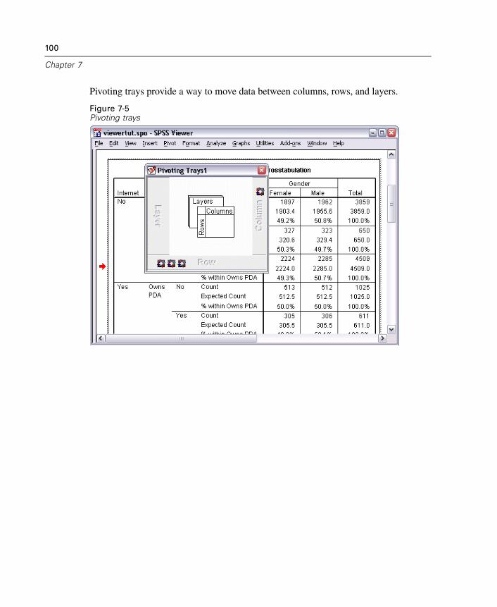
100
Chapter 7
Pivoting trays provide a way to move data between columns, rows, and layers.
Figure 7-5Pivoting trays
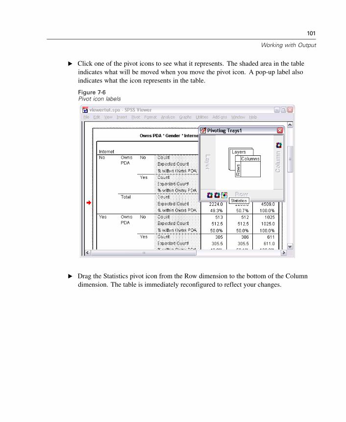
101
Working with Output
E Click one of the pivot icons to see what it represents. The shaded area in the tableindicates what will be moved when you move the pivot icon. A pop-up label alsoindicates what the icon represents in the table.
Figure 7-6Pivot icon labels
E Drag the Statistics pivot icon from the Row dimension to the bottom of the Columndimension. The table is immediately reconfigured to reflect your changes.
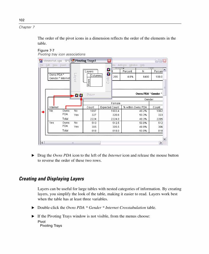
102
Chapter 7
The order of the pivot icons in a dimension reflects the order of the elements in thetable.
Figure 7-7Pivoting tray icon associations
E Drag the Owns PDA icon to the left of the Internet icon and release the mouse buttonto reverse the order of these two rows.
Creating and Displaying Layers
Layers can be useful for large tables with nested categories of information. By creatinglayers, you simplify the look of the table, making it easier to read. Layers work bestwhen the table has at least three variables.
E Double-click the Owns PDA * Gender * Internet Crosstabulation table.
E If the Pivoting Trays window is not visible, from the menus choose:Pivot
Pivoting Trays
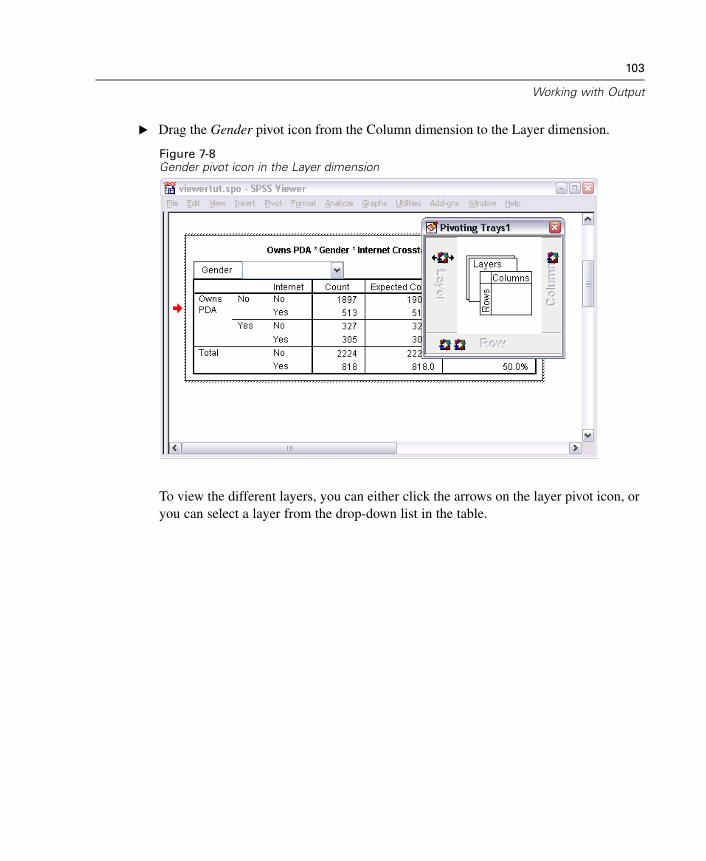
103
Working with Output
E Drag the Gender pivot icon from the Column dimension to the Layer dimension.
Figure 7-8Gender pivot icon in the Layer dimension
To view the different layers, you can either click the arrows on the layer pivot icon, oryou can select a layer from the drop-down list in the table.
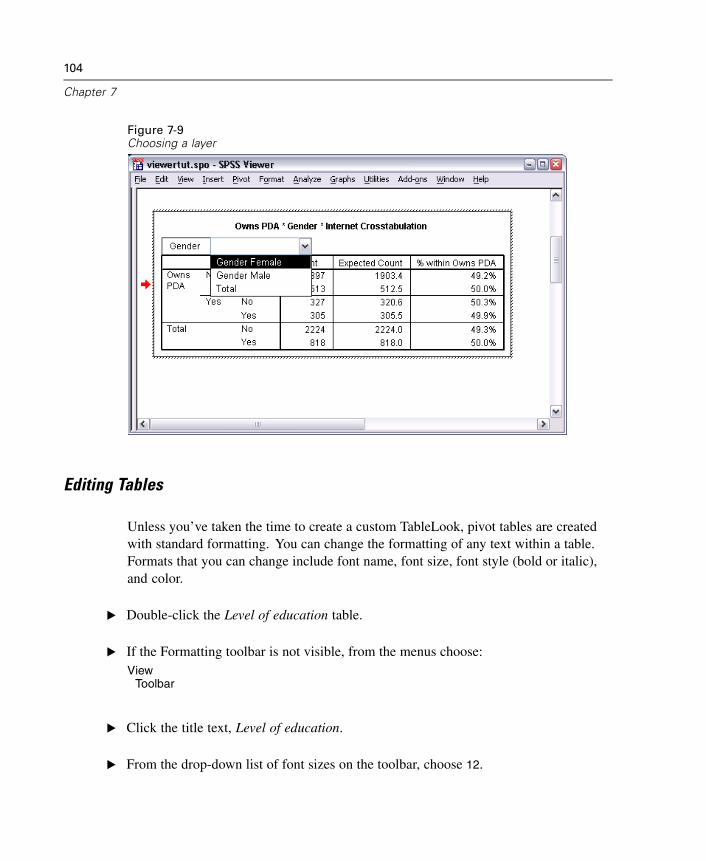
104
Chapter 7
Figure 7-9Choosing a layer
Editing Tables
Unless you’ve taken the time to create a custom TableLook, pivot tables are createdwith standard formatting. You can change the formatting of any text within a table.Formats that you can change include font name, font size, font style (bold or italic),and color.
E Double-click the Level of education table.
E If the Formatting toolbar is not visible, from the menus choose:View
Toolbar
E Click the title text, Level of education.
E From the drop-down list of font sizes on the toolbar, choose 12.

105
Working with Output
E To change the color of the title text, click the Text Color button and choose a new color.
Figure 7-10Reformatted title text in the pivot table
You can also edit the contents of tables and labels. For example, you can change thetitle of this table.
E Double-click the title.
E Type Education Level for the new label.
Note: If you change the values in a table, totals and other statistics are not recalculated.
Hiding Rows and Columns
Some of the data displayed in a table may not be useful or it may unnecessarilycomplicate the table. Fortunately, you can hide entire rows and columns without losingany data.
E Double-click the Education Level table.
E Ctrl-Alt-click on the Valid Percent column label to select all of the cells in that column.
106
Chapter 7
E Right-click the highlighted column and choose Hide Category from the pop-up contextmenu.
The column is now hidden but not deleted.
To redisplay the column:
E From the menus choose:View
Show All
Rows can be hidden and displayed in the same way as columns.
Changing Data Display Formats
You can easily change the display format of data in pivot tables.
E Double-click the Education Level table.
E Click on the Percent column label to select it.
E From the menus choose:Edit
SelectData Cells
E From the menus choose:Format
Cell Properties...
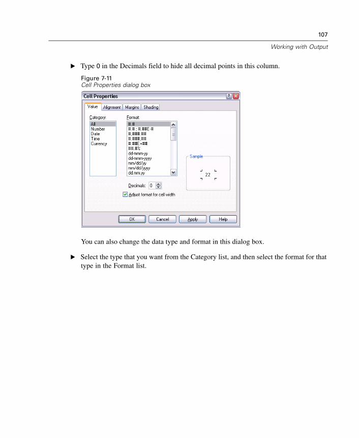
107
Working with Output
E Type 0 in the Decimals field to hide all decimal points in this column.
Figure 7-11Cell Properties dialog box
You can also change the data type and format in this dialog box.
E Select the type that you want from the Category list, and then select the format for thattype in the Format list.
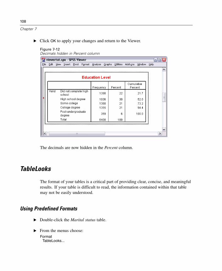
108
Chapter 7
E Click OK to apply your changes and return to the Viewer.
Figure 7-12Decimals hidden in Percent column
The decimals are now hidden in the Percent column.
TableLooks
The format of your tables is a critical part of providing clear, concise, and meaningfulresults. If your table is difficult to read, the information contained within that tablemay not be easily understood.
Using Predefined Formats
E Double-click the Marital status table.
E From the menus choose:Format
TableLooks...
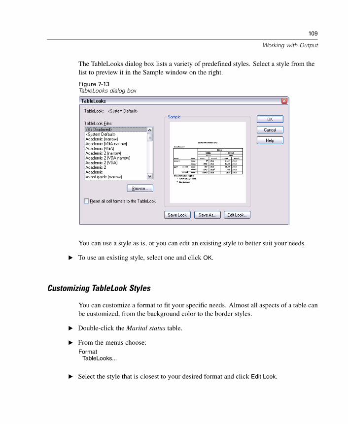
109
Working with Output
The TableLooks dialog box lists a variety of predefined styles. Select a style from thelist to preview it in the Sample window on the right.
Figure 7-13TableLooks dialog box
You can use a style as is, or you can edit an existing style to better suit your needs.
E To use an existing style, select one and click OK.
Customizing TableLook Styles
You can customize a format to fit your specific needs. Almost all aspects of a table canbe customized, from the background color to the border styles.
E Double-click the Marital status table.
E From the menus choose:Format
TableLooks...
E Select the style that is closest to your desired format and click Edit Look.
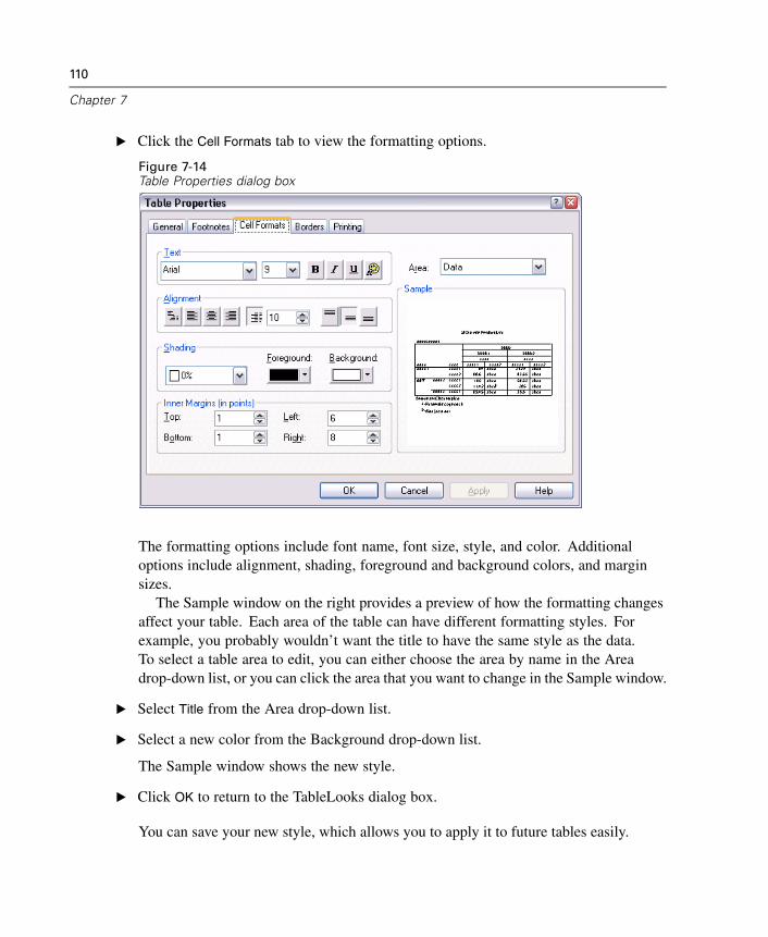
110
Chapter 7
E Click the Cell Formats tab to view the formatting options.
Figure 7-14Table Properties dialog box
The formatting options include font name, font size, style, and color. Additionaloptions include alignment, shading, foreground and background colors, and marginsizes.
The Sample window on the right provides a preview of how the formatting changesaffect your table. Each area of the table can have different formatting styles. Forexample, you probably wouldn’t want the title to have the same style as the data.To select a table area to edit, you can either choose the area by name in the Areadrop-down list, or you can click the area that you want to change in the Sample window.
E Select Title from the Area drop-down list.
E Select a new color from the Background drop-down list.
The Sample window shows the new style.
E Click OK to return to the TableLooks dialog box.
You can save your new style, which allows you to apply it to future tables easily.
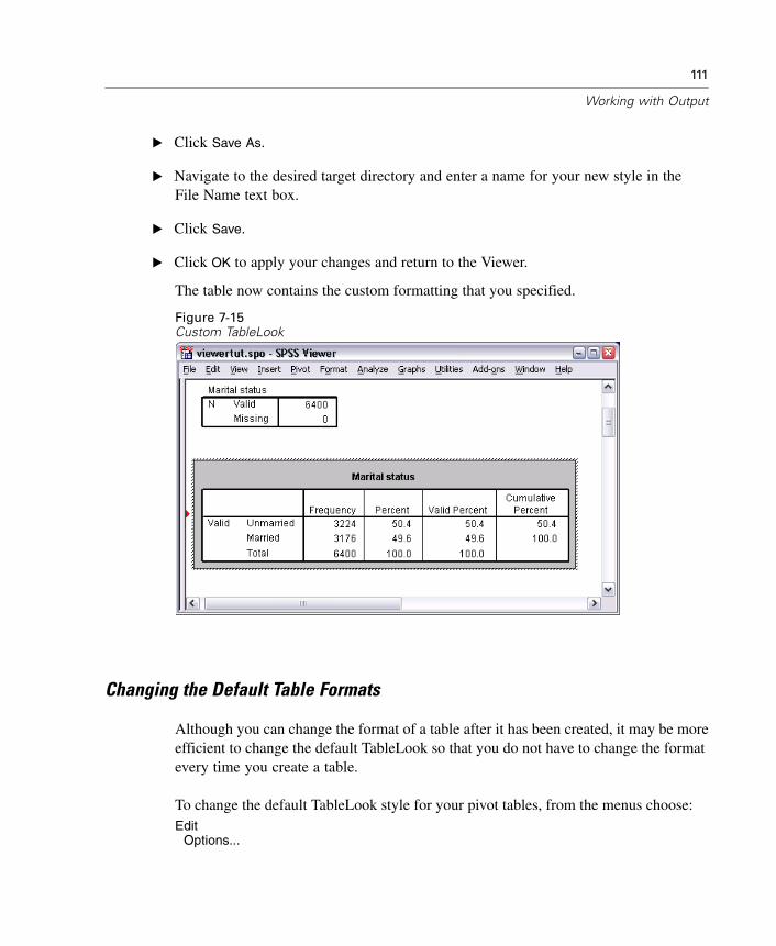
111
Working with Output
E Click Save As.
E Navigate to the desired target directory and enter a name for your new style in theFile Name text box.
E Click Save.
E Click OK to apply your changes and return to the Viewer.
The table now contains the custom formatting that you specified.
Figure 7-15Custom TableLook
Changing the Default Table Formats
Although you can change the format of a table after it has been created, it may be moreefficient to change the default TableLook so that you do not have to change the formatevery time you create a table.
To change the default TableLook style for your pivot tables, from the menus choose:Edit
Options...
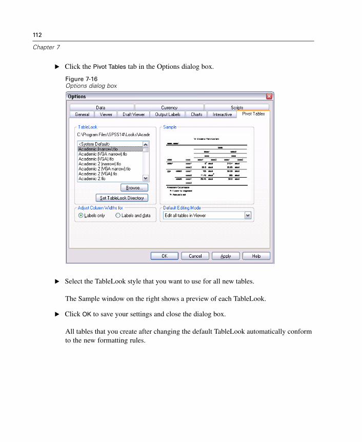
112
Chapter 7
E Click the Pivot Tables tab in the Options dialog box.
Figure 7-16Options dialog box
E Select the TableLook style that you want to use for all new tables.
The Sample window on the right shows a preview of each TableLook.
E Click OK to save your settings and close the dialog box.
All tables that you create after changing the default TableLook automatically conformto the new formatting rules.
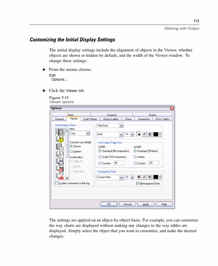
113
Working with Output
Customizing the Initial Display Settings
The initial display settings include the alignment of objects in the Viewer, whetherobjects are shown or hidden by default, and the width of the Viewer window. Tochange these settings:
E From the menus choose:Edit
Options...
E Click the Viewer tab.
Figure 7-17Viewer options
The settings are applied on an object-by-object basis. For example, you can customizethe way charts are displayed without making any changes to the way tables aredisplayed. Simply select the object that you want to customize, and make the desiredchanges.
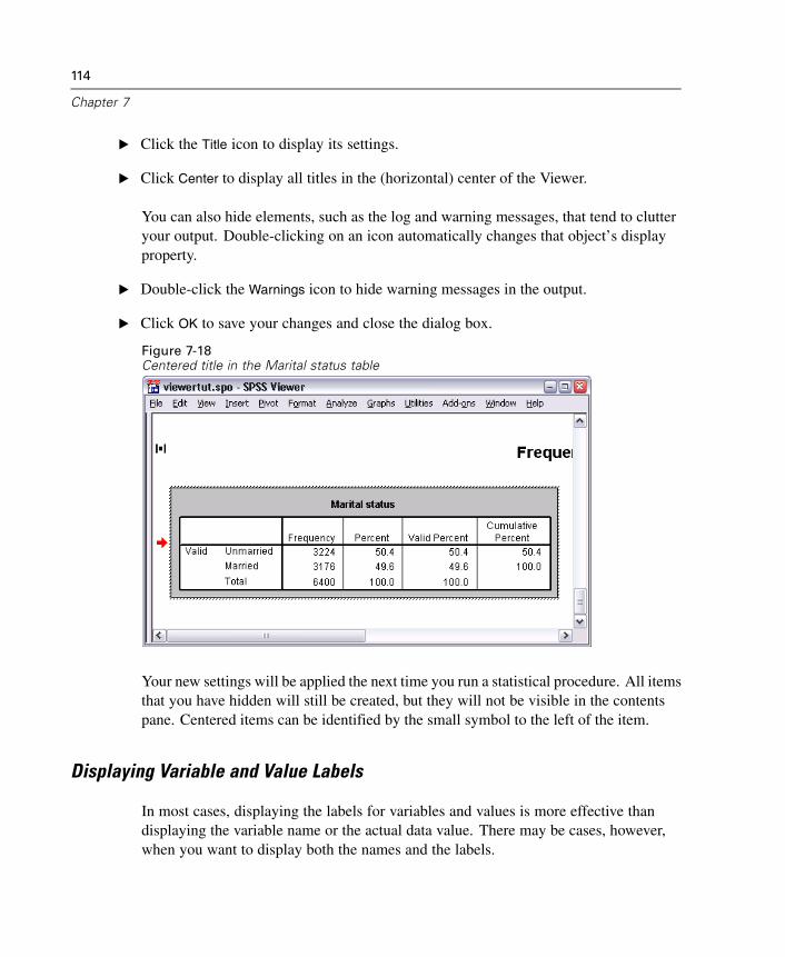
114
Chapter 7
E Click the Title icon to display its settings.
E Click Center to display all titles in the (horizontal) center of the Viewer.
You can also hide elements, such as the log and warning messages, that tend to clutteryour output. Double-clicking on an icon automatically changes that object’s displayproperty.
E Double-click the Warnings icon to hide warning messages in the output.
E Click OK to save your changes and close the dialog box.
Figure 7-18Centered title in the Marital status table
Your new settings will be applied the next time you run a statistical procedure. All itemsthat you have hidden will still be created, but they will not be visible in the contentspane. Centered items can be identified by the small symbol to the left of the item.
Displaying Variable and Value Labels
In most cases, displaying the labels for variables and values is more effective thandisplaying the variable name or the actual data value. There may be cases, however,when you want to display both the names and the labels.
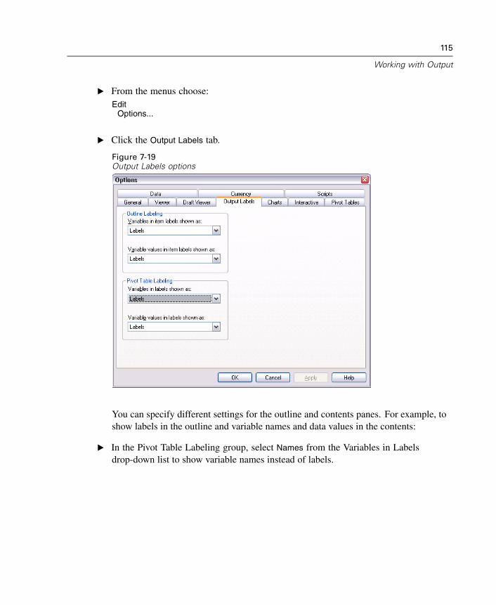
115
Working with Output
E From the menus choose:Edit
Options...
E Click the Output Labels tab.
Figure 7-19Output Labels options
You can specify different settings for the outline and contents panes. For example, toshow labels in the outline and variable names and data values in the contents:
E In the Pivot Table Labeling group, select Names from the Variables in Labelsdrop-down list to show variable names instead of labels.
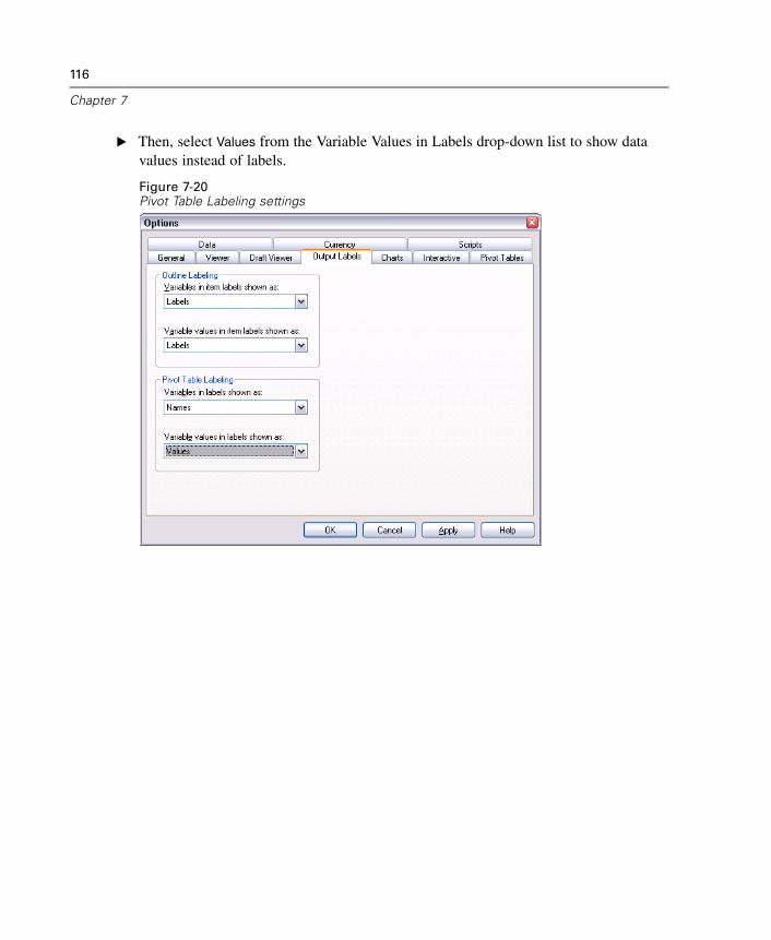
116
Chapter 7
E Then, select Values from the Variable Values in Labels drop-down list to show datavalues instead of labels.
Figure 7-20Pivot Table Labeling settings
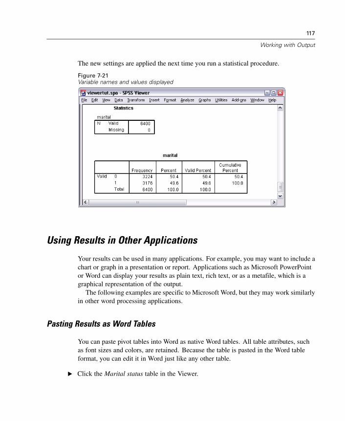
117
Working with Output
The new settings are applied the next time you run a statistical procedure.
Figure 7-21Variable names and values displayed
Using Results in Other Applications
Your results can be used in many applications. For example, you may want to include achart or graph in a presentation or report. Applications such as Microsoft PowerPointor Word can display your results as plain text, rich text, or as a metafile, which is agraphical representation of the output.
The following examples are specific to Microsoft Word, but they may work similarlyin other word processing applications.
Pasting Results as Word Tables
You can paste pivot tables into Word as native Word tables. All table attributes, suchas font sizes and colors, are retained. Because the table is pasted in the Word tableformat, you can edit it in Word just like any other table.
E Click the Marital status table in the Viewer.
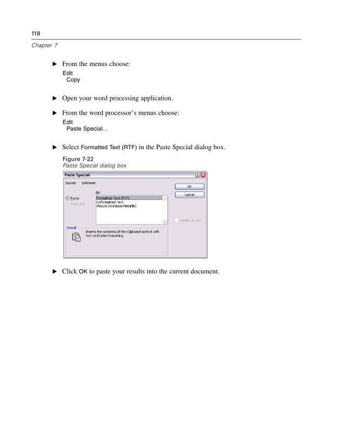
118
Chapter 7
E From the menus choose:Edit
Copy
E Open your word processing application.
E From the word processor’s menus choose:Edit
Paste Special...
E Select Formatted Text (RTF) in the Paste Special dialog box.
Figure 7-22Paste Special dialog box
E Click OK to paste your results into the current document.
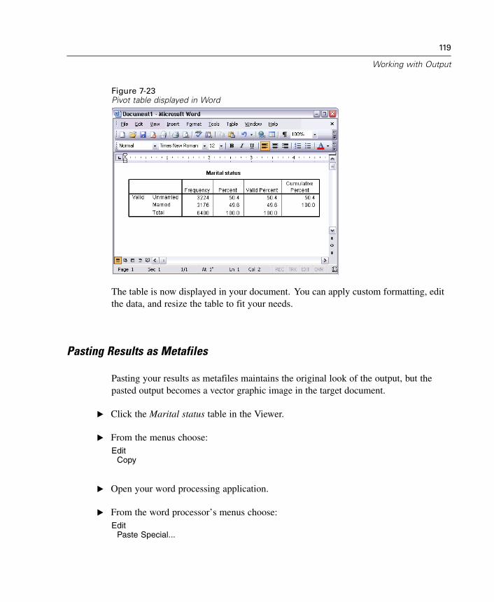
119
Working with Output
Figure 7-23Pivot table displayed in Word
The table is now displayed in your document. You can apply custom formatting, editthe data, and resize the table to fit your needs.
Pasting Results as Metafiles
Pasting your results as metafiles maintains the original look of the output, but thepasted output becomes a vector graphic image in the target document.
E Click the Marital status table in the Viewer.
E From the menus choose:Edit
Copy
E Open your word processing application.
E From the word processor’s menus choose:Edit
Paste Special...
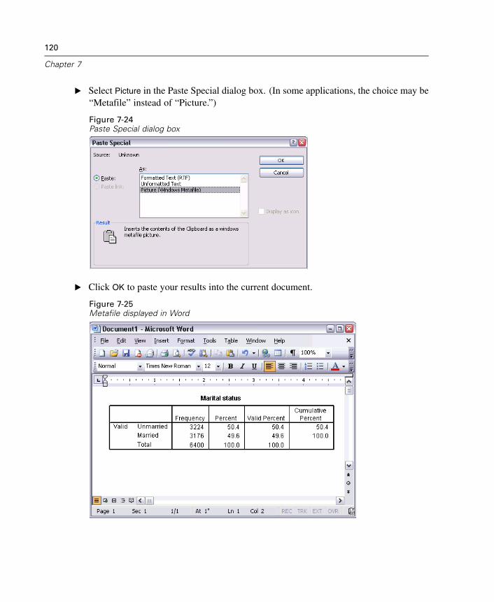
120
Chapter 7
E Select Picture in the Paste Special dialog box. (In some applications, the choice may be“Metafile” instead of “Picture.”)
Figure 7-24Paste Special dialog box
E Click OK to paste your results into the current document.
Figure 7-25Metafile displayed in Word
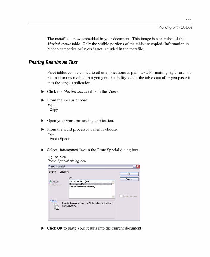
121
Working with Output
The metafile is now embedded in your document. This image is a snapshot of theMarital status table. Only the visible portions of the table are copied. Information inhidden categories or layers is not included in the metafile.
Pasting Results as Text
Pivot tables can be copied to other applications as plain text. Formatting styles are notretained in this method, but you gain the ability to edit the table data after you paste itinto the target application.
E Click the Marital status table in the Viewer.
E From the menus choose:Edit
Copy
E Open your word processing application.
E From the word processor’s menus choose:Edit
Paste Special...
E Select Unformatted Text in the Paste Special dialog box.
Figure 7-26Paste Special dialog box
E Click OK to paste your results into the current document.
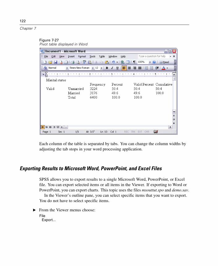
122
Chapter 7
Figure 7-27Pivot table displayed in Word
Each column of the table is separated by tabs. You can change the column widths byadjusting the tab stops in your word processing application.
Exporting Results to Microsoft Word, PowerPoint, and Excel Files
SPSS allows you to export results to a single Microsoft Word, PowerPoint, or Excelfile. You can export selected items or all items in the Viewer. If exporting to Word orPowerPoint, you can export charts. This topic uses the files msouttut.spo and demo.sav.
In the Viewer’s outline pane, you can select specific items that you want to export.You do not have to select specific items.
E From the Viewer menus choose:File
Export...
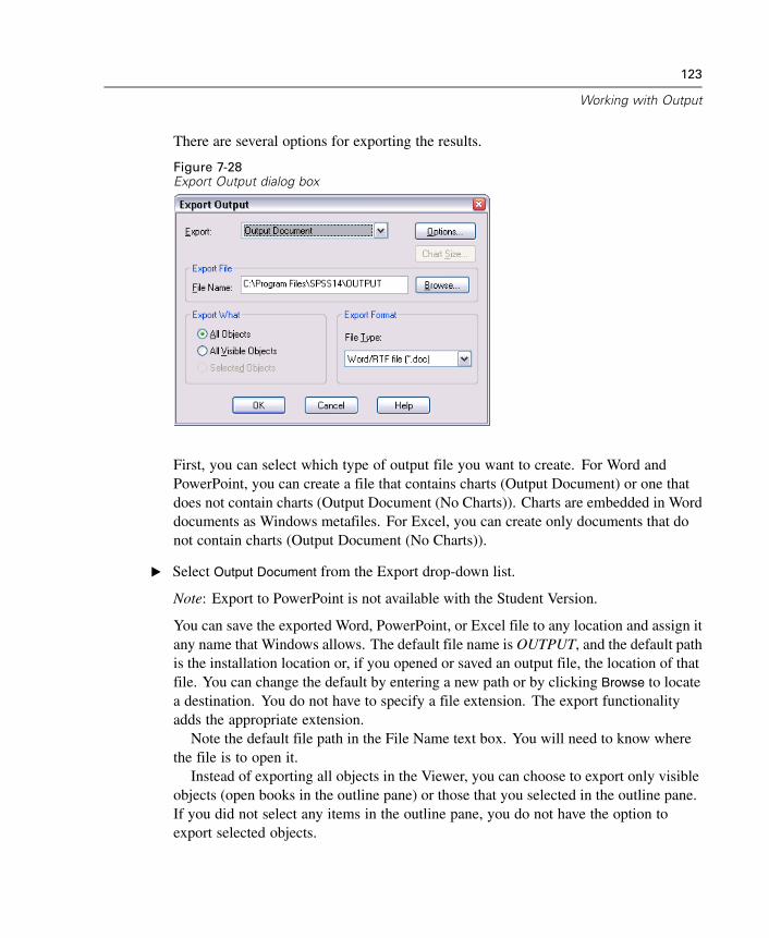
123
Working with Output
There are several options for exporting the results.
Figure 7-28Export Output dialog box
First, you can select which type of output file you want to create. For Word andPowerPoint, you can create a file that contains charts (Output Document) or one thatdoes not contain charts (Output Document (No Charts)). Charts are embedded in Worddocuments as Windows metafiles. For Excel, you can create only documents that donot contain charts (Output Document (No Charts)).
E Select Output Document from the Export drop-down list.
Note: Export to PowerPoint is not available with the Student Version.
You can save the exported Word, PowerPoint, or Excel file to any location and assign itany name that Windows allows. The default file name is OUTPUT, and the default pathis the installation location or, if you opened or saved an output file, the location of thatfile. You can change the default by entering a new path or by clicking Browse to locatea destination. You do not have to specify a file extension. The export functionalityadds the appropriate extension.
Note the default file path in the File Name text box. You will need to know wherethe file is to open it.
Instead of exporting all objects in the Viewer, you can choose to export only visibleobjects (open books in the outline pane) or those that you selected in the outline pane.If you did not select any items in the outline pane, you do not have the option toexport selected objects.
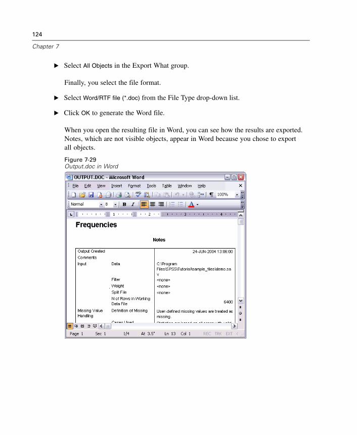
124
Chapter 7
E Select All Objects in the Export What group.
Finally, you select the file format.
E Select Word/RTF file (*.doc) from the File Type drop-down list.
E Click OK to generate the Word file.
When you open the resulting file in Word, you can see how the results are exported.Notes, which are not visible objects, appear in Word because you chose to exportall objects.
Figure 7-29Output.doc in Word
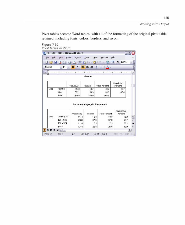
125
Working with Output
Pivot tables become Word tables, with all of the formatting of the original pivot tableretained, including fonts, colors, borders, and so on.
Figure 7-30Pivot tables in Word
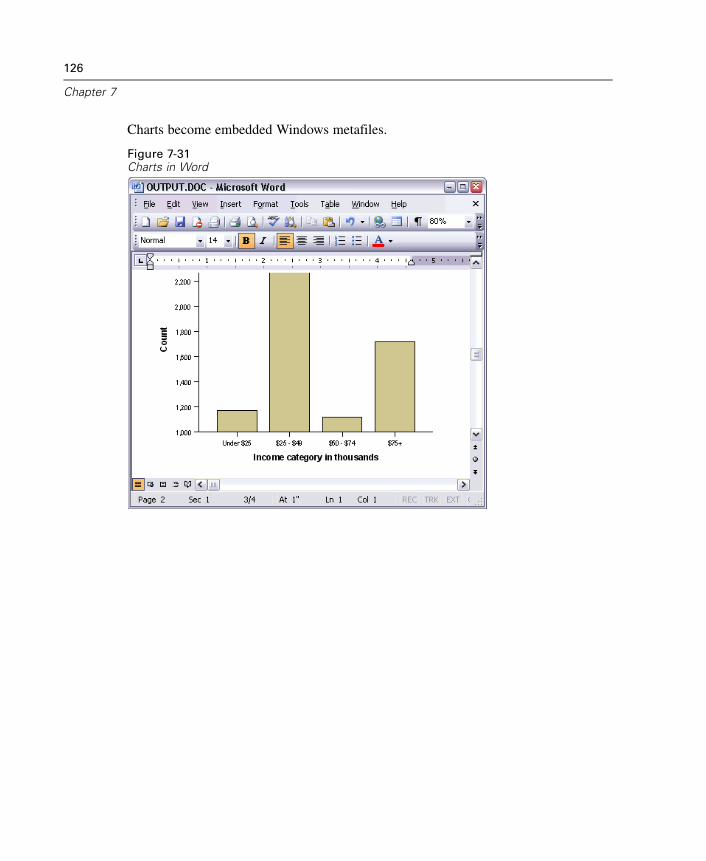
126
Chapter 7
Charts become embedded Windows metafiles.
Figure 7-31Charts in Word
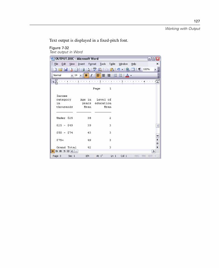
127
Working with Output
Text output is displayed in a fixed-pitch font.
Figure 7-32Text output in Word
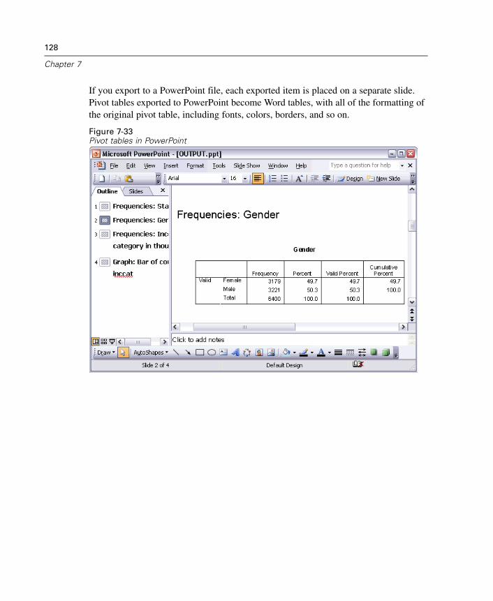
128
Chapter 7
If you export to a PowerPoint file, each exported item is placed on a separate slide.Pivot tables exported to PowerPoint become Word tables, with all of the formatting ofthe original pivot table, including fonts, colors, borders, and so on.
Figure 7-33Pivot tables in PowerPoint
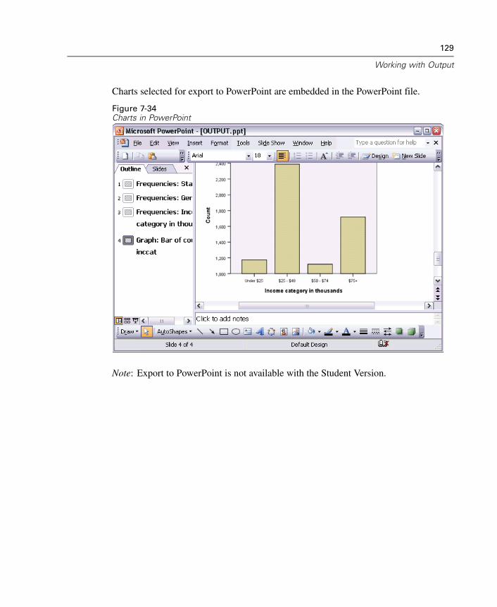
129
Working with Output
Charts selected for export to PowerPoint are embedded in the PowerPoint file.
Figure 7-34Charts in PowerPoint
Note: Export to PowerPoint is not available with the Student Version.
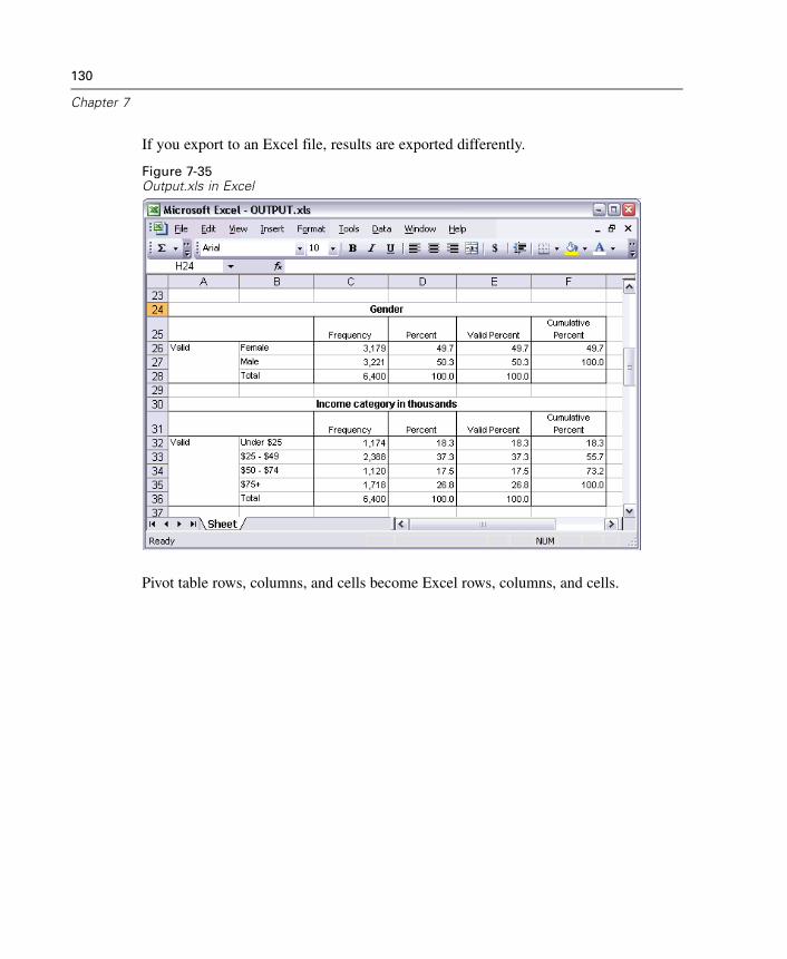
130
Chapter 7
If you export to an Excel file, results are exported differently.
Figure 7-35Output.xls in Excel
Pivot table rows, columns, and cells become Excel rows, columns, and cells.
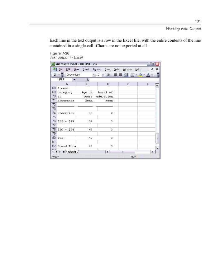
131
Working with Output
Each line in the text output is a row in the Excel file, with the entire contents of the linecontained in a single cell. Charts are not exported at all.
Figure 7-36Text output in Excel
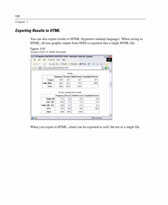
132
Chapter 7
Exporting Results to HTML
You can also export results to HTML (hypertext markup language). When saving asHTML, all non-graphic output from SPSS is exported into a single HTML file.
Figure 7-37Output.htm in Web browser
When you export to HTML, charts can be exported as well, but not to a single file.
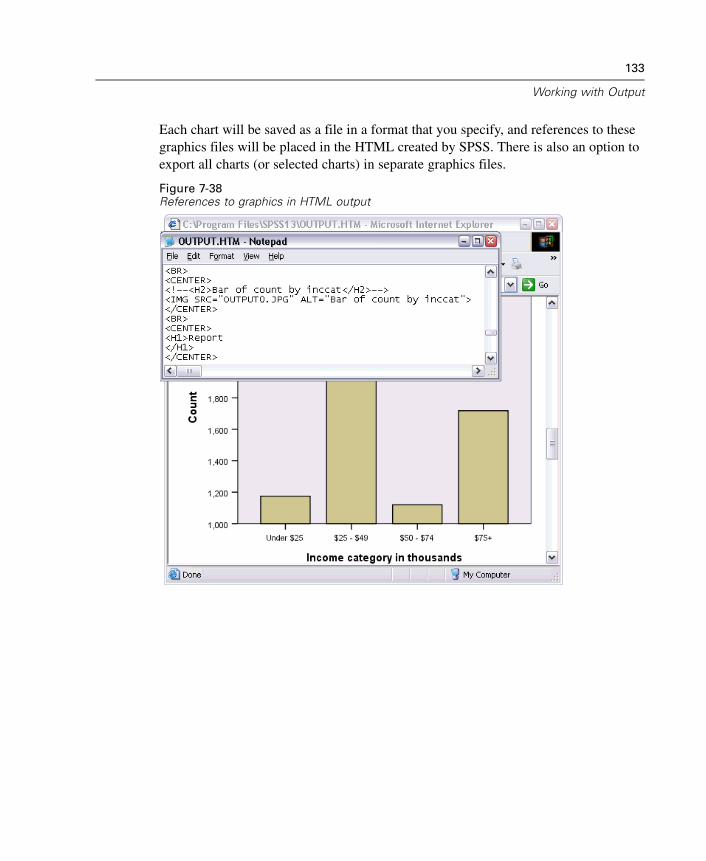
133
Working with Output
Each chart will be saved as a file in a format that you specify, and references to thesegraphics files will be placed in the HTML created by SPSS. There is also an option toexport all charts (or selected charts) in separate graphics files.
Figure 7-38References to graphics in HTML output

Chapter
8Creating and Editing Charts
You can create and edit a wide variety of chart types in SPSS. In these examples, wewill create and edit three commonly used types of charts:
Simple bar chart
Pie chart
Scatterplot with groups
Chart Creation Basics
To demonstrate the basics of chart creation, we will create a bar chart of mean incomefor different levels of job satisfaction. This example uses the data file demo.sav.
E From the menus choose:Graphs
Chart Builder...
135
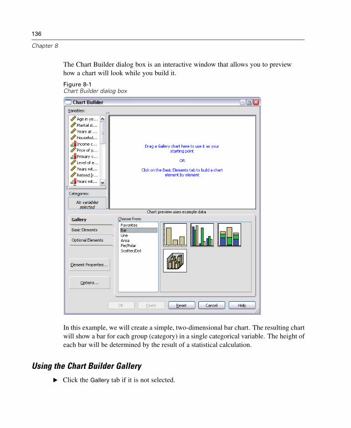
136
Chapter 8
The Chart Builder dialog box is an interactive window that allows you to previewhow a chart will look while you build it.
Figure 8-1Chart Builder dialog box
In this example, we will create a simple, two-dimensional bar chart. The resulting chartwill show a bar for each group (category) in a single categorical variable. The height ofeach bar will be determined by the result of a statistical calculation.
Using the Chart Builder Gallery
E Click the Gallery tab if it is not selected.
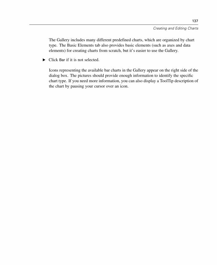
137
Creating and Editing Charts
The Gallery includes many different predefined charts, which are organized by charttype. The Basic Elements tab also provides basic elements (such as axes and dataelements) for creating charts from scratch, but it’s easier to use the Gallery.
E Click Bar if it is not selected.
Icons representing the available bar charts in the Gallery appear on the right side of thedialog box. The pictures should provide enough information to identify the specificchart type. If you need more information, you can also display a ToolTip description ofthe chart by pausing your cursor over an icon.
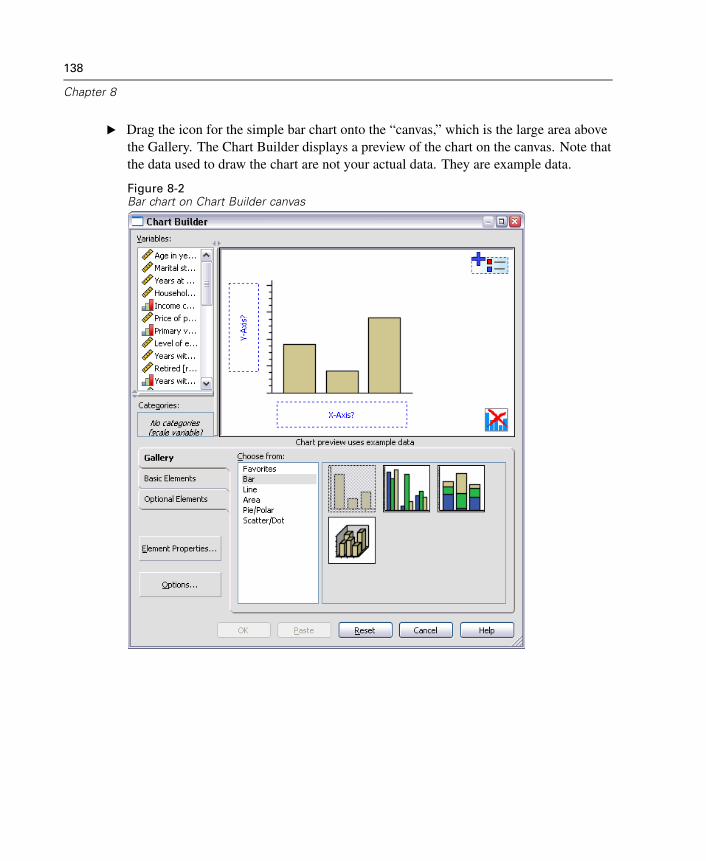
138
Chapter 8
E Drag the icon for the simple bar chart onto the “canvas,” which is the large area abovethe Gallery. The Chart Builder displays a preview of the chart on the canvas. Note thatthe data used to draw the chart are not your actual data. They are example data.
Figure 8-2Bar chart on Chart Builder canvas
139
Creating and Editing Charts
Defining Variables and Statistics
Although there is a chart on the canvas, it is not complete because there are novariables or statistics to control how tall the bars are and to specify which variablecategory corresponds to each bar. You can’t have a chart without any variables andstatistics. You add variables by dragging them from the Variables list, which is locatedto the left of the canvas.
When you drag the variables, the targets are “drop zones” on the canvas. Somedrop zones require a variable while others do not. The drop zone for the x axis isrequired. The variable in this drop zone controls where the bars appear on the x axis.Depending on the type of chart you are creating, you may also need a variable inthe y axis drop zone. For example, when you want to display a summary statistic ofanother variable (such as mean of salary), you need a variable in the y axis drop zone.Scatterplots also require a variable in the y axis. In that case, the drop zone identifiesthe dependent variable.
You are going to create a chart that shows bars for the mean income of each jobsatisfaction category, so both drop zones are needed. There will be a categoricalvariable on the x axis and a scale variable on the y axis for calculating the mean.
A variable’s measurement level is important in the Chart Builder. You are going touse the Job satisfaction variable on the x axis. However, the icon (which looks likea ruler) next to the variable indicates that its measurement level is defined as scale.To create the correct chart, you must use a categorical measurement level. Instead ofgoing back and changing the measurement level in the Variable View, you can changethe measurement level temporarily in the Chart Builder.
E Right-click Job satisfaction in the Variables list and choose Ordinal. Ordinal is anappropriate measurement level because the categories in Job satisfaction can be rankedby level of satisfaction. Note that the icon changes after you change the measurementlevel.
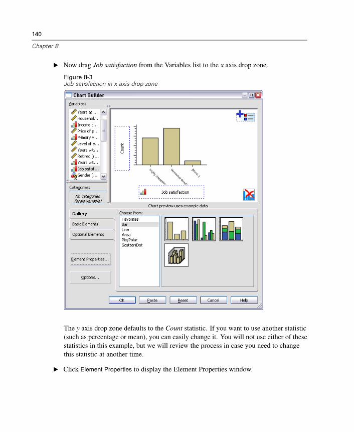
140
Chapter 8
E Now drag Job satisfaction from the Variables list to the x axis drop zone.
Figure 8-3Job satisfaction in x axis drop zone
The y axis drop zone defaults to the Count statistic. If you want to use another statistic(such as percentage or mean), you can easily change it. You will not use either of thesestatistics in this example, but we will review the process in case you need to changethis statistic at another time.
E Click Element Properties to display the Element Properties window.
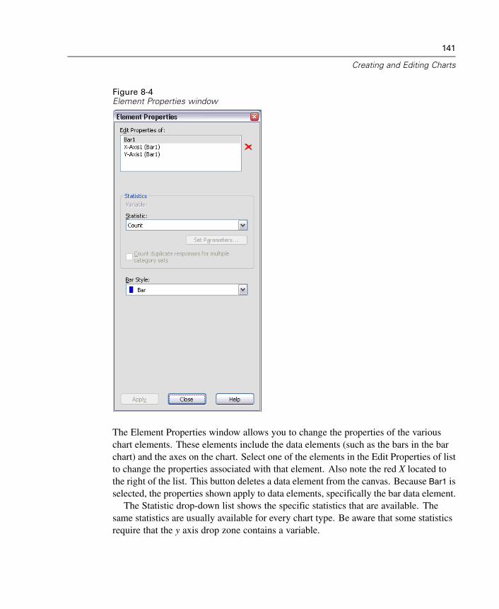
141
Creating and Editing Charts
Figure 8-4Element Properties window
The Element Properties window allows you to change the properties of the variouschart elements. These elements include the data elements (such as the bars in the barchart) and the axes on the chart. Select one of the elements in the Edit Properties of listto change the properties associated with that element. Also note the red X located tothe right of the list. This button deletes a data element from the canvas. Because Bar1 isselected, the properties shown apply to data elements, specifically the bar data element.
The Statistic drop-down list shows the specific statistics that are available. Thesame statistics are usually available for every chart type. Be aware that some statisticsrequire that the y axis drop zone contains a variable.
142
Chapter 8
E Return to the Chart Builder dialog box and drag Household income in thousands fromthe Variables list to the y axis drop zone. Because the variable on the y axis is scalarand the x axis variable is categorical (ordinal is a type of categorical measurementlevel), the y axis drop zone defaults to the Mean statistic. These are the variables andstatistics you want, so there is no need to change the element properties.
Adding Optional Elements
In addition to the required chart elements, you can add optional elements, such astitles and footnotes.
E Click the Optional Elements tab.
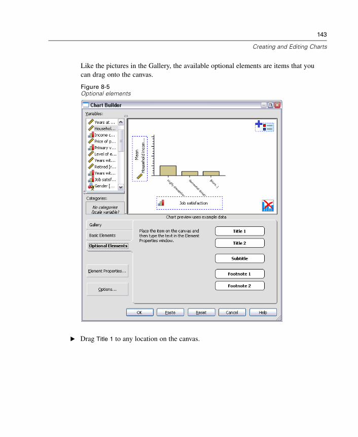
143
Creating and Editing Charts
Like the pictures in the Gallery, the available optional elements are items that youcan drag onto the canvas.
Figure 8-5Optional elements
E Drag Title 1 to any location on the canvas.
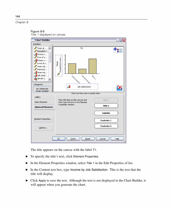
144
Chapter 8
Figure 8-6Title 1 displayed on canvas
The title appears on the canvas with the label T1.
E To specify the title’s text, click Element Properties.
E In the Element Properties window, select Title 1 in the Edit Properties of list.
E In the Content text box, type Income by Job Satisfaction. This is the text that thetitle will display.
E Click Apply to save the text. Although the text is not displayed in the Chart Builder, itwill appear when you generate the chart.
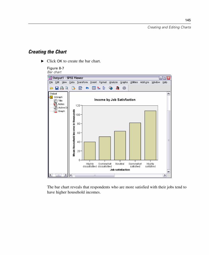
145
Creating and Editing Charts
Creating the Chart
E Click OK to create the bar chart.
Figure 8-7Bar chart
The bar chart reveals that respondents who are more satisfied with their jobs tend tohave higher household incomes.
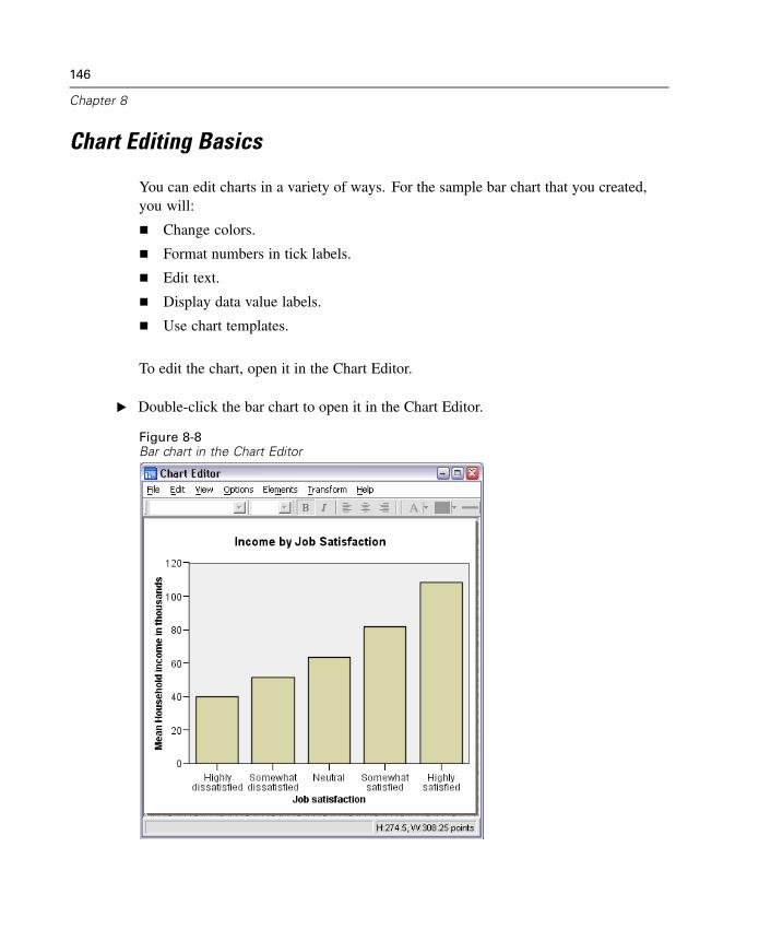
146
Chapter 8
Chart Editing Basics
You can edit charts in a variety of ways. For the sample bar chart that you created,you will:
Change colors.
Format numbers in tick labels.
Edit text.
Display data value labels.
Use chart templates.
To edit the chart, open it in the Chart Editor.
E Double-click the bar chart to open it in the Chart Editor.
Figure 8-8Bar chart in the Chart Editor
147
Creating and Editing Charts
Selecting Chart Elements
To edit a chart element, you first select it.
E Click any one of the bars. The rectangles around the bars indicate that they are selected.
There are general rules for selecting elements in simple charts:
When no data elements are selected, click any data element to select all dataelements.
When all data elements are selected, click a data element to select only that dataelement. You can select a different data element by clicking it. To select multipledata elements, click each element while pressing the Ctrl key.
Note: The behavior is slightly different for grouped charts. Grouped charts arediscussed in the scatterplot example. For more information, see “Selecting Elementsin Grouped Charts” on p. 179.
E To deselect all elements, press the Esc key.
E Click any bar to select all of the bars again.
Using the Properties Window
E From the Chart Editor menus choose:Edit
Properties
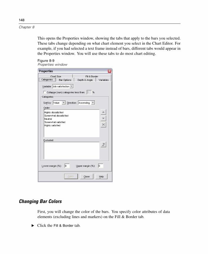
148
Chapter 8
This opens the Properties window, showing the tabs that apply to the bars you selected.These tabs change depending on what chart element you select in the Chart Editor. Forexample, if you had selected a text frame instead of bars, different tabs would appear inthe Properties window. You will use these tabs to do most chart editing.
Figure 8-9Properties window
Changing Bar Colors
First, you will change the color of the bars. You specify color attributes of dataelements (excluding lines and markers) on the Fill & Border tab.
E Click the Fill & Border tab.
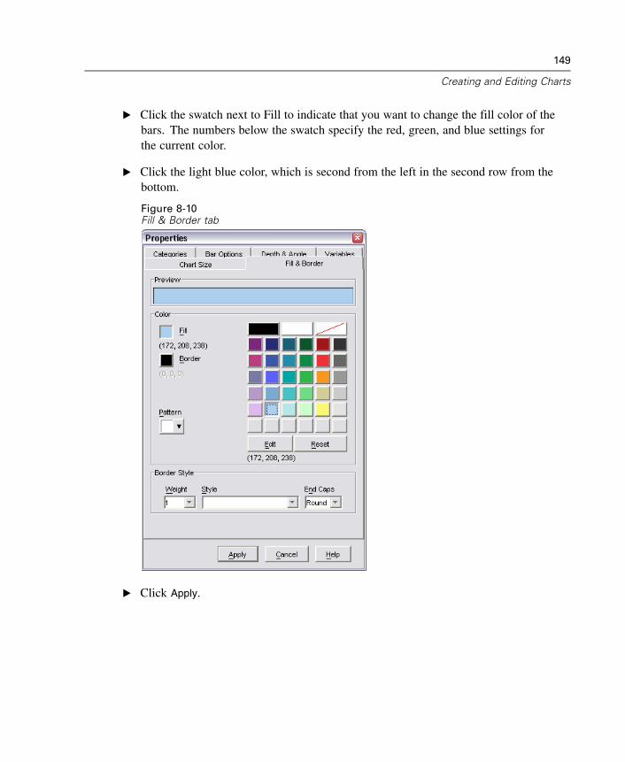
149
Creating and Editing Charts
E Click the swatch next to Fill to indicate that you want to change the fill color of thebars. The numbers below the swatch specify the red, green, and blue settings forthe current color.
E Click the light blue color, which is second from the left in the second row from thebottom.
Figure 8-10Fill & Border tab
E Click Apply.
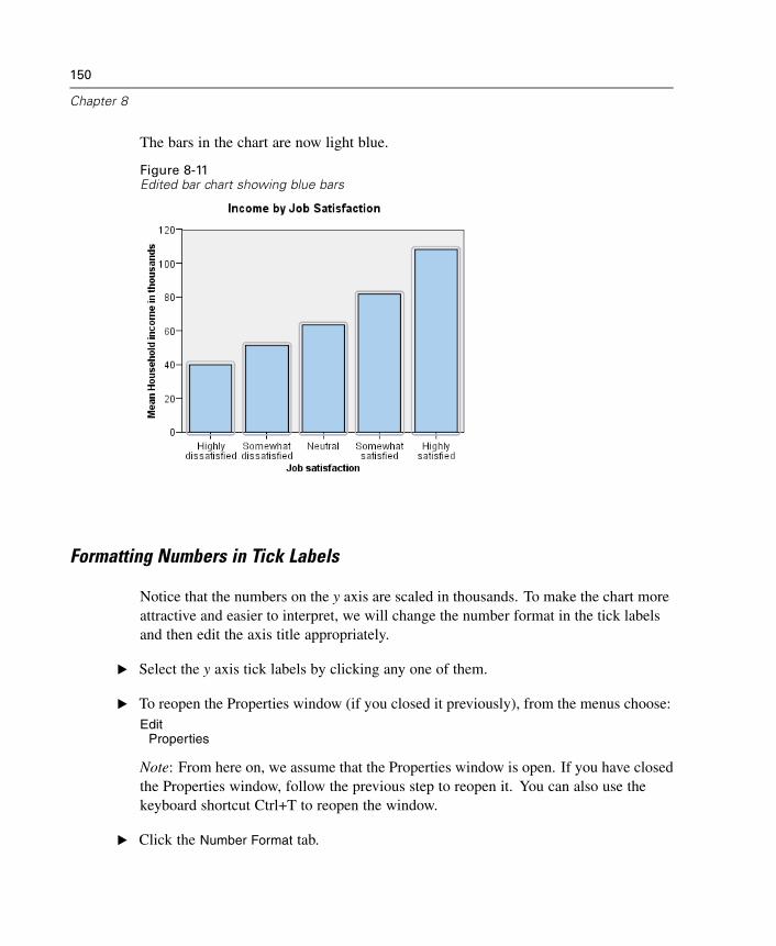
150
Chapter 8
The bars in the chart are now light blue.
Figure 8-11Edited bar chart showing blue bars
Formatting Numbers in Tick Labels
Notice that the numbers on the y axis are scaled in thousands. To make the chart moreattractive and easier to interpret, we will change the number format in the tick labelsand then edit the axis title appropriately.
E Select the y axis tick labels by clicking any one of them.
E To reopen the Properties window (if you closed it previously), from the menus choose:Edit
Properties
Note: From here on, we assume that the Properties window is open. If you have closedthe Properties window, follow the previous step to reopen it. You can also use thekeyboard shortcut Ctrl+T to reopen the window.
E Click the Number Format tab.
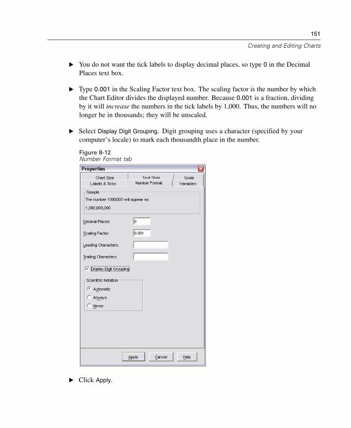
151
Creating and Editing Charts
E You do not want the tick labels to display decimal places, so type 0 in the DecimalPlaces text box.
E Type 0.001 in the Scaling Factor text box. The scaling factor is the number by whichthe Chart Editor divides the displayed number. Because 0.001 is a fraction, dividingby it will increase the numbers in the tick labels by 1,000. Thus, the numbers will nolonger be in thousands; they will be unscaled.
E Select Display Digit Grouping. Digit grouping uses a character (specified by yourcomputer’s locale) to mark each thousandth place in the number.
Figure 8-12Number Format tab
E Click Apply.
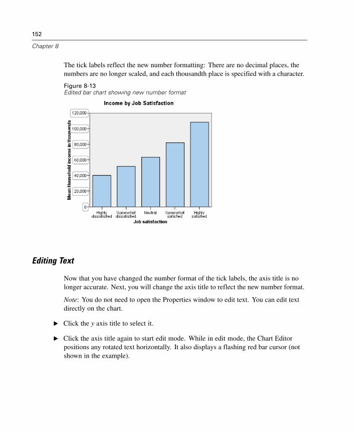
152
Chapter 8
The tick labels reflect the new number formatting: There are no decimal places, thenumbers are no longer scaled, and each thousandth place is specified with a character.
Figure 8-13Edited bar chart showing new number format
Editing Text
Now that you have changed the number format of the tick labels, the axis title is nolonger accurate. Next, you will change the axis title to reflect the new number format.
Note: You do not need to open the Properties window to edit text. You can edit textdirectly on the chart.
E Click the y axis title to select it.
E Click the axis title again to start edit mode. While in edit mode, the Chart Editorpositions any rotated text horizontally. It also displays a flashing red bar cursor (notshown in the example).
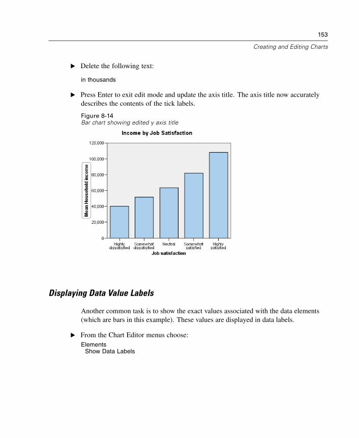
153
Creating and Editing Charts
E Delete the following text:
in thousands
E Press Enter to exit edit mode and update the axis title. The axis title now accuratelydescribes the contents of the tick labels.
Figure 8-14Bar chart showing edited y axis title
Displaying Data Value Labels
Another common task is to show the exact values associated with the data elements(which are bars in this example). These values are displayed in data labels.
E From the Chart Editor menus choose:Elements
Show Data Labels
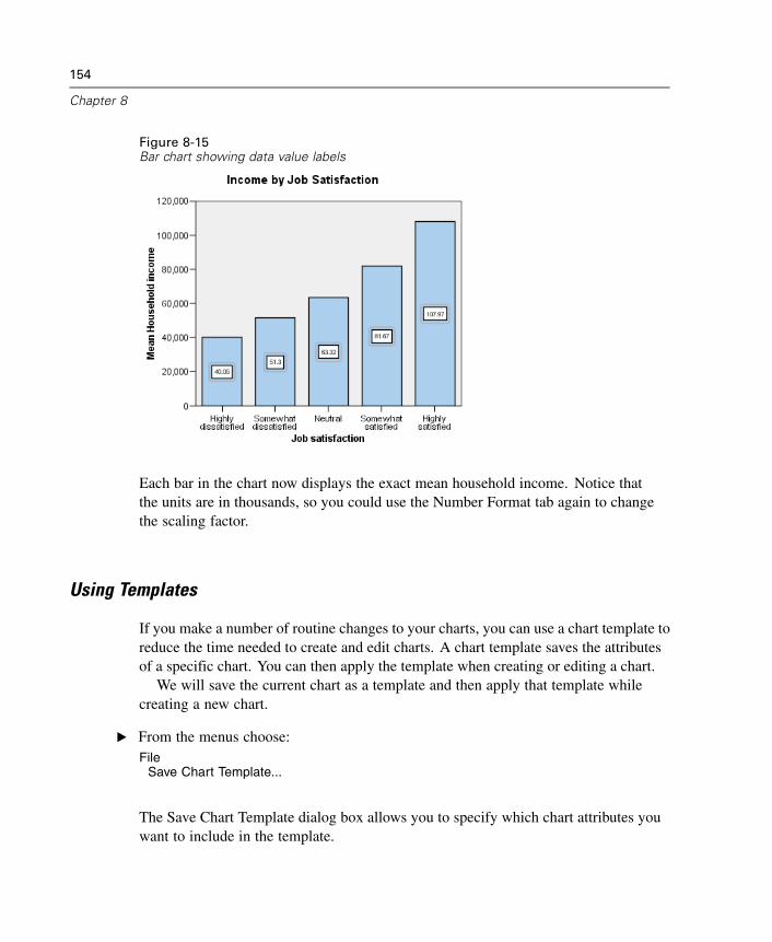
154
Chapter 8
Figure 8-15Bar chart showing data value labels
Each bar in the chart now displays the exact mean household income. Notice thatthe units are in thousands, so you could use the Number Format tab again to changethe scaling factor.
Using Templates
If you make a number of routine changes to your charts, you can use a chart template toreduce the time needed to create and edit charts. A chart template saves the attributesof a specific chart. You can then apply the template when creating or editing a chart.
We will save the current chart as a template and then apply that template whilecreating a new chart.
E From the menus choose:File
Save Chart Template...
The Save Chart Template dialog box allows you to specify which chart attributes youwant to include in the template.
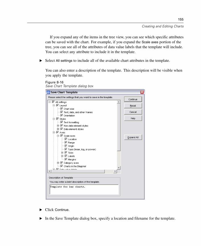
155
Creating and Editing Charts
If you expand any of the items in the tree view, you can see which specific attributescan be saved with the chart. For example, if you expand the Scale axes portion of thetree, you can see all of the attributes of data value labels that the template will include.You can select any attribute to include it in the template.
E Select All settings to include all of the available chart attributes in the template.
You can also enter a description of the template. This description will be visible whenyou apply the template.
Figure 8-16Save Chart Template dialog box
E Click Continue.
E In the Save Template dialog box, specify a location and filename for the template.
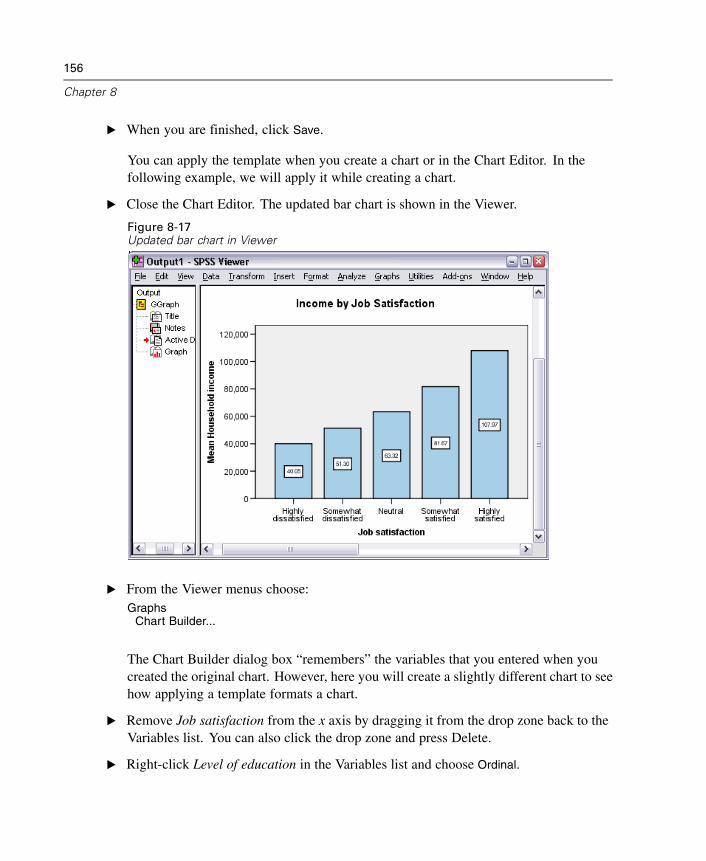
156
Chapter 8
E When you are finished, click Save.
You can apply the template when you create a chart or in the Chart Editor. In thefollowing example, we will apply it while creating a chart.
E Close the Chart Editor. The updated bar chart is shown in the Viewer.
Figure 8-17Updated bar chart in Viewer
E From the Viewer menus choose:Graphs
Chart Builder...
The Chart Builder dialog box “remembers” the variables that you entered when youcreated the original chart. However, here you will create a slightly different chart to seehow applying a template formats a chart.
E Remove Job satisfaction from the x axis by dragging it from the drop zone back to theVariables list. You can also click the drop zone and press Delete.
E Right-click Level of education in the Variables list and choose Ordinal.
157
Creating and Editing Charts
E Drag Level of education from the Variables list to the x axis drop zone.
Because the title is now inaccurate, we are going to delete it.
E Click Element Properties.
E In the Edit Properties of list, select Title 1.
E Click the red X located to the right of the Edit Properties of list.
E Click Apply.
Now we are going to specify the template to apply to the new chart.
E Click Options.
E In the Templates group in the Options dialog box, click Add.
E In the Find Template Files dialog box, locate the template file that you previously savedusing the Save Chart Template dialog box.
E Select that file and click Open.
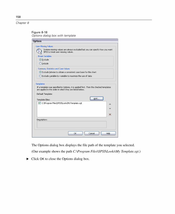
158
Chapter 8
Figure 8-18Options dialog box with template
The Options dialog box displays the file path of the template you selected.
(Our example shows the path C:\Program Files\SPSS\Looks\My Template.sgt.)
E Click OK to close the Options dialog box.
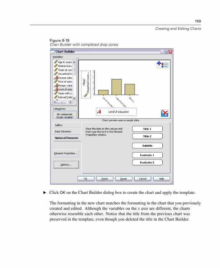
159
Creating and Editing Charts
Figure 8-19Chart Builder with completed drop zones
E Click OK on the Chart Builder dialog box to create the chart and apply the template.
The formatting in the new chart matches the formatting in the chart that you previouslycreated and edited. Although the variables on the x axis are different, the chartsotherwise resemble each other. Notice that the title from the previous chart waspreserved in the template, even though you deleted the title in the Chart Builder.
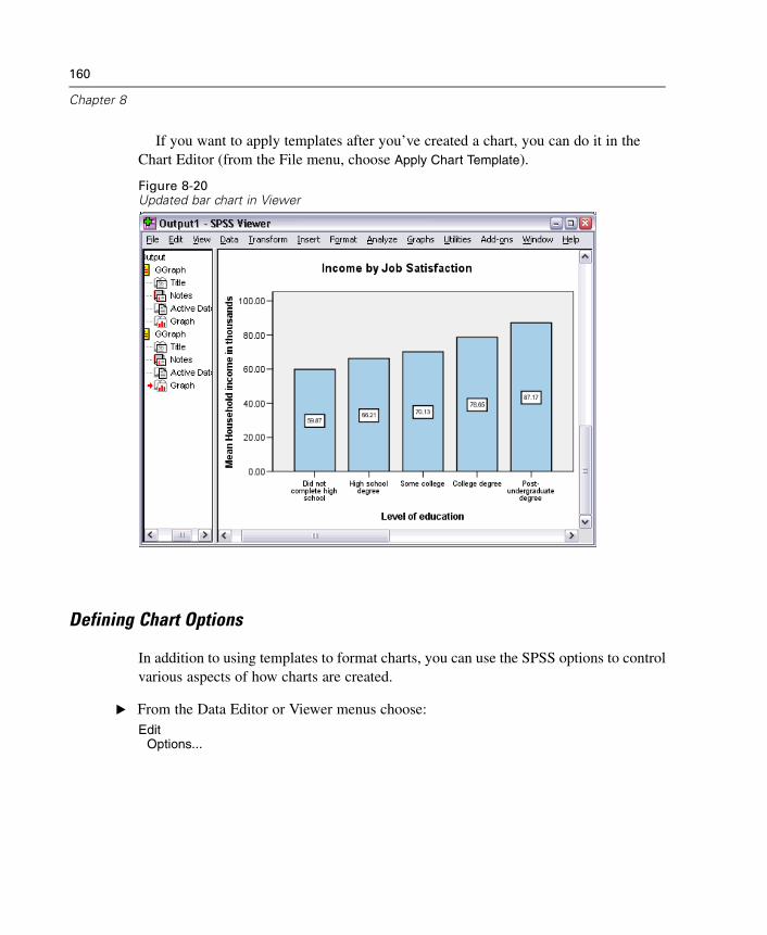
160
Chapter 8
If you want to apply templates after you’ve created a chart, you can do it in theChart Editor (from the File menu, choose Apply Chart Template).
Figure 8-20Updated bar chart in Viewer
Defining Chart Options
In addition to using templates to format charts, you can use the SPSS options to controlvarious aspects of how charts are created.
E From the Data Editor or Viewer menus choose:Edit
Options...
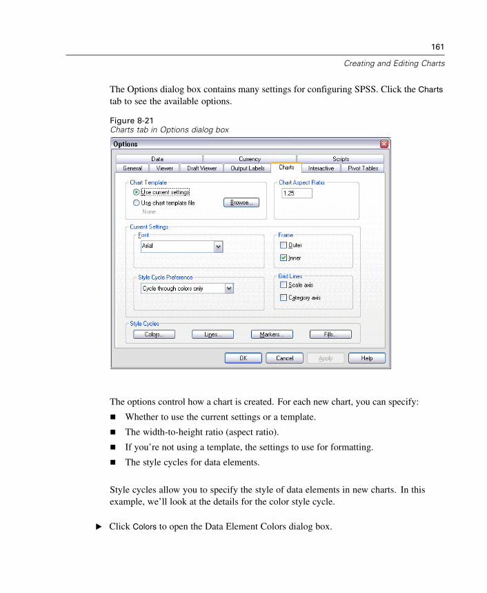
161
Creating and Editing Charts
The Options dialog box contains many settings for configuring SPSS. Click the Charts
tab to see the available options.
Figure 8-21Charts tab in Options dialog box
The options control how a chart is created. For each new chart, you can specify:
Whether to use the current settings or a template.
The width-to-height ratio (aspect ratio).
If you’re not using a template, the settings to use for formatting.
The style cycles for data elements.
Style cycles allow you to specify the style of data elements in new charts. In thisexample, we’ll look at the details for the color style cycle.
E Click Colors to open the Data Element Colors dialog box.
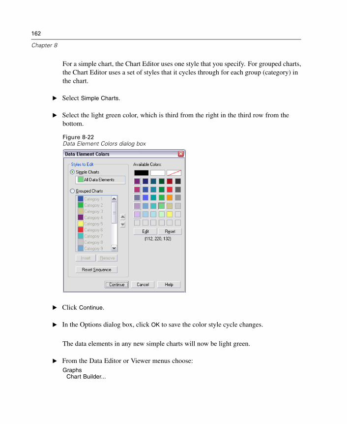
162
Chapter 8
For a simple chart, the Chart Editor uses one style that you specify. For grouped charts,the Chart Editor uses a set of styles that it cycles through for each group (category) inthe chart.
E Select Simple Charts.
E Select the light green color, which is third from the right in the third row from thebottom.
Figure 8-22Data Element Colors dialog box
E Click Continue.
E In the Options dialog box, click OK to save the color style cycle changes.
The data elements in any new simple charts will now be light green.
E From the Data Editor or Viewer menus choose:Graphs
Chart Builder...
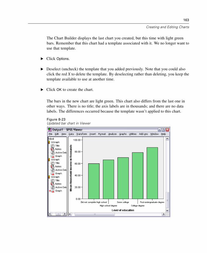
163
Creating and Editing Charts
The Chart Builder displays the last chart you created, but this time with light greenbars. Remember that this chart had a template associated with it. We no longer want touse that template.
E Click Options.
E Deselect (uncheck) the template that you added previously. Note that you could alsoclick the red X to delete the template. By deselecting rather than deleting, you keep thetemplate available to use at another time.
E Click OK to create the chart.
The bars in the new chart are light green. This chart also differs from the last one inother ways. There is no title; the axis labels are in thousands; and there are no datalabels. The differences occurred because the template wasn’t applied to this chart.
Figure 8-23Updated bar chart in Viewer
164
Chapter 8
Other Examples
Now we will create and edit a pie chart and a grouped scatterplot to explore otherediting capabilities, including:
Hiding categories.
Moving text.
Converting a chart to another chart type.
Adding a fit line to a scatterplot.
Identifying points in a scatterplot.
Pie Chart
First, we will create a simple pie chart that shows how many respondents have Internetservice at home. This example uses the data file demo.sav.
E From the menus choose:Graphs
Chart Builder...
The Chart Builder displays the last chart that you created.
E Click the Clear icon in the lower right corner of the canvas to clear the previous chart.
E Click the Gallery tab and click Pie/Polar.
E Drag the pie chart onto the canvas.
E Right-click Internet in the Variables list and choose Nominal.
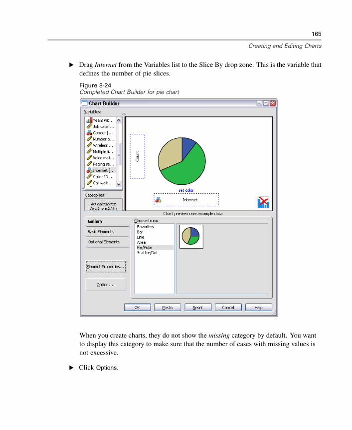
165
Creating and Editing Charts
E Drag Internet from the Variables list to the Slice By drop zone. This is the variable thatdefines the number of pie slices.
Figure 8-24Completed Chart Builder for pie chart
When you create charts, they do not show the missing category by default. You wantto display this category to make sure that the number of cases with missing values isnot excessive.
E Click Options.
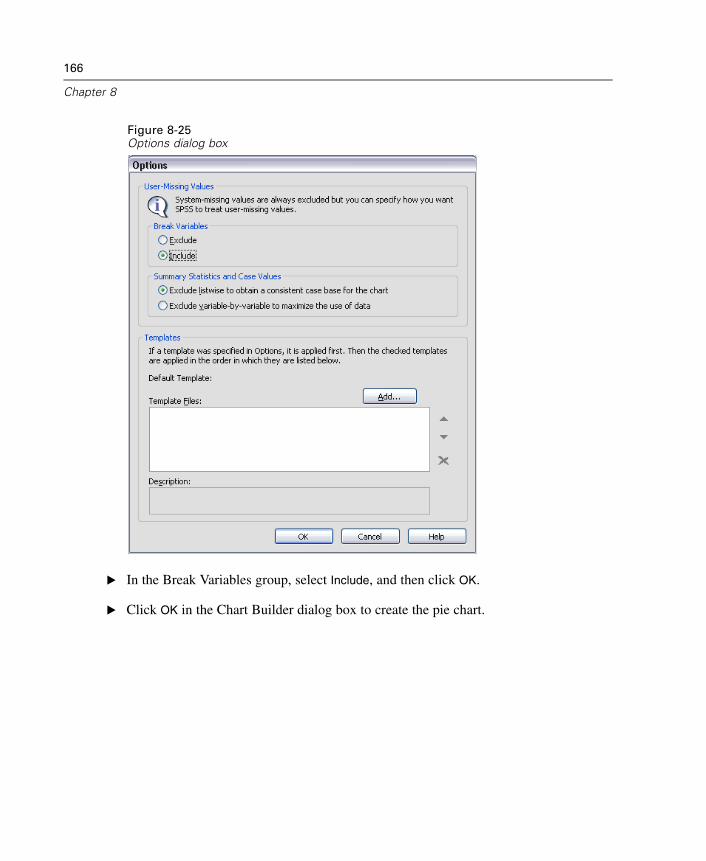
166
Chapter 8
Figure 8-25Options dialog box
E In the Break Variables group, select Include, and then click OK.
E Click OK in the Chart Builder dialog box to create the pie chart.
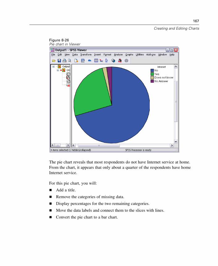
167
Creating and Editing Charts
Figure 8-26Pie chart in Viewer
The pie chart reveals that most respondents do not have Internet service at home.From the chart, it appears that only about a quarter of the respondents have homeInternet service.
For this pie chart, you will:
Add a title.
Remove the categories of missing data.
Display percentages for the two remaining categories.
Move the data labels and connect them to the slices with lines.
Convert the pie chart to a bar chart.
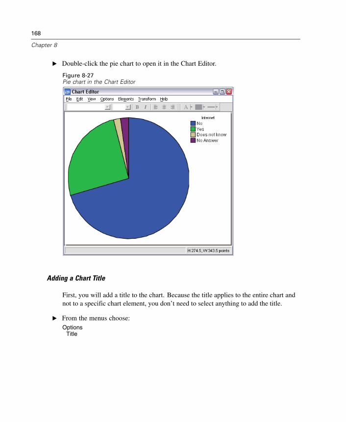
168
Chapter 8
E Double-click the pie chart to open it in the Chart Editor.
Figure 8-27Pie chart in the Chart Editor
Adding a Chart Title
First, you will add a title to the chart. Because the title applies to the entire chart andnot to a specific chart element, you don’t need to select anything to add the title.
E From the menus choose:Options
Title
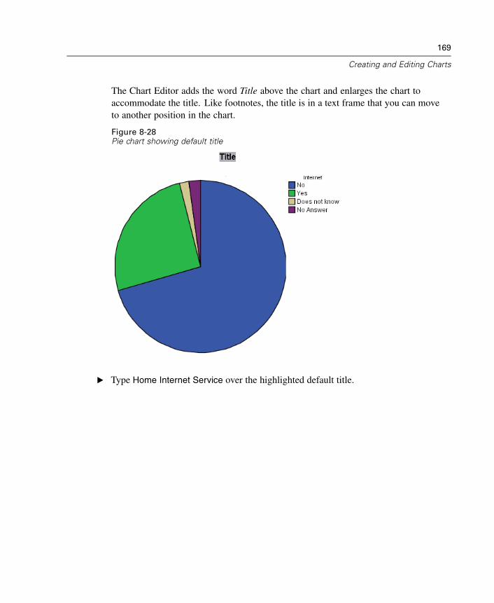
169
Creating and Editing Charts
The Chart Editor adds the word Title above the chart and enlarges the chart toaccommodate the title. Like footnotes, the title is in a text frame that you can moveto another position in the chart.
Figure 8-28Pie chart showing default title
E Type Home Internet Service over the highlighted default title.
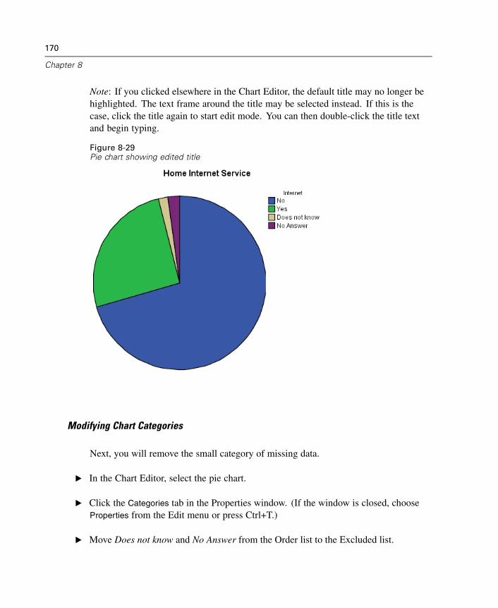
170
Chapter 8
Note: If you clicked elsewhere in the Chart Editor, the default title may no longer behighlighted. The text frame around the title may be selected instead. If this is thecase, click the title again to start edit mode. You can then double-click the title textand begin typing.
Figure 8-29Pie chart showing edited title
Modifying Chart Categories
Next, you will remove the small category of missing data.
E In the Chart Editor, select the pie chart.
E Click the Categories tab in the Properties window. (If the window is closed, chooseProperties from the Edit menu or press Ctrl+T.)
E Move Does not know and No Answer from the Order list to the Excluded list.
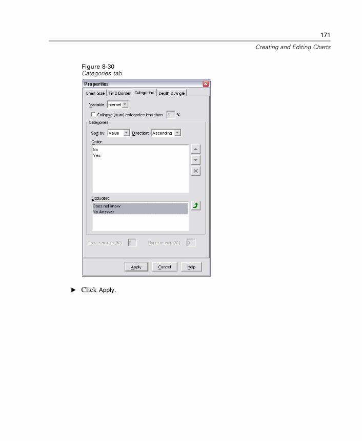
171
Creating and Editing Charts
Figure 8-30Categories tab
E Click Apply.
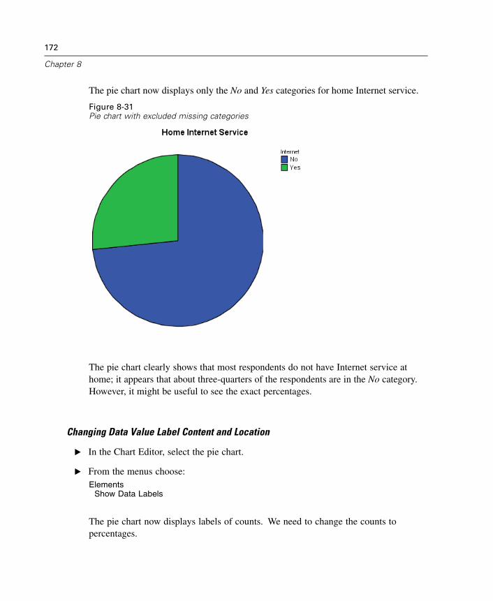
172
Chapter 8
The pie chart now displays only the No and Yes categories for home Internet service.
Figure 8-31Pie chart with excluded missing categories
The pie chart clearly shows that most respondents do not have Internet service athome; it appears that about three-quarters of the respondents are in the No category.However, it might be useful to see the exact percentages.
Changing Data Value Label Content and Location
E In the Chart Editor, select the pie chart.
E From the menus choose:Elements
Show Data Labels
The pie chart now displays labels of counts. We need to change the counts topercentages.
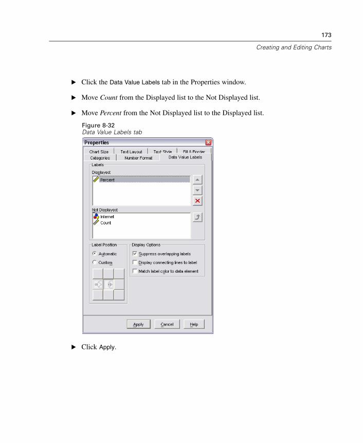
173
Creating and Editing Charts
E Click the Data Value Labels tab in the Properties window.
E Move Count from the Displayed list to the Not Displayed list.
E Move Percent from the Not Displayed list to the Displayed list.
Figure 8-32Data Value Labels tab
E Click Apply.
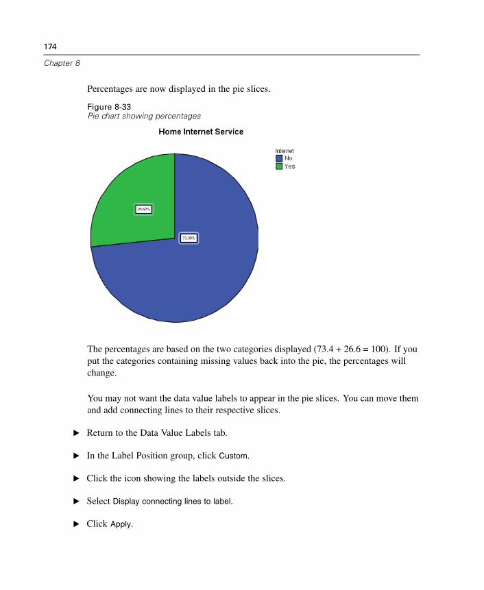
174
Chapter 8
Percentages are now displayed in the pie slices.
Figure 8-33Pie chart showing percentages
The percentages are based on the two categories displayed (73.4 + 26.6 = 100). If youput the categories containing missing values back into the pie, the percentages willchange.
You may not want the data value labels to appear in the pie slices. You can move themand add connecting lines to their respective slices.
E Return to the Data Value Labels tab.
E In the Label Position group, click Custom.
E Click the icon showing the labels outside the slices.
E Select Display connecting lines to label.
E Click Apply.
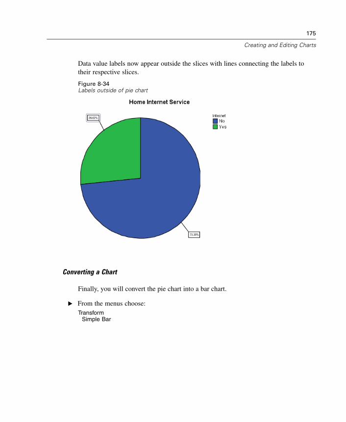
175
Creating and Editing Charts
Data value labels now appear outside the slices with lines connecting the labels totheir respective slices.
Figure 8-34Labels outside of pie chart
Converting a Chart
Finally, you will convert the pie chart into a bar chart.
E From the menus choose:Transform
Simple Bar
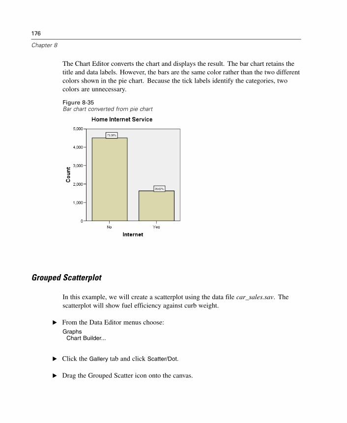
176
Chapter 8
The Chart Editor converts the chart and displays the result. The bar chart retains thetitle and data labels. However, the bars are the same color rather than the two differentcolors shown in the pie chart. Because the tick labels identify the categories, twocolors are unnecessary.
Figure 8-35Bar chart converted from pie chart
Grouped Scatterplot
In this example, we will create a scatterplot using the data file car_sales.sav. Thescatterplot will show fuel efficiency against curb weight.
E From the Data Editor menus choose:Graphs
Chart Builder...
E Click the Gallery tab and click Scatter/Dot.
E Drag the Grouped Scatter icon onto the canvas.
177
Creating and Editing Charts
For a scatterplot, you usually define a scale variable for each axis. Put the dependentvariable on the y axis and the independent variable on the x axis.
E Drag Curb weight from the Variables list to the x axis drop zone.
E Drag Fuel efficiency from the Variables list to the y axis drop zone.
E Drag Vehicle type from the Variables list to the grouping drop zone, which is locatedin the upper right corner of the canvas.
The grouping drop zone is used when another variable splits data elements into groups.In this case, the grouping variable creates distinct groups of points in the resultingscatterplot. In a bar chart, the grouping variable is used for features such as clusteringand stacking.
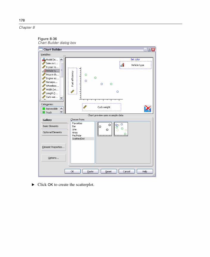
178
Chapter 8
Figure 8-36Chart Builder dialog box
E Click OK to create the scatterplot.
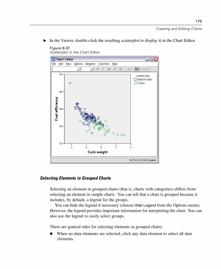
179
Creating and Editing Charts
E In the Viewer, double-click the resulting scatterplot to display it in the Chart Editor.
Figure 8-37Scatterplot in the Chart Editor
Selecting Elements in Grouped Charts
Selecting an element in grouped charts (that is, charts with categories) differs fromselecting an element in simple charts. You can tell that a chart is grouped because itincludes, by default, a legend for the groups.
You can hide the legend if necessary (choose Hide Legend from the Options menu).However, the legend provides important information for interpreting the chart. You canalso use the legend to easily select groups.
There are general rules for selecting elements in grouped charts:
When no data elements are selected, click any data element to select all dataelements.
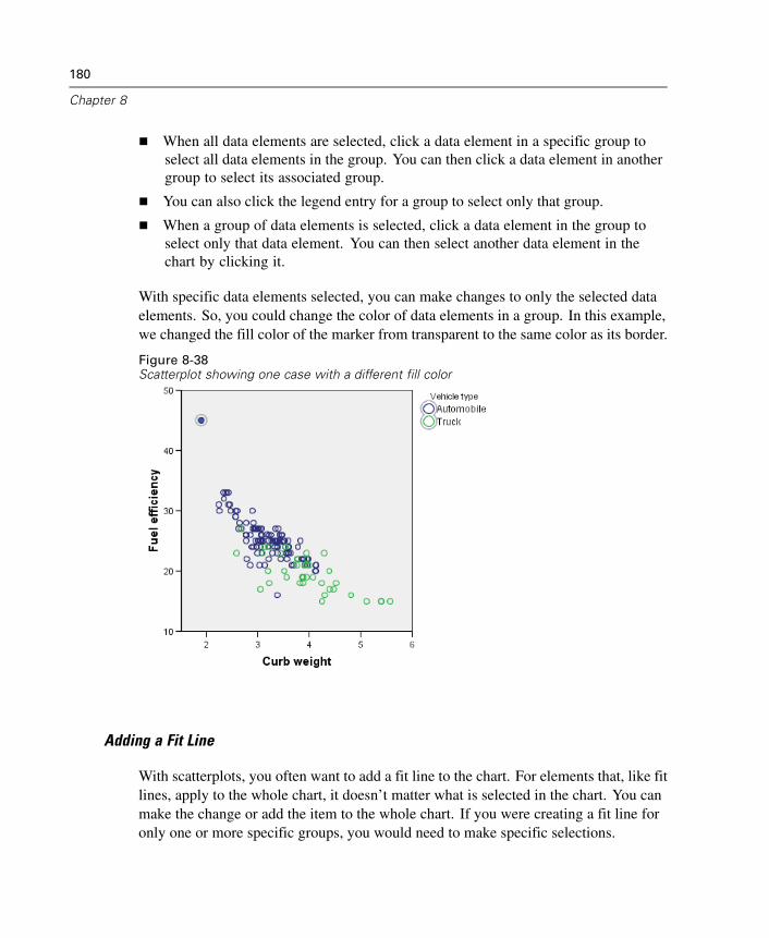
180
Chapter 8
When all data elements are selected, click a data element in a specific group toselect all data elements in the group. You can then click a data element in anothergroup to select its associated group.
You can also click the legend entry for a group to select only that group.
When a group of data elements is selected, click a data element in the group toselect only that data element. You can then select another data element in thechart by clicking it.
With specific data elements selected, you can make changes to only the selected dataelements. So, you could change the color of data elements in a group. In this example,we changed the fill color of the marker from transparent to the same color as its border.
Figure 8-38Scatterplot showing one case with a different fill color
Adding a Fit Line
With scatterplots, you often want to add a fit line to the chart. For elements that, like fitlines, apply to the whole chart, it doesn’t matter what is selected in the chart. You canmake the change or add the item to the whole chart. If you were creating a fit line foronly one or more specific groups, you would need to make specific selections.
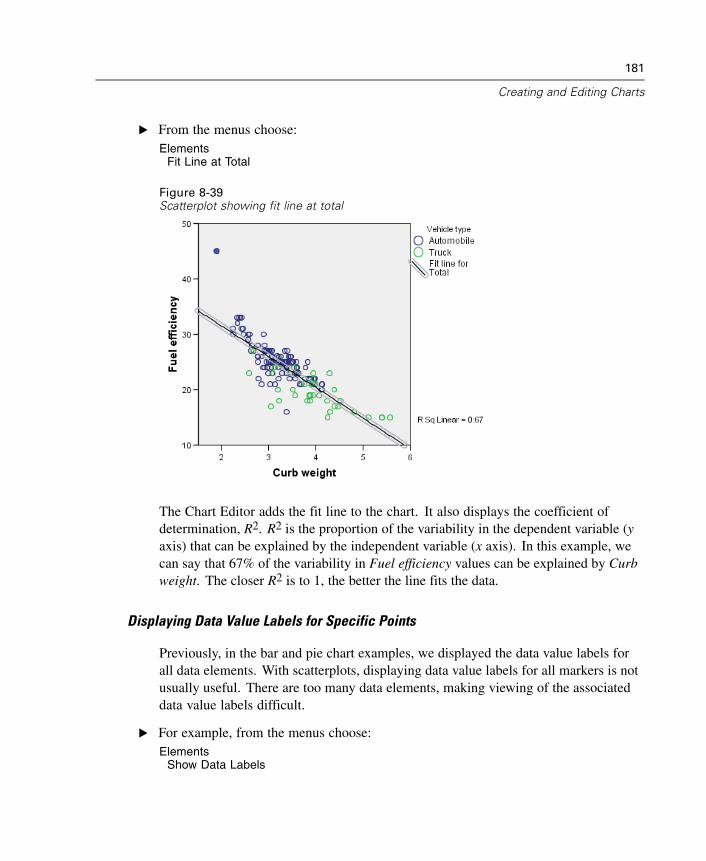
181
Creating and Editing Charts
E From the menus choose:Elements
Fit Line at Total
Figure 8-39Scatterplot showing fit line at total
The Chart Editor adds the fit line to the chart. It also displays the coefficient ofdetermination, R2. R2 is the proportion of the variability in the dependent variable (yaxis) that can be explained by the independent variable (x axis). In this example, wecan say that 67% of the variability in Fuel efficiency values can be explained by Curbweight. The closer R2 is to 1, the better the line fits the data.
Displaying Data Value Labels for Specific Points
Previously, in the bar and pie chart examples, we displayed the data value labels forall data elements. With scatterplots, displaying data value labels for all markers is notusually useful. There are too many data elements, making viewing of the associateddata value labels difficult.
E For example, from the menus choose:Elements
Show Data Labels
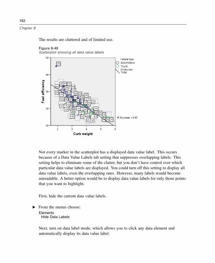
182
Chapter 8
The results are cluttered and of limited use.
Figure 8-40Scatterplot showing all data value labels
Not every marker in the scatterplot has a displayed data value label. This occursbecause of a Data Value Labels tab setting that suppresses overlapping labels. Thissetting helps to eliminate some of the clutter, but you don’t have control over whichparticular data value labels are displayed. You could turn off this setting to display alldata value labels, even the overlapping ones. However, many labels would becomeunreadable. A better option would be to display data value labels for only those pointsthat you want to highlight.
First, hide the current data value labels.
E From the menus choose:Elements
Hide Data Labels
Next, turn on data label mode, which allows you to click any data element andautomatically display its data value label.
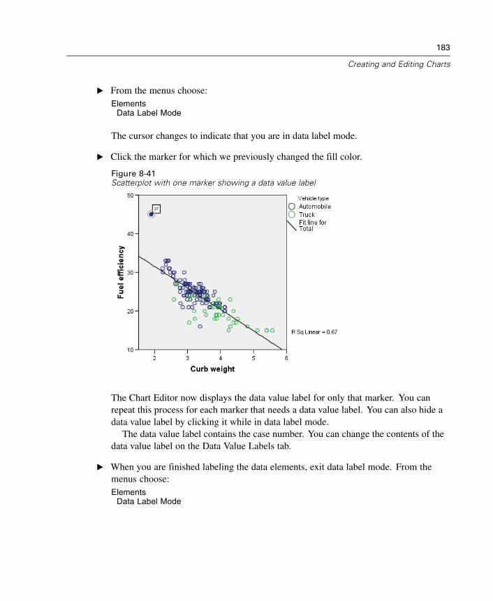
183
Creating and Editing Charts
E From the menus choose:Elements
Data Label Mode
The cursor changes to indicate that you are in data label mode.
E Click the marker for which we previously changed the fill color.
Figure 8-41Scatterplot with one marker showing a data value label
The Chart Editor now displays the data value label for only that marker. You canrepeat this process for each marker that needs a data value label. You can also hide adata value label by clicking it while in data label mode.
The data value label contains the case number. You can change the contents of thedata value label on the Data Value Labels tab.
E When you are finished labeling the data elements, exit data label mode. From themenus choose:Elements
Data Label Mode

Chapter
9Working with Syntax
SPSS provides a powerful command language that allows you to save and automatemany common tasks. It also provides some functionality not found in the menus anddialog boxes. Most commands are accessible from the menus and dialog boxes.However, some commands and options are available only by using the commandlanguage. The command language also allows you to save your jobs in a syntax fileso that you can repeat your analysis at a later date or run it in an automated job withthe Production Facility.
A command syntax file is simply a text file that contains SPSS commands. Youcan open a syntax window and type commands directly, but it is often easier to let thedialog boxes do some or all of the work for you.
The examples in this chapter use the data file demo.sav.
Note: Command syntax is not available with the Student Version.
Pasting Syntax
The easiest way to create syntax is to use the Paste button located on most dialog boxes.
E Open demo.sav for use in this example.
E From the menus choose:Analyze
Descriptive StatisticsFrequencies...
185
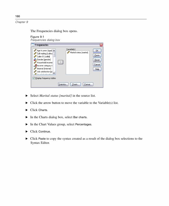
186
Chapter 9
The Frequencies dialog box opens.
Figure 9-1Frequencies dialog box
E Select Marital status [marital] in the source list.
E Click the arrow button to move the variable to the Variable(s) list.
E Click Charts.
E In the Charts dialog box, select Bar charts.
E In the Chart Values group, select Percentages.
E Click Continue.
E Click Paste to copy the syntax created as a result of the dialog box selections to theSyntax Editor.
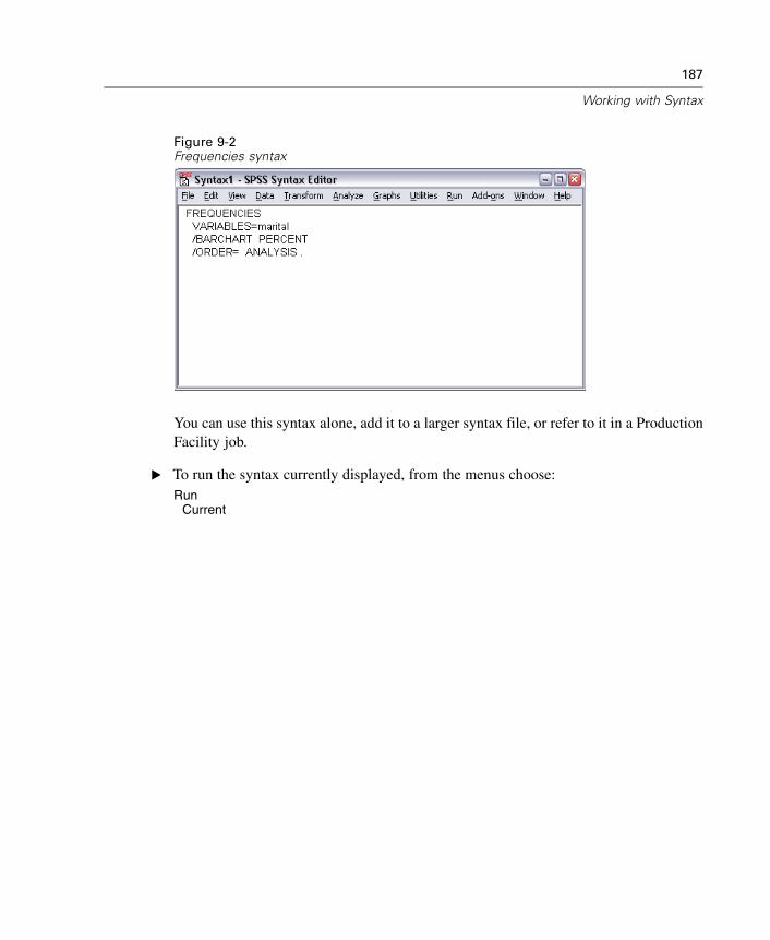
187
Working with Syntax
Figure 9-2Frequencies syntax
You can use this syntax alone, add it to a larger syntax file, or refer to it in a ProductionFacility job.
E To run the syntax currently displayed, from the menus choose:Run
Current
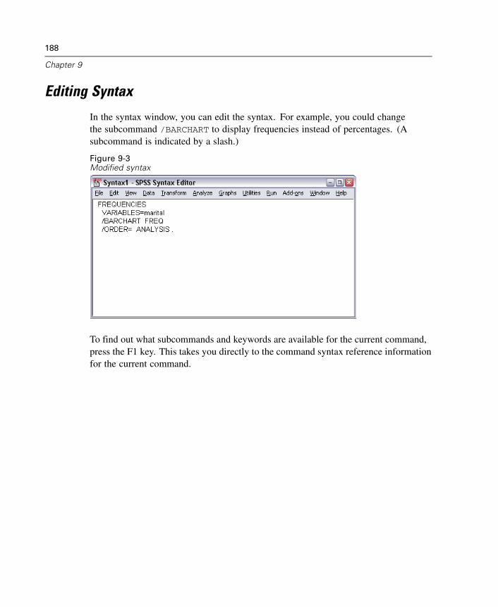
188
Chapter 9
Editing Syntax
In the syntax window, you can edit the syntax. For example, you could changethe subcommand /BARCHART to display frequencies instead of percentages. (Asubcommand is indicated by a slash.)
Figure 9-3Modified syntax
To find out what subcommands and keywords are available for the current command,press the F1 key. This takes you directly to the command syntax reference informationfor the current command.
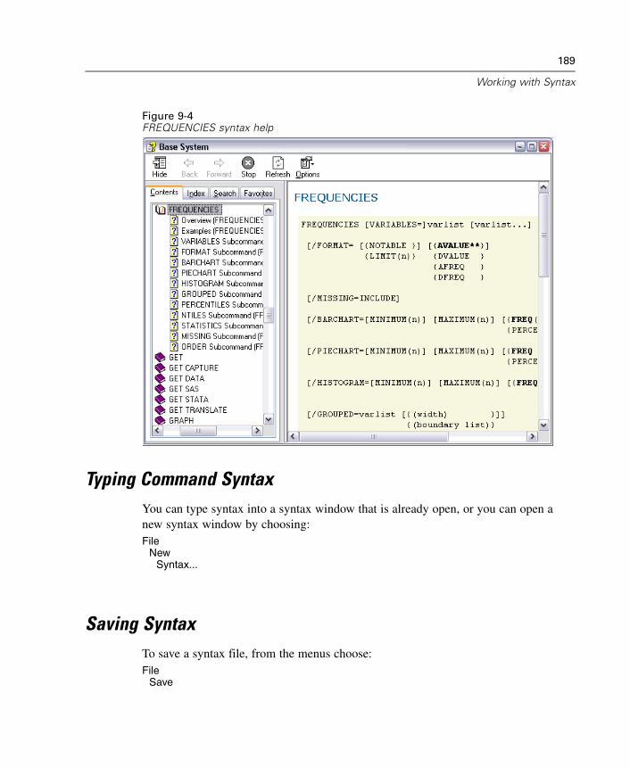
189
Working with Syntax
Figure 9-4FREQUENCIES syntax help
Typing Command SyntaxYou can type syntax into a syntax window that is already open, or you can open anew syntax window by choosing:File
NewSyntax...
Saving SyntaxTo save a syntax file, from the menus choose:File
Save
190
Chapter 9
orFile
Save As...
Either action opens the standard dialog box for saving files.
Opening and Running a Syntax FileE To open a saved syntax file, from the menus choose:
FileOpen
Syntax...
E Select a syntax file. If no syntax files are displayed, make sure Syntax (*.sps) is selectedin the Files of type drop-down list.
E Click Open.
E Use the Run menu in the syntax window to run the commands.
If the commands apply to a specific data file, the data file must be opened beforerunning the commands, or you must include a command that opens the data file. Youcan paste this type of command from the dialog boxes that open data files.
Chapter
10Modifying Data Values
The data you start with may not always be organized in the most useful manner foryour analysis or reporting needs. For example, you may want to:
Create a categorical variable from a scale variable.
Combine several response categories into a single category.
Create a new variable that is the computed difference between two existingvariables.
Calculate the length of time between two dates.
This chapter uses the data file demo.sav.
Creating a Categorical Variable from a Scale Variable
Several categorical variables in the data file demo.sav are, in fact, derived from scalevariables in that data file. For example, the variable inccat is simply income groupedinto four categories. This categorical variable uses the integer values 1–4 to representthe following income categories: less than 25, 25–49, 50–74, and 75 or higher.
To create the categorical variable inccat:
E From the menus in the Data Editor window choose:Transform
Visual Bander...
191
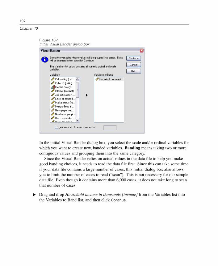
192
Chapter 10
Figure 10-1Initial Visual Bander dialog box
In the initial Visual Bander dialog box, you select the scale and/or ordinal variables forwhich you want to create new, banded variables. Banding means taking two or morecontiguous values and grouping them into the same category.
Since the Visual Bander relies on actual values in the data file to help you makegood banding choices, it needs to read the data file first. Since this can take some timeif your data file contains a large number of cases, this initial dialog box also allowsyou to limit the number of cases to read (“scan”). This is not necessary for our sampledata file. Even though it contains more than 6,000 cases, it does not take long to scanthat number of cases.
E Drag and drop Household income in thousands [income] from the Variables list intothe Variables to Band list, and then click Continue.
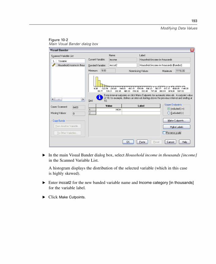
193
Modifying Data Values
Figure 10-2Main Visual Bander dialog box
E In the main Visual Bander dialog box, select Household income in thousands [income]in the Scanned Variable List.
A histogram displays the distribution of the selected variable (which in this caseis highly skewed).
E Enter inccat2 for the new banded variable name and Income category [in thousands]for the variable label.
E Click Make Cutpoints.
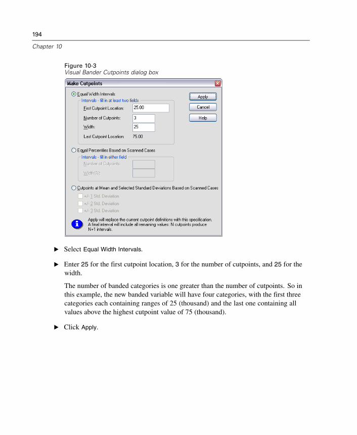
194
Chapter 10
Figure 10-3Visual Bander Cutpoints dialog box
E Select Equal Width Intervals.
E Enter 25 for the first cutpoint location, 3 for the number of cutpoints, and 25 for thewidth.
The number of banded categories is one greater than the number of cutpoints. So inthis example, the new banded variable will have four categories, with the first threecategories each containing ranges of 25 (thousand) and the last one containing allvalues above the highest cutpoint value of 75 (thousand).
E Click Apply.
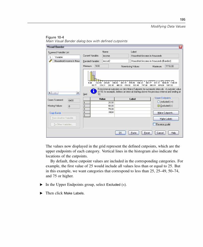
195
Modifying Data Values
Figure 10-4Main Visual Bander dialog box with defined cutpoints
The values now displayed in the grid represent the defined cutpoints, which are theupper endpoints of each category. Vertical lines in the histogram also indicate thelocations of the cutpoints.
By default, these cutpoint values are included in the corresponding categories. Forexample, the first value of 25 would include all values less than or equal to 25. Butin this example, we want categories that correspond to less than 25, 25–49, 50–74,and 75 or higher.
E In the Upper Endpoints group, select Excluded (<).
E Then click Make Labels.
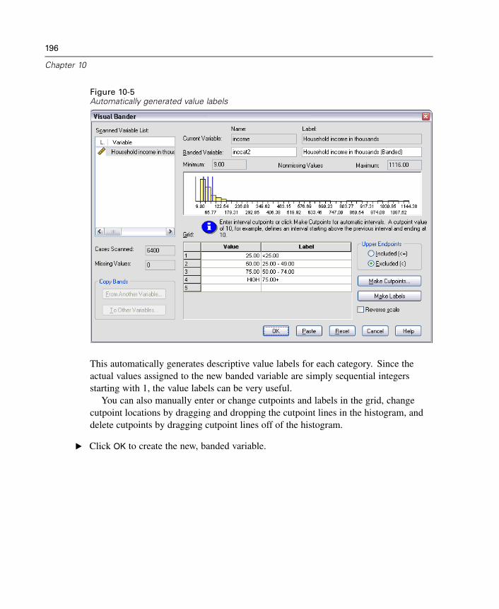
196
Chapter 10
Figure 10-5Automatically generated value labels
This automatically generates descriptive value labels for each category. Since theactual values assigned to the new banded variable are simply sequential integersstarting with 1, the value labels can be very useful.
You can also manually enter or change cutpoints and labels in the grid, changecutpoint locations by dragging and dropping the cutpoint lines in the histogram, anddelete cutpoints by dragging cutpoint lines off of the histogram.
E Click OK to create the new, banded variable.
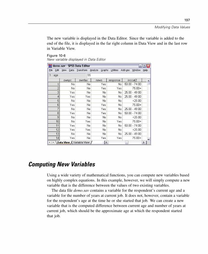
197
Modifying Data Values
The new variable is displayed in the Data Editor. Since the variable is added to theend of the file, it is displayed in the far right column in Data View and in the last rowin Variable View.
Figure 10-6New variable displayed in Data Editor
Computing New Variables
Using a wide variety of mathematical functions, you can compute new variables basedon highly complex equations. In this example, however, we will simply compute a newvariable that is the difference between the values of two existing variables.
The data file demo.sav contains a variable for the respondent’s current age and avariable for the number of years at current job. It does not, however, contain a variablefor the respondent’s age at the time he or she started that job. We can create a newvariable that is the computed difference between current age and number of years atcurrent job, which should be the approximate age at which the respondent startedthat job.
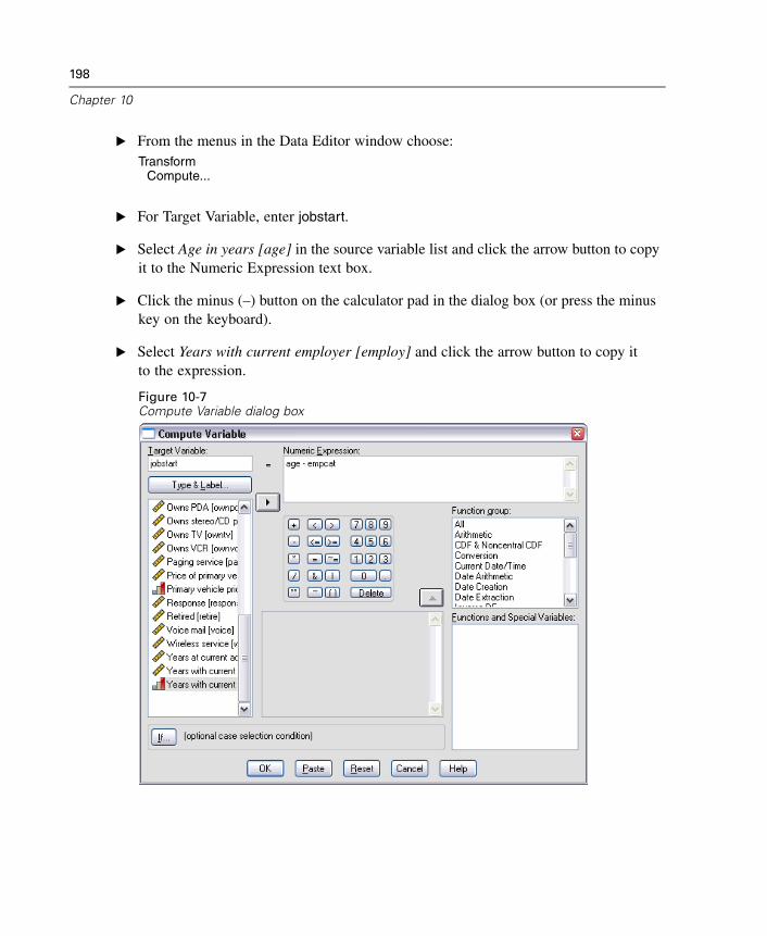
198
Chapter 10
E From the menus in the Data Editor window choose:Transform
Compute...
E For Target Variable, enter jobstart.
E Select Age in years [age] in the source variable list and click the arrow button to copyit to the Numeric Expression text box.
E Click the minus (–) button on the calculator pad in the dialog box (or press the minuskey on the keyboard).
E Select Years with current employer [employ] and click the arrow button to copy itto the expression.
Figure 10-7Compute Variable dialog box
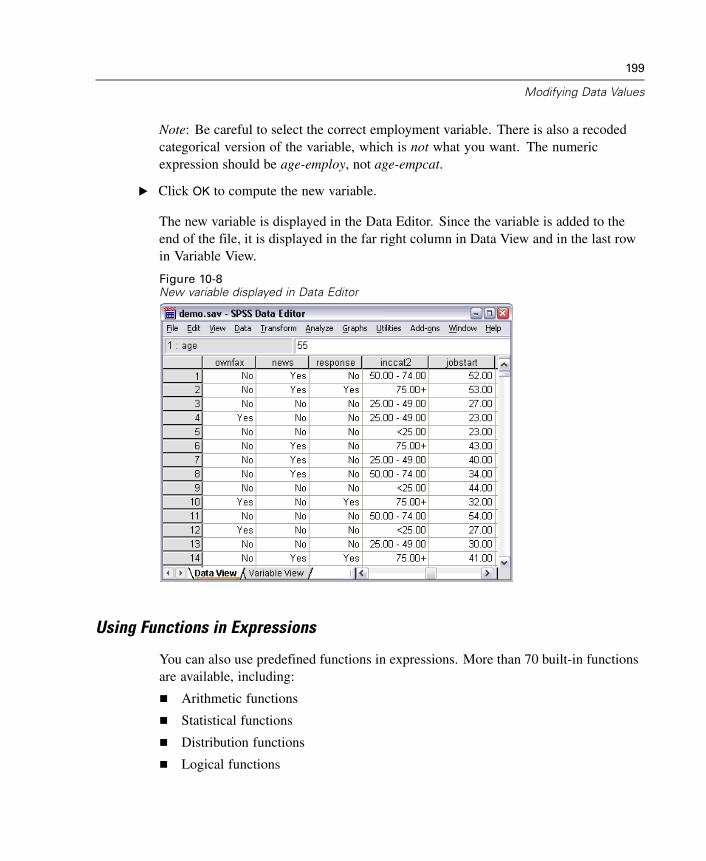
199
Modifying Data Values
Note: Be careful to select the correct employment variable. There is also a recodedcategorical version of the variable, which is not what you want. The numericexpression should be age-employ, not age-empcat.
E Click OK to compute the new variable.
The new variable is displayed in the Data Editor. Since the variable is added to theend of the file, it is displayed in the far right column in Data View and in the last rowin Variable View.
Figure 10-8New variable displayed in Data Editor
Using Functions in Expressions
You can also use predefined functions in expressions. More than 70 built-in functionsare available, including:
Arithmetic functions
Statistical functions
Distribution functions
Logical functions
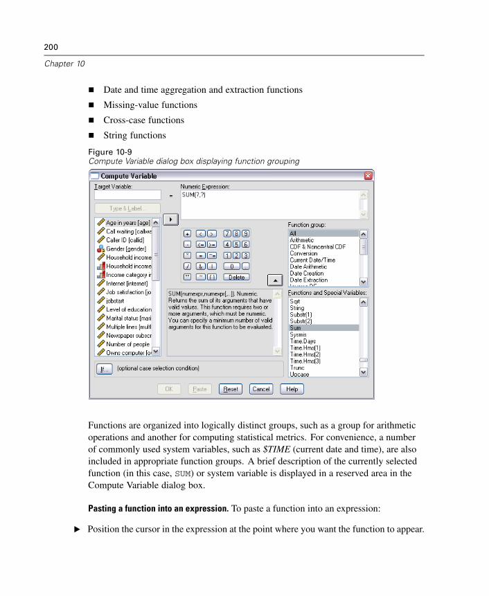
200
Chapter 10
Date and time aggregation and extraction functions
Missing-value functions
Cross-case functions
String functions
Figure 10-9Compute Variable dialog box displaying function grouping
Functions are organized into logically distinct groups, such as a group for arithmeticoperations and another for computing statistical metrics. For convenience, a numberof commonly used system variables, such as $TIME (current date and time), are alsoincluded in appropriate function groups. A brief description of the currently selectedfunction (in this case, SUM) or system variable is displayed in a reserved area in theCompute Variable dialog box.
Pasting a function into an expression. To paste a function into an expression:
E Position the cursor in the expression at the point where you want the function to appear.
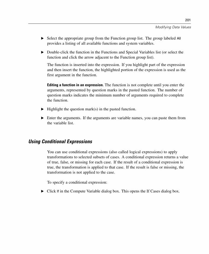
201
Modifying Data Values
E Select the appropriate group from the Function group list. The group labeled All
provides a listing of all available functions and system variables.
E Double-click the function in the Functions and Special Variables list (or select thefunction and click the arrow adjacent to the Function group list).
The function is inserted into the expression. If you highlight part of the expressionand then insert the function, the highlighted portion of the expression is used as thefirst argument in the function.
Editing a function in an expression. The function is not complete until you enter thearguments, represented by question marks in the pasted function. The number ofquestion marks indicates the minimum number of arguments required to completethe function.
E Highlight the question mark(s) in the pasted function.
E Enter the arguments. If the arguments are variable names, you can paste them fromthe variable list.
Using Conditional Expressions
You can use conditional expressions (also called logical expressions) to applytransformations to selected subsets of cases. A conditional expression returns a valueof true, false, or missing for each case. If the result of a conditional expression istrue, the transformation is applied to that case. If the result is false or missing, thetransformation is not applied to the case.
To specify a conditional expression:
E Click If in the Compute Variable dialog box. This opens the If Cases dialog box.
202
Chapter 10
Figure 10-10If Cases dialog box
E Select Include if case satisfies condition.
E Enter the conditional expression.
Most conditional expressions contain at least one relational operator, as in:
age>=21
or
income*3<100
In the first example, only cases with a value of 21 or greater for Age [age] are selected.In the second example, Household income in thousands [income] multiplied by 3 mustbe less than 100 for a case to be selected.
You can also link two or more conditional expressions using logical operators, as in:
age>=21 | ed>=4
203
Modifying Data Values
or
income*3<100 & ed=5
In the first example, cases that meet either the Age [age] condition or the Level ofeducation [ed] condition are selected. In the second example, both the Householdincome in thousands [income] and Level of education [ed] conditions must be metfor a case to be selected.
Working with Dates and Times
A number of tasks commonly performed with dates and times can be easilyaccomplished using the Date and Time Wizard. Using this wizard, you can:
Create a date/time variable from a string variable containing a date or time.
Construct a date/time variable by merging variables containing different parts ofthe date or time.
Add or subtract values from date/time variables, including adding or subtractingtwo date/time variables.
Extract a part of a date or time variable; for example, the day of month from adate/time variable which has the form mm/dd/yyyy.
The examples in this section use the data file upgrade.sav.
To use the Date and Time Wizard:
E From the menus choose:Transform
Date/Time...
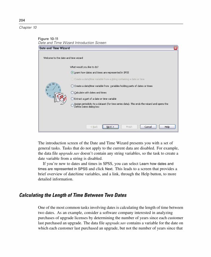
204
Chapter 10
Figure 10-11Date and Time Wizard Introduction Screen
The introduction screen of the Date and Time Wizard presents you with a set ofgeneral tasks. Tasks that do not apply to the current data are disabled. For example,the data file upgrade.sav doesn’t contain any string variables, so the task to create adate variable from a string is disabled.
If you’re new to dates and times in SPSS, you can select Learn how dates and
times are represented in SPSS and click Next. This leads to a screen that provides abrief overview of date/time variables, and a link, through the Help button, to moredetailed information.
Calculating the Length of Time Between Two Dates
One of the most common tasks involving dates is calculating the length of time betweentwo dates. As an example, consider a software company interested in analyzingpurchases of upgrade licenses by determining the number of years since each customerlast purchased an upgrade. The data file upgrade.sav contains a variable for the date onwhich each customer last purchased an upgrade, but not the number of years since that
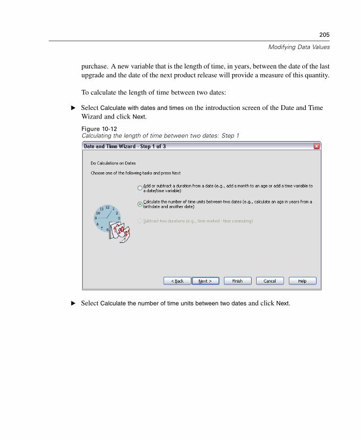
205
Modifying Data Values
purchase. A new variable that is the length of time, in years, between the date of the lastupgrade and the date of the next product release will provide a measure of this quantity.
To calculate the length of time between two dates:
E Select Calculate with dates and times on the introduction screen of the Date and TimeWizard and click Next.
Figure 10-12Calculating the length of time between two dates: Step 1
E Select Calculate the number of time units between two dates and click Next.
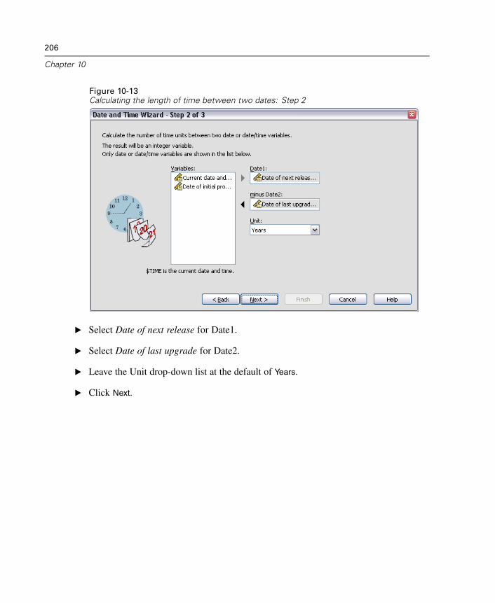
206
Chapter 10
Figure 10-13Calculating the length of time between two dates: Step 2
E Select Date of next release for Date1.
E Select Date of last upgrade for Date2.
E Leave the Unit drop-down list at the default of Years.
E Click Next.
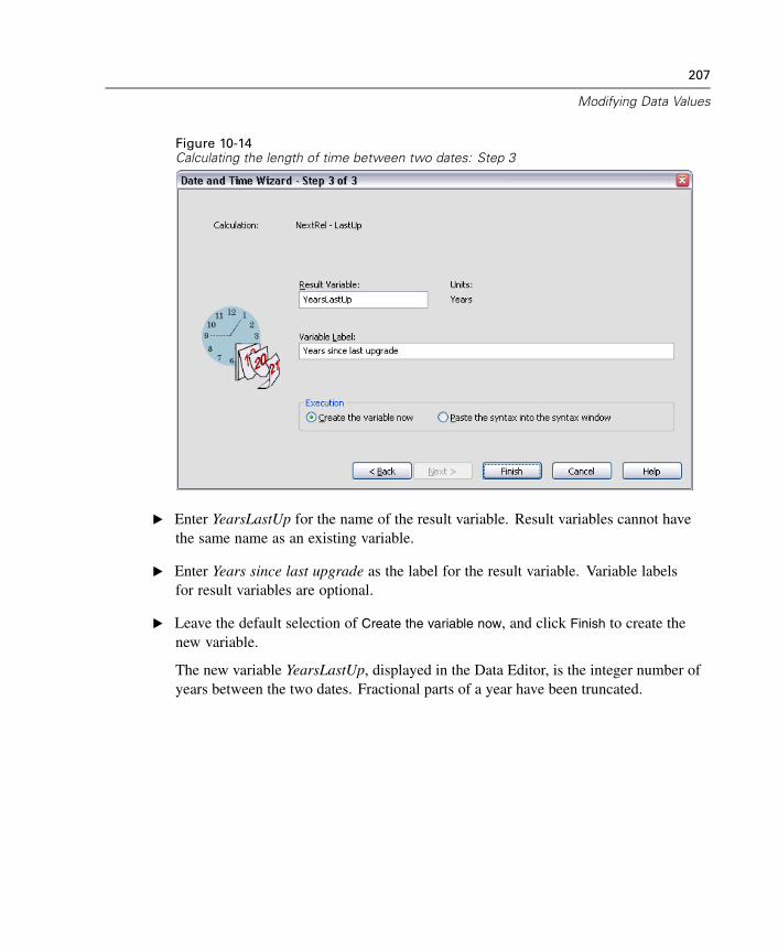
207
Modifying Data Values
Figure 10-14Calculating the length of time between two dates: Step 3
E Enter YearsLastUp for the name of the result variable. Result variables cannot havethe same name as an existing variable.
E Enter Years since last upgrade as the label for the result variable. Variable labelsfor result variables are optional.
E Leave the default selection of Create the variable now, and click Finish to create thenew variable.
The new variable YearsLastUp, displayed in the Data Editor, is the integer number ofyears between the two dates. Fractional parts of a year have been truncated.
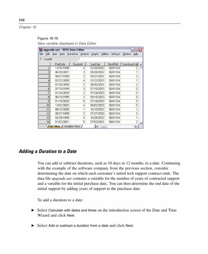
208
Chapter 10
Figure 10-15New variable displayed in Data Editor
Adding a Duration to a Date
You can add or subtract durations, such as 10 days or 12 months, to a date. Continuingwith the example of the software company from the previous section, considerdetermining the date on which each customer’s initial tech support contract ends. Thedata file upgrade.sav contains a variable for the number of years of contracted supportand a variable for the initial purchase date. You can then determine the end date of theinitial support by adding years of support to the purchase date.
To add a duration to a date:
E Select Calculate with dates and times on the introduction screen of the Date and TimeWizard and click Next.
E Select Add or subtract a duration from a date and click Next.
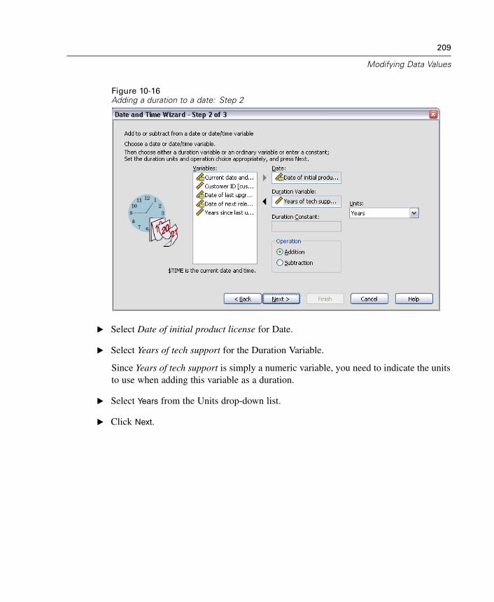
209
Modifying Data Values
Figure 10-16Adding a duration to a date: Step 2
E Select Date of initial product license for Date.
E Select Years of tech support for the Duration Variable.
Since Years of tech support is simply a numeric variable, you need to indicate the unitsto use when adding this variable as a duration.
E Select Years from the Units drop-down list.
E Click Next.
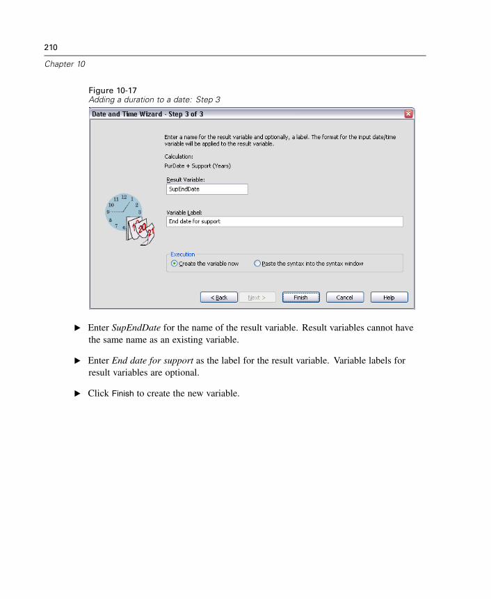
210
Chapter 10
Figure 10-17Adding a duration to a date: Step 3
E Enter SupEndDate for the name of the result variable. Result variables cannot havethe same name as an existing variable.
E Enter End date for support as the label for the result variable. Variable labels forresult variables are optional.
E Click Finish to create the new variable.
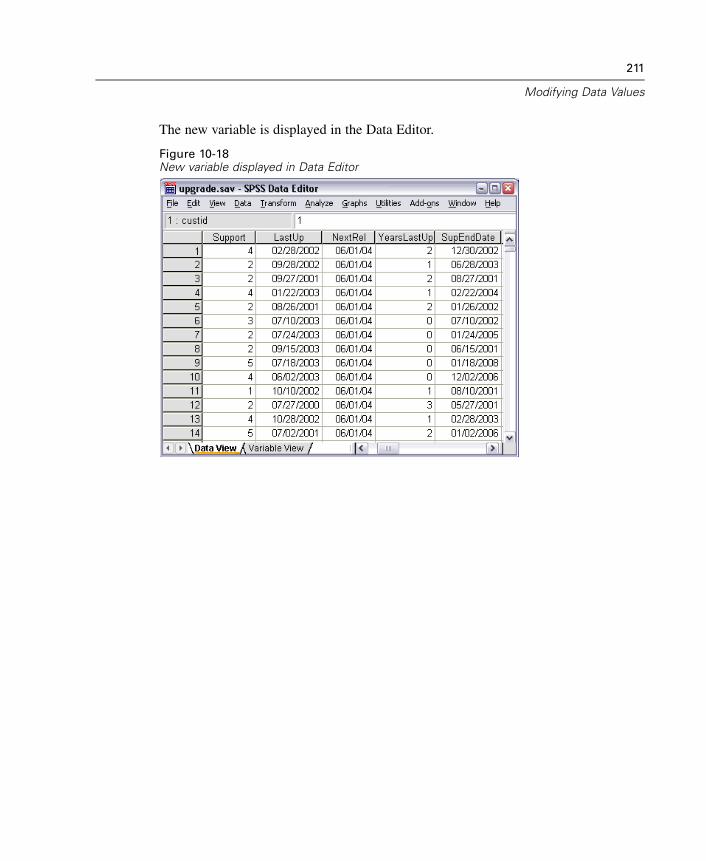
211
Modifying Data Values
The new variable is displayed in the Data Editor.
Figure 10-18New variable displayed in Data Editor

Chapter
11Sorting and Selecting Data
Data files are not always organized in the ideal form for your specific needs. Toprepare data for analysis, you can select from a wide range of file transformations,including the ability to:
Sort data. You can sort cases based on the value of one or more variables.
Select subsets of cases. You can restrict your analysis to a subset of cases orperform simultaneous analyses on different subsets.
The examples in this chapter use the data file demo.sav.
Sorting Data
Sorting cases (sorting rows of the data file) is often useful and sometimes necessary forcertain types of analysis.
To reorder the sequence of cases in the data file based on the value of one or moresorting variables:
E From the menus choose:Data
Sort Cases...
213
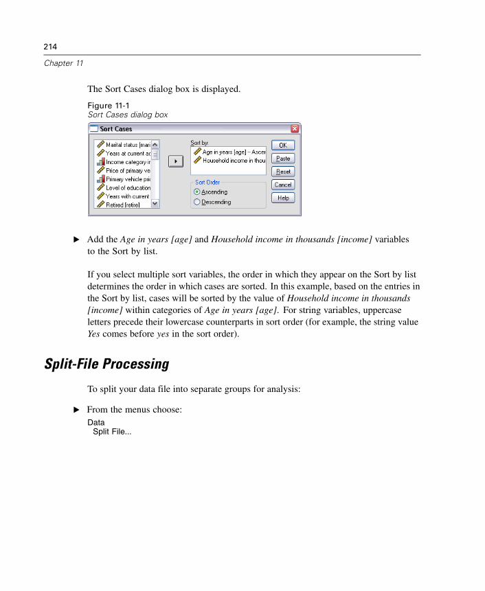
214
Chapter 11
The Sort Cases dialog box is displayed.
Figure 11-1Sort Cases dialog box
E Add the Age in years [age] and Household income in thousands [income] variablesto the Sort by list.
If you select multiple sort variables, the order in which they appear on the Sort by listdetermines the order in which cases are sorted. In this example, based on the entries inthe Sort by list, cases will be sorted by the value of Household income in thousands[income] within categories of Age in years [age]. For string variables, uppercaseletters precede their lowercase counterparts in sort order (for example, the string valueYes comes before yes in the sort order).
Split-File Processing
To split your data file into separate groups for analysis:
E From the menus choose:Data
Split File...
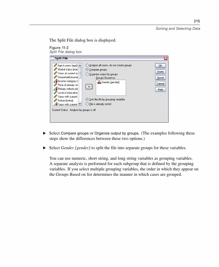
215
Sorting and Selecting Data
The Split File dialog box is displayed.
Figure 11-2Split File dialog box
E Select Compare groups or Organize output by groups. (The examples following thesesteps show the differences between these two options.)
E Select Gender [gender] to split the file into separate groups for these variables.
You can use numeric, short string, and long string variables as grouping variables.A separate analysis is performed for each subgroup that is defined by the groupingvariables. If you select multiple grouping variables, the order in which they appear onthe Groups Based on list determines the manner in which cases are grouped.
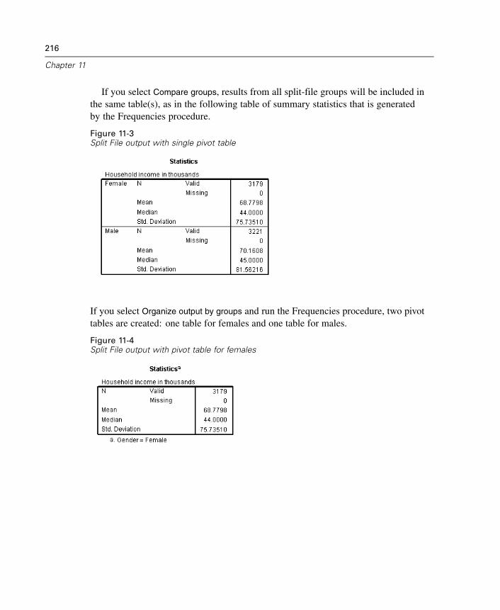
216
Chapter 11
If you select Compare groups, results from all split-file groups will be included inthe same table(s), as in the following table of summary statistics that is generatedby the Frequencies procedure.
Figure 11-3Split File output with single pivot table
If you select Organize output by groups and run the Frequencies procedure, two pivottables are created: one table for females and one table for males.
Figure 11-4Split File output with pivot table for females
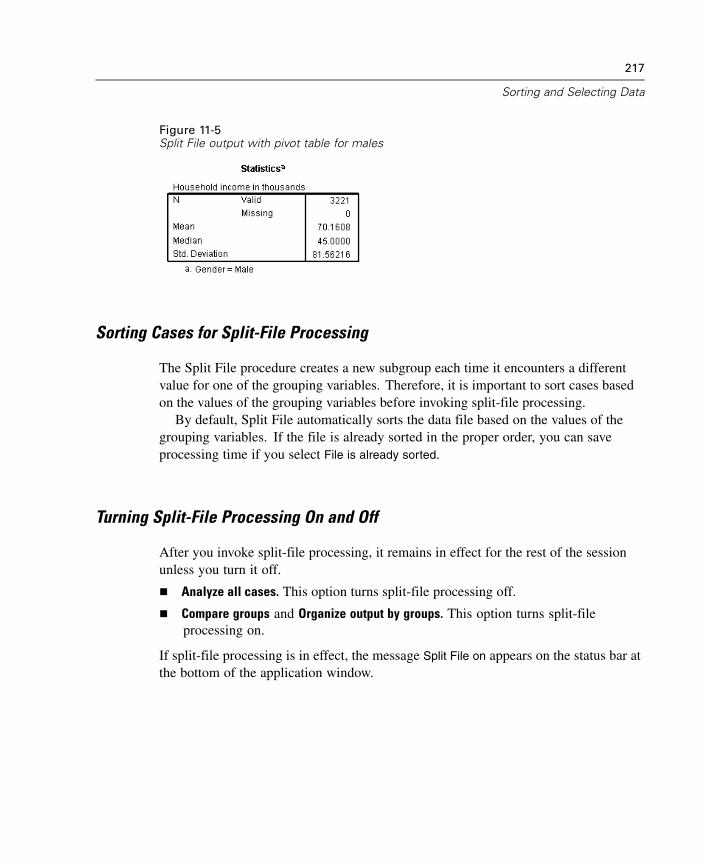
217
Sorting and Selecting Data
Figure 11-5Split File output with pivot table for males
Sorting Cases for Split-File Processing
The Split File procedure creates a new subgroup each time it encounters a differentvalue for one of the grouping variables. Therefore, it is important to sort cases basedon the values of the grouping variables before invoking split-file processing.
By default, Split File automatically sorts the data file based on the values of thegrouping variables. If the file is already sorted in the proper order, you can saveprocessing time if you select File is already sorted.
Turning Split-File Processing On and Off
After you invoke split-file processing, it remains in effect for the rest of the sessionunless you turn it off.
Analyze all cases. This option turns split-file processing off.
Compare groups and Organize output by groups. This option turns split-fileprocessing on.
If split-file processing is in effect, the message Split File on appears on the status bar atthe bottom of the application window.
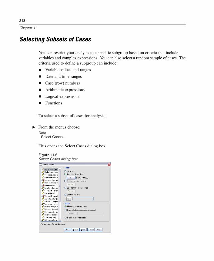
218
Chapter 11
Selecting Subsets of Cases
You can restrict your analysis to a specific subgroup based on criteria that includevariables and complex expressions. You can also select a random sample of cases. Thecriteria used to define a subgroup can include:
Variable values and ranges
Date and time ranges
Case (row) numbers
Arithmetic expressions
Logical expressions
Functions
To select a subset of cases for analysis:
E From the menus choose:Data
Select Cases...
This opens the Select Cases dialog box.
Figure 11-6Select Cases dialog box
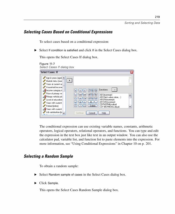
219
Sorting and Selecting Data
Selecting Cases Based on Conditional Expressions
To select cases based on a conditional expression:
E Select If condition is satisfied and click If in the Select Cases dialog box.
This opens the Select Cases If dialog box.
Figure 11-7Select Cases If dialog box
The conditional expression can use existing variable names, constants, arithmeticoperators, logical operators, relational operators, and functions. You can type and editthe expression in the text box just like text in an output window. You can also use thecalculator pad, variable list, and function list to paste elements into the expression. Formore information, see “Using Conditional Expressions” in Chapter 10 on p. 201.
Selecting a Random Sample
To obtain a random sample:
E Select Random sample of cases in the Select Cases dialog box.
E Click Sample.
This opens the Select Cases Random Sample dialog box.
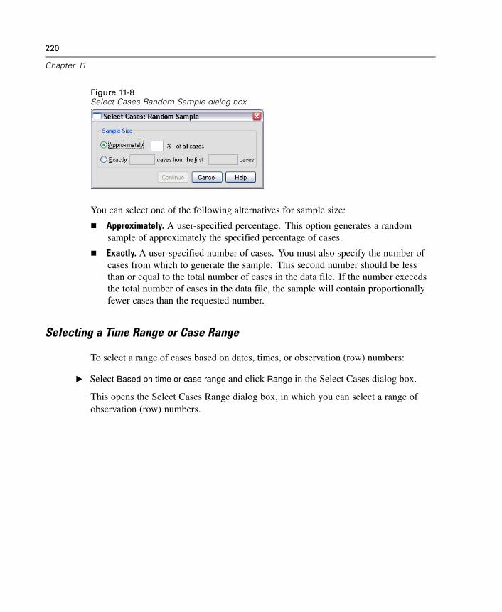
220
Chapter 11
Figure 11-8Select Cases Random Sample dialog box
You can select one of the following alternatives for sample size:
Approximately. A user-specified percentage. This option generates a randomsample of approximately the specified percentage of cases.
Exactly. A user-specified number of cases. You must also specify the number ofcases from which to generate the sample. This second number should be lessthan or equal to the total number of cases in the data file. If the number exceedsthe total number of cases in the data file, the sample will contain proportionallyfewer cases than the requested number.
Selecting a Time Range or Case Range
To select a range of cases based on dates, times, or observation (row) numbers:
E Select Based on time or case range and click Range in the Select Cases dialog box.
This opens the Select Cases Range dialog box, in which you can select a range ofobservation (row) numbers.
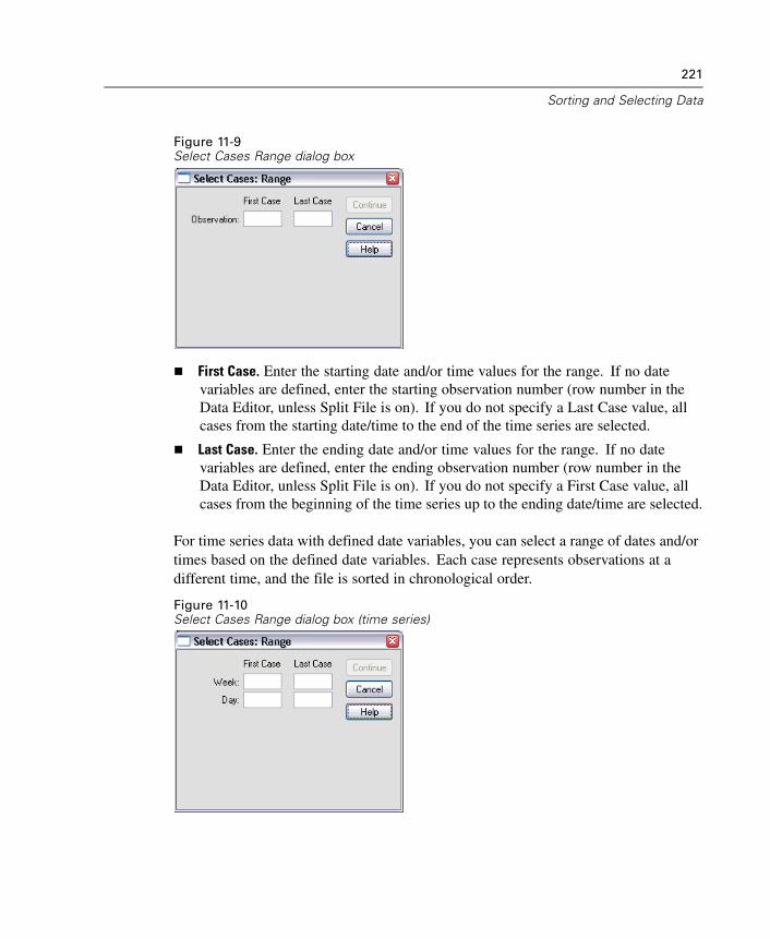
221
Sorting and Selecting Data
Figure 11-9Select Cases Range dialog box
First Case. Enter the starting date and/or time values for the range. If no datevariables are defined, enter the starting observation number (row number in theData Editor, unless Split File is on). If you do not specify a Last Case value, allcases from the starting date/time to the end of the time series are selected.
Last Case. Enter the ending date and/or time values for the range. If no datevariables are defined, enter the ending observation number (row number in theData Editor, unless Split File is on). If you do not specify a First Case value, allcases from the beginning of the time series up to the ending date/time are selected.
For time series data with defined date variables, you can select a range of dates and/ortimes based on the defined date variables. Each case represents observations at adifferent time, and the file is sorted in chronological order.
Figure 11-10Select Cases Range dialog box (time series)
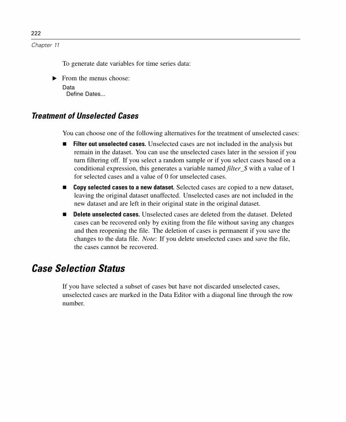
222
Chapter 11
To generate date variables for time series data:
E From the menus choose:Data
Define Dates...
Treatment of Unselected Cases
You can choose one of the following alternatives for the treatment of unselected cases:
Filter out unselected cases. Unselected cases are not included in the analysis butremain in the dataset. You can use the unselected cases later in the session if youturn filtering off. If you select a random sample or if you select cases based on aconditional expression, this generates a variable named filter_$ with a value of 1for selected cases and a value of 0 for unselected cases.
Copy selected cases to a new dataset. Selected cases are copied to a new dataset,leaving the original dataset unaffected. Unselected cases are not included in thenew dataset and are left in their original state in the original dataset.
Delete unselected cases. Unselected cases are deleted from the dataset. Deletedcases can be recovered only by exiting from the file without saving any changesand then reopening the file. The deletion of cases is permanent if you save thechanges to the data file. Note: If you delete unselected cases and save the file,the cases cannot be recovered.
Case Selection Status
If you have selected a subset of cases but have not discarded unselected cases,unselected cases are marked in the Data Editor with a diagonal line through the rownumber.
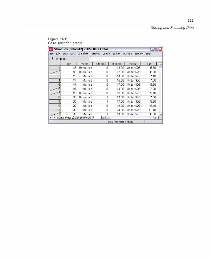
223
Sorting and Selecting Data
Figure 11-11Case selection status

Chapter
12Additional Statistical Procedures
This chapter contains brief examples for selected statistical procedures. The proceduresare grouped according to the order in which they appear on the Analyze menu.
The examples are designed to illustrate sample specifications that are required torun a statistical procedure. The examples in this chapter use the data file demo.sav,with the following exceptions:
The paired-samples t test example uses the data file dietstudy.sav, which is ahypothetical data file containing the results of a study of the “Stillman diet.” In theexamples in this chapter, you must run the procedures to see the output.
The correlation examples use Employee data.sav, which contains historical dataabout a company’s employees.
The exponential smoothing example uses the data file inventor.sav, which containsinventory data that were collected over a period of 70 days.
For information about individual items in a dialog box, click Help. If you want to locatea specific statistic, such as percentiles, use the Index or Search facility in the Helpsystem. For additional information about interpreting the results of these procedures,consult a statistics or data analysis textbook.
Summarizing Data
The Descriptive Statistics submenu on the Analyze menu provides techniques forsummarizing data with statistics and charts.
225
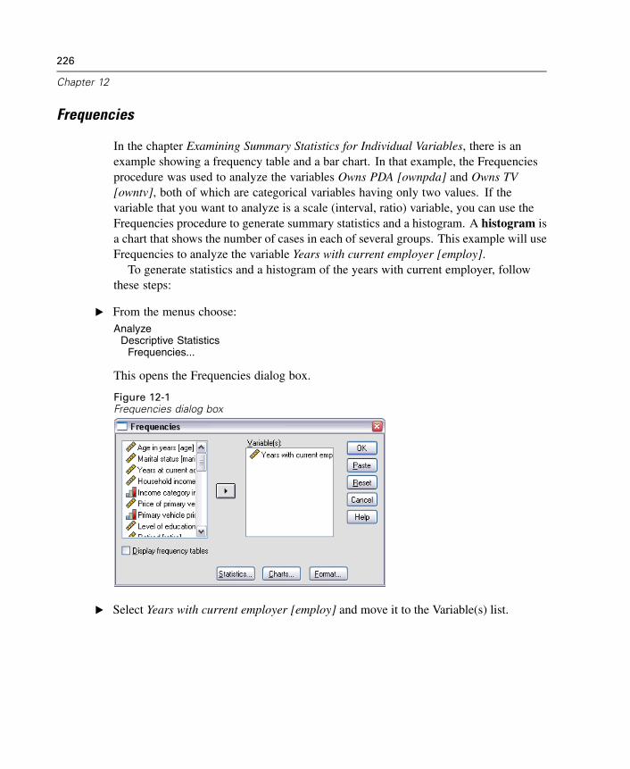
226
Chapter 12
Frequencies
In the chapter Examining Summary Statistics for Individual Variables, there is anexample showing a frequency table and a bar chart. In that example, the Frequenciesprocedure was used to analyze the variables Owns PDA [ownpda] and Owns TV[owntv], both of which are categorical variables having only two values. If thevariable that you want to analyze is a scale (interval, ratio) variable, you can use theFrequencies procedure to generate summary statistics and a histogram. A histogram isa chart that shows the number of cases in each of several groups. This example will useFrequencies to analyze the variable Years with current employer [employ].
To generate statistics and a histogram of the years with current employer, followthese steps:
E From the menus choose:Analyze
Descriptive StatisticsFrequencies...
This opens the Frequencies dialog box.
Figure 12-1Frequencies dialog box
E Select Years with current employer [employ] and move it to the Variable(s) list.
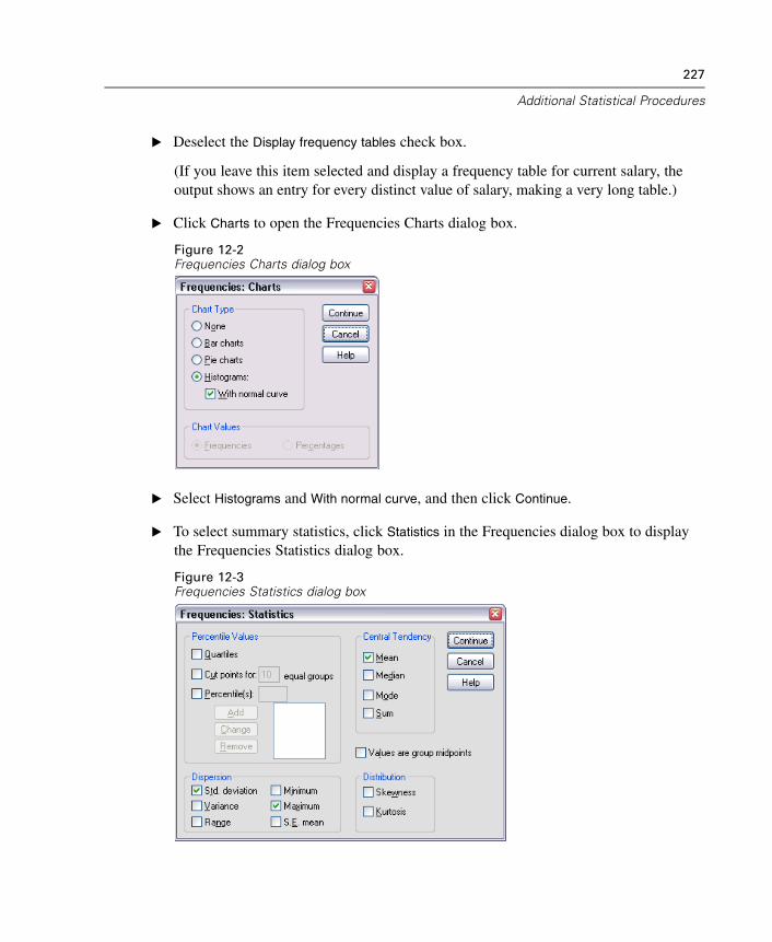
227
Additional Statistical Procedures
E Deselect the Display frequency tables check box.
(If you leave this item selected and display a frequency table for current salary, theoutput shows an entry for every distinct value of salary, making a very long table.)
E Click Charts to open the Frequencies Charts dialog box.
Figure 12-2Frequencies Charts dialog box
E Select Histograms and With normal curve, and then click Continue.
E To select summary statistics, click Statistics in the Frequencies dialog box to displaythe Frequencies Statistics dialog box.
Figure 12-3Frequencies Statistics dialog box
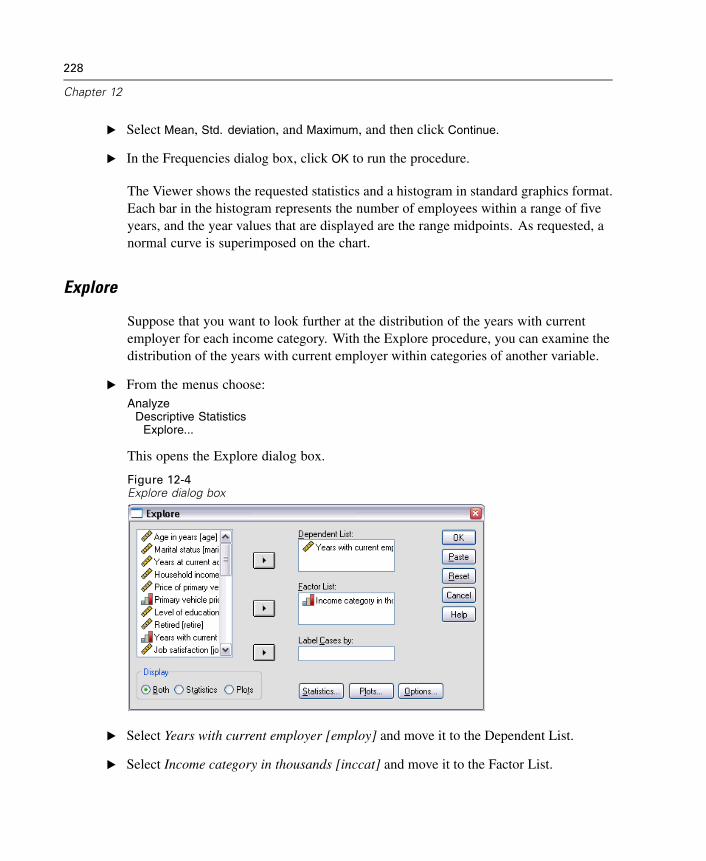
228
Chapter 12
E Select Mean, Std. deviation, and Maximum, and then click Continue.
E In the Frequencies dialog box, click OK to run the procedure.
The Viewer shows the requested statistics and a histogram in standard graphics format.Each bar in the histogram represents the number of employees within a range of fiveyears, and the year values that are displayed are the range midpoints. As requested, anormal curve is superimposed on the chart.
Explore
Suppose that you want to look further at the distribution of the years with currentemployer for each income category. With the Explore procedure, you can examine thedistribution of the years with current employer within categories of another variable.
E From the menus choose:Analyze
Descriptive StatisticsExplore...
This opens the Explore dialog box.
Figure 12-4Explore dialog box
E Select Years with current employer [employ] and move it to the Dependent List.
E Select Income category in thousands [inccat] and move it to the Factor List.
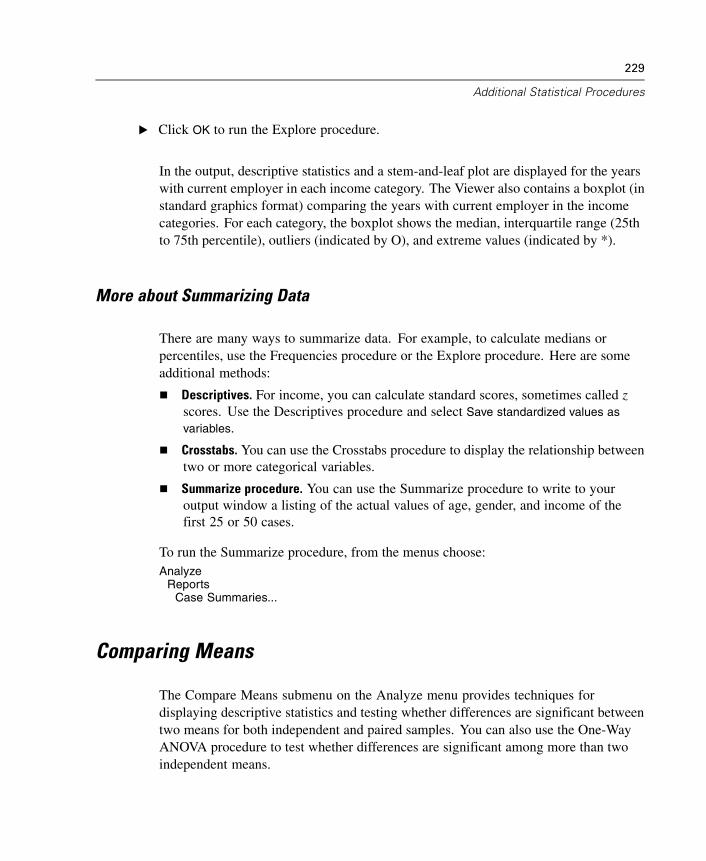
229
Additional Statistical Procedures
E Click OK to run the Explore procedure.
In the output, descriptive statistics and a stem-and-leaf plot are displayed for the yearswith current employer in each income category. The Viewer also contains a boxplot (instandard graphics format) comparing the years with current employer in the incomecategories. For each category, the boxplot shows the median, interquartile range (25thto 75th percentile), outliers (indicated by O), and extreme values (indicated by *).
More about Summarizing Data
There are many ways to summarize data. For example, to calculate medians orpercentiles, use the Frequencies procedure or the Explore procedure. Here are someadditional methods:
Descriptives. For income, you can calculate standard scores, sometimes called zscores. Use the Descriptives procedure and select Save standardized values asvariables.
Crosstabs. You can use the Crosstabs procedure to display the relationship betweentwo or more categorical variables.
Summarize procedure. You can use the Summarize procedure to write to youroutput window a listing of the actual values of age, gender, and income of thefirst 25 or 50 cases.
To run the Summarize procedure, from the menus choose:Analyze
ReportsCase Summaries...
Comparing Means
The Compare Means submenu on the Analyze menu provides techniques fordisplaying descriptive statistics and testing whether differences are significant betweentwo means for both independent and paired samples. You can also use the One-WayANOVA procedure to test whether differences are significant among more than twoindependent means.
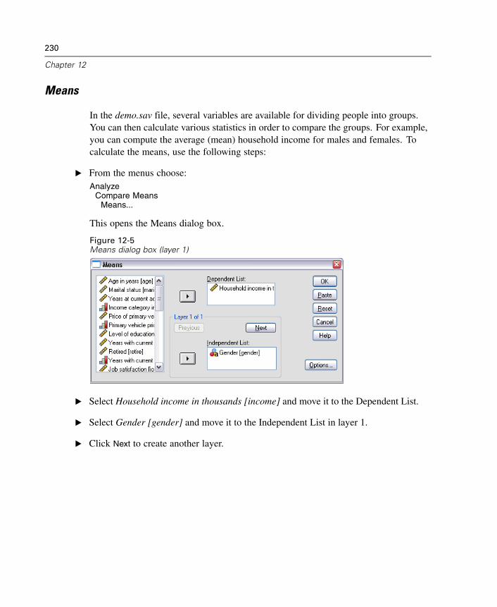
230
Chapter 12
Means
In the demo.sav file, several variables are available for dividing people into groups.You can then calculate various statistics in order to compare the groups. For example,you can compute the average (mean) household income for males and females. Tocalculate the means, use the following steps:
E From the menus choose:Analyze
Compare MeansMeans...
This opens the Means dialog box.
Figure 12-5Means dialog box (layer 1)
E Select Household income in thousands [income] and move it to the Dependent List.
E Select Gender [gender] and move it to the Independent List in layer 1.
E Click Next to create another layer.
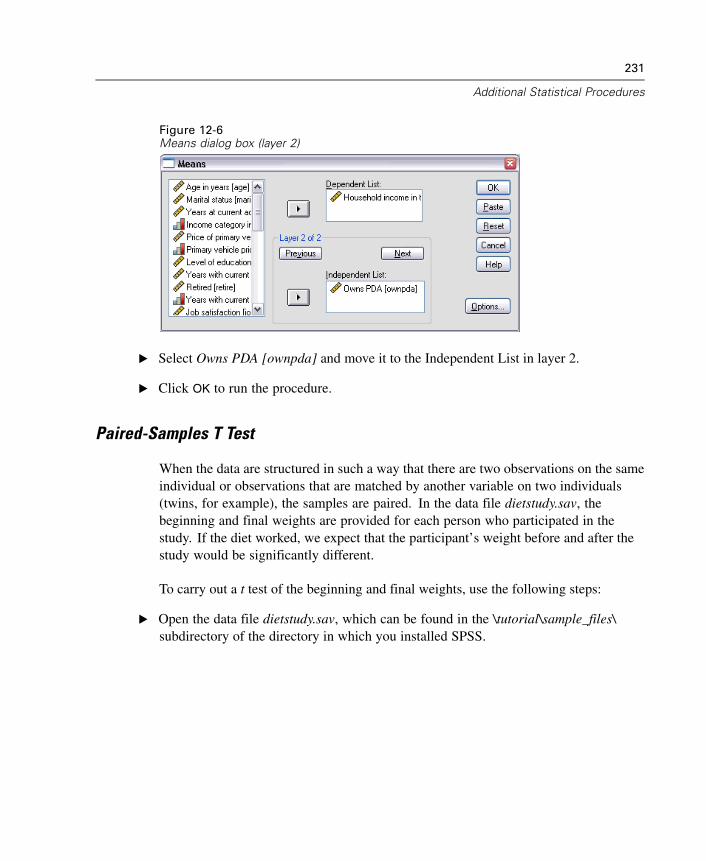
231
Additional Statistical Procedures
Figure 12-6Means dialog box (layer 2)
E Select Owns PDA [ownpda] and move it to the Independent List in layer 2.
E Click OK to run the procedure.
Paired-Samples T Test
When the data are structured in such a way that there are two observations on the sameindividual or observations that are matched by another variable on two individuals(twins, for example), the samples are paired. In the data file dietstudy.sav, thebeginning and final weights are provided for each person who participated in thestudy. If the diet worked, we expect that the participant’s weight before and after thestudy would be significantly different.
To carry out a t test of the beginning and final weights, use the following steps:
E Open the data file dietstudy.sav, which can be found in the \tutorial\sample_files\subdirectory of the directory in which you installed SPSS.
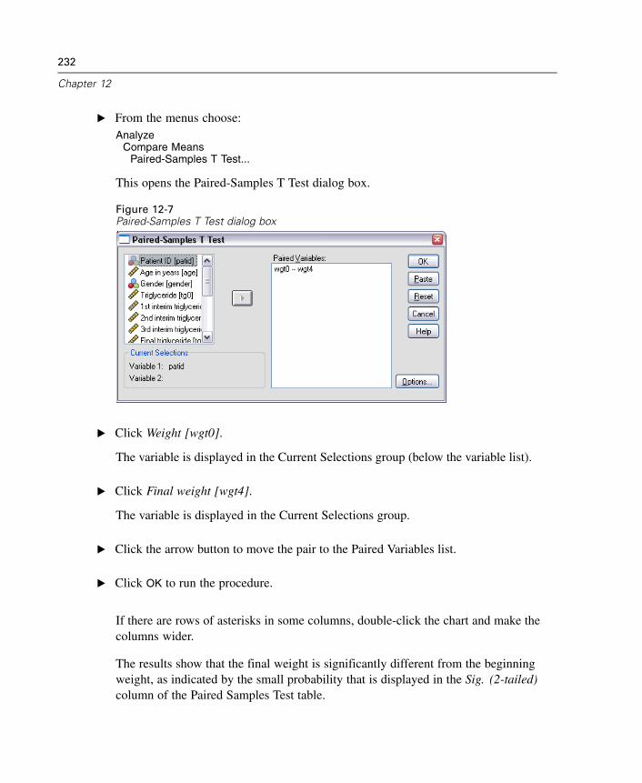
232
Chapter 12
E From the menus choose:Analyze
Compare MeansPaired-Samples T Test...
This opens the Paired-Samples T Test dialog box.
Figure 12-7Paired-Samples T Test dialog box
E Click Weight [wgt0].
The variable is displayed in the Current Selections group (below the variable list).
E Click Final weight [wgt4].
The variable is displayed in the Current Selections group.
E Click the arrow button to move the pair to the Paired Variables list.
E Click OK to run the procedure.
If there are rows of asterisks in some columns, double-click the chart and make thecolumns wider.
The results show that the final weight is significantly different from the beginningweight, as indicated by the small probability that is displayed in the Sig. (2-tailed)column of the Paired Samples Test table.
233
Additional Statistical Procedures
More about Comparing Means
The following examples suggest some ways in which you can use other proceduresto compare means.
Independent-Samples T Test. When you use a t test to compare means of onevariable across independent groups, the samples are independent. Males andfemales in the demo.sav file can be divided into independent groups by the variableGender [gender]. You can use a t test to determine whether the mean householdincomes of males and females are the same.
One-Sample T Test. You can test whether the household income of people withcollege degrees differs from a national or state average. Use Select Cases on theData menu to select the cases with Level of Education [ed] >= 4. Then, runthe One-Sample T Test procedure to compare Household income in thousands[income] and the test value 75.
One-Way ANOVA. The variable Level of Education [ed] divides employees into fiveindependent groups by level of education. You can use the One-Way ANOVAprocedure to test whether Household income in thousands [income] means for thefive groups are significantly different.
ANOVA Models
The General Linear Model submenu on the Analyze menu provides techniques fortesting univariate analysis-of-variance models. (If you have only one factor, you canuse the One-Way ANOVA procedure on the Compare Means submenu.)
Univariate Analysis of Variance
The GLM Univariate procedure can perform an analysis of variance for factorialdesigns. A simple factorial design can be used to test whether a person’s householdincome and job satisfaction affect the number of years with the current employer.
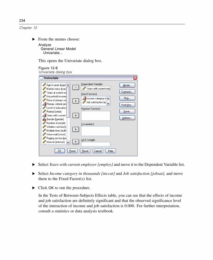
234
Chapter 12
E From the menus choose:Analyze
General Linear ModelUnivariate...
This opens the Univariate dialog box.
Figure 12-8Univariate dialog box
E Select Years with current employer [employ] and move it to the Dependent Variable list.
E Select Income category in thousands [inccat] and Job satisfaction [jobsat], and movethem to the Fixed Factor(s) list.
E Click OK to run the procedure.
In the Tests of Between-Subjects Effects table, you can see that the effects of incomeand job satisfaction are definitely significant and that the observed significance levelof the interaction of income and job satisfaction is 0.000. For further interpretation,consult a statistics or data analysis textbook.
235
Additional Statistical Procedures
Correlating Variables
The Correlate submenu on the Analyze menu provides measures of association fortwo or more numeric variables.
The examples in this topic use the data file Employee data.sav.
Bivariate Correlations
The Bivariate Correlations procedure computes statistics such as Pearson’s correlationcoefficient. Correlations measure how variables or rank orders are related. Correlationcoefficients range in value from –1 (a perfect negative relationship) and +1 (a perfectpositive relationship). A value of 0 indicates no linear relationship.
For example, you can use Pearson’s correlation coefficient to see if there is a stronglinear association between Current Salary [salary] and Beginning Salary [salbegin] inthe data file Employee data.sav.
Partial Correlations
The Partial Correlations procedure calculates partial correlation coefficients thatdescribe the relationship between two variables while adjusting for the effects of oneor more additional variables.
You can estimate the correlation between Current Salary [salary] and BeginningSalary [salbegin], controlling for the linear effects of Months since Hire [jobtime]and Previous Experience [prevexp]. The number of control variables determines theorder of the partial correlation coefficient.
To carry out this Partial Correlations procedure, use the following steps:
E Open the Employee data.sav file, which is usually in the directory where SPSS isinstalled.
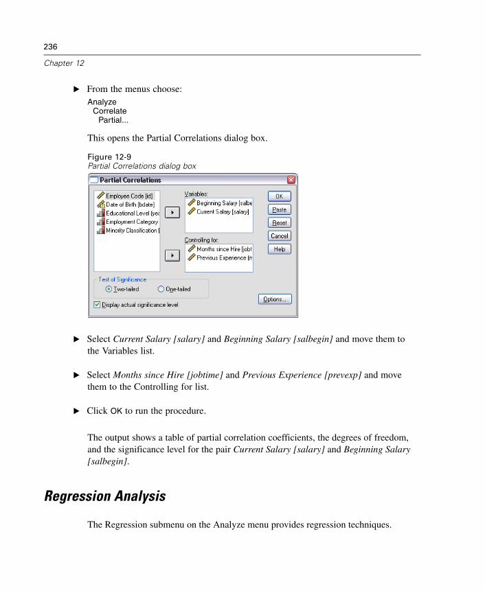
236
Chapter 12
E From the menus choose:Analyze
CorrelatePartial...
This opens the Partial Correlations dialog box.
Figure 12-9Partial Correlations dialog box
E Select Current Salary [salary] and Beginning Salary [salbegin] and move them tothe Variables list.
E Select Months since Hire [jobtime] and Previous Experience [prevexp] and movethem to the Controlling for list.
E Click OK to run the procedure.
The output shows a table of partial correlation coefficients, the degrees of freedom,and the significance level for the pair Current Salary [salary] and Beginning Salary[salbegin].
Regression Analysis
The Regression submenu on the Analyze menu provides regression techniques.
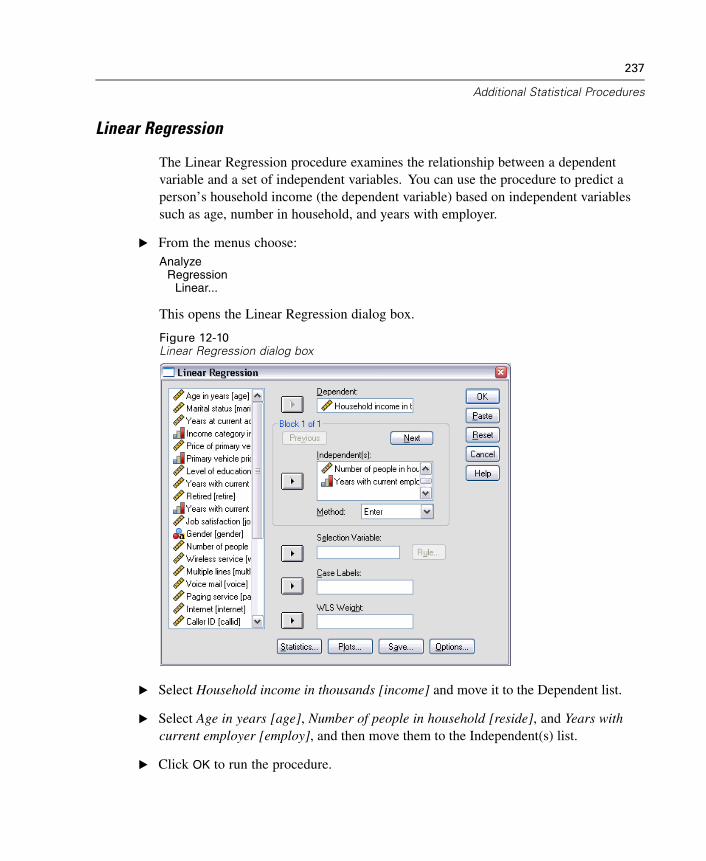
237
Additional Statistical Procedures
Linear Regression
The Linear Regression procedure examines the relationship between a dependentvariable and a set of independent variables. You can use the procedure to predict aperson’s household income (the dependent variable) based on independent variablessuch as age, number in household, and years with employer.
E From the menus choose:Analyze
RegressionLinear...
This opens the Linear Regression dialog box.
Figure 12-10Linear Regression dialog box
E Select Household income in thousands [income] and move it to the Dependent list.
E Select Age in years [age], Number of people in household [reside], and Years withcurrent employer [employ], and then move them to the Independent(s) list.
E Click OK to run the procedure.
238
Chapter 12
The output contains goodness-of-fit statistics and the partial regression coefficients forthe variables.
Examining Fit. To see how well the regression model fits your data, you can examinethe residuals and other types of diagnostics that this procedure provides. In the LinearRegression dialog box, click Save to see a list of the new variables that you can add toyour data file. If you generate any of these variables, they will not be available in alater session unless you save the data file.
Methods. If you have collected a large number of independent variables and want tobuild a regression model that includes only variables that are statistically related to thedependent variable, you can choose a method from the drop-down list. For example, ifyou select Stepwise in the above example, only variables that meet the criteria in theLinear Regression Options dialog box are entered in the equation.
Nonparametric Tests
The Nonparametric Tests submenu on the Analyze menu provides nonparametric testsfor one sample or for two or more paired or independent samples. Nonparametrictests do not require assumptions about the shape of the distributions from which thedata originate.
Chi-Square
The Chi-Square Test procedure is used to test hypotheses about the relative proportionof cases falling into several mutually exclusive groups. You can test the hypothesis thatpeople who participated in the survey occur in the same proportions of gender as thegeneral population (50% males, 50% females).
In this example, you will need to recode the string variable Gender [gender] intoa numeric variable before you can run the procedure.
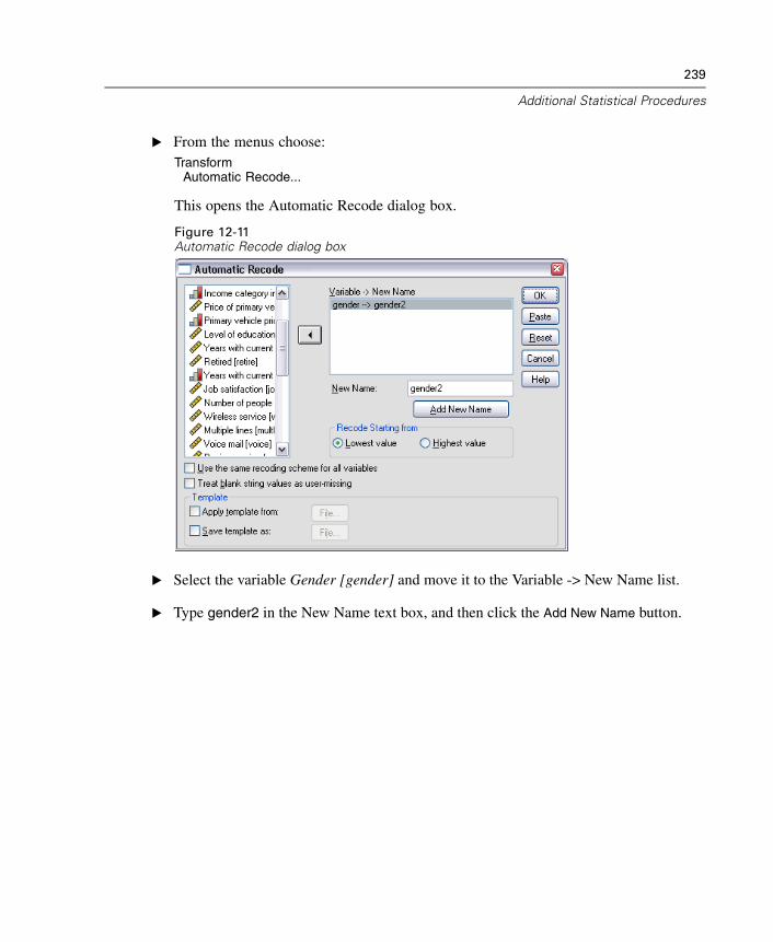
239
Additional Statistical Procedures
E From the menus choose:Transform
Automatic Recode...
This opens the Automatic Recode dialog box.
Figure 12-11Automatic Recode dialog box
E Select the variable Gender [gender] and move it to the Variable -> New Name list.
E Type gender2 in the New Name text box, and then click the Add New Name button.
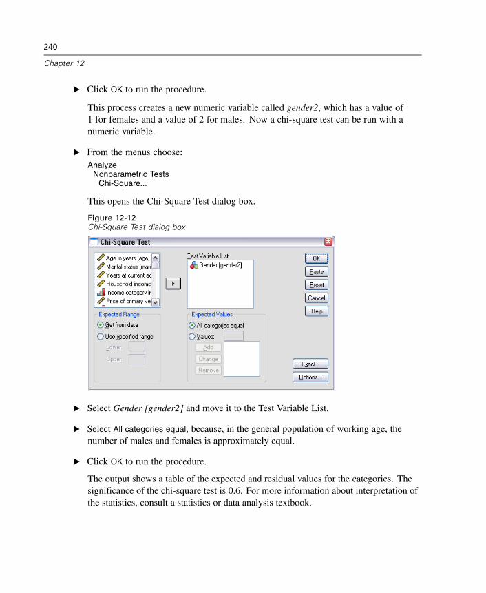
240
Chapter 12
E Click OK to run the procedure.
This process creates a new numeric variable called gender2, which has a value of1 for females and a value of 2 for males. Now a chi-square test can be run with anumeric variable.
E From the menus choose:Analyze
Nonparametric TestsChi-Square...
This opens the Chi-Square Test dialog box.
Figure 12-12Chi-Square Test dialog box
E Select Gender [gender2] and move it to the Test Variable List.
E Select All categories equal, because, in the general population of working age, thenumber of males and females is approximately equal.
E Click OK to run the procedure.
The output shows a table of the expected and residual values for the categories. Thesignificance of the chi-square test is 0.6. For more information about interpretation ofthe statistics, consult a statistics or data analysis textbook.
Index
Access (Microsoft), 36
bar charts, 87
case studies, 28cases
selecting, 218sorting, 213, 217
categorical data, 85summary measures, 86
charts
bar, 87, 135chart options, 160creating charts, 135editing charts, 146histograms, 92pie, 164scatterplot, 176templates, 154
computing new variables, 197conditional expressions, 201continuous data, 85copying variable attributes, 70counts
tables of counts, 86create variable labels, 60
Data Editor
entering non-numeric data, 58entering numeric data, 55multiple open data files, 81
data entry, 55, 58
data files
multiple open data files, 81data types
for variables, 61database files
reading, 36Database Wizard, 36datasets
renaming, 84date and time variables, 203Date and Time Wizard, 203
editing pivot tables, 104entering data
non-numeric, 58numeric, 55
Excel (Microsoft)
exporting results to, 122Excel files
reading, 33exporting results
HTML, 132to Excel, 122to PowerPoint, 122to Word, 122
frequency tables, 86functions in expressions, 199
graphs
bar, 135chart options, 160
241
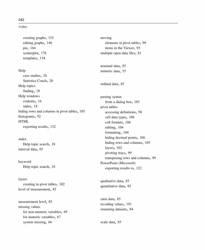
242
Index
creating graphs, 135editing graphs, 146pie, 164scatterplot, 176templates, 154
Help
case studies, 28Statistics Coach, 20
Help topics
finding, 18Help windows
contents, 16index, 18
hiding rows and columns in pivot tables, 105histograms, 92HTML
exporting results, 132
index
Help topic search, 18interval data, 85
keyword
Help topic search, 18
layers
creating in pivot tables, 102level of measurement, 85
measurement level, 85missing values
for non-numeric variables, 69for numeric variables, 67system missing, 66
moving
elements in pivot tables, 99items in the Viewer, 95
multiple open data files, 81
nominal data, 85numeric data, 55
ordinal data, 85
pasting syntax
from a dialog box, 185pivot tables
accessing definitions, 98cell data types, 106cell formats, 106editing, 104formatting, 104hiding decimal points, 106hiding rows and columns, 105layers, 102pivoting trays, 99transposing rows and columns, 99
PowerPoint (Microsoft)
exporting results to, 122
qualitative data, 85quantitative data, 85
ratio data, 85recoding values, 191renaming datasets, 84
scale data, 85
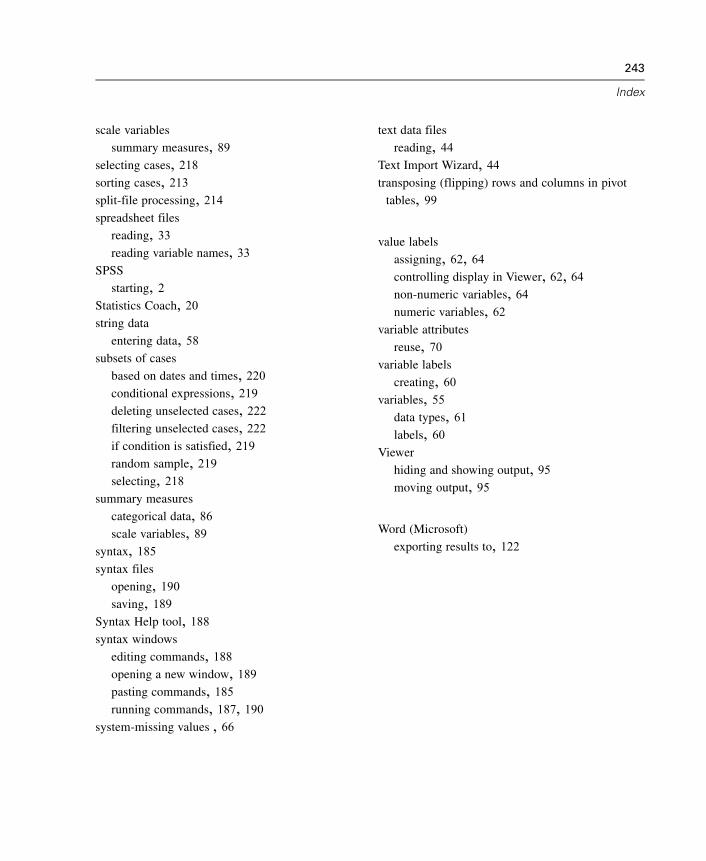
243
Index
scale variables
summary measures, 89selecting cases, 218sorting cases, 213split-file processing, 214spreadsheet files
reading, 33reading variable names, 33
SPSS
starting, 2Statistics Coach, 20string data
entering data, 58subsets of cases
based on dates and times, 220conditional expressions, 219deleting unselected cases, 222filtering unselected cases, 222if condition is satisfied, 219random sample, 219selecting, 218
summary measures
categorical data, 86scale variables, 89
syntax, 185syntax files
opening, 190saving, 189
Syntax Help tool, 188syntax windows
editing commands, 188opening a new window, 189pasting commands, 185running commands, 187, 190
system-missing values , 66
text data files
reading, 44Text Import Wizard, 44transposing (flipping) rows and columns in pivot
tables, 99
value labels
assigning, 62, 64controlling display in Viewer, 62, 64non-numeric variables, 64numeric variables, 62
variable attributes
reuse, 70variable labels
creating, 60variables, 55
data types, 61labels, 60
Viewer
hiding and showing output, 95moving output, 95
Word (Microsoft)
exporting results to, 122