Embed Size (px)
Citation preview
Statistics for cliniciansStatistics for clinicians
Biostatistics course by Kevin E. Kip, Ph.D., FAHAProfessor and Executive Director, Research CenterUniversity of South Florida, College of NursingProfessor, College of Public HealthDepartment of Epidemiology and BiostatisticsAssociate Member, Byrd Alzheimer’s InstituteMorsani College of MedicineTampa, FL, USA
1
SECTION 1.1SECTION 1.1
Module OverviewModule Overviewand Introductionand Introduction
Introduction to biostatistics, descriptive statistics, SPSS, and Power Point.
SECTION 1.4SECTION 1.4
IntroductionIntroductionto SPSSto SPSS
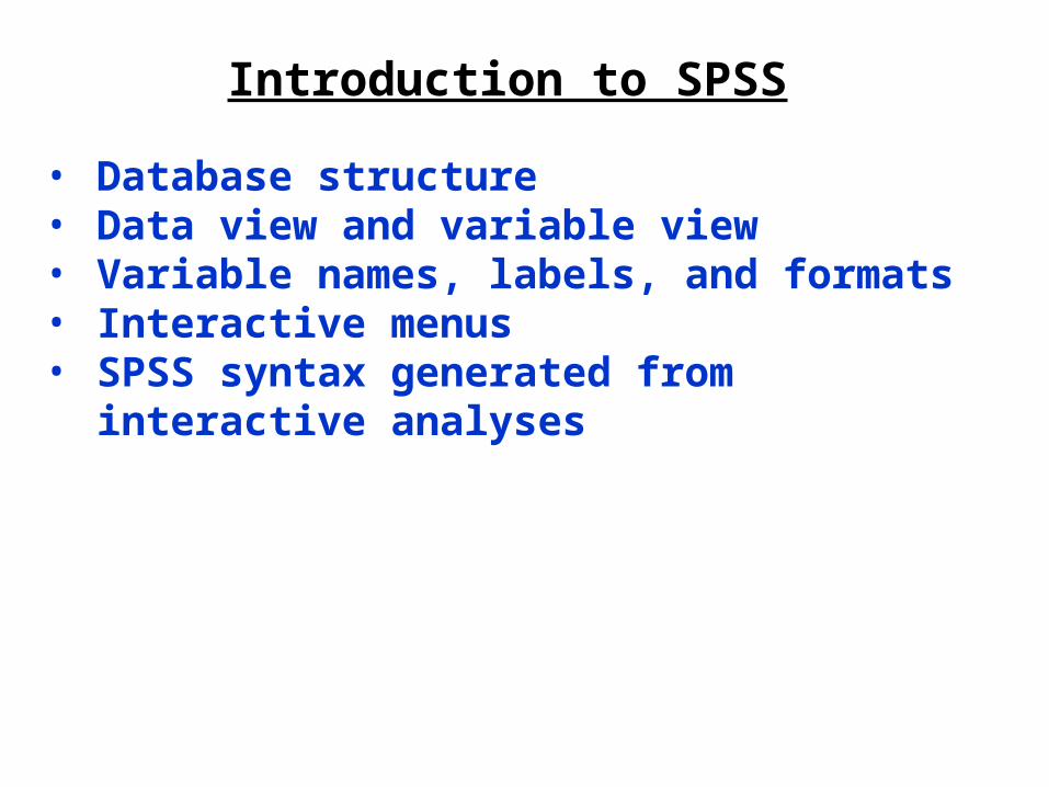
Introduction to SPSS
• Database structure• Data view and variable view• Variable names, labels, and formats• Interactive menus• SPSS syntax generated from interactive analyses
SECTION 1.5SECTION 1.5
SummarizingSummarizingData in ChartsData in Charts
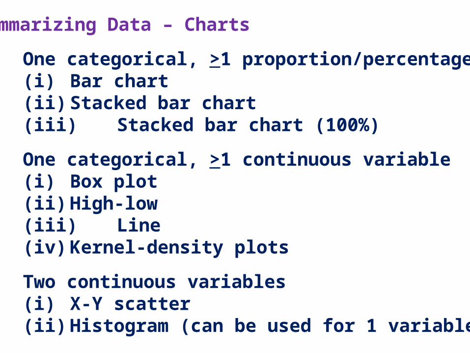
Summarizing Data – Charts
1. One categorical, >1 proportion/percentage(i) Bar chart(ii) Stacked bar chart(iii) Stacked bar chart (100%)
2. One categorical, >1 continuous variable(i) Box plot(ii) High-low(iii) Line(iv) Kernel-density plots
3. Two continuous variables(i) X-Y scatter(ii) Histogram (can be used for 1 variable)
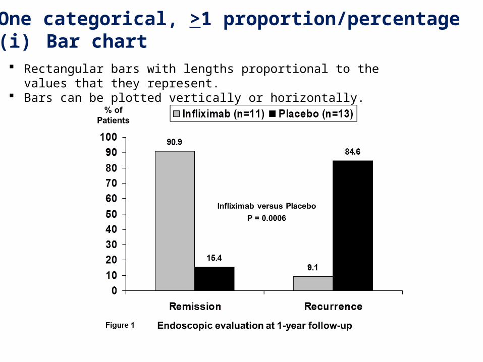
1. One categorical, >1 proportion/percentage(i) Bar chart
Rectangular bars with lengths proportional to the values that they represent. Bars can be plotted vertically or horizontally.
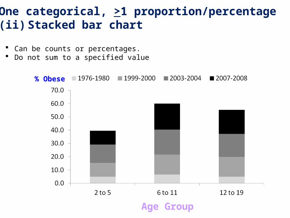
1. One categorical, >1 proportion/percentage(ii) Stacked bar chart
Can be counts or percentages. Do not sum to a specified value
% Obese
Age Group
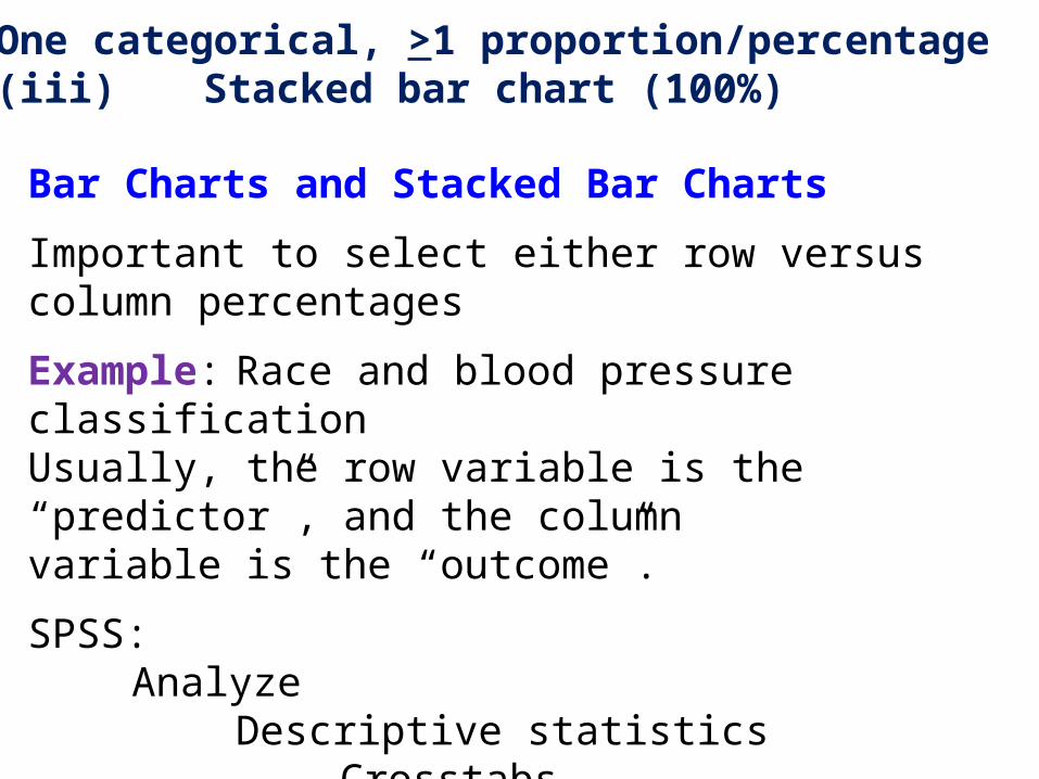
1. One categorical, >1 proportion/percentage(iii) Stacked bar chart (100%)
Bar Charts and Stacked Bar Charts
Important to select either row versus column percentages
Example: Race and blood pressure classificationUsually, the row variable is the “predictor”, and the columnvariable is the “outcome”.
SPSS:Analyze
Descriptive statisticsCrosstabs
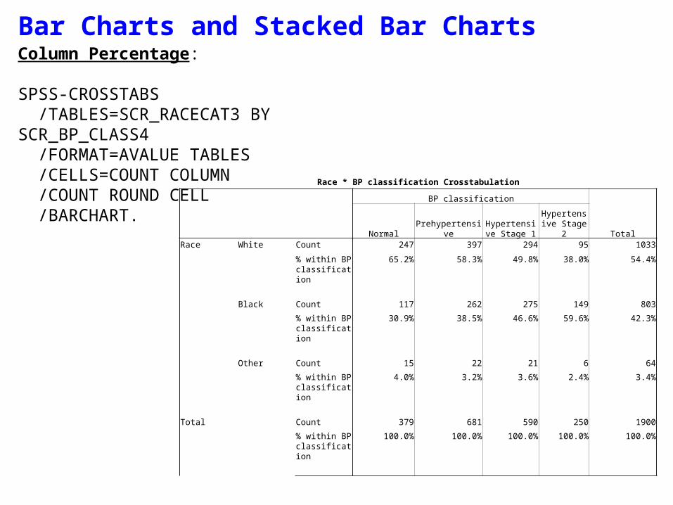
Bar Charts and Stacked Bar ChartsColumn Percentage:
SPSS-CROSSTABS /TABLES=SCR_RACECAT3 BY SCR_BP_CLASS4 /FORMAT=AVALUE TABLES /CELLS=COUNT COLUMN /COUNT ROUND CELL /BARCHART.
Race * BP classification Crosstabulation
BP classification
TotalNormal PrehypertensiveHypertensive
Stage 1Hypertensive Stage 2
Race White Count 247 397 294 95 1033
% within BP classification
65.2% 58.3% 49.8% 38.0% 54.4%
Black Count 117 262 275 149 803
% within BP classification
30.9% 38.5% 46.6% 59.6% 42.3%
Other Count 15 22 21 6 64
% within BP classification
4.0% 3.2% 3.6% 2.4% 3.4%
Total Count 379 681 590 250 1900
% within BP classification
100.0% 100.0% 100.0% 100.0% 100.0%
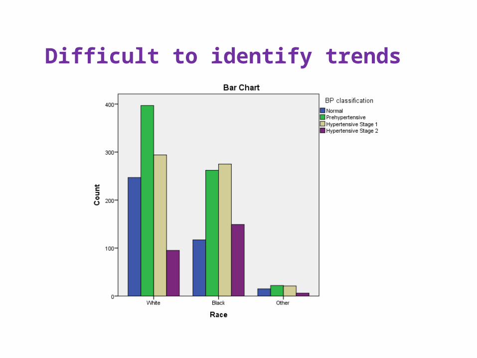
Difficult to identify trends
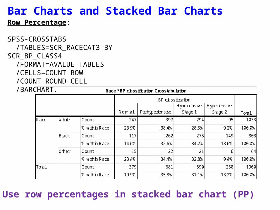
Bar Charts and Stacked Bar ChartsRow Percentage:
SPSS-CROSSTABS /TABLES=SCR_RACECAT3 BY SCR_BP_CLASS4 /FORMAT=AVALUE TABLES /CELLS=COUNT ROW /COUNT ROUND CELL /BARCHART.
Normal PrehypertensiveHypertensive
Stage 1Hypertensive
Stage 2
Count 247 397 294 95 1033
% within Race 23.9% 38.4% 28.5% 9.2% 100.0%
Count 117 262 275 149 803
% within Race 14.6% 32.6% 34.2% 18.6% 100.0%
Count 15 22 21 6 64
% within Race 23.4% 34.4% 32.8% 9.4% 100.0%
Count 379 681 590 250 1900
% within Race 19.9% 35.8% 31.1% 13.2% 100.0%
Total
Race * BP classification Crosstabulation
BP classification
Total
Race White
Black
Other
Use row percentages in stacked bar chart (PP)
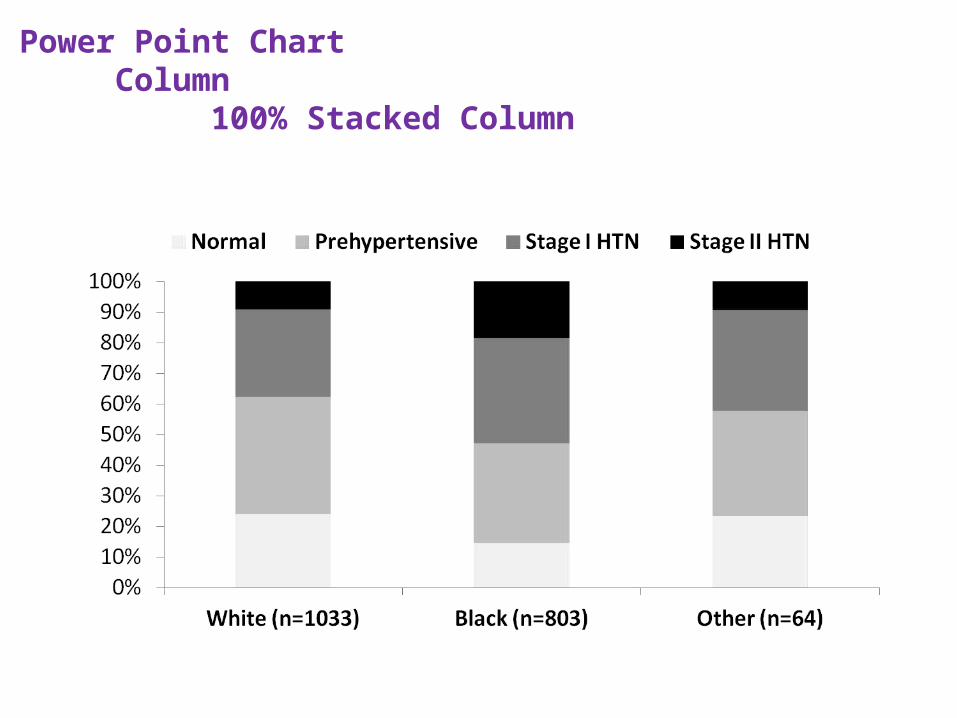
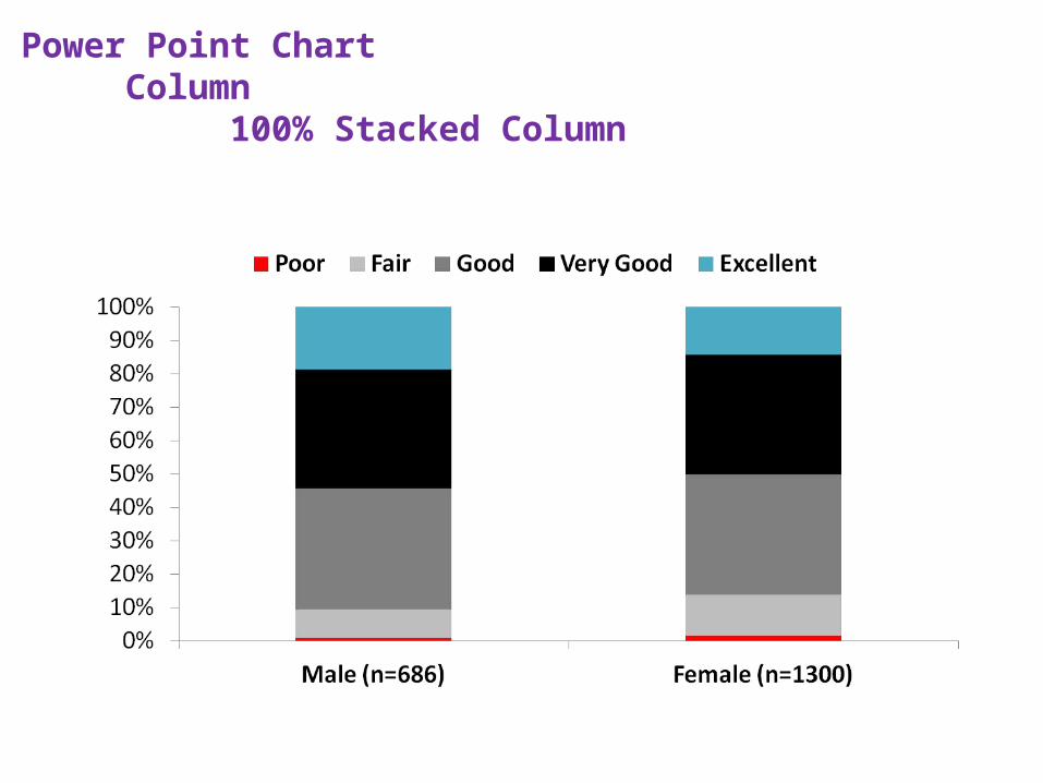
Power Point ChartColumn
100% Stacked Column
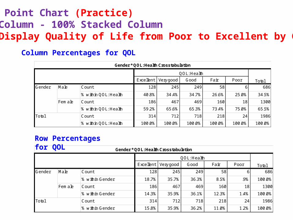
Excellent Very good Good Fair Poor
Count 128 245 249 58 6 686
% within Gender 18.7% 35.7% 36.3% 8.5% .9% 100.0%
Count 186 467 469 160 18 1300
% within Gender 14.3% 35.9% 36.1% 12.3% 1.4% 100.0%
Count 314 712 718 218 24 1986
% within Gender 15.8% 35.9% 36.2% 11.0% 1.2% 100.0%
Total
Gender * QOL: Health Crosstabulation
QOL: Health
Total
Gender Male
Female
Excellent Very good Good Fair Poor
Count 128 245 249 58 6 686
% within QOL: Health 40.8% 34.4% 34.7% 26.6% 25.0% 34.5%
Count 186 467 469 160 18 1300
% within QOL: Health 59.2% 65.6% 65.3% 73.4% 75.0% 65.5%
Count 314 712 718 218 24 1986
% within QOL: Health 100.0% 100.0% 100.0% 100.0% 100.0% 100.0%
Total
Gender * QOL: Health Crosstabulation
QOL: Health
Total
Gender Male
Female
Power Point Chart (Practice)Column - 100% Stacked ColumnDisplay Quality of Life from Poor to Excellent by Gender
Column Percentages for QOL
Row Percentages for QOL
Power Point ChartColumn
100% Stacked Column
Power Point ChartColumn
100% Stacked Column
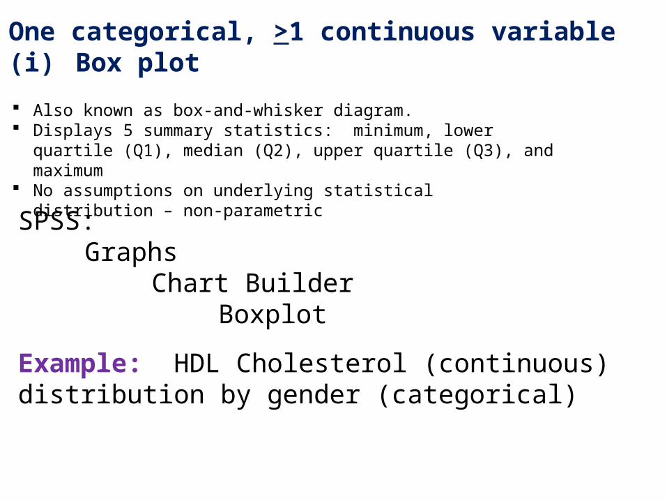
2. One categorical, >1 continuous variable(i) Box plot
Also known as box-and-whisker diagram. Displays 5 summary statistics: minimum, lower quartile (Q1), median (Q2),
upper quartile (Q3), and maximum No assumptions on underlying statistical distribution – non-parametric
SPSS:Graphs
Chart BuilderBoxplot
Example: HDL Cholesterol (continuous) distribution by gender (categorical)
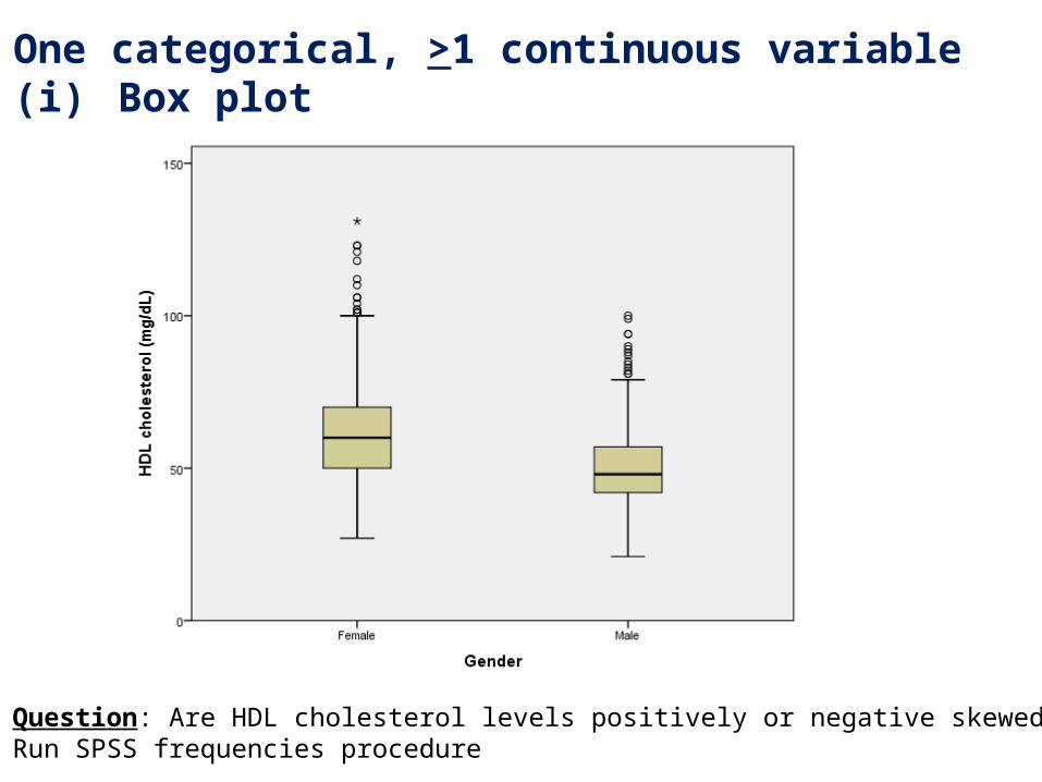
2. One categorical, >1 continuous variable(i) Box plot
Question: Are HDL cholesterol levels positively or negative skewed?Run SPSS frequencies procedure
2. One categorical, >1 continuous variable(i) Box plot
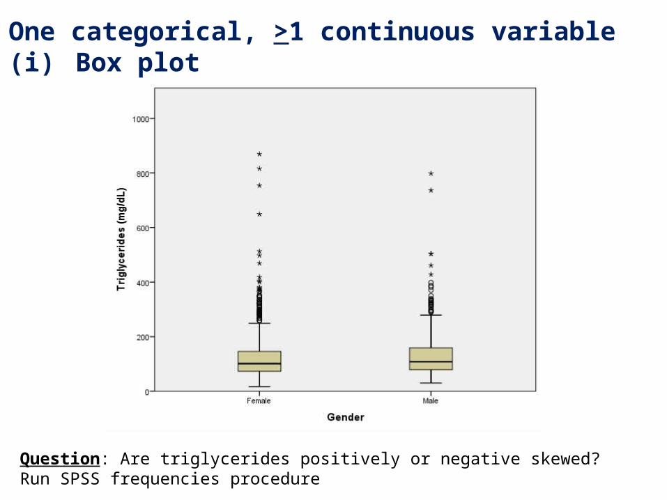
Question: Are triglycerides positively or negative skewed?Run SPSS frequencies procedure
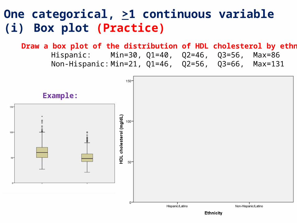
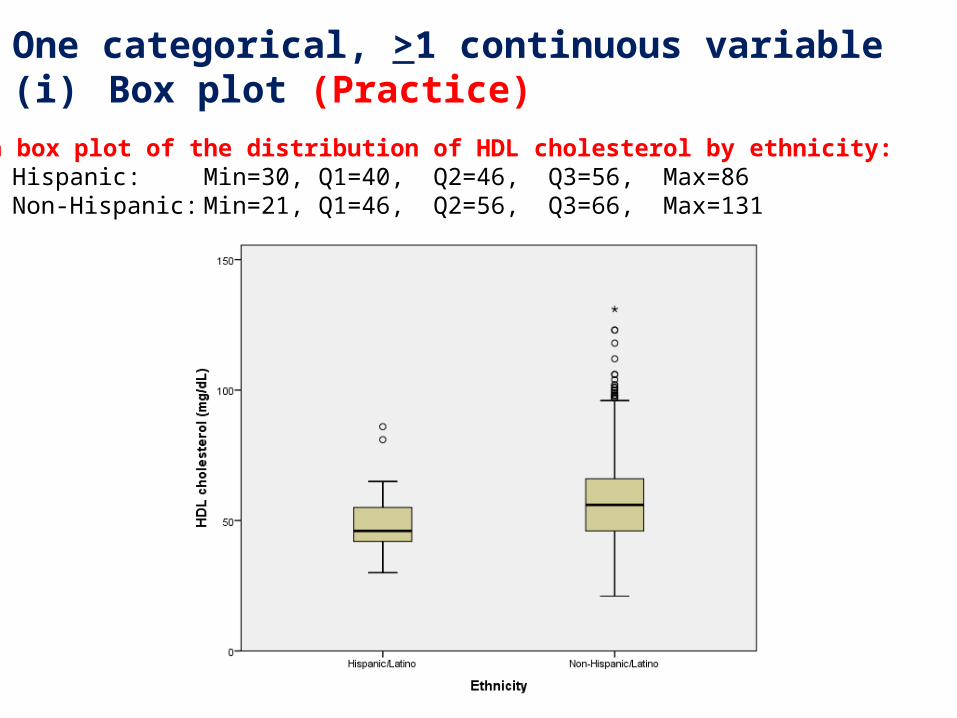
2. One categorical, >1 continuous variable(i) Box plot (Practice)
Draw a box plot of the distribution of HDL cholesterol by ethnicity:Hispanic: Min=30, Q1=40, Q2=46, Q3=56, Max=86Non-Hispanic: Min=21, Q1=46, Q2=56, Q3=66, Max=131
Example:
2. One categorical, >1 continuous variable(i) Box plot (Practice)
Draw a box plot of the distribution of HDL cholesterol by ethnicity:Hispanic: Min=30, Q1=40, Q2=46, Q3=56, Max=86Non-Hispanic: Min=21, Q1=46, Q2=56, Q3=66, Max=131
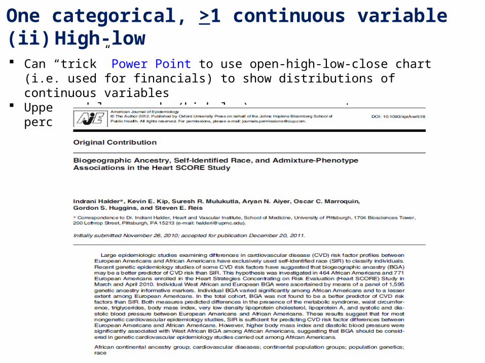
2. One categorical, >1 continuous variable(ii) High-low
Can “trick” Power Point to use open-high-low-close chart (i.e. used for financials) to show distributions of continuous variables
Upper and lower ends (high-low) can represent any percentiles, such as 5th/95th percentiles
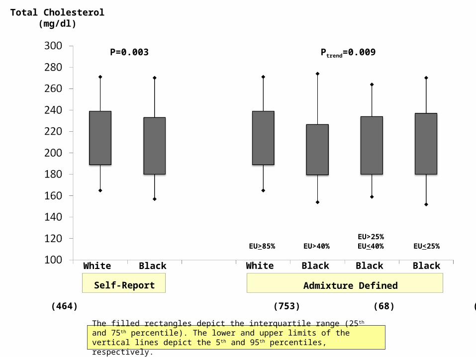
White
Self-Report
Black White Black Black Black
Admixture Defined
EU>85% EU>40%EU>25%EU<40% EU<25%
Total Cholesterol(mg/dl)
N (753) (464) (753) (68) (201) (195)
P=0.003 Ptrend=0.009
The filled rectangles depict the interquartile range (25 th and 75th percentile). The lower and upper limits of the vertical lines depict the 5 th and 95th percentiles, respectively.
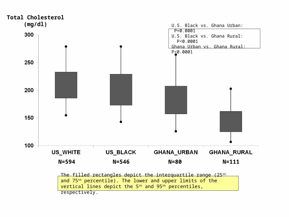
Total Cholesterol(mg/dl)
N=594 N=546 N=80 N=111
U.S. Black vs. Ghana Urban: P=0.0001U.S. Black vs. Ghana Rural: P<0.0001Ghana Urban vs. Ghana Rural: P<0.0001
The filled rectangles depict the interquartile range (25 th and 75th percentile). The lower and upper limits of the vertical lines depict the 5 th and 95th percentiles, respectively.
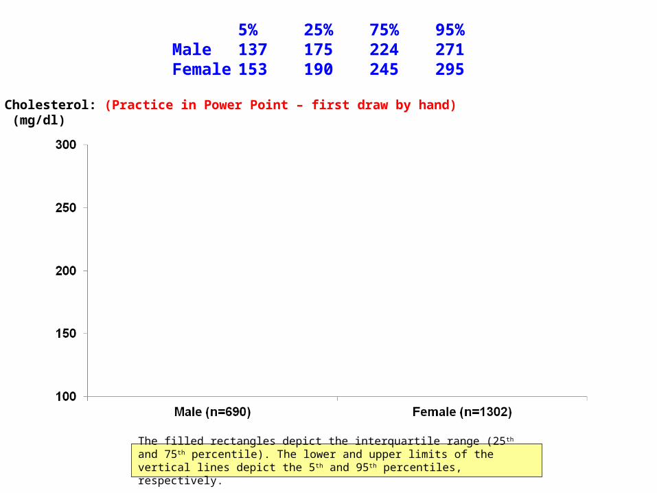
Total Cholesterol: (Practice in Power Point – first draw by hand) (mg/dl)
The filled rectangles depict the interquartile range (25 th and 75th percentile). The lower and upper limits of the vertical lines depict the 5 th and 95th percentiles, respectively.
5% 25% 75% 95%Male 137 175 224 271Female 153 190 245 295
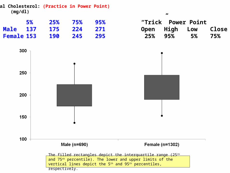
Total Cholesterol: (Practice in Power Point) (mg/dl)
The filled rectangles depict the interquartile range (25 th and 75th percentile). The lower and upper limits of the vertical lines depict the 5 th and 95th percentiles, respectively.
5% 25% 75% 95% “Trick” Power PointMale 137 175 224 271 Open High Low CloseFemale 153 190 245 295 25% 95% 5% 75%
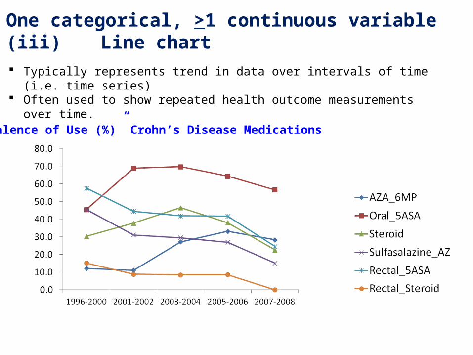
2. One categorical, >1 continuous variable(iii) Line chart
Typically represents trend in data over intervals of time (i.e. time series) Often used to show repeated health outcome measurements over time.
Prevalence of Use (%)” Crohn’s Disease Medications
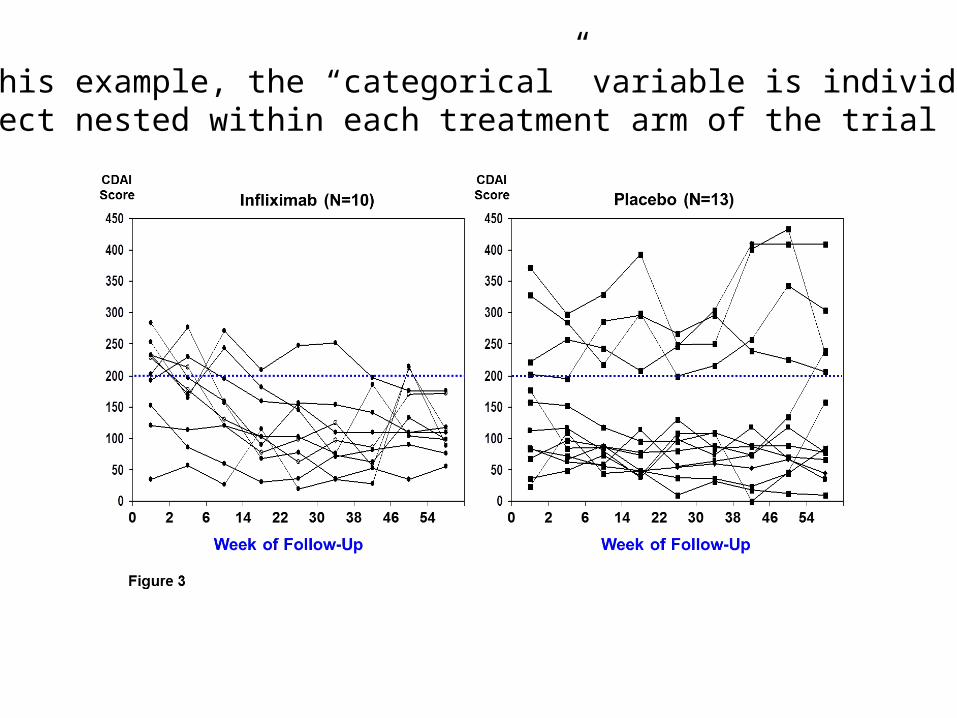
In this example, the “categorical” variable is individual subject nested within each treatment arm of the trial
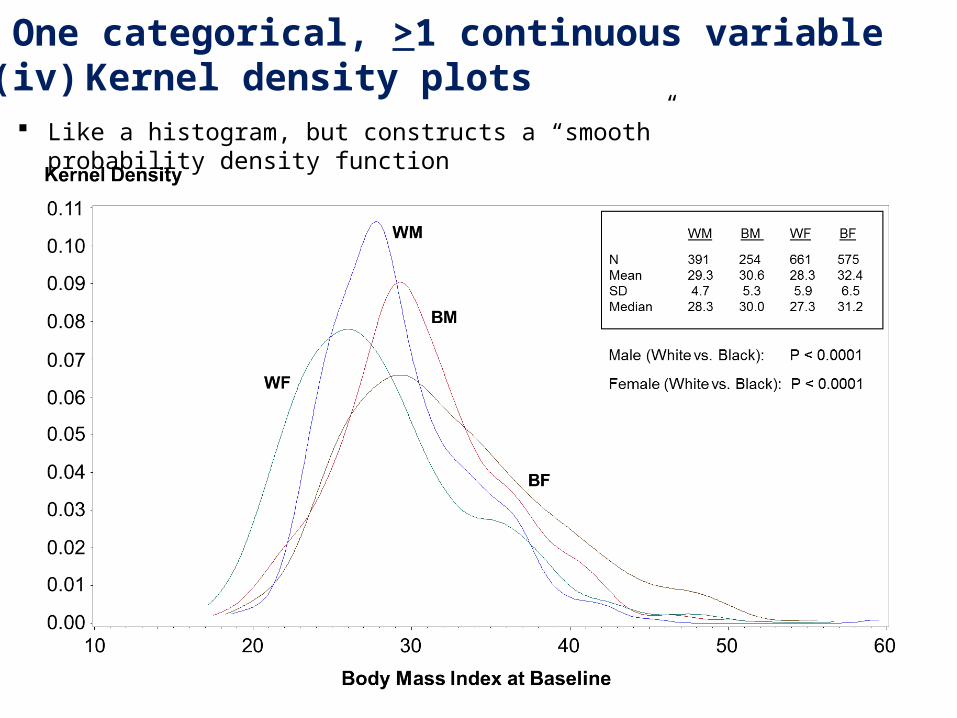
2. One categorical, >1 continuous variable(iv) Kernel density plots
Like a histogram, but constructs a “smooth” probability density function
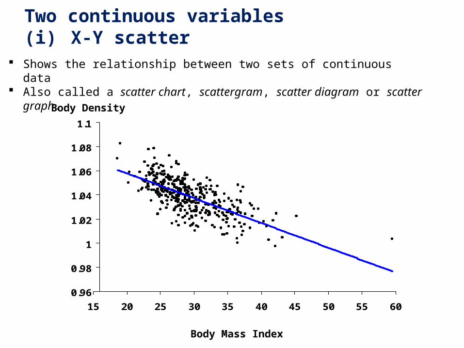
3. Two continuous variables(i) X-Y scatter
0.96
0.98
1
1.02
1.04
1.06
1.08
1.1
15 20 25 30 35 40 45 50 55 60
Body Density
Body Mass Index
Shows the relationship between two sets of continuous data Also called a scatter chart, scattergram, scatter diagram or scatter graph.
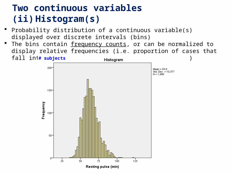
3. Two continuous variables(ii) Histogram(s)
Probability distribution of a continuous variable(s) displayed over discrete intervals (bins) The bins contain frequency counts, or can be normalized to display relative frequencies
(i.e. proportion of cases that fall into each category (bin) with total area = 1.0)
# subjects
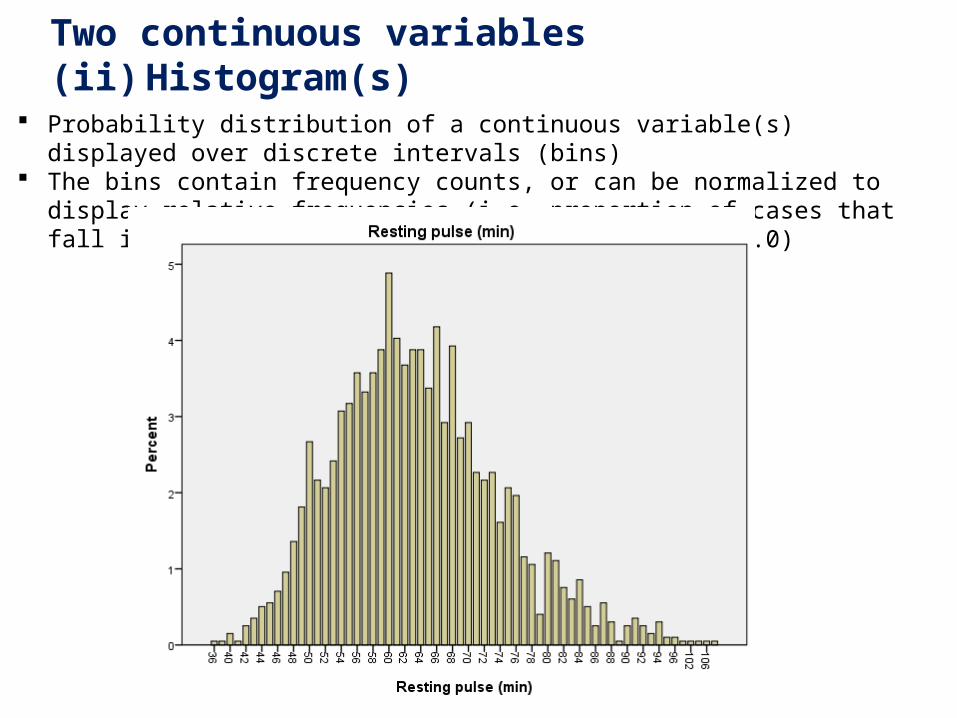
3. Two continuous variables(ii) Histogram(s)
Probability distribution of a continuous variable(s) displayed over discrete intervals (bins) The bins contain frequency counts, or can be normalized to display relative frequencies
(i.e. proportion of cases that fall into each category (bin) with total area = 1.0)
SECTION 1.6SECTION 1.6
SPSSSPSSData ManipulationData Manipulation
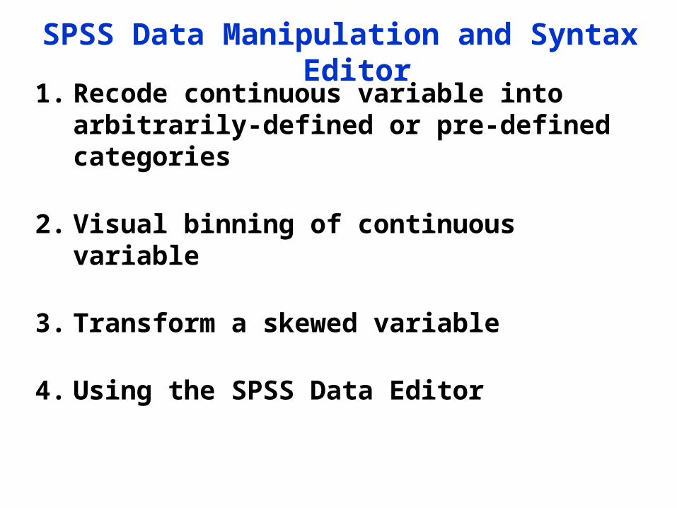
SPSS Data Manipulation and Syntax Editor
1. Recode continuous variable into arbitrarily-defined or pre-defined categories
2. Visual binning of continuous variable
3. Transform a skewed variable
4. Using the SPSS Data Editor
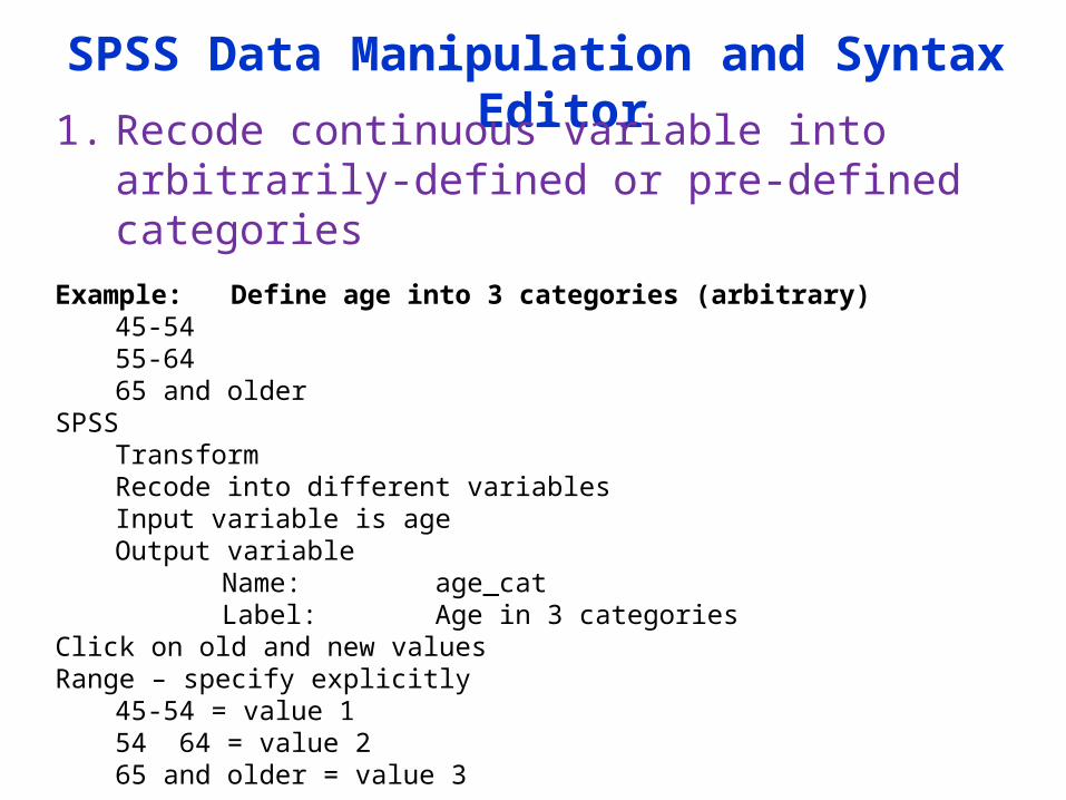
SPSS Data Manipulation and Syntax Editor
1. Recode continuous variable into arbitrarily-defined or pre-defined categories
Example: Define age into 3 categories (arbitrary)45-5455-6465 and older
SPSSTransformRecode into different variablesInput variable is ageOutput variable
Name: age_catLabel: Age in 3 categories
Click on old and new valuesRange – specify explicitly
45-54 = value 154 64 = value 265 and older = value 3
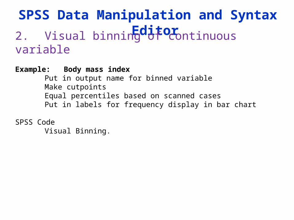
SPSS Data Manipulation and Syntax Editor
2. Visual binning of continuous variable
Example: Body mass indexPut in output name for binned variableMake cutpointsEqual percentiles based on scanned casesPut in labels for frequency display in bar chart
SPSS Code
Visual Binning.
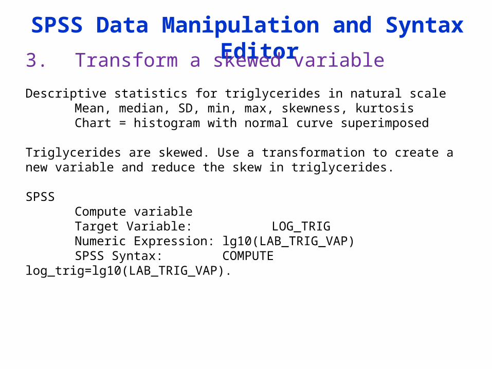
SPSS Data Manipulation and Syntax Editor
3. Transform a skewed variable
Descriptive statistics for triglycerides in natural scaleMean, median, SD, min, max, skewness, kurtosisChart = histogram with normal curve superimposed
Triglycerides are skewed. Use a transformation to create a new variable and reduce the skew in triglycerides. SPSS
Compute variableTarget Variable: LOG_TRIGNumeric Expression: lg10(LAB_TRIG_VAP)SPSS Syntax: COMPUTE log_trig=lg10(LAB_TRIG_VAP).
SPSS Data Manipulation and Syntax Editor
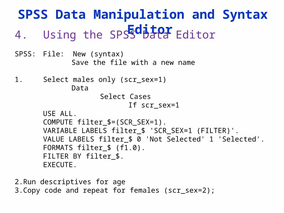
4. Using the SPSS Data Editor
SPSS: File: New (syntax)Save the file with a new name
1. Select males only (scr_sex=1)Data
Select CasesIf scr_sex=1
USE ALL.COMPUTE filter_$=(SCR_SEX=1).VARIABLE LABELS filter_$ 'SCR_SEX=1 (FILTER)'.VALUE LABELS filter_$ 0 'Not Selected' 1 'Selected'.FORMATS filter_$ (f1.0).FILTER BY filter_$.EXECUTE.
2.Run descriptives for age 3.Copy code and repeat for females (scr_sex=2);
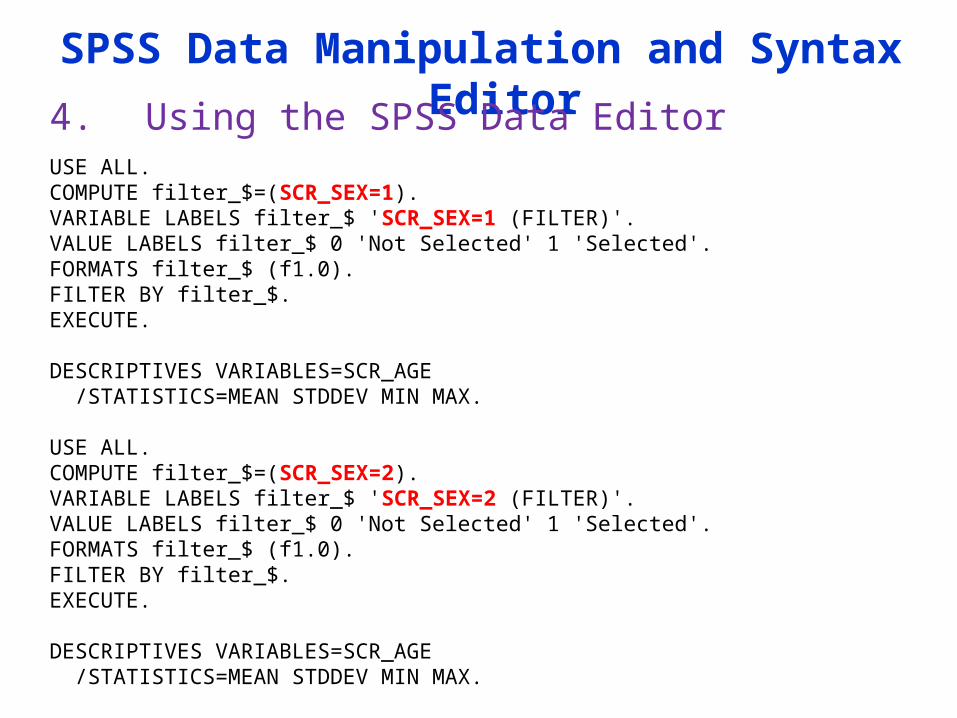
SPSS Data Manipulation and Syntax Editor
4. Using the SPSS Data EditorUSE ALL. COMPUTE filter_$=(SCR_SEX=1). VARIABLE LABELS filter_$ 'SCR_SEX=1 (FILTER)'. VALUE LABELS filter_$ 0 'Not Selected' 1 'Selected'. FORMATS filter_$ (f1.0). FILTER BY filter_$. EXECUTE.
DESCRIPTIVES VARIABLES=SCR_AGE /STATISTICS=MEAN STDDEV MIN MAX.
USE ALL. COMPUTE filter_$=(SCR_SEX=2). VARIABLE LABELS filter_$ 'SCR_SEX=2 (FILTER)'. VALUE LABELS filter_$ 0 'Not Selected' 1 'Selected'. FORMATS filter_$ (f1.0). FILTER BY filter_$. EXECUTE.
DESCRIPTIVES VARIABLES=SCR_AGE /STATISTICS=MEAN STDDEV MIN MAX.