Embed Size (px)
Citation preview
10/25/11 4:38 PMStepping Out With Bootstrap from Twitter | Webdesigntuts+
Page 1 of 20http://webdesign.tutsplus.com/tutorials/htmlcss-tutorials/stepping-out-with-bootstrap-from-twitter/
Advertise Here
Stepping Out With Bootstrapfrom TwitterConnor Turnbull on Sep 7th 2011 with 13 comments
Tutorial DetailsDifficulty: BeginnerEstimated completion time: 25 minsTopic: Bootstrap, from Twitter
Twitter introduced Bootstrap recently, a library of CSS styles aimed at web app developers in need of somedesign help. The toolkit includes everything from grid layouts down to buttons and modals, and works on prettymuch all modern browsers, all the way back to IE7.
Let’s see what we can do with it…
Bootstrap is also enhanced through the Less preprocessor, which adds some additional reasons to use Bootstrap,although we’ll exclude the Less functionality from the scope of this tutorial, to keep thing simple.
Bootstrap includes a bit of documentation, but nowhere does it really explain how to use the toolkit (instead,there’s just one big demo page for you to investigate yourself). So, in this article, we’re going to strip downBootstrap’s example page and analyze how to replicate the elements that Bootstrap covers. In providingexamples, we’ll also build up a sample webpage made entirely with Bootstrap.
What’s Covered?We’re going to take a look at the following (use the links to skip to the various sections):
The Grid SystemTypography
10/25/11 4:38 PMStepping Out With Bootstrap from Twitter | Webdesigntuts+
Page 2 of 20http://webdesign.tutsplus.com/tutorials/htmlcss-tutorials/stepping-out-with-bootstrap-from-twitter/
TablesForms and ButtonsNavigationTabs and PillsPaginationAlerts and Error MessagesModals
The Grid System
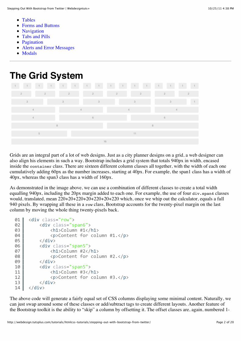
Grids are an integral part of a lot of web designs. Just as a city planner designs on a grid, a web designer canalso align his elements in such a way. Bootstrap includes a grid system that totals 940px in width, encasedinside the container class. There are sixteen different column classes all together, with the width of each onecumulatively adding 60px as the number increases, starting at 40px. For example, the span1 class has a width of40px, whereas the span3 class has a width of 160px.
As demonstrated in the image above, we can use a combination of different classes to create a total widthequalling 940px, including the 20px margin added to each one. For example, the use of four div.span4 classeswould, translated, mean 220+20+220+20+220+20+220 which, once we whip out the calculator, equals a full940 pixels. By wrapping all these in a row class, Bootstrap accounts for the twenty-pixel margin on the lastcolumn by moving the whole thing twenty-pixels back.
The above code will generate a fairly equal set of CSS columns displaying some minimal content. Naturally, wecan just swap around some of these classes or add/subtract tags to create different layouts. Another feature ofthe Bootstrap toolkit is the ability to “skip” a column by offsetting it. The offset classes are, again, numbered 1-
0102030405060708091011121314
<div/class="row">////<div/class="span6">////////<h1>Column/#1</h1>////////<p>Content/for/column/#1.</p>////</div>////<div/class="span5">////////<h1>Column/#2</h1>////////<p>Content/for/column/#2.</p>////</div>////<div/class="span5">////////<h1>Column/#3</h1>////////<p>Content/for/column/#3.</p>////</div></div>
10/25/11 4:38 PMStepping Out With Bootstrap from Twitter | Webdesigntuts+
Page 3 of 20http://webdesign.tutsplus.com/tutorials/htmlcss-tutorials/stepping-out-with-bootstrap-from-twitter/
16 where their widths follow the same +60 pattern, although they now include an additional 40px to compensatefor the left and right margin of said column. For example, we can take the above example, but remove themiddle column by adding the offset5 class to the end tag. For example:
It’s pretty simple to manipulate this with only a few numbers needing to be changed, and the image at the startof this section should be used as a guide for some recommended structures.
TypographyOne of the things that runs through pretty much all of the elements shown in this tutorial is typography.Bootstrap comes with all the typography tags you’d want styled for, everything from an <address> tag to <h1>and the whole heading hierarchy. Honestly, this is “Web Development 101! stuff that you probably alreadyknow, so I won’t waste your time explaining how to style. It’s pretty elemental stuff.
It is important to note that Bootstrap does account for older, now-deprecated tags, so you shouldn’t worry thereif you’re using a CMS that uses them, or for a client who doesn’t know any alternative.
QuotingWhere Bootstrap does need a little more explaining is when you come to use the <blockquote> tag. You canuse the tag on its own to show the quote indented, with a thick grey border on the left. However, it can beenhanced by nesting other tags inside to attribute the quote. When it comes to adding an attribute, simply wrapyour quote text in a <p> tag, and the source in a <small> tag and Bootstrap will automatically style and put adash in front of the source.
01020304050607080910
<div/class="row">////<div/class="span6">////////<h1>Column/#1</h1>////////<p>Content/for/column/#1.</p>////</div>////<div/class="span5/offset5">////////<h1>Column/#3</h1>////////<p>Content/for/column/#3.</p>////</div></div>
1234
<blockquote>////<p>Lorem/ipsum/dolor/sit/amet,/consectetur/adipiscing/elit./Integer/posuere/erat/a/ante/venenatis/dapibus/posuere/velit/aliquet.</////<small>Connor/Turnbull,/August/30th</small></blockquote>
10/25/11 4:38 PMStepping Out With Bootstrap from Twitter | Webdesigntuts+
Page 4 of 20http://webdesign.tutsplus.com/tutorials/htmlcss-tutorials/stepping-out-with-bootstrap-from-twitter/
You’ll end up with a result similar to the image below, depending on what content you put in between theparagraph and small tags.
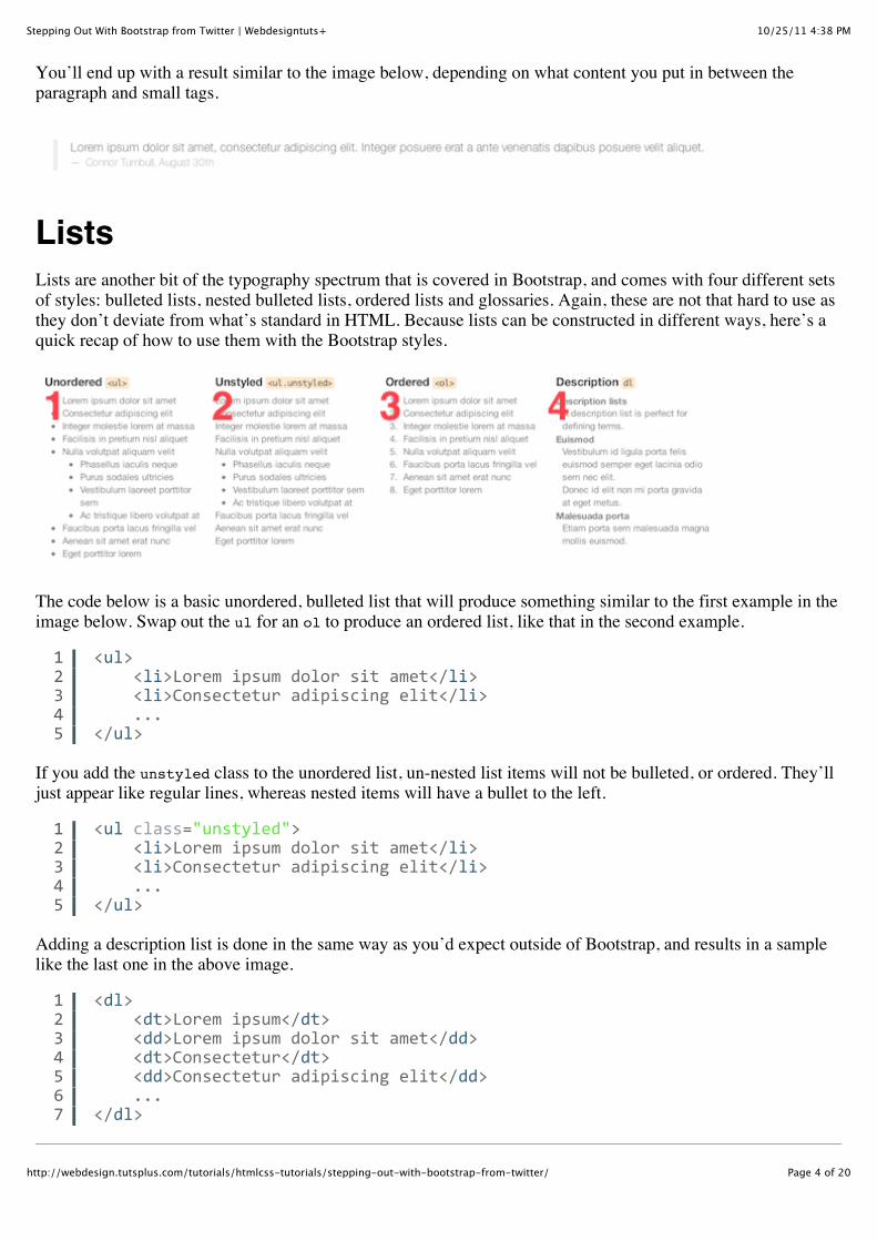
ListsLists are another bit of the typography spectrum that is covered in Bootstrap, and comes with four different setsof styles: bulleted lists, nested bulleted lists, ordered lists and glossaries. Again, these are not that hard to use asthey don’t deviate from what’s standard in HTML. Because lists can be constructed in different ways, here’s aquick recap of how to use them with the Bootstrap styles.
The code below is a basic unordered, bulleted list that will produce something similar to the first example in theimage below. Swap out the ul for an ol to produce an ordered list, like that in the second example.
If you add the unstyled class to the unordered list, un-nested list items will not be bulleted, or ordered. They’lljust appear like regular lines, whereas nested items will have a bullet to the left.
Adding a description list is done in the same way as you’d expect outside of Bootstrap, and results in a samplelike the last one in the above image.
12345
<ul>////<li>Lorem/ipsum/dolor/sit/amet</li>////<li>Consectetur/adipiscing/elit</li>////...</ul>
12345
<ul/class="unstyled">////<li>Lorem/ipsum/dolor/sit/amet</li>////<li>Consectetur/adipiscing/elit</li>////...</ul>
1234567
<dl>////<dt>Lorem/ipsum</dt>////<dd>Lorem/ipsum/dolor/sit/amet</dd>////<dt>Consectetur</dt>////<dd>Consectetur/adipiscing/elit</dd>////...</dl>
10/25/11 4:38 PMStepping Out With Bootstrap from Twitter | Webdesigntuts+
Page 5 of 20http://webdesign.tutsplus.com/tutorials/htmlcss-tutorials/stepping-out-with-bootstrap-from-twitter/
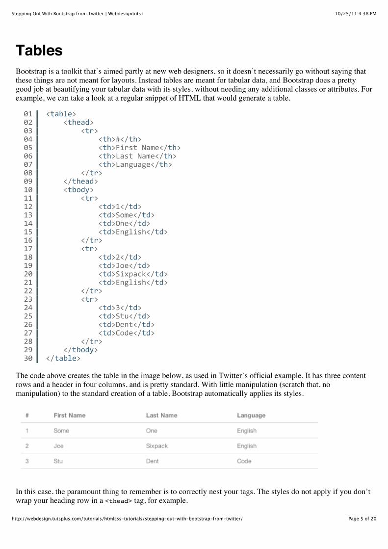
TablesBootstrap is a toolkit that’s aimed partly at new web designers, so it doesn’t necessarily go without saying thatthese things are not meant for layouts. Instead tables are meant for tabular data, and Bootstrap does a prettygood job at beautifying your tabular data with its styles, without needing any additional classes or attributes. Forexample, we can take a look at a regular snippet of HTML that would generate a table.
The code above creates the table in the image below, as used in Twitter’s official example. It has three contentrows and a header in four columns, and is pretty standard. With little manipulation (scratch that, nomanipulation) to the standard creation of a table, Bootstrap automatically applies its styles.
In this case, the paramount thing to remember is to correctly nest your tags. The styles do not apply if you don’twrap your heading row in a <thead> tag, for example.
010203040506070809101112131415161718192021222324252627282930
<table>////<thead>////////<tr>////////////<th>#</th>////////////<th>First/Name</th>////////////<th>Last/Name</th>////////////<th>Language</th>////////</tr>////</thead>////<tbody>////////<tr>////////////<td>1</td>////////////<td>Some</td>////////////<td>One</td>////////////<td>English</td>////////</tr>////////<tr>////////////<td>2</td>////////////<td>Joe</td>////////////<td>Sixpack</td>////////////<td>English</td>////////</tr>////////<tr>////////////<td>3</td>////////////<td>Stu</td>////////////<td>Dent</td>////////////<td>Code</td>////////</tr>////</tbody></table>
10/25/11 4:38 PMStepping Out With Bootstrap from Twitter | Webdesigntuts+
Page 6 of 20http://webdesign.tutsplus.com/tutorials/htmlcss-tutorials/stepping-out-with-bootstrap-from-twitter/
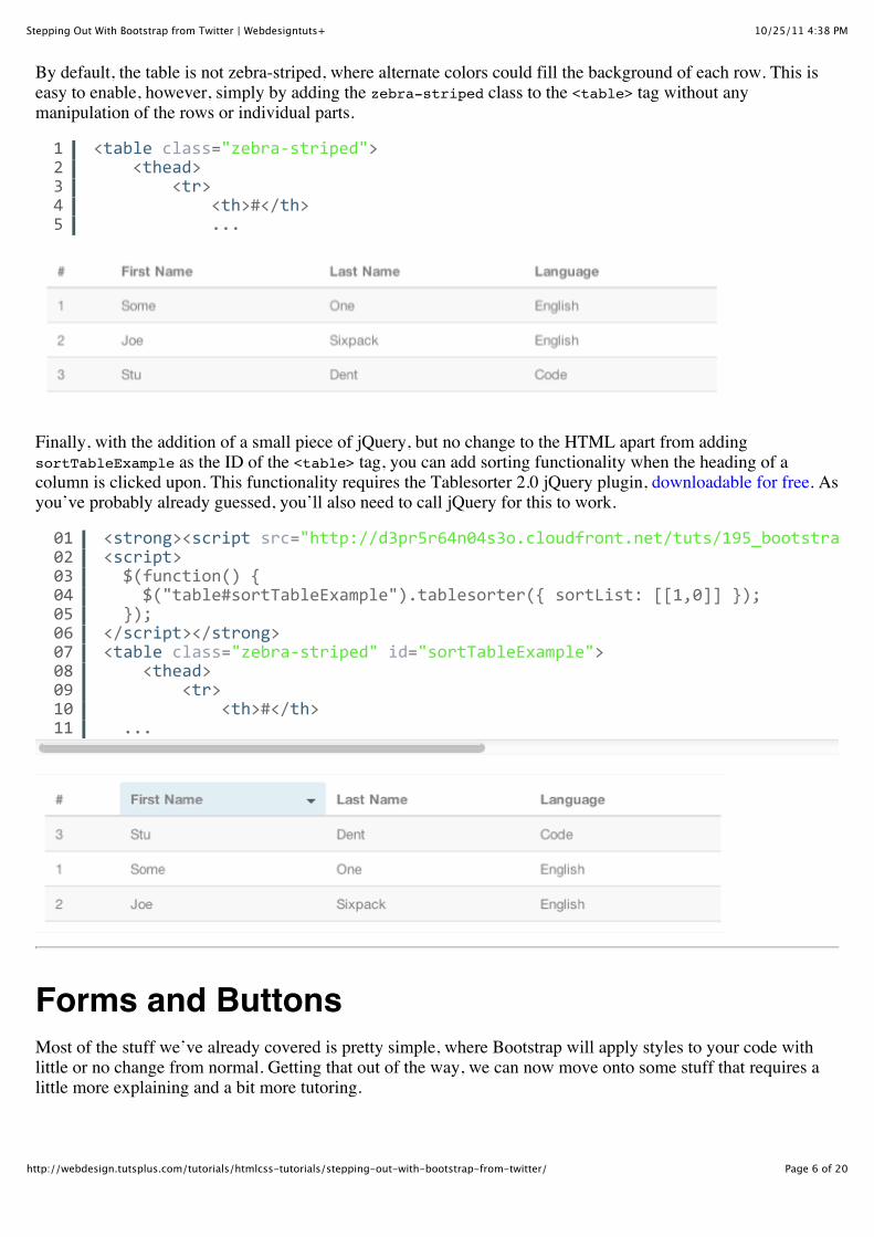
By default, the table is not zebra-striped, where alternate colors could fill the background of each row. This iseasy to enable, however, simply by adding the zebra-striped class to the <table> tag without anymanipulation of the rows or individual parts.
Finally, with the addition of a small piece of jQuery, but no change to the HTML apart from addingsortTableExample as the ID of the <table> tag, you can add sorting functionality when the heading of acolumn is clicked upon. This functionality requires the Tablesorter 2.0 jQuery plugin, downloadable for free. Asyou’ve probably already guessed, you’ll also need to call jQuery for this to work.
Forms and ButtonsMost of the stuff we’ve already covered is pretty simple, where Bootstrap will apply styles to your code withlittle or no change from normal. Getting that out of the way, we can now move onto some stuff that requires alittle more explaining and a bit more tutoring.
12345
<table/class="zebraYstriped">////<thead>////////<tr>////////////<th>#</th>////////////...
0102030405060708091011
<strong><script/src="http://d3pr5r64n04s3o.cloudfront.net/tuts/195_bootstrap/tut/path/to/tablesorter/jquery.tablesorter.min.js"<script>//$(function()/{////$("table#sortTableExample").tablesorter({/sortList:/[[1,0]]/});//});</script></strong><table/class="zebraYstriped"/id="sortTableExample">////<thead>////////<tr>////////////<th>#</th>//...
10/25/11 4:38 PMStepping Out With Bootstrap from Twitter | Webdesigntuts+
Page 7 of 20http://webdesign.tutsplus.com/tutorials/htmlcss-tutorials/stepping-out-with-bootstrap-from-twitter/
FormsFor forms, there are plenty of different styles you can use, so we’re going to look at each one individually. Youcan then just use these in combination with each other, and manipulate them with preexisting knowledge ofregular old HTML forms.
Firstly, it should be noted that your entire form should be wrapped in a <form> tag, but you probably know thatalready. Bootstrap also recommends you wrap your elements in <fieldset> tags, with an additional <legend>tag.
Generally, your form setup shouldn’t differ from the code above. The only other option that Bootstrap providesis to opt for stacked forms, where labels reside to the top of a field, rather than to the left. That can be achievedby adding the form-stacked class to the <form> tag.
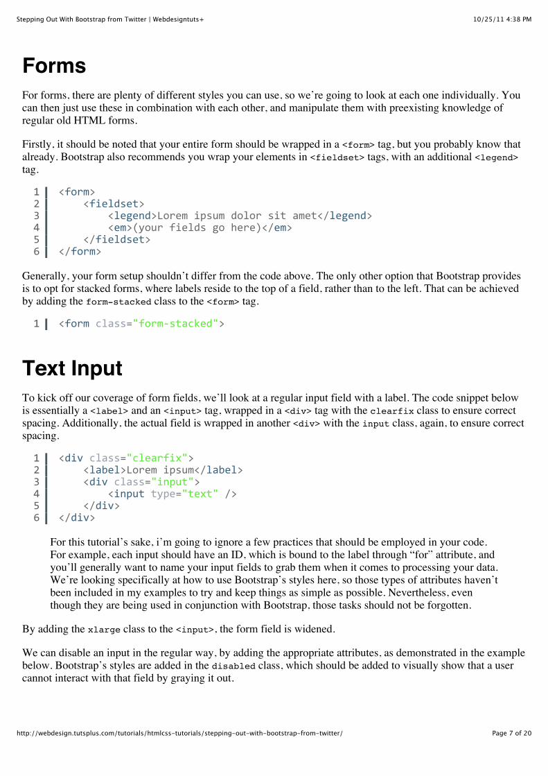
Text InputTo kick off our coverage of form fields, we’ll look at a regular input field with a label. The code snippet belowis essentially a <label> and an <input> tag, wrapped in a <div> tag with the clearfix class to ensure correctspacing. Additionally, the actual field is wrapped in another <div> with the input class, again, to ensure correctspacing.
For this tutorial’s sake, i’m going to ignore a few practices that should be employed in your code.For example, each input should have an ID, which is bound to the label through “for” attribute, andyou’ll generally want to name your input fields to grab them when it comes to processing your data.We’re looking specifically at how to use Bootstrap’s styles here, so those types of attributes haven’tbeen included in my examples to try and keep things as simple as possible. Nevertheless, eventhough they are being used in conjunction with Bootstrap, those tasks should not be forgotten.
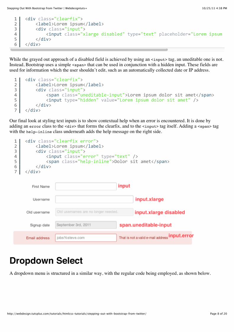
By adding the xlarge class to the <input>, the form field is widened.
We can disable an input in the regular way, by adding the appropriate attributes, as demonstrated in the examplebelow. Bootstrap’s styles are added in the disabled class, which should be added to visually show that a usercannot interact with that field by graying it out.
123456
<form>////<fieldset>////////<legend>Lorem/ipsum/dolor/sit/amet</legend>////////<em>(your/fields/go/here)</em>////</fieldset></form>
1 <form/class="formYstacked">
123456
<div/class="clearfix">////<label>Lorem/ipsum</label>////<div/class="input">////////<input/type="text"//>////</div></div>
10/25/11 4:38 PMStepping Out With Bootstrap from Twitter | Webdesigntuts+
Page 8 of 20http://webdesign.tutsplus.com/tutorials/htmlcss-tutorials/stepping-out-with-bootstrap-from-twitter/
While the grayed out approach of a disabled field is achieved by using an <input> tag, an uneditable one is not.Instead, Bootstrap uses a simple <span> that can be used in conjunction with a hidden input. These fields areused for information which the user shouldn’t edit, such as an automatically collected date or IP address.
Our final look at styling text inputs is to show contextual help when an error is encountered. It is done byadding an error class to the <div> that forms the clearfix, and to the <input> tag itself. Adding a <span> tagwith the help-inline class underneath adds the help message on the right side.
Dropdown SelectA dropdown menu is structured in a similar way, with the regular code being employed, as shown below.
123456
<div/class="clearfix">////<label>Lorem/ipsum</label>////<div/class="input">////////<input/class="xlarge/disabled"/type="text"/placeholder="Lorem/ipsum/dolor/sit/amet"////</div></div>
1234567
<div/class="clearfix">////<label>Lorem/ipsum</label>////<div/class="input">////////<span/class="uneditableYinput">Lorem/ipsum/dolor/sit/amet</span>////////<input/type="hidden"/value="Lorem/ipsum/dolor/sit/amet"//>////</div></div>
1234567
<div/class="clearfix/error">////<label>Lorem/ipsum</label>////<div/class="input">////////<input/class="error"/type="text"//>////////<span/class="helpYinline">Dolor/sit/amet</span>////</div></div>
10/25/11 4:38 PMStepping Out With Bootstrap from Twitter | Webdesigntuts+
Page 9 of 20http://webdesign.tutsplus.com/tutorials/htmlcss-tutorials/stepping-out-with-bootstrap-from-twitter/
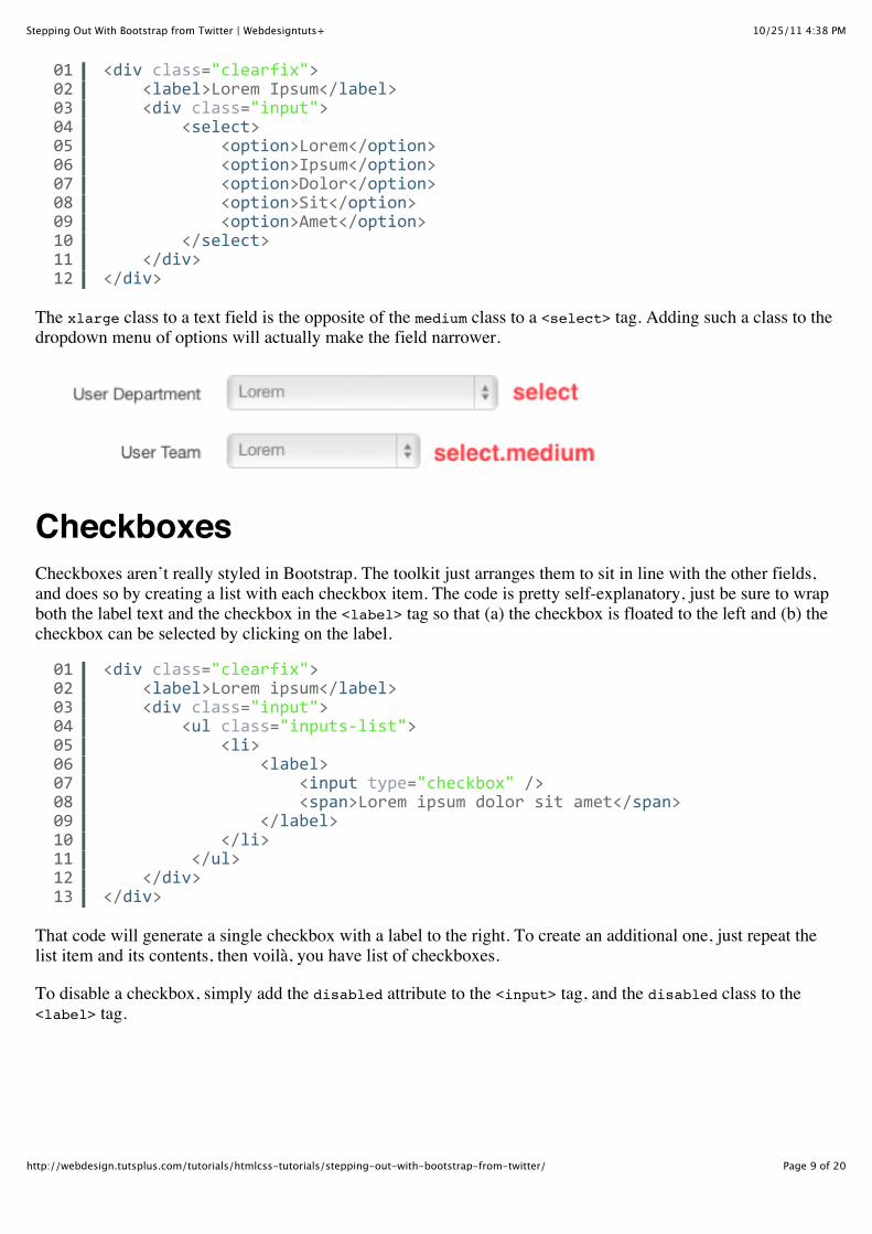
The xlarge class to a text field is the opposite of the medium class to a <select> tag. Adding such a class to thedropdown menu of options will actually make the field narrower.
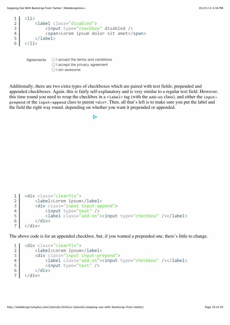
CheckboxesCheckboxes aren’t really styled in Bootstrap. The toolkit just arranges them to sit in line with the other fields,and does so by creating a list with each checkbox item. The code is pretty self-explanatory, just be sure to wrapboth the label text and the checkbox in the <label> tag so that (a) the checkbox is floated to the left and (b) thecheckbox can be selected by clicking on the label.
That code will generate a single checkbox with a label to the right. To create an additional one, just repeat thelist item and its contents, then voilà, you have list of checkboxes.
To disable a checkbox, simply add the disabled attribute to the <input> tag, and the disabled class to the<label> tag.
010203040506070809101112
<div/class="clearfix">////<label>Lorem/Ipsum</label>////<div/class="input">////////<select>////////////<option>Lorem</option>////////////<option>Ipsum</option>////////////<option>Dolor</option>////////////<option>Sit</option>////////////<option>Amet</option>////////</select>////</div></div>
01020304050607080910111213
<div/class="clearfix">////<label>Lorem/ipsum</label>////<div/class="input">////////<ul/class="inputsYlist">////////////<li>////////////////<label>////////////////////<input/type="checkbox"//>////////////////////<span>Lorem/ipsum/dolor/sit/amet</span>////////////////</label>////////////</li>/////////</ul>////</div></div>
10/25/11 4:38 PMStepping Out With Bootstrap from Twitter | Webdesigntuts+
Page 10 of 20http://webdesign.tutsplus.com/tutorials/htmlcss-tutorials/stepping-out-with-bootstrap-from-twitter/
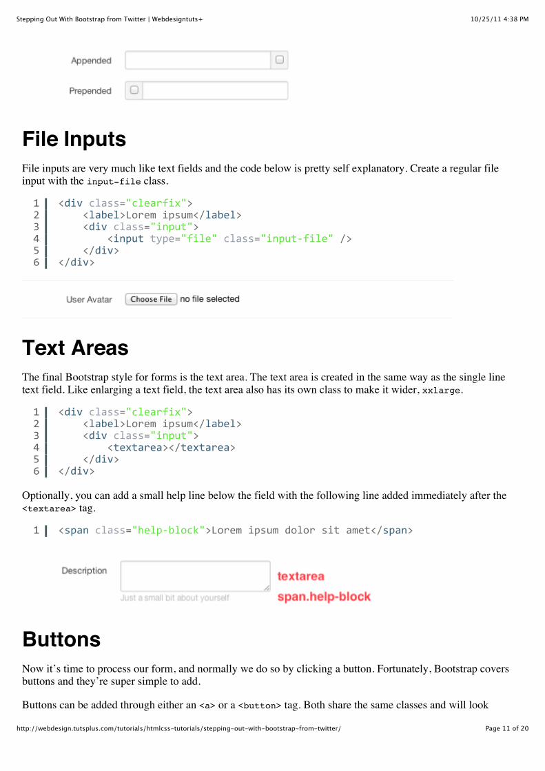
Additionally, there are two extra types of checkboxes which are paired with text fields: prepended andappended checkboxes. Again, this is fairly self-explanatory and is very similar to a regular text field. However,this time round you need to wrap the checkbox in a <label> tag (with the add-on class), and either the input-prepend or the input-append class to parent <div>. Then, all that’s left is to make sure you put the label andthe field the right way round, depending on whether you want it prepended or appended.
The above code is for an appended checkbox, but, if you wanted a prepended one, there’s little to change.
123456
<li>////<label/class="disabled">////////<input/type="checkbox"/disabled//>////////<span>Lorem/ipsum/dolor/sit/amet</span>////</label></li>
1234567
<div/class="clearfix">////<label>Lorem/ipsum</label>////<div/class="input/inputYappend">////////<input/type="text"//>////////<label/class="addYon"><input/type="checkbox"//></label>////</div></div>
1234567
<div/class="clearfix">////<label>Lorem/ipsum</label>////<div/class="input/inputYprepend">////////<label/class="addYon"><input/type="checkbox"//></label>////////<input/type="text"//>////</div></div>
10/25/11 4:38 PMStepping Out With Bootstrap from Twitter | Webdesigntuts+
Page 11 of 20http://webdesign.tutsplus.com/tutorials/htmlcss-tutorials/stepping-out-with-bootstrap-from-twitter/
File InputsFile inputs are very much like text fields and the code below is pretty self explanatory. Create a regular fileinput with the input-file class.
Text AreasThe final Bootstrap style for forms is the text area. The text area is created in the same way as the single linetext field. Like enlarging a text field, the text area also has its own class to make it wider, xxlarge.
Optionally, you can add a small help line below the field with the following line added immediately after the<textarea> tag.
ButtonsNow it’s time to process our form, and normally we do so by clicking a button. Fortunately, Bootstrap coversbuttons and they’re super simple to add.
Buttons can be added through either an <a> or a <button> tag. Both share the same classes and will look
123456
<div/class="clearfix">////<label>Lorem/ipsum</label>////<div/class="input">////////<input/type="file"/class="inputYfile"//>////</div></div>
123456
<div/class="clearfix">////<label>Lorem/ipsum</label>////<div/class="input">////////<textarea></textarea>////</div></div>
1 <span/class="helpYblock">Lorem/ipsum/dolor/sit/amet</span>
10/25/11 4:38 PMStepping Out With Bootstrap from Twitter | Webdesigntuts+
Page 12 of 20http://webdesign.tutsplus.com/tutorials/htmlcss-tutorials/stepping-out-with-bootstrap-from-twitter/
identical, but you should try and reserve buttons for actions, and links for, well, links. So, for example, a buttonwould be written as so:
And an idential button, but created as a link, would be written as so:
By default, the button will appear in a light gray style. However, this can easily be changed to one of the fourothers (light blue, blue, green and red) by applying an additional class.
primary for a blue button that is the primary action (e.g. submitting a form)info for a lighter blue button, usually used to access informationsuccess for a green button, used to signal successdanger for a red button, usually used for irreversible or dangerous actions such as deleting
We can also change the size of a button from the default. To enlarge it, simply add the large class or shrink itwith the (yep, you guessed it) small class.
Finally, to disable a button, all we need to do is add the disabled class and, in the case of an action button, setthe disabled attribute.
or
NavigationBootstrap includes a fixed navigation bar that resembles the one on Twitter’s website. The bar is essentiallymade up of three sections, the title link, the menu items in the search bar, encased in a couple of <div> tags thataren’t worthwhile explaining.
In the code below, you’ll notice an <h3> tag that holds the title. It’s fairly easy to modify this and to add yourown link and text.
Following that are the menu items, which are just unclassified list items with links. It’s straightforward enoughto duplicate these items since they require no Bootstrap-specific styles, apart from the active class on thecurrent link.
1 <button/class="btn">Lorem/ipsum</button>
1 <a/href="#"/class="btn">Lorem/ipsum</a>
12345
<button/class="btn/primary">Primary</button><button/class="btn">Default</button><button/class="btn/info">Info</button><button/class="btn/success">Success</button><button/class="btn/danger">Danger</button>
1 <button/class="btn/disabled"/disabled>Lorem/ipsum</button>
1 <a/class="btn/disabled">Lorem/ipsum</a>
1 <h3><a/href="#">Lorem/ipsum</a></h3>
10/25/11 4:38 PMStepping Out With Bootstrap from Twitter | Webdesigntuts+
Page 13 of 20http://webdesign.tutsplus.com/tutorials/htmlcss-tutorials/stepping-out-with-bootstrap-from-twitter/
The last list is for the dropdown menu. It features a single list item, with another, nested list that appears onhover over. The third line of the code below is the list item that appears constantly on the navigation bar,whereas the list starting at line 4 is the hover items.
As you’ll notice, adding an empty list item with the divider class will add a divider in the dropdown menu.
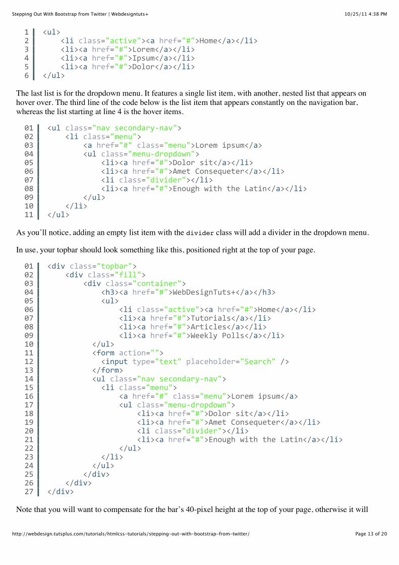
In use, your topbar should look something like this, positioned right at the top of your page.
Note that you will want to compensate for the bar’s 40-pixel height at the top of your page, otherwise it will
123456
<ul>////<li/class="active"><a/href="#">Home</a></li>////<li><a/href="#">Lorem</a></li>////<li><a/href="#">Ipsum</a></li>////<li><a/href="#">Dolor</a></li></ul>
0102030405060708091011
<ul/class="nav/secondaryYnav">////<li/class="menu">////////<a/href="#"/class="menu">Lorem/ipsum</a>////////<ul/class="menuYdropdown">////////////<li><a/href="#">Dolor/sit</a></li>////////////<li><a/href="#">Amet/Consequeter</a></li>////////////<li/class="divider"></li>////////////<li><a/href="#">Enough/with/the/Latin</a></li>////////</ul>////</li></ul>
010203040506070809101112131415161718192021222324252627
<div/class="topbar">////<div/class="fill">////////<div/class="container">////////////<h3><a/href="#">WebDesignTuts+</a></h3>////////////<ul>////////////////<li/class="active"><a/href="#">Home</a></li>////////////////<li><a/href="#">Tutorials</a></li>////////////////<li><a/href="#">Articles</a></li>////////////////<li><a/href="#">Weekly/Polls</a></li>//////////</ul>//////////<form/action="">////////////<input/type="text"/placeholder="Search"//>//////////</form>//////////<ul/class="nav/secondaryYnav">////////////<li/class="menu">////////////////<a/href="#"/class="menu">Lorem/ipsum</a>////////////////<ul/class="menuYdropdown">////////////////////<li><a/href="#">Dolor/sit</a></li>////////////////////<li><a/href="#">Amet/Consequeter</a></li>////////////////////<li/class="divider"></li>////////////////////<li><a/href="#">Enough/with/the/Latin</a></li>////////////////</ul>////////////</li>//////////</ul>////////</div>////</div></div>
10/25/11 4:38 PMStepping Out With Bootstrap from Twitter | Webdesigntuts+
Page 14 of 20http://webdesign.tutsplus.com/tutorials/htmlcss-tutorials/stepping-out-with-bootstrap-from-twitter/
overlap the first elements on your page.
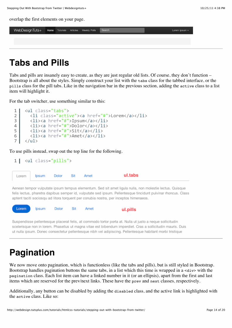
Tabs and PillsTabs and pills are insanely easy to create, as they are just regular old lists. Of course, they don’t function –Bootstrap is all about the styles. Simply construct your list with the tabs class for the tabbed interface, or thepills class for the pill tabs. Like in the navigation bar in the previous section, adding the active class to a listitem will highlight it.
For the tab switcher, use something similar to this:
To use pills instead, swap out the top line for the following.
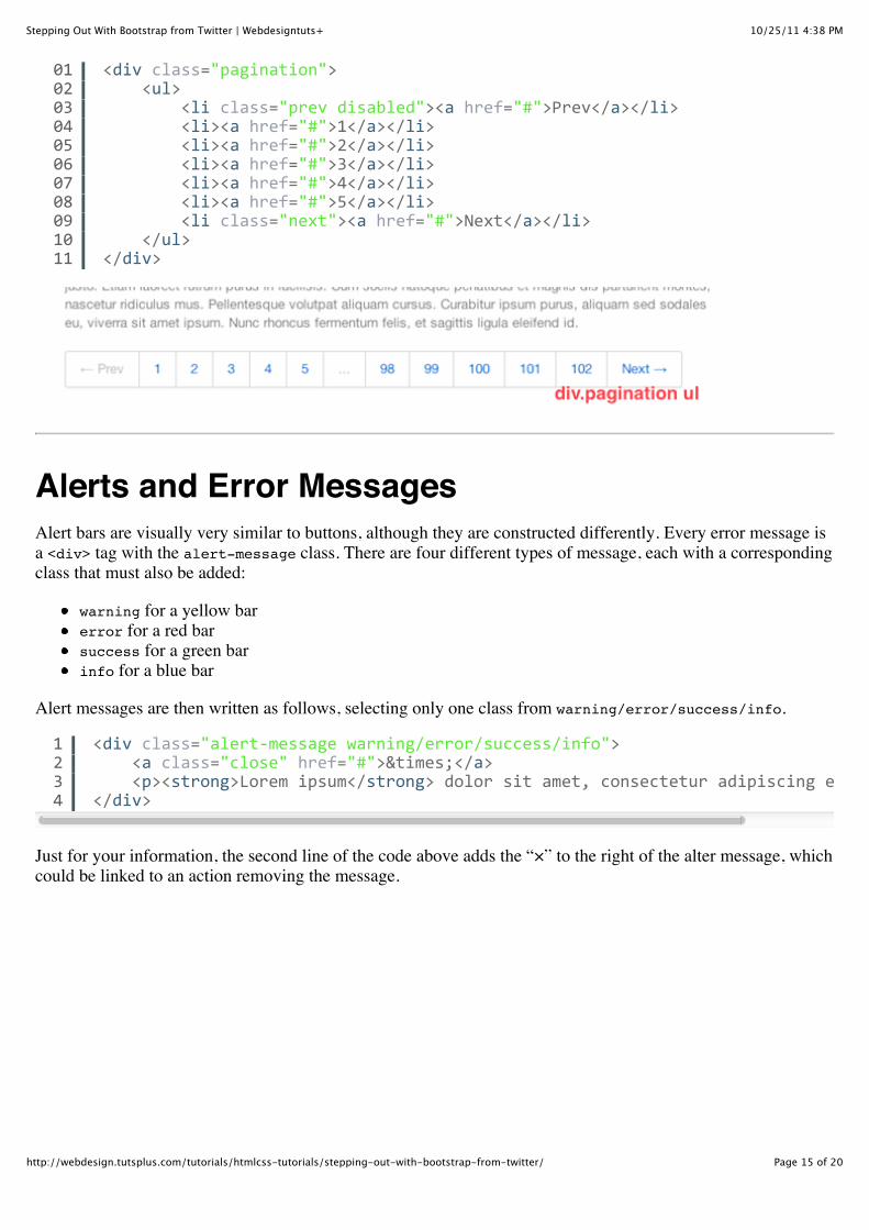
PaginationWe now move onto pagination, which is functionless (like the tabs and pills), but is still styled in Bootstrap.Bootstrap handles pagination buttons the same tabs, in a list which this time is wrapped in a <div> with thepagination class. Each list item can have a linked number in it (or an ellipsis), apart from the first and lastitems which are reserved for the prev/next links. These have the prev and next classes, respectively.
Additionally, any button can be disabled by adding the disabled class, and the active link is highlighted withthe active class. Like so:
1234567
<ul/class="tabs">//<li/class="active"><a/href="#">Lorem</a></li>//<li><a/href="#">Ipsum</a></li>//<li><a/href="#">Dolor</a></li>//<li><a/href="#">Sit</a></li>//<li><a/href="#">Amet</a></li></ul>
1 <ul/class="pills">
10/25/11 4:38 PMStepping Out With Bootstrap from Twitter | Webdesigntuts+
Page 15 of 20http://webdesign.tutsplus.com/tutorials/htmlcss-tutorials/stepping-out-with-bootstrap-from-twitter/
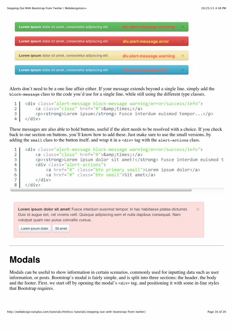
Alerts and Error MessagesAlert bars are visually very similar to buttons, although they are constructed differently. Every error message isa <div> tag with the alert-message class. There are four different types of message, each with a correspondingclass that must also be added:
warning for a yellow barerror for a red barsuccess for a green barinfo for a blue bar
Alert messages are then written as follows, selecting only one class from warning/error/success/info.
Just for your information, the second line of the code above adds the “×” to the right of the alter message, whichcould be linked to an action removing the message.
0102030405060708091011
<div/class="pagination">////<ul>////////<li/class="prev/disabled"><a/href="#">Prev</a></li>////////<li><a/href="#">1</a></li>////////<li><a/href="#">2</a></li>////////<li><a/href="#">3</a></li>////////<li><a/href="#">4</a></li>////////<li><a/href="#">5</a></li>////////<li/class="next"><a/href="#">Next</a></li>////</ul></div>
1234
<div/class="alertYmessage/warning/error/success/info">////<a/class="close"/href="#">×</a>////<p><strong>Lorem/ipsum</strong>/dolor/sit/amet,/consectetur/adipiscing/elit.</</div>
10/25/11 4:38 PMStepping Out With Bootstrap from Twitter | Webdesigntuts+
Page 16 of 20http://webdesign.tutsplus.com/tutorials/htmlcss-tutorials/stepping-out-with-bootstrap-from-twitter/
Alerts don’t need to be a one line affair either. If your message extends beyond a single line, simply add theblock-message class to the code you’d use for a single line, while still using the different type classes.
These messages are also able to hold buttons, useful if the alert needs to be resolved with a choice. If you checkback to our section on buttons, you’ll know how to add these. Just make sure to use the small versions, byadding the small class to the button itself, and wrap it in a <div> tag with the alert-actions class.
ModalsModals can be useful to show information in certain scenarios, commonly used for inputting data such as userinformation, or posts. Bootstrap’s modal is fairly simple, and is split into three sections; the header, the bodyand the footer. First, we start off by opening the modal’s <div> tag, and positioning it with some in-line stylesthat Bootstrap requires.
1234
<div/class="alertYmessage/blockYmessage/warning/error/success/info">////<a/class="close"/href="#">&times;</a>////<p><strong>Lorem/ipsum</strong>/Fusce/interdum/euismod/tempor...</p></div>
12345678
<div/class="alertYmessage/blockYmessage/warning/error/success/info">////<a/class="close"/href="#">&times;</a>////<p><strong>Lorem/ipsum/dolor/sit/amet!</strong>/Fusce/interdum/euismod/tempor...</////<div/class="alertYactions">////////<a/href="#"/class="btn/primary/small">Lorem/ipsum/dolor</a>////////<a/href="#"/class="btn/small">Sit/amet</a>////</div></div>
10/25/11 4:38 PMStepping Out With Bootstrap from Twitter | Webdesigntuts+
Page 17 of 20http://webdesign.tutsplus.com/tutorials/htmlcss-tutorials/stepping-out-with-bootstrap-from-twitter/
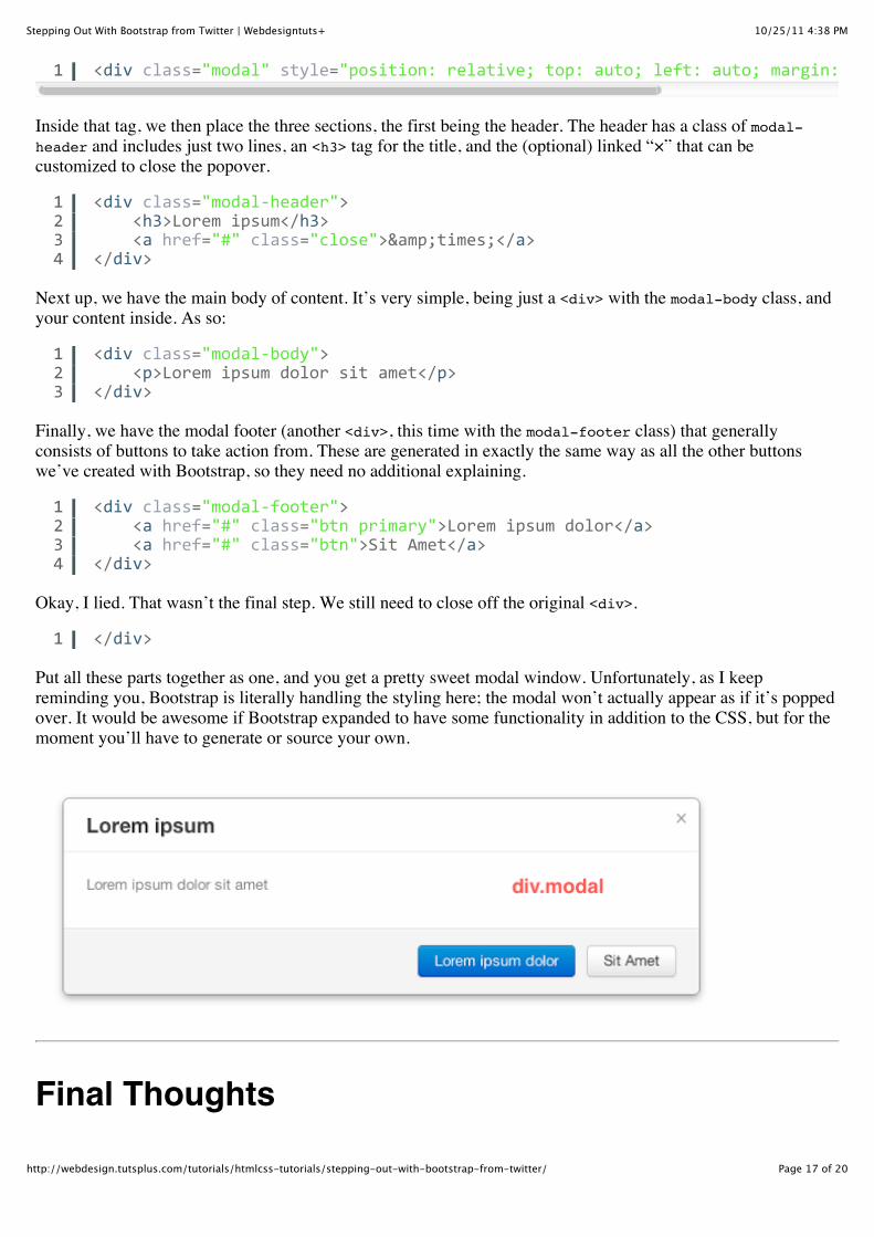
Inside that tag, we then place the three sections, the first being the header. The header has a class of modal-header and includes just two lines, an <h3> tag for the title, and the (optional) linked “×” that can becustomized to close the popover.
Next up, we have the main body of content. It’s very simple, being just a <div> with the modal-body class, andyour content inside. As so:
Finally, we have the modal footer (another <div>, this time with the modal-footer class) that generallyconsists of buttons to take action from. These are generated in exactly the same way as all the other buttonswe’ve created with Bootstrap, so they need no additional explaining.
Okay, I lied. That wasn’t the final step. We still need to close off the original <div>.
Put all these parts together as one, and you get a pretty sweet modal window. Unfortunately, as I keepreminding you, Bootstrap is literally handling the styling here; the modal won’t actually appear as if it’s poppedover. It would be awesome if Bootstrap expanded to have some functionality in addition to the CSS, but for themoment you’ll have to generate or source your own.
Final Thoughts
1 <div/class="modal"/style="position:/relative;/top:/auto;/left:/auto;/margin:/0/auto;/zYindex:/1"
1234
<div/class="modalYheader">////<h3>Lorem/ipsum</h3>////<a/href="#"/class="close">&times;</a></div>
123
<div/class="modalYbody">////<p>Lorem/ipsum/dolor/sit/amet</p></div>
1234
<div/class="modalYfooter">////<a/href="#"/class="btn/primary">Lorem/ipsum/dolor</a>////<a/href="#"/class="btn">Sit/Amet</a></div>
1 </div>
10/25/11 4:38 PMStepping Out With Bootstrap from Twitter | Webdesigntuts+
Page 18 of 20http://webdesign.tutsplus.com/tutorials/htmlcss-tutorials/stepping-out-with-bootstrap-from-twitter/
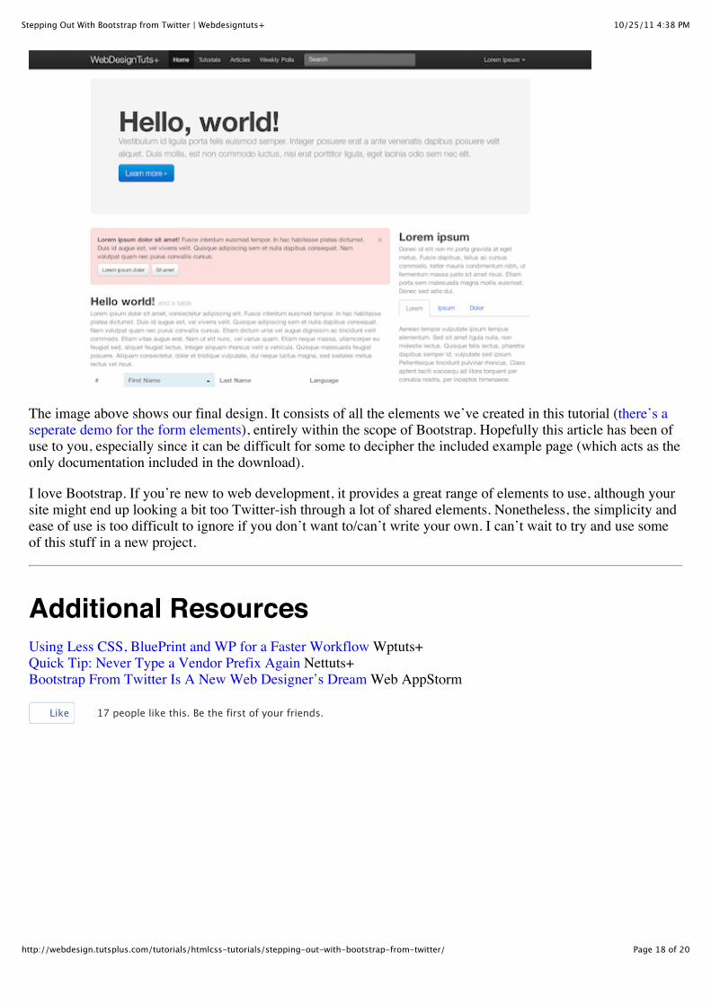
The image above shows our final design. It consists of all the elements we’ve created in this tutorial (there’s aseperate demo for the form elements), entirely within the scope of Bootstrap. Hopefully this article has been ofuse to you, especially since it can be difficult for some to decipher the included example page (which acts as theonly documentation included in the download).
I love Bootstrap. If you’re new to web development, it provides a great range of elements to use, although yoursite might end up looking a bit too Twitter-ish through a lot of shared elements. Nonetheless, the simplicity andease of use is too difficult to ignore if you don’t want to/can’t write your own. I can’t wait to try and use someof this stuff in a new project.
Additional ResourcesUsing Less CSS, BluePrint and WP for a Faster Workflow Wptuts+Quick Tip: Never Type a Vendor Prefix Again Nettuts+Bootstrap From Twitter Is A New Web Designer’s Dream Web AppStorm
Like 17 people like this. Be the first of your friends.
10/25/11 4:38 PMStepping Out With Bootstrap from Twitter | Webdesigntuts+
Page 19 of 20http://webdesign.tutsplus.com/tutorials/htmlcss-tutorials/stepping-out-with-bootstrap-from-twitter/
Tags: bootstrapcssframeworktool kittwitter
By Connor TurnbullThis author has yet to write their bio.

10/25/11 4:38 PMStepping Out With Bootstrap from Twitter | Webdesigntuts+
Page 20 of 20http://webdesign.tutsplus.com/tutorials/htmlcss-tutorials/stepping-out-with-bootstrap-from-twitter/


![[BOOK] [Bootstrap] [Awesome] Bootstrap-Programming-Cookbook](https://img.pdfslide.net/doc/110x75/577ca6bf1a28abea748c023f/book-bootstrap-awesome-bootstrap-programming-cookbook.jpg)

