Embed Size (px)
Citation preview
Author: Andrew Taylor BSc MA FRSA - Art and Engineering in Product Design
Styling, Aesthetics and Colour
Author: Andrew Taylor BSc MA FRSA - Art and Engineering in Product Design
Styling, Aesthetics and Colour FORM FOLLOWS FUNCTION?
The phrase ‘form follows function’ was coined by American architect L H Sullivan
around 1896. He argued that the traditional classical styles of architecture imposed
unnecessary constraints upon architects, especially with the arrival of new building
materials (he was pioneering the concept of the skyscraper). About the same time,
Austrian architect Adolf Loos proposed the abandonment of applied decoration,
especially in relation to the lavish rococo so loved by the Victorians (his rally call was
‘Ornament is crime’). The two ideas fused, giving birth to Functionalism (aka
Modernism). Functionalism became the cornerstone of Industrial Design teaching at the
Bauhaus, and was championed by Industrial Designers such as Raymond Loewy,
Norman bel Geddes, and Henry Dreyfuss, enjoying widespread (if not uncritical)
acceptance in Industrial Design from 1945 to 1985. It had at its core the idea that the
product’s function – the way it was made, the job it was required to do and the way that
it was used – should dictate product form, and the approach worked well with the
predominantly mechanical products of the industrial era. Functionalism also inherited the
architectural idea that there was beauty in simplicity and virtue in the honest use of
materials, an idea taken to extremes by the Minimalist movement (late 1960s) and the
work of architect Mies van der Rohe, in which a building or product would be stripped of
all but the most elemental forms (slogan ‘Less is More’). Over the years, functionalism
was progressively enlarged to encompass additional criteria such as attractiveness,
affordability (price and whole life running costs), safety and recyclability.
But functionalism has its limitations. Claw hammers and vehicle starter motors clearly
derive their form from their function, but the perfect automobile shape from a functional
(aerodynamic) perspective is the teardrop, and such a shape has limited market appeal.
With the relentless miniaturization of components, and with product function becoming
ever more abstract (particularly in the case of microprocessor and screen-based
products), ‘form follows function’ often seems inadequate as a guiding principle in
design, and in the extreme could lead to a world full of identical ‘rationalized black box’
products.
Author: Andrew Taylor BSc MA FRSA - Art and Engineering in Product Design
PRODUCT SEMANTICS
In the 1970s it became clear that a new set of guiding principles was needed in product
design, to overcome the limitations of Functionalism. In addition to their functional
requirements, it was recognized that products should engage the user at an emotional
level, to give meaning to the product, and to enhance the experience of both ownership
and use. A new language of design was needed to formalize this approach. This language
became known as ‘Product Semantics’ – a term coined by psychologists Butter and
Krippendorf in 1984 – and became associated with the slogans ‘form follows meaning’
and ‘design is making sense of things’. The Post-Functional (post-modern) approach to
product design therefore embodies the idea that a product’s form should both clarify its
function (where the product’s function would not be obvious from its functionally-
derived form), and should communicate (through symbolism) abstract ideas and values
associated with the product and its user, to engage the user at a cultural and emotional
level. In particular, a product’s form should address the following requirements:
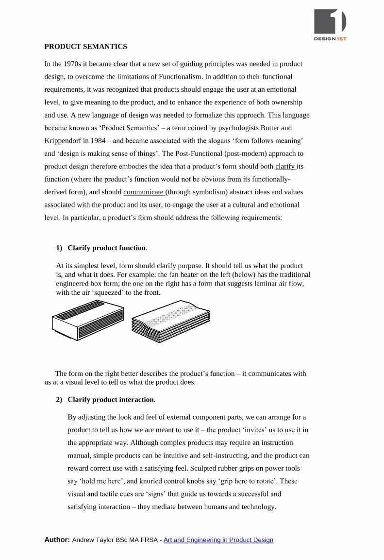
1) Clarify product function.
At its simplest level, form should clarify purpose. It should tell us what the product
is, and what it does. For example: the fan heater on the left (below) has the traditional
engineered box form; the one on the right has a form that suggests laminar air flow,
with the air ‘squeezed’ to the front.
The form on the right better describes the product’s function – it communicates with
us at a visual level to tell us what the product does.
2) Clarify product interaction.
By adjusting the look and feel of external component parts, we can arrange for a
product to tell us how we are meant to use it – the product ‘invites’ us to use it in
the appropriate way. Although complex products may require an instruction
manual, simple products can be intuitive and self-instructing, and the product can
reward correct use with a satisfying feel. Sculpted rubber grips on power tools
say ‘hold me here’, and knurled control knobs say ‘grip here to rotate’. These
visual and tactile cues are ‘signs’ that guide us towards a successful and
satisfying interaction – they mediate between humans and technology.
Author: Andrew Taylor BSc MA FRSA - Art and Engineering in Product Design
3) Indicate quality and design direction.
The materials used and manufacturing routes taken may be intentionally revealed
or disguised. In either case, the product form and execution of detail provide
indicators to the product’s reliability, maintainability, recyclability, and overall
build quality, from which buyers can judge product value-for-money and brand
trustworthiness.
4) Suggest provenance or origin.
By using symbolism, product form can be made to trigger geographical, cultural
or historical associations. The form may suggest ethnicity or country of origin, or
evoke memories of a particular historical period, by tapping into the cultural and
social ‘memories’ of target users. For example, the Chrysler PT Cruiser
automobile (launched in 2000) has a radically different appearance to its
contemporaries, having retro styling evocative of 1930s America, married with
the latest technology. People with positive memories of this period in automobile
history (whether real or acquired) respond positively to the new look.
5) Express cultural values.
Symbolism may also be used to reflect cultural and social values, ideas or
dreams. It may support or enhance the identity, self-image and status of an
individual by reinforcing aspects of the user’s lifestyle, values and aspirations.
Designing for self-image requires a broad understanding of the cultural
background and aspirations of target users. For example, a diamond-encrusted
mobile phone may be irresistible to one group of users, but may be offensive to
another group, because the cultural values of the two groups differ. In common
parlance, we would say that the two groups have different ‘tastes’.
Designers have always faced the dilemma of personal taste, yet products continue
to incorporate irrational styling features and applied decoration (the latest
footwear, consumer durables and vehicles of the ‘bling’ sub-culture for example),
and they sell well into their respective markets. Symbolism may also
communicate the brand values of the designer or product manufacturer, and may
make the product more meaningful and desirable for users sympathetic to those
brand values. Coca-Cola, Nike, Apple, Swatch, Adidas and many more
companies see brand identity (a vehicle for brand values) as a major
differentiator in a competitive market.
Author: Andrew Taylor BSc MA FRSA - Art and Engineering in Product Design
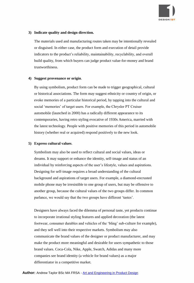
ELEMENTS OF MEANING
Every product has, by accident or design, characteristics that engage our memory,
intellect and emotions. It is through these non-technical characteristics that a product’s
complete meaning is expressed.
Products most likely to become design classics or desirable antiques often have certain
qualities in common:
Innovative approach to an old problem.
An established mythology or provenance (evocative history).
Quality and dependability
Longevity and the capacity to age gracefully.
Simplicity and evidence of an honest use of materials
Intuitive in operation
A satisfying ‘feel’ and good looks.
Aesthetic qualities that create positive associations
Inanimate objects do not possess personality – they have it assigned to them by humans.
This ‘meaning’ given to products is the aggregate of all the interpretations, perceptions,
associations and feelings experienced within the mind of the subject.
Author: Andrew Taylor BSc MA FRSA - Art and Engineering in Product Design
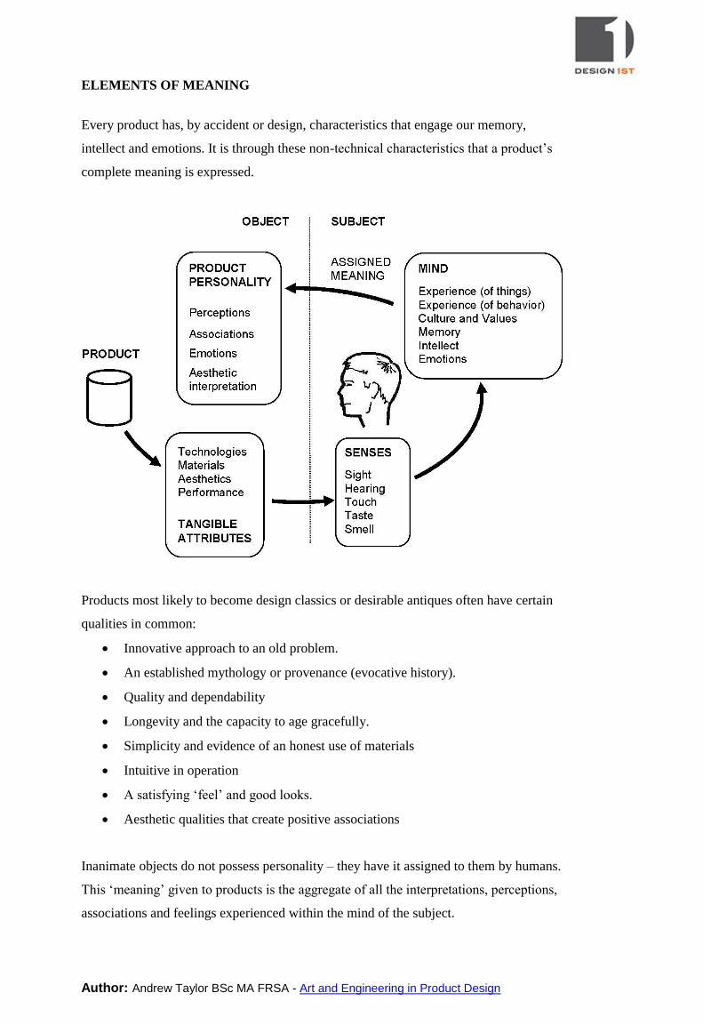
THE IMPORTANCE OF ASSOCIATION
Sights, sounds, textures, tastes and smells can transport us to past times and places, or
remind us of events or people. Some people associate numbers with colours, and some
claim to be able to ‘taste’ colours. In the majority of cases, these associations can be
traced to childhood or later learning experiences. In a very small number of people, the
effect is due to neurological cross-connection in the brain (synaesthesia). The learned
associations below are peculiar to the author and perhaps a small group of people of
similar age.
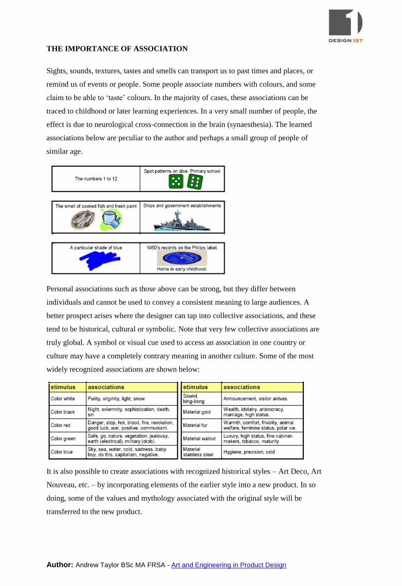
Personal associations such as those above can be strong, but they differ between
individuals and cannot be used to convey a consistent meaning to large audiences. A
better prospect arises where the designer can tap into collective associations, and these
tend to be historical, cultural or symbolic. Note that very few collective associations are
truly global. A symbol or visual cue used to access an association in one country or
culture may have a completely contrary meaning in another culture. Some of the most
widely recognized associations are shown below:
It is also possible to create associations with recognized historical styles – Art Deco, Art
Nouveau, etc. – by incorporating elements of the earlier style into a new product. In so
doing, some of the values and mythology associated with the original style will be
transferred to the new product.
Author: Andrew Taylor BSc MA FRSA - Art and Engineering in Product Design
PRODUCT FORM AND VISUAL STYLE
Every product (in fact every object, 2D or 3D) can be thought of as an assembly of
component shapes – building blocks – blended and arranged to produce a complete
image or object. In other words, the product form is a composite of simpler geometric
elements. For 2-dimensional objects, the elements are the line, square, triangle and circle.
For 3-dimensional objects, these elements are supplemented by the sphere, cylinder, cone
and cube. Every conceivable shape can be constructed by assembling some combination
of these elementary forms. Each has particular characteristics; the circle suggests a
continuous, smooth flowing motion; the square suggests discipline in its straight
horizontal and vertical lines, with jarring changes of direction at the corners. These
characteristics are sub-consciously ‘felt’. In creative designers, they are internalized and
become part of the nervous fabric of the designer.
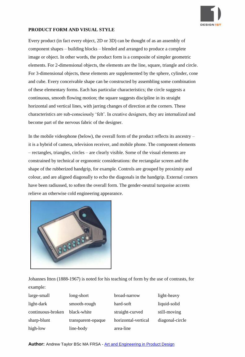
In the mobile videophone (below), the overall form of the product reflects its ancestry –
it is a hybrid of camera, television receiver, and mobile phone. The component elements
– rectangles, triangles, circles – are clearly visible. Some of the visual elements are
constrained by technical or ergonomic considerations: the rectangular screen and the
shape of the rubberized handgrip, for example. Controls are grouped by proximity and
colour, and are aligned diagonally to echo the diagonals in the handgrip. External corners
have been radiussed, to soften the overall form. The gender-neutral turquoise accents
relieve an otherwise cold engineering appearance.
Johannes Itten (1888-1967) is noted for his teaching of form by the use of contrasts, for
example:
large-small long-short broad-narrow light-heavy
light-dark smooth-rough hard-soft liquid-solid
continuous-broken black-white straight-curved still-moving
sharp-blunt transparent-opaque horizontal-vertical diagonal-circle
high-low line-body area-line
Author: Andrew Taylor BSc MA FRSA - Art and Engineering in Product Design
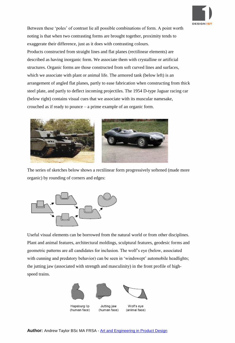
Between these ‘poles’ of contrast lie all possible combinations of form. A point worth
noting is that when two contrasting forms are brought together, proximity tends to
exaggerate their difference, just as it does with contrasting colours.
Products constructed from straight lines and flat planes (rectilinear elements) are
described as having inorganic form. We associate them with crystalline or artificial
structures. Organic forms are those constructed from soft curved lines and surfaces,
which we associate with plant or animal life. The armored tank (below left) is an
arrangement of angled flat planes, partly to ease fabrication when constructing from thick
steel plate, and partly to deflect incoming projectiles. The 1954 D-type Jaguar racing car
(below right) contains visual cues that we associate with its muscular namesake,
crouched as if ready to pounce – a prime example of an organic form.
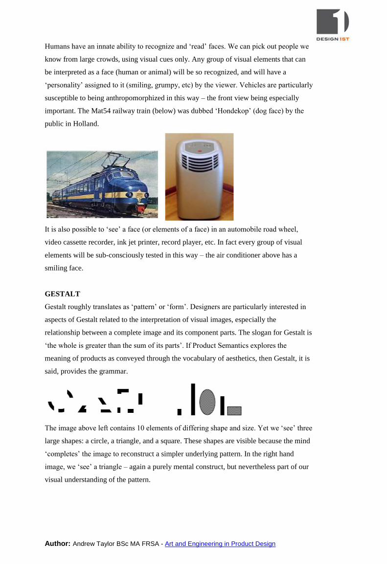
The series of sketches below shows a rectilinear form progressively softened (made more
organic) by rounding of corners and edges:
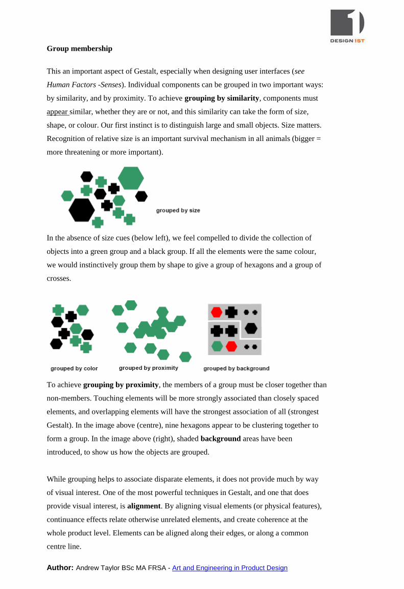
Useful visual elements can be borrowed from the natural world or from other disciplines.
Plant and animal features, architectural moldings, sculptural features, geodesic forms and
geometric patterns are all candidates for inclusion. The wolf’s eye (below, associated
with cunning and predatory behavior) can be seen in ‘windswept’ automobile headlights;
the jutting jaw (associated with strength and masculinity) in the front profile of high-
speed trains.
Author: Andrew Taylor BSc MA FRSA - Art and Engineering in Product Design
Humans have an innate ability to recognize and ‘read’ faces. We can pick out people we
know from large crowds, using visual cues only. Any group of visual elements that can
be interpreted as a face (human or animal) will be so recognized, and will have a
‘personality’ assigned to it (smiling, grumpy, etc) by the viewer. Vehicles are particularly
susceptible to being anthropomorphized in this way – the front view being especially
important. The Mat54 railway train (below) was dubbed ‘Hondekop’ (dog face) by the
public in Holland.
It is also possible to ‘see’ a face (or elements of a face) in an automobile road wheel,
video cassette recorder, ink jet printer, record player, etc. In fact every group of visual
elements will be sub-consciously tested in this way – the air conditioner above has a
smiling face.
GESTALT
Gestalt roughly translates as ‘pattern’ or ‘form’. Designers are particularly interested in
aspects of Gestalt related to the interpretation of visual images, especially the
relationship between a complete image and its component parts. The slogan for Gestalt is
‘the whole is greater than the sum of its parts’. If Product Semantics explores the
meaning of products as conveyed through the vocabulary of aesthetics, then Gestalt, it is
said, provides the grammar.
The image above left contains 10 elements of differing shape and size. Yet we ‘see’ three
large shapes: a circle, a triangle, and a square. These shapes are visible because the mind
‘completes’ the image to reconstruct a simpler underlying pattern. In the right hand
image, we ‘see’ a triangle – again a purely mental construct, but nevertheless part of our
visual understanding of the pattern.
Author: Andrew Taylor BSc MA FRSA - Art and Engineering in Product Design
Group membership
This an important aspect of Gestalt, especially when designing user interfaces (see
Human Factors -Senses). Individual components can be grouped in two important ways:
by similarity, and by proximity. To achieve grouping by similarity, components must
appear similar, whether they are or not, and this similarity can take the form of size,
shape, or colour. Our first instinct is to distinguish large and small objects. Size matters.
Recognition of relative size is an important survival mechanism in all animals (bigger =
more threatening or more important).
In the absence of size cues (below left), we feel compelled to divide the collection of
objects into a green group and a black group. If all the elements were the same colour,
we would instinctively group them by shape to give a group of hexagons and a group of
crosses.
To achieve grouping by proximity, the members of a group must be closer together than
non-members. Touching elements will be more strongly associated than closely spaced
elements, and overlapping elements will have the strongest association of all (strongest
Gestalt). In the image above (centre), nine hexagons appear to be clustering together to
form a group. In the image above (right), shaded background areas have been
introduced, to show us how the objects are grouped.
While grouping helps to associate disparate elements, it does not provide much by way
of visual interest. One of the most powerful techniques in Gestalt, and one that does
provide visual interest, is alignment. By aligning visual elements (or physical features),
continuance effects relate otherwise unrelated elements, and create coherence at the
whole product level. Elements can be aligned along their edges, or along a common
centre line.
Author: Andrew Taylor BSc MA FRSA - Art and Engineering in Product Design
A telephone body is shown below. The superimposed red lines indicate the principal
visual alignments, including edge alignments and
centre alignments. Note that the edges of some
elements are aligned with the centers of other
elements, and that printed text and logos are
treated as if they were physical elements, to be
aligned like any other element. Note the careful
use of ‘white space’ around each element. The
temptation to make all elements exactly the same
shape (and to align them all by extending the grid
of the keypad) has been resisted, allowing
functions to be differentiated by shape and
colour, relieving an otherwise monotonous
presentation. Also note that curves of similar radius are repeated in several positions to
improve the visual coherence of the whole product. This effect is often seen on large
metal castings that seem to have ‘accidental visual coherence’ as a result of using a
consistent fillet radius throughout.
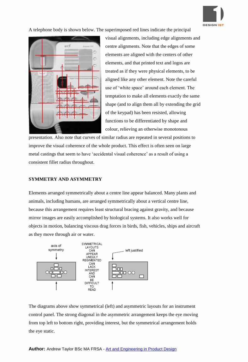
SYMMETRY AND ASYMMETRY
Elements arranged symmetrically about a centre line appear balanced. Many plants and
animals, including humans, are arranged symmetrically about a vertical centre line,
because this arrangement requires least structural bracing against gravity, and because
mirror images are easily accomplished by biological systems. It also works well for
objects in motion, balancing viscous drag forces in birds, fish, vehicles, ships and aircraft
as they move through air or water.
The diagrams above show symmetrical (left) and asymmetric layouts for an instrument
control panel. The strong diagonal in the asymmetric arrangement keeps the eye moving
from top left to bottom right, providing interest, but the symmetrical arrangement holds
the eye static.
Author: Andrew Taylor BSc MA FRSA - Art and Engineering in Product Design
For General Design Tips and Resources, visit:
http://www.design1st.com/Design-Resource-Library/design-resource-center.html