Embed Size (px)
Citation preview
8/2/2019 Teacher Feedback for Magazine
http://slidepdf.com/reader/full/teacher-feedback-for-magazine 1/2
2010/2011 LC AS MEDIA
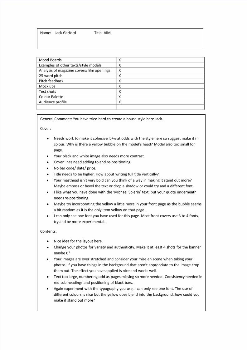
Mood Boards XExamples of other texts/style models X
Analysis of magazine covers/film openings X
25 word pitch X
Pitch feedback X
Mock ups X
Test shots X
Colour Palette X
Audience profile X
Name: Jack Garford Title: AIM
General Comment: You have tried hard to create a house style here Jack.
Cover:
y Needs work to make it cohesive: b/w at odds with the style here so suggest make it in
colour. Why is there a yellow bubble on the models head? Model also too small for
page.
y Your black and white image also needs more contrast.
y Cover lines need adding to and re-positioning.
y No bar code/ date/ price.
y Title needs to be higher. How about writing full title vertically?
y Your masthead isnt very bold can you think of a way in making it stand out more?
Maybe emboss or bevel the text or drop a shadow or could try and a different font.
y I like what you have done with the Michael Spierin text, but your quote underneath
needs re-positioning.
y Maybe try incorporating the yellow a little more in your front page as the bubble seems
a bit random as it is the only item yellow on that page.
y I can only see one font you have used for this page. Most front covers use 3 to 4 fonts,
try and be more experimental.
Contents:
y Nice idea for the layout here.
y Change your photos for variety and authenticity. Make it at least 4 shots for the banner
maybe 6?
y Your images are over stretched and consider your mise en scene when taking your
photos. If you have things in the background that arent appropriate to the image crop
them out. The effect you have applied is nice and works well.
y Text too large, numbering odd as pages missing so more needed. Consistency needed in
red sub headings and positioning of black bars.
y Again experiment with the typography you use, I can only see one font. The use of
different colours is nice but the yellow does blend into the background, how could you
make it stand out more?
8/2/2019 Teacher Feedback for Magazine
http://slidepdf.com/reader/full/teacher-feedback-for-magazine 2/2
2010/2011 LC AS MEDIA
Practical Draft Level:
2a
DPS:
y Colour and location shot looks good here. What other photos do you have as your model
looks a little sad rather than cool in his expression.
y Your title blends into the background what can you do to make it stand out? Could you
maybe change the coloury Bring photo slightly in as a little too big for page. Quotation would look better on photo itself
and move the name to the other page.
y Layout of article looks convincing but missing at least 3 paragraphs as text looks over sized
and too much white space. Columns are uneven and not aligned.
y Look at maybe using a different font for the quote and make larger.
y Colour pallet good.