Embed Size (px)
Citation preview
Ushus-Journal of Business Management 2017, Vol. 16, No. 4, 1-13
ISSN 0975-3311|https://doi: 10.12725/ujbm.41.1
1
The Psychology of Colour Influences
Consumers’ Buying Behaviour – A
Diagnostic Study
J Suresh Kumar*
Abstract
Colour plays an important role in marketing products. It is a powerful marketing tool that influences consumer purchases in many aspects. Marketers must explore the harmony of colours for successful marketing of products. Nearly all products sold today have colourful facades. Selecting the right colours to use has an enormous impact on product sales. While no single set of rules governs colour choices, research has established general guidelines based on the principle of associative learning, the relationship between colour and emotion. The researcher made a diagnostic study on the psychology of colour influences consumers buying behaviour. Secondary data has been extensively used in this research. Colour properties like hue, saturation and value, were discussed. Usage of colours in the packing of products, how colours earn brand image to a product, how colours help marketers to communicate the brand to customers and how to match colours with customer‟s personality are extensively discussed. Conclusions were drawn based on this diagnostic study.
Keywords: Brand image, Consumer buying behaviour, Hue, Saturation, Value
* Army Institute of Hotel Management & Catering Technology, Bengaluru, India; [email protected]
Ushus-Journal of Business Management, Vol. 16, No. 4 ISSN 0975-3311
2
1.1 Introduction
Colour plays a major role in marketing products. It has a major influencing effect on consumer buying behaviour. It is a powerful marketing tool that significantly influences consumer purchases, so much so that it accounts for 85% of the reason why someone decides to purchase a product (Hemphill, 1996). Marketers must understand the psychology of colour in order to use it effectively. Psychology of colour is the study of hues as a determinant of human behaviour. Colour influences perceptions that are not obvious, such as the taste of food. Colours can also enhance the effectiveness of placebos. For example, red or orange pills are generally used as stimulants. Colour can indeed influence a person; however, it is important to remember that these effects differ between people. Factors such as gender, age, and culture can influence how an individual perceives colour. For instance, heterosexual men tend to report that red outfits enhance female attractiveness, while heterosexual females deny any outfit colour impacting that of men.
Psychology of colour is also widely used in marketing and branding. Many marketers see colour as an important part of marketing because colour can be used to influence consumers' emotions and perceptions of goods and services. Companies also use colour when deciding on brand logos. These logos seem to attract more customers when the colour of the brand logo matches the personality of the goods or services, such as the colour pink being heavily used on Victoria's Secret branding. However, colours are not only important for logos and products, but also for window displays in stores. Research shows that warm colours tended to attract spontaneous purchasers, despite cooler colours being more favourable.
Humans associate colours with meanings. These associations are studied extensively in this study.
1.2 Statement of the Problem
Consumer behaviour is one of the complex subjects in the field of marketing. Consumer‟s behaviour is more dynamic than static and
Suresh Kumar Consumers Buying Behaviour–A Diagnostic Study
3
it is greatly influenced by many factors. One of the factors is colour which influences the consumers buying behaviour to a greater extent. Influencing effect of consumer behaviour varies with the consumer and is also based on the product, brand personality, etc. A product including packaging and graphics/visual imagery can be designed well, yet have a lifeless or garnish colour palette may contribute to a lack of consumer enthusiasm towards the product. This can be the same for a product and package design or graphics/visual imagery, which may come in an irresistible colour combination, but is poorly designed in terms of form, ergonomics or functionality. The right colour usage may easily persuade a consumer to gravitate to the product despite its poor design. It is essential in design to combine form, function, aesthetics, and colour harmony in a single product. Will the consumer want to buy a poorly thought out design based on an irresistible colour combination? Will a consumer overlook or reject a well-designed graphic or product based on a poor colour combination? This will help some designers understand that colour is essential to design and how it may make a consumer gravitate towards a particular product whether designed well or not. Colour is truly what sells a product. It is the first thing a consumer notices. We don‟t live in a black and white world but in a vibrant, lively atmosphere of expressive colours. This has prompted the researcher to make a diagnostic study on the Psychology of Colour Influences on Consumer Buying Behaviour.
1.3 Objective of the Study
Hence, the objective of this research article is
To understand and explain how the psychology of colour influences buying behaviour of consumer in selecting a product with respect to products package and branding.
1.4 Methodology of Research
This study employs secondary data with exploratory analysis.
Ushus-Journal of Business Management, Vol. 16, No. 4 ISSN 0975-3311
4
The secondary data were collected from journals, magazines, publications, reports, books, dailies, periodicals, articles, research papers, websites, company publications, manuals, booklets etc.
2. Review of Literature
In the past decade, there has been increased interest in research on colour and psychological functioning. Important advances have been made in theoretical work and empirical work, but there are also important weaknesses in both areas that must be addressed for the literature to continue to develop apace. In this article, The researcher provides brief theoretical reviews of research in this area, in each instance beginning with a historical background and recent advancements, and proceeding to an evaluation focused on weaknesses that provide guidelines for future research.
Colour has three basic properties: Hue, Lightness, and Chroma (Fairchild, 2013). Variation in any or all of these properties could influence downstream effect, cognition, or behaviour, yet only hue is considered in most theorising (most likely because experientially, it is the most salient colour property).
Lightness and Chroma also undoubtedly have implications for psychological functioning (e.g., lightness: Kareklas et al., 2014; Chroma: Lee et al., 2013); lightness has received some attention within conceptual metaphor theory (Meier, in press; see also Prado-León and Rosales-Cinco, 2011), but Chroma has been almost entirely overlooked, as has the issue of combinations of hue, lightness, and chroma.
It has been proved that colours have a strong effect on perception and therefore colours of packaging can be important. The right choice of colours is an important factor in creating the impression needed to influence brand and product selection (Gofman 2010). Colour of packaging has an important role in helping the customers make apart one company product from the other. Cheskin (1957) says that the selection of colours and colour combinations is a necessary process for creating a good design package. Colour is a key element of design due to the fact that it is usually vivid and memorable. The package colour can have a significant effect on consumers‟ ability to recognise a product. Packaging colour draws
Suresh Kumar Consumers Buying Behaviour–A Diagnostic Study
5
the attention of the consumers. Every colour creates different meaning according to the consumer perception. White and black colour is used for creating an image of power, red for energy, blue is used for trust, green for balance.
Finally, most theorising has focused on colour as an independent variable rather than a dependent variable; however, it is also likely that many situational and intrapersonal factors influence colour perception (e.g., situational: Bubl et al., 2009; intrapersonal: Fetterman et al., 2015).
More or less all products sold today have colourful facades. Selecting the right colours to use has an enormous impact on product sales. While no single set of rules govern colour choices, research has established general guidelines based on the principle of associative learning, the relationship between colour and emotion.
3. Associative learning
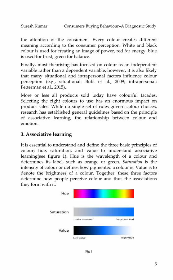
It is essential to understand and define the three basic principles of colour; hue, saturation, and value to understand associative learning(see figure 1). Hue is the wavelength of a colour and determines its label, such as orange or green. Saturation is the intensity of colour or defines how pigmented a colour is. Value is to denote the brightness of a colour. Together, these three factors determine how people perceive colour and thus the associations they form with it.
Fig 1
Ushus-Journal of Business Management, Vol. 16, No. 4 ISSN 0975-3311
6
A study in the College Students Journal reports descriptions given by college students in response to various colours (Naz and Epps, 2004). Findings show that green is primarily associated with nature and elicits positive feelings such as relaxation and calmness. Blue is associated with water, eliciting positive responses including comfort and peace. Red is associated with love and is considered to be a colour of dominance. Black is associated with power, whereas yellow and orange are associated with happiness.
A second study reports the most common words used to describe these colours (Clarke and Cotsall, 2008). In this study, 75% of participants described red with words like „anger,‟ „energy‟ and passion. „Orange‟ and „yellow‟ elicited more cheerful descriptions. Green and blue were described as „peaceful,‟ „relaxing,‟ „clean‟ and „calming.‟ 69% of participants associated black with evil or death, while over 88% of participants used words „innocence‟, „happy‟ and „euphoria‟ to describe white. 70% of participants associated pink with Femininity. Brown, grey, and purple had less agreement on their meaning. This study also reports that the brighter a hue, the more positively it is perceived. This research shows that some colours have stronger associations than others, which is important to keep in mind when designing the package for a product.
4.1 Usage of Colour in Package Designs
Marketers use colour associations to increase product sales by sending a message to the consumer. Crest 3D Whitestrips, for example, is primarily of blue. Blue is associated with cleanliness, emphasizing the product‟s promise of clean, white teeth. White‟s association with purity makes it the ideal accent colour.
Nature Valley Granola Bars are packaged in a green and yellow box. Green is associated with nature and the outdoors, which is appropriate for this product‟s sales pitch of all natural, and healthy ingredients. Furthermore, it is the easiest for the eyes to process. The yellow colour is associated with Sunshine and optimism, promoting the product in a warm and positive manner.
Apple‟s black iPhone box demonstrates the effective use of black in packaging. Although black is linked to death and evil in specific contexts in India, but in this context, it is associated with power
Suresh Kumar Consumers Buying Behaviour–A Diagnostic Study
7
and luxury. Apple‟s products are expensive and the black colour aids in selling the product as an exclusive, high-quality item. Black is often the colour of choice for electronics and other luxury items.
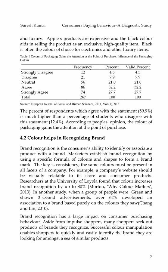
Table 1 Colour of Packaging Gains the Attention at the Point of Purchase. Influence of the Packaging Colour
Frequency Percent Valid Percent
Strongly Disagree 12 4.5 4.5 Disagree 21 7.9 7.9 Neutral 56 21.0 21.0 Agree 86 32.2 32.2 Strongly Agree 74 27.7 27.7 Total 267 100 100
Source: European Journal of Social and Human Sciences, 2014, Vol.(3), № 3
The percent of respondents which agree with the statement (59.9%) is much higher than a percentage of students who disagree with this statement (12.4%). According to peoples‟ opinion, the colour of packaging gains the attention at the point of purchase.
4.2 Colour helps in Recognizing Brand
Brand recognition is the consumer‟s ability to identify or associate a product with a brand. Marketers establish brand recognition by using a specific formula of colours and shapes to form a brand mark. The key is consistency; the same colours must be present in all facets of a company. For example, a company‟s website should be visually relatable to its store and consumer products. Researchers at the University of Loyola found that colour increases brand recognition by up to 80% (Morton, „Why Colour Matters‟, 2013). In another study, when a group of people were Green and shown 3-second advertisements, over 62% developed an association to a brand based purely on the colours they saw(Chang and Lin, 2010).
Brand recognition has a large impact on consumer purchasing behaviour. Aside from impulse shoppers, many shoppers seek out products of brands they recognize. Successful colour manipulation enables shoppers to quickly and easily identify the brand they are looking for amongst a sea of similar products.
Ushus-Journal of Business Management, Vol. 16, No. 4 ISSN 0975-3311
8
Once a company succeeds in establishing brand recognition, it can temporarily manipulate trademark colours to add interest to a product. Heinz, which successfully established brand recognition by using the colour red, introduced EZ Squirt Blastin‟ Green ketchup in October 2000. This dramatic alteration from the familiar deep-red ketchup bottles boosted product sales by $23 million. Consumers had developed such strong associations between Heinz and red ketchup bottles that the green bottles attracted attention and drew interest. This illustrates just how powerful colour can be.
4.3 Colour Communicates Brand Image
Colour helps in establishing brand recognition. It also conveys traits about a company‟s personality, or, brand image. In this sense, colour serves as a subliminal language. Colour is a very influential source of information when people are making a purchasing decision. Customers generally make an initial judgment on a product within 90 seconds of interaction with that product and about 62%-90% of that judgment is based on colour. People often see the logo of a brand or company as a representation of that company. Without prior experience of seeing a logo, we begin to associate a brand with certain characteristics based on the primary logo colour.
Colour mapping provides a means of identifying potential logo colours for new brands and ensuring brand differentiation within a visually cluttered marketplace. A study on logo colour asked participants to rate how appropriate the logo colour was for fictional companies based on the products each company produced. Participants were presented with fictional products in eight different colours and had to rate the appropriateness of the colour for each product. This study showed a pattern of logo colour appropriateness based on product function. If the product was considered functional, fulfils a need or solves a problem, then a functional colour was seen as most appropriate. If the product was seen as sensory-social, conveys attitudes, status, or social approval, then a sensory-social colour was seen as more appropriate. Companies should decide what types of products to produce and then choose a logo colour that is connotative with their products' functions.
Suresh Kumar Consumers Buying Behaviour–A Diagnostic Study
9
Although colour can be useful in marketing, its value and extent of use depend on how it is used and the audience it is used on. The use of colour will have different effects on different people; therefore experimental findings cannot be taken as universally true. A study in the African Journal of Business Management reveals how consumers perceive the colours used by companies like Coco-Cola, Hermes, Starbucks, and IBM.
Participants considered the red of Coca-Cola conveys stimulus, vividness, youth, happiness and energy. Participants regarded Hermes as signifying courage, ego, uniqueness, differentiation; they also considered that the green of Starbucks conveys quiet, leisure, youth, staidness and comfort. Participants perceive IBM as reliable, staid, professional, cool, novel and trustworthy. (Chang, Lun, and Lin 2010).
In addition, the colours purple, white, and yellow reflect the following traits, respectively: imaginative, down-to-earth, and spirited. Companies choose colours for their logos and store designs not just because they look good, but to communicate specific qualities about a service or product.
For example, McDonald's, Wendy‟s, and Burger King use red and yellow in their logos and store exteriors‟ convey urgency, energy, and speed. This communicates to the consumer that they are fast and efficient. Companies like Whole Foods use green for their logo and store signs, which communicate that they are environmentally conscious. UPS‟s deep brown logo and delivery trucks communicate UPS‟s promise to deliver packages in a reliable and consistent manner.
4.4 Tuning Colours to Match Consumer Personality
While some colour associations appear to be strongly rooted, a lot depends on the personality, age gender, and cultural background of the consumer. For example, different shades of colour appeal to specific personality types of shoppers. Fast food restaurants and clearance sales use stimulant colours like red, orange, and black to elicit a sense of urgency in impulse buyers. Retail clothing stores use lighter colours like pink and sky blue to evoke calm, soothing
Ushus-Journal of Business Management, Vol. 16, No. 4 ISSN 0975-3311
10
experience for traditional shoppers who prefer to browse through items at a leisurely pace.
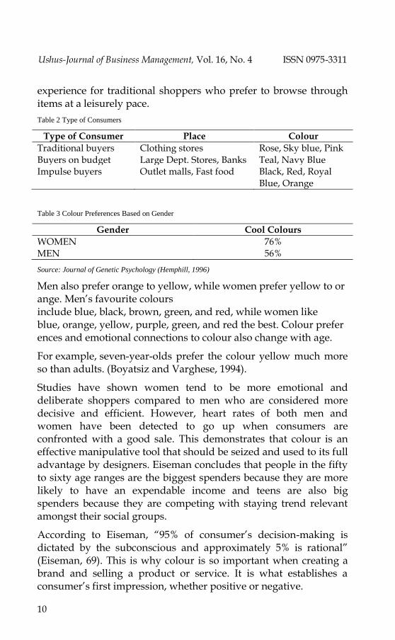
Table 2 Type of Consumers
Type of Consumer Place Colour
Traditional buyers Clothing stores Rose, Sky blue, Pink Buyers on budget Large Dept. Stores, Banks Teal, Navy Blue Impulse buyers Outlet malls, Fast food Black, Red, Royal
Blue, Orange
Table 3 Colour Preferences Based on Gender
Gender Cool Colours
WOMEN 76% MEN 56%
Source: Journal of Genetic Psychology (Hemphill, 1996)
Men also prefer orange to yellow, while women prefer yellow to orange. Men‟s favourite colours include blue, black, brown, green, and red, while women like blue, orange, yellow, purple, green, and red the best. Colour preferences and emotional connections to colour also change with age.
For example, seven-year-olds prefer the colour yellow much more so than adults. (Boyatsiz and Varghese, 1994).
Studies have shown women tend to be more emotional and deliberate shoppers compared to men who are considered more decisive and efficient. However, heart rates of both men and women have been detected to go up when consumers are confronted with a good sale. This demonstrates that colour is an effective manipulative tool that should be seized and used to its full advantage by designers. Eiseman concludes that people in the fifty to sixty age ranges are the biggest spenders because they are more likely to have an expendable income and teens are also big spenders because they are competing with staying trend relevant amongst their social groups.
According to Eiseman, “95% of consumer‟s decision-making is dictated by the subconscious and approximately 5% is rational” (Eiseman, 69). This is why colour is so important when creating a brand and selling a product or service. It is what establishes a consumer‟s first impression, whether positive or negative.
Suresh Kumar Consumers Buying Behaviour–A Diagnostic Study
11
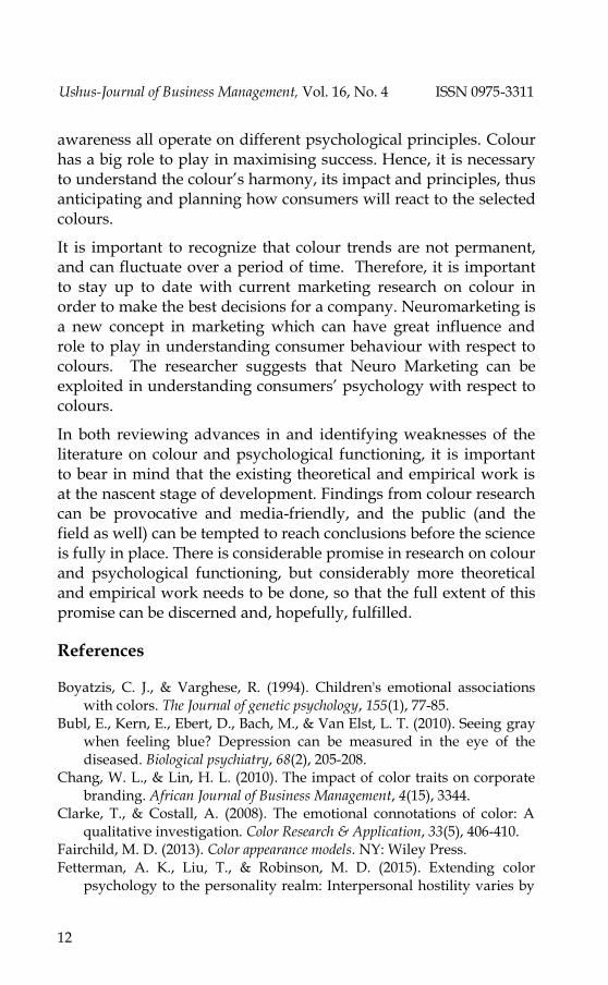
Table 4
Colour India China Japan Thailand
Red Fear, fire Good luck, celebrations
Anger & danger
Sunday
Yellow Sacred, auspicious
Sacred, Royal Courage Royal colour & colour of Monday
Green Hope, harvest New life, fertility
Eternal life
Colour of Wednesday
Blue National sports colour
Immortality Everyday life
Colour of Friday
5. Findings
Colour preferences also vary depending on age and gender. Research findings reveal that 76% of women prefer cool colours compared to 56% of men (Hemphill, 1996).
Truly, there is no universal colour scheme. Colours possess a multitude of meanings depending on the cultural context (table 4). Purple is associated with regality in Europe but signifies excessive spending in China. The colour white implies purity in both the United States and the Middle East, yet in Japan and China, this colour is associated with death and mourning.
In the U.S. blue is a colour linked to trust and authority, which is why it is the most prevalent colour used in business ads across the country. In Japan, on the other hand, blue represents immorality or treachery, which are not qualities businesses wish to convey to customers.
6. Conclusion
Colour is an important factor influencing the consumer buying decision process. It is not simply an afterthought when it comes to product packaging and company branding. Marketers and businessmen invest sufficient time in selecting colours that reflect the values of the company and preferences of the target audience.
The reward for doing so is increased sales, brand recognition and consumer loyalty. Product packaging, branding, and consumer
Ushus-Journal of Business Management, Vol. 16, No. 4 ISSN 0975-3311
12
awareness all operate on different psychological principles. Colour has a big role to play in maximising success. Hence, it is necessary to understand the colour‟s harmony, its impact and principles, thus anticipating and planning how consumers will react to the selected colours.
It is important to recognize that colour trends are not permanent, and can fluctuate over a period of time. Therefore, it is important to stay up to date with current marketing research on colour in order to make the best decisions for a company. Neuromarketing is a new concept in marketing which can have great influence and role to play in understanding consumer behaviour with respect to colours. The researcher suggests that Neuro Marketing can be exploited in understanding consumers‟ psychology with respect to colours.
In both reviewing advances in and identifying weaknesses of the literature on colour and psychological functioning, it is important to bear in mind that the existing theoretical and empirical work is at the nascent stage of development. Findings from colour research can be provocative and media-friendly, and the public (and the field as well) can be tempted to reach conclusions before the science is fully in place. There is considerable promise in research on colour and psychological functioning, but considerably more theoretical and empirical work needs to be done, so that the full extent of this promise can be discerned and, hopefully, fulfilled.
References
Boyatzis, C. J., & Varghese, R. (1994). Children's emotional associations with colors. The Journal of genetic psychology, 155(1), 77-85.
Bubl, E., Kern, E., Ebert, D., Bach, M., & Van Elst, L. T. (2010). Seeing gray when feeling blue? Depression can be measured in the eye of the diseased. Biological psychiatry, 68(2), 205-208.
Chang, W. L., & Lin, H. L. (2010). The impact of color traits on corporate branding. African Journal of Business Management, 4(15), 3344.
Clarke, T., & Costall, A. (2008). The emotional connotations of color: A qualitative investigation. Color Research & Application, 33(5), 406-410.
Fairchild, M. D. (2013). Color appearance models. NY: Wiley Press. Fetterman, A. K., Liu, T., & Robinson, M. D. (2015). Extending color
psychology to the personality realm: Interpersonal hostility varies by
Suresh Kumar Consumers Buying Behaviour–A Diagnostic Study
13
red preferences and perceptual biases. Journal of personality, 83(1), 106-116.
Gofman, A., Moskowitz, H. R., & Mets, T. (2010). Accelerating structured consumer-driven package design. Journal of Consumer Marketing, 27(2), 157-168.
Hemphill, M. (1996). A note on adults' color–emotion associations. The Journal of genetic psychology, 157(3), 275-280.
Kareklas, I., Brunel, F. F., & Coulter, R. (2012). Judgment is not color blind: The impact of automatic color preference on product and advertising preferences. Journal of Consumer Psychology, 24, 87–95.
Lee S., Lee K., Lee S., Song J. (2013). Origins of Human Colour preference for food. Journal of Food Engineering.
Morton, J. L. (2012). Colour & Branding. Mobile Colour Matters. NWI Designs. Web. 30 Apr. 2013.
Naz, K. A. Y. A., and H. Epps (2004). Relationship between Colour and Emotion: a Study of College Students. College Students Journal, 38(3), 396‐405.
Prado-León L. R., Rosales-Cinco R. A. (2011). “Effects of Lightness and Saturation on Colour Associations in the Mexican Population,” in New Directions in Colour Studies, eds. Biggam C., Hough C., Kay C., Simmons D., editors. (Amsterdam, NL: John Benjamins Publishing Company), 389–394.