Embed Size (px)
Citation preview
Exploring InDesign CS3 • © 2008 Thomson Delmar Learning Chapter 3 • Page �
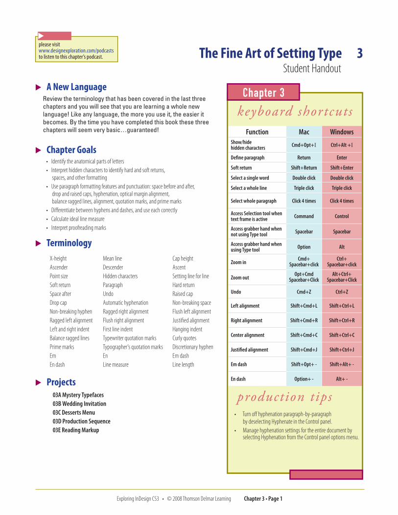
� A New LanguageReview the terminology that has been covered in the last three chapters and you will see that you are learning a whole new language! Like any language, the more you use it, the easier it becomes. By the time you have completed this book these three chapters will seem very basic…guaranteed!
� Chapter Goals• Identify the anatomical parts of letters• Interpret hidden characters to identify hard and soft returns,
spaces, and other formatting• Use paragraph formatting features and punctuation: space before and after,
drop and raised caps, hyphenation, optical margin alignment, balance ragged lines, alignment, quotation marks, and prime marks
• Differentiate between hyphens and dashes, and use each correctly• Calculate ideal line measure• Interpret proofreading marks
� TerminologyX-height Mean line Cap heightAscender Descender AscentPoint size Hidden characters Setting line for lineSoft return Paragraph Hard returnSpace after Undo Raised capDrop cap Automatic hyphenation Non-breaking spaceNon-breaking hyphen Ragged right alignment Flush left alignmentRagged left alignment Flush right alignment Justified alignmentLeft and right indent First line indent Hanging indentBalance ragged lines Typewriter quotation marks Curly quotesPrime marks Typographer’s quotation marks Discretionary hyphenEm En Em dashEn dash Line measure Line length
� Projects03A Mystery Typefaces 03B Wedding Invitation 03C Desserts Menu 03D Production Sequence 03E Reading Markup
keyboard shortcutsFunction Mac Windows
Show/hide hidden characters Cmd+Opt+I Ctrl+Alt +I
Define paragraph Return Enter
Soft return Shift+Return Shift+Enter
Select a single word Double click Double click
Select a whole line Triple click Triple click
Select whole paragraph Click 4 times Click 4 times
Access Selection tool when text frame is active Command Control
Access grabber hand when not using Type tool Spacebar Spacebar
Access grabber hand when using Type tool Option Alt
Zoom inCmd+
Spacebar+clickCtrl+
Spacebar+click
Zoom outOpt+Cmd
Spacebar+ClickAlt+Ctrl+
Spacebar+Click
Undo Cmd+Z Ctrl+Z
Left alignment Shift+Cmd+L Shift+Ctrl+L
Right alignment Shift+Cmd+R Shift+Ctrl+R
Center alignment Shift+Cmd+C Shift+Ctrl+C
Justified alignment Shift+Cmd+J Shift+Ctrl+J
Em dash Shift+Opt+ - Shift+Alt+ -
En dash Option+ - Alt+ -
production tips• Turn off hyphenation paragraph-by-paragraph
by deselecting Hyphenate in the Control panel.• Manage hyphenation settings for the entire document by
selecting Hyphenation from the Control panel options menu.
Chapter 3
The Fine Art of Setting Type 3Student Handout
please visit www.designexploration.com/podcaststo listen to this chapter’s podcast.
�
Exploring InDesign CS3 • © 2008 Thomson Delmar Learning Chapter 3 • Page �
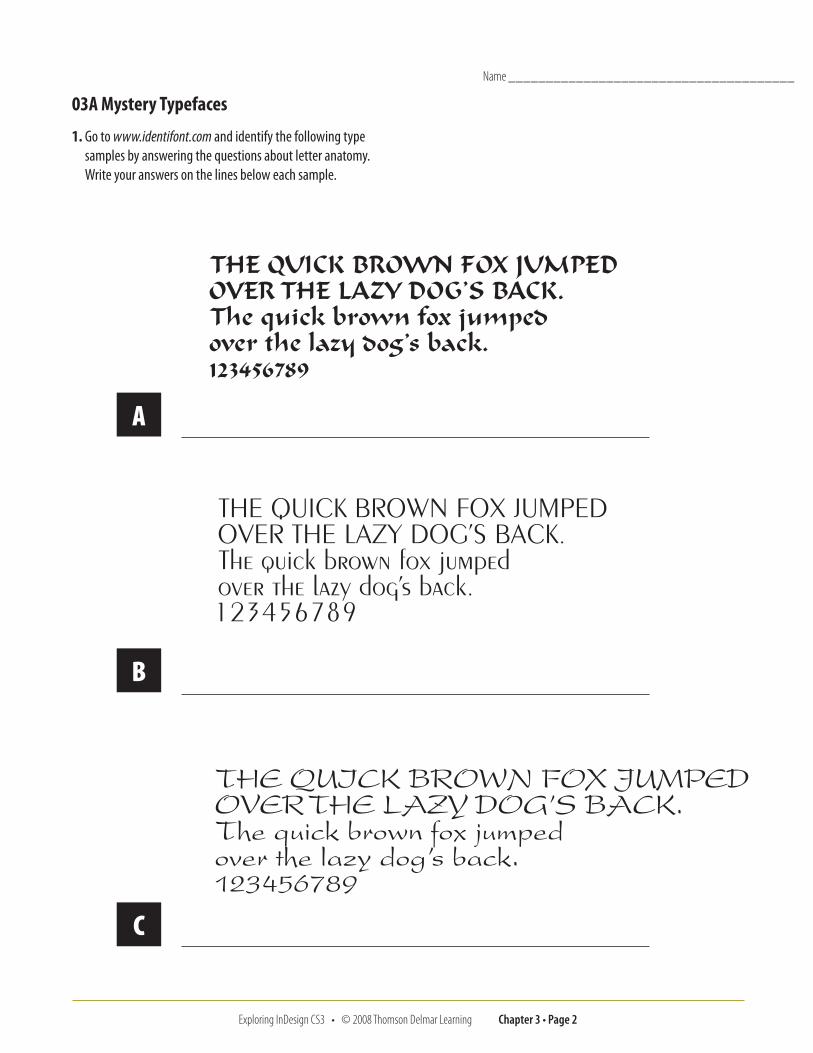
03A Mystery Typefaces
1. Go to www.identifont.com and identify the following type samples by answering the questions about letter anatomy. Write your answers on the lines below each sample.
A
B
C
Name ______________________________________
Exploring InDesign CS3 • © 2008 Thomson Delmar Learning Chapter 3 • Page 3
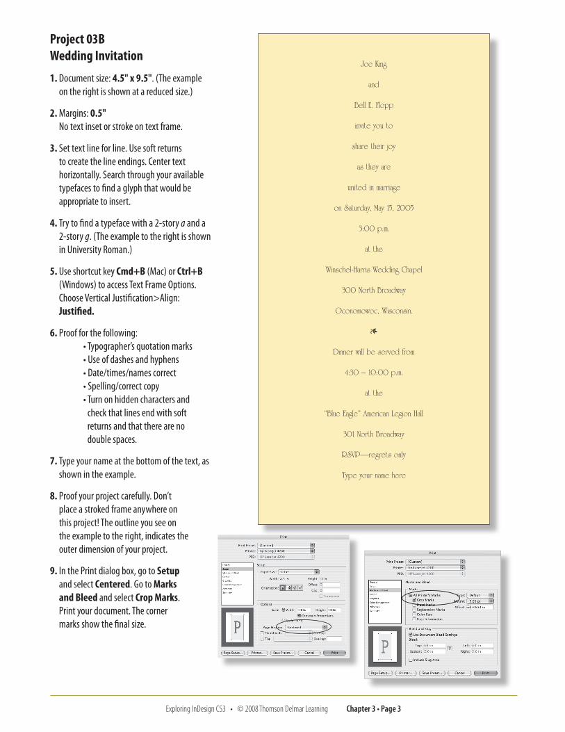
Project 03B Wedding Invitation
1. Document size: 4.5" x 9.5". (The example on the right is shown at a reduced size.)
2. Margins: 0.5" No text inset or stroke on text frame.
3. Set text line for line. Use soft returns to create the line endings. Center text horizontally. Search through your available typefaces to find a glyph that would be appropriate to insert.
4. Try to find a typeface with a 2-story a and a 2-story g. (The example to the right is shown in University Roman.)
5. Use shortcut key Cmd+B (Mac) or Ctrl+B (Windows) to access Text Frame Options. Choose Vertical Justification>Align: Justified.
6. Proof for the following: • Typographer’s quotation marks • Use of dashes and hyphens • Date/times/names correct • Spelling/correct copy • Turn on hidden characters and
check that lines end with soft returns and that there are no double spaces.
7. Type your name at the bottom of the text, as shown in the example.
8. Proof your project carefully. Don’t place a stroked frame anywhere on this project! The outline you see on the example to the right, indicates the outer dimension of your project.
9. In the Print dialog box, go to Setup and select Centered. Go to Marks and Bleed and select Crop Marks. Print your document. The corner marks show the final size.
Exploring InDesign CS3 • © 2008 Thomson Delmar Learning Chapter 3 • Page 4
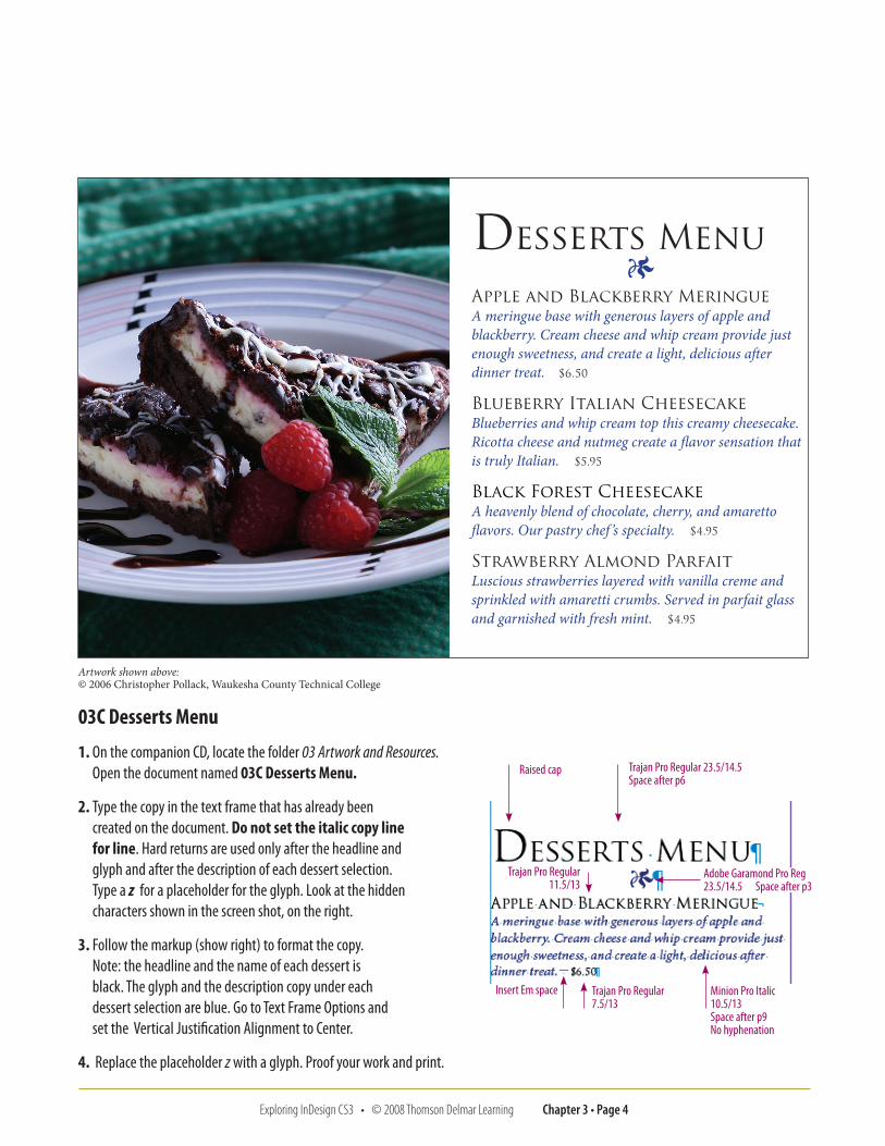
03C Desserts Menu
1. On the companion CD, locate the folder 03 Artwork and Resources. Open the document named 03C Desserts Menu.
2. Type the copy in the text frame that has already been created on the document. Do not set the italic copy line for line. Hard returns are used only after the headline and glyph and after the description of each dessert selection. Type a z for a placeholder for the glyph. Look at the hidden characters shown in the screen shot, on the right.
3. Follow the markup (show right) to format the copy. Note: the headline and the name of each dessert is black. The glyph and the description copy under each dessert selection are blue. Go to Text Frame Options and set the Vertical Justification Alignment to Center.
4. Replace the placeholder z with a glyph. Proof your work and print.
Artwork shown above: © 2006 Christopher Pollack, Waukesha County Technical College
Desserts Menu1
Apple and Blackberry Meringue A meringue base with generous layers of apple and blackberry. Cream cheese and whip cream provide just enough sweetness, and create a light, delicious after dinner treat. $6.50
Blueberry Italian Cheesecake Blueberries and whip cream top this creamy cheesecake. Ricotta cheese and nutmeg create a flavor sensation that is truly Italian. $5.95
Black Forest Cheesecake A heavenly blend of chocolate, cherry, and amaretto flavors. Our pastry chef ’s specialty. $4.95
Strawberry Almond Parfait Luscious strawberries layered with vanilla creme and sprinkled with amaretti crumbs. Served in parfait glass and garnished with fresh mint. $4.95
Raised cap Trajan Pro Regular 23.5/14.5 Space after p6
Adobe Garamond Pro Reg 23.5/14.5 Space after p3
Trajan Pro Regular 11.5/13
Insert Em space Trajan Pro Regular 7.5/13
Minion Pro Italic 10.5/13 Space after p9No hyphenation
Exploring InDesign CS3 • © 2008 Thomson Delmar Learning Chapter 3 • Page �
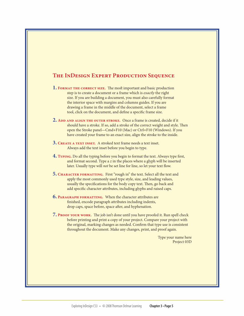
The InDesign Expert Production Sequence
1. Format the correct size. The most important and basic production step is to create a document or a frame which is exactly the right size. If you are building a document, you must also carefully format the interior space with margins and columns guides. If you are drawing a frame in the middle of the document, select a frame tool, click on the document, and define a specific frame size.
2. Add and align the outer stroke. Once a frame is created, decide if it should have a stroke. If so, add a stroke of the correct weight and style. Then open the Stroke panel—Cmd+F10 (Mac) or Ctrl+F10 (Windows). If you have created your frame to an exact size, align the stroke to the inside.
3. Create a text inset. A stroked text frame needs a text inset. Always add the text inset before you begin to type.
4. Typing. Do all the typing before you begin to format the text. Always type first, and format second. Type a z in the places where a glyph will be inserted later. Usually type will not be set line for line, so let your text flow.
5. Character formatting. First “rough in” the text. Select all the text and apply the most commonly used type style, size, and leading values, usually the specifications for the body copy text. Then, go back and add specific character attributes, including glyphs and raised caps.
6. Paragraph formatting. When the character attributes are finished, encode paragraph attributes including indents, drop caps, space before, space after, and hyphenation.
7. Proof your work. The job isn’t done until you have proofed it. Run spell check before printing and print a copy of your project. Compare your project with the original, marking changes as needed. Confirm that type use is consistent throughout the document. Make any changes, print, and proof again.
Type your name here Project 03D
Exploring InDesign CS3 • © 2008 Thomson Delmar Learning Chapter 3 • Page �
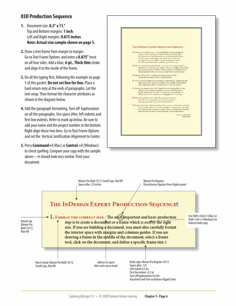
03D Production Sequence
1. Document size: 8.5" x 11." Top and Bottom margins: 1 inch. Left and Right margins: 0.875 inches. Note: Actual-size sample shown on page 5.
2. Draw a text frame from margin to margin. Go to Text Frame Options and enter a 0.875" inset on all four sides. Add a blue, 6-pt., Thick-thin stroke and align it to the inside of the frame.
3. Do all the typing first, following the example on page 5 of this packet. Do not set line for line. Place a hard return only at the ends of paragraphs. Let the text wrap. Then format the character attributes as shown in the diagram below.
4. Add the paragraph formatting. Turn off hyphenation on all the paragraphs. Use space after, left indents and first line indents. Refer to mark up below. Be sure to add your name and the project number at the bottom. Right align those two lines. Go to Text Frame Options and set the Vertical Justification Alignment to Center.
5. Press Command+I (Mac) or Control +I (Windows) to check spelling. Compare your copy with the sample above—it should look very similar. Print your document.
Minion Pro Bold 15/11 Small Caps. Red fillSpace after .25 inches
Raised cap. Minion Pro Bold 14/12, Blue fill
Run in head: Minion Pro Bold 10/12 Small Caps, Red fill
Add an En space after each run in head.
Minion Pro Regular Discretionary ligature from Glyphs panel
Use Shift+Cmd+I (Mac) or Shift+Ctrl+I (Windows) to italicize body copy
Body copy: Minion Pro Regular 10/12Space after .125Left indent 0.5 incFirst line indent -0.5 in.Turn off hyphenation for the document and Turn on Balance Rgged Lines.
Exploring InDesign CS3 • © 2008 Thomson Delmar Learning Chapter 3 • Page �
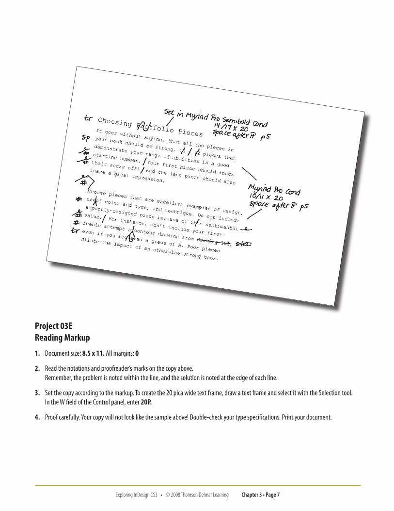
Project 03E Reading Markup
1. Document size: 8.5 x 11. All margins: 0
2. Read the notations and proofreader’s marks on the copy above. Remember, the problem is noted within the line, and the solution is noted at the edge of each line.
3. Set the copy according to the markup. To create the 20 pica wide text frame, draw a text frame and select it with the Selection tool. In the W field of the Control panel, enter 20P.
4. Proof carefully. Your copy will not look like the sample above! Double-check your type specifications. Print your document.
Exploring InDesign CS3 • © 2008 Thomson Delmar Learning Chapter 3 • Page �
Name __________________________________________
� Review Questions Exploring InDesign CS3
1. How is a font’s point size determined?
2. Why is it helpful to see hidden characters?
3. What is the difference between a hard and soft return?
4. How can space be added between paragraphs without pressing the Return key more than once?
5. What does the notation Myriad Pro Semibold Condensed ��/�� × 30 mean?
6. How do you make a drop cap? How do you make a raised cap?
7. Which panel holds the Optical Margin Alignment option?
8. Describe the uses for each of the following: hyphen, em dash, en dash.
9. What is the guideline for calculating an acceptable line measure?
10. How is a typographer’s quotation mark different from a typewriter quotation mark?
11. What does it mean to set text “line for line”?
12. The client has asked you to duplicate a project, but does not know what font was used. What steps would you take to identify the font?
13. What is a discretionary hyphen and how is it entered?
14. When might you use a nonbreaking space?
15. How do you turn off hyphenation for an entire document?
Chapter 3
![Indent · In version 1.2 and more recent versions, the GNU style of indenting is the default. 1.1 Invoking indent As of version 1.3, the format of the indent command is: indent [options]](https://img.pdfslide.net/doc/110x75/5f0b95c87e708231d4313c27/indent-in-version-12-and-more-recent-versions-the-gnu-style-of-indenting-is-the.jpg)