Embed Size (px)
Citation preview
Trends, seasonality and anomalies: making your time-series talk
Wladimir J. AlonsoFogarty International Center / NIH

Goals for of this talk
1. Learn how to extract the basic components of epidemiological relevance from a time-series
2. Learn how to explore the spatial patterns of those components
3. Introduce the modeling tool Epipoi (www.epipoi.info)

But before this…

• well-designed presentation of interesting data – a matter of substance, statistics and design
• consists of complex ideas communicated with clarity, precision and efficiency
• is nearly always multivariate
• requires telling the truth about the data
• Provides the viewer with the greatest number of ideas in the shortest time with the least ink in the smallest space
A parenthesis for “Graphical Excellence”
Edward Tufte (1983)

Napoleon's Retreat from Moscow, 1812by Illarion Pryanishnikov

Charles Joseph Minard (1861): Losses suffered by Napoleon's army in the Russian
campaign of 1812
"It may well be the best statistical graphic ever drawn“(Edward R. Turfte, 1983)
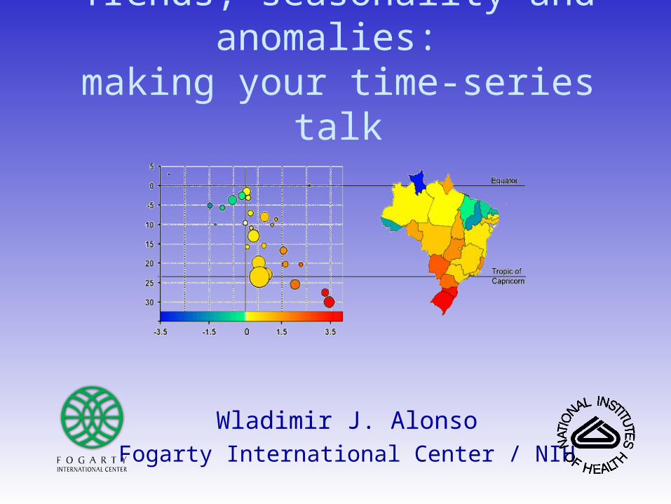
First: Organize your dataset in a
meaningful way
A typical mortality dataset

Time in a meaningful sequence
Variables in meaningful sequence
- Age groups- Causes of deaths- Longitude- Latitude…
Structured spreadsheet as a source of instantaneous analysis
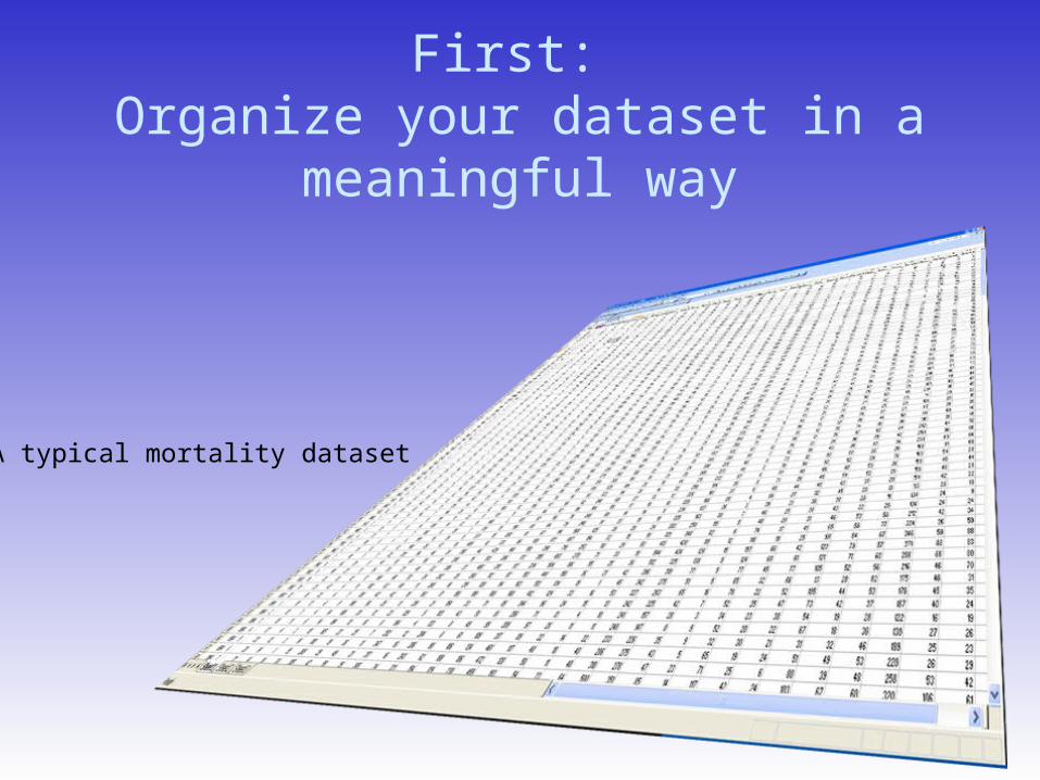
So you can plot in this way:Trends, anomalies, seasonality and even spatial can be seen
Alonso et al 2011 Spatio-temporal patterns of diarrhoeal mortality in Mexico. Epidemiol. Infect
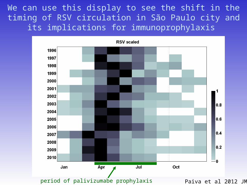
We can use this display to see the shift in the timing of RSV circulation in São Paulo city and its implications for
immunoprophylaxis
Paiva et al 2012 JMVperiod of palivizumabe prophylaxis
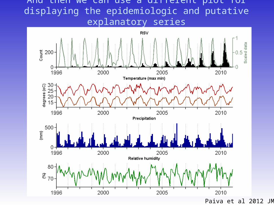
And then we can use a different plot for displaying the epidemiologic and putative explanatory series
Paiva et al 2012 JMV
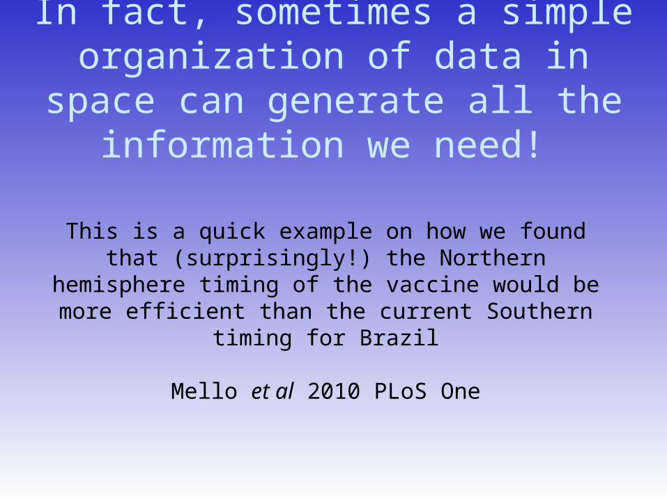
In fact, sometimes a simple organization of data in space can
generate all the information we need!
This is a quick example on how we found that (surprisingly!) the Northern hemisphere timing of the
vaccine would be more efficient than the current Southern timing for Brazil
Mello et al 2010 PLoS One
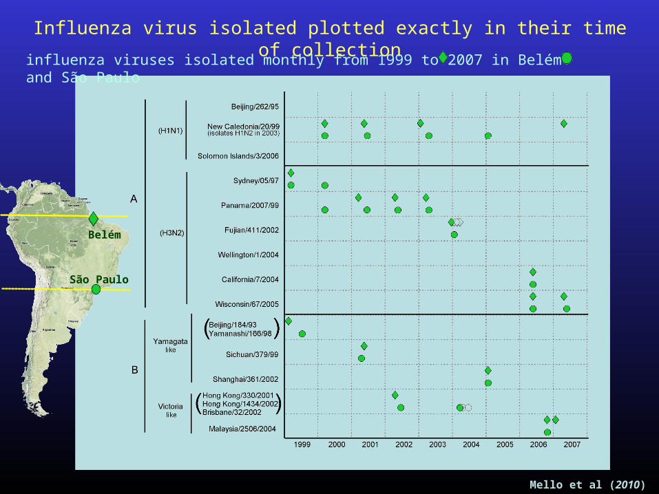
Influenza virus isolated plotted exactly in their time of collection
Mello et al (2010)
Belém
São Paulo
influenza viruses isolated monthly from 1999 to 2007 in Belém and São Paulo
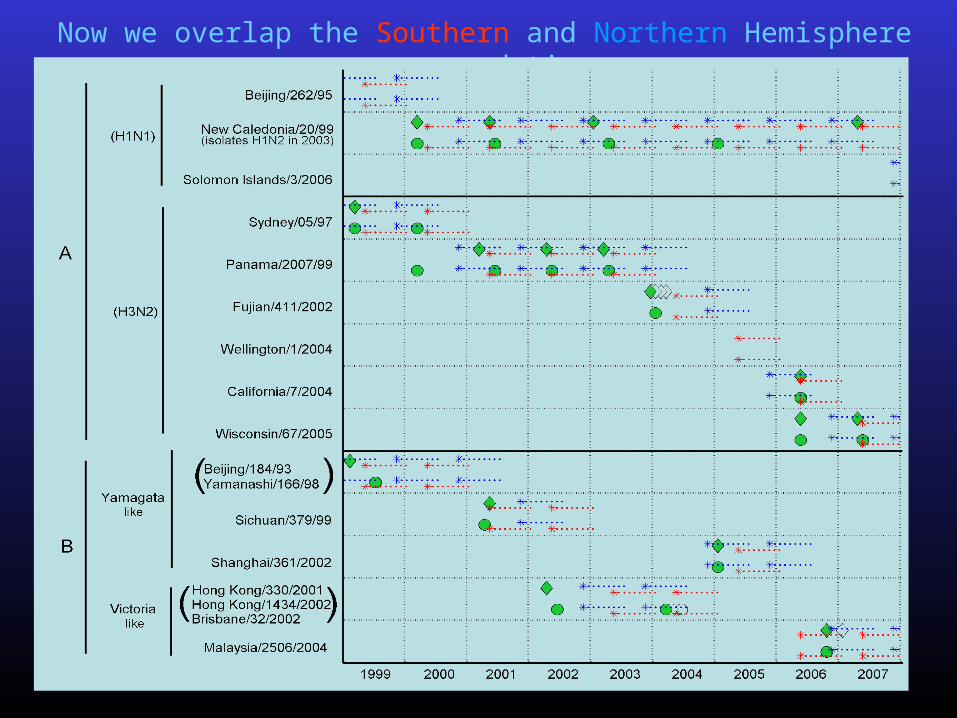
Now we overlap the Southern and Northern Hemisphere recommendations
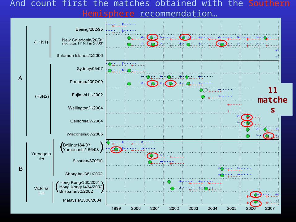
And count first the matches obtained with the Southern Hemisphere recommendation…
11 matches
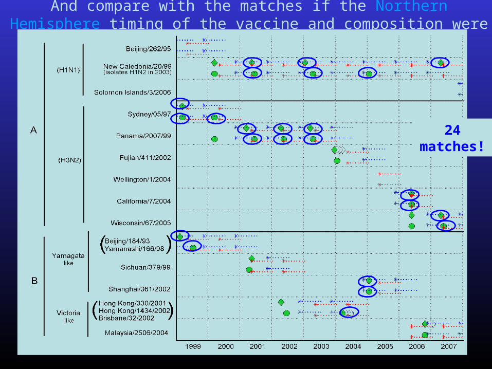
And compare with the matches if the Northern Hemisphere timing of the vaccine and composition were applied
24 matches!

Part 1: How to extract the basic components
of epidemiological relevance from a time-series?
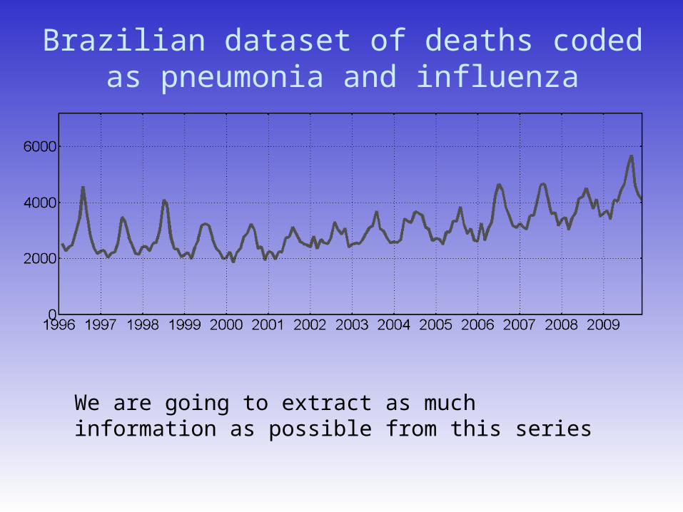
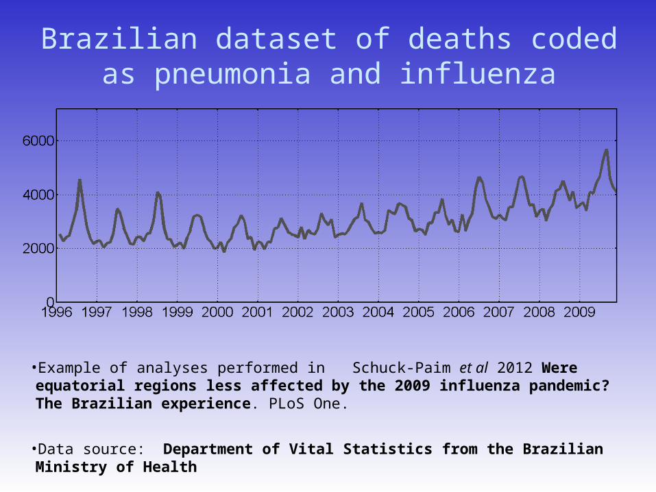
Brazilian dataset of deaths coded as pneumonia and influenza
We are going to extract as much information as possible from this series
Brazilian dataset of deaths coded as pneumonia and influenza
•Example of analyses performed in Schuck-Paim et al 2012 Were equatorial regions less affected by the 2009 influenza pandemic? The Brazilian experience. PLoS One.
•Data source: Department of Vital Statistics from the Brazilian Ministry of Health
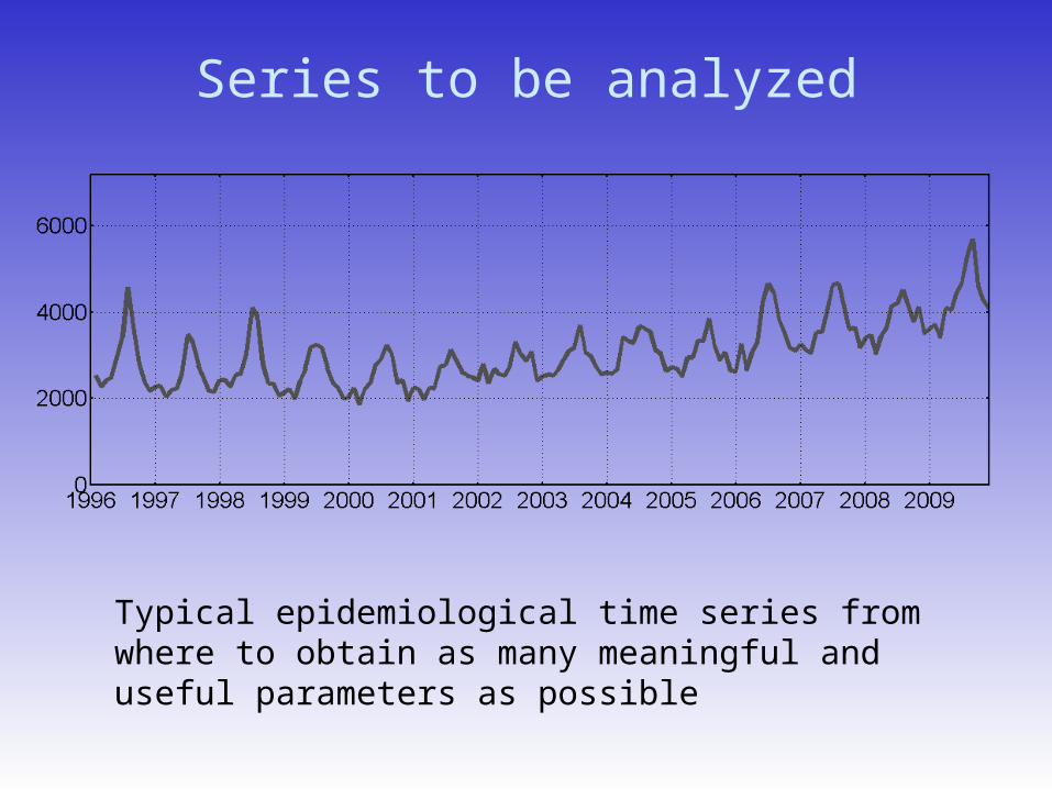
Series to be analyzed
Typical epidemiological time series from where to obtain as many meaningful and useful parameters as possible
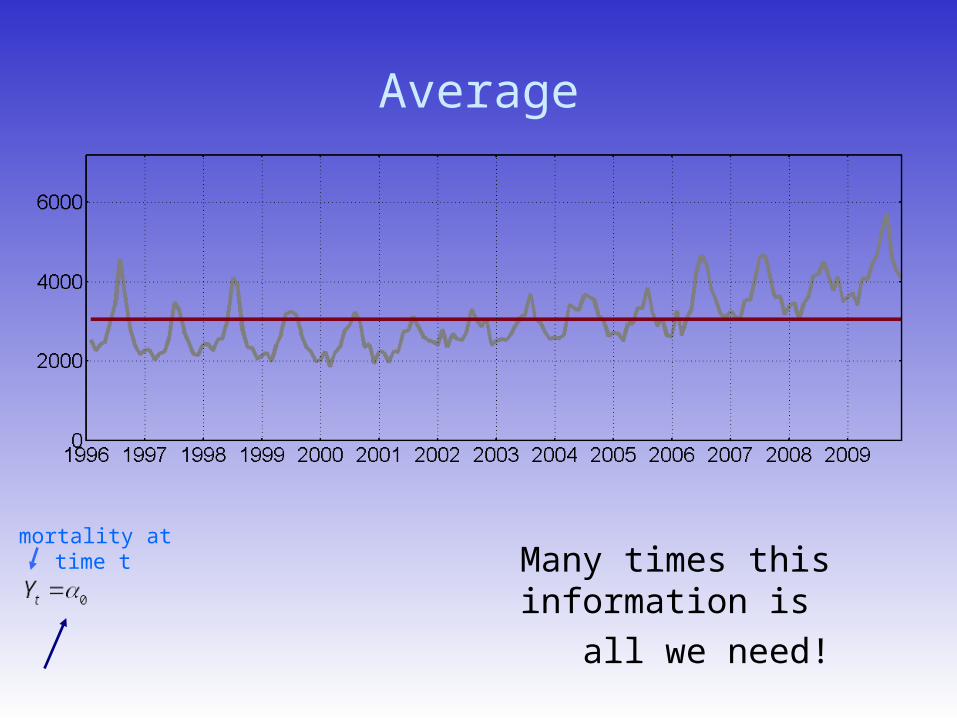
Average
Many times this information is
all we need!
mortality at time t
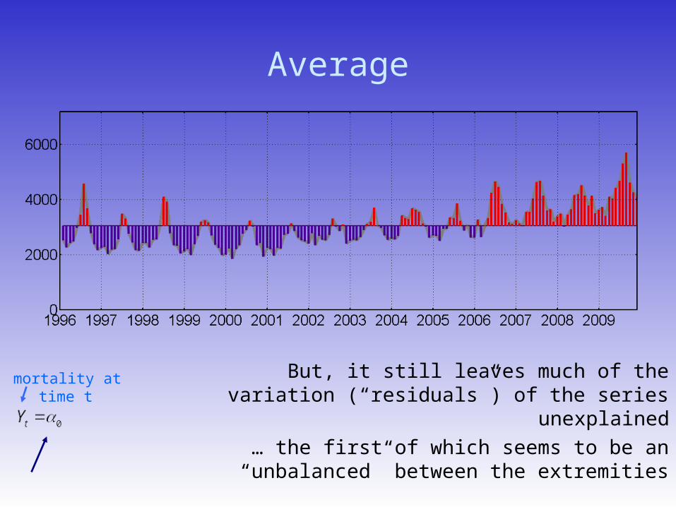
Average
But, it still leaves much of the variation (“residuals”) of the series unexplained
… the first of which seems to be an “unbalanced” between the extremities
mortality at time t
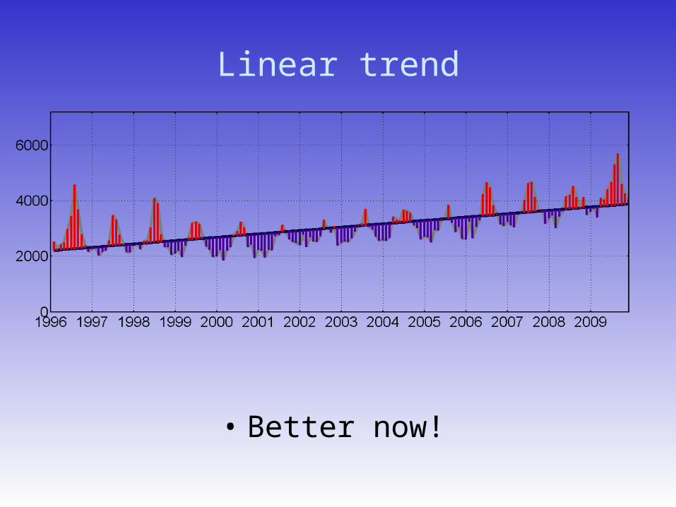
Linear trend
• Better now!
Trend (linear)
We can use this information (e.g. is the disease increasing/decreasing? -
but then the data needs to be incidence)
Mortality at time t
Linear trendsMean Mortality
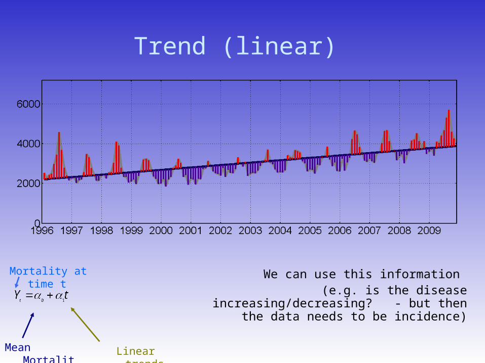
Trend (with quadratic term too)
Mortality at time t
Quadratic trends
2
210ttY
t
• Better definition • It gets more complicated as a parameter
to be compared across time-series• But better if our purpose is eliminate the
temporal trend
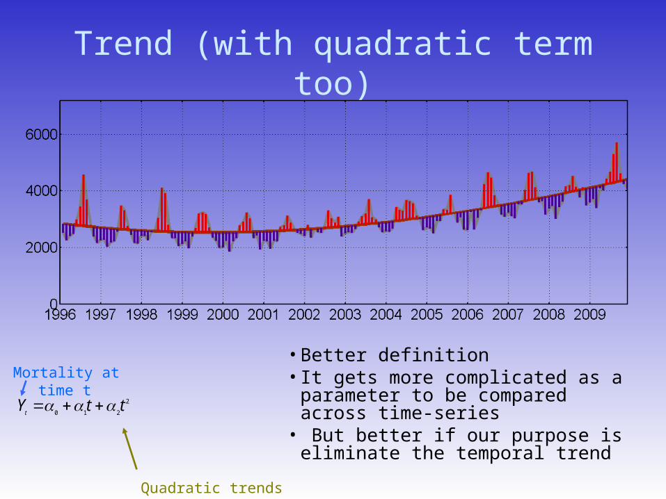
Getting rid of the trend
Blue line: “detrended series”
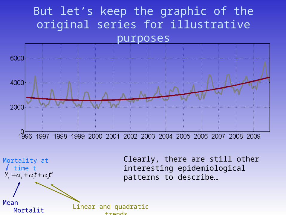
But let’s keep the graphic of the original series for illustrative purposes
Clearly, there are still other interesting epidemiological patterns to describe…
Mortality at time t
Linear and quadratic trends
2
210ttY
t
Mean Mortality
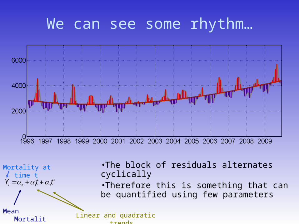
We can see some rhythm…
•The block of residuals alternates cyclically•Therefore this is something that can be quantified using few parameters
Linear and quadratic trends
2
210ttY
t
Mean Mortality
Mortality at time t

Jean Baptiste Joseph Fourier(1768 –1830)
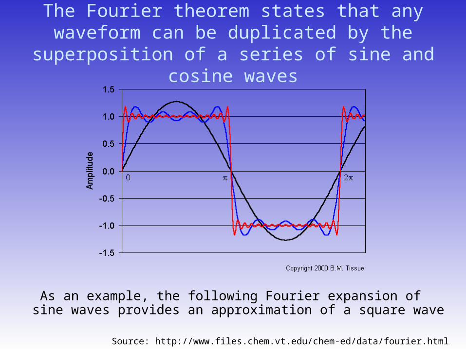
The Fourier theorem states that any waveform can be duplicated by the superposition of a series of sine
and cosine waves
As an example, the following Fourier expansion of sine waves provides an approximation of a square wave
Source: http://www.files.chem.vt.edu/chem-ed/data/fourier.html
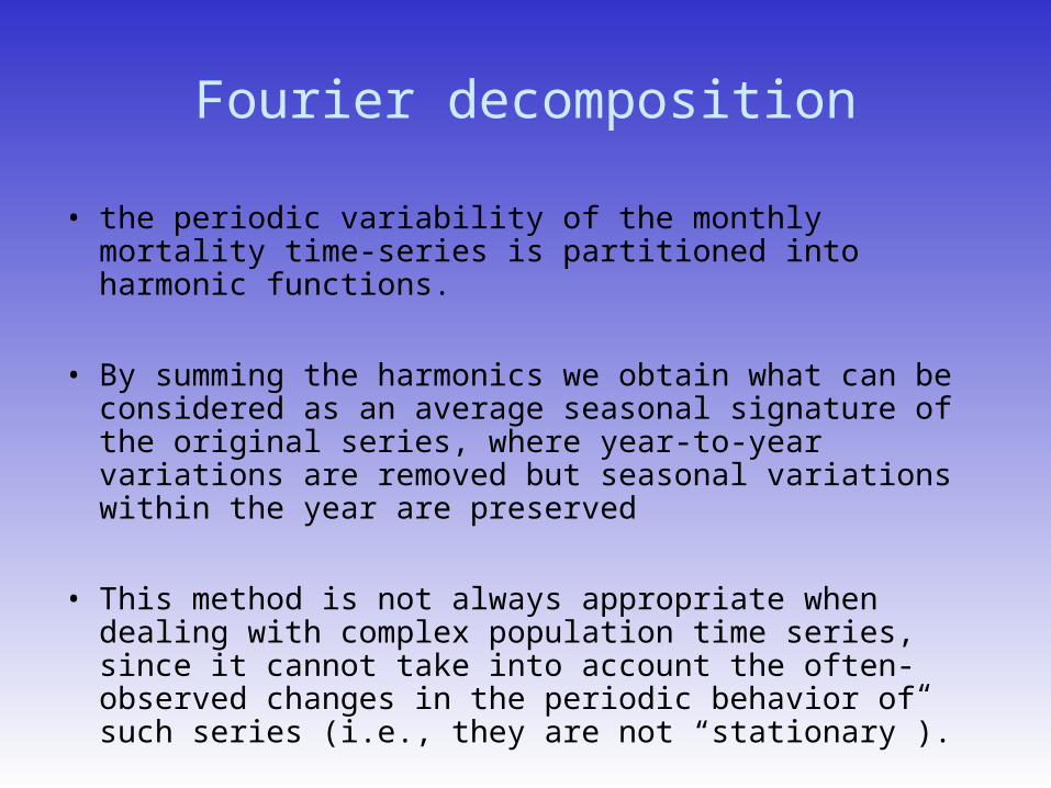
Fourier decomposition
• the periodic variability of the monthly mortality time-series is partitioned into harmonic functions.
• By summing the harmonics we obtain what can be considered as an average seasonal signature of the original series, where year-to-year variations are removed but seasonal variations within the year are preserved
• This method is not always appropriate when dealing with complex population time series, since it cannot take into account the often-observed changes in the periodic behavior of such series (i.e., they are not “stationary”).
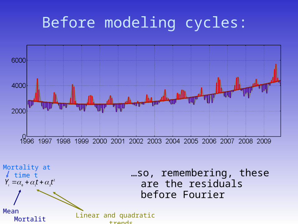
Before modeling cycles:
…so, remembering, these are the residuals before Fourier
Linear and quadratic trends
2
210ttY
t
Mean Mortality
Mortality at time t
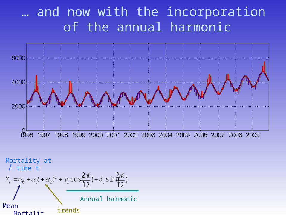
… and now with the incorporation of the annual harmonic
Mortality at time t
trends
Annual harmonicMean
Mortality
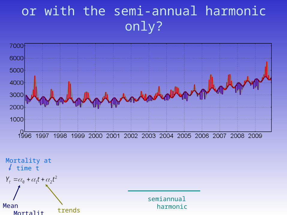
or with the semi-annual harmonic only?
Mortality at time t
trends
semiannual harmonicMean
Mortality
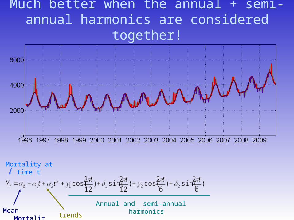
Much better when the annual + semi-annual harmonics are considered together!
Mortality at time t
trends
Annual and semi-annual harmonicsMean
Mortality
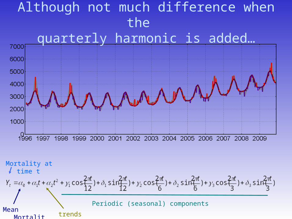
Although not much difference when the quarterly harmonic is added…
Mortality at time t
trends
Periodic (seasonal) componentsMean
Mortality
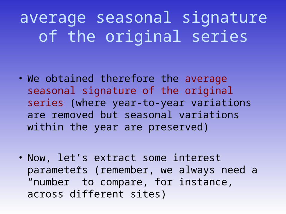
average seasonal signature of the original series
• We obtained therefore the average seasonal signature of the original series (where year-to-year variations are removed but seasonal variations within the year are preserved)
• Now, let’s extract some interest parameters (remember, we always need a “number” to compare, for instance, across different sites)
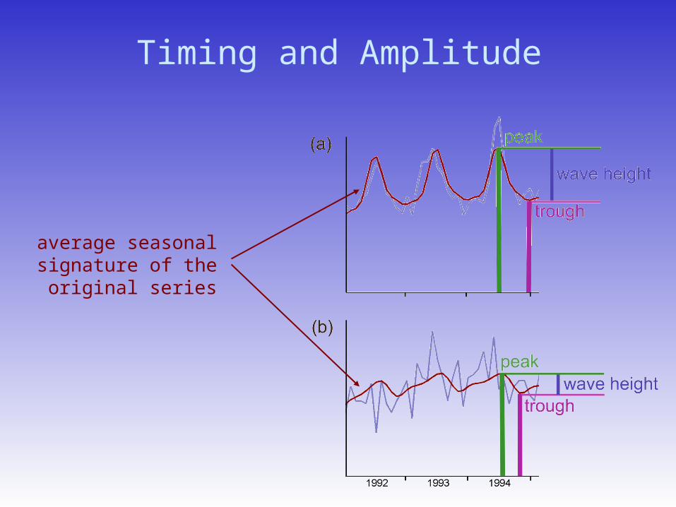
Timing and Amplitude
average seasonal signature of the original
series
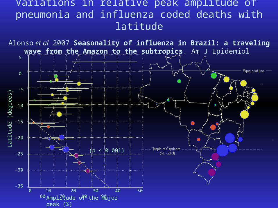
Variations in relative peak amplitude of pneumonia and influenza coded deaths with latitude
Alonso et al 2007 Seasonality of influenza in Brazil: a traveling wave from the Amazon to the subtropics. Am J Epidemiol
Latit
ude
(deg
rees
)
5
0
-5
-10
-15
-20
-25
-30
-35
Amplitude of the major peak (%)0 10 20 30 40 50 60 70 80 90
(p < 0.001)
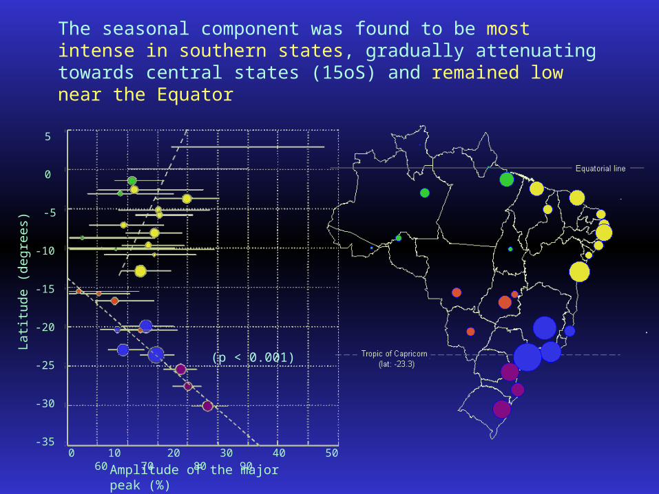
The seasonal component was found to be most intense in southern states, gradually attenuating towards central states (15oS) and remained low near the Equator
Latit
ude
(deg
rees
)
5
0
-5
-10
-15
-20
-25
-30
-35
Amplitude of the major peak (%)0 10 20 30 40 50 60 70 80 90
(p < 0.001)
5
0
-5
-10
-15
-20
-25
-30
-35
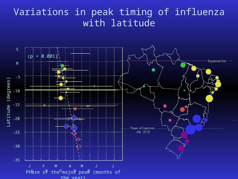
Phase of the major peak (months of the year)J F M A M J J A S O N D
Latit
ude
(deg
rees
)
(p < 0.001)
Variations in peak timing of influenza with latitude
5
0
-5
-10
-15
-20
-25
-30
-35
Phase of the major peak (months of the year)J F M A M J J A S O N D
Latit
ude
(deg
rees
)
(p < 0.001)
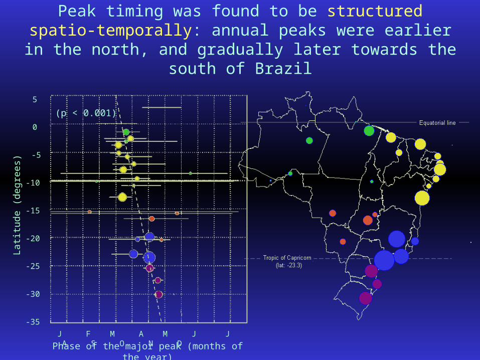
Peak timing was found to be structured spatio-temporally: annual peaks were earlier in the north, and gradually later
towards the south of Brazil
5
0
-5
-10
-15
-20
-25
-30
-35
Phase of the major peak (months of the year)J F M A M J J A S O N D
Latit
ude
(deg
rees
)
(p < 0.001)
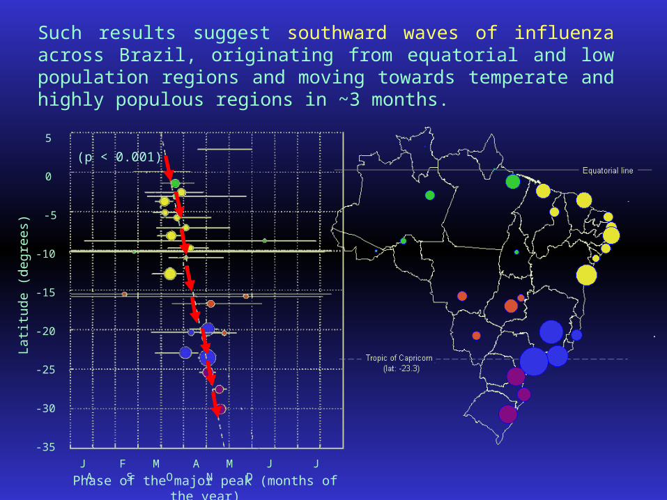
Such results suggest southward waves of influenza across Brazil, originating from equatorial and low population regions and moving towards temperate and highly populous regions in ~3 months.
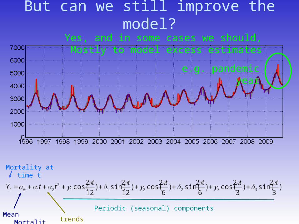
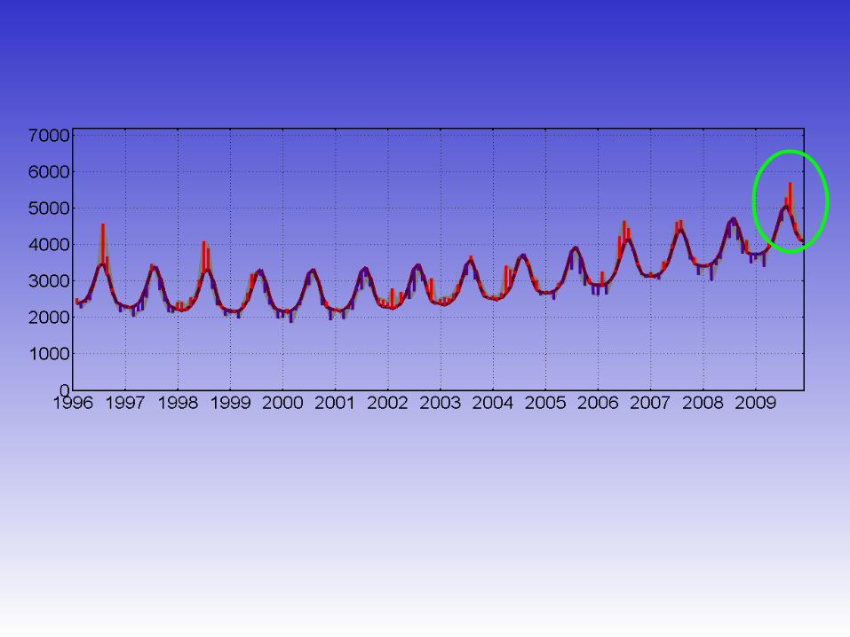
But can we still improve the model?
Mortality at time t
trends
Periodic (seasonal) componentsMean
Mortality
Yes, and in some cases we should,Mostly to model excess estimates
e.g. pandemic year
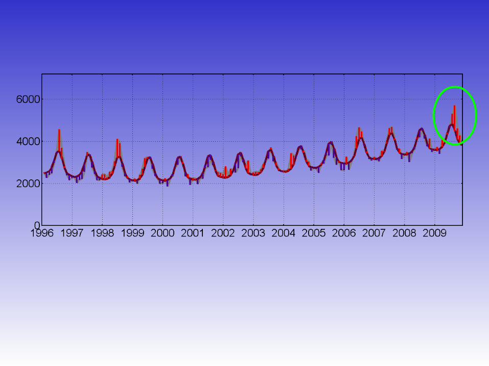
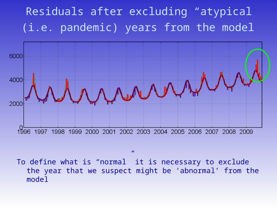
Residuals after excluding “atypical” (i.e. pandemic)
years from the model
To define what is “normal” it is necessary to exclude the year that we suspect might be ‘abnormal’ from the model
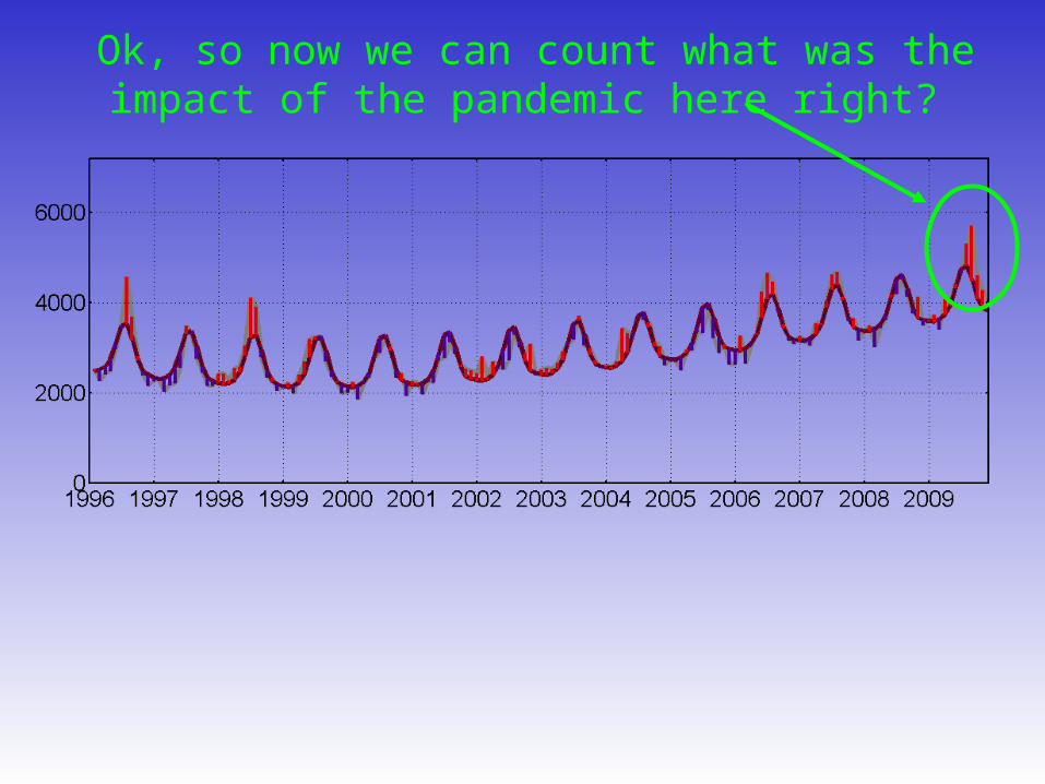
Ok, so now we can count what was the impact of the pandemic here right?
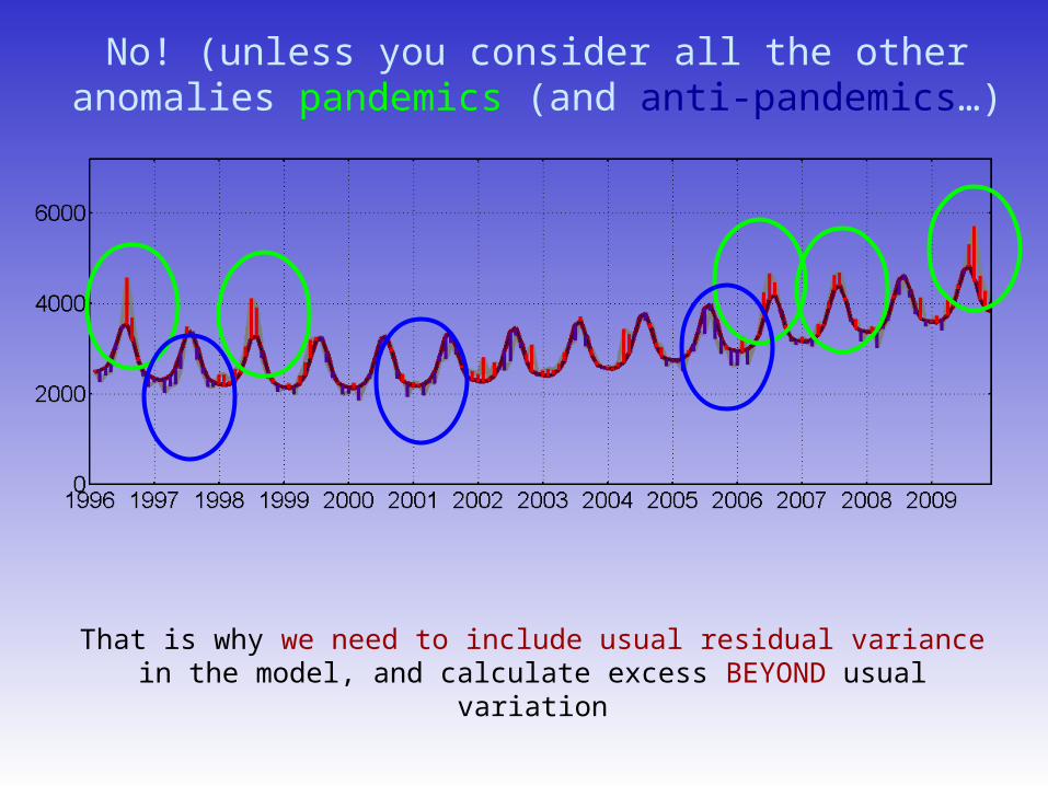
No! (unless you consider all the other anomalies pandemics (and anti-pandemics…)
That is why we need to include usual residual variance in the model, and calculate excess BEYOND usual variation
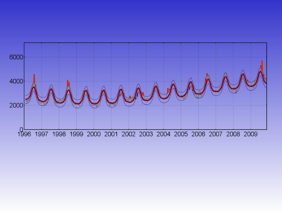
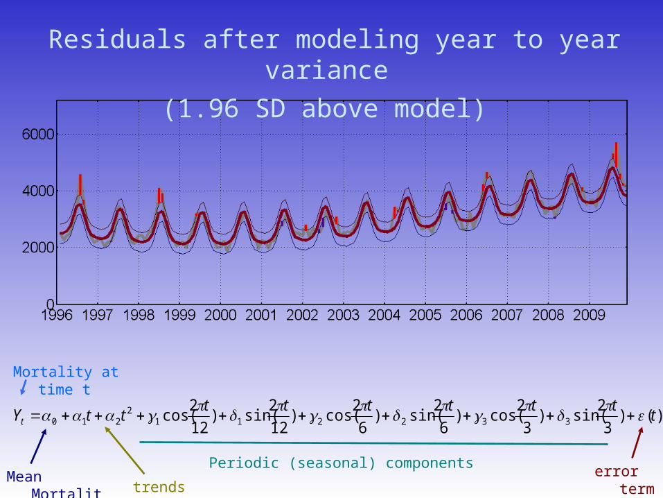
Residuals after modeling year to year variance
(1.96 SD above model)
Mortality at time t
trends
Periodic (seasonal) components error term
Mean Mortality
)()3
2sin()
3
2cos()
6
2sin()
6
2cos()
12
2sin()
12
2cos( 332211
2210 t
ttttttttYt
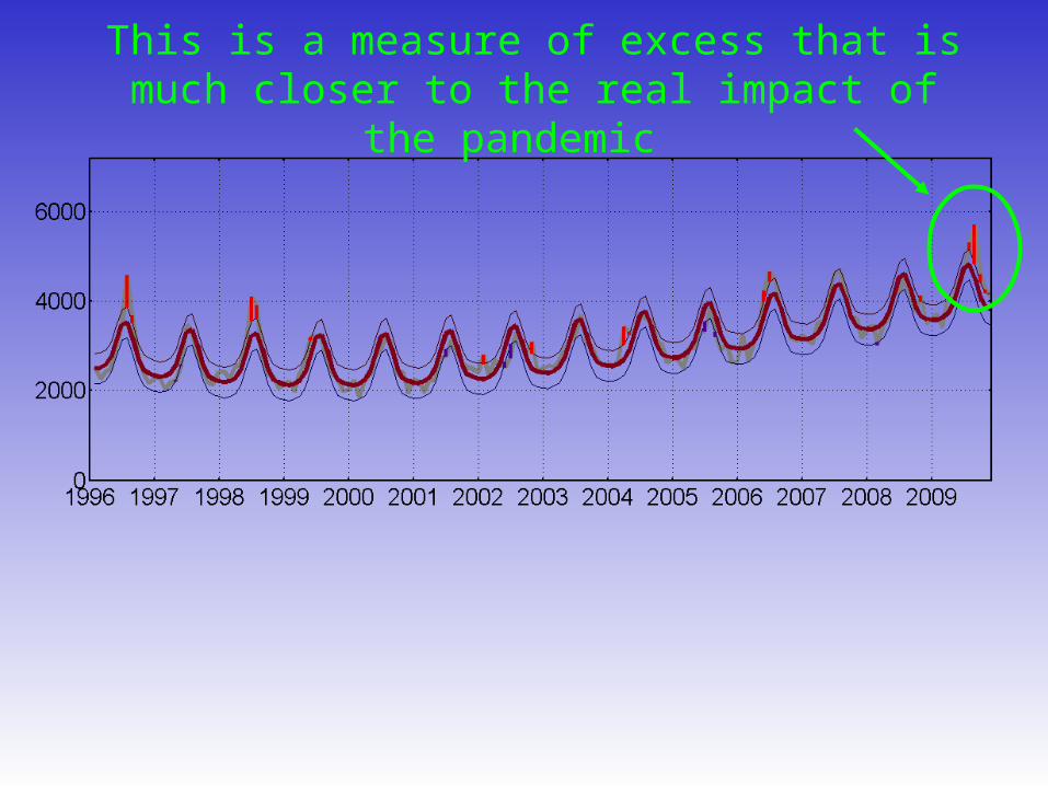
This is a measure of excess that is much closer to the real impact of the pandemic
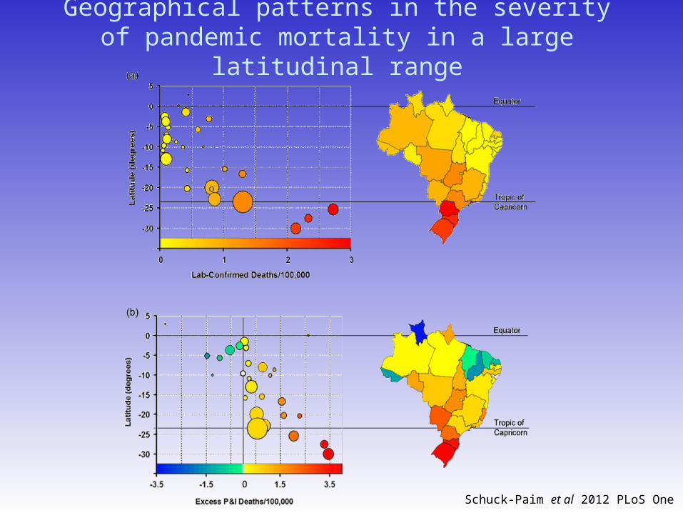
Geographical patterns in the severity of pandemic mortality in a large latitudinal range
Schuck-Paim et al 2012 PLoS One
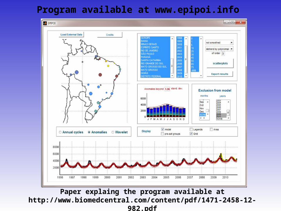
Program available at www.epipoi.info
Paper explaing the program available at http://www.biomedcentral.com/content/pdf/1471-2458-
12-982.pdf
Example from diarrhea mortality in Mexico (1979-1988)
Alonso WJ et al Spatio-temporal patterns of diarrhoeal mortality in Mexico. Epidemiol Infect 2011 Apr;1-9.
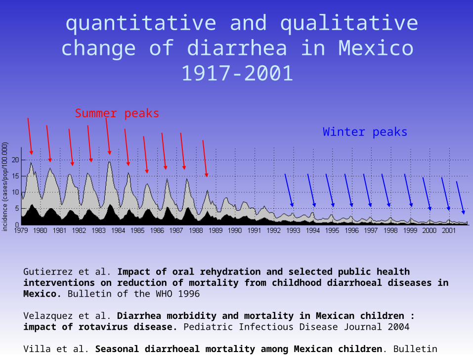
quantitative and qualitative change of diarrhea in Mexico 1917-2001
Winter peaks
Summer peaks
Gutierrez et al. Impact of oral rehydration and selected public health interventions on reduction of mortality from childhood diarrhoeal diseases in Mexico. Bulletin of the WHO 1996
Velazquez et al. Diarrhea morbidity and mortality in Mexican children : impact of rotavirus disease. Pediatric Infectious Disease Journal 2004
Villa et al. Seasonal diarrhoeal mortality among Mexican children. Bulletin of the WHO 1999
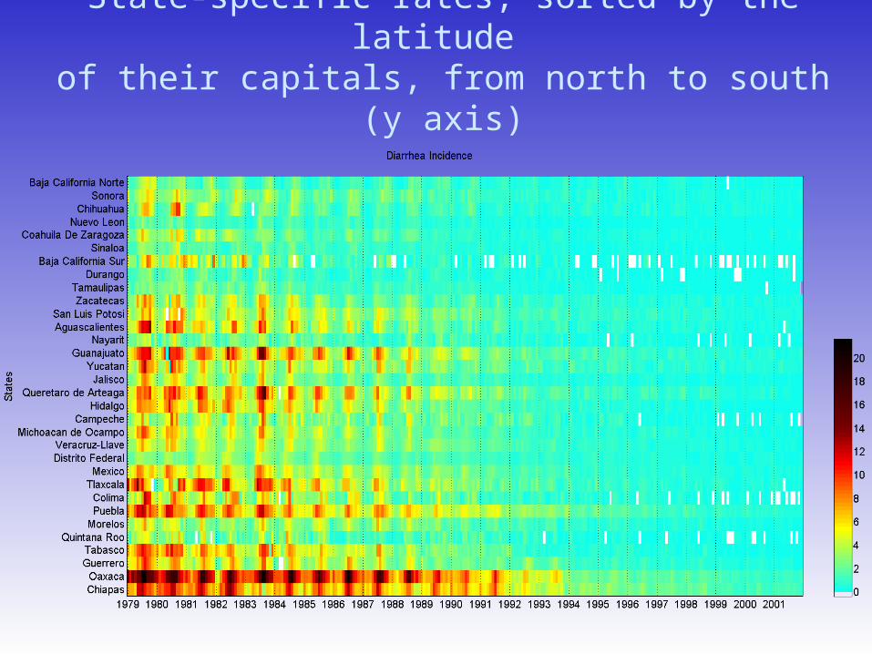
State-specific rates, sorted by the latitude of their capitals, from north to south (y axis)
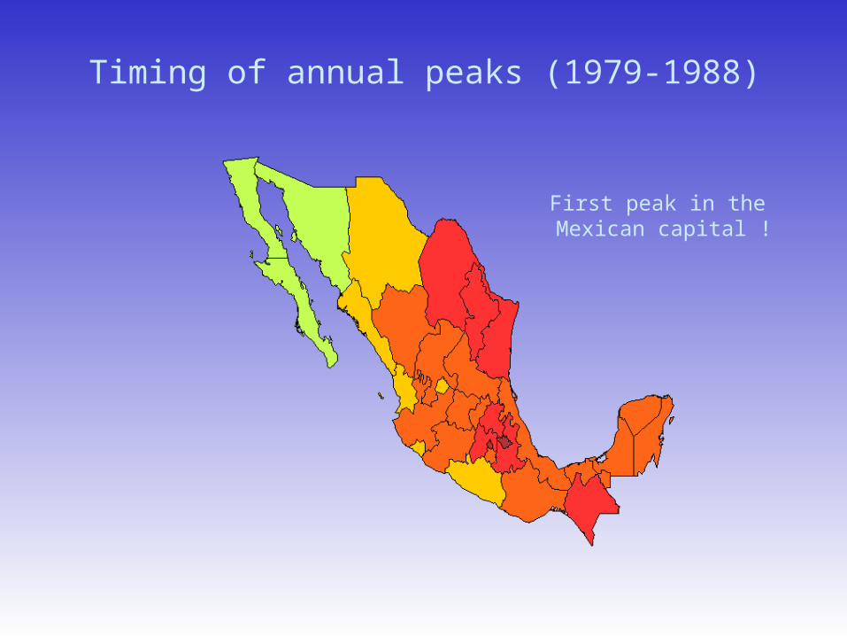
Timing of annual peaks (1979-1988)
First peak in the Mexican capital !
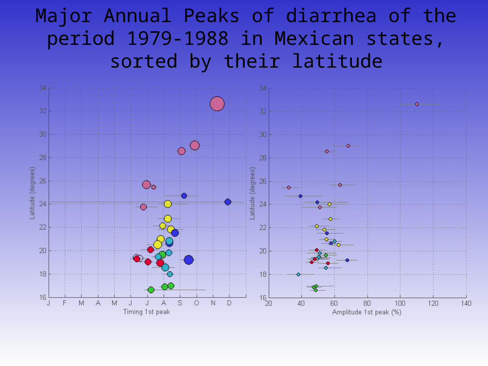
Major Annual Peaks of diarrhea of the period 1979-1988 in Mexican states, sorted by their latitude
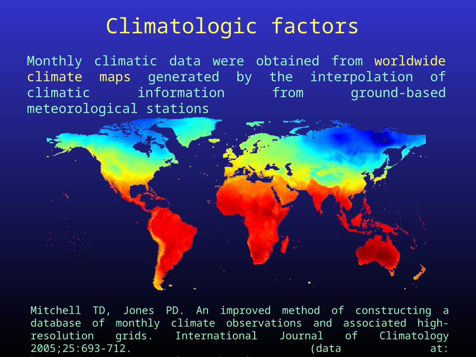
Monthly climatic data were obtained from worldwide climate maps generated by the interpolation of climatic information from ground-based meteorological stations
Climatologic factors
Mitchell TD, Jones PD. An improved method of constructing a database of monthly climate observations and associated high-resolution grids. International Journal of Climatology 2005;25:693-712. (data at: http://www.cru.uea.ac.uk/cru/data/hrg/)
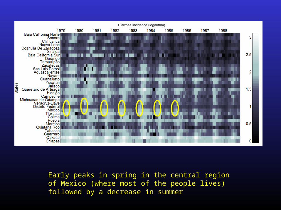
Early peaks in spring in the central region of Mexico (where most of the people lives) followed by a decrease in summer
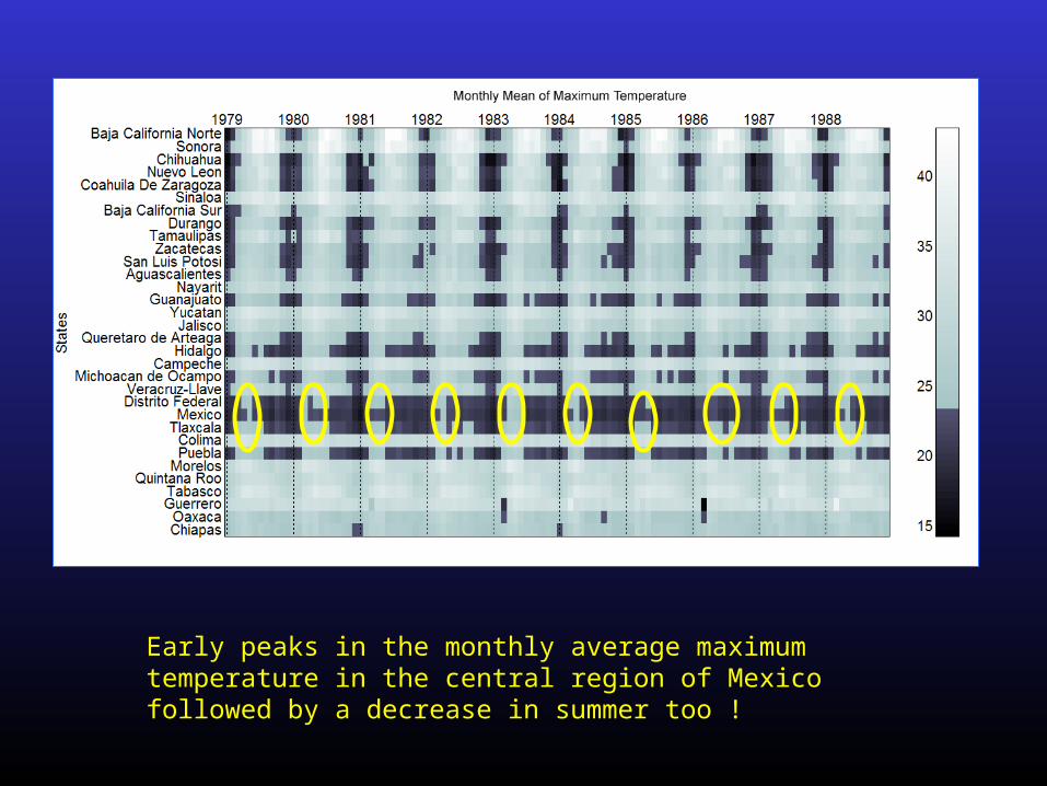
Early peaks in the monthly average maximum temperature in the central region of Mexico followed by a decrease in summer too !
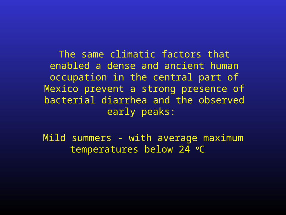
The same climatic factors that enabled a dense and ancient human occupation in
the central part of Mexico prevent a strong presence of bacterial diarrhea and the
observed early peaks:
Mild summers - with average maximum temperatures below 24 oC

Thanks! [email protected]