Embed Size (px)
Citation preview
Using the Graphing Calculator to Create a Scatter Plot and Line of
Best FitUnit 5, Lesson 11
Mrs. King
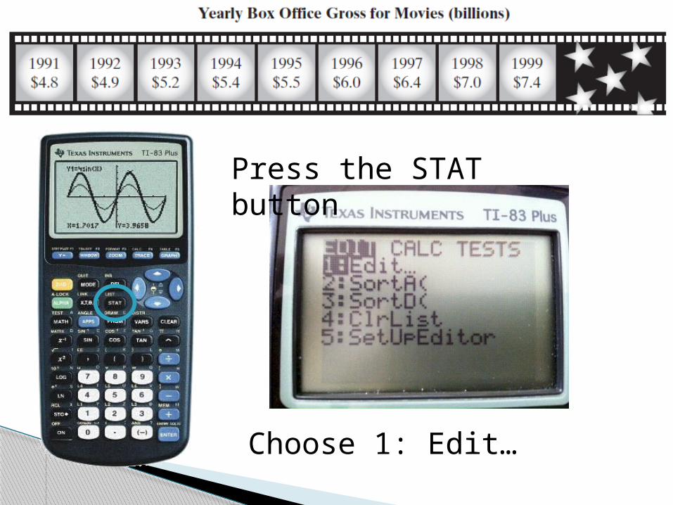
Press the STAT button
Choose 1: Edit…
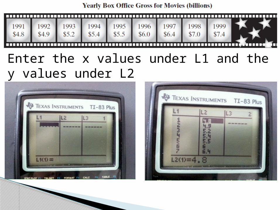
Enter the x values under L1 and the y values under L2
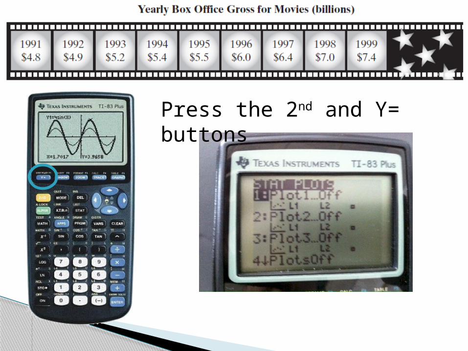
Press the 2nd and Y= buttons
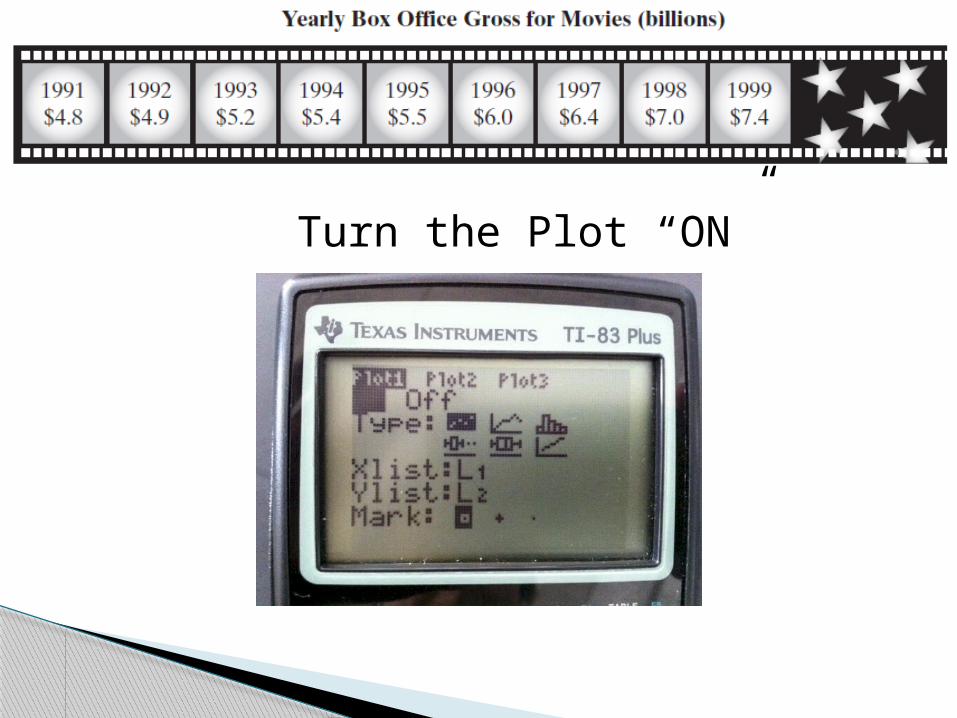
Turn the Plot “ON”
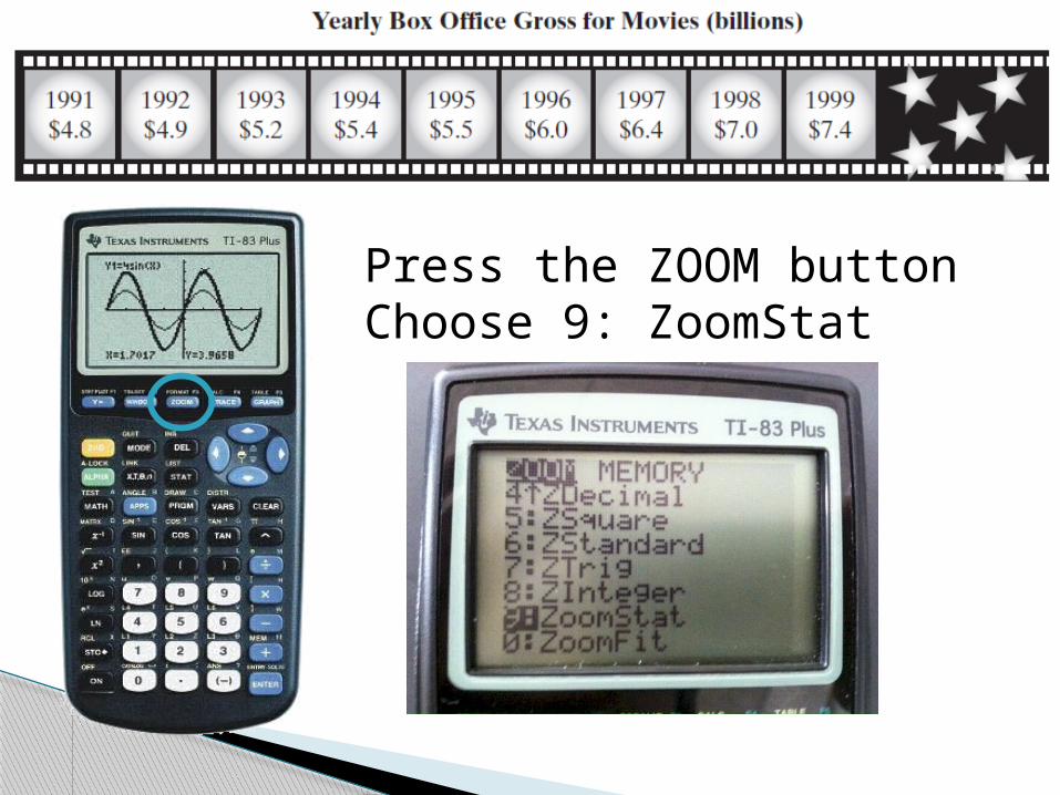
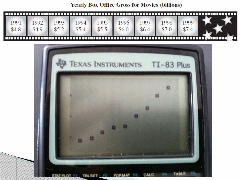
Press the ZOOM buttonChoose 9: ZoomStat
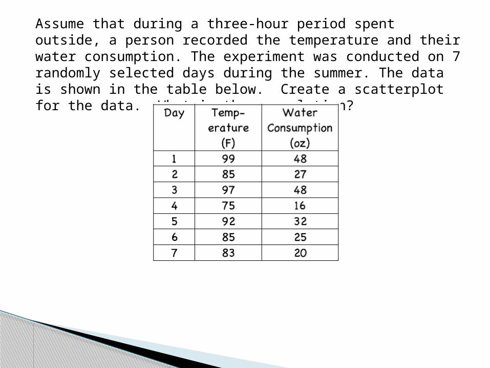
Assume that during a three-hour period spent outside, a person recorded the temperature and their water consumption. The experiment was conducted on 7 randomly selected days during the summer. The data is shown in the table below. Create a scatterplot for the data. What is the correlation?
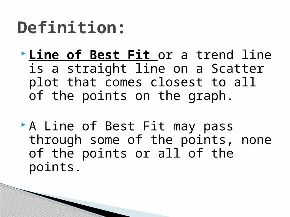
Line of Best Fit or a trend line is a straight line on a Scatter plot that comes closest to all of the points on the graph.
A Line of Best Fit may pass through some of the points, none of the points or all of the points.
Definition:
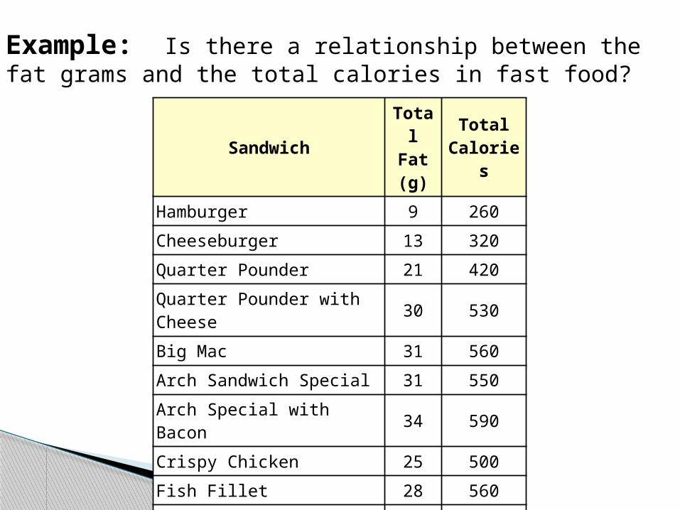
Sandwich Total Fat (g)
Total Calories
Hamburger 9 260
Cheeseburger 13 320
Quarter Pounder 21 420
Quarter Pounder with Cheese 30 530
Big Mac 31 560
Arch Sandwich Special 31 550
Arch Special with Bacon 34 590
Crispy Chicken 25 500
Fish Fillet 28 560
Grilled Chicken 20 440
Grilled Chicken Light 5 300
Example: Is there a relationship between the fat grams and the total calories in fast food?
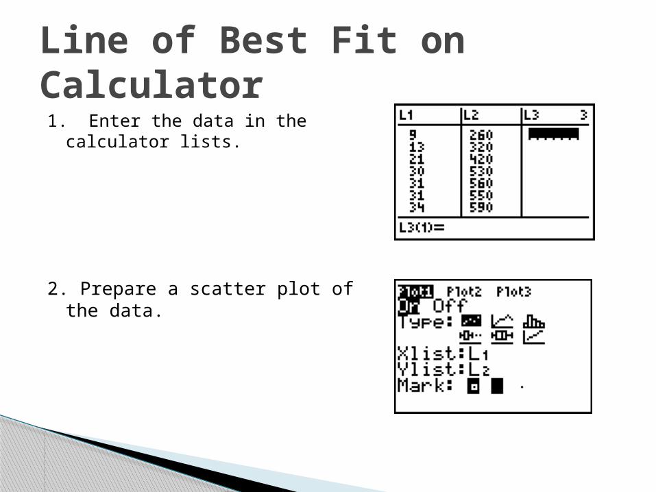
1. Enter the data in the calculator lists.
2. Prepare a scatter plot of the data.
Line of Best Fit on Calculator
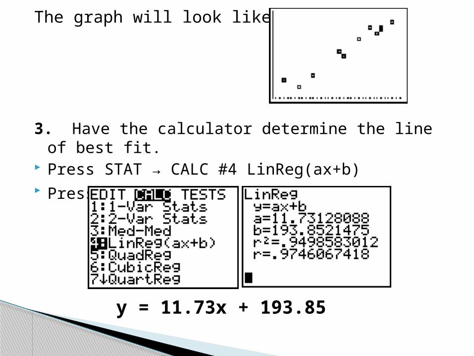
The graph will look like this.
3. Have the calculator determine the line of best fit. Press STAT → CALC #4 LinReg(ax+b) Press ENTER
y = 11.73x + 193.85
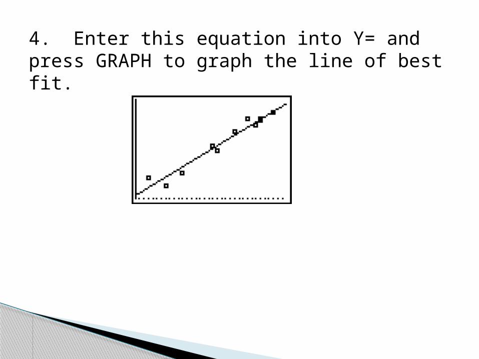
4. Enter this equation into Y= and press GRAPH to graph the line of best fit.
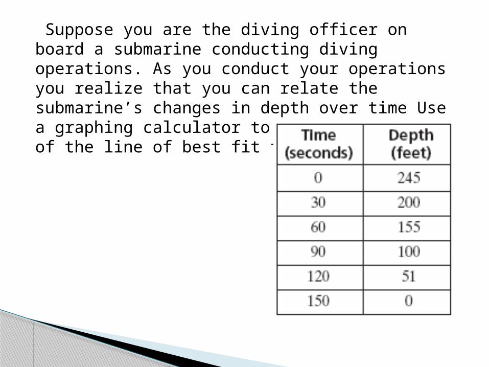
Suppose you are the diving officer on board a submarine conducting diving operations. As you conduct your operations you realize that you can relate the submarine’s changes in depth over time Use a graphing calculator to find the equation of the line of best fit for the data.


![Connecting the FR-4x to the Editor - musikkhandel.no · 16 [Accordion Edit] button Edits the Accordion parameters. 17 [Orchestra Edit] button Edits the Orchestra parameters. 18 [Organ](https://img.pdfslide.net/doc/110x75/5e9b60ca4bbfe774be72afcc/connecting-the-fr-4x-to-the-editor-16-accordion-edit-button-edits-the-accordion.jpg)