Embed Size (px)
Citation preview
Usability Study of an Online Mobile Apps Instructional Module for Busy Instructors
Cheryl Irebaria
University of Hawaiʻi at Mānoa Honolulu, Hawaiʻi
United States of America [email protected]
http://cheirebaria.wix.com/mobileappsmodule
Abstract: Considering the accessibility of online educational applications, it is natural to assume that instructors incorporate them into their practice. However, lack of resourceawareness and time prevent instructors from learning about practical apps. To overcome these barriers, an online instructional module that succinctly shares useful information on how to use the Kahoot!, Blendspace, and PowToon apps was developed. These apps were selected because they offer instructors relief from the timeconsuming task of creating entirely new deliverables by providing readymade products that instructors can use. The purpose of this usability study was to assess the ease of use, learnability, and user satisfaction of the module before use with its target audience. Online resources such as PowToon and YouTube were used to develop content while the ARCS Model of Motivation and Gagne’s Nine Events of Learning guided design and content organization. The testing sessions, which were recorded using Google Hangouts on Air and ScreencastOMatic 2, exposed navigation, structural, and language issues as participants engaged in specific tasks. At the end of each session, participants completed a survey that provided additional insight and recommendations for improvement. Two rounds of usability testing were done; each round uncovered problem areas that were corrected to facilitate quicker navigation of the site. Revisions to the module resulted in a more intuitive and fluid experience. These positive gains lend support for the effectiveness of usability testing in meeting design objectives.
Introduction Instructors may be too occupied with the demands of their profession to look for and research educational apps that could be effectively utilized in the classroom. This is unfortunate because there is a wealth of free apps that would benefit both instructors and students. While it may be easy to provide instructors with lists of apps that could be used for instruction, many do not have the time to explore and evaluate apps that would be appropriate for their individual disciplines or fields. The development of a module that showcases universal and effective mobile applications would relieve them of having to sift through loads of mobile apps just to find ones that would suit their needs. The shortterm benefits of instructors expanding their “toolbox” will be a diversified
classroom and new skills to add to their repertoire; the longterm goal is students will be exposed to new apps and leave their learning environment equipped with the 21stcentury skills and knowledge necessary to navigate a world flooded with new technologies. The purpose of this usability study project is to evaluate an online mobile apps instructional module for individuals who serve in any teaching capacity (e.g., instructors in the fields of business, education, military, medicine, etc.) The online Mobile Apps for Busy Instructors module presents three applications: Kahoot!, Blendspace, and PowToon. Kahoot! is a webbased, gamebased digital platform that employs the use of mobile devices as responsesystem “clickers.” In other words, students can use their mobile devices to answer questions on online quizzes (that were created using Kahoot!). Blendspace is a “place” on the web at which instructors can store useful instructional materials and resources for students to access outside of class. Lastly, PowToon is an online video animation application that can be used to create dynamic videos. Literature Review Other instructional designers have created modules for professional development whose target audience was educators in Hawaii’s public schools. In a study conducted by researchers Lin, Iyoda, and Ho (2011) teachers were asked what they would suggest to other teachers considering mobile technology in their classrooms and three themes formed around common answers: 1) getting teachers ready for mobile integration, 2) getting the school ready for mobile integration, and 3) getting students ready for mobile learning; these results reveal that “...for mobile learning to be successful, the school system, teachers, and students, all need to be ready for diverse learning environments that support digitalage learning experiences (as cited in Tsinakos and Ally, 2013, p. 223). The experience shared in the aforementioned study indicates a need for teacher training in mobile technologies. For more adoption and integration of technology tools to occur, it will take more than introducing and building awareness of such technologies; professional development courses need to be made available so teachers will have opportunities to learn how to effectively use mobile apps and incorporate them into their practice. A study of schools near Silicon Valley, California showed that even though those schools had the technology infrastructure to support meaningful use of technology, teachers did not use technology to its full potential (Richardson, Flora, & Bathon, 2013). This means that having technology tools at one’s disposal does not ensure that they will be used effectively to facilitate learning and encourage their integration into curricula. Development of an instructional module that guides instructors and provides them with readymade ideas for utilizing educational apps would be a purposeful step in the right direction. The justifications for creating an online learning module (instead of conducting the course facetoface) include making learning convenient for busy instructors as well as
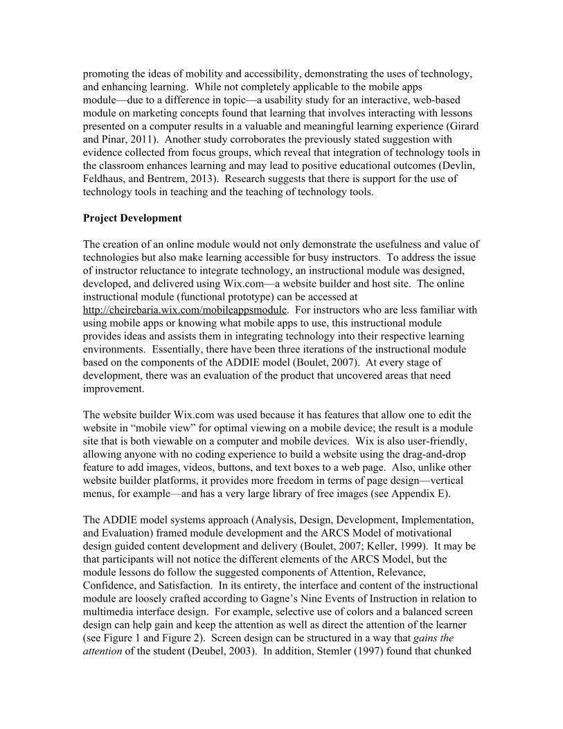
promoting the ideas of mobility and accessibility, demonstrating the uses of technology, and enhancing learning. While not completely applicable to the mobile apps module—due to a difference in topic—a usability study for an interactive, webbased module on marketing concepts found that learning that involves interacting with lessons presented on a computer results in a valuable and meaningful learning experience (Girard and Pinar, 2011). Another study corroborates the previously stated suggestion with evidence collected from focus groups, which reveal that integration of technology tools in the classroom enhances learning and may lead to positive educational outcomes (Devlin, Feldhaus, and Bentrem, 2013). Research suggests that there is support for the use of technology tools in teaching and the teaching of technology tools. Project Development The creation of an online module would not only demonstrate the usefulness and value of technologies but also make learning accessible for busy instructors. To address the issue of instructor reluctance to integrate technology, an instructional module was designed, developed, and delivered using Wix.com—a website builder and host site. The online instructional module (functional prototype) can be accessed at http://cheirebaria.wix.com/mobileappsmodule. For instructors who are less familiar with using mobile apps or knowing what mobile apps to use, this instructional module provides ideas and assists them in integrating technology into their respective learning environments. Essentially, there have been three iterations of the instructional module based on the components of the ADDIE model (Boulet, 2007). At every stage of development, there was an evaluation of the product that uncovered areas that need improvement. The website builder Wix.com was used because it has features that allow one to edit the website in “mobile view” for optimal viewing on a mobile device; the result is a module site that is both viewable on a computer and mobile devices. Wix is also userfriendly, allowing anyone with no coding experience to build a website using the draganddrop feature to add images, videos, buttons, and text boxes to a web page. Also, unlike other website builder platforms, it provides more freedom in terms of page design—vertical menus, for example—and has a very large library of free images (see Appendix E). The ADDIE model systems approach (Analysis, Design, Development, Implementation, and Evaluation) framed module development and the ARCS Model of motivational design guided content development and delivery (Boulet, 2007; Keller, 1999). It may be that participants will not notice the different elements of the ARCS Model, but the module lessons do follow the suggested components of Attention, Relevance, Confidence, and Satisfaction. In its entirety, the interface and content of the instructional module are loosely crafted according to Gagne’s Nine Events of Instruction in relation to multimedia interface design. For example, selective use of colors and a balanced screen design can help gain and keep the attention as well as direct the attention of the learner (see Figure 1 and Figure 2). Screen design can be structured in a way that gains the attention of the student (Deubel, 2003). In addition, Stemler (1997) found that chunked
information improves screen design (as cited in Deubel, 2003). Notice the separations and chunking of information in Figure 1.
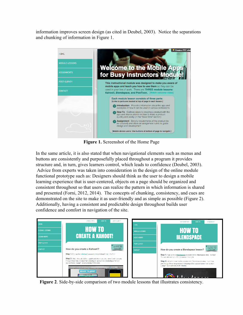
Figure 1. Screenshot of the Home Page In the same article, it is also stated that when navigational elements such as menus and buttons are consistently and purposefully placed throughout a program it provides structure and, in turn, gives learners control, which leads to confidence (Deubel, 2003). Advice from experts was taken into consideration in the design of the online module functional prototype such as: Designers should think as the user to design a mobile learning experience that is usercentered, objects on a page should be organized and consistent throughout so that users can realize the pattern in which information is shared and presented (Forni, 2012, 2014). The concepts of chunking, consistency, and cues are demonstrated on the site to make it as userfriendly and as simple as possible (Figure 2). Additionally, having a consistent and predictable design throughout builds user confidence and comfort in navigation of the site.
Figure 2. Sidebyside comparison of two module lessons that illustrates consistency.
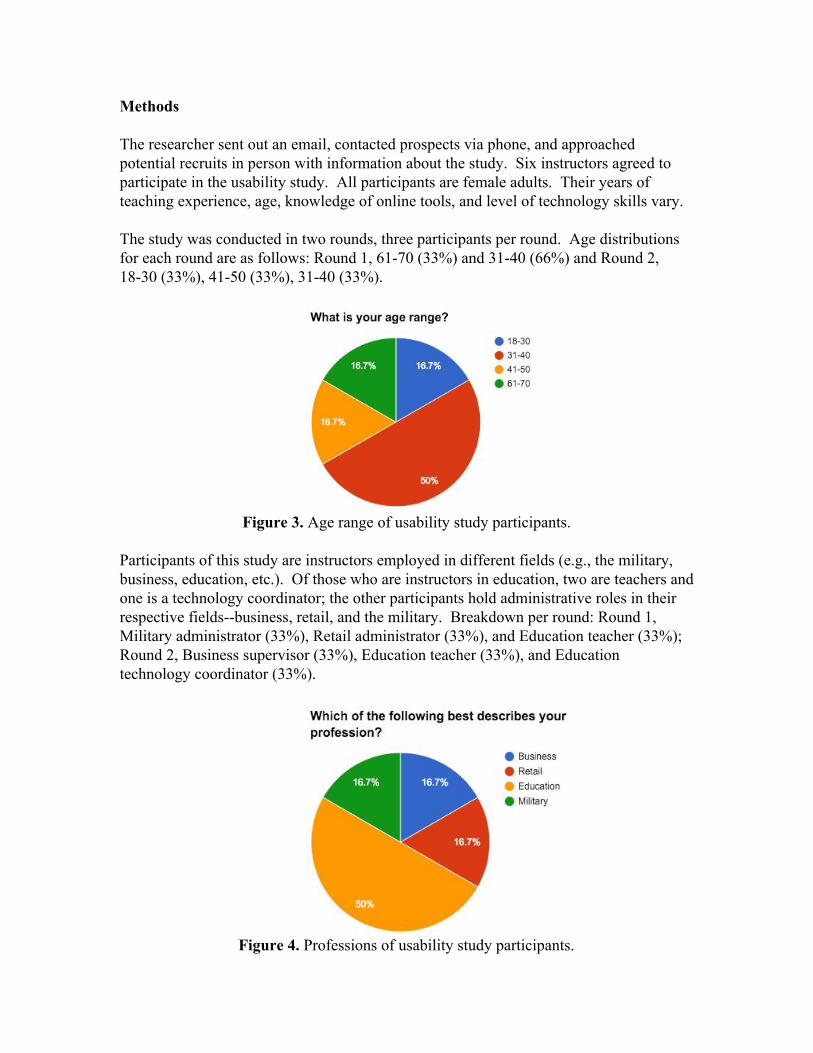
Methods The researcher sent out an email, contacted prospects via phone, and approached potential recruits in person with information about the study. Six instructors agreed to participate in the usability study. All participants are female adults. Their years of teaching experience, age, knowledge of online tools, and level of technology skills vary. The study was conducted in two rounds, three participants per round. Age distributions for each round are as follows: Round 1, 6170 (33%) and 3140 (66%) and Round 2, 1830 (33%), 4150 (33%), 3140 (33%).
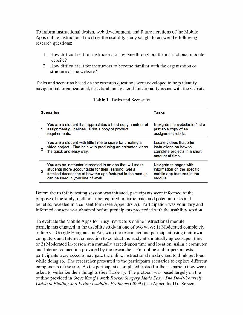
Figure 3. Age range of usability study participants. Participants of this study are instructors employed in different fields (e.g., the military, business, education, etc.). Of those who are instructors in education, two are teachers and one is a technology coordinator; the other participants hold administrative roles in their respective fieldsbusiness, retail, and the military. Breakdown per round: Round 1, Military administrator (33%), Retail administrator (33%), and Education teacher (33%); Round 2, Business supervisor (33%), Education teacher (33%), and Education technology coordinator (33%).
Figure 4. Professions of usability study participants.
To inform instructional design, web development, and future iterations of the Mobile Apps online instructional module, the usability study sought to answer the following research questions:
1. How difficult is it for instructors to navigate throughout the instructional module website?
2. How difficult is it for instructors to become familiar with the organization or structure of the website?
Tasks and scenarios based on the research questions were developed to help identify navigational, organizational, structural, and general functionality issues with the website.
Table 1. Tasks and Scenarios
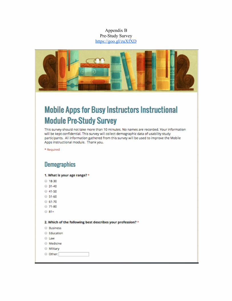
Before the usability testing session was initiated, participants were informed of the purpose of the study, method, time required to participate, and potential risks and benefits, revealed in a consent form (see Appendix A). Participation was voluntary and informed consent was obtained before participants proceeded with the usability session. To evaluate the Mobile Apps for Busy Instructors online instructional module, participants engaged in the usability study in one of two ways: 1) Moderated completely online via Google Hangouts on Air, with the researcher and participant using their own computers and Internet connection to conduct the study at a mutually agreedupon time or 2) Moderated inperson at a mutually agreedupon time and location, using a computer and Internet connection provided by the researcher. For online and inperson tests, participants were asked to navigate the online instructional module and to think out loud while doing so. The researcher presented to the participants scenarios to explore different components of the site. As the participants completed tasks (for the scenarios) they were asked to verbalize their thoughts (See Table 1). The protocol was based largely on the outline provided in Steve Krug’s work Rocket Surgery Made Easy: The DoItYourself Guide to Finding and Fixing Usability Problems (2009) (see Appendix D). Screen
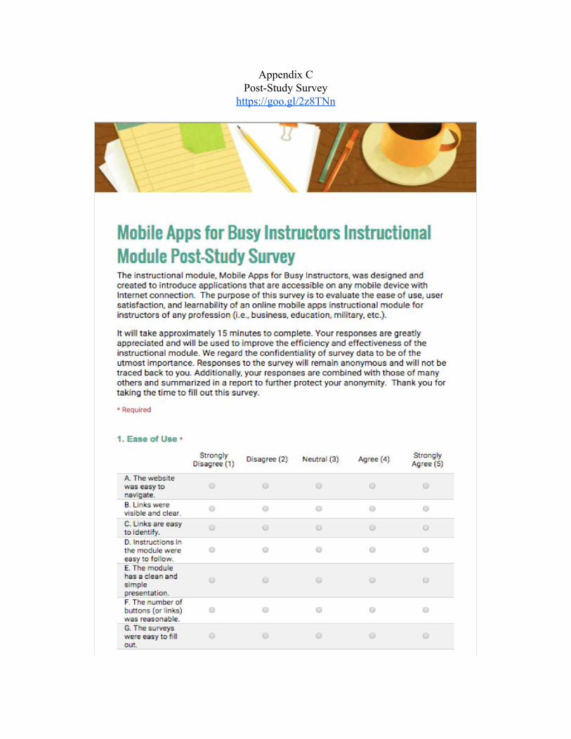
activity and audio were recorded, but no recognizable images of the participants were captured. A tool called ScreencastOMatic 2 was used to record activity and commentary during inperson usability testing sessions. For online sessions, Google Hangouts on Air recorded verbal and screen activity. Recordings were automatically published to YouTube at the end of every session. All recordings were downloaded onto a passwordprotected computer for safekeeping, then deleted from YouTube. The creation of an instructional package and execution of usability testing of the module took approximately 20 weeks to complete. Before participants tested the functional prototype, it underwent an evaluation of peers during Fall semester 2015, and changes were made according to feedback. The actual usability study took place during the beginning half of Spring semester 2016. There was a total of six participants for official usability testing—this number was needed to gather sufficient data to ascertain severe issues. Information gathered from the first round of usability testing was used to improve the site and make exploring it as intuitive as possible. Revisions were made before the second round of usability testing. Evaluation of the instructional module, analysis, and revision took approximately 10 weeks to complete. Results An online prestudy survey gathered data on demographics and instructors’ selfperception with respect to technology use and integration (see Appendix B). Based on prestudy survey data, all participants are comfortable with using computers, tablets, and smartphones and use the Internet on a daily basis. All but one participant selected “Neutral” on items pertaining to comfort with using the Internet for professional development and integration of mobile technology into her practice. At the conclusion of each usability testing session, an online poststudy survey was administered. Openended questions on the survey gathered additional feedback on how the module can be improved (see Appendix C). Likert scale items were used to measure ease of use, learnability, and user satisfaction. Degree of agreement was measured using a 5point scale (5Strongly Agree, 4Agree, 3Neutral, 2Disagree, and 1Strongly Disagree). The researcher considered including questions regarding course effectiveness in promoting technology integration and building familiarity with technology tools but decided they were not pertinent to the usability study because participants would not be able to actually take the course during the session. Both pre and post surveys were created using Google Forms for quick revision and seamless data collection. Data from the surveys were compiled automatically in a Google Sheet. From there, the researcher “cleaned” and organized the data for statistical purposes. Quantitative datagenerated mainly from Likert scale itemswere summarized using descriptive statistics. XLMiner Analysis Toolpak, an online Google Sheets addon, analyzed the data to produce means and standard deviations for each survey item. The statistics provided meaningful insights and suggested recommendations for improving module design.
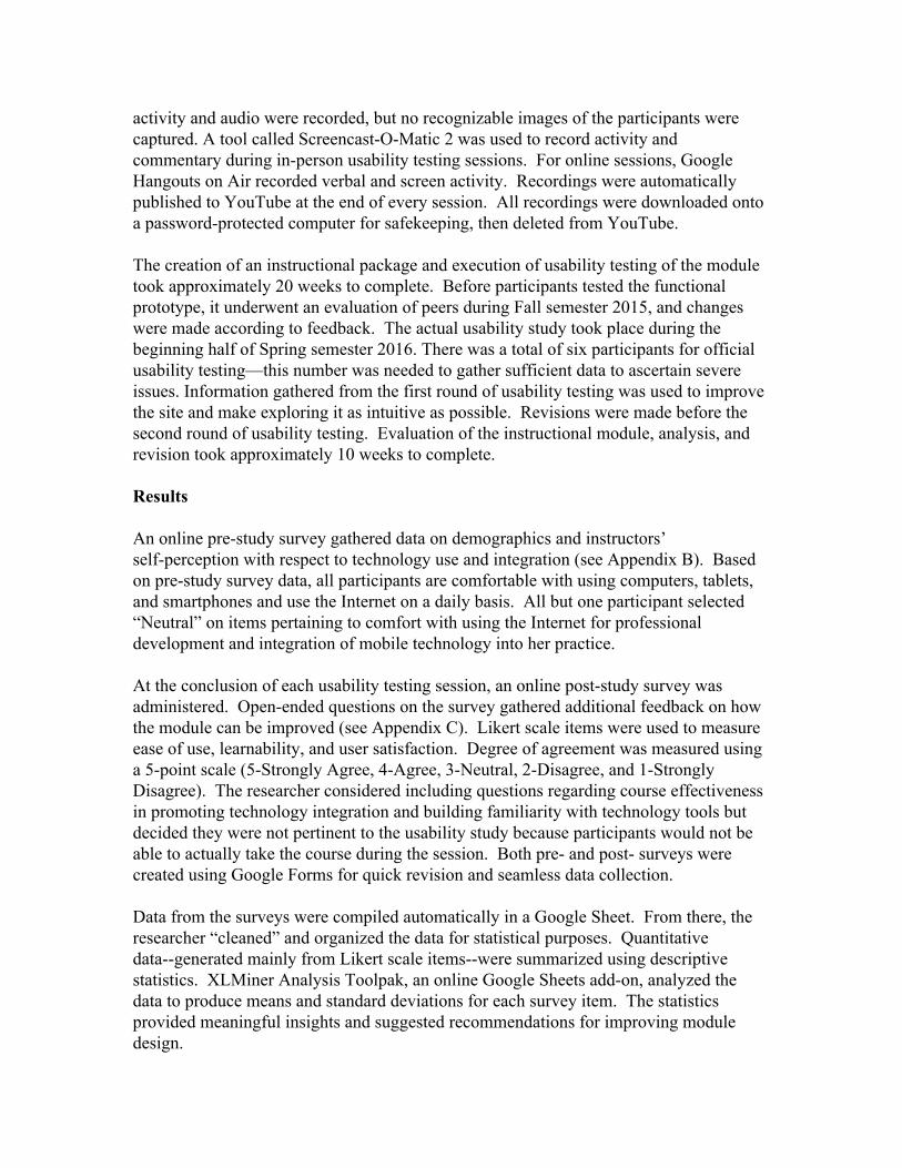
The poststudy results for Ease of Use survey items reveal that participants of the second round (compared to participants of the first round) did not find the site easy to use (Figure 3). The following statements, “Links are easy to identify” and “The module has a clean and simple presentation” scored lower for Round 2. Oddly, the statement, “The website was easy to navigate” had a higher mean the second time around. Time will tell a more objective story.
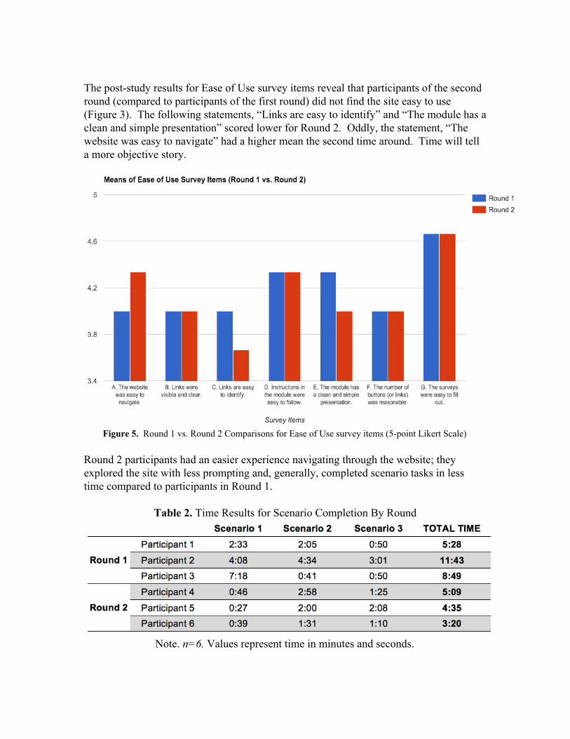
Figure 5. Round 1 vs. Round 2 Comparisons for Ease of Use survey items (5point Likert Scale) Round 2 participants had an easier experience navigating through the website; they explored the site with less prompting and, generally, completed scenario tasks in less time compared to participants in Round 1.
Table 2. Time Results for Scenario Completion By Round
Note. n=6. Values represent time in minutes and seconds.
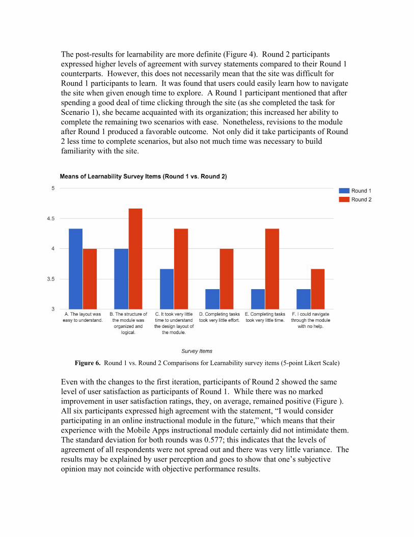
The postresults for learnability are more definite (Figure 4). Round 2 participants expressed higher levels of agreement with survey statements compared to their Round 1 counterparts. However, this does not necessarily mean that the site was difficult for Round 1 participants to learn. It was found that users could easily learn how to navigate the site when given enough time to explore. A Round 1 participant mentioned that after spending a good deal of time clicking through the site (as she completed the task for Scenario 1), she became acquainted with its organization; this increased her ability to complete the remaining two scenarios with ease. Nonetheless, revisions to the module after Round 1 produced a favorable outcome. Not only did it take participants of Round 2 less time to complete scenarios, but also not much time was necessary to build familiarity with the site.
Figure 6. Round 1 vs. Round 2 Comparisons for Learnability survey items (5point Likert Scale) Even with the changes to the first iteration, participants of Round 2 showed the same level of user satisfaction as participants of Round 1. While there was no marked improvement in user satisfaction ratings, they, on average, remained positive (Figure ). All six participants expressed high agreement with the statement, “I would consider participating in an online instructional module in the future,” which means that their experience with the Mobile Apps instructional module certainly did not intimidate them. The standard deviation for both rounds was 0.577; this indicates that the levels of agreement of all respondents were not spread out and there was very little variance. The results may be explained by user perception and goes to show that one’s subjective opinion may not coincide with objective performance results.
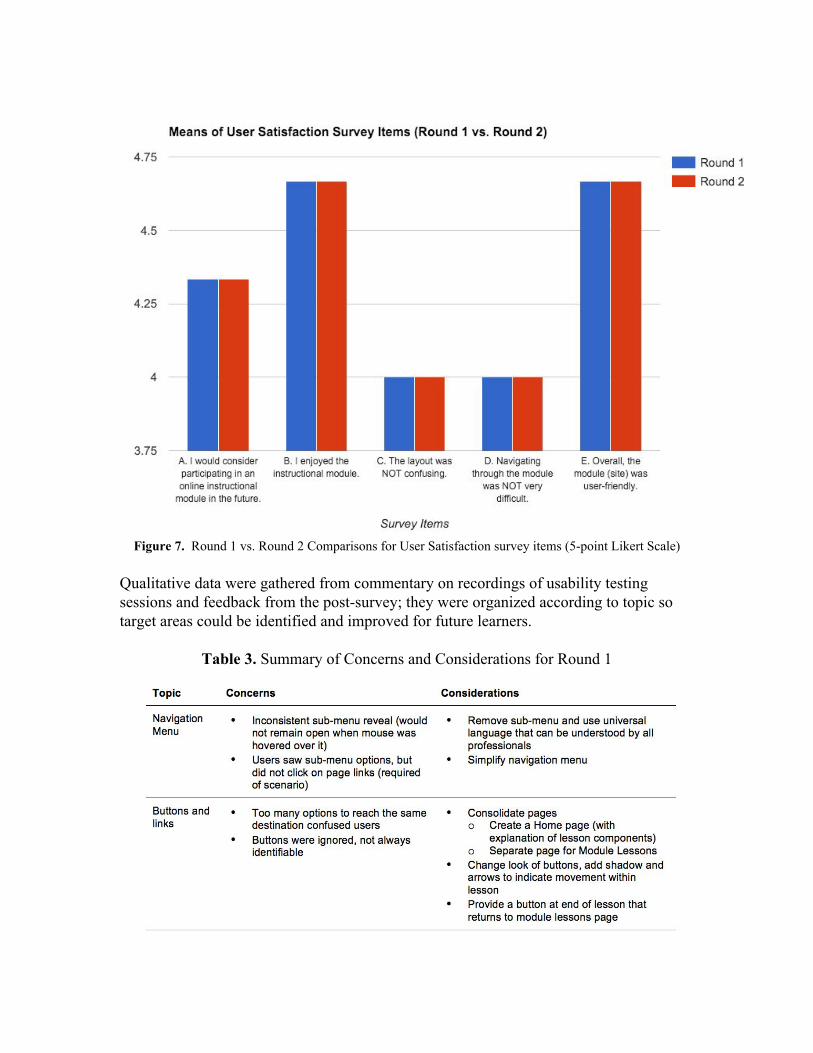
Figure 7. Round 1 vs. Round 2 Comparisons for User Satisfaction survey items (5point Likert Scale) Qualitative data were gathered from commentary on recordings of usability testing sessions and feedback from the postsurvey; they were organized according to topic so target areas could be identified and improved for future learners.
Table 3. Summary of Concerns and Considerations for Round 1
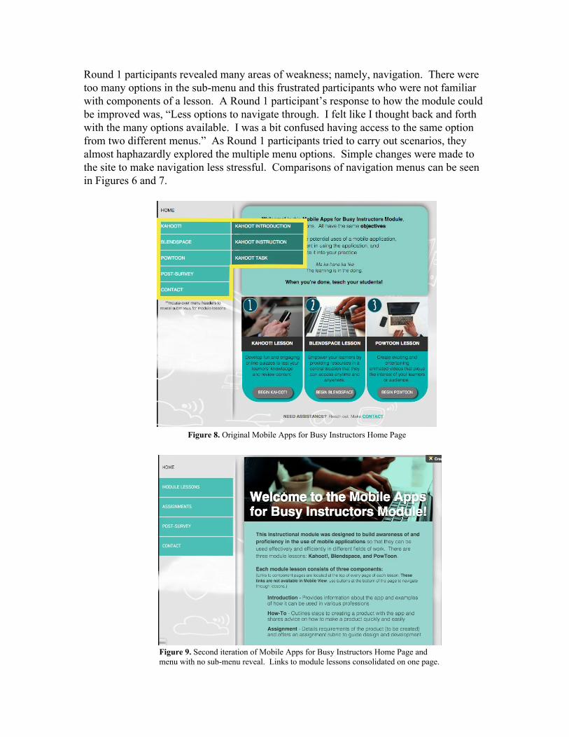
Round 1 participants revealed many areas of weakness; namely, navigation. There were too many options in the submenu and this frustrated participants who were not familiar with components of a lesson. A Round 1 participant’s response to how the module could be improved was, “Less options to navigate through. I felt like I thought back and forth with the many options available. I was a bit confused having access to the same option from two different menus.” As Round 1 participants tried to carry out scenarios, they almost haphazardly explored the multiple menu options. Simple changes were made to the site to make navigation less stressful. Comparisons of navigation menus can be seen in Figures 6 and 7.
Figure 8. Original Mobile Apps for Busy Instructors Home Page
Figure 9. Second iteration of Mobile Apps for Busy Instructors Home Page and menu with no submenu reveal. Links to module lessons consolidated on one page.
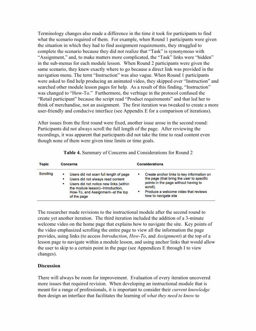
Terminology changes also made a difference in the time it took for participants to find what the scenario required of them. For example, when Round 1 participants were given the situation in which they had to find assignment requirements, they struggled to complete the scenario because they did not realize that “Task” is synonymous with “Assignment,” and, to make matters more complicated, the “Task” links were “hidden” in the submenus for each module lesson. When Round 2 participants were given the same scenario, they knew exactly where to go because a direct link was provided in the navigation menu. The term “Instruction” was also vague. When Round 1 participants were asked to find help producing an animated video, they skipped over “Instruction” and searched other module lesson pages for help. As a result of this finding, “Instruction” was changed to “HowTo.” Furthermore, the verbiage in the protocol confused the “Retail participant” because the script read “Product requirements” and that led her to think of merchandise, not an assignment. The first iteration was tweaked to create a more userfriendly and conducive interface (see Appendix E for a comparison of iterations). After issues from the first round were fixed, another issue arose in the second round: Participants did not always scroll the full length of the page. After reviewing the recordings, it was apparent that participants did not take the time to read content even though none of them were given time limits or time goals.
Table 4. Summary of Concerns and Considerations for Round 2
The researcher made revisions to the instructional module after the second round to create yet another iteration. The third iteration included the addition of a 3minute welcome video on the home page that explains how to navigate the site. Key points of the video emphasized scrolling the entire page to view all the information the page provides, using links (to access Introduction, HowTo, and Assignment) at the top of a lesson page to navigate within a module lesson, and using anchor links that would allow the user to skip to a certain point in the page (see Appendices E through I to view changes). Discussion There will always be room for improvement. Evaluation of every iteration uncovered more issues that required revision. When developing an instructional module that is meant for a range of professionals, it is important to consider their current knowledge then design an interface that facilitates the learning of what they need to know to
successfully use the site (Spool, 2005). The first iteration of the Mobile Apps for Busy Instructors instructional module was, for the most part, too confusing for participants to navigate efficiently and effectively. The many options for navigation made it extremely difficult for participants to become familiar with the structure of the site. It was also discovered that the language used on the site and in the protocol was unfamiliar to individuals outside of educationterms such as deliverable, instruction (meaning lesson or teaching), and rubric are technical jargon that is not familiar to people from outside of the field of education. More research into protocol language should be conducted to determine the best approach for usability studies involving individuals with diverse backgrounds and knowledge. It is also possible that researcher intervention or presence and circumstance could have impacted the performance of participants. Anecdotally, when user activity was not being recorded, participants had expressed that despite the reassurance that the site was being tested not them, they still felt slight pressure to “perform” well. It was found that intervention causes participants to behave a certain way and increases the likelihood of evaluatorbias (Zhao, McDonald, & Edwards, 2014). This presents a challenge and limitation to collecting reliable data. However, the significant differences in the time it took to complete tasksbetween Rounds 1 and 2indicate that changes made to the site probably contributed to the better performance of Round 2 participants. Conclusion If instructors avoid learning about technology tools and integrating them into their projects or practice, their learners will not be exposed to them. Educators have a greater responsibility to prepare themselves and their learners for the 21st century. To do this, they must prepare a toolbox of apps and tech tools so they are equipped to differentiate and engage learners at every stage of instruction and, in the process, demonstrate for their learners how productivity tools can be utilized effectively to produce a highquality product or performance. In this quest to spread knowledge of mobile and software applications, two barriers that may be most within our control to overcome are lack of time and lack of necessary knowledge and skills (Chen & Miller, 1997; Hew & Brush, 2007; Pritchett, C. G., Pritchett, C. C., & Wohleb, 2013). The development of online instructional modules that are succinct, straightforward, and stressfree may be the key to attract instructors who are reluctant to engage in professional development. Other motivating factors that designers should consider to get teachers to explore professional development sites include appearance of the site, ease of use, and the quality and usefulness of the information being presented (Beach & Willows, 2014). With online learning, instructors will have the freedom to access meaningful knowledge asynchronously, at their own convenience. Additionally, to make learning optimal and effective for busy professionals, it is crucial to make learning as natural as possible and empower them to take ownership of their learning.

References Beach, P., & Willows, D. (2014). Investigating teachers’ exploration of a professional
development website: An innovative approach to understanding the factors that motivate teachers to use Internetbased resources/Investigation de l’exploration par les enseignants d’un site Web. Canadian Journal of Learning and Technology/La Revue Canadienne de L’apprentissage et de La Technologie, 40(3). Retrieved from http://cjlt.csj.ualberta.ca/index.php/cjlt/article/view/849
Boulet, G. (2007). Rapid prototyping: An efficient way to collaboratively design and
develop elearning content. Retrieved from http://esouhaits.com/site/docs/Rapid_prototyping.pdf
Chen, M., & Miller, G. (1997). Teacher Stress: A Review of the International Literature.
Retrieved from http://eric.ed.gov/?id=ED410187 Deubel, P. (2003). An investigation of behaviorist and cognitive approaches to
instructional multimedia design. Journal of Educational Multimedia and Hypermedia, 12(1), 63–90.
Devlin, T. J., Feldhaus, C. R., & Bentrem, K. M. (2013). The Evolving Classroom: A
Study of Traditional and TechnologyBased Instruction in a STEM Classroom. Retrieved from http://scholar.lib.vt.edu/ejournals/JTE/v25n1/devlin.html
Forni, K. (Ed.). (2012, October 24). 61 tips on mLearning: making learning mobile. Forni, K. (Ed.). (2014). 61 tips on making learning memorable with graphics and visual
design. Girard, T., & Pinar, M. (2011). A Usability Study of Interactive WebBased Modules.
Turkish Online Journal of Educational TechnologyTOJET, 10(3), 27–32. Hew, K. F., & Brush, T. (2007). Integrating technology into K12 teaching and learning:
current knowledge gaps and recommendations for future research. Educational Technology Research and Development, 55(3), 223–252. http://doi.org/10.1007/s1142300690225
Keller, J. M. (1999). Using the ARCS Motivational Process in ComputerBased
Instruction and Distance Education. New Directions for Teaching and Learning, 1999(78), 37–47.
Krug, S. (2010). Rocket Surgery Made Easy: The DoIt Yourself Guide to Finding and
Fixing Usability Problems. Berkeley, CA: New Riders.

Pritchett, C. G., Pritchett, C. C., & Wohleb, E. C. (2013). Usage, Barriers, and Training of Web 2.0 Technology Applications. SRATE Journal, 22(2), 29–38.
Richardson, J. W., Flora, K., & Bathon, J. (2013). Fostering a School Technology Vision
in School Leader. International Journal of Educational Leadership Preparation, 8(1), 144–160.
Spool, Jared M. (2005). What Makes a Design Seem 'Intuitive'?. User interface
engineering. Retrieved from https://www.uie.com/articles/design_intuitive/ Tsinakos, A. & Ally, M. (Eds.). (2013). Global mobile learning: implementations and
trends. Beijing, China: China Central Radio and TV University Press. Zhao, T., McDonald, S., & Edwards, H. M. (2014). The impact of two different
thinkaloud instructions in a usability test: a case of just following orders? Behaviour & Information Technology, 33(2), 163–183. http://doi.org/10.1080/0144929X.2012.708786
Appendix A Consent Form to Participate in Usability Study
Consent Form
University of Hawai'i Consent to Participate in Usability Study:
Mobile Apps Instructional Module Aloha and Welcome! My name is Cheryl Irebaria. I am a graduate student in the Learning Design and Technology Program at the University of Hawai’i at Mānoa. As a fulfillment for this program, I am conducting a usability study. The purpose of this usability study will be to evaluate the ease of use, learnability, and user satisfaction of an online mobile apps instructional module for instructors of any profession. The mobile apps included in the module are Kahoot!, a free webbased, gamebased digital learning platform and studentresponse system; Blendspace, a space online at which resources can be consolidated for learners; and PowToon, animation software that can be used to create animated video presentations. You are being asked to participate in this research study because you are an adult whose profession requires you to deliver training or instruction. The module is being developed for individuals like you. Your participation in this study will help determine how the module can be adjusted to improve user experience. Project Description – Activities and Time Commitment Participation in this study will involve three activities: 1) Taking a preinstruction survey, 2) Going through an online instructional module, and 3) Completing a postinstruction evaluation. Participation will be completely online through a Google Hangout with the researcher or using your own computer and Internet connection or inperson using a computer (provided) and Internet connection at a mutually agreedupon location. If you participate, you will be asked to navigate through the module and be presented with scenarios to encourage interaction with the site. These questions are intended to evaluate the ease of use and learnability of the Mobile Apps online module. You will be asked to think out loud as you navigate; this will assist researchers in gaining further insights into user experience. Your actions and verbal comments will be screencaptured and recorded. The usability study will begin with a presurvey to collect demographic, attitudinal, and skilllevel data. Participants will then move on to exploring the learning module. The study will conclude with the completion of a postsurvey that includes questions about overall user satisfaction with the module. The entire study should take 3045 minutes. Benefits and Risks The benefits of participating in this usability study include gaining exposure knowledge of dynamic webbased technology tools in your practice and gaining practical takeaways for immediate use. There is minimal risk in participating in this project. The surveys in the module and the study itself are not meant to measure individual ability or performance; they are meant to evaluate the usability of the online instructional module.
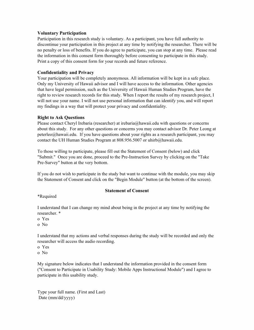
Voluntary Participation Participation in this research study is voluntary. As a participant, you have full authority to discontinue your participation in this project at any time by notifying the researcher. There will be no penalty or loss of benefits. If you do agree to participate, you can stop at any time. Please read the information in this consent form thoroughly before consenting to participate in this study. Print a copy of this consent form for your records and future reference. Confidentiality and Privacy Your participation will be completely anonymous. All information will be kept in a safe place. Only my University of Hawaii advisor and I will have access to the information. Other agencies that have legal permission, such as the University of Hawaii Human Studies Program, have the right to review research records for this study. When I report the results of my research project, I will not use your name. I will not use personal information that can identify you, and will report my findings in a way that will protect your privacy and confidentiality. Right to Ask Questions Please contact Cheryl Irebaria (researcher) at [email protected] with questions or concerns about this study. For any other questions or concerns you may contact advisor Dr. Peter Leong at [email protected]. If you have questions about your rights as a research participant, you may contact the UH Human Studies Program at 808.956.5007 or [email protected]. To those willing to participate, please fill out the Statement of Consent (below) and click "Submit." Once you are done, proceed to the PreInstruction Survey by clicking on the "Take PreSurvey" button at the very bottom. If you do not wish to participate in the study but want to continue with the module, you may skip the Statement of Consent and click on the "Begin Module" button (at the bottom of the screen).
Statement of Consent *Required I understand that I can change my mind about being in the project at any time by notifying the researcher. * o Yes o No I understand that my actions and verbal responses during the study will be recorded and only the researcher will access the audio recording. o Yes o No My signature below indicates that I understand the information provided in the consent form ("Consent to Participate in Usability Study: Mobile Apps Instructional Module") and I agree to participate in this usability study. Type your full name. (First and Last) Date (mm/dd/yyyy)
Appendix D Usability Study Protocol
Usability Protocol Name: Cheryl Irebaria
Modified from Usability Script Rocket Surgery Made Easy © 2010 Steve Krug
Technology SetUp Checklist (Facilitator Computer)
1. Facilitator should set up his/her computer and attach all cords/peripherals make sure to use a wired mouse
2. Plug in to a power outlet (don’t trust the battery) 3. Make sure computer is connected to the Internet 4. Set up audio and test headset test a. Ensure the microphone is working b. Ensure the volume is at a reasonable level 5. Login to Facilitator Google account 6. Contact participant and ask if participant’s computer is set up and participant is ready. 7. For inperson sessions, ensure ScreencastOMatic 2 is launched, set, and operating. After Participant computer is set up: (Does not apply to inperson sessions)
8. Facilitator invites participant to a Google Hangouts on Air. 9. Facilitator can access Google Hangouts on Air through Google+ by clicking on the
green quotations icon and enter your invitation to the participant. 10. Participant can test if Google Hangouts on Air is working with his/her Gmail account:
a. Starting from Gmail, ask participant to click on his/her photo icon next to his/her name in the chat area to see Google Hangout on Air preferences. If participant is logged in, once he/she clicks picture, “Hangout Invites” should appear in the dropdown menu below your photo. This is the invitation to participate in the study.
11. Run a test with Google Hangouts on Air and test video/audio and screenshare a. If it does not work, then review preparation of Facilitator’s computer for Google Hangouts on Air and retest:
i. Ensure that you are running the Chrome browser for best results ii. Ensure you have the current Google Voice and Video Setup plugin iii. Run a test broadcast in Google Hangouts on Air to link your YouTube account. You will need to provide your cell phone or email for verification.
Technology SetUp Checklist (Participant Computer) 12. Participant sets up computer and attach all cords/peripherals make sure to use a
wired mouse 13. Plug in to a power outlet (don’t trust the battery) 14. Make sure computer is connected to the Internet
15. Set up audio and test headset test a. Ensure the microphone is working b. Ensure the volume is at a reasonable level
16. Login to Participant Google account (https://plus.google.com/) 17. Wait for facilitator to contact asking if ready 18. When contacted, facilitator will send invitation for Google Hangouts on Air 19. Accept invitation through Google Hangouts.
a. How to test if Google Hangouts is working with your Gmail account: i. Starting from Gmail, click on your photo icon next to your name in
the chat area to see your Google Hangout preferences. If you are logged in, once you click your picture, “Hangout Invites” should appear in the drop down menu below your photo. This is your invitation to participate in the study.
ii. You can also access Google Hangout through Google+ by clicking on the green quotations icon and enter your invitation to the participant.
20. Run a test with Facilitator computer through Google Hangouts on Air. a. If it does not work, then review preparation of participant computer for
Google Hangouts on Air and retest: i. Ensure that you are running the Chrome browser for best results ii. Ensure you have the current Google Voice and Video Setup plugin iii. Run a test broadcast in Google Hangouts on Air to link your
YouTube account. You will need to provide your cell phone or email for verification.
21. Add bookmark for the URL of the website you are evaluating. Notes items to check (for remote sessions)
Mute mic and turn video off of other participants so does not toggle back and forth Google Hangouts will record screenshare and participants voices
Active mics will be the participant and facilitator Can use with multiple screens Use broadcast now If connection fails, click on Hangouts icon to log back into the call
Facilitator Script
START the Google Hangouts Air Session by clicking on the red button labeled “Start broadcast” OR ScreencastOMatic by clicking on red record button labeled “Rec.”
Hi, [insert participant’s name]. My name is [insert facilitator’s name Cheryl Irebaria] and I’m going to be walking you through this session today.
Before we begin, I have some information for you, and I’m going to read it to make sure that I cover everything.
Since I recruited you to participate, you probably already have a good idea of why you are here, but let me go over it again briefly. I am asking people to view an online instructional module. I would like to see if it works as intended. The session should take about 10 minutes.
The first thing I want to make clear right away is that I’m testing the site, not you. You can’t do anything wrong here. In fact, this is probably the one place today where you don’t have to worry about making mistakes.
As you use the site, I’m going to ask you as much as possible to try to think out loud: to say what you’re looking at, what you’re trying to do, and what you’re thinking. This will be a big help to me.
Also, please don’t worry that you’re going to hurt my feelings. I’m doing this to improve the site, so I need to hear your honest reactions.
If you have any questions as we go along, just ask them. I may not be able to answer them right away, since I’m interested in how people do when they don’t have someone who can help. But if you still have any questions when we’re done I’ll try to answer them.
And if you need to take a break at any point, just let me know. Do you have any questions so far?
Ask participant a few preliminary questions:
OK. Before we look at the site, I’d like to ask you just a few quick questions about your experience as an instructor.
1. How many online courses have you taken before?
2. Now, roughly how many hours a week altogether—just a ballpark estimate— would you say you spend using the Internet, including Web browsing and email, at work and at home?
2.1. And what’s the split between email and browsing—a rough percentage?
2.2. What kinds of sites are you looking at when you browse the Web?
2.3. Do you have any favorite Web sites?
3. Have you ever used Wix website builder beforeeither viewing a site or making one of your own?
3.1. If so, how frequently do you use it?
4. Have you ever built or helped edit a website?
4.1. If so, what program or software did you use?
OK, great. We’re done with the questions, and we can start testing out the site. Ask participant to open URL. [REMOTE] I’m going to send you the website link via the chatbox on Google Hangouts. To get to the chat, click on the blue icon on the top left.
Please click on the link that pops up in the chatbox on the right of Google Hangouts.
Send participant URL for website to be evaluated:
http://cheirebaria.wix.com/mobileappkahoot OR http://cheirebaria.wix.com/mobileappsmodule
Start the timer (keep track of the time)
Ask participant to begin the screenshare: Please start Screenshare by clicking on the ‘Screenshare’ link on your lefthand navigation in the Google Hangouts on Air window. A popup window will appear with three options: Entire Screen, Google+ Hangouts, and the Website. Select the website. [F2F] I’m going to open the website link to the online instructional module. Have participants do a narrative of the website’s overall appearance three or four minutes, at most: I’m going to ask you to look at this page and tell me what you make of it: Just look around and do a little narrative. You can scroll if you want to, but don’t click on anything yet. 1)What strikes you about it? 2)Whose site do you think it is? 3)What can you do here? 4)What is it for? Only ask these questions if you need more narrative and have time. Probe Questions if need to get more narrative: What you can learn from the… What can you gather about the site right away? Top part of the site? Left side of the site? Middle part of the site? Right side of the site?
Ask participant to complete a few specific tasks based off of their scenarios sheet: Scenarios (present in chat box one at a time) Present scenarios with numbers in the chat box TASK 1: Navigate the website to find a printable copy of an assignment rubric. SCENARIO
Scenario 1 (Research Question #1): You are a student that appreciates a hard copy handout of assignment guidelines. Print a copy of product requirements.
TASK 2: Locate videos that offer instructions on how to complete projects in a short amount of time. SCENARIO
Scenario 2 (Research Question #2): You are a student with little time to spare for creating a video project. Find help with producing an animated video the quick and easy way.
TASK 3: Navigate to pages with information on the specific mobile apps featured in the module. SCENARIO
Scenario 3 (Research Question #1): You are an instructor interested in an app that will make students more accountable for their learning. Get a detailed description of how the apps featured in the module can be used in your line of work.
Remember! Keep your participant talking. Thanks for doing that. You did a great job. Now I’m going to ask you to try doing some specific tasks. I’m going to read each one out loud. You should have received a copy of these in your email before this study.
I’m also going to ask you to do these tasks without using any search features. We’ll learn a lot more about how well the site works that way. And again, as much as possible, it will help us if you can try to think out loud as you go along.
Allow the user to proceed from one task to the next until you don’t feel like it’s producing any value or the user becomes very frustrated. Repeat for each task or until time runs out.
Information for Usability Study: RESEARCH QUESTIONS 1: How difficult is it for instructors to navigate throughout the instructional module website? 2: How difficult is it for instructors to become familiar with the organization or structure of the website?
TASK 1: Navigate the website to find a printable copy of an assignment rubric. SCENARIO
∙ Scenario 1 (Research Question #1): You are a student that appreciates a hard copy handout of assignment guidelines. Print a copy of product requirements.
TASK 2: Locate videos that offer instructions on how to complete projects in a short amount of time. SCENARIO
∙ Scenario 2 (Research Question #2): You are a student with little time to spare for creating a video project. Find help with producing an animated video the quick and easy way.
TASK 3: Navigate to pages with information on the specific mobile apps featured in the module. SCENARIO
∙ Scenario 3 (Research Question #1): You are an instructor interested in an app that will make students more accountable for their learning. Get a detailed description of how the apps featured in the module can be used in your line of work.
Probe Questions: Only ask if need more narrative. Are there any noticeable patterns in the structure or organization of the instructional module? Website?
Thanks, that was very helpful.
Request from the participant that they end their screenshare by clicking on the “Screenshare” link on their lefthand navigation in the Google Hangouts on Air window.
Ask the observers’ questions (if time permits).
Post Interview: (Not required but recommended) We are done with the main questions, but I have a few more general questions to ask you.
Note: If you ask yes/no, truefalse, and ranking followup questions, be sure to follow up with questions about WHY. This is because design teams will ask, "Well, what was the cause? What exactly were they thinking when they answered this? How should the product design respond to this? Give us something we can use!"
1. On a scale of 1 to 7, with 1 representing very difficult and 7 representing very easy, how would you rate your experience during today's testing?
2. Please think back to other eportfolios you have viewed before. Have you ever needed to perform tasks like the ones you did in the usability test today? Compared to your prior experience, would you say that the tasks you performed today were easier or more difficult? Why?
3. After participating in this study, would you recommend this site to any of your colleagues as a template for formatting eportfolios? Why?
**That’s the last question, Do you have any questions for me, now that we’re done?
[F2F] End Screen recording.
I want to thank you for your time and willingness to be a participant in this study.
Stop the Google Hangout Air Broadcast by clicking on the red button labeled, “end broadcast.”
For ScreencastOMatic, stop recording by clicking on the blue Pause button, then click Done.
After the Session: 1. Tech group logs in to YouTube to ensure that the video is available on YouTube Channel, download ScreencastOMatic video file to computer desktop or upload to YouTube (for facetoface sessions). 2. Quickly scrub through the videos to ensure the integrity of the audio and video 3. In YouTube Video Manager, set the “Privacy settings” to unlisted, which will allow you to give access to the video through a link (ease of access). Confirm: Invite Participants beforehand to make sure they are in your G+ circle (to access and join Google Hangouts on Air broadcast session)
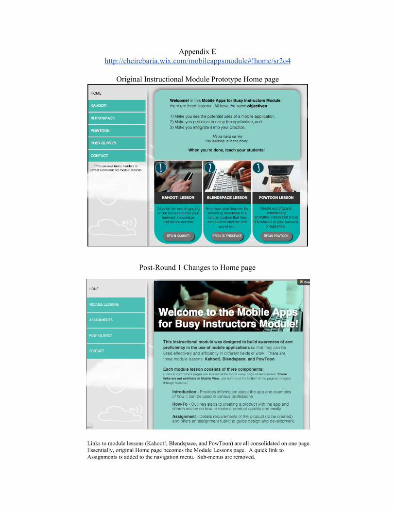
Appendix E http://cheirebaria.wix.com/mobileappsmodule#!home/sr2o4
Original Instructional Module Prototype Home page
PostRound 1 Changes to Home page
Links to module lessons (Kahoot!, Blendspace, and PowToon) are all consolidated on one page. Essentially, original Home page becomes the Module Lessons page. A quick link to Assignments is added to the navigation menu. Submenus are removed.
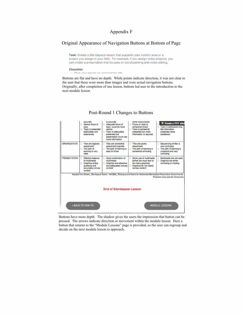
Appendix F
Original Appearance of Navigation Buttons at Bottom of Page
Buttons are flat and have no depth. While points indicate direction, it was not clear to the user that these were more than images and were actual navigation buttons. Originally, after completion of one lesson, buttons led user to the introduction to the next module lesson.
PostRound 1 Changes to Buttons
Buttons have more depth. The shadow gives the users the impression that button can be pressed. The arrows indicate direction or movement within the module lesson. Here a button that returns to the “Module Lessons” page is provided, so the user can regroup and decide on the next module lesson to approach.
Appendix G
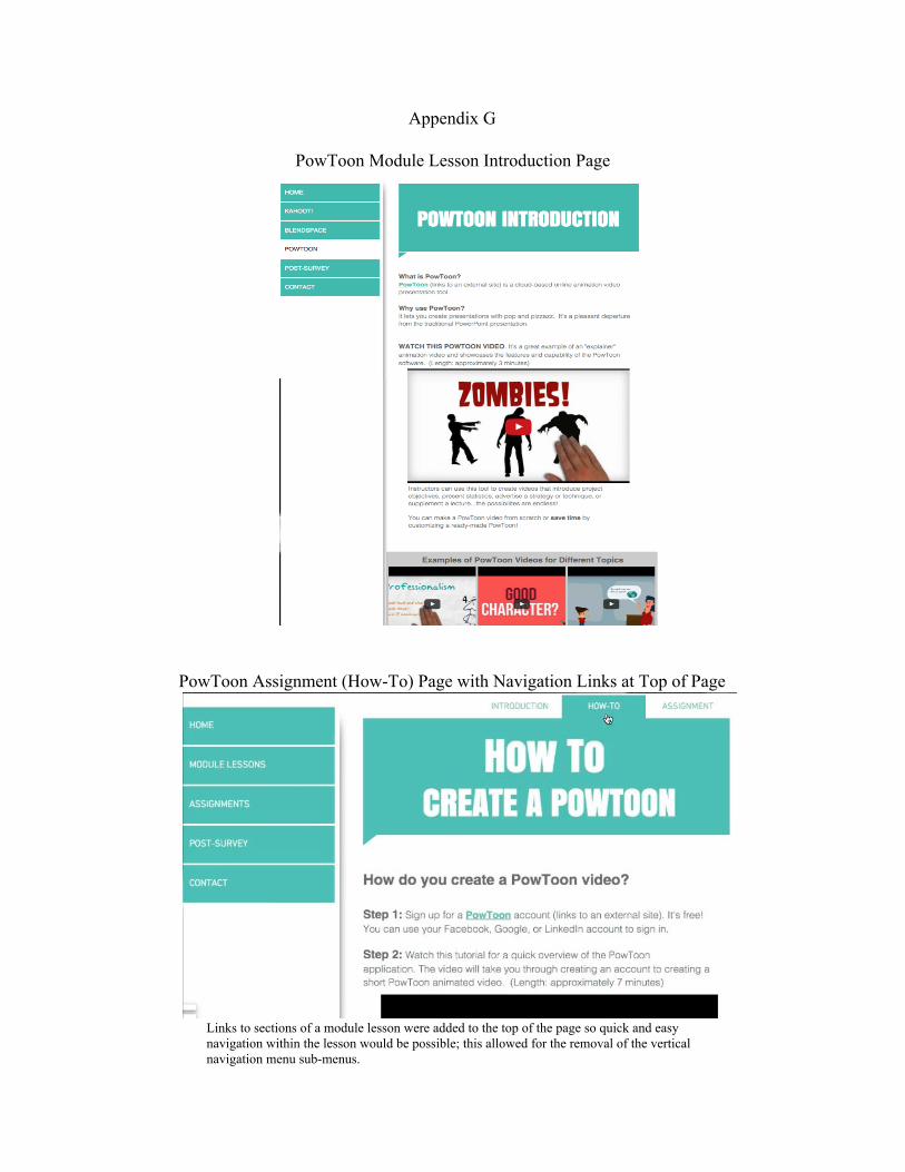
PowToon Module Lesson Introduction Page
PowToon Assignment (HowTo) Page with Navigation Links at Top of Page
Links to sections of a module lesson were added to the top of the page so quick and easy navigation within the lesson would be possible; this allowed for the removal of the vertical navigation menu submenus.
Appendix H
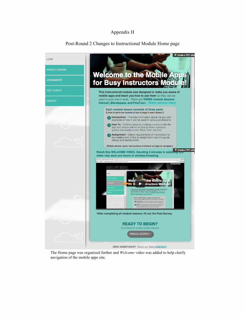
PostRound 2 Changes to Instructional Module Home page
The Home page was organized further and Welcome video was added to help clarify navigation of the mobile apps site.
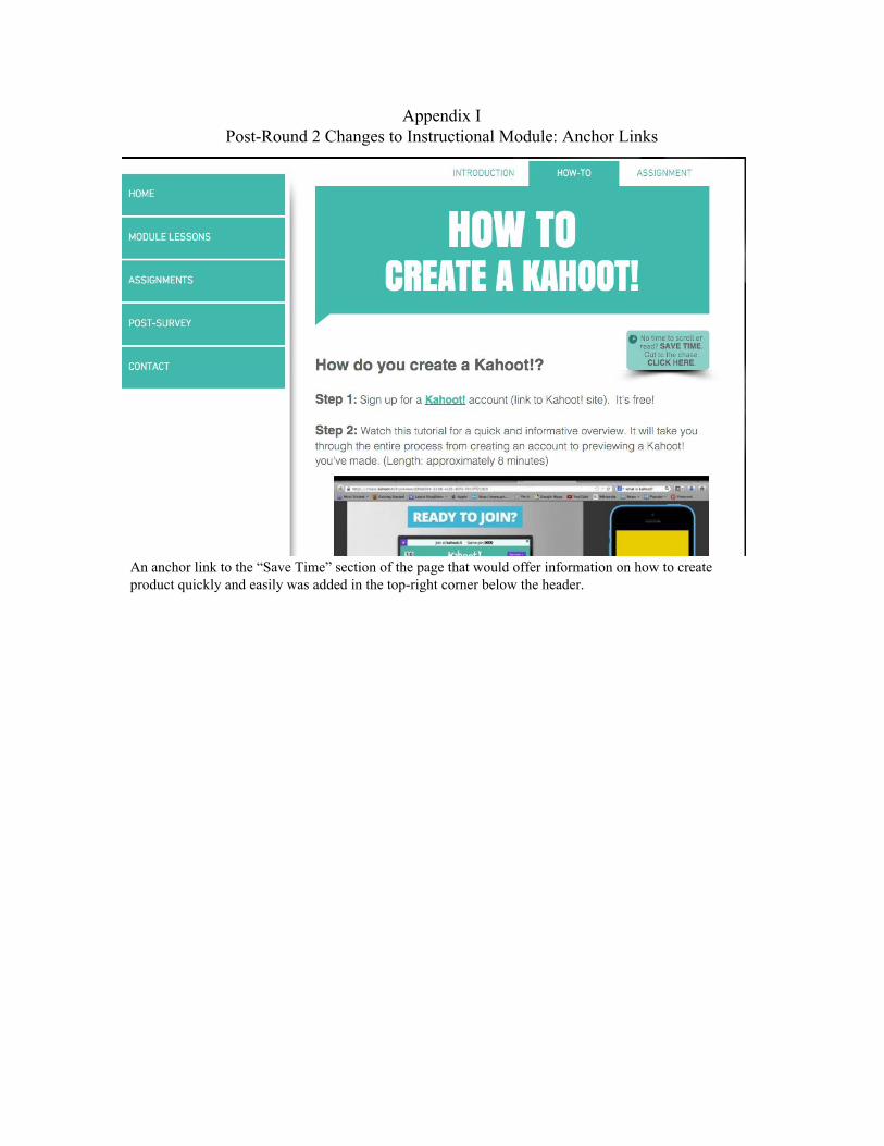
Appendix I PostRound 2 Changes to Instructional Module: Anchor Links
An anchor link to the “Save Time” section of the page that would offer information on how to create product quickly and easily was added in the topright corner below the header.