Embed Size (px)
Citation preview
VIDGA: A Visualization Interface for Detecting Gait Abnormalities inHumansSoheil Kianzad
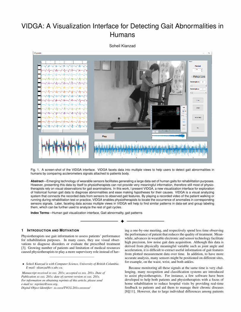
Fig. 1. A screen-shot of the VIDGA interface. VIDGA facets data into multiple views to help users to detect gait abnormalities inhumans by comparing acclerometers signals attached to patients body.
Abstract—Emerging technology of wearable sensors facilitates generating a large data-set of human gaits for rehabilitation purposes.However, presenting this data by itself to physiotherapists can not provide very meaningful information, therefore still most of physio-therapists rely on visual observations for gait examinations. In this work, I present VIDGA, a new visualization interface for explorationof historical human gait data to diagnose abnormalities and ease making hypotheses for their causes. VIDGA is a visual analyzingsystem that connects the recorded data from sensors to observed gait features. By playing a recorded video of the patient walking orrunning during rehabilitation test or practice, VIDGA enables physiotherapists to locate the occurrence of anomalies in correspondingsensors signals. Later, faceting data across multiple views in VIDGA will help to find similar patterns in data-set and group labelingthem, which can be further used to analyze the rest of gait cycles.
Index Terms—Human gait visualization interface, Gait abnormality, gait patterns
1 INTRODUCTION AND MOTIVATION
Physiotherapists use gait information to assess patients’ performancefor rehabilitation purposes. In many cases, they use visual obser-vations to diagnose disorders or evaluate the prescribed treatment[3]. Growing number of patients and limitation of medical resourcescaused physiotherapists to play a more supervisory role instead of hav-
• Soheil Kianzad is with Computer Science, University of British Columbia.E-mail: [email protected].
Manuscript received xx xxx. 201x; accepted xx xxx. 201x. Date ofPublication xx xxx. 201x; date of current version xx xxx. 201x.For information on obtaining reprints of this article, please sende-mail to: [email protected] Object Identifier: xx.xxxx/TVCG.201x.xxxxxxx/
ing a one-by-one meeting, and respectively spend less time observingthe performance of patient that reduces the quality of treatment. Mean-while, advances in wearable electronic and sensor technology facilitatehigh precision, low noise gait data acquisition. Although this data isderived from physically meaningful variable such as joint angle andacceleration, it is difficult to extract useful information of gait featuresfrom plotted measurement data over time. In addition, to have moreaccurate analysis, many sensors might be positioned on different sites,for example, on the waist, wrist, and both ankles.
Because monitoring all these signals at the same time is very chal-lenging, many recognition and classification systems are introducedto assist physiotherapists. For instance, a few software have beendeveloped to help both patients and physiotherapists with a focus ofhome rehabilitation to reduce hospital visits by providing real-timefeedback to patients and aid them to manage their chronic diseases[8][11]. However, due to large individual differences among patients
which are determined by weight, limb length, type of stroke or injury,rehabilitation stage, and habitual posture, further studies are needed toincrease the efficacy of these systems [9]. Consequently, my currentoptions are either to increase medical facilities and number of physio-therapists to satisfy the ongoing needs or improve the recognition andclassification systems. In this situation, a visualization interface—asis the focus of this project —can play a ”medium” role by connect-ing the specialist’s observation to a classification system. Therefore Ibenefit from physiotherapists knowledge, by involving them in label-ing the normal and abnormal data for each patient according to his/herconditions, and then the system can do the rest of process and detectanomalies. In this project, I introduce a new visualization interface toenable physiotherapists to detect anomalies in gait pattern by labelinga set of normal and abnormal behaviors and further visualizing themto monitor patients performance during the test or exercise.
2 RELATED WORK
2.1 Visualization of temporal dataMonitoring processes, verifying trends and predicting behaviors infuture are among the main challenges that scientists, engineers, andbusinessman are dealing with, which require analyzing data over thecourse of time. Visualization of temporal information has been exten-sively investigated and successfully used to address these problems.Survey papers on visualizing techniques of time-oriented data presentthe state of the art methods and categorize them with different prospec-tives. Aigner et al. [1] emphasis on visualization, analyze and taskchallenges of time-oriented data and provide a solution for differentcases. For visualization part, they grouped different methods based onorthogonal design dimensions such as linear vs cyclic, time point vstime intervals and ordered vs branching vs multiple perspectives.
Exploiting the conceptual space-time cube, Bach et al. [2] explainvarious visualization methods by means of applying series of elemen-tary operations. They break down this taxonomy of operations intofive main groups: Extraction, flattering, filling, geometry transforma-tion, and content transformation. These categorizations, however, aretoo broad and most often provide very general guidelines. Therefore,in order to have an effective visualization technique and benefit fromthe relevant studies, it is important to focus on natural characteristicsof time series data which in our case is the occurrence of frequent pat-terns in a quasi-periodic manner. Temporal event sequence is a widelyappearing problem in electronic medical records analysis [17] and afundamental challenge in data mining [14]. Lifelines2 [15] lets usersfind hidden temporal patterns in electronic health records by aligning,filtering and ranking the results in order to find a causal relationshipbetween events. For most of these techniques aligning similar patternsis the key to find similar records or to find the outliers.
On the other hand, Temporal data are normally large in term of anumber of data items. There are many different tools that help usersselect their patterns of interests and filter through all the time seriesdata. For example TimeSeracher 2 [4] which provide users with it-erative multivariate pattern searching or VizTree [12] for discoveringanomaly pattern and visually summarizing the structure of the data.By breaking down the data into labeled bins, VizTree employs a treestructure in which the frequency of patterns are encoded with thicknessso that infrequent or potentially anomalous patterns have thin paths.VidX [18] suggests using Marey’s graph for identification of abnor-malities in massive process control historical data. Users can label aset of normal processes and then the system can detect outliers basedon them using label propagation technique which is a semi-supervisedlearning algorithm. One thing which is common in all of these tech-niques is that they all use the interactive identification of anomalies.However, in many of the mentioned techniques either the data have asimple pattern, for example processing time on each station or they usecomputational transformation such as symbolic aggregate approxima-tion (SAX) to reduce the high dimensional data to a chain of characterbefore running data mining tasks.
One of the main goals of this project is to foster the process ofanomaly detection by providing group labeling of data without trans-forming it. The larger the labeled training data-set, the more accurate
the data mining and anomaly detection techniques will be.
2.2 Radial visualization for cyclic time-dataAmong different representations of serial time data, spiral and radiallayouts are considered to be effective for demonstrating periodic at-tributes of a dataset. These visualizations are mainly aiming for un-covering the previously known cyclic behavior of data. Detecting thisperiodic pattern can be supported by employing analytical methods orthrough user interaction with the system which relies on the humanperception of detecting periodic patterns. However, for many phe-nomena, some irregularity in periodicity makes the radial approachless efficient. One approach to solving this problem is to use an event-anchored model which suits periodic dataset with different duration[5]. One nontrivial challenge of this method is to detect the eventwhere period starts. However, resolving this problem is not the ulti-mate goal of this approach.
There are many studies on the benefits and drawbacks of radial vi-sualizations. Although they are useful for periodic displays and forsome aesthetic reasons, there are some limitations to them such as lowrendering performance, interactivity, and navigation problems and dif-ficulties in attaching detail information[7][6] compared to Cartesiancoordinates which impose a careful consideration in the case of usingthem.
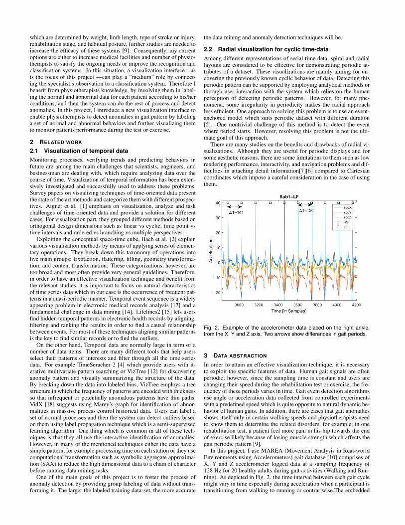
Fig. 2. Example of the accelerometer data placed on the right ankle,from the X, Y and Z axis. Two arrows show differences in gait periods.
3 DATA ABSTRACTION
In order to attain an effective visualization technique, it is necessaryto exploit the specific features of data. Human gait signals are oftenperiodic; however, since the sampling time is constant and users arechanging their speed during the rehabilitation test or exercise, the fre-quency of these periods varies in time. Gait event detection algorithmsuse angle or acceleration data collected from controlled experimentswith a predefined speed which is quite opposite to natural dynamic be-havior of human gaits. In addition, there are cases that gait anomaliesshows itself only in certain walking speeds and physiotherapists needto know them to determine the related disorders, for example, in onerehabilitation test, a patient feel more pain in his hip towards the endof exercise likely because of losing muscle strength which affects thegait periodic pattern [9].
In this project, I use MAREA (Movement Analysis in Real-worldEnvironments using Accelerometers) gait database [10] comprises ofX, Y and Z accelerometer logged data at a sampling frequency of128 Hz for 20 healthy adults during gait activities (Walking and Run-ning). As depicted in Fig. 2. the time interval between each gait cyclemight vary in time especially during acceleration when a participant istransitioning from walking to running or contrariwise.The embedded
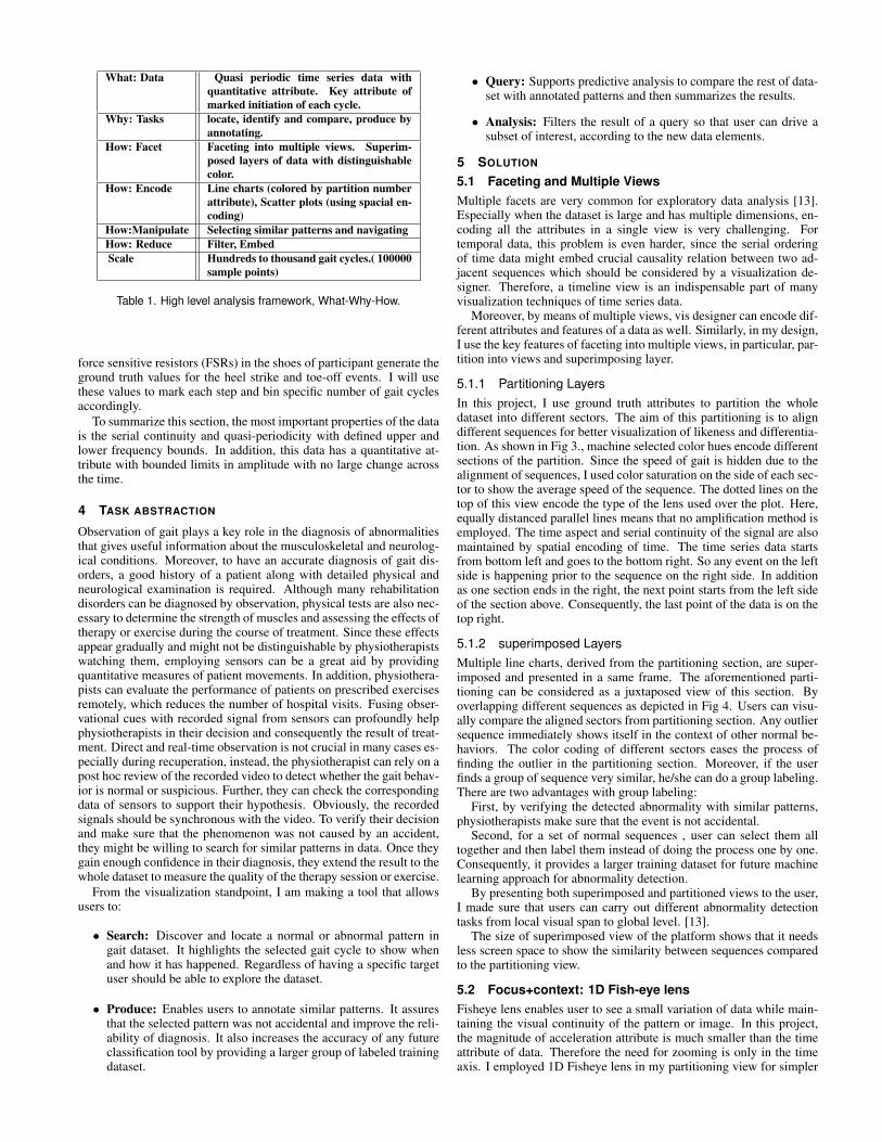
What: Data Quasi periodic time series data withquantitative attribute. Key attribute ofmarked initiation of each cycle.
Why: Tasks locate, identify and compare, produce byannotating.
How: Facet Faceting into multiple views. Superim-posed layers of data with distinguishablecolor.
How: Encode Line charts (colored by partition numberattribute), Scatter plots (using spacial en-coding)
How:Manipulate Selecting similar patterns and navigatingHow: Reduce Filter, EmbedScale Hundreds to thousand gait cycles.( 100000
sample points)
Table 1. High level analysis framework, What-Why-How.
force sensitive resistors (FSRs) in the shoes of participant generate theground truth values for the heel strike and toe-off events. I will usethese values to mark each step and bin specific number of gait cyclesaccordingly.
To summarize this section, the most important properties of the datais the serial continuity and quasi-periodicity with defined upper andlower frequency bounds. In addition, this data has a quantitative at-tribute with bounded limits in amplitude with no large change acrossthe time.
4 TASK ABSTRACTION
Observation of gait plays a key role in the diagnosis of abnormalitiesthat gives useful information about the musculoskeletal and neurolog-ical conditions. Moreover, to have an accurate diagnosis of gait dis-orders, a good history of a patient along with detailed physical andneurological examination is required. Although many rehabilitationdisorders can be diagnosed by observation, physical tests are also nec-essary to determine the strength of muscles and assessing the effects oftherapy or exercise during the course of treatment. Since these effectsappear gradually and might not be distinguishable by physiotherapistswatching them, employing sensors can be a great aid by providingquantitative measures of patient movements. In addition, physiothera-pists can evaluate the performance of patients on prescribed exercisesremotely, which reduces the number of hospital visits. Fusing obser-vational cues with recorded signal from sensors can profoundly helpphysiotherapists in their decision and consequently the result of treat-ment. Direct and real-time observation is not crucial in many cases es-pecially during recuperation, instead, the physiotherapist can rely on apost hoc review of the recorded video to detect whether the gait behav-ior is normal or suspicious. Further, they can check the correspondingdata of sensors to support their hypothesis. Obviously, the recordedsignals should be synchronous with the video. To verify their decisionand make sure that the phenomenon was not caused by an accident,they might be willing to search for similar patterns in data. Once theygain enough confidence in their diagnosis, they extend the result to thewhole dataset to measure the quality of the therapy session or exercise.
From the visualization standpoint, I am making a tool that allowsusers to:
• Search: Discover and locate a normal or abnormal pattern ingait dataset. It highlights the selected gait cycle to show whenand how it has happened. Regardless of having a specific targetuser should be able to explore the dataset.
• Produce: Enables users to annotate similar patterns. It assuresthat the selected pattern was not accidental and improve the reli-ability of diagnosis. It also increases the accuracy of any futureclassification tool by providing a larger group of labeled trainingdataset.
• Query: Supports predictive analysis to compare the rest of data-set with annotated patterns and then summarizes the results.
• Analysis: Filters the result of a query so that user can drive asubset of interest, according to the new data elements.
5 SOLUTION
5.1 Faceting and Multiple ViewsMultiple facets are very common for exploratory data analysis [13].Especially when the dataset is large and has multiple dimensions, en-coding all the attributes in a single view is very challenging. Fortemporal data, this problem is even harder, since the serial orderingof time data might embed crucial causality relation between two ad-jacent sequences which should be considered by a visualization de-signer. Therefore, a timeline view is an indispensable part of manyvisualization techniques of time series data.
Moreover, by means of multiple views, vis designer can encode dif-ferent attributes and features of a data as well. Similarly, in my design,I use the key features of faceting into multiple views, in particular, par-tition into views and superimposing layer.
5.1.1 Partitioning LayersIn this project, I use ground truth attributes to partition the wholedataset into different sectors. The aim of this partitioning is to aligndifferent sequences for better visualization of likeness and differentia-tion. As shown in Fig 3., machine selected color hues encode differentsections of the partition. Since the speed of gait is hidden due to thealignment of sequences, I used color saturation on the side of each sec-tor to show the average speed of the sequence. The dotted lines on thetop of this view encode the type of the lens used over the plot. Here,equally distanced parallel lines means that no amplification method isemployed. The time aspect and serial continuity of the signal are alsomaintained by spatial encoding of time. The time series data startsfrom bottom left and goes to the bottom right. So any event on the leftside is happening prior to the sequence on the right side. In additionas one section ends in the right, the next point starts from the left sideof the section above. Consequently, the last point of the data is on thetop right.
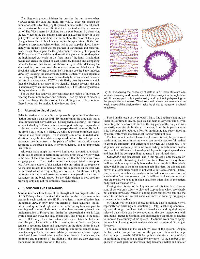
5.1.2 superimposed LayersMultiple line charts, derived from the partitioning section, are super-imposed and presented in a same frame. The aforementioned parti-tioning can be considered as a juxtaposed view of this section. Byoverlapping different sequences as depicted in Fig 4. Users can visu-ally compare the aligned sectors from partitioning section. Any outliersequence immediately shows itself in the context of other normal be-haviors. The color coding of different sectors eases the process offinding the outlier in the partitioning section. Moreover, if the userfinds a group of sequence very similar, he/she can do a group labeling.There are two advantages with group labeling:
First, by verifying the detected abnormality with similar patterns,physiotherapists make sure that the event is not accidental.
Second, for a set of normal sequences , user can select them alltogether and then label them instead of doing the process one by one.Consequently, it provides a larger training dataset for future machinelearning approach for abnormality detection.
By presenting both superimposed and partitioned views to the user,I made sure that users can carry out different abnormality detectiontasks from local visual span to global level. [13].
The size of superimposed view of the platform shows that it needsless screen space to show the similarity between sequences comparedto the partitioning view.
5.2 Focus+context: 1D Fish-eye lensFisheye lens enables user to see a small variation of data while main-taining the visual continuity of the pattern or image. In this project,the magnitude of acceleration attribute is much smaller than the timeattribute of data. Therefore the need for zooming is only in the timeaxis. I employed 1D Fisheye lens in my partitioning view for simpler
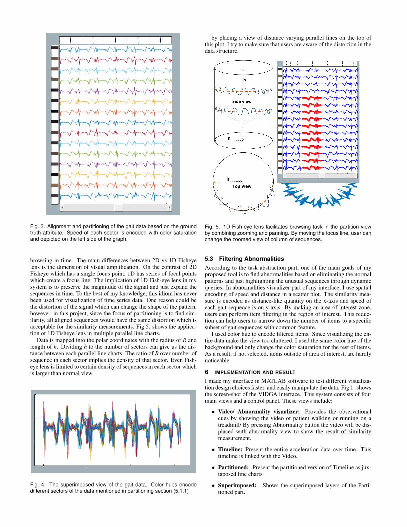
Fig. 3. Alignment and partitioning of the gait data based on the groundtruth attribute. Speed of each sector is encoded with color saturationand depicted on the left side of the graph.
browsing in time. The main differences between 2D vs 1D Fisheyelens is the dimension of visual amplification. On the contrast of 2DFisheye which has a single focus point, 1D has series of focal pointswhich create a focus line. The implication of 1D Fish-eye lens in mysystem is to preserve the magnitude of the signal and just expand thesequences in time. To the best of my knowledge, this idiom has neverbeen used for visualization of time series data. One reason could bethe distortion of the signal which can change the shape of the pattern,however, in this project, since the focus of partitioning is to find sim-ilarity, all aligned sequences would have the same distortion which isacceptable for the similarity measurements. Fig 5. shows the applica-tion of 1D Fisheye lens in multiple parallel line charts.
Data is mapped into the polar coordinates with the radius of R andlength of h. Dividing h to the number of sectors can give us the dis-tance between each parallel line charts. The ratio of R over number ofsequence in each sector implies the density of that sector. Even Fish-eye lens is limited to certain density of sequences in each sector whichis larger than normal view.
Fig. 4. The superimposed view of the gait data. Color hues encodedifferent sectors of the data mentioned in partitioning section (5.1.1)
by placing a view of distance varying parallel lines on the top ofthis plot, I try to make sure that users are aware of the distortion in thedata structure.
Fig. 5. 1D Fish-eye lens facilitates browsing task in the partition viewby combining zooming and panning. By moving the focus line, user canchange the zoomed view of column of sequences.
5.3 Filtering AbnormalitiesAccording to the task abstraction part, one of the main goals of myproposed tool is to find abnormalities based on eliminating the normalpatterns and just highlighting the unusual sequences through dynamicqueries. In abnormalities visualizer part of my interface, I use spatialencoding of speed and distance in a scatter plot. The similarity mea-sure is encoded as distance-like quantity on the x-axis and speed ofeach gait sequence is on y-axis. By making an area of interest zone,users can perform item filtering in the region of interest. This reduc-tion can help users to narrow down the number of items to a specificsubset of gait sequences with common feature.
I used color hue to encode filtered items. Since visualizing the en-tire data make the view too cluttered, I used the same color hue of thebackground and only change the color saturation for the rest of items.As a result, if not selected, items outside of area of interest, are hardlynoticeable.
6 IMPLEMENTATION AND RESULT
I made my interface in MATLAB software to test different visualiza-tion design choices faster, and easily manipulate the data. Fig 1. showsthe screen-shot of the VIDGA interface. This system consists of fourmain views and a control panel. These views include:
• Video/ Abnormality visualizer: Provides the observationalcues by showing the video of patient walking or running on atreadmill/ By pressing Abnormality button the video will be dis-placed with abnormality view to show the result of similaritymeasurement.
• Timeline: Present the entire acceleration data over time. Thistimeline is linked with the Video.
• Partitioned: Present the partitioned version of Timeline as jux-taposed line charts
• Superimposed: Shows the superimposed layers of the Parti-tioned part.
The diagnosis process initiates by pressing the run button whenVIDGA facets the data into multiform views. User can change thenumber of sectors by changing the period number in the control panel.Since the size of this view is limited, there is a trade-off between num-ber of The Video starts by clicking on the play button. By observingthe real video of the gait pattern users can analyze the behavior of thegait cycles. at the same time, on the Timline, the color of the signalchanges from blue to black according to the spent time. If the userobserves a suspicious behavior then, he/she can stop the video. Imme-diately the signal’s point will be marked in Partitioned and Superim-posed views. To compare the the gait sequence, user might employ the1D Fisheye lens. The sidebar underneath this plot can be used to placethe highlighted gait cycle in the focal line of the lens. In addition,he/she can check the speed of each sector by looking and comparingthe color hue of each sector. As shown in Fig 5. After detecting theabnormalities user can brush the selected items and label them. Tocheck the validity of the decision, he/she might use the Superimposedview. By Pressing the abnormality button, system will run Dynamictime warping (DTW) to check the similarity between labeled data andthe rest of gait sequences. DTW is a similarity quantity measure whichfinds the Euclidean distance of two signals.. Then it presents the datain abnormality visualizer as explained in 5.3. DTW is the only externallibrary used in VIDGA.
For the post hoc analysis user can select the region of interest, byentering the minimum speed and distance. Then by means of sidebarshe/she can change the dimension of the filtering zone. The results offiltered items will be marked in the timeline view.
6.1 Alternative visual designs
Helix is considered as an effective approach supporting intuitive nav-igation through a data set [16]. By transforming the time axis into athree-dimensional curve, data will be mapped into a spring-like formatas depicted in Fig 6. This structure can support both superimposed andpartitioned views depending on the perspective of the user. By look-ing from z axis to the x-y plane, we will see the superimposed layersformed in a circular shape. This is exactly similar to the radial visu-alization for cyclic time data as explained before. To make periodicsequences overlap correctly, the peach of helixs ring should changeaccording to the speed of gait. In my pilot design, I did not implementthis feature.
Although radial graph has its own limitations, the main drawbacksof this design appear in partitioning section. From the Z-x view whichis the side of the helix structure, we can see that the time axis formsa zigzag pattern. The tilted axes were not appreciated in my pilottest. A serious setback of this design is the mirroring of the sequence.As the axis rotates in a circular path, the sequences on the rear willbe mirrored which is very ambiguous to users. As shown in Fig 6the sequences on the red arrow are mirrored compared to the similarsequences on the black arrow. So the Helix design is best used forbrowsing only and not for similarity measurement.
7 DISCUSSION AND LIMITATIONS
Lessons Learned I think one of the strengths of this project is the useof 1D Fish-eye lens. I noticed that as the number of sequences in-creases in each partition, the 1D Fish-eye lens is more effective thanthe normal view, in providing fine details of each sequence. In ad-dition, sliding left and right can ease the browsing task compare tozooming and panning. I also realized that there are two options in theimplementation of Fisheye lens. In the first approach, the lens is fixedwhile a user can move the data dynamically and bring it to the focusline of 1D Fish-eye lens. For instance, if a user rotates the helix de-sign, the part of the helix which is coming to the front view (at thecenter) is becoming larger and sequences on the sides shrink in size.In the other approach, the lens is trucking, similar to camera move-ment technique, by the user to an arbitrary position with defined upperbound and lower bound when the data is stationary. In this case, theminimum and maximum of the sliding of the lens are also clear andusers know the exact location of the lens.
Fig. 6. Preserving the continuity of data in a 3D helix structure canfacilitate browsing and provide more intuitive navigation through data-set. It can support both superimposing and partitioning depending onthe perspective of the user. Tilted axes and mirrored sequence are theweaknesses of this design which make the similarity measurement hardto achieve.
Based on the result of my pilot test, I also find out that changing thelinear axis of time to any 3D path such as helix is very confusing. Evenpresenting the data from 2D such as the x-y plane or the z-y plane wasnot easily conceivable by them. However, from the implementationside, it reduces the required effort for partitioning and superimposingby a straightforward mathematical transformation of data.
The last but not the least lesson that I learned is that, the juxtaposedpartitioning and superimposing views can provide a powerful methodto compare similarity and differences between gait sequences. Thealignment and especially the same color coding in both views, enableusers to find differences of overlapped layers in superimposed viewand then find the corresponding sequence in partitioned view.
Limitations The dataset that I use in this project is only the acceler-ation in the z-direction of right ankle over time. However, many abnor-malities might not appear only in one data for example in Hemiplegicgait, which is one of the most common gait disorders, the affected gaitmoves in a semi circle which is not visible in Z acceleration. There-fore, a more comprehensive analysis is needed on other dimensions ofacceleration from one sensor (x, y). In addition, to have a more accu-rate diagnosis, we need to include data from other sites of the patientbody such as waist or wrist.
Playing video is one of the key features of this interface. Currentcontrol system only offers to play and stop options which are clearlynot enough, however, instead of adding more buttons we can link thevideo to the timeline so that users can move in time by dragging acourser on the timeline.
MATLAB was not a good choice for linking data in multiple views,especially for brushing and annotating. Only in labeling abnormal-ity, and filtering, I implemented the shared view and highlighting ofselected data which can be extended to all the user interactions withdata items. Better recognition and classification algorithm is neededto improve the accuracy of the system. One future work can be apply-ing machine learning to gait analysis data and diagnose different gaitdeceases.
The last limitation is the scalability issue of the system. Despitethe fact that it can perform well on the predefined task on the largedataset (approximately, 100000 data points), the visualization of datain partitioning section is not effective anymore. As the number of se-quences in each partition increases, they become smaller and smaller
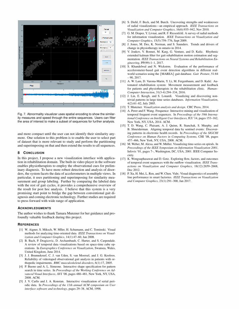
Fig. 7. Abnormality visualizer uses spatial encoding to show the similar-ity measures and speed through the entire sequences. Users can filterthe area of interest to make a subset of sequences for further analysis.
and more compact until the user can not identify their similarity any-more. One solution to this problem is to enable the user to select partof dataset that is more relevant to study and perform the partitioningand superimposing on that and then extend the results to all sequences.
8 CONCLUSION
In this project, I propose a new visualization interface with applica-tion in rehabilitation domain. The built-in video player in the softwareenables physiotherapists to employ the observational cues for prelim-inary diagnosis. To have more robust detection and analysis of disor-ders, the system facets the data of accelerometers in multiple views. Inparticular, it uses partitioning and superimposing for similarity mea-surement and group labeling. Further by comparing the labeled datawith the rest of gait cycles, it provides a comprehensive overview ofthe result for post hoc analysis. I believe that this system is a verypromising start point to bridge the gap between conventional gait di-agnosis and coming electronic technology. Further studies are requiredto press forward with wide range of application.
ACKNOWLEDGMENTS
The author wishes to thank Tamara Munzner for her guidance and pro-foundly valuable feedback during this project.
REFERENCES
[1] W. Aigner, S. Miksch, W. Mller, H. Schumann, and C. Tominski. Visualmethods for analyzing time-oriented data. IEEE Transactions on Visual-ization and Computer Graphics, 14(1):47–60, Jan 2008.
[2] B. Bach, P. Dragicevic, D. Archambault, C. Hurter, and S. Carpendale.A review of temporal data visualizations based on space-time cube op-erations. In Eurographics Conference on Visualization, Swansea, Wales,United Kingdom, June 2014.
[3] J. J. Brunnekreef, C. J. van Uden, S. van Moorsel, and J. G. Kooloos.Reliability of videotaped observational gait analysis in patients with or-thopedic impairments. BMC musculoskeletal disorders, 6(1):17, 2005.
[4] P. Buono and A. L. Simeone. Interactive shape specification for patternsearch in time series. In Proceedings of the Working Conference on Ad-vanced Visual Interfaces, AVI ’08, pages 480–481, New York, NY, USA,2008. ACM.
[5] J. V. Carlis and J. A. Konstan. Interactive visualization of serial peri-odic data. In Proceedings of the 11th annual ACM symposium on Userinterface software and technology, pages 29–38. ACM, 1998.
[6] S. Diehl, F. Beck, and M. Burch. Uncovering strengths and weaknessesof radial visualizations—an empirical approach. IEEE Transactions onVisualization and Computer Graphics, 16(6):935–942, Nov 2010.
[7] G. M. Draper, Y. Livnat, and R. F. Riesenfeld. A survey of radial methodsfor information visualization. IEEE Transactions on Visualization andComputer Graphics, 15(5):759–776, Sept 2009.
[8] J. Jones, M. Des, K. Norman, and S. Saunders. Trends and drivers ofchange in physiotherapy in ontario in 2014.
[9] V. Joukov, V. Bonnet, M. Karg, G. Venture, and D. Kulic. Rhythmicextended kalman filter for gait rehabilitation motion estimation and seg-mentation. IEEE Transactions on Neural Systems and Rehabilitation En-gineering, PP(99):1–1, 2017.
[10] S. Khandelwal and N. Wickstrm. Evaluation of the performance ofaccelerometer-based gait event detection algorithms in different real-world scenarios using the {MAREA} gait database. Gait Posture, 51:84– 90, 2017.
[11] A. W. Lam, D. Varona-Marin, Y. Li, M. Fergenbaum, and D. Kulic. Au-tomated rehabilitation system: Movement measurement and feedbackfor patients and physiotherapists in the rehabilitation clinic. Human–Computer Interaction, 31(3-4):294–334, 2016.
[12] J. Lin, E. Keogh, and S. Lonardi. Visualizing and discovering non-trivial patterns in large time series databases. Information Visualization,4(2):61–82, July 2005.
[13] T. Munzner. Visualization analysis and design. CRC Press, 2014.[14] A. Perer and F. Wang. Frequence: Interactive mining and visualization of
temporal frequent event sequences. In Proceedings of the 19th Interna-tional Conference on Intelligent User Interfaces, IUI ’14, pages 153–162,New York, NY, USA, 2014. ACM.
[15] T. D. Wang, C. Plaisant, A. J. Quinn, R. Stanchak, S. Murphy, andB. Shneiderman. Aligning temporal data by sentinel events: Discover-ing patterns in electronic health records. In Proceedings of the SIGCHIConference on Human Factors in Computing Systems, CHI ’08, pages457–466, New York, NY, USA, 2008. ACM.
[16] M. Weber, M. Alexa, and W. Muller. Visualizing time-series on spirals. InProceedings of the IEEE Symposium on Information Visualization 2001,Infovis ’01, pages 7–, Washington, DC, USA, 2001. IEEE Computer So-ciety.
[17] K. Wongsuphasawat and D. Gotz. Exploring flow, factors, and outcomesof temporal event sequences with the outflow visualization. IEEE Trans-actions on Visualization and Computer Graphics, 18(12):2659–2668,Dec 2012.
[18] P. Xu, H. Mei, L. Ren, and W. Chen. Vidx: Visual diagnostics of assemblyline performance in smart factories. IEEE Transactions on Visualizationand Computer Graphics, 23(1):291–300, Jan 2017.