Embed Size (px)
Citation preview

Why is the Shiller CAPE So High?15
Alternative Investment Analyst Review • Spring 2015
What a CAIA Member Should Know What a CAIA Member Should Know, continued
Why is the Shiller CAPE So High?
www.philosophicaleconomics.com
Research ReviewCAIA Member ContributionCAIA Member ContributionWhat a CAIA Member Should Know
What a CAIA Member Should Know
16Alternative Investment Analyst Review Why is the Shiller CAPE So High?
What a CAIA Member Should Know What a CAIA Member Should Know, continued
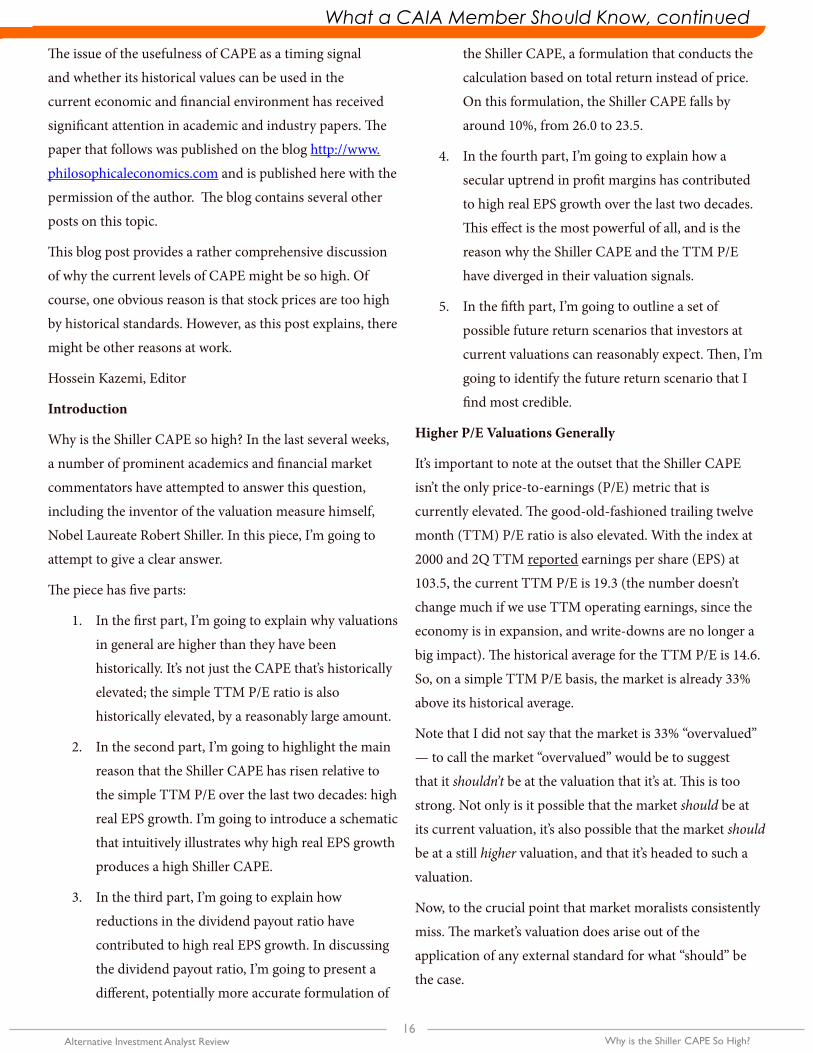
The issue of the usefulness of CAPE as a timing signal
and whether its historical values can be used in the
current economic and financial environment has received
significant attention in academic and industry papers. The
paper that follows was published on the blog http://www.
philosophicaleconomics.com and is published here with the
permission of the author. The blog contains several other
posts on this topic.
This blog post provides a rather comprehensive discussion
of why the current levels of CAPE might be so high. Of
course, one obvious reason is that stock prices are too high
by historical standards. However, as this post explains, there
might be other reasons at work.
Hossein Kazemi, Editor
Introduction
Why is the Shiller CAPE so high? In the last several weeks,
a number of prominent academics and financial market
commentators have attempted to answer this question,
including the inventor of the valuation measure himself,
Nobel Laureate Robert Shiller. In this piece, I’m going to
attempt to give a clear answer.
The piece has five parts:
1. In the first part, I’m going to explain why valuations
in general are higher than they have been
historically. It’s not just the CAPE that’s historically
elevated; the simple TTM P/E ratio is also
historically elevated, by a reasonably large amount.
2. In the second part, I’m going to highlight the main
reason that the Shiller CAPE has risen relative to
the simple TTM P/E over the last two decades: high
real EPS growth. I’m going to introduce a schematic
that intuitively illustrates why high real EPS growth
produces a high Shiller CAPE.
3. In the third part, I’m going to explain how
reductions in the dividend payout ratio have
contributed to high real EPS growth. In discussing
the dividend payout ratio, I’m going to present a
different, potentially more accurate formulation of
the Shiller CAPE, a formulation that conducts the
calculation based on total return instead of price.
On this formulation, the Shiller CAPE falls by
around 10%, from 26.0 to 23.5.
4. In the fourth part, I’m going to explain how a
secular uptrend in profit margins has contributed
to high real EPS growth over the last two decades.
This effect is the most powerful of all, and is the
reason why the Shiller CAPE and the TTM P/E
have diverged in their valuation signals.
5. In the fifth part, I’m going to outline a set of
possible future return scenarios that investors at
current valuations can reasonably expect. Then, I’m
going to identify the future return scenario that I
find most credible.
Higher P/E Valuations Generally
It’s important to note at the outset that the Shiller CAPE
isn’t the only price-to-earnings (P/E) metric that is
currently elevated. The good-old-fashioned trailing twelve
month (TTM) P/E ratio is also elevated. With the index at
2000 and 2Q TTM reported earnings per share (EPS) at
103.5, the current TTM P/E is 19.3 (the number doesn’t
change much if we use TTM operating earnings, since the
economy is in expansion, and write-downs are no longer a
big impact). The historical average for the TTM P/E is 14.6.
So, on a simple TTM P/E basis, the market is already 33%
above its historical average.
Note that I did not say that the market is 33% “overvalued”
— to call the market “overvalued” would be to suggest
that it shouldn’t be at the valuation that it’s at. This is too
strong. Not only is it possible that the market should be at
its current valuation, it’s also possible that the market should
be at a still higher valuation, and that it’s headed to such a
valuation.
Now, to the crucial point that market moralists consistently
miss. The market’s valuation does arise out of the
application of any external standard for what “should” be
the case.
Why is the Shiller CAPE So High?17
Alternative Investment Analyst Review • Spring 2015
What a CAIA Member Should Know What a CAIA Member Should Know, continued
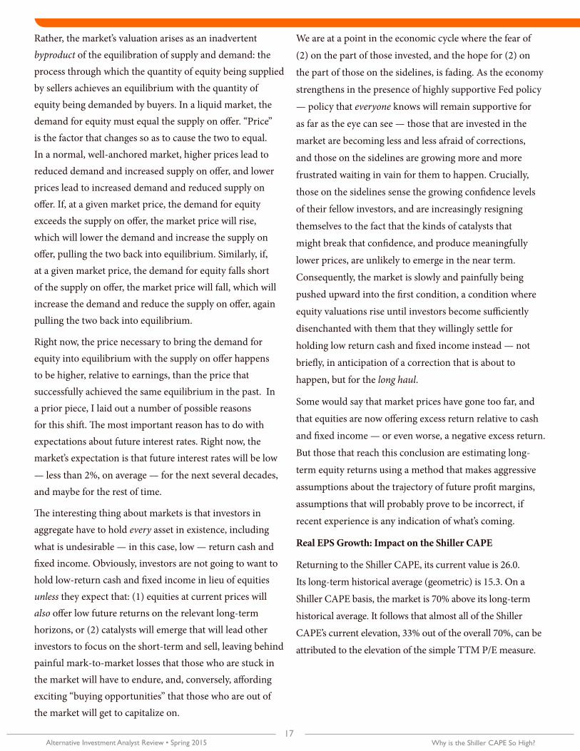
Rather, the market’s valuation arises as an inadvertent byproduct of the equilibration of supply and demand: the process through which the quantity of equity being supplied by sellers achieves an equilibrium with the quantity of equity being demanded by buyers. In a liquid market, the demand for equity must equal the supply on offer. “Price” is the factor that changes so as to cause the two to equal. In a normal, well-anchored market, higher prices lead to reduced demand and increased supply on offer, and lower prices lead to increased demand and reduced supply on offer. If, at a given market price, the demand for equity exceeds the supply on offer, the market price will rise, which will lower the demand and increase the supply on offer, pulling the two back into equilibrium. Similarly, if, at a given market price, the demand for equity falls short of the supply on offer, the market price will fall, which will increase the demand and reduce the supply on offer, again pulling the two back into equilibrium.
Right now, the price necessary to bring the demand for equity into equilibrium with the supply on offer happens to be higher, relative to earnings, than the price that successfully achieved the same equilibrium in the past. In a prior piece, I laid out a number of possible reasons for this shift. The most important reason has to do with expectations about future interest rates. Right now, the market’s expectation is that future interest rates will be low
— less than 2%, on average — for the next several decades, and maybe for the rest of time.
The interesting thing about markets is that investors in aggregate have to hold every asset in existence, including
what is undesirable — in this case, low — return cash and fixed income. Obviously, investors are not going to want to hold low-return cash and fixed income in lieu of equities unless they expect that: (1) equities at current prices will also offer low future returns on the relevant long-term horizons, or (2) catalysts will emerge that will lead other investors to focus on the short-term and sell, leaving behind painful mark-to-market losses that those who are stuck in the market will have to endure, and, conversely, affording exciting “buying opportunities” that those who are out of the market will get to capitalize on.
We are at a point in the economic cycle where the fear of
(2) on the part of those invested, and the hope for (2) on
the part of those on the sidelines, is fading. As the economy
strengthens in the presence of highly supportive Fed policy
— policy that everyone knows will remain supportive for
as far as the eye can see — those that are invested in the
market are becoming less and less afraid of corrections,
and those on the sidelines are growing more and more
frustrated waiting in vain for them to happen. Crucially,
those on the sidelines sense the growing confidence levels
of their fellow investors, and are increasingly resigning
themselves to the fact that the kinds of catalysts that
might break that confidence, and produce meaningfully
lower prices, are unlikely to emerge in the near term.
Consequently, the market is slowly and painfully being
pushed upward into the first condition, a condition where
equity valuations rise until investors become sufficiently
disenchanted with them that they willingly settle for
holding low return cash and fixed income instead — not
briefly, in anticipation of a correction that is about to
happen, but for the long haul.
Some would say that market prices have gone too far, and
that equities are now offering excess return relative to cash
and fixed income — or even worse, a negative excess return.
But those that reach this conclusion are estimating long-
term equity returns using a method that makes aggressive
assumptions about the trajectory of future profit margins,
assumptions that will probably prove to be incorrect, if
recent experience is any indication of what’s coming.
Real EPS Growth: Impact on the Shiller CAPE
Returning to the Shiller CAPE, its current value is 26.0.
Its long-term historical average (geometric) is 15.3. On a
Shiller CAPE basis, the market is 70% above its long-term
historical average. It follows that almost all of the Shiller
CAPE’s current elevation, 33% out of the overall 70%, can be
attributed to the elevation of the simple TTM P/E measure.
18Alternative Investment Analyst Review Why is the Shiller CAPE So High?
What a CAIA Member Should Know What a CAIA Member Should Know, continued
This fact usually gets missed in discussions about the CAPE
because market participants tend to analyze the market’s
valuation in terms of forward earnings estimates. On the
most recent estimates for year-end 2015, the market’s P/E is
15.1, a number almost perfectly in-line with the historical
average. But this number is pure fantasy.
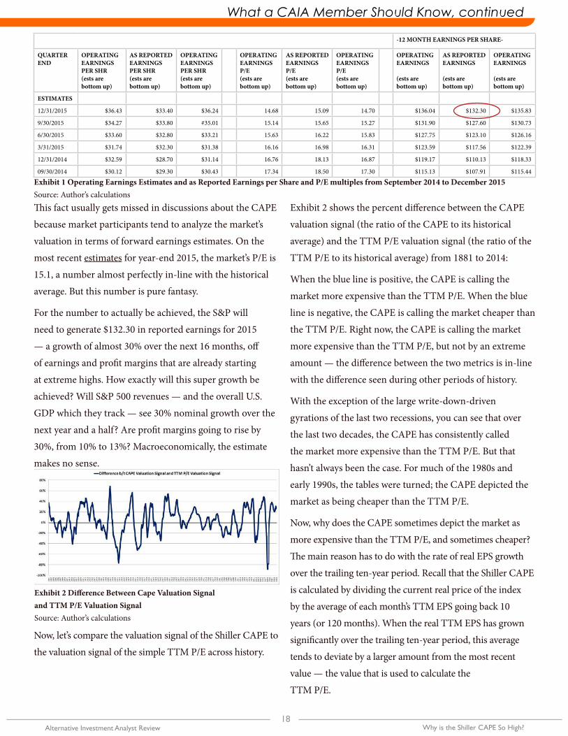
For the number to actually be achieved, the S&P will
need to generate $132.30 in reported earnings for 2015
— a growth of almost 30% over the next 16 months, off
of earnings and profit margins that are already starting
at extreme highs. How exactly will this super growth be
achieved? Will S&P 500 revenues — and the overall U.S.
GDP which they track — see 30% nominal growth over the
next year and a half? Are profit margins going to rise by
30%, from 10% to 13%? Macroeconomically, the estimate
makes no sense.
Now, let’s compare the valuation signal of the Shiller CAPE to
the valuation signal of the simple TTM P/E across history.
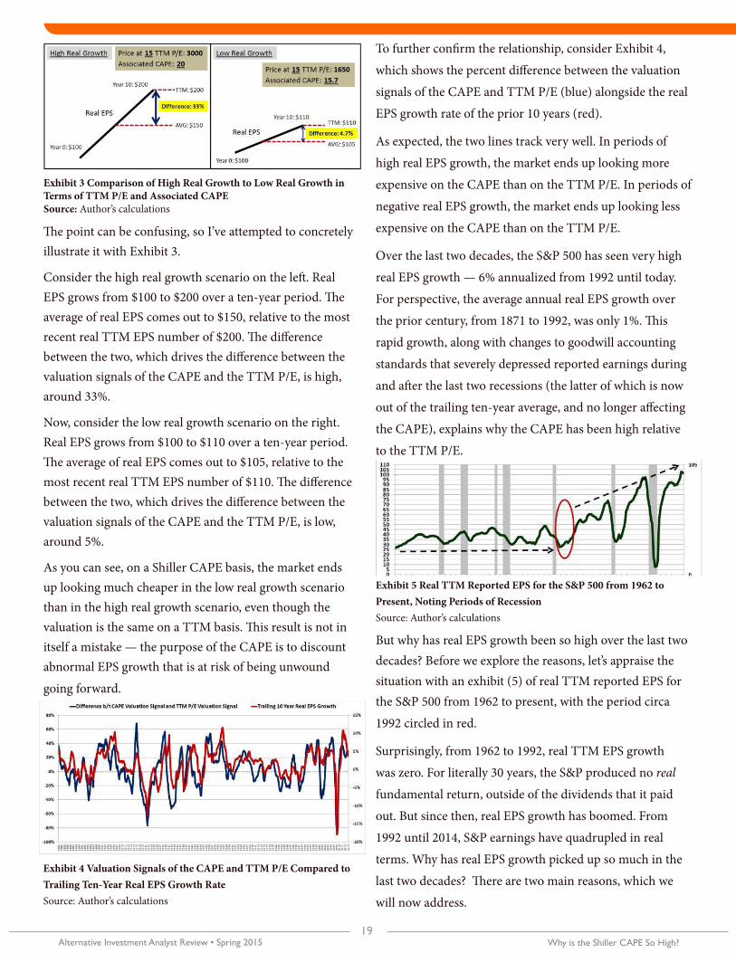
Exhibit 2 shows the percent difference between the CAPE
valuation signal (the ratio of the CAPE to its historical
average) and the TTM P/E valuation signal (the ratio of the
TTM P/E to its historical average) from 1881 to 2014:
When the blue line is positive, the CAPE is calling the
market more expensive than the TTM P/E. When the blue
line is negative, the CAPE is calling the market cheaper than
the TTM P/E. Right now, the CAPE is calling the market
more expensive than the TTM P/E, but not by an extreme
amount — the difference between the two metrics is in-line
with the difference seen during other periods of history.
With the exception of the large write-down-driven
gyrations of the last two recessions, you can see that over
the last two decades, the CAPE has consistently called
the market more expensive than the TTM P/E. But that
hasn’t always been the case. For much of the 1980s and
early 1990s, the tables were turned; the CAPE depicted the
market as being cheaper than the TTM P/E.
Now, why does the CAPE sometimes depict the market as
more expensive than the TTM P/E, and sometimes cheaper?
The main reason has to do with the rate of real EPS growth
over the trailing ten-year period. Recall that the Shiller CAPE
is calculated by dividing the current real price of the index
by the average of each month’s TTM EPS going back 10
years (or 120 months). When the real TTM EPS has grown
significantly over the trailing ten-year period, this average
tends to deviate by a larger amount from the most recent
value — the value that is used to calculate the
TTM P/E.
-12 MONTH EARNINGS PER SHARE-
QUARTER END
OPERATING EARNINGS PER SHR(ests are bottom up)
AS REPORTED EARNINGS PER SHR(ests are bottom up)
OPERATING EARNINGS PER SHR(ests are bottom up)
OPERATING EARNINGS P/E(ests are bottom up)
AS REPORTED EARNINGS P/E(ests are bottom up)
OPERATING EARNINGS P/E(ests are bottom up)
OPERATING EARNINGS
(ests are bottom up)
AS REPORTED EARNINGS
(ests are bottom up)
OPERATING EARNINGS
(ests are bottom up)
ESTIMATES
12/31/2015 $36.43 $33.40 $36.24 14.68 15.09 14.70 $136.04 $132.30 $135.83
9/30/2015 $34.27 $33.80 #35.01 15.14 15.65 15.27 $131.90 $127.60 $130.73
6/30/2015 $33.60 $32.80 $33.21 15.63 16.22 15.83 $127.75 $123.10 $126.16
3/31/2015 $31.74 $32.30 $31.38 16.16 16.98 16.31 $123.59 $117.56 $122.39
12/31/2014 $32.59 $28.70 $31.14 16.76 18.13 16.87 $119.17 $110.13 $118.33
09/30/2014 $30.12 $29.30 $30.43 17.34 18.50 17.30 $115.13 $107.91 $115.44
Exhibit 1 Operating Earnings Estimates and as Reported Earnings per Share and P/E multiples from September 2014 to December 2015Source: Author’s calculations
Exhibit 2 Difference Between Cape Valuation Signal and TTM P/E Valuation SignalSource: Author’s calculations
Why is the Shiller CAPE So High?19
Alternative Investment Analyst Review • Spring 2015
What a CAIA Member Should Know What a CAIA Member Should Know, continued
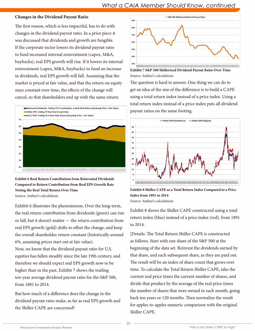
The point can be confusing, so I’ve attempted to concretely illustrate it with Exhibit 3.
Consider the high real growth scenario on the left. Real EPS grows from $100 to $200 over a ten-year period. The average of real EPS comes out to $150, relative to the most recent real TTM EPS number of $200. The difference between the two, which drives the difference between the valuation signals of the CAPE and the TTM P/E, is high, around 33%.
Now, consider the low real growth scenario on the right. Real EPS grows from $100 to $110 over a ten-year period. The average of real EPS comes out to $105, relative to the most recent real TTM EPS number of $110. The difference between the two, which drives the difference between the valuation signals of the CAPE and the TTM P/E, is low, around 5%.
As you can see, on a Shiller CAPE basis, the market ends up looking much cheaper in the low real growth scenario than in the high real growth scenario, even though the valuation is the same on a TTM basis. This result is not in itself a mistake — the purpose of the CAPE is to discount abnormal EPS growth that is at risk of being unwound
going forward.
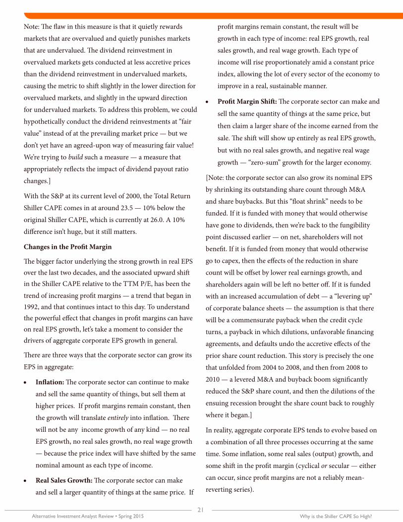
To further confirm the relationship, consider Exhibit 4,
which shows the percent difference between the valuation
signals of the CAPE and TTM P/E (blue) alongside the real
EPS growth rate of the prior 10 years (red).
As expected, the two lines track very well. In periods of
high real EPS growth, the market ends up looking more
expensive on the CAPE than on the TTM P/E. In periods of
negative real EPS growth, the market ends up looking less
expensive on the CAPE than on the TTM P/E.
Over the last two decades, the S&P 500 has seen very high
real EPS growth — 6% annualized from 1992 until today.
For perspective, the average annual real EPS growth over
the prior century, from 1871 to 1992, was only 1%. This
rapid growth, along with changes to goodwill accounting
standards that severely depressed reported earnings during
and after the last two recessions (the latter of which is now
out of the trailing ten-year average, and no longer affecting
the CAPE), explains why the CAPE has been high relative
to the TTM P/E.
But why has real EPS growth been so high over the last two decades? Before we explore the reasons, let’s appraise the situation with an exhibit (5) of real TTM reported EPS for the S&P 500 from 1962 to present, with the period circa
1992 circled in red.
Surprisingly, from 1962 to 1992, real TTM EPS growth
was zero. For literally 30 years, the S&P produced no real
fundamental return, outside of the dividends that it paid
out. But since then, real EPS growth has boomed. From
1992 until 2014, S&P earnings have quadrupled in real
terms. Why has real EPS growth picked up so much in the
last two decades? There are two main reasons, which we
will now address.
Exhibit 4 Valuation Signals of the CAPE and TTM P/E Compared to Trailing Ten-Year Real EPS Growth Rate Source: Author’s calculations
Exhibit 5 Real TTM Reported EPS for the S&P 500 from 1962 to Present, Noting Periods of RecessionSource: Author’s calculations
Exhibit 3 Comparison of High Real Growth to Low Real Growth in Terms of TTM P/E and Associated CAPESource: Author’s calculations
20Alternative Investment Analyst Review Why is the Shiller CAPE So High?
What a CAIA Member Should Know What a CAIA Member Should Know, continued
Changes in the Dividend Payout Ratio
The first reason, which is less impactful, has to do with changes in the dividend payout ratio. In a prior piece it was discussed that dividends and growth are fungible. If the corporate sector lowers its dividend payout ratio to fund increased internal reinvestment (capex, M&A, buybacks), real EPS growth will rise. If it lowers its internal reinvestment (capex, M&A, buybacks) to fund an increase in dividends, real EPS growth will fall. Assuming that the market is priced at fair value, and that the return on equity stays constant over time, the effects of the change will cancel, so that shareholders end up with the same return.
Exhibit 6 illustrates the phenomenon. Over the long-term, the real return contribution from dividends (green) can rise
or fall, but it doesn’t matter — the return contribution from real EPS growth (gold) shifts to offset the change, and keep the overall shareholder return constant (historically around 6%, assuming prices start out at fair value).Now, we know that the dividend payout ratio for U.S. equities has fallen steadily since the late 19th century, and therefore we should expect real EPS growth now to be higher than in the past. Exhibit 7 shows the trailing ten-year average dividend payout ratio for the S&P 500, from 1881 to 2014.
But how much of a difference does the change in the dividend payout ratio make, as far as real EPS growth and the Shiller CAPE are concerned?
The question is hard to answer. One thing we can do to get an idea of the size of the difference is to build a CAPE using a total return index instead of a price index. Using a total return index instead of a price index puts all dividend payout ratios on the same footing.
Exhibit 8 shows the Shiller CAPE constructed using a total return index (blue) instead of a price index (red), from 1891 to 2014.
[Details: The Total Return Shiller CAPE is constructed as follows. Start with one share of the S&P 500 at the beginning of the data set. Reinvest the dividends earned by that share, and each subsequent share, as they are paid out. The result will be an index of share count that grows over time. To calculate the Total Return Shiller CAPE, take the current real price times the current number of shares, and divide that product by the average of the real price times the number of shares that were owned in each month, going back ten years or 120 months. Then normalize the result for apples-to-apples numeric comparison with the original Shiller CAPE.
Exhibit 6 Real Return Contribution from Reinvested Dividends Compared to Return Contribution from Real EPS Growth Rate Noting the Real Total Return Over TimeSource: Author’s calculations
Exhibit 8 Shiller CAPE as a Total Return Index Compared to a Price Index from 1891 to 2014Source: Author’s calculations
Exhibit 7 S&P 500 Shillerized Dividend Payout Ratio Over TimeSource: Author’s calculations
Why is the Shiller CAPE So High?21
Alternative Investment Analyst Review • Spring 2015
What a CAIA Member Should Know What a CAIA Member Should Know, continued
Note: The flaw in this measure is that it quietly rewards
markets that are overvalued and quietly punishes markets
that are undervalued. The dividend reinvestment in
overvalued markets gets conducted at less accretive prices
than the dividend reinvestment in undervalued markets,
causing the metric to shift slightly in the lower direction for
overvalued markets, and slightly in the upward direction
for undervalued markets. To address this problem, we could
hypothetically conduct the dividend reinvestments at “fair
value” instead of at the prevailing market price — but we
don’t yet have an agreed-upon way of measuring fair value!
We’re trying to build such a measure — a measure that
appropriately reflects the impact of dividend payout ratio
changes.]
With the S&P at its current level of 2000, the Total Return
Shiller CAPE comes in at around 23.5 — 10% below the
original Shiller CAPE, which is currently at 26.0. A 10%
difference isn’t huge, but it still matters.
Changes in the Profit Margin
The bigger factor underlying the strong growth in real EPS over the last two decades, and the associated upward shift in the Shiller CAPE relative to the TTM P/E, has been the
trend of increasing profit margins — a trend that began in 1992, and that continues intact to this day. To understand the powerful effect that changes in profit margins can have on real EPS growth, let’s take a moment to consider the drivers of aggregate corporate EPS growth in general.
There are three ways that the corporate sector can grow its
EPS in aggregate:
• Inflation: The corporate sector can continue to make
and sell the same quantity of things, but sell them at
higher prices. If profit margins remain constant, then
the growth will translate entirely into inflation. There
will not be any income growth of any kind — no real
EPS growth, no real sales growth, no real wage growth
— because the price index will have shifted by the same
nominal amount as each type of income.
• Real Sales Growth: The corporate sector can make
and sell a larger quantity of things at the same price. If
profit margins remain constant, the result will be
growth in each type of income: real EPS growth, real
sales growth, and real wage growth. Each type of
income will rise proportionately amid a constant price
index, allowing the lot of every sector of the economy to
improve in a real, sustainable manner.
• Profit Margin Shift: The corporate sector can make and
sell the same quantity of things at the same price, but
then claim a larger share of the income earned from the
sale. The shift will show up entirely as real EPS growth,
but with no real sales growth, and negative real wage
growth — “zero-sum” growth for the larger economy.
[Note: the corporate sector can also grow its nominal EPS
by shrinking its outstanding share count through M&A
and share buybacks. But this “float shrink” needs to be
funded. If it is funded with money that would otherwise
have gone to dividends, then we’re back to the fungibility
point discussed earlier — on net, shareholders will not
benefit. If it is funded from money that would otherwise
go to capex, then the effects of the reduction in share
count will be offset by lower real earnings growth, and
shareholders again will be left no better off. If it is funded
with an increased accumulation of debt — a “levering up”
of corporate balance sheets — the assumption is that there
will be a commensurate payback when the credit cycle
turns, a payback in which dilutions, unfavorable financing
agreements, and defaults undo the accretive effects of the
prior share count reduction. This story is precisely the one
that unfolded from 2004 to 2008, and then from 2008 to
2010 — a levered M&A and buyback boom significantly
reduced the S&P share count, and then the dilutions of the
ensuing recession brought the share count back to roughly
where it began.]
In reality, aggregate corporate EPS tends to evolve based on
a combination of all three processes occurring at the same
time. Some inflation, some real sales (output) growth, and
some shift in the profit margin (cyclical or secular — either
can occur, since profit margins are not a reliably mean-
reverting series).
22Alternative Investment Analyst Review Why is the Shiller CAPE So High?
What a CAIA Member Should Know What a CAIA Member Should Know, continued
The important point to recognize, however, is this: real sales
growth for the aggregate corporate sector (real increases in
the actual quantity of wanted stuff that corporations make
and sell, as opposed to inflationary growth driven by price
increases) is hard to produce in large amounts, particularly
on a per share, after-dilution basis. For this reason, absent
a profit margin change, it’s difficult for real EPS to grow
rapidly over time. Wherever rapid real EPS growth does
occur, a profit margin increase is almost always the cause.
Not surprisingly, the real EPS quadrupling that began in
1992, and that has caused the Shiller CAPE to substantially
increase in value relative to the TTM P/E, has primarily
been driven by the profit margin upshift that started in
that year and that continues to this day. In much the same
way, the real EPS growth that investors suffered from 1962
to 1992, and that caused the market of the 1980s and early
1990s to look cheaper on a Shiller CAPE basis than on a
TTM P/E basis, was driven primarily by the profit margin
downshift that took place during the period.
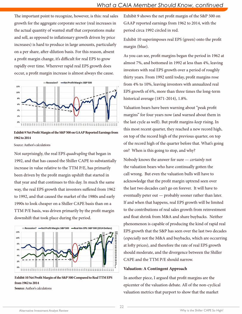
Exhibit 9 shows the net profit margin of the S&P 500 on
GAAP reported earnings from 1962 to 2014, with the
period circa 1992 circled in red.
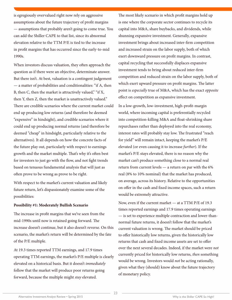
Exhibit 10 superimposes real EPS (green) onto the profit
margin (blue).
As you can see, profit margins began the period in 1962 at
almost 7%, and bottomed in 1992 at less than 4%, leaving
investors with real EPS growth over a period of roughly
thirty years. From 1992 until today, profit margins rose
from 4% to 10%, leaving investors with annualized real
EPS growth of 6%, more than three times the long-term
historical average (1871-2014), 1.8%.
Valuation bears have been warning about “peak profit
margins” for four years now (and warned about them in
the last cycle as well). But profit margins keep rising. In
this most recent quarter, they reached a new record high,
on top of the record high of the previous quarter, on top
of the record high of the quarter before that. What’s going
on? When is this going to stop, and why?
Nobody knows the answer for sure — certainly not
the valuation bears who have continually gotten the
call wrong. But even the valuation bulls will have to
acknowledge that the profit margin uptrend seen over
the last two decades can’t go on forever. It will have to
eventually peter out — probably sooner rather than later.
If and when that happens, real EPS growth will be limited
to the contributions of real sales growth from reinvestment
and float shrink from M&A and share buybacks. Neither
phenomenon is capable of producing the kind of rapid real
EPS growth that the S&P has seen over the last two decades
(especially not the M&A and buybacks, which are occurring
at lofty prices), and therefore the rate of real EPS growth
should moderate, and the divergence between the Shiller
CAPE and the TTM P/E should narrow.
Valuation: A Contingent Approach
In another piece, I argued that profit margins are the
epicenter of the valuation debate. All of the non-cyclical
valuation metrics that purport to show that the market
Exhibit 9 Net Profit Margin of the S&P 500 on GAAP Reported Earnings from 1962 to 2014
Source: Author’s calculations
Exhibit 10 Net Profit Margin of the S&P 500 Compared to Real TTM EPS from 1962 to 2014Source: Author’s calculations
Why is the Shiller CAPE So High?23
Alternative Investment Analyst Review • Spring 2015
What a CAIA Member Should Know What a CAIA Member Should Know, continued
is egregiously overvalued right now rely on aggressive
assumptions about the future trajectory of profit margins
— assumptions that probably aren’t going to come true. You
can add the Shiller CAPE to that list, since its abnormal
elevation relative to the TTM P/E is tied to the increase
in profit margins that has occurred since the early-to-mid
1990s.
When investors discuss valuation, they often approach the
question as if there were an objective, determinate answer.
But there isn’t. At best, valuation is a contingent judgement
— a matter of probabilities and conditionalities: “if A, then
B, then C, then the market is attractively valued,” “if X,
then Y, then Z, then the market is unattractively valued.”
There are credible scenarios where the current market could
end up producing low returns (and therefore be deemed
“expensive” in hindsight), and credible scenarios where it
could end up producing normal returns (and therefore be
deemed “cheap” in hindsight, particularly relative to the
alternatives). It all depends on how the concrete facts of
the future play out, particularly with respect to earnings
growth and the market multiple. That’s why it’s often best
for investors to just go with the flow, and not fight trends
based on tenuous fundamental analysis that will just as
often prove to be wrong as prove to be right.
With respect to the market’s current valuation and likely
future return, let’s dispassionately examine some of the
possibilities:
Possibility #1: Moderately Bullish Scenario
The increase in profit margins that we’ve seen from the
mid-1990s until now is retained going forward. The
increase doesn’t continue, but it also doesn’t reverse. On this
scenario, the market’s return will be determined by the fate
of the P/E multiple.
At 19.3 times reported TTM earnings, and 17.9 times
operating TTM earnings, the market’s P/E multiple is clearly
elevated on a historical basis. But it doesn’t immediately
follow that the market will produce poor returns going
forward, because the multiple might stay elevated.
The most likely scenario in which profit margins hold up
is one where the corporate sector continues to recycle its
capital into M&A, share buybacks, and dividends, while
shunning expansive investment. Generally, expansive
investment brings about increased inter-firm competition
and increased strain on the labor supply, both of which
exert downward pressure on profit margins. In contrast,
capital recycling that successfully displaces expansive
investment tends to bring about reduced inter-firm
competition and reduced strain on the labor supply, both of
which exert upward pressure on profit margins. The latter
point is especially true of M&A, which has the exact opposite
effect on competition as expansive investment.
In a low-growth, low-investment, high-profit-margin
world, where incoming capital is preferentially recycled
into competition-killing M&A and float-shrinking share
repurchases rather than deployed into the real economy,
interest rates will probably stay low. The frustrated “reach
for yield” will remain intact, keeping the market’s P/E
elevated (or even causing it to increase further). If the
market’s P/E stays elevated, there is no reason why the
market can’t produce something close to a normal real
return from current levels — a return on par with the 6%
real (8% to 10% nominal) that the market has produced,
on average, across its history. Relative to the opportunities
on offer in the cash and fixed income spaces, such a return
would be extremely attractive.
Now, even if the current market — at a TTM P/E of 19.3 times reported earnings and 17.9 times operating earnings — is set to experience multiple contraction and lower-than-normal future returns, it doesn’t follow that the market’s current valuation is wrong. The market should be priced to offer historically low returns, given the historically low returns that cash and fixed income assets are set to offer over the next several decades. Indeed, if the market were not currently priced for historically low returns, then something would be wrong. Investors would not be acting rationally, given what they (should) know about the future trajectory
of monetary policy.
24Alternative Investment Analyst Review Why is the Shiller CAPE So High?
What a CAIA Member Should Know What a CAIA Member Should Know, continued
Possibility #2: Moderately Bearish Scenario
The increase in profit margins is not going to fully hold. Some, but not all, of the profit margin gain will be given back. On this assumption, it becomes harder to defend the market’s current valuation.
Importantly, sustained reductions in the profit margin — as opposed to a temporary drop associated with recession — tend to occur alongside rising sales growth. In terms of the effect on EPS, rising sales growth will help to make up for some of the profit that will be lost. However, almost half of all sales growth ends up being inflation — the result of price increases rather than real output increases. With inflation comes lower returns in terms (the only terms that matter), and also, crucially, a tighter Fed. If the Fed gets tighter, a TTM P/E of 19.3 will be much harder to sustain. The market will therefore have to fight two headwinds at the same time — slow EPS growth due to profit margin contraction and a return drag driven by multiple contraction. Returns on such a scenario will likely be weak, at least in real terms.
But they need not be disastrously weak. In another piece, I argued that returns might end up being 5% or 6% nominal, or 3% or 4% real. Of course, that piece assumed a starting price for the S&P 500 of 1775. Nine months later, the index is already at 2000. The estimated returns have downshifted to 3% or 4% nominal, and 1% or 2% real. Such returns offer almost no premium over the returns on offer in the much — safer fixed income world, and therefore, if any kind of profit margin contraction is coming, then the current market is probably pushing the boundaries of defensible valuation.
Possibility #3: Aggressively Bearish Scenario
Profit margins are going to fully revert to the pre-1990s average. On this assumption, the market is obscenely, outrageously expensive. If, at a profit margin of 9% to 10%, EPS comes in at $103.5, and if profit margins are headed to the pre-1990s average of 5% or 6%, then the implication is that EPS is headed to around $55 (a number that will be adjusted upward in the presence of sales growth and inflation — but only as time passes). Instead of a historically elevated TTM P/E of 19, the market would be sitting at a true, normalized TTM P/E of around 36.
Obviously, if margins and earnings were to suddenly come
apart, such that the S&P at 2000 shifts from being valued
at 19 times earnings to being valued at 36 times earnings,
as opposed to the “15 times forward” that investors think
they are buying into, prices would suffer a huge adjustment.
If the shift were to happen quickly, over a short number
of months or quarters, the market would almost certainly
crash.
But even if the shift were to happen very slowly, such that
EPS simply stagnates in place without falling precipitously,
real returns over the next decade, and maybe even the
next two or three decades, would still end up being very
low — zero or even negative. The profit margin contraction
would eat away at real EPS growth, as it did from the 1960s
until the 1990s. Even nominal returns over various relevant
horizons might end up being zero or negative.
Possibility #4: Aggressively Bullish Scenario
Profit margins are going to continue to increase. Now,
before you viscerally object, ask yourself: Why can’t that
happen? Why can’t profit margins rise to 12% or 14% or
even higher from here? The thought might sound crazy,
but how crazy would it have sounded if someone were to
have predicted, in 1992, with profit margins at less than
4%, that twenty years later profit margins would be holding
steady north of 10%, more than 200 basis points above the
previous record high?
If profit margins are set to continue their upward increase,
then the market might actually be cheap up here, and
produce above average returns going forward. The same
is true if P/E multiples are set to continue their rise — a
possibility that should not be immediately dismissed. As
always, the price of equity will be decided by the dynamics
of supply and demand. So long as we continue to live in a
slow growth world aggressively backstopped by ultra-dovish
Fed policy, a world where investors want and need a decent
return, but can only get one in equities, there’s no reason why
the market’s P/E multiple can’t get pushed higher, to numbers
above 20 or even 25. It certainly wouldn’t be the first time.
What a CAIA Member Should Know Research Review
Why is the Shiller CAPE So High?25
Alternative Investment Analyst Review • Spring 2015
What a CAIA Member Should Know What a CAIA Member Should Know, continued
Going forward, all that is necessary for such an outcome to be achieved is for investors to experience a re-anchoring of their perceptions of what is “appropriate” — to become more tolerant and less viscerally afraid of those kinds of valuation levels. If the present environment holds safely for a long enough period of time, such a re-anchoring will occur naturally, on its own. Indeed, it’s occurring right now, as we speak. Three years ago, nobody would have been comfortable with the market at 2000, 19 times trailing earnings. People were acclimatized to 12, 13, or 14, as “reasonable” multiples, and were even seriously debating whether multiples below 10 were going to become the post-crisis “new normal.” The psychology has obviously shifted since then, and could easily continue to shift.
As for me, I tend to lean towards option #2: a moderately bearish outcome. I’m expecting weak long-term returns, with some profit margin contraction as labor supply tightens, and some multiple contraction as Fed policy gets more normal — but not a return to the historical averages. Importantly, I don’t foresee a realization of the moderately bearish outcome any time soon. It’s a ways away.
I expect the market to eventually get slammed, and pay back its valuation excesses, as happens in every business cycle. If this occurs, it will occur in the next recession, which is when valuation excesses generally get paid back — not during expansionary periods, but during contractions. The next recession is at least a few years away, maybe longer, and therefore it’s too early to get bearish. Before sizeable recession becomes a significant risk, the current expansion will need to progress further, so that more economic imbalances are built up (more misallocations in the deployment of the economy’s labor and capital resources), excesses that provoke rising inflation, and that get pressured by the monetary policy tightening that occurs in response to it.
In the meantime, I expect the market to continue its frustrating and painful grind higher, albeit at a slower pace, offering only small pullbacks in response to temporary scares. Those who are holding out for something “bigger” are unlikely to be rewarded any time soon.
Given the headwinds, I think the long-term total return
— through the end of the current business cycle — will be
around 1% to 2% real, 3% to 4% nominal. Poor, but still
better than the other options on the investment menu. An
investor’s best bet, in my view, would be to underweight
U.S. equity markets in favor of more attractively priced
alternatives in Europe, Japan, and the Emerging Markets.
Acknowledgement
Patrick O’Shaughnessy @millennial_inv of OSAM provided
valuable help for this piece.