Embed Size (px)
Citation preview
22804/2012 en.sdjournal.org
DATA DEVELOPMENT GEMS
It just takes a line of code to produce a simple sta-tistical graph in R. Using the plot() command, you can quickly visualize relationships among two
variables of your choice. However, R offers much more than the traditional graphics system. In this ar-ticle, I will give an overview of both traditional and high-level plotting functions in R, and I will show how graphs created in R can be further improved using Adobe Illustrator, one of the leading vector graphics editors. In Illustrator, you can change al-most every aspect of your graph and choose from a wide variety of symbols, graphics styles, pens, pen-cils and brushes, color spaces and modes; you can also add raster images, apply three-dimensional ef-fects and save your graph for both print and web production, including animation in Adobe Flash Pro-fessional. But let s first start with the R basics, before moving on to Illustrator.
Traditional graphics functions in RThis is the place where you´ll usually start off
when creating graphics in R. However, this is also the place where you should make sure that you code your graph sequentially from the beginning (see Listings 1 and 2). Depending on your machine, the plot() command will open a graphics device, for example the X11 device on Windows, or the Quartz device on Mac OS X. You start by calling plot() with type=”n”, axes=FALSE, and empty x- and y labels. This ensures that the device area has the correct size but remains empty. After that, you sequentially add elements to your plot. Points are added using the points() command, axes and their labels using the axis() command, titles and annotations using the ti-tle() command, legends using the legend() com-mand. You can also add model predictions and ref-erence lines using lines(). Working sequentially is the
Using R in combination with Adobe Illustrator CS6 for professional graphics outputProducing professionally looking statistical graphics with R is straightforward - but only if you know the capabilities and limitations of each graphics package. Here, I give an overview of the most frequently used graphics packages and show how output created with R can be “polished” further using Adobe Illustrator CS6, the industry standard of vector graphics editing. By combining R with Illustrator, you will be able to create even more convincing statistical graphics for your target audience.
What you’ll learn:
• Graphics packages in R: tra-ditional, trellis, grid
• Working with colours and transparencies• Adding background images to R graphics• Batch creation of pdf files• Changing styles, fonts, colours
and elements in Illustrator• Creating layered PDF files
What you should know:
• Basic object manipulations in R (subsetting, updating)
• Syntax for R model formulae (y~x+z)• Basic syntax of plot and xyplot
22904/2012 en.sdjournal.org
Using R in combination with Adobe Illustrator CS6 for professional graphics output
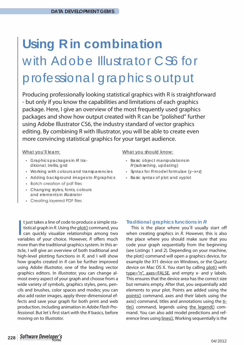
key to traditional graphics in R, because it allows you to fine-control every element in your plot. The tra-ditional graphics system is fine for plotting relation-ships between a few variables, for example continu-ous x and y variable (Figure 1), plus maybe one or two factors. However, if you want to visualize more complex relationships (say a four-way interaction), you are much better off using high-level functions.
High-level graphics using the lattice package
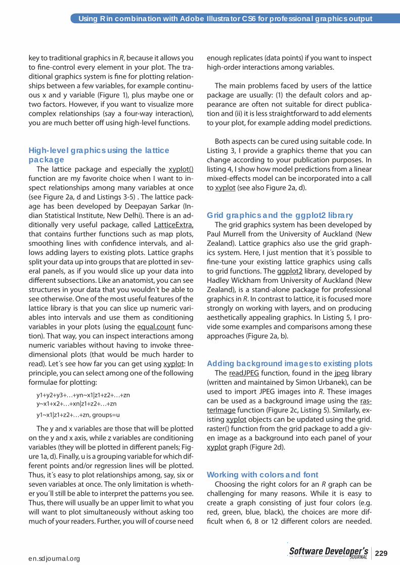
The lattice package and especially the xyplot() function are my favorite choice when I want to in-spect relationships among many variables at once (see Figure 2a, d and Listings 3-5) . The lattice pack-age has been developed by Deepayan Sarkar (In-dian Statistical Institute, New Delhi). There is an ad-ditionally very useful package, called LatticeExtra, that contains further functions such as map plots, smoothing lines with confidence intervals, and al-lows adding layers to existing plots. Lattice graphs split your data up into groups that are plotted in sev-eral panels, as if you would slice up your data into different subsections. Like an anatomist, you can see structures in your data that you wouldn´t be able to see otherwise. One of the most useful features of the lattice library is that you can slice up numeric vari-ables into intervals and use them as conditioning variables in your plots (using the equal.count func-tion). That way, you can inspect interactions among numeric variables without having to invoke three-dimensional plots (that would be much harder to read). Let s see how far you can get using xyplot: In principle, you can select among one of the following formulae for plotting:
y1+y2+y3+…+yn~x1|z1+z2+…+zn y~x1+x2+…+xn|z1+z2+…+zn
y1~x1|z1+z2+…+zn, groups=u
The y and x variables are those that will be plotted on the y and x axis, while z variables are conditioning variables (they will be plotted in different panels; Fig-ure 1a, d). Finally, u is a grouping variable for which dif-ferent points and/or regression lines will be plotted. Thus, it s easy to plot relationships among, say, six or seven variables at once. The only limitation is wheth-er you´ll still be able to interpret the patterns you see. Thus, there will usually be an upper limit to what you will want to plot simultaneously without asking too much of your readers. Further, you will of course need
enough replicates (data points) if you want to inspect high-order interactions among variables.
The main problems faced by users of the lattice package are usually: (1) the default colors and ap-pearance are often not suitable for direct publica-tion and (ii) it is less straightforward to add elements to your plot, for example adding model predictions.
Both aspects can be cured using suitable code. In Listing 3, I provide a graphics theme that you can change according to your publication purposes. In listing 4, I show how model predictions from a linear mixed-effects model can be incorporated into a call to xyplot (see also Figure 2a, d).
Grid graphics and the ggplot2 libraryThe grid graphics system has been developed by
Paul Murrell from the University of Auckland (New Zealand). Lattice graphics also use the grid graph-ics system. Here, I just mention that it s possible to fine-tune your existing lattice graphics using calls to grid functions. The ggplot2 library, developed by Hadley Wickham from University of Auckland (New Zealand), is a stand-alone package for professional graphics in R. In contrast to lattice, it is focused more strongly on working with layers, and on producing aesthetically appealing graphics. In Listing 5, I pro-vide some examples and comparisons among these approaches (Figure 2a, b).
Adding background images to existing plotsThe readJPEG function, found in the jpeg library
(written and maintained by Simon Urbanek), can be used to import JPEG images into R. These images can be used as a background image using the ras-terImage function (Figure 2c, Listing 5). Similarly, ex-isting xyplot objects can be updated using the grid.raster() function from the grid package to add a giv-en image as a background into each panel of your xyplot graph (Figure 2d).
Working with colors and fontChoosing the right colors for an R graph can be
challenging for many reasons. While it is easy to create a graph consisting of just four colors (e.g. red, green, blue, black), the choices are more dif-ficult when 6, 8 or 12 different colors are needed.
23004/2012 en.sdjournal.org
DATA DEVELOPMENT GEMS
The package RColorBrewer, written by Erich Neu-wirth (University of Vienna, Austria) provides a link to ColorBrewer (colorbrewer2.org) where you can select among ordered color sequences consisting of 1-12 colors, where colors are easy to distinguish from one another. In addition, you can use R s built-in color palettes (rainbow, heat.colors, terrain.colors, cm.colors, topo.colors). Examples for working with colors are given in listings 3, 4 and 5.
Selecting and applying fonts in R is easy in theory, but very much system- and device-dependent. You will most frequently use the postscriptFonts() com-mand to choose among different fonts, but these need to be installed properly on your system. Em-bedding fonts (using the embedFonts command) in a postscript or pdf file can also be tricky. In general, I would recommend to work with standard fonts in R (e.g. Helvetica, Arial, Times) and do the finer font editing in Illustrator.
Exporting your graph to IllustratorThe easiest way of saving your graph(s) in R for
post-processing in Illustrator is to open the pdf() de-vice (see Listing 1), then run your lines of code to cre-ate your graph(s), and then close the pdf device us-ing dev.off(). This allows you to save as many graphs as you want for later processing; graphs can even be created automatically using any of the apply() com-mands, or (less efficiently) by using a for() loop. Make sure to add the option useDingbats=FALSE in your pdf command to ensure that symbols are rendered properly inside the pdf. Examples for creating pdf files from R are shown in Listings 1-5.
Post-processing a scatter plot in IllustratorOnce you´ve saved your graph in pdf (or post-
script) format, you re ready to import it in Illustra-tor. You´ll first be asked which page you want to im-port. Placing several pages at once is possible using publicly available Illustrator scripts (Apple Script or Java Script); you can find these by performing a web search for “multi-page pdf Illustrator”.
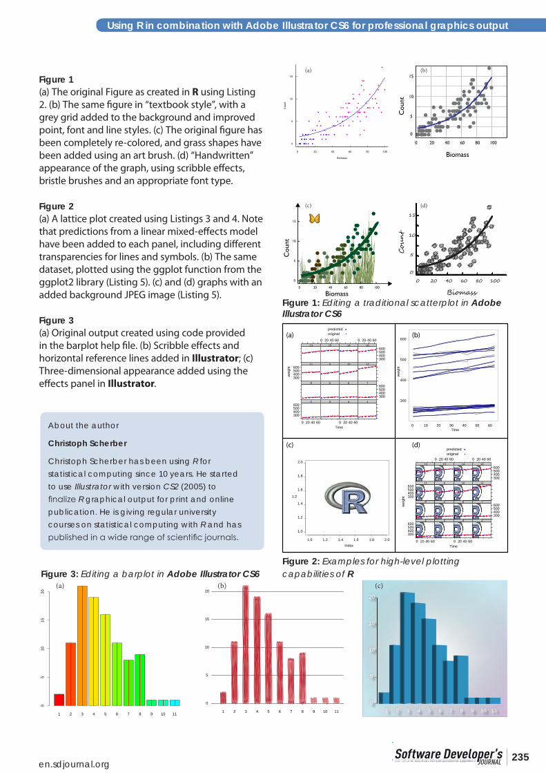
But for now let s assume you have imported just one single pdf graph (as in Figure 1a, created using Listing 2). After importing it, several operations are necessary before you can enjoy the full editing ca-pabilities of Illustrator CS6:
(1) select all objects(2) release clipping masks (object panel)
Next, create separate layers for all objects of sim-ilar types. In your final image, there will be a layer containing all text elements, another layer contain-ing axes, boxes etc., and one containing graph ob-jects (plotting symbols, bars, etc).
In our example (Figure 1a), use the magic wand tool with 90% tolerance (double click for options) several times, pressing “shift”, to select all dots of the graph; cut and paste objects into their original posi-tion in a new layer (name this “dots layer”).
Use select/objects/text objects to select all text, cut the text objects and paste them in their original positions on a new layer (name this “text layer”). Se-lect all objects on this layer and change your font as desired (e.g. Gill Sans MT, 18 or 36 Pt for tickmarks vs. axis labels). To adjust the size of your plotting area, use the artboard tool. Go to “Options” and select “automatically fit to graphics dimensions”.
Use select/objects/similar appearance to select the axes of the graph (using select/objects/similar appearance). Name this layer “axes layer”.
Now you should have an Illustrator file with the following layers: (1) dots layer; (2) text layer; (3) axes layer. You are now ready to create new versions of your graph (Figure 1b, c, d).
For Figure 1b, go to the dots layer, select all ob-jects in this layer (fix all other layers) and change the fill color to grey and outline color to “none”. Then create a new background layer, use the rectangular grid tool and add a grid at exactly the tickmark po-sitions. Be sure to always work using smart guides (menu: view/smart guides). Alternatively, you can also select all tick marks and transform them appro-priately (possibly after copying them to a new layer, inserting them at their original positions). Next, se-lect the non-linear regression line and apply a line style of your choice.
For Figure 1c, start by working on the “axes layer”. Select a 5 Pt rounded calligraphic brush to change the appearance of the axis tick marks. Select the axes, change their width to 5 Pt and apply arrowheads of your choice (with 80% scaling). Then select the
23104/2012 en.sdjournal.org
Using R in combination with Adobe Illustrator CS6 for professional graphics output
non-linear regression line; load a brushes library (e.g. bristle brushes) and select a bristle brush of your choice to modify the appearance of the regression line. Play around with the transparency of the brush to change the appearance as you wish. Go to the “dots layer” and open the “effects” panel; select “convert to form/el-lipse”. Use the options to select an additional width of 4 Pt each. Now select all dots and open the menu “edit/colors”. Use a palette (e.g. “leaves”) to change the colors of all dots. Finally, create a new layer in the background. Create an art brush (e.g. using an imported, traced im-age) and add your favorite background to the image. Open a symbols library of your choice and add a sym-bol into the upper left corner of your graph.
Finally, Figure 1d has been created in a similar way, but applying scribble effects to the ellipse-transformed dots in the dots layer with the follow-ing options:
• angle 30°• path overlap 0 mm• variation for path overlap 1.76 mm• stroke width 0.5 mm• curviness 20%• variation for curviness 50%• spacing 0.5 mm• variation for spacing 0.5 mm
It is helpful to make frequent use of the appear-ance panel; this way, you can always change the effects you applied later on. Your scribble effect should appear low down in the appearance panel when you select any dot in your graph.
Next, use a Filbert bristle brush to change the ap-pearance of the regression line and the axes. Finally, go to the text layer and choose a handwriting font, e.g. Segoe Script.
Post-processing bar plots and box-and-whisker plots in Illustrator
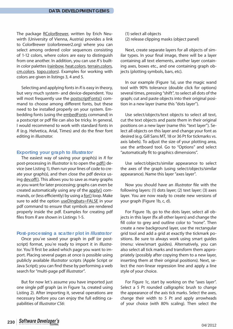
With categorical explanatory variables, you will usually end up with a bar plot or a box-and-whisker plot in R. In many cases, you may wish to edit these types of graphs using Illustrator. In principle, the same steps described above are necessary: Move objects to different layers, then apply styles as de-sired. Figure 3a shows an example created using R s barplot() help page. While this Figure already looks convincing, you may wish to change the appearance
of the bars for publication. For example, you can add a scribble effect to the bars (Figure 3b), or even make your bars appear three-dimensional (Figure 3c). The three-dimensional appearance of bars in Figure 3c can be added using the extrude effect (Effect/3D/Extrude and Bevel) with the following options:
• Angle 45°• Perspective 37°• Extrude depth 50 Pt• Surface Shading: Plastic• Light intensity 100%• Ambient light 26%• Highlight intensity 60%• Highlight size 90%• Blend steps 25
Finally, create a new layer, draw a rectangle and apply a custom style (e.g. plastic foil effect).
Web and print publication of your illustrations
You should now have seen that almost anything is possible when combining R s powerful graphics engines with Adobe Illustrator s vector graphics editing capabilities. At this stage, you should con-sider also the intended publication medium for your graphical output. For web publishing, you can di-rectly add slices to your Illustrator image and hand your file over to Adobe Fireworks or Flash Profession-al to add interactivity (e.g. buttons). If you intend to publish for print media, you´ll need to make sure that your file is in CMYK color space. Then place your images in Adobe InDesign or other suitable layout software. For Microsoft Office 2010 or earlier, you can save your files from Illustrator in PNG format and work almost without loss of image resolution. How-ever, such an approach is usually only recommend-ed for PowerPoint presentations or screen devices. If you want to use your content in OpenOffice Draw, the best solution is to export your images as EPS files from Illustrator. Finally, if you want to edit existing Il-lustrator files in a freeware such as InkScape, you can use AI or PDF files, but sometimes fonts are replaced by filled contours. These issues are likely to improve in later versions of InkScape.
Overall, the combination of R and Illustrator has worked perfectly for me over the last seven years, and in combination with other elements of Adobe s CS6, this software duo is almost unbeatable.
23204/2012 en.sdjournal.org
DATA DEVELOPMENT GEMS
Listing 1: R code showing the use of the traditional graphics system in R to create a pdf file of known dimensions.
# Create some example datax=1:10y=(1:10)^2
# Open a PDF device (output will be written into this file)pdf(“myfile.pdf”,width = 2, height = 2,pointsize=12)
# Define sizes of margins and number of margin linespar(mar=c(3.1,3.1,0.2,0.2),mgp=c(2,0.3,0))
# Create an empty plotplot(x,y,type=”n”,axes=FALSE,xlab=””,ylab=””,las=T,tck=0.02,pch=16,lwd=1.5,cex.lab=1.5,cex.axis=1.3)
# Now sequentially add elements to the empty plotpoints(x,y,pch=16)title(xlab=”Xlab”,ylab=”Ylab”,las=T)axis(1,tck=0.02,las=T)axis(2,tck=0.02,las=T)box()
# when finished, close the PDF devicedev.off()
Listing 2: R code to produce graphical output using the standard graphics system. A PDF is created for later editing in Illustrator.
#set the random number generator to a reproducible state
set.seed(1000) # create sample data by sampling from a uniform distribution# then use a poisson distribution to create counts of objects# to be plotted on the y axisbiomass=sort(runif(100,1,100))y = 0.2+0.1*biomasscount=rpois(length(y),y)
# Now create your graph using the Windows (X11) device:par(las=1,bty=”l”,lwd=2,tck=0.02)plot(count~biomass,pch=16,type=”n”,axes=F,xlab=””,ylab=””)points(count~biomass,pch=16,col=rainbow(length(count),start=4/6))axis(1)axis(2)title(xlab=”Biomass”,ylab=”Count”)box()
# finally, add a blue line with model predictionsm1=glm(count~biomass,poisson)lines(biomass,predict(m1,type=”response”),col=”blue”,lwd=2)
# copy the content of the current device to a PDF device# depending on your system, you may use different font families,# but this often doesn´t work properly and font editing should be # done in Illustrator.# Be sure to turn off the “Dingbats” font because symbols# may otherwise render wrongly on some systems.
dev.copy2pdf(file=”myfile.pdf”,useDingbats=FALSE,family=”sans”)
23304/2012 en.sdjournal.org
Using R in combination with Adobe Illustrator CS6 for professional graphics output
Listing 3: R code defining a graphics theme to customize trellis graphics in the lattice library
install.packages(c(“RColorBrewer”,”latticeExtra”))
my.theme=function(colors,lty,pch=16,cex=1.5,lwd=2,fill=colors,alpha=1,...){
require(latticeExtra)theme <- custom.theme(symbol = colors, fill = colors, region = colors)theme <- modifyList(theme, list(axis.line = list(col = “black”,lwd=2), axis.text = list(cex = 1.5, col = “black”), par.sub.text= list(cex = 1.5, col = “black”), par.main.text= list(cex = 1.5, col = “black”), par.xlab.text=list(cex = 1.5, col = “black”), par.ylab.text=list(cex = 1.5, col = “black”), par.zlab.text=list(cex = 1.5, col = “black”), panel.background = list(col = “white”), reference.line = list(col = “darkgrey”), strip.background = list(col = c(“grey80”, “grey70”, “grey60”)), strip.shingle = list(col = c(“grey60”, “grey50”, “grey40”)), strip.border = list(col = “black”,lwd=2), add.text = list(cex = 1)))
theme=modifyList(theme,simpleTheme(alpha=alpha,col=colors, cex=cex, pch=pch,lwd=lwd,lty=lty, fill=colors, col.points=colors, col.line=colors))}
# save the function as an R object (for later usage):capture.output(my.theme,file=”my.theme.R”)
Listing 4: R code to produce graphical output using the trellis graphics system.
# First, load the required packages
install.packages(c(“RColorBrewer”,”latticeExtra”))library(nlme)library(lattice)library(RColorBrewer)source(“my.theme.R”)
# load a sample dataset (body weight growth in rats)data(BodyWeight)
# reorder the response variable in the data frameBodyWeight$Rat=ordered(BodyWeight$Rat,levels=1:16)
# now set up a mixed-effects model, where weight is the# response variable, and Diet and Time are the# explanatory variables; # random effects are included for Time (random slopes)# and the individual rats (random intercepts) m1=lme(weight~Time*Diet,random=~Time|Rat,data=BodyWeight)
# calculate predictions from this model:mygrid <-expand.grid(Time = do.breaks(range(BodyWeight$Time),5),Rat=unique(BodyWeight$Rat))
m1.pred <-cbind(mygrid,weight = predict(m1, newdata = mygrid))
orig <- BodyWeight[,c(“Time”, “Rat”,”weight”)]
23404/2012 en.sdjournal.org
DATA DEVELOPMENT GEMS
combined <-make.groups(predicted=m1.pred,original = orig)
# select colours using the palettes “Set1” and “Dark2” # in RColorBrewermycolors=c(brewer.pal(8,”Set1”),brewer.pal(8,”Dark2”))
# Now create a series of xyplots, using different colour options:xyplot(weight~Time,BodyWeight,type=c(“p”,”smooth”),groups=Rat,auto.key=list(columns=4),par.settings=my.theme(colors=mycolors,lty=1:16,pch=c(16,17,1,2,19:25)))
xyplot(weight~Time,BodyWeight,type=c(“p”,”smooth”),groups=Rat,auto.key=list(columns=4),par.settings=my.theme(colors=heat.colors(16)))
xyplot(weight~Time,BodyWeight,type=c(“p”,”smooth”),groups=Rat,auto.key=list(columns=4),par.settings=my.theme(colors=rainbow(16,start=4/6)))
xyplot(weight~Time,BodyWeight,type=c(“p”,”smooth”),groups=Rat,auto.key=list(columns=4),par.settings=my.theme(colors=terrain.colors(16)))
xyplot(weight~Time,BodyWeight,type=c(“p”,”smooth”),groups=Rat,auto.key=list(columns=4),par.settings=my.theme(colors=cm.colors(16)))
# now plot the predictions from the model# together with the original data;# add transparency
xyplot(weight ~ Time | Rat,data = combined, groups = which,type = c(“p”,”l”),auto.key=T,par.settings=my.theme(alpha=c(1,0.5),cex=1,lwd=1,colors=c(“blue”,”red”),lty=c(1,2),pch=c(16,17)))
Listing 5: Producing graphical output using the ggplot2, lattice and grid packages. This also shows how to incorporate JPEG images as a background.
install.packages(c(“ggplot2”,”grid”,”jpeg”))library(“ggplot2”)library(“grid”)library(“nlme”)library(“jpeg”)source(“my.theme.R”)
theme_set(theme_bw())theme_update(panel.grid.minor = theme_blank(),panel.grid.major=theme_blank())
oplot <- ggplot(BodyWeight, aes(Time, weight, group = Rat)) +geom_line()
oplot + geom_line(data = m1.pred, colour = “darkblue”, alpha=0.5,size=1)
### JPEG image as a background (load the jpeg library first)
img <- readJPEG(system.file(“img”, “Rlogo.jpg”, package=”jpeg”))plot(1:2, type=”n”)rasterImage(img, 1.2, 1.27, 1.8, 1.73)
x1=xyplot(weight ~ Time | Rat,data = combined, groups = which,type = c(“p”,”l”),auto.key=T,par.settings=my.theme(alpha=c(1,0.5),cex=1,lwd=1,colors=c(“blue”,”red”),lty=c(1,2),pch=c(16,17)))
update(x1,panel=function(x,y,...){grid.raster(img,0.5,0.5,0.5,0.5)panel.xyplot(x,y,...)})
23504/2012 en.sdjournal.org
Using R in combination with Adobe Illustrator CS6 for professional graphics output
Figure 1(a) The original Figure as created in R using Listing 2. (b) The same figure in “textbook style”, with a grey grid added to the background and improved point, font and line styles. (c) The original figure has been completely re-colored, and grass shapes have been added using an art brush. (d) “Handwritten” appearance of the graph, using scribble effects, bristle brushes and an appropriate font type.
Figure 2 (a) A lattice plot created using Listings 3 and 4. Note that predictions from a linear mixed-effects model have been added to each panel, including different transparencies for lines and symbols. (b) The same dataset, plotted using the ggplot function from the ggplot2 library (Listing 5). (c) and (d) graphs with an added background JPEG image (Listing 5).
Figure 3(a) Original output created using code provided in the barplot help file. (b) Scribble effects and horizontal reference lines added in Illustrator; (c) Three-dimensional appearance added using the effects panel in Illustrator.
0 20 40 60 80 100
0
5
10
15
Biomass
Cou
nt0 20 40 60 80 100
0
5
10
15
BiomassC
ount
0 20 40 60 80 100
0
5
10
15
Biomass
Cou
nt
0 20 40 60 80 100
0
5
10
15
Biomass
Cou
nt
(a) (b)
(c) (d)
Time
wei
ght
300400500600
0 20 40 60
2 3
0 20 40 60
4 1
8 5 6
300400500600
7
300400500600
11 9 10 12
13
0 20 40 6015 14
0 20 40 60
300400500600
16
300
400
500
600
0 10 20 30 40 50 60Time
wei
ght
1.0 1.2 1.4 1.6 1.8 2.0
1.0
1.2
1.4
1.6
1.8
2.0
Index
1:2
Time
wei
ght
300400500600
0 20 40 60
2 3
0 20 40 60
4 1
8 5 6
300400500600
7
300400500600
11 9 10 12
13
0 20 40 6015 14
0 20 40 60
300400500600
16
predictedoriginal
predictedoriginal(a) (b)
(c) (d)
1 2 3 4 5 6 7 8 9 10 11
05
1015
20
1 2 3 4 5 6 7 8 9 10 110
5
10
15
20
1 2 3 4 5 6 7 8 9 10 11
0
5
10
15
20(a) (b) (c)
Figure 1: Editing a traditional scatterplot in Adobe Illustrator CS6
Figure 2: Examples for high-level plotting capabilities of RFigure 3: Editing a barplot in Adobe Illustrator CS6
About the author
Christoph Scherber
Christoph Scherber has been using R for statistical computing since 10 years. He started to use Illustrator with version CS2 (2005) to finalize R graphical output for print and online publication. He is giving regular university courses on statistical computing with R and has published in a wide range of scientific journals.