Embed Size (px)
Citation preview
NatioNal ScholaStic PreSS aSSociatioN
YEARBOOKGUIDEBOOK

2
Written by:Homer L. Hall
retired, Kirkwood (Mo.) HS
Sarah NicholsWhitney HS,
Rocklin, Calif.
Edited by:Logan Aimone
Executive Director, NSPA
Design and Production by:Marc Wood
Communications Director, NSPA
© Copyright 1994, 2000, 2004, 2008. All rights reserved.National Scholastic Press Association
2221 University Ave. SE, Suite 121Minneapolis, MN 55414
612-625-8335nspa.studentpress.org
[email protected] 978-0-9798676-3-7
Additional copies of this guidebook may be purchased from our Web site: store.studentpress.org
YEARBOOKGUIDEBOOK
coNteNtSThe Yearbook’s Function .................................................4
The Legal Scene ...............................................................6
The Role of Evaluations ...................................................7
Using This Guidebook .....................................................7
Scoring ..............................................................................8
Help Us Help You .............................................................8
Getting Started .................................................................9
How To Write Copy ........................................................10
Alternative Copy Formats .............................................15
Theme Copy ...................................................................17
Student Life Copy ..........................................................17
Academic Copy ..............................................................18
Sports Copy ....................................................................18
Club Copy .......................................................................19
Portrait Page Copy .........................................................21
How to Write Headlines ................................................21
How to Write Captions ..................................................22
Designing a Book ...........................................................24
Using Photos, Artwork and Graphics ...........................28
Supplemental Materials Online ...................................30
Where are the Judging Scoresheets? ............................30
4
the Yearbook’S FuNctioNFor more than 85 years the National Scholastic Press Association and the Associated Collegiate Press have been providing critique services for scholastic publications. During that time the yearbook in most schools has evolved from a small paperback volume containing mostly portraits and group photographs to a sophisticated hard-bound edition that resembles many magazines in content and design.
Today’s yearbooks come in all styles, shapes and sizes. The best part — both for readers each year and for the staffs creating the book — is that no two are the same. No formula exists for a “perfect” yearbook. Student staffers can rest assured that many paths to a suc-cessful yearbook exist, and more are forged each year. Books change each year just as the styles hanging in our closets, and similarly, the styles in one part of the country differ greatly from yearbook trends and expectations in another.
Producing a yearbook requires a great deal of planning, creativity and problem solving from everyone involved. In getting started, the biggest task is knowing your readers. Where you live and the basic characteristics of your school population will play a key role in the type of book you set out to create. Understanding the wants and needs of your readers is critical, because the book is not just about them, but for them. Conducting polls and surveys, or inviting students to be part of a focus group in which you ask detailed questions about reader preferences, will help you plan for a book your students will appreciate.
The other critical task, and one sometimes overlooked by advisers
and editors in the planning process, is knowing your budget. Enter the brainstorming phase fully briefed on your financial status. Meet with your yearbook representative and discuss your options before choosing a theme and determining the size and scope of book you hope to create. This approach helps ensure financial solvency and responsible production. You won’t want to scale back your dream cover or cut parts of the book later, so it’s best to develop a realistic plan and work within it.
While its presentation and structure has changed over the years, a yearbook’s purpose remains the same. It is the job of each yearbook staff to cover historical moments on an annual basis and through copy, photographs and design make the book unique to the year. Since each year is different, staffs should not merely copy what they have seen in other books. They should strive to be imaginative and creative while maintaining the basics of sound journalistic principles.
Today’s best yearbooks provide readers with interesting, diverse content in a variety of formats while serving these purposes:
A memory book: Through storytelling photos, detailed reporting and meaningful quotes, students can relive the year. Memories — both of the year’s highs and lows — are captured and provide readers with, “Oh yeah!” moments for years to come. Descriptive copy helps bring readers back to the scene while a variety of photos from each activity or event can evoke emotions and take readers down memory lane.
A history book: Recording the year’s events with attention to dates, scores, costs and other facts and figures preserves a time capsule of students’ world from that year. For future staffs and historians who want to recapture some of the events that occurred, complete data will provide records for developing a history of a decade or a century and will provide staffs with the information for comparison and
contrast. Attention to popular culture and things like MySpace, YouTube, Nintendo Wii, reality television, MP3 players and text messaging all help capture the year from a teenage perspective. Additionally, major state, national and world news should be localized to include students’ reactions and how they are affected. A history book is not complete unless all events which affected those involved are included, including those that may be controversial. Sometimes events occur at high schools which students and faculty mem-bers may find to be negative in nature, but failure to include them in a yearbook would mean that the history of a year would not be complete. When staffs responsibly report the negative, they should be doing so in an attempt to make the school campus a better environment in years to come.
Generally, readers would rather remember the good times, but no journalist should be involved in a cover-up of the news. Emphasize the positive, but don’t eliminate the negative.
A reference book: By including accurate records of who attended the school in each grade level and who participated on each team, in each club and so forth, the yearbook serves as a directory and valuable source for research. Enrollment, sports statistics and
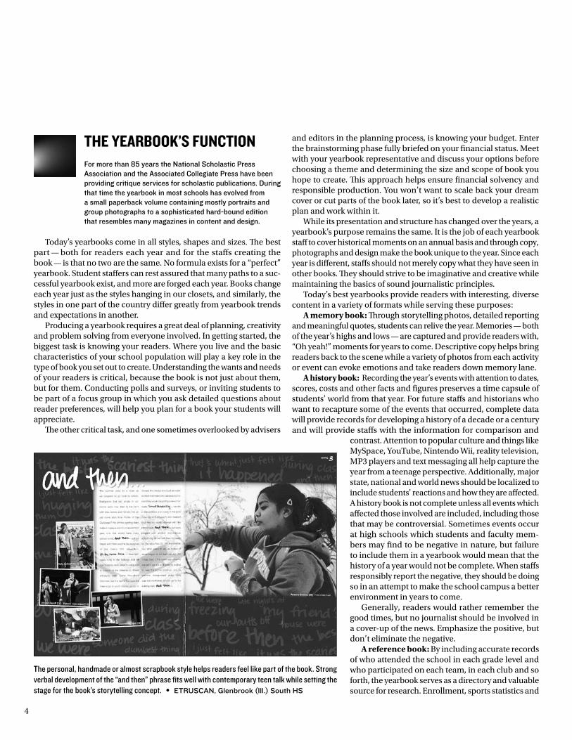
The personal, handmade or almost scrapbook style helps readers feel like part of the book. Strong verbal development of the “and then” phrase fits well with contemporary teen talk while setting the stage for the book’s storytelling concept. • Etruscan, Glenbrook (Ill.) south Hs
5
“I used to
think that
the yearbook
experience
helped build
character,
now I think it
just reveals
it.”JIm Jordan, del campo Hs, Fair oaks, calif.
other figures tell a complete story now and serve for quick reference later. Complete coverage of the academic curriculum, athletic programs and extra-curricular opportunities can serve as a reference tool for those outside the district.
If a yearbook is to fulfill its purposes, it will do all of the above. As if meeting the above criteria is not sufficient challenge, the other responsibility is to be sure to deliver the yearbook on time.
Making a yearbook of any kind is a huge undertak-ing. As some yearbook specialists are known to say, it takes months and months of hard work to plan and produce a yearbook — it really doesn’t take that much more work to do a good one. While there’s no formula, there are key concepts critical to the book’s journalistic integrity, historical usefulness and visual appeal. The purpose of this guidebook is to address these concepts and provide examples of yearbooks meeting or exceeding these standards.
The nation’s best yearbooks offer a blend of sizes, shapes, organizational styles and storytelling formats. Some showcase large photos and compelling copy, while others focus on a multitude of storytelling angles and picture 20-30 students per spread. The beauty is that any type of yearbook can be wildly successful with its readers by doing a few things each year:
1. Create a cover your students will love. Know-ing your readers and their wants/needs is the only way to achieve this. At some schools, a “good” cover will include school colors and offer a traditional or school-spirited vibe. Some schools are used to seeing photos on the cover and therefore will be disappointed with any-thing else, regardless of the design. It’s impor-tant to keep in mind that your readers are not design snobs or yearbook geeks. When planning a cover over the summer or at a workshop, the staff should make an effort to present samples or a mock-up cover to a panel of students for feedback upon returning to school in the fall.
2. Cover all students. It’s simple. We all know readers want to see themselves and their friends. Create a plan and get everyone in the book as many times as possible. Devise a cross-referencing system to prevent over-coverage of the “I do everything at my school” individuals, and be sure that photos and quotes of yearbook staff members aren’t dominating your pages.
3. Spell names correctly. This shouldn’t be as tricky as we make it. Get an accurate list from the school registrar, counseling department, attendance office or other reliable source. Pro-vide copies to all staff members in your staff manual. Keep a copy in a reference binder in the yearbook room. Employ a detailed editing system so each page is checked at every stage of production.
The top yearbooks today seem to do it all: they create books both popular with their student popula-tions and strong in journalistic standards. They are innovative and not afraid to take risks, but these books demonstrate an understanding of the yearbook’s
purpose. These books, not a panel of judges or board of directors from any association, set the standards in yearbook journalism.
The parts of a yearbook are connected … its theme drives the coverage and the ways that cov-erage is presented are through its writing, design and photography.
Good books set the standards in concept, cover-age, design, copy and photography. Instead of picture books or philosophical ponderings on the high school experience — like yearbooks of decades past — to-day’s yearbooks present engaging stories and detailed history using a variety of verbal and visual formats. Today’s best books are unified with an underlying idea, whether it be a traditional theme phrase or a more understated concept, and organized into read-er-friendly sections with well-planned content. The theme or concept fits the specific year, with verbal and visual development on the cover, endsheets, title page, opening, divider pages and closing. Readers may not recognize the layering of this theme or concept, which is fine. The concept is simply a device for aid-ing the staff in telling the year’s stories through one perspective. When fully developed, it will aid the staff in all major decision-making, including number and type of sections, copy formats, photo angles, color and graphic elements.
Coverage includes a wide range of topics that mat-ter to readers, both during the school day and beyond it. Readers have a genuine reason to visit each page of the book. All individuals at the school are repre-sented without overemphasis on a certain group or grade level. Readers can expect to find themselves pictured and/or quoted in multiple sections of the book. By focusing on topics of interest to all types of students, coverage avoids popularity contests like superlatives.
Copy captures the highs and lows and uses mean-ingful quotes to give readers a personal feeling of being there. Description and attention-getting leads hook readers. Facts and figures are the result of careful in-terviewing and thorough research. Each story is told in the best possible format for that story; a yearbook may combine in-depth feature stories with alterna-tive formats such as narratives or fast facts in order to present a variety of perspectives. Copy is not only complete and interesting but also error-free as staffers establish and follow style guidelines for consistency. Writers avoid opinion statements and editorializing. They recognize the need for non-biased reporting; they are creating the only permanent record of the year.
Complete captions answering all reader ques-tions and creative, specific headlines add more in-formation to each spread. These elements are part of the planning and reporting stages rather than an afterthought.
Visually, the book is organized and unified through the use of a consistent design scheme such as columns or grids. Arrangement of elements and use of space work together to direct eyeflow and guide readers through each spread’s content. Pages are unified
VEtERAn VOIcE
6
“Everyone has a
story to tell. Find
those stories.
talk to the kids
who don’t look
like you, dress
like you, act like
you. ask cool
teachers, snoop,
ask around,
survey. not only
will these stories
add depth and
richness to
your yearbook,
getting to know
these kids and
telling their
stories will make
you a better
person.”
KIm GrEEn, columbus (Ind.)
north Hs
through repeating graphic elements, each chosen carefully to fit the book’s personality and enhance content rather than draw unnecessary attention. Color is attractive and clearly planned, and staffs may limit themselves to a set palette to enhance photos and graphics. Typefaces aid readability and complete the overall effect. Creative use of display type for headline packages provides another entry point for readers and shows off careful wordplay to fit the topic. Designers understand dominance, proportion, rhythm and contrast and the finished product is eye-catching but not cluttered. Their pages offer visual variety rather than a monotonous, overly templated look. The book is designed by students without the use of pre-made templates or sample layouts. Although designers may break traditional design rules, they experiment with a purpose and with the content in mind.
Photography in these books is a blend of careful planning, shooting and editing. During planning stages, staff members discuss multiple angles to the story so photographers know to shoot before, during and after events and look for both action and reaction. Staff members are trained to look for the stories, not just the action. During photo shoots, photographers move around to achieve a variety of angles and dis-tances, often shooting a particular topic on multiple occasions to complete the story.
Instead of posed shots or scrapbook-style pho-tos, or most recently, what are known as “MySpace photos,” photographers strive to capture action and facial expressions for a strong center of interest. They incorporate compositional techniques such as fram-ing, leading lines and repetition while varying the number of people in the photo as well as the gender and grade level. Photos represent the diversity of the school.
Good books showcase the best images in high-profile areas. Images run large are deserving, and on the rare occasion that a lesser-quality image appears, it is small and used for its storytelling value. Photog-raphers, designers and editors understand the value of sharp contrast, crisp focus and proper resolution and work together to maximize strong photos as a key element in design.
the legal SceNeToday’s yearbooks are better in part because they tell the complete story. They report the controversial happenings in both copy and photos. These reports, in some instances, have brought about censorship efforts on the part of administrators.
Administrators were given more leniency in cen-soring school publications when the Supreme Court handed down its decision in the Hazelwood School District v. Kuhlmeier case on Jan. 13, 1988.
The Court said it would allow censorship of some student “speech that is inconsistent with (the school’s) basic educational mission.” The Court especially gave administrators control over publications produced as
part of a curriculum course and over publications not being operated as public forums.
In such instances, the decision basically destroys the First Amendment rights of student journalists if an administrator chooses to eliminate those rights. The key word here is “chooses.” The decision did not say that an administrator must censor. Therefore, staffs should continue to work with administrators to allow them to responsibly report all sensitive and controversial issues.
The Court refused to apply the standard which it created in the case Tinker v. Des Moines Inde-pendent Community School District in 1969. In that case the Court only allowed censorship by school officials when they could demonstrate material and substantial disruption of school activities or inva-sion of the rights of others. In Hazelwood, the court said censorship will only be prohibited in school-sponsored activities when school officials have “no valid educational purpose” for their action.
Legislators in several states have passed bills which override the Supreme Court’s decision in their states. Other states are working on such laws. This is a possi-bility in all states. Journalism advisers should organize in each state to establish such legislation. A yearbook cannot be a true history book without covering con-troversial and sensitive issues.
At the same time, informed, professional staffs understand libel laws, the definitions of obscenity, the dangers of invasion of privacy and the guidelines for prior restraint. Those staffs also realize the impor-tance of the word “responsible” and the need to be accurate in all reporting.
One strategy for accuracy and integrity is to es-tablish a quote-checking system. Verifying quotes helps a staff maintain credibility. Having the people being quoted verify and initial their quotes helps the staff to prove at the end of the year that the person actually said what the staff has printed. It is easy for sources to forget what they said since much time lapses between being interviewed and seeing the printed yearbook.
By being accurate, responsible and fair, the best yearbook staffs avoid serious controversy, but they provide complete coverage of the year. Yearbook staffs should also realize that anything they include in the book should be in “good taste.” Staffs should not include things just because they want to shock the reader or sensationalize their reporting.
Reporters should always ask themselves why they are covering a topic and why readers have a right to know the information. Controversy for the sake of controversy should be avoided.
When covering news events beyond the school community, staffs often struggle to find photo cover-age. One solution is to purchase photos for use from organizations such as MCT Campus or the Associated Press. Other sources may offer free images online for use. Finding images using Google or other search engines, however, is not an acceptable method, since Google merely locates the images; they are property of individual sites on which the images appear.
The yearbook is permanent, and it’s important to limit content to only that material which you can
VEtERAn VOIcE
7
verify as well as interpret in order to guarantee that copy does not have double-meanings, hidden mes-sages or inside jokes. Some schools may be used to traditions such as senior wills, senior quotes or senior send-off messages. These are not journalistic and can be dangerous since you may not understand the intent behind these messages.
the role oF evaluatioNSIn this complex and changing period for student publications, the National Scholastic Press Association continues to update its evaluation service, which for more than 85 years has provided student journalists and their advisers with an outside opinion of their work and suggestions on how to improve it. Individuals who have demonstrated a strong knowledge of yearbook production for many years serve as judges.
This guidebook reflects a renewed (and continued) concern for providing concise, practical guidance tailored to the needs of the individual publication. As with previous guidebooks, the judging standards reflect what the top publications are doing. There is no attempt at measuring publications against some mythical perfect publication, as no such yearbook exists.
No one philosophy of journalism or idea of what a publication should include or how it should look is promoted. As in the past, the judging criteria are based on what a broad range of top publications are achieving. Publications, not associations, set the standards. And, in responding to the associations’ evaluations and challenges to improve, it is the pub-lications which raise the standards from guidebook to guidebook.
uSiNg thiS guidebookThe guidebook is divided into five distinct sections: Concept, Coverage, Design, Writing and Editing, and Photography. Each section’s explanation corresponds to the scoring guide, where judges offer praise and suggestions for improvement.
These sections are then broken into subsections. Each subsection includes specific considerations representing guidelines in that area. In each subsection of the scoring guide is space for the judge to com-ment on strengths in that area of the publication. There is also space for the judge to list weaknesses of the book and to make suggestions about your work and goals for the next year.
The judge will cite specific examples of strengths and weaknesses and give the page number he or she is referring to. There is also a place at the end of the design, writing and editing and photography sections to deduct points based on the percentage of work done by a professional or the adviser. The maximum points deducted for
non-student work in any section is 100. In addition, there is a scor-ing section for successfully meeting deadlines, an important part of a journalistic endeavor. Each school indicates this information on its entry form.
Because all books submitted for critiques are vying for the same top rating, it would be expected that a book which is done primarily by professionals or the adviser might be better than those done by students. Deducting points is an attempt to put all schools on more equal footing, and it justifies the belief that a book should be done by students. It is understandable that professionals might take the portraits and group pictures, but all other work should be student produced.
Changing technology has created an interesting dichotomy; on one hand, yearbook companies have been offering to do more and more of
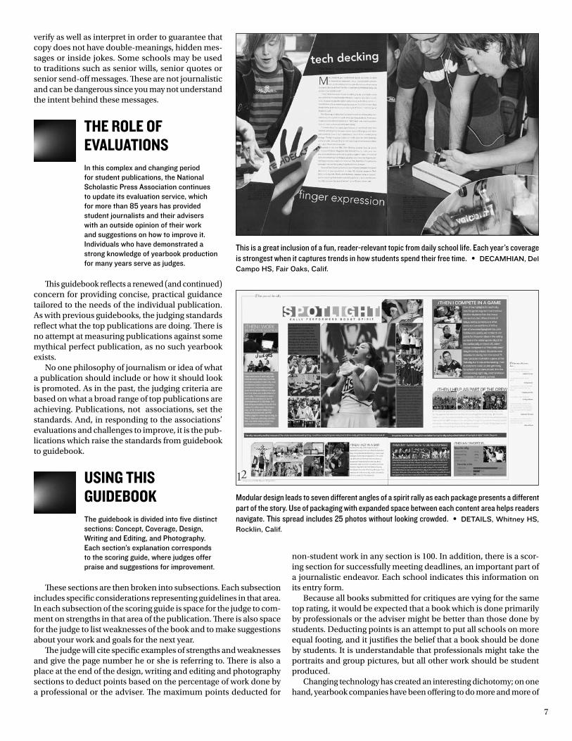
This is a great inclusion of a fun, reader-relevant topic from daily school life. Each year’s coverage is strongest when it captures trends in how students spend their free time. • dEcamHIan, del campo Hs, Fair oaks, calif.
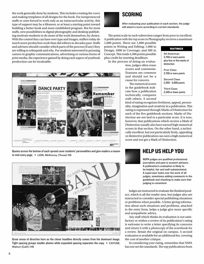
Modular design leads to seven different angles of a spirit rally as each package presents a different part of the story. Use of packaging with expanded space between each content area helps readers navigate. This spread includes 25 photos without looking crowded. • dEtaIls, Whitney Hs, rocklin, calif.
8
the work generally done by students. This includes creating the cover and making templates of all designs for the book. For inexperienced staffs or ones forced to work only as an extracurricular activity, this type of support may be a lifesaver, or at least a starting point toward building a better book and more established program. But for most staffs, new possibilities in digital photography and desktop publish-ing motivate students to do more of the work themselves, by choice. With the control they can have over type and images, staffers today do much more production work than did editors in decades past. Staffs and advisers should consider which parts of the process (if any) they are willing to relinquish and why. For students interested in pursuing careers in graphic communications, advertising or various forms of print media, the experience gained by doing each aspect of yearbook production can be invaluable.
ScoriNgAfter evaluating your publication in each section, the judge will award a score according to current standards.
The point scale in each subsection ranges from poor to excellent. A publication with the top score in Photography receives a maximum 1,000 points. There are 1,000 possible points in Writing and Editing; 1,000 in Design; 1000 in Coverage; and 500 in Concept. This totals 4,500 points possible plus credit for meeting deadlines.
In the process of doing an evalua-tion, judges often erase scores and comments. Erasures are common and should not be a cause for concern.
The numerical scores in the guidebook indi-cate how a publication technically compares with others. A second kind of rating recognizes liveliness, appeal, person-ality, imagination and creativity in a publication. This rating is expressed through Marks of Distinction for each of the five guidebook sections. Marks of Dis-tinction are not tied to a particular score. It is true, however, that publications which receive a Mark of Distinction usually also have earned high numerical scores in that section. On the other hand, a techni-cally excellent, but not particularly lively, appealing or distinctive publication can earn a high numerical score and not get a Mark of Distinction.
helP uS helP YouNSPA judges are qualified professional journalists and past or present advisers. A publication’s evaluation is likely to be helpful, fair and well-substantiated. A supervisor looks over the work of all judges, sometimes adding comments to the guidebook and checking to make sure that judging is consistent.
Judges are instructed to evaluate the finished prod-uct, which is all the reader sees, but judges also are instructed to consider special publishing situations or problems when possible. A letter giving informa-tion about such situations and problems, attached to the entry form, helps a judge give more specific and sympathetic advice.
Any staff which thinks its evaluation is not satis-factory or wishes a review of its publication’s rating is welcome to write a letter specifying its concerns and return it with a photocopy of the scorebook for a review. Retain the original on campus. A second evaluation is available for an additional fee, covering the cost of another critique.
In considering your rating, remember that NSPA has not set the standards. The top publications from
all-american3,700 or more points plus four or five marks of distinction
First class3,700 or more points
second class2,350 - 3,699 points
third class2,349 or fewer points
RAtInGs
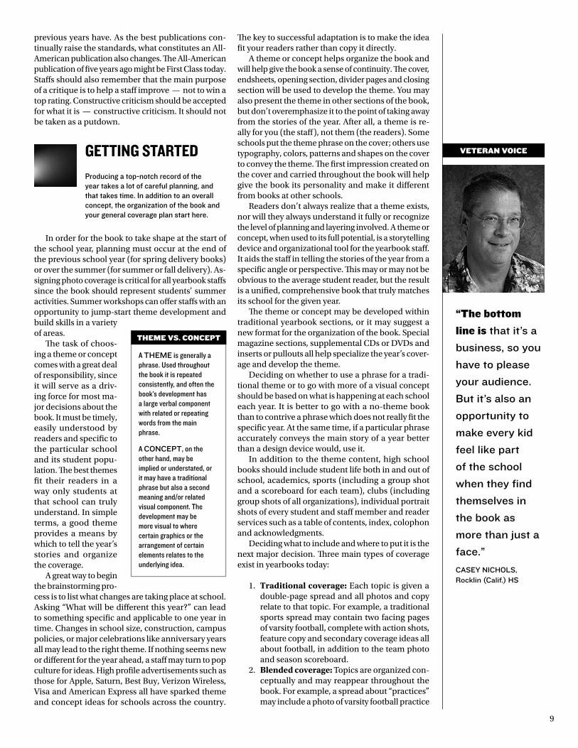
Quotes across the bottom of each spread cover students’ personalities and give readers a reason to visit every page. • lIon, mcKinney (texas) Hs
Great sense of direction here as the clever headline directly comes from the dominant image. Tight spacing groups smaller photos while expanded spacing separates the copy. • cayusE, Walnut (calif.) Hs
9
“the bottom
line is that it’s a
business, so you
have to please
your audience.
But it’s also an
opportunity to
make every kid
feel like part
of the school
when they find
themselves in
the book as
more than just a
face.”
casEy nIcHols, rocklin (calif.) Hs
previous years have. As the best publications con-tinually raise the standards, what constitutes an All-American publication also changes. The All-American publication of five years ago might be First Class today. Staffs should also remember that the main purpose of a critique is to help a staff improve — not to win a top rating. Constructive criticism should be accepted for what it is — constructive criticism. It should not be taken as a putdown.
gettiNg StartedProducing a top-notch record of the year takes a lot of careful planning, and that takes time. In addition to an overall concept, the organization of the book and your general coverage plan start here.
In order for the book to take shape at the start of the school year, planning must occur at the end of the previous school year (for spring delivery books) or over the summer (for summer or fall delivery). As-signing photo coverage is critical for all yearbook staffs since the book should represent students’ summer activities. Summer workshops can offer staffs with an opportunity to jump-start theme development and build skills in a variety of areas.
The task of choos-ing a theme or concept comes with a great deal of responsibility, since it will serve as a driv-ing force for most ma-jor decisions about the book. It must be timely, easily understood by readers and specific to the particular school and its student popu-lation. The best themes fit their readers in a way only students at that school can truly understand. In simple terms, a good theme provides a means by which to tell the year’s stories and organize the coverage.
A great way to begin the brainstorming pro-cess is to list what changes are taking place at school. Asking “What will be different this year?” can lead to something specific and applicable to one year in time. Changes in school size, construction, campus policies, or major celebrations like anniversary years all may lead to the right theme. If nothing seems new or different for the year ahead, a staff may turn to pop culture for ideas. High profile advertisements such as those for Apple, Saturn, Best Buy, Verizon Wireless, Visa and American Express all have sparked theme and concept ideas for schools across the country.
The key to successful adaptation is to make the idea fit your readers rather than copy it directly.
A theme or concept helps organize the book and will help give the book a sense of continuity. The cover, endsheets, opening section, divider pages and closing section will be used to develop the theme. You may also present the theme in other sections of the book, but don’t overemphasize it to the point of taking away from the stories of the year. After all, a theme is re-ally for you (the staff), not them (the readers). Some schools put the theme phrase on the cover; others use typography, colors, patterns and shapes on the cover to convey the theme. The first impression created on the cover and carried throughout the book will help give the book its personality and make it different from books at other schools.
Readers don’t always realize that a theme exists, nor will they always understand it fully or recognize the level of planning and layering involved. A theme or concept, when used to its full potential, is a storytelling device and organizational tool for the yearbook staff. It aids the staff in telling the stories of the year from a specific angle or perspective. This may or may not be obvious to the average student reader, but the result is a unified, comprehensive book that truly matches its school for the given year.
The theme or concept may be developed within traditional yearbook sections, or it may suggest a new format for the organization of the book. Special magazine sections, supplemental CDs or DVDs and inserts or pullouts all help specialize the year’s cover-age and develop the theme.
Deciding on whether to use a phrase for a tradi-tional theme or to go with more of a visual concept should be based on what is happening at each school each year. It is better to go with a no-theme book than to contrive a phrase which does not really fit the specific year. At the same time, if a particular phrase accurately conveys the main story of a year better than a design device would, use it.
In addition to the theme content, high school books should include student life both in and out of school, academics, sports (including a group shot and a scoreboard for each team), clubs (including group shots of all organizations), individual portrait shots of every student and staff member and reader services such as a table of contents, index, colophon and acknowledgments.
Deciding what to include and where to put it is the next major decision. Three main types of coverage exist in yearbooks today:
1. Traditional coverage: Each topic is given a double-page spread and all photos and copy relate to that topic. For example, a traditional sports spread may contain two facing pages of varsity football, complete with action shots, feature copy and secondary coverage ideas all about football, in addition to the team photo and season scoreboard.
2. Blended coverage: Topics are organized con-ceptually and may reappear throughout the book. For example, a spread about “practices” may include a photo of varsity football practice
A tHEmE is generally a phrase. Used throughout the book it is repeated consistently, and often the book’s development has a large verbal component with related or repeating words from the main phrase.
A concEpt, on the other hand, may be implied or understated, or it may have a traditional phrase but also a second meaning and/or related visual component. The development may be more visual to where certain graphics or the arrangement of certain elements relates to the underlying idea.
thEmE Vs. cOncEpt
VEtERAn VOIcE
10
“stOp looking
through
magazines for
visual ideas.
start reading
magazines to
understand
verbal voice
and approach.
understand
that in the
professional
world, a verbal
package
alWays comes
before a visual
package.”
dan austIn, casa roble Hs,
orangevale, calif.
alongside coverage of marching band practice, girls soccer and cheerleading. All different types of practice could be represented. Therefore, the coverage of the varsity football team is “blended” throughout the book rather than appearing on just one traditional spread.
3. Chronological coverage: Topics are covered in the book based on events and activities in the order they occur. The book is organized by time intervals; for example, one spread may cover a full week of the school year. Its content may include a student council fundraiser (or-ganizations), students waiting in line to see a highly anticipated movie at its opening night (student life), a varsity football game against local rivals (sports) and a major history project due (academics) all on the same spread since they took place at the same time.
As with any part of the yearbook planning pro-cess, it is important to consider a variety of factors in determining the best coverage approach. Following the same organization to the book as previous years is usually the easiest method but not always the best one. If the book’s theme doesn’t naturally lend itself to one style over another, consider your school cal-endar and deadline strategies. A shift to reorganizing your coverage may be just the change the staff needs. Interview your readers and provide samples from other yearbooks to get feedback, too. Keep in mind that any change is likely to be met with hesitancy at first, both from experienced yearbook staff members and from readers who expect the same book delivered each year. Don’t let this deter you. It’s a different year, so certainly it will be a different book.
Once you’ve determined the coverage approach, you’re ready to plan specific content for each spread on your ladder, a page-by-page diagram outlining the book. Start as soon as possible, of course allow-ing some flexibility for unexpected events and news throughout the year. Some topics deserve more than one spread, but many deserve only one. Jump cover-age (using more than one spread for a topic) helps emphasize special events and larger topics, while the occasional use of a single-page design may be appro-priate for smaller topics or stories with less impact. Do not overemphasize one topic or group in comparison to others unless a specific news event makes this natural. For example, football should not cover four spreads if soccer gets only one spread. Seniors should not get 16 pages and freshmen get only six unless the class sizes vary greatly. While you may decide to make senior portraits slightly larger than those of the other grade levels, or do something special to com-memorate the year’s graduating class, be careful not to go overboard. The book belongs to all grade levels at your school and should be all-inclusive. Everyone should have a reason to visit every page.
Knowing what topics to include isn’t as chal-lenging as it may seem: If it’s on students’ minds, it should be in their yearbooks. What they do in their free time — including the music they enjoy, video games they play, brands of clothing they wear, hangouts they visit — should find its way onto your
pages. Same with students’ involvement in politics, their thoughts on the economy, values, religion and personal choices. Using a school calendar, academic planning guide, clubs directory and even a previous year’s book all may be helpful in listing the groups, events, classes and teams you expect to include. Again, relying on what you’ve done in the past can help remind you who and what to cover but should not dictate how to cover it.
How the book gets completed and when varies greatly among staffs, but generally a deadline plan for the year should be put in place early and adhered to faithfully. This may include creating teams or special deadline editors, following mini-deadlines to break up the process. A wise staff will always work ahead of required deadlines. Submitting pages before they are due and “banking” pages at the printing plant can help keep you on track later.
how to write coPYTeen readers today get a bad rap. Teachers and parents love to label them as lazy. Actually, teens today read more than ever — but they are selective readers. The fast-paced delivery of information from things like Web sites, text messages and other interactive media has made students good at finding exactly what they want, and quickly, while tuning out undesirable content. The best yearbooks have piggybacked on this trend and offer readers copy in a variety of formats.
Alternative copy styles, sometimes called “quick reads,” are generally short and interactive in nature. These include narratives, fast facts, quote boxes, side-bars, timelines and infographics. The idea is to provide multiple entry points and offer readers a chance to interact with the content. Yearbooks organized with a blended or chronological coverage approach may benefit from these copy formats since each spread’s content may include multiple topics.
This isn’t to say that traditional feature stories are too long and “old fashioned” for yearbooks. The Harry Potter phenomenon is evidence that readers of any age will still curl up with compelling copy, regardless of length. The key is making it compelling.
Good yearbook copy — and good storytelling in general — is about people. Reporters should tell the stories of the year, with all of the detail and history embedded, through the eyes of the students who lived them.
1. Be specific. Since a yearbook is preserving the year’s history, its copy should be as detailed as possible. Include the date when describing an event. Focus on facts and figures. Required reading titles, songs played at dances, scores from sporting events, exact dollars raised or donated and cost of various items like tickets are all details worth mentioning since they offer insight into how the year differs from years past and help ignite memories when readers are reminded later of these specifics. Avoid terms
VEtERAn VOIcE

11
like “some,” “many” or “few” by using numbers whenever possible, and refrain from making hasty generalizations or obvious statements that apply every year.
2. Include meaningful quotes. Readers generally prefer reading what their peers have to say in direct quote format. Asking good questions leads to interesting, relevant material worth quoting. Usually, a trained reporter will ask follow-up questions to gain added meaning and detail. A direct quote should offer readers a new perspective or piece of information rather than repeat from the body copy. Sometimes the best use of quotes is by themselves, either as an entire story in first-person narrative or a question-answer format like an interview. Con-temporary magazines are full of examples.
3. Show, don’t tell. Descriptive details and sen-sory images help bring a scene to life. By at-tending each event to record observations, reporters can recreate events and help pre-serve students’ memories. Literary techniques learned in English class can come in handy here — using simile, metaphor and allusion all can help enliven body copy.
4. Focus on students. Teachers, coaches, ad-ministrators and parents all play a role in the school experience, but yearbook copy is for students. Interview them. Write about them. Write for them.
5. Avoid editorializing and opinion statements. The yearbook writer’s aim is to capture the stories of the year with accuracy and objectiv-ity rather than award praise or pass judgment. How people felt will be apparent through their quotes within each story. Even phrases such as “tried their hardest,” “worked diligently” and “gave it their all” contain editorializing. Careful editing from multiple staff members will help eliminate all traces of writer opinion.
6. Say what you mean. Journalistic writing dif-fers from the type of writing done in English or creative writing classes. Be concise. Use straightforward language rather than flowery prose. Sentences should vary in structure but should deliver information in a simple way using a series of short paragraphs.
Consistency in copy presentation is important. Create a style manual and train all staffers to use it. That way each writer knows whether to spell out the number “ten” or whether to write “10” as a numeral.
Professional journalists are debating today whether courtesy titles of Mr., Mrs., Miss and Ms. should be used. Some publications have as a rule that there are only three times to use the courtesy titles — in an obituary, in a direct quote or when husband and wife are mentioned together. This should be a staff’s decision, but once the decision is made, be sure to be consistent.
Another style debate involves identifying individuals by grade level. Those who believe that this should happen argue that a grade level ID is the most precise way to identify a student while those who choose not to identify this way contend that a label of senior or sophomore is only important if you are trying to distinguish which Greg Sims you are referring to.
One other area of debate involves the usage of the masculine gen-der in cases where the gender may not be known. This is acceptable, however, it is best to remain neutral. Using “chairperson” instead of “chairman,” for example, is acceptable. In cases where gender is known, it is also permissible to remain neutral. Again, the key is to be consistent.
Capitalization is also an important part of style. Most staffs will not capitalize freshman, sophomore, junior and senior unless they begin a sentence. The same is true for varsity and junior varsity.
Once you have decided on a consistent style, you are ready to start writing exciting copy. Even though yearbooks today are better than they were 10 years ago, lack of interesting copy continues be
A bright graphic treatment in the background grabs readers’ attention and echoes the concept statement “like never before.” Jagged, tilted theme copy completes the effect. Using Photoshop for background screens and/or scanned artwork can give a sense of depth or dramatically change the overall look of a publication. • calumEt, arapahoe Hs, centennial, colo.
Captivating copy works, regardless of length. Strong feature writing combines here with a powerful storytelling image staged to illustrate a serious topic affecting teens. • laIr, shawnee mission northwest Hs, shawnee, Kan.
12
a problem. Too many yearbook staffs are still writing leads like the following:
• PlayProductionisaclubdesignedforthosestudentswhoareinterested in the actual production of a play.
• Thisyear’sPepClubpromotedspirit.• TheStageCrewwasresponsibleforbuildingpropsandsetting
up the stage for programs.• ThepurposeoftheSpanishClubwastocreategreaterunder-
standing of the Spanish culture.• Historyisaclassrequiredforthreeyearsandinvolvesmuch
studying and reading.• Driver’sEd.isaself-explanatorycourse.Studentsdrive.
• TheHomeEconomicsDepartmentofferedtwomaincoursesof study this year: Clothing and Foods.
The above leads would make most readers stop — and turn the page. The lead usually tells readers how exciting (or not!) the rest of the copy will be. Boring leads turn off readers. Writers need to be innovative and creative when writing leads, and starting with “a,” “an” or “the” is not creative. Use a variety of leads from section to section and even within the same section. Don’t follow a pattern. Leads may range from a few well-chosen words, satire or poetry to suspended interest, parody and description. Good copy stands the test of time. A lead that was well-written in decades past would still be interesting to readers years later, even if the details anchor it in time somehow.
Using a few well-chosen words is a good way to begin copy as long as those words are eye-catching and are parallel in construction. This is the one place in copy where the writer can use sentence fragments on purpose.
The following lead introduces a copy block in the clubs section:
Secretary of State. Speaker of the House. Lieutenant Governor.
At the forty-eighth annual Youth In Government (YIG) convention in Jefferson City, Dec. 5-7, Kirkwood candidates won three major offices, continuing their success from the past three years, when they won at least two each year.
pIonEEr, Kirkwood Hs, Kirkwood, mo.
The following lead also uses an adjective and a noun in each sentence:
Advanced technology. Discontinued dress codes. Al-tered Curriculum. From the 1950s to today, high school has changed.
pIonEEr, Kirkwood Hs, Kirkwood, mo.
Satirical leads are a good way to add humor to a book. The following lead introduces a copy spread on a drafting class where toothpicks are used to con-struct bridges:
I sit here, merely minutes away from my inevitable doom, reflecting on the events of my life. Where shall I start? Oh yes, the box. I was born into a catering company. Like all the others, I was constantly shoved into stinky cheeses, olives or pickles. The big brown cardboard box, however, was where we lived most of the time. Though life was quite dull, I really couldn’t complain; the people treated me well. Years passed with no memorable happenings. Then one day a stranger came and took us away.
HauBErK, shawnee mission East Hs, prairie Village, Kan.
When writing satire, be sure that the imagination
has been stretched so far that there is no doubt that the information presented is false. It is likely that only the more talented writers on your staff will be able to pull this off; not everyone can write well satirically.
Comparison and contrast can also be used effec-tively for both leads and for the concept of a block of copy.
Comparison and contrast leads may also be al-lusion leads in that they allude to something well
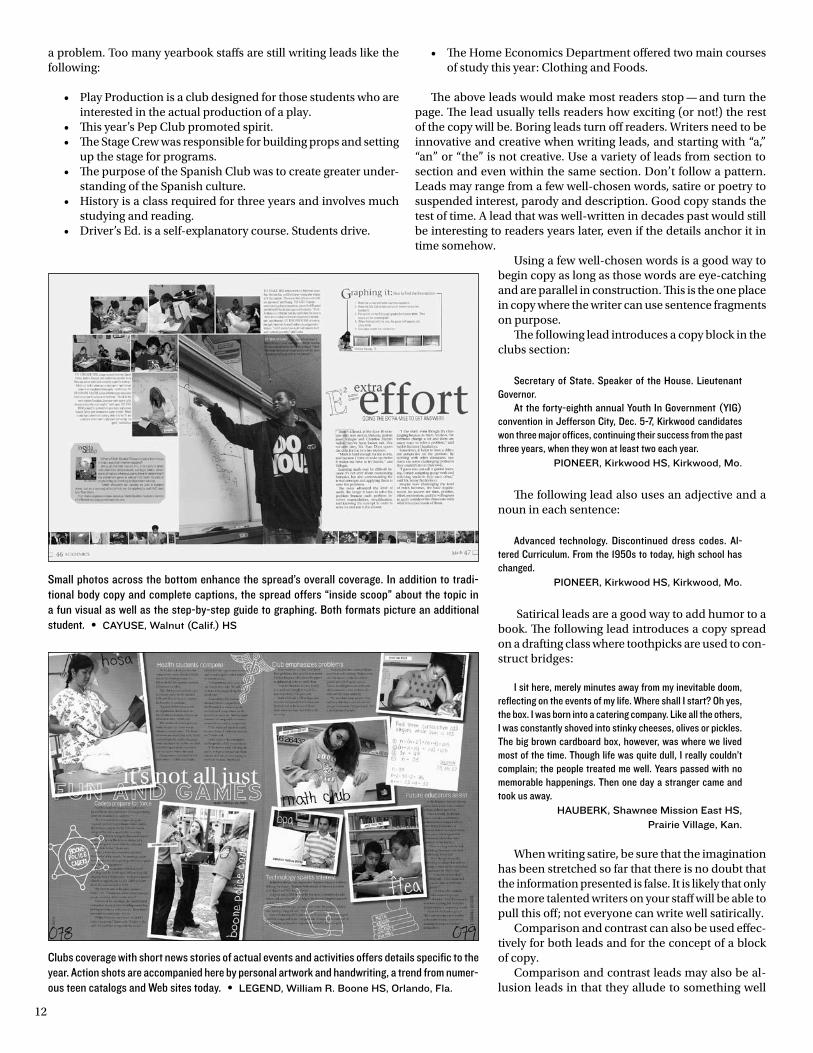
Small photos across the bottom enhance the spread’s overall coverage. In addition to tradi-tional body copy and complete captions, the spread offers “inside scoop” about the topic in a fun visual as well as the step-by-step guide to graphing. Both formats picture an additional student. • cayusE, Walnut (calif.) Hs
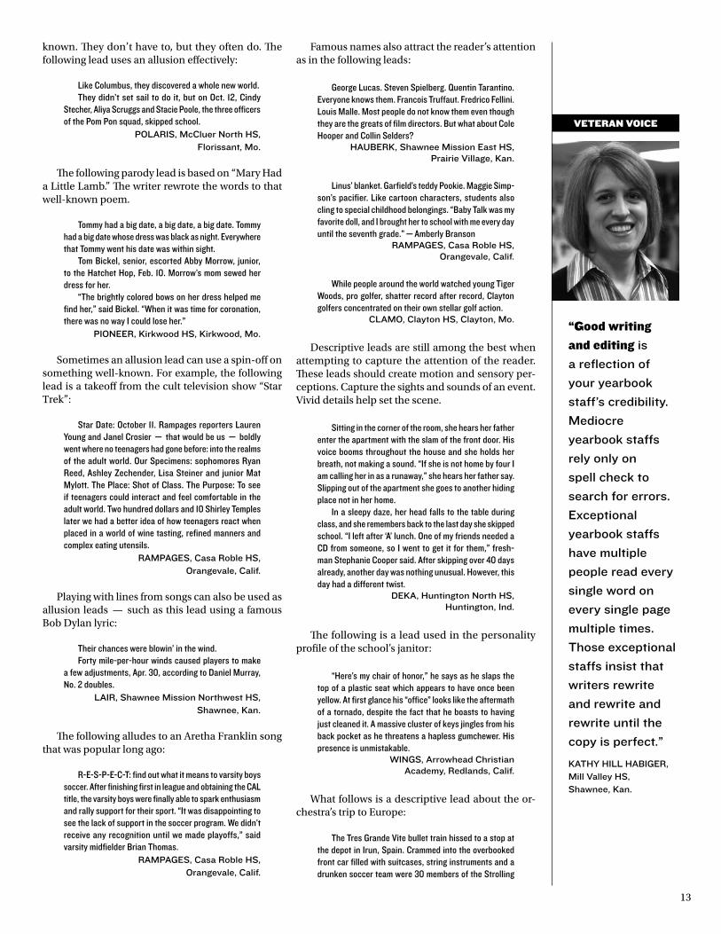
Clubs coverage with short news stories of actual events and activities offers details specific to the year. Action shots are accompanied here by personal artwork and handwriting, a trend from numer-ous teen catalogs and Web sites today. • lEGEnd, William r. Boone Hs, orlando, Fla.
13
known. They don’t have to, but they often do. The following lead uses an allusion effectively:
Like Columbus, they discovered a whole new world.They didn’t set sail to do it, but on Oct. 12, Cindy
Stecher, Aliya Scruggs and Stacie Poole, the three officers of the Pom Pon squad, skipped school.
polarIs, mccluer north Hs, Florissant, mo.
The following parody lead is based on “Mary Had a Little Lamb.” The writer rewrote the words to that well-known poem.
Tommy had a big date, a big date, a big date. Tommy had a big date whose dress was black as night. Everywhere that Tommy went his date was within sight.
Tom Bickel, senior, escorted Abby Morrow, junior, to the Hatchet Hop, Feb. 10. Morrow’s mom sewed her dress for her.
“The brightly colored bows on her dress helped me find her,” said Bickel. “When it was time for coronation, there was no way I could lose her.”
pIonEEr, Kirkwood Hs, Kirkwood, mo.
Sometimes an allusion lead can use a spin-off on something well-known. For example, the following lead is a takeoff from the cult television show “Star Trek”:
Star Date: October 11. Rampages reporters Lauren Young and Janel Crosier — that would be us — boldly went where no teenagers had gone before: into the realms of the adult world. Our Specimens: sophomores Ryan Reed, Ashley Zechender, Lisa Steiner and junior Mat Mylott. The Place: Shot of Class. The Purpose: To see if teenagers could interact and feel comfortable in the adult world. Two hundred dollars and 10 Shirley Temples later we had a better idea of how teenagers react when placed in a world of wine tasting, refined manners and complex eating utensils.
rampaGEs, casa roble Hs, orangevale, calif.
Playing with lines from songs can also be used as allusion leads — such as this lead using a famous Bob Dylan lyric:
Their chances were blowin’ in the wind.Forty mile-per-hour winds caused players to make
a few adjustments, Apr. 30, according to Daniel Murray, No. 2 doubles.
laIr, shawnee mission northwest Hs, shawnee, Kan.
The following alludes to an Aretha Franklin song that was popular long ago:
R-E-S-P-E-C-T: find out what it means to varsity boys soccer. After finishing first in league and obtaining the CAL title, the varsity boys were finally able to spark enthusiasm and rally support for their sport. “It was disappointing to see the lack of support in the soccer program. We didn’t receive any recognition until we made playoffs,” said varsity midfielder Brian Thomas.
rampaGEs, casa roble Hs, orangevale, calif.
Famous names also attract the reader’s attention as in the following leads:
George Lucas. Steven Spielberg. Quentin Tarantino. Everyone knows them. Francois Truffaut. Fredrico Fellini. Louis Malle. Most people do not know them even though they are the greats of film directors. But what about Cole Hooper and Collin Selders?
HauBErK, shawnee mission East Hs, prairie Village, Kan.
Linus’ blanket. Garfield’s teddy Pookie. Maggie Simp-son’s pacifier. Like cartoon characters, students also cling to special childhood belongings. “Baby Talk was my favorite doll, and I brought her to school with me every day until the seventh grade.” — Amberly Branson
rampaGEs, casa roble Hs, orangevale, calif.
While people around the world watched young Tiger Woods, pro golfer, shatter record after record, Clayton golfers concentrated on their own stellar golf action.
clamo, clayton Hs, clayton, mo.
Descriptive leads are still among the best when attempting to capture the attention of the reader. These leads should create motion and sensory per-ceptions. Capture the sights and sounds of an event. Vivid details help set the scene.
Sitting in the corner of the room, she hears her father enter the apartment with the slam of the front door. His voice booms throughout the house and she holds her breath, not making a sound. “If she is not home by four I am calling her in as a runaway,” she hears her father say. Slipping out of the apartment she goes to another hiding place not in her home.
In a sleepy daze, her head falls to the table during class, and she remembers back to the last day she skipped school. “I left after ‘A’ lunch. One of my friends needed a CD from someone, so I went to get it for them,” fresh-man Stephanie Cooper said. After skipping over 40 days already, another day was nothing unusual. However, this day had a different twist.
dEKa, Huntington north Hs, Huntington, Ind.
The following is a lead used in the personality profile of the school’s janitor:
“Here’s my chair of honor,” he says as he slaps the top of a plastic seat which appears to have once been yellow. At first glance his “office” looks like the aftermath of a tornado, despite the fact that he boasts to having just cleaned it. A massive cluster of keys jingles from his back pocket as he threatens a hapless gumchewer. His presence is unmistakable.
WInGs, arrowhead christian academy, redlands, calif.
What follows is a descriptive lead about the or-chestra’s trip to Europe:
The Tres Grande Vite bullet train hissed to a stop at the depot in Irun, Spain. Crammed into the overbooked front car filled with suitcases, string instruments and a drunken soccer team were 30 members of the Strolling
“Good writing
and editing is
a reflection of
your yearbook
staff’s credibility.
mediocre
yearbook staffs
rely only on
spell check to
search for errors.
Exceptional
yearbook staffs
have multiple
people read every
single word on
every single page
multiple times.
those exceptional
staffs insist that
writers rewrite
and rewrite and
rewrite until the
copy is perfect.”
KatHy HIll HaBIGEr, mill Valley Hs, shawnee, Kan.
VEtERAn VOIcE
14
“Dig! Dig!
Dig! When
interviewing,
dig for those
memorable,
unusual quotes
that play
on readers’
emotions. make
them laugh, cry,
frown, grimace,
groan or smile.”
H.l. Hall, tennessee High school
press association
Strings, their sponsor, Karen McGhee and three of the group’s four parent chaperones.
After barely making the train as it departed Paris three hours earlier, the group was happy to get off the train, thinking that the worst part of the trip was over. They were wrong.
IndIan, shawnee mission north Hs, overland park, Kan.
Next to description, the most effective lead is the teaser or suspended interest lead. Most teaser leads are one sentence in length, but they usually need a second paragraph to help explain the teaser.
As you rooted for the freshman football team, you casually looked to the sidelines and noticed something unusual.
Number 50 had a blond braid tied behind his helmet. You looked past it at first and then turned back suddenly and realized that it wasn’t a blond braid hanging from his helmet; it was a blonde braid hanging from her helmet.
EpIc, center Hs, antelope, calif.
Another type of lead, the narrative hook lead, is similar to description, but it uses fiction. The writer may use all the tools of a fiction writer. Another name used for this kind of start is the hypothetical lead.
Smoking it up... As they snuck out the side door of the school to have a cigarette, they felt their guilty con-sciences nagging at them. They knew they were wrong for leaving school, but they couldn’t resist.
Whether at school or out on the weekend with friends, some students chose to smoke.
However on July 1, a new law was passed prohibiting underage smokers from buying, possessing or smoking cigarettes.
IndIan, shawnee mission north Hs, overland park, Kan.
Quotes can also be effective as leads if they are exciting quotes. Writers need to dig deep for mean-ingful, unusual quotes. That’s true whether the quote is being used for the lead or in the body of the copy block. Avoid trite statements and quotes which merely repeat known facts. The following are examples of successful quote leads:
“My family is Muslim. I can’t eat pork, but I do anyway,” said sophomore Nadirah Muhammad.
HI•s•potts, pottsville area Hs, pottsville, pa.
“I have to clean my room before I study,” said Kym Dally. “If it doesn’t get clean, I can’t concentrate.”
WInGs, arrowhead christian academy, redlands, calif.
“Wow, that was a curb,” said junior Paul Le Fevre, referring to the bump he backed over as he pulled out of the teacher parking lot at 4 p.m. on Oct. 21.
Thank goodness nobody was keeping score — yet. Le Fevre was on his way to his house to get his birth
certificate for his 4:30 p.m. appointment at the DMV in Carmichael.
EpIc, center Hs, antelope, calif.
Another way to begin copy is with a question lead. Like the quote lead, the question must be one that will make the reader sit up and take notice. He or she must want to know the answer to the question, or the technique has not worked.
Does watching film and eating Oreos while listening to White Zombie sound a little odd before competition? This is how junior Ben Graves mentally prepares himself before every race.
crEst, manchester Hs, north manchester, Ind.
“Could you hand me the Rehabilitation file?... Did you catch that last point?... This is exactly the same as the last time we heard it!... Where did you put that new evidence?... The order will be...”
In a debate round the team who did not have control of the floor would take notes while preparing their evidence in response to the other team’s speech on the topic of juvenile crime.
laIr, shawnee mission northwest Hs, shawnee, Kan.
Poetry is another effective way to begin copy, but be sure that the rhythm is correct and that the words rhyme.
“You’re my honey,You’re my lamb.You’re my sugar.Yes, you am.Do I love you? Yes!”This is just one of the many poems, riddles and cards
that Jane Lake has received from her husband, Principal Jim Lake, over the 25 years they have been married.
crImson & BluE, lincoln Hs, council Bluffs, Iowa
Other effective ways to begin copy include the con-versational approach, summary leads and exclama-tory leads. Be sure the conversational approach is a natural-sounding conversation between two people. It normally works best when it is a real conversation instead of one that has been made up.
Also, be sure that your summary leads have punch. They are often boring and are normally best used for a straight news story. Most copy in yearbooks is feature-oriented since the news is old by the time the book comes out.
Obviously there can be some overlapping with any of the types of leads discussed above. Staffs should make an attempt to use a variety of leads in order to avoid being monotonous.
Once a lead is written, the rest of the job becomes easier. The key is to zero in on one aspect of the year for each sport, club, organization, academic class and off-campus activity. Don’t get too broad or the writing will become general and lose focus. Create that single effect, create motion, create sensory perceptions and report information accurately without including the writer’s opinion, and you’re well on your way.
Some staffs use a different kind of secondary story in every section of the book, so they do not seem re-dundant. Others have taken this idea one step further and have created libraries of coverage possibilities
VEtERAn VOIcE
15
for all sections of the book so that the content really can dictate the design. They believe that, instead of having a secondary story that is always a Q & A in the life section and always a list in academics, any one section might feature dozens of kinds of stories to engage a variety of readers and tell the story of the year in many different voices.
It is common for staffs to require all members to collect quotable quotes each week. Then, when it is time to design copy mods for the people section, they have some great little vignettes covering the whole school and the whole year that can bring back memories for entire classrooms of students or teams of athletes.
Del Campo HS, Fair Oaks, Calif. has a decades-old quotable quotes tradition which takes the assignment to its highest level as staffers record all pertinent background information in addition to their quotes. The following appeared in the Decamhian:
“Just call me Mr. Cleo,” junior Clinton Bonner said to senior Lee Black on the sidelines of the Rocklin game September 13. Black was marvelling at Bonner’s ability to predict the way the game would go.
“Free at last. I came so close to reading a book,” junior Adam Graves said during his second period Poetic Experience class, September 26. Graves had been suspended for three days and was glad to be back in school because it saved him from boredom.
“I don’t understand these Canadians and their tie fetish,” junior Erica Holley said to junior Rein Zane November 7 during lunch. Holley had just seen a girl wearing a tie and chalked it up to pop star Avril Lavigne’s influence.
“This is a common sense quiz? I am going to fail!” said junior Natalie Gold-berg in her Honors Physics class, September 5. Goldberg claimed that she could memorize testable information from the book, but had no common sense.
The Tom Tom, Danville (Ind.) HS, used quotes throughout the sports section. Below are responses found in a repeated feature titled “The best times”:
“The bus rides were the best part of the season because we had so much fun talking and bonding that it did not matter if we lost.” — junior Jacquelyn Stephenson, girls’ basketball
“My favorite part about the season was when we beat South Montgom-ery for the first time and won our tournament.” — freshman Trevor Leach, basketball
“Winning is the highlight; we won state finals last weekend. It truly is an indescribable feeling.” — junior Lyssa Freeland, winter guard
The Ceniad from East Lansing (Mich.) HS also used quotes in a mix of ways in the sports section. Sometimes a single player was quoted; on other spreads the quotes were established as a point/counterpoint. These quotes appeared as a feature about athletes’ lucky charms:
“I wear my Pinocchio shirt for every game. I used to consider it my lucky shirt when I was younger. I write all the games and scores on the back. It’s the dirtiest shirt I have ever seen.” — junior Andrew Bracken
“Before freshman year I went to Olympic trials and I got a pair of goggles there. I have worn them ever since, but only for meets. They’re my good luck charm. I keep them in my bag.” — junior Lauren Anderson
alterNative StorY FormSThere are many ways to present copy in brief format, including surveys, quote bars, Q & A, top 10 lists, fast facts, quizzes and infographics.
Since staffs are utilizing various methods to present their copy in brief, many kinds of secondary stories present essential information for the year. In some cases, the traditional copy has all but disappeared from the yearbook.
A short profile on a player or a coach could be used in the sports section to supplement the main story of the year. Other stories might include a timeline with highlights of the season, a series of stats or personal records from the season, quotes about memorable games, a list of the coach’s favorite sayings and more. It is easy to see that the possibilities are endless.
An option in the clubs section would be to do a short profile on a key member of the group. In the academics section, a staff might consider doing short profiles on outstanding students within each academic department or recaps of assignments students will always remember.
Because the trend is to make copy visual in order to help the reader recall some of the special moments of the year, extra stories which present additional facts are always appropriate. For example, a copy
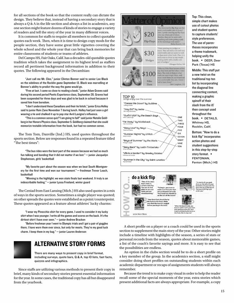
Top: This clean, simple chart makes use of cutout photos and student quotes to capture students’ style preferences. The use of paren-theses incorporates a theme trademark, helping unify the book. • dEEr, deer park (texas) Hs
Middle: This staff put a new twist on the traditional top ten list by incorporating the diagonal line connecting content, making a graphic spinoff of their slash from the if/then concept used throughout the book. • dEtaIls, Whitney Hs, rocklin, calif.
Bottom: “How to do a kick flip” incorporates action photos and student suggestions in this step-by-step story format. • FEntonIan, Fenton (mich.) Hs
16
block on some organization might zero in on just one major event the group participated in during the year. A sidebar, perhaps entitled “Facts on File” could list other activities of the group.
Remember that the key to good copy is to be innovative. It is not necessary to present academics by departments, for example. Think of what students have to do to meet academic requirements. Perhaps you could present the academic section by doing spreads on requirements for various courses. For example, you might do a spread on tests, another one on projects, another one on homework, another one on field trips and yet another one on taking notes. An-other approach might be to use questions and answers. Again, the ideas are limitless.
Try new approaches to storytelling, but in doing so be sure to consider the following copy writing guidelines:
1. The words “team,” “chorus,” “band” and “choir,” for example, are singular. They should be followed by the possessive pro-noun “its,” not the pronoun “their.”
2. Do not use the phrase “due to” loosely for “because of” since they literally do not mean the same thing. Something occurs “because of” something else — not “due to” something else.
3. Be sure that you use the words “ef-fect” and “affect” properly. “Effect” is a noun and “affect” is a verb.
4. Do not use “stated” loosely as a synonym for “said.” “Stated” should be used only if someone is mak-ing an official state-ment. Actually there is no better word for “said” than “said” un-less another word de-scribes the way a per-son says something such as “shouted” or “screamed.”
5. Avoid using the verb “feels,” when you re-ally mean “thinks” or “believes.” People tell you their thoughts, not their feelings.
6. Avoid monotony and redundancy. Elimi-nate the words “this year” from your copy unless they are neces-sary for comparison. Do not use the name of your school unless it is needed; it is obvious which school you are writing about.
7. Write in active voice — not passive. It is a more natural way to write and quite often it is shorter. However, use passive voice if necessary for a more effective lead and to keep the writing from being strained.
8. Don’t talk in generalities. Be specific. Report facts that fit the unique year. Avoid copy like the following: “Verb, noun and adjec-tive usage are studied throughout all four years of English. Composition skills, vocabulary and literature are also ongoing parts of the program.” The copy above could be written any year. Dig deep, find the unusual and don’t include trite expressions.
9. Use quotes that add meaning. Avoid quotes like the following: “I was so thrilled to be elected queen. I just couldn’t believe it when I heard my name.” Instead, use quotes like the following: “It was funny when I saw Dave Johnson (master of ceremonies) read the name of the queen off a used disciplinary slip. Since I had received several disciplinary slips
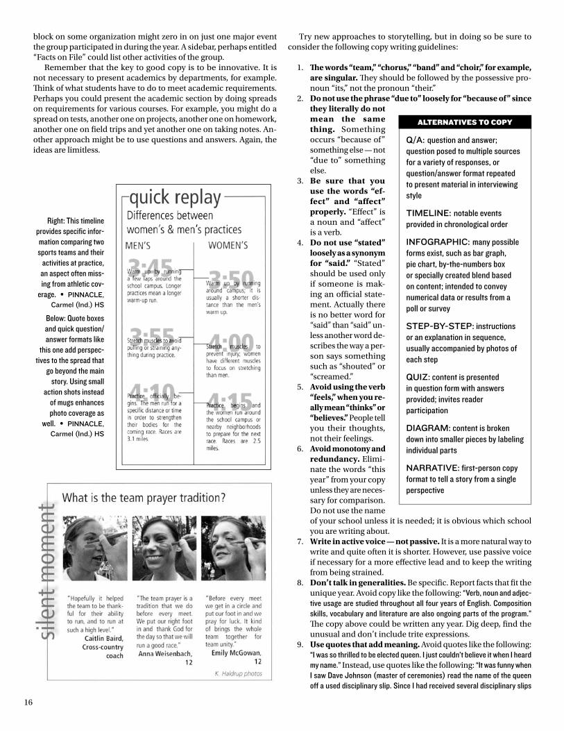
Right: This timeline provides specific infor-mation comparing two sports teams and their
activities at practice, an aspect often miss-ing from athletic cov-
erage. • pInnaclE, carmel (Ind.) Hs
Below: Quote boxes and quick question/answer formats like
this one add perspec-tives to the spread that
go beyond the main story. Using small
action shots instead of mugs enhances photo coverage as
well. • pInnaclE, carmel (Ind.) Hs
Q/a: question and answer; question posed to multiple sources for a variety of responses, or question/answer format repeated to present material in interviewing style
tImElInE: notable events provided in chronological order
InFoGrapHIc: many possible forms exist, such as bar graph, pie chart, by-the-numbers box or specially created blend based on content; intended to convey numerical data or results from a poll or survey
stEp-By-stEp: instructions or an explanation in sequence, usually accompanied by photos of each step
QuIz: content is presented in question form with answers provided; invites reader participation
dIaGram: content is broken down into smaller pieces by labeling individual parts
narratIVE: first-person copy format to tell a story from a single perspective
AltERnAtIVEs tO cOpY
17
“Academics is
the sole reason
schools exist,
so don’t think
of academics
coverage as
boring, or else
it will be. Jazz
up this section
with the honest
perspective of
students.”
mary Kay doWnEs, chantilly (Va.) Hs
during the year for tardiness, I guess it was appropriate that it was my name which was on the slip.” Quotes usually make copy more effective. Readers like to see their names in print, and quotes also help the writer make the copy more specific to fit a particular year.
10. Bury attributions for best effect. Place who said the quote in the middle or at the end of a quote. This helps to avoid monotony. It is best to bury the attribution in the middle of a quote if there is a logical thought break for it.
11. Proof copy carefully. “A lot” is two words, for example. Correct spelling is part of style.
12. Keep paragraphs short to enhance readabil-ity. A good rule to follow is 40 words or fewer to each paragraph. Vary paragraph length, how-ever, to avoid monotony.
13. Vary word usage within a sentence and within a paragraph. Use synonyms where appropriate.
14. As a rule, write in past tense, third person. It is possible to write copy in first or second person, but it takes a more skilled writer. Many readers have a hard time identifying with first or second person copy. The first person “I” is often not identified, and the second person “you” does not pertain to each “you” reading the copy. Avoid using first person “our.” First person “we” might be used for theme copy, but it is just like second person “you.” Not every person at a school did what the copy says “we” all did.
15. Use statistics when appropriate. They add to the history of a year. This is not the same as including research material from the Internet without a direct localization to your readers.
16. Use a variety of copy presentations. Some forms and styles to consider: question/answer; survey results/statistical analysis; dialogue/dramatization; lists; first-person narratives; anecdotes; timelines and factoids. Survey re-sults can be presented as an infographic. In order to receive a representative cross-section of opinion, follow consistent scientific meth-ods. For example, from a class of 400 seniors, a survey of every tenth person would provide 40 responses or 10 percent of the student popula-tion. A source should be provided for each in-fographic when communicating poll or survey results.
17. Write exciting leads. Avoid beginning with “a,” “an,” “the.” Rely on description and scene-setting techniques.
18. Use transitions well so the reader is carried from one thought to the next.
19. Use descriptive words to make copy come alive.
20. Use sound interviewing techniques. Dig deep for meaningful, unusual quotes and important details.
theme coPYThe tone of the theme/concept is established in this first block of copy explaining why the idea fits this school this year with lots of specifics. The same tone or style should be used for all division page copy and the closing as well.
“High School. Captured Daily” was a theme for Rampages from Casa Roble HS, Orangevale, Calif.. Below is the opening theme copy:
Every science test. Every history lecture.Every morph into smelly gym clothes. Every Eng-
lish essay. Every math problem. Every progress report hidden from your parents. Every economics nap. Every government trip. Every speech where you can’t help but stutter. Every deadline. Every tardy. Every time you just feel so overwhelmed. Every good grade. Every bad grade. Ev-ery time something actually makes sense. Every minute. Every class. Every day.
High School. Captured Daily. Created by Casa. Brought to you by Rampages.
The Quinault staff from Aberdeen (Wash.) HS used traditional copy packed with specifics to make “Voices,” a concept which might have been too general to be effective, tie clearly to both their school and to the coverage year:
Every person lives a story, but no story reads with the same voice. Listen to someone’s story and you can tell a lot about its owner. Some stay up late working on Nidick’s pre-calc assignment. Others sleep in and show up tardy to first period. Some spend $50 on a pair of Abercrombie jeans. Others shell out 50¢ for a hot buy at the “B” Street Thrift Store. Some park their 1988 Blazer in the senior lot. Others have their parents drop them off in front of the Phillips Building. Some listen to Green Day. Others, Garth Brooks. Simply put, your voice, your style personalizes you. It’s what you make it. So go on already. Find your own voice.
StudeNt liFe coPYBecause student life is often one of the earliest sections in the book, it is imperative that a staff write the copy well to make a good first impression.
It is also important to select interesting topics. The Indian, Shawnee Mission North HS, Overland Park, Kan., wrote the following copy which indicates some research on the part of the writer. Research and good quotes are necessary to write good copy.
Up in the Sky... Bright hot lights, harnesses that bruised hips and 23 hours of practice a week were all part of the hardships that the 19 crew heads and 80 members of Peter Pan had to go through to put on a successful production.
Months of planning went into the winter musical main stage, as the plays are selected a year in advance. The
VEtERAn VOIcE
18
director and stage manager rarely stopped working on it until closing night.
“I chose Peter Pan because it is the 75th anniversary and I wanted something really special, and what’s more special than flying?” said director Maureen Davis of the production’s four sold-out shows. “I also wanted some-thing that would appeal to everyone young and old.”
The cast members who flew were excited about being in the air, but could not deny that it was somewhat of a trying experience.
“The harness, depending on where you put it, puts pressure on your lungs,” said senior Megan Birdsall, who played Peter Pan. “But the hardest thing was if the flight people jerked you, then it was all over. Plus, it was harder because I had bronchitis.”
The six cast members who flew may have seemed graceful, but in reality, the harnesses inflicted pain upon the flyers.
“It feels like you’re pregnant, we have to waddle around to get used to not bending from the hip down,” said junior Jenny Foster, who played Liza.
However, not all attention was focused on the actors and actresses on stage. The pit and crews also played an important role in the creation of the winter musical.
“The young men who controlled the flyers were hand-picked,” Davis said, “They did not try out. I asked them because I thought that they were strong enough and responsible.”
Memories were also made outside of practices, while students were shopping for break-a-legs, or just hung out.
“Me and Grant were looking for break-a-legs and I was wearing my blue fur coat and bunny ears,” Birdsall recalled. “Grant was embarrassed because I was pounding on the door of Aromas, because I needed to get in, but they had just closed the store.”
Because North had one of the most recognized drama departments in the district, the students often felt more pressure to give an excellent performance.
“Our goals are to always do good theater,” Davis said. “We don’t do high school theater, we make it the best it can be.”
With help from their teachers, students set higher expectations for themselves and worked on developing their talent.
“It’s not necessarily our talent, but the way the teach-ers shape that talent,” said junior Nick Cottini, who played a pirate. “They have more experience and they know how to get maximum performance from us.”
academic coPYBringing memorable assignments to life is just one way to make the academics copy in your book more interesting; nothing could be more boring than a tired list of courses offered.
In its departmental academics section, the In-dian, Shawnee Mission North HS, Overland Park, Kan., recognized its 75th anniversary with historical sidebar copy. The following copy is taken from the Art Seminar spread:
Entering room 185, a group of 19 students crowd-ed around a table cluttered with paintings, drawings, photographs and sculptures, grabbing whatever space they could to spread out their projects. They were hard
at work preparing their portfolios and critiquing each other’s work.
“I want to have a career in art, so that’s why I took the class,” said senior Margaret Schramm.
Once the school year began, art seminar prepared the students for attending specific colleges and possibly art schools. To be accepted into Art Seminar, a recommenda-tion from an art teacher was required and a “B” average must have been maintained in previous art classes.
“I didn’t know about the class until last year,” said senior Jennifer Agniel. “One day I got a note that said a teacher had recommended me for the class and I thought it would be a fun thing to do.”
Preparing slides and matting artwork for portfolios could be very time-consuming and sometimes stress-ful.
“We got time that we otherwise wouldn’t have to prepare our portfolios, and we got advice on what we can do to improve them,” Agniel said.
Students also used this hour as an artistic outlet for their abilities.
“Getting our portfolios done is stressful,” Schramm said, “but it’s really exciting when you get a piece of work done that you like.”
Portfolios showcased the students’ best work to be shown to college representatives, and were also a way to get scholarships.
“One of the assignments was to do a series, and that is something I would have never done on my own,” Agniel said. “It pushed me further than what I would normally do.”
Art teacher Lynda Vandever has been the class’ instructor and sponsor for seven years. She said the quality of artists in her class continued to improve with each year.
“This is one of the most talented groups I’ve ever had,” Vandever said.
Historical copy:World War II was a landmark of the 1940s, but to stu-
dents attending SM North it was a decade for progress.A third building was added that housed the Future
Farmer Program, a wood working class and the art depart-ment.
The ’40s was a decade of new organizations. The first debate club was organized, and math, science and foreign language clubs were popular. Business clubs were set up, along with the National Honor Society.
In 1944 the enrollment was 1,054 students with only 30 teachers. Journalism and creative writing clubs were pop-ular, but most students were interested in joining Mercy’s Messengers, a club that helped with war efforts.
SPortS coPYGood sports copy should include some of the thrills and chills of the year. You don’t need to rehash the whole season; the scoreboard contains all of that information and more.
Describe some of the key plays. Help the reader relive some of the exciting moments. Be sure to in-clude statistics — both team and individual. Sidebars with coaches’ and players’ comments can also add to sports coverage. Geography is also important in sports copy. Set the location of the action for the reader. Let the reader know if it was a 40-yard touchdown run
“A picture may
be worth a
thousand words,
but you can’t
tell the complete
story of the
year without
the words. Go
beyond the
standard copy
block to add
more info and
more reader
appeal. Fast
facts, bios,
narratives,
lists and other
alternative copy
options increase
coverage.”
lynn strausE, retired, East lansing
(mich.) Hs
VEtERAn VOIcE
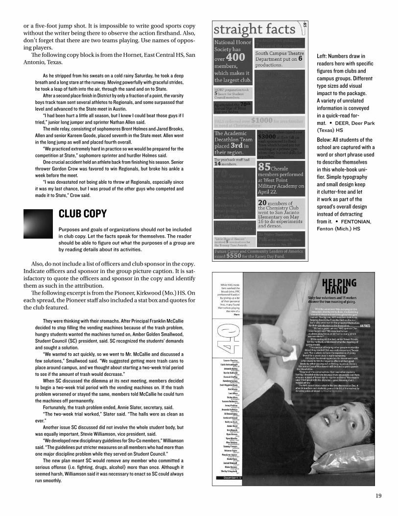
19
or a five-foot jump shot. It is impossible to write good sports copy without the writer being there to observe the action firsthand. Also, don’t forget that there are two teams playing. Use names of oppos-ing players.
The following copy block is from the Hornet, East Central HS, San Antonio, Texas.
As he stripped from his sweats on a cold rainy Saturday, he took a deep breath and a long stare at the runway. Moving powerfully with graceful strides, he took a leap of faith into the air, through the sand and on to State.
After a second place finish in District by only a fraction of a point, the varsity boys track team sent several athletes to Regionals, and some surpassed that level and advanced to the State meet in Austin.
“I had been hurt a little all season, but I knew I could beat those guys if I tried,” junior long jumper and sprinter Nathan Allen said.
The mile relay, consisting of sophomores Brent Holmes and Jared Brooks, Allen and senior Kareem Goode, placed seventh in the State meet. Allen went in the long jump as well and placed fourth overall.
“We practiced extremely hard in practice so we would be prepared for the competition at State,” sophomore sprinter and hurdler Holmes said.
One crucial accident held an athlete back from finishing his season. Senior thrower Gordon Crow was favored to win Regionals, but broke his ankle a week before the meet.
“I was devastated not being able to throw at Regionals, especially since it was my last chance, but I was proud of the other guys who competed and made it to State,” Crow said.
club coPYPurposes and goals of organizations should not be included in club copy. Let the facts speak for themselves. The reader should be able to figure out what the purposes of a group are by reading details about its activities.
Also, do not include a list of officers and club sponsor in the copy. Indicate officers and sponsor in the group picture caption. It is sat-isfactory to quote the officers and sponsor in the copy and identify them as such in the attribution.
The following excerpt is from the Pioneer, Kirkwood (Mo.) HS. On each spread, the Pioneer staff also included a stat box and quotes for the club featured.
They were thinking with their stomachs. After Principal Franklin McCallie decided to stop filling the vending machines because of the trash problem, hungry students wanted the machines turned on, Amber Golden Smallwood, Student Council (SC) president, said. SC recognized the students’ demands and sought a solution.
“We wanted to act quickly, so we went to Mr. McCallie and discussed a few solutions,” Smallwood said. “We suggested getting more trash cans to place around campus, and we thought about starting a two-week trial period to see if the amount of trash would decrease.”
When SC discussed the dilemma at its next meeting, members decided to begin a two-week trial period with the vending machines on. If the trash problem worsened or stayed the same, members told McCallie he could turn the machines off permanently.
Fortunately, the trash problem ended, Annie Slater, secretary, said.“The two-week trial worked,” Slater said. “The halls were as clean as
ever.”Another issue SC discussed did not involve the whole student body, but
was equally important, Stevie Williamson, vice president, said.“We developed new disciplinary guidelines for Stu-Co members,” Williamson
said. “The guidelines put stricter measures on all members who had more than one major discipline problem while they served on Student Council.”
The new plan meant SC would remove any member who committed a serious offense (i.e. fighting, drugs, alcohol) more than once. Although it seemed harsh, Williamson said it was necessary to enact so SC could always run smoothly.
Left: Numbers draw in readers here with specific figures from clubs and campus groups. Different type sizes add visual impact to the package. A variety of unrelated information is conveyed in a quick-read for-mat. • dEEr, deer park (texas) Hs
Below: All students of the school are captured with a word or short phrase used to describe themselves in this whole-book uni-fier. Simple typography and small design keep it clutter-free and let it work as part of the spread’s overall design instead of detracting from it. • FEntonIan, Fenton (mich.) Hs
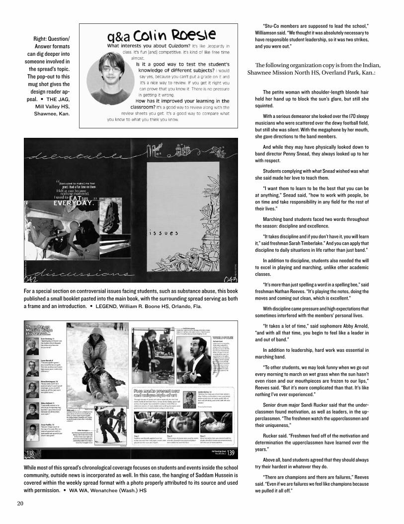
20
“Stu-Co members are supposed to lead the school,” Williamson said. “We thought it was absolutely necessary to have responsible student leadership, so it was two strikes, and you were out.”
The following organization copy is from the Indian, Shawnee Mission North HS, Overland Park, Kan.:
The petite woman with shoulder-length blonde hair held her hand up to block the sun’s glare, but still she squinted.
With a serious demeanor she looked over the 170 sleepy musicians who were scattered over the dewy football field, but still she was silent. With the megaphone by her mouth, she gave directions to the band members.
And while they may have physically looked down to band director Penny Snead, they always looked up to her with respect.
Students complying with what Snead wished was what she said made her love to teach them.
“I want them to learn to be the best that you can be at anything,” Snead said, “how to work with people, be on time and take responsibility in any field for the rest of their lives.”
Marching band students faced two words throughout the season: discipline and excellence.
“It takes discipline and if you don’t have it, you will learn it,” said freshman Sarah Timberlake.” And you can apply that discipline to daily situations in life rather than just band.”
In addition to discipline, students also needed the will to excel in playing and marching, unlike other academic classes.
“It’s more than just spelling a word in a spelling bee,” said freshman Nathan Reeves. “It’s playing the notes, doing the moves and coming out clean, which is excellent.”
With discipline came pressure and high expectations that sometimes interfered with the members’ personal lives.
“It takes a lot of time,” said sophomore Abby Arnold, “and with all that time, you begin to feel like a leader in and out of band.”
In addition to leadership, hard work was essential in marching band.
“To other students, we may look funny when we go out every morning to march on wet grass when the sun hasn’t even risen and our mouthpieces are frozen to our lips,” Reeves said. “But it’s more complicated than that. It’s like nothing I’ve ever experienced.”
Senior drum major Sandi Rucker said that the under-classmen found motivation, as well as leaders, in the up-perclassmen. “The freshmen watch the upperclassmen and their uniqueness,”
Rucker said. “Freshmen feed off of the motivation and determination the upperclassmen have learned over the years.”
Above all, band students agreed that they should always try their hardest in whatever they do.
“There are champions and there are failures,” Reeves said. “Even if we are failures we feel like champions because we pulled it all off.”
For a special section on controversial issues facing students, such as substance abuse, this book published a small booklet pasted into the main book, with the surrounding spread serving as both a frame and an introduction. • lEGEnd, William r. Boone Hs, orlando, Fla.
While most of this spread’s chronological coverage focuses on students and events inside the school community, outside news is incorporated as well. In this case, the hanging of Saddam Hussein is covered within the weekly spread format with a photo properly attributed to its source and used with permission. • Wa Wa, Wenatchee (Wash.) Hs
Right: Question/Answer formats
can dig deeper into someone involved in
the spread’s topic. The pop-out to this mug shot gives the
design reader ap-peal. • tHE JaG,
mill Valley Hs, shawnee, Kan.
21
“In a perfect
world, the
photographers
gather every
scrap of
information
needed for every
photo’s caption.
However, the
next best
information-
gathering system
is to show the
photo to the key
person involved,
interviewing to
find out what
happened just
before, during
and after the
shot was taken.”
KatHy craGHEad, retired, mexico (mo.) Hs
Portrait Page coPYTypes of copy on portrait pages may vary from briefs, anecdotes and quotable quotes to profiles and additional student life coverage. This section is a great place to cover lots of random stories that make the year (and the school) unique.
The following story is from the Hornet, East Central HS, Austin, Texas:
Looking around the crowded bank’s reception area, the boy waited patiently for his turn to have his paycheck cashed. Being in half-day allowed the boy to acquire enough credits to graduate but yet earn money to help out the family, pay for a car or spend weekends going out.
Money seemed to be more of a necessity as students grew older. Seniors were faced with expenses such as dues, class rings and graduation.
“I got into half-day so I could make money and work,” Bradi Nester said.
Along with the money, there came the consequence of becoming a more responsible adult. Going to school and work made students realize they had become more dependable.
“I definitely think I have become more responsible because I have to manage my time, and I am also depended on at work,” Matt Mead said.
Students in half-day took jobs that were closely re-lated to what they planned on doing in the future. Getting into the work force also made some students’ attitudes towards life change.
“Having a part-time job changed my attitude toward life in general because it showed me what the ‘real world’ is like,” Angie Honeycutt said.
The Hornet also used brief quotes in its portrait section. The quotes listed below were placed next to the headline, “Car Ownership Reveals Downfalls”:
“My father hates to see dirt on my car, so I wash it once a week. It is just like another chore, but I would much rather do this one. My parents think I need the experience.” — Casey Sharp
“I hate transporting my brother around because he is a back-seat driver. He always tells me that my turns are too sharp and that I drive way too fast. I try not to transport him at all.” — Kris Mylius
“I have to work to get money for gas and car insurance. I think the price is outrageously high. I usually try to find a station selling gas for around $1.09. I also hate getting stuck in traffic.” — Michelle Fletcher
how to write headliNeSTo be successful, a headline should do more than just grab the reader’s attention; it should fit the specific year, it should allude to the copy and it should provide enough information that readers are directed to the start of the copy.
Most books today use magazine-style feature heads to attract the reader. Magazine heads are lively.
They use plays on words, emotion words and impact phrases. They are seldom complete sentences and are usually two to five words in length.
The best feature heads give a twist to a well-known saying, an ad or the title of a song, book or movie. For example:
send in the clonesfor a story on cloning. pIonEEr,
Kirkwood Hs, Kirkwood, mo.
Rain, Rain, stay and play... and totally ruin our homecoming day
for a story about the weather’s effect on homecoming spirit. VolsunG, downey (calif.) Hs
Real men wear short shorts for a story on the cross country team.
WInGs, arrowhead christian academy, redlands, calif.
Drivers Wantedfor a story about guys and their cars.
EpIc, center Hs, antelope, calif.
three’s a crowdfor a story when the varsity football
team ended in a three-way tie in league play. VolsunG, downey (calif.) Hs
However, a clever headline is not enough to draw the reader onto the spread and provide information about the specifics of content. You need an informa-tion-packed secondary headline (what some people call a subhead) to get the highest impact possible. The best yearbooks design all of their headline packages with ample space for effective secondary heads.
Stand-alone sentence heads are not as common since they generally do not have the reader appeal that feature heads do. Sentence heads are usually written in downstyle, which means only the first word and proper nouns are capitalized. A sentence head needs a subject and verb.
Avoid label heads. These are usually one to three words in length (Basketball, National Honor Society, School Board) and they are the type of headline that could be used any year at any school anywhere in the world. They do not fit the specific year even though they do allude to the story’s content. They certainly do not grab the reader’s attention.
Regardless of the type of headline you choose, consider the following guidelines:
1. Every story in the book should have some type of headline package that includes both a main headline and an information-packed secondary headline.
2. Each headline package should offer specif-ic details — but don’t add words just to fill space.
VEtERAn VOIcE
22
“After you
have finished
designing a
spread, take
something off
the page. and
something
else. one less
graphic. one
less color. add
a little extra
space between
elements. pages
will come alive.
less is more.”
crystal KazmIErsKI, arrowhead christian
academy, redlands, calif.
4. Write positive heads by telling what was done rather than what was not done.
5. Avoid repetition of words and phrases within a headline package or from spread to spread. For example, do not use the word “senior” on every spread in the senior portrait section. In general, avoid using “students” as your subject since nearly every story in the book is about students.
6. Make sure abbreviations are easily under-stood by all readers, and when using acro-nyms, omit periods.
7. Use single rather than double quote marks.8. Divide related thoughts with a semicolon, but
use a semicolon only at the end of a line.9. Use a comma for the word “and” in sentence
heads, and avoid using “a,” “an” and “the.” It is satisfactory to use them in feature heads.
10. Do not editorialize. The writer’s opinion does not belong in headlines.
11. Do not split related phrases from line to line in a multiple-line head, i.e., prepositions and objects, nouns and adjectives, verbs and objects, names.
12. Use present tense to make the copy appear to be more current. Avoid future tense as a yearbook is a history book.
13. Avoid using the name of the school or a club in a headline. It’s obvious which school you’re writing about, and the club should be in the fo-lio as part of the page information or in another key location.
14. Do not hyphenate words in headlines.15. Do not use periods at the end of a headline.16. Consider using the dominant photo as a
source for a headline idea. Often the dominant photo depicts part of the information presented in copy. Making a verbal/visual connection creates huge impact for readers.
17. Select typefaces to complement each other. It is possible to mix serif with sans serif letters and roman with italic. Study contemporary magazines to get ideas for innovative type treat-ments. Headline package design is a major entry point on the spread.
There are many different ways to present a head-line within a design. One possible way is just as a one-line primary headline. This was popular in both newspapers and yearbooks for many decades. For example:
A tie-BreakerThe problem with a single element headline is
two-fold. First, it can be boring in terms of design. Using a decorative typeface won’t help, either — that just creates a distraction.
In addition, readers haven’t learned anything in-teresting to make them read on to the story itself.
One option would be to write a wicket — a mul-tiple line secondary head that reads into the primary head. For example:
Lavon Kincaid’slast-second shothelps team win
Overtime BattleThe wicket may go to the side of the primary head-
line, or it may go above. It is not necessary for the primary and secondary head to form a complete sentence as in the example above. The two parts of the head may stand alone as separate elements.
Another possibility is to write a tripod head where two lines either to the left or right of the main head are about half the size of the main head. Normally, it is best to separate the main head from the two smaller lines with a colon.
You might also use a kicker. A kicker is a short in-troductory head to the primary head. For example:
It takes two. . .
A whirling danceStill another possibility is a hammer head where
the primary head is on top of a smaller, secondary head. For example:
A lOOK BAcKschool celebrates 100th birthday
There’s no limit to the format variation of headlines. Not all of the styles even have names. The goal of the designer should be to create a style (or replicate one from a magazine or other publication) that attracts the reader’s attention, works with other design elements on the spread and leads the readers to the story.
Using lines, screens, initial letters and a variety of type sizes can add graphic appeal to a headline package. Proper use of typestyles can add to the page design. Typography is an integral part of design and staffs should use it in the most appealing ways pos-sible.
Be aware that magazine heads do not always com-pletely identify page content. Therefore, it may be necessary to write a sentence headline as a second-ary headline to explain the main headline or clarify for readers.
how to write caPtioNSCaptions must tell the complete story behind each photograph. That means each one answers who, what, when, where, why and how, if possible. The captions are part of the history of the year. Incomplete captions mean incomplete reporting and a less than accurate history.
Some staffs write such detailed captions that they use the captions as mini-stories and eliminating the
VEtERAn VOIcE
23
traditional copy block in favor of copy that is more reader-friendly. A lack of good reporting is evident if captions do not contain answers to all pertinent questions as well as additional background infor-mation.
In recent years, staffs have taken writing great cap-tions one step further and required that the subject of the photo be quoted as well. This requirement has several benefits; first, when the photo’s subject is interviewed, he knows he is going to be in the year-book (which may lead him to purchase a yearbook) and second, the credibility of the staff increases as it is clear to all that the captions have been reported accurately. A similar approach is to quote someone not in the picture, asking an eyewitness to comment on the event. The benefit here is that a second student appears in the book (one pictured, one quoted).
As a child, Aubrey Liccketto spent time with her father learning all there was to know about cars. Liccketto’s father promised to buy her a 1966 Mustang when she was 16. However, he passed away before he could fulfill his promise. She decided to get a part-time job and earned enough money to buy the car herself. “My dad got me into cars when I was little and it was what we bonded over. I felt that being involved with cars kept me close to him,” Liccketto said.
To process a roll of film, Colleen O’Donnell pours 10 millili-ters of D-76, a standard developer, into a measuring cup. “The developer had to be 68 degrees so the darkroom was always freezing. If the developer was not cold enough, I had to put it in the freezer,” said O’Donnell. “I loved developing my own film because once I had the negatives at my disposal, I could control the contrast of the photo while printing.”
Careful not to cut himself, Sam Liu shaves his legs because he likes them smooth. “I shaved really fast because I did not want my dad to catch me shaving. He thought shaving was for girls,” Liu said. “But then again, times changed. I liked the look and the feel. I ignored what others said to me about it because I liked it.”
When writing captions, keep the following guide-lines in mind:
1. Avoid stating the obvious. Tell the readers more than they would know if they saw the photo without the caption.
2. Be accurate. Writing captions is part of report-ing. The caption writer must find out what was going on when the picture was taken. Do not make up captions. Photographers should write down all the essential information when they shoot the photo. Don’t send the caption writer out at the last minute to get information.
3. Be serious. Avoid gag captions.4. Do not editorialize. Leave out the writer’s opinion.5. Begin with words that have a strong impact. Avoid beginning
with “a,” “an” and “the.” Also avoid beginning with “ing” words, prepositions, dates and time elements such as “during,” “while,” “at,” “as,” “after” and “when.”
6. Write in the present tense, active voice when answering the questions of who and what. The action in that frame is frozen forever. Generally the background information (especially the why and how) follows in the second and third sentences, for which past tense is preferred.
7. Use full names and complete identifications.8. Use multiple sentences to tell the complete story. After an-
swering the necessary questions in the first sentence, require a second sentence that provides an additional fact or background information. Writing captions as short stories themselves can enhance your coverage and get more students in the book via direct quotes.
9. Identify all people in an action photo unless it is a large crowd shot. Some staffs set a cut-off, requiring that photos with fewer than five or seven students be identified individually.
10. Use colorful, lively verbs. Avoid passive “to be” verbs — am, is, are, was, were.
Sports coverage meets student life in this attractive spread about snowboarding. Quick-reads and fast facts around the spread include specific information about cost and equipment from student enthusiasts. • nExus, Inland lakes Hs, Indian river, mich.
Following the chronological style is easy for readers on this spread due to the tabs with each day of the week labeling every content module. Concept development at the bottom of each spread fits the 24:7 theme by covering 24 students with a one-word descriptor. The 24th person is showcased with a special feature of seven fun facts. • pIErIan, richmond (Ind.) Hs
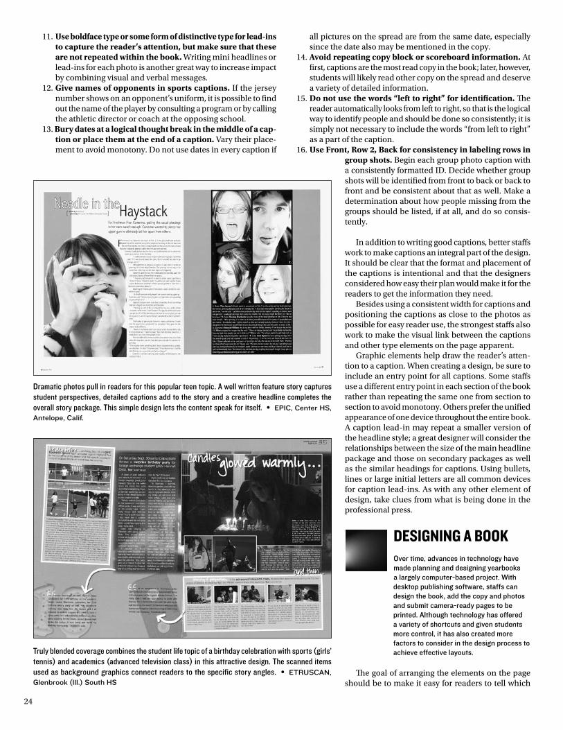
24
11. Use boldface type or some form of distinctive type for lead-ins to capture the reader’s attention, but make sure that these are not repeated within the book. Writing mini headlines or lead-ins for each photo is another great way to increase impact by combining visual and verbal messages.
12. Give names of opponents in sports captions. If the jersey number shows on an opponent’s uniform, it is possible to find out the name of the player by consulting a program or by calling the athletic director or coach at the opposing school.
13. Bury dates at a logical thought break in the middle of a cap-tion or place them at the end of a caption. Vary their place-ment to avoid monotony. Do not use dates in every caption if
all pictures on the spread are from the same date, especially since the date also may be mentioned in the copy.
14. Avoid repeating copy block or scoreboard information. At first, captions are the most read copy in the book; later, however, students will likely read other copy on the spread and deserve a variety of detailed information.
15. Do not use the words “left to right” for identification. The reader automatically looks from left to right, so that is the logical way to identify people and should be done so consistently; it is simply not necessary to include the words “from left to right” as a part of the caption.
16. Use Front, Row 2, Back for consistency in labeling rows in group shots. Begin each group photo caption with a consistently formatted ID. Decide whether group shots will be identified from front to back or back to front and be consistent about that as well. Make a determination about how people missing from the groups should be listed, if at all, and do so consis-tently.
In addition to writing good captions, better staffs work to make captions an integral part of the design. It should be clear that the format and placement of the captions is intentional and that the designers considered how easy their plan would make it for the readers to get the information they need.
Besides using a consistent width for captions and positioning the captions as close to the photos as possible for easy reader use, the strongest staffs also work to make the visual link between the captions and other type elements on the page apparent.
Graphic elements help draw the reader’s atten-tion to a caption. When creating a design, be sure to include an entry point for all captions. Some staffs use a different entry point in each section of the book rather than repeating the same one from section to section to avoid monotony. Others prefer the unified appearance of one device throughout the entire book. A caption lead-in may repeat a smaller version of the headline style; a great designer will consider the relationships between the size of the main headline package and those on secondary packages as well as the similar headings for captions. Using bullets, lines or large initial letters are all common devices for caption lead-ins. As with any other element of design, take clues from what is being done in the professional press.
deSigNiNg a bookOver time, advances in technology have made planning and designing yearbooks a largely computer-based project. With desktop publishing software, staffs can design the book, add the copy and photos and submit camera-ready pages to be printed. Although technology has offered a variety of shortcuts and given students more control, it has also created more factors to consider in the design process to achieve effective layouts.
The goal of arranging the elements on the page should be to make it easy for readers to tell which
Dramatic photos pull in readers for this popular teen topic. A well written feature story captures student perspectives, detailed captions add to the story and a creative headline completes the overall story package. This simple design lets the content speak for itself. • EpIc, center Hs, antelope, calif.
Truly blended coverage combines the student life topic of a birthday celebration with sports (girls’ tennis) and academics (advanced television class) in this attractive design. The scanned items used as background graphics connect readers to the specific story angles. • Etruscan, Glenbrook (Ill.) south Hs
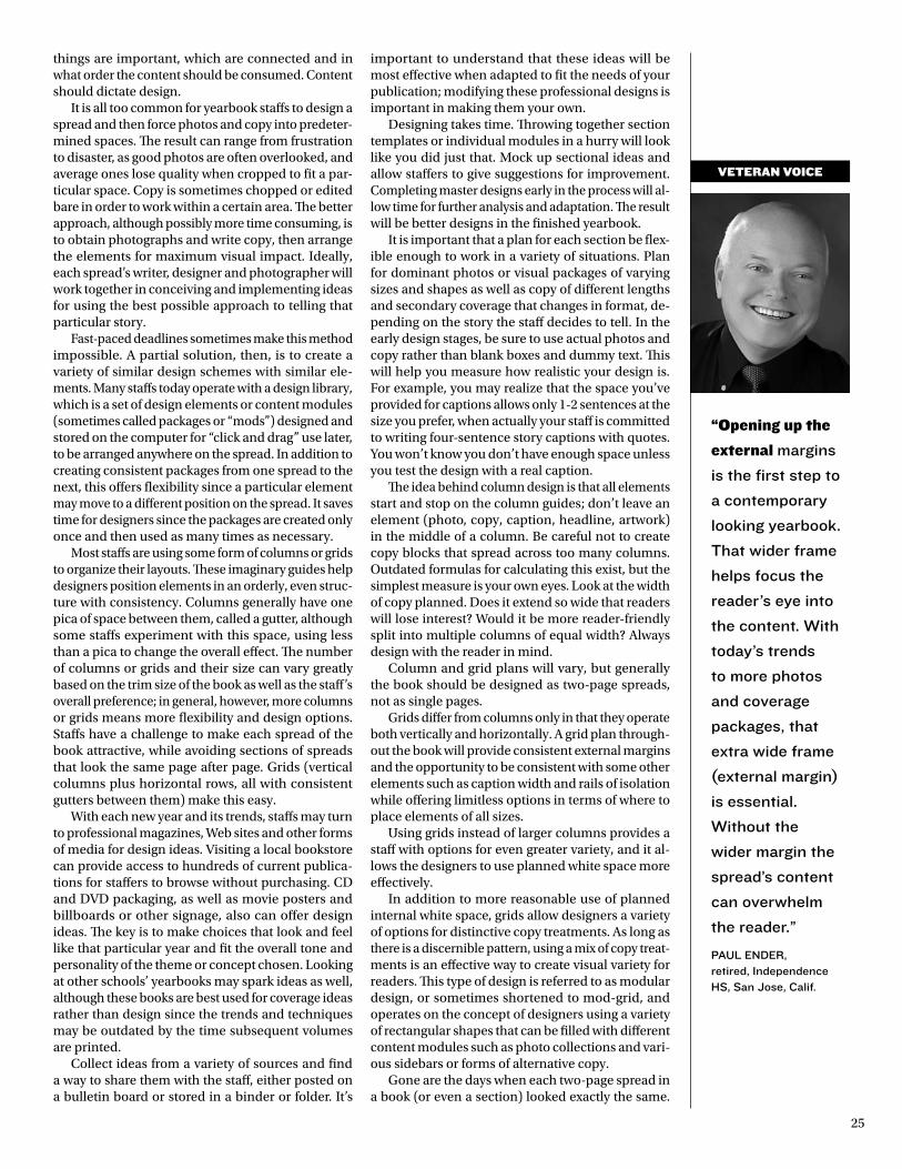
25
“Opening up the
external margins
is the first step to
a contemporary
looking yearbook.
that wider frame
helps focus the
reader’s eye into
the content. With
today’s trends
to more photos
and coverage
packages, that
extra wide frame
(external margin)
is essential.
Without the
wider margin the
spread’s content
can overwhelm
the reader.”
paul EndEr, retired, Independence Hs, san Jose, calif.
things are important, which are connected and in what order the content should be consumed. Content should dictate design.
It is all too common for yearbook staffs to design a spread and then force photos and copy into predeter-mined spaces. The result can range from frustration to disaster, as good photos are often overlooked, and average ones lose quality when cropped to fit a par-ticular space. Copy is sometimes chopped or edited bare in order to work within a certain area. The better approach, although possibly more time consuming, is to obtain photographs and write copy, then arrange the elements for maximum visual impact. Ideally, each spread’s writer, designer and photographer will work together in conceiving and implementing ideas for using the best possible approach to telling that particular story.
Fast-paced deadlines sometimes make this method impossible. A partial solution, then, is to create a variety of similar design schemes with similar ele-ments. Many staffs today operate with a design library, which is a set of design elements or content modules (sometimes called packages or “mods”) designed and stored on the computer for “click and drag” use later, to be arranged anywhere on the spread. In addition to creating consistent packages from one spread to the next, this offers flexibility since a particular element may move to a different position on the spread. It saves time for designers since the packages are created only once and then used as many times as necessary.
Most staffs are using some form of columns or grids to organize their layouts. These imaginary guides help designers position elements in an orderly, even struc-ture with consistency. Columns generally have one pica of space between them, called a gutter, although some staffs experiment with this space, using less than a pica to change the overall effect. The number of columns or grids and their size can vary greatly based on the trim size of the book as well as the staff’s overall preference; in general, however, more columns or grids means more flexibility and design options. Staffs have a challenge to make each spread of the book attractive, while avoiding sections of spreads that look the same page after page. Grids (vertical columns plus horizontal rows, all with consistent gutters between them) make this easy.
With each new year and its trends, staffs may turn to professional magazines, Web sites and other forms of media for design ideas. Visiting a local bookstore can provide access to hundreds of current publica-tions for staffers to browse without purchasing. CD and DVD packaging, as well as movie posters and billboards or other signage, also can offer design ideas. The key is to make choices that look and feel like that particular year and fit the overall tone and personality of the theme or concept chosen. Looking at other schools’ yearbooks may spark ideas as well, although these books are best used for coverage ideas rather than design since the trends and techniques may be outdated by the time subsequent volumes are printed.
Collect ideas from a variety of sources and find a way to share them with the staff, either posted on a bulletin board or stored in a binder or folder. It’s
important to understand that these ideas will be most effective when adapted to fit the needs of your publication; modifying these professional designs is important in making them your own.
Designing takes time. Throwing together section templates or individual modules in a hurry will look like you did just that. Mock up sectional ideas and allow staffers to give suggestions for improvement. Completing master designs early in the process will al-low time for further analysis and adaptation. The result will be better designs in the finished yearbook.
It is important that a plan for each section be flex-ible enough to work in a variety of situations. Plan for dominant photos or visual packages of varying sizes and shapes as well as copy of different lengths and secondary coverage that changes in format, de-pending on the story the staff decides to tell. In the early design stages, be sure to use actual photos and copy rather than blank boxes and dummy text. This will help you measure how realistic your design is. For example, you may realize that the space you’ve provided for captions allows only 1-2 sentences at the size you prefer, when actually your staff is committed to writing four-sentence story captions with quotes. You won’t know you don’t have enough space unless you test the design with a real caption.
The idea behind column design is that all elements start and stop on the column guides; don’t leave an element (photo, copy, caption, headline, artwork) in the middle of a column. Be careful not to create copy blocks that spread across too many columns. Outdated formulas for calculating this exist, but the simplest measure is your own eyes. Look at the width of copy planned. Does it extend so wide that readers will lose interest? Would it be more reader-friendly split into multiple columns of equal width? Always design with the reader in mind.
Column and grid plans will vary, but generally the book should be designed as two-page spreads, not as single pages.
Grids differ from columns only in that they operate both vertically and horizontally. A grid plan through-out the book will provide consistent external margins and the opportunity to be consistent with some other elements such as caption width and rails of isolation while offering limitless options in terms of where to place elements of all sizes.
Using grids instead of larger columns provides a staff with options for even greater variety, and it al-lows the designers to use planned white space more effectively.
In addition to more reasonable use of planned internal white space, grids allow designers a variety of options for distinctive copy treatments. As long as there is a discernible pattern, using a mix of copy treat-ments is an effective way to create visual variety for readers. This type of design is referred to as modular design, or sometimes shortened to mod-grid, and operates on the concept of designers using a variety of rectangular shapes that can be filled with different content modules such as photo collections and vari-ous sidebars or forms of alternative copy.
Gone are the days when each two-page spread in a book (or even a section) looked exactly the same.
VEtERAn VOIcE
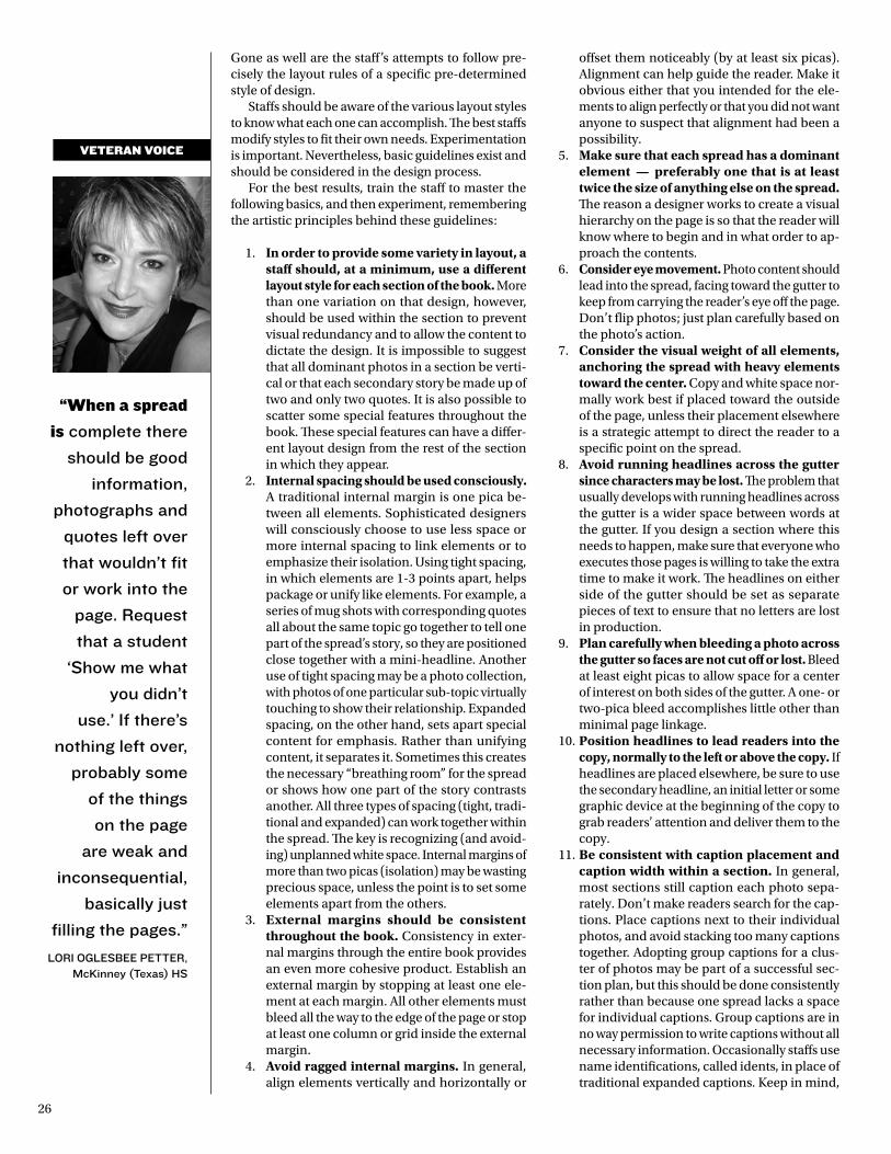
26
“When a spread
is complete there
should be good
information,
photographs and
quotes left over
that wouldn’t fit
or work into the
page. request
that a student
‘show me what
you didn’t
use.’ If there’s
nothing left over,
probably some
of the things
on the page
are weak and
inconsequential,
basically just
filling the pages.”
lorI oGlEsBEE pEttEr, mcKinney (texas) Hs
Gone as well are the staff’s attempts to follow pre-cisely the layout rules of a specific pre-determined style of design.
Staffs should be aware of the various layout styles to know what each one can accomplish. The best staffs modify styles to fit their own needs. Experimentation is important. Nevertheless, basic guidelines exist and should be considered in the design process.
For the best results, train the staff to master the following basics, and then experiment, remembering the artistic principles behind these guidelines:
1. In order to provide some variety in layout, a staff should, at a minimum, use a different layout style for each section of the book. More than one variation on that design, however, should be used within the section to prevent visual redundancy and to allow the content to dictate the design. It is impossible to suggest that all dominant photos in a section be verti-cal or that each secondary story be made up of two and only two quotes. It is also possible to scatter some special features throughout the book. These special features can have a differ-ent layout design from the rest of the section in which they appear.
2. Internal spacing should be used consciously. A traditional internal margin is one pica be-tween all elements. Sophisticated designers will consciously choose to use less space or more internal spacing to link elements or to emphasize their isolation. Using tight spacing, in which elements are 1-3 points apart, helps package or unify like elements. For example, a series of mug shots with corresponding quotes all about the same topic go together to tell one part of the spread’s story, so they are positioned close together with a mini-headline. Another use of tight spacing may be a photo collection, with photos of one particular sub-topic virtually touching to show their relationship. Expanded spacing, on the other hand, sets apart special content for emphasis. Rather than unifying content, it separates it. Sometimes this creates the necessary “breathing room” for the spread or shows how one part of the story contrasts another. All three types of spacing (tight, tradi-tional and expanded) can work together within the spread. The key is recognizing (and avoid-ing) unplanned white space. Internal margins of more than two picas (isolation) may be wasting precious space, unless the point is to set some elements apart from the others.
3. External margins should be consistent throughout the book. Consistency in exter-nal margins through the entire book provides an even more cohesive product. Establish an external margin by stopping at least one ele-ment at each margin. All other elements must bleed all the way to the edge of the page or stop at least one column or grid inside the external margin.
4. Avoid ragged internal margins. In general, align elements vertically and horizontally or
offset them noticeably (by at least six picas). Alignment can help guide the reader. Make it obvious either that you intended for the ele-ments to align perfectly or that you did not want anyone to suspect that alignment had been a possibility.
5. Make sure that each spread has a dominant element — preferably one that is at least twice the size of anything else on the spread. The reason a designer works to create a visual hierarchy on the page is so that the reader will know where to begin and in what order to ap-proach the contents.
6. Consider eye movement. Photo content should lead into the spread, facing toward the gutter to keep from carrying the reader’s eye off the page. Don’t flip photos; just plan carefully based on the photo’s action.
7. Consider the visual weight of all elements, anchoring the spread with heavy elements toward the center. Copy and white space nor-mally work best if placed toward the outside of the page, unless their placement elsewhere is a strategic attempt to direct the reader to a specific point on the spread.
8. Avoid running headlines across the gutter since characters may be lost. The problem that usually develops with running headlines across the gutter is a wider space between words at the gutter. If you design a section where this needs to happen, make sure that everyone who executes those pages is willing to take the extra time to make it work. The headlines on either side of the gutter should be set as separate pieces of text to ensure that no letters are lost in production.
9. Plan carefully when bleeding a photo across the gutter so faces are not cut off or lost. Bleed at least eight picas to allow space for a center of interest on both sides of the gutter. A one- or two-pica bleed accomplishes little other than minimal page linkage.
10. Position headlines to lead readers into the copy, normally to the left or above the copy. If headlines are placed elsewhere, be sure to use the secondary headline, an initial letter or some graphic device at the beginning of the copy to grab readers’ attention and deliver them to the copy.
11. Be consistent with caption placement and caption width within a section. In general, most sections still caption each photo sepa-rately. Don’t make readers search for the cap-tions. Place captions next to their individual photos, and avoid stacking too many captions together. Adopting group captions for a clus-ter of photos may be part of a successful sec-tion plan, but this should be done consistently rather than because one spread lacks a space for individual captions. Group captions are in no way permission to write captions without all necessary information. Occasionally staffs use name identifications, called idents, in place of traditional expanded captions. Keep in mind,
VEtERAn VOIcE
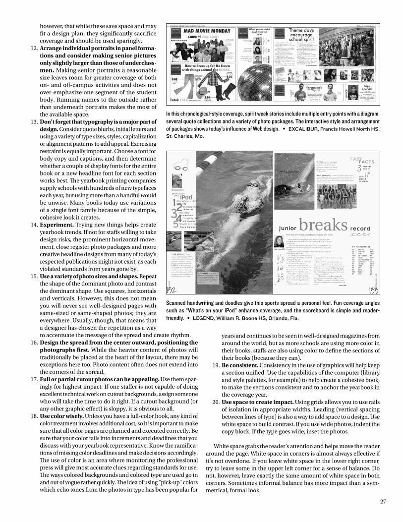
27
however, that while these save space and may fit a design plan, they significantly sacrifice coverage and should be used sparingly.
12. Arrange individual portraits in panel forma-tions and consider making senior pictures only slightly larger than those of underclass-men. Making senior portraits a reasonable size leaves room for greater coverage of both on- and off-campus activities and does not over-emphasize one segment of the student body. Running names to the outside rather than underneath portraits makes the most of the available space.
13. Don’t forget that typography is a major part of design. Consider quote blurbs, initial letters and using a variety of type sizes, styles, capitalization or alignment patterns to add appeal. Exercising restraint is equally important. Choose a font for body copy and captions, and then determine whether a couple of display fonts for the entire book or a new headline font for each section works best. The yearbook printing companies supply schools with hundreds of new typefaces each year, but using more than a handful would be unwise. Many books today use variations of a single font family because of the simple, cohesive look it creates.
14. Experiment. Trying new things helps create yearbook trends. If not for staffs willing to take design risks, the prominent horizontal move-ment, close register photo packages and more creative headline designs from many of today’s respected publications might not exist, as each violated standards from years gone by.
15. Use a variety of photo sizes and shapes. Repeat the shape of the dominant photo and contrast the dominant shape. Use squares, horizontals and verticals. However, this does not mean you will never see well-designed pages with same-sized or same-shaped photos; they are everywhere. Usually, though, that means that a designer has chosen the repetition as a way to accentuate the message of the spread and create rhythm.
16. Design the spread from the center outward, positioning the photographs first. While the heavier content of photos will traditionally be placed at the heart of the layout, there may be exceptions here too. Photo content often does not extend into the corners of the spread.
17. Full or partial cutout photos can be appealing. Use them spar-ingly for highest impact. If one staffer is not capable of doing excellent technical work on cutout backgrounds, assign someone who will take the time to do it right. If a cutout background (or any other graphic effect) is sloppy, it is obvious to all.
18. Use color wisely. Unless you have a full-color book, any kind of color treatment involves additional cost, so it is important to make sure that all color pages are planned and executed correctly. Be sure that your color falls into increments and deadlines that you discuss with your yearbook representative. Know the ramifica-tions of missing color deadlines and make decisions accordingly. The use of color is an area where monitoring the professional press will give most accurate clues regarding standards for use. The ways colored backgrounds and colored type are used go in and out of vogue rather quickly. The idea of using “pick-up” colors which echo tones from the photos in type has been popular for
years and continues to be seen in well-designed magazines from around the world, but as more schools are using more color in their books, staffs are also using color to define the sections of their books (because they can).
19. Be consistent. Consistency in the use of graphics will help keep a section unified. Use the capabilities of the computer (library and style palettes, for example) to help create a cohesive book, to make the sections consistent and to anchor the yearbook in the coverage year.
20. Use space to create impact. Using grids allows you to use rails of isolation in appropriate widths. Leading (vertical spacing between lines of type) is also a way to add space to a design. Use white space to build contrast. If you use wide photos, indent the copy block. If the type goes wide, inset the photos.
White space grabs the reader’s attention and helps move the reader around the page. White space in corners is almost always effective if it’s not overdone. If you leave white space in the lower right corner, try to leave some in the upper left corner for a sense of balance. Do not, however, leave exactly the same amount of white space in both corners. Sometimes informal balance has more impact than a sym-metrical, formal look.
In this chronological-style coverage, spirit week stories include multiple entry points with a diagram, several quote collections and a variety of photo packages. The interactive style and arrangement of packages shows today’s influence of Web design. • ExcalIBur, Francis Howell north Hs, st. charles, mo.
Scanned handwriting and doodles give this sports spread a personal feel. Fun coverage angles such as “What’s on your iPod” enhance coverage, and the scoreboard is simple and reader-friendly. • lEGEnd, William r. Boone Hs, orlando, Fla.
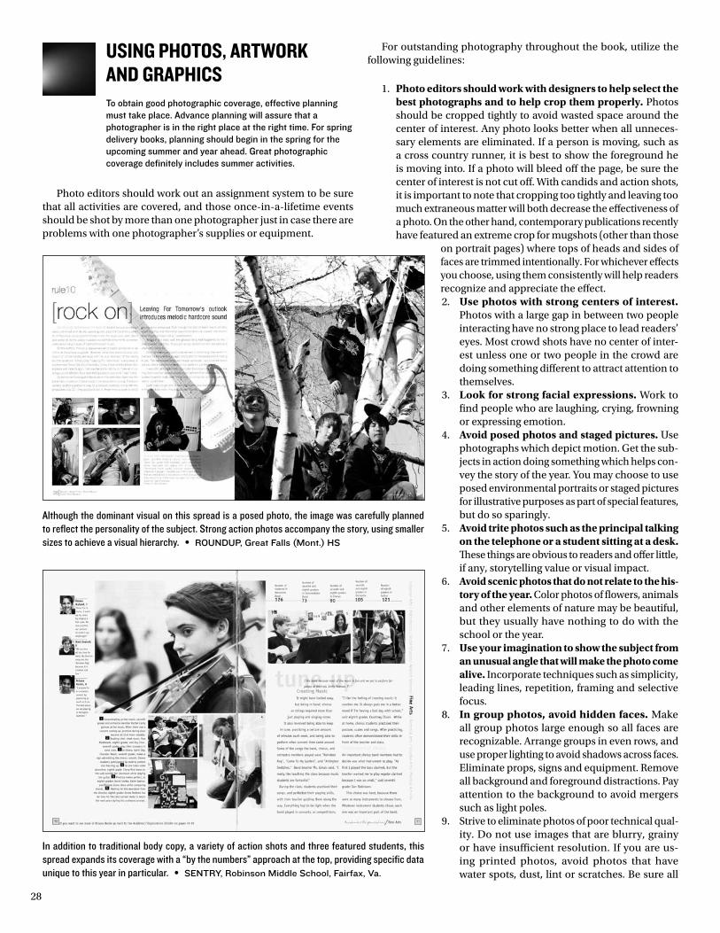
28
uSiNg PhotoS, artwork aNd graPhicSTo obtain good photographic coverage, effective planning must take place. Advance planning will assure that a photographer is in the right place at the right time. For spring delivery books, planning should begin in the spring for the upcoming summer and year ahead. Great photographic coverage definitely includes summer activities.
Photo editors should work out an assignment system to be sure that all activities are covered, and those once-in-a-lifetime events should be shot by more than one photographer just in case there are problems with one photographer’s supplies or equipment.
For outstanding photography throughout the book, utilize the following guidelines:
1. Photo editors should work with designers to help select the best photographs and to help crop them properly. Photos should be cropped tightly to avoid wasted space around the center of interest. Any photo looks better when all unneces-sary elements are eliminated. If a person is moving, such as a cross country runner, it is best to show the foreground he is moving into. If a photo will bleed off the page, be sure the center of interest is not cut off. With candids and action shots, it is important to note that cropping too tightly and leaving too much extraneous matter will both decrease the effectiveness of a photo. On the other hand, contemporary publications recently have featured an extreme crop for mugshots (other than those
on portrait pages) where tops of heads and sides of faces are trimmed intentionally. For whichever effects you choose, using them consistently will help readers recognize and appreciate the effect.2. Use photos with strong centers of interest.
Photos with a large gap in between two people interacting have no strong place to lead readers’ eyes. Most crowd shots have no center of inter-est unless one or two people in the crowd are doing something different to attract attention to themselves.
3. Look for strong facial expressions. Work to find people who are laughing, crying, frowning or expressing emotion.
4. Avoid posed photos and staged pictures. Use photographs which depict motion. Get the sub-jects in action doing something which helps con-vey the story of the year. You may choose to use posed environmental portraits or staged pictures for illustrative purposes as part of special features, but do so sparingly.
5. Avoid trite photos such as the principal talking on the telephone or a student sitting at a desk. These things are obvious to readers and offer little, if any, storytelling value or visual impact.
6. Avoid scenic photos that do not relate to the his-tory of the year. Color photos of flowers, animals and other elements of nature may be beautiful, but they usually have nothing to do with the school or the year.
7. Use your imagination to show the subject from an unusual angle that will make the photo come alive. Incorporate techniques such as simplicity, leading lines, repetition, framing and selective focus.
8. In group photos, avoid hidden faces. Make all group photos large enough so all faces are recognizable. Arrange groups in even rows, and use proper lighting to avoid shadows across faces. Eliminate props, signs and equipment. Remove all background and foreground distractions. Pay attention to the background to avoid mergers such as light poles.
9. Strive to eliminate photos of poor technical qual-ity. Do not use images that are blurry, grainy or have insufficient resolution. If you are us-ing printed photos, avoid photos that have water spots, dust, lint or scratches. Be sure all
Although the dominant visual on this spread is a posed photo, the image was carefully planned to reflect the personality of the subject. Strong action photos accompany the story, using smaller sizes to achieve a visual hierarchy. • roundup, Great Falls (mont.) Hs
In addition to traditional body copy, a variety of action shots and three featured students, this spread expands its coverage with a “by the numbers” approach at the top, providing specific data unique to this year in particular. • sEntry, robinson middle school, Fairfax, Va.
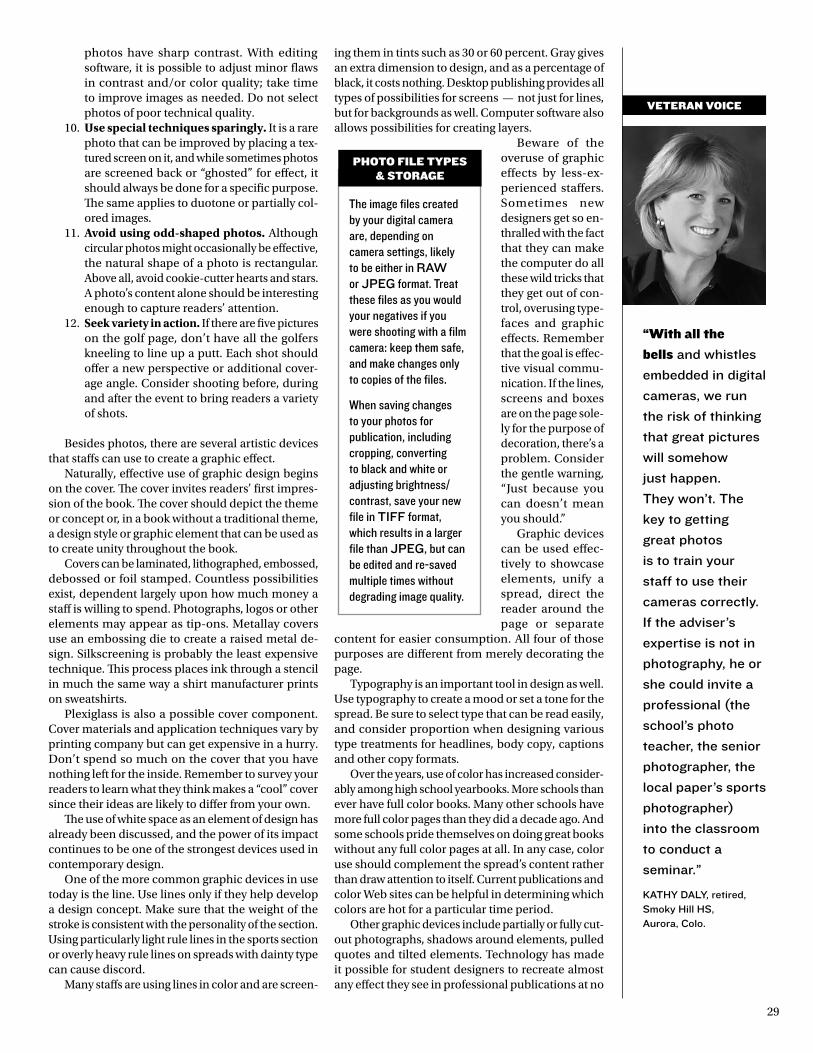
29
“With all the
bells and whistles
embedded in digital
cameras, we run
the risk of thinking
that great pictures
will somehow
just happen.
they won’t. the
key to getting
great photos
is to train your
staff to use their
cameras correctly.
If the adviser’s
expertise is not in
photography, he or
she could invite a
professional (the
school’s photo
teacher, the senior
photographer, the
local paper’s sports
photographer)
into the classroom
to conduct a
seminar.”
KatHy daly, retired, smoky Hill Hs, aurora, colo.
photos have sharp contrast. With editing software, it is possible to adjust minor flaws in contrast and/or color quality; take time to improve images as needed. Do not select photos of poor technical quality.
10. Use special techniques sparingly. It is a rare photo that can be improved by placing a tex-tured screen on it, and while sometimes photos are screened back or “ghosted” for effect, it should always be done for a specific purpose. The same applies to duotone or partially col-ored images.
11. Avoid using odd-shaped photos. Although circular photos might occasionally be effective, the natural shape of a photo is rectangular. Above all, avoid cookie-cutter hearts and stars. A photo’s content alone should be interesting enough to capture readers’ attention.
12. Seek variety in action. If there are five pictures on the golf page, don’t have all the golfers kneeling to line up a putt. Each shot should offer a new perspective or additional cover-age angle. Consider shooting before, during and after the event to bring readers a variety of shots.
Besides photos, there are several artistic devices that staffs can use to create a graphic effect.
Naturally, effective use of graphic design begins on the cover. The cover invites readers’ first impres-sion of the book. The cover should depict the theme or concept or, in a book without a traditional theme, a design style or graphic element that can be used as to create unity throughout the book.
Covers can be laminated, lithographed, embossed, debossed or foil stamped. Countless possibilities exist, dependent largely upon how much money a staff is willing to spend. Photographs, logos or other elements may appear as tip-ons. Metallay covers use an embossing die to create a raised metal de-sign. Silkscreening is probably the least expensive technique. This process places ink through a stencil in much the same way a shirt manufacturer prints on sweatshirts.
Plexiglass is also a possible cover component. Cover materials and application techniques vary by printing company but can get expensive in a hurry. Don’t spend so much on the cover that you have nothing left for the inside. Remember to survey your readers to learn what they think makes a “cool” cover since their ideas are likely to differ from your own.
The use of white space as an element of design has already been discussed, and the power of its impact continues to be one of the strongest devices used in contemporary design.
One of the more common graphic devices in use today is the line. Use lines only if they help develop a design concept. Make sure that the weight of the stroke is consistent with the personality of the section. Using particularly light rule lines in the sports section or overly heavy rule lines on spreads with dainty type can cause discord.
Many staffs are using lines in color and are screen-
ing them in tints such as 30 or 60 percent. Gray gives an extra dimension to design, and as a percentage of black, it costs nothing. Desktop publishing provides all types of possibilities for screens — not just for lines, but for backgrounds as well. Computer software also allows possibilities for creating layers.
Beware of the overuse of graphic effects by less-ex-perienced staffers. Sometimes new designers get so en-thralled with the fact that they can make the computer do all these wild tricks that they get out of con-trol, overusing type-faces and graphic effects. Remember that the goal is effec-tive visual commu-nication. If the lines, screens and boxes are on the page sole-ly for the purpose of decoration, there’s a problem. Consider the gentle warning, “Just because you can doesn’t mean you should.”
Graphic devices can be used effec-tively to showcase elements, unify a spread, direct the reader around the page or separate
content for easier consumption. All four of those purposes are different from merely decorating the page.
Typography is an important tool in design as well. Use typography to create a mood or set a tone for the spread. Be sure to select type that can be read easily, and consider proportion when designing various type treatments for headlines, body copy, captions and other copy formats.
Over the years, use of color has increased consider-ably among high school yearbooks. More schools than ever have full color books. Many other schools have more full color pages than they did a decade ago. And some schools pride themselves on doing great books without any full color pages at all. In any case, color use should complement the spread’s content rather than draw attention to itself. Current publications and color Web sites can be helpful in determining which colors are hot for a particular time period.
Other graphic devices include partially or fully cut-out photographs, shadows around elements, pulled quotes and tilted elements. Technology has made it possible for student designers to recreate almost any effect they see in professional publications at no
VEtERAn VOIcE
The image files created by your digital camera are, depending on camera settings, likely to be either in raW or JpEG format. Treat these files as you would your negatives if you were shooting with a film camera: keep them safe, and make changes only to copies of the files.
When saving changes to your photos for publication, including cropping, converting to black and white or adjusting brightness/contrast, save your new file in tIFF format, which results in a larger file than JpEG, but can be edited and re-saved multiple times without degrading image quality.
phOtO FIlE tYpEs & stORAGE
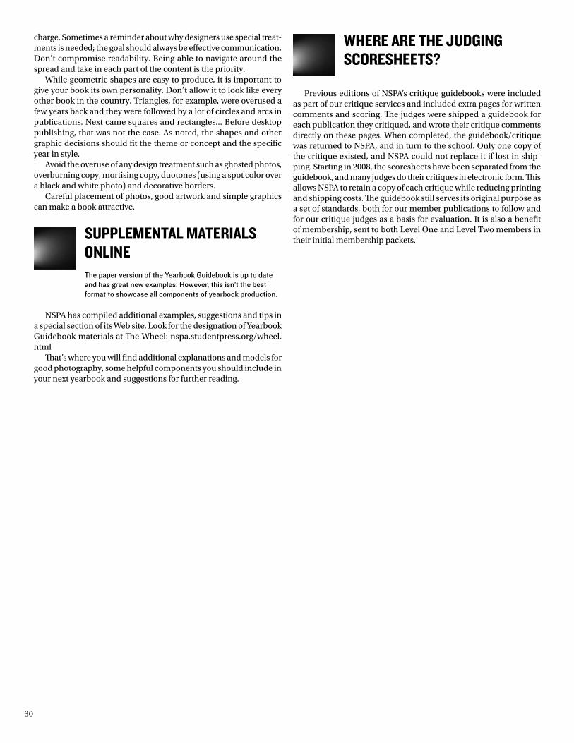
30
charge. Sometimes a reminder about why designers use special treat-ments is needed; the goal should always be effective communication. Don’t compromise readability. Being able to navigate around the spread and take in each part of the content is the priority.
While geometric shapes are easy to produce, it is important to give your book its own personality. Don’t allow it to look like every other book in the country. Triangles, for example, were overused a few years back and they were followed by a lot of circles and arcs in publications. Next came squares and rectangles... Before desktop publishing, that was not the case. As noted, the shapes and other graphic decisions should fit the theme or concept and the specific year in style.
Avoid the overuse of any design treatment such as ghosted photos, overburning copy, mortising copy, duotones (using a spot color over a black and white photo) and decorative borders.
Careful placement of photos, good artwork and simple graphics can make a book attractive.
SuPPlemeNtal materialS oNliNeThe paper version of the Yearbook Guidebook is up to date and has great new examples. However, this isn’t the best format to showcase all components of yearbook production.
NSPA has compiled additional examples, suggestions and tips in a special section of its Web site. Look for the designation of Yearbook Guidebook materials at The Wheel: nspa.studentpress.org/wheel.html
That’s where you will find additional explanations and models for good photography, some helpful components you should include in your next yearbook and suggestions for further reading.
where are the JudgiNg ScoreSheetS?
Previous editions of NSPA’s critique guidebooks were included as part of our critique services and included extra pages for written comments and scoring. The judges were shipped a guidebook for each publication they critiqued, and wrote their critique comments directly on these pages. When completed, the guidebook/critique was returned to NSPA, and in turn to the school. Only one copy of the critique existed, and NSPA could not replace it if lost in ship-ping. Starting in 2008, the scoresheets have been separated from the guidebook, and many judges do their critiques in electronic form. This allows NSPA to retain a copy of each critique while reducing printing and shipping costs. The guidebook still serves its original purpose as a set of standards, both for our member publications to follow and for our critique judges as a basis for evaluation. It is also a benefit of membership, sent to both Level One and Level Two members in their initial membership packets.

31

NSPa.StudeNtPreSS.org

![Edline Teacher Guide · 2016. 7. 6. · 10/30/2009 Edline LLC, © 2009, Chicago, IL, All Rights Reserved. [S-09] 1 Edline Teacher Guide](https://img.pdfslide.net/doc/110x75/60934b2ea784042c6b08a047/edline-teacher-2016-7-6-10302009-edline-llc-2009-chicago-il-all-rights.jpg)