
Creating Rich Internet Applications with Silverlight
Jeff ProsiseCofounder, Wintellectwww.wintellect.com
Goals
Build an understanding of Silverlight Come away with lots of practical knowledge
and hard-hitting advice Know what Silverlight is capable of doing
and how to go about doing it Have fun!
Silverlight
Microsoft's platform for rich, highly interactive Web experiences and RIAs Cross-platform (browsers and OSes)
Windows, Mac OS, Linux ("Moonlight") Internet Explorer, Firefox, Safari, and more
XAML-based rendering (subset of WPF XAML) Implemented as browser plug-in
Quick, easy install experience
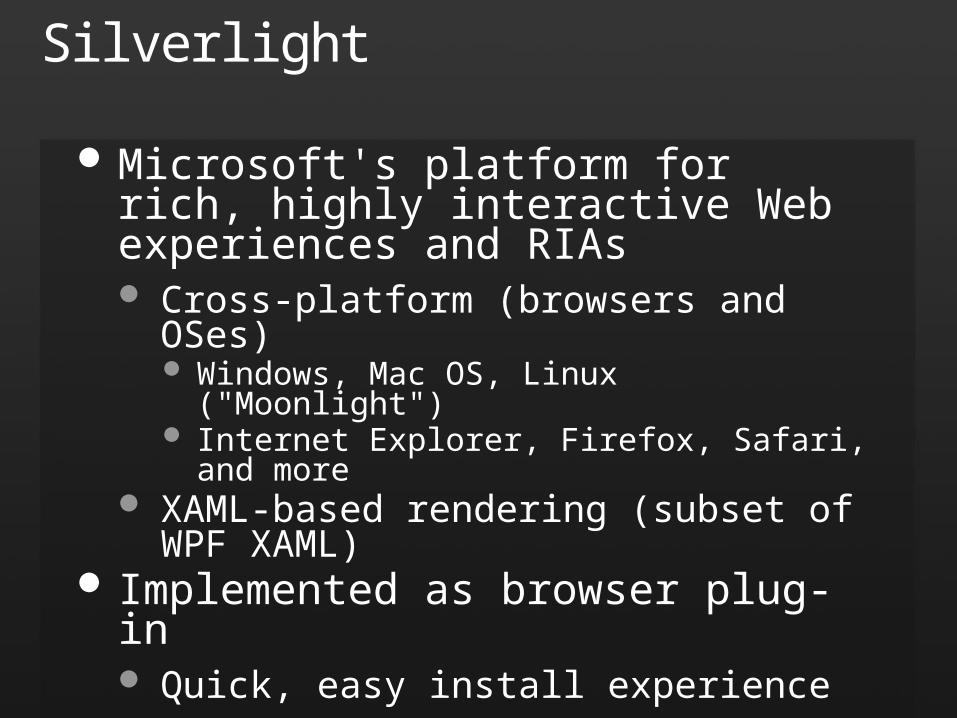
Old vs. New (UI vs. UX)
Web UI Silverlight UX
Silverlight Versions
Silverlight 1.0 Shipped September 2007 XAML rendering and JavaScript API
Silverlight 2 Shipped October 2008 Enhanced XAML, .NET Framework, managed
code, dynamic languages (e.g., IronRuby)
Silverlight Developer Tools
Visual Studio 2008 SP1 or VWD 2008 SP1 Silverlight Tools for Visual Studio 2008 SP1
http://www.microsoft.com/downloads/details.aspx?FamilyId=c22d6a7b-546f-4407-8ef6-d60c8ee221ed
Works with VS 2008 SP1 and VWD 2008 SP1 Includes Silverlight 2 run-time
Expression Blend 2 SP1 http://www.microsoft.com/downloads/details.aspx?
FamilyId=EB9B5C48-BA2B-4C39-A1C3-135C60BBBE66
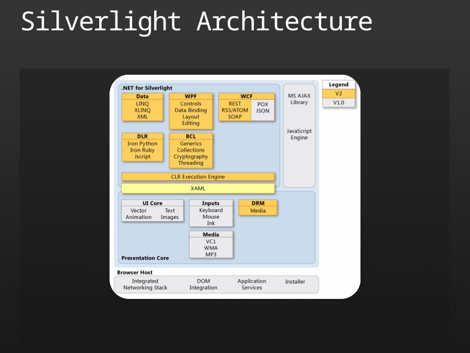
Silverlight Architecture
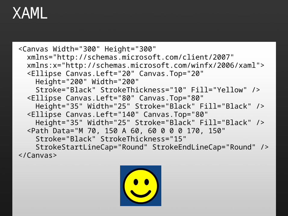
XAML
<Canvas Width="300" Height="300" xmlns="http://schemas.microsoft.com/client/2007" xmlns:x="http://schemas.microsoft.com/winfx/2006/xaml"> <Ellipse Canvas.Left="20" Canvas.Top="20" Height="200" Width="200" Stroke="Black" StrokeThickness="10" Fill="Yellow" /> <Ellipse Canvas.Left="80" Canvas.Top="80" Height="35" Width="25" Stroke="Black" Fill="Black" /> <Ellipse Canvas.Left="140" Canvas.Top="80" Height="35" Width="25" Stroke="Black" Fill="Black" /> <Path Data="M 70, 150 A 60, 60 0 0 0 170, 150" Stroke="Black" StrokeThickness="15" StrokeStartLineCap="Round" StrokeEndLineCap="Round" /></Canvas>
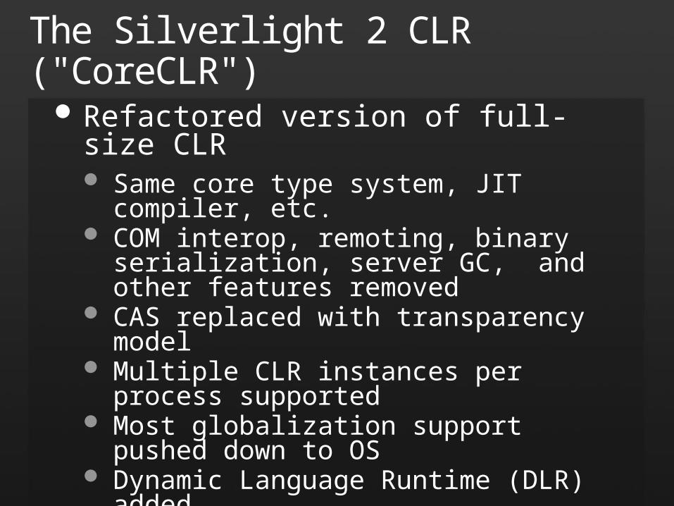
The Silverlight 2 CLR ("CoreCLR")
Refactored version of full-size CLR Same core type system, JIT compiler, etc. COM interop, remoting, binary serialization,
server GC, and other features removed CAS replaced with transparency model Multiple CLR instances per process supported Most globalization support pushed down to OS Dynamic Language Runtime (DLR) added
Small footprint (< 2MB), cross-platform
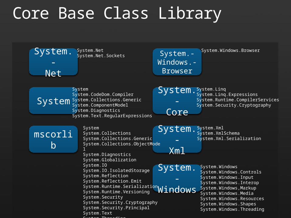
Core Base Class Library
mscorlib
System
System.-Windows
System.-Windows.-
Browser
System.-Xml
System.-Core
System.WindowsSystem.Windows.ControlsSystem.Windows.InputSystem.Windows.InteropSystem.Windows,MarkupSystem.Windows.MediaSystem.Windows.ResourcesSystem.Windows.ShapesSystem.Windows.Threading
System.Windows.Browser
SystemSystem.CollectionsSystem.Collections.GenericSystem.Collections.ObjectModelSystem.DiagnosticsSystem.GlobalizationSystem.IOSystem.IO.IsolatedStorageSystem.ReflectionSystem.Reflection.EmitSystem.Runtime.SerializationSystem.Runtime.VersioningSystem.SecuritySystem.Security.CryptographySystem.Security.PrincipalSystem.TextSystem.Threading
SystemSystem.CodeDom.CompilerSystem.Collections.GenericSystem.ComponentModelSystem.DiagnosticsSystem.Text.RegularExpressions
System.LinqSystem.Linq.ExpressionsSystem.Runtime.CompilerServicesSystem.Security.Cryptography
System.XmlSystem.XmlSchemaSystem.Xml.Serialization
System.-Net
System.NetSystem.Net.Sockets
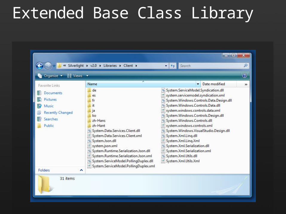
Extended Base Class Library
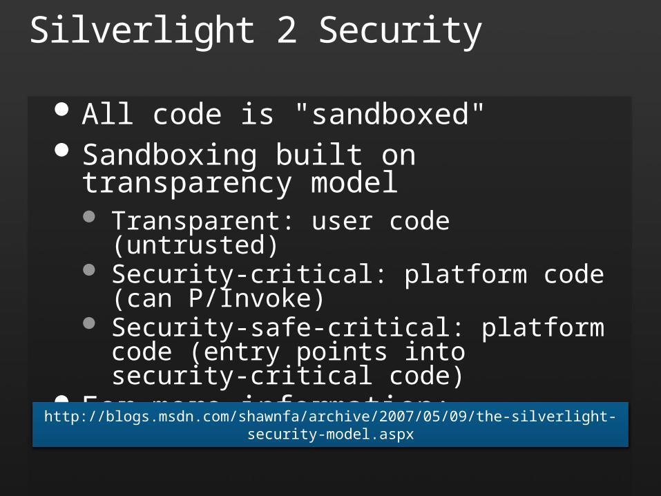
Silverlight 2 Security
All code is "sandboxed" Sandboxing built on transparency model
Transparent: user code (untrusted) Security-critical: platform code (can P/Invoke) Security-safe-critical: platform code (entry
points into security-critical code) For more information:
http://blogs.msdn.com/shawnfa/archive/2007/05/09/the-silverlight-security-model.aspx
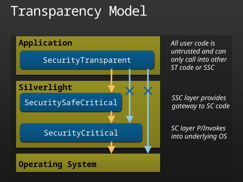
Transparency Model
Application
SecurityTransparent
Silverlight
SecuritySafeCritical
SecurityCritical
Operating System
All user code isuntrusted and canonly call into otherST code or SSC
SSC layer providesgateway to SC code
SC layer P/Invokesinto underlying OS

Hello, Silverlight!
demo
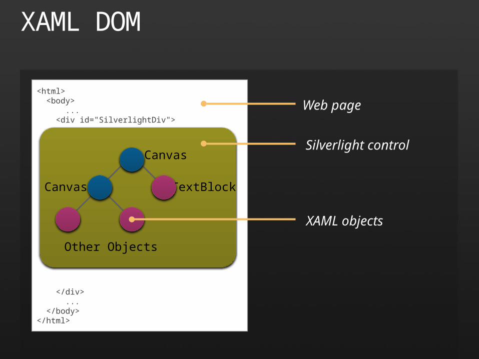
XAML DOM
<html> <body> ... <div id="SilverlightDiv">
</div> ... </body></html>
Canvas
Canvas TextBlock
Other Objects
Web page
Silverlight control
XAML objects
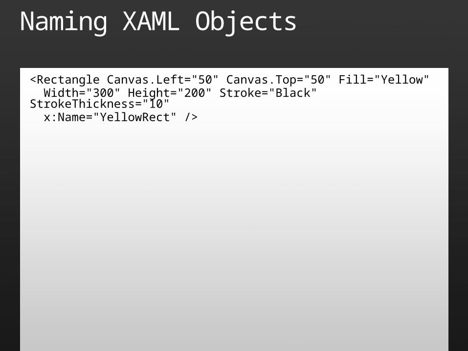
Naming XAML Objects
<Rectangle Canvas.Left="50" Canvas.Top="50" Fill="Yellow" Width="300" Height="200" Stroke="Black" StrokeThickness="10" x:Name="YellowRect" />
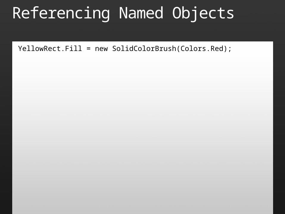
Referencing Named Objects
YellowRect.Fill = new SolidColorBrush(Colors.Red);
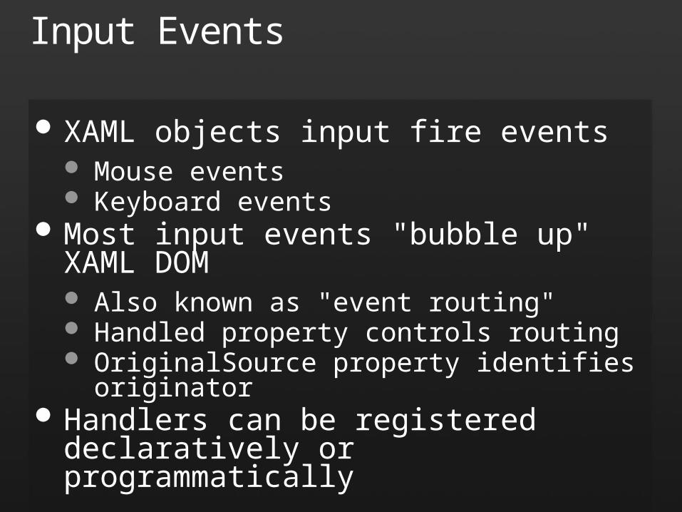
Input Events
XAML objects input fire events Mouse events Keyboard events
Most input events "bubble up" XAML DOM Also known as "event routing" Handled property controls routing OriginalSource property identifies originator
Handlers can be registered declaratively or programmatically
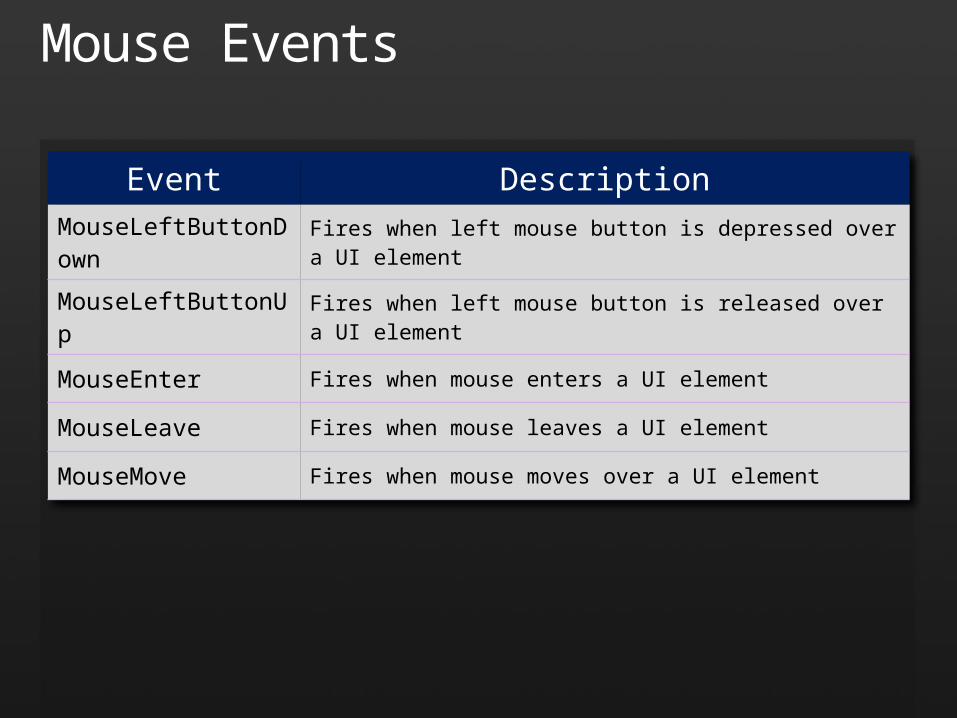
Mouse Events
Event DescriptionMouseLeftButtonDown Fires when left mouse button is depressed over a UI element
MouseLeftButtonUp Fires when left mouse button is released over a UI element
MouseEnter Fires when mouse enters a UI element
MouseLeave Fires when mouse leaves a UI element
MouseMove Fires when mouse moves over a UI element
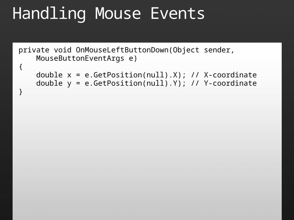
Handling Mouse Events
private void OnMouseLeftButtonDown(Object sender, MouseButtonEventArgs e){ double x = e.GetPosition(null).X); // X-coordinate double y = e.GetPosition(null).Y); // Y-coordinate}
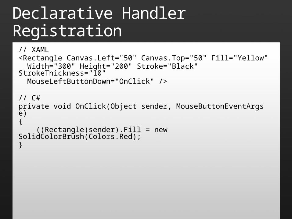
Declarative Handler Registration
// XAML<Rectangle Canvas.Left="50" Canvas.Top="50" Fill="Yellow" Width="300" Height="200" Stroke="Black" StrokeThickness="10" MouseLeftButtonDown="OnClick" />
// C#private void OnClick(Object sender, MouseButtonEventArgs e){ ((Rectangle)sender).Fill = new SolidColorBrush(Colors.Red);}
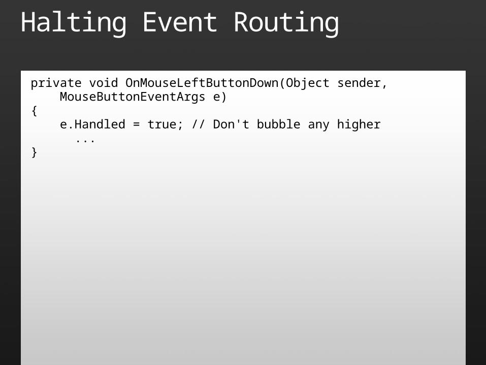
Halting Event Routing
private void OnMouseLeftButtonDown(Object sender, MouseButtonEventArgs e){ e.Handled = true; // Don't bubble any higher ...}
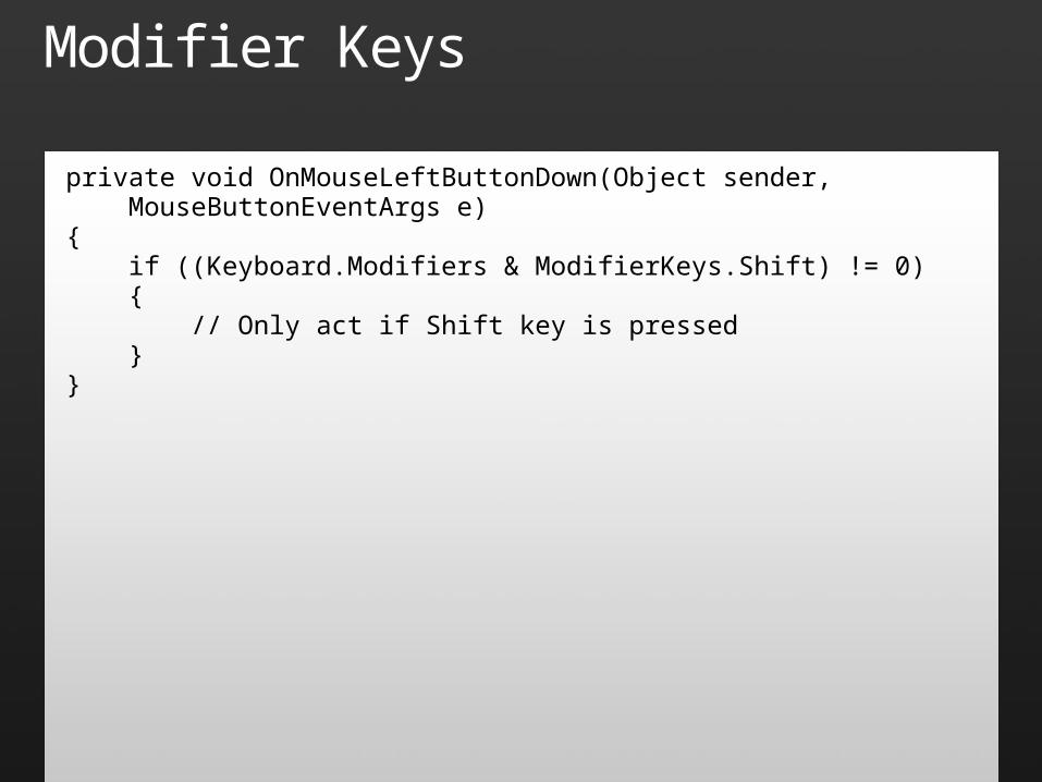
Modifier Keys
private void OnMouseLeftButtonDown(Object sender, MouseButtonEventArgs e){ if ((Keyboard.Modifiers & ModifierKeys.Shift) != 0) { // Only act if Shift key is pressed }}

Mouse Input
demo
Layout Controls
Controls for positioning visual objects Canvas – Arranges objects using absolute
positioning (Canvas.Left and Canvas.Top) StackPanel – Arranges objects in a row or
column (StackPanel.Orientation) Grid – Arranges objects in rows and columns GridSplitter – Allows Grid rows and columns to
be resized interactively
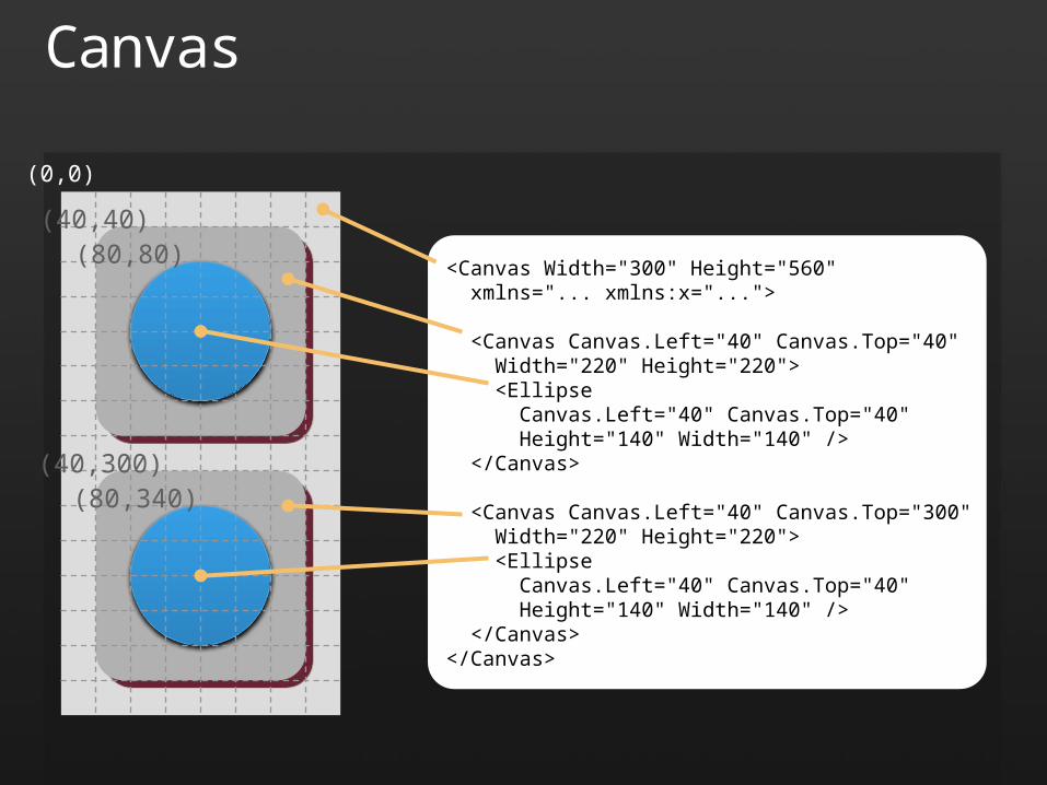
Canvas
<Canvas Width="300" Height="560" xmlns="... xmlns:x="..."> <Canvas Canvas.Left="40" Canvas.Top="40" Width="220" Height="220"> <Ellipse Canvas.Left="40" Canvas.Top="40" Height="140" Width="140" /> </Canvas>
<Canvas Canvas.Left="40" Canvas.Top="300" Width="220" Height="220"> <Ellipse Canvas.Left="40" Canvas.Top="40" Height="140" Width="140" /> </Canvas></Canvas>
(40,40)
(0,0)
(40,300)
(80,80)
(80,340)
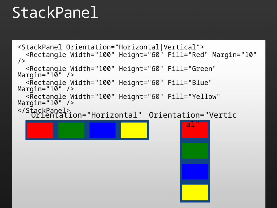
StackPanel
<StackPanel Orientation="Horizontal|Vertical"> <Rectangle Width="100" Height="60" Fill="Red" Margin="10" /> <Rectangle Width="100" Height="60" Fill="Green" Margin="10" /> <Rectangle Width="100" Height="60" Fill="Blue" Margin="10" /> <Rectangle Width="100" Height="60" Fill="Yellow" Margin="10" /></StackPanel>
Orientation="Horizontal" Orientation="Vertical"
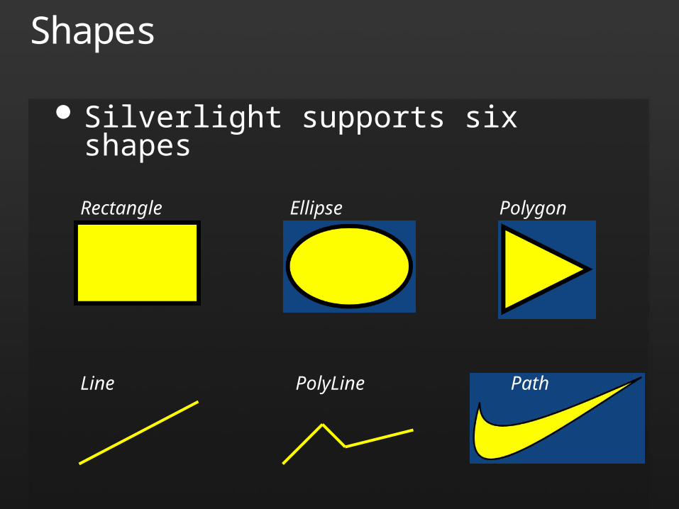
Shapes
Silverlight supports six shapes
Rectangle Ellipse Polygon
Line PolyLine Path
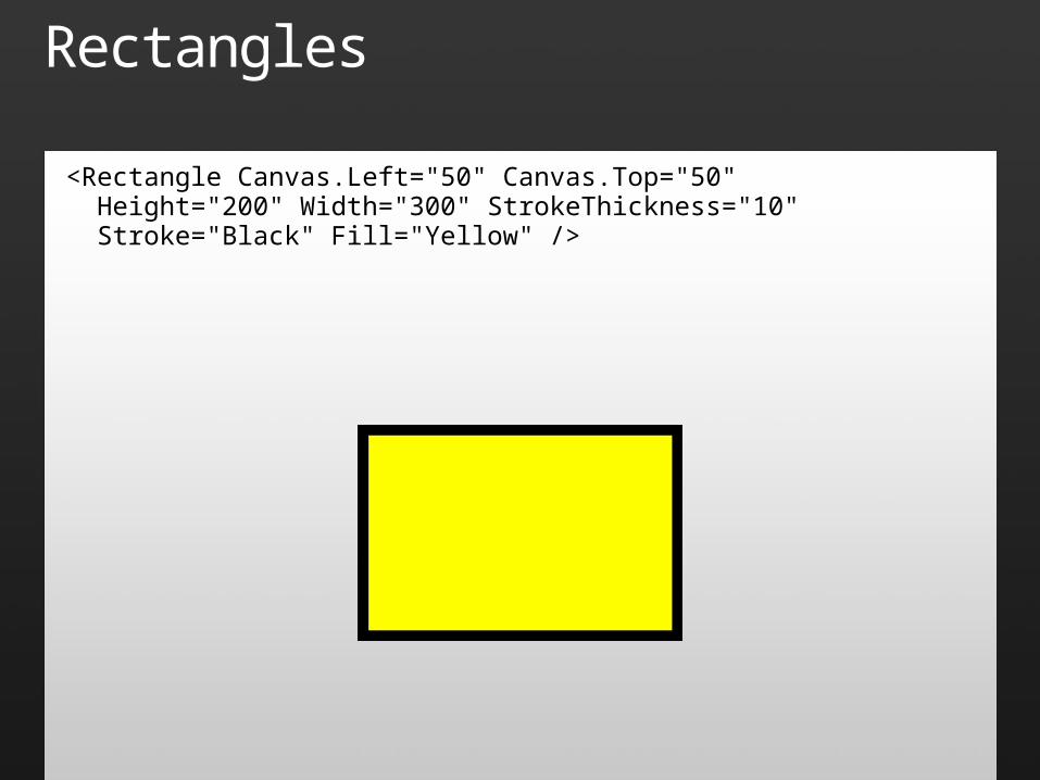
Rectangles
<Rectangle Canvas.Left="50" Canvas.Top="50" Height="200" Width="300" StrokeThickness="10" Stroke="Black" Fill="Yellow" />
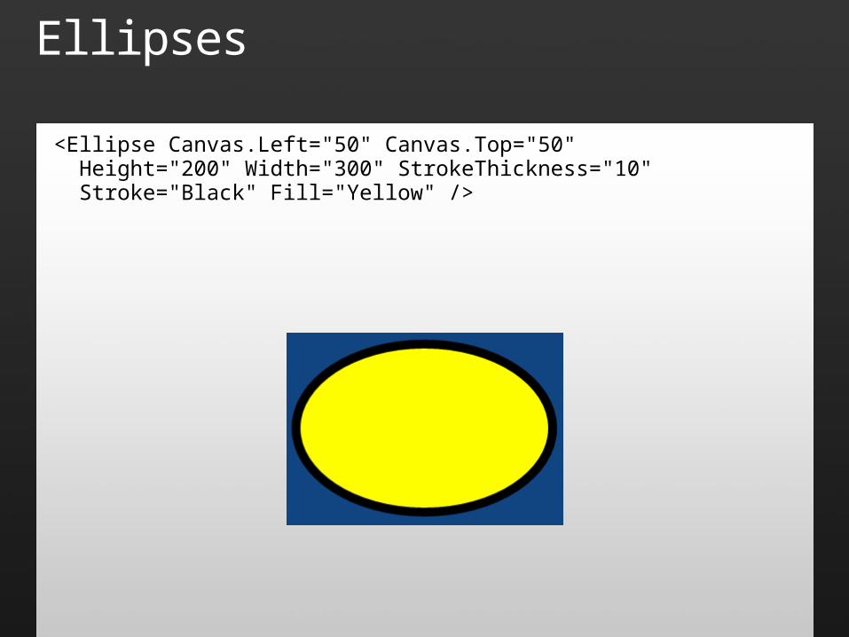
Ellipses
<Ellipse Canvas.Left="50" Canvas.Top="50" Height="200" Width="300" StrokeThickness="10" Stroke="Black" Fill="Yellow" />
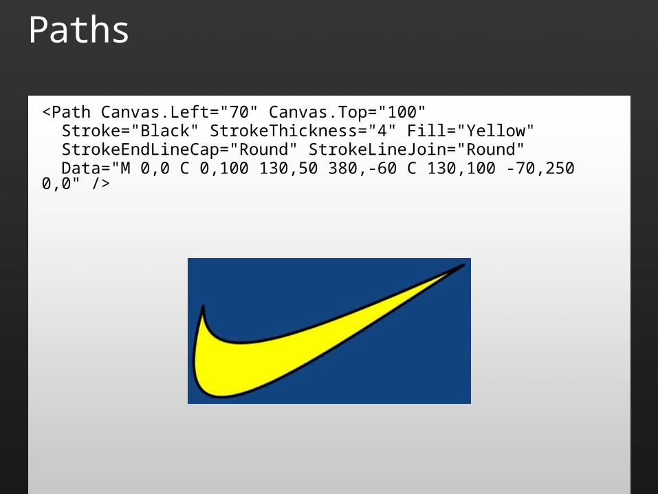
Paths
<Path Canvas.Left="70" Canvas.Top="100" Stroke="Black" StrokeThickness="4" Fill="Yellow" StrokeEndLineCap="Round" StrokeLineJoin="Round" Data="M 0,0 C 0,100 130,50 380,-60 C 130,100 -70,250 0,0" />
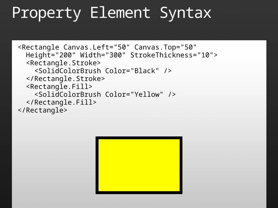
Property Element Syntax
<Rectangle Canvas.Left="50" Canvas.Top="50" Height="200" Width="300" StrokeThickness="10"> <Rectangle.Stroke> <SolidColorBrush Color="Black" /> </Rectangle.Stroke> <Rectangle.Fill> <SolidColorBrush Color="Yellow" /> </Rectangle.Fill></Rectangle>
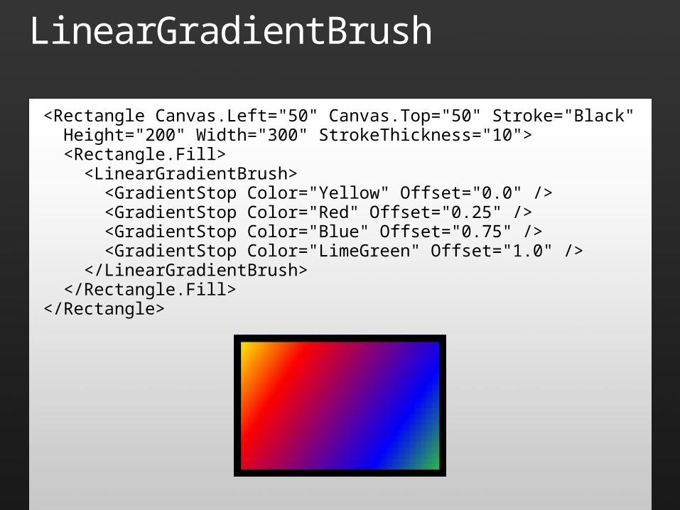
LinearGradientBrush
<Rectangle Canvas.Left="50" Canvas.Top="50" Stroke="Black" Height="200" Width="300" StrokeThickness="10"> <Rectangle.Fill> <LinearGradientBrush> <GradientStop Color="Yellow" Offset="0.0" /> <GradientStop Color="Red" Offset="0.25" /> <GradientStop Color="Blue" Offset="0.75" /> <GradientStop Color="LimeGreen" Offset="1.0" /> </LinearGradientBrush> </Rectangle.Fill></Rectangle>
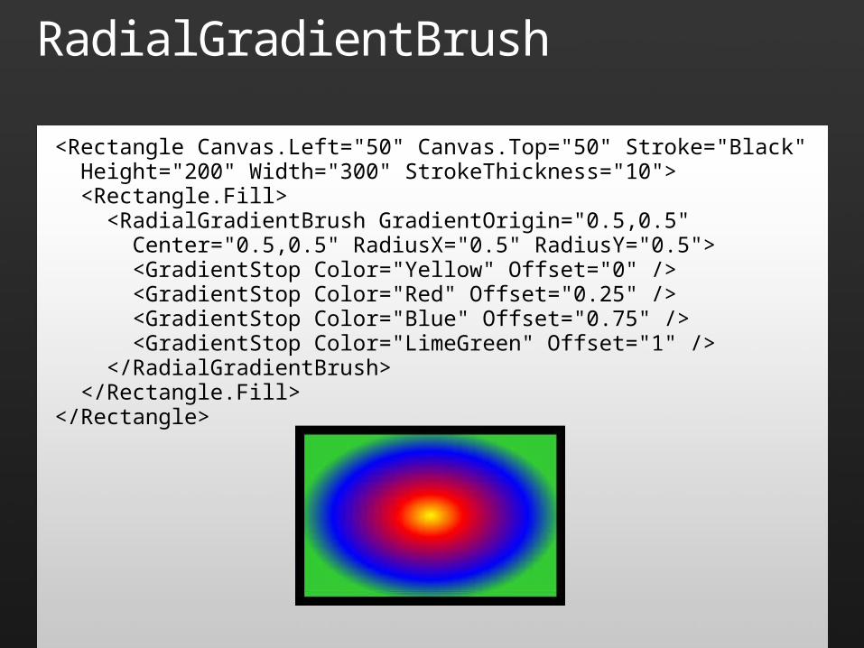
RadialGradientBrush
<Rectangle Canvas.Left="50" Canvas.Top="50" Stroke="Black" Height="200" Width="300" StrokeThickness="10"> <Rectangle.Fill> <RadialGradientBrush GradientOrigin="0.5,0.5" Center="0.5,0.5" RadiusX="0.5" RadiusY="0.5"> <GradientStop Color="Yellow" Offset="0" /> <GradientStop Color="Red" Offset="0.25" /> <GradientStop Color="Blue" Offset="0.75" /> <GradientStop Color="LimeGreen" Offset="1" /> </RadialGradientBrush> </Rectangle.Fill></Rectangle>
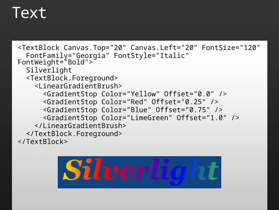
Text
<TextBlock Canvas.Top="20" Canvas.Left="20" FontSize="120" FontFamily="Georgia" FontStyle="Italic" FontWeight="Bold"> Silverlight <TextBlock.Foreground> <LinearGradientBrush> <GradientStop Color="Yellow" Offset="0.0" /> <GradientStop Color="Red" Offset="0.25" /> <GradientStop Color="Blue" Offset="0.75" /> <GradientStop Color="LimeGreen" Offset="1.0" /> </LinearGradientBrush> </TextBlock.Foreground></TextBlock>
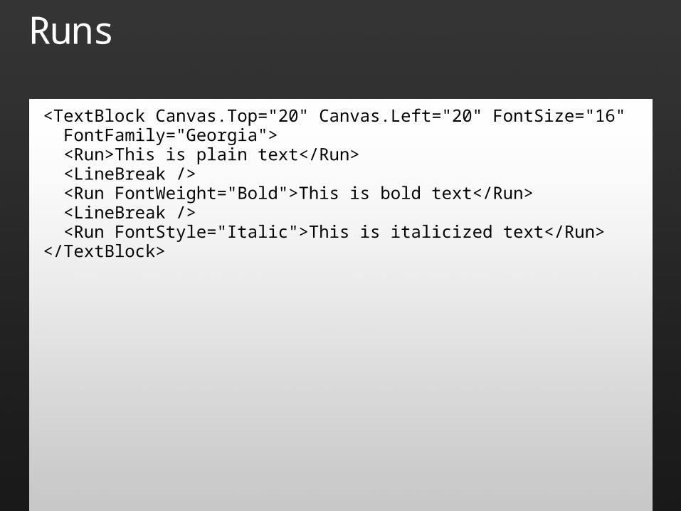
Runs
<TextBlock Canvas.Top="20" Canvas.Left="20" FontSize="16" FontFamily="Georgia"> <Run>This is plain text</Run> <LineBreak /> <Run FontWeight="Bold">This is bold text</Run> <LineBreak /> <Run FontStyle="Italic">This is italicized text</Run></TextBlock>
Fonts
Default is "Portable User Interface" Standard fonts used from local computer:
Arial, Arial Black, Comic Sans MS, Courier New, Georgia, Lucida Grande/Lucida Sans Unicode, Times New Roman, Trebuchet MS, Verdana
Custom fonts can be embedded as resources or downloaded on demand Applied declaratively with FontFamily Applied programmatically with FontSource
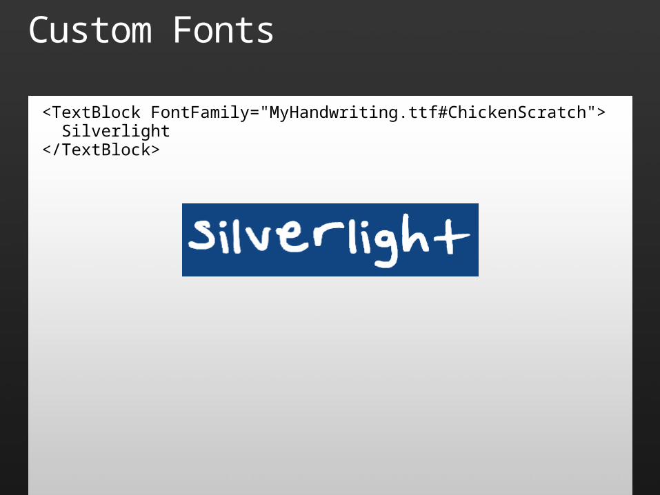
Custom Fonts
<TextBlock FontFamily="MyHandwriting.ttf#ChickenScratch"> Silverlight</TextBlock>
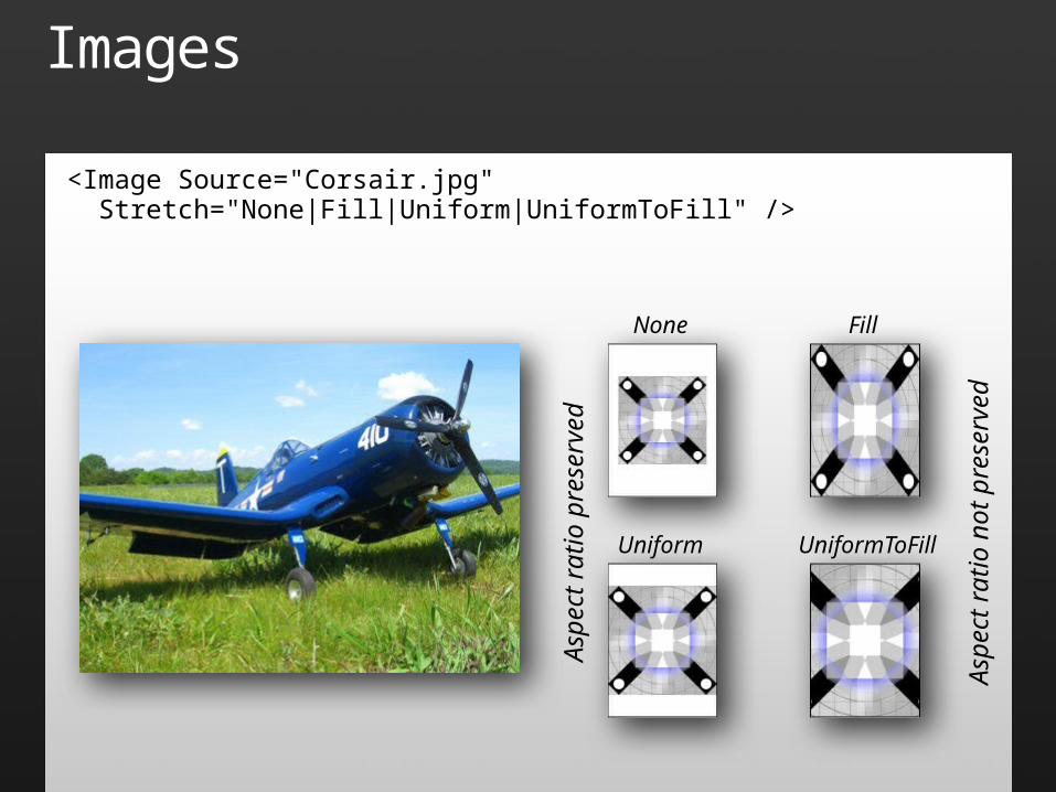
Images
<Image Source="Corsair.jpg" Stretch="None|Fill|Uniform|UniformToFill" />
None Fill
Uniform UniformToFillAs
pect
ratio
pre
serv
ed
Aspe
ct ra
tio n
ot p
rese
rved
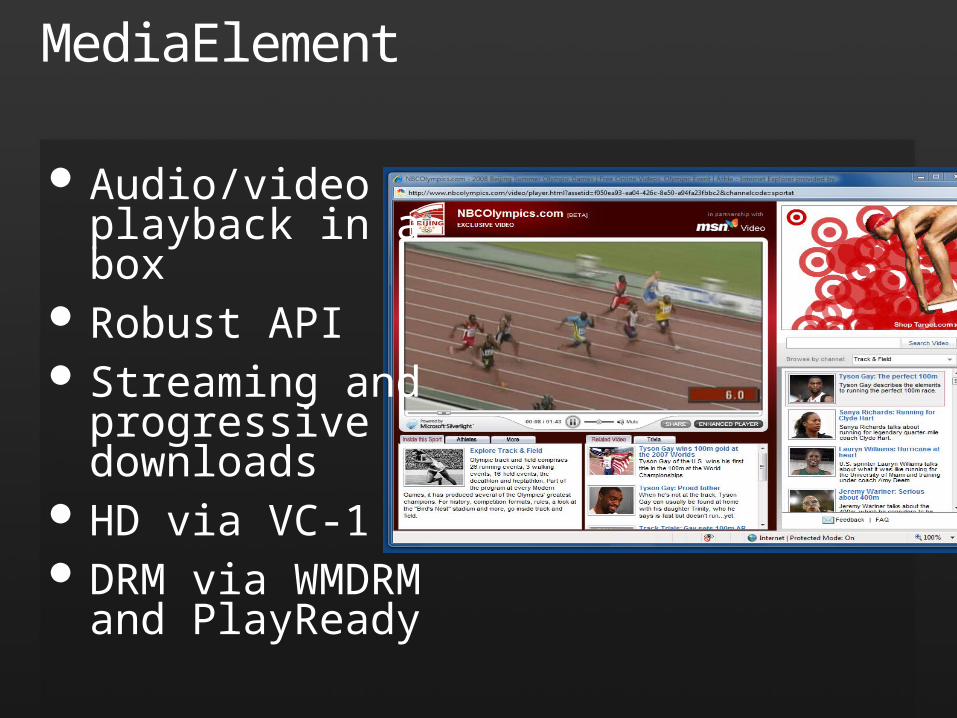
MediaElement
Audio/video playback in a box
Robust API Streaming and
progressive downloads
HD via VC-1 DRM via WMDRM
and PlayReady
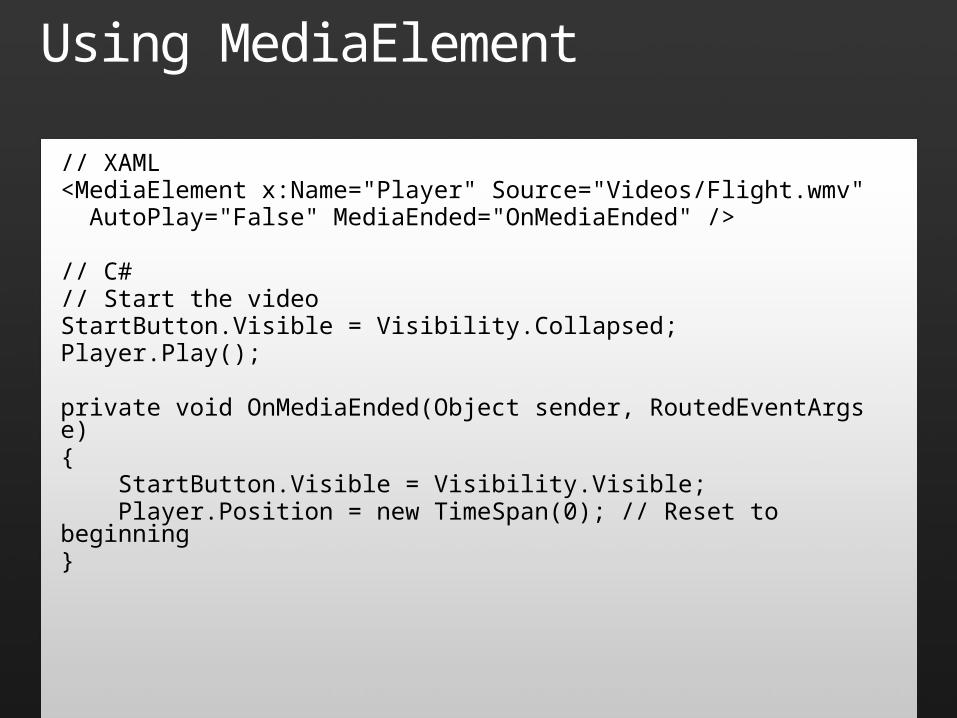
Using MediaElement
// XAML<MediaElement x:Name="Player" Source="Videos/Flight.wmv" AutoPlay="False" MediaEnded="OnMediaEnded" />
// C#// Start the videoStartButton.Visible = Visibility.Collapsed;Player.Play();
private void OnMediaEnded(Object sender, RoutedEventArgs e){ StartButton.Visible = Visibility.Visible; Player.Position = new TimeSpan(0); // Reset to beginning}
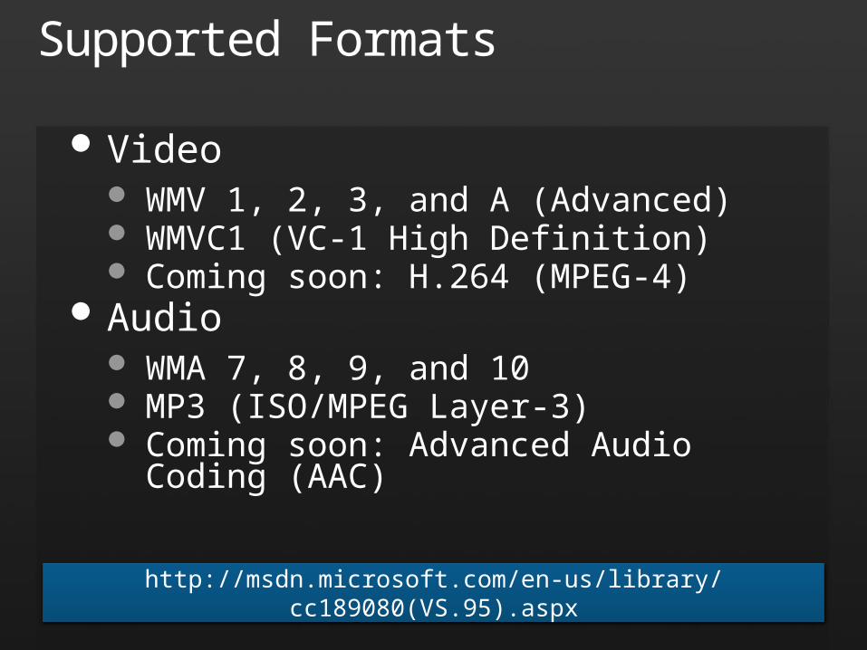
Supported Formats
Video WMV 1, 2, 3, and A (Advanced) WMVC1 (VC-1 High Definition) Coming soon: H.264 (MPEG-4)
Audio WMA 7, 8, 9, and 10 MP3 (ISO/MPEG Layer-3) Coming soon: Advanced Audio Coding (AAC)
http://msdn.microsoft.com/en-us/library/cc189080(VS.95).aspx

MediaElement
demo
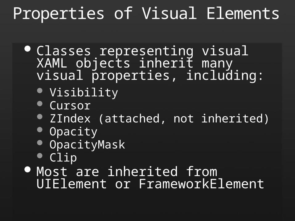
Properties of Visual Elements
Classes representing visual XAML objects inherit many visual properties, including: Visibility Cursor ZIndex (attached, not inherited) Opacity OpacityMask Clip
Most are inherited from UIElement or FrameworkElement
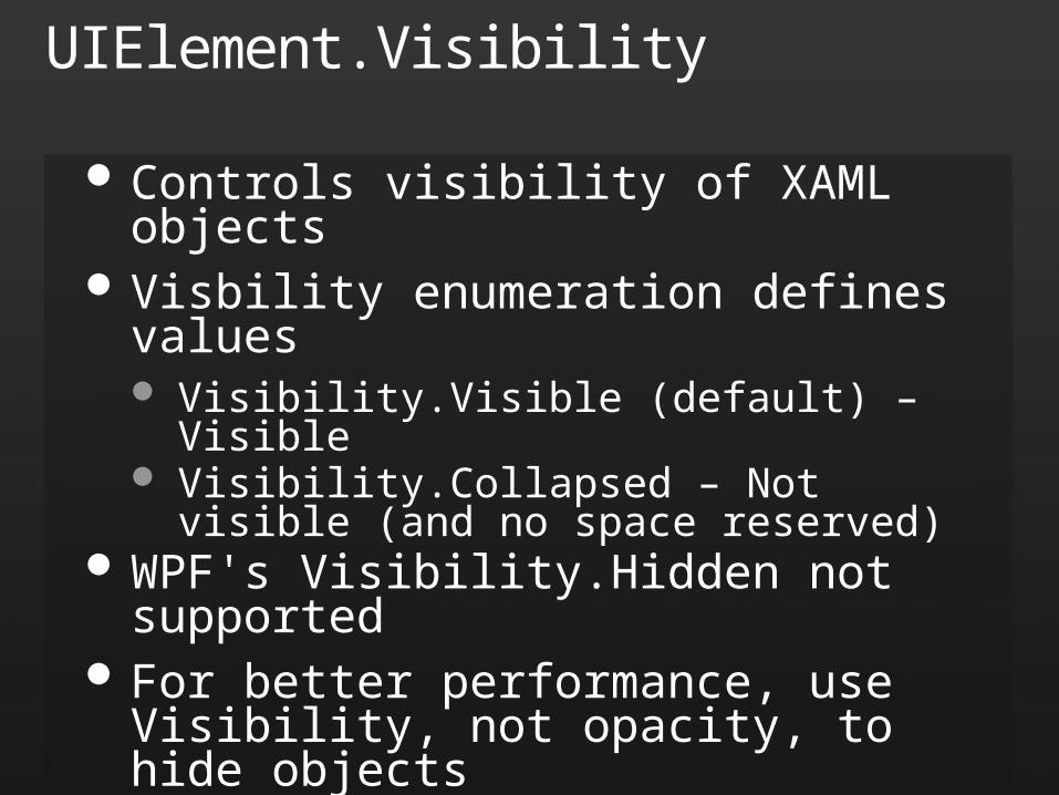
UIElement.Visibility
Controls visibility of XAML objects Visbility enumeration defines values
Visibility.Visible (default) – Visible Visibility.Collapsed – Not visible (and no space
reserved) WPF's Visibility.Hidden not supported For better performance, use Visibility, not
opacity, to hide objects
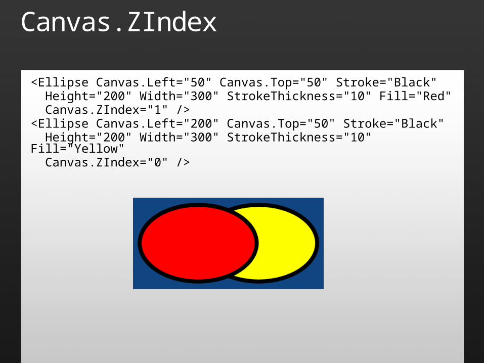
Canvas.ZIndex
<Ellipse Canvas.Left="50" Canvas.Top="50" Stroke="Black" Height="200" Width="300" StrokeThickness="10" Fill="Red" Canvas.ZIndex="1" /><Ellipse Canvas.Left="200" Canvas.Top="50" Stroke="Black" Height="200" Width="300" StrokeThickness="10" Fill="Yellow" Canvas.ZIndex="0" />
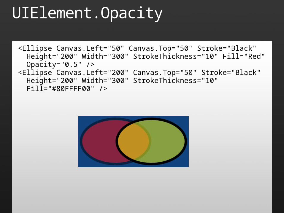
UIElement.Opacity
<Ellipse Canvas.Left="50" Canvas.Top="50" Stroke="Black" Height="200" Width="300" StrokeThickness="10" Fill="Red" Opacity="0.5" /><Ellipse Canvas.Left="200" Canvas.Top="50" Stroke="Black" Height="200" Width="300" StrokeThickness="10" Fill="#80FFFF00" />
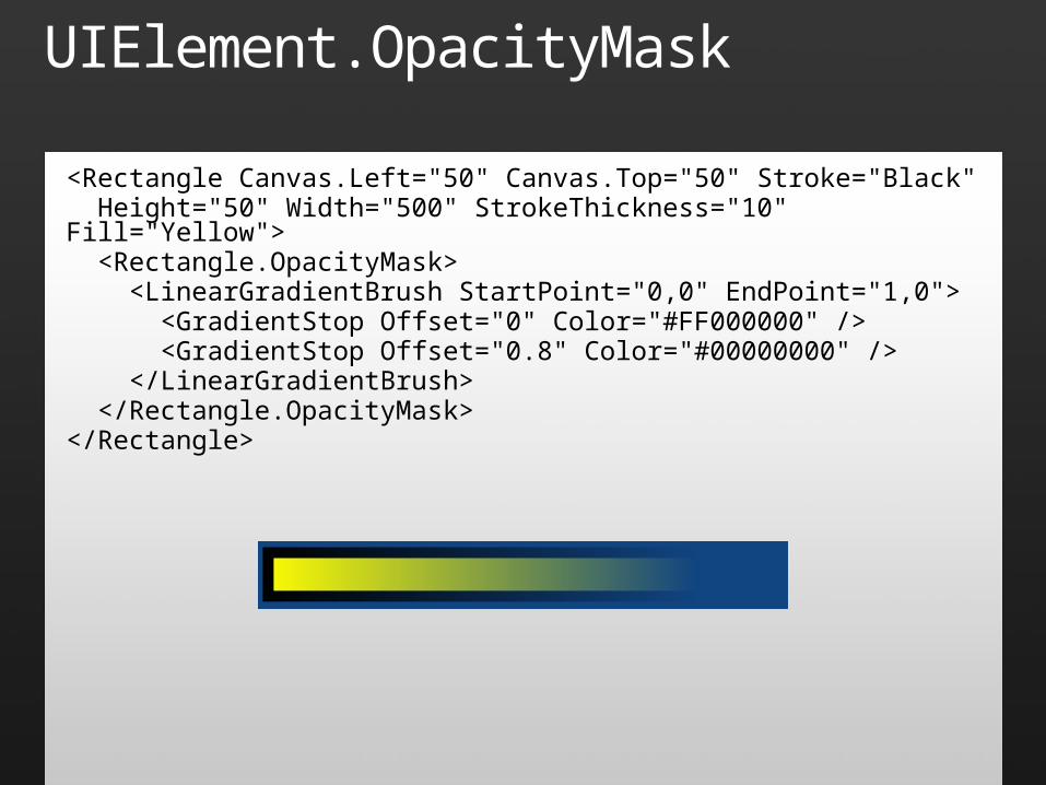
UIElement.OpacityMask
<Rectangle Canvas.Left="50" Canvas.Top="50" Stroke="Black" Height="50" Width="500" StrokeThickness="10" Fill="Yellow"> <Rectangle.OpacityMask> <LinearGradientBrush StartPoint="0,0" EndPoint="1,0"> <GradientStop Offset="0" Color="#FF000000" /> <GradientStop Offset="0.8" Color="#00000000" /> </LinearGradientBrush> </Rectangle.OpacityMask></Rectangle>
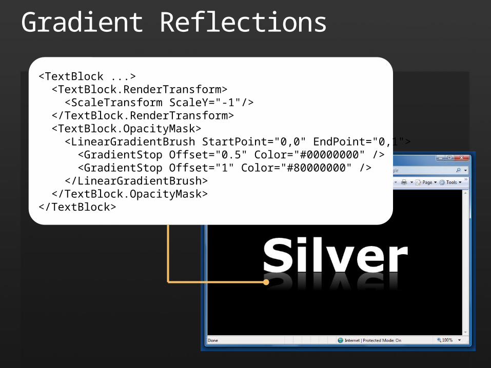
Gradient Reflections
<TextBlock ...> <TextBlock.RenderTransform> <ScaleTransform ScaleY="-1"/> </TextBlock.RenderTransform> <TextBlock.OpacityMask> <LinearGradientBrush StartPoint="0,0" EndPoint="0,1"> <GradientStop Offset="0.5" Color="#00000000" /> <GradientStop Offset="1" Color="#80000000" /> </LinearGradientBrush> </TextBlock.OpacityMask></TextBlock>
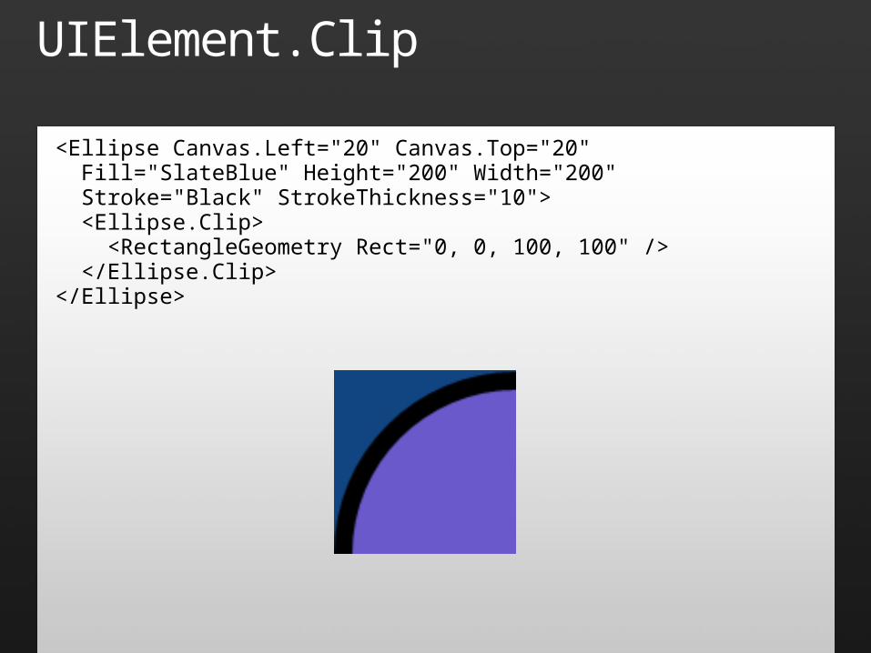
UIElement.Clip
<Ellipse Canvas.Left="20" Canvas.Top="20" Fill="SlateBlue" Height="200" Width="200" Stroke="Black" StrokeThickness="10"> <Ellipse.Clip> <RectangleGeometry Rect="0, 0, 100, 100" /> </Ellipse.Clip></Ellipse>
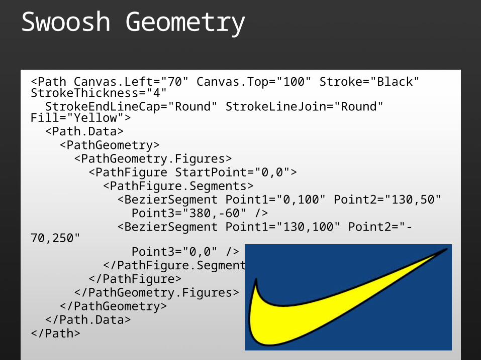
Swoosh Geometry
<Path Canvas.Left="70" Canvas.Top="100" Stroke="Black" StrokeThickness="4" StrokeEndLineCap="Round" StrokeLineJoin="Round" Fill="Yellow"> <Path.Data> <PathGeometry> <PathGeometry.Figures> <PathFigure StartPoint="0,0"> <PathFigure.Segments> <BezierSegment Point1="0,100" Point2="130,50" Point3="380,-60" /> <BezierSegment Point1="130,100" Point2="-70,250" Point3="0,0" /> </PathFigure.Segments> </PathFigure> </PathGeometry.Figures> </PathGeometry> </Path.Data></Path>
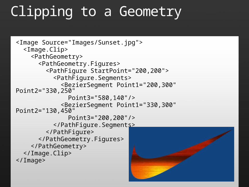
Clipping to a Geometry
<Image Source="Images/Sunset.jpg"> <Image.Clip> <PathGeometry> <PathGeometry.Figures> <PathFigure StartPoint="200,200"> <PathFigure.Segments> <BezierSegment Point1="200,300" Point2="330,250" Point3="580,140"/> <BezierSegment Point1="330,300" Point2="130,450" Point3="200,200"/> </PathFigure.Segments> </PathFigure> </PathGeometry.Figures> </PathGeometry> </Image.Clip></Image>

Clipping
demo
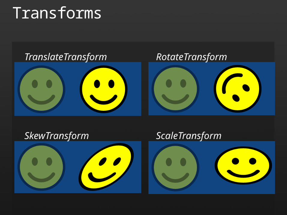
Transforms
TranslateTransform RotateTransform
SkewTransform ScaleTransform
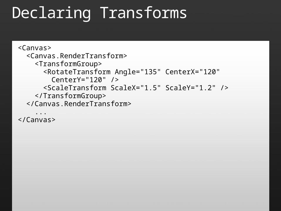
Declaring Transforms
<Canvas> <Canvas.RenderTransform> <TransformGroup> <RotateTransform Angle="135" CenterX="120" CenterY="120" /> <ScaleTransform ScaleX="1.5" ScaleY="1.2" /> </TransformGroup> </Canvas.RenderTransform> ...</Canvas>
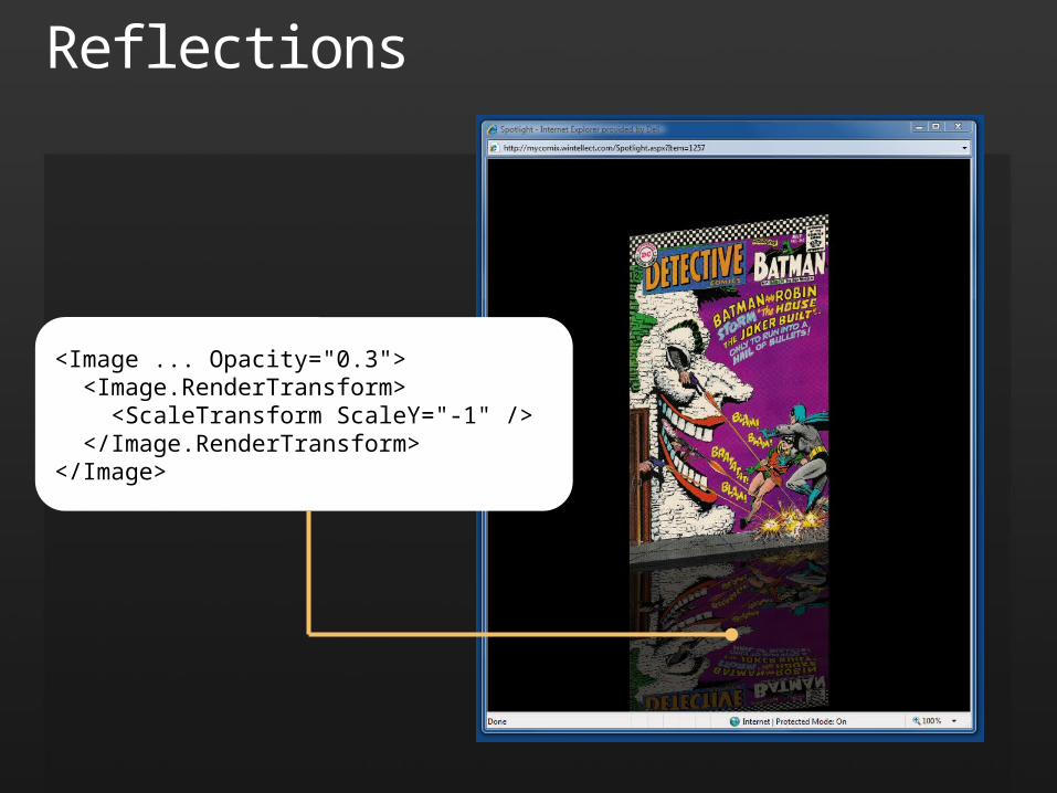
Reflections
<Image ... Opacity="0.3"> <Image.RenderTransform> <ScaleTransform ScaleY="-1" /> </Image.RenderTransform></Image>

Transforms
demo
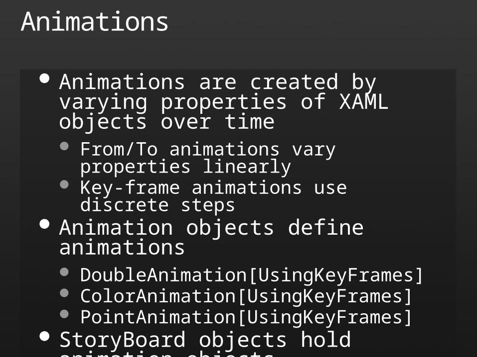
Animations
Animations are created by varying properties of XAML objects over time From/To animations vary properties linearly Key-frame animations use discrete steps
Animation objects define animations DoubleAnimation[UsingKeyFrames] ColorAnimation[UsingKeyFrames] PointAnimation[UsingKeyFrames]
StoryBoard objects hold animation objects
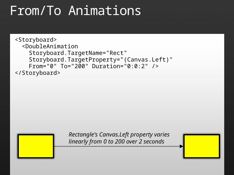
From/To Animations
<Storyboard> <DoubleAnimation Storyboard.TargetName="Rect" Storyboard.TargetProperty="(Canvas.Left)" From="0" To="200" Duration="0:0:2" /></Storyboard>
Rectangle's Canvas.Left property varies linearly from 0 to 200 over 2 seconds
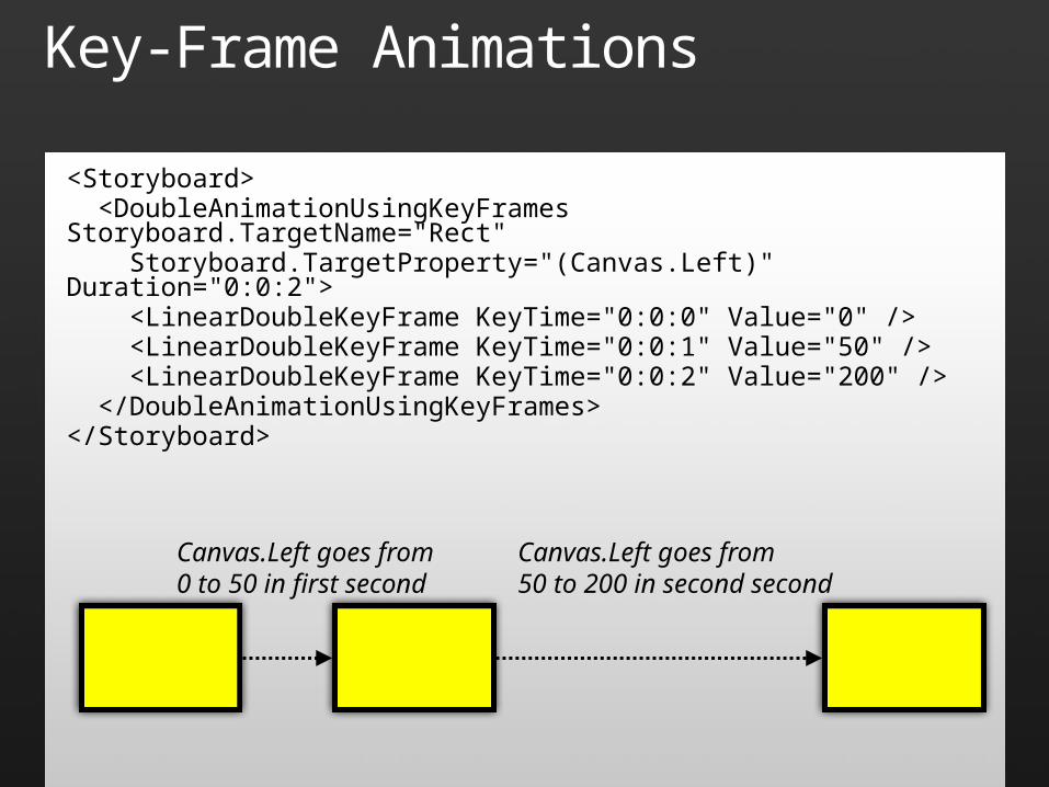
Key-Frame Animations
<Storyboard> <DoubleAnimationUsingKeyFrames Storyboard.TargetName="Rect" Storyboard.TargetProperty="(Canvas.Left)" Duration="0:0:2"> <LinearDoubleKeyFrame KeyTime="0:0:0" Value="0" /> <LinearDoubleKeyFrame KeyTime="0:0:1" Value="50" /> <LinearDoubleKeyFrame KeyTime="0:0:2" Value="200" /> </DoubleAnimationUsingKeyFrames></Storyboard>
Canvas.Left goes from0 to 50 in first second
Canvas.Left goes from50 to 200 in second second
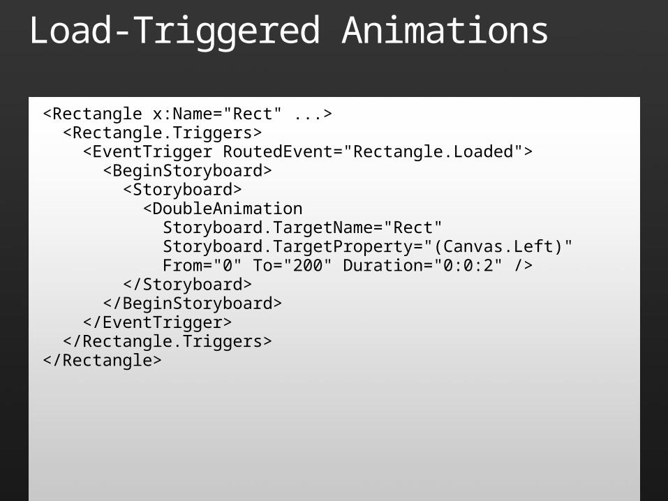
Load-Triggered Animations
<Rectangle x:Name="Rect" ...> <Rectangle.Triggers> <EventTrigger RoutedEvent="Rectangle.Loaded"> <BeginStoryboard> <Storyboard> <DoubleAnimation Storyboard.TargetName="Rect" Storyboard.TargetProperty="(Canvas.Left)" From="0" To="200" Duration="0:0:2" /> </Storyboard> </BeginStoryboard> </EventTrigger> </Rectangle.Triggers></Rectangle>
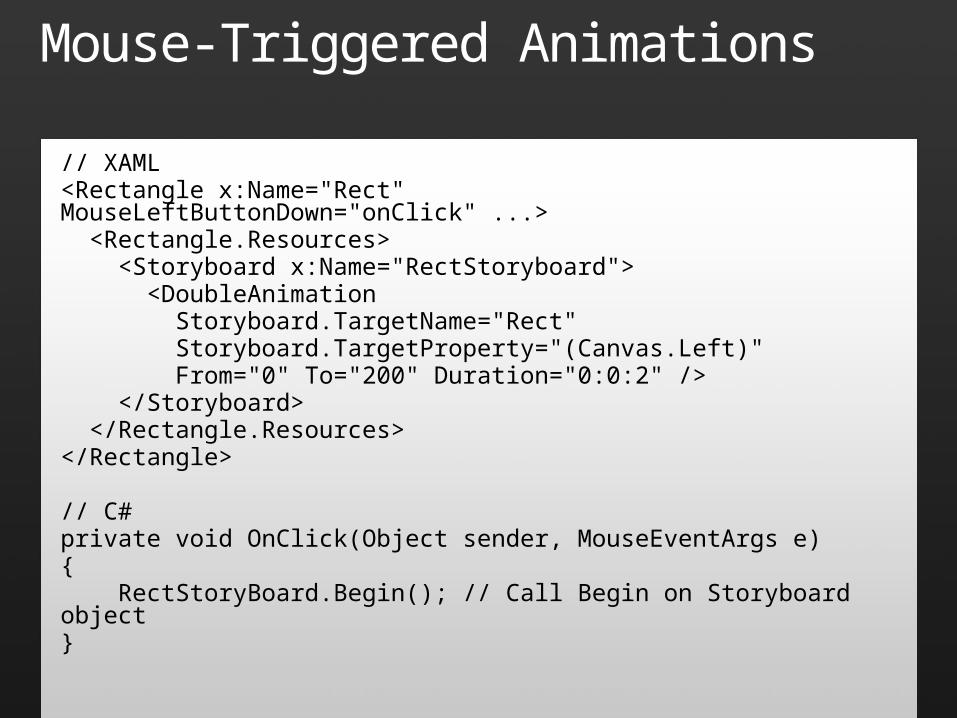
Mouse-Triggered Animations
// XAML<Rectangle x:Name="Rect" MouseLeftButtonDown="onClick" ...> <Rectangle.Resources> <Storyboard x:Name="RectStoryboard"> <DoubleAnimation Storyboard.TargetName="Rect" Storyboard.TargetProperty="(Canvas.Left)" From="0" To="200" Duration="0:0:2" /> </Storyboard> </Rectangle.Resources></Rectangle>
// C#private void OnClick(Object sender, MouseEventArgs e){ RectStoryBoard.Begin(); // Call Begin on Storyboard object}
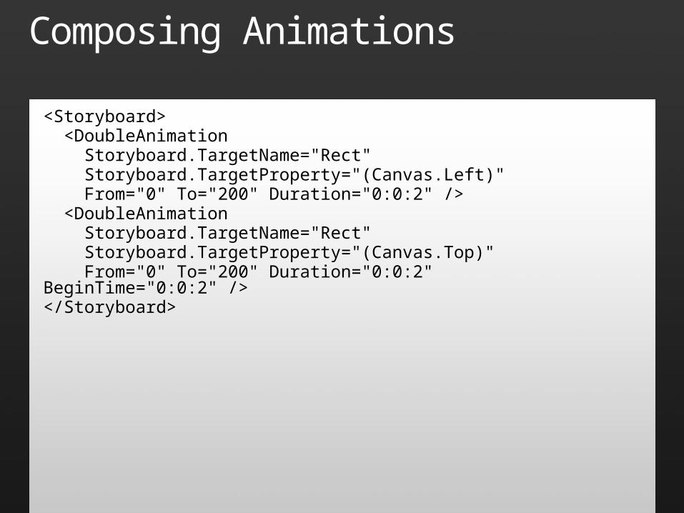
Composing Animations
<Storyboard> <DoubleAnimation Storyboard.TargetName="Rect" Storyboard.TargetProperty="(Canvas.Left)" From="0" To="200" Duration="0:0:2" /> <DoubleAnimation Storyboard.TargetName="Rect" Storyboard.TargetProperty="(Canvas.Top)" From="0" To="200" Duration="0:0:2" BeginTime="0:0:2" /></Storyboard>

Animations
demo
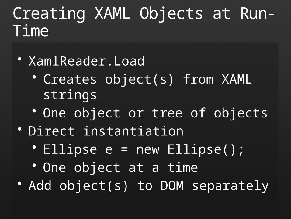
Creating XAML Objects at Run-Time
• XamlReader.Load• Creates object(s) from XAML strings• One object or tree of objects
• Direct instantiation• Ellipse e = new Ellipse();• One object at a time
• Add object(s) to DOM separately
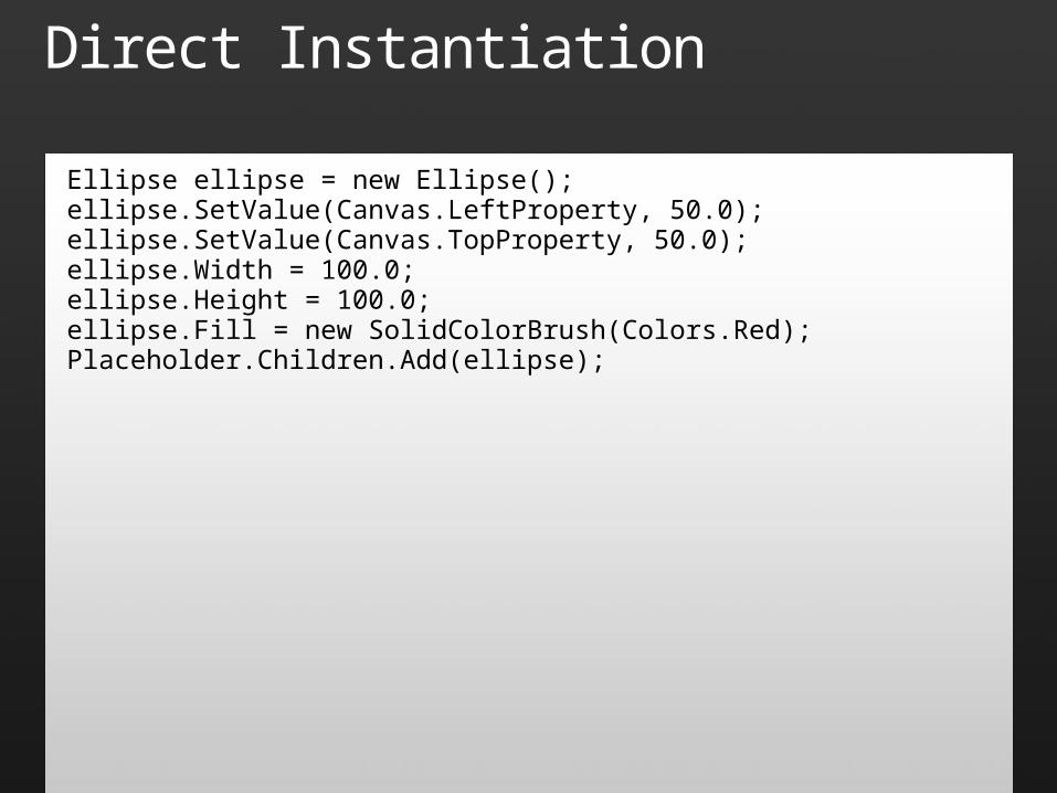
Direct Instantiation
Ellipse ellipse = new Ellipse();ellipse.SetValue(Canvas.LeftProperty, 50.0);ellipse.SetValue(Canvas.TopProperty, 50.0);ellipse.Width = 100.0;ellipse.Height = 100.0;ellipse.Fill = new SolidColorBrush(Colors.Red); Placeholder.Children.Add(ellipse);
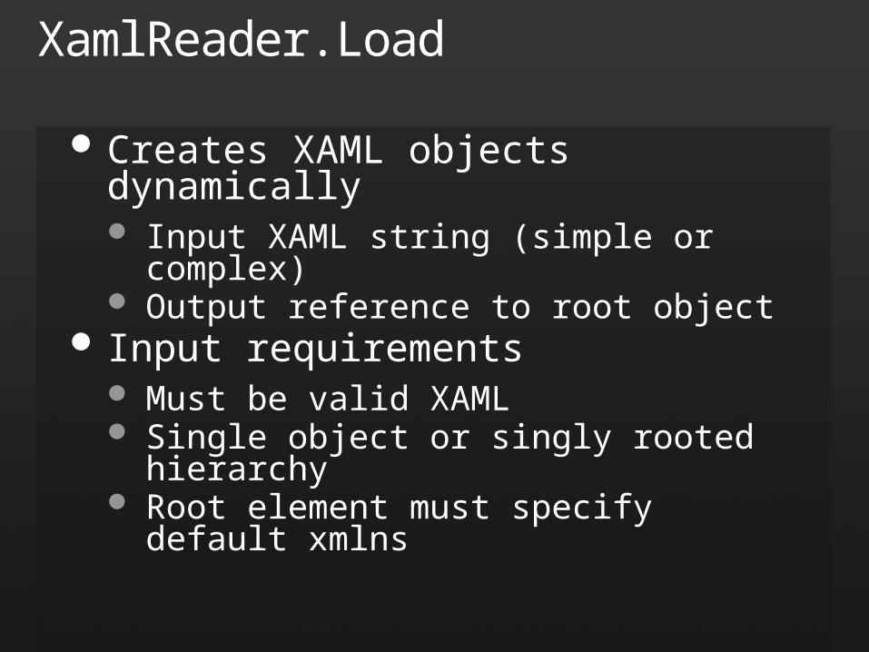
XamlReader.Load
Creates XAML objects dynamically Input XAML string (simple or complex) Output reference to root object
Input requirements Must be valid XAML Single object or singly rooted hierarchy Root element must specify default xmlns
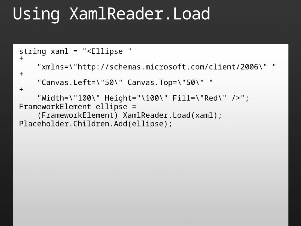
Using XamlReader.Load
string xaml = "<Ellipse " + "xmlns=\"http://schemas.microsoft.com/client/2006\" " + "Canvas.Left=\"50\" Canvas.Top=\"50\" " + "Width=\"100\" Height="\100\" Fill=\"Red\" />";FrameworkElement ellipse = (FrameworkElement) XamlReader.Load(xaml);Placeholder.Children.Add(ellipse);

Dynamic XAML
demo
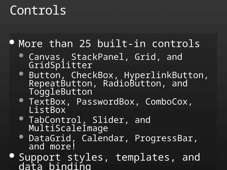
Controls
More than 25 built-in controls Canvas, StackPanel, Grid, and GridSplitter Button, CheckBox, HyperlinkButton, RepeatButton,
RadioButton, and ToggleButton TextBox, PasswordBox, ComboCox, ListBox TabControl, Slider, and MultiScaleImage DataGrid, Calendar, ProgressBar, and more!
Support styles, templates, and data binding
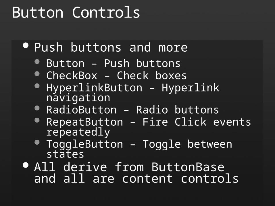
Button Controls
Push buttons and more Button – Push buttons CheckBox – Check boxes HyperlinkButton – Hyperlink navigation RadioButton – Radio buttons RepeatButton – Fire Click events repeatedly ToggleButton – Toggle between states
All derive from ButtonBase and all are content controls
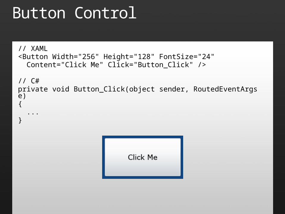
Button Control
// XAML<Button Width="256" Height="128" FontSize="24" Content="Click Me" Click="Button_Click" />
// C#private void Button_Click(object sender, RoutedEventArgs e){ ...}
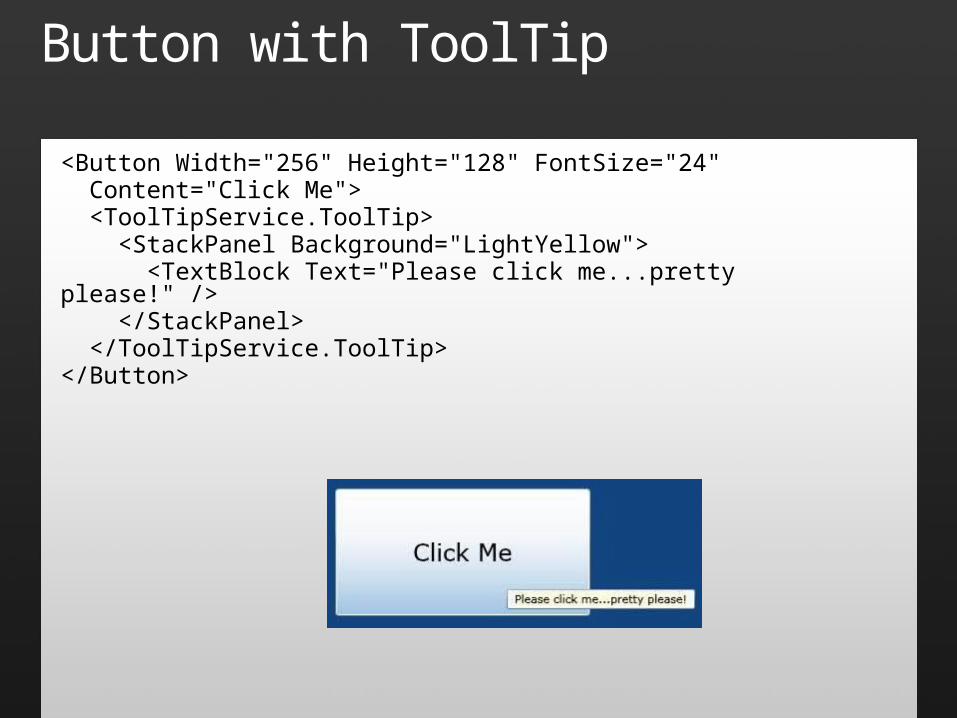
Button with ToolTip
<Button Width="256" Height="128" FontSize="24" Content="Click Me"> <ToolTipService.ToolTip> <StackPanel Background="LightYellow"> <TextBlock Text="Please click me...pretty please!" /> </StackPanel> </ToolTipService.ToolTip></Button>
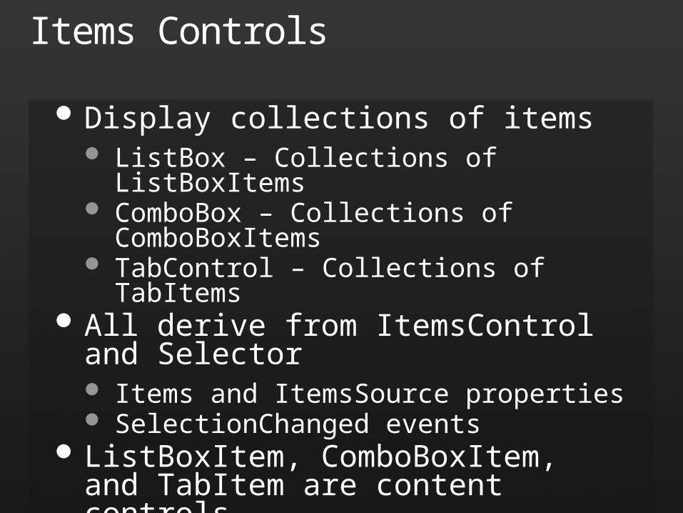
Items Controls
Display collections of items ListBox – Collections of ListBoxItems ComboBox – Collections of ComboBoxItems TabControl – Collections of TabItems
All derive from ItemsControl and Selector Items and ItemsSource properties SelectionChanged events
ListBoxItem, ComboBoxItem, and TabItem are content controls
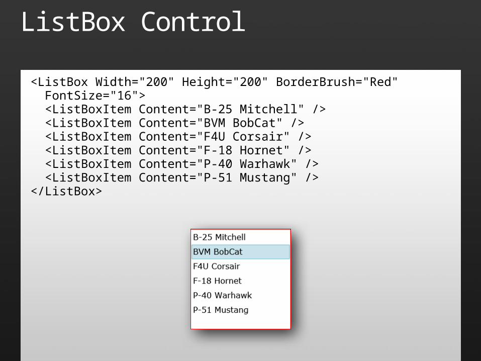
ListBox Control
<ListBox Width="200" Height="200" BorderBrush="Red" FontSize="16"> <ListBoxItem Content="B-25 Mitchell" /> <ListBoxItem Content="BVM BobCat" /> <ListBoxItem Content="F4U Corsair" /> <ListBoxItem Content="F-18 Hornet" /> <ListBoxItem Content="P-40 Warhawk" /> <ListBoxItem Content="P-51 Mustang" /></ListBox>
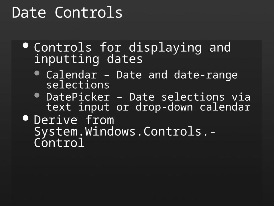
Date Controls
Controls for displaying and inputting dates Calendar – Date and date-range selections DatePicker – Date selections via text input or
drop-down calendar Derive from System.Windows.Controls.-
Control
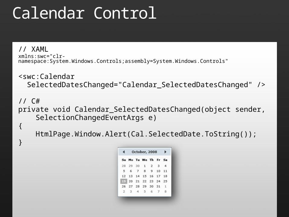
Calendar Control
// XAMLxmlns:swc="clr-namespace:System.Windows.Controls;assembly=System.Windows.Controls"
<swc:Calendar SelectedDatesChanged="Calendar_SelectedDatesChanged" />
// C#private void Calendar_SelectedDatesChanged(object sender, SelectionChangedEventArgs e){ HtmlPage.Window.Alert(Cal.SelectedDate.ToString());}
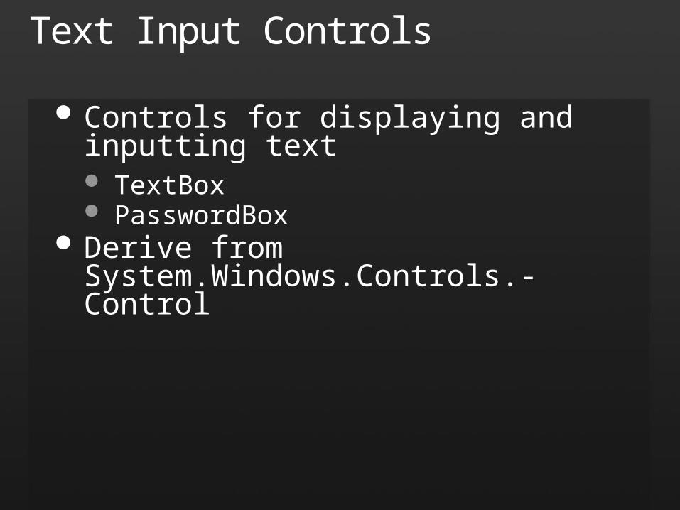
Text Input Controls
Controls for displaying and inputting text TextBox PasswordBox
Derive from System.Windows.Controls.-Control
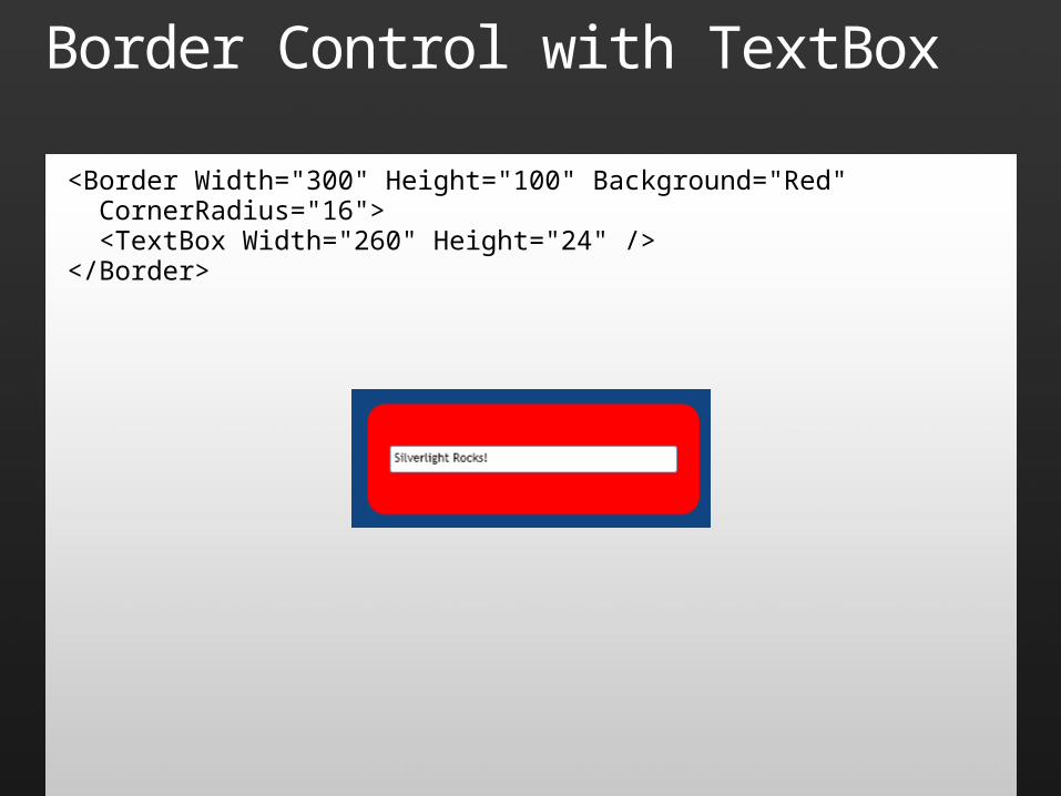
Border Control with TextBox
<Border Width="300" Height="100" Background="Red" CornerRadius="16"> <TextBox Width="260" Height="24" /></Border>
Range Controls
Controls for sliding, scrolling, and providing percent-complete feedback to the user ProgressBar ScrollBar Slider
All derive from System.Windows.Controls.-Primitives.RangeBase Minimum, Maximum, and Value properties ValueChanged events
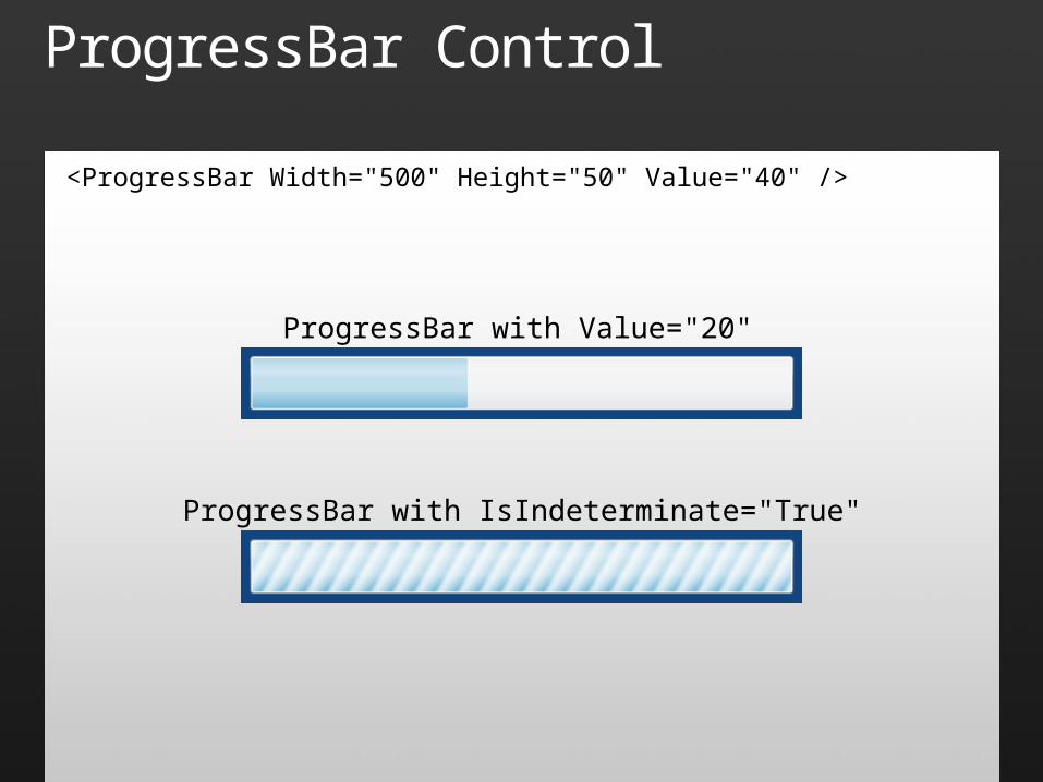
ProgressBar Control
<ProgressBar Width="500" Height="50" Value="40" />
ProgressBar with Value="20"
ProgressBar with IsIndeterminate="True"
Other Controls
More tools for building great UXes Border – Background for other controls DataGrid – Rows and columns of data InkPresenter – Tablet-style input MultiScaleImage – Deep Zoom Popup – Popup container for other controls ScrollViewer – Scrolling content viewer ToolTip – Tooltip popups to enhance controls
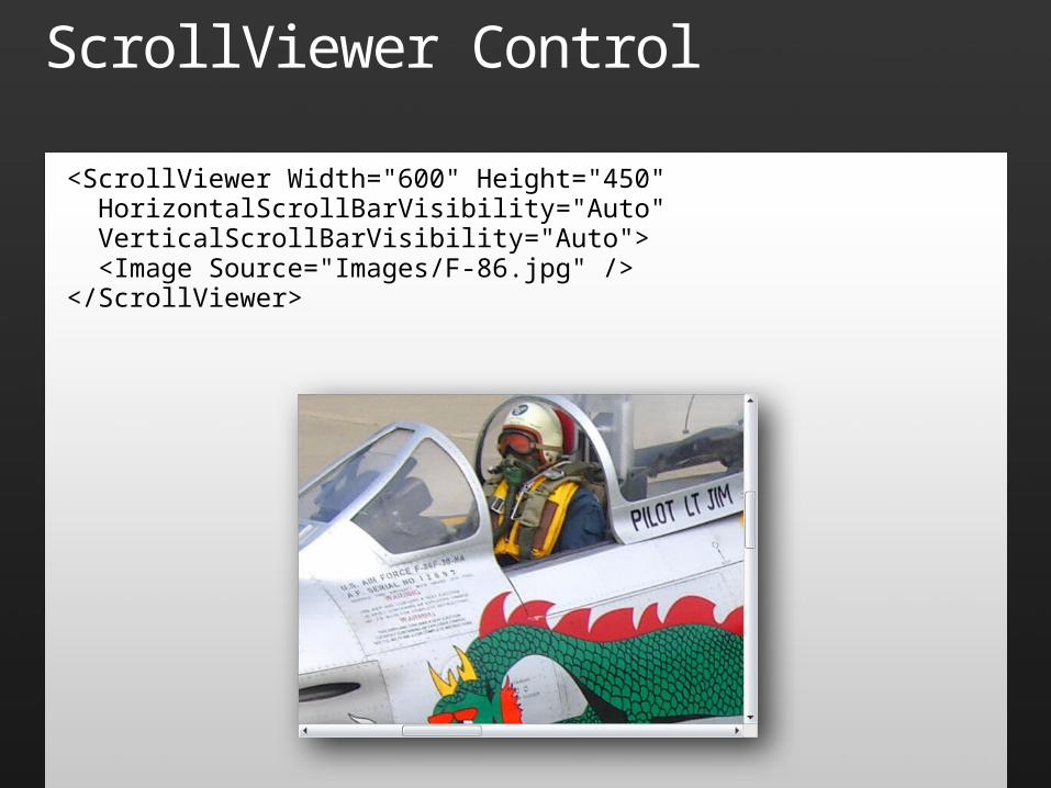
ScrollViewer Control
<ScrollViewer Width="600" Height="450" HorizontalScrollBarVisibility="Auto" VerticalScrollBarVisibility="Auto"> <Image Source="Images/F-86.jpg" /></ScrollViewer>
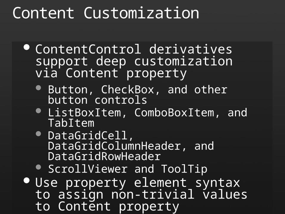
Content Customization
ContentControl derivatives support deep customization via Content property Button, CheckBox, and other button controls ListBoxItem, ComboBoxItem, and TabItem DataGridCell, DataGridColumnHeader, and
DataGridRowHeader ScrollViewer and ToolTip
Use property element syntax to assign non-trivial values to Content property
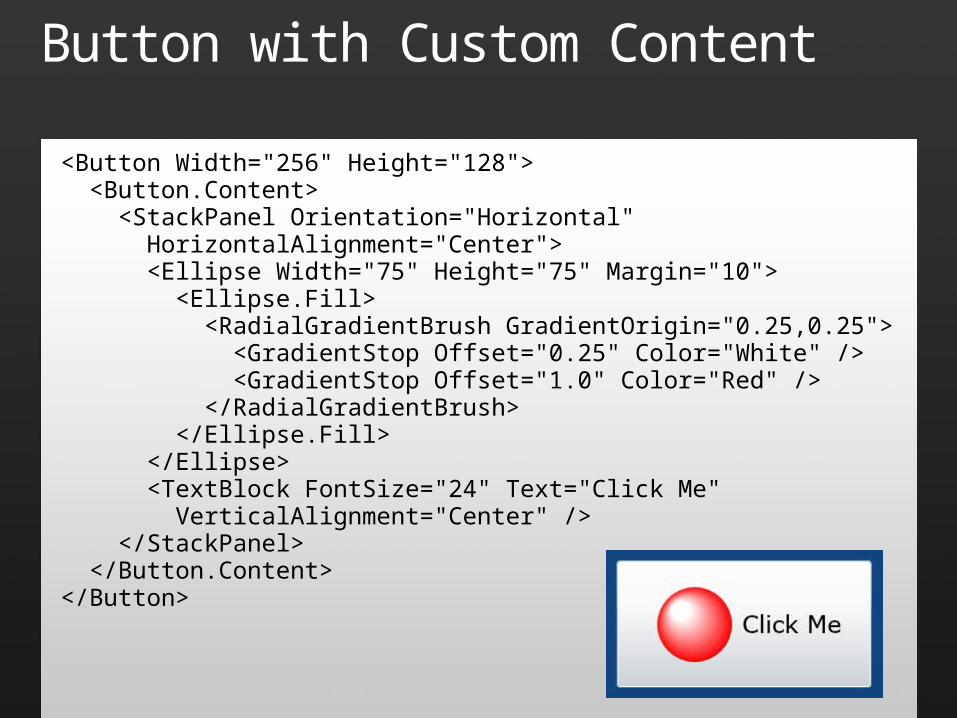
Button with Custom Content
<Button Width="256" Height="128"> <Button.Content> <StackPanel Orientation="Horizontal" HorizontalAlignment="Center"> <Ellipse Width="75" Height="75" Margin="10"> <Ellipse.Fill> <RadialGradientBrush GradientOrigin="0.25,0.25"> <GradientStop Offset="0.25" Color="White" /> <GradientStop Offset="1.0" Color="Red" /> </RadialGradientBrush> </Ellipse.Fill> </Ellipse> <TextBlock FontSize="24" Text="Click Me" VerticalAlignment="Center" /> </StackPanel> </Button.Content></Button>
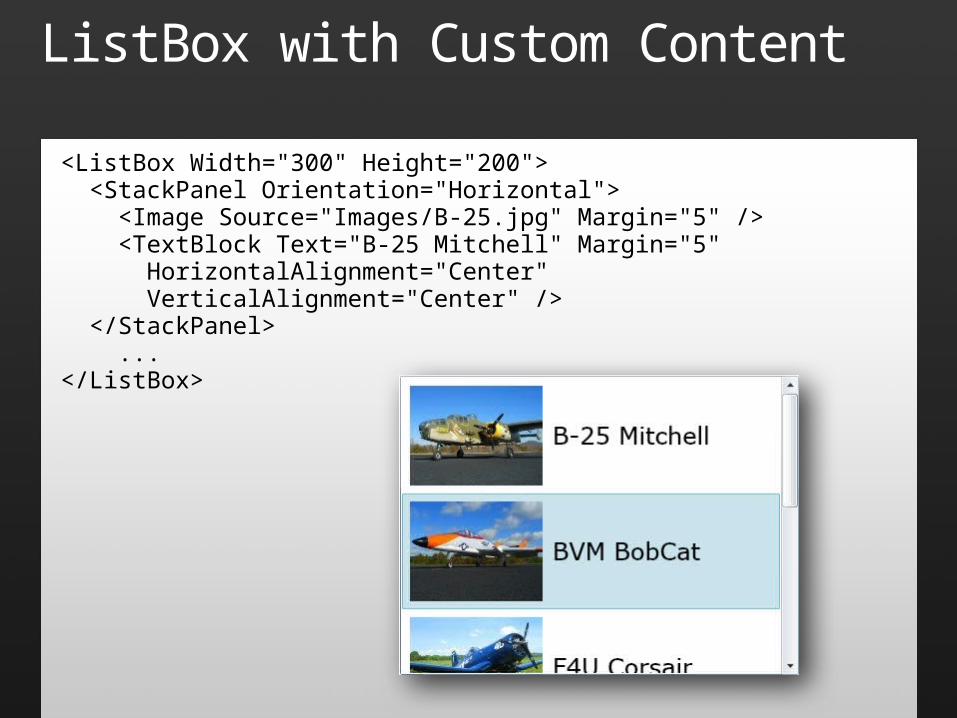
ListBox with Custom Content
<ListBox Width="300" Height="200"> <StackPanel Orientation="Horizontal"> <Image Source="Images/B-25.jpg" Margin="5" /> <TextBlock Text="B-25 Mitchell" Margin="5" HorizontalAlignment="Center" VerticalAlignment="Center" /> </StackPanel> ...</ListBox>
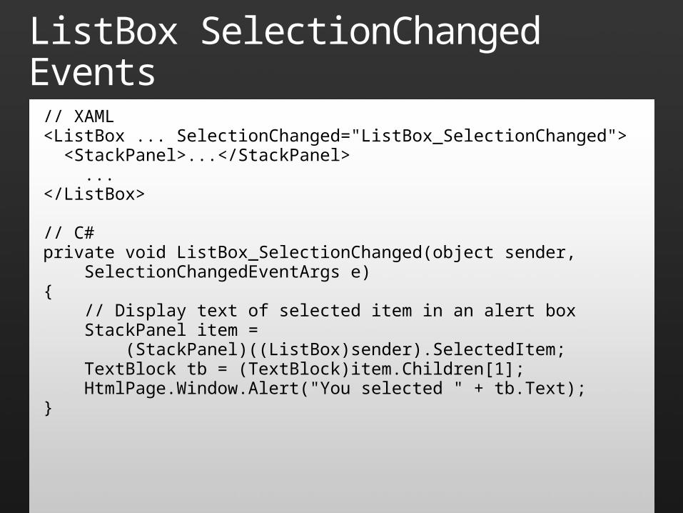
ListBox SelectionChanged Events
// XAML<ListBox ... SelectionChanged="ListBox_SelectionChanged"> <StackPanel>...</StackPanel> ...</ListBox>
// C#private void ListBox_SelectionChanged(object sender, SelectionChangedEventArgs e){ // Display text of selected item in an alert box StackPanel item = (StackPanel)((ListBox)sender).SelectedItem; TextBlock tb = (TextBlock)item.Children[1]; HtmlPage.Window.Alert("You selected " + tb.Text);}

Controls
demo
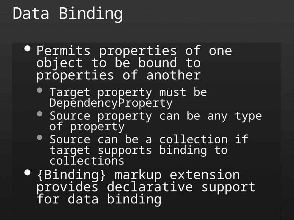
Data Binding
Permits properties of one object to be bound to properties of another Target property must be DependencyProperty Source property can be any type of property Source can be a collection if target supports
binding to collections {Binding} markup extension provides
declarative support for data binding
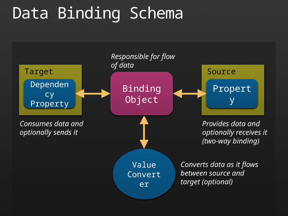
Data Binding Schema
ValueConverter
Target
DependencyProperty
BindingObject
Source
Property
Converts data as it flows between source and target (optional)
Provides data and optionally receives it (two-way binding)
Consumes data and optionally sends it
Responsible for flow of data
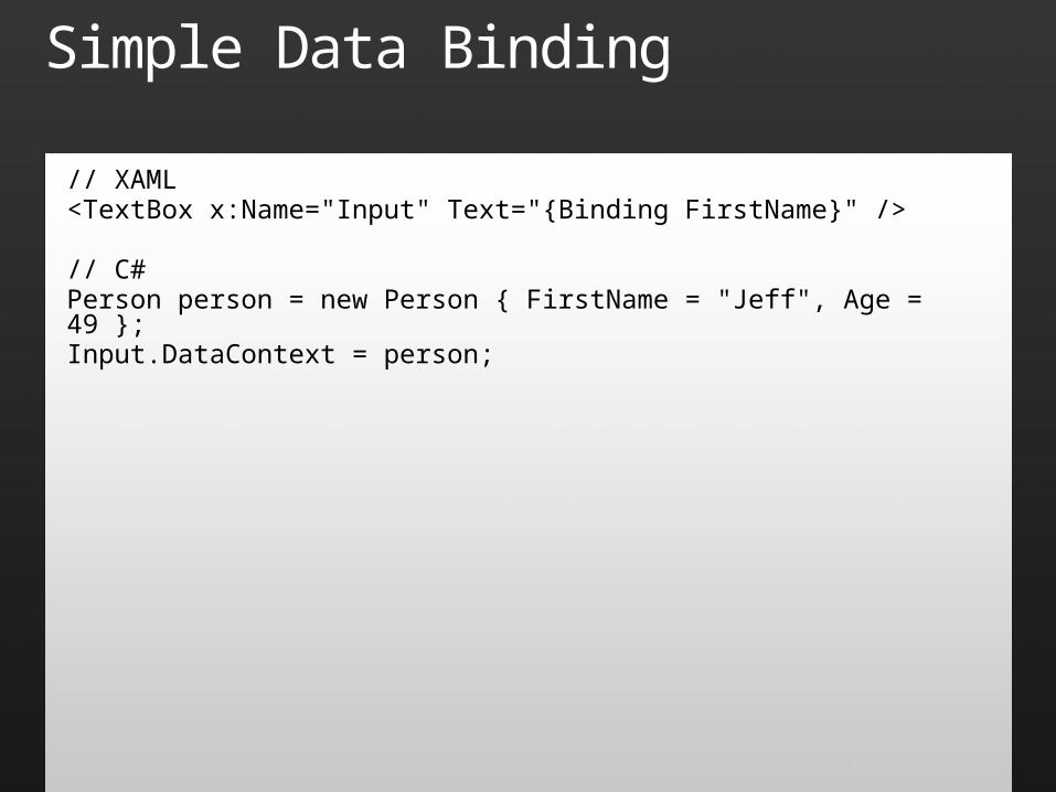
Simple Data Binding
// XAML<TextBox x:Name="Input" Text="{Binding FirstName}" />
// C#Person person = new Person { FirstName = "Jeff", Age = 49 };Input.DataContext = person;
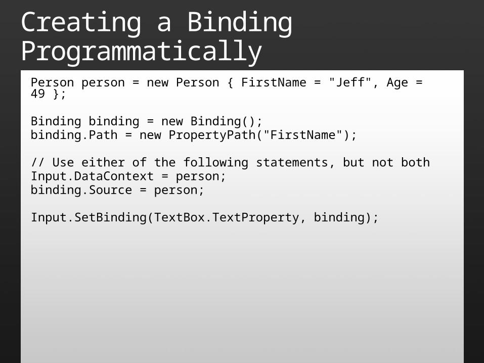
Creating a Binding ProgrammaticallyPerson person = new Person { FirstName = "Jeff", Age = 49 };
Binding binding = new Binding();binding.Path = new PropertyPath("FirstName");
// Use either of the following statements, but not bothInput.DataContext = person;binding.Source = person;
Input.SetBinding(TextBox.TextProperty, binding);
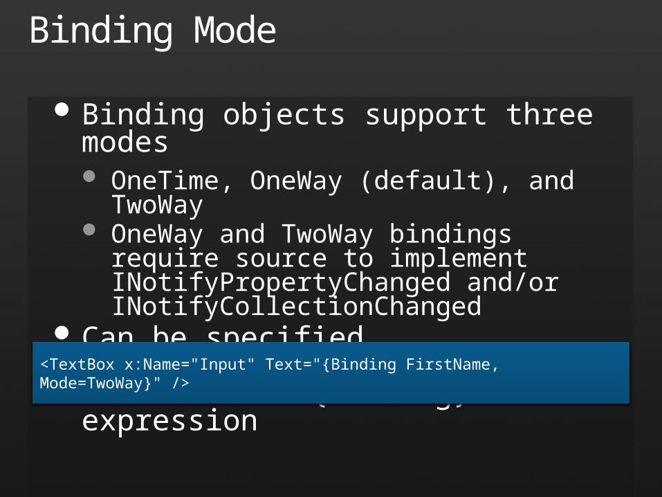
Binding Mode
Binding objects support three modes OneTime, OneWay (default), and TwoWay OneWay and TwoWay bindings require source
to implement INotifyPropertyChanged and/or INotifyCollectionChanged
Can be specified programmatically or with Mode attribute in {Binding} expression
<TextBox x:Name="Input" Text="{Binding FirstName, Mode=TwoWay}" />
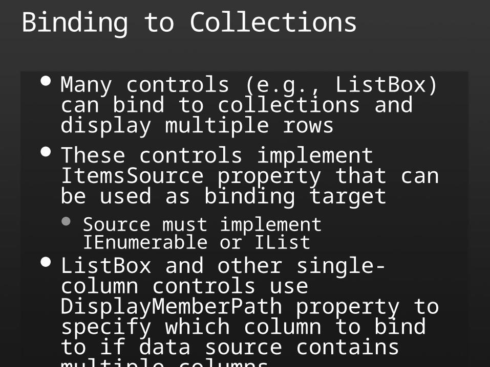
Binding to Collections
Many controls (e.g., ListBox) can bind to collections and display multiple rows
These controls implement ItemsSource property that can be used as binding target Source must implement IEnumerable or IList
ListBox and other single-column controls use DisplayMemberPath property to specify which column to bind to if data source contains multiple columns
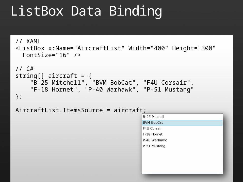
ListBox Data Binding
// XAML<ListBox x:Name="AircraftList" Width="400" Height="300" FontSize="16" />
// C#string[] aircraft = { "B-25 Mitchell", "BVM BobCat", "F4U Corsair", "F-18 Hornet", "P-40 Warhawk", "P-51 Mustang"};
AircraftList.ItemsSource = aircraft;
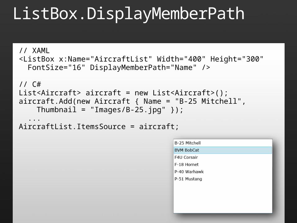
ListBox.DisplayMemberPath
// XAML<ListBox x:Name="AircraftList" Width="400" Height="300" FontSize="16" DisplayMemberPath="Name" />
// C#List<Aircraft> aircraft = new List<Aircraft>();aircraft.Add(new Aircraft { Name = "B-25 Mitchell", Thumbnail = "Images/B-25.jpg" }); ...AircraftList.ItemsSource = aircraft;
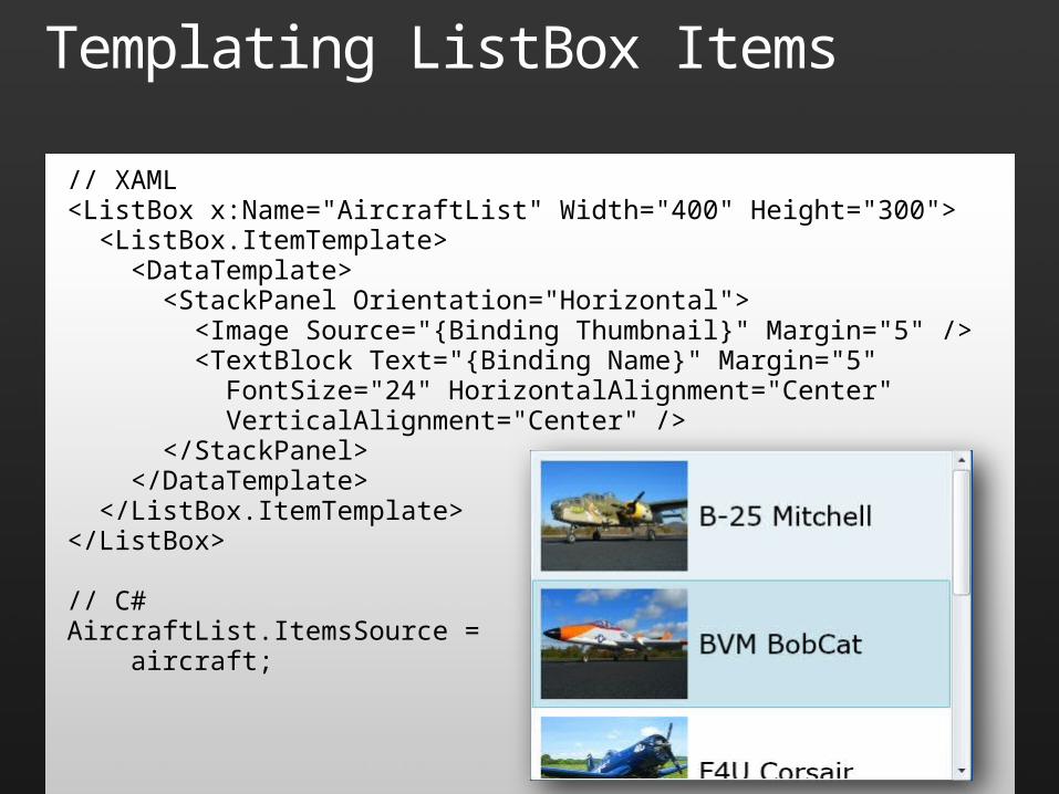
Templating ListBox Items
// XAML<ListBox x:Name="AircraftList" Width="400" Height="300"> <ListBox.ItemTemplate> <DataTemplate> <StackPanel Orientation="Horizontal"> <Image Source="{Binding Thumbnail}" Margin="5" /> <TextBlock Text="{Binding Name}" Margin="5" FontSize="24" HorizontalAlignment="Center" VerticalAlignment="Center" /> </StackPanel> </DataTemplate> </ListBox.ItemTemplate></ListBox>
// C#AircraftList.ItemsSource = aircraft;

Data Binding
demo
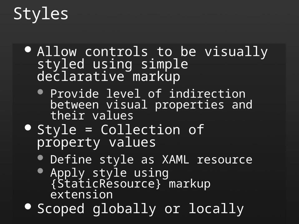
Styles
Allow controls to be visually styled using simple declarative markup Provide level of indirection between visual
properties and their values Style = Collection of property values
Define style as XAML resource Apply style using {StaticResource} markup
extension Scoped globally or locally
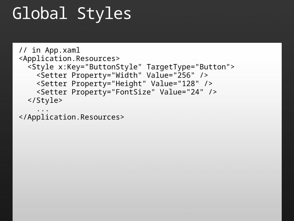
Global Styles
// in App.xaml<Application.Resources> <Style x:Key="ButtonStyle" TargetType="Button"> <Setter Property="Width" Value="256" /> <Setter Property="Height" Value="128" /> <Setter Property="FontSize" Value="24" /> </Style> ...</Application.Resources>
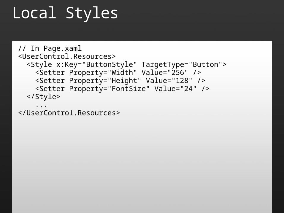
Local Styles
// In Page.xaml<UserControl.Resources> <Style x:Key="ButtonStyle" TargetType="Button"> <Setter Property="Width" Value="256" /> <Setter Property="Height" Value="128" /> <Setter Property="FontSize" Value="24" /> </Style> ...</UserControl.Resources>
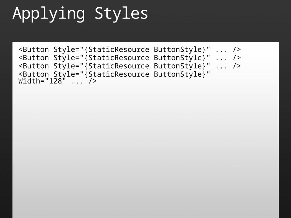
Applying Styles
<Button Style="{StaticResource ButtonStyle}" ... /><Button Style="{StaticResource ButtonStyle}" ... /><Button Style="{StaticResource ButtonStyle}" ... /><Button Style="{StaticResource ButtonStyle}" Width="128" ... />
Styles
demo
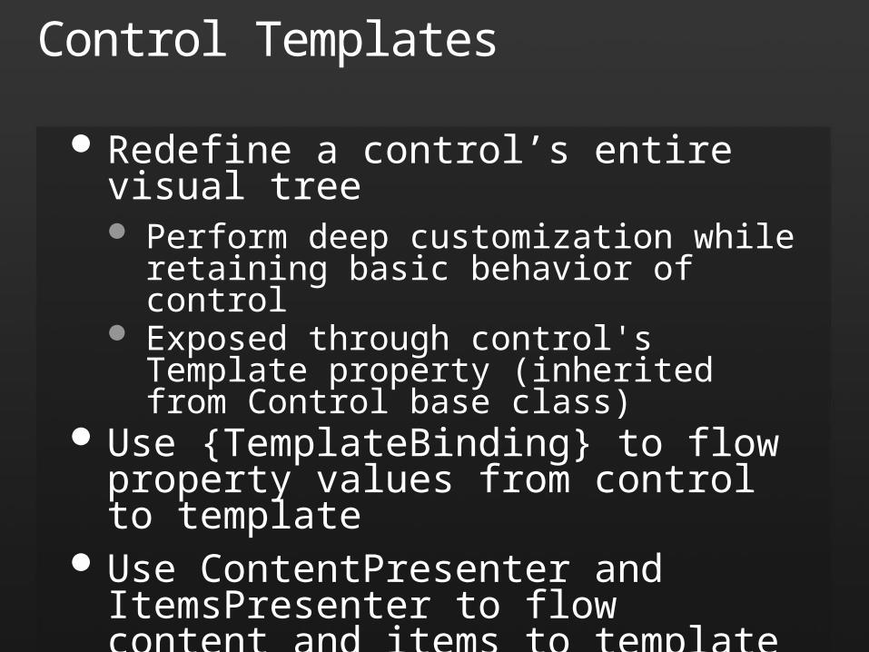
Control Templates
Redefine a control’s entire visual tree Perform deep customization while retaining
basic behavior of control Exposed through control's Template property
(inherited from Control base class) Use {TemplateBinding} to flow property
values from control to template Use ContentPresenter and ItemsPresenter
to flow content and items to template
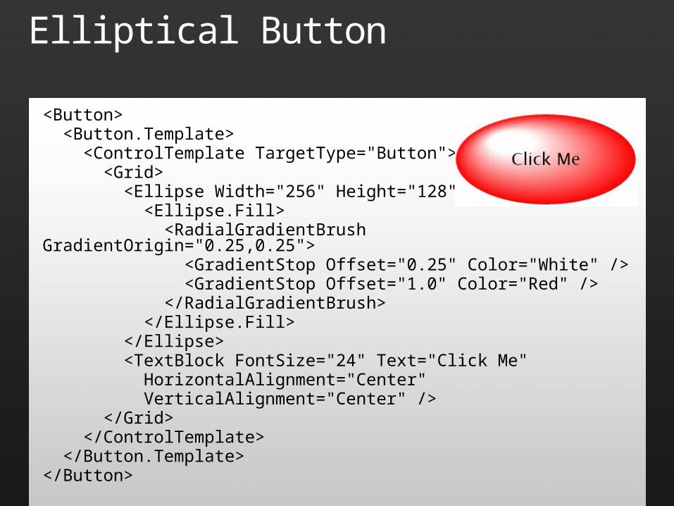
Elliptical Button
<Button> <Button.Template> <ControlTemplate TargetType="Button"> <Grid> <Ellipse Width="256" Height="128"> <Ellipse.Fill> <RadialGradientBrush GradientOrigin="0.25,0.25"> <GradientStop Offset="0.25" Color="White" /> <GradientStop Offset="1.0" Color="Red" /> </RadialGradientBrush> </Ellipse.Fill> </Ellipse> <TextBlock FontSize="24" Text="Click Me" HorizontalAlignment="Center" VerticalAlignment="Center" /> </Grid> </ControlTemplate> </Button.Template></Button>
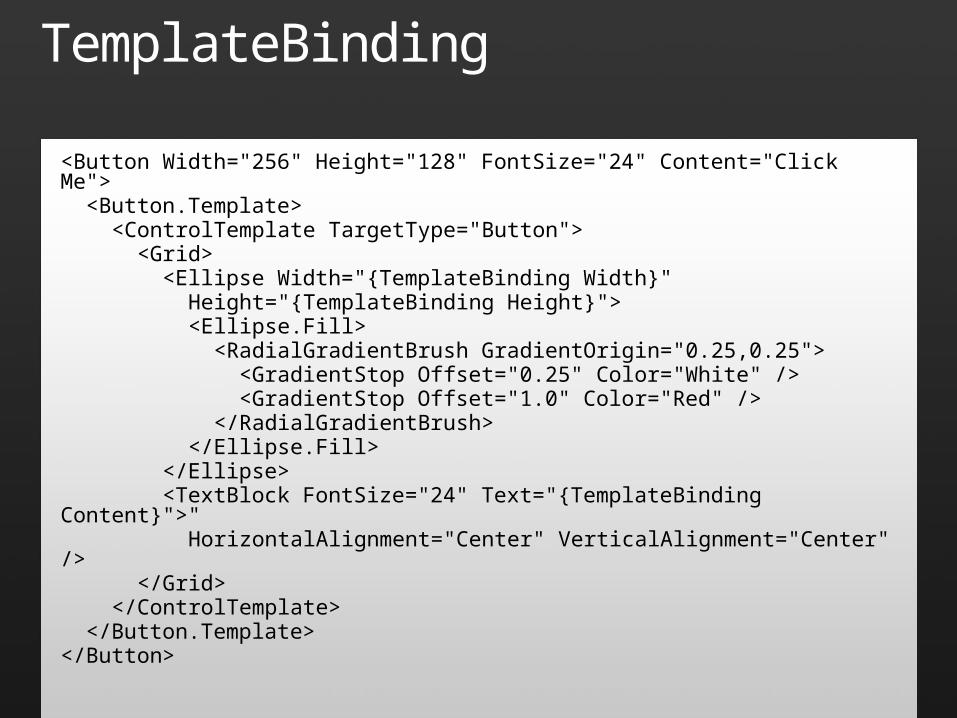
TemplateBinding
<Button Width="256" Height="128" FontSize="24" Content="Click Me"> <Button.Template> <ControlTemplate TargetType="Button"> <Grid> <Ellipse Width="{TemplateBinding Width}" Height="{TemplateBinding Height}"> <Ellipse.Fill> <RadialGradientBrush GradientOrigin="0.25,0.25"> <GradientStop Offset="0.25" Color="White" /> <GradientStop Offset="1.0" Color="Red" /> </RadialGradientBrush> </Ellipse.Fill> </Ellipse> <TextBlock FontSize="24" Text="{TemplateBinding Content}">" HorizontalAlignment="Center" VerticalAlignment="Center" /> </Grid> </ControlTemplate> </Button.Template></Button>
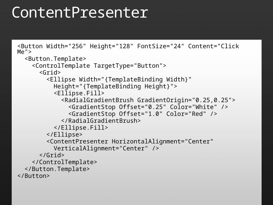
ContentPresenter
<Button Width="256" Height="128" FontSize="24" Content="Click Me"> <Button.Template> <ControlTemplate TargetType="Button"> <Grid> <Ellipse Width="{TemplateBinding Width}" Height="{TemplateBinding Height}"> <Ellipse.Fill> <RadialGradientBrush GradientOrigin="0.25,0.25"> <GradientStop Offset="0.25" Color="White" /> <GradientStop Offset="1.0" Color="Red" /> </RadialGradientBrush> </Ellipse.Fill> </Ellipse> <ContentPresenter HorizontalAlignment="Center" VerticalAlignment="Center" /> </Grid> </ControlTemplate> </Button.Template></Button>
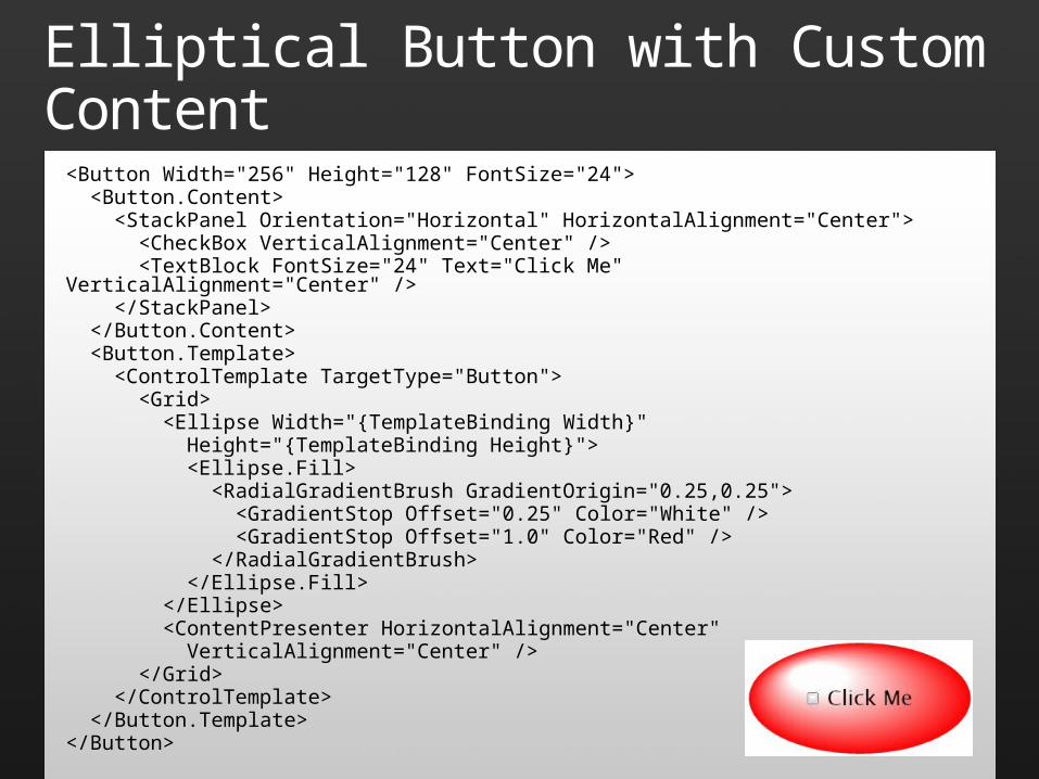
Elliptical Button with Custom Content<Button Width="256" Height="128" FontSize="24"> <Button.Content> <StackPanel Orientation="Horizontal" HorizontalAlignment="Center"> <CheckBox VerticalAlignment="Center" /> <TextBlock FontSize="24" Text="Click Me" VerticalAlignment="Center" /> </StackPanel> </Button.Content> <Button.Template> <ControlTemplate TargetType="Button"> <Grid> <Ellipse Width="{TemplateBinding Width}" Height="{TemplateBinding Height}"> <Ellipse.Fill> <RadialGradientBrush GradientOrigin="0.25,0.25"> <GradientStop Offset="0.25" Color="White" /> <GradientStop Offset="1.0" Color="Red" /> </RadialGradientBrush> </Ellipse.Fill> </Ellipse> <ContentPresenter HorizontalAlignment="Center" VerticalAlignment="Center" /> </Grid> </ControlTemplate> </Button.Template></Button>
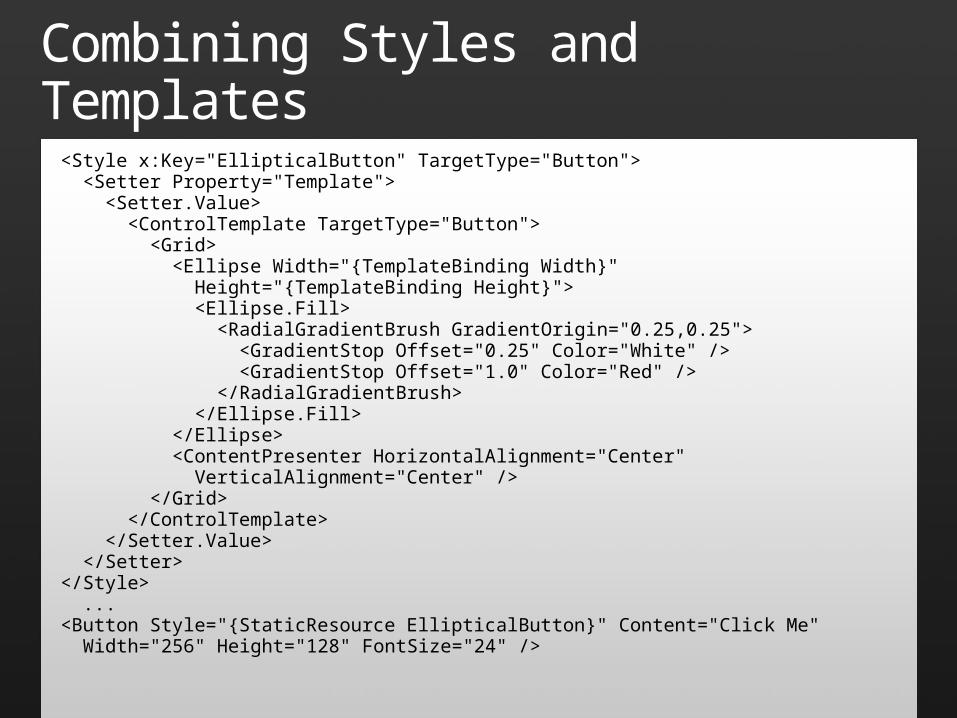
Combining Styles and Templates
<Style x:Key="EllipticalButton" TargetType="Button"> <Setter Property="Template"> <Setter.Value> <ControlTemplate TargetType="Button"> <Grid> <Ellipse Width="{TemplateBinding Width}" Height="{TemplateBinding Height}"> <Ellipse.Fill> <RadialGradientBrush GradientOrigin="0.25,0.25"> <GradientStop Offset="0.25" Color="White" /> <GradientStop Offset="1.0" Color="Red" /> </RadialGradientBrush> </Ellipse.Fill> </Ellipse> <ContentPresenter HorizontalAlignment="Center" VerticalAlignment="Center" /> </Grid> </ControlTemplate> </Setter.Value> </Setter></Style> ...<Button Style="{StaticResource EllipticalButton}" Content="Click Me" Width="256" Height="128" FontSize="24" />
Templates
demo
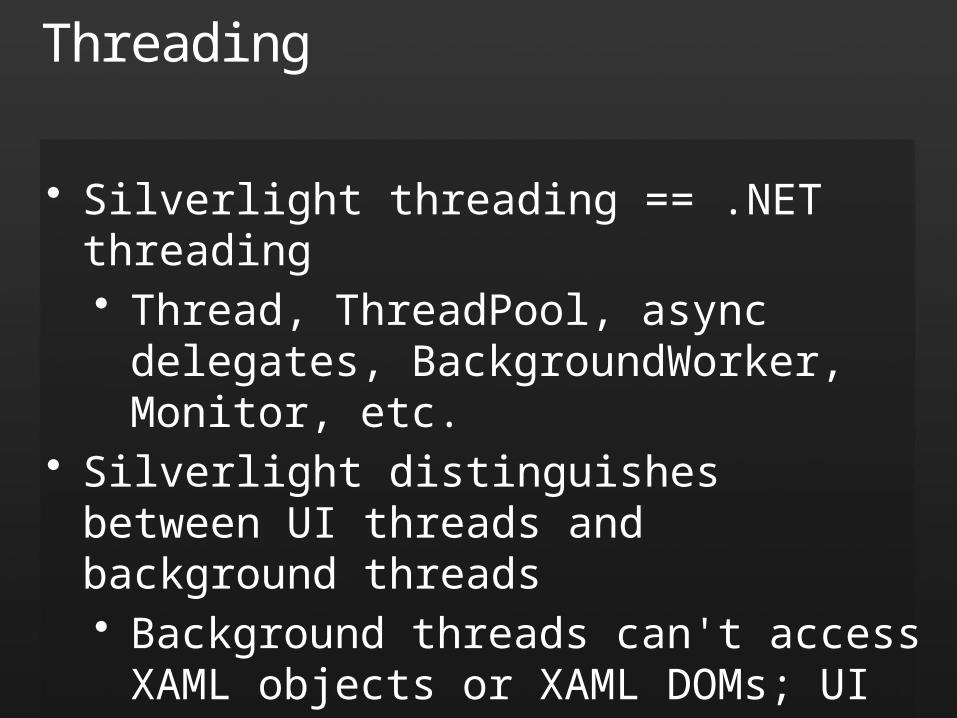
Threading
• Silverlight threading == .NET threading• Thread, ThreadPool, async delegates,
BackgroundWorker, Monitor, etc.• Silverlight distinguishes between UI threads and
background threads• Background threads can't access XAML
objects or XAML DOMs; UI threads can• Marshal to UI thread to access UI
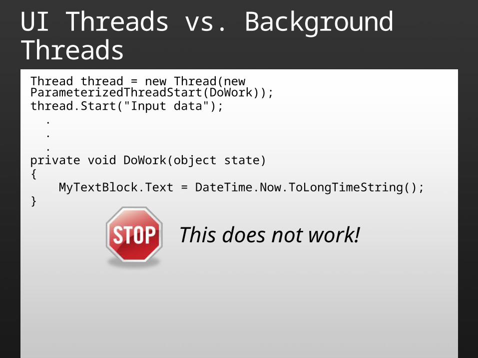
UI Threads vs. Background ThreadsThread thread = new Thread(new ParameterizedThreadStart(DoWork));thread.Start("Input data"); . . .private void DoWork(object state){ MyTextBlock.Text = DateTime.Now.ToLongTimeString();}
This does not work!
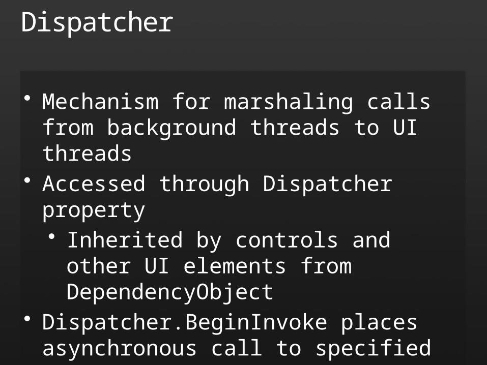
Dispatcher
• Mechanism for marshaling calls from background threads to UI threads
• Accessed through Dispatcher property• Inherited by controls and other UI elements
from DependencyObject• Dispatcher.BeginInvoke places asynchronous
call to specified method on UI thread• Accepts any delegate type
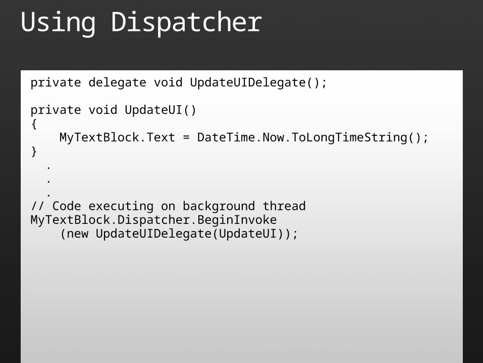
Using Dispatcher
private delegate void UpdateUIDelegate();
private void UpdateUI(){ MyTextBlock.Text = DateTime.Now.ToLongTimeString();} . . .// Code executing on background threadMyTextBlock.Dispatcher.BeginInvoke (new UpdateUIDelegate(UpdateUI));
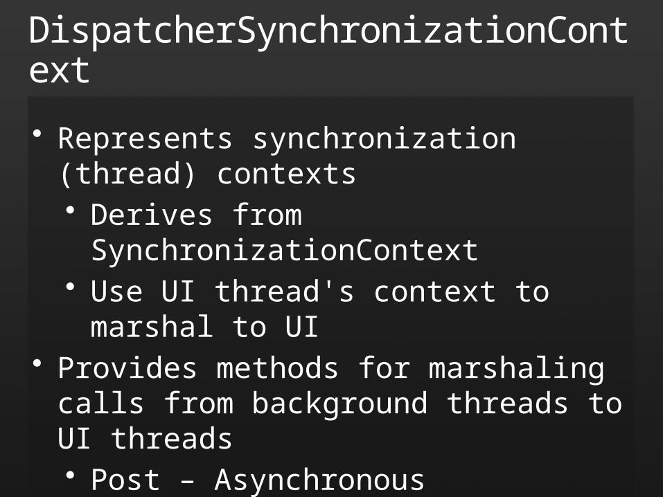
DispatcherSynchronizationContext
• Represents synchronization (thread) contexts• Derives from SynchronizationContext• Use UI thread's context to marshal to UI
• Provides methods for marshaling calls from background threads to UI threads• Post – Asynchronous• Send – Synchronous
• Uses SendOrPostCallback delegate
Posting to the UI Thread
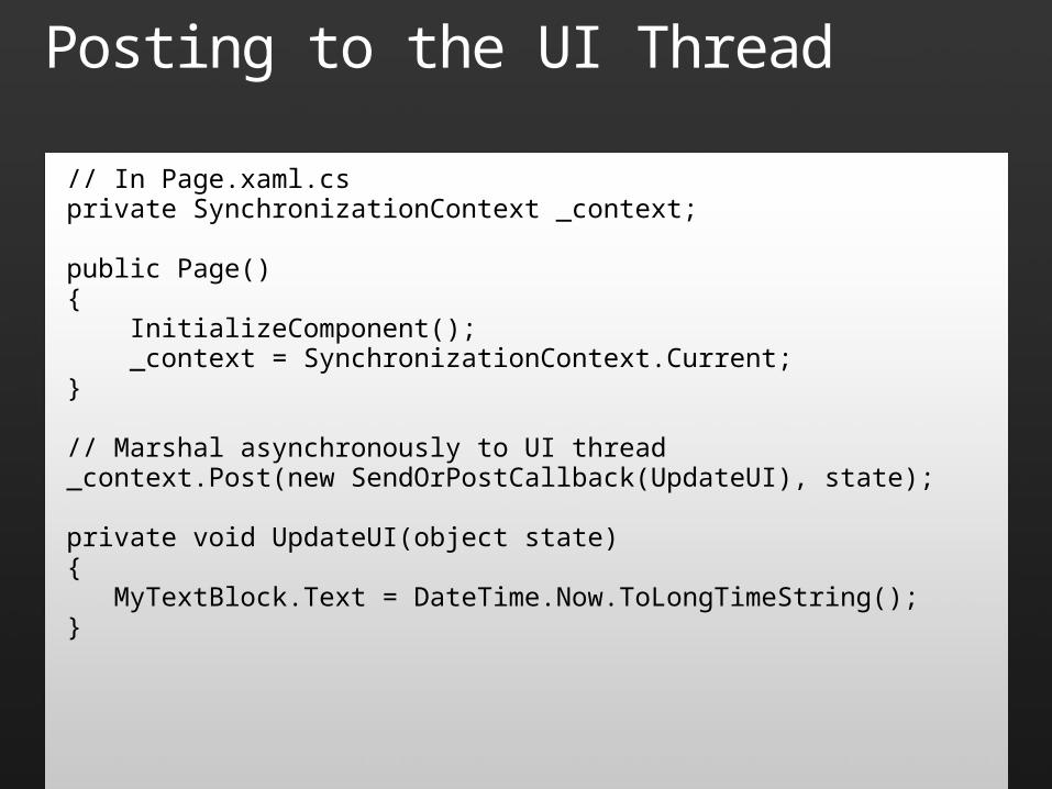
// In Page.xaml.csprivate SynchronizationContext _context;
public Page(){ InitializeComponent(); _context = SynchronizationContext.Current;}
// Marshal asynchronously to UI thread_context.Post(new SendOrPostCallback(UpdateUI), state);
private void UpdateUI(object state){ MyTextBlock.Text = DateTime.Now.ToLongTimeString();}

Sending to the UI Thread
// In Page.xaml.csprivate SynchronizationContext _context;
public Page(){ InitializeComponent(); _context = SynchronizationContext.Current;}
// Marshal synchronously to UI thread_context.Send(new SendOrPostCallback(UpdateUI), state);
private void UpdateUI(object state){ MyTextBlock.Text = DateTime.Now.ToLongTimeString();}
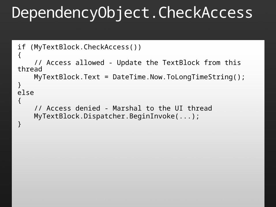
DependencyObject.CheckAccess
if (MyTextBlock.CheckAccess()){ // Access allowed - Update the TextBlock from this thread MyTextBlock.Text = DateTime.Now.ToLongTimeString();}else{ // Access denied - Marshal to the UI thread MyTextBlock.Dispatcher.BeginInvoke(...);}

Threading
demo
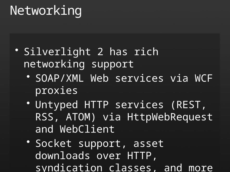
Networking
• Silverlight 2 has rich networking support• SOAP/XML Web services via WCF
proxies• Untyped HTTP services (REST, RSS,
ATOM) via HttpWebRequest and WebClient
• Socket support, asset downloads over HTTP, syndication classes, and more
• Also supports WCF duplex services and ADO.NET data services ("Astoria")
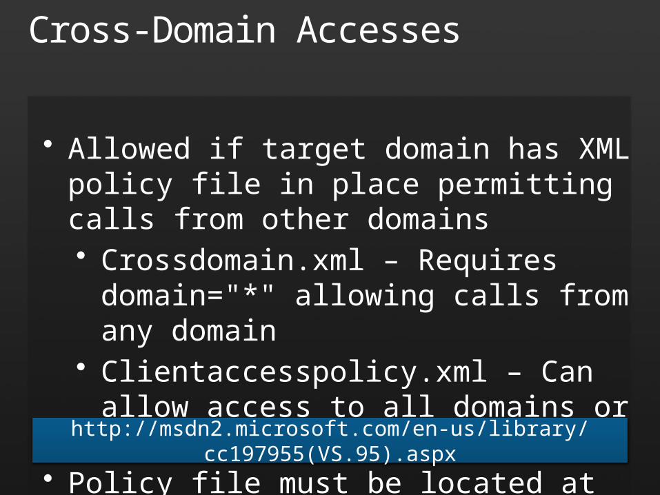
Cross-Domain Accesses
• Allowed if target domain has XML policy file in place permitting calls from other domains• Crossdomain.xml – Requires
domain="*" allowing calls from any domain
• Clientaccesspolicy.xml – Can allow access to all domains or specified domains
• Policy file must be located at domain root
http://msdn2.microsoft.com/en-us/library/cc197955(VS.95).aspx
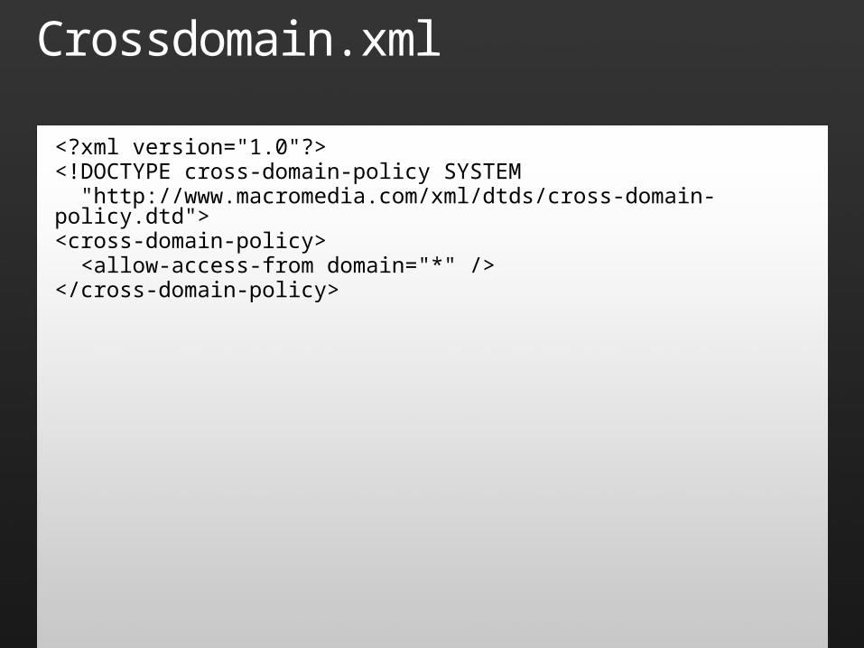
Crossdomain.xml
<?xml version="1.0"?><!DOCTYPE cross-domain-policy SYSTEM "http://www.macromedia.com/xml/dtds/cross-domain-policy.dtd"><cross-domain-policy> <allow-access-from domain="*" /></cross-domain-policy>
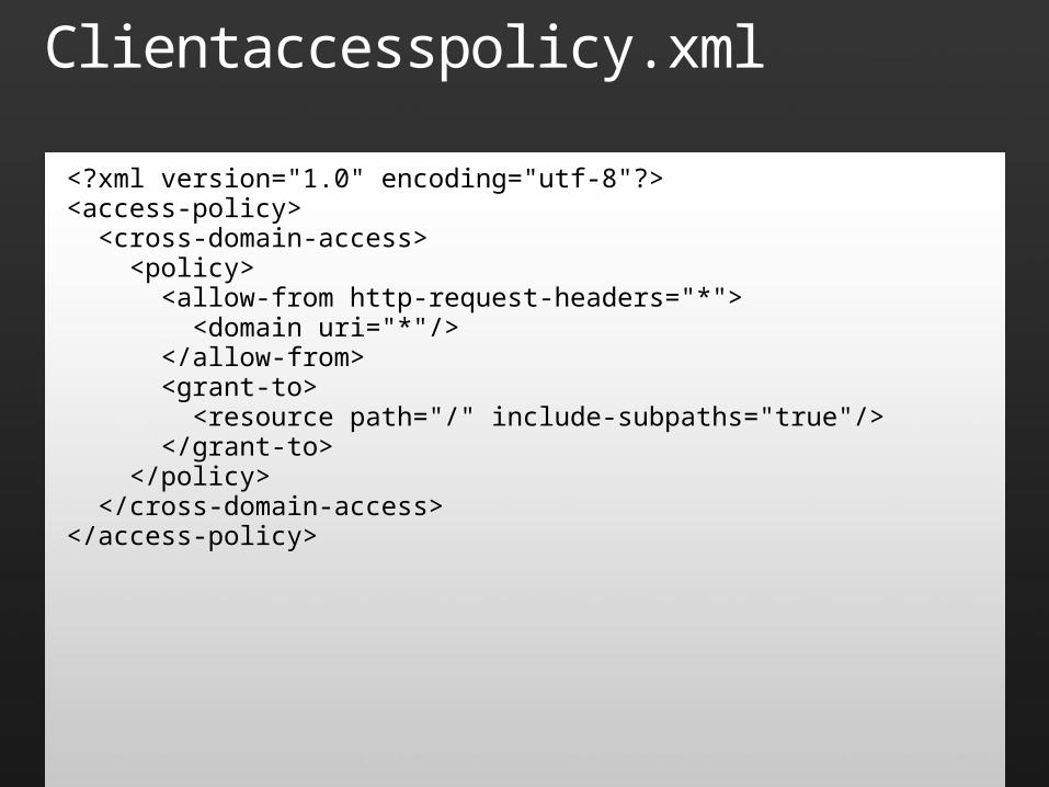
Clientaccesspolicy.xml
<?xml version="1.0" encoding="utf-8"?><access-policy> <cross-domain-access> <policy> <allow-from http-request-headers="*"> <domain uri="*"/> </allow-from> <grant-to> <resource path="/" include-subpaths="true"/> </grant-to> </policy> </cross-domain-access></access-policy>
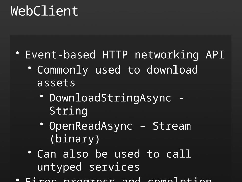
WebClient
• Event-based HTTP networking API• Commonly used to download
assets• DownloadStringAsync - String• OpenReadAsync – Stream
(binary)• Can also be used to call untyped
services• Fires progress and completion events
and supports cancellation of pending requests• Event handlers execute on UI
thread
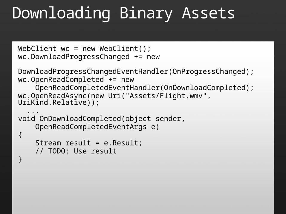
Downloading Binary Assets
WebClient wc = new WebClient();wc.DownloadProgressChanged += new DownloadProgressChangedEventHandler(OnProgressChanged);wc.OpenReadCompleted += new OpenReadCompletedEventHandler(OnDownloadCompleted);wc.OpenReadAsync(new Uri("Assets/Flight.wmv", UriKind.Relative)); ...void OnDownloadCompleted(object sender, OpenReadCompletedEventArgs e){ Stream result = e.Result; // TODO: Use result}
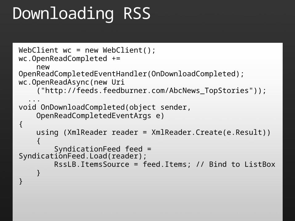
Downloading RSS
WebClient wc = new WebClient();wc.OpenReadCompleted += new OpenReadCompletedEventHandler(OnDownloadCompleted);wc.OpenReadAsync(new Uri ("http://feeds.feedburner.com/AbcNews_TopStories")); ...void OnDownloadCompleted(object sender, OpenReadCompletedEventArgs e){ using (XmlReader reader = XmlReader.Create(e.Result)) { SyndicationFeed feed = SyndicationFeed.Load(reader); RssLB.ItemsSource = feed.Items; // Bind to ListBox }}
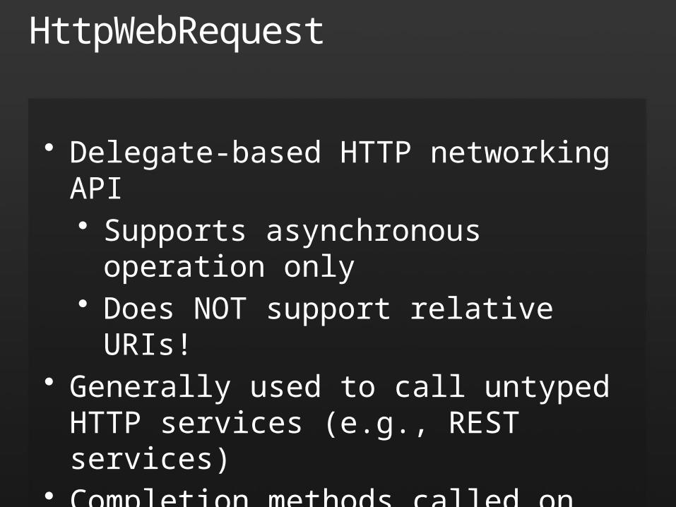
HttpWebRequest
• Delegate-based HTTP networking API• Supports asynchronous operation only• Does NOT support relative URIs!
• Generally used to call untyped HTTP services (e.g., REST services)
• Completion methods called on background threads
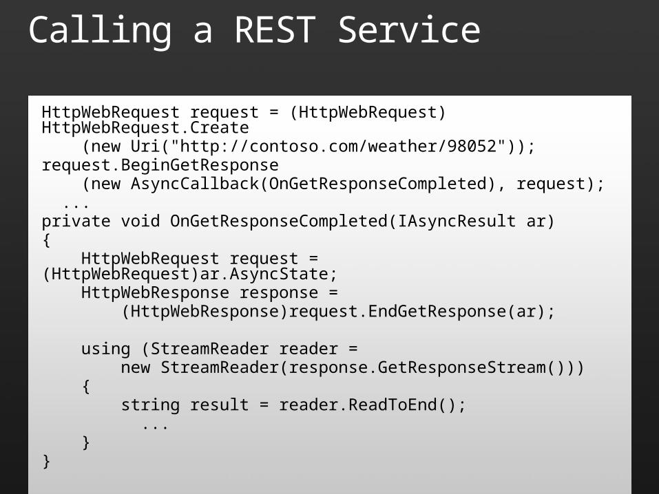
Calling a REST Service
HttpWebRequest request = (HttpWebRequest) HttpWebRequest.Create (new Uri("http://contoso.com/weather/98052"));request.BeginGetResponse (new AsyncCallback(OnGetResponseCompleted), request); ...private void OnGetResponseCompleted(IAsyncResult ar){ HttpWebRequest request = (HttpWebRequest)ar.AsyncState; HttpWebResponse response = (HttpWebResponse)request.EndGetResponse(ar);
using (StreamReader reader = new StreamReader(response.GetResponseStream())) { string result = reader.ReadToEnd(); ... }}
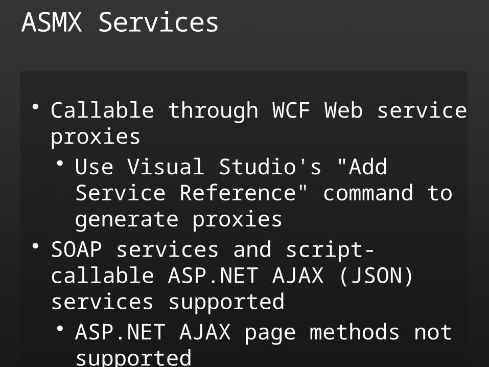
ASMX Services
• Callable through WCF Web service proxies• Use Visual Studio's "Add Service
Reference" command to generate proxies
• SOAP services and script-callable ASP.NET AJAX (JSON) services supported• ASP.NET AJAX page methods not
supported• Asynchronous calls only
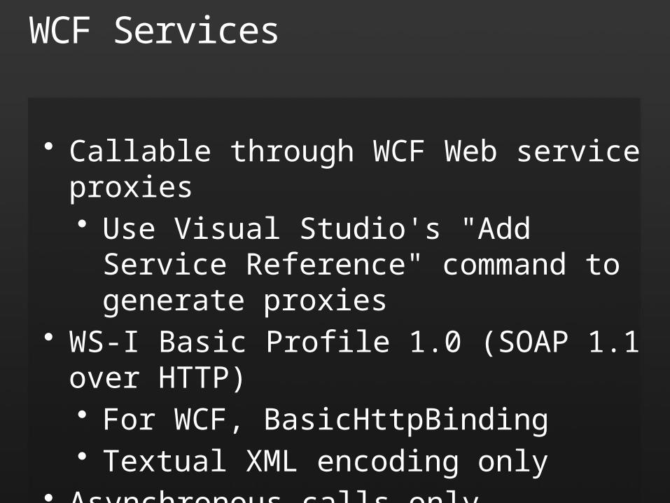
WCF Services
• Callable through WCF Web service proxies• Use Visual Studio's "Add Service
Reference" command to generate proxies
• WS-I Basic Profile 1.0 (SOAP 1.1 over HTTP)• For WCF, BasicHttpBinding• Textual XML encoding only
• Asynchronous calls only
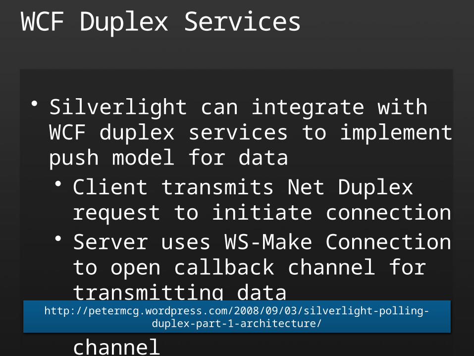
WCF Duplex Services
• Silverlight can integrate with WCF duplex services to implement push model for data• Client transmits Net Duplex request
to initiate connection• Server uses WS-Make Connection to
open callback channel for transmitting data
• Client "listens" on callback channelhttp://petermcg.wordpress.com/2008/09/03/silverlight-polling-duplex-part-1-architecture/
Sockets
• Silverlight supports socket connections• System.Net.Sockets.Socket class• Policy file required even for same domain• Connection must be made from client
• Restrictions• Ports 4502-4532 only• Host identified by host name, not IP• TCP only (no UDP)

Networking
demo
Browser Integration
• System.Windows.Browser namespace contains classes for accessing browser DOM ("HTML bridge")• HtmlPage, HtmlWindow, and others
• Managed -> unmanaged• Access DOM from managed code• Call JavaScript functions from managed code
• Unmanaged -> managed• Call managed code from JavaScript• Process DOM events with managed code
Alerting the User
HtmlPage.Window.Alert ("Hello, Silverlight!");
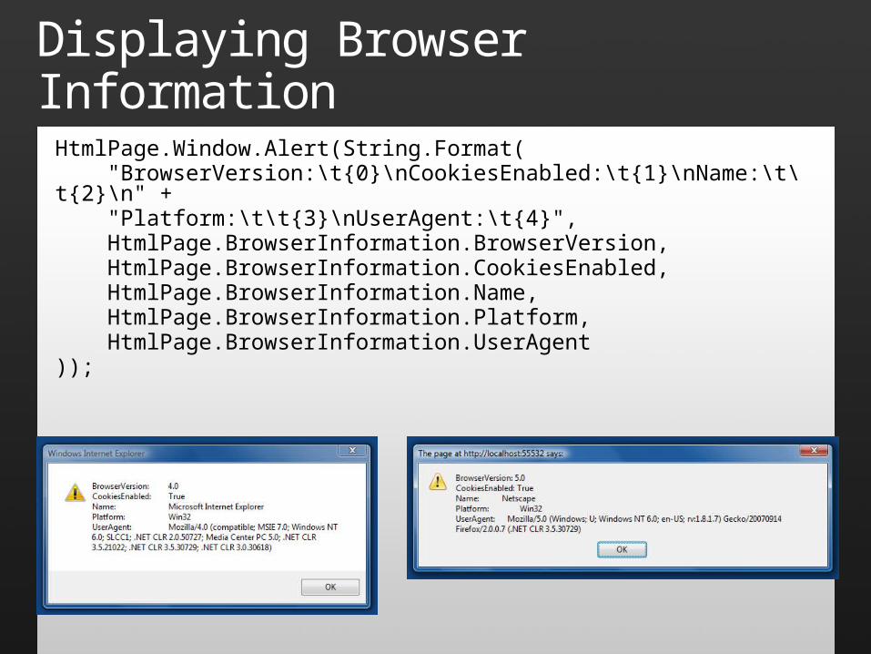
Displaying Browser Information
HtmlPage.Window.Alert(String.Format( "BrowserVersion:\t{0}\nCookiesEnabled:\t{1}\nName:\t\t{2}\n" + "Platform:\t\t{3}\nUserAgent:\t{4}", HtmlPage.BrowserInformation.BrowserVersion, HtmlPage.BrowserInformation.CookiesEnabled, HtmlPage.BrowserInformation.Name, HtmlPage.BrowserInformation.Platform, HtmlPage.BrowserInformation.UserAgent));
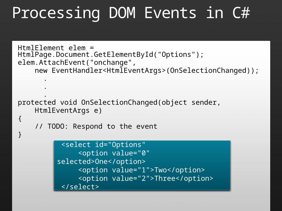
Processing DOM Events in C#
HtmlElement elem = HtmlPage.Document.GetElementById("Options");elem.AttachEvent("onchange", new EventHandler<HtmlEventArgs>(OnSelectionChanged)); . . .protected void OnSelectionChanged(object sender, HtmlEventArgs e){ // TODO: Respond to the event}
<select id="Options" <option value="0" selected>One</option> <option value="1">Two</option> <option value="2">Three</option> </select>
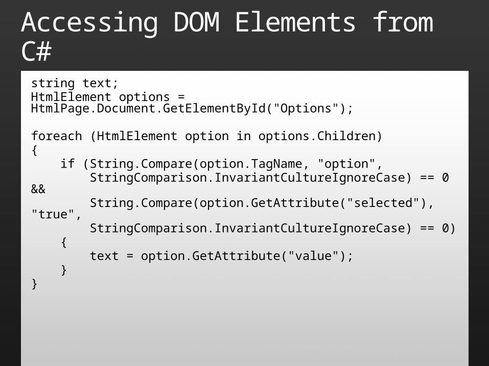
Accessing DOM Elements from C#
string text;HtmlElement options = HtmlPage.Document.GetElementById("Options");
foreach (HtmlElement option in options.Children){ if (String.Compare(option.TagName, "option", StringComparison.InvariantCultureIgnoreCase) == 0 && String.Compare(option.GetAttribute("selected"), "true", StringComparison.InvariantCultureIgnoreCase) == 0) { text = option.GetAttribute("value"); }}
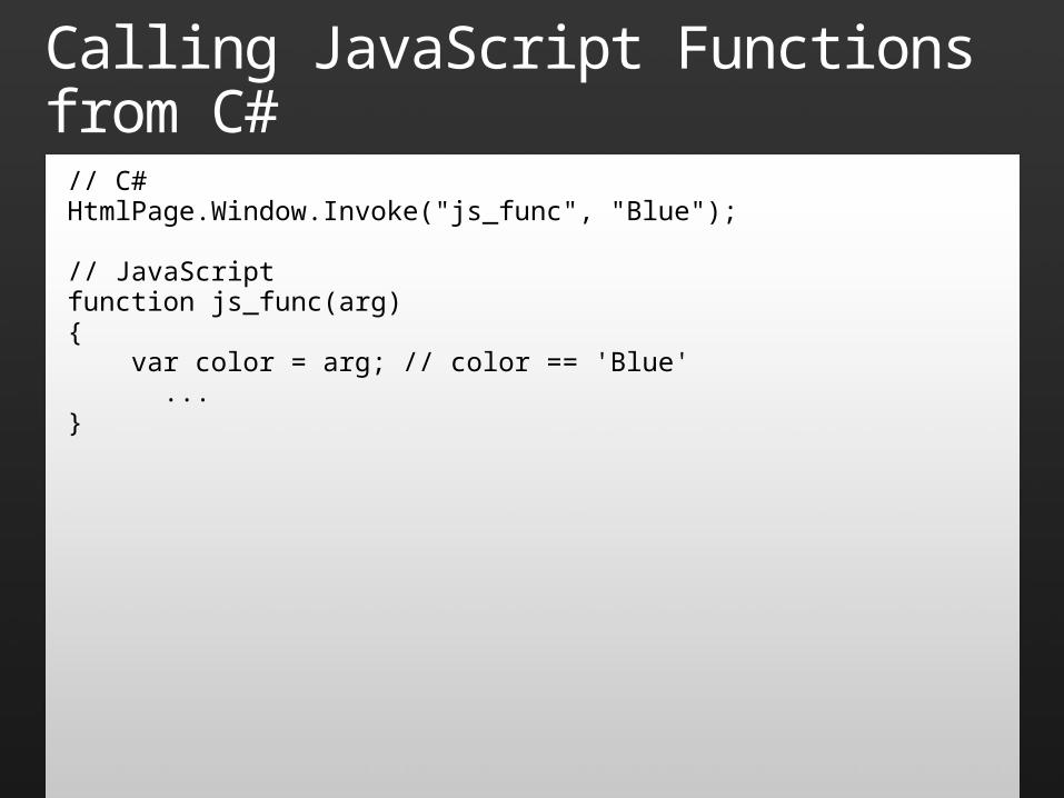
Calling JavaScript Functions from C#// C#HtmlPage.Window.Invoke("js_func", "Blue");
// JavaScriptfunction js_func(arg){ var color = arg; // color == 'Blue' ...}
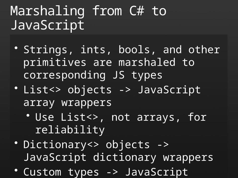
Marshaling from C# to JavaScript
• Strings, ints, bools, and other primitives are marshaled to corresponding JS types
• List<> objects -> JavaScript array wrappers• Use List<>, not arrays, for reliability
• Dictionary<> objects -> JavaScript dictionary wrappers
• Custom types -> JavaScript wrappers• By-ref and by-val semantics are honored
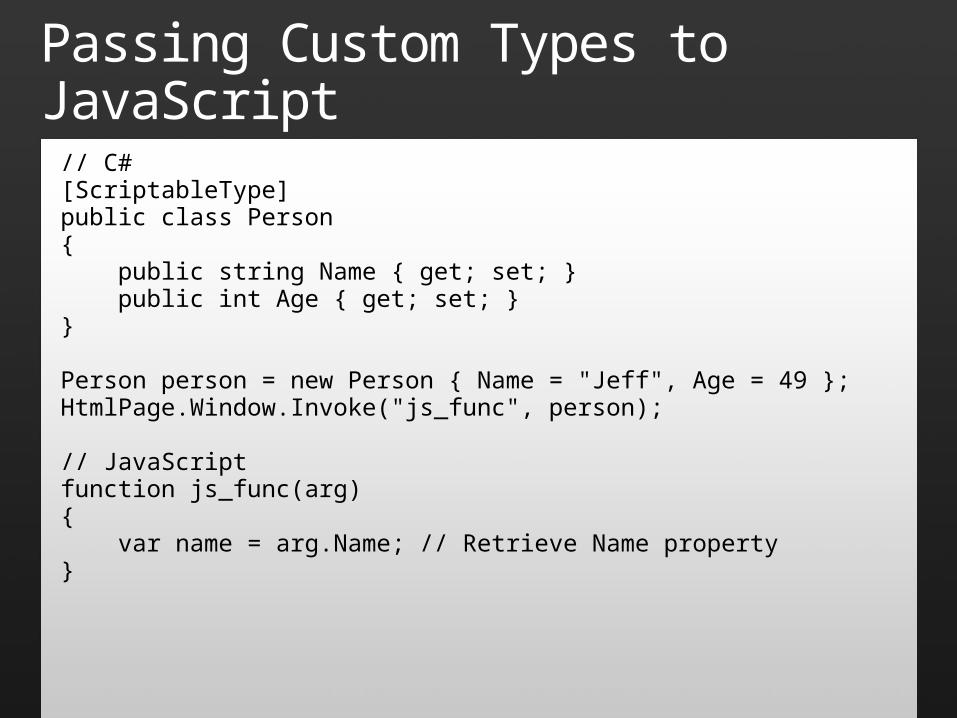
Passing Custom Types to JavaScript
// C#[ScriptableType]public class Person{ public string Name { get; set; } public int Age { get; set; }}
Person person = new Person { Name = "Jeff", Age = 49 };HtmlPage.Window.Invoke("js_func", person);
// JavaScriptfunction js_func(arg){ var name = arg.Name; // Retrieve Name property}
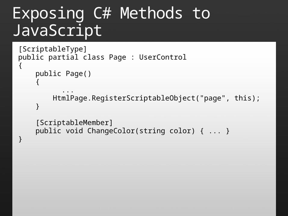
Exposing C# Methods to JavaScript
[ScriptableType]public partial class Page : UserControl{ public Page() { ... HtmlPage.RegisterScriptableObject("page", this); }
[ScriptableMember] public void ChangeColor(string color) { ... }}
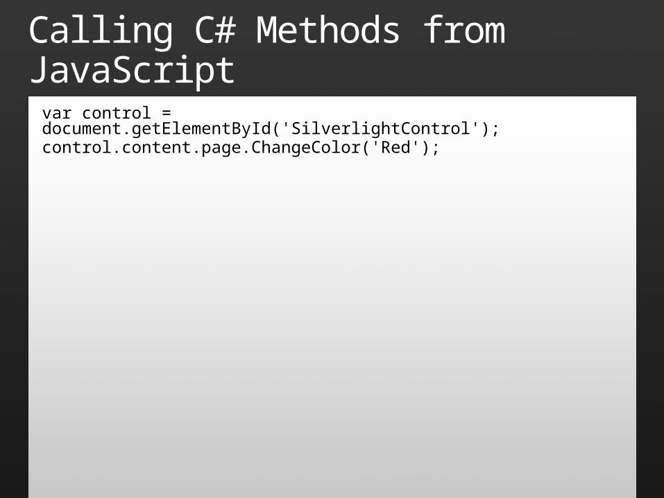
Calling C# Methods from JavaScriptvar control = document.getElementById('SilverlightControl');control.content.page.ChangeColor('Red');
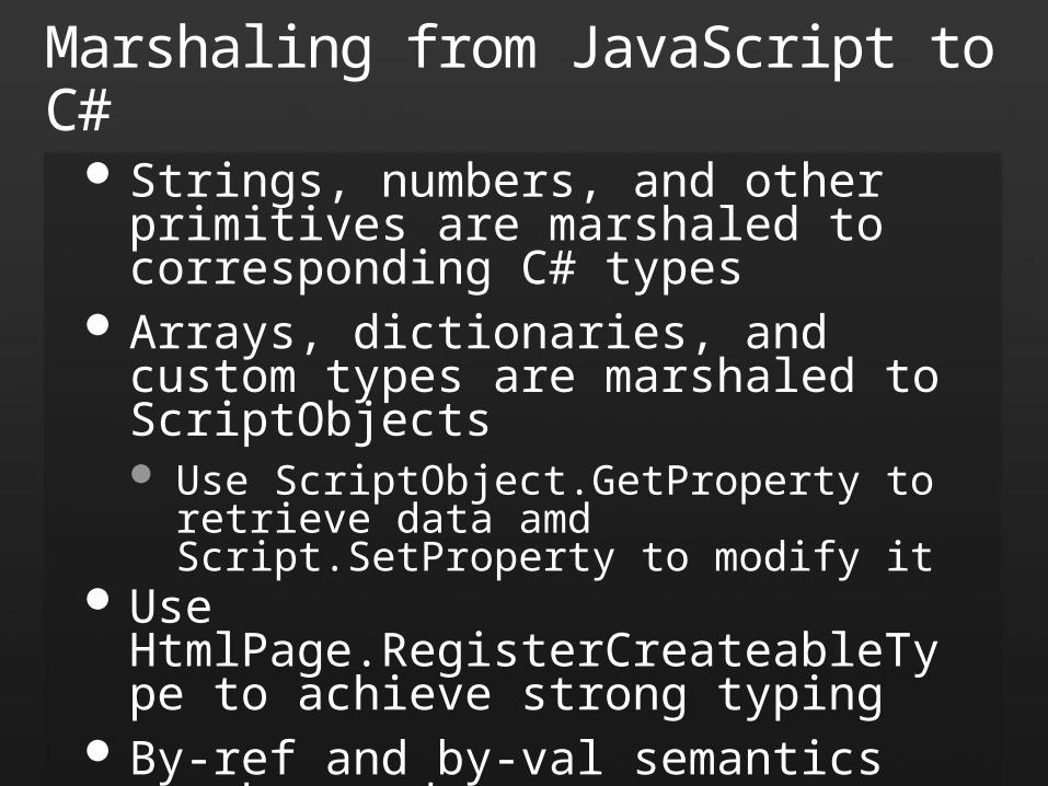
Marshaling from JavaScript to C#
Strings, numbers, and other primitives are marshaled to corresponding C# types
Arrays, dictionaries, and custom types are marshaled to ScriptObjects Use ScriptObject.GetProperty to retrieve data
amd Script.SetProperty to modify it Use HtmlPage.RegisterCreateableType to
achieve strong typing By-ref and by-val semantics are honored
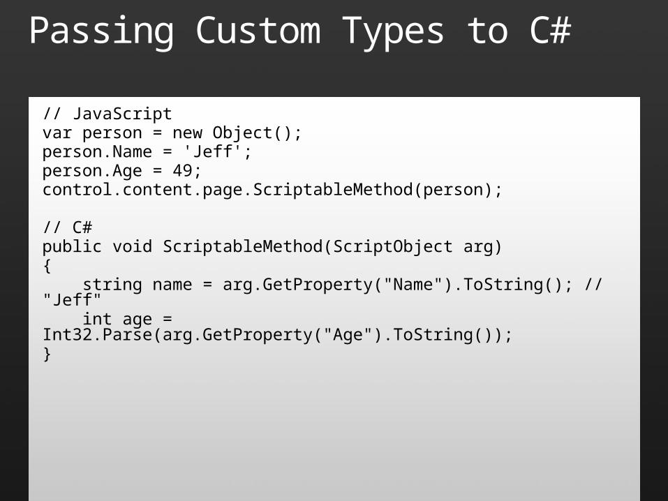
Passing Custom Types to C#
// JavaScriptvar person = new Object();person.Name = 'Jeff';person.Age = 49;control.content.page.ScriptableMethod(person);
// C#public void ScriptableMethod(ScriptObject arg){ string name = arg.GetProperty("Name").ToString(); // "Jeff" int age = Int32.Parse(arg.GetProperty("Age").ToString());}
Passing Custom Types to C#
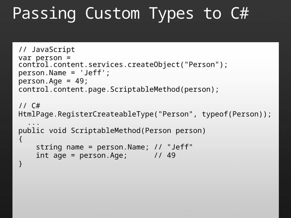
// JavaScriptvar person = control.content.services.createObject("Person");person.Name = 'Jeff';person.Age = 49;control.content.page.ScriptableMethod(person);
// C#HtmlPage.RegisterCreateableType("Person", typeof(Person)); ...public void ScriptableMethod(Person person){ string name = person.Name; // "Jeff" int age = person.Age; // 49}

Browser Integration
demo
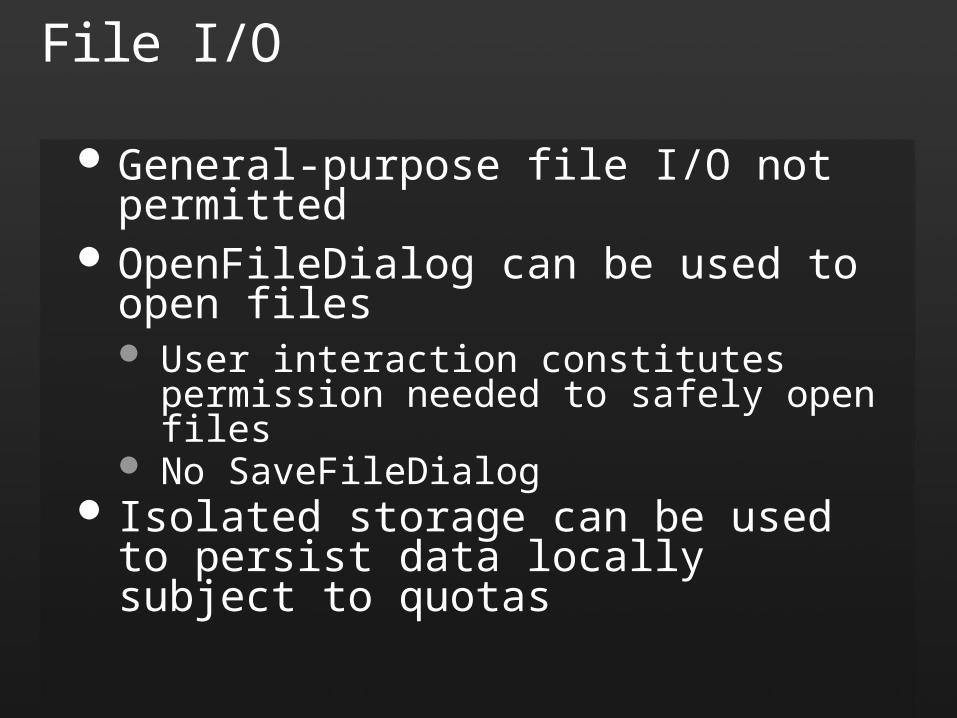
File I/O
General-purpose file I/O not permitted OpenFileDialog can be used to open files
User interaction constitutes permission needed to safely open files
No SaveFileDialog Isolated storage can be used to persist data
locally subject to quotas
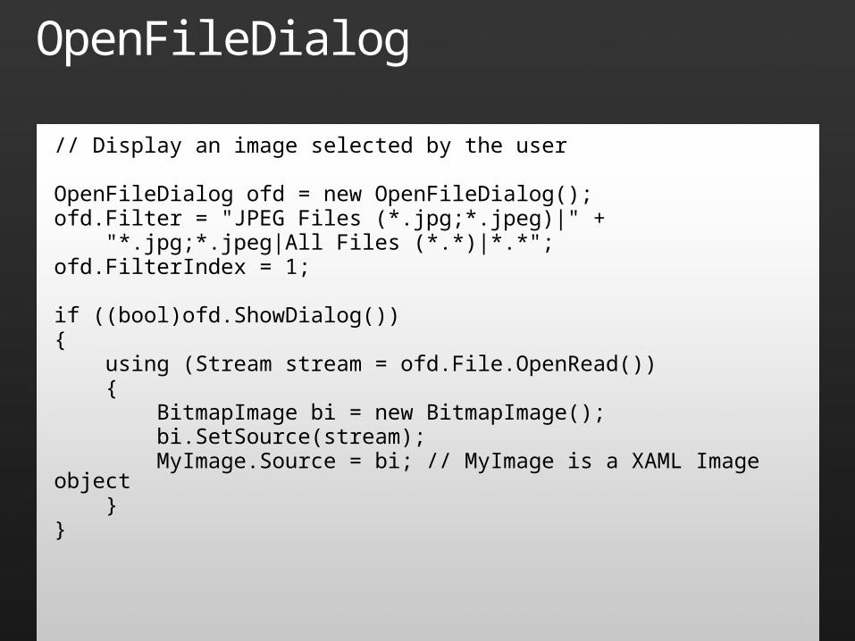
OpenFileDialog
// Display an image selected by the user
OpenFileDialog ofd = new OpenFileDialog();ofd.Filter = "JPEG Files (*.jpg;*.jpeg)|" + "*.jpg;*.jpeg|All Files (*.*)|*.*";ofd.FilterIndex = 1;
if ((bool)ofd.ShowDialog()){ using (Stream stream = ofd.File.OpenRead()) { BitmapImage bi = new BitmapImage(); bi.SetSource(stream); MyImage.Source = bi; // MyImage is a XAML Image object }}
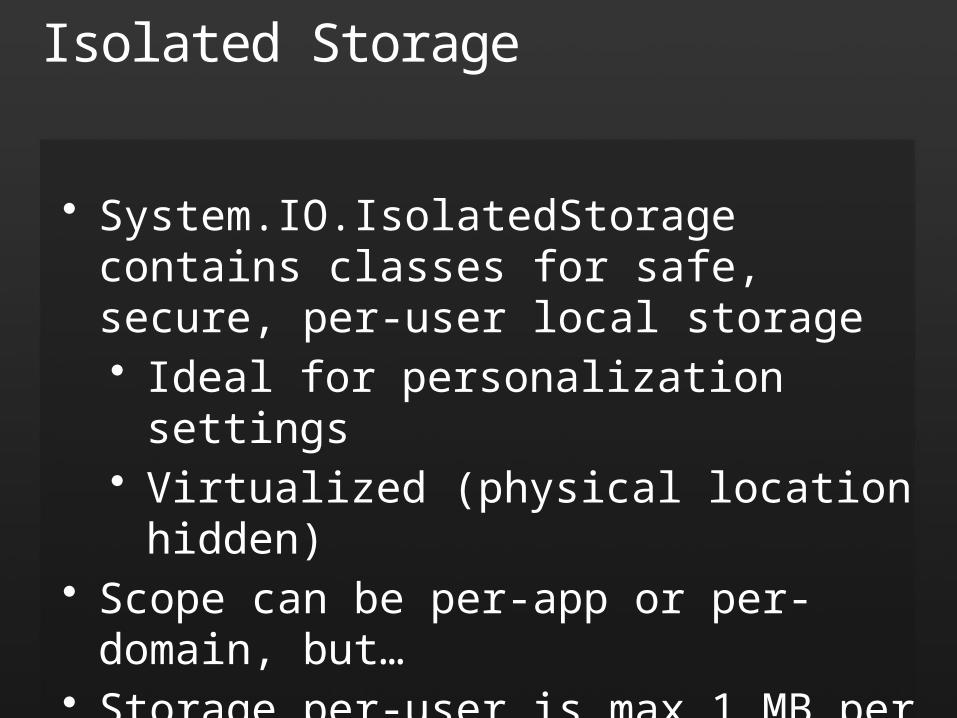
Isolated Storage
• System.IO.IsolatedStorage contains classes for safe, secure, per-user local storage• Ideal for personalization settings• Virtualized (physical location hidden)
• Scope can be per-app or per-domain, but…• Storage per-user is max 1 MB per domain
• IsolatedStorageFile.IncreaseQuotaTo method increases quota if user approves
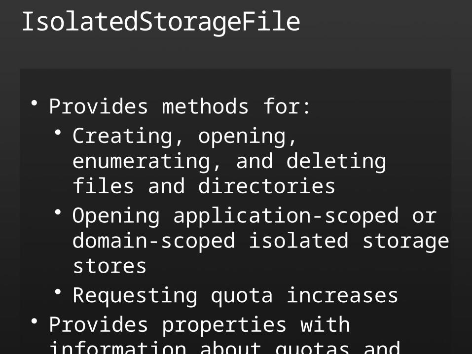
IsolatedStorageFile
• Provides methods for:• Creating, opening, enumerating, and
deleting files and directories• Opening application-scoped or domain-
scoped isolated storage stores• Requesting quota increases
• Provides properties with information about quotas and free space
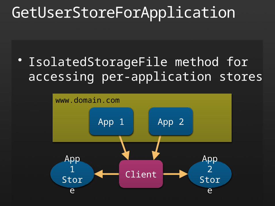
• IsolatedStorageFile method for accessing per-application stores
GetUserStoreForApplication
App 1Store
App 2Store
www.domain.com
App 1 App 2
Client
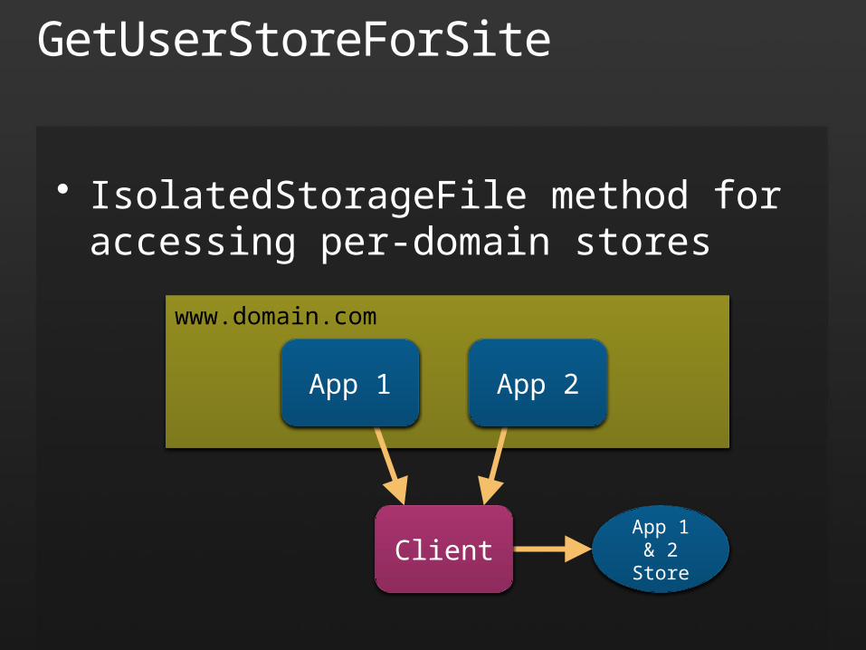
GetUserStoreForSite
• IsolatedStorageFile method for accessing per-domain stores
App 1 & 2Store
www.domain.com
App 1 App 2
Client
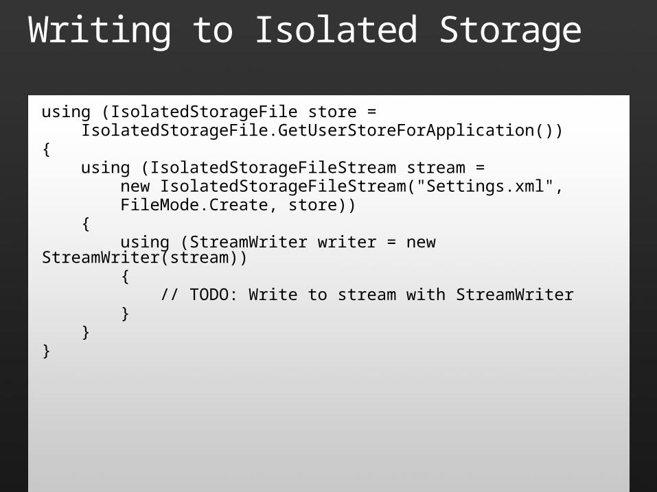
Writing to Isolated Storage
using (IsolatedStorageFile store = IsolatedStorageFile.GetUserStoreForApplication()){ using (IsolatedStorageFileStream stream = new IsolatedStorageFileStream("Settings.xml", FileMode.Create, store)) { using (StreamWriter writer = new StreamWriter(stream)) { // TODO: Write to stream with StreamWriter } }}
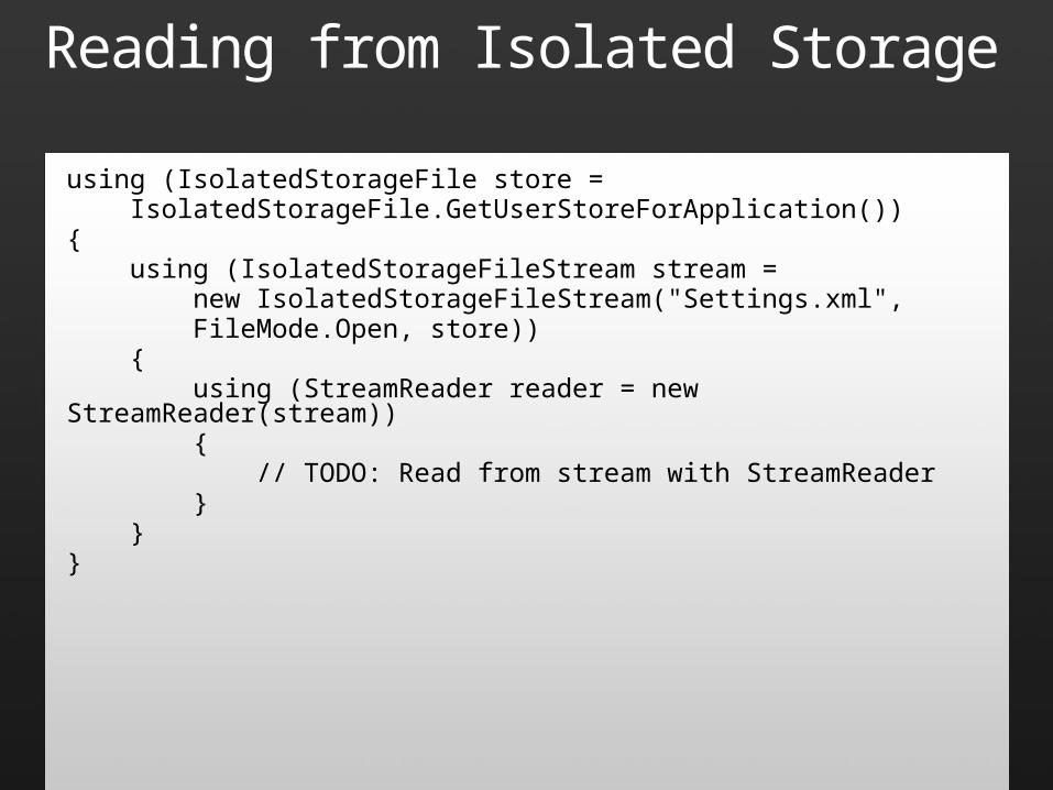
Reading from Isolated Storage
using (IsolatedStorageFile store = IsolatedStorageFile.GetUserStoreForApplication()){ using (IsolatedStorageFileStream stream = new IsolatedStorageFileStream("Settings.xml", FileMode.Open, store)) { using (StreamReader reader = new StreamReader(stream)) { // TODO: Read from stream with StreamReader } }}
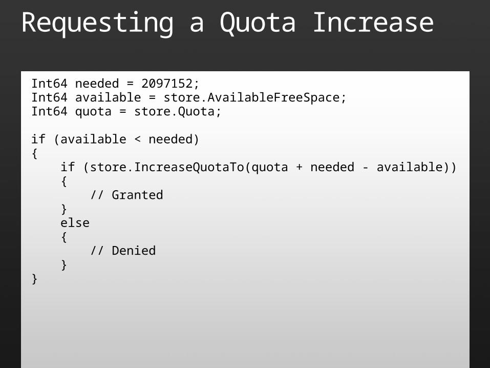
Requesting a Quota Increase
Int64 needed = 2097152;Int64 available = store.AvailableFreeSpace;Int64 quota = store.Quota;
if (available < needed){ if (store.IncreaseQuotaTo(quota + needed - available)) { // Granted } else { // Denied }}
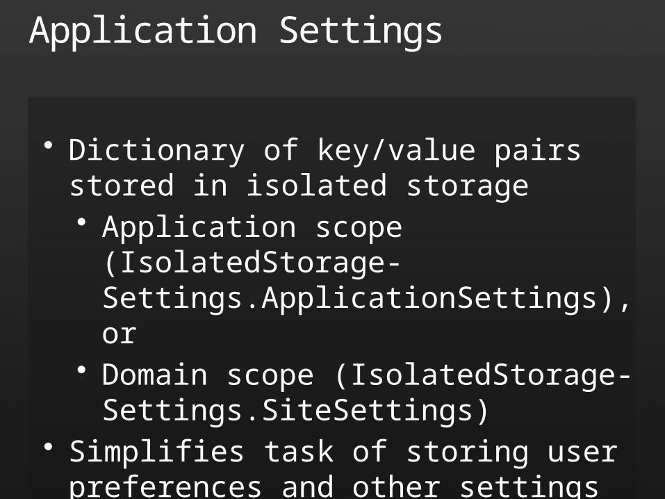
Application Settings
• Dictionary of key/value pairs stored in isolated storage• Application scope (IsolatedStorage-
Settings.ApplicationSettings), or• Domain scope (IsolatedStorage-
Settings.SiteSettings)• Simplifies task of storing user preferences and
other settings for individual applications or all applications in a domain
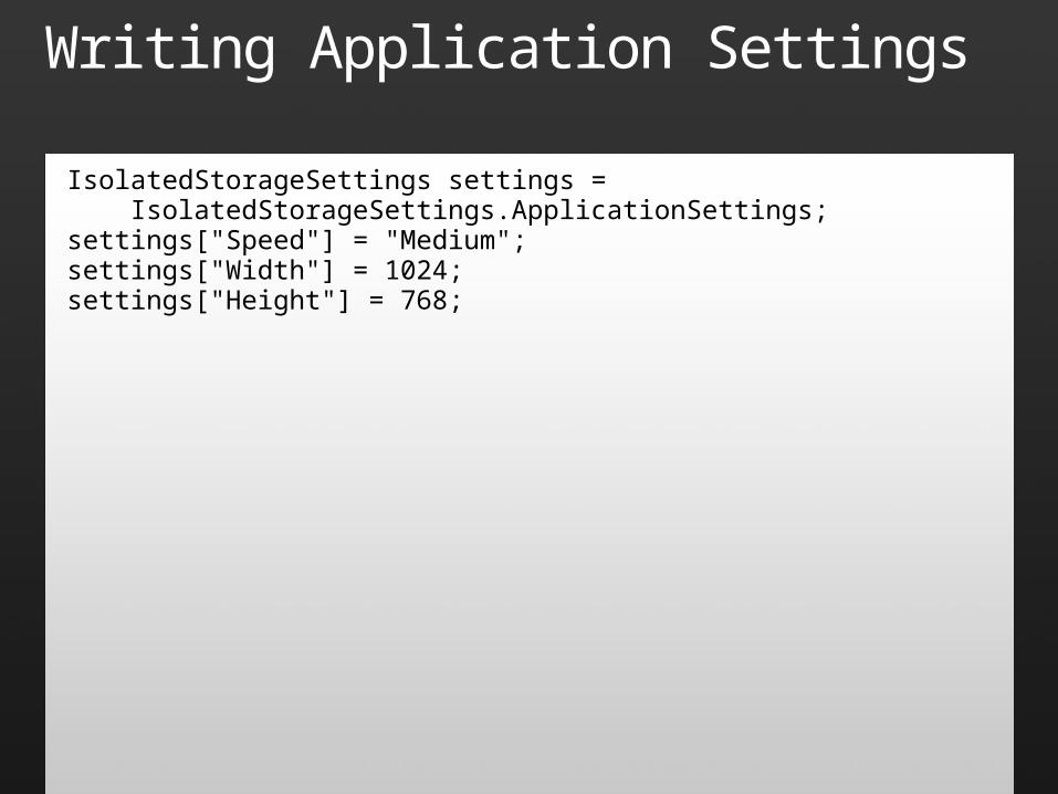
Writing Application Settings
IsolatedStorageSettings settings = IsolatedStorageSettings.ApplicationSettings;settings["Speed"] = "Medium";settings["Width"] = 1024;settings["Height"] = 768;
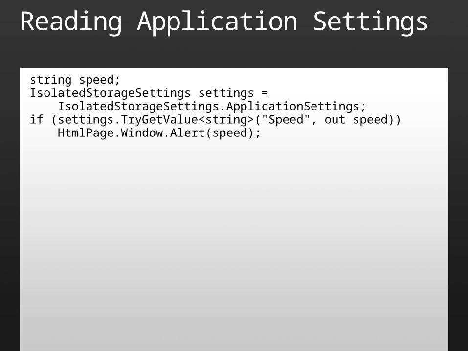
Reading Application Settings
string speed;IsolatedStorageSettings settings = IsolatedStorageSettings.ApplicationSettings;if (settings.TryGetValue<string>("Speed", out speed)) HtmlPage.Window.Alert(speed);
Isolated Storage
demo

© 2008 Microsoft Corporation. All rights reserved. Microsoft, Windows, Windows Vista and other product names are or may be registered trademarks and/or trademarks in the U.S. and/or other countries.The information herein is for informational purposes only and represents the current view of Microsoft Corporation as of the date of this presentation. Because Microsoft must respond to changing market
conditions, it should not be interpreted to be a commitment on the part of Microsoft, and Microsoft cannot guarantee the accuracy of any information provided after the date of this presentation. MICROSOFT MAKES NO WARRANTIES, EXPRESS, IMPLIED OR STATUTORY, AS TO THE INFORMATION IN THIS PRESENTATION.

Recommended