An analytical advantage - using data to reduce lap times…
Nowadays, motor racing relies not only on the feedback from the racer - but also from the data that has been captured whilst out on track. The possibility exists to capture a variety of parameter data in an effort to lap more quickly; capturing data relating to wheel speed, suspension movement, throttle position, braking pressure and many others.
The use of Global Positioning System (GPS) datalogging is becoming increasingly popular, as it can capture not only how fast the racer was going - but also where they were on the earth at that very moment.
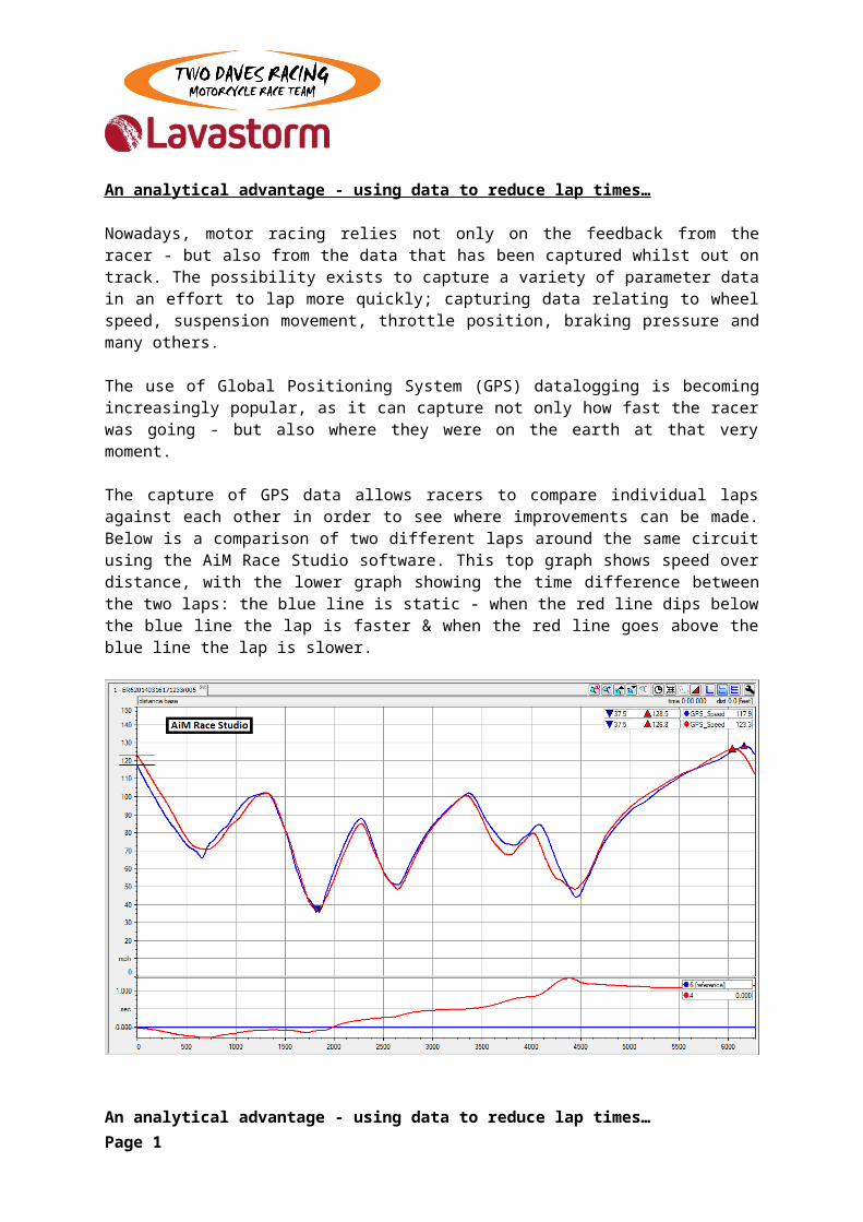
The capture of GPS data allows racers to compare individual laps against each other in order to see where improvements can be made. Below is a comparison of two different laps around the same circuit using the AiM Race Studio software. This top graph shows speed over distance, with the lower graph showing the time difference between the two laps: the blue line is static - when the red line dips below the blue line the lap is faster & when the red line goes above the blue line the lap is slower.
This lap-by-lap analysis is very useful and allows racers to spot some interesting events and raise questions such as “What happened to the ‘faster’ blue lap at this point?”
An analytical advantage - using data to reduce lap times… Page 1
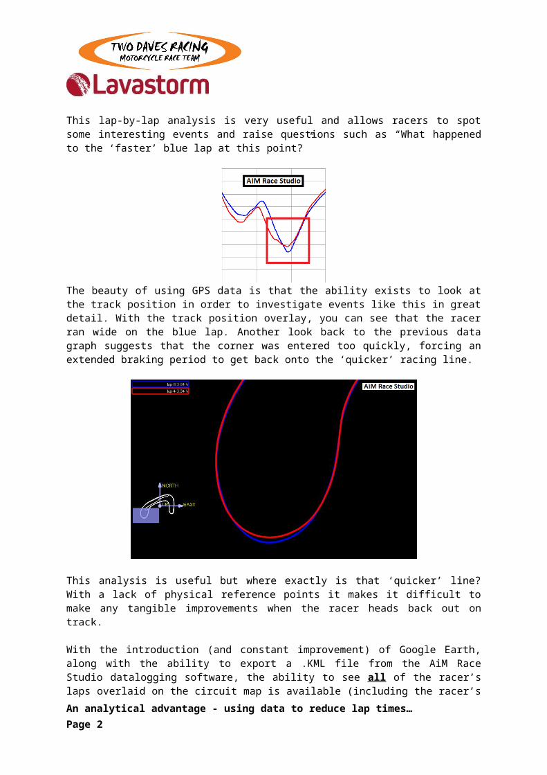
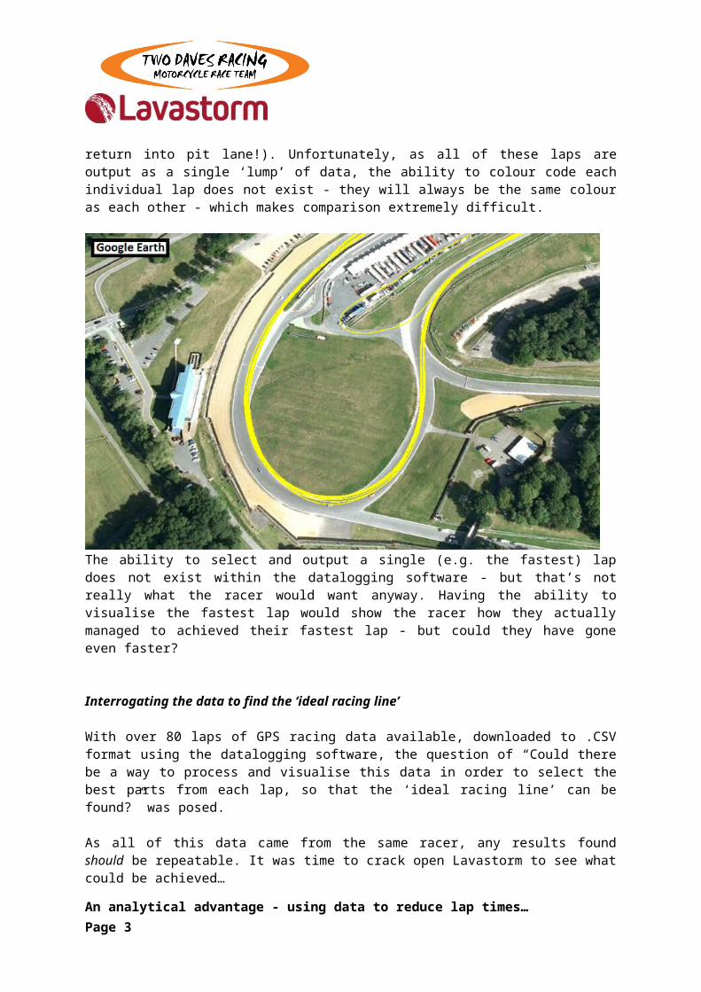
The beauty of using GPS data is that the ability exists to look at the track position in order to investigate events like this in great detail. With the track position overlay, you can see that the racer ran wide on the blue lap. Another look back to the previous data graph suggests that the corner was entered too quickly, forcing an extended braking period to get back onto the ‘quicker’ racing line.
This analysis is useful but where exactly is that ‘quicker’ line? With a lack of physical reference points it makes it difficult to make any tangible improvements when the racer heads back out on track.
With the introduction (and constant improvement) of Google Earth, along with the ability to export a .KML file from the AiM Race Studio datalogging software, the ability to see all of the racer’s laps overlaid on the circuit map is available (including the racer’s return into pit lane!). Unfortunately, as all of these laps are output as a single ‘lump’ of data, the ability to colour code each individual lap does not exist - they will always be the same colour as each other - which makes comparison extremely difficult.
An analytical advantage - using data to reduce lap times… Page 2
The ability to select and output a single (e.g. the fastest) lap does not exist within the datalogging software - but that’s not really what the racer would want anyway. Having the ability to visualise the fastest lap would show the racer how they actually managed to achieved their fastest lap - but could they have gone even faster?
Interrogating the data to find the ‘ideal racing line’
With over 80 laps of GPS racing data available, downloaded to .CSV format using the datalogging software, the question of “Could there be a way to process and visualise this data in order to select the best parts from each lap, so that the ‘ideal racing line’ can be found?” was posed.
As all of this data came from the same racer, any results found should be repeatable. It was time to crack open Lavastorm to see what could be achieved…
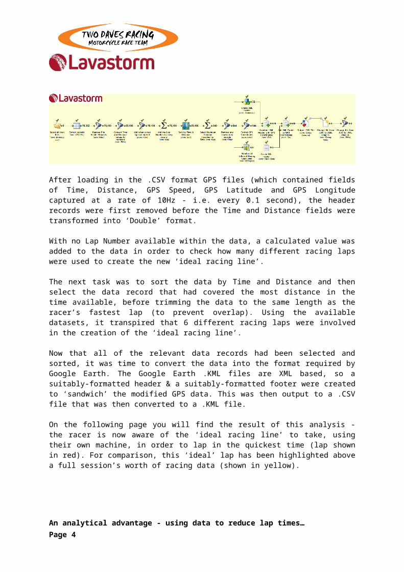
After loading in the .CSV format GPS files (which contained fields of Time, Distance, GPS Speed, GPS Latitude and GPS Longitude captured at a rate of 10Hz - i.e. every 0.1 second), the header records were first removed before the Time and Distance fields were transformed into ‘Double’ format.
With no Lap Number available within the data, a calculated value was added to the data in order to check how many different racing laps were used to create the new ‘ideal racing line’.
The next task was to sort the data by Time and Distance and then select the data record that had covered the most distance in the time available, before trimming the data to the same length as the racer’s fastest lap (to prevent overlap). Using the available datasets, it transpired that 6 different racing laps were involved in the creation of the ‘ideal racing line’.
Now that all of the relevant data records had been selected and sorted, it was time to convert the data into the format required by Google Earth. The Google Earth .KML files are XML based, so a suitably-formatted header & a suitably-formatted footer were created to ‘sandwich’ the modified GPS data. This was then output to a .CSV file that was then converted to a .KML file.
On the following page you will find the result of this analysis - the racer is now aware of the ‘ideal racing line’ to take, using their own machine, in order to lap in the quickest time (lap shown in red). For comparison, this ‘ideal’ lap has been highlighted above a full session’s worth of racing data (shown in yellow).
An analytical advantage - using data to reduce lap times… Page 3
Now that the ‘ideal racing line’ has been uncovered, the pressure is now on the racer to stick to it during the next session out on track. After the following session has been completed, the ‘new’ data from this new session can be downloaded into a .KML file to view (in Google Earth) how close the actual racing lines were to the ‘ideal racing line’.
The new data can also be run through Lavastorm to see whether an even quicker racing line can be revealed!
Even though the data analysis shown above is only scratching the surface of what Lavastorm is able to achieve, a racer is always happy to take any advantage they can get!
An analytical advantage - using data to reduce lap times… Page 4
Recommended