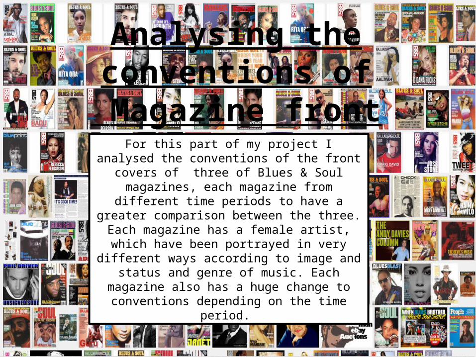
Analysing the conventions of Magazine front covers
For this part of my project I analysed the conventions of the front covers of three of Blues & Soul magazines, each magazine from different time periods to have a
greater comparison between the three. Each magazine has a female artist, which have been portrayed in very different ways according to image and status and genre
of music. Each magazine also has a huge change to conventions depending on the time period.
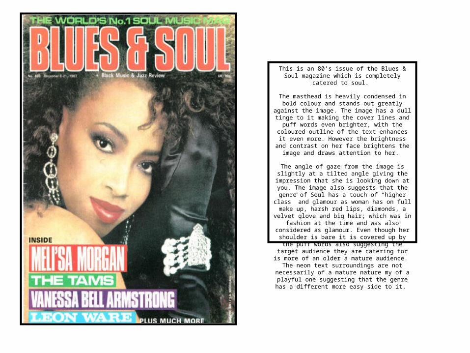
This is an 80’s issue of the Blues & Soul magazine which is completely catered to soul.
The masthead is heavily condensed in bold colour and stands out greatly against the image. The image has a dull tinge to it making the cover lines and puff words even brighter, with the coloured outline of the text enhances it even more. However the brightness
and contrast on her face brightens the image and draws attention to her.
The angle of gaze from the image is slightly at a tilted angle giving the impression that she is looking
down at you. The image also suggests that the genre of Soul has a touch of “higher class” and
glamour as woman has on full make up, harsh red lips, diamonds, a velvet glove and big hair; which
was in fashion at the time and was also considered as glamour. Even though her shoulder is bare it is covered up by the puff words also suggesting the target audience they are catering for is more of an
older a mature audience. The neon text surroundings are not necessarily of a mature nature my of a playful one suggesting that the genre has a
different more easy side to it.
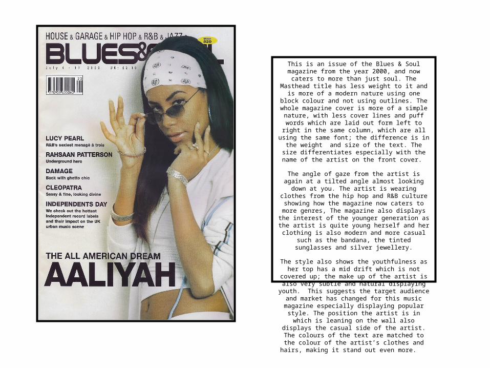
This is an issue of the Blues & Soul magazine from the year 2000, and now caters to more than just soul. The
Masthead title has less weight to it and is more of a modern nature using one block colour and not using
outlines. The whole magazine cover is more of a simple nature, with less cover lines and puff words which are
laid out form left to right in the same column, which are all using the same font; the difference is in the weight and size of the text. The size differentiates especially
with the name of the artist on the front cover.
The angle of gaze from the artist is again at a tilted angle almost looking down at you. The artist is wearing clothes from the hip hop and R&B culture showing how
the magazine now caters to more genres, The magazine also displays the interest of the younger
generation as the artist is quite young herself and her clothing is also modern and more casual such as the bandana, the tinted sunglasses and silver jewellery.
The style also shows the youthfulness as her top has a mid drift which is not covered up; the make up of the
artist is also very subtle and natural displaying youth. This suggests the target audience and market has
changed for this music magazine especially displaying popular style. The position the artist is in which is
leaning on the wall also displays the casual side of the artist. The colours of the text are matched to the colour
of the artist’s clothes and hairs, making it stand out even more.
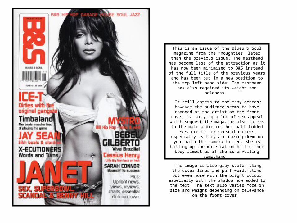
This is an issue of the Blues & Soul magazine from the “noughties” later than the previous issue. The
masthead has become less of the attraction as it has now been minimised to B&S instead of the full title of
the previous years and has been put in a new position to the top left hand side. The masthead has also
regained its weight and boldness.
It still caters to the many genres; however the audience seems to have changed as the artist on the
front cover is carrying a lot of sex appeal which suggest the magazine also caters to the male
audience; her half lidded eyes create her sensual nature, especially as they are gazing down on you,
with the camera tilted. She is holding up the material on half of her body almost as if she is unveiling
something.
The image is also gray scale making the cover lines and puff words stand out even more with the bright colour especially with the shadow now added to the
text. The text also varies more in size and weight depending on relevance on the front cover.
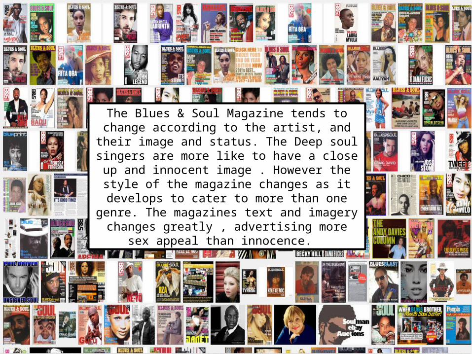
The Blues & Soul Magazine tends to change according to the artist, and their image and status. The Deep soul singers are more like to have a close up and innocent image . However the style of the magazine changes as
it develops to cater to more than one genre. The magazines text and imagery changes greatly , advertising more sex appeal than innocence.
Recommended