RESPONSIVE WEB DESIGN
TWITTER BOOTSTRAP 3CSS MEDIA QUERIES
CONTENTS
• What is Responsive Web Design?• What is Twitter Bootstrap 3? • Why Twitter Bootstrap 3? • What is Twitter Bootstrap grid system?• What is Media Queries?• Why to use media queries?• How to use media queries?• What are the standard responsive screen resolutions?
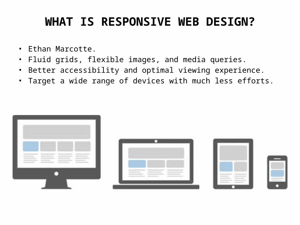
WHAT IS RESPONSIVE WEB DESIGN?
• Ethan Marcotte.• Fluid grids, flexible images, and media queries.• Better accessibility and optimal viewing experience.• Target a wide range of devices with much less efforts.
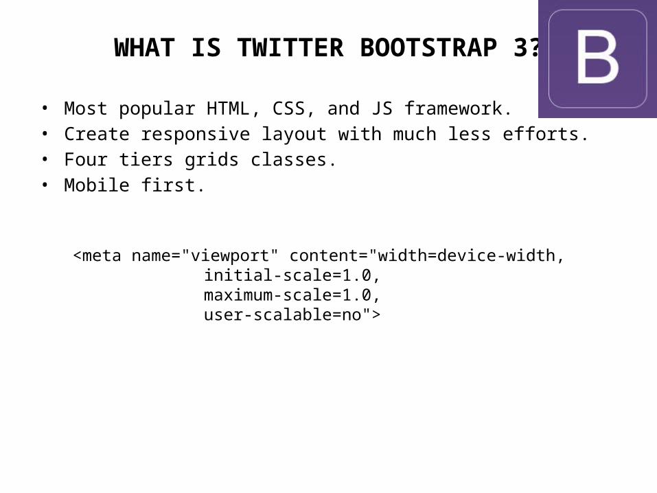
WHAT IS TWITTER BOOTSTRAP 3?
• Most popular HTML, CSS, and JS framework.• Create responsive layout with much less efforts.• Four tiers grids classes.• Mobile first.
<meta name="viewport" content="width=device-width, initial-scale=1.0, maximum-scale=1.0, user-scalable=no">
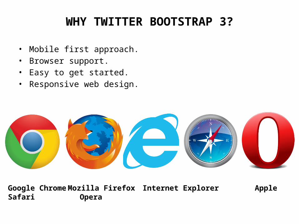
WHY TWITTER BOOTSTRAP 3?
• Mobile first approach.• Browser support.• Easy to get started.• Responsive web design.
Google Chrome Mozilla Firefox Internet Explorer Apple Safari Opera
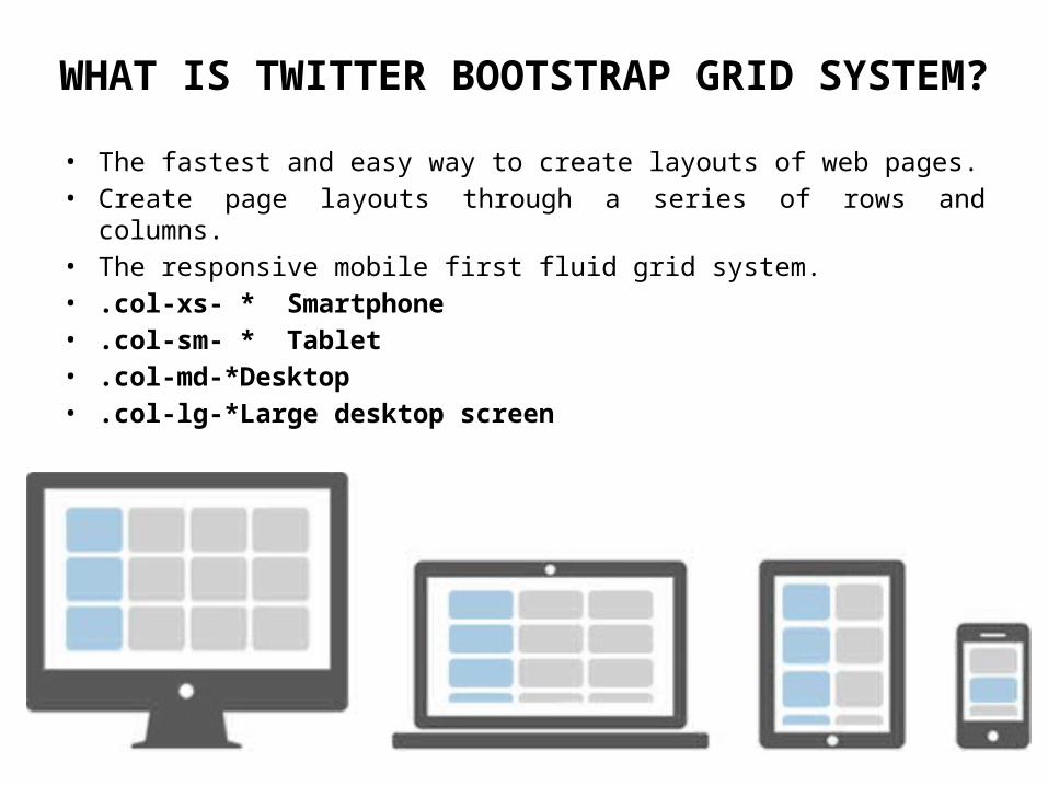
WHAT IS TWITTER BOOTSTRAP GRID SYSTEM?
• The fastest and easy way to create layouts of web pages.• Create page layouts through a series of rows and columns.• The responsive mobile first fluid grid system.• .col-xs- * Smartphone• .col-sm- * Tablet• .col-md-* Desktop• .col-lg-* Large desktop screen
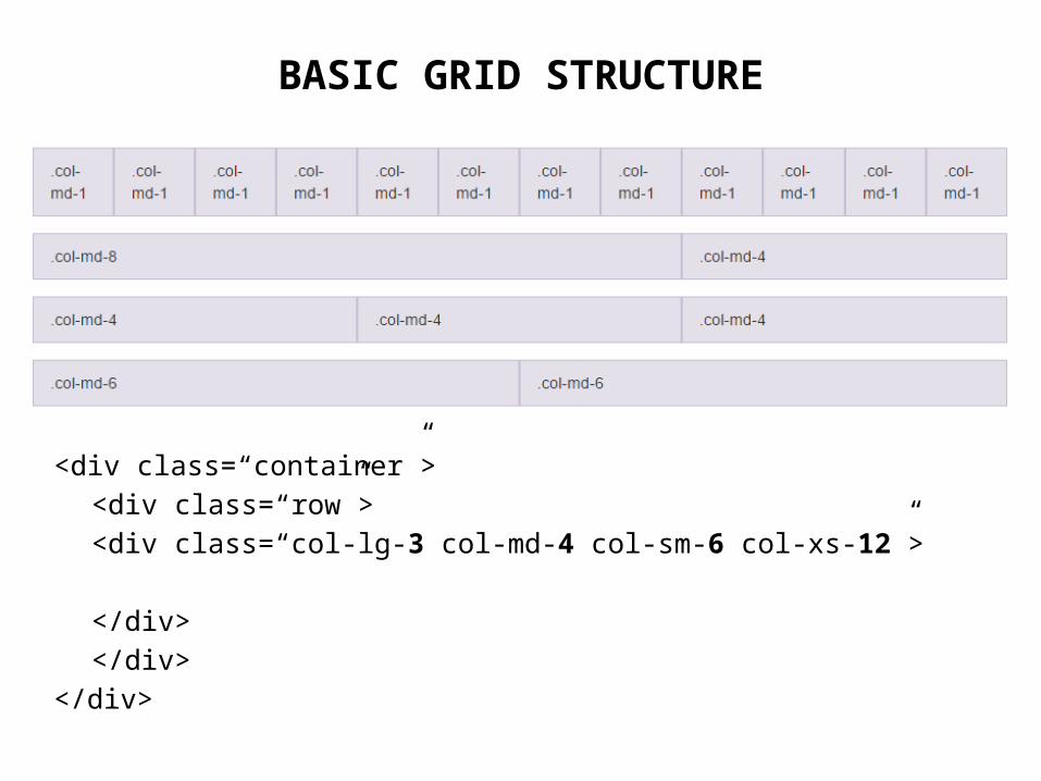
BASIC GRID STRUCTURE
<div class=“container”><div class=“row”>
<div class=“col-lg-3 col-md-4 col-sm-6 col-xs-12”>
</div></div>
</div>
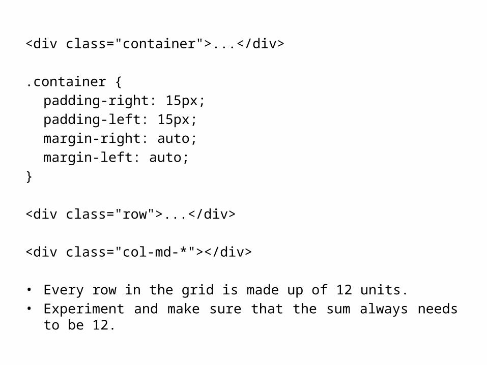
<div class="container">...</div>
.container { padding-right: 15px; padding-left: 15px; margin-right: auto; margin-left: auto;
}
<div class="row">...</div>
<div class="col-md-*"></div>
• Every row in the grid is made up of 12 units.• Experiment and make sure that the sum always needs to be 12.
WHAT IS MEDIA QUERIES?
• Customize the presentation.• An excellent way to create responsive layout.
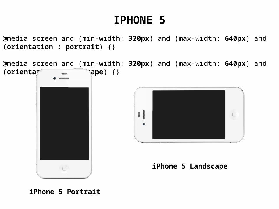
@media screen and (min-width: 320px) and (max-width: 640px) and (orientation : portrait) {}
@media screen and (min-width: 320px) and (max-width: 640px) and (orientation : landscape) {}
IPHONE 5
iPhone 5 Landscape
iPhone 5 Portrait
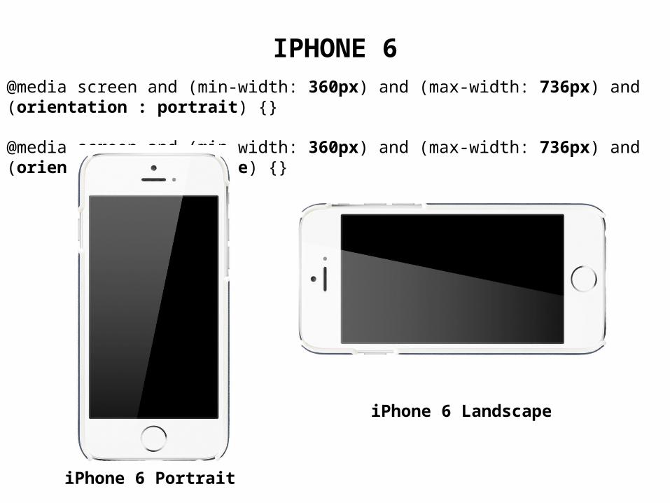
@media screen and (min-width: 360px) and (max-width: 736px) and (orientation : portrait) {}
@media screen and (min-width: 360px) and (max-width: 736px) and (orientation : landscape) {}
IPHONE 6
iPhone 6 Portrait
iPhone 6 Landscape
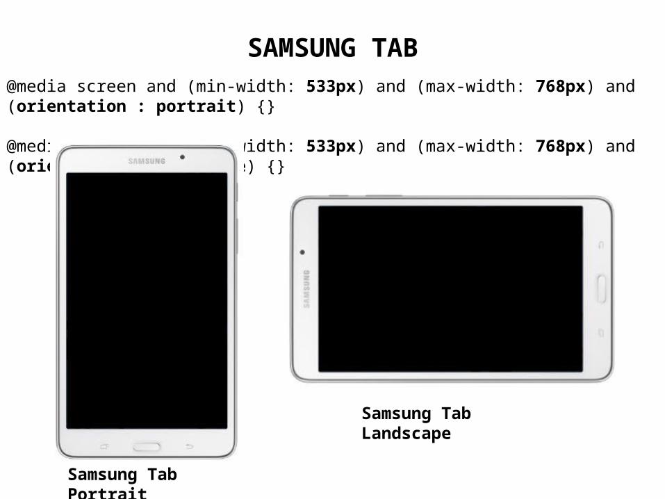
SAMSUNG TAB@media screen and (min-width: 533px) and (max-width: 768px) and (orientation : portrait) {}
@media screen and (min-width: 533px) and (max-width: 768px) and (orientation : landscape) {}
Samsung Tab Portrait
Samsung Tab Landscape
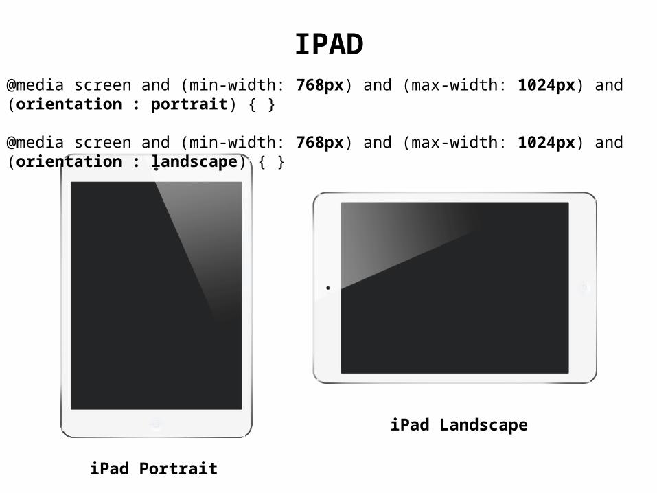
@media screen and (min-width: 768px) and (max-width: 1024px) and (orientation : portrait) { }
@media screen and (min-width: 768px) and (max-width: 1024px) and (orientation : landscape) { }
IPAD
iPad Portrait
iPad Landscape
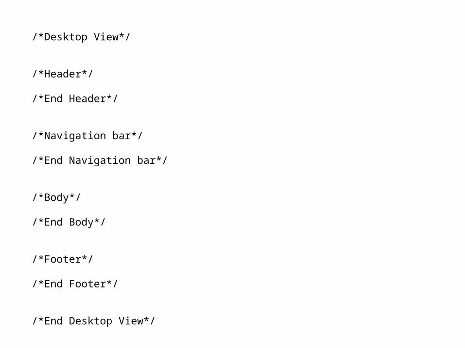
/*Desktop View*/
/*Header*/
/*End Header*/
/*Navigation bar*/
/*End Navigation bar*/
/*Body*/
/*End Body*/
/*Footer*/
/*End Footer*/
/*End Desktop View*/
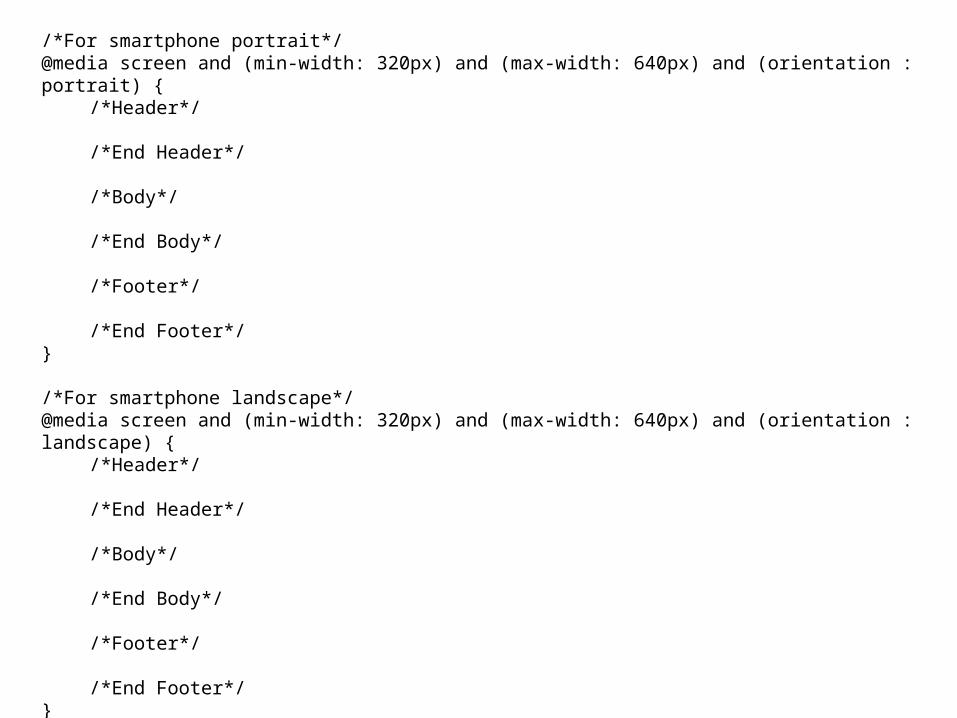
/*For smartphone portrait*/@media screen and (min-width: 320px) and (max-width: 640px) and (orientation : portrait) {
/*Header*/
/*End Header*/
/*Body*/
/*End Body*/
/*Footer*/
/*End Footer*/}
/*For smartphone landscape*/@media screen and (min-width: 320px) and (max-width: 640px) and (orientation : landscape) {
/*Header*/
/*End Header*/
/*Body*/
/*End Body*/
/*Footer*/
/*End Footer*/}
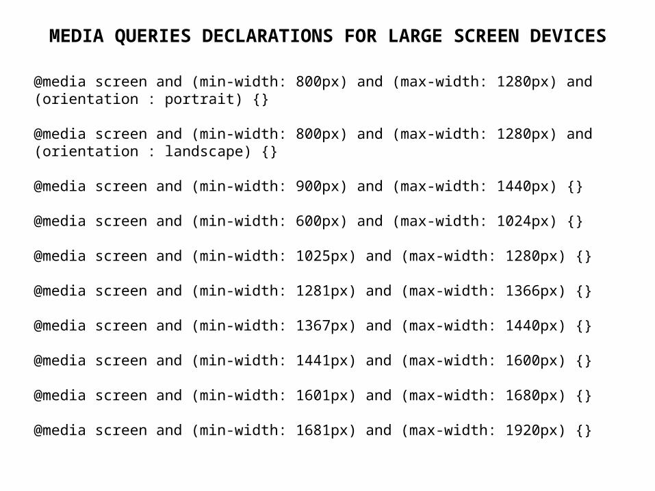
@media screen and (min-width: 800px) and (max-width: 1280px) and (orientation : portrait) {}
@media screen and (min-width: 800px) and (max-width: 1280px) and (orientation : landscape) {}
@media screen and (min-width: 900px) and (max-width: 1440px) {}
@media screen and (min-width: 600px) and (max-width: 1024px) {}
@media screen and (min-width: 1025px) and (max-width: 1280px) {}
@media screen and (min-width: 1281px) and (max-width: 1366px) {}
@media screen and (min-width: 1367px) and (max-width: 1440px) {}
@media screen and (min-width: 1441px) and (max-width: 1600px) {}
@media screen and (min-width: 1601px) and (max-width: 1680px) {}
@media screen and (min-width: 1681px) and (max-width: 1920px) {}
MEDIA QUERIES DECLARATIONS FOR LARGE SCREEN DEVICES

Thank You!
Any Questions?
Recommended


![Responsive design - Twitter Bootstrap [FR]](https://img.pdfslide.net/doc/110x75/58ce97ee1a28ab8c3b8b6b85/responsive-design-twitter-bootstrap-fr.jpg)