Embed Size (px)
Citation preview
WHAT’S NEW IN EXCEL 2016
New Charts (Tree Map, Waterfall & Histogram)
New Charts (Tree Map, Waterfall & Histogram)
New Charts (Tree Map, Waterfall & Histogram)
Get & Transform
New Charts (Tree Map, Waterfall & Histogram)
One-Click Forecasting
Data Loss Prevention
One-Click Forecasting
Office Anywhere
Get & Transform
One-Click Forecasting
Data Loss Prevention
Office Anywhere
New Analysis Capabilities (Relationship Detection, Time Grouping, Drill Down & Field Searching)
Publish to Power BI
New Charts (Tree Map, Waterfall & Histogram)
Get & Transform Get & Transform
Tell Me
Key Office Enhancements (Simplified Sharing & Insights)
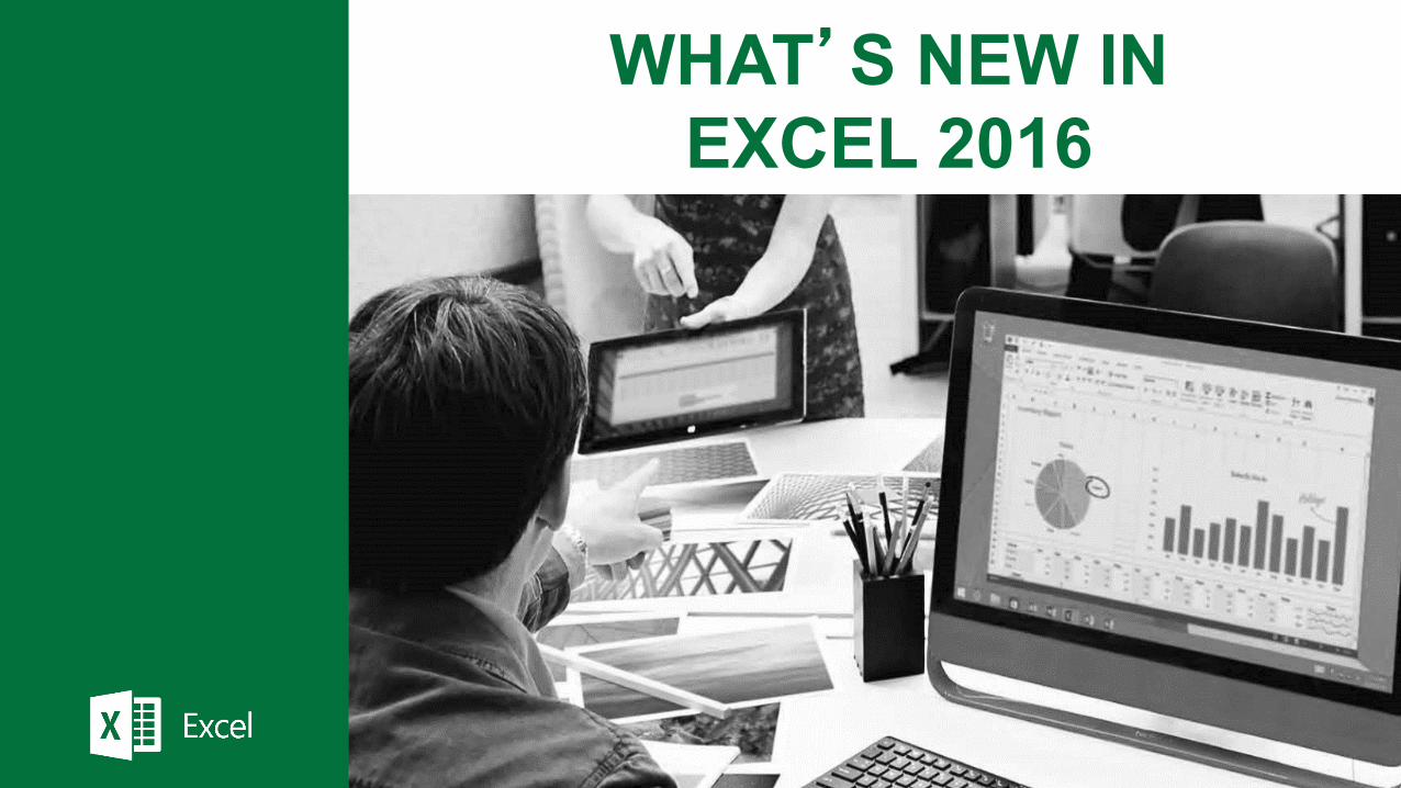
If you only have time for a limited number of features, please use the following table and sequence of feature presentation
1 feature 2 features 3 features 5 features 10 features
3D Maps
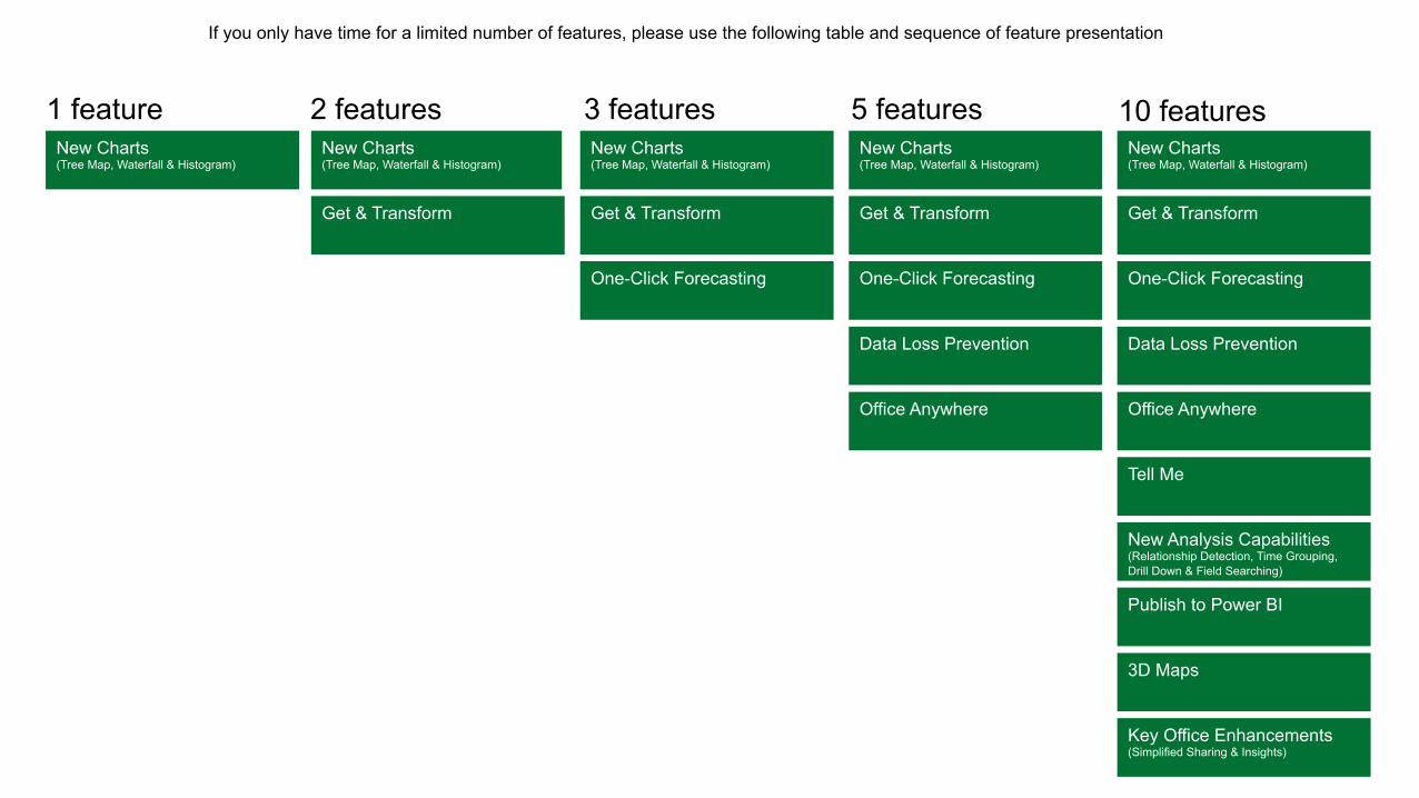
Excel now comes with a set of new modern charts, like Waterfall and Treemap, that give you more ways to explore and tell compelling stories with your business data.
* New charts include Waterfall, Treemap, Sunburst, Box & Whisker, Histogram and Pareto
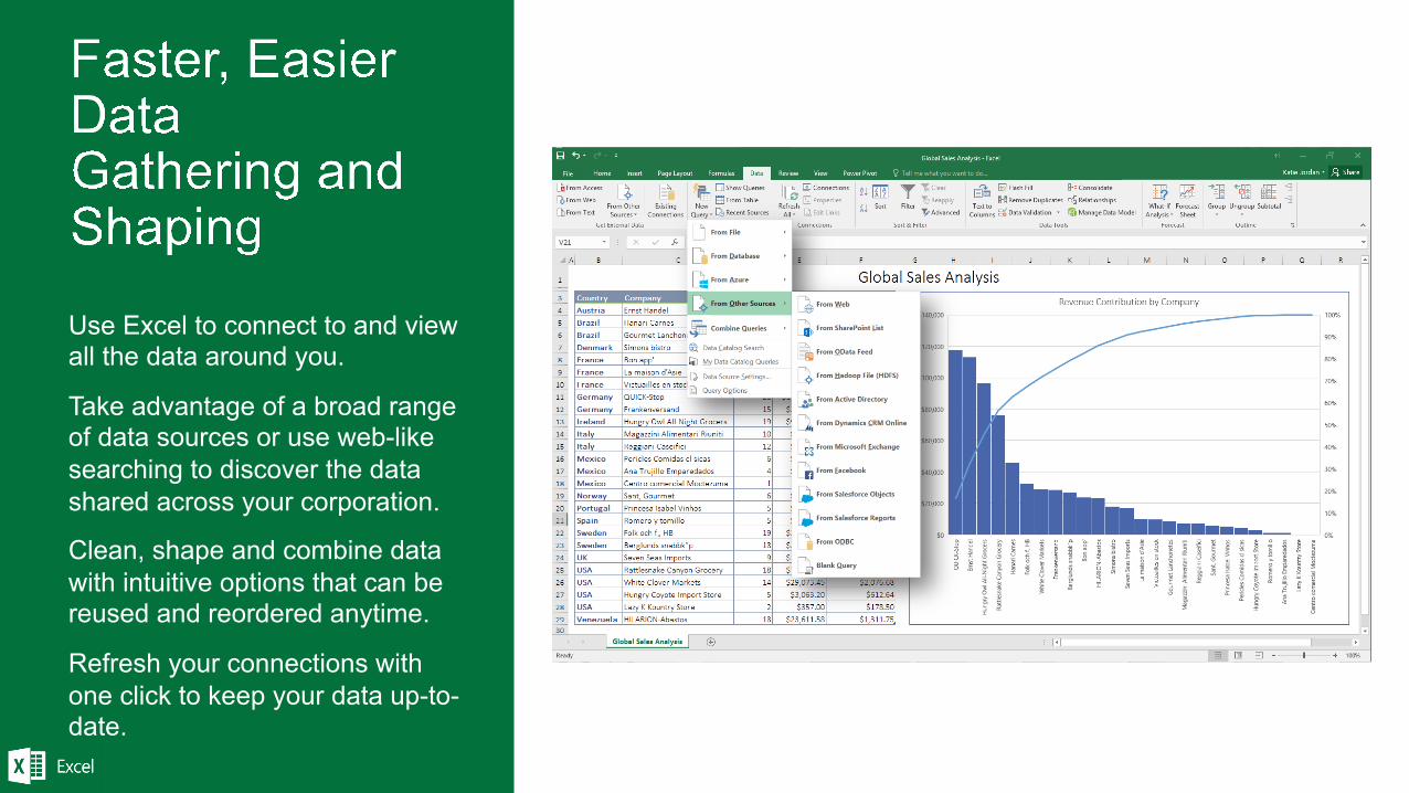
Use Excel to connect to and view all the data around you.
Take advantage of a broad range of data sources or use web-like searching to discover the data shared across your corporation.
Clean, shape and combine data with intuitive options that can be reused and reordered anytime.
Refresh your connections with one click to keep your data up-to-date.
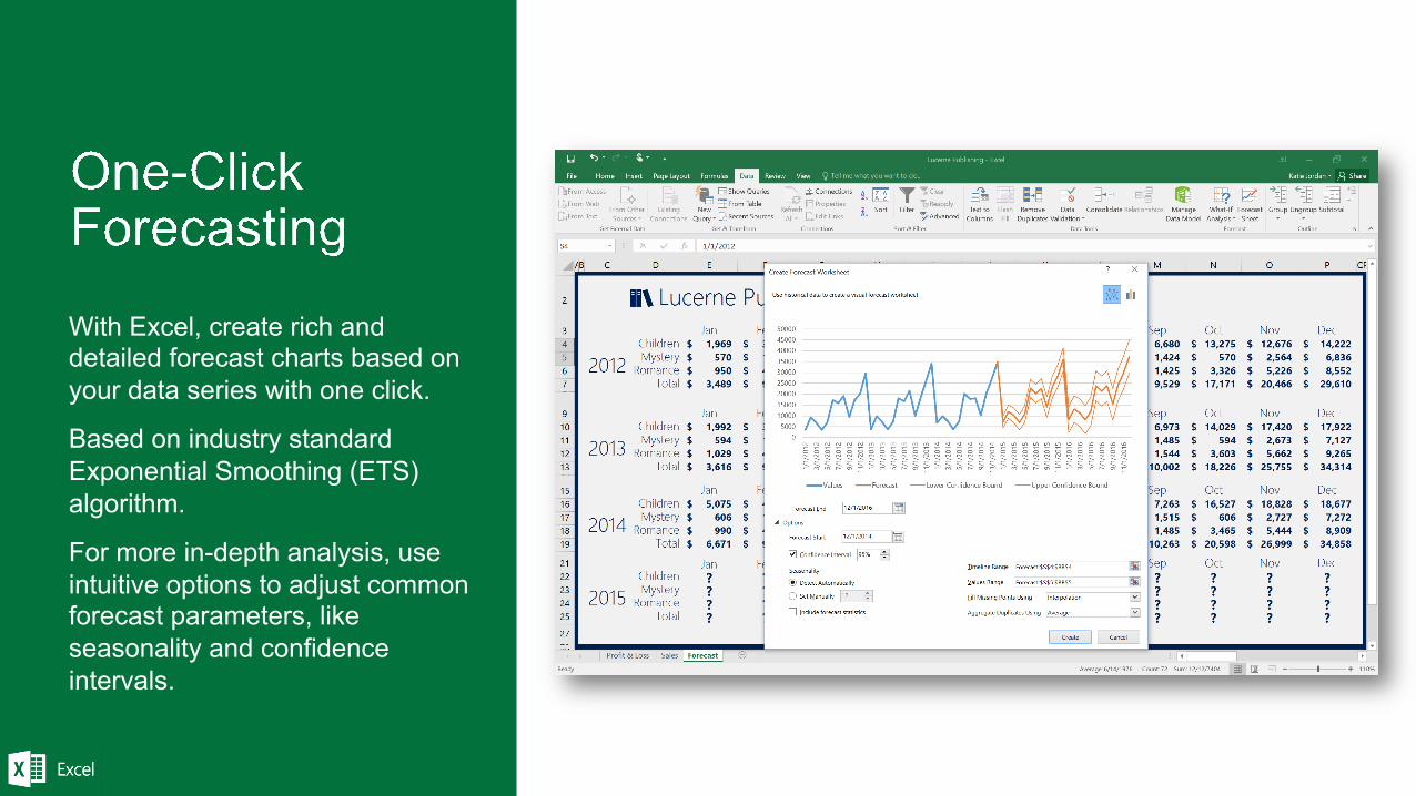
With Excel, create rich and detailed forecast charts based on your data series with one click.
Based on industry standard Exponential Smoothing (ETS) algorithm.
For more in-depth analysis, use intuitive options to adjust common forecast parameters, like seasonality and confidence intervals.
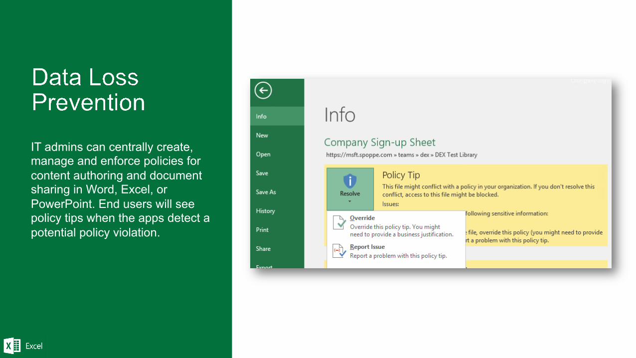
IT admins can centrally create, manage and enforce policies for content authoring and document sharing in Word, Excel, or PowerPoint. End users will see policy tips when the apps detect a potential policy violation.
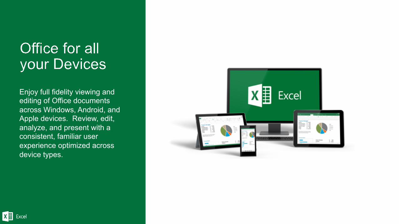
Enjoy full fidelity viewing and editing of Office documents across Windows, Android, and Apple devices. Review, edit, analyze, and present with a consistent, familiar user experience optimized across device types.
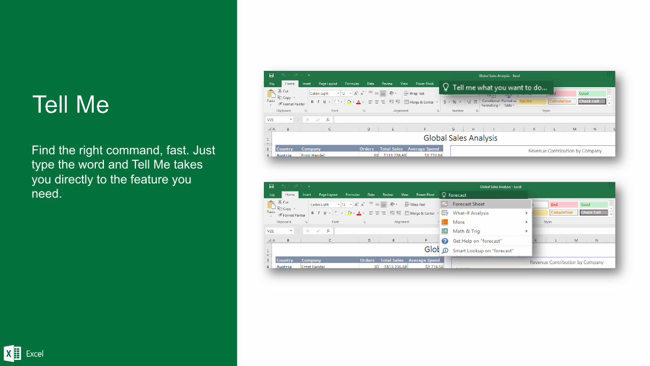
Find the right command, fast. Just type the word and Tell Me takes you directly to the feature you need.
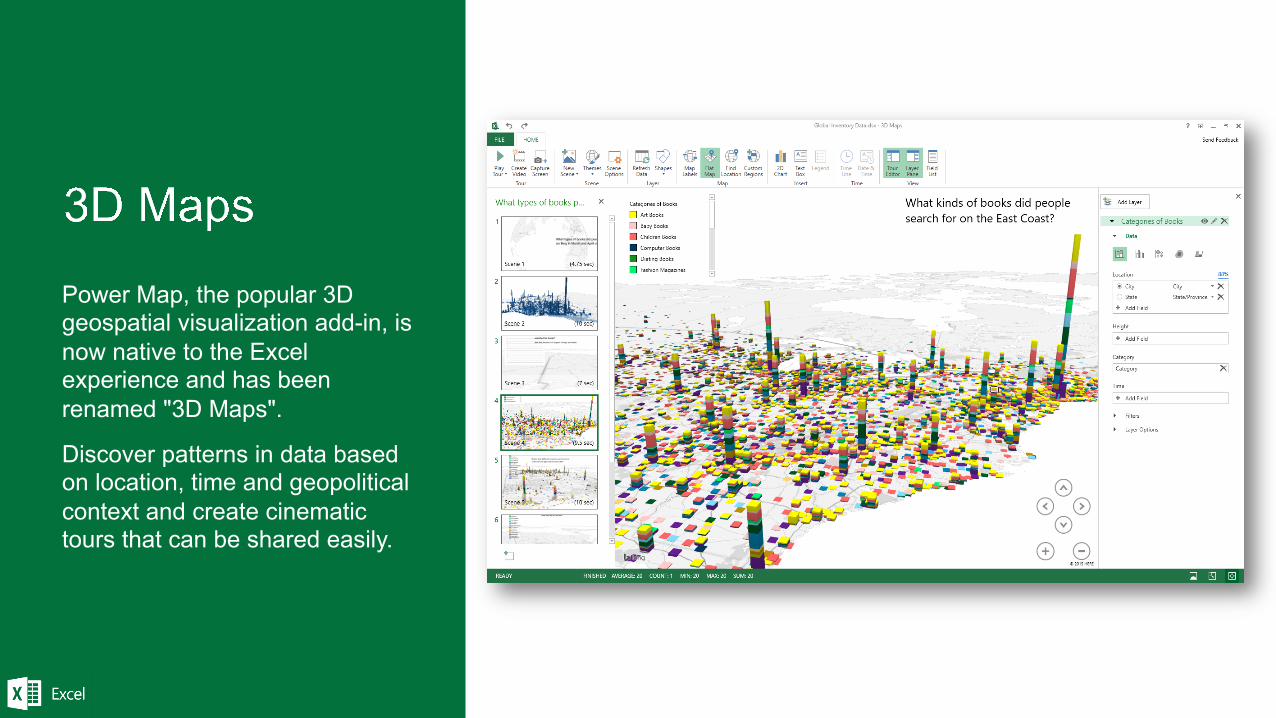
Power Map, the popular 3D geospatial visualization add-in, is now native to the Excel experience and has been renamed "3D Maps".
Discover patterns in data based on location, time and geopolitical context and create cinematic tours that can be shared easily.
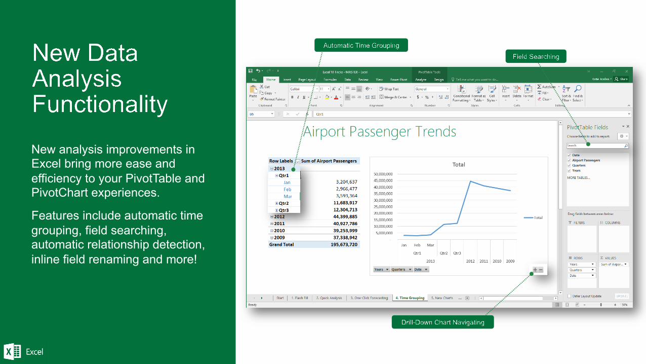
New analysis improvements in Excel bring more ease and efficiency to your PivotTable and PivotChart experiences.
Features include automatic time grouping, field searching, automatic relationship detection, inline field renaming and more!
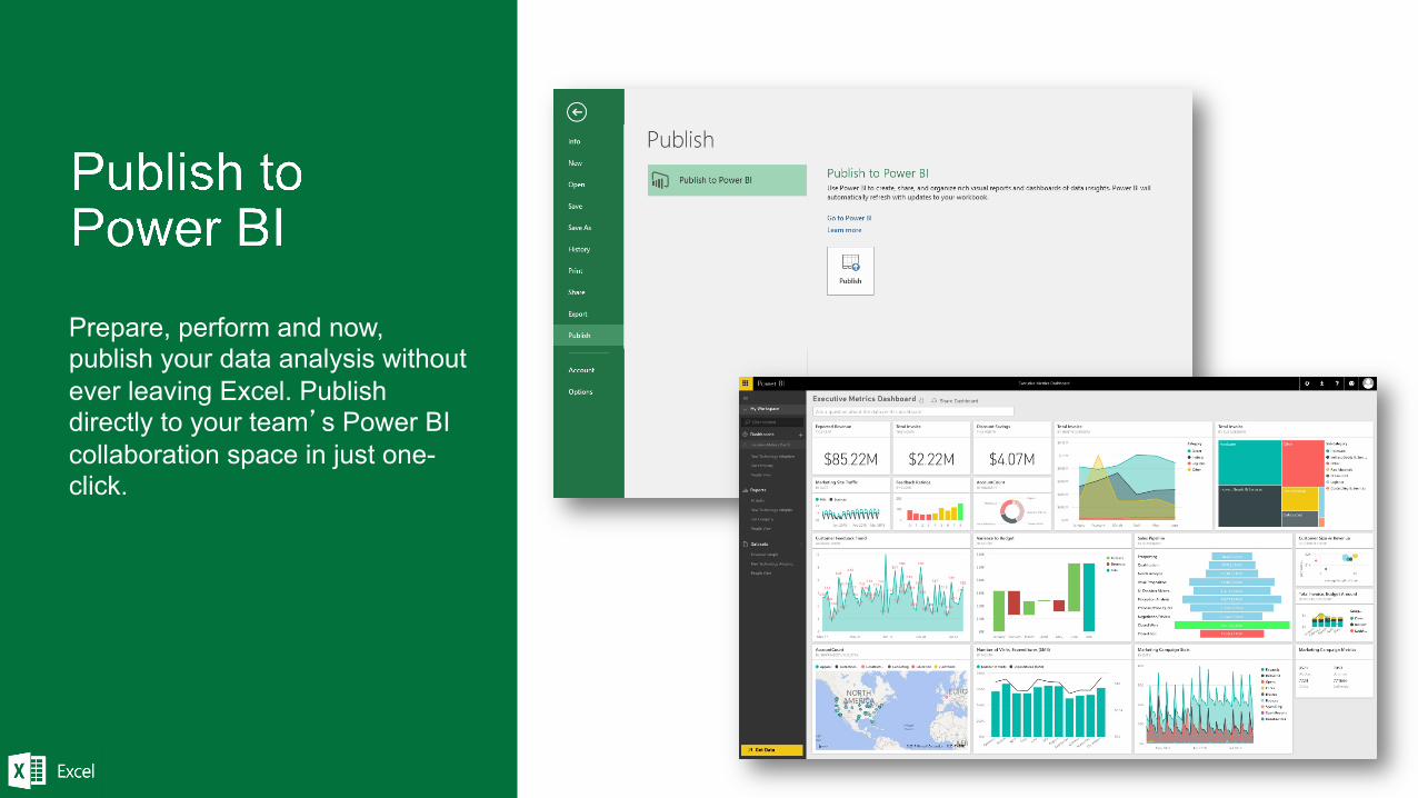
Prepare, perform and now, publish your data analysis without ever leaving Excel. Publish directly to your team’s Power BI collaboration space in just one-click.
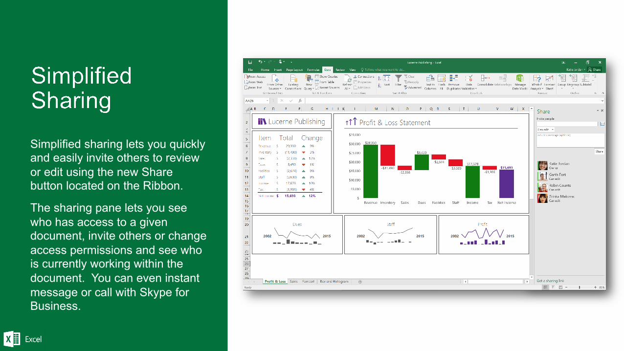
Simplified sharing lets you quickly and easily invite others to review or edit using the new Share button located on the Ribbon.
The sharing pane lets you see who has access to a given document, invite others or change access permissions and see who is currently working within the document. You can even instant message or call with Skype for Business.
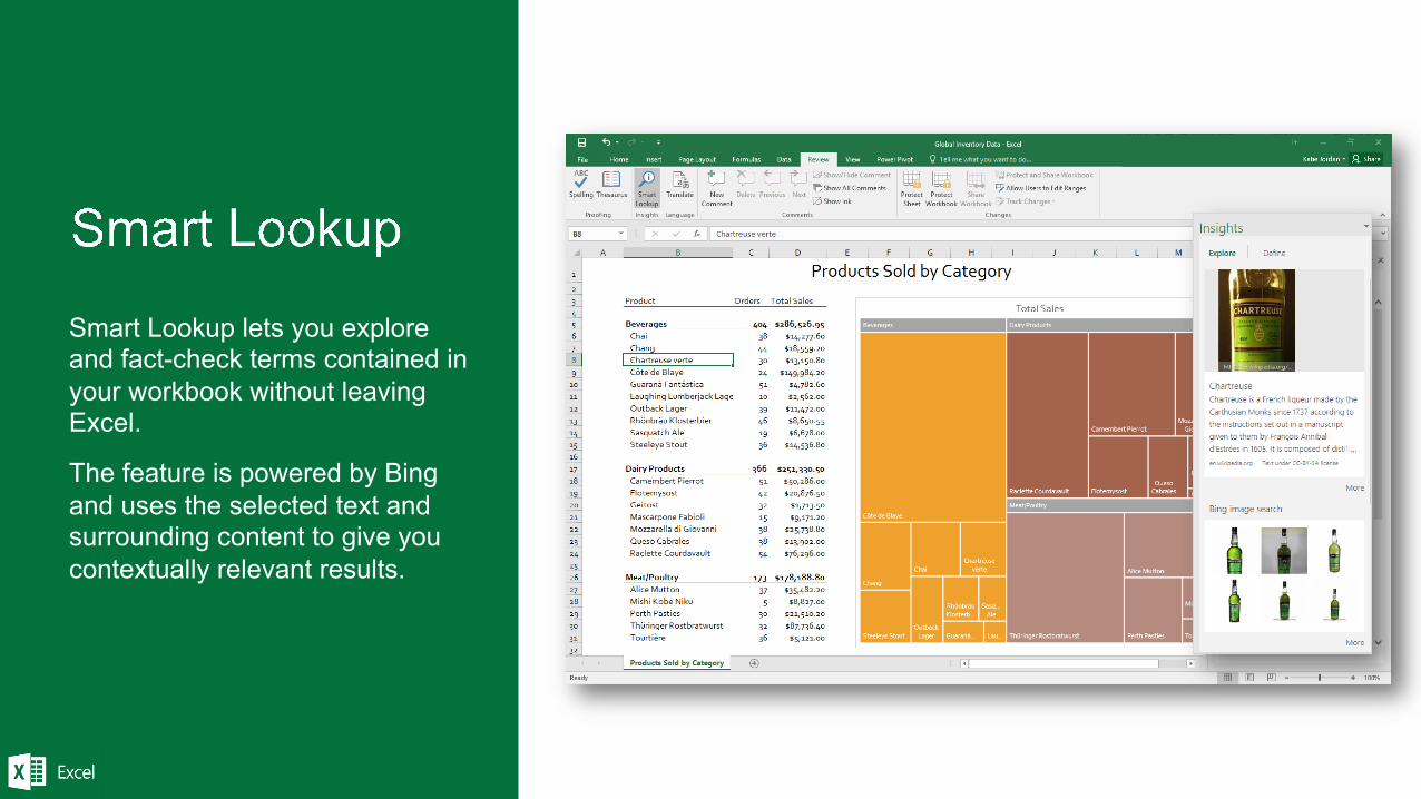
Smart Lookup lets you explore and fact-check terms contained in your workbook without leaving Excel.
The feature is powered by Bing and uses the selected text and surrounding content to give you contextually relevant results.
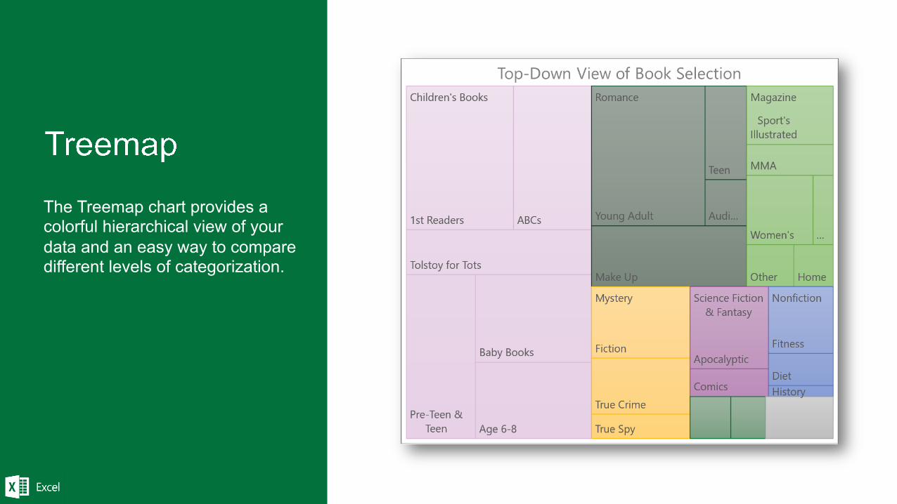
The Treemap chart provides a colorful hierarchical view of your data and an easy way to compare different levels of categorization.
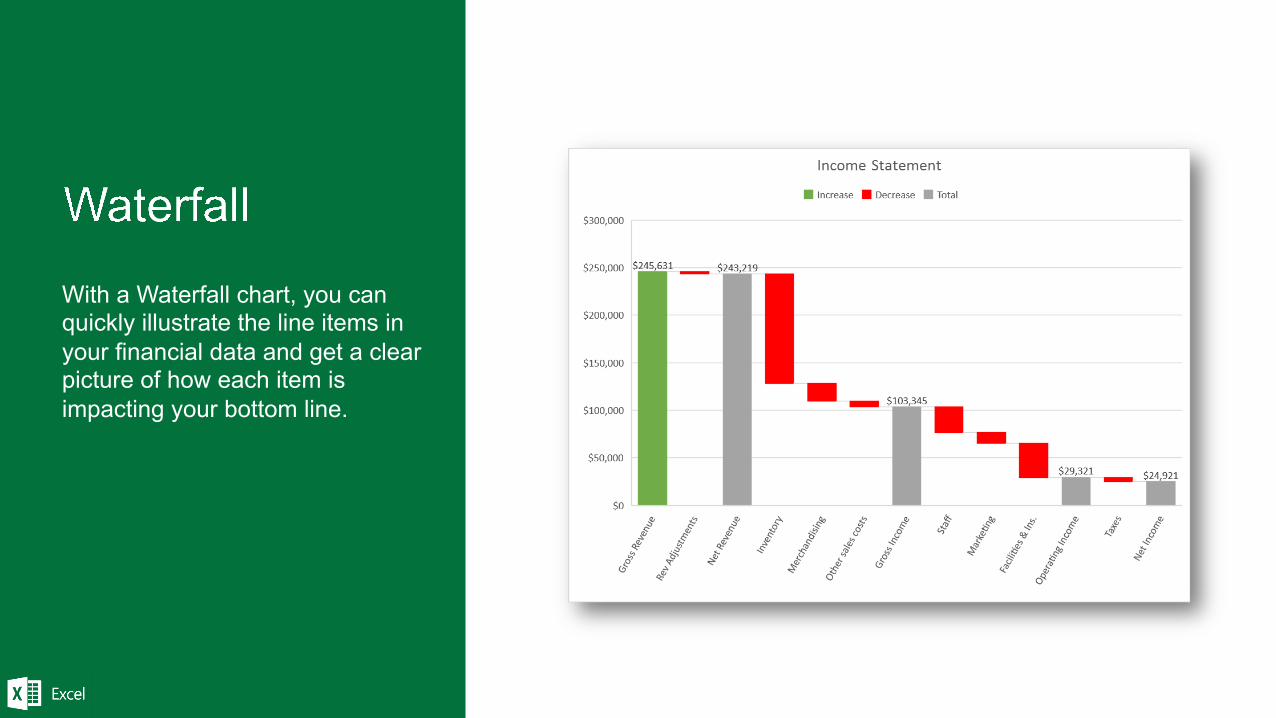
With a Waterfall chart, you can quickly illustrate the line items in your financial data and get a clear picture of how each item is impacting your bottom line.
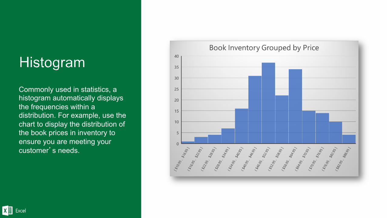
Commonly used in statistics, a histogram automatically displays the frequencies within a distribution. For example, use the chart to display the distribution of the book prices in inventory to ensure you are meeting your customer’s needs.
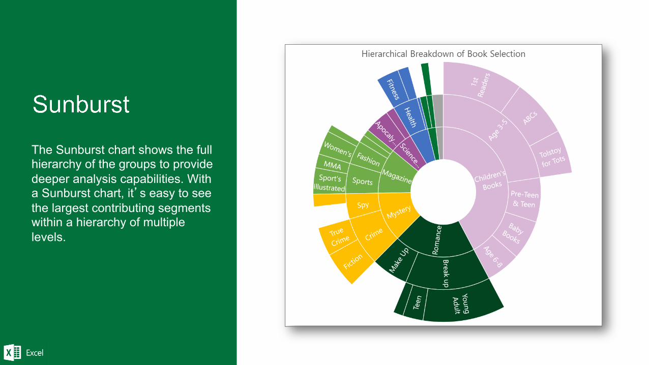
The Sunburst chart shows the full hierarchy of the groups to provide deeper analysis capabilities. With a Sunburst chart, it’s easy to see the largest contributing segments within a hierarchy of multiple levels.
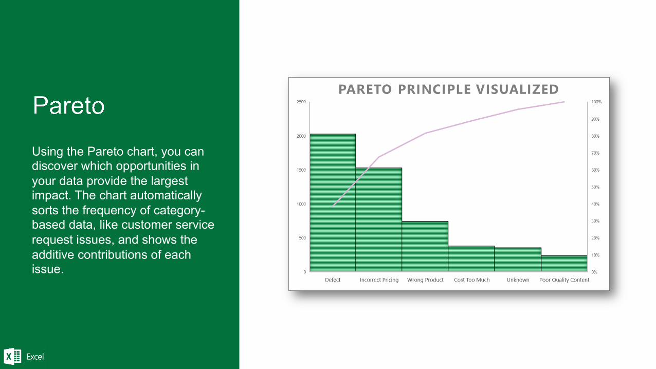
Using the Pareto chart, you can discover which opportunities in your data provide the largest impact. The chart automatically sorts the frequency of category-based data, like customer service request issues, and shows the additive contributions of each issue.
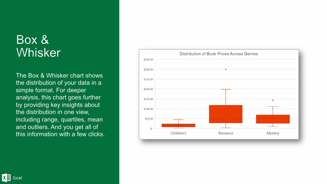
The Box & Whisker chart shows the distribution of your data in a simple format. For deeper analysis, this chart goes further by providing key insights about the distribution in one view, including range, quartiles, mean and outliers. And you get all of this information with a few clicks.