Embed Size (px)
Citation preview
Evaluation question 2: How effective is the combination
of your main product and ancillary texts?
Jess Marshall
Before starting the planning for either of my projects, I first looked at a number of real media products to see how they used codes, forms and conventions to look professional and a like a thematically consistent package. I realised that I would need to take genre and overall tone into account and incorporate the same styling into each of my ancillary tasks as well as my film.
I was aware that I didn’t want to exactly replicate these features, but I wanted to ensure that my review page was recognisable as a review page and my film poster as a film poster. I focussed on looking at products that fit into the same genre as my film so I could get a feel for what sort of thing was included in each ancillary task. I looked mainly at the images and promotional media used for ‘Shutter Island’ and looked through both Total Film and Empire magazine to get a feel for the format of film reviews similar to my own.
Real Media Products
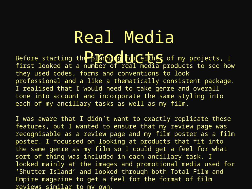
ResearchThe film I looked at quite a lot when trying to ensure my three projects were professional and consistent was ‘Shutter Island’, I felt that it had a similar ambiguous and dark storylineto my film that came across really well through the poster. Both poster and film are visually quite similar, from the film poster, we can easily interpret the genre. They both follow a similar colour scheme, which is a fairly saturated blue.
In my opinion the two worked well together as a combination of media products, they are styled appropriately and were successful at grabbing my attention. Therefore I decided to use the film when creating my ancillary tasks so that I could model my work on an existing set of products.
Before making my work look nice, I needed to make sure that it would look like existing review pages and posters. Otherwise, the combination of my film and ancillary tasks wouldn’t be as effective as I hoped because I wanted them to look professional.
For the film poster, I looked at the types of images used, the text, and the overall layout. This meant I then had to look for fonts that didn’t look word processed and I also had to take images that allowed me to remove the background and compile together into one image.
When looking through film review magazines, I was looking for what language was used in the text as well as the font, structure and images used. Once I’d done this I was able to create my own structure that readers would still be able to identify as a review format.
Form and Structure
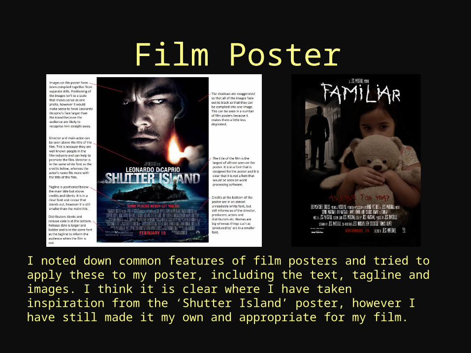
Film Poster
I noted down common features of film posters and tried to apply these to my poster, including the text, tagline and images. I think it is clear where I have taken inspiration from the ‘Shutter Island’ poster, however I have still made it my own and appropriate for my film.

Review PageAgain, with my review page it is clear where I have taken inspiration from both Total Film and Empire in terms of layout and font types. However I have made it my own with the suggested films column, the icon in the top left and a few other features such as the quotation.
I paid particular attention to the lines on my review page, the one down the left side and the one separating the review and fact file. I felt that this made my page look more professional and structured.
Images and TextThe types of images I used for each ancillary task were very different. For my review page I used stills from my film because I noticed that this was common in review magazines such as Total Film and Empire. I picked out what I thought was one of the best shots in the film and inserted it into the page. Whereas for my film poster, I staged and shot stills especially for the task. This gave me a chance to play with shutter speeds and positioning in order to edit the photos into one compiled image.
The text that I used for each ancillary task also differed quite a lot. The text on my review was very descriptive and in word processed font. This was best suited to the nature of the media, which is to inform readers. Therefore, I think my choice of font and writing style was appropriate for my review page. For my poster, I had to find fonts to use online. I wanted it to look more like artwork than a few images and text compiled in a word document. Fonts can often be recognised and associated with certain films, so I wanted the title of my film to look unique. However, I followed conventions and put the credits in a narrow font, which made my poster recognisable as a poster.
Theme and Overall FeelI noted down common features of film posters and tried to apply these to my poster, including the text, tagline and images. I think it is clear where I have taken inspiration from the ‘Shutter Island’ poster, however I have still made it my own and appropriate for my film. I tried to stick to a colour scheme and keep the images that I used linked.
In each image I used either for the review page or poster, the young girl can be seen, her dress I felt was quite iconic and symbolic of her character which was a fundamental aspect to the film. I used this imagery to tie my three media products together.
I wanted the combination of my film and ancillary tasks to give off a dark and mysterious feel, only showing the villain in shadow or in quick shots. I also did this through the colour schemes and language used for the taglines. I feel that I have created a successful theme across my three products.
Existing Media Format vs. CreativityWhen looking at existing media formats, I was very conscious of how much I wanted to replicate the conventions that I identified. I didn’t want to lose the unique and creative aspect of my work. I noticed that most review pages had the same colour scheme, and film posters use the same font. I was a little wary of simply replicating these effects.
However some conventions exist for a reason. The narrow text on film posters for example allows the audience to identify the image as a poster, without this font my project may not look professional or realistic and considering the task was to make a film poster, obviously I wanted my work to look like one.
I decided to replicate the features that I identified to ensure my work looked as it was supposed to, however when it came to extra content, images and colour, I decided to use my own themes and ideas that fit well with my film and its genre. Therefore, my two ancillary tasks were effective and realistic but still built on the horror genre as a combination of products.
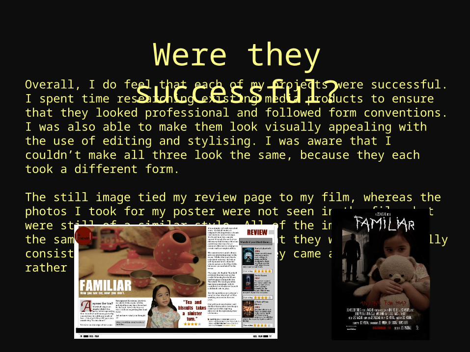
Were they successful?Overall, I do feel that each of my projects were successful. I spent time researching existing media products to ensure that they looked professional and followed form conventions. I was also able to make them look visually appealing with the use of editing and stylising. I was aware that I couldn’t make all three look the same, because they each took a different form.
The still image tied my review page to my film, whereas the photos I took for my poster were not seen in the film, but were still of a similar style. All of the images followed the same colour palette, meaning that they were thematically consistent and it was clear that they came as a package, rather than from different films.