Embed Size (px)
Citation preview
In what ways does your media product use, develop or challenge
forms and conventions of real media products?
Main task:
We had a strong idea of what we wanted for our main task, our music video, as soon as we listened to the song we were making it for. However to get the most authentic outcome possible we did research into existing music videos to understand the codes and conventions of this media product.
For this evaluation we have taken two example videos, one used in our research task and a new one, to show how our video conforms to the conventions found in the genre of music video we are chose to produce.
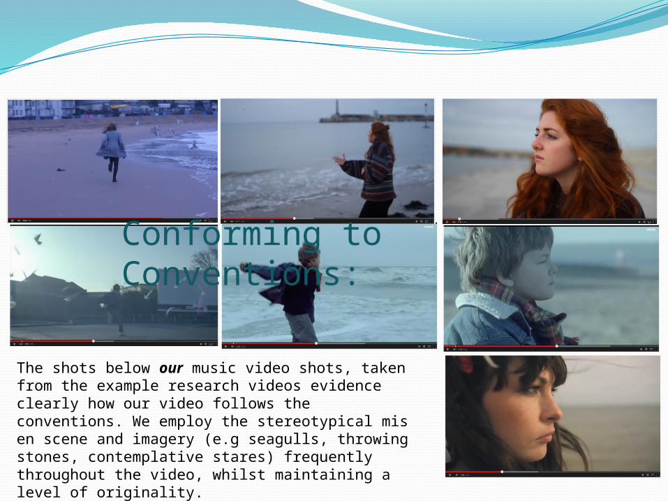
Conforming to Conventions:
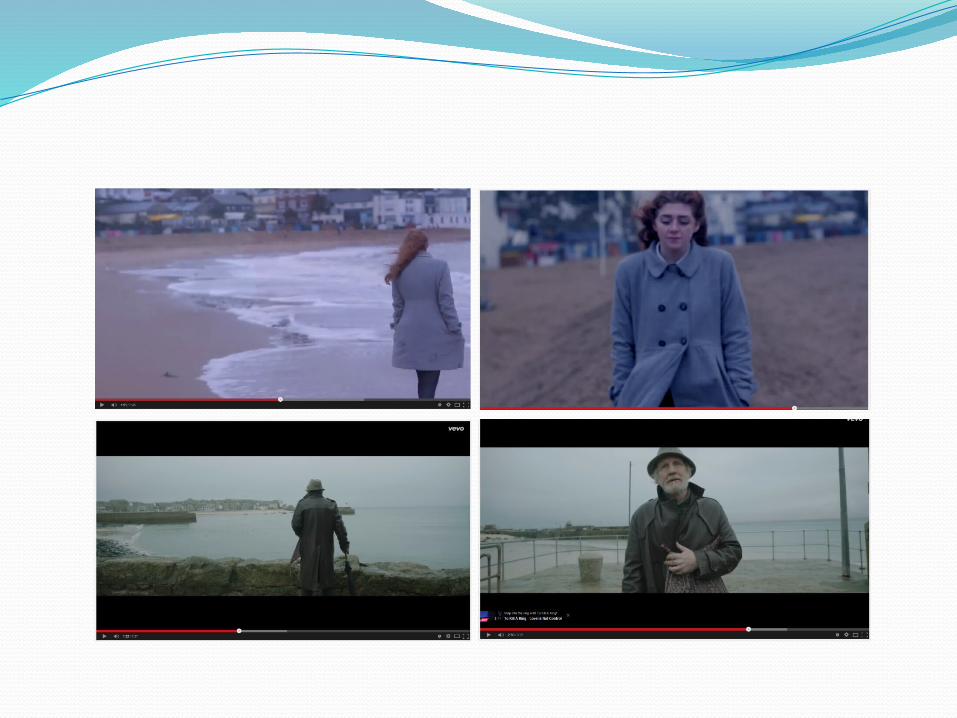
The shots below our music video shots, taken from the example research videos evidence clearly how our video follows the conventions. We employ the stereotypical mis en scene and imagery (e.g seagulls, throwing stones, contemplative stares) frequently throughout the video, whilst maintaining a level of originality.
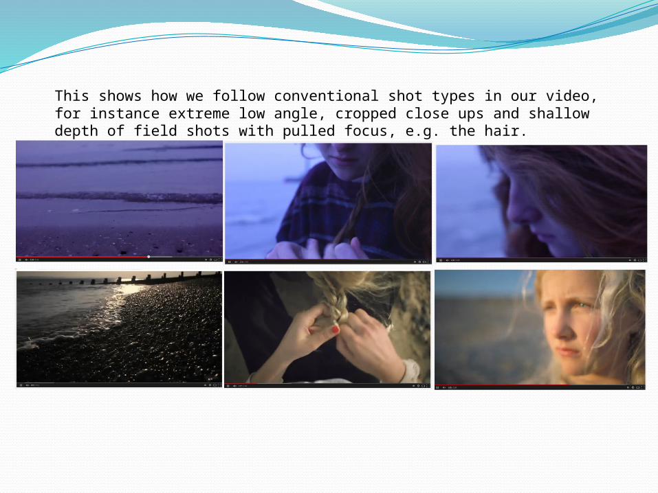
This shows how we follow conventional shot types in our video, for instance extreme low angle, cropped close ups and shallow depth of field shots with pulled focus, e.g. the hair.
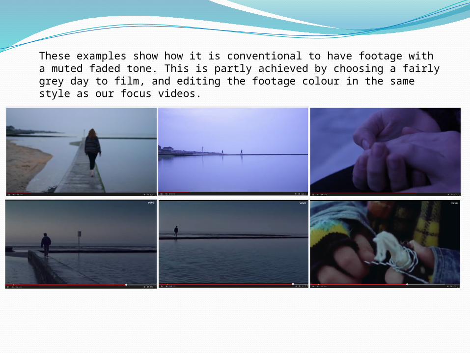
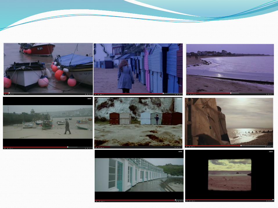
These examples show how it is conventional to have footage with a muted faded tone. This is partly achieved by choosing a fairly grey day to film, and editing the footage colour in the same style as our focus videos.
There isn’t much about our music video which sets it apart from the majority and makes it particularly unconventional within its genre.
Perhaps the artists not appearing in the video is challenging a convention, however in the Jamie T video, Jamie T doesn’t appear
in the video and uses a child protagonist instead so we can see this approach isn’t entirely unconventional.
This is what Sven E Carlsson categorises as conceptual videos: when the audience watch something other than the artist
throughout the video.
Challenging Conventions:
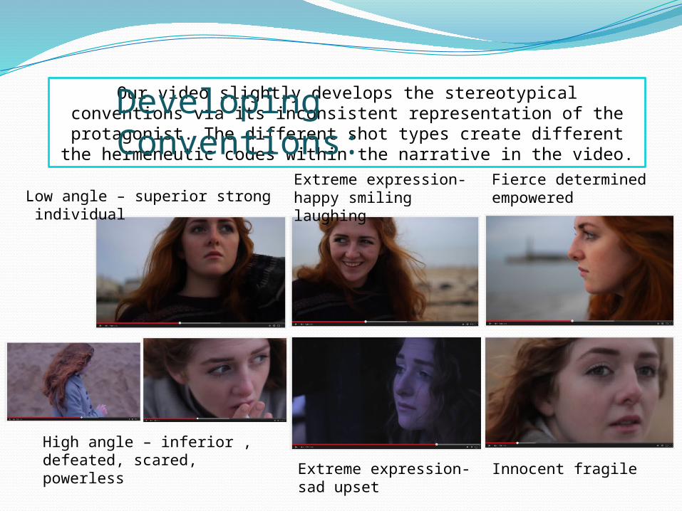
Our video slightly develops the stereotypical conventions via its inconsistent representation of the protagonist. The different shot
types create different the hermeneutic codes within the narrative in the video.
Developing Conventions:
Low angle – superior strong individual
High angle – inferior , defeated, scared, powerless
Extreme expression- happy smiling laughing
Extreme expression- sad upset
Fierce determined empowered
Innocent fragile
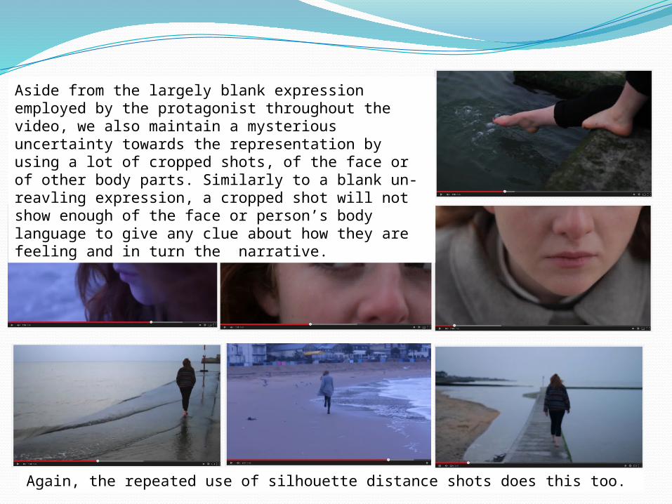
Aside from the largely blank expression employed by the protagonist throughout the video, we also maintain a mysterious uncertainty towards the representation by using a lot of cropped shots, of the face or of other body parts. Similarly to a blank un-reavling expression, a cropped shot will not show enough of the face or person’s body language to give any clue about how they are feeling and in turn the narrative.
Again, the repeated use of silhouette distance shots does this too.
• Lyrics establish a general feeling/mood/sense of subject rather than a meaning. Meaning is presented more through visuals.
YES ‘you hold this world in front of you in the palms of your left and right hands’ - video at this point films just her hand playing with the sand ‘She's just a little girl’ –video at this point is of protagonist running and chasing the seagulls in a very childlike manner
‘But…Lucy’s got the handles’ –video at this point catches protagonist (Lucy) smiling and laughing, the only shot like this of the whole video. The lyrics mean that Lucy has actually won in this situation, she has got hold of it, and so the shot reflects this momentary pleasure.
• Tempo of music drives the editing.
YES - our video predominantly has a slow and steady pace reflecting the tempo of the music especially the guitar, as well as the tone of the lyrics. However during the bridge in the song about midway through, we speed up our editing dramatically and noticeably to match the tempo of the song which effective and conventional.
• Genre might be reflected in types of mise-en-scene, themes, performance, camera and editing styles.
YES -as shown and explained previously in the selection of screen shots and annotations, the location of the beach (mise-en-scene), the understated acting of the protagonist (no performance, pretending to be filmed candidly), the camera shot types used (mimicked from focus videos) and the faded and steady editing style, all work to together to reflect the chosen indie alternative genre.
• Camerawork impacts meaning. Movement, angle and shot distance all play a part in the representation of the artist/band (close-ups dominate).
YES - the range of shots used signify the ambivalence in the representation of the protagonist, rather than the artist. For instance the high angle shots imply her has the small, vulnerable, feeble, upset victim, whereas the low angle shots suggest her as the empowered, liberated strong female. The long distance and silhouette shots again suggest her as small, insignificant, voiceless, unimportant and without identity or feelings; just a body/person in the distance.
General Theory:
• Editing is done in fast cuts, rendering many of the images impossible to grasp on first viewing, so ensuring multiple viewing.
NO – our editing is done in slow cuts to match the tempo of our music. Therefore it is possible to grasp a lot of the images upon first viewing, despite them not being repeated throughout the video. However what ensures multiple viewing in our case is the ambiguity present in the video. The narrative is largely subjective and the blank expression of the protagonist allows the audience to make their own minds up, form a negotiated reading and use their imagination. The audience might not initially be aware of this however and so feel the need to watch the video multiple times to grasp the narrative, before confirming their own reading.
• Digital effects often enhance editing, which manipulates the original images to offer different kinds of pleasure for the audience.
NO –We kept our video natural looking with minimal enhancing and no fancy or creative editing techniques or effects
• Intertextuality is often present. NO – no intertextuality present in our video, making it unconventional according to General Theory
• Exhibitionism is the psychological need and pattern of behaviour involving the exposure of parts of the body to another person with a tendency toward an extravagant, usually at least partially
sexually inspired behaviour to attract the attention of another in an open display.
The apparently more powerful independent female artists of recent years have added to the complexity of the politics of looking and gender/cultural debates, by being at once sexually
provocative and apparently in control of, and inviting, a sexualized gaze.
NO -unconventionally in videos featuring a sole female figure, the video does not sexualise the protagonist or use exhibitionism whatsoever
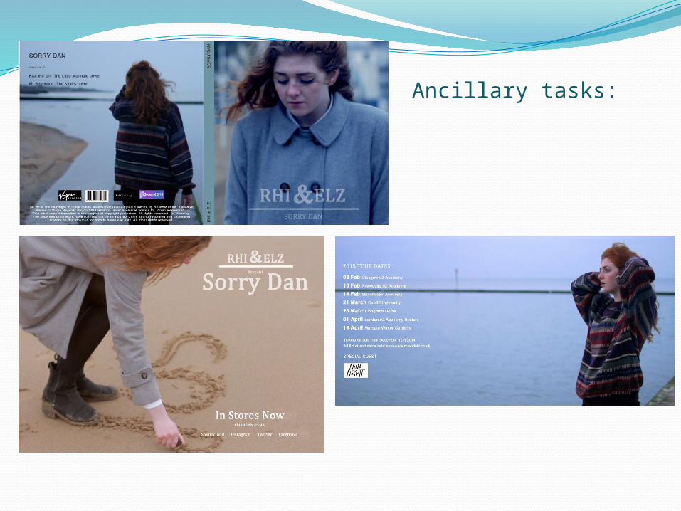
Ancillary tasks:
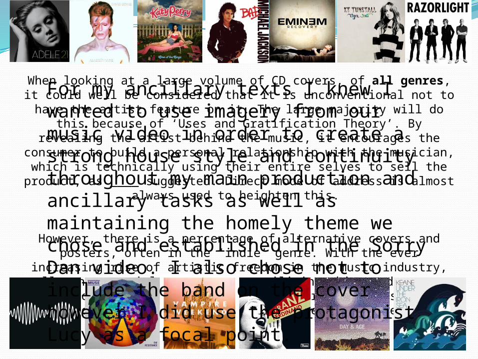
When looking at a large volume of CD covers, of all genres, it could well be considered that it is unconventional not to have the artist feature on it. The large majority will do this because of ‘Uses and Gratification Theory’. By revealing the artist behind the music, it
encourages the consumer to build a personal relationship with the musician, which is technically using their entire selves to sell the
product, as ____ suggested. Direct mode of address is almost always used to heighten this.
However, there is a percentage of alternative covers and posters, often in the ‘indie’ genre. With the ever increasing rise of artistic freedom in the music industry, all consequential products are utilising this, and we
are seeing more and more ‘unconventional’ forms, perhaps causing them now to simply be a different convention rather than
unconventional.
For my ancillary texts I knew I wanted to use imagery from our music video in order to create a strong house style and continuity throughout my main production and ancillary tasks as well as maintaining the homely theme we chose and established in the Sorry Dan video. I also chose not to include the band on the cover however I did use the protagonist Lucy as a focal point.
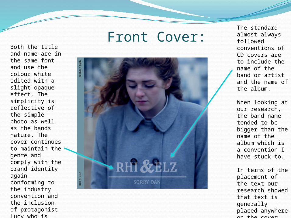
Front Cover:The standard almost always followed conventions of CD covers are to include the name of the band or artist and the name of the album.
When looking at our research, the band name tended to be bigger than the name of the album which is a convention I have stuck to.
In terms of the placement of the text our research showed that text is generally placed anywhere on the cover therefore showing now explicit conventional guidelines.
Both the title and name are in the same font and use the colour white edited with a slight opaque effect. The simplicity is reflective of the simple photo as well as the bands nature. The cover continues to maintain the genre and comply with the brand identity again conforming to the industry convention and the inclusion of protagonist Lucy who is featured solely in the video creates a recognisable brand identity.
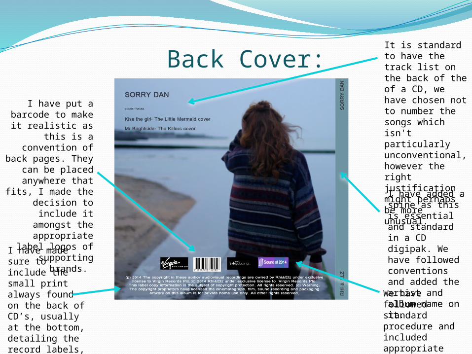
It is standard to have the track list on the back of the of a CD, we have chosen not to number the songs which isn't particularly unconventional, however the right justification might perhaps be more unusual.
I have put a barcode to make it realistic as this is a convention of back
pages. They can be placed
anywhere that fits, I made the
decision to include it amongst the
appropriate label logos of supporting
brands.
I have added a spine as this is essential and standard in a CD digipak. We have followed conventions and added the artist and album name on it.
I have made sure to include the small print always found on the back of CD’s, usually at the bottom, detailing the record labels, copyrights and liscenes etc.
Back Cover:
We have followed standard procedure and included appropriate label logos.
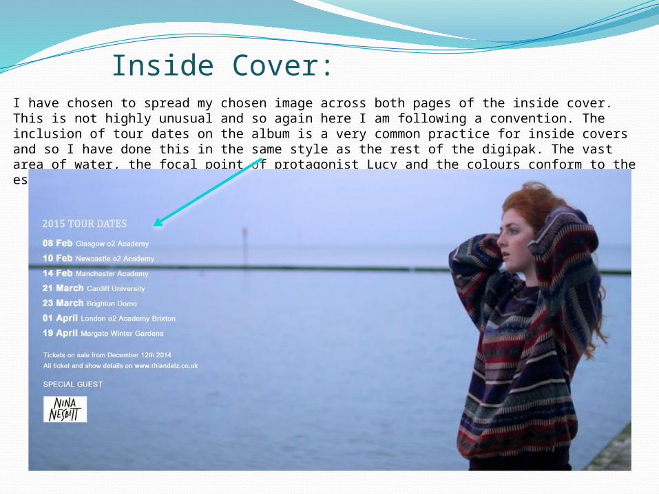
Inside Cover:I have chosen to spread my chosen image across both pages of the inside cover. This is not highly unusual and so again here I am following a convention. The inclusion of tour dates on the album is a very common practice for inside covers and so I have done this in the same style as the rest of the digipak. The vast area of water, the focal point of protagonist Lucy and the colours conform to the established genre and brand identity which is conventional.
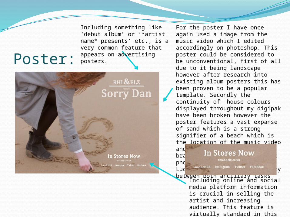
Poster:
Including something like ‘debut album’ or ‘*artist name* presents’ etc., is a very common feature that appears on advertising posters.
Including online and social media platform information is crucial in selling the artist and increasing audience. This feature is virtually standard in this digital age.
For the poster I have once again used a image from the music video which I edited accordingly on photoshop. This poster could be considered to be unconventional, first of all due to it being landscape however after research into existing album posters this has been proven to be a popular template. Secondly the continuity of house colours displayed throughout my digipak have been broken however the poster features a vast expanse of sand which is a strong signifier of a beach which is the location of the music video and a substantial part of the brand identity. Once again the photograph purposely includes Lucy to maintain the continuity between both ancillary tasks