Embed Size (px)
Citation preview
Album Advertisement Scott Galloway
Explanation
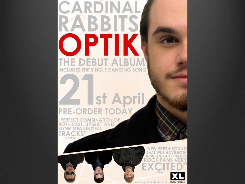
Here is the final, electronic album advertisement that I have adapted. Some feedback we were given after our first draft were relating to who was saying the quotes that were placed on our advertisement, what record label were the band signed to as well as why did we choose the different elements of our advertisement relating to our target audience and genre.
Quotes
We came up with realistic and believable quotes that had been said about the band. Also we worded them to highlight that is was the bands debut album and that they were fresh on the scene.
Also, by referencing that the quotes were said by two different music magazines, Mojo and The Wire. This makes the advert seem real and more believable.
We chose to do this as it is a common convention for advertisements to have positive quotes on them from different magazines or figures within the music industry. We also chose the magazine ‘The Wire’ as it is more of an independent magazine which writes about alternative and indie music which suits the genre of our band. This can also attract the target audience because if the read ‘The Wire’ magazine, they are likely to listen to alternative and indie music, therefore by seeing the quote on the bands advertisement said by the magazine, audiences are more likely to search the band and listen to their music.
Record Label
XL Recordings is an independent, British recording company. Founded in 1989, it first produced more dance and rave music by artists such as The Prodigy. As time progressed, the record label started to sign more independent bands and artists such as Vampire Weekend.
We feel that due to the range of the different genes that the label produces, such as independent, is a good staring point for our band. The use of the large varieties of genres from the label means that the label has a lot of listeners, meaning the band will get a lot of promotion and recognition.
Text Sizes
We decided to included different sizes of text throughout the advertisement to separate the text, make it interesting to read and eye catching towards the audience.
The text is split up into sections. The main information, such as the album name, artist name and release date, is very largely placed at the top of the advertisement to catch the audiences attention and attract them to the advert.
The quotes and information about what the album contains is a bit smaller, but it interreges the audience and makes them want to read more of the advert and what the critics say about the bands new album. This is also seen as a common convention within album advertisement.
Fragmentation Theme
We have also decided to continue to theme of fragmentation which ran throughout our album cover onto our album advertisement. We have done this as it will make the advertisement recognizable for the audience. The consumers can identify the same theme throughout the two forms of media and will make the link that they are both advertising the same band.
Also, if some people see the advertisement in the high street or in different shops, the unique theme on the advertisement will imprint in their mind. Once finding the album, they will realize what band it is and what album as the design is unique to the band and album itself.
We have done this as we found different albums in the same genre of music also have unique and unusual album covers that are eye catching and interesting to look at. Therefore we feel that our target audience would be attracted by our advertisement due to the interesting and technical design which is unique to the band.