Embed Size (px)
Citation preview
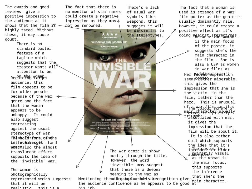
The fact that a woman is used is strange of a war film poster as the genre is usually dominantly male. However, it could create a positive effect as it’s going against stereotypes.
Her facial expression seems rather miserable, this gives the impression that she is the victim in the film, rather than the hero. This is unusual of a war film, as the main character usually triumphs.
The colour scheme of green is typically associated with war, it gives the impression that the film will be about it. It is also rather dull which supports the idea that it’s intended for older audiences.
The war genre is shown mostly through the title. However, the word ‘invisible’ may suggest that there is a deeper meaning to the war as most people know it.
The bold font of the title makes it stand out, also the almost translucent effect supports the idea of the ‘invisible’ war.
Regarding target audience, this film appears to be for older people because of the war genre and the fact that the woman appears to be unhappy. It could also suggest contrasting against the usual stereotype of war films for men, and in fact target women.
Because the woman is the main focus of the poster, it suggests she’s the main character in the film . She is also a USP as women in war films as soldiers aren’t common.
The poster is primarily visual as the woman is the main focus, this supports the inference that she’s the main character. The woman is photographically
represented which suggests that it will be realistic , this is a standard poster feature.
There is no standard poster feature of a tagline which suggests that the creator wants all attention to be on the woman.
The awards and good reviews give a positive impression to the audience as it shows that the film is highly rated. Without these, it may cause doubt.
The fact that there is no mention of star names could create a negative impression as they may not be renowned.
Mentioning the director and his recognition gives the audience confidence as he appears to be good at his job.
There’s a lack of usual war symbols like weapons, this suggests it will be dissimilar to the stereotypes.
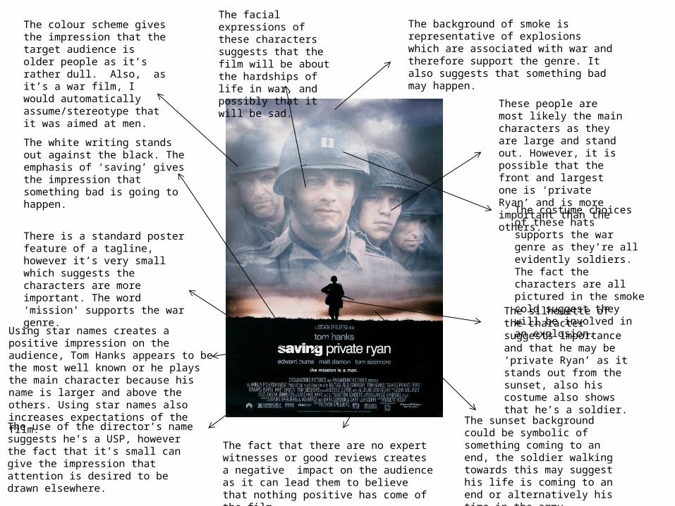
The background of smoke is representative of explosions which are associated with war and therefore support the genre. It also suggests that something bad may happen.
These people are most likely the main characters as they are large and stand out. However, it is possible that the front and largest one is ‘private Ryan’ and is more important than the others.
The costume choices of these hats supports the war genre as they’re all evidently soldiers. The fact the characters are all pictured in the smoke cold suggest they will be involved in an explosion.
The silhouette of the character suggests importance and that he may be ‘private Ryan’ as it stands out from the sunset, also his costume also shows that he’s a soldier.
The sunset background could be symbolic of something coming to an end, the soldier walking towards this may suggest his life is coming to an end or alternatively his time in the army.
The use of the director’s name suggests he’s a USP, however the fact that it’s small can give the impression that attention is desired to be drawn elsewhere.
Using star names creates a positive impression on the audience, Tom Hanks appears to be the most well known or he plays the main character because his name is larger and above the others. Using star names also increases expectations of the film.
There is a standard poster feature of a tagline, however it’s very small which suggests the characters are more important. The word ‘mission’ supports the war genre.
The white writing stands out against the black. The emphasis of ‘saving’ gives the impression that something bad is going to happen.
The colour scheme gives the impression that the target audience is older people as it’s rather dull. Also, as it’s a war film, I would automatically assume/stereotype that it was aimed at men.
The facial expressions of these characters suggests that the film will be about the hardships of life in war, and possibly that it will be sad.
The fact that there are no expert witnesses or good reviews creates a negative impact on the audience as it can lead them to believe that nothing positive has come of the film.
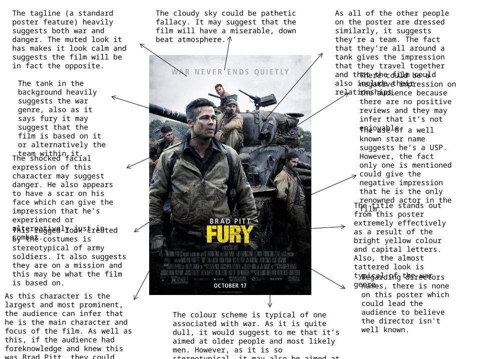
The title stands out from this poster extremely effectively as a result of the bright yellow colour and capital letters. Also, the almost tattered look is typical of the war genre.
The use of a well known star name suggests he’s a USP. However, the fact only one is mentioned could give the negative impression that he is the only renowned actor in the film.
Regarding directors names, there is none on this poster which could lead the audience to believe the director isn't well known. The colour scheme is typical of one associated with war.
As it is quite dull, it would suggest to me that it’s aimed at older people and most likely men. However, as it is so stereotypical, it may also be aimed at younger boys.
As this character is the largest and most prominent, the audience can infer that he is the main character and focus of the film. As well as this, if the audience had foreknowledge and knew this was Brad Pitt, they could infer he is the main character because he’s so well known.
This rugged look created by the costumes is stereotypical of army soldiers. It also suggests they are on a mission and this may be what the film is based on.
The shocked facial expression of this character may suggest danger. He also appears to have a scar on his face which can give the impression that he’s experienced or alternatively just in combat.
The tank in the background heavily suggests the war genre, also as it says fury it may suggest that the film is based on it or alternatively the team within it.
The tagline (a standard poster feature) heavily suggests both war and danger. The muted look it has makes it look calm and suggests the film will be in fact the opposite.
The cloudy sky could be pathetic fallacy. It may suggest that the film will have a miserable, down beat atmosphere.
As all of the other people on the poster are dressed similarly, it suggests they’re a team. The fact that they’re all around a tank gives the impression that they travel together and that the film could also include their relationships.
There could be a negative impression on the audience because there are no positive reviews and they may infer that it’s not enjoyable.