Embed Size (px)
Citation preview
Campaign Poster ideas
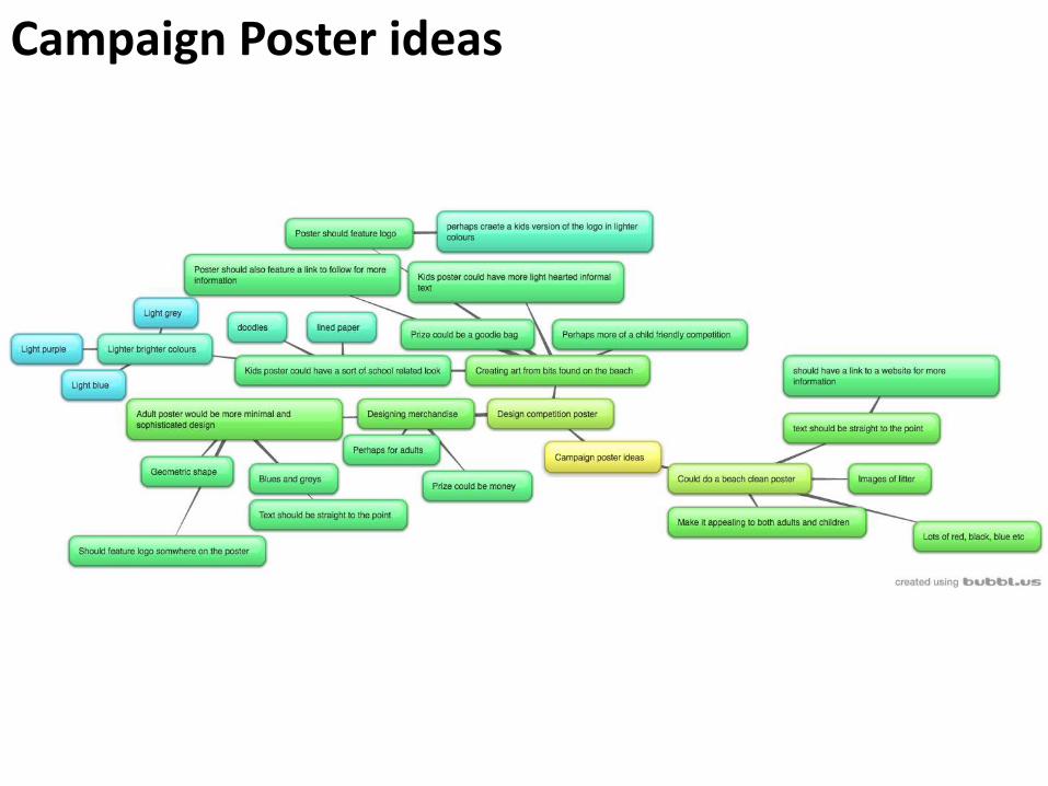
Adult Design Competition PosterPotential colourscheme
Could hold text in the centre of the poster
Use these types of images for background. Could make a pattern inspired by these shapes
Potential font. Would work for a small amount of bold text
Text wouldn’t be obvious with this font, though could inspire some of the shapes I use
Font for larger amounts of text
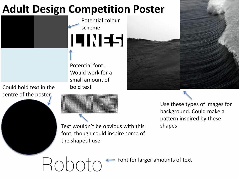
Kids Design Competition Poster
Potential colourschemes
2 potential fonts for small amounts of text
Potential imagery
Potential font for larger amounts of text
Use lined paper for the background
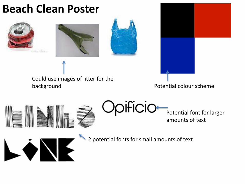
Beach Clean Poster
Could use images of litter for the background
2 potential fonts for small amounts of text
Potential colour scheme
Potential font for larger amounts of text
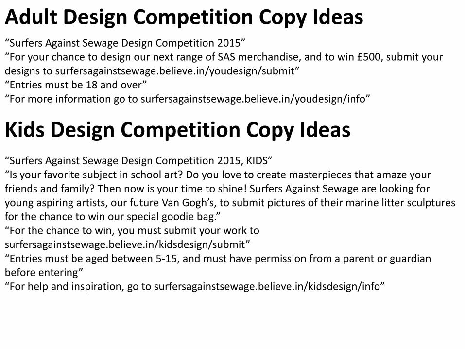
Adult Design Competition Copy Ideas “Surfers Against Sewage Design Competition 2015”“For your chance to design our next range of SAS merchandise, and to win £500, submit your designs to surfersagainstsewage.believe.in/youdesign/submit”“Entries must be 18 and over”“For more information go to surfersagainstsewage.believe.in/youdesign/info”
Kids Design Competition Copy Ideas“Surfers Against Sewage Design Competition 2015, KIDS”“Is your favorite subject in school art? Do you love to create masterpieces that amaze your friends and family? Then now is your time to shine! Surfers Against Sewage are looking for young aspiring artists, our future Van Gogh’s, to submit pictures of their marine litter sculptures for the chance to win our special goodie bag.”“For the chance to win, you must submit your work to surfersagainstsewage.believe.in/kidsdesign/submit”“Entries must be aged between 5-15, and must have permission from a parent or guardian before entering”“For help and inspiration, go to surfersagainstsewage.believe.in/kidsdesign/info”
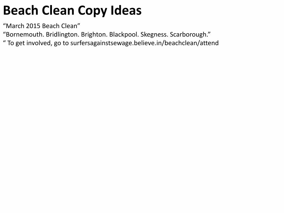
Beach Clean Copy Ideas“March 2015 Beach Clean”“Bornemouth. Bridlington. Brighton. Blackpool. Skegness. Scarborough.”“ To get involved, go to surfersagainstsewage.believe.in/beachclean/attend
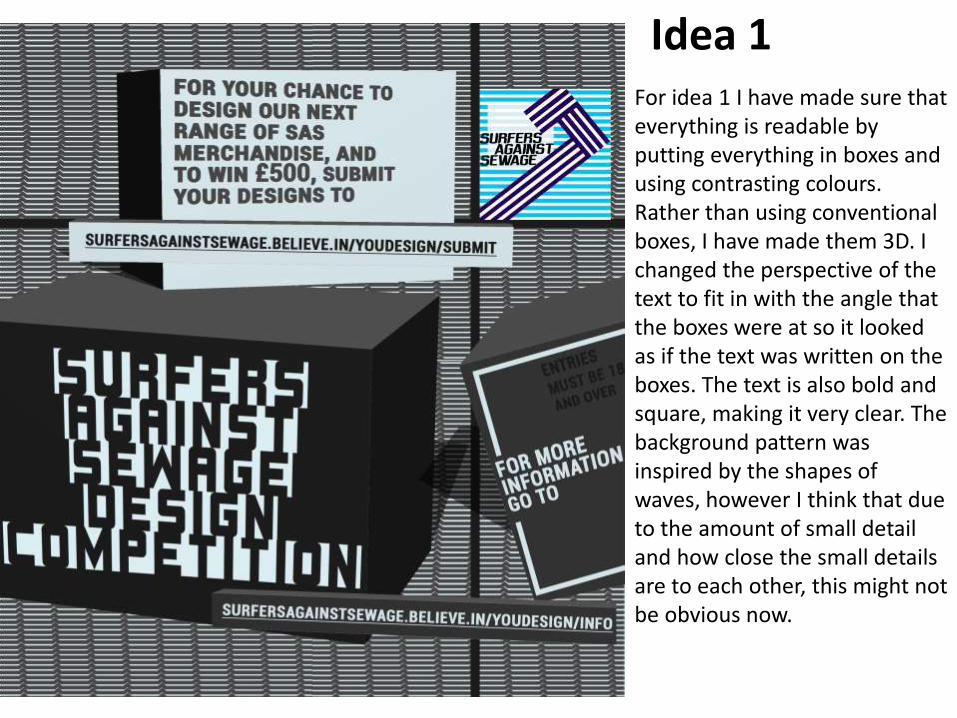
Idea 1For idea 1 I have made sure that everything is readable by putting everything in boxes and using contrasting colours. Rather than using conventional boxes, I have made them 3D. I changed the perspective of the text to fit in with the angle that the boxes were at so it looked as if the text was written on the boxes. The text is also bold and square, making it very clear. The background pattern was inspired by the shapes of waves, however I think that due to the amount of small detail and how close the small details are to each other, this might not be obvious now.
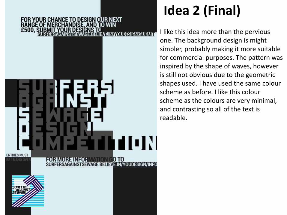
Idea 2 (Final)
I like this idea more than the pervious one. The background design is might simpler, probably making it more suitable for commercial purposes. The pattern was inspired by the shape of waves, however is still not obvious due to the geometric shapes used. I have used the same colourscheme as before. I like this colourscheme as the colours are very minimal, and contrasting so all of the text is readable.
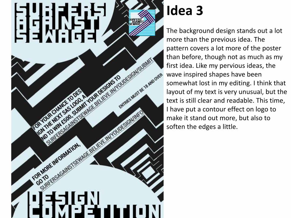
Idea 3The background design stands out a lot more than the previous idea. The pattern covers a lot more of the poster than before, though not as much as my first idea. Like my pervious ideas, the wave inspired shapes have been somewhat lost in my editing. I think that layout of my text is very unusual, but the text is still clear and readable. This time, I have put a contour effect on logo to make it stand out more, but also to soften the edges a little.
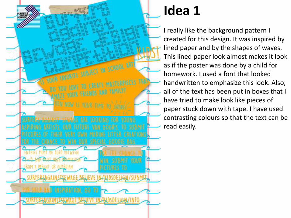
Idea 1I really like the background pattern I created for this design. It was inspired by lined paper and by the shapes of waves. This lined paper look almost makes it look as if the poster was done by a child for homework. I used a font that looked handwritten to emphasize this look. Also, all of the text has been put in boxes that I have tried to make look like pieces of paper stuck down with tape. I have used contrasting colours so that the text can be read easily.
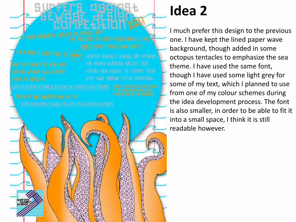
Idea 2I much prefer this design to the previous one. I have kept the lined paper wave background, though added in some octopus tentacles to emphasize the sea theme. I have used the same font, though I have used some light grey for some of my text, which I planned to use from one of my colour schemes during the idea development process. The font is also smaller, in order to be able to fit it into a small space, I think it is still readable however.
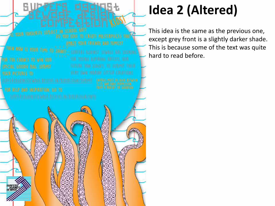
This idea is the same as the previous one, except grey front is a slightly darker shade. This is because some of the text was quite hard to read before.
Idea 2 (Altered)


![Media campaign ideas[1]](https://img.pdfslide.net/doc/110x75/548d1dd8b4795945138b4f08/media-campaign-ideas1.jpg)