Embed Size (px)
Citation preview
Olivia Cotterell
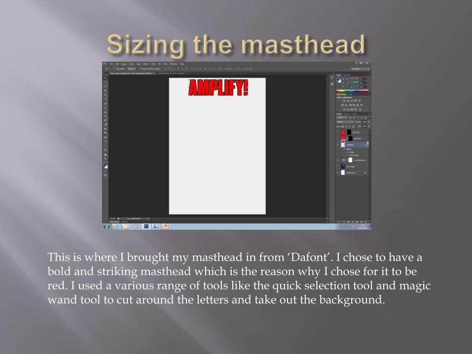
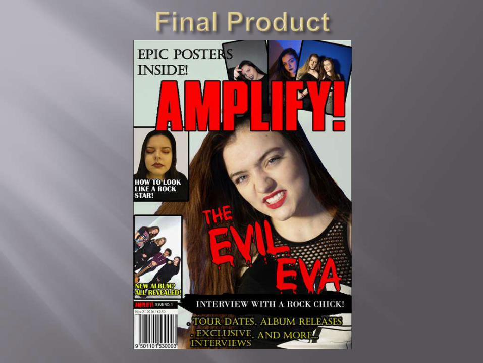
This is where I brought my masthead in from ‘Dafont’. I chose to have a bold and striking masthead which is the reason why I chose for it to be red. I used a various range of tools like the quick selection tool and magic wand tool to cut around the letters and take out the background.
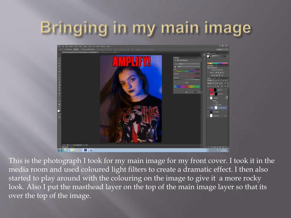
This is the photograph I took for my main image for my front cover. I took it in the media room and used coloured light filters to create a dramatic effect. I then also started to play around with the colouring on the image to give it a more rocky look. Also I put the masthead layer on the top of the main image layer so that its over the top of the image.
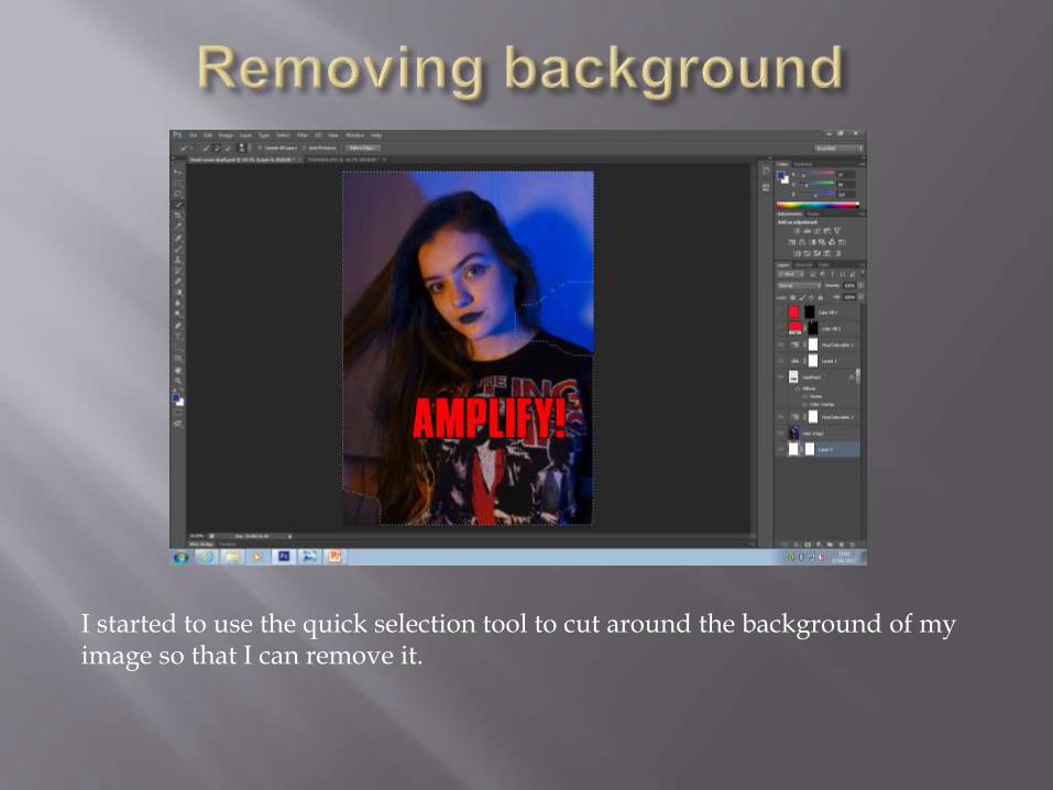
I started to use the quick selection tool to cut around the background of my image so that I can remove it.
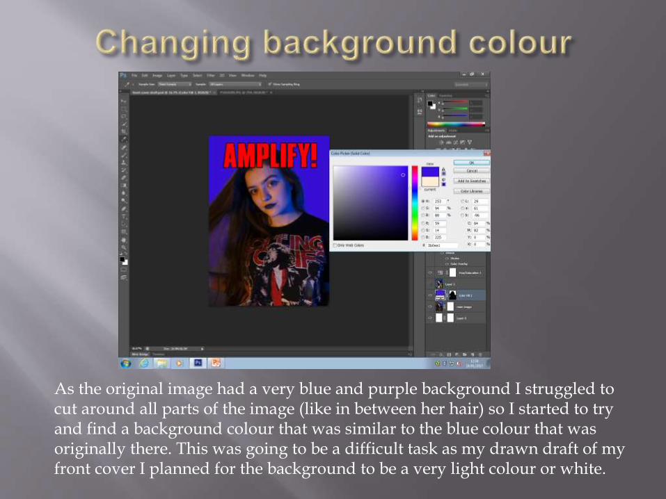
As the original image had a very blue and purple background I struggled to cut around all parts of the image (like in between her hair) so I started to try and find a background colour that was similar to the blue colour that was originally there. This was going to be a difficult task as my drawn draft of my front cover I planned for the background to be a very light colour or white.
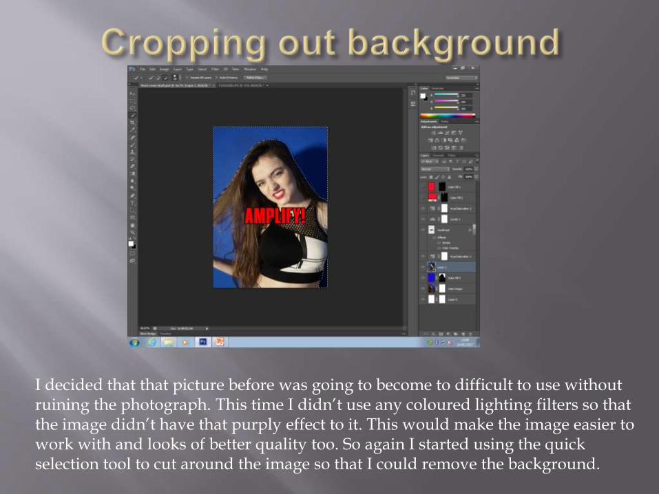
I decided that that picture before was going to become to difficult to use without ruining the photograph. This time I didn’t use any coloured lighting filters so that the image didn’t have that purply effect to it. This would make the image easier to work with and looks of better quality too. So again I started using the quick selection tool to cut around the image so that I could remove the background.
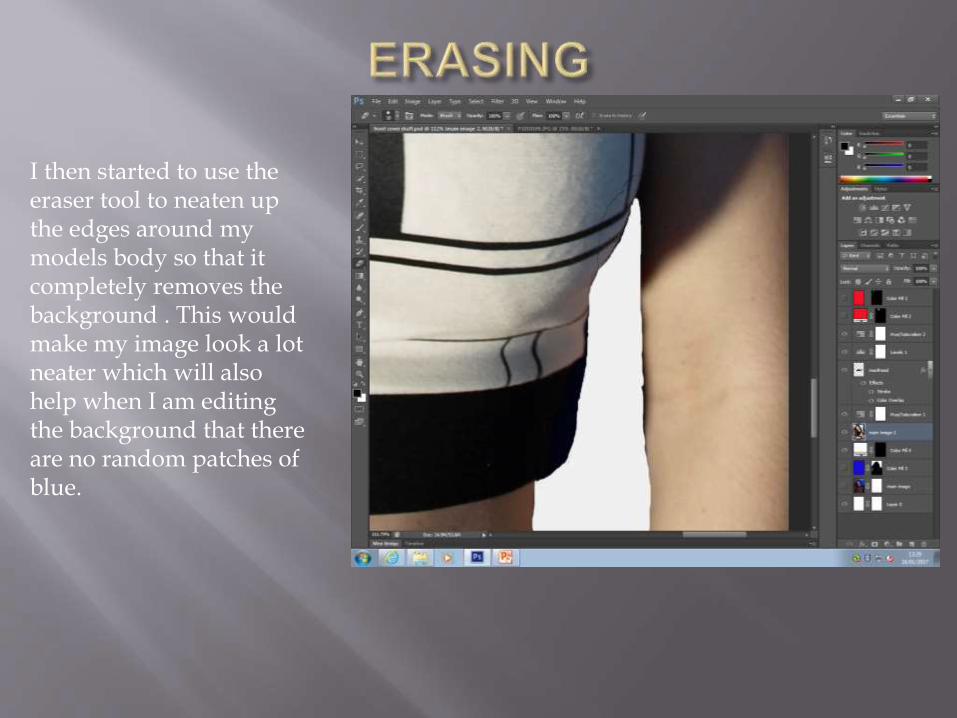
I then started to use the eraser tool to neaten up the edges around my models body so that it completely removes the background . This would make my image look a lot neater which will also help when I am editing the background that there are no random patches of blue.
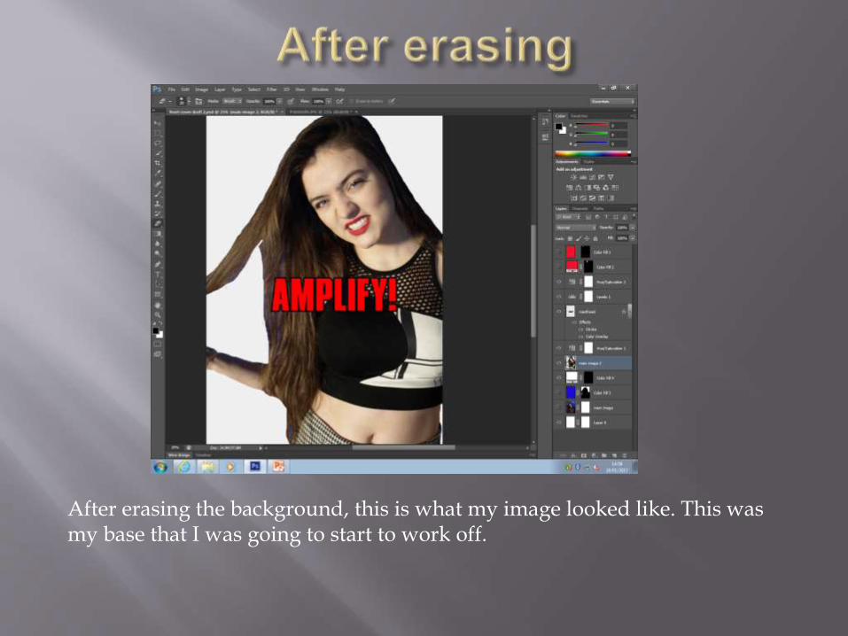
After erasing the background, this is what my image looked like. This was my base that I was going to start to work off.
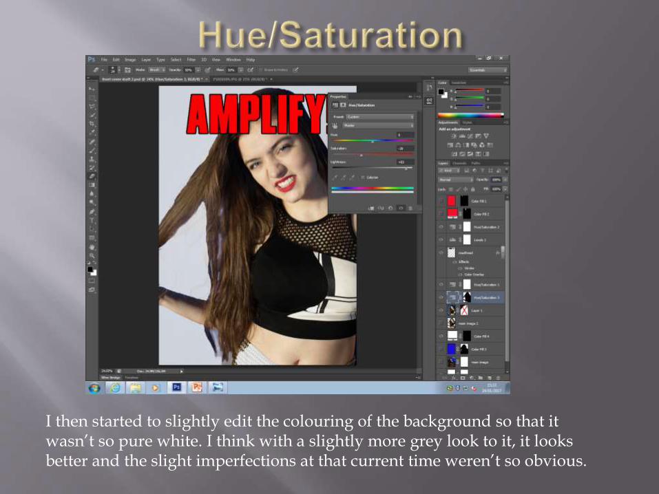
I then started to slightly edit the colouring of the background so that it wasn’t so pure white. I think with a slightly more grey look to it, it looks better and the slight imperfections at that current time weren’t so obvious.
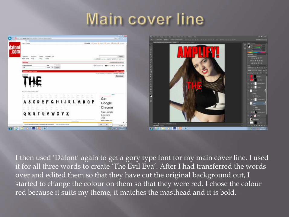
I then used ‘Dafont’ again to get a gory type font for my main cover line. I used it for all three words to create ‘The Evil Eva’. After I had transferred the words over and edited them so that they have cut the original background out, I started to change the colour on them so that they were red. I chose the colour red because it suits my theme, it matches the masthead and it is bold.
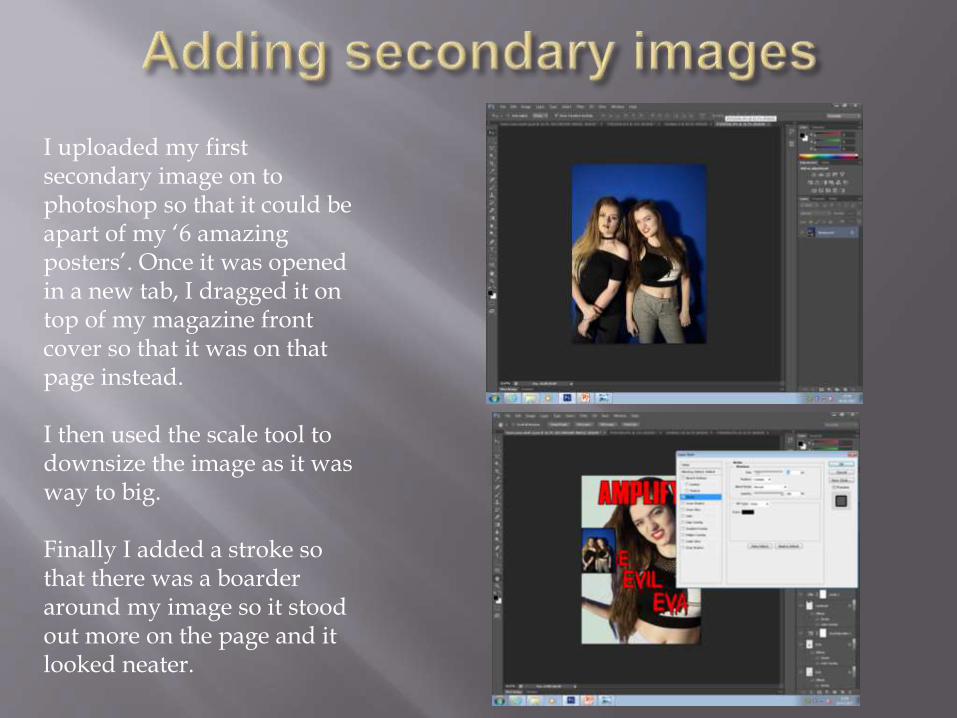
I uploaded my first secondary image on to photoshop so that it could be apart of my ‘6 amazing posters’. Once it was opened in a new tab, I dragged it on top of my magazine front cover so that it was on that page instead.
I then used the scale tool to downsize the image as it was way to big.
Finally I added a stroke so that there was a boarder around my image so it stood out more on the page and it looked neater.
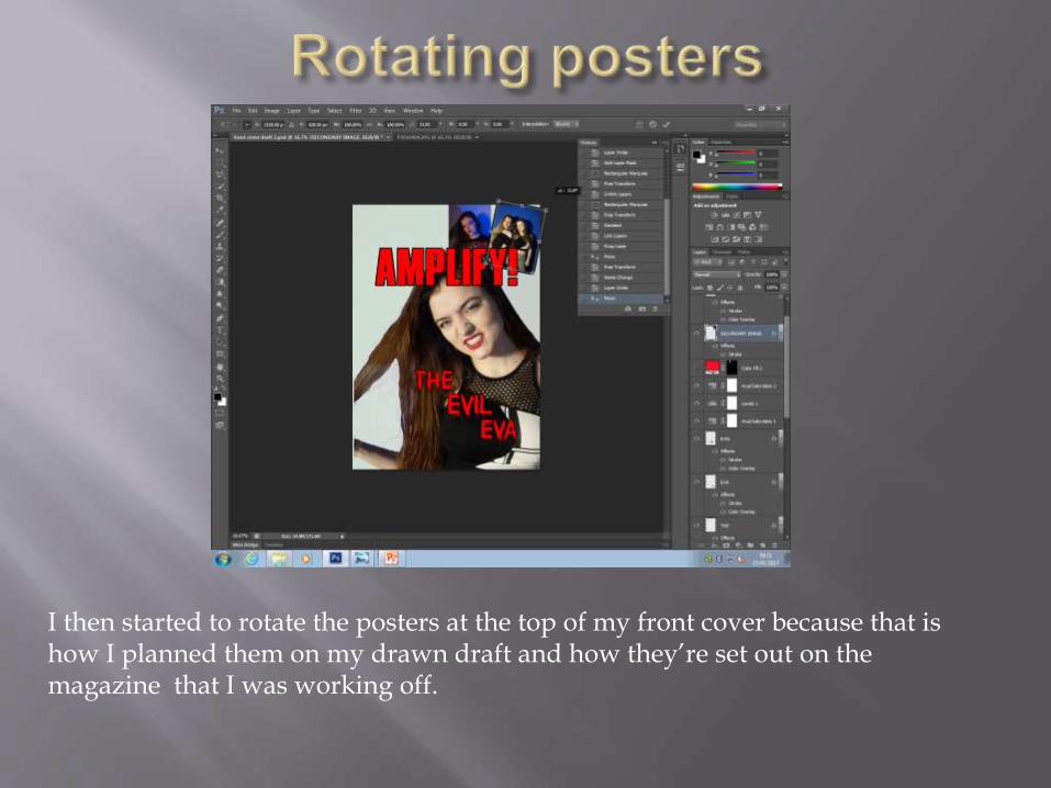
I then started to rotate the posters at the top of my front cover because that is how I planned them on my drawn draft and how they’re set out on the magazine that I was working off.
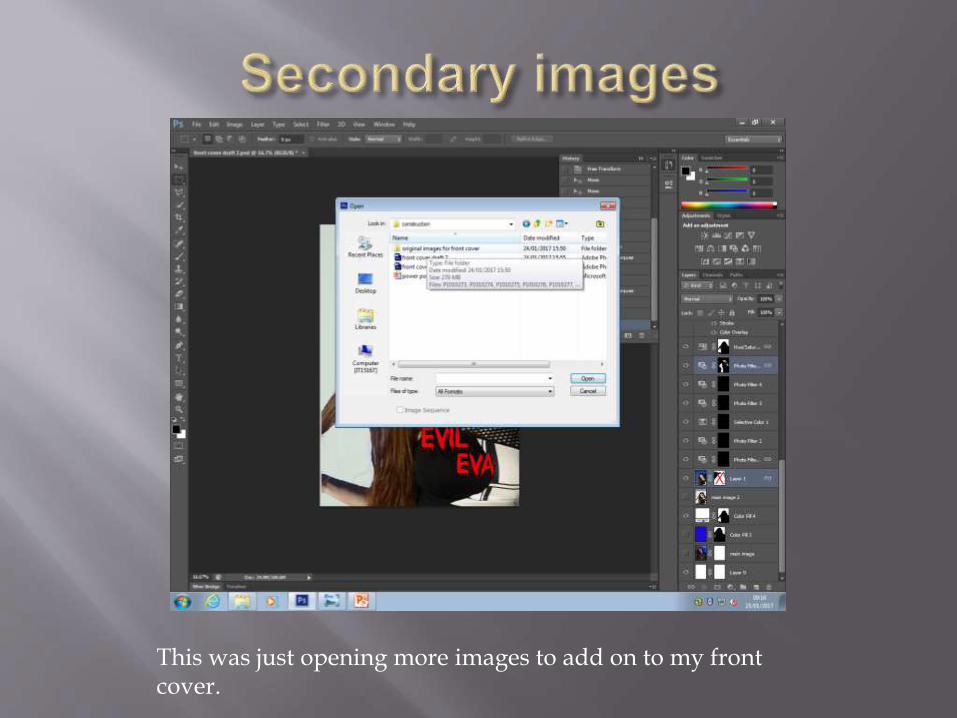
This was just opening more images to add on to my front cover.
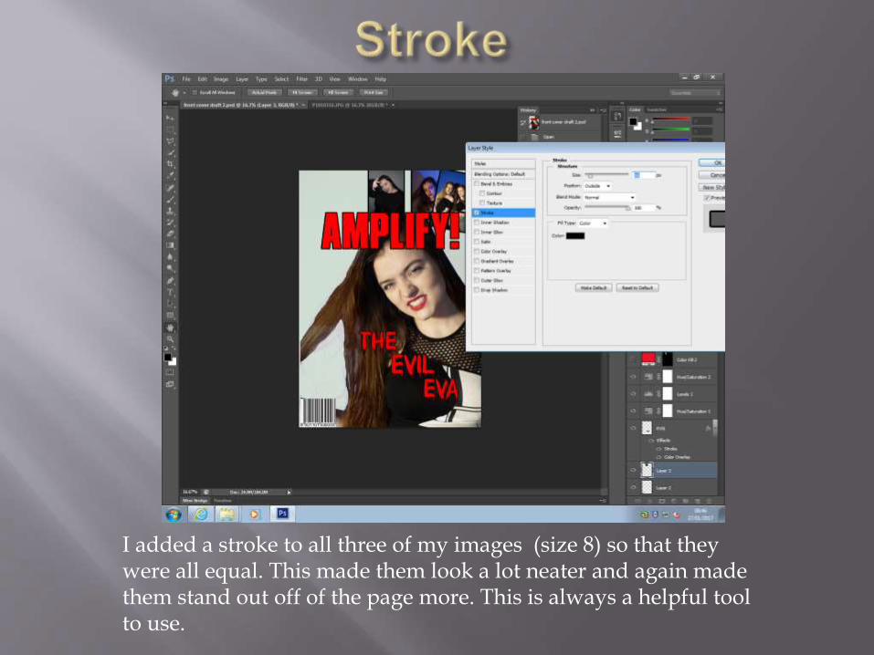
I added a stroke to all three of my images (size 8) so that they were all equal. This made them look a lot neater and again made them stand out off of the page more. This is always a helpful tool to use.
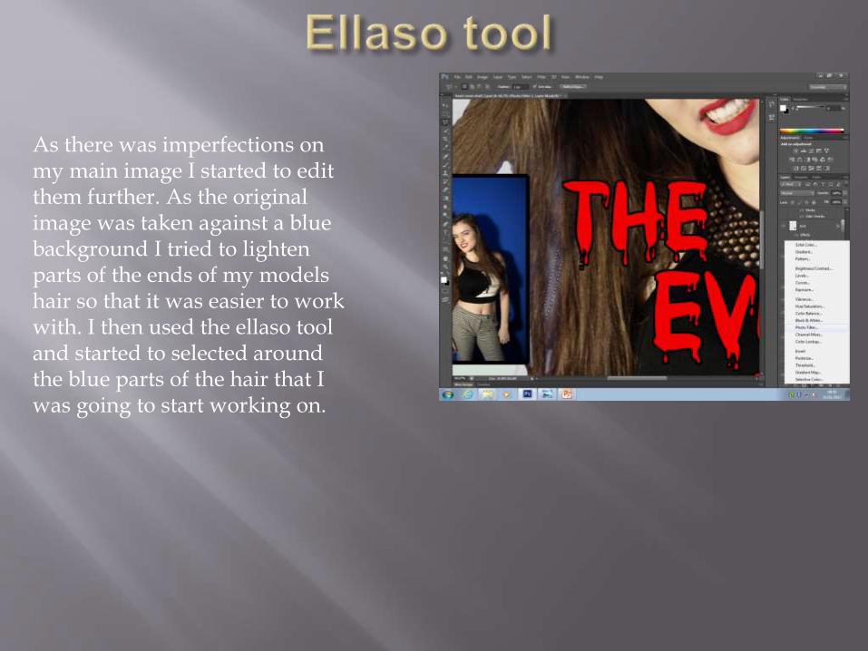
As there was imperfections on my main image I started to edit them further. As the original image was taken against a blue background I tried to lighten parts of the ends of my models hair so that it was easier to work with. I then used the ellaso tool and started to selected around the blue parts of the hair that I was going to start working on.
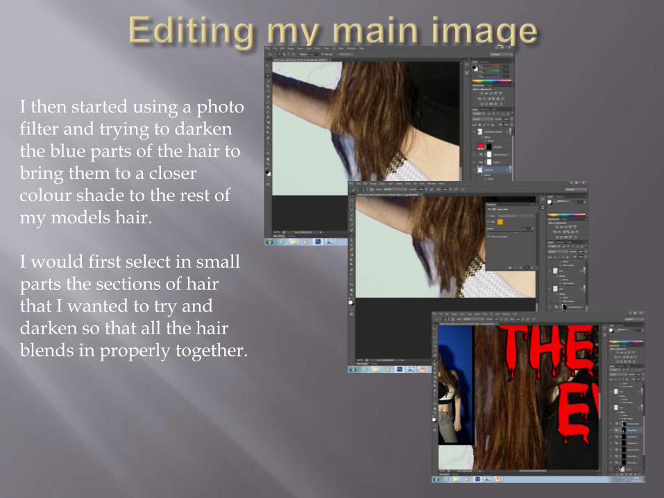
I then started using a photo filter and trying to darken the blue parts of the hair to bring them to a closer colour shade to the rest of my models hair.
I would first select in small parts the sections of hair that I wanted to try and darken so that all the hair blends in properly together.
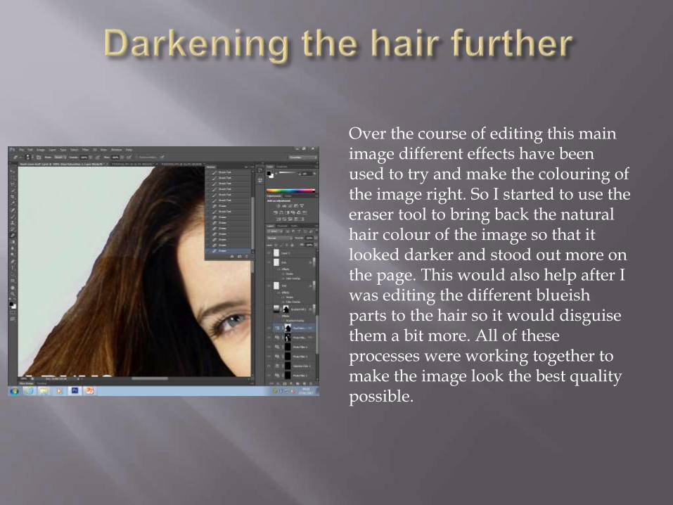
Over the course of editing this main image different effects have been used to try and make the colouring of the image right. So I started to use the eraser tool to bring back the natural hair colour of the image so that it looked darker and stood out more on the page. This would also help after I was editing the different blueish parts to the hair so it would disguise them a bit more. All of these processes were working together to make the image look the best quality possible.

I first opened my image on to Photoshop into a different tab to work on. I started to first edit the colouring of the image with the hue/saturation tool because the image looked quite yellowish.
I wanted to change the colouring on the image as I wanted the dark red make-up to stand out more off of her face.
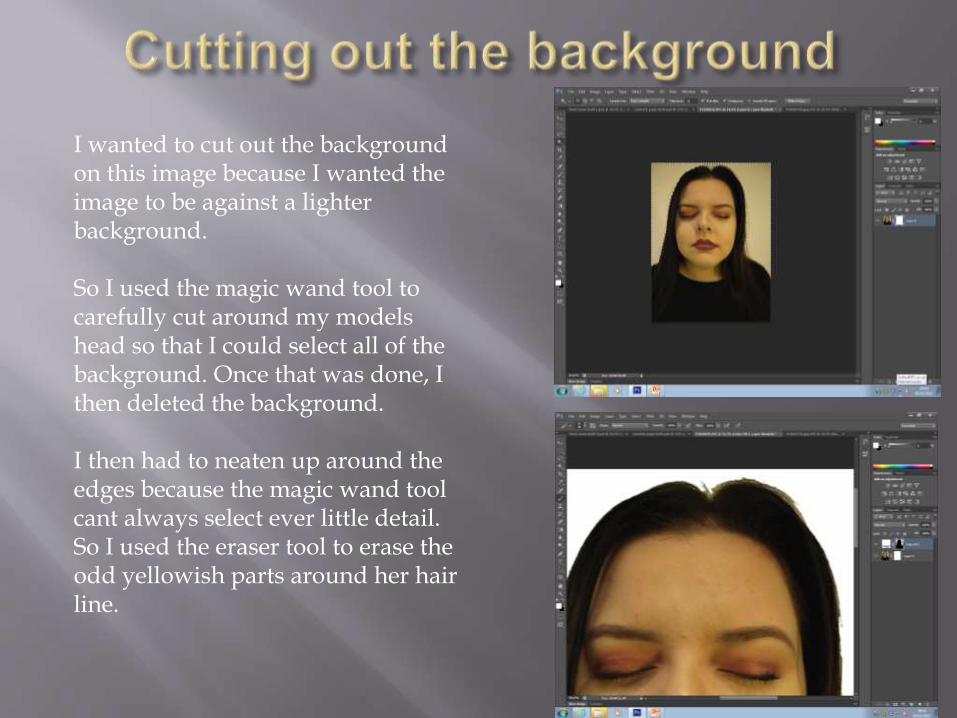
I wanted to cut out the background on this image because I wanted the image to be against a lighter background.
So I used the magic wand tool to carefully cut around my models head so that I could select all of the background. Once that was done, I then deleted the background.
I then had to neaten up around the edges because the magic wand tool cant always select ever little detail. So I used the eraser tool to erase the odd yellowish parts around her hair line.
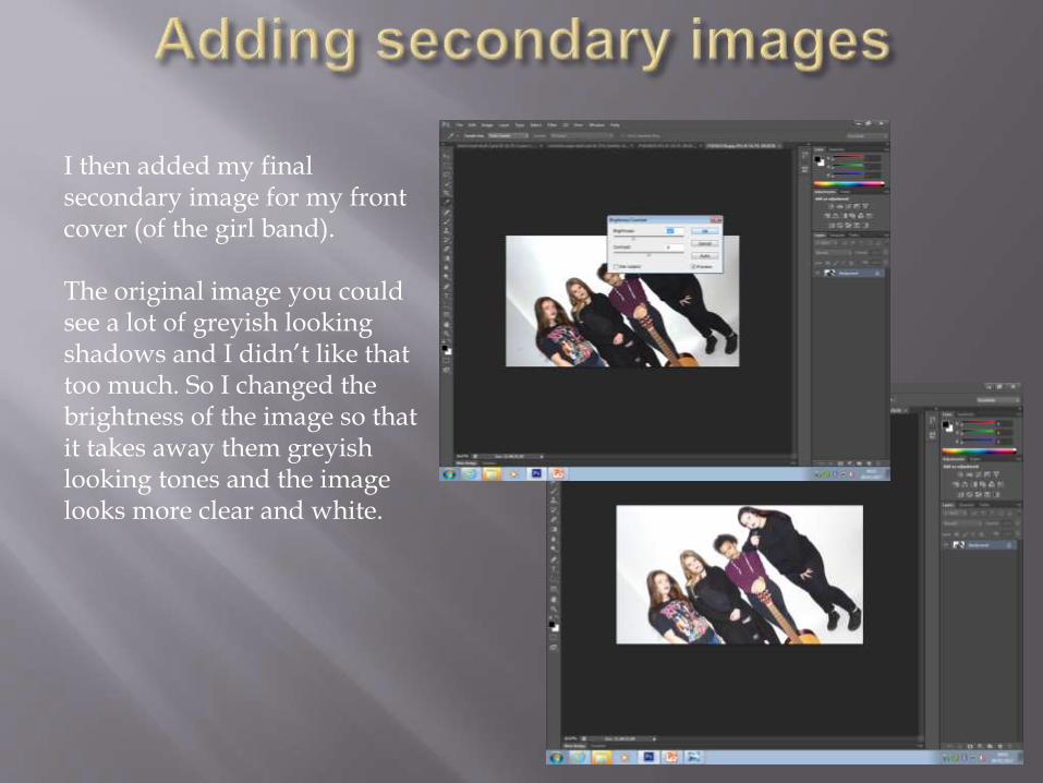
I then added my final secondary image for my front cover (of the girl band).
The original image you could see a lot of greyish looking shadows and I didn’t like that too much. So I changed the brightness of the image so that it takes away them greyish looking tones and the image looks more clear and white.
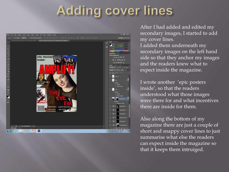
After I had added and edited my secondary images, I started to add my cover lines. I added them underneath my secondary images on the left hand side so that they anchor my images and the readers knew what to expect inside the magazine.
I wrote another ‘epic posters inside’, so that the readers understood what those images were there for and what incentives there are inside for them.
Also along the bottom of my magazine there are just a couple of short and snappy cover lines to just summarise what else the readers can expect inside the magazine so that it keeps them intruiged.
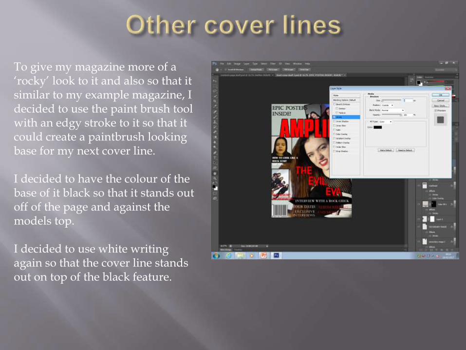
To give my magazine more of a ‘rocky’ look to it and also so that it similar to my example magazine, I decided to use the paint brush tool with an edgy stroke to it so that it could create a paintbrush looking base for my next cover line.
I decided to have the colour of the base of it black so that it stands out off of the page and against the models top.
I decided to use white writing again so that the cover line stands out on top of the black feature.
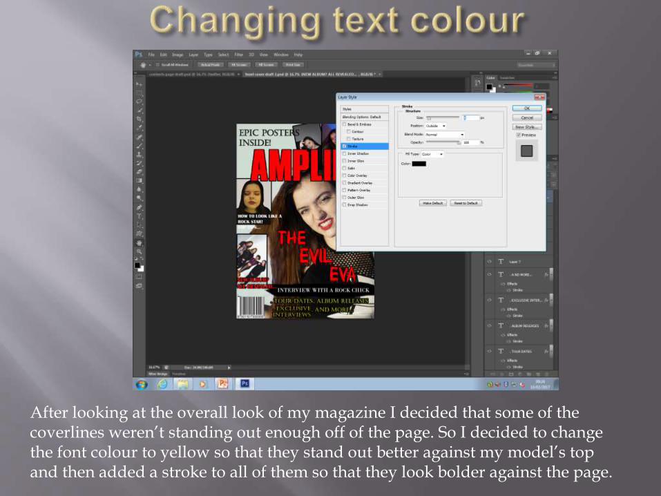
After looking at the overall look of my magazine I decided that some of the coverlines weren’t standing out enough off of the page. So I decided to change the font colour to yellow so that they stand out better against my model’s top and then added a stroke to all of them so that they look bolder against the page.
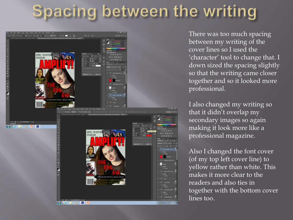
There was too much spacing between my writing of the cover lines so I used the ‘character’ tool to change that. I down sized the spacing slightly so that the writing came closer together and so it looked more professional.
I also changed my writing so that it didn’t overlap my secondary images so again making it look more like a professional magazine.
Also I changed the font cover (of my top left cover line) to yellow rather than white. This makes it more clear to the readers and also ties in together with the bottom cover lines too.
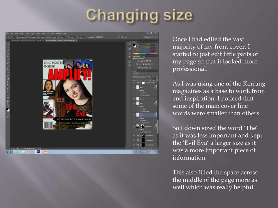
Once I had edited the vast majority of my front cover, I started to just edit little parts of my page so that it looked more professional.
As I was using one of the Kerrangmagazines as a base to work from and inspiration, I noticed that some of the main cover line words were smaller than others.
So I down sized the word ‘The’ as it was less important and kept the ‘Evil Eva’ a larger size as it was a more important piece of information.
This also filled the space across the middle of the page more as well which was really helpful.
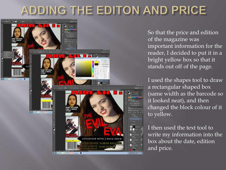
So that the price and edition of the magazine was important information for the reader, I decided to put it in a bright yellow box so that it stands out off of the page.
I used the shapes tool to draw a rectangular shaped box (same width as the barcode so it looked neat), and then changed the block colour of it to yellow.
I then used the text tool to write my information into the box about the date, edition and price.
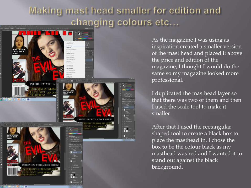
As the magazine I was using as inspiration created a smaller version of the mast head and placed it above the price and edition of the magazine, I thought I would do the same so my magazine looked more professional.
I duplicated the masthead layer so that there was two of them and then I used the scale tool to make it smaller
After that I used the rectangular shaped tool to create a black box to place the masthead in. I chose the box to be the colour black as my masthead was red and I wanted it to stand out against the black background.