Embed Size (px)
Citation preview
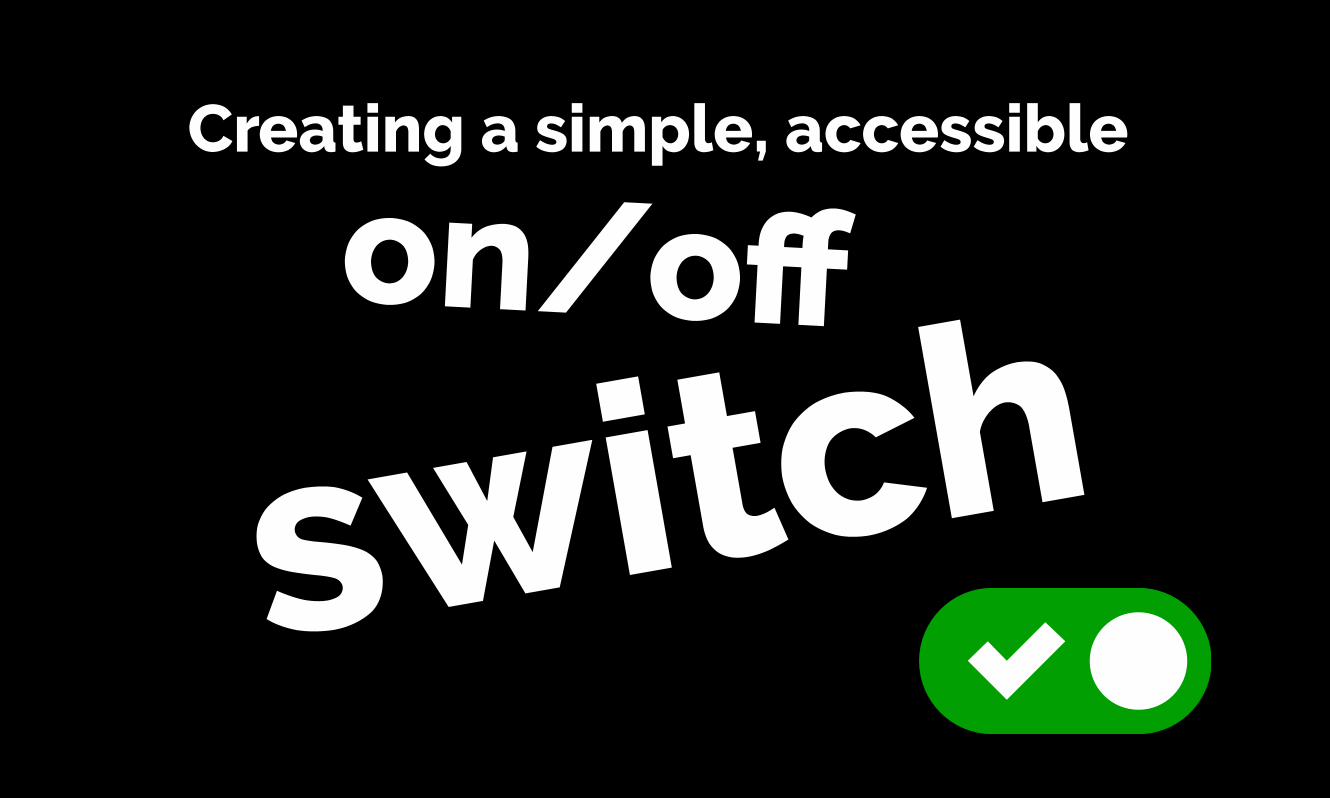
Creating a simple, accessible
on/off
switch

Intro
This presentation is based on a simple GitHub Repo and page
available here:
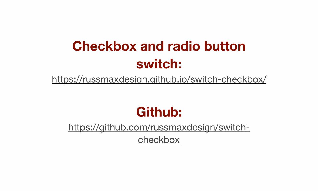
Checkbox and radio button switch:
https://russmaxdesign.github.io/switch-checkbox/
Github: https://github.com/russmaxdesign/switch-
checkbox
During this presentation, I’m going to ask you some questions - which you can answer in the chat window.
I'll be giving away three SitePoint Premium annual memberships as
prizes to the best/quickest answers.

That gives you unrestricted access to over $20,000 worth of SitePoint
books and courses!
https://www.sitepoint.com/premium/
I want to start with a couple of accessibility-related questions.
And yes, these are incredibly easy, “prize-winnable” questions.
Question 1: What is the easiest and most
effective way of identifying common accessibility problems in your site/
app?
Answer
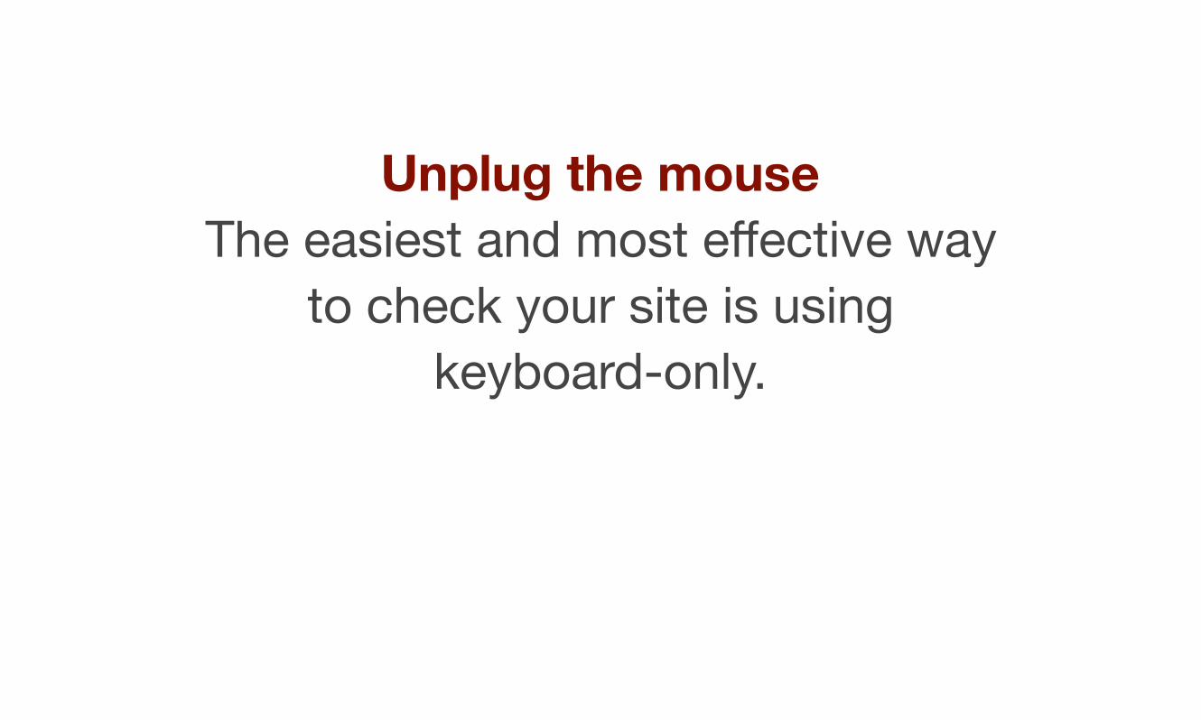
Unplug the mouseThe easiest and most effective way
to check your site is using keyboard-only.
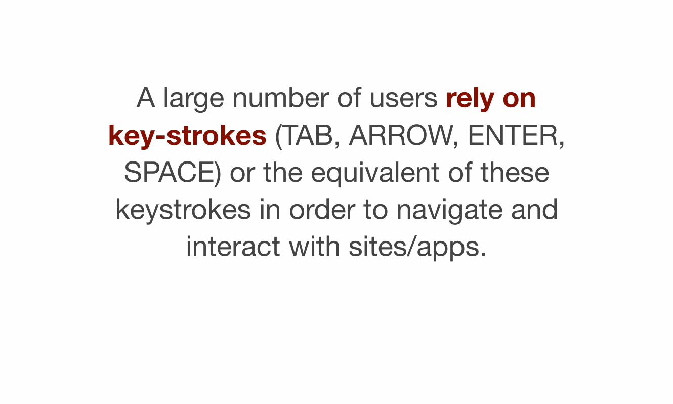
A large number of users rely on key-strokes (TAB, ARROW, ENTER,
SPACE) or the equivalent of these keystrokes in order to navigate and
interact with sites/apps.
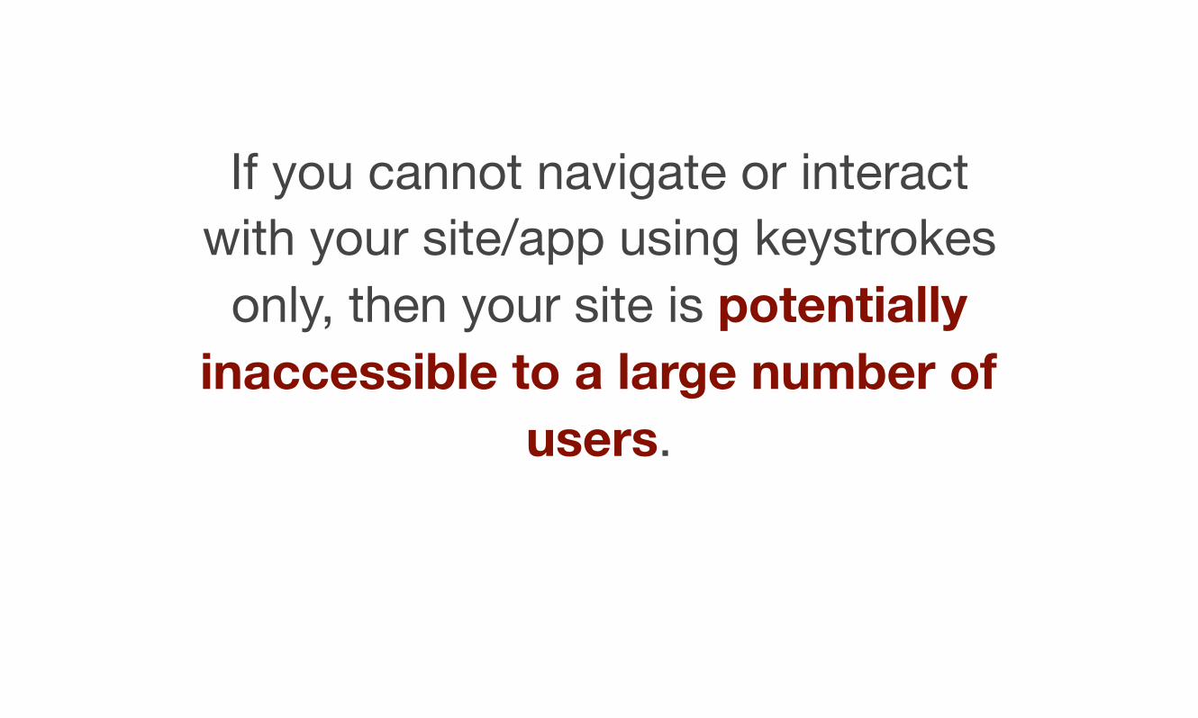
If you cannot navigate or interact with your site/app using keystrokes
only, then your site is potentially inaccessible to a large number of
users.
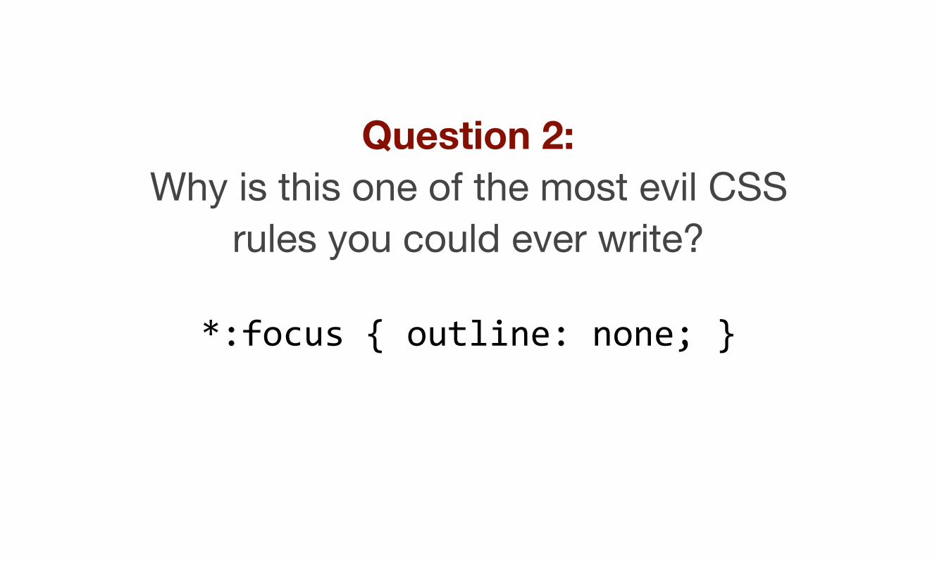
Question 2: Why is this one of the most evil CSS
rules you could ever write?
*:focus { outline: none; }

Answer
Because this rule make it hard, if not impossible, for keyboard-only users to see which element is in focus and therefore very hard to navigate
and interact with your site/app.
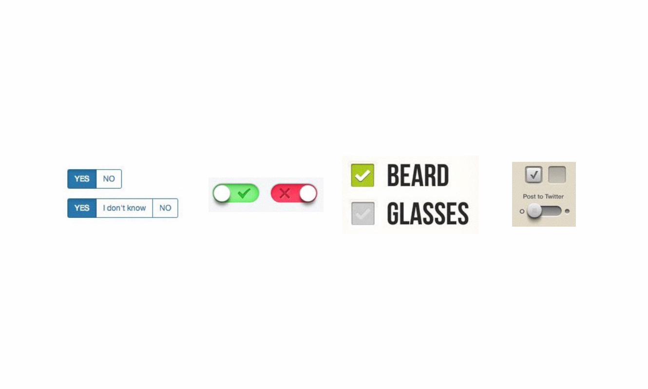
Time to explore how to style a simple radio button or checkbox!
Custom radios & checkboxes
Web designers and developers have always struggled with how to customise radio buttons and
checkboxes.
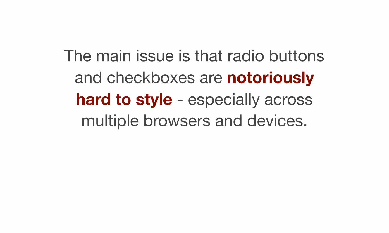
The main issue is that radio buttons and checkboxes are notoriously hard to style - especially across multiple browsers and devices.
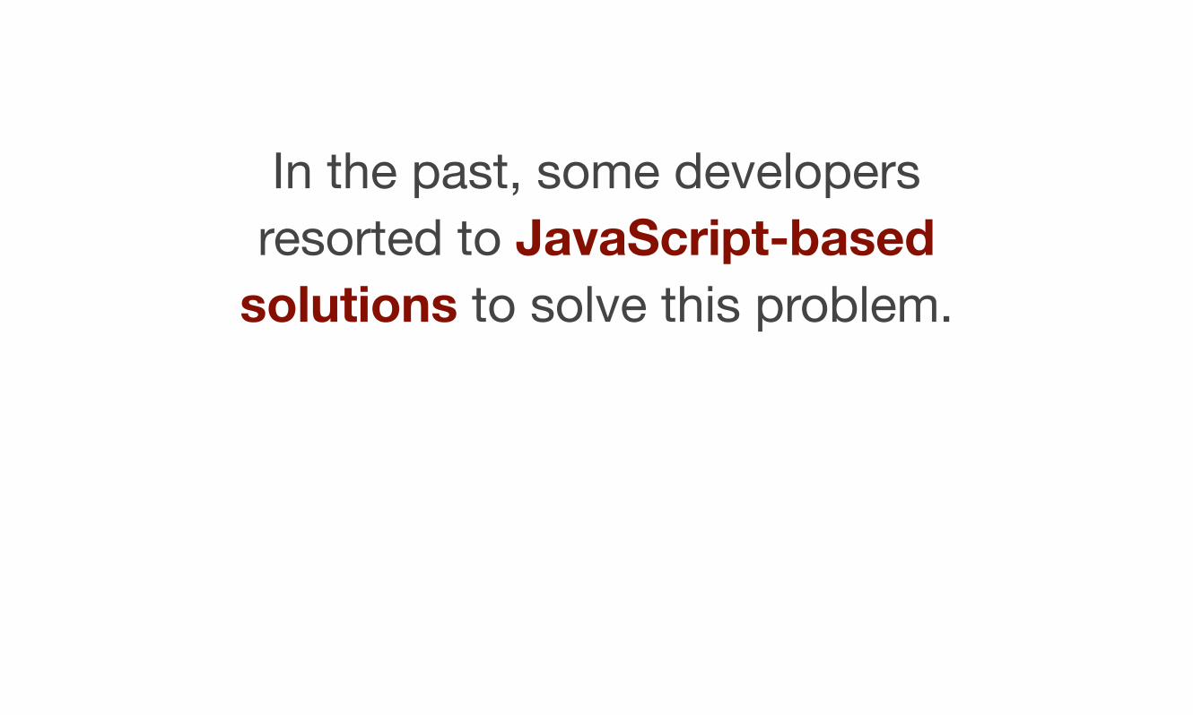
In the past, some developers resorted to JavaScript-based
solutions to solve this problem.
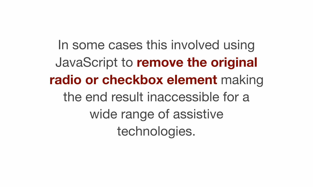
In some cases this involved using JavaScript to remove the original
radio or checkbox element making the end result inaccessible for a
wide range of assistive technologies.

A solution
It is possible to style these elements without having to use JavaScript. And more importantly, we can make
the end result accessible.
Let’s take a simple example of an on/off switch that can be applied to either radio or checkbox elements:
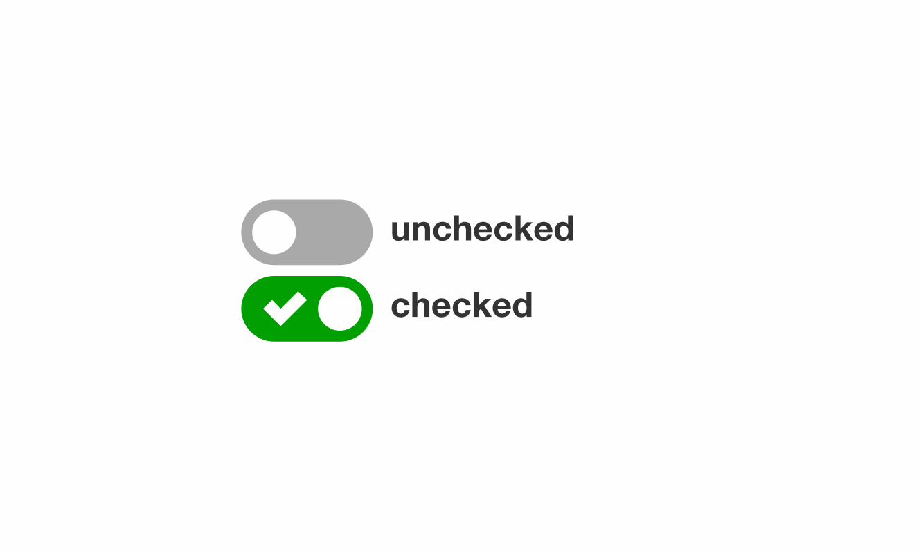
unchecked
checked
The solution I’m about to demo, has five key accessibility features.
Well… many of these are not really features, they are just default
behaviours that should not be overridden.
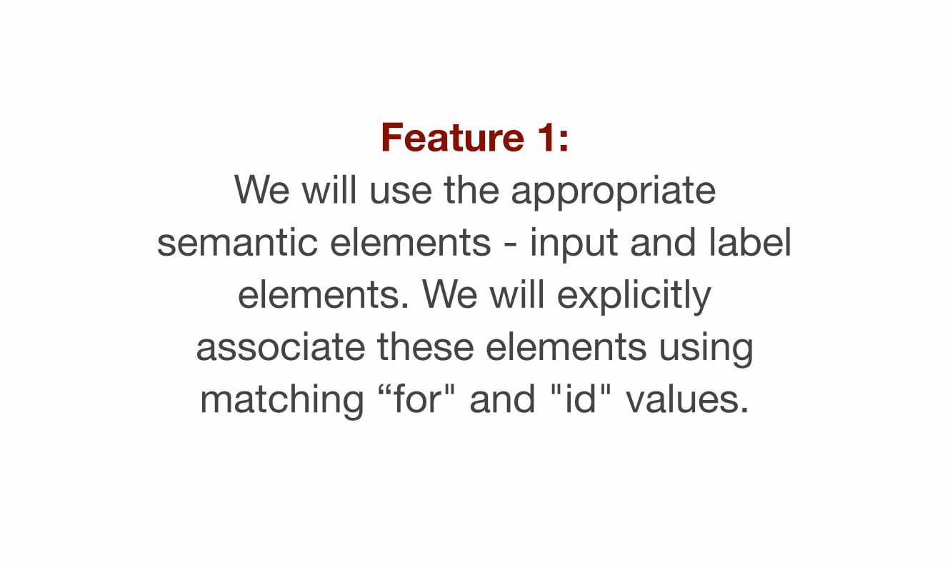
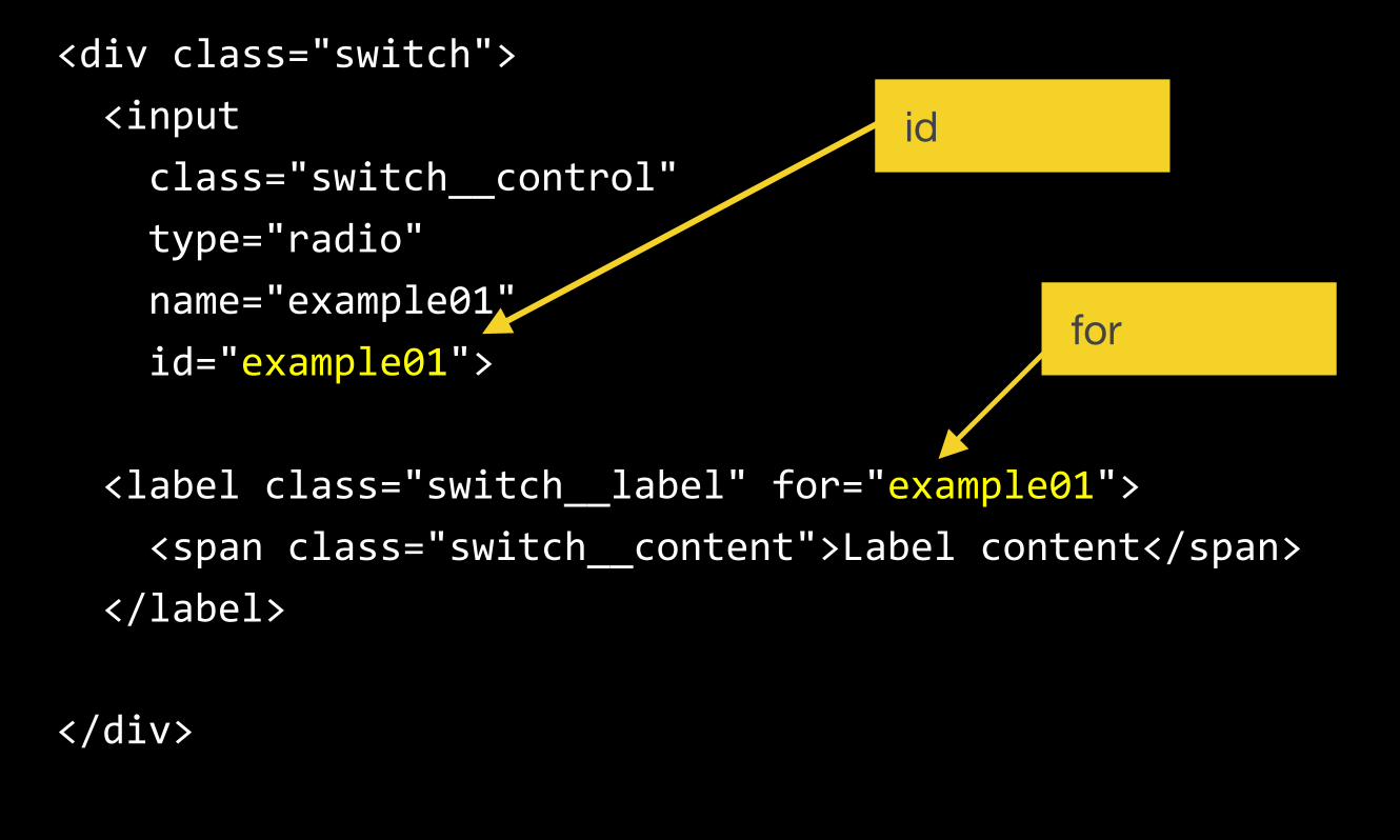
Feature 1: We will use the appropriate
semantic elements - input and label elements. We will explicitly
associate these elements using matching “for" and "id" values.
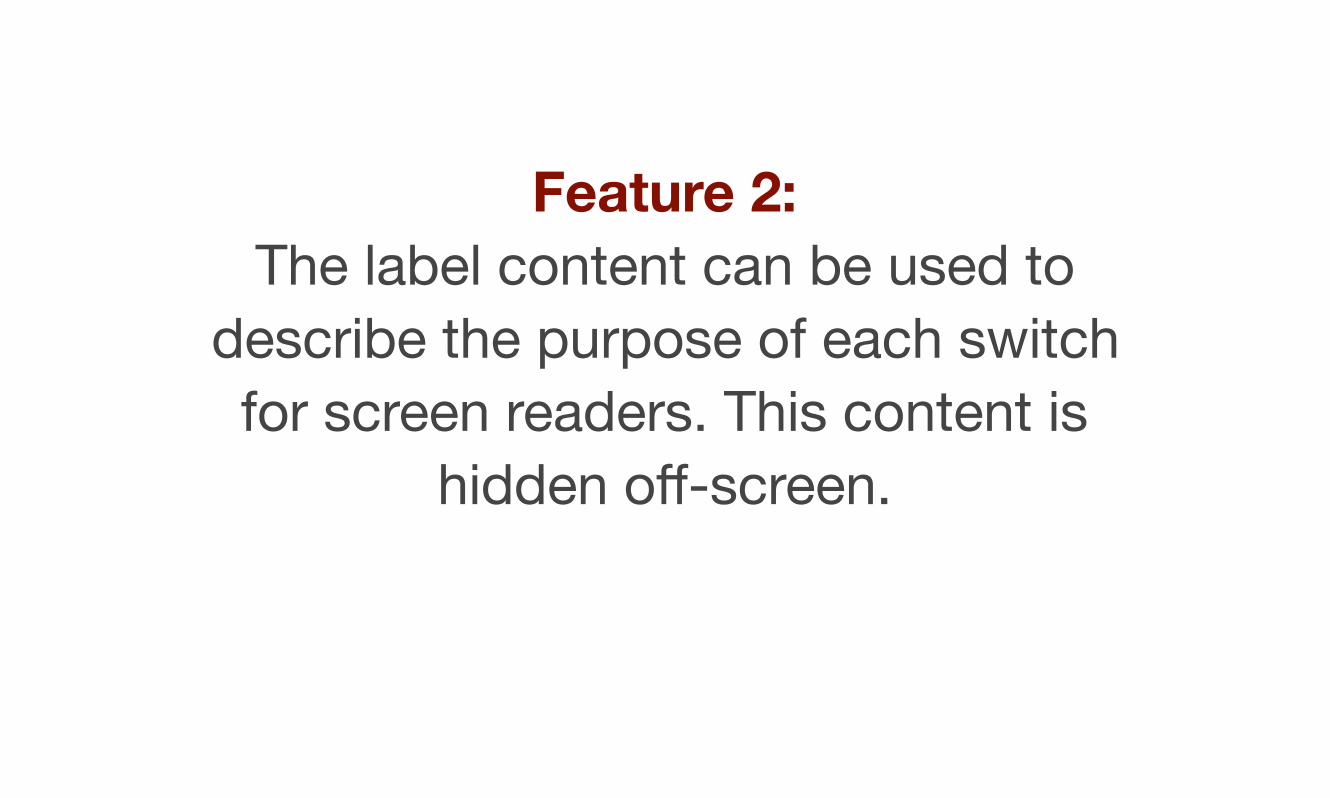
Feature 2: The label content can be used to
describe the purpose of each switch for screen readers. This content is
hidden off-screen.
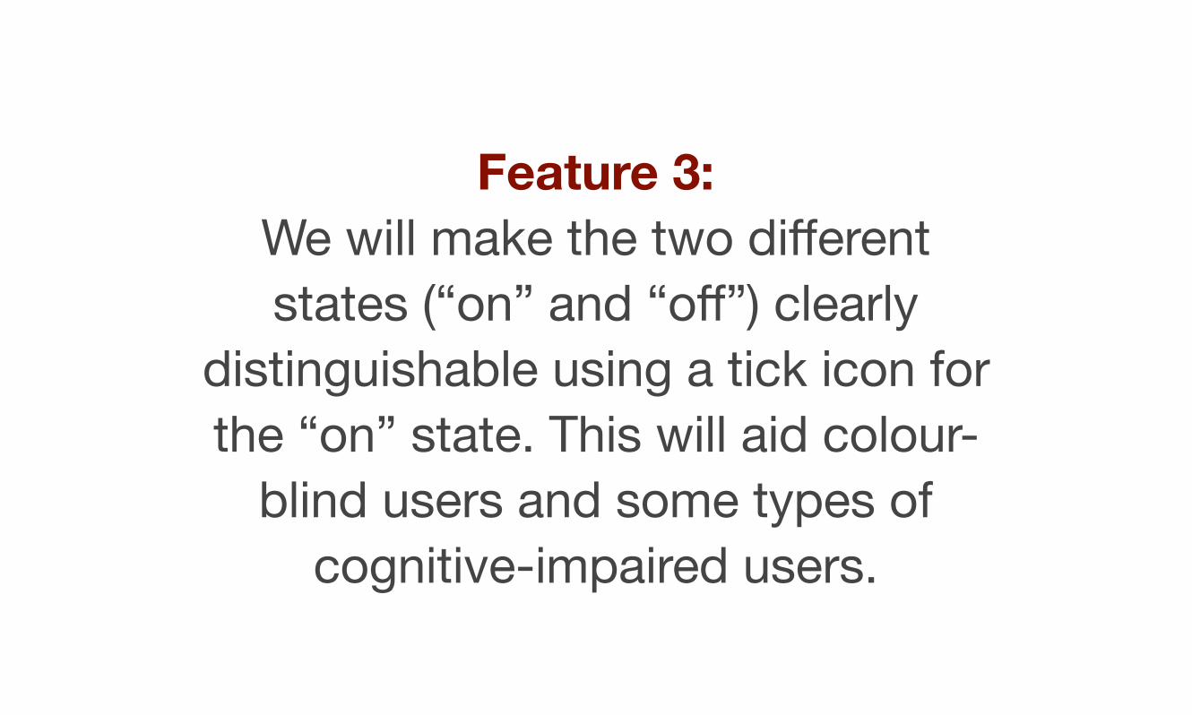
Feature 3: We will make the two different states (“on” and “off”) clearly
distinguishable using a tick icon for the “on” state. This will aid colour-
blind users and some types of cognitive-impaired users.
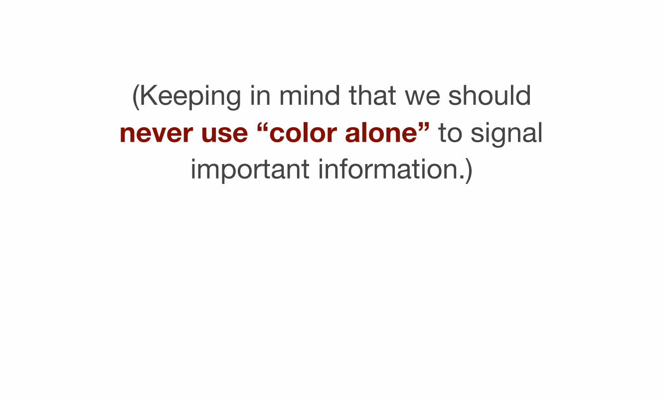
(Keeping in mind that we should never use “color alone” to signal
important information.)
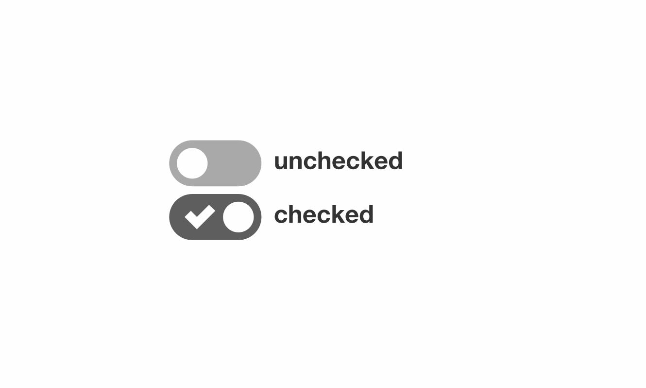
unchecked
checked
Feature 4: Because we are using native
elements, the default keyboard behaviour will still be available.
(Users can select a radio button or checkbox using the SPACE bar).
Feature 5: We will make the focus and hover states clearly visible. The focus state is especially important for
keyboard only users.
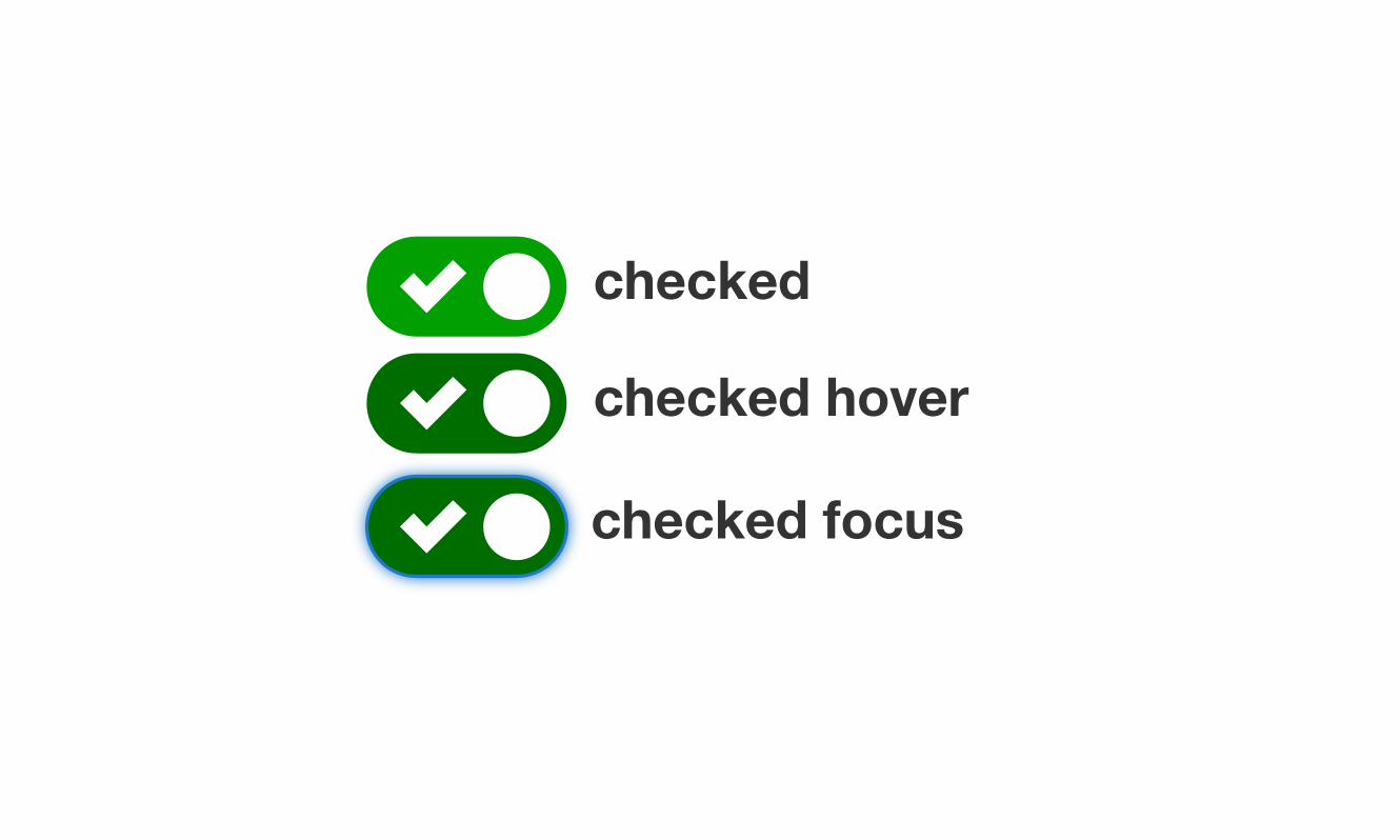
checked
checked hover
checked focus

The markup
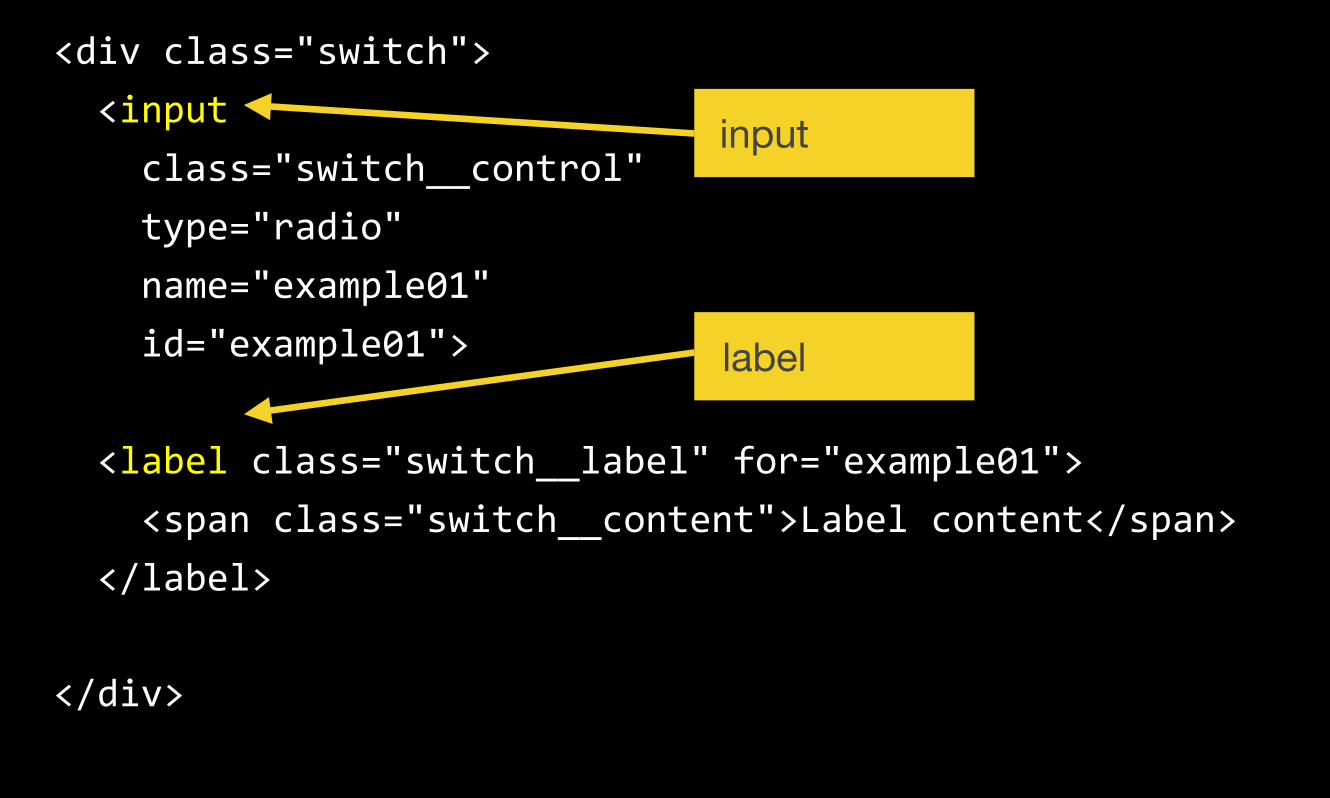
<div class="switch"> <input class="switch__control" type="radio" name="example01" id="example01">
<label class="switch__label" for="example01"> <span class="switch__content">Label content</span> </label>
</div>
input
label
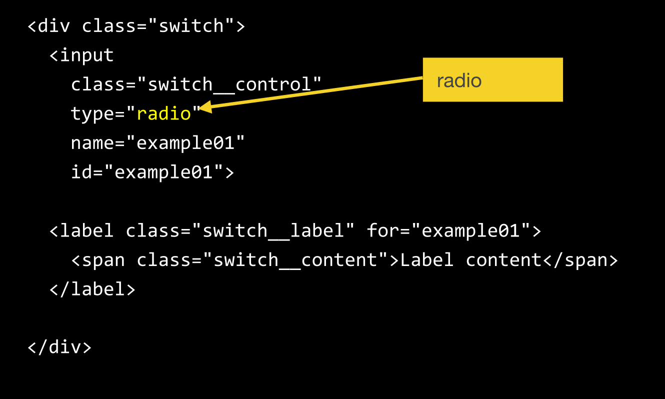
<div class="switch"> <input class="switch__control" type="radio" name="example01" id="example01">
<label class="switch__label" for="example01"> <span class="switch__content">Label content</span> </label>
</div>
radio
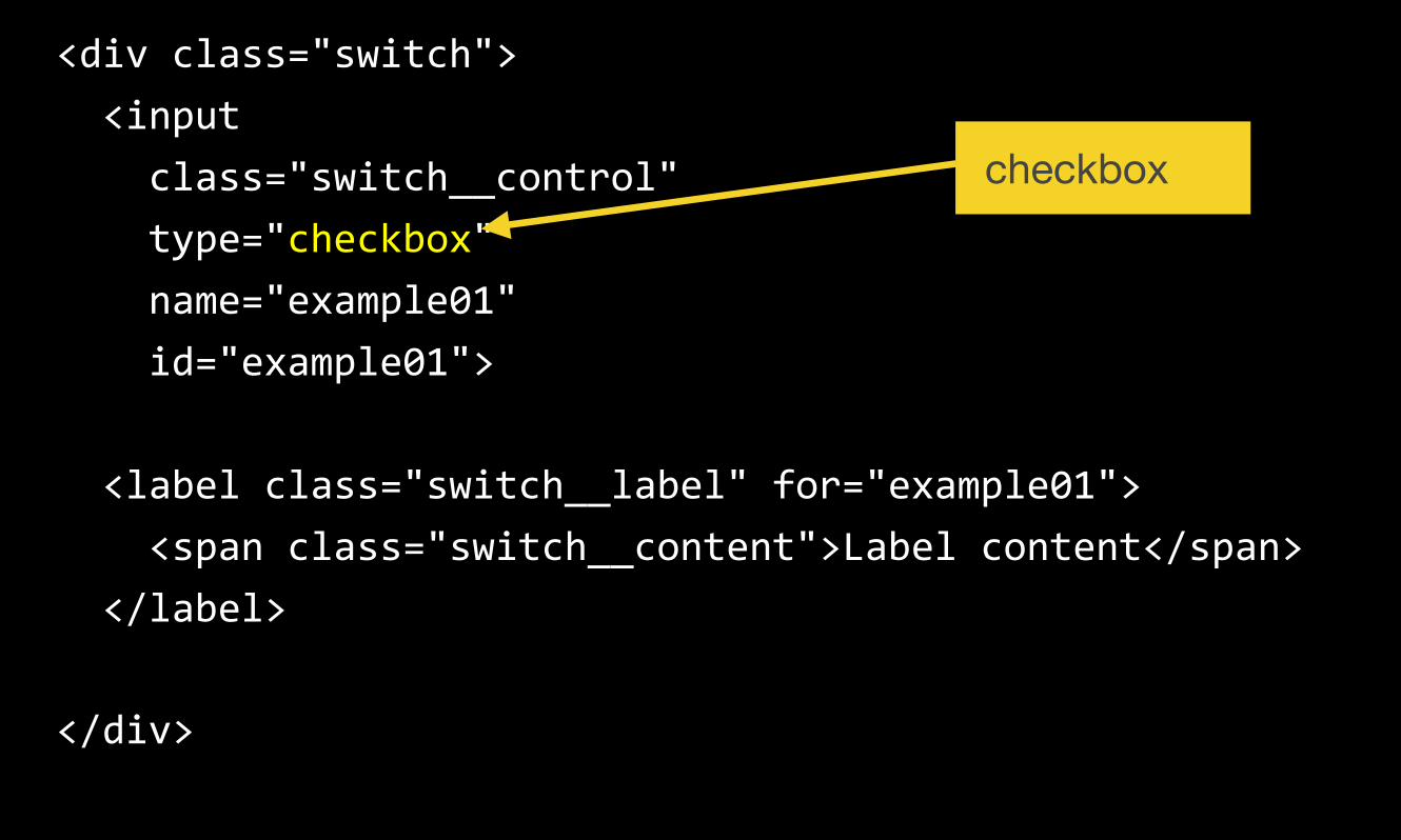
<div class="switch"> <input class="switch__control" type="checkbox" name="example01" id="example01">
<label class="switch__label" for="example01"> <span class="switch__content">Label content</span> </label>
</div>
checkbox
<div class="switch"> <input class="switch__control" type="radio" name="example01" id="example01">
<label class="switch__label" for="example01"> <span class="switch__content">Label content</span> </label>
</div>
id
for
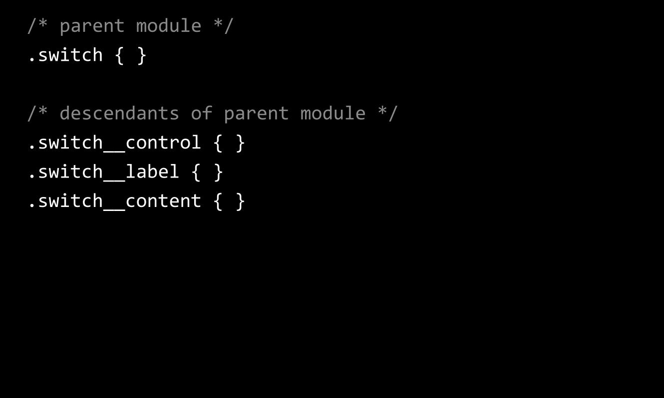
The class names
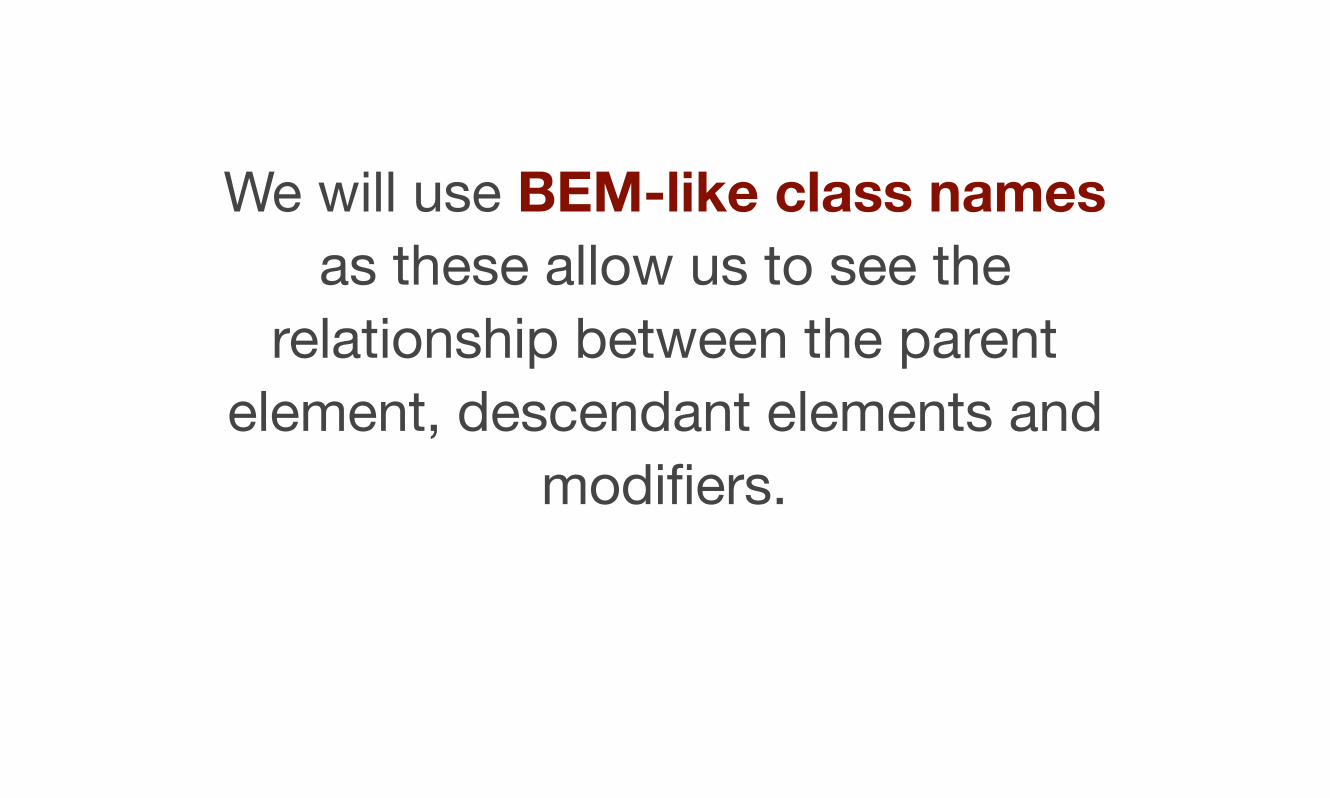
We will use BEM-like class names as these allow us to see the
relationship between the parent element, descendant elements and
modifiers.
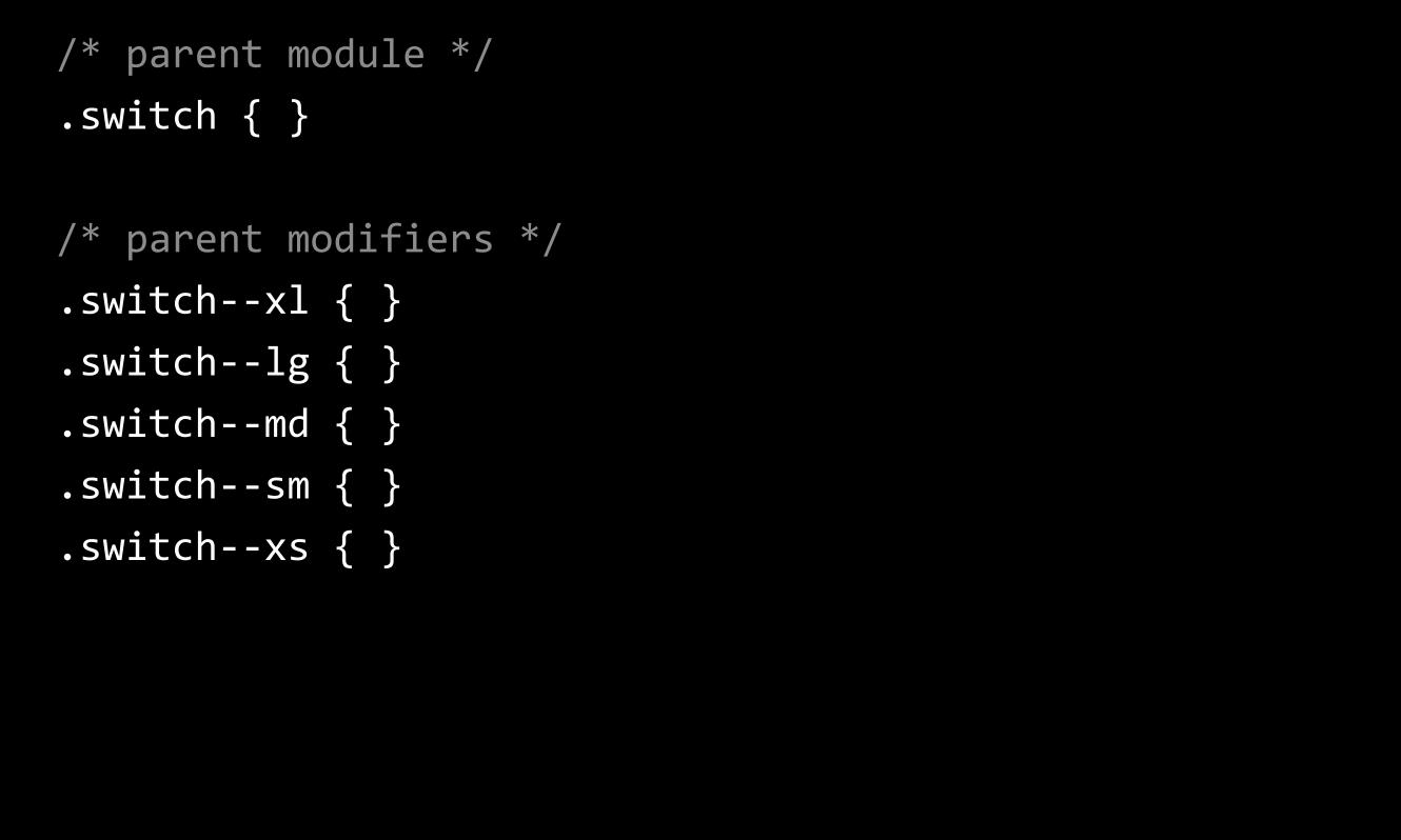
/* parent module */ .switch { }
/* parent modifiers */ .switch-‐-‐xl { } .switch-‐-‐lg { } .switch-‐-‐md { } .switch-‐-‐sm { } .switch-‐-‐xs { }
/* parent module */ .switch { }
/* descendants of parent module */ .switch__control { } .switch__label { } .switch__content { }
How does it work
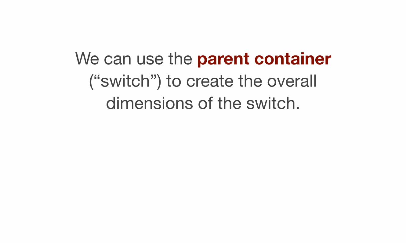
We can use the parent container (“switch”) to create the overall
dimensions of the switch.
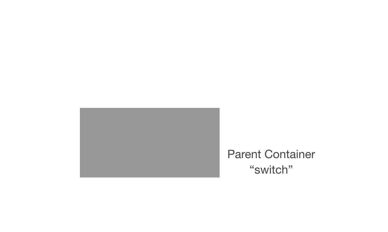
Parent Container“switch”
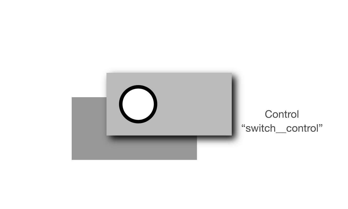
The radio button or checkbox control (“switch__control”) is then positioned on top of the parent. It will be given the same dimensions
as the parent.
Control“switch__control”
The label (“switch__label”) is placed on top of the radio button and also given the same dimensions as the parent. We are hiding the control
under the label.
We will then style the background of the label to look like a switch - including adding rounded corners
and our background icon.
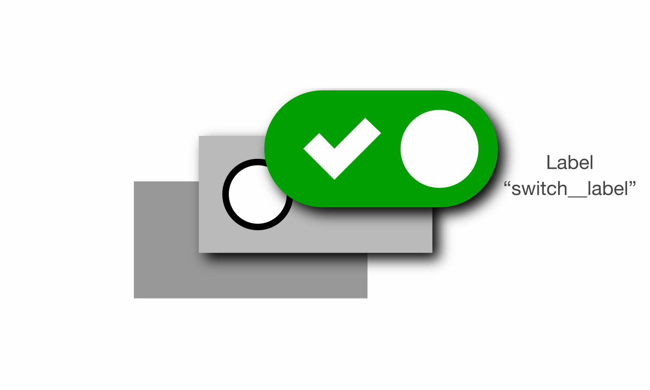
Label“switch__label”
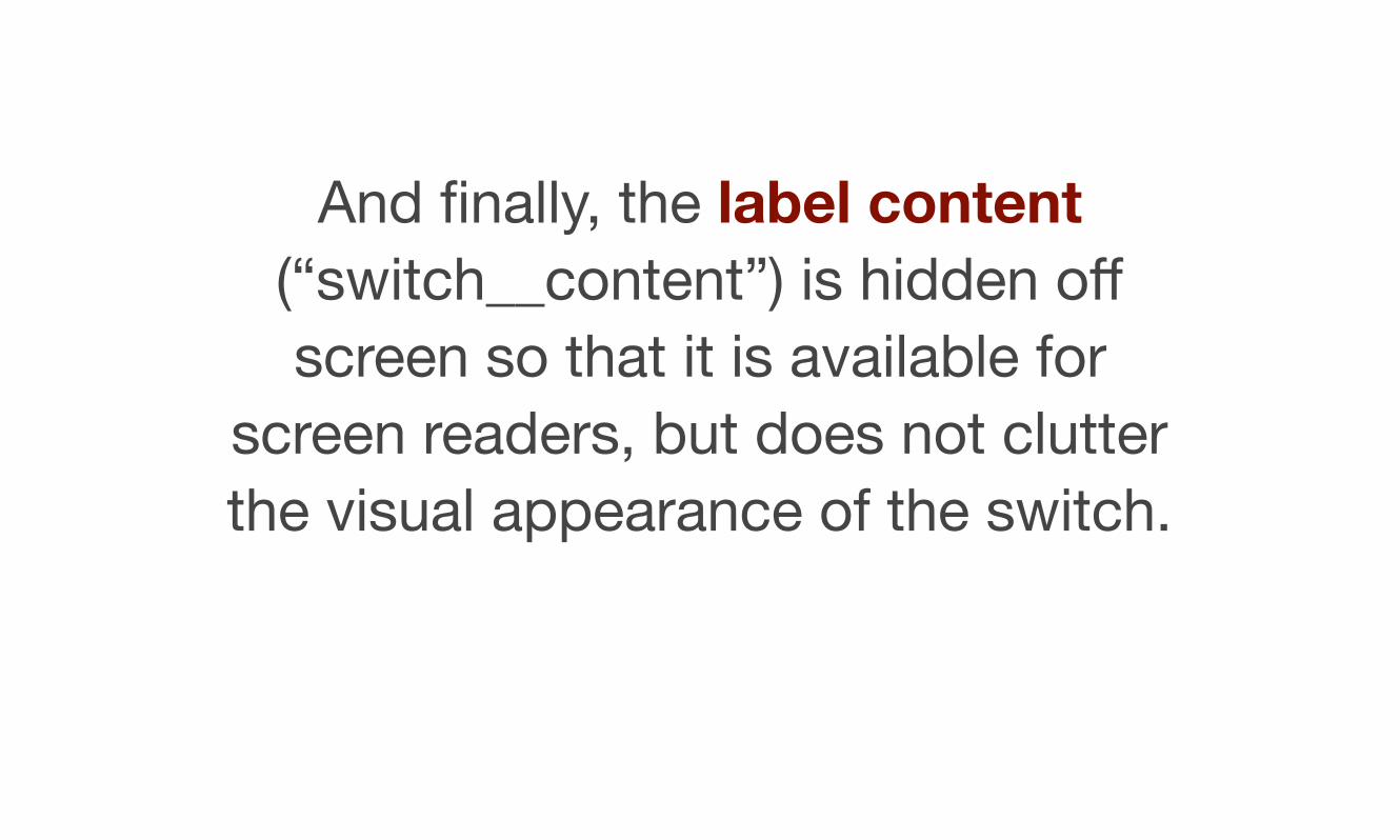
And finally, the label content (“switch__content”) is hidden off screen so that it is available for
screen readers, but does not clutter the visual appearance of the switch.
Adding states
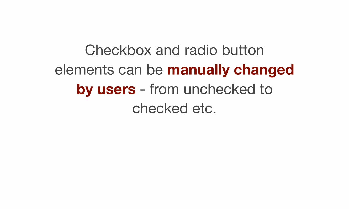
Checkbox and radio button elements can be manually changed
by users - from unchecked to checked etc.
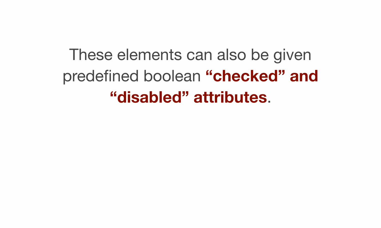
These elements can also be given predefined boolean “checked” and
“disabled” attributes.
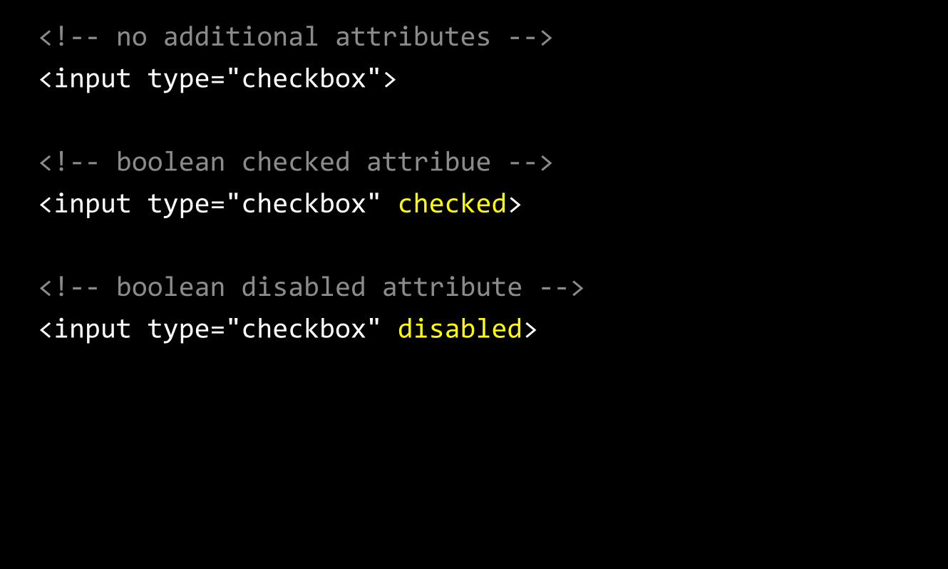
<!-‐-‐ no additional attributes -‐-‐> <input type="checkbox">
<!-‐-‐ boolean checked attribue -‐-‐> <input type="checkbox" checked>
<!-‐-‐ boolean disabled attribute -‐-‐> <input type="checkbox" disabled>
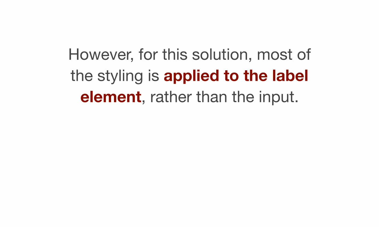
However, for this solution, most of the styling is applied to the label
element, rather than the input.
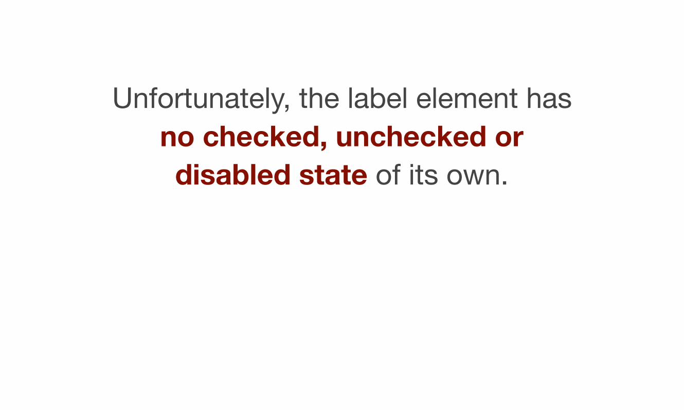
Unfortunately, the label element has no checked, unchecked or disabled state of its own.
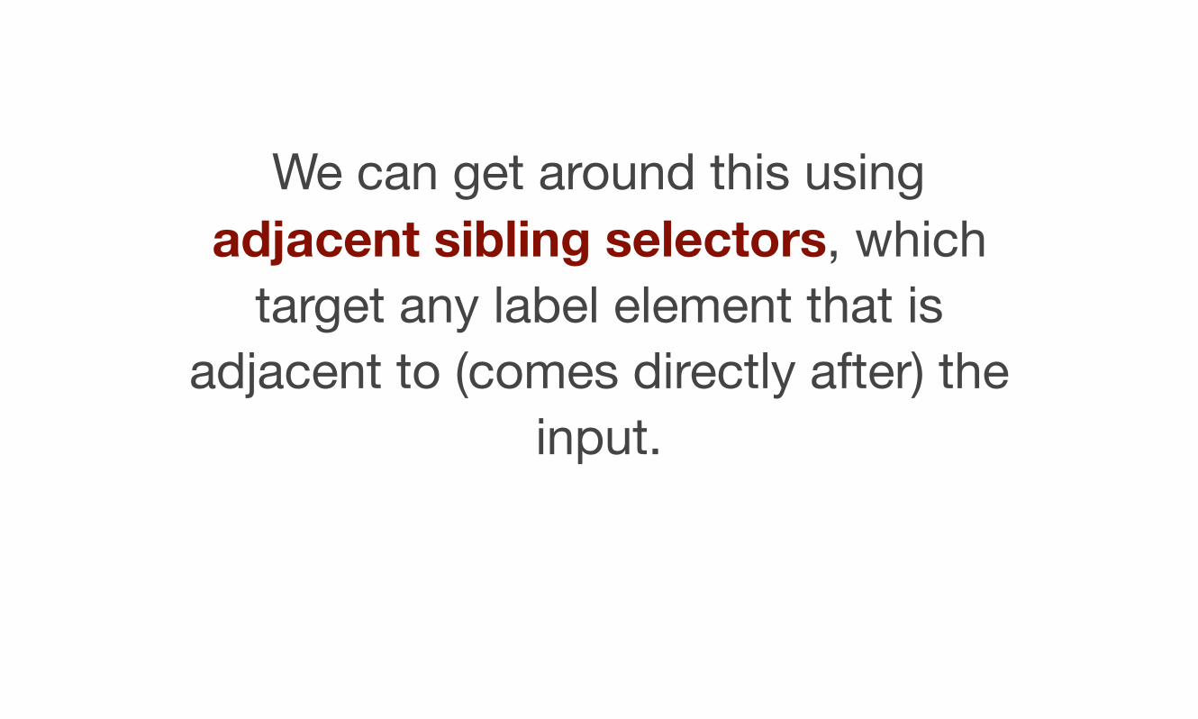
We can get around this using adjacent sibling selectors, which
target any label element that is adjacent to (comes directly after) the
input.
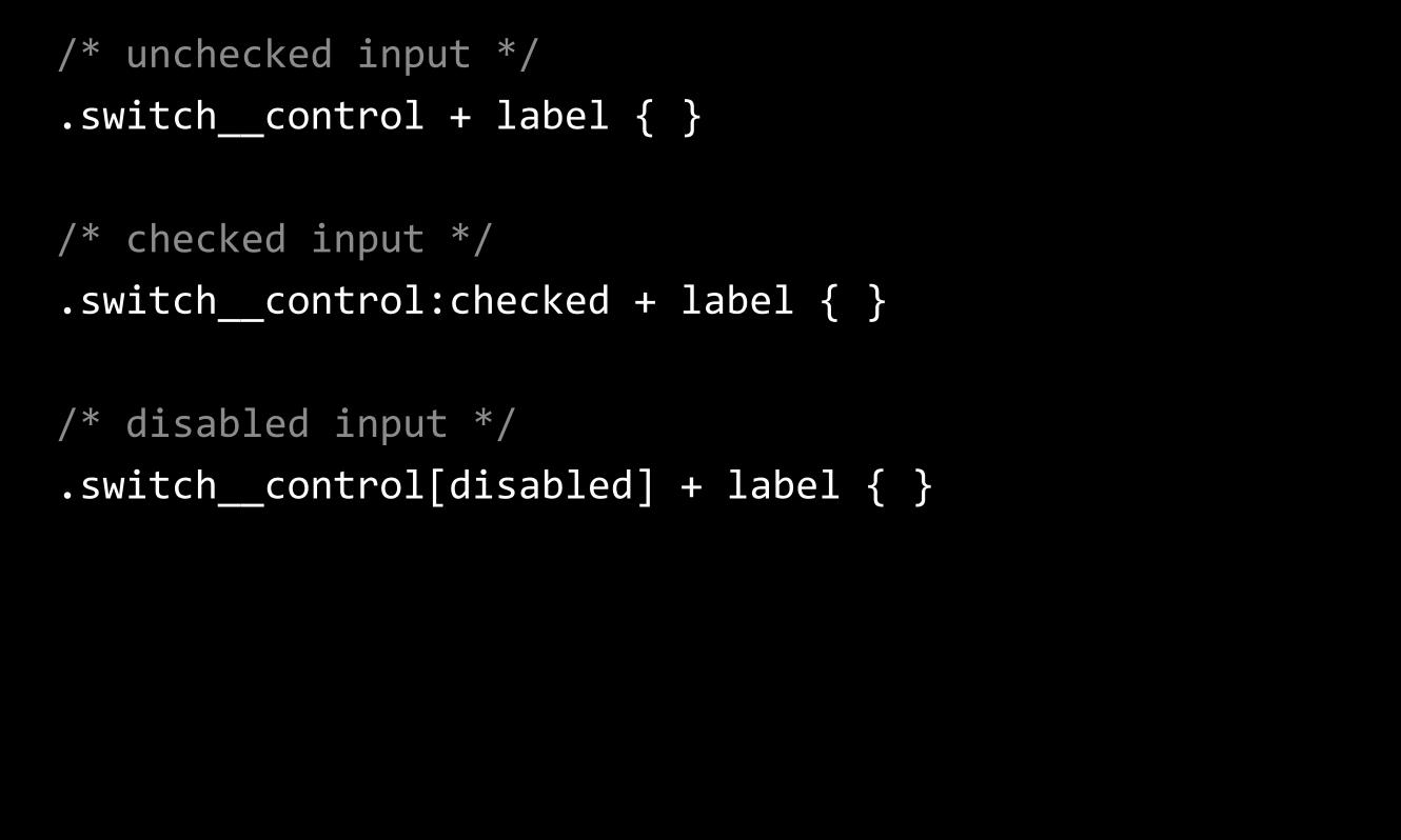
/* unchecked input */ .switch__control + label { }
/* checked input */ .switch__control:checked + label { }
/* disabled input */ .switch__control[disabled] + label { }
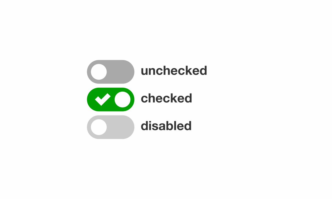
unchecked
checked
disabled
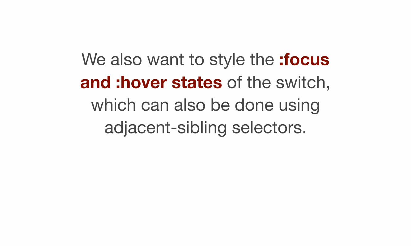
We also want to style the :focus and :hover states of the switch,
which can also be done using adjacent-sibling selectors.
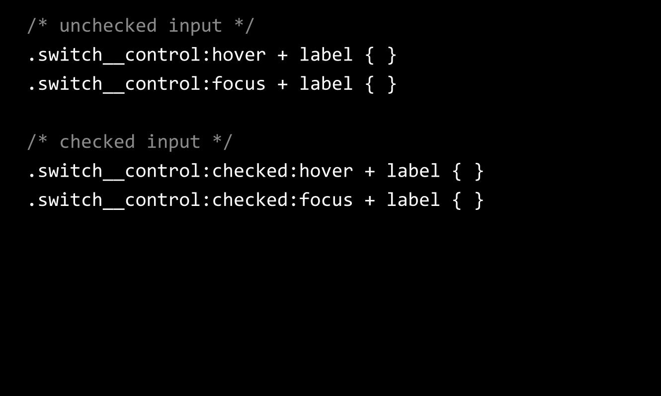
/* unchecked input */ .switch__control:hover + label { } .switch__control:focus + label { }
/* checked input */ .switch__control:checked:hover + label { } .switch__control:checked:focus + label { }
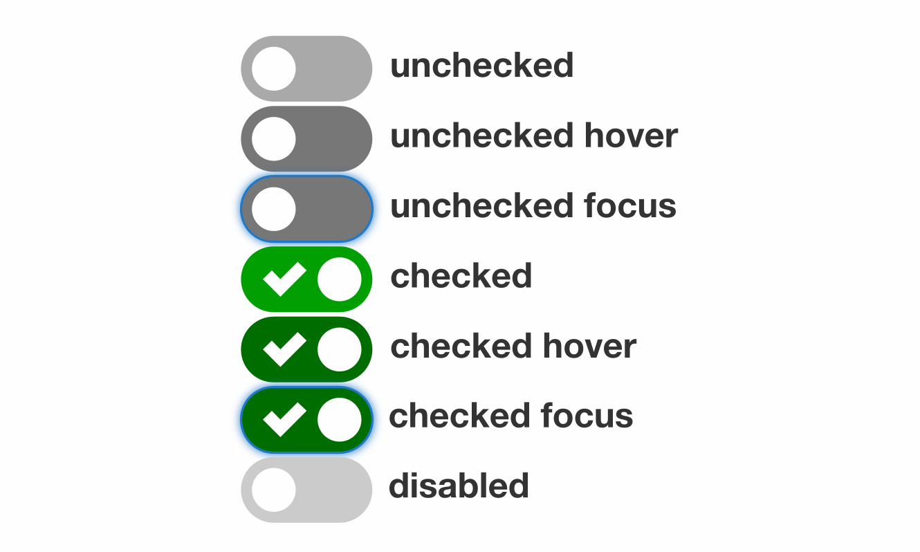
unchecked hoverunchecked focus
unchecked
checkedchecked hoverchecked focusdisabled
SASS variables
Time for our final “prize-winnable” question (and yes, this one is also
super-easy to answer)…
Question 3: Why would we want to be able to
control all of the dimensions of our switch using one master SASS
variable?

Answer
Because this makes it easier to maintain and to scale as needed.
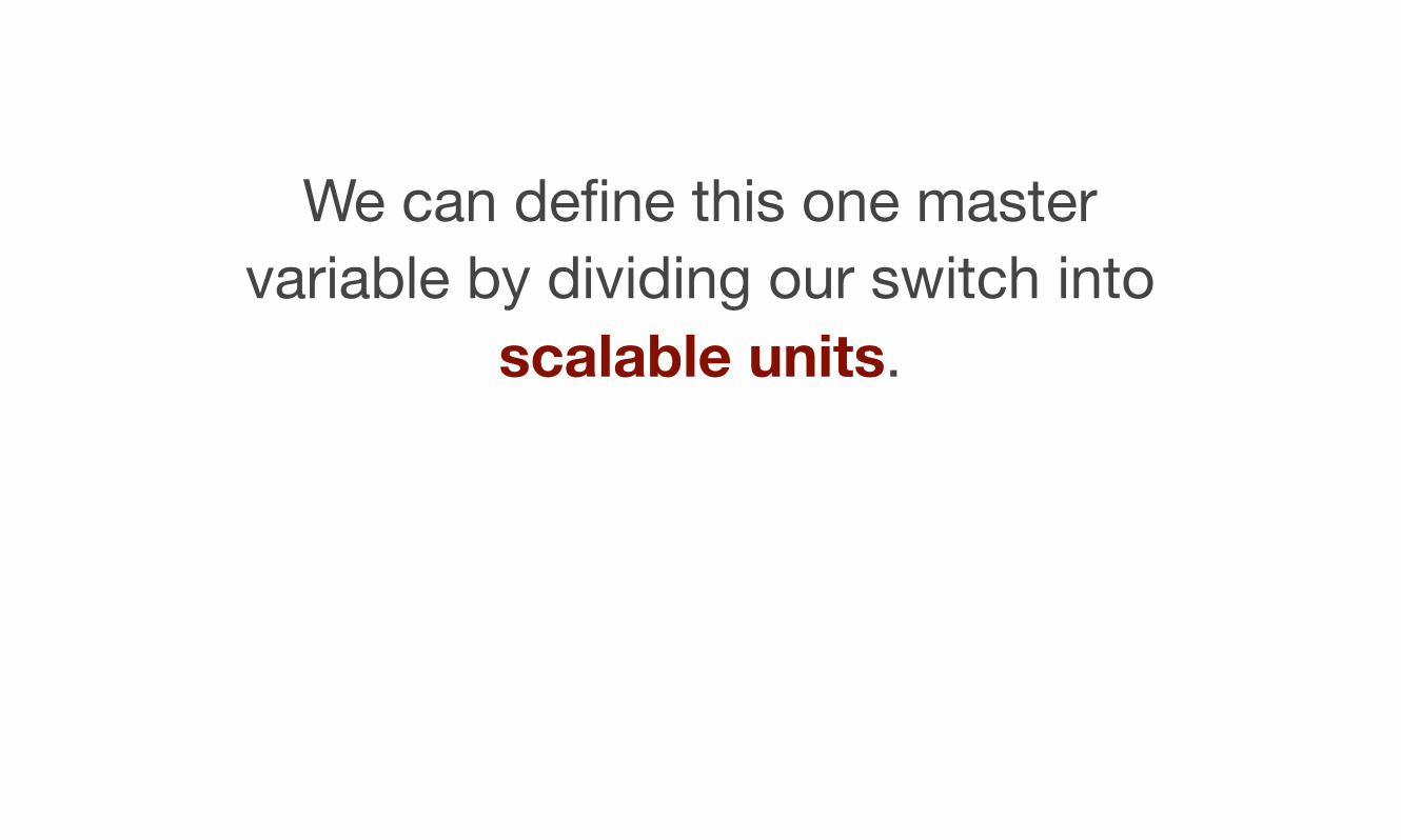
We can define this one master variable by dividing our switch into
scalable units.
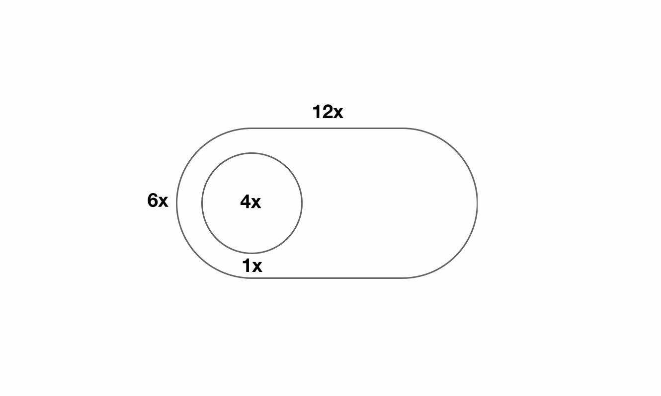
12x
6x 4x
1x
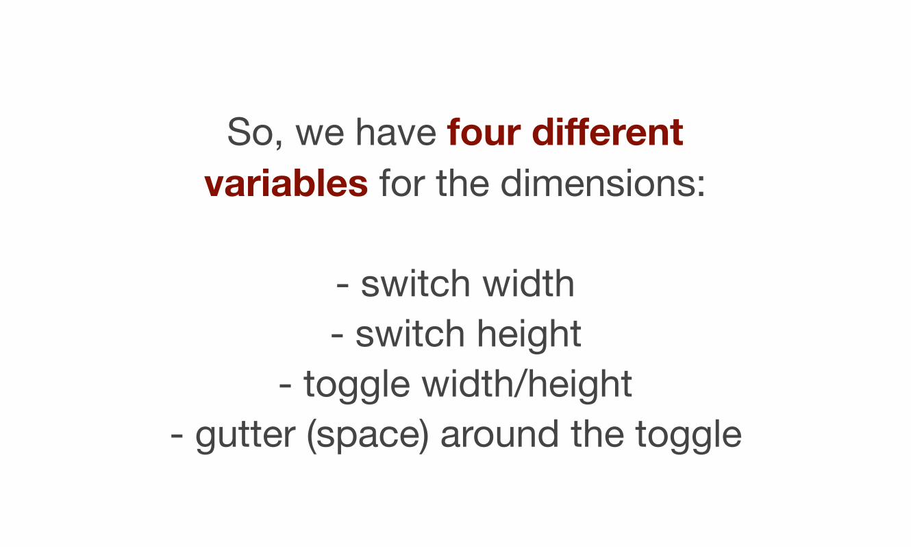
So, we have four different variables for the dimensions:
- switch width- switch height
- toggle width/height- gutter (space) around the toggle
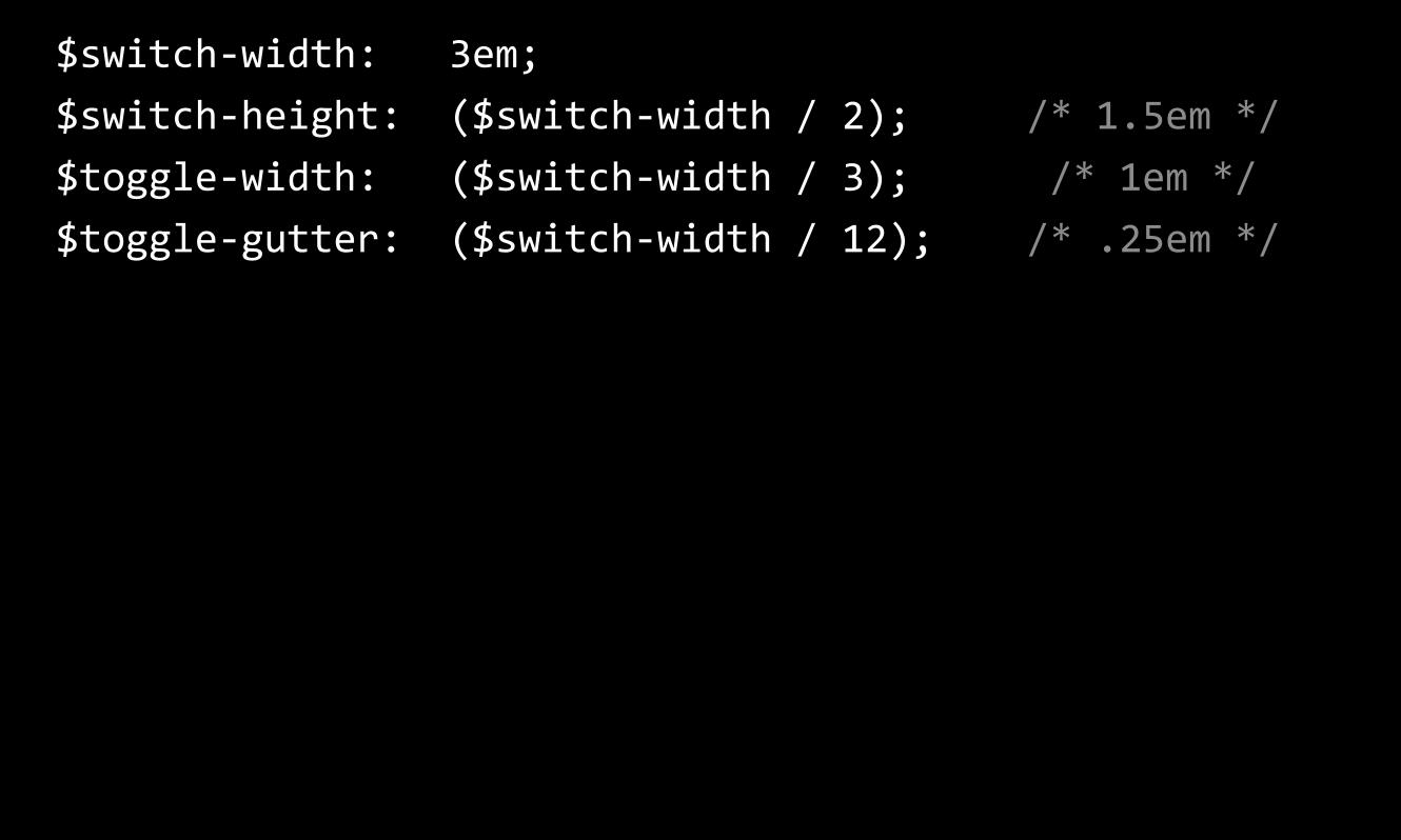
$switch-‐width: 3em; $switch-‐height: ($switch-‐width / 2); /* 1.5em */ $toggle-‐width: ($switch-‐width / 3); /* 1em */ $toggle-‐gutter: ($switch-‐width / 12); /* .25em */
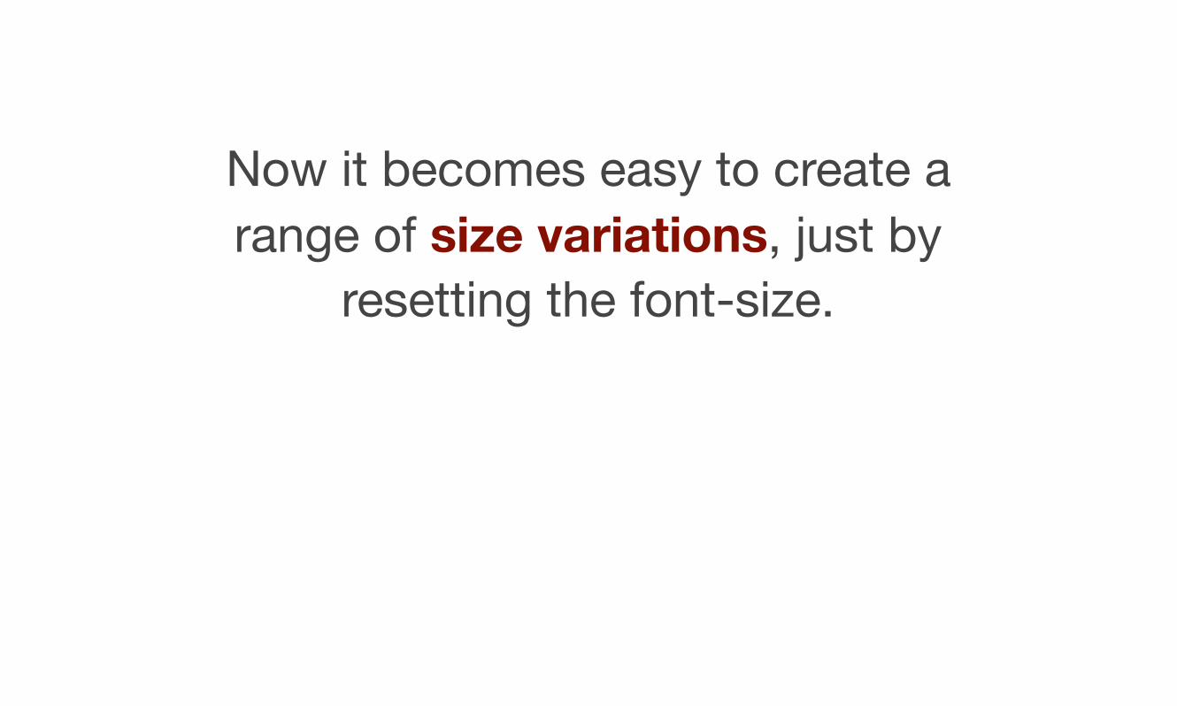
Now it becomes easy to create a range of size variations, just by
resetting the font-size.
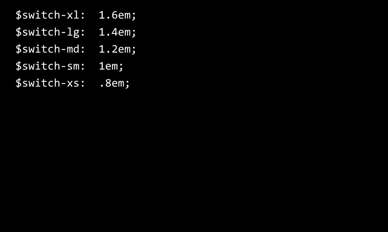
$switch-‐xl: 1.6em; $switch-‐lg: 1.4em; $switch-‐md: 1.2em; $switch-‐sm: 1em; $switch-‐xs: .8em;
We can also set some quick variables for each of the
background-colors used in different states.
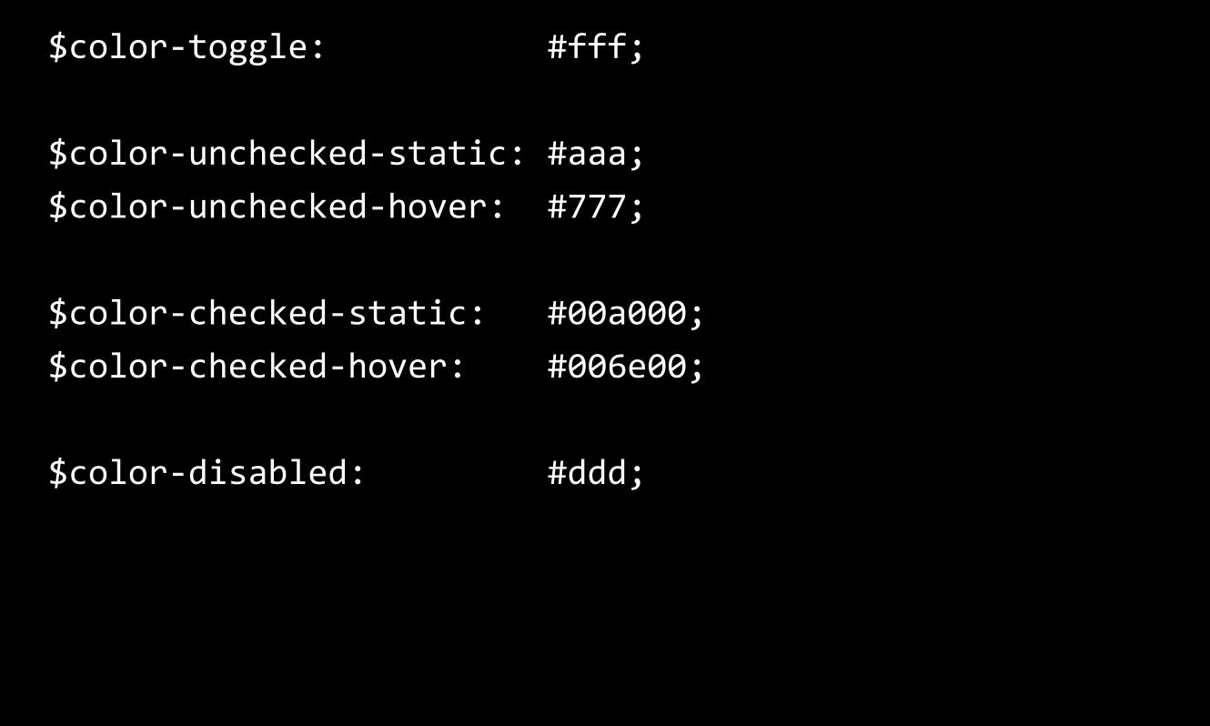
$color-‐toggle: #fff;
$color-‐unchecked-‐static: #aaa; $color-‐unchecked-‐hover: #777;
$color-‐checked-‐static: #00a000; $color-‐checked-‐hover: #006e00;
$color-‐disabled: #ddd;

Transitions
I’m generally not a fan of transitions or animations unless they are being used to help “tell the story” of a UI component - help users understand
what is happening.
Transitions should not draw attention to themselves. Ideally they
should be simple and subtle.
For the checkbox, we could do a very simple transition to animate the switch from unchecked to
checked - to help users understand what has happened.
We can do this by transitioning the “left” property as it changes from
unchecked to checked.
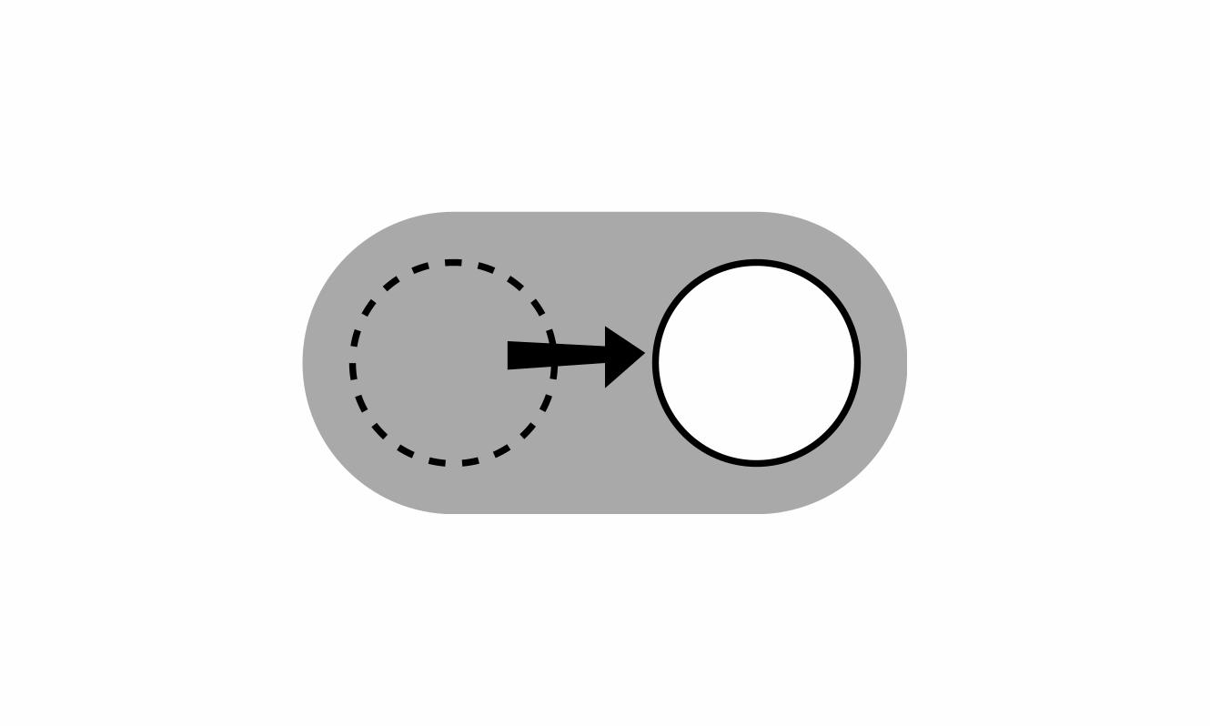
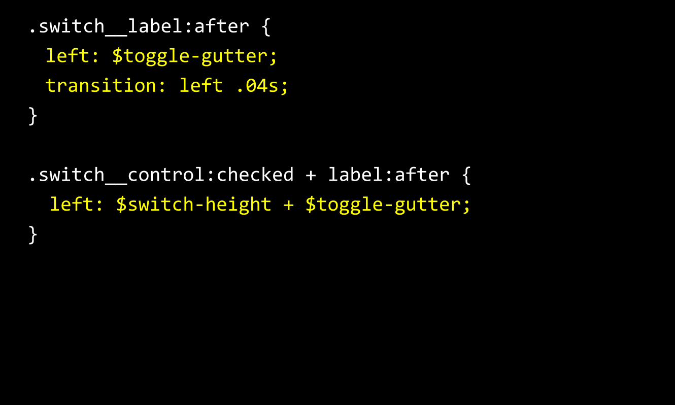
.switch__label:after { left: $toggle-‐gutter; transition: left .04s;
}
.switch__control:checked + label:after { left: $switch-‐height + $toggle-‐gutter; }
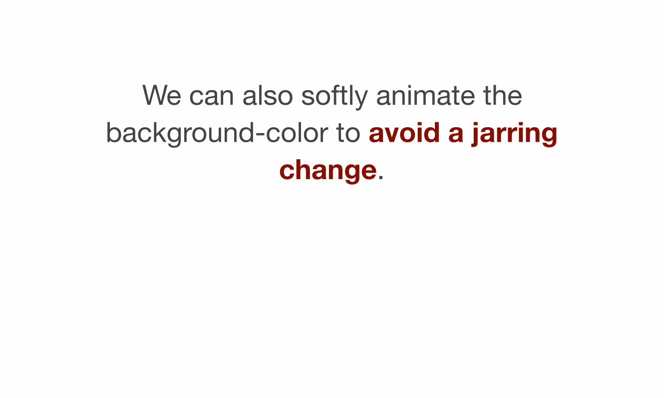
We can also softly animate the background-color to avoid a jarring
change.
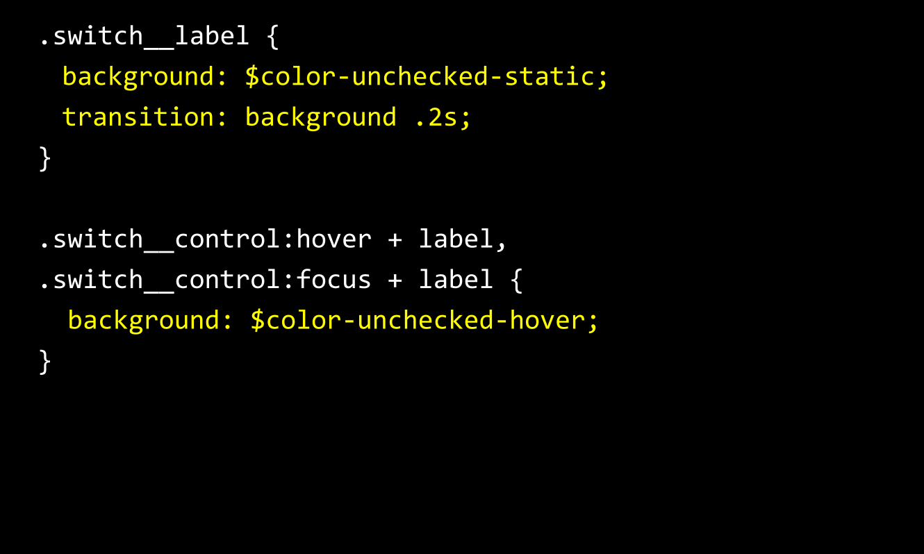
.switch__label { background: $color-‐unchecked-‐static; transition: background .2s;
}
.switch__control:hover + label,
.switch__control:focus + label { background: $color-‐unchecked-‐hover; }

Demos

Checkbox and radio button switch:
https://russmaxdesign.github.io/switch-checkbox/
Github: https://github.com/russmaxdesign/switch-
checkbox
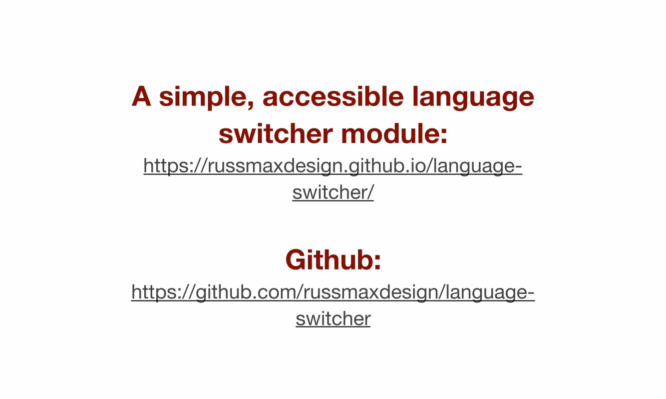
A simple, accessible language switcher module:
https://russmaxdesign.github.io/language-switcher/
Github: https://github.com/russmaxdesign/language-
switcher
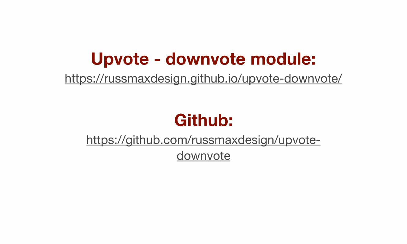
Upvote - downvote module: https://russmaxdesign.github.io/upvote-downvote/
Github: https://github.com/russmaxdesign/upvote-
downvote
Russ Weakley Max Design
Site: maxdesign.com.au Twitter: twitter.com/russmaxdesign Slideshare: slideshare.net/maxdesign Linkedin: linkedin.com/in/russweakley