Embed Size (px)
DESCRIPTION
Citation preview
Developing Modern Mobile Web Apps patterns & practices
Summary: This project provides guidance on building mobile web experiences using HTML5, CSS3, and JavaScript. Developing web apps for mobile browsers can be less forgiving than developing for desktop browsers. There are issues of screen size, the availability of specific feature support, and other differences between mobile browsers that will impact how you develop your apps. In addition, there are various levels of support for the emerging standards of HTML5 and CSS3, and standards for some features, such as touch, are just beginning to take shape. All of these factors suggest that it is best to keep your HTML, CSS, and JavaScript as simple as you can in order to ensure compatibility with as many devices as possible. This project illustrates how to do this, as well as how to add more advanced functionality where supported.
Category: Guide Applies to: ASP.NET MVC 4, HTML5, CSS3, and JavaScript Source: MSDN Library (patterns & practices) (link to source content) E-book publication date: June 2012

Copyright © 2012 by Microsoft Corporation
All rights reserved. No part of the contents of this book may be reproduced or transmitted in any form or by any means without the written permission of the publisher.
Microsoft and the trademarks listed at http://www.microsoft.com/about/legal/en/us/IntellectualProperty/Trademarks/EN-US.aspx are trademarks of the Microsoft group of companies. All other marks are property of their respective owners. The example companies, organizations, products, domain names, email addresses, logos, people, places, and events depicted herein are fictitious. No association with any real company, organization, product, domain name, email address, logo, person, place, or event is intended or should be inferred. This book expresses the author’s views and opinions. The information contained in this book is provided without any express, statutory, or implied warranties. Neither the authors, Microsoft Corporation, nor its resellers, or distributors will be held liable for any damages caused or alleged to be caused either directly or indirectly by this book.
Contents Building Modern Mobile Web Apps ......................................................................................................... 6
Summary ............................................................................................................................................. 6
Authors and contributors..................................................................................................................... 6
Related titles ....................................................................................................................................... 7
Feedback and support ......................................................................................................................... 7
Choosing between a web and native experience ..................................................................................... 8
Platform options .................................................................................................................................. 8
Influencing factors ............................................................................................................................... 8
Native solutions ................................................................................................................................... 9
Web solutions ................................................................................................................................... 10
Hybrid solutions ................................................................................................................................ 10
Using third-party frameworks ............................................................................................................ 11
Summary ........................................................................................................................................... 11
Further reading ................................................................................................................................. 12
Defining the mobile web app experience ............................................................................................... 13
Lightweight and responsive ............................................................................................................... 13
Designed to suit device capabilities and constraints ........................................................................... 13
Rich, platform-agnostic user interface ............................................................................................... 14
Forward thinking ............................................................................................................................... 15
Summary ........................................................................................................................................... 15
References ........................................................................................................................................ 15
Choosing devices and levels of support.................................................................................................. 16
Determining which browsers and devices to support ......................................................................... 16
Summary ........................................................................................................................................... 18
References ........................................................................................................................................ 18
Options for building mobile web experiences ........................................................................................ 19
Improving the mobile-friendliness of your existing app ...................................................................... 19
Using a proxy-based solution ............................................................................................................. 21
Developing a standalone mobile solution .......................................................................................... 22
Developing a responsive experience .................................................................................................. 23
Summary ........................................................................................................................................... 24
Resources .......................................................................................................................................... 24
Mobilizing the Mileage Stats app ........................................................................................................... 25
What is Mileage Stats Mobile? ........................................................................................................... 25
Summary ........................................................................................................................................... 27
Delivering mobile-friendly styles and markup ........................................................................................ 28
Goals when developing mobile-friendly markup ................................................................................ 28
Embracing browser diversity.............................................................................................................. 33
Summary ........................................................................................................................................... 35
Developing mobile-friendly forms.......................................................................................................... 36
Goals when developing mobile-friendly forms ................................................................................... 36
Form element implementation in Mileage Stats ................................................................................ 37
Styling form elements ........................................................................................................................ 40
Fallback strategies and false positives ................................................................................................ 41
Creating custom input widgets .......................................................................................................... 42
Summary ........................................................................................................................................... 43
Delivering mobile-friendly images ......................................................................................................... 44
Major considerations ......................................................................................................................... 44
Summary ........................................................................................................................................... 48
Delivering a responsive layout ............................................................................................................... 49
Why use responsive design? .............................................................................................................. 49
Summary ........................................................................................................................................... 56
Additional usability enhancements ........................................................................................................ 57
Navigating large recordsets ............................................................................................................... 57
Providing access to the desktop experience ....................................................................................... 58
Summary ........................................................................................................................................... 59
Detecting devices and their features ..................................................................................................... 61
Detecting features on the server ....................................................................................................... 61
Delivering the SPA enhancements ......................................................................................................... 68
Defining the single page application (SPA) requirements ................................................................... 68
Frameworks....................................................................................................................................... 69
Building the single page application ................................................................................................... 71
Summary ........................................................................................................................................... 86
Testing mobile web experiences ............................................................................................................ 87
Mobile testing tools/options.............................................................................................................. 87
Testing on desktop browsers ............................................................................................................. 87
Testing on emulators and simulators ................................................................................................. 88
Testing on device hardware ............................................................................................................... 89
Using a remote device service ........................................................................................................... 90
Choosing test browsers and devices .................................................................................................. 90
Why and how to test ......................................................................................................................... 92
Debugging on mobile devices ............................................................................................................ 94
Summary ........................................................................................................................................... 96
Appendix A: Changes to the server-side code ........................................................................................ 97
Reducing duplication in the controller actions ................................................................................... 97
Appendix B: Implementing geolocation ............................................................................................... 103
Appendix C: Delivering mobile-friendly charts ..................................................................................... 109
Rationale and approach ................................................................................................................... 109
Building Modern Mobile Web Apps June 2012
Summary This project provides guidance on building mobile web experiences using HTML5, CSS3, and JavaScript. Developing web apps for mobile browsers can be less forgiving than developing for desktop browsers. There are issues of screen size, the availability of specific feature support, and other differences between mobile browsers that will impact how you develop your apps. In addition, there are various levels of support for the emerging standards of HTML5 and CSS3, and standards for some features, such as touch, are just beginning to take shape. All of these factors suggest that it is best to keep your HTML, CSS, and JavaScript as simple as you can in order to ensure compatibility with as many devices as possible. This project illustrates how to do this, as well as how to add more advanced functionality where supported.
Downloads Download Reference Implementation code
Guidance topics Choosing between a web and native experience
Defining the mobile web app experience
Choosing devices and level of support
Options for building mobile web experiences
Mobilizing the Mileage Stats app
Delivering mobile-friendly styles and markup
Developing mobile-friendly forms
Delivering mobile-friendly images
Delivering a responsive layout
Additional usability enhancements
Detecting devices and their features
Delivering the SPA enhancements
Testing mobile web experiences
Changes to the server-side code
Implementing geolocation
Delivering mobile-friendly charts
Community http://liike.github.com/
License Microsoft patterns & practices License
Authors and contributors This guide was produced by the following individuals:
• Program and product management: Eugenio Pace and Don Smith.
• Subject matter experts and advisors: Erick Porter, Abu Obeida Bakhach, Stephanie Rieger, Bryan Rieger.
• Development: Christopher Bennage, Francis Cheung, Pablo Cibraro, Bryan Rieger, Stephanie Rieger.
• Test team: Carlos Farre, Amrita Bhandari (Satyam), Jaya Mahato (Satyam).
• Edit team: Nancy Michell, RoAnn Corbisier.
• Release Management: Nelly Delgado and Richard Burte (Channel Catalyst).
We want to thank the customers, partners, and community members who have patiently reviewed our early content and drafts. Among them, we want to highlight the exceptional contributions of Pablo Cibraro (AgileSight), Ducas Francis (Senior Consultant, Readify), Akira Inoue (Microsoft Japan), Chris Love (Chief Mobility Officer, Tellago), Luca Passani (CTO, ScientiaMobile, Inc.), Steve Presley (Mobile Technology Architect), Jon Arne Sæterås (Mobiletech.no), Don Smith (Intergen Ltd.), and Alexander Zeitler (PDMLab).
Related titles •
•
Project Silk: Client-Side Web Development for Modern Browsers
Developing a Windows Phone App from Start to Finish
Feedback and support Questions?Comments?Suggestions? Visit the patterns & practices community site on GitHub: http://liike.github.com/. This content is a guidance offering, designed to be reused, customized, and extended. It is not a Microsoft product. Code-based guidance is shipped "as is" and without warranties. Customers can obtain support through Microsoft Support Services for a fee, but the code is considered user-written by Microsoft support staff.
Choosing between a web and native experience Before developing a mobile experience for your content or app, you first need to choose which platform to use. You can build a native app that is written in the language specific to a device's platform. You can build a web solution using standards-based technologies such as HTML, CSS, and JavaScript. Or, you can take a hybrid approach, using both native components and web technologies. It is not always obvious which platform is appropriate for your app.
There's more to choosing an approach than simply considering the technical advantages and disadvantages. You should also bear in mind how the choice will impact your users, whether it will limit the features your app needs, and whether it will impact your ability to deliver on time and on budget.
Platform options Let's begin by defining what we mean by native, web, and hybrid.
When you build a native app, you must use APIs specific to the device's operating system. It also generally means working with a language and SDK specific to the platform. For example, in the case of Windows Phone, you use XAML and either C# or Visual Basic. For iOS devices, you use Cocoa Touch and Objective-C.
A web app is anapp written using HTML, CSS, and JavaScript which are sent from a web server over the Internet and rendered in the web browser on the device. In most cases, the browser comes preinstalled on the device, but many devices also allow users to install alternate browsers. This guide is focused on building mobile apps using web technologies.
When we speak of hybrid apps, we are referring to apps that are built using both native code and web technologies. In general, these are native apps that use an embedded web browser. (For example, in the case of Windows Phone it's the WebBrowser control.) The HTML, CSS, and JavaScript for such an app may live on a web server or be embedded in the native app itself.
There is great variation in hybrid implementations. Certain apps will primarily use native platform controls and APIs, and the embedded browser will play a very small role. In other instances you may only use the native platform as a shim, and build the majority of the app with web technologies. In many cases, hybrid apps use frameworks that wrap some of the common native functionality in JavaScript, making it available to the web layer.
Influencing factors In order to choose the most appropriate technique, you should consider your app's requirements (and how they will evolve in the future), the impact of the chosen method on your users, and the experience and culture of the team developing the app. In general, these and other factors can be evaluated in terms of investment, reach, and features:
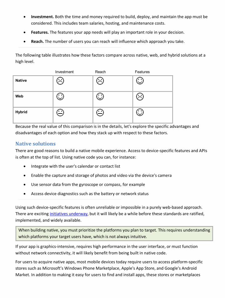
• Investment. Both the time and money required to build, deploy, and maintain the app must be considered. This includes team salaries, hosting, and maintenance costs.
• Features. The features your app needs will play an important role in your decision.
• Reach. The number of users you can reach will influence which approach you take.
The following table illustrates how these factors compare across native, web, and hybrid solutions at a high level.
Investment Reach Features
Native
Web
Hybrid
Because the real value of this comparison is in the details, let's explore the specific advantages and disadvantages of each option and how they stack up with respect to these factors.
Native solutions There are good reasons to build a native mobile experience. Access to device-specific features and APIs is often at the top of list. Using native code you can, for instance:
• Integrate with the user's calendar or contact list
• Enable the capture and storage of photos and video via the device's camera
• Use sensor data from the gyroscope or compass, for example
• Access device diagnostics such as the battery or network status
Using such device-specific features is often unreliable or impossible in a purely web-based approach. There are exciting initiatives underway, but it will likely be a while before these standards are ratified, implemented, and widely available.
When building native, you must prioritize the platforms you plan to target. This requires understanding which platforms your target users have, which is not always intuitive.
If your app is graphics-intensive, requires high performance in the user interface, or must function without network connectivity, it will likely benefit from being built in native code.
For users to acquire native apps, most mobile devices today require users to access platform-specific stores such as Microsoft’s Windows Phone Marketplace, Apple's App Store, and Google's Android Market. In addition to making it easy for users to find and install apps, these stores or marketplaces
often provide features that facilitate revenue generation (see the official documentation for each store for details about services provided).
Another benefit of native apps is that app update notifications can be delivered directly to the device, allowing you to stay in touch with users who don't use the app frequently.
While the aforementioned benefits of native apps represent a strong argument in their favor, there are also drawbacks. For example, deploying an app to the stores for distribution can be time consuming and often includes a review process that can further delay publication.
In addition, if your app needs to target multiple native platforms, you may have to employ a larger development team (or even multiple development teams) with expertise in each specific platform. This can increase the investment of time and money. If you don't target more than one, you limit your reach.
Web solutions Web solutions all share a similar runtime environment: the browser. Web browsers come pre-installed on all modern smartphones, tablets, e-book readers, and some game consoles and music players. If the ability to reach a large number of users is your highest priority, then the ubiquity of the web and the multitude of ways users may access your app are of great value.
There are additional advantages of web-based mobile solutions as well. For instance, many developers are already familiar with HTML, CSS, and JavaScript, but if your team doesn't have web experience, becoming competent can be relatively quick and inexpensive. Plus, if you already have a web presence, you may be able to save time by reusing some of your existing web assets and deployment processes. The ability to deploy new features or bug fixes as often as you like is another time saver. Your users will benefit from the time savings as well, because they won't have to install your app or manage updates.
Another advantage (if you have an existing web presence) is that you will already have metrics on the devices your visitors use. Understanding your existing audience makes prioritizing the experience more straightforward.
However, developing web apps for mobile browsers can be less forgiving than developing for desktop browsers. There are issues of screen size, the availability of specific feature support, and other differences between mobile browsers that will impact how you develop your apps. In addition, there are various levels of support for the emerging standards of HTML5 and CSS3, and standards for some features, such as touch, are just beginning to take shape. All of these factors suggest that it is best to keep your HTML, CSS, and JavaScript as simple as you can in order to ensure compatibility with as many devices as possible.
Although you can reach a broad audience quickly and inexpensively, certain features are either not available or will require extra effort to implement. For example, the ability to run apps offline is poorly supported on most mobile browsers.
Hybrid solutions Using web technologies inside of a native app can give you the best of both worlds. You can mitigate certain disadvantages of the native approach, while gaining a considerable level of flexibility.
Consider a natively built and deployed app whose sole interface is a web view control that takes up the entire screen of the device. All of the user interface and interactions can be built using traditional web development practices. The device-specific features that are not normally available to web apps, such as the microphone or the notification center can be made available to JavaScript. This is possible because many devices allow the JavaScript executing in a web view control to communicate with the native host app. In addition, there are a number of third-party frameworks that provide ways to interact with native APIs using JavaScript. See Using third-party frameworks later in this topic for more information.
Some of the flexibility of this approach relates to where your web assets are stored. That is, they may be embedded in the native app itself, or they may be retrieved from the web. Images, markup, style sheets, and scripts that aren't likely to change can often be bundled with the app to improve load times. Other assets (those that will likely change) can be downloaded as needed from remote servers.
Hybrid apps reap the benefits of deployment in an app storefront while often requiring a smaller investment than native solutions. However, they aren't perfect for all scenarios. Because they share the same deployment constraints as native solutions, it's more time consuming to publish new features or fixes compared to web-only solutions. And while the reach is broader than it is for a native app because the codebase remains more consistent across the targeted platforms, its reach is not as great as that of a web app.
Using third-party frameworks There are a number of third-party frameworks available to facilitate the development of mobile web and hybrid apps. The list that follows is by no means exhaustive, and is only included here to give you a sense of the types of frameworks available at the time of this writing.
jQuery Mobile is a framework for building mobile web apps. It is a JavaScript UI library that depends upon the jQuery Core and jQuery UI libraries. Its themeable design allows for a customized look that matches the mobile OS design patterns. However, given the various levels of HTML5 support among mobile browsers, not all elements or animations appear consistently across the major platforms. Its main advantage perhaps is that websites built with jQuery Core can detect the mobile browser and reformat the site layout to be consistent with the device's screen size.
Apache Cordova, distributed by Adobe under the name PhoneGap, is a framework that wraps the most common device capabilities when building hybrid apps as described above. It provides an app shell that exposes some native functionality to the embedded web browser. Frameworks such as PhoneGap aim to make cross-platform development easier while enabling developers to use device features that are not commonly available to web platforms. Hybrid frameworks like PhoneGap may also be used in conjunction with other web-only frameworks such as Sencha Touch or jQuery Mobile.
Summary It’s important to understand the advantages and disadvantages when choosing a platform. The choice is determined largely by the way your app will be used by your target audience. Third-party frameworks can be very useful, but are not always required. The choice to use a framework should be made by weighing the advantages and disadvantages.
Further reading • Hybrid mobile apps take off as HTML5 vs. native debate continues. By Ron Perry at
http://venturebeat.com/2011/07/08/hybrid-mobile-apps-take-off-as-html5-vs-native-debate-continues
• Device APIs Working Group: http://www.w3.org/2009/dap
• PhoneGap from Adobe: http://phonegap.com
• jQuery Mobile: http://jquerymobile.com/
• Which Cross-Platform Framework is Right for Me? By Daniel Pfeiffer at http://floatlearning.com/2011/07/which-cross-platform-framework-is-right-for-me
• Comparison: App Inventor, DroidDraw, Rhomobile, PhoneGap, Appcelerator, WebView, and AML. By Jeff Rowberg at http://www.amlcode.com/2010/07/16/comparison-appinventor-rhomobile-phonegap-appcelerator-webview-and-aml
• HTML5 Offline Web Applications: http://www.w3.org/TR/html5/offline.html
Defining the mobile web app experience As mentioned earlier, this guide focuses on building mobile web apps. In this section we will examine the defining characteristics of a modern mobile web app. These characteristics are born of best practices and provide a useful framework upon which you may plan and design the features of your own app.
Mobile web apps should be
• Lightweight and responsive
• Designed to suit each device's capabilities and constraints
• Include a rich, platform-agnostic user interface
• Built with forward-thinking practices
Lightweight and responsive Mobile devices may be more powerful than the computers we owned in 1995, but they remain quite constrained compared to the desktop computers we use today. A slower processor not only impacts the overall speed of the browser, but can also influence the speed at which content is accessed from the network, the redraw rate for effects and animations, and the responsiveness of the view as a user interacts with it. Mobile devices are also often used in contexts where bandwidth may be poor or prone to unexpected latency.
Mobile apps should therefore be lightweight and not impose additional latency through unnecessarily heavy markup, poor data management, or use of gratuitous and unnecessary effects. A good way to determine an appropriate size for your app is to consider how long you would like users to wait as the page loads.
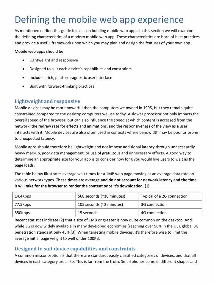
The table below illustrates average wait times for a 1MB web page moving at an average data rate on various network types. These times are average and do not account for network latency and the time it will take for the browser to render the content once it's downloaded. (1)
14.4Kbps 568 seconds (~10 minutes) Typical of a 2G connection
77.5Kbps 105 seconds (~2 minutes) 3G connection
550Kbps 15 seconds 4G connection
Recent statistics indicate (2) that a size of 1MB or greater is now quite common on the desktop. And while 3G is now widely available in many developed economies (reaching over 56% in the US), global 3G penetration stands at only 45% (3). When targeting mobile devices, it's therefore wise to limit the average initial page weight to well under 100KB.
Designed to suit device capabilities and constraints A common misconception is that there are standard, easily classified categories of devices, and that all devices in each category are alike. This is far from the truth. Smartphones come in different shapes and
sizes, ship with many different browsers, and have varying CPU power. Tablets also greatly vary in size. In fact some are not much larger than a phone.
A similar problem applies to platforms. For example, although many devices use the Android operating system, the platform can be integrated into all manner of devices, from tablets, to televisions, to in-car entertainment displays. The manufacturer can also choose which of several platform versions to implement (for example, Android 2.2 vs. 2.3), and can make changes to the user interface and platform settings. For this reason, it's unlikely you would be able to design one app that would work seamlessly on all Android devices.
Rather than develop a web app specific to a particular platform's browser (such as Windows Phone), rendering engine (such as WebKit) or device grouping (such as smartphones) it's best to deliver a flexible app targeting the lowest common denominator app, then layer additional features and enhancements in accordance with the capabilities and constraints of each browser and device.
This level of adaptability is best achieved through the use of future-friendly, backwards-compatible practices such as unobtrusive JavaScript and progressive enhancement. These will enable you to broaden your reach today, while more easily supporting the browsers and platforms of tomorrow.
Rich, platform-agnostic user interface It's sometimes hard to define what we mean by a "rich interface" or why an app should have one to begin with. The richness of an interface does not guarantee that an app will be stable, well thought out, or have well-chosen features and good performance. These characteristics should certainly be the primary concern of a product team as they will greatly impact users (and the viability of your product).
A well-designed product can, however, benefit greatly from a richer interface. A feature may be well designed, but still hard to use. Users may not understand how to find a feature, what that feature is for, or the language used may cause them to make mistakes. Features may also be hard to use due to external factors such as hardware and screen quality.
A rich user interface is therefore one that works well with (and enhances) the back-end business logic, permitting users to effortlessly complete their tasks. A rich app also embraces unique device or browser characteristics, working with the device or platform, rather than against it.
For example, some apps choose to mimic the design of the iOS platform, and include a back button at the top of each app view. This may be familiar to native iOS app users, but is counterproductive for a browser-based app. Most mobile browsers have their own built-in back button, and those that don't have purposely omitted it as their platform includes a mandatory hardware-based back button.
So while a separate back button may make the app look like a native app, the developers now have the added burden of ensuring this button's behavior is identical to that of the browser or hardware version. This effort could better be spent improving the overall cross-browser compatibility of the app, or implementing enhancements for users with more powerful or standards-compliant browsers.
Forward thinking The goals of each app will vary; however, developing for mobile always provides a unique opportunity. Our existing patterns and practices were designed in an age of large, stationary desktop computers. Many of these practices are being challenged by the new diversity in connected devices. While some of these devices are smaller and more portable, others—such as Smart TVs—are larger and more social. And these changes will only accelerate. In fact by 2015, Morgan Stanley predicts (4) the number of mobile Internet users will overtake those using fixed Internet connectivity.
Developing a mobile version of your web app is therefore an opportunity to examine older practices and determine which may no longer be appropriate. It's also an opportunity to redesign your product from the ground up, with the aim of making it more adaptable to future change. In this sense, designing a mobile app should be considered a long-term investment in your product's future.
And although your mobile app may start small, it may through iteration achieve feature parity with your original desktop app.
You may even discover that features you considered important when the legacy app was developed become less important, when transposed to smaller and more portable devices. Your mobile app may even cause you to replace the legacy app altogether, opting for a more feature-based development approach that will enable you to support new contexts such as web-enabled TV.
Summary Understanding the constraints of mobile devices can help you build fast and responsive web apps. The practices gained from this understanding can also improve your web development in general. It’s important to realize that the classification of browsers into "mobile" and "desktop" rapidly changes as the number and types of devices continually grows.
References (1) Calculated based on data from http://web.forret.com/tools/bandwidth.asp?speed=550&unit=Kbps
(2) http://gigaom.com/2011/12/21/hold-those-caps-the-average-web-page-is-now-almost-1mb/
(3) http://www.slideshare.net/kleinerperkins/kpcb-internet-trends-2011-9778902
(4) http://gigaom.com/2010/04/12/mary-meeker-mobile-internet-will-soon-overtake-fixed-internet/
Choosing devices and levels of support When you're setting out to create a mobile web experience for an app, one of the first questions you have to be able to answer is, "Which devices are you going to support, and what is the achievable UI experience on those devices?" Answering this question is not always intuitive or straightforward as it depends on a number of factors.
Determining which browsers and devices to support Choosing which devices and browsers to support is somewhat of an organic process, and a decision that has no right or wrong answer. Ideally, you want to support as many browsers (and therefore users) as possible. In practice however, the decision is somewhat of a balancing act between the project goals, the available budget, the availability of stable and well-distributed web technologies, and the device market share of your target audience.
If mobile development is new to you, you may not be familiar with the range of mobile browsers or devices. You therefore won't know what features are supported on what browsers, and consequently which devices you should support.
This is not as much of a problem as it seems. Unless you're building a product for a very specific audience (for example, a large corporate sales force where everyone carries the same brand of device) it's probably safe to presume that you will always need to support a variety of browsers and devices. As a matter of fact, even within such a sales force group, there may easily be 5-10 different device models, various screen sizes, and multiple form factors and browser versions.
This diversity will be present even when targeting popular devices such as the iPhone. There have been four versions of iOS since the platform launched, and although all iPhones have the same screen size, new browser features have been introduced with each operating system release. So although they appear quite similar, an iPhone 4 with iOS 5 will have different capabilities than an iPhone 3GS with iOS 4.3.5, or even an iPod Touch with iOS 4.3.5.
Now that you know you'll need to support a range of devices, let's determine just how wide this range should be. The best way to begin is by considering the features and overall experience of your app.
Considering features First, determine the key features and behaviors of your app, and whether these require specific technologies. If, for example, your app makes heavy use of location coordinates, you may need a mechanism to detect the user's location. The HTML5 geolocation specification provides a fairly simple API that could generate highly granular coordinates, but the technology is not yet well supported across all devices.
This simple example illustrates the type of choice you will have to make.
• If you decide that you only have the resources to implement and support HTML5 geolocation, you will have no choice but to exclude many older smartphones as well as most feature phones that lack such support.
• If you decide that excluding these users is unacceptable given your business goals and the market share of these devices, this decision will in turn impact the resources you will need to devote to both design and the development of a secondary location detection method.
Starting with key features is important as the decisions you make may require or completely eliminate specific browsers or devices.
By comparison, the need for other technologies—for example CSS3 transitions or HTML5 video—may be considered simple enhancements (the absence of a transition doesn't typically affect functionality, and most platforms provide an easy means to launch video in a standalone native player). Rather than eliminate devices that don't support these features, it would make sense to detect support for them and only load the appropriate resources and scripts if the feature is supported.
Experience and context of use Also related to technology factors are the overall design goals of your app. Some apps are designed for all-purpose use, while others are specific to a particular context or behavior such as shopping, watching TV, or inputting complex data in the context of work. These factors may inform the type of device that will be used, but that should still be considered carefully. Recent research indicates that users often spread tasks over periods of time and make use of whatever device is available to them. The fact that your app enables users to purchase and download films for use on their TV doesn't mean they won't spend their one-hour train commute browsing and bookmarking films on their phone for later viewing at home.
Market penetration within your audience Next, examine the market penetration of the various mobile operating systems in the region your product operates in. Most mobile operating systems are popular all over the world, but you will still find significant differences from region to region. (1)
If you have a pre-existing desktop web version of the product, it's also important to review its web traffic and analytics reports. This data is particularly valuable, as it will indicate the most common devices in your region and, more importantly, devices that are in use by existing customers.
Note: If your existing analytics show very little mobile traffic, please review the type of detection method being used. Many analytics packages rely on client-side JavaScript to track visitors and to extract device information such as screen size. Devices with less capable browsers may not support the necessary level of JavaScript and may therefore not appear in the report.
An alternative is to use server-side detection, which extracts device data from the user agent string.
When possible, also review the individual platform versions accessing your site. Many users will never update their phone's operating system, or will simply not have the option to do so. Your analytics package should be able to provide some version data, and regularly updated platform version stats can also be found on the Android and BlackBerry developer sites. (Apple sadly does not release these statistics, but data released by native app analytics services such as Flurry can often provide an indication of platform version popularity).

Budget Finally, you may have existing dependencies related to budget, in-house skills, or frameworks and toolkits that you specialize in.
While it's not always possible to develop a project using the exact technologies you prefer, these factors should be considered, as the ramp-up time required to learn new technologies will ultimately affect the cost of the developing the app.
Each variant of app behavior (for example, the difference between loading data through a full-page refresh instead of using Ajax) may require additional visual and interaction design, along with further front-end development and testing.
Summary Understanding the benefits, risks, and potential return on investment are central to being successful when building apps for the mobile web. Balancing the needs of your users against the features available on the platform sometimes needs careful consideration.
References (1) An exhaustive list of sites that contain this type of data can be found in A comprehensive guide to mobile statistics by Cloud Four in Portland.
Options for building mobile web experiences Deciding which approach to use when developing a mobile app is never simple. There are many techniques available, each with their own pros and cons. It's also important to understand that there is also no single correct answer. The decision should depend on your circumstances and include careful consideration of all related factors, including your resources, timeline, back-end architecture, and data or content structures.
Improving the mobile-friendliness of your existing app Mobile browsers are improving all the time, and if your users own a smartphone they may already be able to use your app on that device. While this may not provide a great experience, if your app is simple (or budgets and schedule are tight) you could opt to simply improve the mobile-friendliness of that app.
The goal in this case would not be to optimize the app for mobile use, but to simply address major issues that may be driving mobile users away, or preventing them from completing key tasks. Some of the problems that users encounter are common to all web apps, while others will be specific to your particular product. In either case, it's best to uncover these problems in context and with a bit of testing.
1. Check your analytics to determine the most common browsers and devices accessing your app.
2. Test your site using these devices. Be sure to test all key tasks and flows to ensure important functionality isn't broken and mobile users complete key tasks.
Note: If you're unable to test on device hardware, you may be able to test on a platform emulator. See Testing mobile web experiences for info about choosing emulators for testing.
These initial tests should provide you with a list of app-specific issues. In addition to these, you can improve the experience by addressing the following common problems.
Page weight and latency Many mobile users will access your app on slow networks, and may be paying for each kilobyte they download. It's therefore important to reduce page weight and increase responsiveness wherever you can. This will make all users happy (even those visiting from a desktop computer) and won't tempt mobile users to immediately abandon your site in favor of others.
• A portion of the weight will naturally come from the images on your site so where possible, optimize these to reduce payload size.
• Be sure as well to review the number of scripts being used. These can be surprisingly heavy, and in many cases greatly exceed the weight of the markup, images, and other assets used to deliver the user interface. It's worth noting as well that if these scripts happen not to work on mobile, the experience might be further improved by preventing a user from even downloading them.
If your app uses large numbers of scripts and images, this can impact performance in an additional way.
Note: According to the Yahoo! Developer Network article, "Best Practices for Speeding Up Your Web Site," "80% of the end-user response time is spent on the front-end. Most of this time is tied up in downloading all the components in the page: images, style sheets, scripts, Flash, etc. Reducing the number of components in turn reduces the number of HTTP requests required to render the page. This is the key to faster pages." (1)
HTTP requests can be reduced in several ways:
• By combining CSS and script files
• By supplying images using data URIs which can be embedded directly within your mark-up or CSS
• By combining icons and other small graphics into one larger image (also called a sprite sheet)
These techniques may not be supported across all devices, so they should be tested on the key browsers and devices accessing your site. See Delivering mobile friendly images for more info regarding the image techniques described above.
Don't forget to try techniques such as minification and gzip compression on your CSS, JavaScript, and HTML, in order to reduce the actual size of the file being downloaded to the client. For a full list of performance best practices, see Best Practices for Speeding Up Your Web Site.
Many third-party services such as advertising, social media widgets, and analytics generate their own HTTP requests. This is worth investigating as they may generate more requests and result in latency that will be beyond your control.
Scripts and interactivity An increasing number of mobile devices are manipulated using a touch screen. It's therefore important to check your app for features and content that can only be accessed using a mouse (or other pointer-based) event. Touchscreen users may still be able to trigger these events by tapping the screen, but the interaction may be more complex or confusing than it needs to be.
Augmenting the experience with mobile-specific capabilities Typing on small screens can be awkward, so look for ways to improve data input.
• Don't force users to type if they don't have to. Look for opportunities to prepopulate data (based on past choices) or provide them with useful choices in a menu.
• Take advantage of the new HTML5 form input types, placeholder attributes, and built-in validation for common inputs such as email addresses and URLs. These are not yet supported on all browsers but are designed to degrade gracefully. Until these features are fully supported, it's important to keep secondary hints and validation in place. See Delivering mobile friendly forms for more info.
Unless your app is extremely simple, these types of improvements to your desktop web app should be considered an interim solution. Following these steps may improve the experience, but it's likely that many problems will remain unresolved.
Pros • Adapting an existing app is typically quicker than designing and implementing a full mobile-
specific version.
• While the resulting experience may not be fully optimized, it can improve the experience enough to suit many users and provide time to plan a longer-term solution.
Cons • Reducing page weight, improving latency, and augmenting the app with mobile-friendly
features are in most cases stopgap measures. This cannot replace a more comprehensive design process that may involve improvements to app flow, markup structure, and deeper integration of mobile-friendly CSS and JavaScript.
• As outlined when discussing images, many of the improvements recommended don't fully resolve the challenge of supporting devices with many screen sizes and capabilities. If your images are 800 pixels wide and 300KB, optimizing them will not resolve the basic problem that you are serving large, high-bandwidth images to smaller, resource-constrained devices.
Using a proxy-based solution Migrating or refactoring a desktop app's back end to enable new, mobile-friendly features and functionality is not always possible. Some apps are highly complex, or may have been built by teams that have since moved onto other projects. This can make large-scale changes to the server-side code difficult, and if the app doesn't have a consistent and well-thought-out architecture (or doesn't contain unit tests) changes can be riskier still.
Business pressures may also mandate an aggressive mobile strategy that means the app must be available in a matter of weeks. In this case, you may want to consider using a proxy-based solution.
Proxy-based solutions vary in their implementation, but most use a combined approach including data collection, transformation, and optimization in order to dynamically generate a mobile-appropriate variant of your web site. This optimization and transformation "layer" (or app) is typically offered as a third-party service that intercepts the existing web site's outbound markup, and optimizes it for the mobile client. Certain proxy solutions specialize in adaptation of content-heavy sites, while others focus more specifically on e-commerce and transactional apps.
Pros • Using a proxy solution is typically quicker than implementing a mobile site from scratch.
• Proxy based solutions don't typically require duplication of content, so they integrate well into your existing content management system (CMS) and production workflows. You update the desktop app, and the mobile experience takes care of itself.
• Part of the optimization process requires some sort of content collection, which can often be adapted to dynamically generate an API for an otherwise static web site.
Cons • Proxy services work best when you wish to entirely mirror the desktop content and business
logic. Aiming for consistency is great, but there may be times when you still need to serve different content or functionality to different devices. Doing so may not be possible when using a proxy.
• The more you customize your proxied site (and therefore fork desktop business logic or controllers), the more long-term maintenance you will incur each time your desktop site changes.
• Upgrades to your overall technology stack (payment services, remote caching, and so forth) may not be reflected in the proxy environment unless you incur the cost of a second implementation.
• Proxy services may offer less flexibility and control over the design, infrastructure, and the experience you deliver to each device.
Developing a standalone mobile solution A standalone mobile solution is one that has been designed with mobile as the primary context. Standalone apps operate independently from any existing (desktop) web app, and are therefore often hosted on separate domains (or subdomains).
Pros • The experience can be fully tailored to small/portable devices.
• Markup and template structures can be reassessed and optimized in accordance with good practice for mobile devices.
• Content and functionality can be implemented gradually, to suit user demand and budgetary constraints. The eventual goal may be to reach feature parity with the legacy app, but a standalone site provides the freedom to do this in stages.
• There may be little need for image adaptation as lightweight images (and media) can be served from the very beginning.
Cons • Having a standalone site may require maintenance of a separate additional site (and potentially
separate assets and content within your CMS).
• A standalone site will require a detection and redirection strategy to ensure URLs resolve gracefully regardless of the requesting device. If the standalone mobile experience doesn't contain all the functionality of the desktop experience, you may also need a strategy to convey this to users, and suggested alternative content or other means of completing their task.
• If the site operates from a separate domain (and despite the use of redirection) you may need additional marketing efforts to promote the site.
• If not designed responsively, you may need a separate site for larger devices such as tablets (and a strategy to determine which devices should receive each site).
To ensure the best experience, it will also be necessary to implement some manner of feature detection, to ensure the functionality and experience you serve is appropriate to the capabilities of each browser and/or device.
Developing a responsive experience Responsive design is a technique that enables developers to adapt the layout and visual design of an app to suit multiple screen sizes. This is implemented using a series of CSS media queries that trigger layout and stylistic changes. These changes occur once a device property (such as screen width) meets the criteria defined within that media query.
Responsive design is most often applied to a single site (or app) enabling it to adapt to all contexts—from small portable devices, all the way up to desktop computers (and even larger screens such as televisions).
Pros • Developers can design and maintain one set of markup (with the occasional variation), and in
doing so, support a wide range of devices. This reduces the number of templates and resources that must be designed, and avoids duplication of any future design, implementation, and maintenance efforts.
• The app is easier to promote, as there is only one domain, and one URL for each article, section, or feature on the web site. This is particularly helpful in today's highly connected world as URLs shared by email or using social media will resolve gracefully regardless of the device.
Cons • Responsiveness isn't something you can simply add to an existing web site. While it may be
possible to inject some flexibility into an existing experience, most apps will require significant changes to templates, styles, and in many cases scripts and content.
• Responsive design is ideal for adapting layouts, but there is no built-in mechanism to target differences in browser or device capabilities. It's therefore necessary to pair responsive design with some manner of feature detection to ensure the most appropriate functionality and experience is served to each device.
• Responsive techniques enable you to scale images to suit different screen sizes, but do not address image weight or legibility. A separate image adaptation strategy may therefore be required.
• Some content may simply not be appropriate at certain screen sizes. You may therefore need to add, remove, or adapt the content (including advertising).
The sample app included in this guide, Mileage Stats Mobile, uses, responsive design as a tool (and strategy), enabling us to better target devices with a wide range of screen sizes.
Users who access Mileage Stats Mobile from a desktop computer are still redirected to the pre-existing desktop app, which is fully optimized for larger screens and more capable browsers.
See Delivering a responsive layout for more details of our responsive implementation.
Summary If you have an existing web app that was not optimized for mobile browsers, there are a few options for improving the experience for mobile users. Each option has advantages and disadvantages. You should consider how well each of these choices will work for your existing app, and think about the overall return on investment involved in any particular option.
Resources (1) http://developer.yahoo.com/performance/rules.html
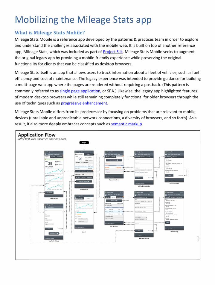
Mobilizing the Mileage Stats app What is Mileage Stats Mobile? Mileage Stats Mobile is a reference app developed by the patterns & practices team in order to explore and understand the challenges associated with the mobile web. It is built on top of another reference app, Mileage Stats, which was included as part of Project Silk. Mileage Stats Mobile seeks to augment the original legacy app by providing a mobile-friendly experience while preserving the original functionality for clients that can be classified as desktop browsers.
Mileage Stats itself is an app that allows users to track information about a fleet of vehicles, such as fuel efficiency and cost of maintenance. The legacy experience was intended to provide guidance for building a multi-page web app where the pages are rendered without requiring a postback. (This pattern is commonly referred to as single page application, or SPA.) Likewise, the legacy app highlighted features of modern desktop browsers while still remaining completely functional for older browsers through the use of techniques such as progressive enhancement.
Mileage Stats Mobile differs from its predecessor by focusing on problems that are relevant to mobile devices (unreliable and unpredictable network connections, a diversity of browsers, and so forth). As a result, it also more deeply embraces concepts such as semantic markup.
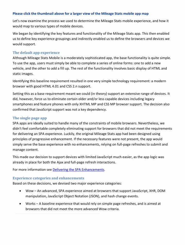
Please click the thumbnail above for a larger view of the Mileage Stats mobile app map
Let's now examine the process we used to determine the Mileage Stats mobile experience, and how it would map to various types of mobile devices.
We began by identifying the key features and functionality of the Mileage Stats app. This then enabled us to define key experience groupings and indirectly enabled us to define the browsers and devices we would support.
The default app experience Although Mileage Stats Mobile is a moderately sophisticated app, the base functionality is quite simple. To use the app, users must simply be able to complete a series of online forms: one to add a new vehicle, and the other to add a fill up. The rest of the functionality involves basic display of HTML and static images.
Identifying this baseline requirement resulted in one very simple technology requirement: a modern browser with good HTML 4.01 and CSS 2.n support.
Setting this as a base requirement meant we could (in theory) support an extensive range of devices. It did, however, force us to eliminate certain older and/or less capable devices including legacy smartphones and feature phones with only XHTML MP and CSS MP browser support. The decision also confirmed that JavaScript support was not a key dependency.
The single page app SPA apps are ideally suited to handle many of the constraints of mobile browsers. Nevertheless, we didn't feel comfortable completely eliminating support for browsers that did not meet the requirements for delivering an SPA experience. Luckily, the original Mileage Stats app had been designed using principles of progressive enhancement. If the necessary features were not present, the app would simply serve the base experience with no enhancements, relying on full-page refreshes to submit and manage content.
This made our decision to support devices with limited JavaScript much easier, as the app logic was already in place for both the Ajax and full-page refresh interactions.
For more information see Delivering the SPA Enhancements.
Experience categories and enhancements Based on these decisions, we devised two major experience categories:
• Wow – An advanced, SPA experience aimed at browsers that support JavaScript, XHR, DOM manipulation, JavaScript Object Notation (JSON), and hash change events.
• Works – A baseline experience that would rely on simple page refreshes, and is aimed at browsers that did not meet the more advanced Wow criteria.
The experience would not, however, be limited to the criteria outlined for these two groups. We planned to implement additional micro-layers of experience based on the capabilities of the browser or device. These would include:
• Using CSS3 media queries and basic responsive design principles to adapt the layout for different screen sizes.
• Enhancing the UI using CSS effects such as drop shadows, gradients, and rounded corners.
• Using a device-pixel-ratio media query to detect high pixel density devices, and provide them with high-resolution graphics.
• Using geolocation data (where supported) to offer a list of nearby gas stations based on the user's current location.
• Generating custom pre-sized bitmap charts on the server and exploring the use of canvas to deliver dynamic charts where supported.
The experience each device would receive would therefore be an aggregate of features based on that browser's capabilities. Rather than implicitly detect a device (or platform), and place it within a particular group, we would detect key capabilities (such as JSON, XHR, or location support) and use these to determine the most appropriate collection of functionality to provide.
The Whoops device group A third experience level, entitled Whoops, was also created for extremely old or basic browsers. While these browsers met the base requirement of HTML 4.01 and CSS 2.n support, the browser implementation might not be robust enough, or the devices might be too small and/or underpowered to properly run even a basic Works experience. In most cases it was simply due to small screen size (typically less than 320 pixels wide), which resulted in an excessively cramped layout. While it might have been possible to detect these devices and serve an extremely basic version of the layout, the team decided that it was not worth the additional effort as we were already supporting a very wide range of current and legacy (three to four-year old) devices.
Summary The reference app for this project is based upon the reference app for Project Silk. We wanted to explore popular patterns for building mobile web apps, making use of modern features while enabling the app to work on as many devices as was reasonable.
Delivering mobile-friendly styles and markup Goals when developing mobile-friendly markup The key to mobile-friendly markup is structure. Mobile browsers are often less powerful than their desktop counterparts. They are often used on resource-constrained devices, and may be subject to latency from both the network and the device. These factors may cause markup, scripts, styles, and images to download and render slowly—or at worst, not at all.
Structuring your HTML To be mobile friendly, HTML should be simple, clean, and well structured. Delivering well-structured markup speeds parsing and rendering, and will ensure that if images or styles don’t load as planned, there will still be human- and machine-legible markup underneath.
The best way to create mobile-friendly HTML is to keep things simple.
• Use HTML elements for their intended purpose. If your text is a header, use an appropriate, semantically relevant tag (such as an <h2> or <header>) instead of wrapping it in <div class="header">.
• Use semantic elements to take advantage of the cascading aspect of CSS.All browsers that support HTML will include a default style sheet with instructions to render semantic elements defining paragraphs, headers, or text emphasis. There will, however, be no default styling available for random markup enclosed in a <div> element. Taking advantage of a browser’s built-in styles may also enable you to write fewer CSS definitions, which can result in smaller downloads and faster parsing and rendering.
• Think twice before wrapping semantic elements (such as headers or paragraphs) in an additional div or container. Remember that each new element must still be parsed, and may require additional styles that will increase the size of your style sheet. These elements also often require longer CSS definitions, with increased specificity, which can also increase the time required to parse the styles.
• Where possible, use the new HTML5 semantic elements (such as header, footer, section, and aside) to further clarify your markup. These elements can be styled and will cascade, like any other HTML element. They are supported on most desktop and smartphone browsers including Windows Internet Explorer starting at version 9. A polyfill script is also available to enable support back to Internet Explorer 7, but should be tested thoroughly to ensure it works on target devices. The HTML5 specification also includes a series of new form attributes and input types. These include input placeholders, built-in form validation for common inputs such as an email address, and attributes that can be set to constrain the input type. These are only supported on newer browsers, but are designed to degrade gracefully and thus can safely be used in your base markup. See Developing mobile-friendly forms for more details.
Setting the viewport tag Setting the viewport meta tag is an important step when developing mobile-friendly markup. Mobile devices come in all shapes and sizes, but their physical size is just one of three factors that impact the user experience. Each device also has a screen size, measured in hardware pixels, and a pixel density measurement, which is the number of pixels per inch (ppi).
Content on a high-ppi display is small and crisp, as pixels are smaller and more of them have been squeezed onto the screen’s physical space. Conversely, content on a low-ppi display will be larger and fuzzier, as fewer (and larger) pixels have been used to display the content.
This creates an interesting problem. Devices with a high ppi may be quite crisp (which is considered a feature), but the content may be uncomfortably small (which would be considered a bug). Handset manufacturers compensate for this by setting an implicit viewport size. For example, while the Samsung Galaxy S2’s display is 480 x 800 pixels, the viewport has been adjusted to a dimension of 320 x 450 pixels to improve legibility.
It’s important to respect these preset dimensions when developing your app. You can do so by adding a viewport meta tag and setting its content property to a value of "device-width".
<meta name="viewport" content="width=device-width">
Doing so instructs the browser to render the page using this preset device viewport width.
Note: While it is possible to change this value, you should consider the implications that such a change will have on the hundreds of devices you might have to support. A value that improves the legibility of your app on one device may decrease the legibility on another.
Other settings are available to control the minimum, maximum, and initial scale at which the page will load. The user-scalable property can also be used to prevent a user from zooming in and out. These should also be used with caution. And as a rule, it’s best to simply let the device choose the most appropriate viewport behavior, and not attempt to control or constrain what the user can do.
Note: Do not forget to include the viewport tag. If a viewport width is not specified (either with a fixed value or a setting of device-width), most mobile browsers will default to a much larger value—often 960px. This will result in a tiny layout that is difficult to read, even if that layout has been mobile optimized.
Please consult The IE Mobile Viewport for Windows Phone for additional details.
Structuring your CSS Mobile-friendly CSS is lightweight and embraces the inherent flexibility and diversity of the web.
Use flexible values Where possible, use flexible values such as em units for typography, and percentages for layouts. These keep the layout adaptable and result in a more malleable and future-friendly user interface. They also
provide users full control over font size, should that option be available in their browser. Pixel values can, of course, still be used when setting media queries or specifying borders.
Consider browser diversity Writing CSS for devices requires pragmatism. There are thousands of mobile devices, several rendering engines, many popular mobile browsers, and many versions of each browser. Clearly, understanding the specification level of each browser or device is impossible. It’s therefore important to create CSS that is not specifically dependent on the specifications or characteristics of just one browser.
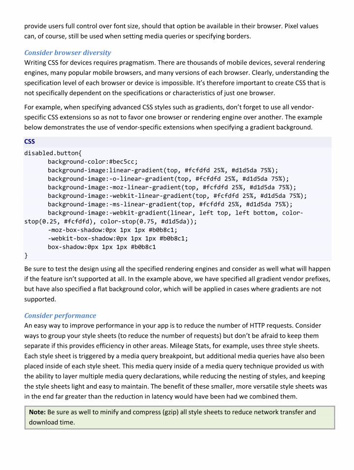
For example, when specifying advanced CSS styles such as gradients, don’t forget to use all vendor-specific CSS extensions so as not to favor one browser or rendering engine over another. The example below demonstrates the use of vendor-specific extensions when specifying a gradient background.
CSS
disabled.button{ background-color:#bec5cc; background-image:linear-gradient(top, #fcfdfd 25%, #d1d5da 75%); background-image:-o-linear-gradient(top, #fcfdfd 25%, #d1d5da 75%); background-image:-moz-linear-gradient(top, #fcfdfd 25%, #d1d5da 75%); background-image:-webkit-linear-gradient(top, #fcfdfd 25%, #d1d5da 75%); background-image:-ms-linear-gradient(top, #fcfdfd 25%, #d1d5da 75%); background-image:-webkit-gradient(linear, left top, left bottom, color-stop(0.25, #fcfdfd), color-stop(0.75, #d1d5da)); -moz-box-shadow:0px 1px 1px #b0b8c1; -webkit-box-shadow:0px 1px 1px #b0b8c1; box-shadow:0px 1px 1px #b0b8c1 }
Be sure to test the design using all the specified rendering engines and consider as well what will happen if the feature isn’t supported at all. In the example above, we have specified all gradient vendor prefixes, but have also specified a flat background color, which will be applied in cases where gradients are not supported.
Consider performance An easy way to improve performance in your app is to reduce the number of HTTP requests. Consider ways to group your style sheets (to reduce the number of requests) but don’t be afraid to keep them separate if this provides efficiency in other areas. Mileage Stats, for example, uses three style sheets. Each style sheet is triggered by a media query breakpoint, but additional media queries have also been placed inside of each style sheet. This media query inside of a media query technique provided us with the ability to layer multiple media query declarations, while reducing the nesting of styles, and keeping the style sheets light and easy to maintain. The benefit of these smaller, more versatile style sheets was in the end far greater than the reduction in latency would have been had we combined them.
Note: Be sure as well to minify and compress (gzip) all style sheets to reduce network transfer and download time.
Create modular, reusable styles As suggested in Structuring your HTML, the best base for a mobile app is well-structured markup that prioritizes the use of semantic HTML elements over non-semantic elements such as divs. The key benefit of well-structured and semantic markup is that it enables you to reduce the number and complexity of the style declarations you create. This will ultimately impact a style sheet’s file size and the time required to parse and render the content.
The cascading nature of styles allows us to create a common or base style that can be augmented/extended by applying additional styles. This enables us to create modular, and easily extensible components that can be reused throughout the app.
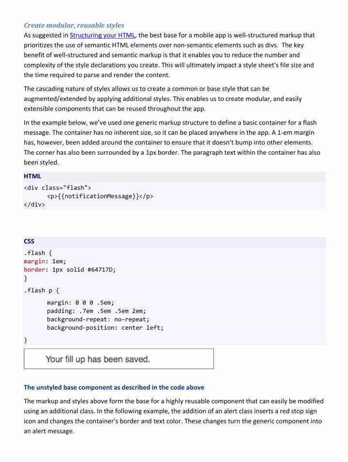
In the example below, we’ve used one generic markup structure to define a basic container for a flash message. The container has no inherent size, so it can be placed anywhere in the app. A 1-em margin has, however, been added around the container to ensure that it doesn’t bump into other elements. The corner has also been surrounded by a 1px border. The paragraph text within the container has also been styled.
HTML
<div class="flash"> <p>{{notificationMessage}}</p> </div>
CSS
.flash { margin: 1em; border: 1px solid #64717D; }
.flash p {
margin: 0 0 0 .5em; padding: .7em .5em .5em 2em; background-repeat: no-repeat; background-position: center left;
}
The unstyled base component as described in the code above
The markup and styles above form the base for a highly reusable component that can easily be modified using an additional class. In the following example, the addition of an alert class inserts a red stop sign icon and changes the container’s border and text color. These changes turn the generic component into an alert message.
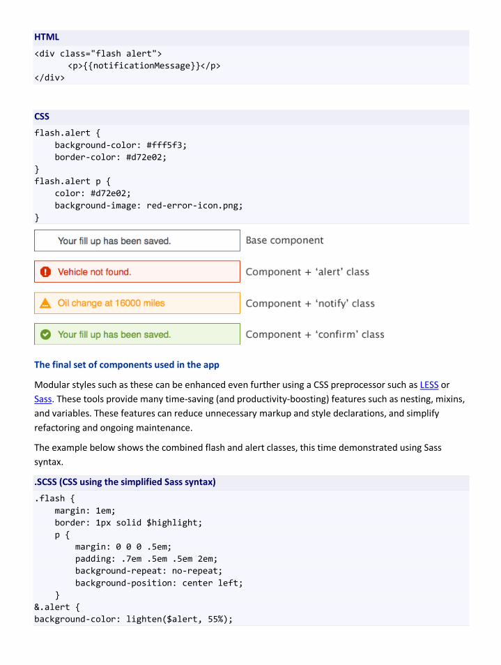
HTML
<div class="flash alert"> <p>{{notificationMessage}}</p> </div>
CSS
flash.alert { background-color: #fff5f3; border-color: #d72e02; } flash.alert p { color: #d72e02; background-image: red-error-icon.png; }
The final set of components used in the app
Modular styles such as these can be enhanced even further using a CSS preprocessor such as LESS or Sass. These tools provide many time-saving (and productivity-boosting) features such as nesting, mixins, and variables. These features can reduce unnecessary markup and style declarations, and simplify refactoring and ongoing maintenance.
The example below shows the combined flash and alert classes, this time demonstrated using Sass syntax.
.SCSS (CSS using the simplified Sass syntax)
.flash { margin: 1em; border: 1px solid $highlight; p { margin: 0 0 0 .5em; padding: .7em .5em .5em 2em; background-repeat: no-repeat; background-position: center left; } &.alert { background-color: lighten($alert, 55%);
border-color: $alert; p { color: $alert; background-image: $img-alert; } }
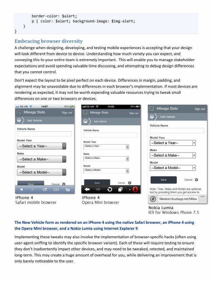
Embracing browser diversity A challenge when designing, developing, and testing mobile experiences is accepting that your design will look different from device to device. Understanding how much variety you can expect, and conveying this to your entire team is extremely important. This will enable you to manage stakeholder expectations and avoid spending valuable time discussing, and attempting to debug design differences that you cannot control.
Don’t expect the layout to be pixel perfect on each device. Differences in margin, padding, and alignment may be unavoidable due to differences in each browser’s implementation. If most devices are rendering as expected, it may not be worth expending valuable resources trying to tweak small differences on one or two browsers or devices.
The New Vehicle form as rendered on an iPhone 4 using the native Safari browser, an iPhone 4 using the Opera Mini browser, and a Nokia Lumia using Internet Explorer 9
Implementing these tweaks may also involve the implementation of browser-specific hacks (often using user-agent sniffing to identify the specific browser variant). Each of these will require testing to ensure they don’t inadvertently impact other devices, and may need to be tweaked, retested, and maintained long-term. This may create a huge amount of overhead for you, while delivering an improvement that is only barely noticeable to the user.
Focus instead on fixing highly noticeable problems that affect legibility, such as text or images that overflow onto other elements, inconsistently sized copy, or elements that disappear off the edge of the page. These larger problems are often easy to replicate on the desktop, and can often be resolved through tweaking or refactoring of markup and styles.
See Styling form elements for recommendations specific to forms.
Tip: Test often during the implementation of styles and layout, and where possible, take screenshots of problems you encounter as you implement key aspects of the design. This will provide a useful reference for your test team and avoid the filing of unnecessary bugs. It will also assist in stakeholder discussions, enabling team members to quickly review and discuss differences in rendering across devices.
Knowing when and what to reuse When creating a mobile version of an existing app, it’s natural to want to reuse existing code and assets. This can be counterproductive as desktop code, styles, and markup were almost always created with more powerful devices in mind.
Reusing markup Good mobile markup is simple, to the point (with few extraneous divs or containers), and makes good use of semantic elements. The more complex the markup, the harder the browser will have to work to parse (and if necessary) adapt it. It’s therefore often hard to reuse markup that was created for the desktop, as it may be bloated and overly complex.
Reusing CSS Existing CSS is also hard to reuse as it may have been created to match your more complex desktop markup. It may also include properties that aren’t supported on mobile browsers, or effects such as CSS gradients, shadows, and transparencies, that can severely impact performance.
Reusing JavaScript For similar reasons, it may be difficult to reuse existing JavaScript. JavaScript support on mobile devices varies, so you should not assume your code will simply work across all the devices you need to support. You may also want to reconsider the use of JavaScript-based animations, as these are CPU intensive. Creating animations using CSS is less likely to cause performance problems, but may not be as well supported as an equivalent JavaScript animation.
As mobile browsers and devices are incredibly diverse, it’s always important to develop using the principles of progressive enhancement. This includes the use of unobtrusive JavaScript practices and feature detection to ensure that functionality is only implemented when support actually exists. Although these practices are also widely encouraged when developing for desktop computers, it’s possible your app may not have been designed in this way. This may make it difficult to reuse front- and back-end controllers.
See Delivering a responsive layout for additional details on the markup and CSS strategy.

Summary There are a few points you should keep in mind when aiming for mobile-friendly solutions. First, simple markup is both easier to maintain and faster to load. Second, understanding how the viewport affects the rendering of your markup has a big impact on the experience of your users. Third, CSS is inherently difficult to maintain. Using tools such as Sass or LESS can help to mitigate the difficulty.
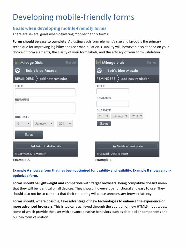
Developing mobile-friendly forms Goals when developing mobile-friendly forms There are several goals when delivering mobile-friendly forms:
Forms should be easy to complete. Adjusting each form element’s size and layout is the primary technique for improving legibility and user manipulation. Usability will, however, also depend on your choice of form elements, the clarity of your form labels, and the efficacy of your form validation.
Example A shows a form that has been optimized for usability and legibility. Example B shows an un-optimized form.
Forms should be lightweight and compatible with target browsers. Being compatible doesn’t mean that they will be identical on all devices. They should, however, be functional and easy to use. They should also not be so complex that their rendering will cause unnecessary browser latency.
Forms should, where possible, take advantage of new technologies to enhance the experience on more advanced browsers. This is typically achieved through the addition of new HTML5 input types, some of which provide the user with advanced native behaviors such as date picker components and built-in form validation.
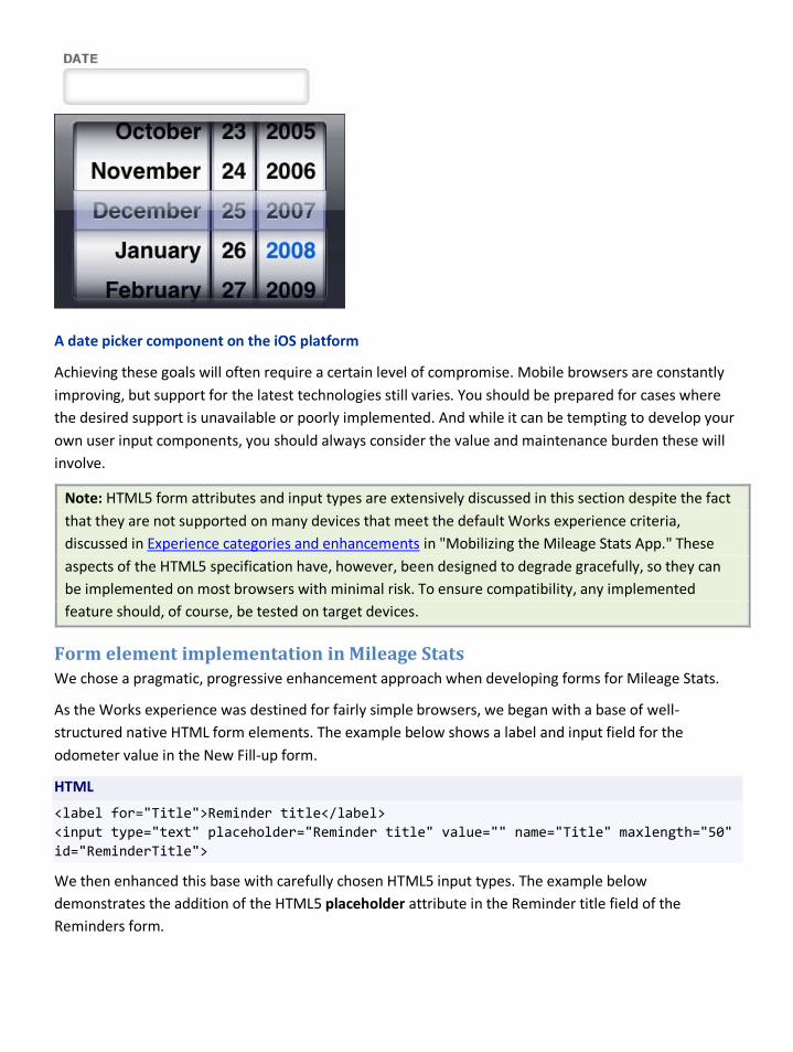
A date picker component on the iOS platform
Achieving these goals will often require a certain level of compromise. Mobile browsers are constantly improving, but support for the latest technologies still varies. You should be prepared for cases where the desired support is unavailable or poorly implemented. And while it can be tempting to develop your own user input components, you should always consider the value and maintenance burden these will involve.
Note: HTML5 form attributes and input types are extensively discussed in this section despite the fact that they are not supported on many devices that meet the default Works experience criteria, discussed in Experience categories and enhancements in "Mobilizing the Mileage Stats App." These aspects of the HTML5 specification have, however, been designed to degrade gracefully, so they can be implemented on most browsers with minimal risk. To ensure compatibility, any implemented feature should, of course, be tested on target devices.
Form element implementation in Mileage Stats We chose a pragmatic, progressive enhancement approach when developing forms for Mileage Stats.
As the Works experience was destined for fairly simple browsers, we began with a base of well-structured native HTML form elements. The example below shows a label and input field for the odometer value in the New Fill-up form.
HTML
<label for="Title">Reminder title</label> <input type="text" placeholder="Reminder title" value="" name="Title" maxlength="50" id="ReminderTitle">
We then enhanced this base with carefully chosen HTML5 input types. The example below demonstrates the addition of the HTML5 placeholder attribute in the Reminder title field of the Reminders form.
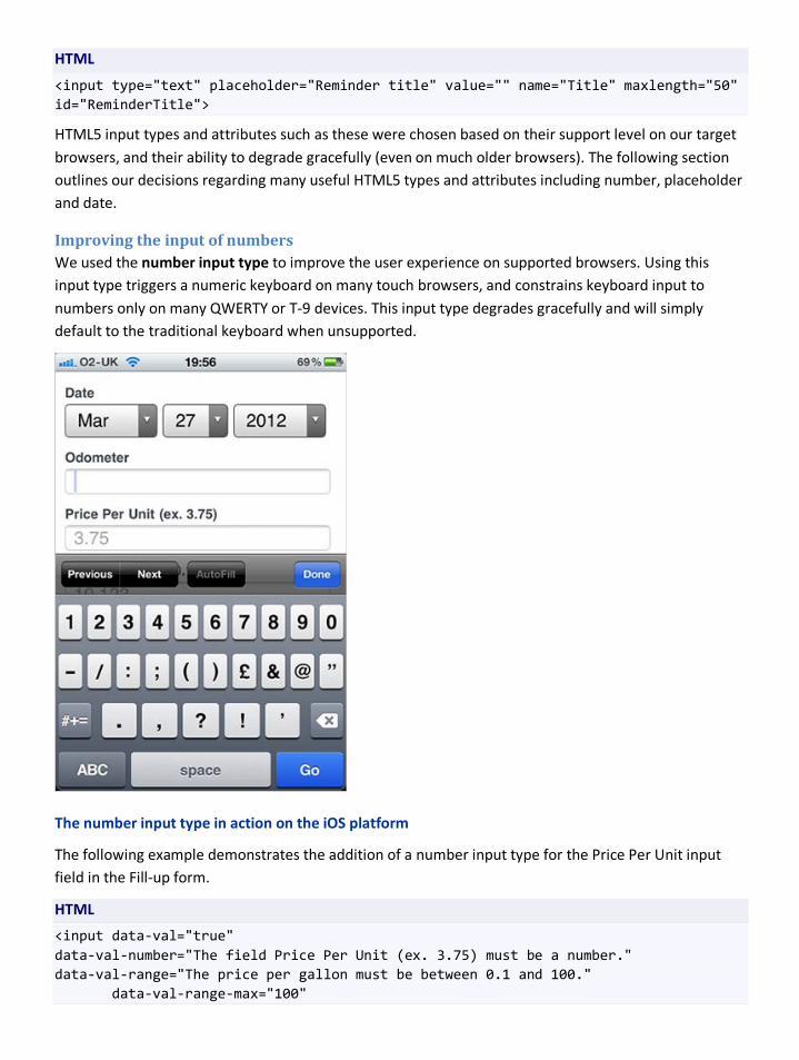
HTML
<input type="text" placeholder="Reminder title" value="" name="Title" maxlength="50" id="ReminderTitle">
HTML5 input types and attributes such as these were chosen based on their support level on our target browsers, and their ability to degrade gracefully (even on much older browsers). The following section outlines our decisions regarding many useful HTML5 types and attributes including number, placeholder and date.
Improving the input of numbers We used the number input type to improve the user experience on supported browsers. Using this input type triggers a numeric keyboard on many touch browsers, and constrains keyboard input to numbers only on many QWERTY or T-9 devices. This input type degrades gracefully and will simply default to the traditional keyboard when unsupported.
The number input type in action on the iOS platform
The following example demonstrates the addition of a number input type for the Price Per Unit input field in the Fill-up form.
HTML
<input data-val="true" data-val-number="The field Price Per Unit (ex. 3.75) must be a number." data-val-range="The price per gallon must be between 0.1 and 100." data-val-range-max="100"
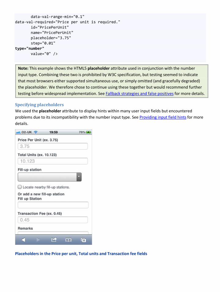
data-val-range-min="0.1" data-val-required="Price per unit is required." id="PricePerUnit" name="PricePerUnit" placeholder="3.75" step="0.01" type="number" value="0" />
Note: This example shows the HTML5 placeholder attribute used in conjunction with the number input type. Combining these two is prohibited by W3C specification, but testing seemed to indicate that most browsers either supported simultaneous use, or simply omitted (and gracefully degraded) the placeholder. We therefore chose to continue using these together but would recommend further testing before widespread implementation. See Fallback strategies and false positives for more details.
Specifying placeholders We used the placeholder attribute to display hints within many user input fields but encountered problems due to its incompatibility with the number input type. See Providing input field hints for more details.
Placeholders in the Price per unit, Total units and Transaction fee fields
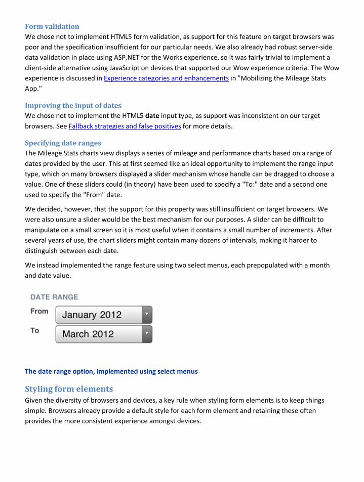
Form validation We chose not to implement HTML5 form validation, as support for this feature on target browsers was poor and the specification insufficient for our particular needs. We also already had robust server-side data validation in place using ASP.NET for the Works experience, so it was fairly trivial to implement a client-side alternative using JavaScript on devices that supported our Wow experience criteria. The Wow experience is discussed in Experience categories and enhancements in "Mobilizing the Mileage Stats App."
Improving the input of dates We chose not to implement the HTML5 date input type, as support was inconsistent on our target browsers. See Fallback strategies and false positives for more details.
Specifying date ranges The Mileage Stats charts view displays a series of mileage and performance charts based on a range of dates provided by the user. This at first seemed like an ideal opportunity to implement the range input type, which on many browsers displayed a slider mechanism whose handle can be dragged to choose a value. One of these sliders could (in theory) have been used to specify a "To:" date and a second one used to specify the "From" date.
We decided, however, that the support for this property was still insufficient on target browsers. We were also unsure a slider would be the best mechanism for our purposes. A slider can be difficult to manipulate on a small screen so it is most useful when it contains a small number of increments. After several years of use, the chart sliders might contain many dozens of intervals, making it harder to distinguish between each date.
We instead implemented the range feature using two select menus, each prepopulated with a month and date value.
The date range option, implemented using select menus
Styling form elements Given the diversity of browsers and devices, a key rule when styling form elements is to keep things simple. Browsers already provide a default style for each form element and retaining these often provides the more consistent experience amongst devices.
• Ensure your form’s markup is well structured and uses semantic elements where these exist. For example, be sure to use <label> elements for all form labels, instead of less semantically relevant paragraph, header or div elements.
• Begin by testing your form on key browsers using only basic, browser-default styling. There is quite a bit of variety in the styling of certain form elements, so it’s important to begin with an understanding of each form element’s’ default state. This step can prevent you from wasting time later debugging differences that may look like bugs, but may be beyond your control.
• Add form styling gradually and retest frequently. This may feel like an additional step, but form elements are often the trickiest HTML elements to style. Appling styles gradually can help catch problems early and reduce the need for extensive debugging at a later date.
• Where possible, take screenshots of default form elements behavior. This will provide a useful reference for your test team and avoid the filing of unnecessary bugs.
Fallback strategies and false positives Due to the wide fragmentation in form input types, it’s important to consider what will happen in cases where the specification isn’t fully implemented (or behaves unexpectedly). We encountered this several times during the development of Mileage Stats.
Inputting a date Choosing the most appropriate method for all our users to enter a date proved challenging. The simplest, and most consistent date input method is to provide three select menus (one each for the day, month and year). The select form element is well supported and benefits from a well-designed native component—even on much older browsers. Using a select menu also simplifies validation, as the user can only input values contained within these menus.
On certain newer devices however, specifying an HTML5 date input type would display a custom calendar widget, improving the experience even further. A calendar widget may be better for the user, but knowing when it’s safe to use one poses a problem. It’s possible to detect support for this input type using a JavaScript feature test, but due to spotty implementation, a large number of devices return a false positive. These devices pass a feature test for the date input type, but only display a simple text input field.
We therefore had two choices:
• We could use the simplest and most consistent form element for everyone.
• Or, we could improve the experience for certain users, while making it far worse for others.
Note: A third but far more maintenance-intensive solution would have been to create an approved list containing devices that we knew supported the date input type. We would serve the simple select menu to most devices, and the custom HTML5 date element markup to devices on our approved list.
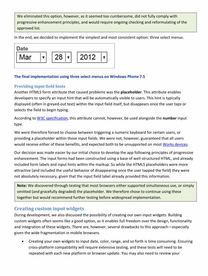
We eliminated this option, however, as it seemed too cumbersome, did not fully comply with progressive enhancement principles, and would require ongoing checking and reformulating of the approved list.
In the end, we decided to implement the simplest and most consistent option: three select menus.
The final implementation using three select menus on Windows Phone 7.5
Providing input field hints Another HTML5 form attribute that caused problems was the placeholder. This attribute enables developers to specify an input hint that will be automatically visible to users. This hint is typically displayed (often in greyed-out text) within the input field itself, but disappears once the user taps or selects the field to begin typing.
According to W3C specification, this attribute cannot, however, be used alongside the number input type.
We were therefore forced to choose between triggering a numeric keyboard for certain users, or providing a placeholder within those input fields. We were not, however, guaranteed that all users would receive either of these benefits, and expected both to be unsupported on most Works devices.
Our decision was made easier by our initial choice to develop the app following principles of progressive enhancement. The input forms had been constructed using a base of well-structured HTML, and already included form labels and input hints within the markup. So while the HTML5 placeholders were more attractive (and included the useful behavior of disappearing once the user tapped the field) they were not absolutely necessary, given that the input field label already provided this information.
Note: We discovered through testing that most browsers either supported simultaneous use, or simply omitted (and gracefully degraded) the placeholder. We therefore chose to continue using these together but would recommend further testing before widespread implementation.
Creating custom input widgets During development, we also discussed the possibility of creating our own input widgets. Building custom widgets often seems like a good option, as it enables full freedom over the design, functionality and integration of these widgets. There are, however, several drawbacks to this approach—especially given the wide fragmentation in mobile browsers.
• Creating your own widgets to input date, color, range, and so forth is time consuming. Ensuring cross-platform compatibility will require extensive testing, and these tests will need to be repeated with each new platform or browser update. You may also need to review your
interaction model to suit unexpected new browsing methods—for example, the use of a remote control or Xbox Kinect-style gestures on an Internet-enabled TV.
• If your widget doesn’t work on a user’s browser there may be no natural fallback mechanism. The user may simply be stuck.
Unless you plan to support only a few browsers, or have considerable testing and development resources at your disposal, it’s best to avoid rolling your own widgets and opt to provide the best experience you can using the existing (and usable) HTML form elements.
Note: Frameworks and libraries such as Sencha Touch and jQuery Mobile include custom input components. These can be useful if you wish to provide a custom experience but do not wish to develop one on your own.
Summary Inputting data on small, resource-constrained devices can be difficult. Your primary goal should be to simplify this task as much as possible.
Use HTML5 input types where you can, but be pragmatic. Test thoroughly to ensure features work as expected and ensure fallbacks are in place to plug the gaps. Avoid implementing custom components unless you have the time and resources to thoroughly test and maintain them.
In the end, your users (and team) may be far happier with old fashioned markup that is easy to construct and maintain, and expected to work on most devices.
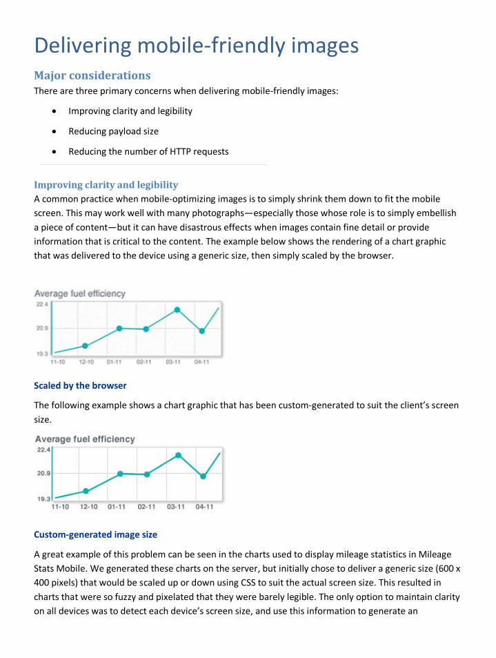
Delivering mobile-friendly images Major considerations There are three primary concerns when delivering mobile-friendly images:
• Improving clarity and legibility
• Reducing payload size
• Reducing the number of HTTP requests
Improving clarity and legibility A common practice when mobile-optimizing images is to simply shrink them down to fit the mobile screen. This may work well with many photographs—especially those whose role is to simply embellish a piece of content—but it can have disastrous effects when images contain fine detail or provide information that is critical to the content. The example below shows the rendering of a chart graphic that was delivered to the device using a generic size, then simply scaled by the browser.
Scaled by the browser
The following example shows a chart graphic that has been custom-generated to suit the client’s screen size.
Custom-generated image size
A great example of this problem can be seen in the charts used to display mileage statistics in Mileage Stats Mobile. We generated these charts on the server, but initially chose to deliver a generic size (600 x 400 pixels) that would be scaled up or down using CSS to suit the actual screen size. This resulted in charts that were so fuzzy and pixelated that they were barely legible. The only option to maintain clarity on all devices was to detect each device’s screen size, and use this information to generate an
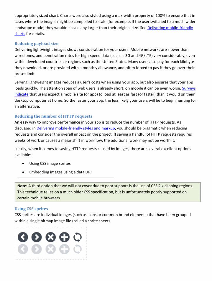
appropriately sized chart. Charts were also styled using a max-width property of 100% to ensure that in cases where the images might be compelled to scale (for example, if the user switched to a much wider landscape mode) they wouldn’t scale any larger than their original size. See Delivering mobile-friendly charts for details.
Reducing payload size Delivering lightweight images shows consideration for your users. Mobile networks are slower than wired ones, and penetration rates for high-speed data (such as 3G and 4G/LTE) vary considerably, even within developed countries or regions such as the United States. Many users also pay for each kilobyte they download, or are provided with a monthly allowance, and often forced to pay if they go over their preset limit.
Serving lightweight images reduces a user's costs when using your app, but also ensures that your app loads quickly. The attention span of web users is already short; on mobile it can be even worse. Surveys indicate that users expect a mobile site (or app) to load at least as fast (or faster) than it would on their desktop computer at home. So the faster your app, the less likely your users will be to begin hunting for an alternative.
Reducing the number of HTTP requests An easy way to improve performance in your app is to reduce the number of HTTP requests. As discussed in Delivering mobile-friendly styles and markup, you should be pragmatic when reducing requests and consider the overall impact on the project. If saving a handful of HTTP requests requires weeks of work or causes a major shift in workflow, the additional work may not be worth it.
Luckily, when it comes to saving HTTP requests caused by images, there are several excellent options available:
• Using CSS image sprites
• Embedding images using a data URI
Note: A third option that we will not cover due to poor support is the use of CSS 2.x clipping regions. This technique relies on a much older CSS specification, but is unfortunately poorly supported on certain mobile browsers.
Using CSS sprites CSS sprites are individual images (such as icons or common brand elements) that have been grouped within a single bitmap image file (called a sprite sheet).
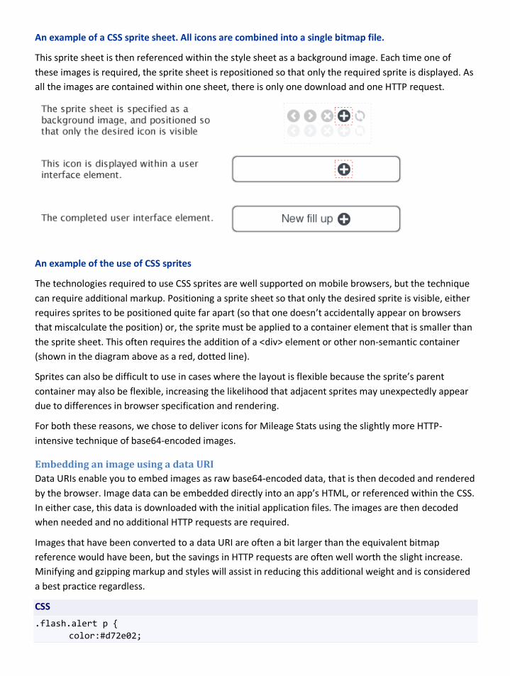
An example of a CSS sprite sheet. All icons are combined into a single bitmap file.
This sprite sheet is then referenced within the style sheet as a background image. Each time one of these images is required, the sprite sheet is repositioned so that only the required sprite is displayed. As all the images are contained within one sheet, there is only one download and one HTTP request.
An example of the use of CSS sprites
The technologies required to use CSS sprites are well supported on mobile browsers, but the technique can require additional markup. Positioning a sprite sheet so that only the desired sprite is visible, either requires sprites to be positioned quite far apart (so that one doesn’t accidentally appear on browsers that miscalculate the position) or, the sprite must be applied to a container element that is smaller than the sprite sheet. This often requires the addition of a <div> element or other non-semantic container (shown in the diagram above as a red, dotted line).
Sprites can also be difficult to use in cases where the layout is flexible because the sprite’s parent container may also be flexible, increasing the likelihood that adjacent sprites may unexpectedly appear due to differences in browser specification and rendering.
For both these reasons, we chose to deliver icons for Mileage Stats using the slightly more HTTP-intensive technique of base64-encoded images.
Embedding an image using a data URI Data URIs enable you to embed images as raw base64-encoded data, that is then decoded and rendered by the browser. Image data can be embedded directly into an app’s HTML, or referenced within the CSS. In either case, this data is downloaded with the initial application files. The images are then decoded when needed and no additional HTTP requests are required.
Images that have been converted to a data URI are often a bit larger than the equivalent bitmap reference would have been, but the savings in HTTP requests are often well worth the slight increase. Minifying and gzipping markup and styles will assist in reducing this additional weight and is considered a best practice regardless.
CSS
.flash.alert p { color:#d72e02;
background-image:url(data:image/png;base64,iVBORw0KGgoAAAANSUhEUgAAABQAAAAUCAYAAACNiR0NAAAA/0lEQVQ4ja2TKw7CQBRFDx+FIWygGocAj6pmCbiyDlZBaNI94Em6AkioKw4MigRIERBSimDaTMsMTEOveZP5nLnzubUkSahS9UppQFM3EPYac8D5snYN2N0gPsmdSocGMIA+sCx2fgANYRlUzM9USx8l7DU6Ysd+cVVrMATgcdjzOOxUYLcbxJOiQyUMwPJ8LM+nPRrrnDqpUxmohJWQUwRWIiPg83p51+hcDfAWbnL1b2AZGQHv2yBXv0kbPVmRvyCOzsQGdygDXTQJsTw/ax9nUx1rDdKRxU93f1rQw2yQopdKleUf0ctipwQK6Aqz5ORgoH9lG3EnZWBah//oBcbsY/fF+otkAAAAAElFTkSuQmCC) }
Note: Free online tools are available to generate data URIs. A search for "data uri generator" will provide the most up-to-date list.
Using canvas and SVG There are considerable benefits to using newer image formats such as canvas and SVG on mobile; however, these benefits may take a few more years to be fully realized.
Scalable Vector Images (SVG) are ideal for mobile as they are often lightweight, and can be scaled up or down with (theoretically) little impact on clarity. Support for SVG is improving, but if your app needs to work on older browsers, you will need a strategy to detect support for SVG, and provide bitmap images in cases where SVG is unsupported). There are also differing levels of support for SVG, even in newer browsers, so it’s important to carefully examine the overall value of using this format for your project.
Aspects of the canvas API are now supported on most smartphone browsers and can be used to generate and style diagrams, icons, and other graphical images. Support for canvas is improving but—similar to SVG—it cannot yet be relied on as a solution on all browsers. Generating complex graphics using canvas can also be time consuming, and extensive testing will be required if supporting many browsers. Tools and libraries are available to assist you in generating canvas drawings; however, many have not been fully tested on mobile.
Delivering high-resolution images Mobile devices come in a large range of pixel densities (the number of hardware pixels per inch). On high pixel-density displays, HTML text is crystal clear, but bitmap images can look fuzzy if not designed with this high density in mind. If an image has been specified as a background image using CSS, it’s easy to swap it for a higher-density version using the device pixel ratio media query.
An example of this technique can be found in the enhanced.css style sheet. In this case, we use a media query to identify devices with a pixel ratio of two. We then specify a new icon within that media query. The original low-resolution icon (the one we are replacing) was 20 x 20 pixels. The new icon is four times that size, 40 x 40 pixels. We then resize this icon using the background-size property, to fit the original 20 pixel x 20-pixel dimension.
CSS
@media all and (-webkit-min-device-pixel-ratio: 2) { form li.required, .flag { background-image:url(data:image/png;base64, iVBORw0KGgoAAAANSUhEUgAAACgAAAAoCAYAAACM/rhtAAAAzElEQVRYhe3YuRGDQBBFwUbBopggWeRKJa69Ztfgud/pqvFm2rbNbuu0YN4f43odLvP2xhpH2e8YyBDIcyDdkddAuiLvAemGvA+kCzINSDgyHUgoMg9IGDIfSA
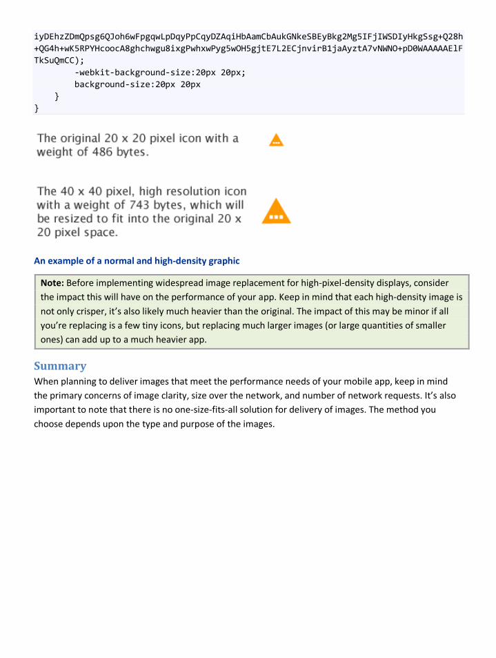
iyDEhzZDmQpsg6QJoh6wFpgqwLpDqyPpCqyDZAqiHbAamCbAukGNkeSBEyBkg2Mg5IFjIWSDIyHkgSsg+Q28h+QG4h+wK5RPYHcoocA8ghchwgu8ixgPwhxwPyg5wOH5gjtE7L2ECjnvirB1jaAyztA7vNWNO+pD0WAAAAAElFTkSuQmCC); -webkit-background-size:20px 20px; background-size:20px 20px } }
An example of a normal and high-density graphic
Note: Before implementing widespread image replacement for high-pixel-density displays, consider the impact this will have on the performance of your app. Keep in mind that each high-density image is not only crisper, it’s also likely much heavier than the original. The impact of this may be minor if all you’re replacing is a few tiny icons, but replacing much larger images (or large quantities of smaller ones) can add up to a much heavier app.
Summary When planning to deliver images that meet the performance needs of your mobile app, keep in mind the primary concerns of image clarity, size over the network, and number of network requests. It’s also important to note that there is no one-size-fits-all solution for delivery of images. The method you choose depends upon the type and purpose of the images.
Delivering a responsive layout Why use responsive design? Responsive design is a technique that enables developers to adapt the layout and design of an app to suit multiple screen sizes. This is implemented using a series of CSS media queries that trigger layout and stylistic changes. These changes occur once a device property (such as screen width) meets the criteria defined within the media query. Developing a site in this way provides several advantages.
Developers can design and maintain one set of markup (with the occasional minor variation), and in doing so, support a wide range of devices. This reduces the number of templates and resources that must be designed, and avoids duplication of any future design, implementation, or maintenance efforts. The app is also easier to promote, as there is only one domain, and one URL for each article, section, or feature on the website. This is particularly helpful in today’s highly connected world as URLs shared by email or using social media will resolve gracefully regardless of the device.
The technologies required to design responsively are also widely supported, and by creating the markup and styles "mobile first," it’s possible to design around devices without the necessary media query support.
Responsive design is most often applied to a single site (or app), enabling it to adapt to all contexts—from small portable devices, all the way up to desktop computers (and even larger screens such as televisions). There is, however, no reason it cannot be used to improve apps that have been explicitly designed to suit a mobile context such as Mileage Stats.
Note: See Choosing the number of style sheets for more information about the "mobile first" technique.
Targeting features and capabilities Responsive design is ideal for mobile, as it enables developers to target a wide variety of screen sizes. It enables you to detect devices that share a common screen size, and deliver specific CSS to those devices. Where it falls short, however, is in addressing the variety in browser implementations.
A group of devices may all share a screen width of 320 pixels, but one of these may be a lower-powered smartphone with a basic browser and QWERTY keyboard, while the other may be a high-capability, touch-enabled device with a next-generation rendering engine. The last thing you may want is to serve the same CSS, JavaScript (and sometimes even HTML) to these two devices.
For these reasons, we decided to implement several additional levels of feature detection for Mileage Stats Mobile. These additional steps would enable us to detect not only the screen size, but additional capabilities such as support for JSON, XHR, Canvas, and the HTML5 geolocation API.
See Detecting devices and their features for additional information.

Managing expectations A critical step in responsive design is managing expectations. Stakeholders must understand, and buy into, concepts of progressive enhancement, graceful degradation, and the need to design in accordance with device capabilities and constraints.
They must understand that there will be no single, pixel-perfect reference version of the design. Each device (and browser) will render the design to the best of its capabilities. Font size and line length will vary (within an appropriate range). Design elements (such as gradients and rounded corners) may appear on one device, but not another, and the brand colors may shift based on a device's screen quality, brightness, contrast settings, and environmental factors such as lighting.
This is perfectly normal, but it’s important to prepare all manner of stakeholders for this reality. This is particularly important for the test team, who will encounter the app on many devices and should be able to distinguish between actual bugs and design differences caused by varying levels of HTML or CSS support.
Evolving your design process Another key factor in developing a responsive experience is a willingness to vary your design process. Your app will not only be flexible, it will adapt its appearance and UI, its layout, and even certain features to suit the capabilities of each device. To deliver the best product, your design process will need to be as flexible as the app you are creating.
Responsive design is a fairly new practice, so best practices are still emerging. What is becoming clear, however, is that it’s counterproductive to approach the design of a responsive app using only static and pixel-perfect mockups or wireframes.
While we cannot offer a formal set of recommendations, the list below outlines suggestions based on the process we used when developing Mileage Stats Mobile:
• We started working in HTML quite early, creating exploratory prototypes based on the data and app flows of the original Mileage Stats app. These prototypes were extremely simple, with very little visual design, but helped kick off and inform the overall design process. They also helped us uncover problem areas caused by lack of space, and the need for a clearer way of finding mechanisms on smaller screens.
• As the app was based on an existing product, we decided not to spend too much time wireframing the application flow. We focusing instead on uncovering, prototyping, and eventually documenting the differences between the existing desktop app and the new mobile version.
• We created preliminary visual design mock-ups with variants to represent common mobile phone and tablet screen sizes. These helped the team visualize the product while keeping in mind that actual screen sizes would vary. We also began work on the actual templates (based on these designs) quite early, testing all design iterations on target devices to ensure feasibility and uncover problems as soon as possible.
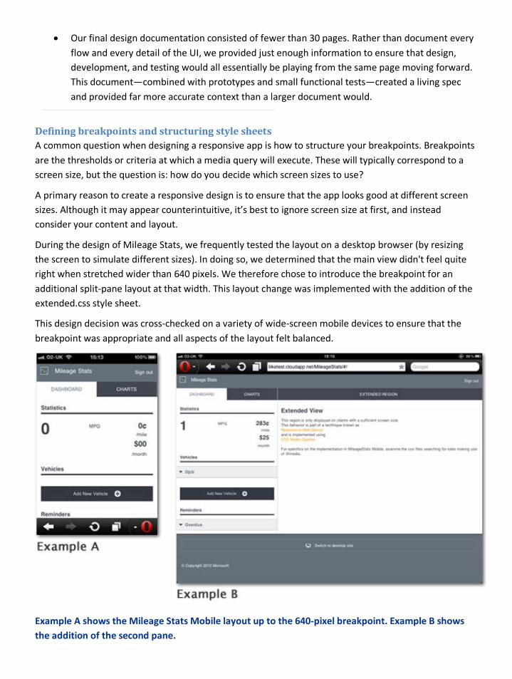
• Our final design documentation consisted of fewer than 30 pages. Rather than document every flow and every detail of the UI, we provided just enough information to ensure that design, development, and testing would all essentially be playing from the same page moving forward. This document—combined with prototypes and small functional tests—created a living spec and provided far more accurate context than a larger document would.
Defining breakpoints and structuring style sheets A common question when designing a responsive app is how to structure your breakpoints. Breakpoints are the thresholds or criteria at which a media query will execute. These will typically correspond to a screen size, but the question is: how do you decide which screen sizes to use?
A primary reason to create a responsive design is to ensure that the app looks good at different screen sizes. Although it may appear counterintuitive, it’s best to ignore screen size at first, and instead consider your content and layout.
During the design of Mileage Stats, we frequently tested the layout on a desktop browser (by resizing the screen to simulate different sizes). In doing so, we determined that the main view didn't feel quite right when stretched wider than 640 pixels. We therefore chose to introduce the breakpoint for an additional split-pane layout at that width. This layout change was implemented with the addition of the extended.css style sheet.
This design decision was cross-checked on a variety of wide-screen mobile devices to ensure that the breakpoint was appropriate and all aspects of the layout felt balanced.
Example A shows the Mileage Stats Mobile layout up to the 640-pixel breakpoint. Example B shows the addition of the second pane.
Choosing the number of style sheets Given that each HTTP request causes latency, you might expect that combining all your style sheets would be a good idea. There is, however, some benefit to loading several distinct style sheets that progressively enhance the experience based on a variety of criteria.
The first benefit comes from a mobile-first approach to structuring your style sheets. Most smartphones now include a browser that supports CSS media queries, but users may be using an older device, or a low-cost feature phone. A mobile-first approach structures your CSS so that the smallest, and least capable device doesn’t receive the styles destined for more capable devices.
The first step is to create a style sheet with only minimal styling for default HTML elements such as headers, paragraphs and form elements. This style sheet has no media query breakpoint, so it is served to every device (including those that don’t yet support or understand media queries). Structuring style sheets in this way is what we mean by "mobile first" as it doesn’t penalize web browsers with no media query support. These browsers receive a simple, "good enough" experience that prioritizes speed, legibility, and widespread availability.
HTML
<link rel="stylesheet" type="text/css" href="../styles/css/default.css" media="screen, handheld" />
Note: Most devices, as well as desktop browsers use the "screen" media type; however, certain older mobile browsers use the "handheld" type. We have specified both to ensure that all browsers download this particular style sheet.
The next step is to create a style sheet with the next layer of styles and layout. For Mileage Stats Mobile, this style sheet was defined using a 320-pixel breakpoint, as this is a common base size for smartphones.
HTML
<link rel="stylesheet" type="text/css" href="../styles/css/enhanced.css" media="only screen and (min-width: 320px)" />
This style sheet shouldn’t replicate the styles supplied in the first; it should instead build on them. Let’s say, for example, that we want all h2 elements to be 1.2 em in size, but as screens get larger, we want to surround them with a blue border. We would therefore set all h2s font size to 1.2 em in the default style sheet, but only include the enhancement—in this case, the blue border—in the second style sheet.
We then repeat this approach with the third style sheet, which in this case begins at 640 pixels and primarily focuses on changing the layout to suit wider screens. There is no need to reapply default styles for fonts, lists, and form elements, as these were applied in the first style sheet and will cascade to all the others. What this also means is that the second and third style sheets are often much smaller than the first.
Note: Serving a larger style sheet to a smaller device may seem odd, but remember that these are all default styles that a user would need to download regardless.

By keeping these style sheets separate, the smaller devices won’t (in theory) download or use the CSS meant for larger devices, but there is also a second advantage. These style sheets (and the media queries that control them) have so far been specified in the document head. Now that the style sheets are separate, we can add a second layer of media queries inside the CSS documents themselves.
This second layer is best reserved for small tweaks in layout or content. For example, you may find that when the screen is larger than 500 pixels, copy becomes uncomfortable to read due to the width of a line of text. It isn’t worth creating an entirely new style sheet (and breakpoint in the head of your document) to fix this small problem, but you can add a media query within the second style sheet to enable that adjustment.
An example of this technique can be found in the default.css style sheet. This style sheet is served to all devices, some of which will include a screen that is less than 320 pixels in width. On these smaller screens, there isn’t room for the arrow icon that is displayed next to each fill-up and reminder record. We have therefore omitted this icon in the default design, then use a media query to add the icon on screens that meet the minimum size criteria (which we determined through testing was 320 pixels).
CSS
@media (min-width: 320px){ .widget.fillup tr td:last-child,.widget.reminder tr td:last-child { padding-right:1.75em; background-image:url(data:image/png;base64,iVBORw0KGgoAAAANSUhEUgAAABgAAAAQCAYAAAAMJL+VAAABYElEQVQ4ja2Uv0sCYRjHP9oPBRu65VBxSZEQbJCCoKZIB4eGBqGbggaHdlcHV/+DhlYDh8YGjbYi6GjIoYYKXJJbjoZAK7OhO7H3zt4z/C4v7wPf5/M+78v79Q0GA0ZVrtaKQBYo8Ft1oFkpaUdMIJ8NKFdrCtAAViUeHchVSprpGWA1fwQUjwczgYQXiN9aG2LzTDrO4X6eYGDezWdPK9XMV2i5CBRHi6lkjMLOBguhIMmlKHf3bT77fdEbvbhsvWxtruiyCcTH5Llt0O19ABBWFznY2x43icPrBsiKxW7vneOTcy8Qh9cN4KqOYbpCJtVYAEBEVQgG5ob7K/1heoBMOs5ufn24Pz275rb19C9AUyymkjGvzR1eN0BdLJqvb8O7l5zc4RVl/+QbhIgIqwoRVfmruV4paWsywKy15hCiomOYdIyxSWBaHqn8AFamJPgJMpl0POYQjKSprWnH9TfLX4TCilQ89gAAAABJRU5ErkJggg==); background-repeat:no-repeat; background-position:center right } }
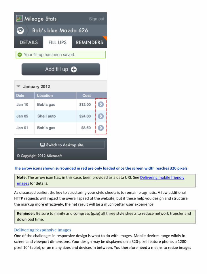
The arrow icons shown surrounded in red are only loaded once the screen width reaches 320 pixels.
Note: The arrow icon has, in this case, been provided as a data URI. See Delivering mobile friendly images for details.
As discussed earlier, the key to structuring your style sheets is to remain pragmatic. A few additional HTTP requests will impact the overall speed of the website, but if these help you design and structure the markup more effectively, the net result will be a much better user experience.
Reminder: Be sure to minify and compress (gzip) all three style sheets to reduce network transfer and download time.
Delivering responsive images One of the challenges in responsive design is what to do with images. Mobile devices range wildly in screen and viewport dimensions. Your design may be displayed on a 320-pixel feature phone, a 1280- pixel 10" tablet, or on many sizes and devices in between. You therefore need a means to resize images
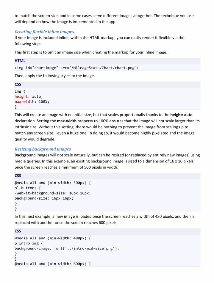
to match the screen size, and in some cases serve different images altogether. The technique you use will depend on how the image is implemented in the app.
Creating flexible inline images If your image is included inline, within the HTML markup, you can easily render it flexible via the following steps.
This first step is to omit an image size when creating the markup for your inline image.
HTML
<img id="chartimage" src="/MileageStats/Chart/chart.png">
Then, apply the following styles to the image.
CSS
img { height: auto; max-width: 100%; }
This will create an image with no initial size, but that scales proportionally thanks to the height: auto declaration. Setting the max-width property to 100% ensures that the image will not scale larger than its intrinsic size. Without this setting, there would be nothing to prevent the image from scaling up to match any screen size—even a huge one. In doing so, it would become highly pixelated and the image quality would degrade.
Resizing background images Background images will not scale naturally, but can be resized (or replaced by entirely new images) using media queries. In this example, an existing background image is sized to a dimension of 16 x 16 pixels once the screen reaches a minimum of 500 pixels in width.
CSS
@media all and (min-width: 500px) { ol.buttons { -webkit-background-size: 16px 16px; background-size: 16px 16px; } }
In this next example, a new image is loaded once the screen reaches a width of 480 pixels, and then is replaced with another once the screen reaches 600 pixels.
CSS
@media all and (min-width: 480px) { p.intro img { background-image: url('../intro-mid-size.png'); } } @media all and (min-width: 600px) {
p.intro img { background-image: url('../intro-large.png'); } }
Image replacement techniques The techniques described in the last section enable you to replace a background image via CSS, or create a flexible inline image, but there are many cases in which these changes may not be sufficient to deliver a good experience.
It’s trivial to scale an image, enabling it to fit any screen size. But unless the image was quite large to begin with, it will look progressively fuzzier as it scales up. And given that the largest mobile screens range from 800 to 1280+ pixels (easily resulting in 200KB to 300KB images) it hardly seems fair to subject smaller devices to such a large download.
Automatically resizing images can also impact legibility. This was a big problem for Mileage Stats Mobile as some of our most important images were charts containing text and fine details. Resizing these by as little as 20% resulted in blurred text, and a loss of critical detail. We therefore needed a means of detecting the screen size ahead of time and serving an appropriately sized image to each device.
There are many techniques available for this type of responsive image replacement. Many of these rely on client-side screen size detection, making it difficult to deliver correctly sized images on first load (before the tests have been run and the correct screen size determined). Using client-side, Canvas-based chart rendering for Mileage Stats Mobile would have also overcomplicated our implementation. We therefore needed a means to detect the screen size well ahead of the first load.
See Detecting devices and their features and Delivering mobile-friendly charts for more details.
Note: A detailed explanation of many client-side responsive image replacement techniques can be found in the following articles from Cloud Four in Portland: Responsive images – Part 1 and Part 2 – An in depth look at techniques.
Summary It is increasingly difficult to make assumptions about the screen sizes and resolutions on devices with web browsers. Instead of offering a different design for each variation, it is more practical to create a single design that responds to the differences. In order to best employ the technique, developers and designers need to understand features of CSS such as media queries.
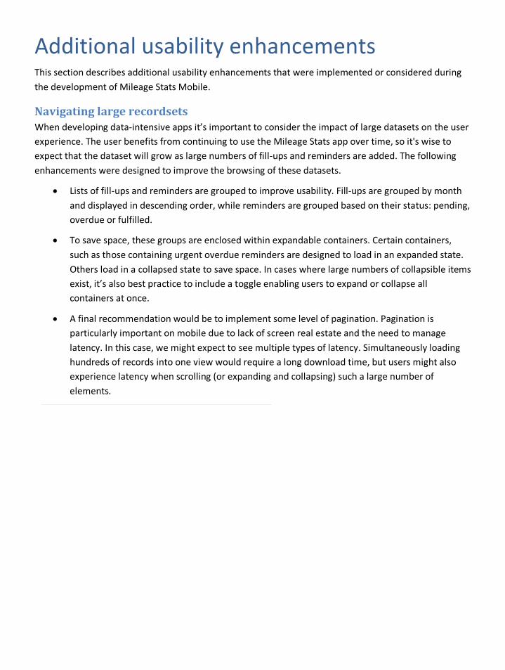
Additional usability enhancements This section describes additional usability enhancements that were implemented or considered during the development of Mileage Stats Mobile.
Navigating large recordsets When developing data-intensive apps it’s important to consider the impact of large datasets on the user experience. The user benefits from continuing to use the Mileage Stats app over time, so it's wise to expect that the dataset will grow as large numbers of fill-ups and reminders are added. The following enhancements were designed to improve the browsing of these datasets.
• Lists of fill-ups and reminders are grouped to improve usability. Fill-ups are grouped by month and displayed in descending order, while reminders are grouped based on their status: pending, overdue or fulfilled.
• To save space, these groups are enclosed within expandable containers. Certain containers, such as those containing urgent overdue reminders are designed to load in an expanded state. Others load in a collapsed state to save space. In cases where large numbers of collapsible items exist, it’s also best practice to include a toggle enabling users to expand or collapse all containers at once.
• A final recommendation would be to implement some level of pagination. Pagination is particularly important on mobile due to lack of screen real estate and the need to manage latency. In this case, we might expect to see multiple types of latency. Simultaneously loading hundreds of records into one view would require a long download time, but users might also experience latency when scrolling (or expanding and collapsing) such a large number of elements.
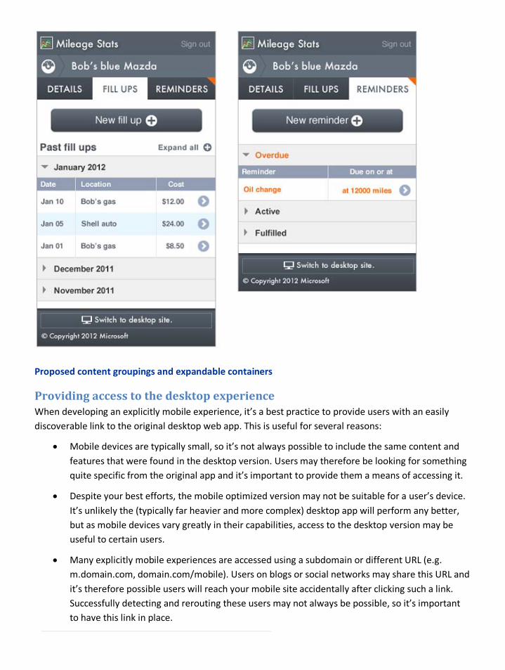
Proposed content groupings and expandable containers
Providing access to the desktop experience When developing an explicitly mobile experience, it’s a best practice to provide users with an easily discoverable link to the original desktop web app. This is useful for several reasons:
• Mobile devices are typically small, so it’s not always possible to include the same content and features that were found in the desktop version. Users may therefore be looking for something quite specific from the original app and it’s important to provide them a means of accessing it.
• Despite your best efforts, the mobile optimized version may not be suitable for a user’s device. It’s unlikely the (typically far heavier and more complex) desktop app will perform any better, but as mobile devices vary greatly in their capabilities, access to the desktop version may be useful to certain users.
• Many explicitly mobile experiences are accessed using a subdomain or different URL (e.g. m.domain.com, domain.com/mobile). Users on blogs or social networks may share this URL and it’s therefore possible users will reach your mobile site accidentally after clicking such a link. Successfully detecting and rerouting these users may not always be possible, so it’s important to have this link in place.
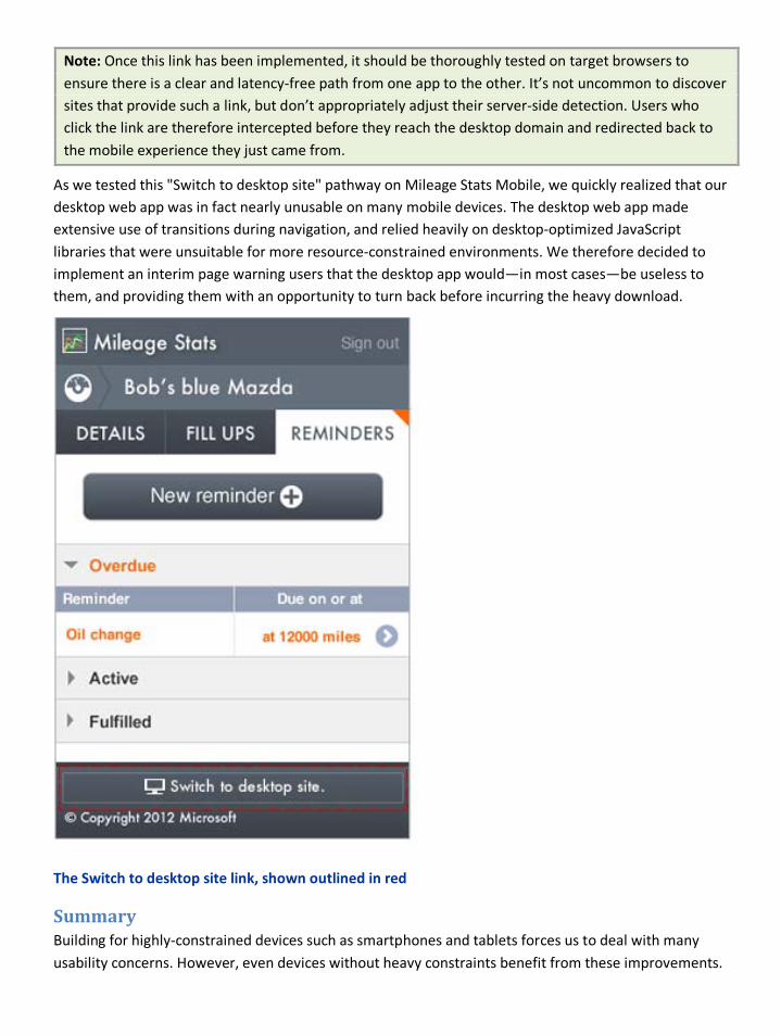
Note: Once this link has been implemented, it should be thoroughly tested on target browsers to ensure there is a clear and latency-free path from one app to the other. It’s not uncommon to discover sites that provide such a link, but don’t appropriately adjust their server-side detection. Users who click the link are therefore intercepted before they reach the desktop domain and redirected back to the mobile experience they just came from.
As we tested this "Switch to desktop site" pathway on Mileage Stats Mobile, we quickly realized that our desktop web app was in fact nearly unusable on many mobile devices. The desktop web app made extensive use of transitions during navigation, and relied heavily on desktop-optimized JavaScript libraries that were unsuitable for more resource-constrained environments. We therefore decided to implement an interim page warning users that the desktop app would—in most cases—be useless to them, and providing them with an opportunity to turn back before incurring the heavy download.
The Switch to desktop site link, shown outlined in red
Summary Building for highly-constrained devices such as smartphones and tablets forces us to deal with many usability concerns. However, even devices without heavy constraints benefit from these improvements.

When dealing with large datasets, keep in mind how these will affect a user. It’s best to use pagination when possible. In cases where your mobile site is distinct from your desktop site, it’s a good idea to provide users with a back door to the desktop version in case functionality is missing from the mobile one.
Detecting devices and their features The number of mobile web browsers in use today is surprisingly large. In addition, there is a lot of variation in the characteristics of these devices (such as screen size and pixel density) as well as in the browsers’ support for web standards. Historically, these variations have been so divergent that it was common for web apps to have two completely different sets of pages. That is, one set of markup for mobile devices and another for desktop browsers.
However, new types of devices such as tablets and televisions are being used to browse the web, and creating a separate set of pages for each of these types is simply not feasible. The distinctions between these devices are blurring. It is becoming increasingly difficult to make assumptions about device and browser capabilities based upon these historical classifications.
We’ve already mentioned that the safest choice when developing for the web is to keep things simple. However, users’ expectations are always increasing. One solution to building the simplest app is progressive enhancement. Progressive enhancement means that you first build your app to support the set of features that represents the lowest common denominator. In the case of the mobile web, this will likely mean simple HTML and CSS and very little JavaScript. First, ensure that the essential functionality of the app is available on highly constrained devices, then begin detecting specific features and enhancing the user experience when those features are present.
The concept of identifying mobile devices as the lowest common denominator has become known as mobile first.
The legacy experience of Mileage Stats targeted desktop browsers. Since our goal was to extend the app to provide a mobile experience, we decided early in the project to group devices into two classes: desktop and mobile. We further subdivided the mobile experience into the Works and Wow experiences mentioned in Mobilizing the Mileage Stats application.
Detecting features on the server
Identifying and grouping devices into classes Every browser identifies itself by providing a user-agent string whenever it makes a request to a web server. This user-agent string not only identifies the browser’s vendor and version number, but frequently includes information such as the host operating system or some identifier for the device it’s running on.
It is generally a bad practice to provide unique responses for specific user-agent strings for a number of reasons.
User-agent strings may vary slightly even for the same browser on devices that are seemingly identical. The number of variations can quickly become overwhelming.
Likewise, there is no guaranteed way to predict the user-agent strings of future browsers. Historically this has caused problems. At one time, it was a common practice for many sites to deliver the latest markup only to browsers that identified certain vendors in their user-agent strings. Other vendors

received down-level markup even if they supported the latest features. We still see vestiges of this practice in modern user-agent strings; for example, the inclusion of "Mozilla/5.0" in the user-agent string for Internet Explorer 9. For more information on user-agent strings, see Understanding User-Agent Strings.
Despite these problems, user-agent strings are still necessary in many scenarios.
There are third-party databases available that can provide detailed information about a browser based on its user-agent string. These solutions are not generally free for commercial use though, and they all require the use of a custom programming interface for making queries. Nevertheless, these databases allow developers to make choices about what assets to send to a browser based on capabilities. Furthermore, browsers can be sorted into classifications based upon their capabilities.
Built-in feature detection in ASP.NET Out of the box, ASP.NET will examine an incoming request and provide you with information on the capabilities of the browser making the request. The capabilities are exposed on the HttpRequest object as the property Browser with a type of HttpBrowserCapabilities. Internally, ASP.NET uses an instance of HttpCapabilitiesDefaultProvider to populate this property.
However, you can create your own provider by inheriting from HttpCapabilitiesProvider. In Mileage Stats, we did just that and created MobileCapabilitiesProvider. Our custom provider inherits from the default provider. Then you can tell ASP.NET to use your custom provider instead of the default.
Global.asax.cs
protected void Application_Start() { AreaRegistration.RegisterAllAreas(); RegisterGlobalFilters(GlobalFilters.Filters); RegisterRoutes(RouteTable.Routes); InitializeDependencyInjectionContainer(); // Injects the custom BrowserCapabilitiesProvider // into the ASP.NET pipeline. HttpCapabilitiesBase.BrowserCapabilitiesProvider = container.Resolve<MobileCapabilitiesProvider>(); // Some code omitted for clarity }
In the snippet above, we resolve our custom provider from the container and tell ASP.NET to use it instead of the default, by assigning it to HttpCapabilitiesBase.BrowserCapabilitiesProvider.
At its core, theHttpBrowserCapabilities object is really just a dictionary, though it has many strongly typed properties available for convenience. These properties perform an internal lookup and then convert the raw value to the appropriate type. For most properties, the raw value is a string representing a Boolean value such as True or False.

We can set values in the dictionary directly using the indexer and the strongly typed properties will return the corresponding values.
When creating a custom provider, the only method that needs to be overridden when inheriting from HttpCapabilitiesProvideris GetBrowserCapabilities.
HttpBrowserCapabilities GetBrowserCapabilities(HttpRequest request);
In our implementation, we’ll first get the values from the default provider and then supplement that with data from multiple sources.
Extending ASP.NET with a third-party database There are a number of third-party databases and services that can be used to determine a browser’s capabilities from a user-agent string. 51Degrees, DeviceAtlas, and WURFL are a few examples. At the time of this writing, both 51Degrees and WURLF provide NuGet packages.
We chose not to implement a specific third-party product in Mileage Stats. Instead, we created a placeholder function named DetermineCapsBy3rdPartyDatabasethat simulates providing results from a database.
In the snippet below, we first get the base capabilities by invoking the method on the super class. We then call GetAdditionalCapabilities and merge the results into a single dictionary. Finally, we return an instance of HttpBrowserCapabilities.
MobileCapabilitiesProvider.cs
public override HttpBrowserCapabilities GetBrowserCapabilities(HttpRequest request) { var httpContext = request.RequestContext.HttpContext; var browser = base.GetBrowserCapabilities(request); SetDefaults(browser); browser.Capabilities.Merge(GetAdditionalCapabilities(httpContext)); return browser; } public virtual IDictionary GetAdditionalCapabilities(HttpContextBase context) { var capabilities = new Dictionary<string, string>(); if (BrowserOverrideStores.Current.GetOverriddenUserAgent(context) != null) return capabilities; capabilities.Merge(DetermineCapsBy3rdPartyDatabase(context)); capabilities.Merge(DetermineCapsByProfilingClient(context.Request, _encoder)); return capabilities; }
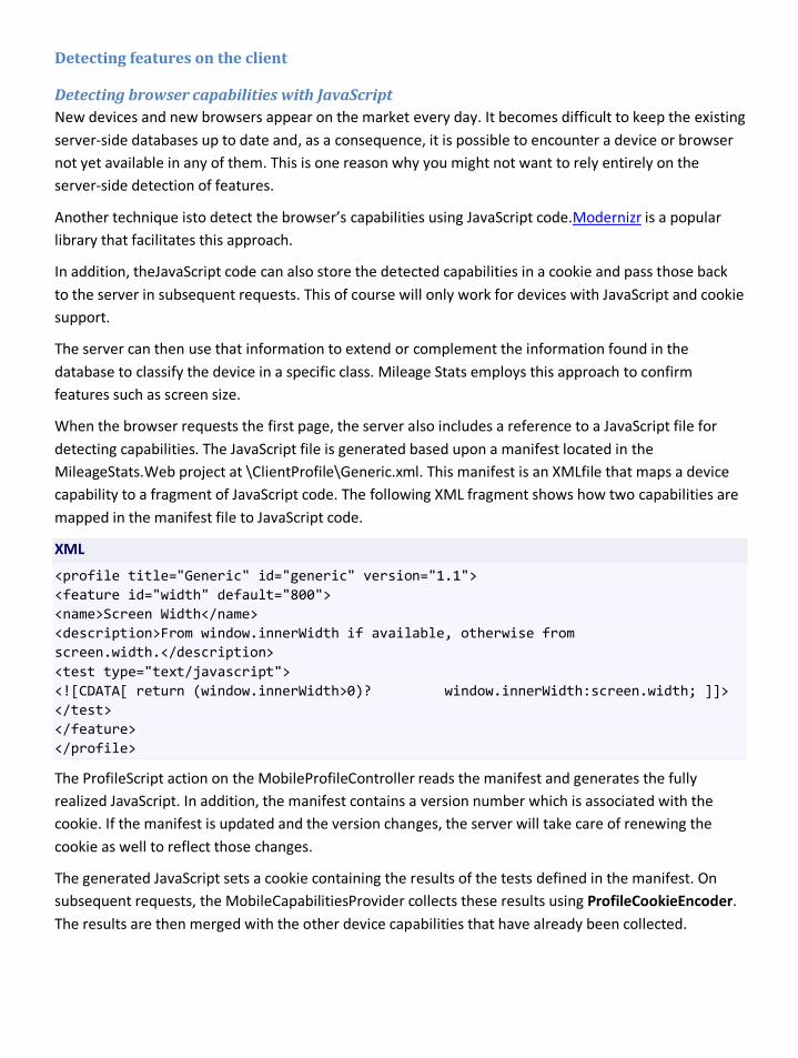
Detecting features on the client
Detecting browser capabilities with JavaScript New devices and new browsers appear on the market every day. It becomes difficult to keep the existing server-side databases up to date and, as a consequence, it is possible to encounter a device or browser not yet available in any of them. This is one reason why you might not want to rely entirely on the server-side detection of features.
Another technique isto detect the browser’s capabilities using JavaScript code.Modernizr is a popular library that facilitates this approach.
In addition, theJavaScript code can also store the detected capabilities in a cookie and pass those back to the server in subsequent requests. This of course will only work for devices with JavaScript and cookie support.
The server can then use that information to extend or complement the information found in the database to classify the device in a specific class. Mileage Stats employs this approach to confirm features such as screen size.
When the browser requests the first page, the server also includes a reference to a JavaScript file for detecting capabilities. The JavaScript file is generated based upon a manifest located in the MileageStats.Web project at \ClientProfile\Generic.xml. This manifest is an XMLfile that maps a device capability to a fragment of JavaScript code. The following XML fragment shows how two capabilities are mapped in the manifest file to JavaScript code.
XML
<profile title="Generic" id="generic" version="1.1"> <feature id="width" default="800"> <name>Screen Width</name> <description>From window.innerWidth if available, otherwise from screen.width.</description> <test type="text/javascript"> <![CDATA[ return (window.innerWidth>0)? window.innerWidth:screen.width; ]]> </test> </feature> </profile>
The ProfileScript action on the MobileProfileController reads the manifest and generates the fully realized JavaScript. In addition, the manifest contains a version number which is associated with the cookie. If the manifest is updated and the version changes, the server will take care of renewing the cookie as well to reflect those changes.
The generated JavaScript sets a cookie containing the results of the tests defined in the manifest. On subsequent requests, the MobileCapabilitiesProvider collects these results using ProfileCookieEncoder. The results are then merged with the other device capabilities that have already been collected.

MobileCapabilitiesProvider.cs
public static readonly Func<HttpRequestBase, IProfileCookieEncoder, IDictionary<string, string>> DetermineCapsByProfilingClient = (request, encoder) => { // The profile cookie is parsed for getting the device // capabilities inferred on the client side. var profileCookie = request.Cookies["profile"]; return (profileCookie != null) ? encoder.GetDeviceCapabilities(profileCookie) : new Dictionary<string, string>(); };
Providing content for the different identified classes Once all the device capabilities from different sourcesare combined, the server is in good shape to determine and categorize the device into a specific class. The three classes that Mileage Stats is concerned with correspond to the experiences we’ve outlined: Legacy, Works, and Wow.
The Legacy experience is the original set of assets developed for Project Silk. For the Works experience, the server will simply send basic HTML markup with no JavaScript. All the implementation will rely on HTTP full postbacks.
For the Wow experience, a more robust single page application (SPA) implementation with JavaScript will be provided. See Delivering the SPA enhancements for details.
A device can be associated with the Wow class if the following capabilities are present:
• JSON
• XmlHttpRequest
• HashChangeEvent
HttpBrowserCapabilitiesExtensions.cs
public static bool IsWow(this HttpBrowserCapabilitiesBase httpBrowser) { // We should also check for supporting DOM manipulation; however, // we currently don't have a source for that particular capability. // If you use a third-party database for feature detection, then // you should consider adding a test for this. return httpBrowser.IsMobileDevice && httpBrowser.SupportsJSON() && httpBrowser.SupportsXmlHttp && httpBrowser.SupportsHashChangeEvent(); }
If any of these capabilities cannot be found on the device, it is automatically associated with the Works experience.
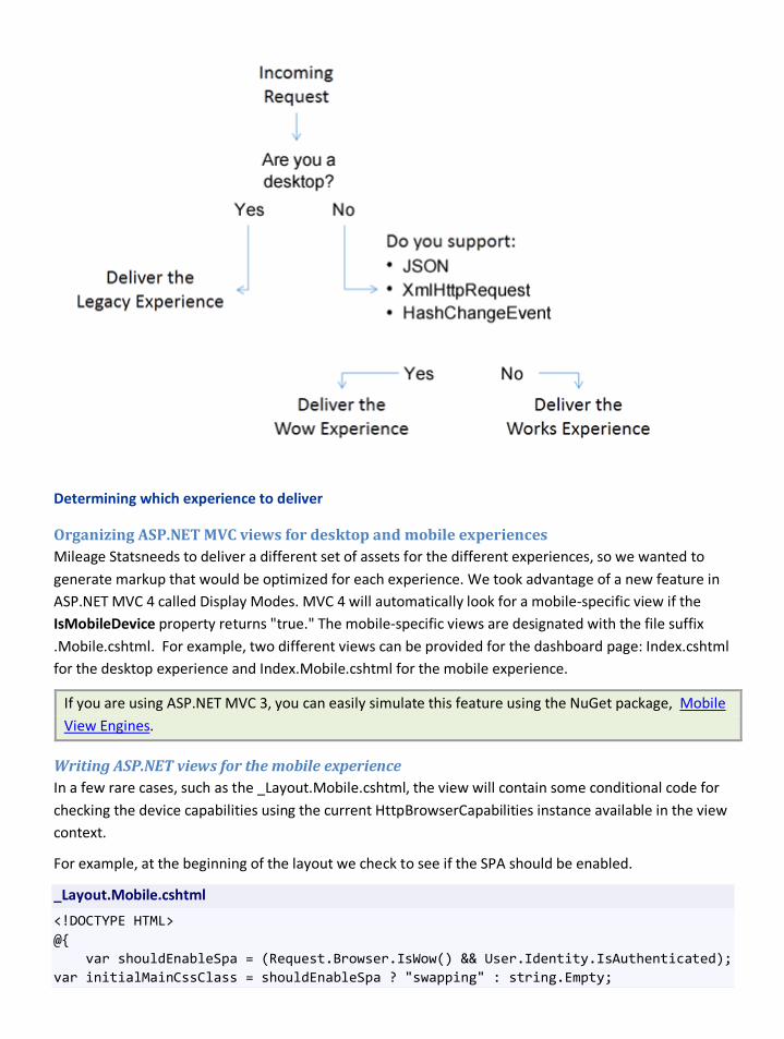
Determining which experience to deliver
Organizing ASP.NET MVC views for desktop and mobile experiences Mileage Statsneeds to deliver a different set of assets for the different experiences, so we wanted to generate markup that would be optimized for each experience. We took advantage of a new feature in ASP.NET MVC 4 called Display Modes. MVC 4 will automatically look for a mobile-specific view if the IsMobileDevice property returns "true." The mobile-specific views are designated with the file suffix .Mobile.cshtml. For example, two different views can be provided for the dashboard page: Index.cshtml for the desktop experience and Index.Mobile.cshtml for the mobile experience.
If you are using ASP.NET MVC 3, you can easily simulate this feature using the NuGet package, Mobile View Engines.
Writing ASP.NET views for the mobile experience In a few rare cases, such as the _Layout.Mobile.cshtml, the view will contain some conditional code for checking the device capabilities using the current HttpBrowserCapabilities instance available in the view context.
For example, at the beginning of the layout we check to see if the SPA should be enabled.
_Layout.Mobile.cshtml
<!DOCTYPE HTML> @{ var shouldEnableSpa = (Request.Browser.IsWow() && User.Identity.IsAuthenticated); var initialMainCssClass = shouldEnableSpa ? "swapping" : string.Empty;
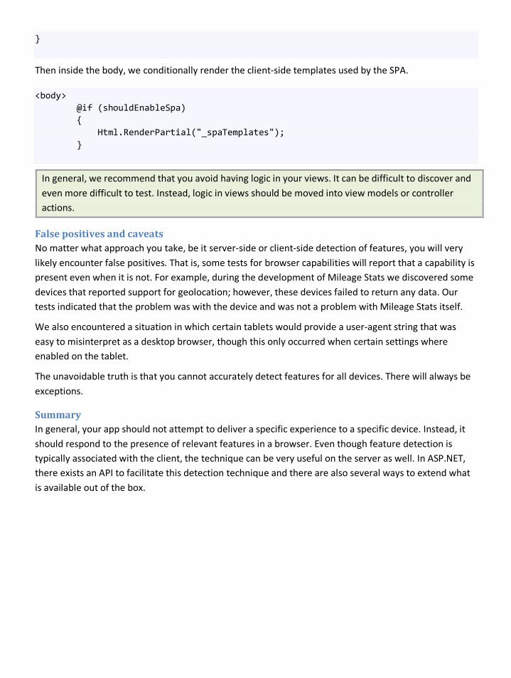
}
Then inside the body, we conditionally render the client-side templates used by the SPA.
<body> @if (shouldEnableSpa) { Html.RenderPartial("_spaTemplates"); }
In general, we recommend that you avoid having logic in your views. It can be difficult to discover and even more difficult to test. Instead, logic in views should be moved into view models or controller actions.
False positives and caveats No matter what approach you take, be it server-side or client-side detection of features, you will very likely encounter false positives. That is, some tests for browser capabilities will report that a capability is present even when it is not. For example, during the development of Mileage Stats we discovered some devices that reported support for geolocation; however, these devices failed to return any data. Our tests indicated that the problem was with the device and was not a problem with Mileage Stats itself.
We also encountered a situation in which certain tablets would provide a user-agent string that was easy to misinterpret as a desktop browser, though this only occurred when certain settings where enabled on the tablet.
The unavoidable truth is that you cannot accurately detect features for all devices. There will always be exceptions.
Summary In general, your app should not attempt to deliver a specific experience to a specific device. Instead, it should respond to the presence of relevant features in a browser. Even though feature detection is typically associated with the client, the technique can be very useful on the server as well. In ASP.NET, there exists an API to facilitate this detection technique and there are also several ways to extend what is available out of the box.
Delivering the SPA enhancements Single page applications, also referred to as SPAs, are ideally suited to handle many of the constraints of mobile browsers. A single page application behaves more like a traditional desktop app, treating the browser like a runtime environment. Instead of requesting a full page from the server on every interaction, it will generally load all of its assets up front and minimize further communication with the server. There are a number of ways to implement a SPA, and Mileage Stats illustrates just one of them. For more information on the pattern in general see
Defining the single page application (SPA) requirements
http://en.wikipedia.org/wiki/Single_page_application.
As discussed in Mobilizing the Mileage Stats Application, the default (or lowest common denominator) web app experience is essentially a traditional, http-request based web page experience. User actions such as clicking a link or submitting a form cause a full-page refresh, and are not dependent on client-side scripting to request content or deliver additional functionality In Mileage Stats, we referred to this experience as Works, implying that it will work on nearly any browser.
In contrast, we referred to the SPA for Mileage Stats as the Wow experience. The Wow experience is designed to enhance the Works experience in accordance with each browser's capabilities. The Wow technology requirements therefore begin with the same list of features required for the Works experience.
• Strong HTML 4.01 support to define app and components structure.
• Basic CSS 2.n support to provide styling and enhance information design.
• Strong HTML form support to enable data input (this will typically go hand in hand with good HTML support)
These are augmented with an additional series of requirements, which will be used to implement the enhanced, SPA experience:
• Support for XHR and JSON
• Support for the hashchange event
The hashchange event is fired when the hash portion of the URL changes. The hash is more formally referred to the fragment identifier. The hash portion of a URL is part that comes after a # character. This portion is not sent to the server and does not cause the browser to load a page.
See Detecting Devices and their Features for more information about the process we used to detect these browser capabilities.
Frameworks There are many tools you can use when building mobile web experiences. And, as always, there are advantages and disadvantages to each of the tools. Frameworks and libraries such as jQuery Mobile and Sencha Touch cater specifically to building web apps for mobile devices. We took a different approach, but it's important to understand the advantages and disadvantages of the various options. You should carefully consider the benefits these sorts of frameworks and libraries can potentially bring to your project.
Pros • Frameworks are typically designed to get you started quickly. It's therefore often possible to get
something running in a short amount of time.
• Many mobile frameworks are subsets of a popular desktop framework. The ramp-up time may therefore be relatively quick, and you may be able to use existing skills and workflows. Due to the desktop component, these frameworks may also simplify your initial development and testing using desktop tools.
• Many frameworks have large development communities that can provide support and code samples.
• Many frameworks offer components or patterns that have been specifically designed for modern smartphones. Frameworks may be particularly useful if you plan to target these devices exclusively.
Cons • Many libraries and frameworks may not yet have been extensively tested on mobile browsers
or devices. Others may focus exclusively on only the newest and most modern versions of these devices. This may limit your ability to adapt the code to expand this level of support.
• Each framework or library you use becomes yet another aspect of your implementation that you'll need to test, debug, and maintain across all your chosen devices. The amount of support required may also not become apparent until well into development, or until you begin to combine frameworks and have the opportunity to test them in a real device environment.
• Some frameworks are exclusively for mobile devices. They do not support a "mobile first" approach where one web site adapts to all possible clients.
Choosing a library or framework Choosing a library or framework before you understand the basic needs of your app can lead to difficulties if the selection turns out to be a poor match. Read the documentation, look at the code, and ask questions from the community on sites such as StackOverflow and Twitter. In addition, consider using the candidate libraries to prototype the essential portions of your app.
Look for libraries that have been extensively tested on the devices you need to support (and not just the most popular devices, or latest versions of a platform). Before you decide which to use, write tests for the specific functionality you plan to use, and test these on your target browsers and device hardware.
Remember as well that mobile devices have much slower CPUs and significantly less RAM than their desktop counterparts. You may therefore not be able to use a library in the same way as you would have on the desktop. Just because the library supports an animation, effect, or transition, doesn't mean it will make sense to use it in a production environment. This is particularly true of animations and transitions performed using JavaScript (as opposed to those using CSS).
In summary, consider the following when selecting a library or framework:
• Does it satisfy the technical requirements of your app?
• Does it fit well with your coding style?
• How long has it been around? Is the community active and helpful?
• Is the licensing compatible with your app?
Actual usage in Mileage Stats During the Mileage Stats project we explored the use of many frameworks and libraries, eventually settling on the following:
• jQuery: We chose jQuery because of its popularity, maturity, and high level of distribution. During our testing, the jQuery features we used worked as expected on all the devices. (With the exception of setting the Accept header during an XHR request as mentioned below, but that was not jQuery specific.) Nevertheless, we had some hesitation in choosing jQuery due to the fact that we only use a portion of jQuery's functionality and due to its non-trivial size (32KB, which minified and gzipped over a 2G connection might take 12 or more seconds to download).
• Mustache: We chose Mustache to handle templating on the client side. Mustache is a very lightweight library, describing itself as "logic-less templates." It is small, has no additional dependencies, and could easily be combined and minified with all of our custom JavaScript.
Issues, gotchas and things we learned One of the challenges when working in this space is the diversity and variations in browsers, especially in places where specifications are unclear. With this in mind, we strongly recommend that you test early and test often. Ensure you get something running on a device as soon as possible, in order to evaluate whether or not it behaves as expected. This is particularity important, as feature detection is often not binary. That means that just because something says it's supported doesn't mean it will work as it does on other devices.
As an example, we encountered a problem on certain devices (ones that had passed the feature tests for XHR), that did not include any custom HTTP headers such as Accept when making an XHR request. This
problem was discovered late in the project and caused us to redesign the way we handled content negotiation.
In another case, we tested on a physical device that passed the check for the GeoLocation API, but never returned a value when we invoked the API. We discovered later that this problem only occurred when there was no SIM card in the device.
Building the single page application The purpose of implementing a single page interface is primarily to improve the responsiveness of the app. This ultimately leads to a better user experience. Improved responsiveness is generally achieved by making fewer network requests and by having smaller payloads for the requests that are made.
In the case of Mileage Stats, our plan for implementing the SPA experience can be summarized as follows:
On the initial request, after a user has authenticated, the entire HTML, CSS, and JavaScript necessary to run the app would be downloaded at one time. Subsequent requests would only be for data. In addition, we would cache data in memory to reduce the number of requests. Navigation in the SPA would make use of the hashchange event and reflect the corresponding URL as much as possible. Likewise, we would employ a model view controller (MVC)-like pattern on the client side that would map the hash to a corresponding controller. These controllers would employ client-side templating to produce HTML fragments and update the document object model (DOM). In addition, these controllers would retrieve any necessary data from the cache or using XHR.
An alternative to this approach is to just load a minimal set of assets initially in order to make the startup time as short as possible. The choice is primarily driven by the desired user experience. In this scenario, the remaining assets are either loaded in the background immediately after startup or loaded just in time as they are needed. In the case of Mileage Stats, we felt this added complexity without a significant improvement in the user experience.
Note: Single page applications have become very popular. As a consequence, there are many JavaScript frameworks and libraries that are specifically intended to support this pattern. In general, they are often referred to as "JavaScript MVC" and searching the web for this term yields dozens of potential frameworks. Even so, the label "MVC" can be somewhat misleading, as many of these frameworks are not strictly concerned with implementing the pattern exactly. Some popular frameworks at the time of writing are:
* Backbone.js
* Batman.js
* Ember.js
* Knockout.js
* SproutCore
* Sammy.js
Some attempt to provide an end-to-end solution, while others focus on solving specific problems. Some can even be used in tandem.
The architecture of Mileage Stats SPA The Mileage Stats app is built on the idea of progressive enhancement. This means that if we detect the minimum set of features necessary for enabling the SPA experience, we send additional markup to the client browser. Specifically, we render all of the necessary client-side templates and we include all of the necessary JavaScript.
Our custom JavaScript is partitioned in modules, where each module is a property on the global object mstats. Some modules are part of a general framework and other modules are specific to certain views in the app. The file app.js is the entry point for our client-side logic. It is responsible for configuring and bootstrapping the modules. We'll refer to modules by their file name, but with the .js extension omitted.
The router module is responsible for listening to changes in the hash. The hash is the portion of the URL beginning with the character # until the end of the URL. The hash is never sent back to the server. When a change in the hash occurs, the router looks for a matching route and then delegates to the transition module.
Those of you following the HTML5 specification may ask why we choose to use the hashchange event instead of the newer (and better) pushstate. Our reason was simply that some of our targeted devices did not support pushstate, whereas they all supported hashchange. There are libraries such as history.js that will attempt to use pushstate and fall back to hashchange only as necessary. However, we wanted to avoid taking another external dependency. In general though, using pushstate is preferred over using hashchange because it allows URLs to be consistent between SPAs and their more traditional counterparts.
The transition module coordinates the retrieval of any necessary data, the application of the client template, the invocation of custom logic related to the new view, and finally updating the DOM. This coordination is governed by configuration registered for a route in app.js.
The ajax module is the gateway for all communication with the server. Internally, it makes use of jQuery's Ajax helper. It also handles caching of data.
This code also makes heavy use of convention over configuration. For example, it is assumed that a hash of #/vehicle/1/details should request JSON from /vehicle/1/details. Likewise, it assumed that the client-side template to be used is named vehicle_details.
Deeper in the SPA Let's dive deeper into how the SPA was implemented.
Altering the markup for SPA We begin by detecting whether the minimum set of features necessary for enabling the SPA experience are present. This occurs at the beginning of the layout for mobile browsers. (See Detecting Devices and their Features for more information on how the extension method IsWow is implemented.)
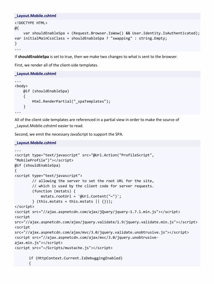
_Layout.Mobile.cshtml
<!DOCTYPE HTML> @{ var shouldEnableSpa = (Request.Browser.IsWow() && User.Identity.IsAuthenticated); var initialMainCssClass = shouldEnableSpa ? "swapping" : string.Empty; } ...
If shouldEnableSpa is set to true, then we make two changes to what is sent to the browser.
First, we render all of the client-side templates.
_Layout.Mobile.cshtml
... <body> @if (shouldEnableSpa) { Html.RenderPartial("_spaTemplates"); } ...
All of the client side templates are referenced in a partial view in order to make the source of _Layout.Mobile.cshstml easier to read.
Second, we emit the necessary JavaScript to support the SPA.
_Layout.Mobile.cshtml
... <script type="text/javascript" src="@Url.Action("ProfileScript", "MobileProfile")"></script> @if (shouldEnableSpa) { <script type="text/javascript"> // allowing the server to set the root URL for the site, // which is used by the client code for server requests. (function (mstats) { mstats.rootUrl = '@Url.Content("~")'; } (this.mstats = this.mstats || {})); </script> <script src="//ajax.aspnetcdn.com/ajax/jQuery/jquery-1.7.1.min.js"></script> <script src="//ajax.aspnetcdn.com/ajax/jquery.validate/1.9/jquery.validate.min.js"></script> <script src="//ajax.aspnetcdn.com/ajax/mvc/3.0/jquery.validate.unobtrusive.js"></script> <script src="//ajax.aspnetcdn.com/ajax/mvc/3.0/jquery.unobtrusive-ajax.min.js"></script> <script src="~/Scripts/mustache.js"></script> if (HttpContext.Current.IsDebuggingEnabled) {
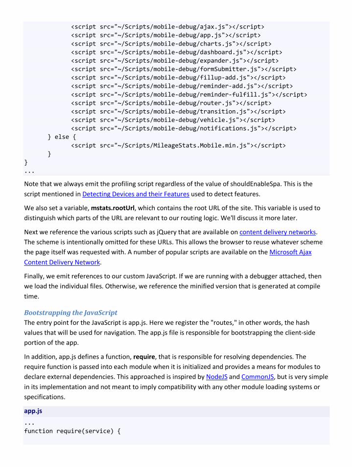
<script src="~/Scripts/mobile-debug/ajax.js"></script> <script src="~/Scripts/mobile-debug/app.js"></script> <script src="~/Scripts/mobile-debug/charts.js"></script> <script src="~/Scripts/mobile-debug/dashboard.js"></script> <script src="~/Scripts/mobile-debug/expander.js"></script> <script src="~/Scripts/mobile-debug/formSubmitter.js"></script> <script src="~/Scripts/mobile-debug/fillup-add.js"></script> <script src="~/Scripts/mobile-debug/reminder-add.js"></script> <script src="~/Scripts/mobile-debug/reminder-fulfill.js"></script> <script src="~/Scripts/mobile-debug/router.js"></script> <script src="~/Scripts/mobile-debug/transition.js"></script> <script src="~/Scripts/mobile-debug/vehicle.js"></script> <script src="~/Scripts/mobile-debug/notifications.js"></script> } else { <script src="~/Scripts/MileageStats.Mobile.min.js"></script> } } ...
Note that we always emit the profiling script regardless of the value of shouldEnableSpa. This is the script mentioned in Detecting Devices and their Features used to detect features.
We also set a variable, mstats.rootUrl, which contains the root URL of the site. This variable is used to distinguish which parts of the URL are relevant to our routing logic. We'll discuss it more later.
Next we reference the various scripts such as jQuery that are available on content delivery networks. The scheme is intentionally omitted for these URLs. This allows the browser to reuse whatever scheme the page itself was requested with. A number of popular scripts are available on the Microsoft Ajax Content Delivery Network.
Finally, we emit references to our custom JavaScript. If we are running with a debugger attached, then we load the individual files. Otherwise, we reference the minified version that is generated at compile time.
Bootstrapping the JavaScript The entry point for the JavaScript is app.js. Here we register the "routes," in other words, the hash values that will be used for navigation. The app.js file is responsible for bootstrapping the client-side portion of the app.
In addition, app.js defines a function, require, that is responsible for resolving dependencies. The require function is passed into each module when it is initialized and provides a means for modules to declare external dependencies. This approached is inspired by NodeJS and CommonJS, but is very simple in its implementation and not meant to imply compatibility with any other module loading systems or specifications.
app.js
... function require(service) {
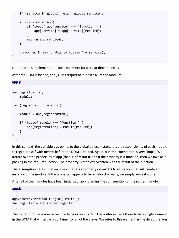
if (service in global) return global[service]; if (service in app) { if (typeof app[service] === 'function') { app[service] = app[service](require); } return app[service]; } throw new Error('unable to locate ' + service); } ...
Note that this implementation does not check for circular dependencies.
After the DOM is loaded, app.js uses requireto initialize all of the modules.
app.js
... var registration, module; for (registration in app) { module = app[registration]; if (typeof module === 'function') { app[registration] = module(require); } } ...
In this context, the variable app points to the global object mstats. It is the responsibility of each module to register itself with mstats before the DOM is loaded. Again, our implementation is very simple. We iterate over the properties of app (that is, of mstats), and if the property is a function, then we invoke it passing in the require function. The property is then overwritten with the result of the function.
The assumption here is that each module sets a property on mstats to a function that will create an instance of the module. If the property happens to be an object already, we simply leave it alone.
After all of the modules have been initialized, app.js begins the configuration of the router module.
app.js
... app.router.setDefaultRegion('#main'); var register = app.router.register; ...
The router module is now accessible to us as app.router. The router expects there to be a single element in the DOM that will act as a container for all of the views. We refer to this element as the default region
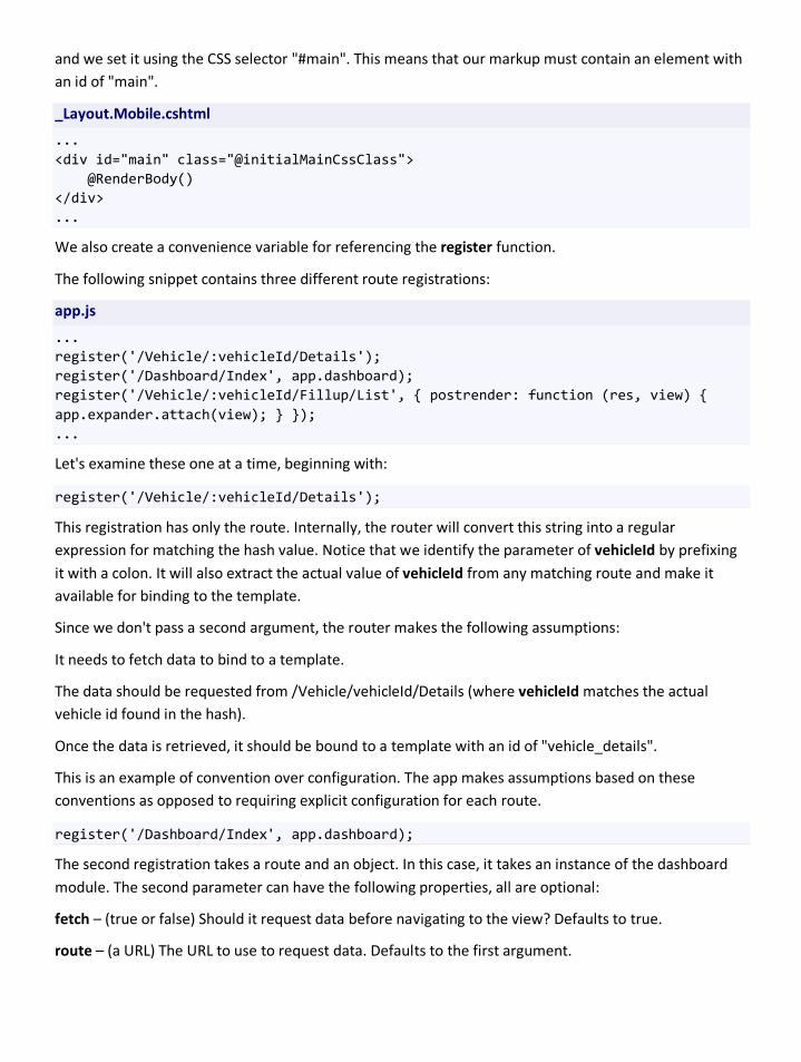
and we set it using the CSS selector "#main". This means that our markup must contain an element with an id of "main".
_Layout.Mobile.cshtml
... <div id="main" class="@initialMainCssClass"> @RenderBody() </div> ...
We also create a convenience variable for referencing the register function.
The following snippet contains three different route registrations:
app.js
... register('/Vehicle/:vehicleId/Details'); register('/Dashboard/Index', app.dashboard); register('/Vehicle/:vehicleId/Fillup/List', { postrender: function (res, view) { app.expander.attach(view); } }); ...
Let's examine these one at a time, beginning with:
register('/Vehicle/:vehicleId/Details');
This registration has only the route. Internally, the router will convert this string into a regular expression for matching the hash value. Notice that we identify the parameter of vehicleId by prefixing it with a colon. It will also extract the actual value of vehicleId from any matching route and make it available for binding to the template.
Since we don't pass a second argument, the router makes the following assumptions:
It needs to fetch data to bind to a template.
The data should be requested from /Vehicle/vehicleId/Details (where vehicleId matches the actual vehicle id found in the hash).
Once the data is retrieved, it should be bound to a template with an id of "vehicle_details".
This is an example of convention over configuration. The app makes assumptions based on these conventions as opposed to requiring explicit configuration for each route.
register('/Dashboard/Index', app.dashboard);
The second registration takes a route and an object. In this case, it takes an instance of the dashboard module. The second parameter can have the following properties, all are optional:
fetch – (true or false) Should it request data before navigating to the view? Defaults to true.
route – (a URL) The URL to use to request data. Defaults to the first argument.
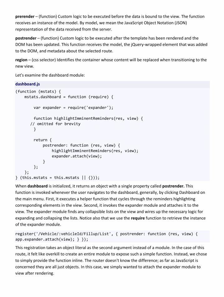
prerender – (function) Custom logic to be executed before the data is bound to the view. The function receives an instance of the model. By model, we mean the JavaScript Object Notation (JSON) representation of the data received from the server.
postrender – (function) Custom logic to be executed after the template has been rendered and the DOM has been updated. This function receives the model, the jQuery-wrapped element that was added to the DOM, and metadata about the selected route.
region – (css selector) Identifies the container whose content will be replaced when transitioning to the new view.
Let's examine the dashboard module:
dashboard.js
(function (mstats) { mstats.dashboard = function (require) { var expander = require('expander'); function highlightImminentReminders(res, view) { // omitted for brevity } return { postrender: function (res, view) { highlightImminentReminders(res, view); expander.attach(view); } }; }; } (this.mstats = this.mstats || {}));
When dashboard is initialized, it returns an object with a single property called postrender. This function is invoked whenever the user navigates to the dashboard, generally, by clicking Dashboard on the main menu. First, it executes a helper function that cycles through the reminders highlighting corresponding elements in the view. Second, it invokes the expander module and attaches it to the view. The expander module finds any collapsible lists on the view and wires up the necessary logic for expanding and collapsing the lists. Notice also that we use the require function to retrieve the instance of the expander module.
register('/Vehicle/:vehicleId/Fillup/List', { postrender: function (res, view) { app.expander.attach(view); } });
This registration takes an object literal as the second argument instead of a module. In the case of this route, it felt like overkill to create an entire module to expose such a simple function. Instead, we chose to simply provide the function inline. The router doesn't know the difference; as far as JavaScript is concerned they are all just objects. In this case, we simply wanted to attach the expander module to view after rendering.
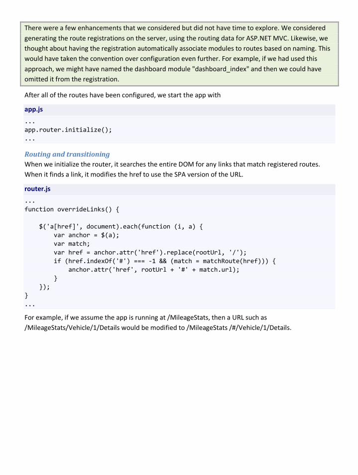
There were a few enhancements that we considered but did not have time to explore. We considered generating the route registrations on the server, using the routing data for ASP.NET MVC. Likewise, we thought about having the registration automatically associate modules to routes based on naming. This would have taken the convention over configuration even further. For example, if we had used this approach, we might have named the dashboard module "dashboard_index" and then we could have omitted it from the registration.
After all of the routes have been configured, we start the app with
app.js
... app.router.initialize(); ...
Routing and transitioning When we initialize the router, it searches the entire DOM for any links that match registered routes. When it finds a link, it modifies the href to use the SPA version of the URL.
router.js
... function overrideLinks() { $('a[href]', document).each(function (i, a) { var anchor = $(a); var match; var href = anchor.attr('href').replace(rootUrl, '/'); if (href.indexOf('#') === -1 && (match = matchRoute(href))) { anchor.attr('href', rootUrl + '#' + match.url); } }); } ...
For example, if we assume the app is running at /MileageStats, then a URL such as /MileageStats/Vehicle/1/Details would be modified to /MileageStats /#/Vehicle/1/Details.
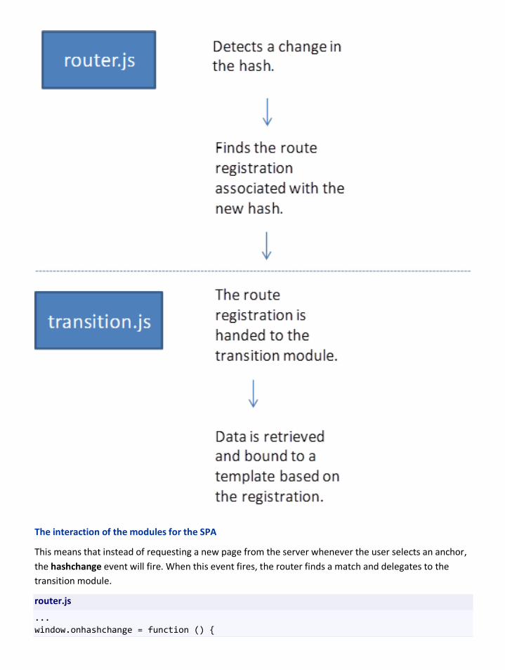
The interaction of the modules for the SPA
This means that instead of requesting a new page from the server whenever the user selects an anchor, the hashchange event will fire. When this event fires, the router finds a match and delegates to the transition module.
router.js
... window.onhashchange = function () {

var route = window.location.hash.replace('#', ''), target = matchRoute(route); if (target) { transition.to(target, defaultRegion, namedParametersPattern, function () { overrideLinks(); }); } ... }; ...
The transition module exportsthe function to. Inside the module however, the function is named transitionTo. This function is at the heart of the SPA.
transition.js
... // this function is exported as mstats.transition.to function transitionTo(target, defaultRegion, namedParametersPattern, callback) { var registration = target.registration, region = registration.region || defaultRegion, host = $(region, document), route = registration.route; var template = getTemplateFor(route, namedParametersPattern); var onSuccess = success(host, template, target, callback); host.removeClass(cssClassForTransition).addClass(cssClassForTransition); if (registration.fetch && !mstats.initialModel) { ajax.request({ dataType: 'json', type: 'GET', url: appendJsonFormat(makeRelativeToRoot(target.url)), success: onSuccess, cache: false, error: error(host) }); } else { var response = { Model: app.initialModel }; app.initialModel = null; onSuccess(response); } }
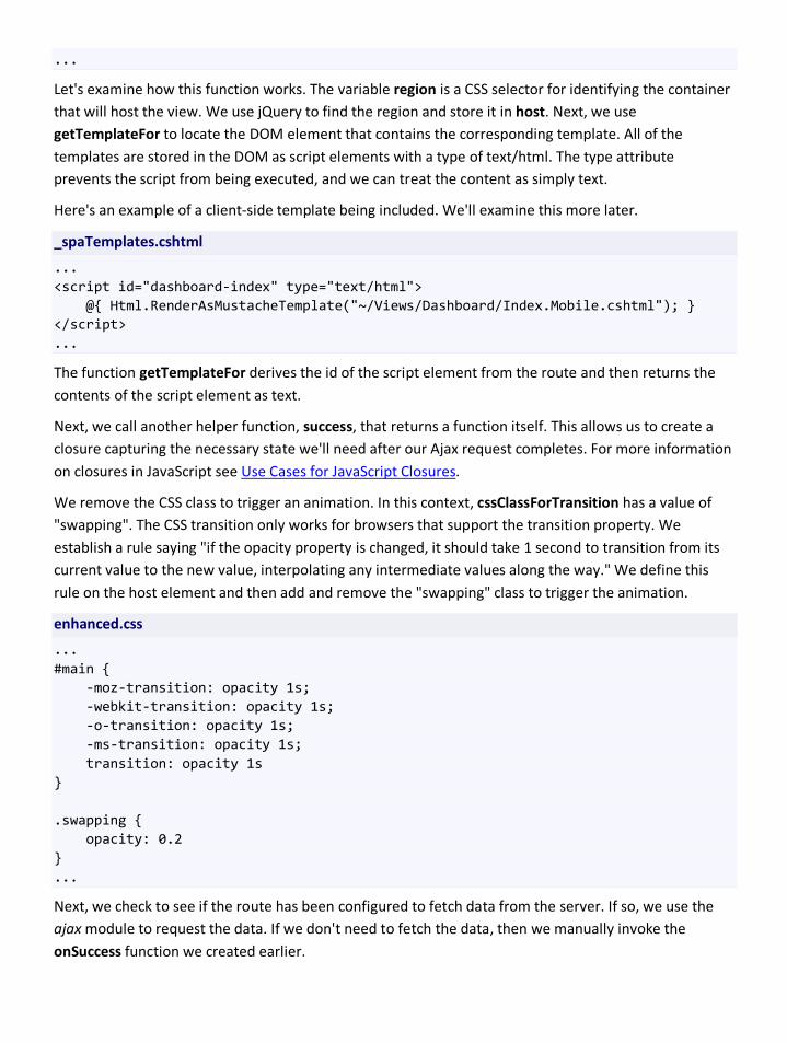
...
Let's examine how this function works. The variable region is a CSS selector for identifying the container that will host the view. We use jQuery to find the region and store it in host. Next, we use getTemplateFor to locate the DOM element that contains the corresponding template. All of the templates are stored in the DOM as script elements with a type of text/html. The type attribute prevents the script from being executed, and we can treat the content as simply text.
Here's an example of a client-side template being included. We'll examine this more later.
_spaTemplates.cshtml
... <script id="dashboard-index" type="text/html"> @{ Html.RenderAsMustacheTemplate("~/Views/Dashboard/Index.Mobile.cshtml"); } </script> ...
The function getTemplateFor derives the id of the script element from the route and then returns the contents of the script element as text.
Next, we call another helper function, success, that returns a function itself. This allows us to create a closure capturing the necessary state we'll need after our Ajax request completes. For more information on closures in JavaScript see Use Cases for JavaScript Closures.
We remove the CSS class to trigger an animation. In this context, cssClassForTransition has a value of "swapping". The CSS transition only works for browsers that support the transition property. We establish a rule saying "if the opacity property is changed, it should take 1 second to transition from its current value to the new value, interpolating any intermediate values along the way." We define this rule on the host element and then add and remove the "swapping" class to trigger the animation.
enhanced.css
... #main { -moz-transition: opacity 1s; -webkit-transition: opacity 1s; -o-transition: opacity 1s; -ms-transition: opacity 1s; transition: opacity 1s } .swapping { opacity: 0.2 } ...
Next, we check to see if the route has been configured to fetch data from the server. If so, we use the ajax module to request the data. If we don't need to fetch the data, then we manually invoke the onSuccess function we created earlier.

We also have a special condition checking for and using initialModel. This is an optimization that only applies for the very first view that was loaded. Rather than having the server load all of the initial assets and then immediately send a new request for the data of the first view, we simply include the data on the initial load and have the server look for it.
Let's examine the helper function, success.
transition.js
... function success(host, template, target, callback) { var registration = target.registration; return function (model, status, xhr) { var view, el; model.__route__ = target.params; if (registration.prerender) { model = registration.prerender(model); } view = templating.to_html(template, model); host.empty(); host.append(view); el = host.children().last(); if (registration.postrender) { registration.postrender(model, el, target); } notifications.renderTo(host); host.removeClass(cssClassForTransition); if (callback) callback(model, el); }; } ...
This function returns another function. However, it uses a closure to capture several important variables in order to have the appropriate state.
The resulting function first copies over the parameters extracted from the route. It sets these to a well-known variable __route__. This name was chosen because it's unlikely that it will collide with other properties on the response sent from the server.
Next, we check for the presence of a prerender function and execute it if found.
After that, we invoke the templating engine to produce a DOM element by binding the model to our template. In this context, the variable templating points to Mustache. We then replace the contents of the host element with the new view we've just created.
Next, we check for the presence of a postrender function and execute it if found.
After the view has been added to the DOM, we render any notifications. These are messages such as "vehicle successfully updated." We also remove the CSS class, which triggers the reciprocal animation for the transition. Finally, we check for and invoke a callback.
Client-Side templates Let's turn our attention to the client-side templates for a moment. As we've mentioned, we decided to use Mustache for templating. Mustache templates are very simple. They are standard HTML with placeholders for values identified in the template using double curly braces.
example of a Mustache template
<p>{{person.name}}</p>
We could combine this template with the JSON data:
example JSON data
{ person: { name: 'Antonio Bermejo' } }
The result would be the following markup:
example of resulting markup
<p>Antonio Bermejo</p>
Additionally, Mustache has support for conditionals and loops. Both use the same syntax.
example of Mustache section
{{#has_items}} <ul> {{#items} <li>{{#name}}</li> {{/items}} </ul> {{/has_ items }}
The template above could be combined with:
example JSON data
{ has_items: true, items: [ { name: 'ninja' }, { name: 'pirate' } ] }
The result would be:

example of resulting markup
<ul> <li>ninja</li> <li>pirate</li> </ul>
By this point, you may have noticed that Mustache templates differ significantly from Razor templates. This presented us with an interesting problem. We wanted the client-side templates to match the server-side templates exactly. In addition, we wanted to avoid having to maintain two sets of templates. That is, one set for the Works experience and another for the Wow experience.
We decided to create a set of HTML helpers that would allow us to build a template with Razor and render either a Mustache template or simple markup. This allowed us to have one source template to maintain while providing us with both client-side and server-side templates.
This was an experimental aspect of our project. The result worked well for us, but we had to create Mustache-aware helpers to mirror many of the standard helpers. We only implemented the helpers that we needed.
Below is a snippet from one of the templates. Notice that any value that would potentially be rendered as a placeholder in a Mustache template uses a custom helper. The custom helpers all begin with Mustache.
ReminderForm.Mobile.cshtml
... @{ var today = DateTime.Now; } <ul> <li> @Html.LabelFor(model => model.Title) @Html.ValidationMessageFor(model => model.Title) @Mustache.TextBoxFor(model => model.Title, new { id = "ReminderTitle", maxlength = "50" }) </li> <li> @Html.LabelFor(model => model.Remarks) @Html.ValidationMessageFor(model => model.Remarks) @Mustache.TextAreaFor(model => model.Remarks, new { wrap = "soft" }) </li> <li class="psuedo-date"> <label for="DueDate">Date</label> @Html.ValidationMessageFor(model = >model.DueDate) @Html.DropDownListFor(model => model.DueDateMonth, SelectListFor.Month(i => today.Month == i)) @Html.DropDownListFor(model => model.DueDateDay, SelectListFor.Date(i => today.Day == i))

@Html.DropDownListFor(model => model.DueDateYear, SelectListFor.Year(i => today.Year == i)) </li> <li> @Html.LabelFor(model => model.DueDistance) @Html.ValidationMessageFor(model => model.DueDistance) @Mustache.InputTypeFor(model => model.DueDistance) </li> </ul> ...
This template can be rendered as the result of a controller action just as you would render any view. However, when we want to render this as a Mustache template we would need to use another helper, as demonstrated below:
@{ Html.RenderAsMustacheTemplate("~/Views/Reminder/ReminderForm.Mobile.cshtml"); }
In the actual source for Mileage Stats, ReminderForm.Mobile.cshtml is only rendered using Html.Partial. However, this occurs in Add.Mobile.cshtml, which in turn is rendered with Html.RenderAsMustacheTemplate. The rendering context is passed on the partial so that the complete view renders as expected.
It is worth mentioning that we had to be careful to handle the differences between Mustache and Razor with respect to iterating over enumerables. We had to introduce helpers that could emit the closing identifier required by Mustache for rendering lists. Consider this snippet from \Views\Reminder\List.Mobile.cshtml:
List.Mobile.cshtml
... @foreach (var item in Mustache.Loop(m => m)) { <dl class="fillup widget"> <dt><h2><a href="#">@Mustache.Value(item, m => m.StatusName)</a></h2></dt> <dd> <table> <-- omitted for brevity --> </table> </dd> </dl> } ...
In this snippet, the model's type is List<ReminderListViewModel>. Our helper, Mustach.Loop, returns an instance of a custom class MileageStats.Web.Helpers.Mustache.DisposableEnumerable<T>. This class wraps any enumeration that we give and emits the necessary Mustache identifiers before and after the code block inside the foreach loop. It's able to do this because it's automatically disposed by the foreach statement. We emit the opening identifier in its constructor and the closing identifier when it's disposed.

One of the most beneficial side effects of using Razor to produce the Mustache templates is that it forced us to simplify our views. We found that there were lots of places where presentation logic (such as formatting values) had bled into the views. Since we didn't want to implement this same logic in JavaScript, we moved it into the corresponding view models. In the end, this made the views easier to maintain without having a negative impact on the view models. Additionally, we were able to reuse the built-in ASP.NET MVC validation (driven by the DataAnnotation attributes).
Summary Use of the Single Page Application pattern can produce fast and responsive apps. However, you should always be aware of which browsers your app needs to support and test extensively on actual devices to ensure that the features supporting you SPA work as expected. If you are considering a third-party framework or library to support your SPA, you should prototype the types of features you anticipate your app will need and test on actual devices.
Testing mobile web experiences One of the first challenges we faced was deciding on a comprehensive way to test Mileage Stats across its experiences and devices. There are a number of options in the area of testing, and each option comes with its own advantages and disadvantages.
Mobile testing tools/options Testing a web app on the desktop is challenging enough, but doing so on mobile can easily become costly and overwhelming. The key to maximizing your test budget is having a good understanding of which browsers and devices are indispensable to your project, and which can be replaced by desktop tools and emulators. It’s also important to understand the benefits of each mobile testing option.
There are three primary options when testing on mobile devices.
• Testing and debugging on desktop browsers
• Testing on emulators and simulators
• Testing on hardware devices
Testing on desktop browsers Desktop browsers can be extremely useful when developing mobile web sites and apps. Although they are no replacement for testing on actual devices, they do provide robust debugging options and can be used to simulate mobile screen sizes.
Pros • Desktop browsers are free, familiar, and require no special hardware. Testing on desktop
browsers can also be automated using tools such as Visual Studio 2011, or Selenium and Watir.
• Modern desktop browsers can easily be resized to mimic an average smartphone screen (although several can only be resized down to approximately 480px. Due to the popularity of responsive design, there are also a growing number of tools and extensions to assist in triggering a specific screen size. It’s important to remember, however, that due to the width and position of scroll bars (and other browser chrome), resized desktop browser can only provide an approximation of the final mobile viewport size.
• Most desktop browsers provide tools or extensions to swap the default user agent string. This is useful to trigger mobile-specific styling and business logic in cases where these are dependent on the presence of a specific user agent.
• Desktop browsers can also be used in conjunction with developer tools or proxies such as Charles (on Mac) and Fiddler (on .NET) to monitor and debug network traffic and performance issues.
Cons • Desktop browsers are almost always more powerful than a mobile equivalent. They are more
frequently updated, so they include the latest HTML specifications and are also installed on devices with much faster processors. For these reasons, they will never accurately simulate the environment of a smaller, more constrained device.
Testing on emulators and simulators Emulators and simulators are often free of charge, and so can prove a useful and economical addition to your test routine. It is important, however, to understand the differences between an emulator and a simulator.
Emulators An emulator is a piece of software “that translates compiled code from an original architecture to the platform where it is running” (see "Programming the Mobile Web." O’Reilly, 2010). Emulator’s don’t simply simulate a device’s operating system; they provide a means to run a virtual version of it on your computer (often down to the specific version number). Emulators therefore provide a useful and accurate environment to test and debug your mobile app.
Pros • Emulators reflect the true web browser (and operating system) environment, so are ideal for
testing and debugging visual design, overall rendering, and the execution of simple client-side interactions.
• Many emulators are provided free of charge by the OEM or platform manufacturer.
Cons • Emulators cannot provide emulation of individual devices from a hardware and CPU point of
view. They cannot reveal, for example, that animations will perform poorly due to limited CPU power, or that link buttons will not respond as expected due to poor screen touch sensitivity.
• Likewise, emulators may not represent real-world conditions such as network latency, limited bandwidth, or determining the device's location.
• Emulators are typically bundled into an operating system SDK and they can take considerable time to install and learn to use correctly. They also require regular updates to ensure they always include the most up-to-date operating system versions.
• Most emulators do not work with automation tools and so must be used manually. The user agent strings provided by emulators often differ from those of the actual devices. Logic that relies on specific user agent strings may not behave as expected on emulators.
Simulators A simulator is a far less sophisticated tool that is only designed to provide a reasonable facsimile of the experience on a device. Simulators vary greatly in their ability to represent the true device environment. Some, such as the iOS simulator, provide an excellent facsimile of the overall environment, including simulation of the native iOS font. Others may simply simulate the screen size of popular devices.
Pros • Most (but not all) simulators are provided free of charge by the OEM or platform manufacturer.
Cons • Simulators cannot emulate the actual operating system, or web browser found on the device,
so they cannot be relied on to test or debug front-end design or functionality (the excellent iOS simulator is an exception and provides an excellent browser simulator).
• Similar to emulators, simulators will not reflect differences in device hardware, performance, CPU, fonts, color gamut, display density, network speed.
Note:A comprehensive list of mobile simulators and emulators can be found on Maximiliano Firtman’s Mobile Web Programming site. Note that many of these are incorporated into an operating system’s SDK and are therefore not web specific.
Testing on device hardware Testing on actual device hardware can be costly, but will always provide the most accurate results.
Pros • Testing on actual devices provides access to real device capabilities and constraints. These
include device CPU, physical size, manipulation options, screen size, dpi, screen quality, and overall device responsiveness. Testing on devices (using a network SIM card) will also enable you to determine the impact of network speed and latency.
Cons • Testing on actual devices is expensive. Unless you have access to a local test lab (or a
community through which you can borrow devices), you will need to purchase the devices you need.
Note: Even when testing on actual devices with SIM cards, keep in mind that network speed and latency can vary significantly depending on your location and carrier. If this is crucial to your user experience, you should likewise consider testing your app from different locations.
Using a remote device service An alternative to purchasing or borrowing devices is to pay a monthly or hourly fee to access remote devices through services such as Device Anywhere and Perfecto Mobile. These services enable you to choose from large collections of devices that are hosted remotely and accessible using a proxy app.
Pros • These services offer a vast collection of devices and enable you to request devices running on
specific operator (cellular) networks. This enables you to test on specific network environments (and witness the impact of network speed, transcoding (designed to compress scripts and markup) and enables you to test on specific operator variants of a device.
Cons • Remote services can be slow to use and subject to network latency, making it difficult to
accurately test features such as asynchronous loading, transitions, and animations. And although touch is supported (using the mouse as proxy), it can be difficult to accurately test the performance of complex gestures such as swipes, long-taps/presses or multi-touch interactions.
• If used regularly, the cost these services can be comparable to that of purchasing your own devices, without the benefit of being able to fully manipulate an actual device.
Note: Another cost to factor is network access. Although most modern smartphones support Wi-Fi, it’s important to also test on an actual operator network. Doing so will enable you to determine the true impact of network speed (e.g. 2G, 3G) on your design and overall app functionality.
Choosing test browsers and devices It’s important to carefully choose test devices, browsers, and even emulators, as this will enable you to maximize the value of your testing budget. The devices you choose should enable you to test the key features your app requires (such as location detection or HTML5 video) while also reflecting the various platforms and browser versions that will access your app.
The following steps are recommended when determining the most appropriate test browsers and devices for your project. Each step builds on the information derived from the previous step, enabling you to gradually compile a prioritized list of candidate browsers and devices. The final step in the process is to determine how this list maps to the resources at hand. Emulators may, at that point, be substituted for browsers that you are unable to acquire by purchasing, borrowing or remotely leasing actual hardware.
1. Existing traffic If your mobile app has a desktop equivalent, review that site’s analytics. These will provide a good indication of popular platforms and devices within your existing user base and general region of operation. Where possible, try to also determine the most popular platform versions. This is important, as new devices don’t necessarily ship with the newest OS. Users may also not be aware that they can upgrade their device (or, in some cases won’t have the option to do so). Your analytics package should
be able to provide some platform version data, and regularly updated platform version stats can also be found on the Android and BlackBerry developer sites.
Note:Be aware that analytics can be deceptive. Many analytics packages rely on JavaScript (or set this option as default) so may not report accurate traffic from devices with poor JavaScript support. If your analytics provider offers a mobile friendly (typically server-side) version, it may be worth trying it out for a few months. This will enable you to analyze a more representative segment of your traffic patterns.
2. Regional traffic and market Next, review overall market share and traffic in your region (or the regions you operate in) so that you can focus on the platforms that are most likely to access the site. Certain brands are more popular in certain regions, so this step helps ensure that you don’t spend time testing on platforms that your users aren’t likely to be using. Regional platform data will typically reinforce the data in your desktop site’s analytics.
Good sources for this type of data include Statcounter’s mobile browser stats and the regular releases of market share statistics published by the likes of Comscore and Nielsen (although these will often be US only). Jason Grigsby from Cloud Four has also compiled this huge list of traffic and market share resources.
Based on these first two steps, you should be able to devise a list of candidate devices/browsers while also eliminating devices that are completely unrelated to your market or product conditions.
3. Device-specific factors The next step is to map your device list against the factors that make a good test device. This will help you pick the most useful models rather than simply opting for the cheapest (or sexiest) on the list. A great resource during this step is Device Atlas’ Data Explorer (login required) which enables you to query common device properties across thousands of devices. Another useful tool is GSM Arena which includes comprehensive (consumer-facing) device specifications, a robust, advanced search/filter option, and a popularity meter providing a glimpse of the interest level for each device.
Here are the device-specific factors you should consider:
a) Form factor Touch screens are increasingly popular, but a good 30% of smartphones also have a keyboard, trackball, or other indirect manipulation mechanism, so you want to make sure to test on multiples of these.
b) Screen size This is obviously a big one. You want to be certain that you can test on a range of representative sizes (and orientations). Android devices are particularly handy as you can easily spoof the default viewport size by adjusting the zoom Level. This is a great stop-gap if you only have a few devices on hand.
c) Performance Devices vary greatly in CPU, memory, and overall performance (including factors such as quality of touch screen) so you want to ensure you don’t simply test on only really high- or low-end devices.
d) DPI Screen dpi also varies quite a bit and can greatly impact legibility. Although it’s hard to mitigate poor dpi displays, testing on such devices can be hugely useful to get a feel for the many ways your site will look.
e) Screen conditions This is also one that you can’t do much about, but is good to keep in mind. Screen condition factors can include overall screen quality (which impacts sensitivity to touch input), variations in colour gamut, and the ability for users to adjust contrast. In general, the cheaper the display, the more potential for this type of variation.
4. Project-specific factors Next you want to double-check your list of browsers and devices, accounting for any project-specific factors. If, for example, your app revolves around venues and business that are nearby, you will likely need to test support for the HTML geolocation API.
5. Budget Rounding out the list is budget. In many cases, this will remain a primary consideration, but following the preceding steps should enable you to better justify each purchase and convey to stakeholders the value of testing on each browser or device. At this point, you should also be able to prioritize devices, and understand when it’s safe to simply use an emulator.
Note: Review steps 1 and 2 every few months to ensure conditions have not changed. Don’t presume that a platform or device that is popular today will remain popular. Newly released platforms (and platform versions such as Android 2.2) can take as long as 3-6 months to begin appearing in your logs and analytics.
Why and how to test The ideal test environment is one that saves time and minimizes unnecessary or redundant testing—especially on actual hardware devices (which can be expensive to purchase and time consuming to test on). This requires not only a good mix of tools, but also a clear understanding of which aspects of your app require the most exhaustive testing, and which tools will enable you to test these features most effectively.
An obvious overall goal is to confirm that application features work as expected on the browsers and devices that are most likely to access your site. What working as expected actually means will be largely dependent on the nature of each bug or problem you uncover.
• Feature testing of key functionality. Ideally, all users, on all browsers should be able to perform key application tasks. The usability may vary, but no user should be prevented from completing a task due to app error or lack of support for their browser.
• Feature testing enhancements. Many web apps also include non-critical features that are implemented as enhancements through feature detection. For example, Mileage Stats requires that users input the name of their local gas station during a fill up. On browsers that support the HTML5 geolocation API, this input field is replaced with a prompt to “use my location” to detect
nearby gas stations. A list of these stations is populated into a select menu, saving valuable time for users on more capable browsers.
• Look and experience. Testing the look and experience will also be highly dependent on the browser or device. For example, if the design has been implemented using media queries, certain layout and stylistic enhancements will only appear at certain screen sizes. Other aspects of the design may be implemented across the board, but only work on certain browsers. For example, many Mileage Stats input forms use the placeholder attribute to provide hints within form elements. Browsers that don’t support this specification will simply ignore it (and that’s ok so long as the same information is available in other ways). This is not a bug; it’s simply the natural input field behavior and should be communicated to your test team to avoid unnecessary testing and the filing of unresolvable bugs.
• Performance. Testers should also keep an eye out for performance problems. All devices are not alike, and even smartphones can vary greatly in screen quality, memory, and processor speed. An underpowered device will always perform more poorly than a more capable one, but testing may uncover cases where the performance difference is unacceptable.
• Usability. Testers should also flag any usability concerns. These may include:
◦ Text that is too small or difficult to read due to poor contrast (especially on lower-end devices).
◦ Buttons and links that are too close together, or too small to manipulate.
◦ Custom widgets and controls such as sliders or carousels that don’t work as expected.
Your test environment should ideally provide a means to test for all these factors, and include tools to debug problems as you discover them. Although testing on device hardware provides the most accurate results, devices don’t necessarily provide the best debugging environment. It’s therefore perfectly ok to use desktop browsers throughout the test process.
• Aim to discover and resolve routine problems (related to layout, look and feel, and client-side functionality) on the desktop, where you have access to the robust easy-to-use debugging tools.
• If something is broken on the desktop, you can safely assume it will be broken on mobile as well, so there’s no point wasting time retesting it on actual hardware. Fix the problem on the desktop, then test the feature in question on your target devices.
• Be sure to test on a WebKit-based desktop browser, and at least one browser that uses an alternate rendering engine. Opera is an excellent choice as its proprietary Presto rendering engine is also found in the very popular Opera Mobile and Opera Mini mobile browsers. Unlike Safari and Chrome, Opera’s desktop browser can also be resized to widths of as little as 50px. You can therefore easily use it to simulate almost any device screen size.
It’s important however not to presume that just because a feature works on the desktop, it will test on mobile. Start testing on hardware (or emulators) as soon as working code is available. Mobile devices
have varying levels of HTML, CSS and JavaScript support. They also operate on slower networks that may periodically time out or deliver scripts and content much more slowly than expected. Some network operators also implement transcoders, which may compress and sometimes even alter scripts and mark-up, in an effort to improve page load performance. These factors impact the experience and may introduce unexpected bugs, so the sooner you identify them the better.
To ensure you catch all relevant bugs, be sure to test in a variety of environments:
• Test using wi-fi and (if possible on several) operator networks. This is particularly important if your app is data-sensitive and may fail if latency causes content to load too slowly, or not at all.
• Be sure to test at both portrait and landscape orientations. On Android devices, it’s also possible to trigger alternate viewport sizes using the zoom Level feature (in Settings). Resetting the zoom level on a few devices will quickly help you determine how well your design adapts to changing conditions.
• Touch screens are increasingly popular, yet approximately 30% of smartphones have a keyboard (sometimes along with a touch screen). Other devices may include a track ball or joystick. Your app should work regardless of the manipulation method the user will choose.
• If your app is popular, users may share a link to it with their friends using social networks. Some of these friends may open that link in an embedded web view, directly within a native app. Embedded web views aren’t always implemented with the same level of web standards support or functionality. Testing in embedded web views can therefore prevent unfortunate surprises.
• If possible, also test on several of the most popular standalone browsers. These include:
◦ Opera Mini and Opera Mobile (available for most feature phones, smartphones, and now also on a tablet-optimized version)
◦ Firefox Mobile (available for Android)
◦ Dolphin (available for Android and iOS)
◦ UC Web (a popular Chinese proxy browser, available for most feature phones and smartphones)
Debugging on mobile devices Mobile debugging can be time-consuming, so always pretest mobile bugs on the desktop, just in case there is an obvious solution. It’s also wise to reconfirm support levels related to the feature that has failed. Certain browsers may simply not support that HTML element, attribute, or CSS property. This may need to be explained to a client or other stakeholder, and in extreme cases, the feature may need to be redesigned, but this should not be considered an actual bug.
If you find that you still can’t resolve the problem, you may want to try one of the following remote debugging tools.
• Mobile Perf Bookmarklet is a collection of performance and debugging bookmarks for mobile browsers. Included are links to handy tools such as YSlow. DOM Monster and the Firebug Lite DOM inspector. These tools can be fiddly to use on small screens, so are most useful on tablets and larger devices (approximately 480px and up).
• Adobe Shadow is a remote debugger compatible with recent versions of Android and iOS.
• Opera Dragonfly is a cross-device, cross-platform debugging environment for Opera browsers.
Performing automated testing with Visual Studio 2010 Visual Studio 2010 Ultimate has a feature known as Coded UI Tests. This feature can be used to automate the testing of a mobile web site using a desktop browser.
Pros • Most desktop browsers can spoof a user agent string automatically during browser initialization
in the coded UI automation, allowing you to simulate a device and test main user scenarios. It also allows you to use the automation as a build validation test process, which allows you to eliminate bugs before releasing code to the test team.
• Many problems are often easy to replicate on the desktop, and can often be resolved through tweaking or refactoring of markup and styles. Automation can help catch those easy defects early before releasing to test.
• Coded UI automation uses a WaitForReady mechanism, which waits for asynchronous Ajax calls to return, allowing you to test web apps with JavaScript.
• The desktop size screen can be set up by the test automation to validate the UI elements on various screen sizes.
• JavaScript exceptions can be trapped by the test automation, flagging errors that might occur during user scenarios.
• Test automation can be used to validate UI design if one is present, or if the website has been wireframed, you can write assertions to validate common design elements.
Cons • Desktop browsers cannot reproduce device behavior to catch functional defects that are very
specific to devices and platform operating systems
• UI and/or design changes may pose a constraint in automation productivity, given the time necessary to write and maintain tests.

Summary Testing is crucial to success when targeting mobile devices. Making assumptions about what will work is risky. Testing on actual devices is always preferable, but reasonable options exist when there are time and budget constraints.

Appendix A: Changes to the server-side code Reducing duplication in the controller actions In the early stages of the project, while the team was reviewing the source of the original Mileage Stats app from Project Silk, we decided that there was an opportunity to reduce the amount of code in the app without affecting the functionality. We were still operating under the self-imposed constraint of changing the original app as little as possible; however, making modifications to the controllers resulted in simplifying many of the problems we were facing for the mobile version of Mileage Stats.
In the original version of Mileage Stats there was a separate set of actions for delivering the JSON results needed for the single page application (SPA) experience. These actions were similar to their counterparts that were responsible for rendering markup. However, they differed in two significant ways. The first difference was variations in the models themselves. The second and closely related difference was that the actions returning markup needed to compose data from multiple sources in order to render the complete view.
For example, the original VehicleController contained the following two actions, both responsible for returning a list of vehicles:
VehicleController.cs (original)
… public JsonResult JsonList() { var list = Using<GetVehicleListForUser>() .Execute(CurrentUserId) .Select(x => ToJsonVehicleViewModel(x)) .ToList(); return Json(list); } public ActionResult List() { AddCountryListToViewBag(); var vehicles = Using<GetVehicleListForUser>() .Execute(CurrentUserId); var imminentReminders = Using<GetImminentRemindersForUser>() .Execute(CurrentUserId, DateTime.UtcNow); var statistics = Using<GetFleetSummaryStatistics>() .Execute(CurrentUserId);

var model = new DashboardViewModel { User = CurrentUser, VehicleListViewModel = new VehicleListViewModel(vehicles), ImminentReminders = imminentReminders, FleetSummaryStatistics = statistics }; return View(model); } …
Notice first that both actions make use of the same GetVehicleListForUser command. This command returns the primary data that both actions are concerned with. The JSON version projects the data to a new model using ToJsonVehicleViewModel. Whereas the markup version of the action collects additional data and then composes everything into an instance of the DashboardViewModel class. In fact, the class DashboardViewModel only exists to aggregate this data and to support IntelliSense in the corresponding view.
For the mobile version of Mileage Stats, we anticipated needing the same set of JSON endpoints. However, we knew after our initial design work that actions for the markup would be different. Specifically, the mobile version of the actions did not need the same data composed into the view model. For example, the original version of the Details action for the ReminderController included a list of vehicles:
ReminderController.cs (original)
… public ActionResult Details(int id) { var reminder = Using<GetReminder>() .Execute(id); var vehicles = Using<GetVehicleListForUser>() .Execute(CurrentUserId); var vehicle = vehicles.First(v => v.VehicleId == reminder.VehicleId); var reminders = Using<GetUnfulfilledRemindersForVehicle>() .Execute(CurrentUserId, reminder.VehicleId, vehicle.Odometer ?? 0) .Select(r => new ReminderSummaryModel(r, r.IsOverdue ?? false)); var viewModel = new ReminderDetailsViewModel { VehicleList = new VehicleListViewModel(vehicles, vehicle.VehicleId) { IsCollapsed = true }, Reminder = ToFormModel(reminder), Reminders = new SelectedItemList<ReminderSummaryModel>(reminders, x => x.First(item => item.ReminderId == id)),
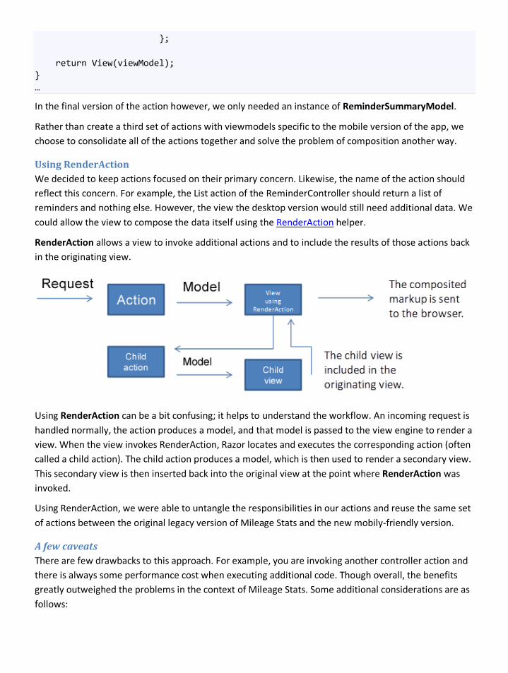
}; return View(viewModel); } …
In the final version of the action however, we only needed an instance of ReminderSummaryModel.
Rather than create a third set of actions with viewmodels specific to the mobile version of the app, we choose to consolidate all of the actions together and solve the problem of composition another way.
Using RenderAction We decided to keep actions focused on their primary concern. Likewise, the name of the action should reflect this concern. For example, the List action of the ReminderController should return a list of reminders and nothing else. However, the view the desktop version would still need additional data. We could allow the view to compose the data itself using the RenderAction helper.
RenderAction allows a view to invoke additional actions and to include the results of those actions back in the originating view.
Using RenderAction can be a bit confusing; it helps to understand the workflow. An incoming request is handled normally, the action produces a model, and that model is passed to the view engine to render a view. When the view invokes RenderAction, Razor locates and executes the corresponding action (often called a child action). The child action produces a model, which is then used to render a secondary view. This secondary view is then inserted back into the original view at the point where RenderAction was invoked.
Using RenderAction, we were able to untangle the responsibilities in our actions and reuse the same set of actions between the original legacy version of Mileage Stats and the new mobily-friendly version.
A few caveats There are few drawbacks to this approach. For example, you are invoking another controller action and there is always some performance cost when executing additional code. Though overall, the benefits greatly outweighed the problems in the context of Mileage Stats. Some additional considerations are as follows:
RenderPartial It’s easy to confuse RenderAction with RenderPartial. RenderAction is for invoking a completely independent action. RenderPartial is simply for rendering a view based on a model passed to it. In most cases, the model passed to it is derived from the main view model.
Rendering forms Avoid using RenderAction to render forms. It likely won’t work the way you’d expect because RenderAction essentially passes through the model view controller (MVC) lifecycle a second time. This means that any form rendering will need to occur in your primary view.
Hidden duplication Since your controller actions are completely independent, it’s easy to unnecessarily duplicate expensive operations. For example, perhaps you have a view composing two actions that both need to look up details about the selected vehicle. If the data was aggregated at the controller level, it could consolidate the lookup. However, when the aggregation happens in the view, you might retrieve the same data twice.
Following the pattern Using RenderAction breaks the model view controller pattern. It is generally assumed in MVC that the view does nothing more than render a model. It is the responsibility of a controller to invoke a view, but the view knows nothing about the controller. Using RenderAction breaks this rule.
Using content negotiation RenderAction allowed us to consolidate the actions related to markup, but it did not address the fact that we had a separate set of similar actions for retrieving the JSON data. In fact, after redesigning the actions and views using RenderAction the resulting actions were even more similar to the JSON actions.
We decided to employ a technique known as content negotiation. Content negotiation allows a browser to specify the representation it would like for the resulting data. According to the HTTP specification, a client can identify a format that it prefers using the Accept header when making a request.
We created a custom ActionResult that would examine this header and render the result accordingly. Using this, the Details action on the ReminderController is able to handle requests for both JSON and markup.
ReminderController.cs
… public ActionResult Details(int vehicleId, int id) { var reminder = Using<GetReminder>().Execute(id); var viewModel = new ReminderSummaryModel(reminder); return new ContentTypeAwareResult(viewModel); } …
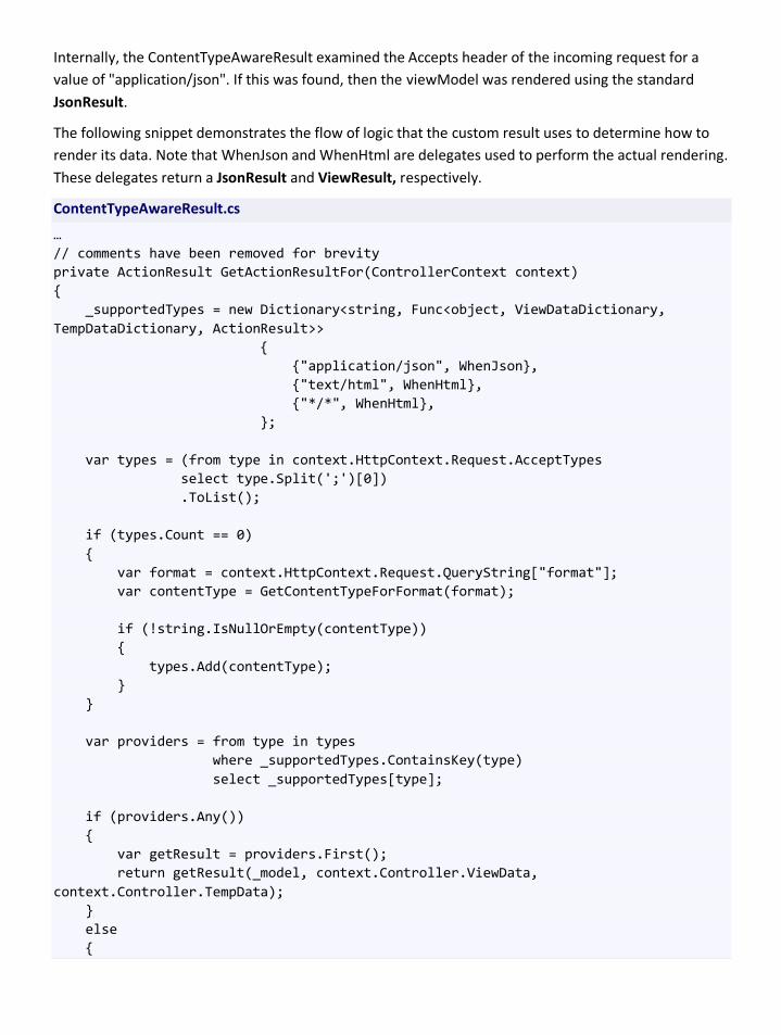
Internally, the ContentTypeAwareResult examined the Accepts header of the incoming request for a value of "application/json". If this was found, then the viewModel was rendered using the standard JsonResult.
The following snippet demonstrates the flow of logic that the custom result uses to determine how to render its data. Note that WhenJson and WhenHtml are delegates used to perform the actual rendering. These delegates return a JsonResult and ViewResult, respectively.
ContentTypeAwareResult.cs
… // comments have been removed for brevity private ActionResult GetActionResultFor(ControllerContext context) { _supportedTypes = new Dictionary<string, Func<object, ViewDataDictionary, TempDataDictionary, ActionResult>> { {"application/json", WhenJson}, {"text/html", WhenHtml}, {"*/*", WhenHtml}, }; var types = (from type in context.HttpContext.Request.AcceptTypes select type.Split(';')[0]) .ToList(); if (types.Count == 0) { var format = context.HttpContext.Request.QueryString["format"]; var contentType = GetContentTypeForFormat(format); if (!string.IsNullOrEmpty(contentType)) { types.Add(contentType); } } var providers = from type in types where _supportedTypes.ContainsKey(type) select _supportedTypes[type]; if (providers.Any()) { var getResult = providers.First(); return getResult(_model, context.Controller.ViewData, context.Controller.TempData); } else {
var msg = string.Format("An unsupported media type was requested. The supported content types are : {0}", String.Join(",", types)); return new HttpStatusCodeResult(406, msg); } } …
It’s important to note that ContentTypeAwareResult was written to handle the specifics of Mileage Stats and is not meant to reflect a general purpose solution for content negotiation.
Caveats The first caveat is that implementing content negotiation correctly is a large task. The problem itself seems trivial at first, but there are many edge cases. For example, our solution does not properly handle the weights associated with the accepted formats. If you want to use content negotiation, and especially if your API is consumed by clients outside of your control, then you should consider using a framework such as ASP.NET Web API.
The most significant problem we encountered, however, was the fact that certain mobile browsers would not allow us to set the Accept header on a request. Otherwise, these browsers met all of our requirements for delivering the SPA experience. Ultimately, we could not rely on the Accept header to accurately reflect the format that the client wanted. We resorted to appending the request format to the query string. You can see this fact in the snippet above, where we look for the presence of "format" in the query string.
Appendix B: Implementing geolocation Geolocation has been become a fundamental feature in many apps over the last few years.
Many of the devices on the market today have been fitted with GPS hardware that can produce reliable geographical data. In addition, the HTML5 specification has recently included geolocation as one of the main features, which means any web browser supporting that specification will be able to retrieve geographic positioning information with the use of JavaScript.
Many online services and apps (such as Microsoft Bing Maps) provide valuable use of such geolocation information. Displaying the user location on a map or providing directions are some of the more useful services these capabilities can enable.
Geolocation in HTML5 HTML5 introduced a new set of JavaScript APIs that can be used to determine the user's location. There are multiple techniques that a device may use to determine this data and provide it to the browser. These include the use of GPS, IP address, and cell tower triangulation.
The actual technique used by the device is hidden from the app consuming the API. Not knowing how the location information was obtained might not be a problem, but it's important for developers to understand that the accuracy of the information might vary considerably, depending on the technique used.
Another important aspect of the geolocation API is that it runs completely asynchronously on the browser. Any attempt to access geolocation data will typically result in a dialogue being presented to the user asking them for their permission to allow the geolocation lookup. You must handle the case in which the user does not grant permission. If permission is granted by the user, the API will return the data via a callback when the operation is complete.
The API in detail Any web browser with support for geolocation will provide access to the intrinsic global object navigator available in the windows object. The privacy settings on the browser for disabling geolocation will not affect the availability of this object.
We will start by discussing the first and most important method available in this object, getCurrentPosition.
JavaScript
void getCurrentPosition(successCallback, errorCallback, options);
The getCurrentPosition method asynchronously attempts to acquire a new Position object. If successful, it will invoke the success callback by passing the Position object as an argument. If the attempt fails, it will try to invoke the error callback by passing an object with the error details. If the user intentionally disabled geolocation in the browser privacy settings, the error callback will be invoked as well. The following example illustrates how this method is called by a script block in the browser.

JavaScript
function get_geolocation() { navigator.geolocation.getCurrentPosition(function(position) { alert('Lat: ' + position.coords.latitude + ' ' + 'Lon: ' + position.coords.latitude); }); }
The code above does not handle any error condition that might happen while trying to get the user's location. The error callback must be used in that case for addressing the error.
JavaScript
function get_geolocation() { navigator.geolocation.getCurrentPosition(function(position) { alert('Lat: ' + position.coords.latitude + ' ' + 'Lon: ' + position.coords.latitude); }, function(error) { switch(error.code) { case error.PERMISSION_DENIED: alert("user did not share geolocation data"); break; case error.POSITION_UNAVAILABLE: alert("could not detect current position"); break; case error.TIMEOUT: alert("retrieving position timed out"); break; default: alert("unknown error"); break; } }); }
As part of the position object returned by the getCurrentPosition method call, two pieces of information are available, the geographic coordinates and a timestamp. The timestamp simply denotes the time at which the instance of geolocation data was created.
The geographic coordinates also include their associated accuracy, as well as a set of other optional attributes, such as altitude and speed.
The other two available methods, watchPosition and clearPosition, work pretty much together. As the name states, the watchPosition method asynchronously starts watching the device location and invoking a callback with the new position. This allows the app to get real-time data about the device location. On the other hand, the clearPosition method stops acquiring any new position fixes and invoking any callbacks.
JavaScript
long watchPosition(success, error, options); void clearWatch(long watchId);
The app can create multiple watchers, which are correlated and identified by the number returned when the function is invoked. The same identifier can also be used as the argument for destroying that watcher with the clearWatch method.
Browsers with no geolocation support You might run into scenarios in which geolocation is not available as a native feature on the device you are targeting. In those cases, the obvious question concerns finding the best possible solution to provide a similar user experience.
An external geolocation service is a well-known solution to this problem. These services typically map the IP address of a device to geographic locations using geolocation databases. Usually they do a good job, but at times they may suffer from the following issues:
• The IP address cannot be mapped to any record in the database, so the location cannot be determined. This typically happens for IP addresses not commonly used on the Internet.
• The IP address is associated with a very large geographic area such as a big city or state, which means the exact location in terms of latitude and longitude, cannot be determined.
• The IP address is associated with a wrong location.
The rule of thumb in this scenario is that an external geolocation service is not as reliable as the native geolocation support in the device, and in some cases it might be completely inaccurate. In addition, these services do not provide additional information such as altitude, speed, or heading of the device. Nevertheless, IP address-based location is still a good solution when GPS or triangulation are not supported.
Please note that this may raise some privacy concerns if the geolocation capability was intentionally disabled by the user, so it is always a good idea to get the user’s consent before performing any location-aware operation.
Online services: Microsoft Bing Maps Bing Maps provides a set of online services for integrating rich geographic capabilities into any existing web app. In a nutshell, it enables users to search, discover, explore, plan, and share information about specific locations.
The Bing Maps platform includes a map control for web-based apps as well as a set of REST and SOAP-based services for incorporating both location and local search features into a web app.
The REST and SOAP services differ in the way they are consumed and in some of the functionality they provide. Some of the features they provide include:
• A locations API for finding a location based on a point, address, or query. This service basically matches addresses, places, and geographic entities to latitude and longitude coordinates on the

map, and return location information for a specified latitude and longitude set of coordinates. The SOAP API also provides a way to search for points of interests, which is not available in the REST version, and can be used for example to search all the nearby gas stations.
• An imagery API for getting a static map which might contain a route, or for getting imagery metadata.
• A routes API for finding a walking, driving, or transit route, or more specific information about routes (such as the route for going to a specific location).
• A traffic API for getting traffic information for a geographical area. (Only available in the REST API)
The following code illustrates how the SOAP service for searching locations can be used to find any nearby gas station.
BingMapService.cs
public IEnumerable<string> SearchKeywordLocation(string keyword, double latitude, double longitude) { var results = new List<string>(); var searchRequest = new SearchRequest(); // Set the credentials using a valid Bing Maps key searchRequest.Credentials = new SearchService.Credentials(); searchRequest.Credentials.ApplicationId = GetBingMapsApplicationKey(); //Create the search query var ssQuery = new StructuredSearchQuery(); ssQuery.Keyword = keyword; ssQuery.Location = string.Format("{0}, {1}", latitude, longitude); searchRequest.StructuredQuery = ssQuery; //Make the search request SearchResponse searchResponse; using (var searchService = new SearchServiceClient("BasicHttpBinding_ISearchService")) { searchResponse = searchService.Search(searchRequest); } foreach (var searchResult in searchResponse.ResultSets[0].Results) { results.Add(string.Format("{0} ({1})", searchResult.Name, searchResult.Distance)); } return results;

}
Both the SOAP and REST services require an application key for authenticating the caller application. A new application key can be obtained by following the instructions on Getting a Bing Maps Key on MSDN.
Geolocation in the real world: Finding a nearby gas station in Mileage Stats The Mileage Stats app uses geolocation for finding all nearby gas stations based on the device location.
In terms of implementation, this feature combines the geolocation API available in the browser for determining the device location and an online service like Bing Maps for finding the nearest gas stations. The Bing Maps REST service did not provide an API for locating points of interest, so we used the SOAP service instead.
Both the REST and the SOAP services require the use of an API key for authentication. The API key should be kept secret. If you embed this key in the JavaScript code, it will become visible to anyone.
In Mileage Stats, the functionality for consuming the Bing Maps API is encapsulated on the server side, and exposed to the browser through a façade using REST services. In that way, the key does not need to be exposed on the client side. Another advantage is that the REST service can hide many of the complexities involved in dealing with the Bing Map APIs or even make it possible to use the SOAP services on the server side as well.
A specific controller, GeoLocationController, was created for exposing this façade to the browser.
GeoLocationController.cs
public class GeoLocationController : Controller { private readonly IMapService mapService; public GeoLocationController(IMapService mapService) { this.mapService = mapService; } public JsonResult GetFillupStations(double latitude, double longitude) { return Json(this.mapService.SearchKeywordLocation("Gas Stations", latitude, longitude), JsonRequestBehavior.AllowGet); } }
GetFillupStations is an action that can be invoked on the browser by using regular Ajax calls. This method receives the device latitude and longitude (which can be obtained from the geolocation API), and returns a JSON message with the expected response.
IMapService is another abstraction on top of Bing Maps that hides many of the implementation details for simplifying unit testing and allowing a possible replacement by another online service in the future.
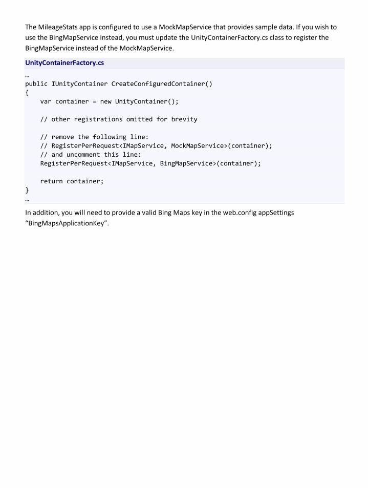
The MileageStats app is configured to use a MockMapService that provides sample data. If you wish to use the BingMapService instead, you must update the UnityContainerFactory.cs class to register the BingMapService instead of the MockMapService.
UnityContainerFactory.cs
… public IUnityContainer CreateConfiguredContainer() { var container = new UnityContainer(); // other registrations omitted for brevity // remove the following line: // RegisterPerRequest<IMapService, MockMapService>(container); // and uncomment this line: RegisterPerRequest<IMapService, BingMapService>(container); return container; } …
In addition, you will need to provide a valid Bing Maps key in the web.config appSettings “BingMapsApplicationKey”.
Appendix C: Delivering mobile-friendly charts Rationale and approach Delivering charts to mobile browsers presents a different set of challenges compared to delivering charts to desktop browsers. Mobile browsers are constrained by bandwidth limitations as well as varying support for HTML5 canvas or JavaScript-based charting frameworks.
In addition to client-side canvas-based charting frameworks, server-side charting libraries provide an option for browsers that do not support JavaScript.
Implementation The legacy Mileage Stats web app used a combination of server-rendered images and client-rendered charts. To support browsers that are not JavaScript enabled, server-rendered chart images are delivered to the browser. The System.Web.Helpers.Chart class provides this server-side charting functionality. For JavaScript-enabled browsers, the jqPlot library was used to render charts on the browser.
However, the jqPlot library was not used in the Mileage Stats Mobile web app due to its size (more than 200KB minified and gzipped). Charting libraries such as flot and Flotr2 were also considered but were not utilized in Mileage Stats Mobile due to limited support across the set of target browsers.
In order to provide a consistent and predictable solution to all target browsers, the server-side rendered chart technique was chosen. The chart image generated on the server ranges from 15KB to 20KB. This solution requires no client-side charting libraries to be loaded since all chart generation occurs server side. One drawback to this solution is that new chart images are frequently downloaded to the client. These chart images cannot be cached due to changes to the back-end data. This makes poor use of bandwidth.
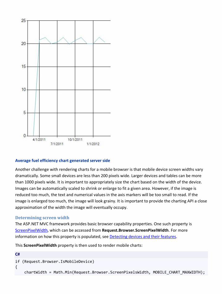
Average fuel efficiency chart generated server side
Another challenge with rendering charts for a mobile browser is that mobile device screen widths vary dramatically. Some small devices are less than 200 pixels wide. Larger devices and tables can be more than 1000 pixels wide. It is important to appropriately size the chart based on the width of the device. Images can be automatically scaled to shrink or enlarge to fit a given area. However, if the image is reduced too much, the text and numerical values in the axis markers will be too small to read. If the image is enlarged too much, the image will look grainy. It is important to provide the charting API a close approximation of the width the image will eventually occupy.
Determining screen width The ASP.NET MVC framework provides basic browser capability properties. One such property is ScreenPixelWidth, which can be accessed from Request.Browser.ScreenPixelWidth. For more information on how this property is populated, see Detecting devices and their features.
This ScreenPixelWidth property is then used to render mobile charts:
C#
if (Request.Browser.IsMobileDevice) { chartWidth = Math.Min(Request.Browser.ScreenPixelsWidth, MOBILE_CHART_MAXWIDTH);

… } … var myChart = GetChartInstance(chartWidth, chartHeight, theme);