Embed Size (px)
Citation preview
DIGIPACK CASE STUDIES
BY KELLYAN
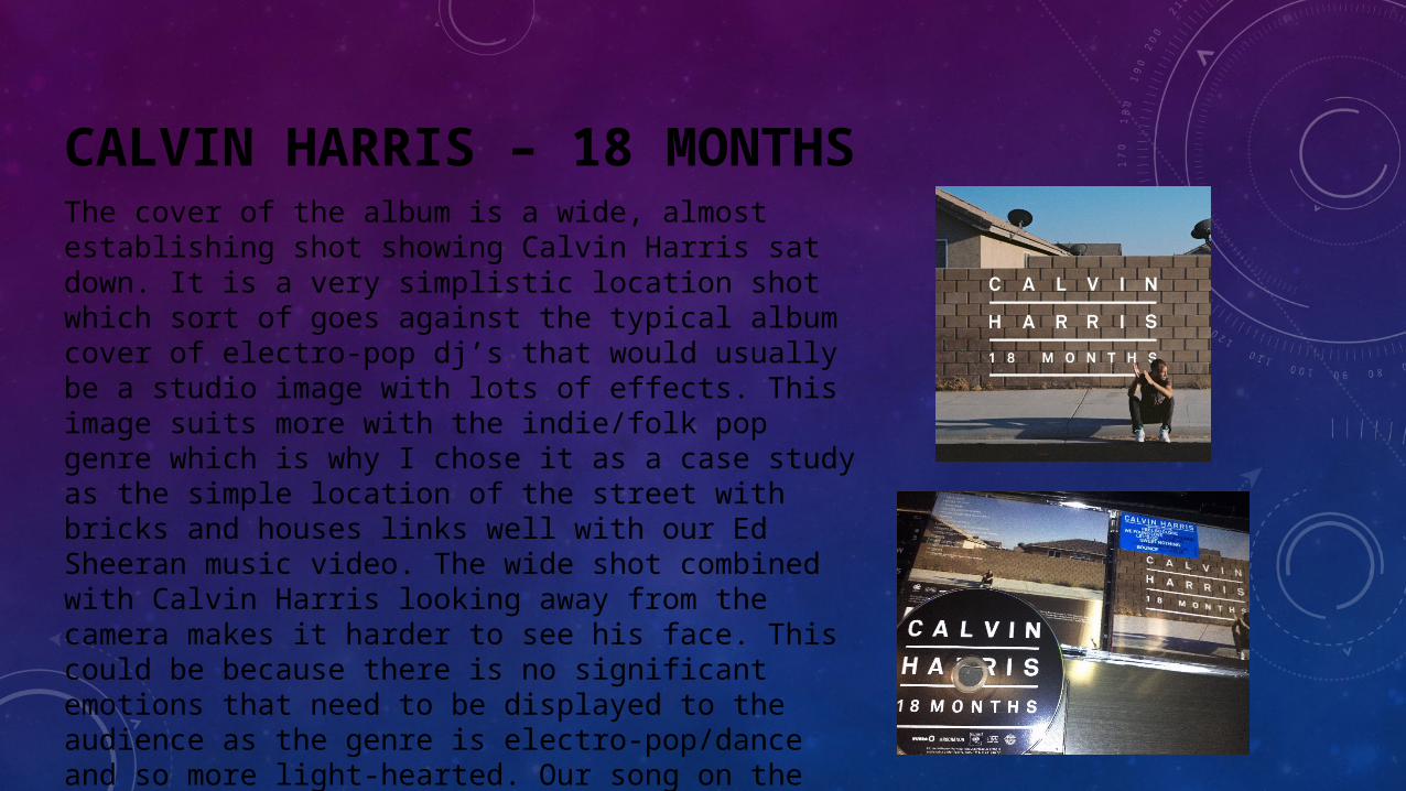
CALVIN HARRIS – 18 MONTHSThe cover of the album is a wide, almost establishing shot showing Calvin Harris sat down. It is a very simplistic location shot which sort of goes against the typical album cover of electro-pop dj’s that would usually be a studio image with lots of effects. This image suits more with the indie/folk pop genre which is why I chose it as a case study as the simple location of the street with bricks and houses links well with our Ed Sheeran music video. The wide shot combined with Calvin Harris looking away from the camera makes it harder to see his face. This could be because there is no significant emotions that need to be displayed to the audience as the genre is electro-pop/dance and so more light-hearted. Our song on the other hand is more emotional so will probably include some sort of close up to convey the necessary emotions with a similar background. There is a zoomed out version of the same picture on the back accentuating more on the simplistic style of this album digipack which is another theme we will try to incorporate into our album case.
BEN HOWARD
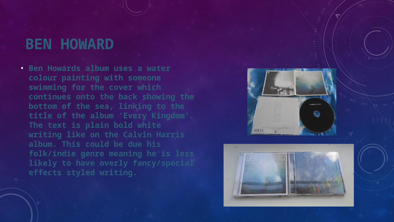
• Ben Howards album uses a water colour painting with someone swimming for the cover which continues onto the back showing the bottom of the sea, linking to the title of the album ‘Every Kingdom’. The text is plain bold white writing like on the Calvin Harris album. This could be due his folk/indie genre meaning he is less likely to have overly fancy/special effects styled writing.
ED SHEERAN -X
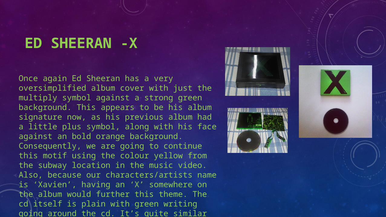
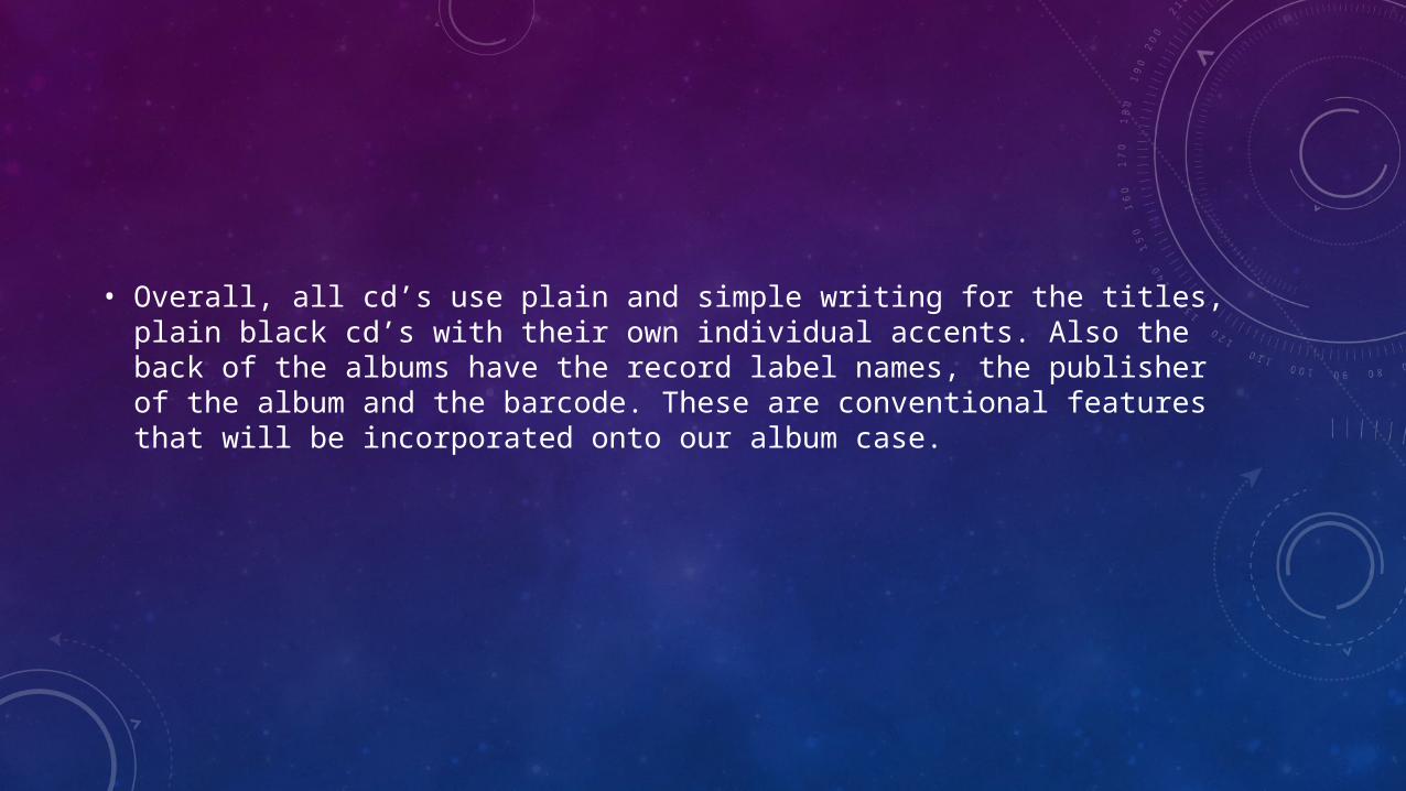
Once again Ed Sheeran has a very oversimplified album cover with just the multiply symbol against a strong green background. This appears to be his album signature now, as his previous album had a little plus symbol, along with his face against an bold orange background. Consequently, we are going to continue this motif using the colour yellow from the subway location in the music video. Also, because our characters/artists name is ‘Xavien’, having an ‘X’ somewhere on the album would further this theme. The cd itself is plain with green writing going around the cd. It’s quite similar to both the Calvin Harris and Ben Howard cd as they are all black with a small amount of writing. Inside the album there is an image of micro-organisms which ‘multiply’ linking back to the title of the album.
• Overall, all cd’s use plain and simple writing for the titles, plain black cd’s with their own individual accents. Also the back of the albums have the record label names, the publisher of the album and the barcode. These are conventional features that will be incorporated onto our album case.
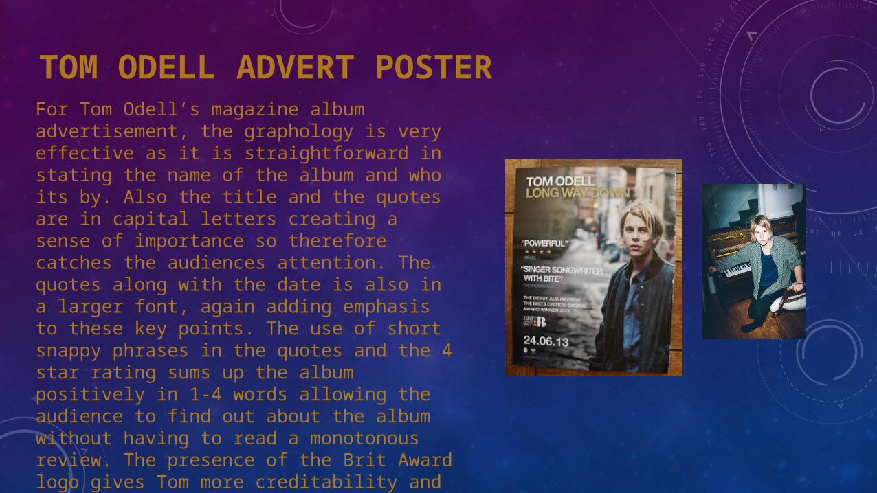
TOM ODELL ADVERT POSTERFor Tom Odell’s magazine album advertisement, the graphology is very effective as it is straightforward in stating the name of the album and who its by. Also the title and the quotes are in capital letters creating a sense of importance so therefore catches the audiences attention. The quotes along with the date is also in a larger font, again adding emphasis to these key points. The use of short snappy phrases in the quotes and the 4 star rating sums up the album positively in 1-4 words allowing the audience to find out about the album without having to read a monotonous review. The presence of the Brit Award logo gives Tom more creditability and causes the audience to believe that he must be an outstanding artist in order to have been a Brit award winner. The image used is a location shot with Tom in casual clothing, looking into the camera to create a relationship with the audience who may view him as a ‘normal’ boy.
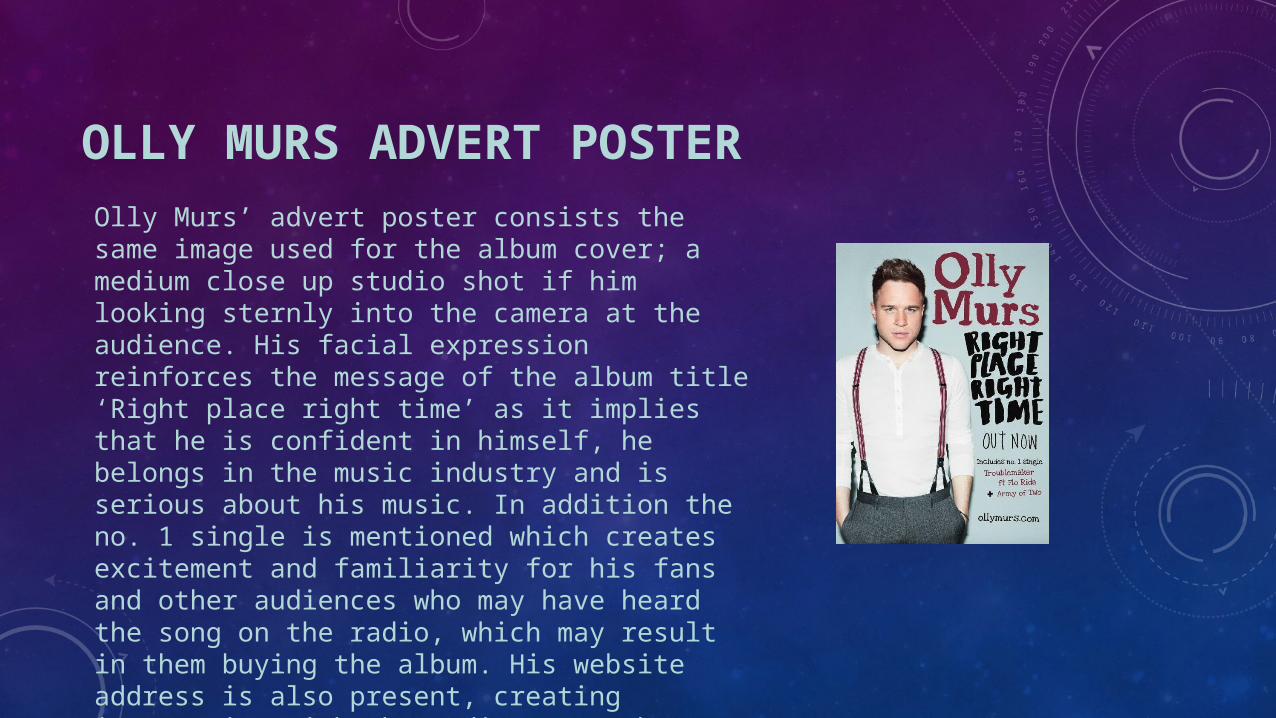
OLLY MURS ADVERT POSTEROlly Murs’ advert poster consists the same image used for the album cover; a medium close up studio shot if him looking sternly into the camera at the audience. His facial expression reinforces the message of the album title ‘Right place right time’ as it implies that he is confident in himself, he belongs in the music industry and is serious about his music. In addition the no. 1 single is mentioned which creates excitement and familiarity for his fans and other audiences who may have heard the song on the radio, which may result in them buying the album. His website address is also present, creating interaction with the audience as they can use the link to purchase his music, merchandise etc. The colour scheme of burgundy and black go with his trouser straps making the appearance of the poster more aesthetically pleasing .
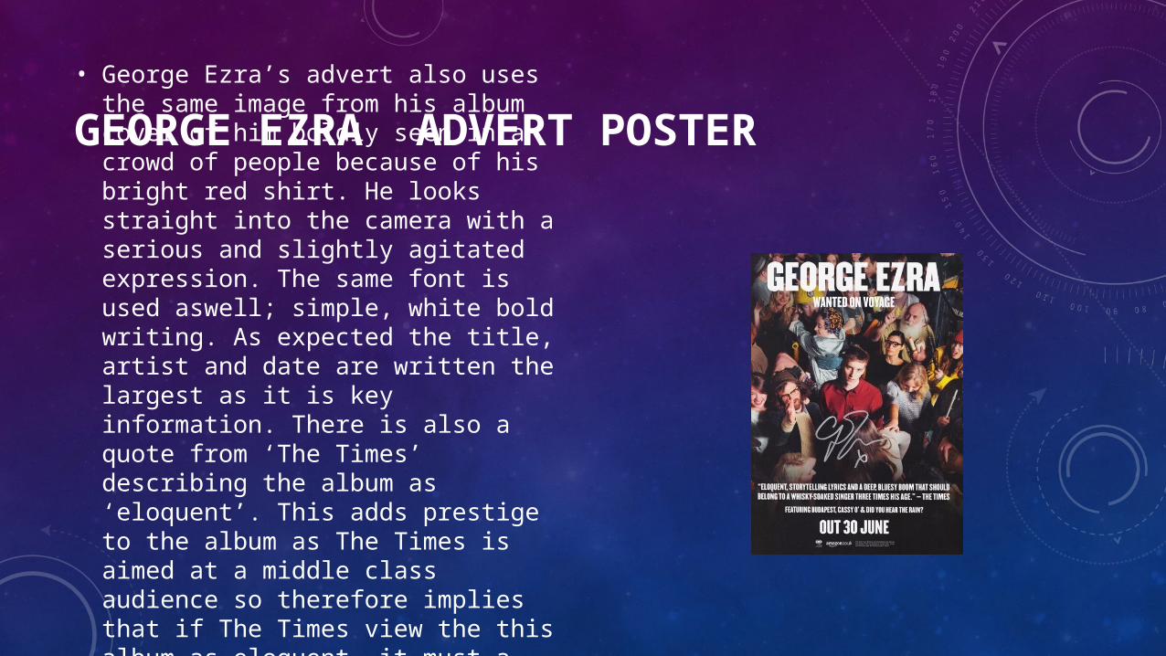
GEORGE EZRA ADVERT POSTER• George Ezra’s advert also uses the same image
from his album cover of him boldly seen in a crowd of people because of his bright red shirt. He looks straight into the camera with a serious and slightly agitated expression. The same font is used aswell; simple, white bold writing. As expected the title, artist and date are written the largest as it is key information. There is also a quote from ‘The Times’ describing the album as ‘eloquent’. This adds prestige to the album as The Times is aimed at a middle class audience so therefore implies that if The Times view the this album as eloquent, it must a very respectable album.