Embed Size (px)
DESCRIPTION
Citation preview
EVALUATION
Jay Bridges and Zain Abiddin
• In what ways does your media product use, develop or challenge forms and conventions of real media products?
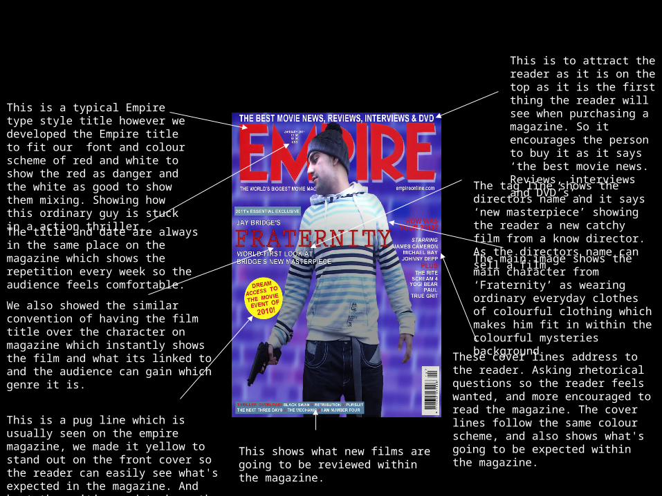
This is a typical Empire type style title however we developed the Empire title to fit our font and colour scheme of red and white to show the red as danger and the white as good to show them mixing. Showing how this ordinary guy is stuck in a action thriller.
The title and date are always in the same place on the magazine which shows the repetition every week so the audience feels comfortable.
We also showed the similar convention of having the film title over the character on magazine which instantly shows the film and what its linked to and the audience can gain which genre it is.
This is a pug line which is usually seen on the empire magazine, we made it yellow to stand out on the front cover so the reader can easily see what's expected in the magazine. And kept the writing red to keep the colour scheme going.
This shows what new films are going to be reviewed within the magazine.
These cover lines address to the reader. Asking rhetorical questions so the reader feels wanted, and more encouraged to read the magazine. The cover lines follow the same colour scheme, and also shows what's going to be expected within the magazine.
The main image shows the main character from ‘Fraternity’ as wearing ordinary everyday clothes of colourful clothing which makes him fit in within the colourful mysteries background
The tag line shows the directors name and it says ‘new masterpiece’ showing the reader a new catchy film from a know director. As the directors name can sell a film.
This is to attract the reader as it is on the top as it is the first thing the reader will see when purchasing a magazine. So it encourages the person to buy it as it says ‘the best movie news. Reviews, interviews and DVD’s’.
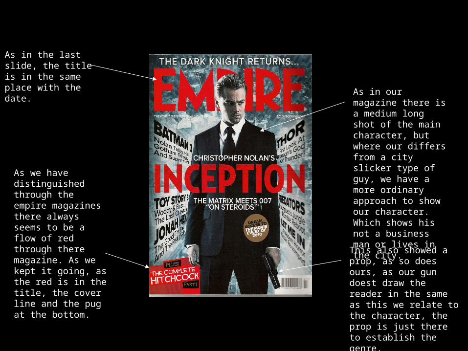
As in the last slide, the title is in the same place with the date.
This also showed a prop, as so does ours, as our gun doest draw the reader in the same as this we relate to the character, the prop is just there to establish the genre.
As we have distinguished through the empire magazines there always seems to be a flow of red through there magazine. As we kept it going, as the red is in the title, the cover line and the pug at the bottom.
As in our magazine there is a medium long shot of the main character, but where our differs from a city slicker type of guy, we have a more ordinary approach to show our character. Which shows his not a business man or lives in the city.
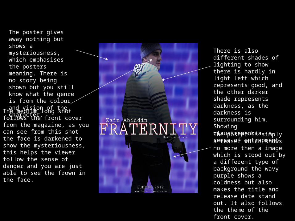
The poster gives away nothing but shows a mysteriousness, which emphasises the posters meaning. There is no story being shown but you still know what the genre is from the colour and vision of the character.
The medium long shot follows the front cover from the magazine, as you can see from this shot the face is darkened to show the mysteriousness, this helps the viewer follow the sense of danger and you are just able to see the frown in the face.
There is also different shades of lighting to show there is hardly in light left which represents good, and the other darker shade represents darkness, as the darkness is surrounding him. Showing claustrophobia, a sense of entrapment.
The poster is simply a teaser which shows no more then a image which is stood out by a different type of background the wavy purple shows a coldness but also makes the title and release date stand out. It also follows the theme of the front cover.
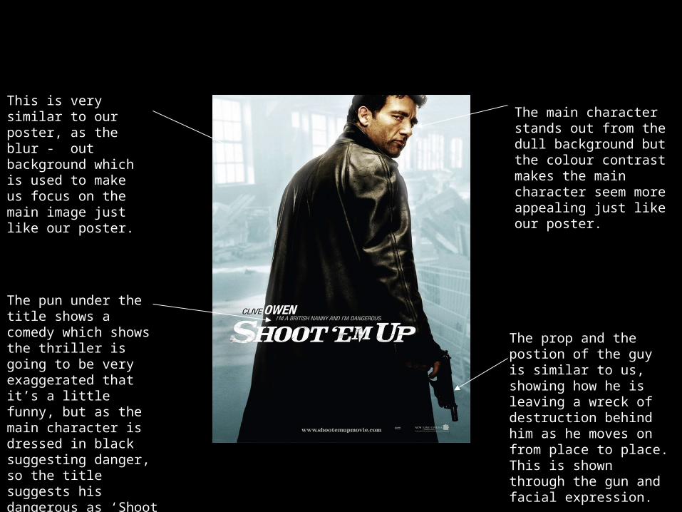
This is very similar to our poster, as the blur - out background which is used to make us focus on the main image just like our poster.
The pun under the title shows a comedy which shows the thriller is going to be very exaggerated that it’s a little funny, but as the main character is dressed in black suggesting danger, so the title suggests his dangerous as ‘Shoot ‘em up’ shows a constant killer.
The main character stands out from the dull background but the colour contrast makes the main character seem more appealing just like our poster.
The prop and the postion of the guy is similar to us, showing how he is leaving a wreck of destruction behind him as he moves on from place to place. This is shown through the gun and facial expression.
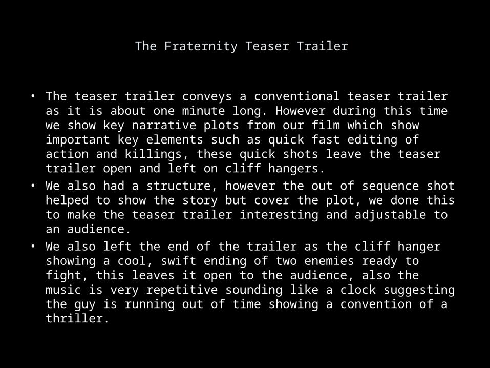
The Fraternity Teaser Trailer
• The teaser trailer conveys a conventional teaser trailer as it is about one minute long. However during this time we show key narrative plots from our film which show important key elements such as quick fast editing of action and killings, these quick shots leave the teaser trailer open and left on cliff hangers.
• We also had a structure, however the out of sequence shot helped to show the story but cover the plot, we done this to make the teaser trailer interesting and adjustable to an audience.
• We also left the end of the trailer as the cliff hanger showing a cool, swift ending of two enemies ready to fight, this leaves it open to the audience, also the music is very repetitive sounding like a clock suggesting the guy is running out of time showing a convention of a thriller.
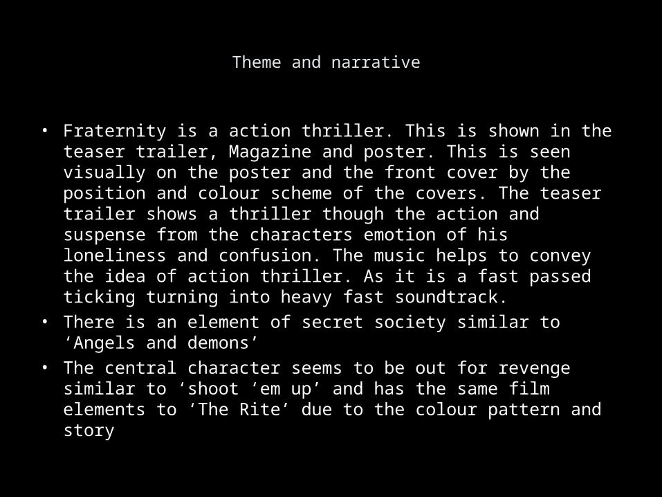
Theme and narrative
• Fraternity is a action thriller. This is shown in the teaser trailer, Magazine and poster. This is seen visually on the poster and the front cover by the position and colour scheme of the covers. The teaser trailer shows a thriller though the action and suspense from the characters emotion of his loneliness and confusion. The music helps to convey the idea of action thriller. As it is a fast passed ticking turning into heavy fast soundtrack.
• There is an element of secret society similar to ‘Angels and demons’ • The central character seems to be out for revenge similar to ‘shoot
‘em up’ and has the same film elements to ‘The Rite’ due to the colour pattern and story
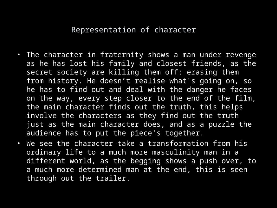
Representation of character
• The character in fraternity shows a man under revenge as he has lost his family and closest friends, as the secret society are killing them off: erasing them from history. He doesn’t realise what's going on, so he has to find out and deal with the danger he faces on the way, every step closer to the end of the film, the main character finds out the truth, this helps involve the characters as they find out the truth just as the main character does, and as a puzzle the audience has to put the piece's together.
• We see the character take a transformation from his ordinary life to a much more masculinity man in a different world, as the begging shows a push over, to a much more determined man at the end, this is seen through out the trailer.
Iconography
• The iconography seen throughout the teaser trailer shows thriller, as there are close ups of guns being drawn, medium shots of people ready to fight, etc.. This shows the audience that the main character has a lot of problems to go thorough to find the truth. The teaser shows a psychological impact of the main characters as his mind is represented by the teasers order of events, as it is out of place and back to front.
• The use of weapons and fast past action is typical in any type of thriller as it shows danger and fear, to show what danger this man is going through to get revenge and find out the truth.
Audio-Visual Style
• Starting the trailer there was a sound bridge, before we even see the main character the sound bridge came into place to show a hidden danger, then the shot opened with over the shoulder close up of a man looking through his blinds, searching for something, as it comes clear his looking for danger.
• The lighting in thrillers is usually dark as we followed the convention we changed it to break the stereotype, as the trailer opens it shows a colourfulness and openness as the trailer goes on, it shows a sense of more exposure and danger, as the danger and truth unfolds the trailer becomes to get darker from the lighting and starts becoming more closed and claustrophobic.
• The music we chose at the start of the trailer shows a type of timer, which is usually seen through a thriller trailer, as it creates suspense and tension. the non-diegitic music starts to become more involved in the action as the is not much diegitc sounds in the teaser as it doesn’t follow sequence as there is less dialogue shows amore eerie trailer following thriller teaser trailers.
2. How effective is the combination of your main product and ancillary texts?
• In our opinion we believe that that the combination of our main product and ancillary texts are incredibly effective, in the sense that the ancillary texts represent the main product appropriately.
• The ancillary texts (particularly the teaser poster) capture the more darker and mysterious side of the protagonist, as to his position in the film, and why his holding a gun.
• The other ancillary text (magazine cover) uses the same pose but from a different view, this time actually being able to see the protagonists face and capture his emotion.
• We chose to reveal more of the protagonist with the magazine cover, as traditionally magazine covers reveal more. This is because as times goes on and the films release is closer, more is revealed at a steady pace. Rarely will you see a Thriller film’s teaser poster revealing a lot about the film.
2. How effective is the combination of your main product and ancillary texts?
• We think our main product and ancillary texts do work well together as they use alike representational elements, including the same protagonist character and a thematic colour scheme of blue, white and red.
• The reason we chose to use white is that it shows light and represents the good inside of the protagonist. White is used particularly strongly in the magazine cover ancillary text, we chose to do this as we wanted to reveal a lot more about the protagonist through this ancillary text.
• The reason we chose to use red is that it shows terror and represents the danger the protagonist has put himself in. Red is particularly shown in the main product, we chose to do this as we wanted to use the main product to reveal the actual danger the film is based around.
2. How effective is the combination of your main product and ancillary texts?
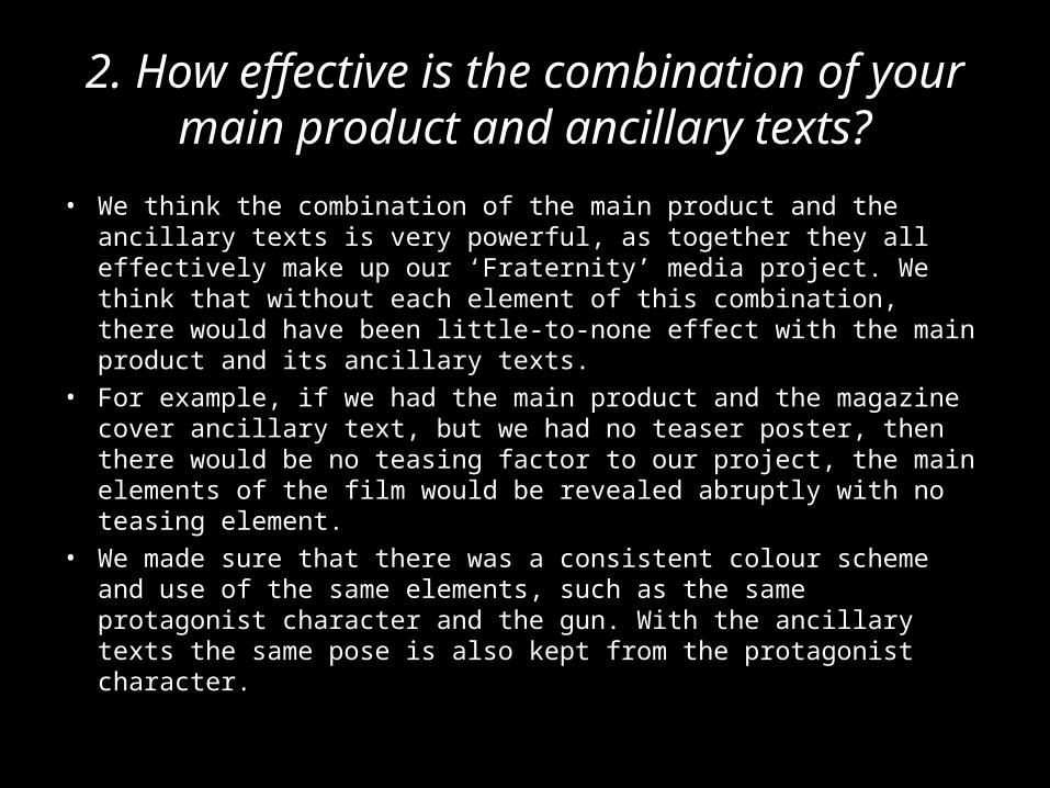
• We think the combination of the main product and the ancillary texts is very powerful, as together they all effectively make up our ‘Fraternity’ media project. We think that without each element of this combination, there would have been little-to-none effect with the main product and its ancillary texts.
• For example, if we had the main product and the magazine cover ancillary text, but we had no teaser poster, then there would be no teasing factor to our project, the main elements of the film would be revealed abruptly with no teasing element.
• We made sure that there was a consistent colour scheme and use of the same elements, such as the same protagonist character and the gun. With the ancillary texts the same pose is also kept from the protagonist character.
What have you learned from your audience feed back?
FEEDBACK
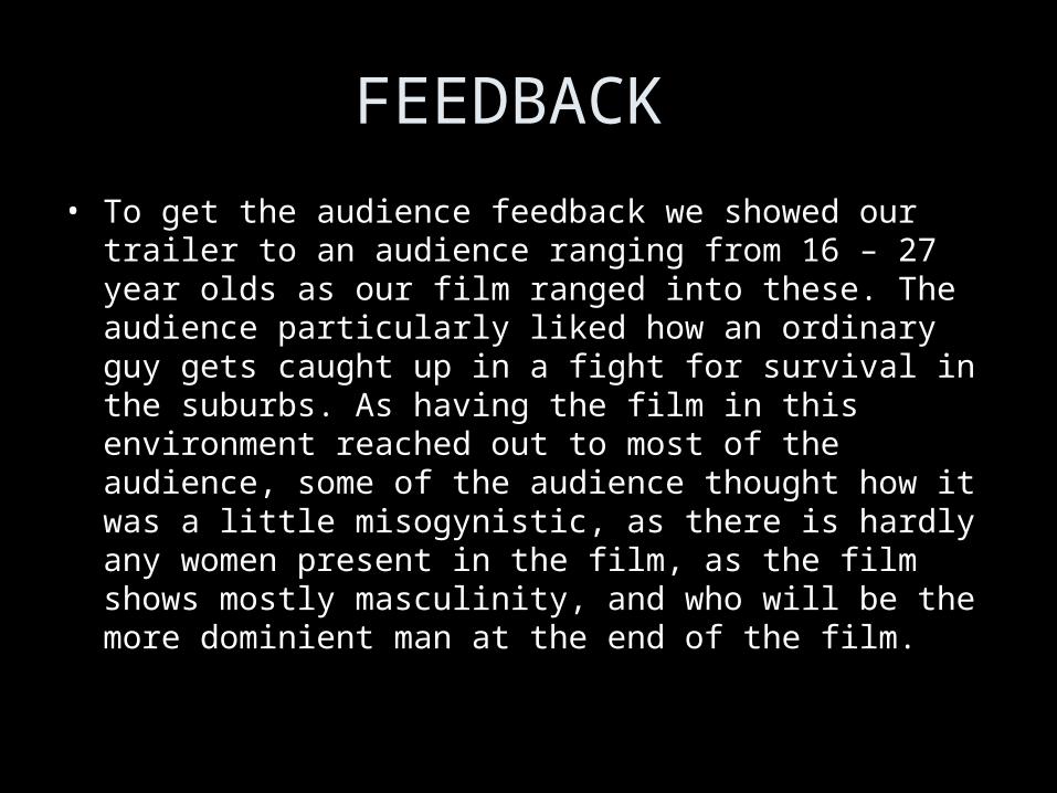
• To get the audience feedback we showed our trailer to an audience ranging from 16 – 27 year olds as our film ranged into these. The audience particularly liked how an ordinary guy gets caught up in a fight for survival in the suburbs. As having the film in this environment reached out to most of the audience, some of the audience thought how it was a little misogynistic, as there is hardly any women present in the film, as the film shows mostly masculinity, and who will be the more dominient man at the end of the film.
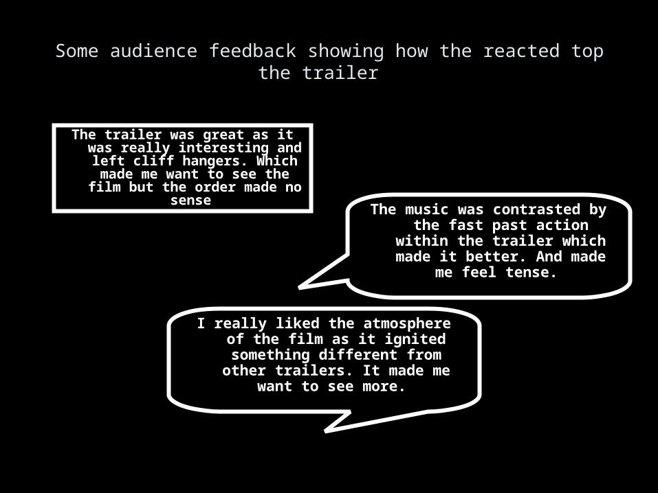
Some audience feedback showing how the reacted top the trailer
The trailer was great as it was really interesting and left cliff hangers. Which made me want to see the
film but the order made no sense
The music was contrasted by the fast past action within the trailer which made it better. And made
me feel tense.
I really liked the atmosphere of the film as it ignited something different
from other trailers. It made me want to see more.
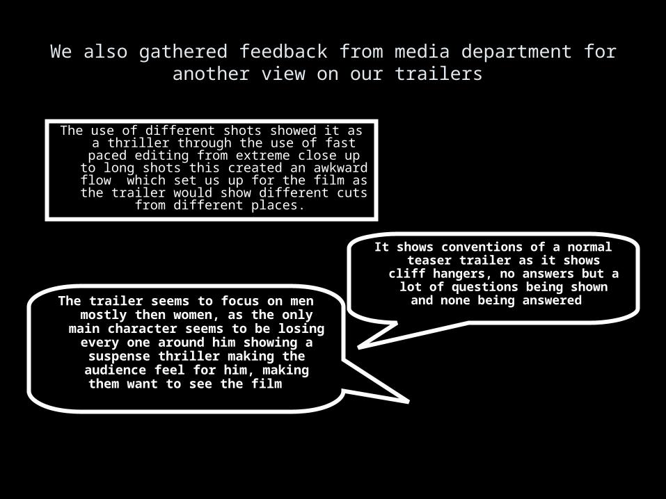
We also gathered feedback from media department for another view on our trailers
The use of different shots showed it as a thriller through the use of fast paced editing from
extreme close up to long shots this created an awkward flow which set us up for the film as the
trailer would show different cuts from different places.
It shows conventions of a normal teaser trailer as it shows cliff
hangers, no answers but a lot of questions being shown and none
being answered The trailer seems to focus on men mostly then women, as the only
main character seems to be losing every one around him showing a
suspense thriller making the audience feel for him, making them
want to see the film
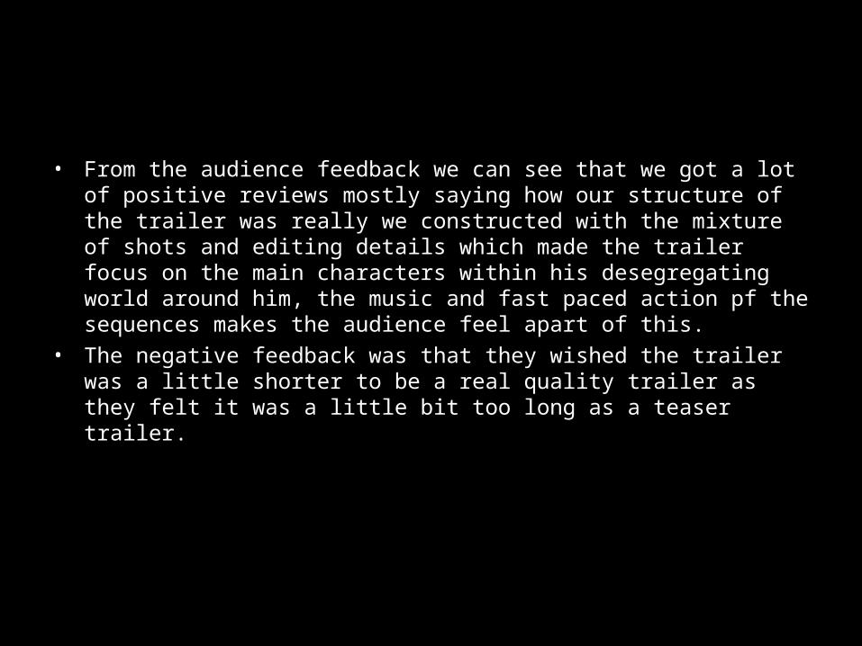
• From the audience feedback we can see that we got a lot of positive reviews mostly saying how our structure of the trailer was really we constructed with the mixture of shots and editing details which made the trailer focus on the main characters within his desegregating world around him, the music and fast paced action pf the sequences makes the audience feel apart of this.
• The negative feedback was that they wished the trailer was a little shorter to be a real quality trailer as they felt it was a little bit too long as a teaser trailer.
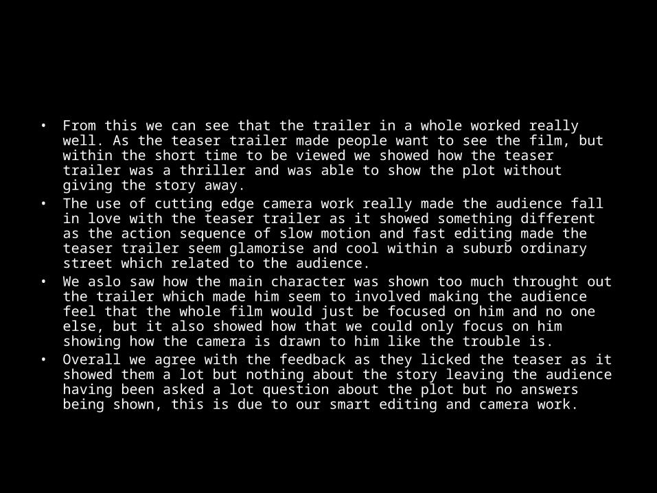
• From this we can see that the trailer in a whole worked really well. As the teaser trailer made people want to see the film, but within the short time to be viewed we showed how the teaser trailer was a thriller and was able to show the plot without giving the story away.
• The use of cutting edge camera work really made the audience fall in love with the teaser trailer as it showed something different as the action sequence of slow motion and fast editing made the teaser trailer seem glamorise and cool within a suburb ordinary street which related to the audience.
• We aslo saw how the main character was shown too much throught out the trailer which made him seem to involved making the audience feel that the whole film would just be focused on him and no one else, but it also showed how that we could only focus on him showing how the camera is drawn to him like the trouble is.
• Overall we agree with the feedback as they licked the teaser as it showed them a lot but nothing about the story leaving the audience having been asked a lot question about the plot but no answers being shown, this is due to our smart editing and camera work.
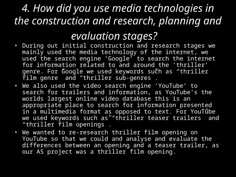
4. How did you use media technologies in the construction and research, planning and
evaluation stages? • During out initial construction and research stages we mainly used
the media technology of the internet, we used the search engine ‘Google’ to search the internet for information related to and around the ‘thriller’ genre. For Google we used keywords such as “thriller film genre” and “thriller sub-genres”.
• We also used the video search engine ‘YouTube’ to search for trailers and information, as YouTube’s the worlds largest online video database this is an appropriate place to search for information presented in a multimedia format as opposed to text. For YouTube we used keywords such as “thriller teaser trailers” and “thriller film openings”.
• We wanted to re-research thriller film opening on YouTube so that we could and analyse and evaluate the differences between an opening and a teaser trailer, as our AS project was a thriller film opening.
4. How did you use media technologies in the construction and research, planning and
evaluation stages?• Subsequently we commenced our construction and research stage and were on the
planning stage. We decided on developing a project based around the action thriller genre, as we have experience in this genre from our AS project, we believe that we could widen our experience and increase our knowledge in this sub-genre.
• To collect and accumulate all of the plans we made, we used an internet blog. We created this internet blog using the website ‘Blogger’, this allowed us to collect all of our plans and show our progress creating our main product and ancillary texts.
• As part of our planning, we needed to produce the following:• Planning notes – Lists actors and there roles, costumes, props, locations and the filming start date• Synopsis – Outlines the main plot and story• Shooting script – Lists all camera shots, shot types and a description of what happens in each shot • Storyboards – Shows a rough sketch of each shot, showing what should take place and description of what is happening in that shot
• The planning notes, synopsis and shooting script were all written digitally using a word processor program, whereas the storyboards were hand-drawn and the descriptions hand-written.
• Our storyboards were made digital by taking a high-resolution picture of them using a digital still camera.
• We added all of the above planning elements to our blog and wrote a description explaining our progress.
4. How did you use media technologies in the construction and research, planning and
evaluation stages?• After completing our construction and research & planning stages,
we were now on the evaluation stage. The main technology we used on this stage was the use of presentation software.
• We chose to use presentation software as its more pleasant-to-view and presentable compared to a standard report.
• Presentations are easier for the reader to view and digest, they allow the viewer to take in small chunks of information at a time, as opposed to a lengthy 10-page report for example.
• We think this media technology we’ve used for our evaluation stage is appropriate and suitable for use in this situation as it allows us to evaluate and analyse our project to a powerful extent, without boring the viewer.
4. How did you use media technologies in the construction and research, planning and
evaluation stages?• To develop our main product we used a digital video camera, this media
technology allowed us to capture footage in a widescreen format, which is used on almost every screen produced today.
• This media technology also makes it very easy to transfer the captured footage onto the computer, we can either connect the camera using a USB connection wire or insert the memory card into a card reader.
• After we put the footage onto the computer, we edited the footage using the software ‘Adobe Premier Pro’. We’ve used this same editing software in our previous AS project, since we were familiar to this software, it was easy to pick up and use efficiently.
• This media technology of editing video permitted us with very powerful software to experiment with our captured footage.
• Soon we were on the right track creating an exciting film and exhilarating film trailer, after numerous experimentations with our footage, we had decided on a final cut, we added the appropriate titles and soundtrack, and our main product was then complete.
4. How did you use media technologies in the construction and research, planning and
evaluation stages?• After studying researched material we were particularly inspired by the ‘Shoot Em Up’
teaser film poster, it had exactly what we were looking for, mystery, darkness, ambiguity and secrecy.
• In terms of our magazine cover ancillary text, we were particularly inspired by the ‘Inception’ Empire magazine cover, it had the similar elements we were looking for; as seen above.
• Using a digital still camera we took pictures and uploaded them to computer, from there we used our photo-editing software to edit the pictures.
• To create both our ancillary texts we used the ‘Paint Shop Pro’ software. We were taught how to use this software by our teachers, Zain personally had experience with similar software from his ICT subject.
• With Zain mainly editing these pictures and creating our ancillary texts, Jay researched and studied our research material to create the perfect poster and magazine cover.
• This was a challenge as none of us had any experience creating an actual film poster or magazine cover, although with our teachers aid and our creativity, we were able to successfully produce appropriate and suitable film poster and magazine cover.