Embed Size (px)
Citation preview
Magazine CoverAnalysis
By Kimberley Bray
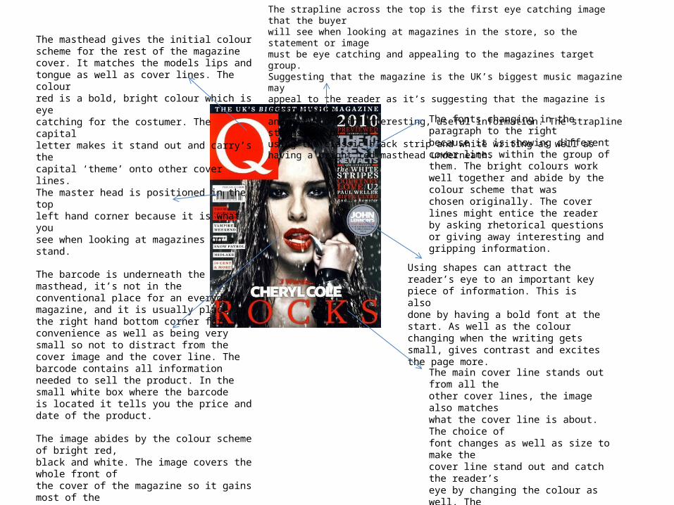
The masthead gives the initial colourscheme for the rest of the magazinecover. It matches the models lips andtongue as well as cover lines. The colourred is a bold, bright colour which is eyecatching for the costumer. The capitalletter makes it stand out and carry’s thecapital ‘theme’ onto other cover lines.The master head is positioned in the topleft hand corner because it is what yousee when looking at magazines on astand.
The barcode is underneath themasthead, it’s not in theconventional place for an everydaymagazine, and it is usually place inthe right hand bottom corner forconvenience as well as being verysmall so not to distract from thecover image and the cover line. Thebarcode contains all informationneeded to sell the product. In thesmall white box where the barcodeis located it tells you the price anddate of the product.
The image abides by the colour scheme of bright red,black and white. The image covers the whole front ofthe cover of the magazine so it gains most of thereader’s attention. The red lips also draw’s the readerseye due to it being luxurious and sexually attractive,the magazine doesn’t just appeal to music lovers butalso Cheryl Cole fans due to her clearly featuring in themagazine. Cheryl is also staring straight into thecamera, which makes the reader feel connected.
The fonts changing in theparagraph to the rightbecause it is showing differentcover lines within the group ofthem. The bright colours workwell together and abide by thecolour scheme that waschosen originally. The coverlines might entice the readerby asking rhetorical questionsor giving away interesting andgripping information.
The main cover line stands out from all theother cover lines, the image also matcheswhat the cover line is about. The choice offont changes as well as size to make thecover line stand out and catch the reader’seye by changing the colour as well. Thestatement is also very strong but choosingsomething that is short, snappy and isbiased. Choosing something biased to puton the cover is may draw readers into themagazine to know why Cheryl Cole rocks
The strapline across the top is the first eye catching image that the buyerwill see when looking at magazines in the store, so the statement or imagemust be eye catching and appealing to the magazines target group.Suggesting that the magazine is the UK’s biggest music magazine mayappeal to the reader as it’s suggesting that the magazine is worth buyingand will contain interesting, useful information. The strapline stands out byusing the classic black strip and white writing as well as having a bright red masthead underneath.
Using shapes can attract thereader’s eye to an important keypiece of information. This is alsodone by having a bold font at thestart. As well as the colourchanging when the writing getssmall, gives contrast and excites the page more.
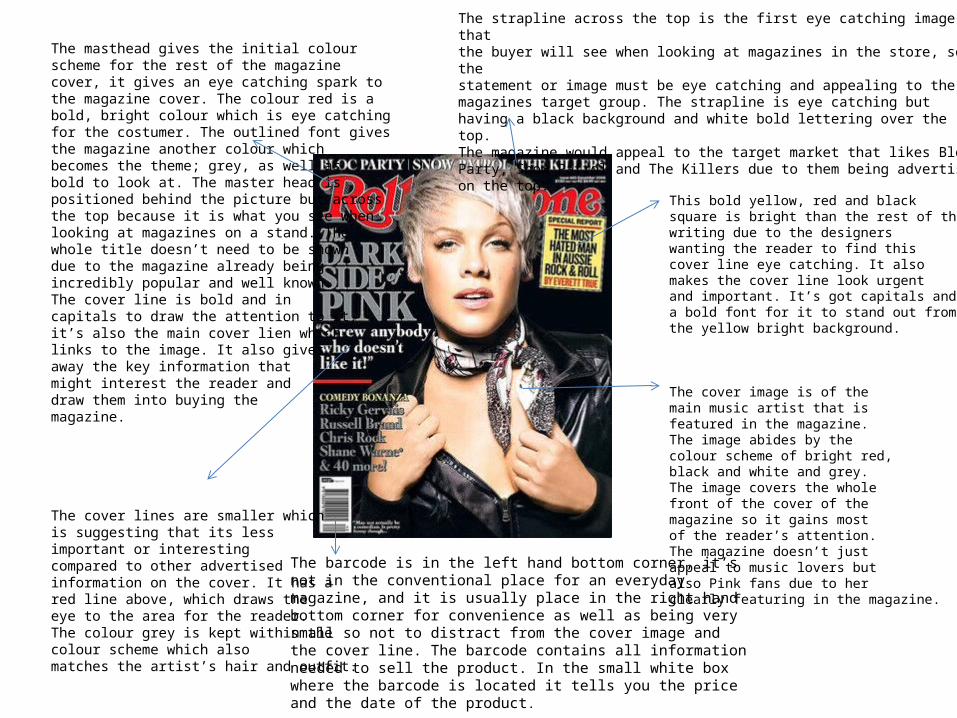
The masthead gives the initial colourscheme for the rest of the magazinecover, it gives an eye catching spark tothe magazine cover. The colour red is abold, bright colour which is eye catchingfor the costumer. The outlined font givesthe magazine another colour whichbecomes the theme; grey, as well asbold to look at. The master head ispositioned behind the picture but acrossthe top because it is what you see whenlooking at magazines on a stand. Thewhole title doesn’t need to be showndue to the magazine already beingincredibly popular and well known.The cover line is bold and incapitals to draw the attention to it,it’s also the main cover lien whichlinks to the image. It also givesaway the key information thatmight interest the reader anddraw them into buying themagazine.
The cover lines are smaller whichis suggesting that its lessimportant or interestingcompared to other advertisedinformation on the cover. It has ared line above, which draws theeye to the area for the reader.The colour grey is kept within thecolour scheme which alsomatches the artist’s hair and outfit.
This bold yellow, red and blacksquare is bright than the rest of thewriting due to the designerswanting the reader to find thiscover line eye catching. It alsomakes the cover line look urgentand important. It’s got capitals anda bold font for it to stand out fromthe yellow bright background.
The cover image is of themain music artist that isfeatured in the magazine.The image abides by thecolour scheme of bright red,black and white and grey.The image covers the wholefront of the cover of themagazine so it gains mostof the reader’s attention.The magazine doesn’t justappeal to music lovers butalso Pink fans due to herclearly featuring in the magazine.
The strapline across the top is the first eye catching image thatthe buyer will see when looking at magazines in the store, so thestatement or image must be eye catching and appealing to themagazines target group. The strapline is eye catching buthaving a black background and white bold lettering over the top.The magazine would appeal to the target market that likes BlocParty, Snow Patrol and The Killers due to them being advertised on the top.
The barcode is in the left hand bottom corner, it’snot in the conventional place for an everydaymagazine, and it is usually place in the right handbottom corner for convenience as well as being verysmall so not to distract from the cover image andthe cover line. The barcode contains all informationneeded to sell the product. In the small white boxwhere the barcode is located it tells you the price and the date of the product.
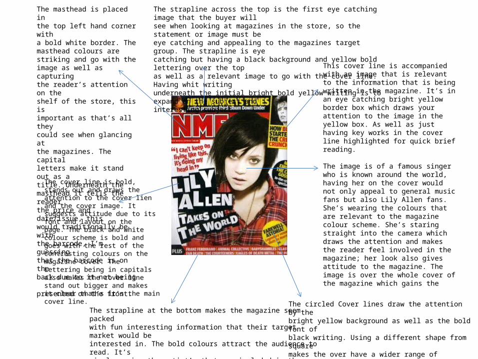
This cover line is accompaniedwith an image that is relevantto the information that is beingwritten in the magazine. It’s inan eye catching bright yellowborder box which draws yourattention to the image in theyellow box. As well as justhaving key works in the coverline highlighted for quick briefreading.
The image is of a famous singerwho is known around the world,having her on the cover wouldnot only appeal to general musicfans but also Lily Allen fans.She’s wearing the colours thatare relevant to the magazinecolour scheme. She’s staringstraight into the camera whichdraws the attention and makesthe reader feel involved in themagazine; her look also givesattitude to the magazine. Theimage is over the whole cover ofthe magazine which gains the
The circled Cover lines draw the attention by thebright yellow background as well as the bold font ofblack writing. Using a different shape from squaremakes the over have a wider range of interestingthings to look at and attract the reader to buy themagazine.
The masthead is placed inthe top left hand corner witha bold white border. Themasthead colours arestriking and go with theimage as well as capturingthe reader’s attention on theshelf of the store, this isimportant as that’s all theycould see when glancing atthe magazines. The capitalletters make it stand out as atitle. Underneath themasthead it tells the readerthe price and date/issue, thiswould traditionally be withthe barcode, I’m guessingthat the barcode is on theback due to it not being presented on the front.
The strapline across the top is the first eye catching image that the buyer willsee when looking at magazines in the store, so the statement or image must beeye catching and appealing to the magazines target group. The strapline is eyecatching but having a black background and yellow bold lettering over the topas well as a relevant image to go with the cover line. Having whit writingunderneath the initial bright bold yellow writing is to expand on the subject andinteresting subject.
The strapline at the bottom makes the magazine seem packedwith fun interesting information that their target market would beinterested in. The bold colours attract the audience to read. It’ssimply naming the artist’s that are included in the magazine insome way, This might appeal to more people as their favouriteartist may have a article in which would broaden the target range.
The cover line is bold,stands out and draws theattention to the cover lienand the cover image. Itsuggests attitude due to itsfont and layout on thepage. The black and whitecolour scheme is bold andgoes with the rest of thecontrasting colours on themagazine cover. TheLettering being in capitalsalso makes the cover linestand out bigger and makesit clear that’s it’s the main cover line.