Embed Size (px)
Citation preview

Making of Digipak and Magazine Advert
PlanFront Cover:-close up of artists face-artist has to be making direct eye contact with the audience to connect to them-artists face has to be main feature. Everything else in background must be blurred and not apparent Inside Panel:-mid shot of artist-show artist using main instrument – guitar-show artist looking down, fixated at guitar-take picture of artist as if they are playing guitarCD Panel:-heart shape with hands-close up-shoot in green room-also, shoot artist doing heart in a shadowBack Cover:-position artist to one side of picture so that songs can be positioned on the right Magazine Advert:-Close up of artist face gazing directly at camera-long shot of artist looking to the right – add scenery in the background. Possibly a park outdoor setting
Selected Images
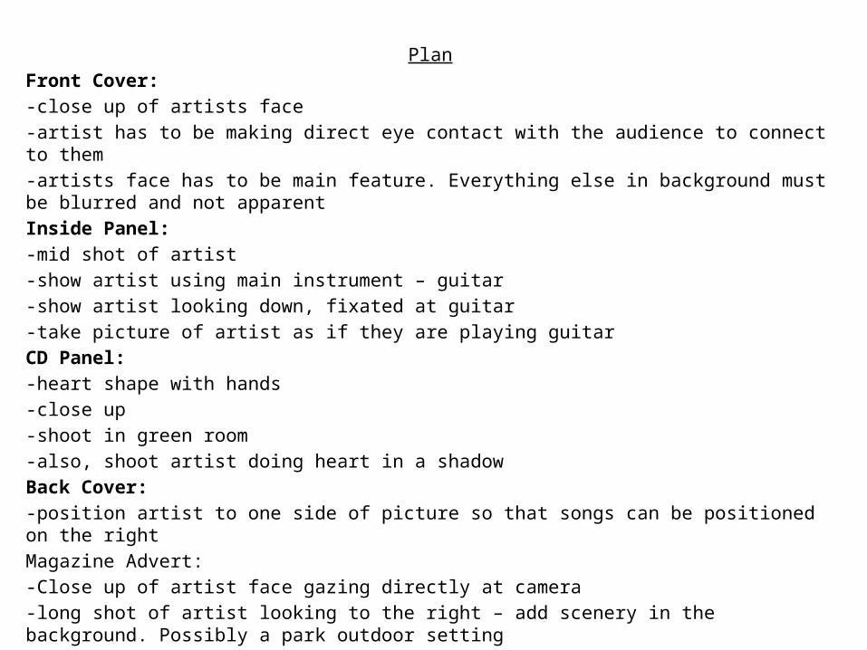
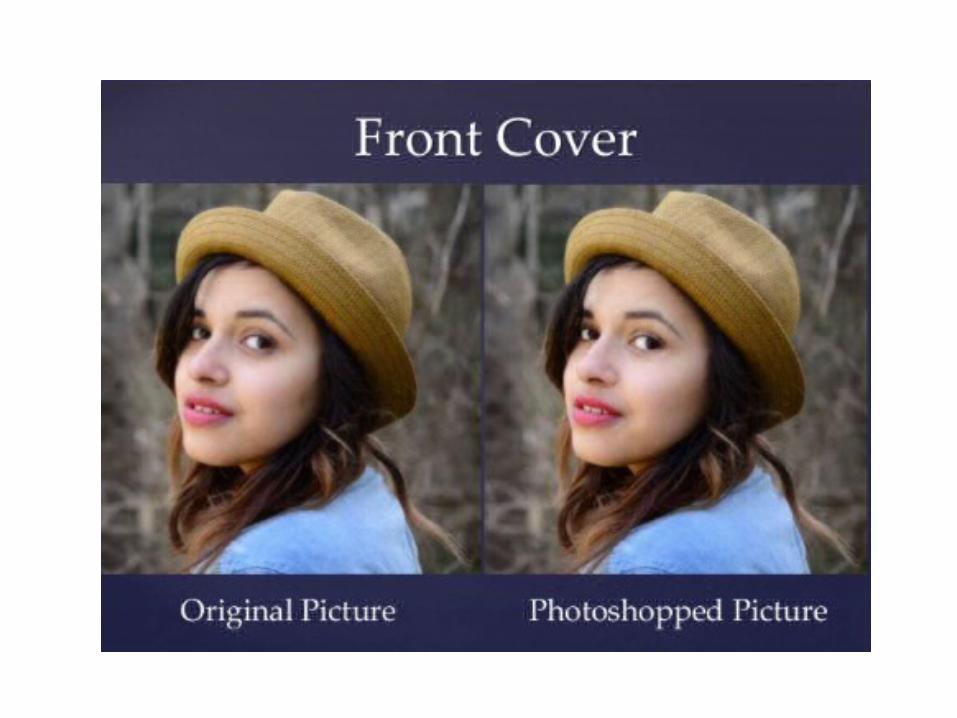
We decided to use this as our front cover as she is looking directly into the camera which makes it seem more personal as it looks like she is connecting with the target audience. Also, she is looking over her shoulders, which we thought would look interesting instead of her just facing the camera.
We decided to use this as our inside panel as we wanted to show her playing the guitar which is a big part of her star image. We were able to choose from a variety of facial expressions whilst she played the guitar because we shot lots. These were facial expressions such as a straight expression, a mouth open smile or a closed mouth smile. In the end we decided to go with the closed mouth smile as it made her look innocent and focused on playing the guitar.
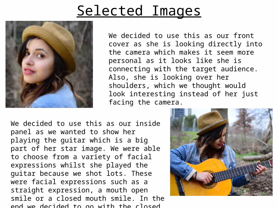
We decided to use the image of a heart on the inside panel as we wanted to choose something different, instead of just featuring her face on all four panels. Hearts are associated with love, which is one of the key main themes in our music video and the driving passion behind it.
Originally, we wanted to use this picture for the back panel. However we decided not to because the text was not viewable on top of the trees. It looked messy and it also looked like there was too much going on in one picture which we did not like.
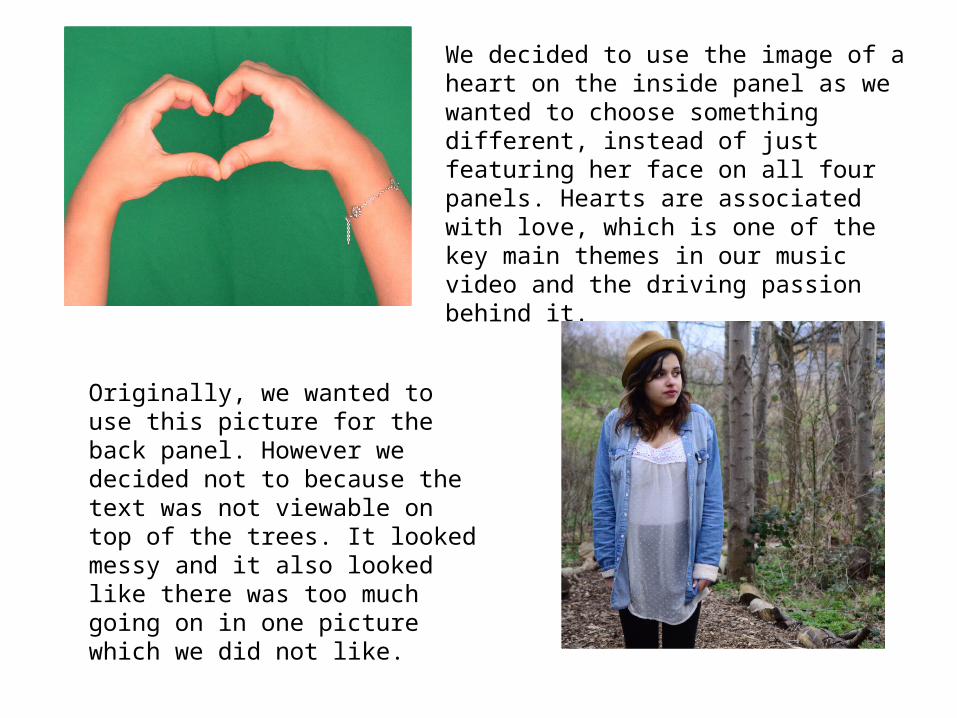
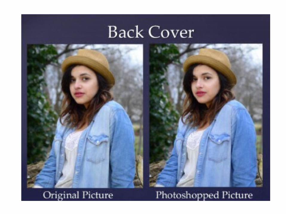
We then decided to choose this image for the back cover. This worked much more better as we were able to position the text over the tree on the left and this was perfect as the white text came up much more clearly and looked much more effective.
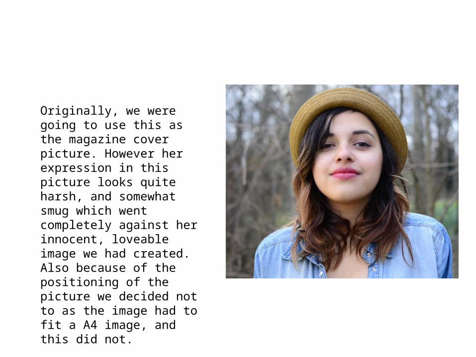
Originally, we were going to use this as the magazine cover picture. However her expression in this picture looks quite harsh, and somewhat smug which went completely against her innocent, loveable image we had created. Also because of the positioning of the picture we decided not to as the image had to fit a A4 image, and this did not.
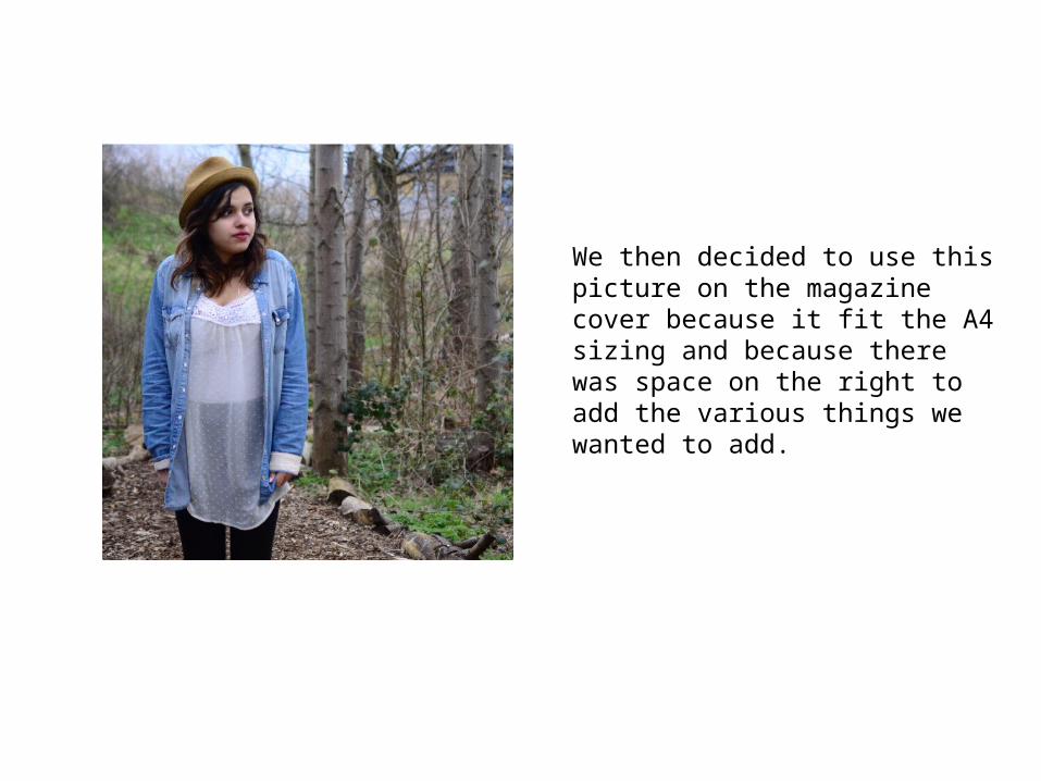
We then decided to use this picture on the magazine cover because it fit the A4 sizing and because there was space on the right to add the various things we wanted to add.
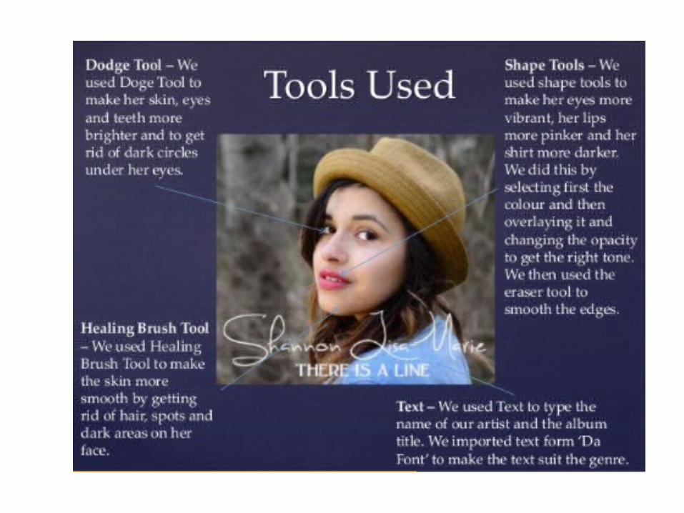
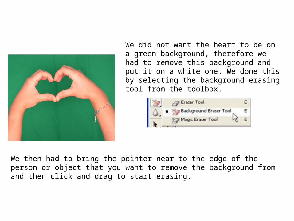
We did not want the heart to be on a green background, therefore we had to remove this background and put it on a white one. We done this by selecting the background erasing tool from the toolbox.
We then had to bring the pointer near to the edge of the person or object that you want to remove the background from and then click and drag to start erasing.
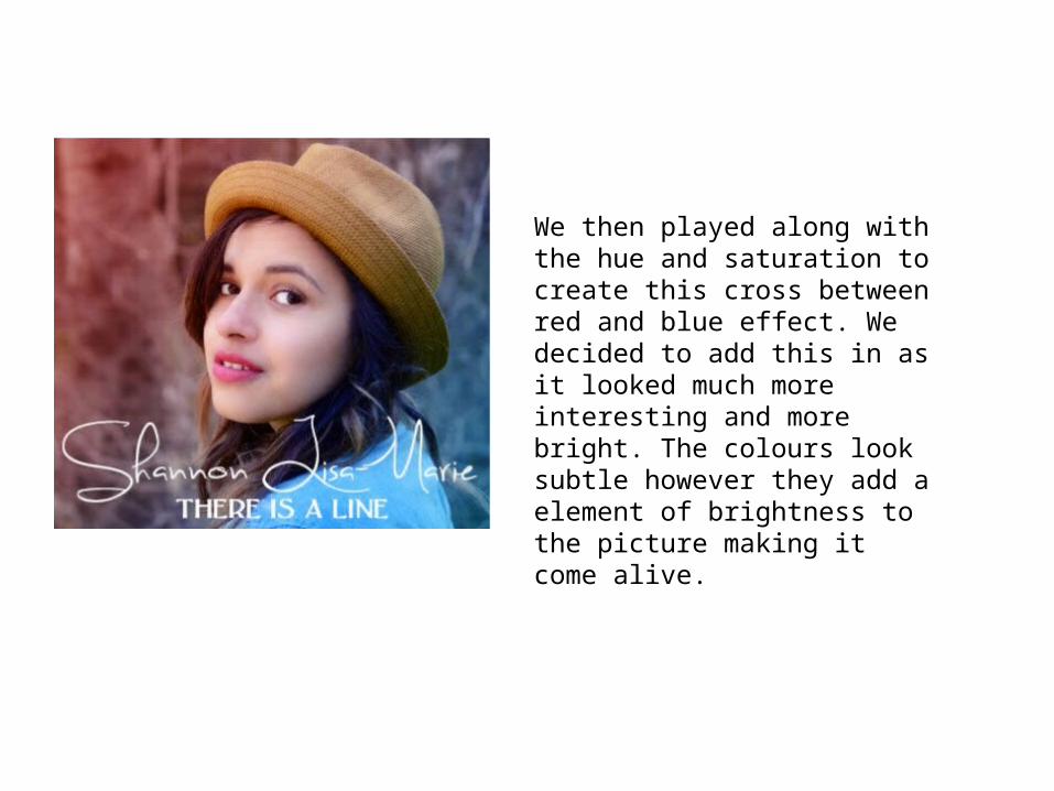
We then played along with the hue and saturation to create this cross between red and blue effect. We decided to add this in as it looked much more interesting and more bright. The colours look subtle however they add a element of brightness to the picture making it come alive.
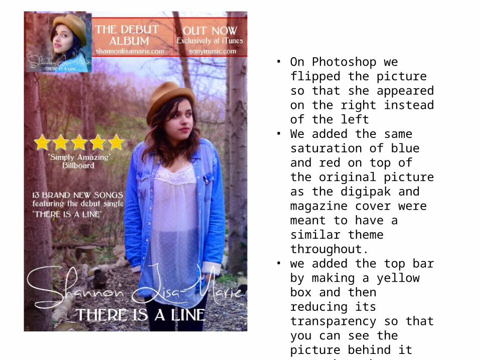
• On Photoshop we flipped the picture so that she appeared on the right instead of the left
• We added the same saturation of blue and red on top of the original picture as the digipak and magazine cover were meant to have a similar theme throughout.
• we added the top bar by making a yellow box and then reducing its transparency so that you can see the picture behind it come through.
• We also added the front cover of the digipak to advertise it.