Embed Size (px)
Citation preview
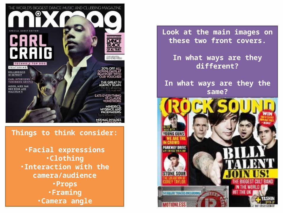
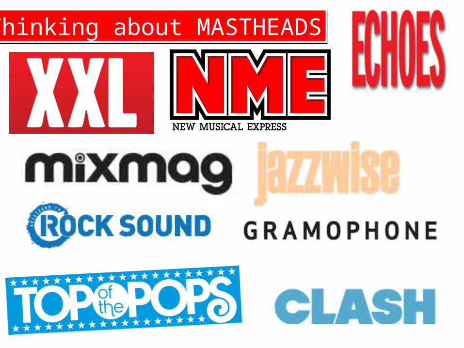
Look at the main images on these two front covers.
In what ways are they different?
In what ways are they the same?
Things to think consider:
•Facial expressions•Clothing
•Interaction with the camera/audience
•Props•Framing
•Camera angle
The Title of Your Magazine
What is your magazine called?What is the literal meaning of the words in the title?
What are the associations of the words?
The Title of Your Magazine
What is your magazine called?What is the literal meaning of the words in the title?
What are the associations of the words?
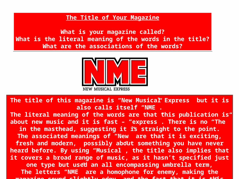
The title of this magazine is “New Musical Express” but it is also calls itself “NME”.The literal meaning of the words are that this publication is about new music and it is
fast – “express”. There is no “The” in the masthead, suggesting it is straight to the point.The associated meanings of “New” are that it is exciting, fresh and modern, possibly
about something you have never heard before. By using “Musical”, the title also implies that it covers a broad range of music, as it hasn’t specified just one type but used an all
encompassing umbrella term,The letters “NME” are a homophone for enemy, making the magazine sound slightly edgy, and the fact that it is this title which is highlighted over “New Musical Express”
suggests that you have to be “in the know” to understand what the magazine is about, making it seem like an elite kind of club.
Ways to describe typography:
CleanBoldSans-SerifSerifBlockySmoothSquaredRoundedOrnateDecorativeSimple
Ways to describe typography:
CleanBoldSans-SerifSerifBlockySmoothSquaredRoundedOrnateDecorativeSimple
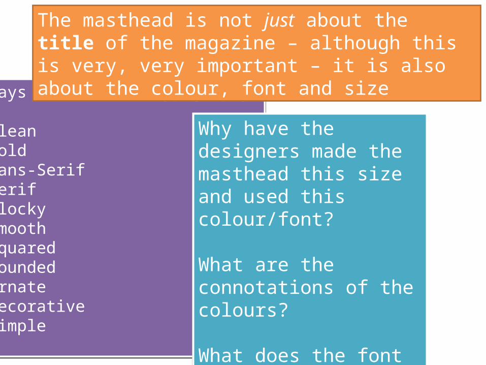
The masthead is not just about the title of the magazine – although this is very, very important – it is also about the colour, font and size
Why have the designers made the masthead this size and used this colour/font?
What are the connotations of the colours?
What does the font suggest about the magazine?
Why have the designers made the masthead this size and used this colour/font?
What are the connotations of the colours?
What does the font suggest about the magazine?
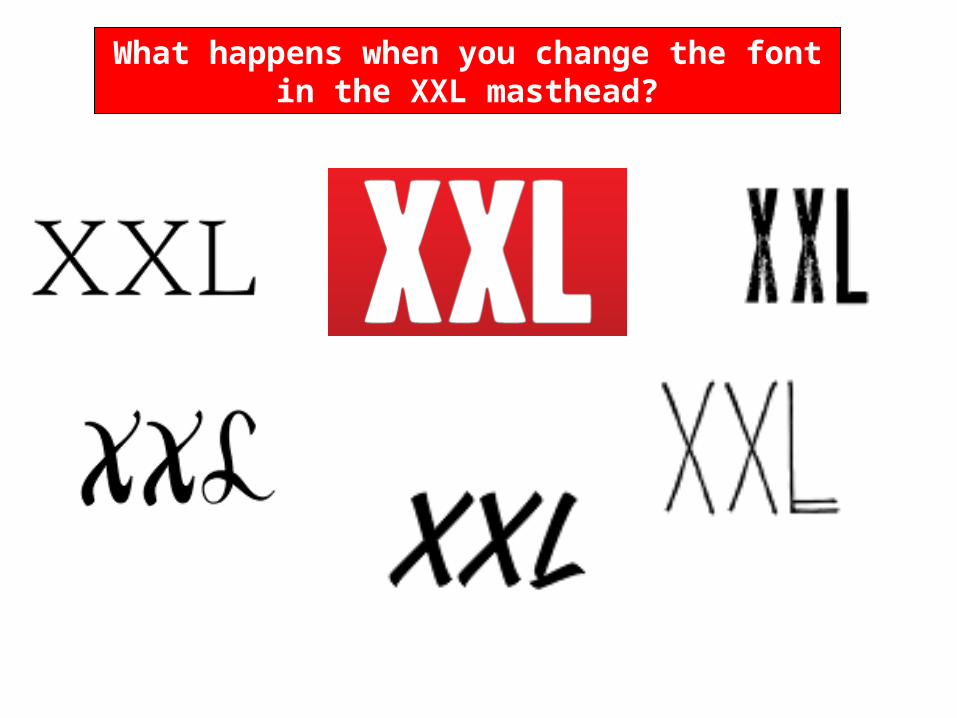
What happens when you change the font in the XXL masthead?
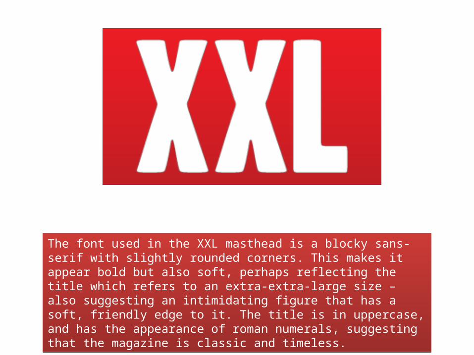
The font used in the XXL masthead is a blocky sans-serif with slightly rounded corners. This makes it appear bold but also soft, perhaps reflecting the title which refers to an extra-extra-large size – also suggesting an intimidating figure that has a soft, friendly edge to it. The title is in uppercase, and has the appearance of roman numerals, suggesting that the magazine is classic and timeless.
The font used in the XXL masthead is a blocky sans-serif with slightly rounded corners. This makes it appear bold but also soft, perhaps reflecting the title which refers to an extra-extra-large size – also suggesting an intimidating figure that has a soft, friendly edge to it. The title is in uppercase, and has the appearance of roman numerals, suggesting that the magazine is classic and timeless.
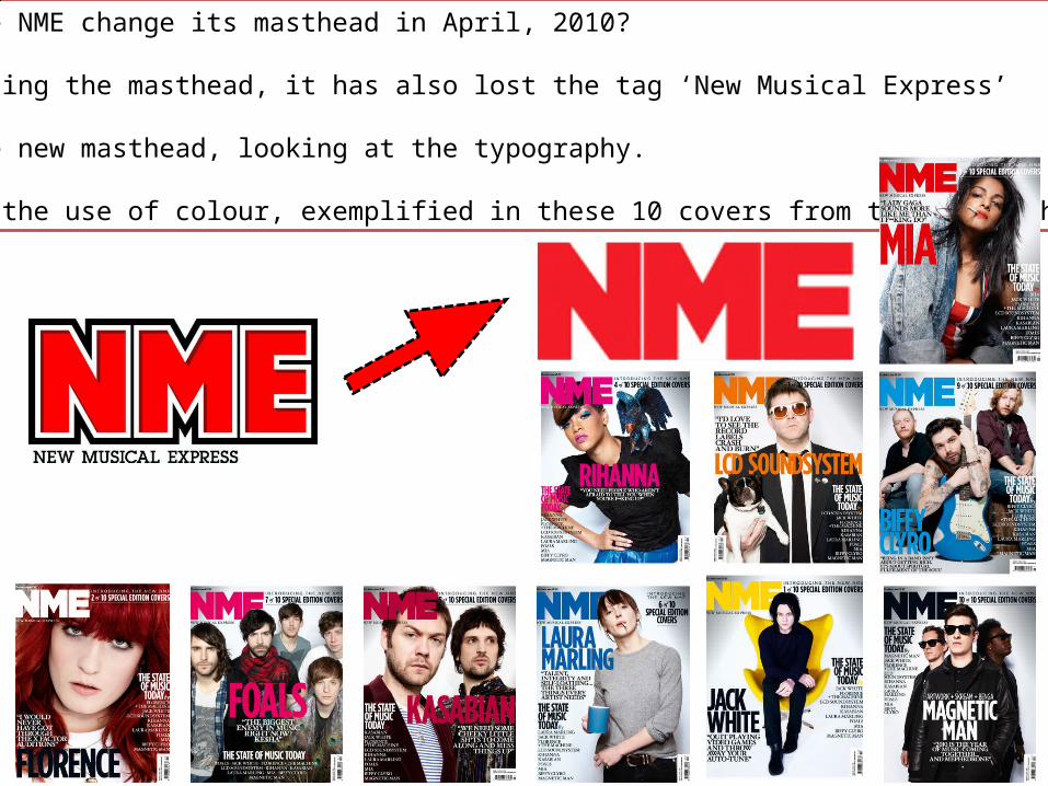
Why did the NME change its masthead in April, 2010?
Since changing the masthead, it has also lost the tag ‘New Musical Express’
Analyse the new masthead, looking at the typography.
Comment on the use of colour, exemplified in these 10 covers from the relaunch