Embed Size (px)
Citation preview

W

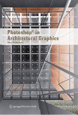
Horst Sondermann
Photoshop® in Architectural Graphics
W

Prof. Arch. Horst Sondermann
Faculty of Architecture and Design
HFT Stuttgart
Schellingstr. 24, 70174 Stuttgart
This work is subject to copyright.
All rights are reserved, whether the whole or part of the material is concerned, specifi-
cally those of translation, reprinting, re-use of illustrations, broadcasting, reproduction
by photocopying machines or similar means, and storage in data banks.
Product Liability: The publisher can give no guarantee for the information contained
in this book. The use of registered names, trademarks, etc. in this publication does not
imply, even in the absence of specific statement, that such names are exempt from the
relevant protective laws and regulations and therefore free for general use.
© 2009 SpringerWienNewYork/Wien
Printed in Austria
SpringerWienNewYork is a part of Springer Science+Business Media
springer.at
Layout and Cover Design: Horst Sondermann
Typesetting in Tasse Regular Wide and Bold Wide
Translation from German into English: George Morton, Stuttgart
Printing and binding: Holzhausen Druck & Medien GmbH., 1140 Vienna, Austria
Printed on acid-free and chlorine-free bleached paper
SPIN: 12030606
Library of Congress Control Number: 2008943077
With 1000 colored Figures
ISBN 978-3-211-71591-8 SpringerWienNewYork
Table of Contents
Introduction
Chapter 01 Photoshop® and Bridge® · Workspace and File
Management
Chapter 02 Paint and Drawing Tools · Selections, Channels, Masks
Chapter 03 RGB and CMYK
Chapter 04 Pencil Drawing
Chapter 05 Seamless Texture
Chapter 06 Clipping via Alpha Channel
Chapter 07 Composing on CAAD-Basis
Chapter 08 Lens and Color Correction
Software, Tutorial Files, Acknowledgements
Index
6
8
24
54
78
100
116
134
226
236
237
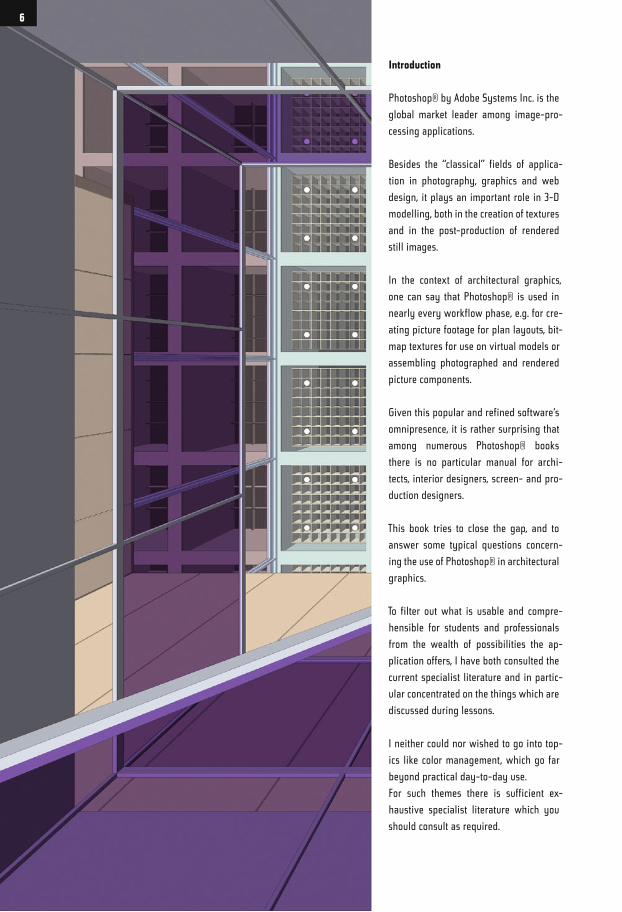
Introduction
Photoshop® by Adobe Systems Inc. is the
global market leader among image-pro-
cessing applications.
Besides the “classical” fields of applica-
tion in photography, graphics and web
design, it plays an important role in 3-D
modelling, both in the creation of textures
and in the post-production of rendered
still images.
In the context of architectural graphics,
one can say that Photoshop® is used in
nearly every workflow phase, e.g. for cre-
ating picture footage for plan layouts, bit-
map textures for use on virtual models or
assembling photographed and rendered
picture components.
Given this popular and refined software‘s
omnipresence, it is rather surprising that
among numerous Photoshop® books
there is no particular manual for archi-
tects, interior designers, screen- and pro-
duction designers.
This book tries to close the gap, and to
answer some typical questions concern-
ing the use of Photoshop® in architectural
graphics.
To filter out what is usable and compre-
hensible for students and professionals
from the wealth of possibilities the ap-
plication offers, I have both consulted the
current specialist literature and in partic-
ular concentrated on the things which are
discussed during lessons.
I neither could nor wished to go into top-
ics like color management, which go far
beyond practical day-to-day use.
For such themes there is sufficient ex-
haustive specialist literature which you
should consult as required.
6
Yet, while working on this book, I realized
that there is much more to show (in my
Mac there is still some material which
I developed for this but for which there
was no space in this book) - we shall see
if there is a chance to introduce it in a
second volume.
It seems to me appropriate at this point to
make a few remarks about the specialist
terms I have used.
First of all, I presume that you use a
mouse with at least two keys, thus the
frequent references to the context menu
reached by right-clicking.
If you work with a single-key mouse or
a trackpad there is, depending on the
operating system, a modification key for
simulating the right-click : on the Mac
keyboard it is the CTRL key.
Moreover, I use the term CTRL for the
most important command key; Mac-users
then know that on their keyboard it is the
Apple or Command key.
PC-users are quite simply in the major-
ity (still), and the idea was to save space
when writing.
The Shift key should be familiar, the Op-
tion key is referred to as Alt throughout
the book.
Please forgive my preference for key-
board shortcuts; the work is quite simply
done faster when one knows them. I have,
however, tried to name the associated
menu commands as much as possible.
And now I wish you much fun, and also
energy, when working through the tuto-
rials.
7
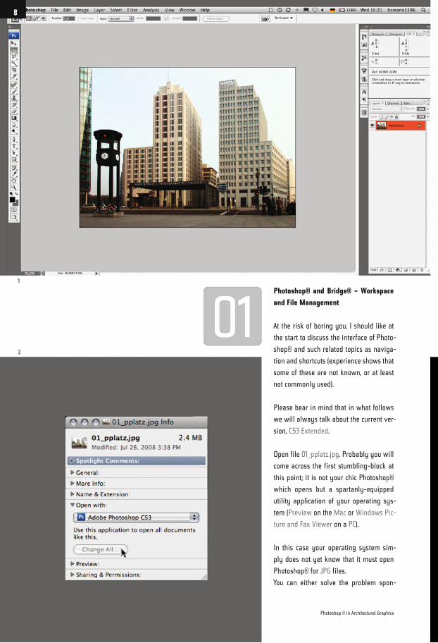
Photoshop® and Bridge® – Workspace
and File Management
At the risk of boring you, I should like at
the start to discuss the interface of Photo-
shop® and such related topics as naviga-
tion and shortcuts (experience shows that
some of these are not known, or at least
not commonly used).
Please bear in mind that in what follows
we will always talk about the current ver-
sion, CS3 Extended.
Open file 01_pplatz.jpg. Probably you will
come across the first stumbling-block at
this point; it is not your chic Photoshop®
which opens but a spartanly-equipped
utility application of your operating sys-
tem (Preview on the Mac or Windows Pic-
ture and Fax Viewer on a PC).
In this case your operating system sim-
ply does not yet know that it must open
Photoshop® for JPG files.
You can either solve the problem spon-
1
2
Photoshop ® in Architectural Graphics
8
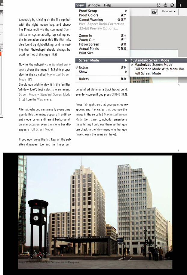
taneously by clicking on the file symbol
with the right mouse key, and choos-
ing Photoshop® via the command Open
with...; or systematically, by calling up
the information about this file (Get Info,
also found by right-clicking) and instruct-
ing that Photoshop® should always be
used for files of this type (iII.2)
Now to Photoshop® – the Standard Work-
space shows the image in 1/3 of its proper
size, in the so called Maximized Screen
Mode (ill.1)
Should you wish to view it in the familiar
“window look”, just select the command
Screen Mode – Standard Screen Mode
(III.3) from the View menu.
Alternatively you can press F; every time
you do this the image appears in a differ-
ent mode, or on a different background;
on one occasion even the menu bar dis-
appears (Full Screen Mode).
If you now press the Tab key, all the pal-
ettes disappear too, and the image can
be admired alone on a black background,
even full-screen if you press CTRL-0 (ill.4).
Press Tab again, so that your palettes re-
appear, and F once, so that you see the
image in the so called Maximized Screen
Mode (don´t worry, nobody remembers
these terms; I only use them so that you
can check in the View menu whether you
have chosen the same as I have).
3
4
Chapter 01 · Photoshop® and Bridge® · Workspace and File Management
9
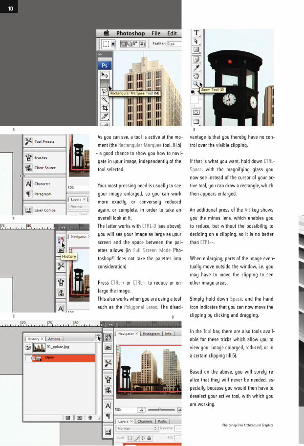
As you can see, a tool is active at the mo-
ment (the Rectangular Marquee tool, ill.5)
– a good chance to show you how to navi-
gate in your image, independently of the
tool selected.
Your most pressing need is usually to see
your image enlarged, so you can work
more exactly, or conversely reduced
again, or complete, in order to take an
overall look at it.
The latter works with CTRL-0 (see above);
you will see your image as large as your
screen and the space between the pal-
ettes allows (in Full Screen Mode Pho-
toshop® does not take the palettes into
consideration).
Press CTRL-+ or CTRL-- to reduce or en-
large the image.
This also works when you are using a tool
such as the Polygonal Lasso. The disad-
vantage is that you thereby have no con-
trol over the visible clipping.
If that is what you want, hold down CTRL-
Space; with the magnifying glass you
now see instead of the cursor of your ac-
tive tool, you can draw a rectangle, which
then appears enlarged.
An additional press of the Alt key shows
you the minus lens, which enables you
to reduce, but without the possibility to
deciding on a clipping, so it is no better
than CTRL--.
When enlarging, parts of the image even-
tually move outside the window, i.e. you
may have to move the clipping to see
other image areas.
Simply hold down Space, and the hand
icon indicates that you can now move the
clipping by clicking and dragging.
In the Tool bar, there are also tools avail-
able for these tricks which allow you to
view your image enlarged, reduced, or in
a certain clipping (ill.6).
Based on the above, you will surely re-
alize that they will never be needed, es-
pecially because you would then have to
deselect your active tool, with which you
are working.
5
7
6
8 9
Photoshop ® in Architectural Graphics
10
Don´t forget; CTRL-0 puts the image back
to maximum size, and should you wish
to see it 100%, here is another shortcut:
CTRL-Alt-0.
So much for navigation, now to the cre-
ation of your workspace.
You have probably already realized that
your image window and the palettes
around it “stick” to each other; you can,for
example, click on the gap between the
image and the right-hand palettes and
drag to the left, thus enabling the exten-
sion of the palettes (the image window
then correspondingly reduces, but this
only occurs in Maximized Screen Mode,
ill.7)
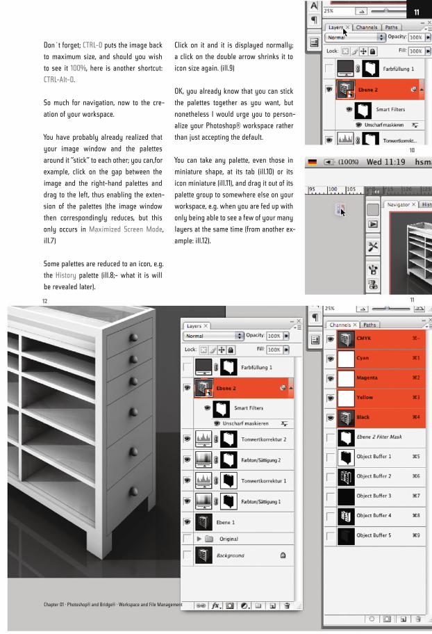
Some palettes are reduced to an icon, e.g.
the History palette (ill.8;- what it is will
be revealed later).
Click on it and it is displayed normally;
a click on the double arrow shrinks it to
icon size again. (ill.9)
OK, you already know that you can stick
the palettes together as you want, but
nonetheless I would urge you to person-
alize your Photoshop® workspace rather
than just accepting the default.
You can take any palette, even those in
miniature shape, at its tab (ill.10) or its
icon miniature (ill.11), and drag it out of its
palette group to somewhere else on your
workspace, e.g. when you are fed up with
only being able to see a few of your many
layers at the same time (from another ex-
ample: ill.12).
10
1112
Chapter 01 · Photoshop® and Bridge® · Workspace and File Management
11
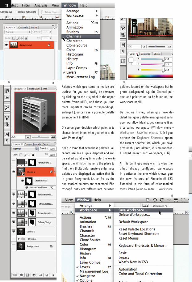
Palettes which you come to realize are
useless for you can easily be removed
by clicking on the x symbol in the upper
palette frame (ill.13), and those you find
more important can be correspondingly
enlarged (you can see a possible palette
arrangement in ill.14).
Of course, your decision which palettes to
choose depends on what you what to do
with Photoshop®.
Keep in mind that even those palettes you
cannot see are at your disposal and can
be called up at any time onto the work-
space; the Window menu is the place to
find them (ill.15; unfortunately only those
palettes are displayed as active that lie
in group foreground, i.e. as far as the
non-marked palettes are concerned, Pho-
toshop® does not differentiate between
palettes located on the workspace but in
group background, e.g. the Channel pal-
ette, and palettes not to be found on the
workspace at all).
Be that as it may; when you have de-
cided that your palette arrangement suits
your workflow ideally, you can save it as
a so called workspace ((Window menu –
Workspace – Save Workspace, ill.16; if you
activate the Keyboard Shortcuts option
the current shortcut set, which you have
presumably not altered, is simultaneous-
ly saved too in “your” workspace, ill.17)
At this point you may wish to view the
other, already configured workspaces,
in particular the one which shows you
the new features of Photoshop® CS3
Extended in the form of color-marked
menu items (Window menu – Workspace
15 14
16
13
12
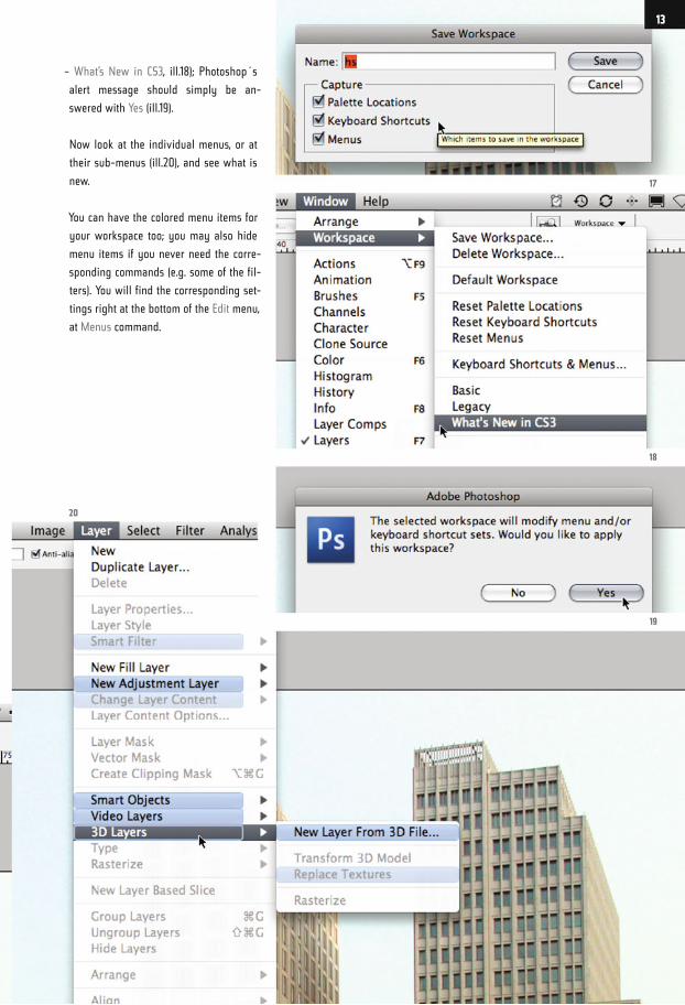
– What’s New in CS3, ill.18); Photoshop´s
alert message should simply be an-
swered with Yes (ill.19).
Now look at the individual menus, or at
their sub-menus (ill.20), and see what is
new.
You can have the colored menu items for
your workspace too; you may also hide
menu items if you never need the corre-
sponding commands (e.g. some of the fil-
ters). You will find the corresponding set-
tings right at the bottom of the Edit menu,
at Menus command.
17
18
19
20
13
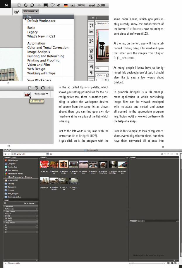
In the so called Options palette, which
shows you setting possibilites for the cur-
rently active tool, there is another possi-
bility to select the workspace desired
(of course from the same list as shown
above), there you can find your own de-
fined one at the very top of the list, which
is handy.
Just to the left waits a tiny icon with the
instruction Go to Bridge® (ill.22).
If you click on it, the program with the
same name opens, which you presum-
ably already know, the enhancement of
the former File Browser, now an indepen-
dent piece of software (ill.23).
At the top, on the left, you will find a tab
named Folders; bring it forward and open
the folder with the images from Chapter
01 (01_pictures01).
As many people I know have so far ig-
nored this decidedly useful tool, I should
also like to say a few words about
Bridge®.
In principle Bridge® is a file-manage-
ment application in which particularly
image files can be viewed, equipped
with metadata and sorted, and above
all opened in the appropriate program
(e.g.Photoshop®), or worked on there with
the help of a script.
I use it, for example, to look at my screen-
shots, eventually relocate them, and then
have them converted all at once into
21
22 23
Photoshop ® in Architectural Graphics
14
CMYK in Photoshop®, sharpen them and
save them as a copy in a new folder.
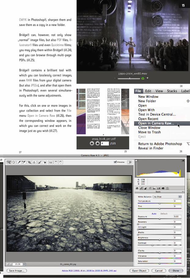
Bridge® can, however, not only show
„normal“ image files, but also PDF files, Il-
lustrator® files und even Quicktime films;
you may play them within Bridge® (ill.24),
and you can browse through multi-page
PDFs. (ill.25).
Bridge® contains a brilliant tool with
which you can losslessly correct images,
even RAW files from your digital camera
(but also JPEGs), and after that open them
in Photoshop®, even several simultane-
ously with the same adjustments.
For this, click on one or more images in
your collection and select from the File
menu Open in Camera Raw (ill.26), then
the corresponding window appears, in
which you can correct and work on the
image just as you wish (ill.27).
24
262527
15
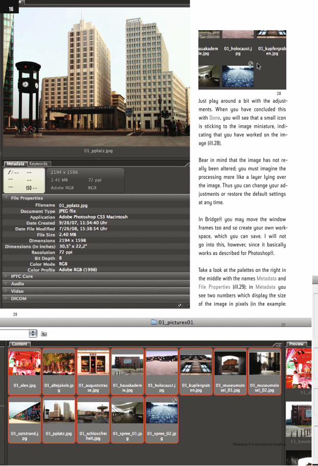
Just play around a bit with the adjust-
ments. When you have concluded this
with Done, you will see that a small icon
is sticking to the image miniature, indi-
cating that you have worked on the im-
age (ill.28).
Bear in mind that the image has not re-
ally been altered; you must imagine the
processing more like a layer lying over
the image. Thus you can change your ad-
justments or restore the default settings
at any time.
In Bridge® you may move the window
frames too and so create your own work-
space, which you can save. I will not
go into this, however, since it basically
works as described for Photoshop®.
Take a look at the palettes on the right in
the middle with the names Metadata and
File Properties (ill.29): in Metadata you
see two numbers which display the size
of the image in pixels (in the example:
29
28
30
Photoshop ® in Architectural Graphics
16
2194 x 1598), the file size, the resolution
and the color mode.
Under File Properties you can also see
the Name and the File Format, its Creation
Date, the Bit Depth (see chapter 03) and
the embedded color profile.
What you can do especially well in
Bridge® is rename your files; in addition
you can transfer them at the same time to
some other, suitable place on your hard
disk.
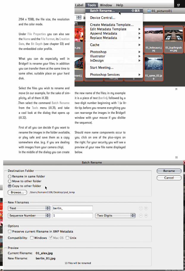
Select the files you wish to rename and
move (in our example, for the sake of sim-
plicity, all of them ill.30)
.Then select the command Batch Rename
from the Tools menu (ill.31), and take
a cool look at the dialog that opens up
(ill.32).
First of all you can decide if you want to
rename the images in the folder available,
or play safe and save them as a copy
somewhere else. (e.g. if you are dealing
with images from your camera chip).
In the middle of the dialog you can create
the new name of the files; in my example
it is a piece of text (berlin), followed by a
two-digit number beginning with 1 (a lit-
tle tip; before you rename everything you
can rearrange the images in the Bridge®
window with your mouse if you dislike
the sequence).
Should more name components occur to
you, click on one of the plus-signs on
the right. For your security you will see a
preview of your new file name displayed
below.
32
31
17
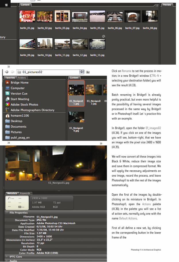
Click on Rename to set the process in mo-
tion; in a new Bridge® window (CTRL-N +
selecting your destination folder) you will
see the result (ill.33).
Batch renaming in Bridge® is already
pretty practical, but even more helpful is
the possibility of having several images
processed in the same way by Bridge®
or in Photoshop® itself. Let´s practice this
with an example.
In Bridge®, open the folder 01_images02
(ill.34). If you click on one of the images
you will see, bottom-right, that we have
an image with the pixel size 2400 x 1600
(ill.35).
We will now convert all these images into
Black & White, reduce their image size
and save them in compressed format. We
will apply the necessary adjustments on
one image, record the process, and leave
Photoshop® to edit the rest of the images
automatically.
Open the first of the images by double-
clicking on its miniature in Bridge®. In
Photoshop®, open the Actions palette
(ill.36); in the palette you will see a list
of action sets, normally only one with the
name Default Actions.
First of all define a new set, by clicking
on the corresponding button in the lower
frame of the
33
34 35
Photoshop ® in Architectural Graphics
18
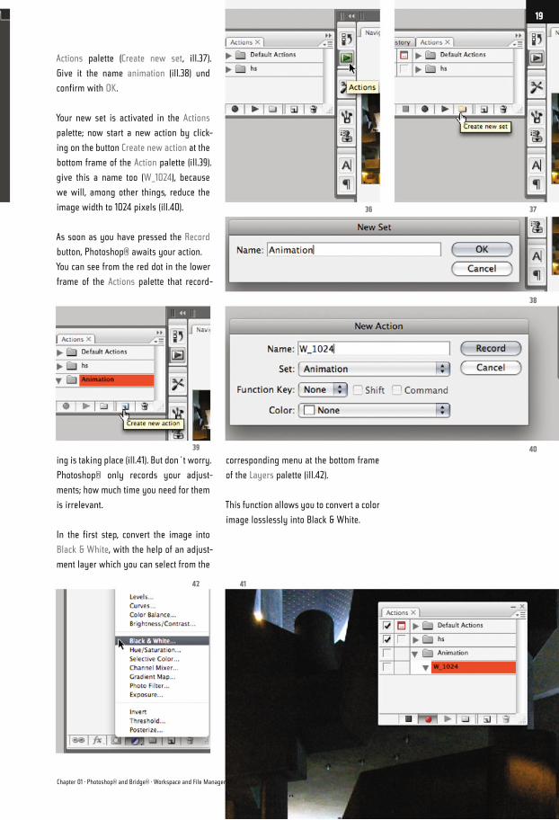
Actions palette (Create new set, ill.37).
Give it the name animation (ill.38) und
confirm with OK.
Your new set is activated in the Actions
palette; now start a new action by click-
ing on the button Create new action at the
bottom frame of the Action palette (ill.39).
give this a name too (W_1024), because
we will, among other things, reduce the
image width to 1024 pixels (ill.40).
As soon as you have pressed the Record
button, Photoshop® awaits your action.
You can see from the red dot in the lower
frame of the Actions palette that record-
ing is taking place (ill.41). But don´t worry.
Photoshop® only records your adjust-
ments; how much time you need for them
is irrelevant.
In the first step, convert the image into
Black & White, with the help of an adjust-
ment layer which you can select from the
corresponding menu at the bottom frame
of the Layers palette (ill.42).
This function allows you to convert a color
image losslessly into Black & White.
37
38
40
36
39
42 41
Chapter 01 · Photoshop® and Bridge® · Workspace and File Management
19
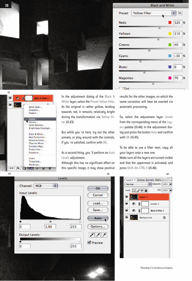
In the adjustment dialog of the Black &
White layer, select the Preset Yellow filter.
As the original is rather yellow, tending
towards red, it remains relatively bright
during the transformation via Yellow fil-
ter (ill.43).
But while you´re here, try out the other
presets, or play around with the controls.
If you´re satisfied, confirm with OK.
As a second thing, you´ll perform an Auto
Levels adjustment.
Although this has no significant effect on
this specific image, it may show positive
results for the other images, on which the
same correction will later be exerted via
automatic processing.
So, select the adjustment layer Levels
from the corresponding menu of the Lay-
ers palette (ill.44); in the adjustment dia-
log just press the button Auto and confirm
with OK (ill.45).
To be able to use a filter next, copy all
your layers onto a new one.
Make sure all the layers are turned visible
and that the uppermost is activated, and
press Shift-Alt-CTRL-E (ill.46).
43
44 45 46
Photoshop ® in Architectural Graphics
20
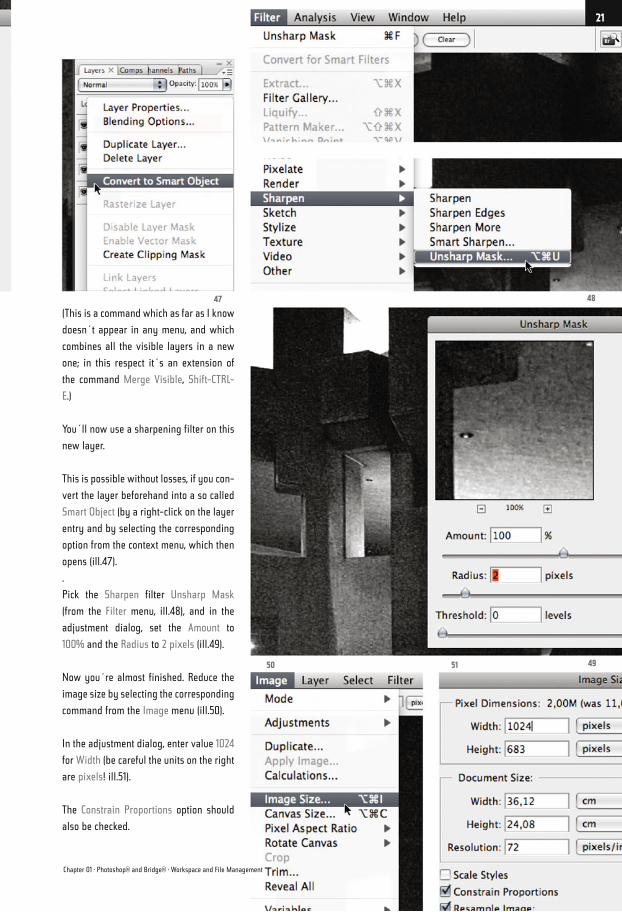
(This is a command which as far as I know
doesn´t appear in any menu, and which
combines all the visible layers in a new
one; in this respect it´s an extension of
the command Merge Visible, Shift-CTRL-
E.)
You´ll now use a sharpening filter on this
new layer.
This is possible without losses, if you con-
vert the layer beforehand into a so called
Smart Object (by a right-click on the layer
entry and by selecting the corresponding
option from the context menu, which then
opens (ill.47).
.
Pick the Sharpen filter Unsharp Mask
(from the Filter menu, ill.48), and in the
adjustment dialog, set the Amount to
100% and the Radius to 2 pixels (ill.49).
Now you´re almost finished. Reduce the
image size by selecting the corresponding
command from the Image menu (ill.50).
In the adjustment dialog, enter value 1024
for Width (be careful the units on the right
are pixels! ill.51).
The Constrain Proportions option should
also be checked.
4847
495150
Chapter 01 · Photoshop® and Bridge® · Workspace and File Management
21
Finally, you should save the file in a for-
mat that demands as little disk space as
possible. This is best done with the com-
mand Save for Web & Devices from the
File menu (ill.52).
The window which then opens should
show your image twice; if not, click at the
top on the tab 2-up (ill.53).
On the left you can see your original im-
age; on the right the version which is
created in the file format selected on the
right. Here, eventual quality losses can be
observed.
On the right side, JPEG high is the default
preset. Here, select from the menu the
preset JPEG Medium (ill.54).
I don´t want to go into detail at this stage
about how the quality selected (which
further to the right can be set steplessly)
affects the image and its size.
Just check yourself; the resulting file size
will be displayed below the right-hand
image in accordance with the settings
you‘ve chosen.
At this point, let´s stay with the JPEG Me-
dium preset.
Click top right on Save, and you can enter
the file name und destination.
I advise you to create your own folder at
this stage, so that the saved copy doesn´t
conflict with your original (ill.55; my fold-
er is named Frames).
With that, saving with the adjustments
you´ve performed is finished.
You should now close your original, with-
out saving the changes. The edited copy
has been, after all, saved in the new
folder.
The time has now come to finish record-
ing. To do this, click on the left button at
the bottom frame of the Actions palette
(ll.56).
So, now you´ll want to reap the benefits
of your preparatory work. In Bridge®,
select all the images apart from the one
you´ve already worked on (ill.57).
Also in Bridge®, select the command
52 54
53
Photoshop ® in Architectural Graphics
22
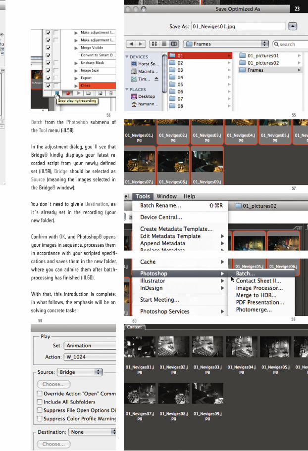
Batch from the Photoshop submenu of
the Tool menu (ill.58).
In the adjustment dialog, you´ll see that
Bridge® kindly displays your latest re-
corded script from your newly defined
set (ill.59); Bridge should be selected as
Source (meaning the images selected in
the Bridge® window).
You don´t need to give a Destination, as
it´s already set in the recording (your
new folder).
Confirm with OK, and Photoshop® opens
your images in sequence, processes them
in accordance with your scripted specifi-
cations and saves them in the new folder,
where you can admire them after batch-
processing has finished (ill.60).
With that, this introduction is complete;
in what follows, the emphasis will be on
solving concrete tasks.
5556
57
586059
23
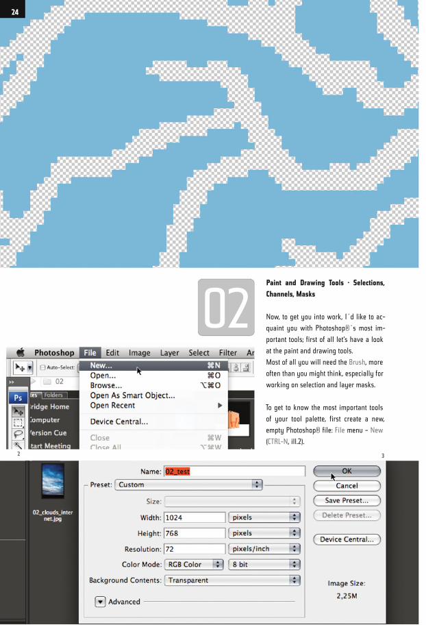
Paint and Drawing Tools · Selections,
Channels, Masks
Now, to get you into work, I´d like to ac-
quaint you with Photoshop®´s most im-
portant tools; first of all let‘s have a look
at the paint and drawing tools.
Most of all you will need the Brush, more
often than you might think, especially for
working on selection and layer masks.
To get to know the most important tools
of your tool palette, first create a new,
empty Photoshop® file: File menu – New
(CTRL-N, ill.2).
2 3
24
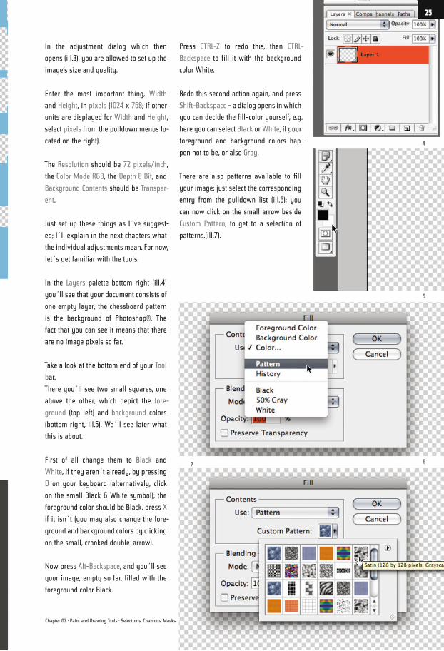
In the adjustment dialog which then
opens (ill.3), you are allowed to set up the
image‘s size and quality.
Enter the most important thing, Width
and Height, in pixels (1024 x 768; if other
units are displayed for Width and Height,
select pixels from the pulldown menus lo-
cated on the right).
The Resolution should be 72 pixels/inch,
the Color Mode RGB, the Depth 8 Bit, and
Background Contents should be Transpar-
ent.
Just set up these things as I´ve suggest-
ed; I´ll explain in the next chapters what
the individual adjustments mean. For now,
let´s get familiar with the tools.
In the Layers palette bottom right (ill.4)
you´ll see that your document consists of
one empty layer; the chessboard pattern
is the background of Photoshop®. The
fact that you can see it means that there
are no image pixels so far.
Take a look at the bottom end of your Tool
bar.
There you´ll see two small squares, one
above the other, which depict the fore-
ground (top left) and background colors
(bottom right, ill.5). We´ll see later what
this is about.
First of all change them to Black and
White, if they aren´t already, by pressing
D on your keyboard (alternatively, click
on the small Black & White symbol); the
foreground color should be Black, press X
if it isn´t (you may also change the fore-
ground and background colors by clicking
on the small, crooked double-arrow).
Now press Alt-Backspace, and you´ll see
your image, empty so far, filled with the
foreground color Black.
Press CTRL-Z to redo this, then CTRL-
Backspace to fill it with the background
color White.
Redo this second action again, and press
Shift-Backspace – a dialog opens in which
you can decide the fill-color yourself, e.g.
here you can select Black or White, if your
foreground and background colors hap-
pen not to be, or also Gray.
There are also patterns available to fill
your image; just select the corresponding
entry from the pulldown list (ill.6); you
can now click on the small arrow beside
Custom Pattern, to get to a selection of
patterns.(ill.7).
4
5
67
Chapter 02 · Paint and Drawing Tools · Selections, Channels, Masks
25
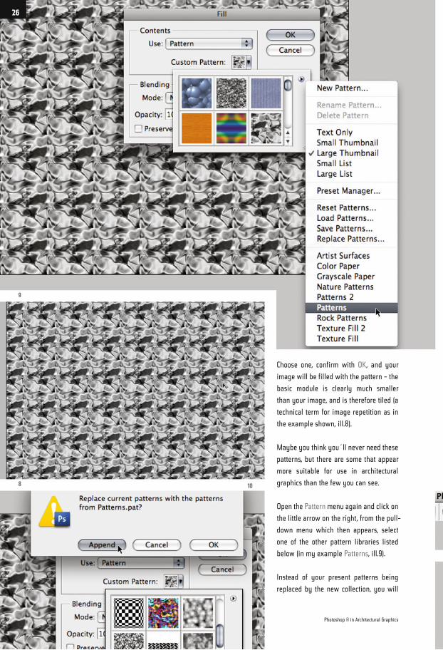
Choose one, confirm with OK, and your
image will be filled with the pattern – the
basic module is clearly much smaller
than your image, and is therefore tiled (a
technical term for image repetition as in
the example shown, ill.8).
Maybe you think you´ll never need these
patterns, but there are some that appear
more suitable for use in architectural
graphics than the few you can see.
Open the Pattern menu again and click on
the little arrow on the right, from the pull-
down menu which then appears, select
one of the other pattern libraries listed
below (in my example Patterns, ill.9).
Instead of your present patterns being
replaced by the new collection, you will
9
8
11
10
Photoshop ® in Architectural Graphics
26
rather Append them (ill.10). Now the new
ones appear in subsequence to your de-
fault patterns.
Now for example select Fractures (ill.11),
and confirm with OK. The result looks far
less tiled, and you can imagine how the
image can be used for surface textures
together with a few filters and color over-
lays (ill.12).
So much for the possibilities of filling an
empty layer fast with color, or with a pat-
tern.
Make a note of the shortcuts (see above.);
OK, there is of course a menu command
which corresponds to Shift-Backspace
(Edit menu: Fill, ill.13), but if you want to
work quickly, it´s simply faster with the
key shortcuts
Press Alt-Backspace, to replace your pat-
tern by Black.
Now you´ll get to know the paint tool,
which you use most often if you want to
change your selections “by hand“, or your
masks (we´ll come to that, don´t worry).
You can use the Brush tool to apply fore-
ground color, or replace it by the back-
ground color, simply by toggling the two
preset colors via the X key.
11
1213
27
Insofar, you can almost always use the
Brush instead of the Eraser tool, which of
course makes the work easier.
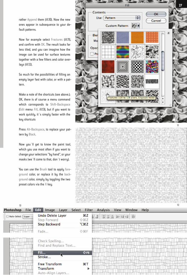
Now press B to select the Brush tool
(ill.14); Black should still be the fore-
ground color.
If you now wish to paint with the brush
you won´t see anything, but before we
swap the foreground and background col-
ors, I´d like to show you how to change
the brush size and its hardness with the
help of shortcuts, while working with the
tool. This saves you clicking around in the
Options palette.
Open the Keyboard Shortcuts overview
from the Edit menu (ill.15); the Photoshop®
Defaults set should be selected (ill.16).
Take a look at the keyboard shortcuts for
Tools, and scroll down in the list under it.
There you´ll see the shortcuts to De-
crease Brush Size ([), to Increase Brush
Size (]) next to Decrease Brush Hardness
({) and Increase Brush Hardness (}).
Since for prime tasks I prefer single-key
shortcuts, I designed my own (ill.17): to
decrease size . (point), to increase size ,
(comma); on the same keys, I have : (co-
lon) for decreasing hardness and ; (semi-
colon) for increasing hardness.
As soon as you´ve defined your own
shortcuts, you can save the whole thing
as a new Set, with a new name (e.g. your
initials), by clicking on the corresponding
symbol (ill.18).
15
16 17
14
Photoshop ® in Architectural Graphics
28
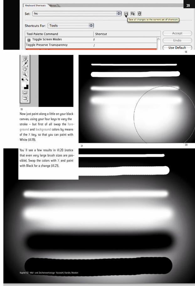
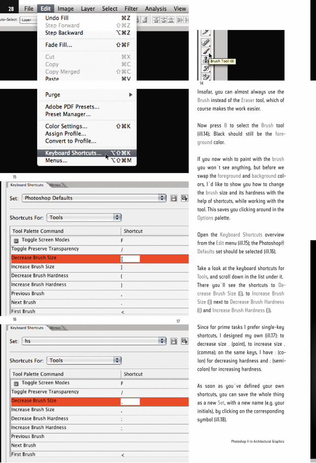
Now just paint along a little on your black
canvas, using your four keys to vary the
stroke – but first of all swap the fore-
ground and background colors by means
of the X key, so that you can paint with
White (ill.19).
You´ll see a few results in ill.20 (notice
that even very large brush sizes are pos-
sible). Swap the colors with X and paint
with Black for a change (ill.21).
18
2021
19
29
Kapitel 02 · Mal- und Zeichenwerkzeuge · Auswahl, Kanäle, Masken
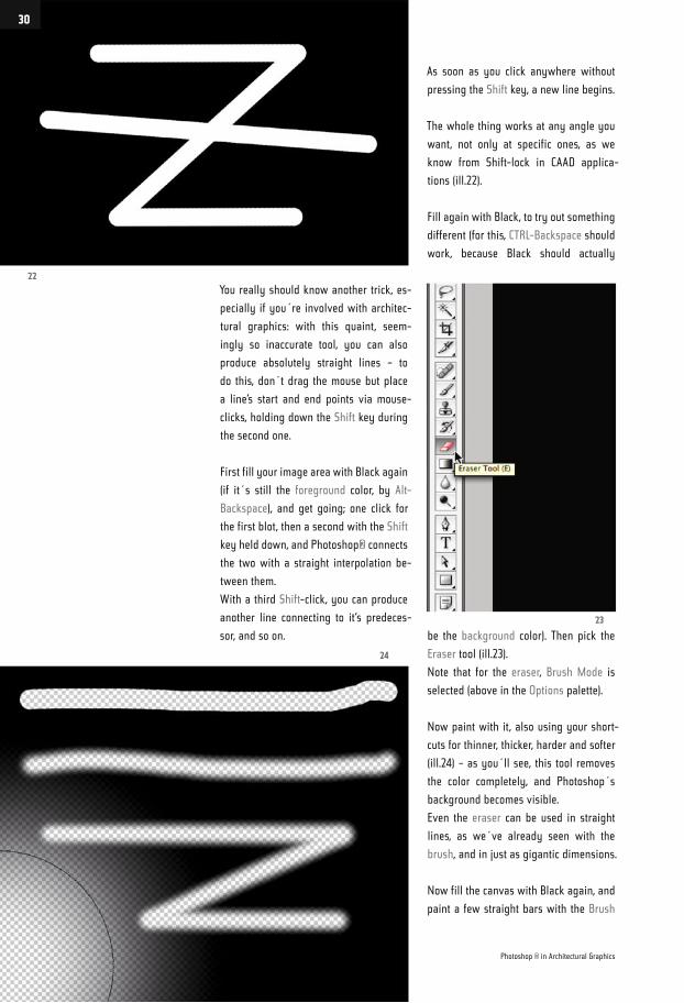
You really should know another trick, es-
pecially if you´re involved with architec-
tural graphics: with this quaint, seem-
ingly so inaccurate tool, you can also
produce absolutely straight lines – to
do this, don´t drag the mouse but place
a line’s start and end points via mouse-
clicks, holding down the Shift key during
the second one.
First fill your image area with Black again
(if it´s still the foreground color, by Alt-
Backspace), and get going; one click for
the first blot, then a second with the Shift
key held down, and Photoshop® connects
the two with a straight interpolation be-
tween them.
With a third Shift-click, you can produce
another line connecting to it‘s predeces-
sor, and so on.
As soon as you click anywhere without
pressing the Shift key, a new line begins.
The whole thing works at any angle you
want, not only at specific ones, as we
know from Shift-lock in CAAD applica-
tions (ill.22).
Fill again with Black, to try out something
different (for this, CTRL-Backspace should
work, because Black should actually
be the background color). Then pick the
Eraser tool (ill.23).
Note that for the eraser, Brush Mode is
selected (above in the Options palette).
Now paint with it, also using your short-
cuts for thinner, thicker, harder and softer
(ill.24) – as you´ll see, this tool removes
the color completely, and Photoshop´s
background becomes visible.
Even the eraser can be used in straight
lines, as we´ve already seen with the
brush, and in just as gigantic dimensions.
Now fill the canvas with Black again, and
paint a few straight bars with the Brush
22
24
23
Photoshop ® in Architectural Graphics
30
tool (if you hold the Shift key down when
dragging the mouse, the lines are painted
exactly horizontally, ill.25).
Now try out how to clone image parts
with the Clone Stamp tool; select it (S for
Stamp, or Shift-S if one of the other re-
touch tools is at the front, ill.26).
Increase the tool size, using the corre-
sponding keyboard shortcut, so that the
circle is larger than the width of your line
group (ill.27).
Make sure that the circle is over a com-
plete part of the line group (the one you
want to clone, preferably centered), and
click once with the Alt key held down.
With this, you have copied the image con-
tents within the circle, and can now paste
it to the right, to lengthen the lines.
Here the first click is especially important,
so that your lines are not crooked. When
you managed to hit the correct position,
drag the mouse to the right with the Shift
key held down, and your lines will grow
longer acordingly (ill.28).
Please don´t despair; the Clone Stamp
tool doesn´t make accurate work all that
easy, but with a little practice it should
work.
A further tool you really should know
about is the Pen, with which you can
draw vector shapes that can be trans-
formed into normal pixel selections. Most
important, the Pen tool allows you to se-
lect image areas with curved edges easily.
25
2728
26
Chapter 02 · Paint and Drawing Tools · Selections, Channels, Masks
31
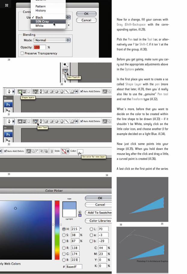
Now for a change, fill your canvas with
Gray (Shift-Backspace with the corre-
sponding option, ill.29).
Pick the Pen tool in the Tool bar, or alter-
natively use P (or Shift-P, if it isn´t at the
front of the group, ill.30).
Before you get going, make sure you car-
ry out the appropriate adjustments above
in the Options palette.
In the first place you want to create a so
called Shape Layer with the pen (more
about that later, ill.31), then you´d really
also like to use the „genuine“ Pen tool
and not the Freeform type (ill.32).
What´s more, before that you want to
decide on the color to be created within
the line shape to be drawn (ill.33) – if it
shouldn´t be White, simply click on the
little color icon, and choose another (I for
example decided on a light Blue. ill.34).
Now just click some points into your
image (ill.35). When you hold down the
mouse key after the click and drag a little,
a curved point is created (ill.36).
A last click on the first point of the series
29
30
31
32
33 34
36 35
Photoshop ® in Architectural Graphics
32
closes the shape (the so called path) for
the time being (ill.37).
You may modify this figure, e.g. with the
Direct Selection tool (A, ill.38).
Select the tool, and click twice on one of
the corners to move it to another location
(ill.39).
If you click on two points with the Shift
key held down, so both are marked, you
can move the whole line between them
(ill.40).
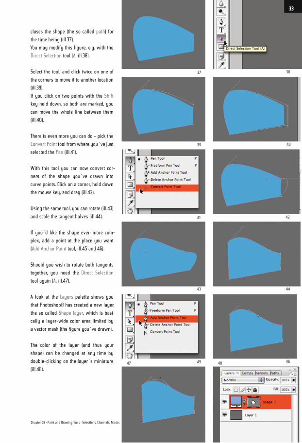
There is even more you can do – pick the
Convert Point tool from where you´ve just
selected the Pen (ill.41).
With this tool you can now convert cor-
ners of the shape you´ve drawn into
curve points. Click on a corner, hold down
the mouse key, and drag (ill.42).
Using the same tool, you can rotate (ill.43)
and scale the tangent halves (ill.44).
If you´d like the shape even more com-
plex, add a point at the place you want
(Add Anchor Point tool, ill.45 and 46).
Should you wish to rotate both tangents
together, you need the Direct Selection
tool again (A, ill.47).
A look at the Layers palette shows you
that Photoshop® has created a new layer,
the so called Shape layer, which is basi-
cally a layer-wide color area limited by
a vector mask (the figure you´ve drawn).
The color of the layer (and thus your
shape) can be changed at any time by
double-clicking on the layer´s miniature
(ill.48).
38
40
42
44
4648
37
39
41
43
4547
Chapter 02 · Paint and Drawing Tools · Selections, Channels, Masks
33
If you now want to draw yet another path
selection with the Pen tool on the same
layer (perhaps because you want the
same color for both) you can do it, but
make sure the corresponding option is
activated in the Options palette (ill.49).
In the first place click on the vector mask
miniature once, to deactivate the first
path, then again, to make it editable again.
By doing this you make sure that all
points and tangents are deselected.
After drawing you can see the change in
the mask miniature of the layer (ill.50; if it
hasn´t worked properly, Photoshop® has
created a new layer for the second figure).
By the way - clicking on the mask minia-
ture of the shape layer with the CTRL key
held down allows you to load the shape
as a pixel selection (ill.51).
I´d rather not go into this at this stage,
but you should be aware that it also
works in reverse; a pixel selection can
be transformed into a vector path, with a
corresponding command from the Paths
palette menu.
You can also cut holes in your shape by
50
49
51
Photoshop ® in Architectural Graphics
34
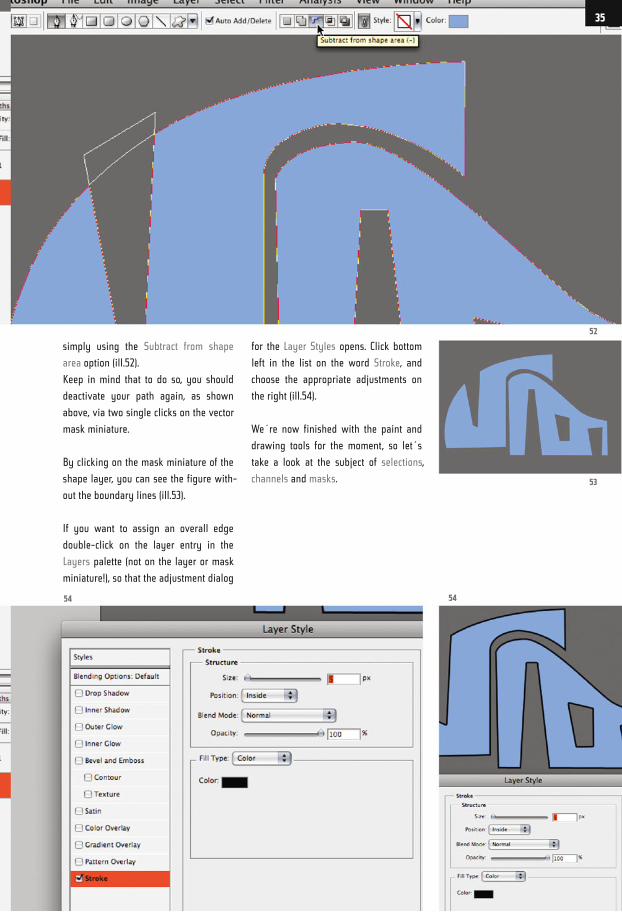
simply using the Subtract from shape
area option (ill.52).
Keep in mind that to do so, you should
deactivate your path again, as shown
above, via two single clicks on the vector
mask miniature.
By clicking on the mask miniature of the
shape layer, you can see the figure with-
out the boundary lines (ill.53).
If you want to assign an overall edge
double-click on the layer entry in the
Layers palette (not on the layer or mask
miniature!), so that the adjustment dialog
for the Layer Styles opens. Click bottom
left in the list on the word Stroke, and
choose the appropriate adjustments on
the right (ill.54).
We´re now finished with the paint and
drawing tools for the moment, so let´s
take a look at the subject of selections,
channels and masks.
54
52
53
54
35
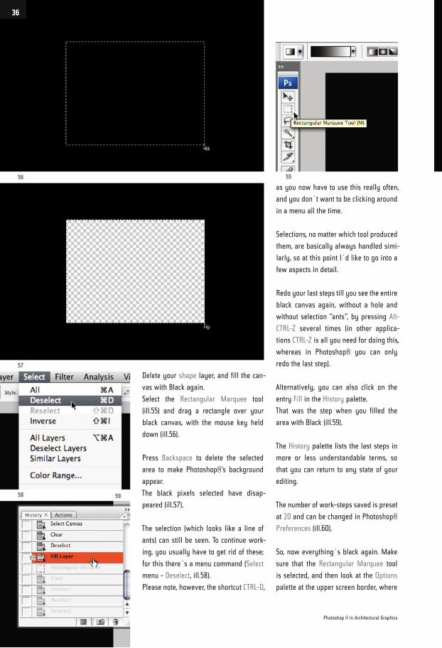
Delete your shape layer, and fill the can-
vas with Black again.
Select the Rectangular Marquee tool
(ill.55) and drag a rectangle over your
black canvas, with the mouse key held
down (ill.56).
Press Backspace to delete the selected
area to make Photoshop®‘s background
appear.
The black pixels selected have disap-
peared (ill.57).
The selection (which looks like a line of
ants) can still be seen. To continue work-
ing, you usually have to get rid of these;
for this there´s a menu command (Select
menu - Deselect, ill.58).
Please note, however, the shortcut CTRL-D,
as you now have to use this really often,
and you don´t want to be clicking around
in a menu all the time.
Selections, no matter which tool produced
them, are basically always handled simi-
larly, so at this point I´d like to go into a
few aspects in detail.
Redo your last steps till you see the entire
black canvas again, without a hole and
without selection “ants“, by pressing Alt-
CTRL-Z several times (in other applica-
tions CTRL-Z is all you need for doing this,
whereas in Photoshop® you can only
redo the last step).
Alternatively, you can also click on the
entry Fill in the History palette.
That was the step when you filled the
area with Black (ill.59).
The History palette lists the last steps in
more or less understandable terms, so
that you can return to any state of your
editing.
The number of work-steps saved is preset
at 20 and can be changed in Photoshop®
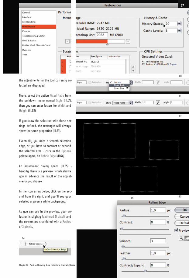
Preferences (ill.60).
So, now everything´s black again. Make
sure that the Rectangular Marquee tool
is selected, and then look at the Options
palette at the upper screen border, where
56
57
58 59
55
Photoshop ® in Architectural Graphics
36
the adjustments for the tool currently se-
lected are displayed.
There, select the option Fixed Ratio from
the pulldown menu named Style (ill.61),
then you can enter factors for Width and
Height (ill.62).
If you draw the selection with these set-
tings defined, the rectangle will always
show the same proportion (ill.63).
Eventually you need a smooth selection
edge, or you have to contract or expand
the selected area – click in the Options
palette again, on Refine Edge (ill.64).
An adjustment dialog opens (ill.65) –
handily, there´s a preview which shows
you in advance the result of the adjust-
ments you choose.
In the icon array below, click on the sec-
ond from the right, and you´ll see your
selected area on a white background.
As you can see in the preview, your se-
lection is slightly feathered (1 pixel), and
the corners are chamfered with a Radius
of 3 pixels.
60
61
62
6365
64
Chapter 02 · Paint and Drawing Tools · Selections, Channels, Masks
37
66
67 68
Photoshop ® in Architectural Graphics
38
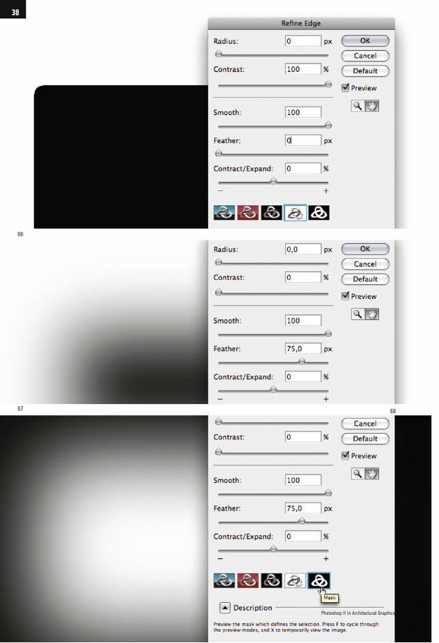
Now enter a value of 100 for Radius and
Contrast, and set everything else to 0
(ill.66).
Your selection is completely sharpened,
and the corners are chamfered.
Now give the selection a rather smooth
edge (Feather=75, ill.67), and reduce Ra-
dius and Contrast again to 0 – the result
looks completely different.
If you change the preview mode to Mask
(ill.68), you´ll see your selection inverted,
just like it would look as a mask (a subject
I´ll come to later).
Now confirm the Refine Edge dialog with
OK, and delete the selection – the result is
a smooth-edged, oval hole in your black
canvas (ill.69).
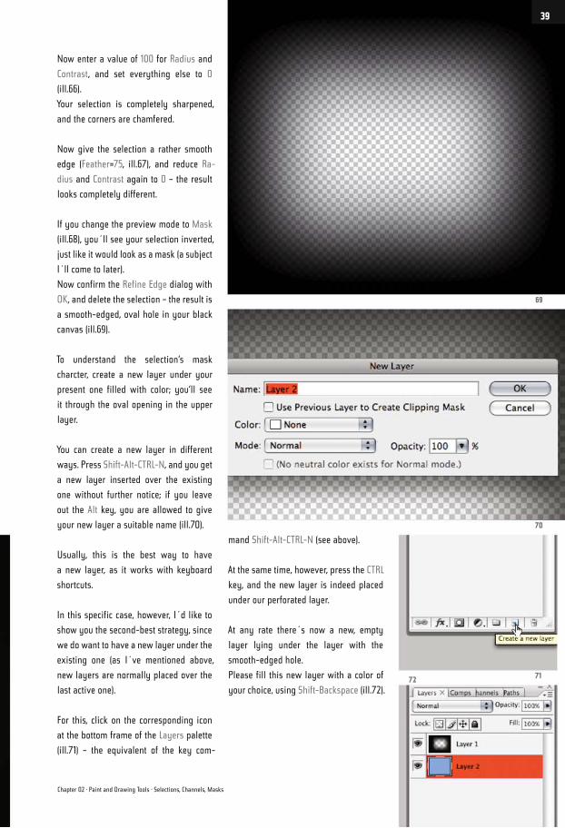
To understand the selection‘s mask
charcter, create a new layer under your
present one filled with color; you‘ll see
it through the oval opening in the upper
layer.
You can create a new layer in different
ways. Press Shift-Alt-CTRL-N, and you get
a new layer inserted over the existing
one without further notice; if you leave
out the Alt key, you are allowed to give
your new layer a suitable name (ill.70).
Usually, this is the best way to have
a new layer, as it works with keyboard
shortcuts.
In this specific case, however, I´d like to
show you the second-best strategy, since
we do want to have a new layer under the
existing one (as I´ve mentioned above,
new layers are normally placed over the
last active one).
For this, click on the corresponding icon
at the bottom frame of the Layers palette
(ill.71) – the equivalent of the key com-
mand Shift-Alt-CTRL-N (see above).
At the same time, however, press the CTRL
key, and the new layer is indeed placed
under our perforated layer.
At any rate there´s now a new, empty
layer lying under the layer with the
smooth-edged hole.
Please fill this new layer with a color of
your choice, using Shift-Backspace (ill.72).
69
70
7172
Chapter 02 · Paint and Drawing Tools · Selections, Channels, Masks
39
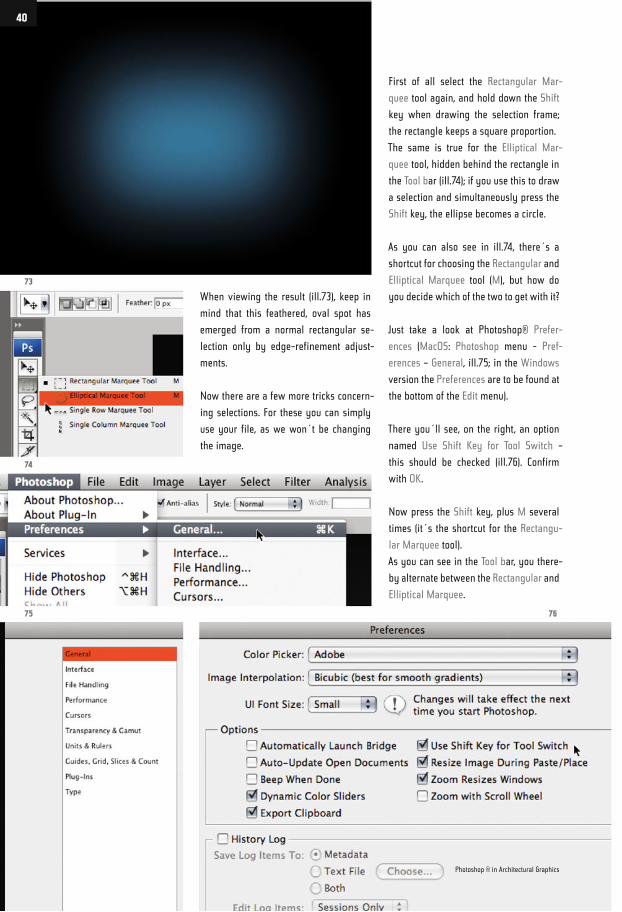
When viewing the result (ill.73), keep in
mind that this feathered, oval spot has
emerged from a normal rectangular se-
lection only by edge-refinement adjust-
ments.
Now there are a few more tricks concern-
ing selections. For these you can simply
use your file, as we won´t be changing
the image.
First of all select the Rectangular Mar-
quee tool again, and hold down the Shift
key when drawing the selection frame;
the rectangle keeps a square proportion.
The same is true for the Elliptical Mar-
quee tool, hidden behind the rectangle in
the Tool bar (ill.74); if you use this to draw
a selection and simultaneously press the
Shift key, the ellipse becomes a circle.
As you can also see in ill.74, there´s a
shortcut for choosing the Rectangular and
Elliptical Marquee tool (M), but how do
you decide which of the two to get with it?
Just take a look at Photoshop® Prefer-
ences (MacOS: Photoshop menu - Pref-
erences – General, ill.75; in the Windows
version the Preferences are to be found at
the bottom of the Edit menu).
There you´ll see, on the right, an option
named Use Shift Key for Tool Switch –
this should be checked (ill.76). Confirm
with OK.
Now press the Shift key, plus M several
times (it´s the shortcut for the Rectangu-
lar Marquee tool).
As you can see in the Tool bar, you there-
by alternate between the Rectangular and
Elliptical Marquee.
73
74
75 76
Photoshop ® in Architectural Graphics
40
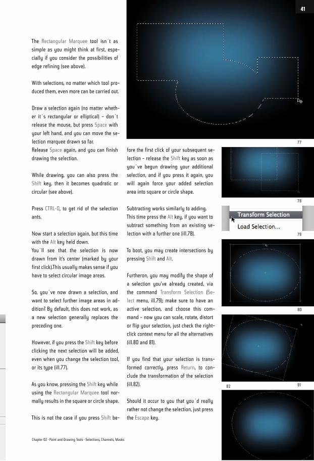
The Rectangular Marquee tool isn´t as
simple as you might think at first, espe-
cially if you consider the possibilities of
edge refining (see above).
With selections, no matter which tool pro-
duced them, even more can be carried out.
Draw a selection again (no matter wheth-
er it´s rectangular or elliptical) – don´t
release the mouse, but press Space with
your left hand, and you can move the se-
lection marquee drawn so far.
Release Space again, and you can finish
drawing the selection.
While drawing, you can also press the
Shift key, then it becomes quadratic or
circular (see above).
Press CTRL-D, to get rid of the selection
ants.
Now start a selection again, but this time
with the Alt key held down.
You´ll see that the selection is now
drawn from it‘s center (marked by your
first click).This usually makes sense if you
have to select circular image areas.
So, you´ve now drawn a selection, and
want to select further image areas in ad-
dition? By default, this does not work, as
a new selection generally replaces the
preceding one.
However, if you press the Shift key before
clicking the next selection will be added,
even when you change the selection tool,
or its type (ill.77).
As you know, pressing the Shift key while
using the Rectangular Marquee tool nor-
mally results in the square or circle shape.
This is not the case if you press Shift be-
fore the first click of your subsequent se-
lection - release the Shift key as soon as
you´ve begun drawing your additional
selection, and if you press it again, you
will again force your added selection
area into square or circle shape.
Subtracting works similarly to adding.
This time press the Alt key, if you want to
subtract something from an existing se-
lection with a further one (ill.78).
To boot, you may create intersections by
pressing Shift and Alt.
Furtheron, you may modify the shape of
a selection you‘ve already created, via
the command Transform Selection (Se-
lect menu, ill.79); make sure to have an
active selection, and choose this com-
mand – now you can scale, rotate, distort
or flip your selection, just check the right-
click context menu for all the alternatives
(ill.80 and 81).
If you find that your selection is trans-
formed correctly, press Return, to con-
clude the transformation of the selection
(ill.82).
Should it occur to you that you´d really
rather not change the selection, just press
the Escape key.
77
78
79
80
8182
Chapter 02 · Paint and Drawing Tools · Selections, Channels, Masks
41
Now to a further selection tool; please
open the file 02_terragni.psd (ill.83).
Let’s assume you want to assign a differ-
ent color to the building – in the first place,
you have to select the according faces.
Activate the so called Polygonal Lasso
(the tool directly under the Rectangular
Marquee tool, ill.84); if you see something
different there, because here too several
tools are hidden behind one icon, press
Shift, and keep pressing L till the one you
want appears.
Now try to draw a polygonal selection
around the house with a sequence of
clicks.
Do you want to zoom in while clicking, to
be able to work more exactly?
Consider my tips from the first chapter -
for zooming in or out, you don´t have to
deselect your Lasso tool and choose the
Zoom tool instead.
No - just press CTRL-Space to see the
zoom cursor, use it to draw the clipping
rectangle you want to see enlarged, re-
lease CTRL-Space, and keep on lasso-
clicking.
If you need to move the image clipping,
stay with the Polygonal Lasso, but this
83
84 85
Photoshop ® in Architectural Graphics
42
time press your Space bar - you can now
move the image clipping with the little
hand cursor.
(If you move your Lasso tool towards
one of the window borders while click-
ing, the clipping will move by itself, but
rather fast - avoid the rush, and stick to
the Space-bar shortcut).
In this example, as in most architectural
graphics, you often have to draw selec-
tion edges exactly vertically or horizon-
tally - to do this, just press the Shift key.
If you´ve clicked wrong, press Backspace
to reverse the click. You can do this sev-
eral times, until you´re back at the begin-
ning.
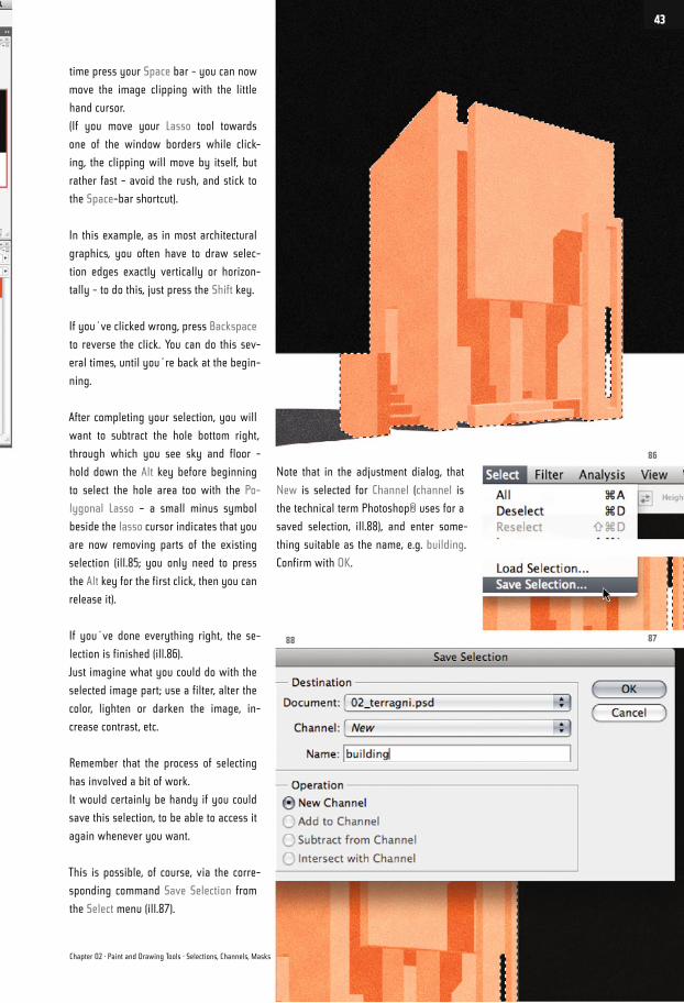
After completing your selection, you will
want to subtract the hole bottom right,
through which you see sky and floor -
hold down the Alt key before beginning
to select the hole area too with the Po-
lygonal Lasso – a small minus symbol
beside the lasso cursor indicates that you
are now removing parts of the existing
selection (ill.85; you only need to press
the Alt key for the first click, then you can
release it).
If you´ve done everything right, the se-
lection is finished (ill.86).
Just imagine what you could do with the
selected image part; use a filter, alter the
color, lighten or darken the image, in-
crease contrast, etc.
Remember that the process of selecting
has involved a bit of work.
It would certainly be handy if you could
save this selection, to be able to access it
again whenever you want.
This is possible, of course, via the corre-
sponding command Save Selection from
the Select menu (ill.87).
Note that in the adjustment dialog, that
New is selected for Channel (channel is
the technical term Photoshop® uses for a
saved selection, ill.88), and enter some-
thing suitable as the name, e.g. building.
Confirm with OK.
86
8788
Chapter 02 · Paint and Drawing Tools · Selections, Channels, Masks
43
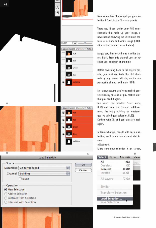
Now where has Photoshop® put your se-
lection ? Check in the Channels palette.
There you´ll see under your RGB color
channels, that make up your image, a
new channel showing the selection in the
form of a black-and-white image (ill.89;
click on the channel to see it alone).
As you see, the selected area is white, the
rest black. From this channel you can re-
cover your selection at any time.
Before switching back to the Layers pal-
ette, you must reactivate the RGB chan-
nels by any means (clicking on the up-
permost is all you need to do, ill.90).
Let´s now assume you´ve cancelled your
selection by mistake, or you realize later
that you need it again.
Just select Load Selection (Select menu,
ill.91) and from the Channel pulldown
menu the entry building (or whatever
you´ve called your selection, ill.92).
Confirm with OK, and your ants are back
again.
To learn what you can do with such a se-
lection, we´ll undertake a short visit to
color
adjustment.
Make sure your selection is on screen,
89
90 9192
Photoshop ® in Architectural Graphics
44
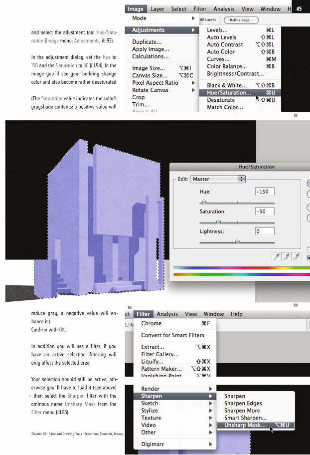
and select the adustment tool Hue/Satu-
ration (Image menu: Adjustments, ill.93).
In the adjustment dialog, set the Hue to
150 and the Saturation to 50 (ill.94). In the
image you´ll see your building change
color and also become rather desaturated.
(The Saturation value indicates the color’s
grayshade contents; a positive value will
reduce gray, a negative value will en-
hance it.)
Confirm with OK.
In addition you will use a filter; if you
have an active selection, filtering will
only affect the selected area.
Your selection should still be active, oth-
erwise you´ll have to load it (see above)
– then select the Sharpen filter with the
ominous name Unsharp Mask from the
Filter menu (ill.95).
93
9495
Chapter 02 · Paint and Drawing Tools · Selections, Channels, Masks
45
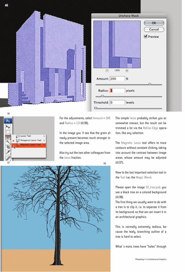
For the adjustments, select Amount = 200
and Radius = 2,0 (ill.96).
In the image you´ll see that the grain al-
ready present becomes much stronger in
the selected image area.
Also try out the two other colleagues from
the lasso fraction.
The simple lasso probably strikes you as
somewhat inexact, but the result can be
trimmed a lot via the Refine-Edge opera-
tion, like any selection.
The Magnetic Lasso tool offers to trace
contours without constant clicking, taking
into account the contrast between image
areas, whose amount may be adjusted
(ill.97).
Now to the last important selection tool in
the Tool bar, the Magic Wand.
Please open the image 02_tree.psd; you
see a black tree on a colored background
(ill.98).
The first thing we usually want to do with
a tree is to clip it, i.e. to separate it from
its background, so that we can insert it in
an architectural graphics.
This is normally extremely tedious, be-
cause the leafy, branching outline of a
tree is hard to select.
What´s more, trees have “holes“ through
96
97 98
Photoshop ® in Architectural Graphics
46
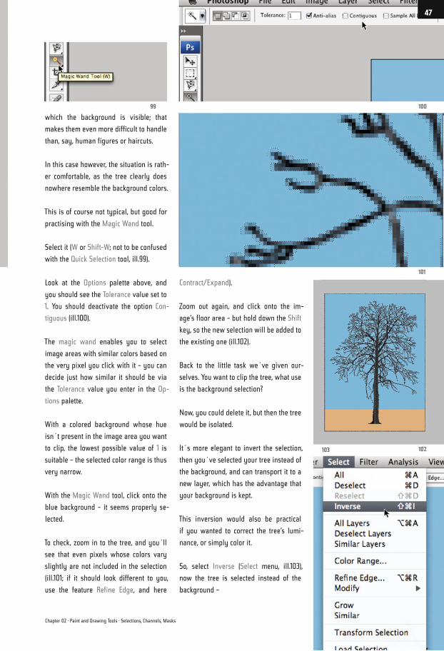
which the background is visible; that
makes them even more difficult to handle
than, say, human figures or haircuts.
In this case however, the situation is rath-
er comfortable, as the tree clearly does
nowhere resemble the background colors.
This is of course not typical, but good for
practising with the Magic Wand tool.
Select it (W or Shift-W; not to be confused
with the Quick Selection tool, ill.99).
Look at the Options palette above, and
you should see the Tolerance value set to
1. You should deactivate the option Con-
tiguous (ill.100).
The magic wand enables you to select
image areas with similar colors based on
the very pixel you click with it – you can
decide just how similar it should be via
the Tolerance value you enter in the Op-
tions palette.
With a colored background whose hue
isn´t present in the image area you want
to clip, the lowest possible value of 1 is
suitable – the selected color range is thus
very narrow.
With the Magic Wand tool, click onto the
blue background - it seems properly se-
lected.
To check, zoom in to the tree, and you´ll
see that even pixels whose colors vary
slightly are not included in the selection
(ill.101; if it should look different to you,
use the feature Refine Edge, and here
Contract/Expand).
Zoom out again, and click onto the im-
age‘s floor area - but hold down the Shift
key, so the new selection will be added to
the existing one (ill.102).
Back to the little task we´ve given our-
selves. You want to clip the tree, what use
is the background selection?
Now, you could delete it, but then the tree
would be isolated.
It´s more elegant to invert the selection,
then you´ve selected your tree instead of
the background, and can transport it to a
new layer, which has the advantage that
your background is kept.
This inversion would also be practical
if you wanted to correct the tree‘s lumi-
nance, or simply color it.
So, select Inverse (Select menu, ill.103),
now the tree is selected instead of the
background –
10099
101
102103
Chapter 02 · Paint and Drawing Tools · Selections, Channels, Masks
47
and then Layer via Cut (Layer menu - New,
ill.104).
Photoshop® cuts out the tree and places
it on a new layer over the existing one
(ill.105).
In the Layers palette, click on the eye
symbol in front of the lower layer to hide
the background, and take a close-up look
at the branches of the cut-out tree.
At the transition to the existing back-
ground it shows blue pixels which the
magic wand, with its low tolerance,
hasn´t selected (ill.106).
You can desaturate these, for simplicity´s
sake with the command Hue/Saturation
(Image menu - Adjustments, ill.107).
In the adjustment dialog, push the Satura-
tion control completely to the left (ill.108),
and the blue aureole round the branches
changes to Gray (ill.109).
107
106 105
104
108
Photoshop ® in Architectural Graphics
48
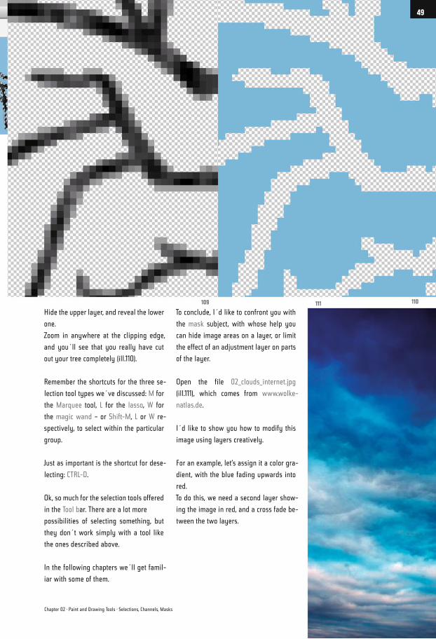
Hide the upper layer, and reveal the lower
one.
Zoom in anywhere at the clipping edge,
and you´ll see that you really have cut
out your tree completely (ill.110).
Remember the shortcuts for the three se-
lection tool types we´ve discussed: M for
the Marquee tool, L for the lasso, W for
the magic wand – or Shift-M, L or W re-
spectively, to select within the particular
group.
Just as important is the shortcut for dese-
lecting: CTRL-D.
Ok, so much for the selection tools offered
in the Tool bar. There are a lot more
possibilities of selecting something, but
they don´t work simply with a tool like
the ones described above.
In the following chapters we´ll get famil-
iar with some of them.
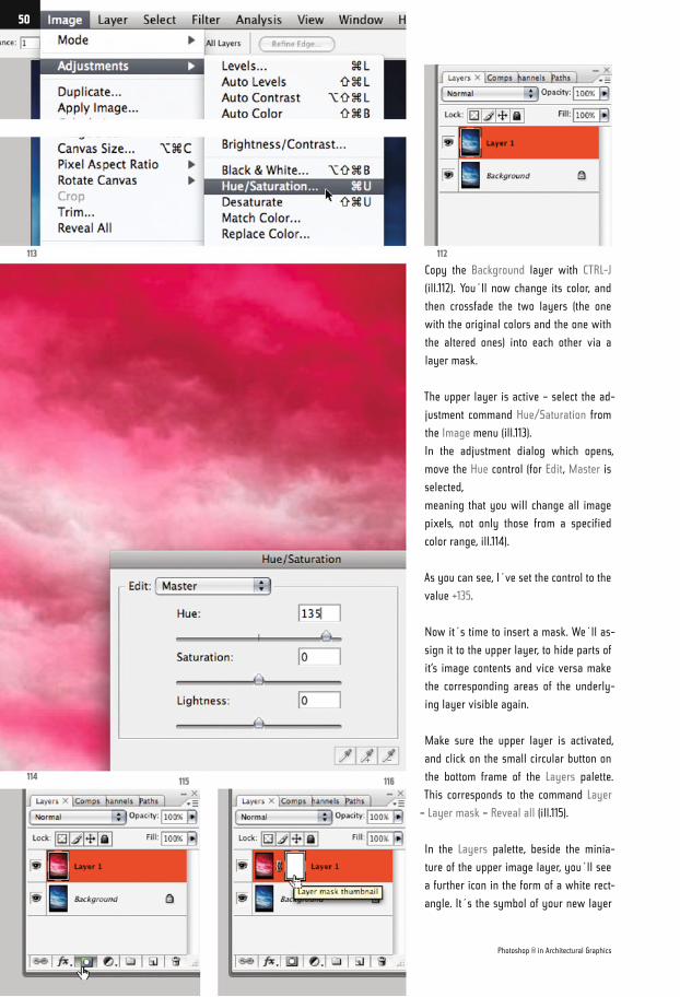
To conclude, I´d like to confront you with
the mask subject, with whose help you
can hide image areas on a layer, or limit
the effect of an adjustment layer on parts
of the layer.
Open the file 02_clouds_internet.jpg
(ill.111), which comes from www.wolke-
natlas.de.
I´d like to show you how to modify this
image using layers creatively.
For an example, let‘s assign it a color gra-
dient, with the blue fading upwards into
red.
To do this, we need a second layer show-
ing the image in red, and a cross fade be-
tween the two layers.
111 110109
Chapter 02 · Paint and Drawing Tools · Selections, Channels, Masks
49
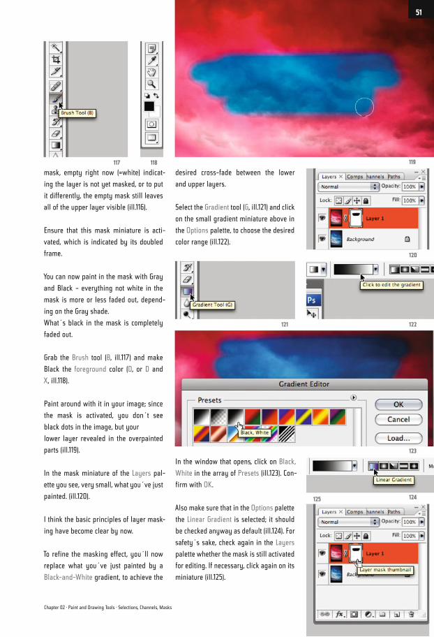
Copy the Background layer with CTRL-J
(ill.112). You´ll now change its color, and
then crossfade the two layers (the one
with the original colors and the one with
the altered ones) into each other via a
layer mask.
The upper layer is active – select the ad-
justment command Hue/Saturation from
the Image menu (ill.113).
In the adjustment dialog which opens,
move the Hue control (for Edit, Master is
selected,
meaning that you will change all image
pixels, not only those from a specified
color range, ill.114).
As you can see, I´ve set the control to the
value +135.
Now it´s time to insert a mask. We´ll as-
sign it to the upper layer, to hide parts of
it‘s image contents and vice versa make
the corresponding areas of the underly-
ing layer visible again.
Make sure the upper layer is activated,
and click on the small circular button on
the bottom frame of the Layers palette.
This corresponds to the command Layer
– Layer mask – Reveal all (ill.115).
In the Layers palette, beside the minia-
ture of the upper image layer, you´ll see
a further icon in the form of a white rect-
angle. It´s the symbol of your new layer
113
114115 116
112
Photoshop ® in Architectural Graphics
50
mask, empty right now (=white) indicat-
ing the layer is not yet masked, or to put
it differently, the empty mask still leaves
all of the upper layer visible (ill.116).
Ensure that this mask miniature is acti-
vated, which is indicated by its doubled
frame.
You can now paint in the mask with Gray
and Black – everything not white in the
mask is more or less faded out, depend-
ing on the Gray shade.
What´s black in the mask is completely
faded out.
Grab the Brush tool (B, ill.117) and make
Black the foreground color (D, or D and
X, ill.118).
Paint around with it in your image; since
the mask is activated, you don´t see
black dots in the image, but your
lower layer revealed in the overpainted
parts (ill.119).
In the mask miniature of the Layers pal-
ette you see, very small, what you´ve just
painted. (ill.120).
I think the basic principles of layer mask-
ing have become clear by now.
To refine the masking effect, you´ll now
replace what you´ve just painted by a
Black-and-White gradient, to achieve the
desired cross-fade between the lower
and upper layers.
Select the Gradient tool (G, ill.121) and click
on the small gradient miniature above in
the Options palette, to choose the desired
color range (ill.122).
In the window that opens, click on Black,
White in the array of Presets (ill.123). Con-
firm with OK.
Also make sure that in the Options palette
the Linear Gradient is selected; it should
be checked anyway as default (ill.124). For
safety´s sake, check again in the Layers
palette whether the mask is still activated
for editing. If necessary, click again on its
miniature (ill.125).
119117 118
120
122121
123
124125
Chapter 02 · Paint and Drawing Tools · Selections, Channels, Masks
51
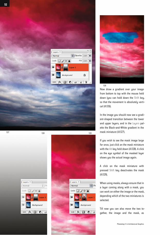
Now draw a gradient over your image
from bottom to top with the mouse held
down (you can hold down the Shift key,
so that the movement is absolutely verti-
cal (ill.126).
In the image you should now see a gradi-
ent-shaped transition between the lower
and upper layers, and in the Layers pal-
ette the Black-and-White gradient in the
mask miniature (ill.127).
If you wish to see the mask image large
for once, just click on the mask miniature
with the Alt key held down (ill.128). A click
on the eye symbol of the masked layer
shows you the actual image again.
A click on the mask miniature with
pressed Shift key deactivates the mask
(ill.129).
When using masks, always ensure that in
a layer coming along with a mask, you
can work on either the image or the mask,
depending which of the two miniatures is
selected.
Till now you can also move the two to-
gether, the image and the mask, as
127 128 129
126
Photoshop ® in Architectural Graphics
52
they´re linked with each other. If you
want to avoid this, click on the small
chain symbol between the miniatures
to make it disappear, then they can be
moved separately.
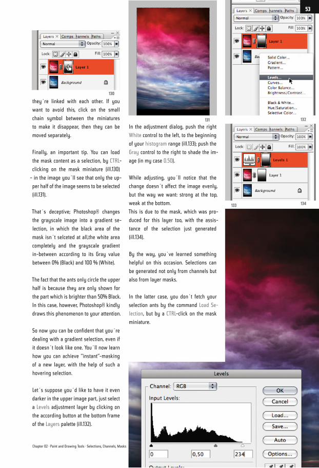
Finally, an important tip. You can load
the mask content as a selection, by CTRL-
clicking on the mask miniature (ill.130)
– in the image you´ll see that only the up-
per half of the image seems to be selected
(ill.131).
That´s deceptive; Photoshop® changes
the grayscale image into a gradient se-
lection, in which the black area of the
mask isn´t selceted at all,the white area
completely and the grayscale gradient
in-between according to its Gray value
between 0% (Black) and 100 % (White).
The fact that the ants only circle the upper
half is because they are only shown for
the part which is brighter than 50% Black.
In this case, however, Photoshop® kindly
draws this phenomenon to your attention.
So now you can be confident that you´re
dealing with a gradient selection, even if
it doesn´t look like one. You´ll now learn
how you can achieve “instant“-masking
of a new layer, with the help of such a
hovering selection.
Let´s suppose you´d like to have it even
darker in the upper image part, just select
a Levels adjustment layer by clicking on
the according button at the bottom frame
of the Layers palette (ill.132).
In the adjustment dialog, push the right
White control to the left, to the beginning
of your histogram range (ill.133); push the
Gray control to the right to shade the im-
age (in my case 0.50).
While adjusting, you´ll notice that the
change doesn´t affect the image evenly,
but the way we want: strong at the top,
weak at the bottom.
This is due to the mask, which was pro-
duced for this layer too, with the assis-
tance of the selection just generated
(ill.134).
By the way, you´ve learned something
helpful on this occasion. Selections can
be generated not only from channels but
also from layer masks.
In the latter case, you don´t fetch your
selection ants by the command Load Se-
lection, but by a CTRL-click on the mask
miniature.
132131
130
134133
Chapter 02 · Paint and Drawing Tools · Selections, Channels, Masks
53
RGB and CMYK
At this point I´d like to bother you with
a subject which might strike you as a bit
prim, but which plays an important part
in production.
Maybe you already know about the dif-
ference between RGB and CMYK color
spaces, but there´s no harm in restating
the significance and the technical pitfalls
of color management, of course in a con-
text which is digestible for architects and
the likes of us.
You´ll find out things which go beyond
this, and which can´t be described here,
in the extensive specialist literature.
In general, images only to be presented
on screen (e.g. in a PowerPoint presenta-
tion), can remain in the RGB space, while
all images to be printed (whether from
Photoshop® or embedded in a PDF), have
finally to be converted into CMYK mode.
A professional printshop, or in my case
a publisher, simply doesn´t accept RGB
data, no matter how hidden.
The reason is simple: printer colors can
only reproduce part of the color spec-
trum that is available on screens. So ev-
ery printer driver converts the colors that
reach beyond the CMYK space, on the
basis of rather opaque criteria, into other,
printable colors.
The result is often disappointing.
From the foregoing, you probably con-
clude that the RGB mode has advantages
over the CMYK mode, which is correct,
because many tools in Photoshop®, e.g.
a lot of the filters, are only available for
RGB images.
We´ll come to that later, but first let´s
take a look at the whole thing in detail.
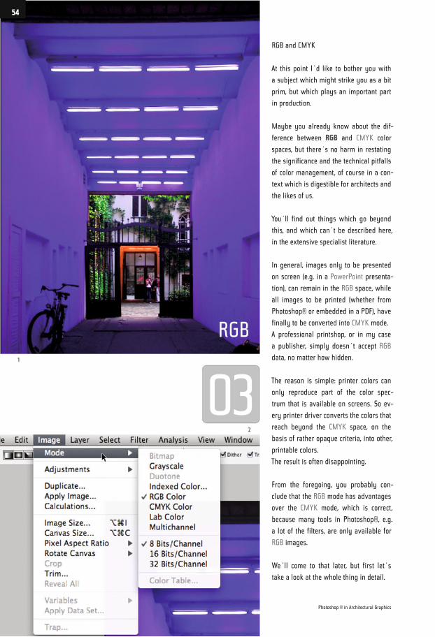
RGB
1
2
Photoshop ® in Architectural Graphics
54
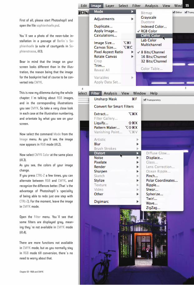
First of all, please start Photoshop® and
open the file sophienhoefe.psd.
You´ll see a photo of the neon-tube in-
stallation in a passage of Berlin´s So-
phienhoefe (a suite of courtyards in So-
phienstrasse, ill.1).
Bear in mind that the image on your
screen looks different than in the illus-
tration, the reason being that the image
for the bookprint had of course to be con-
verted into CMYK.
This is now my dilemma during the whole
chapter: I´m talking about RGB images,
and in the corresponding illustrations
you see CMYK. So take a very close look
in each case at the illustration numbering,
and orientate by what you see on your
screen.
Now select the command Mode from the
Image menu. As you´ll see, the image
now appears in RGB mode (ill.2).
Now select CMYK Color at the same place
(ill.3).
As you see, the colors of your image
change.
If you press CTRL-Z a few times, you can
alternate between RGB and CMYK, and
recognize the diffences better. (That´s the
advantage of Photoshop®´s speciality
of being able to redo just one step with
CTRL-Z). For the moment, leave the image
in CMYK mode.
Open the Filter menu. You´ll see that
some filters are displayed gray, mean-
ing they´re not available in CMYK mode
(ill.4).
There are more functions not available
in CMYK mode, but as you normally stay
in RGB mode till conversion, there´s no
need to worry about that.
34
Chapter 03 · RGB and CMYK
55
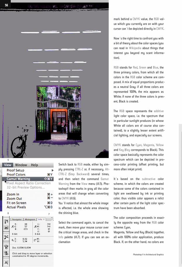
Switch back to RGB mode, either by sim-
ply pressing CTRL-Z or, if necessary, Alt-
CTRL-Z (Step Backward) several times,
and then select the command Gamut
Warning from the View menu (ill.5). Pho-
toshop® then marks in gray all the color
areas that will change when converting
to CMYK (ill.6).
You´ll notice that almost the whole image
is affected, i.e. the whole area showing
the shining blue.
Select the command again, to cancel the
mark, then move your mouse cursor over
the critical image areas, and check in the
Info palette (ill.7). If you can see an ex-
clamation
mark behind a CMYK value, the RGB val-
ue which you currently are on with your
cursor can´t be depicted directly in CMYK.
Now´s the right time to confront you with
a bit of theory about the color spaces (you
can read in Wikipedia about things that
interest you beyond my scant informa-
tion).
RGB stands for Red, Green and Blue, the
three primary colors, from which all the
colors in the RGB color scheme are com-
posed. A mix of equal proportions produc-
es a neutral Gray; if all three colors are
represented 100%, the mix appears as
White; if none of the three colors is pres-
ent, Black is created.
The RGB space represents the additive
light color space, i.e. the spectrum that
in particular sunlight produces (in whose
White all colors are of course also con-
tained), to a slightly lesser extent artifi-
cial lighting, and especially our screens.
CMYK stands for Cyan, Magenta, Yellow
and Key (Key corresponds to Black). This
color space basically represents the color
spectrum which can be depicted in pro-
cess-color printing (offset printing, but
more often inkjet print).
It´s based on the subtractive color
scheme, in which the colors are created
because some of the colors contained in
light are swallowed by ink or printing
color; thus visible color appears a relict
after certain parts of the light color spec-
trum have been absorbed.
The color composition proceeds in exact-
ly the opposite way from the RGB color
scheme: Cyan,
Magenta, Yellow and Key (Black) together,
all with 100% color application, produce
Black. If, on the other hand, no colors are
5
6 7
Photoshop ® in Architectural Graphics
56
applied (application 0%), the white paper
remains visible. (Which means you ought
to realize that the lightest color of the
print is determined by the paper color).
Theoretically, Black isn´t necessary in
this color scheme, but in practice it is,
because with it the color application can
be reduced. Instead of producing a Black
with 100% Cyan, Magenta and Yellow re-
spectively (which would mean three color
layers with a total of 300% color amount),
the 3 can be replaced by 100% Black.
Usually the color hue’s gray component
is in particular replaced by a correspond-
ing black component (the so called achro-
matic setup).
The RGB scheme can, depending on the
device (screen, camera chip, scanner sen-
sor), appear in a differentially large color
range, and this is exactly how the CMYK
scheme behaves, where the size of the
color space depends on the output device
and the kind of paper.
That´s why there are so called color
profiles, little add-on files in which cor-
responding device colors are allocated to
the original colors, in tabular form.
Without my going into this subject in de-
tail, it should be borne in mind that the
CMYK mode always depicts fewer colors
than the RGB scheme.
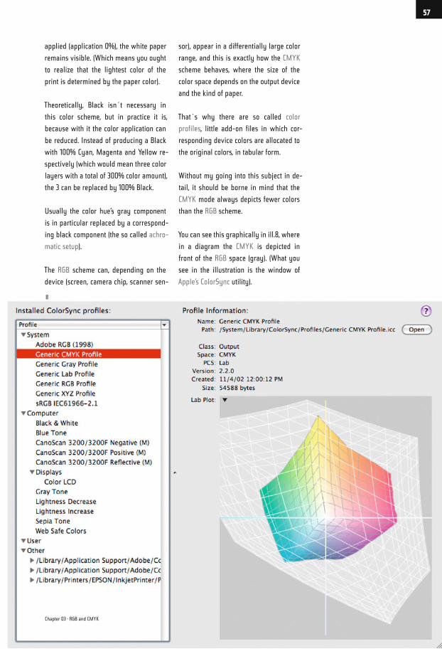
You can see this graphically in ill.8, where
in a diagram the CMYK is depicted in
front of the RGB space (gray). (What you
see in the illustration is the window of
Apple’s ColorSync utility).
8
Chapter 03 · RGB and CMYK
57
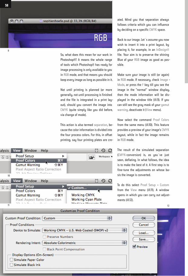
So, what does this mean for our work in
Photoshop®? It means the whole range
of tools which Photoshop® has ready for
image processing is only available to you
in RGB mode, and that means you should
keep every image as long as possible in it.
Not until printing is planned (or more
generally, not until processing is finished
and the file is integrated in a print lay-
out), should you convert the image into
CMYK (quite simply like you did before,
via change of mode).
This action is also termed separation, be-
cause the color information is divided into
the four process colors. For this, in offset
printing, say four printing plates are cre-
ated. Mind you that separation always
follows criteria which you can influence
by deciding on a specific CMYK space.
Back to our image. Let´s assume you now
wish to insert it into a print layout, by
placing it, for example, in an InDesign®
file. Your aim is to preserve the shining
Blue of your RGB image as good as pos-
sible.
Make sure your image is still (or again)
in RGB mode. If necessary, check Image -
Mode, or press the F key till you see the
image in the "normal“ window display,
then the mode information will be dis-
played in the window title (ill.9). If you
can still see the gray mask of your gamut
warning, deactivate it (View menu).
Now select the command Proof Colors
from the same menu (ill.10). This feature
provides a preview of your image‘s CMYK
layout, while in fact the image remains
in RGB mode.
The result of the simulated separation
(CMYK-conversion) is, as you´ve just
seen, deflating. In what follows, the idea
is to make the best of it. A first step is to
fine-tune the adjustments on whose ba-
sis the image is converted.
To do this select Proof Setup – Custom
from the View menu (ill.11). A window
opens in which you can carry out adjust-
ments (ill.12).
9
10
11 12
58
RGB
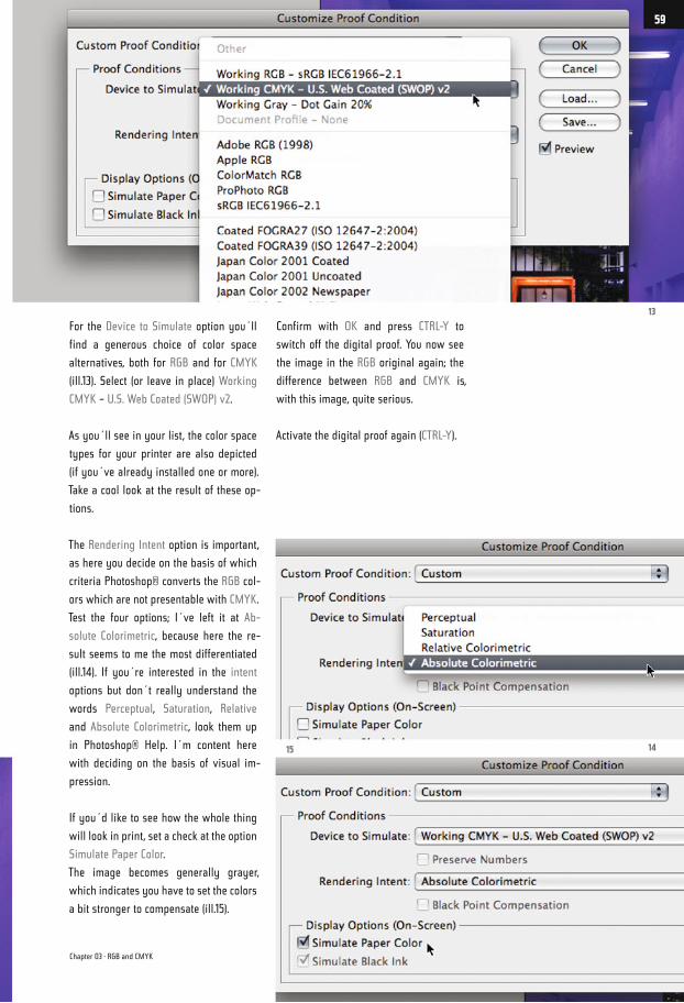
For the Device to Simulate option you´ll
find a generous choice of color space
alternatives, both for RGB and for CMYK
(ill.13). Select (or leave in place) Working
CMYK – U.S. Web Coated (SWOP) v2.
As you´ll see in your list, the color space
types for your printer are also depicted
(if you´ve already installed one or more).
Take a cool look at the result of these op-
tions.
The Rendering Intent option is important,
as here you decide on the basis of which
criteria Photoshop® converts the RGB col-
ors which are not presentable with CMYK.
Test the four options; I´ve left it at Ab-
solute Colorimetric, because here the re-
sult seems to me the most differentiated
(ill.14). If you´re interested in the intent
options but don´t really understand the
words Perceptual, Saturation, Relative
and Absolute Colorimetric, look them up
in Photoshop® Help. I´m content here
with deciding on the basis of visual im-
pression.
If you´d like to see how the whole thing
will look in print, set a check at the option
Simulate Paper Color.
The image becomes generally grayer,
which indicates you have to set the colors
a bit stronger to compensate (ill.15).
Confirm with OK and press CTRL-Y to
switch off the digital proof. You now see
the image in the RGB original again; the
difference between RGB and CMYK is,
with this image, quite serious.
Activate the digital proof again (CTRL-Y).
13
1415
Chapter 03 · RGB and CMYK
59
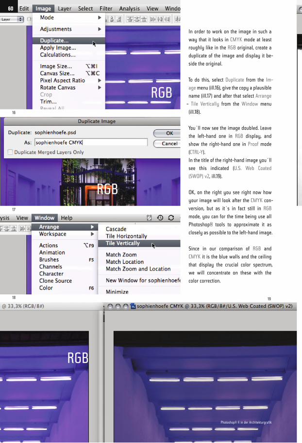
In order to work on the image in such a
way that it looks in CMYK mode at least
roughly like in the RGB original, create a
duplicate of the image and display it be-
side the original.
To do this, select Duplicate from the Im-
age menu (ill.16), give the copy a plausible
name (ill.17) and after that select Arrange
– Tile Vertically from the Window menu
(ill.18).
You´ll now see the image doubled. Leave
the left-hand one in RGB display, and
show the right-hand one in Proof mode
(CTRL-Y).
In the title of the right-hand image you´ll
see this indicated (U.S. Web Coated
(SWOP) v2, ill.19).
OK, on the right you see right now how
your image will look after the CMYK con-
version, but as it´s in fact still in RGB
mode, you can for the time being use all
Photoshop® tools to approximate it as
closely as possible to the left-hand image.
Since in our comparison of RGB and
CMYK it is the blue walls and the ceiling
that display the crucial color spectrum,
we will concentrate on these with the
color correction.
16
17
18 19
60
Photoshop® ® in der Architekturgrafik
RGB
RGB
RGB
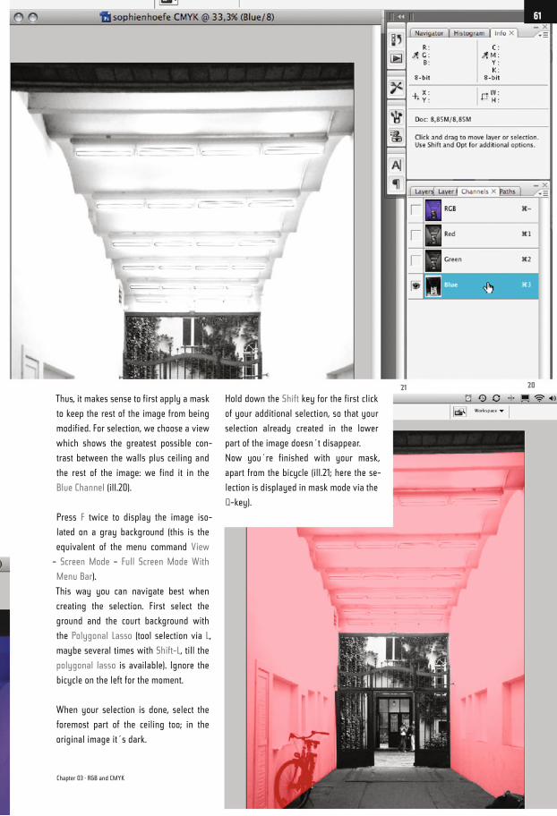
Thus, it makes sense to first apply a mask
to keep the rest of the image from being
modified. For selection, we choose a view
which shows the greatest possible con-
trast between the walls plus ceiling and
the rest of the image: we find it in the
Blue Channel (ill.20).
Press F twice to display the image iso-
lated on a gray background (this is the
equivalent of the menu command View
– Screen Mode – Full Screen Mode With
Menu Bar).
This way you can navigate best when
creating the selection. First select the
ground and the court background with
the Polygonal Lasso (tool selection via L,
maybe several times with Shift-L, till the
polygonal lasso is available). Ignore the
bicycle on the left for the moment.
When your selection is done, select the
foremost part of the ceiling too; in the
original image it´s dark.
Hold down the Shift key for the first click
of your additional selection, so that your
selection already created in the lower
part of the image doesn´t disappear.
Now you´re finished with your mask,
apart from the bicycle (ill.21; here the se-
lection is displayed in mask mode via the
Q-key).
2021
Chapter 03 · RGB and CMYK
61
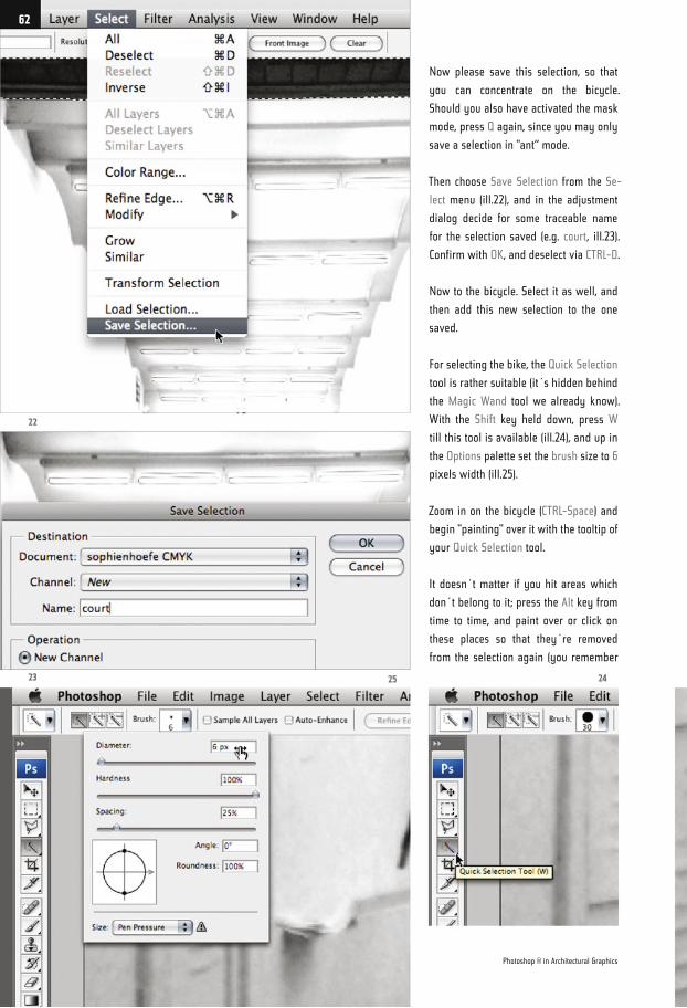
Now please save this selection, so that
you can concentrate on the bicycle.
Should you also have activated the mask
mode, press Q again, since you may only
save a selection in "ant“ mode.
Then choose Save Selection from the Se-
lect menu (ill.22), and in the adjustment
dialog decide for some traceable name
for the selection saved (e.g. court, ill.23).
Confirm with OK, and deselect via CTRL-D.
Now to the bicycle. Select it as well, and
then add this new selection to the one
saved.
For selecting the bike, the Quick Selection
tool is rather suitable (it´s hidden behind
the Magic Wand tool we already know).
With the Shift key held down, press W
till this tool is available (ill.24), and up in
the Options palette set the brush size to 6
pixels width (ill.25).
Zoom in on the bicycle (CTRL-Space) and
begin "painting" over it with the tooltip of
your Quick Selection tool.
It doesn´t matter if you hit areas which
don´t belong to it; press the Alt key from
time to time, and paint over or click on
these places so that they´re removed
from the selection again (you remember
22
23 25 24
Photoshop ® in Architectural Graphics
62
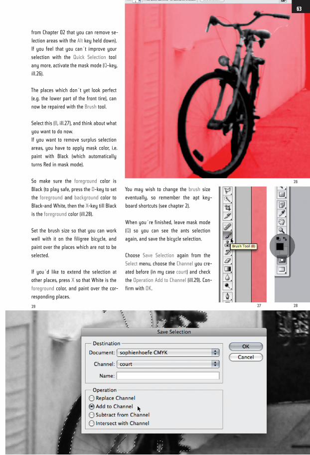
from Chapter 02 that you can remove se-
lection areas with the Alt key held down).
If you feel that you can´t improve your
selection with the Quick Selection tool
any more, activate the mask mode (Q-key,
ill.26).
The places which don´t yet look perfect
(e.g. the lower part of the front tire), can
now be repaired with the Brush tool.
Select this (B, ill.27), and think about what
you want to do now.
If you want to remove surplus selection
areas, you have to apply mask color, i.e.
paint with Black (which automatically
turns Red in mask mode).
So make sure the foreground color is
Black (to play safe, press the D-key to set
the foreground and background color to
Black-and White, then the X-key till Black
is the foreground color (ill.28).
Set the brush size so that you can work
well with it on the filigree bicycle, and
paint over the places which are not to be
selected.
If you´d like to extend the selection at
other places, press X so that White is the
foreground color, and paint over the cor-
responding places.
You may wish to change the brush size
eventually, so remember the apt key-
board shortcuts (see chapter 2).
When you´re finished, leave mask mode
(Q) so you can see the ants selection
again, and save the bicycle selection.
Choose Save Selection again from the
Select menu, choose the Channel you cre-
ated before (in my case court) and check
the Operation Add to Channel (ill.29). Con-
firm with OK.
28
26
2729
63
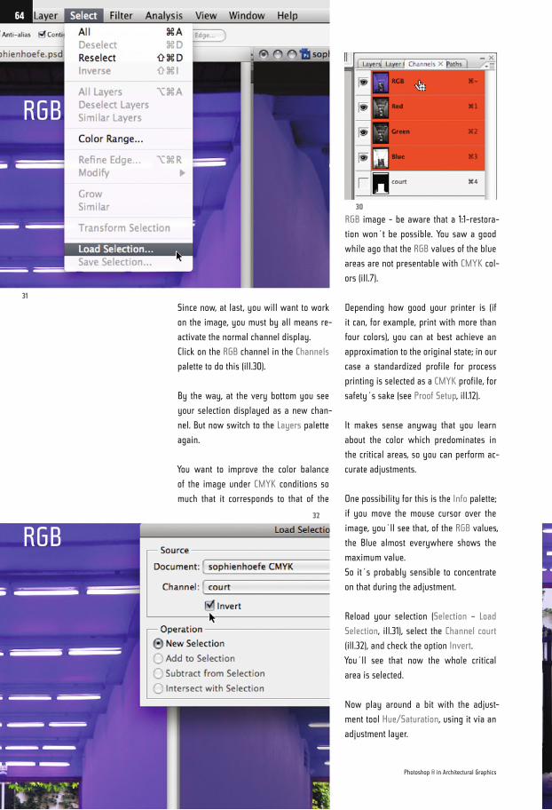
Since now, at last, you will want to work
on the image, you must by all means re-
activate the normal channel display.
Click on the RGB channel in the Channels
palette to do this (ill.30).
By the way, at the very bottom you see
your selection displayed as a new chan-
nel. But now switch to the Layers palette
again.
You want to improve the color balance
of the image under CMYK conditions so
much that it corresponds to that of the
RGB image - be aware that a 1:1-restora-
tion won´t be possible. You saw a good
while ago that the RGB values of the blue
areas are not presentable with CMYK col-
ors (ill.7).
Depending how good your printer is (if
it can, for example, print with more than
four colors), you can at best achieve an
approximation to the original state; in our
case a standardized profile for process
printing is selected as a CMYK profile, for
safety´s sake (see Proof Setup, ill.12).
It makes sense anyway that you learn
about the color which predominates in
the critical areas, so you can perform ac-
curate adjustments.
One possibility for this is the Info palette;
if you move the mouse cursor over the
image, you´ll see that, of the RGB values,
the Blue almost everywhere shows the
maximum value.
So it´s probably sensible to concentrate
on that during the adjustment.
Reload your selection (Selection – Load
Selection, ill.31), select the Channel court
(ill.32), and check the option Invert.
You´ll see that now the whole critical
area is selected.
Now play around a bit with the adjust-
ment tool Hue/Saturation, using it via an
adjustment layer.
31
32
30
Photoshop ® in Architectural Graphics
64
RGB
RGB
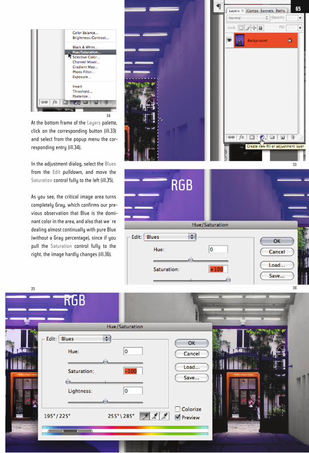
At the bottom frame of the Layers palette,
click on the corresponding button (ill.33)
and select from the popup menu the cor-
responding entry (ill.34).
In the adjustment dialog, select the Blues
from the Edit pulldown, and move the
Saturation control fully to the left (ill.35).
As you see, the critical image area turns
completely Gray, which confirms our pre-
vious observation that Blue is the domi-
nant color in the area, and also that we´re
dealing almost continually with pure Blue
(without a Gray percentage), since if you
pull the Saturation control fully to the
right, the image hardly changes (ill.36).
33
3635
34
65
RGB
RGB
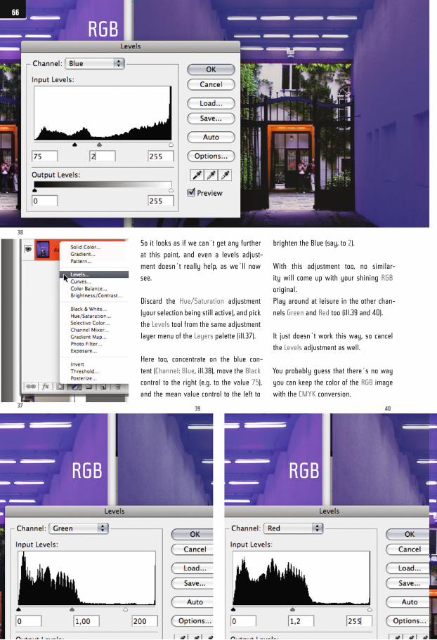
So it looks as if we can´t get any further
at this point, and even a levels adjust-
ment doesn´t really help, as we´ll now
see.
Discard the Hue/Saturation adjustment
(your selection being still active), and pick
the Levels tool from the same adjustment
layer menu of the Layers palette (ill.37).
Here too, concentrate on the blue con-
tent (Channel: Blue, ill.38), move the Black
control to the right (e.g. to the value 75),
and the mean value control to the left to
brighten the Blue (say, to 2).
With this adjustment too, no similar-
ity will come up with your shining RGB
original.
Play around at leisure in the other chan-
nels Green and Red too (ill.39 and 40).
It just doesn´t work this way, so cancel
the Levels adjustment as well.
You probably guess that there´s no way
you can keep the color of the RGB image
with the CMYK conversion.
37
38
4039
66
RGB
RGB RGB
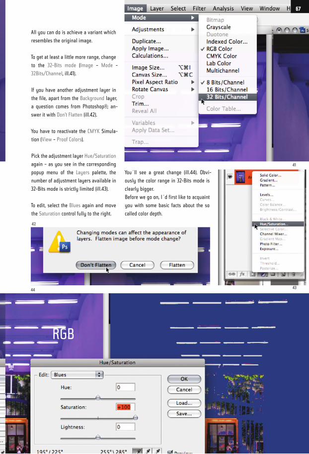
All you can do is achieve a variant which
resembles the original image.
To get at least a little more range, change
to the 32-Bits mode (Image – Mode -
32Bits/Channel, ill.41).
If you have another adjustment layer in
the file, apart from the Background layer,
a question comes from Photoshop®; an-
swer it with Don’t Flatten (ill.42).
You have to reactivate the CMYK Simula-
tion (View – Proof Colors).
Pick the adjustment layer Hue/Saturation
again – as you see in the corresponding
popup menu of the Layers palette, the
number of adjustment layers available in
32-Bits mode is strictly limited (ill.43).
To edit, select the Blues again and move
the Saturation control fully to the right.
You´ll see a great change (ill.44). Obvi-
ously the color range in 32-Bits mode is
clearly bigger.
Before we go on, I´d first like to acquaint
you with some basic facts about the so
called color depth.
41
4344
42
67
RGB
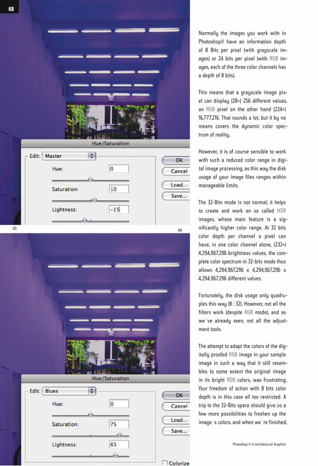
Normally the images you work with in
Photoshop® have an information depth
of 8 Bits per pixel (with grayscale im-
ages) or 24 bits per pixel (with RGB im-
ages, each of the three color channels has
a depth of 8 bits).
This means that a grayscale image pix-
el can display (28=) 256 different values,
an RGB pixel on the other hand (224=)
16,777,216. That sounds a lot, but it by no
means covers the dynamic color spec-
trum of reality.
However, it is of course sensible to work
with such a reduced color range in digi-
tal image processing, as this way the disk
usage of your image files ranges within
manageable limits.
The 32-Bits mode is not normal; it helps
to create and work on so called HDR
images, whose main feature is a sig-
nificantly higher color range. At 32 bits
color depth per channel a pixel can
have, in one color channel alone, (232=)
4,294,967,296 brightness values, the com-
plete color spectrum in 32-bits mode thus
allows 4,294,967,296 x 4,294,967,296 x
4,294,967,296 different values.
Fortunately, the disk usage only quadru-
ples this way (8 : 32). However, not all the
filters work (despite RGB mode), and as
we´ve already seen, not all the adjust-
ment tools.
The attempt to adapt the colors of the dig-
itally proofed RGB image in your sample
image in such a way that it still resem-
bles to some extent the original image
in its bright RGB colors, was frustrating.
Your freedom of action with 8 bits color
depth is in this case all too restricted. A
trip to the 32-Bits space should give us a
few more possibilities to freshen up the
image´s colors, and when we´re finished,
45 46
Photoshop ® in Architectural Graphics
68
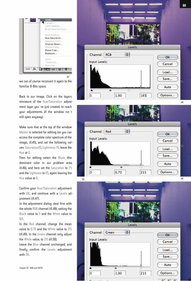
we can of course reconvert it again to the
familiar 8-Bits space.
Back to our image. Click on the layers
miniature of the Hue/Saturation adjust-
ment layer you´ve just created, to reach
your adjustments (if the window isn´t
still open anyway).
Make sure that at the top of the window
Master is selected for editing (so you can
access the complete color spectrum of the
image, ill.45), and set the following val-
ues: Saturation:10, Lightness:-15, leave the
Hue at 0.
Then for editing select the Blues (the
dominant color in our problem area,
ill.46), and here set the Saturation to 75
and the Lightness to 65, again leaving the
Hue value at 0.
Confirm your Hue/Saturation adjustment
with OK, and continue with a Levels ad-
justment (ill.47).
In the adjustment dialog, deal first with
the whole RGB channel (ill.48), setting the
Black value to 5 and the White value to
165.
In the Red channel, change the mean
value to 0.70 and the White value to 215
(ill.49). In the Green channel only adjust
the White value, to 215 (ill.50).
Leave the Blue channel unchanged, and
finally confirm the Levels adjustment
with OK.
51
52
48
4950
47
Chapter 03 · RGB and CMYK
69
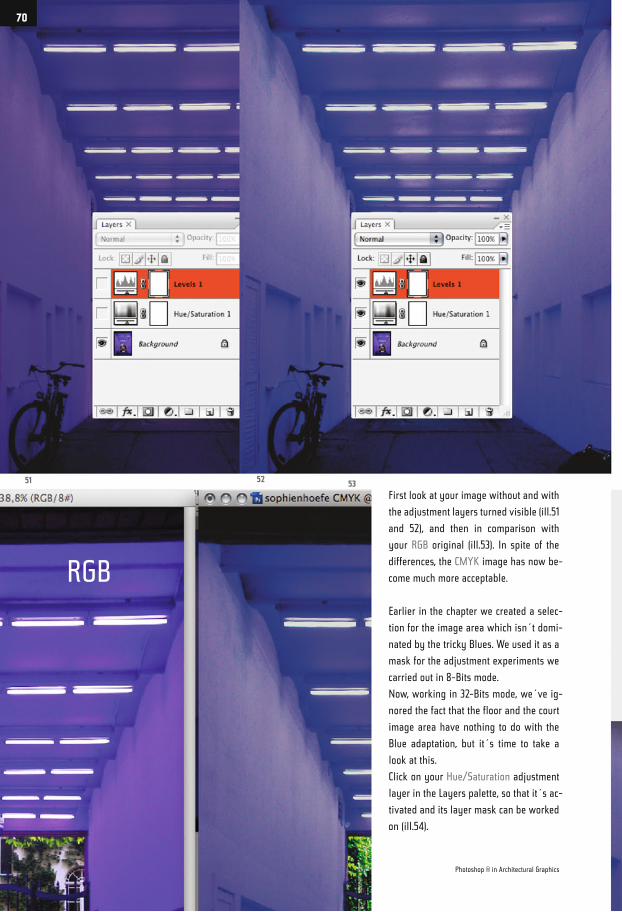
First look at your image without and with
the adjustment layers turned visible (ill.51
and 52), and then in comparison with
your RGB original (ill.53). In spite of the
differences, the CMYK image has now be-
come much more acceptable.
Earlier in the chapter we created a selec-
tion for the image area which isn´t domi-
nated by the tricky Blues. We used it as a
mask for the adjustment experiments we
carried out in 8-Bits mode.
Now, working in 32-Bits mode, we´ve ig-
nored the fact that the floor and the court
image area have nothing to do with the
Blue adaptation, but it´s time to take a
look at this.
Click on your Hue/Saturation adjustment
layer in the Layers palette, so that it´s ac-
tivated and its layer mask can be worked
on (ill.54).
51 5352
Photoshop ® in Architectural Graphics
70
RGB
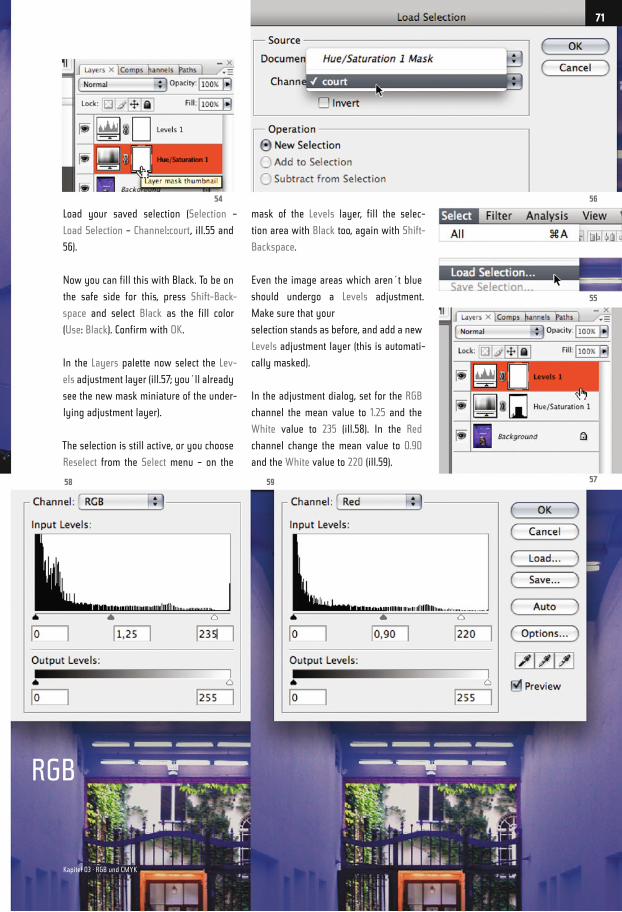
Load your saved selection (Selection –
Load Selection – Channel:court, ill.55 and
56).
Now you can fill this with Black. To be on
the safe side for this, press Shift-Back-
space and select Black as the fill color
(Use: Black). Confirm with OK.
In the Layers palette now select the Lev-
els adjustment layer (ill.57; you´ll already
see the new mask miniature of the under-
lying adjustment layer).
The selection is still active, or you choose
Reselect from the Select menu – on the
mask of the Levels layer, fill the selec-
tion area with Black too, again with Shift-
Backspace.
Even the image areas which aren´t blue
should undergo a Levels adjustment.
Make sure that your
selection stands as before, and add a new
Levels adjustment layer (this is automati-
cally masked).
In the adjustment dialog, set for the RGB
channel the mean value to 1.25 and the
White value to 235 (ill.58). In the Red
channel change the mean value to 0.90
and the White value to 220 (ill.59).
56
55
5758 59
54
71
Kapitel 03 · RGB und CMYK
RGB
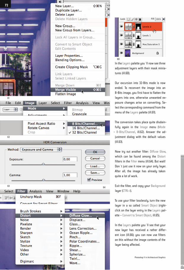
In the Layers palette you´ll now see three
adjustment layers with their mask minia-
tures (ill.60).
Our excursion into 32-Bits mode is now
ended. To reconvert the image into an
8-Bits image, you first have to flatten the
layers into one, otherwise unwanted ex-
posure changes arise on converting. Se-
lect the corresponding command from the
menu of the Layers palette (ill.61).
The conversion takes place quite disdain-
fully again in the Image menu (Mode
- 8-Bits/Channel, ill.62). Answer the ad-
justment dialog with the default values
(ill.63).
Now try out another filter: Diffuse Glow,
which can be found among the Distort
filters in the Filter menu (ill.64). But wait!
Don´t just use it now on your only layer.
After all, the image has already taken
quite a lot of work.
Exit the filter, and copy your Background
layer (CTRL-J).
To use your filter losslessly, turn the new
layer in a so called Smart Object (right-
click on the layer entry in the Layers pal-
ette – Convert to Smart Object, ill.65).
In the Layers palette you´ll see that your
new layer has received a rather differ-
ent icon (ill.66); you can now use filters
on this without the image contents of the
layer being affected.
61
62
6364
60
Photoshop ® in Architectural Graphics
72
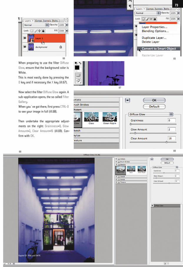
When preparing to use the filter Diffuse
Glow, ensure that the background color is
White.
This is most easily done by pressing the
D key and if necessary the X key (ill.67).
Now select the filter Diffuse Glow again. A
sub-application opens, the so called Filter
Gallery.
When you´ve got there, first press CTRL-0
to see your image in full (ill.68).
Then undertake the appropriate adjust-
ments on the right: Graininess=0, Glow
Amount=2, Clear Amount=16 (ill.69). Con-
firm with OK.
66 65
67
6968
73
Kapitel 03 · RGB und CMYK
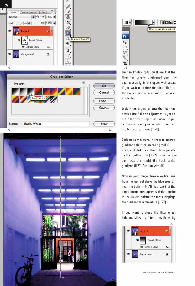
Back in Photoshop® you´ll see that the
filter has greatly brightened your im-
age, especially in the upper wall areas.
If you wish to confine the filter effect to
the lower image area, a gradient mask is
available.
Look in the Layers palette; the filter has
nestled itself like an adjustment layer be-
neath the Smart Object, and above it you
can see an empty mask which you can
use for your purposes (ill.70).
Click on its miniature, in order to insert a
gradient; select the according tool (G,
ill.71), and click up in the Options palette
on the gradient icon (ill.72). From the gra-
dient assortment, pick the Black, White
gradient (ill.73). Confirm with OK.
Now, in your image, draw a vertical line
from the top (just above the blue area) till
near the bottom (ill.74). You see that the
upper image area appears darker again;
in the Layers palette the mask displays
the gradient as a miniature (ill.75).
If you want to study the filter effect,
hide and show the filter a few times, by
70
73
7271
75
74
Photoshop ® in Architectural Graphics
74
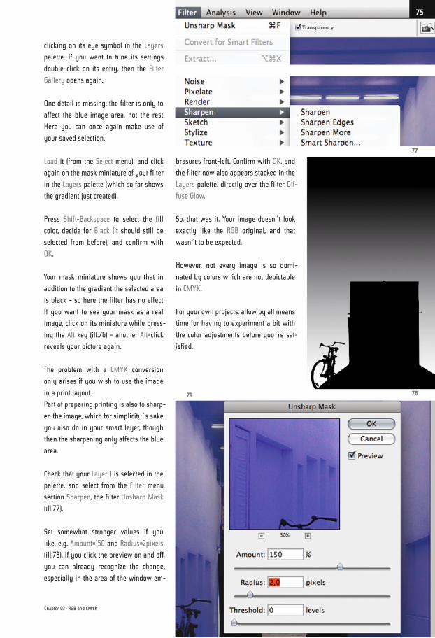
clicking on its eye symbol in the Layers
palette. If you want to tune its settings,
double-click on its entry, then the Filter
Gallery opens again.
One detail is missing: the filter is only to
affect the blue image area, not the rest.
Here you can once again make use of
your saved selection.
Load it (from the Select menu), and click
again on the mask miniature of your filter
in the Layers palette (which so far shows
the gradient just created).
Press Shift-Backspace to select the fill
color, decide for Black (it should still be
selected from before), and confirm with
OK.
Your mask miniature shows you that in
addition to the gradient the selected area
is black – so here the filter has no effect.
If you want to see your mask as a real
image, click on its miniature while press-
ing the Alt key (ill.76) – another Alt-click
reveals your picture again.
The problem with a CMYK conversion
only arises if you wish to use the image
in a print layout.
Part of preparing printing is also to sharp-
en the image, which for simplicity´s sake
you also do in your smart layer, though
then the sharpening only affects the blue
area.
Check that your Layer 1 is selected in the
palette, and select from the Filter menu,
section Sharpen, the filter Unsharp Mask
(ill.77).
Set somewhat stronger values if you
like, e.g. Amount=150 and Radius=2pixels
(ill.78). If you click the preview on and off,
you can already recognize the change,
especially in the area of the window em-
brasures front-left. Confirm with OK, and
the filter now also appears stacked in the
Layers palette, directly over the filter Dif-
fuse Glow.
So, that was it. Your image doesn´t look
exactly like the RGB original, and that
wasn´t to be expected.
However, not every image is so domi-
nated by colors which are not depictable
in CMYK.
For your own projects, allow by all means
time for having to experiment a bit with
the color adjustments before you´re sat-
isfied.
77
7679
Chapter 03 · RGB and CMYK
75
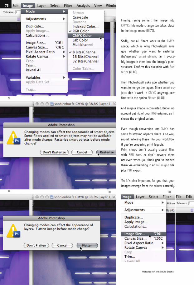
Finally, really convert the image into
CMYK; this mode change too takes place
in the Image menu (ill.79).
Sadly, not all filters work in the CMYK
space, which is why Photoshop® asks
you whether you want to rasterize
the"useless“ smart objects, i.e. irrevoca-
bly integrate them into the image’s pixel
structure. Confirm this question with Ras-
terize (ill.80).
Then Photoshop® asks you whether you
want to merge the layers. Since smart ob-
jects don´t work in CMYK anyway, con-
firm with the option Flatten (ill.81).
And so your image is converted. But on no
account get rid of your RGB original, as it
shows the original colors.
Even though conversion into CMYK has
some frustrating aspects, there´s no way
round factoring these into your workflow
if you´re preparing print layouts.
Print shops don´t usually accept files
with RGB data, or don´t rework them,
not even when you think you´ve hidden
them via embedding in an InDesign® file
plus PDF export.
Yet it´s also important for you that your
images emerge from the printer correctly.
79
8081 82
Photoshop ® in Architectural Graphics
76
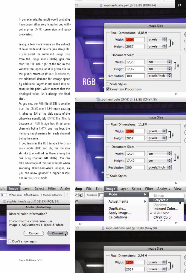
In our example, the result would probably
have been rather surprising for you with-
out a prior CMYK conversion and post-
processing.
Lastly, a few more words on the subject
of color mode and file size (see also p.68):
if you select the command Image Size
from the Image menu (ill.82), you can
read the file size right at the top in the
window that opens, as it is given due to
the pixels structure (Pixels Dimensions;
the additional demand for storage space
by additional layers is not taken into ac-
count at this point, which means that the
displayed value isn´t always the final
size).
As you see, the RGB file (ill.83) is smaller
than the CMYK one (ill.84; more exactly,
it takes up 3/4 of the disk space of the
otherwise equally big CMYK file. This is
because an RGB image has three color
channels but a CMYK one has four, the
memory requirements for each channel
being the same.
If you transfer the RGB image into Gray-
scale mode (ill.85 and 86), the file size
shrinks to one-third, as there´s only the
one Gray channel left (ill.87). You can
take advantage of this, for example when
scanning Black-and-White images, as
you can allow yourself a higher resolu-
tion in Grayscale mode.
86 84
83
8587
Chapter 03 · RGB and CMYK
77
RGB
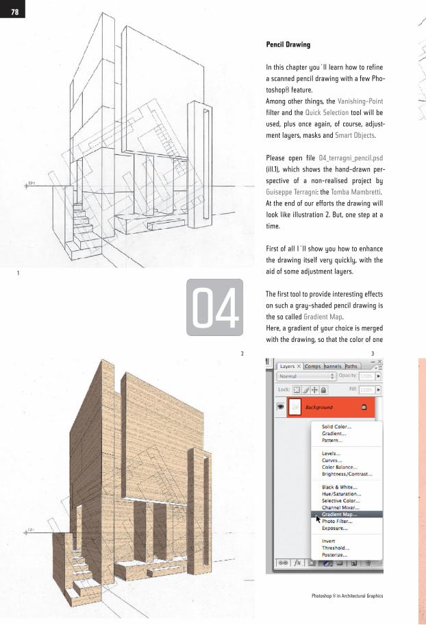
Pencil Drawing
In this chapter you´ll learn how to refine
a scanned pencil drawing with a few Pho-
toshop® feature.
Among other things, the Vanishing-Point
filter and the Quick Selection tool will be
used, plus once again, of course, adjust-
ment layers, masks and Smart Objects.
Please open file 04_terragni_pencil.psd
(ill.1), which shows the hand-drawn per-
spective of a non-realised project by
Guiseppe Terragni: the Tomba Mambretti.
At the end of our efforts the drawing will
look like illustration 2. But, one step at a
time.
First of all I´ll show you how to enhance
the drawing itself very quickly, with the
aid of some adjustment layers.
The first tool to provide interesting effects
on such a gray-shaded pencil drawing is
the so called Gradient Map.
Here, a gradient of your choice is merged
with the drawing, so that the color of one
1
2 3
Photoshop ® in Architectural Graphics
78
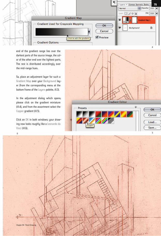
end of the gradient range lies over the
darkest parts of the source image, the col-
or of the other end over the lightest parts.
The rest is distributed accordingly over
the mid-range hues.
So, place an adjustment layer for such a
Gradient Map over your Background lay-
er (from the corresponding menu at the
bottom frame of the Layers palette, ill.3).
In the adjustment dialog which opens,
please click on the gradient miniature
(ill.4), and from the assortment select the
Copper gradient (ill.5).
Click on OK in both windows; your draw-
ing now looks roughly like a Leonardo da
Vinci (ill.6).
6 5
4
Chapter 04 · Pencil Drawing
79
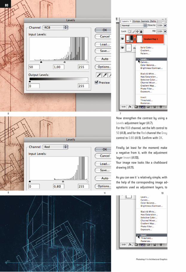
Now strengthen the contrast by using a
Levels adjustment layer (ill.7).
For the RGB channel, set the left control to
50 (ill.8), and for the Red channel the Gray
control to 0.80 (ill.9). Confirm with OK.
Finally (at least for the moment) make
a negative from it, with the adjustment
layer Invert (ill.10).
Your image now looks like a chalkboard
drawing (ill.11).
As you can see it´s relatively simple, with
the help of the corresponding image ad-
aptations used as adjustment layers, to
8 7
9 11 10
Photoshop ® in Architectural Graphics
80
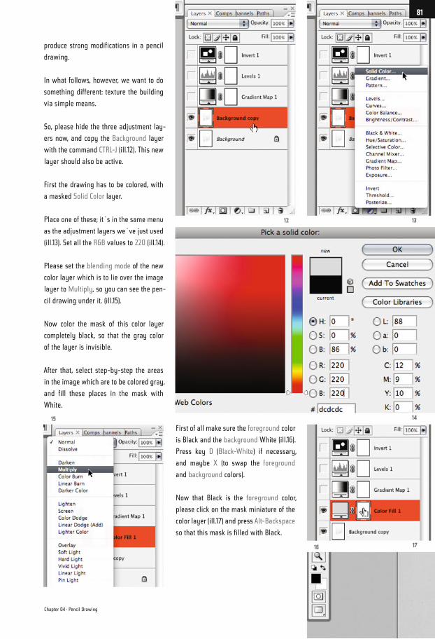
produce strong modifications in a pencil
drawing.
In what follows, however, we want to do
something different: texture the building
via simple means.
So, please hide the three adjustment lay-
ers now, and copy the Background layer
with the command CTRL-J (ill.12). This new
layer should also be active.
First the drawing has to be colored, with
a masked Solid Color layer.
Place one of these; it´s in the same menu
as the adjustment layers we´ve just used
(ill.13). Set all the RGB values to 220 (ill.14).
Please set the blending mode of the new
color layer which is to lie over the image
layer to Multiply, so you can see the pen-
cil drawing under it. (ill.15).
Now color the mask of this color layer
completely black, so that the gray color
of the layer is invisible.
After that, select step-by-step the areas
in the image which are to be colored gray,
and fill these places in the mask with
White.
First of all make sure the foreground color
is Black and the background White (ill.16).
Press key D (Black-White) if necessary,
and maybe X (to swap the foreground
and background colors).
Now that Black is the foreground color,
please click on the mask miniature of the
color layer (ill.17) and press Alt-Backspace
so that this mask is filled with Black.
13
1415
12
1716
Chapter 04 · Pencil Drawing
81
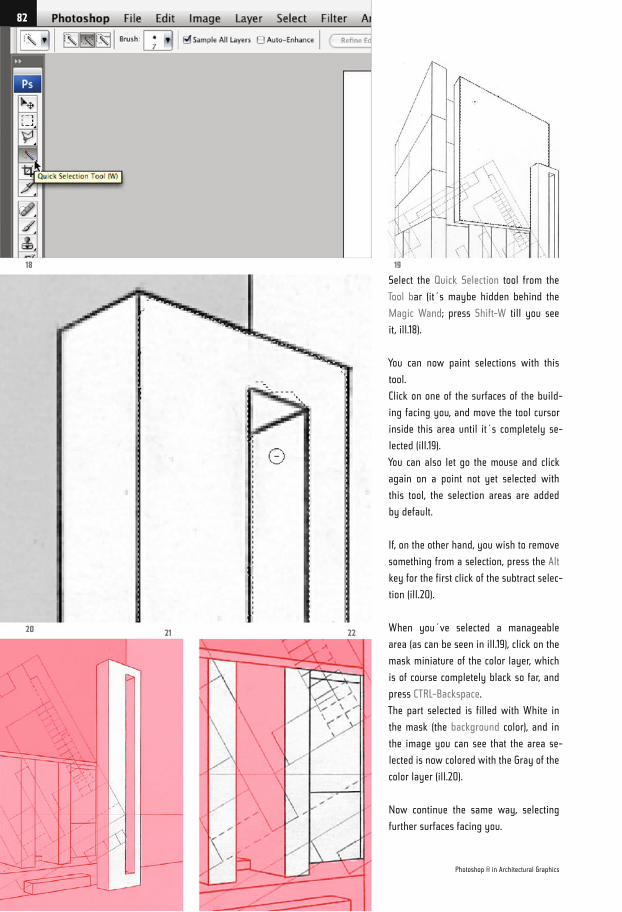
Select the Quick Selection tool from the
Tool bar (it´s maybe hidden behind the
Magic Wand; press Shift-W till you see
it, ill.18).
You can now paint selections with this
tool.
Click on one of the surfaces of the build-
ing facing you, and move the tool cursor
inside this area until it´s completely se-
lected (ill.19).
You can also let go the mouse and click
again on a point not yet selected with
this tool, the selection areas are added
by default.
If, on the other hand, you wish to remove
something from a selection, press the Alt
key for the first click of the subtract selec-
tion (ill.20).
When you´ve selected a manageable
area (as can be seen in ill.19), click on the
mask miniature of the color layer, which
is of course completely black so far, and
press CTRL-Backspace.
The part selected is filled with White in
the mask (the background color), and in
the image you can see that the area se-
lected is now colored with the Gray of the
color layer (ill.20).
Now continue the same way, selecting
further surfaces facing you.
18 19
20 2221
Photoshop ® in Architectural Graphics
82
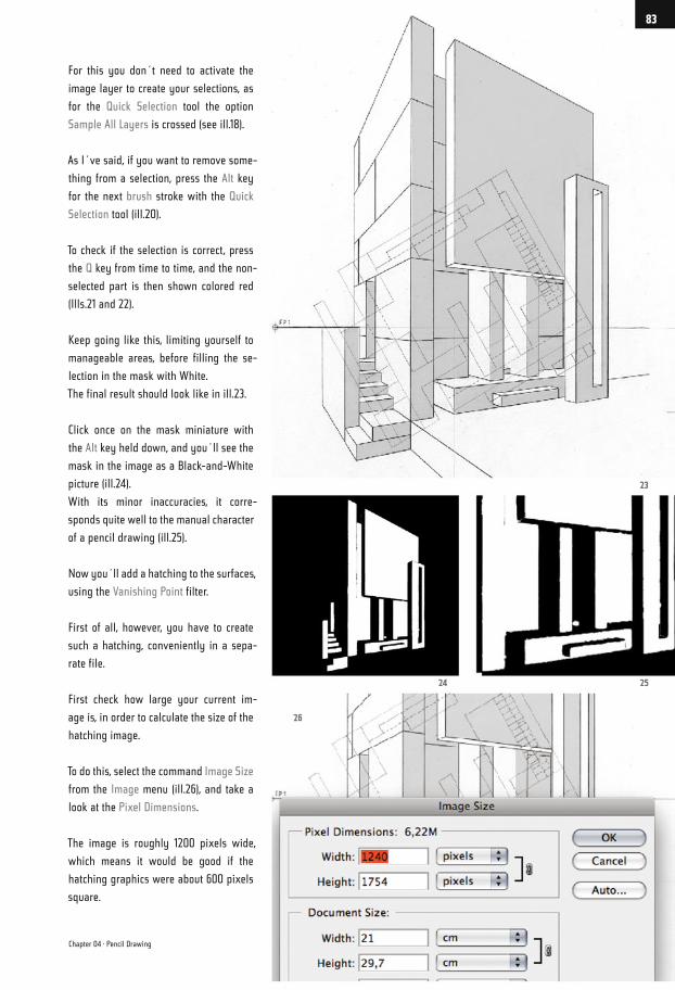
For this you don´t need to activate the
image layer to create your selections, as
for the Quick Selection tool the option
Sample All Layers is crossed (see ill.18).
As I´ve said, if you want to remove some-
thing from a selection, press the Alt key
for the next brush stroke with the Quick
Selection tool (ill.20).
To check if the selection is correct, press
the Q key from time to time, and the non-
selected part is then shown colored red
(Ills.21 and 22).
Keep going like this, limiting yourself to
manageable areas, before filling the se-
lection in the mask with White.
The final result should look like in ill.23.
Click once on the mask miniature with
the Alt key held down, and you´ll see the
mask in the image as a Black-and-White
picture (ill.24).
With its minor inaccuracies, it corre-
sponds quite well to the manual character
of a pencil drawing (ill.25).
Now you´ll add a hatching to the surfaces,
using the Vanishing Point filter.
First of all, however, you have to create
such a hatching, conveniently in a sepa-
rate file.
First check how large your current im-
age is, in order to calculate the size of the
hatching image.
To do this, select the command Image Size
from the Image menu (ill.26), and take a
look at the Pixel Dimensions.
The image is roughly 1200 pixels wide,
which means it would be good if the
hatching graphics were about 600 pixels
square.
2524
26
23
Chapter 04 · Pencil Drawing
83
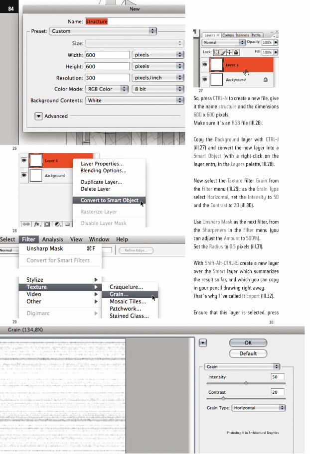
So, press CTRL-N to create a new file, give
it the name structure and the dimensions
600 x 600 pixels.
Make sure it´s an RGB file (ill.26).
Copy the Background layer with CTRL-J
(ill.27) and convert the new layer into a
Smart Object (with a right-click on the
layer entry in the Layers palette, ill.28).
Now select the Texture filter Grain from
the Filter menu (ill.29); as the Grain Type
select Horizontal, set the Intensity to 50
and the Contrast to 20 (ill.30).
Use Unsharp Mask as the next filter, from
the Sharpeners in the Filter menu (you
can adjust the Amount to 500%).
Set the Radius to 0.5 pixels (ill.31).
With Shift-Alt-CTRL-E, create a new layer
over the Smart layer which summarizes
the result so far, and which you can copy
in your pencil drawing right away.
That´s why I´ve called it Export (ill.32).
Ensure that this layer is selected, press
26
28
29 30
27
Photoshop ® in Architectural Graphics
84
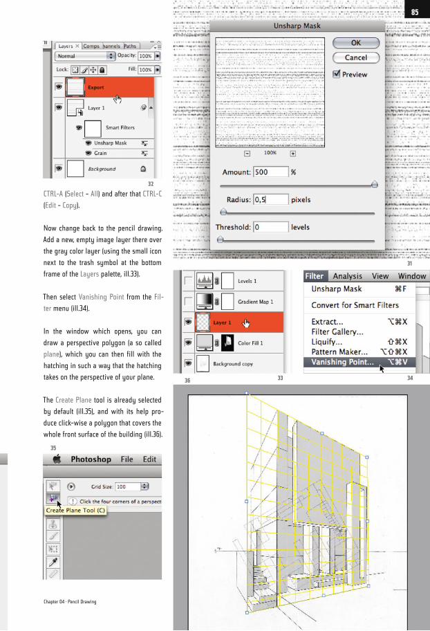
CTRL-A (Select - All) and after that CTRL-C
(Edit - Copy).
Now change back to the pencil drawing.
Add a new, empty image layer there over
the gray color layer (using the small icon
next to the trash symbol at the bottom
frame of the Layers palette, ill.33).
Then select Vanishing Point from the Fil-
ter menu (ill.34).
In the window which opens, you can
draw a perspective polygon (a so called
plane), which you can then fill with the
hatching in such a way that the hatching
takes on the perspective of your plane.
The Create Plane tool is already selected
by default (ill.35), and with its help pro-
duce click-wise a polygon that covers the
whole front surface of the building (ill.36).
3433
32
36
35
31
Chapter 04 · Pencil Drawing
85
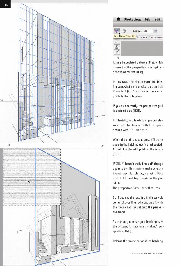
It may be depicted yellow at first, which
means that the perspective is not yet rec-
ognized as correct (ill.36).
In this case, and also to make the draw-
ing somewhat more precise, pick the Edit
Plane tool (ill.37) and move the corner
points to the right place.
If you do it correctly, the perspective grid
is depicted blue (ill.38).
Incidentally, in this window you can also
zoom into the drawing with CTRL-Space
and out with CTRL-Alt-Space.
When the grid is ready, press CTRL-V to
paste in the hatching you´ve just copied.
At first it´s placed top left in the image
(ill.39).
If CTRL-V doesn´t work, break off, change
again to the file structure, make sure the
Export layer is selected, repeat CTRL-A
and CTRL-C, and try it again in the pen-
cil file.
The perspective frame can still be seen.
So, if you see the hatching in the top-left
corner of your filter window, grab it with
the mouse and drag it onto the perspec-
tive frame.
As soon as you move your hatching over
the polygon, it snaps into the plane’s per-
spective (ill.40).
Release the mouse button if the hatching
37
38 39
Photoshop ® in Architectural Graphics
86
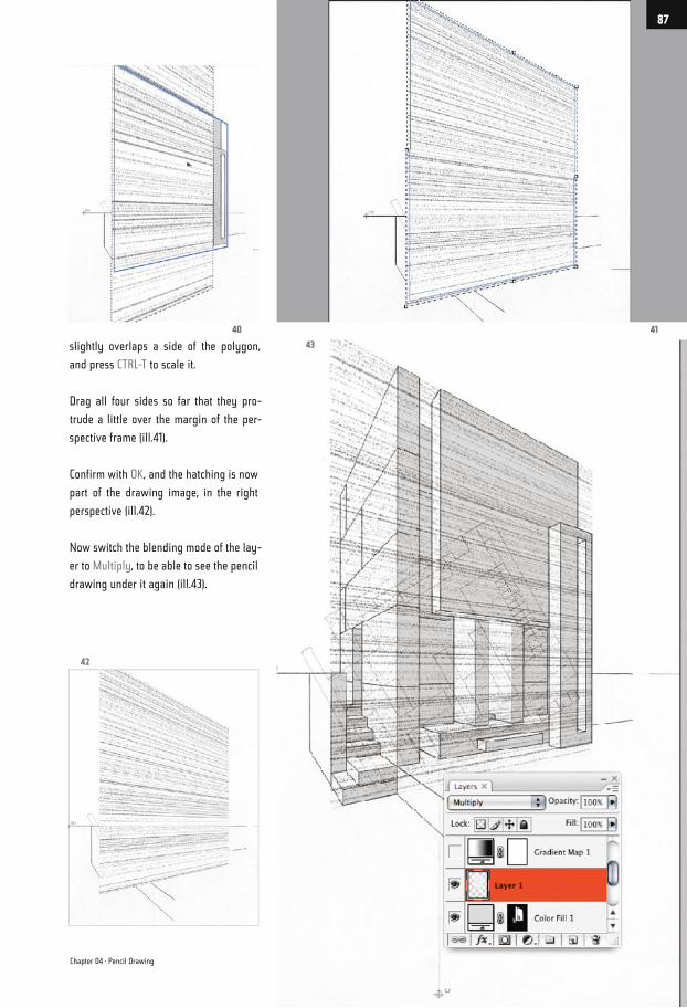
slightly overlaps a side of the polygon,
and press CTRL-T to scale it.
Drag all four sides so far that they pro-
trude a little over the margin of the per-
spective frame (ill.41).
Confirm with OK, and the hatching is now
part of the drawing image, in the right
perspective (ill.42).
Now switch the blending mode of the lay-
er to Multiply, to be able to see the pencil
drawing under it again (ill.43).
4140
42
43
Chapter 04 · Pencil Drawing
87
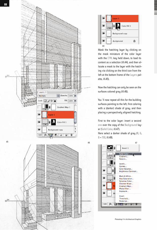
Mask the hatching layer by clicking on
the mask miniature of the color layer
with the CTRL key held down, to load its
content as a selection (ill.44), and then al-
locate a mask to the layer with the hatch-
ing via clicking on the third icon from the
left at the bottom frame of the Layers pal-
ette, ill.45).
Now the hatching can only be seen on the
surfaces colored gray (ill.46).
You´ll now repeat all this for the building
surfaces pointing to the left, first coloring
with a (darker) shade of gray, and then
placing a perspectively aligned hatching.
First to the color layer: insert a second
one over the copy of the Background lay-
er (Solid Color, ill.47).
Here select a darker shade of gray (R, G,
B = 150‚ ill.48).
45
44
4746
Photoshop ® in Architectural Graphics
88
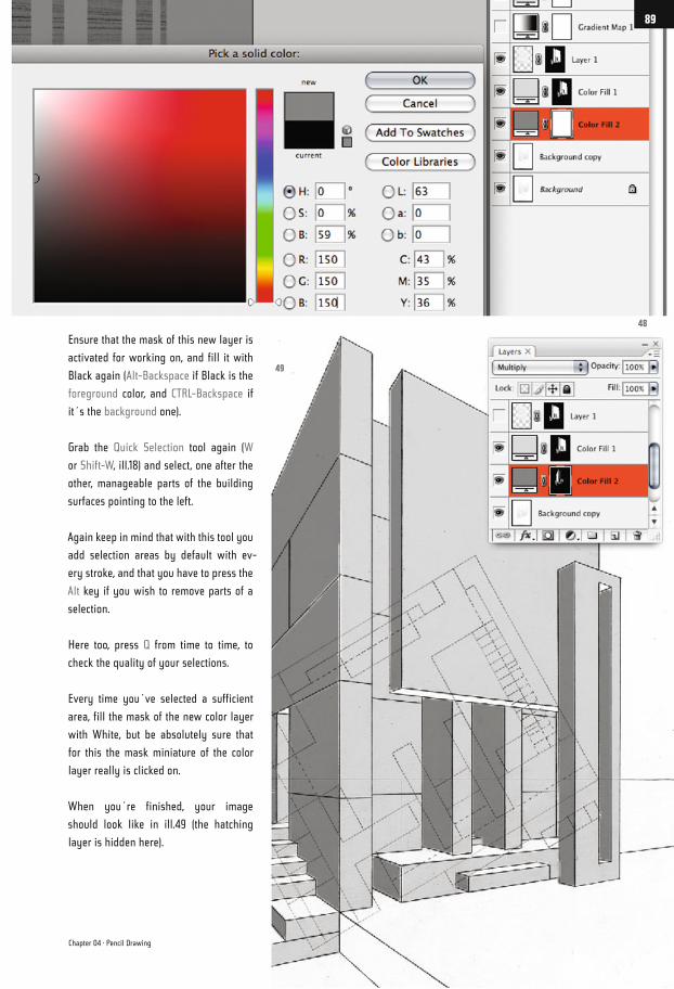
Ensure that the mask of this new layer is
activated for working on, and fill it with
Black again (Alt-Backspace if Black is the
foreground color, and CTRL-Backspace if
it´s the background one).
Grab the Quick Selection tool again (W
or Shift-W, ill.18) and select, one after the
other, manageable parts of the building
surfaces pointing to the left.
Again keep in mind that with this tool you
add selection areas by default with ev-
ery stroke, and that you have to press the
Alt key if you wish to remove parts of a
selection.
Here too, press Q from time to time, to
check the quality of your selections.
Every time you´ve selected a sufficient
area, fill the mask of the new color layer
with White, but be absolutely sure that
for this the mask miniature of the color
layer really is clicked on.
When you´re finished, your image
should look like in ill.49 (the hatching
layer is hidden here).
48
49
Chapter 04 · Pencil Drawing
89
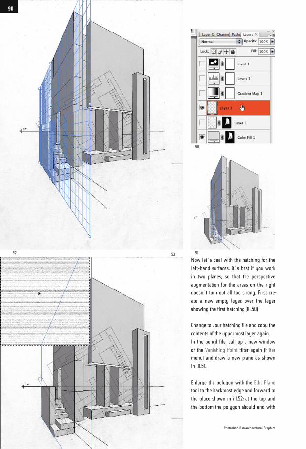
Now let´s deal with the hatching for the
left-hand surfaces; it´s best if you work
in two planes, so that the perspective
augmentation for the areas on the right
doesn´t turn out all too strong. First cre-
ate a new empty layer, over the layer
showing the first hatching (ill.50)
Change to your hatching file and copy the
contents of the uppermost layer again.
In the pencil file, call up a new window
of the Vanishing Point filter again (Filter
menu) and draw a new plane as shown
in ill.51.
Enlarge the polygon with the Edit Plane
tool to the backmost edge and forward to
the place shown in ill.52; at the top and
the bottom the polygon should end with
52 51
50
53
Photoshop ® in Architectural Graphics
90
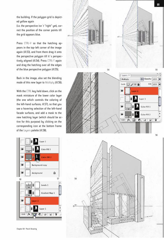
the building. If the polygon grid is depict-
ed yellow again
(i.e. the perspective isn´t “right“ yet), cor-
rect the position of the corner points till
the grid appears blue.
Press CTRL-V so that the hatching ap-
pears in the top-left corner of the image
again (ill.53), and from there drag it onto
the perspective polygon till it´s perspec-
tively aligned (ill.54). Press CTRL-T again
and drag the hatching over all the edges
of the blue perspective polygon (ill.55).
Back in the image, also set the blending
mode of this new layer to Multiply (ill.56).
With the CTRL key held down, click on the
mask miniature of the lower color layer
(the one which controls the coloring of
the left-hand surfaces, ill.57), so that you
see a hovering selection of the left-hand
facade surfaces, and add a mask to the
new hatching layer (which should be ac-
tive for this purpose) by clicking on the
corresponding icon at the bottom frame
of the Layers palette (ill.58).
5554
56
595758
Chapter 04 · Pencil Drawing
91
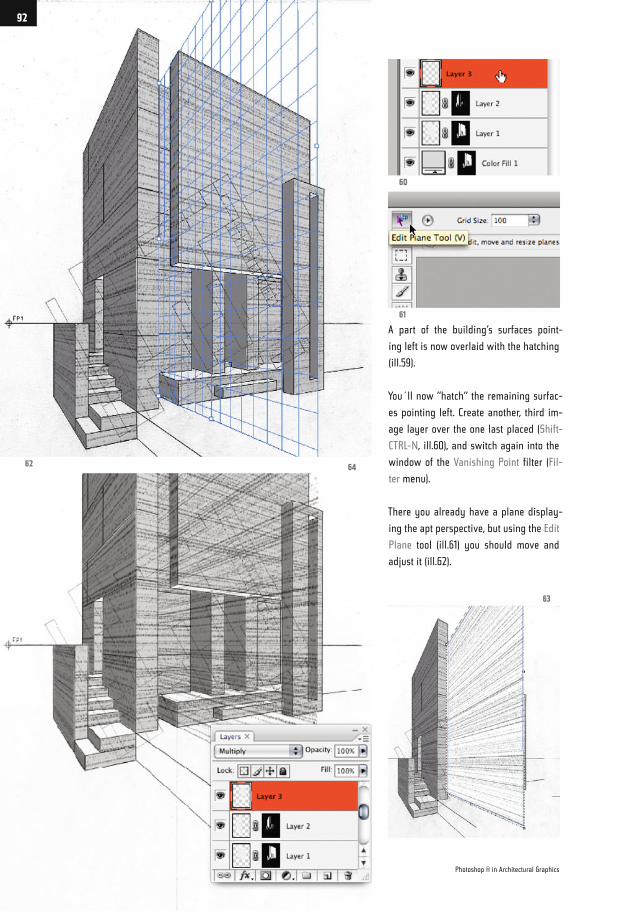
A part of the building‘s surfaces point-
ing left is now overlaid with the hatching
(ill.59).
You´ll now “hatch“ the remaining surfac-
es pointing left. Create another, third im-
age layer over the one last placed (Shift-
CTRL-N, ill.60), and switch again into the
window of the Vanishing Point filter (Fil-
ter menu).
There you already have a plane display-
ing the apt perspective, but using the Edit
Plane tool (ill.61) you should move and
adjust it (ill.62).
62 64
60
61
63
Photoshop ® in Architectural Graphics
92
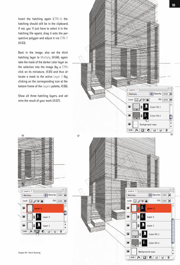
Insert the hatching again (CTRL-V; the
hatching should still be in the clipboard,
if not, you´ll just have to select it in the
hatching file again), drag it onto the per-
spective polygon and adjust it via CTRL-T
(ill.63).
Back in the image, also set the third
hatching layer to Multiply (ill.64), again
take the mask of the darker color layer as
the selection into the image (by a CTRL-
click on its miniature, ill.65) and thus al-
locate a mask to the active Layer 3 (by
clicking on the corresponding icon at the
bottom frame of the Layers palette, ill.66).
Show all three hatching layers, and ad-
mire the result of your work (ill.67).
656766
Chapter 04 · Pencil Drawing
93
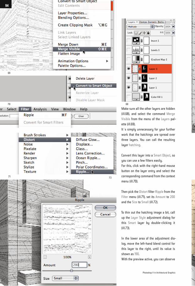
Make sure all the other layers are hidden
(ill.68), and select the command Merge
Visible from the menu of the Layers pal-
ette (ill.69).
It´s simply unnecessary for your further
work that the hatchings are spread over
three layers. You can call the resulting
layer hatching.
Convert this layer into a Smart Object, so
you can use a few filters easily.
For this, click with the right-hand mouse
button on the layer entry and select the
corresponding command from the context
menu (ill.70).
Then pick the Distort filter Ripple from the
Filter menu (ill.71), set its Amount to 200
and the Size to Small (ill.72).
To thin out the hatching image a bit, call
up the Layer Style adjustment dialog for
this Smart layer by double-clicking it
(ill.73).
In the lower area of the adjustment dia-
log, move the left-hand blend control for
this layer to the right, until its value is
shown as 190.
With the preview active, you can observe
69
70
71 72
68
Photoshop ® in Architectural Graphics
94
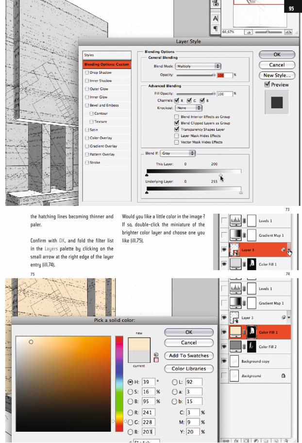
the hatching lines becoming thinner and
paler.
Confirm with OK, and fold the filter list
in the Layers palette by clicking on the
small arrow at the right edge of the layer
entry (ill.74).
Would you like a little color in the image ?
If so, double-click the miniature of the
brighter color layer and choose one you
like (ill.75).
73
7475
95
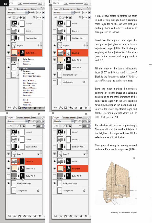
If you´d now prefer to control the color
in such a way that you have a common
color layer for all the surfaces that you
partially shade with a Levels adjustment,
then proceed as follows:
Insert over the brighter color layer (the
one you´ve just given a color) a Levels
adjustment layer (ill.76). Don´t change
anything at the adjustments of the histo-
gram for the moment, and simply confirm
with OK.
Fill the mask of the Levels adjustment
layer (ill.77) with Black (Alt-Backspace if
Black is the foreground color, CTRL-Back-
space if Black is the background one).
Bring the mask marking the surfaces
pointing left into the image as a selection,
by clicking on the mask miniature of the
darker color layer with the CTRL key held
down (ill.78), click on the black mask min-
iature of the Levels adjustment layer, and
fill the selection area with White (Alt- or
CTRL-Backspace, ill.79).
The selection still hovers over your image.
Now also click on the mask miniature of
the brighter color layer, and here fill the
selection area with White too.
Now your drawing is evenly colored,
without differences in brightness (ill.80).
80
797876 77
Photoshop ® in Architectural Graphics
96
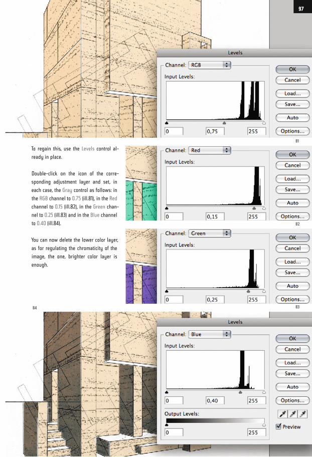
To regain this, use the Levels control al-
ready in place.
Double-click on the icon of the corre-
sponding adjustment layer and set, in
each case, the Gray control as follows: in
the RGB channel to 0.75 (ill.81), in the Red
channel to 0.15 (ill.82), in the Green chan-
nel to 0.25 (ill.83) and in the Blue channel
to 0.40 (ill.84).
You can now delete the lower color layer,
as for regulating the chromaticity of the
image, the one, brighter color layer is
enough.
81
82
8384
97
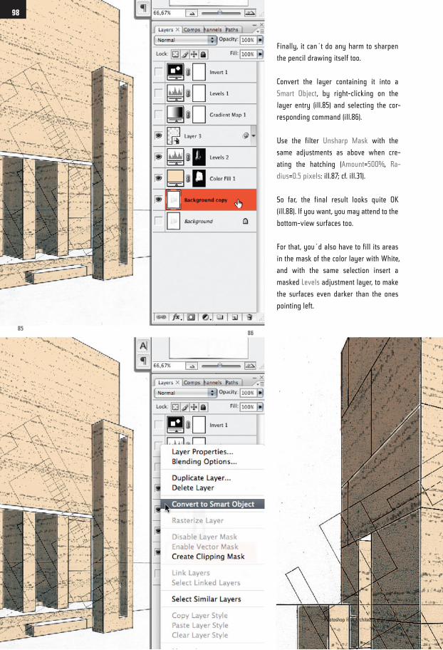
Finally, it can´t do any harm to sharpen
the pencil drawing itself too.
Convert the layer containing it into a
Smart Object, by right-clicking on the
layer entry (ill.85) and selecting the cor-
responding command (ill.86).
Use the filter Unsharp Mask with the
same adjustments as above when cre-
ating the hatching (Amount=500%, Ra-
dius=0.5 pixels: ill.87; cf. ill.31).
So far, the final result looks quite OK
(ill.88). If you want, you may attend to the
bottom-view surfaces too.
For that, you´d also have to fill its areas
in the mask of the color layer with White,
and with the same selection insert a
masked Levels adjustment layer, to make
the surfaces even darker than the ones
pointing left.
8586
Photoshop ® in Architectural Graphics
98
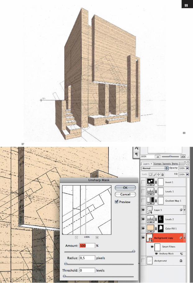
88
87
Chapter 04 · Pencil Drawing
99
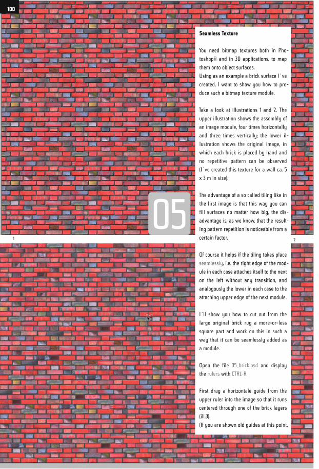
Seamless Texture
You need bitmap textures both in Pho-
toshop® and in 3D applications, to map
them onto object surfaces.
Using as an example a brick surface I´ve
created, I want to show you how to pro-
duce such a bitmap texture module.
Take a look at illustrations 1 and 2. The
upper illustration shows the assembly of
an image module, four times horizontally
and three times vertically; the lower il-
lustration shows the original image, in
which each brick is placed by hand and
no repetitive pattern can be observed
(I´ve created this texture for a wall ca. 5
x 3 m in size).
The advantage of a so called tiling like in
the first image is that this way you can
fill surfaces no matter how big, the dis-
advantage is, as we know, that the result-
ing pattern repetition is noticeable from a
certain factor.
Of course it helps if the tiling takes place
seamlessly, i.e. the right edge of the mod-
ule in each case attaches itself to the next
on the left without any transition, and
analogously the lower in each case to the
attaching upper edge of the next module.
I´ll show you how to cut out from the
large original brick rug a more-or-less
square part and work on this in such a
way that it can be seamlessly added as
a module.
Open the file 05_brick.psd and display
the rulers with CTRL-R.
First drag a horizontale guide from the
upper ruler into the image so that it runs
centered through one of the brick layers
(ill.3).
(If you are shown old guides at this point,
1 2
100
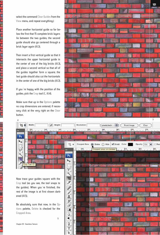
select the command Clear Guides from the
View menu, and repeat everything.)
Place another horizontal guide so far be-
low the first that 15 complete brick layers
lie between the two guides; the second
guide should also go centered through a
brick layer again (ill.3).
Then insert a first vertical guide so that it
intersects the upper horizontal guide in
the center of one of the big bricks (ill.3),
and place a second vertical so that all of
the guides together form a square; the
last guide should also cut the horizontals
in the center of one of the big bricks (ill.3).
If you´re happy with the position of the
guides, pick the Crop tool (C, ill.4).
Make sure that up in the Options palette
no crop dimensions are entered; if neces-
sary click at the very right on the Clear
button.
Now trace your guides square with the
Crop tool (as you see, the tool snaps to
the guides). When you´re finished, the
rest of the image is at first shown dark-
ened (ill.5).
Be absolutely sure that now, in the Op-
tions palette, Delete is checked for the
Cropped Area.
34
5
Chapter 05 · Seamless Texture
101
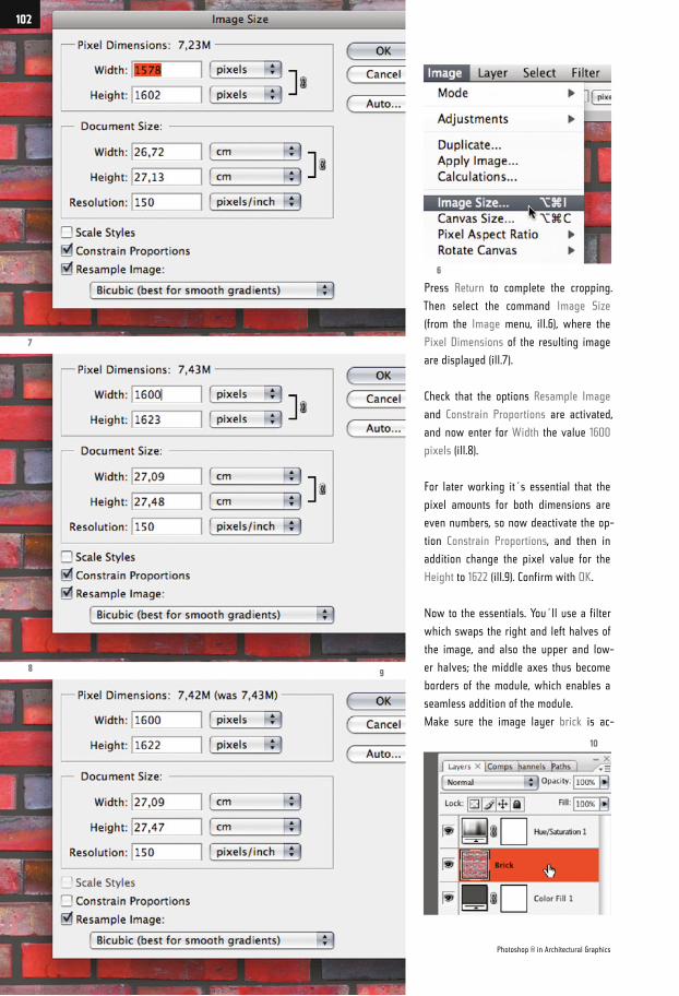
Press Return to complete the cropping.
Then select the command Image Size
(from the Image menu, ill.6), where the
Pixel Dimensions of the resulting image
are displayed (ill.7).
Check that the options Resample Image
and Constrain Proportions are activated,
and now enter for Width the value 1600
pixels (ill.8).
For later working it´s essential that the
pixel amounts for both dimensions are
even numbers, so now deactivate the op-
tion Constrain Proportions, and then in
addition change the pixel value for the
Height to 1622 (ill.9). Confirm with OK.
Now to the essentials. You´ll use a filter
which swaps the right and left halves of
the image, and also the upper and low-
er halves; the middle axes thus become
borders of the module, which enables a
seamless addition of the module.
Make sure the image layer brick is ac-
7
89
10
6
Photoshop ® in Architectural Graphics
102
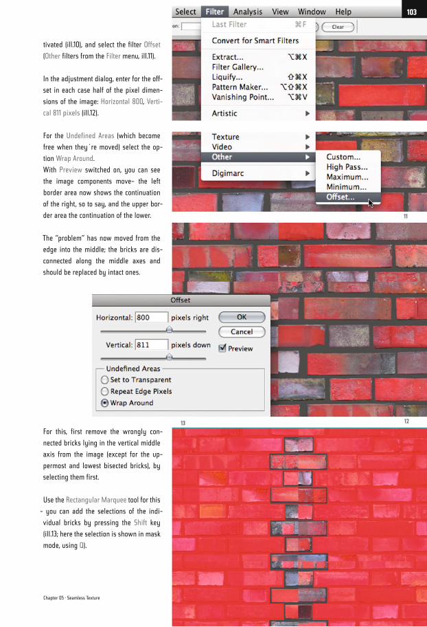
tivated (ill.10), and select the filter Offset
(Other filters from the Filter menu, ill.11).
In the adjustment dialog, enter for the off-
set in each case half of the pixel dimen-
sions of the image: Horizontal 800, Verti-
cal 811 pixels (ill.12).
For the Undefined Areas (which become
free when they´re moved) select the op-
tion Wrap Around.
With Preview switched on, you can see
the image components move– the left
border area now shows the continuation
of the right, so to say, and the upper bor-
der area the continuation of the lower.
The “problem“ has now moved from the
edge into the middle; the bricks are dis-
connected along the middle axes and
should be replaced by intact ones.
For this, first remove the wrongly con-
nected bricks lying in the vertical middle
axis from the image (except for the up-
permost and lowest bisected bricks), by
selecting them first.
Use the Rectangular Marquee tool for this
- you can add the selections of the indi-
vidual bricks by pressing the Shift key
(ill.13; here the selection is shown in mask
mode, using Q).
13 12
11
Chapter 05 · Seamless Texture
103
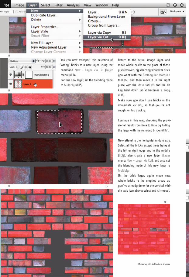
You can now transport this selection of
“wrong“ bricks to a new layer, using the
command New - Layer via Cut (Layer
menu) (ill.14).
For this new layer, set the blending mode
to Multiply (ill.15).
Return to the actual image layer, and
move whole bricks to the place of those
just removed, by selecting whatever brick
you want with the Rectangular Marquee
tool (M) and then move it to the right
place with the Move tool (V) and the Alt
key held down (so it becomes a copy,
ill.16).
Make sure you don´t use bricks in the
immediate vicinity, so that you´re not
caught on too quickly.
Continue in this way, checking the provi-
sional result from time to time by hiding
the layer with the removed bricks (ill.17).
Now attend to the horizontal middle axis.
Select all the bricks except those lying at
the left or right edge and in the middle
(ill.18), also create a new layer (Layer
menu: New - Layer via Cut), and also set
the blending mode of this new layer to
Multiply.
On the brick layer, again move new,
whole bricks to the emptied areas, as
you´ve already done for the vertical mid-
dle axis (see above: select and Alt-move).
14
15
16 17
18
Photoshop ® in Architectural Graphics
104
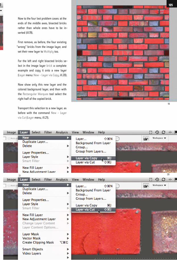
Now to the four last problem cases: at the
ends of the middle axes, bisected bricks
rather than whole ones have to be in-
serted (ill.19).
First remove, as before, the four existing
“wrong“ bricks from the image layer, and
set their new layer to Multiply too.
For the left and right bisected bricks se-
lect in the image layer brick a complete
example and copy it onto a new layer
(Layer menu: New – Layer via Copy, ill.20).
Now show only this new layer and the
colored background layer, and then with
the Rectangular Marquee tool select the
right half of the copied brick.
Transport this selection to a new layer, as
before with the command New - Layer
via Cut (Layer menu, ill.21).
19
2021
105
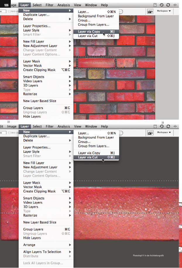
22 23
106
Photoshop® ® in der Architekturgrafik
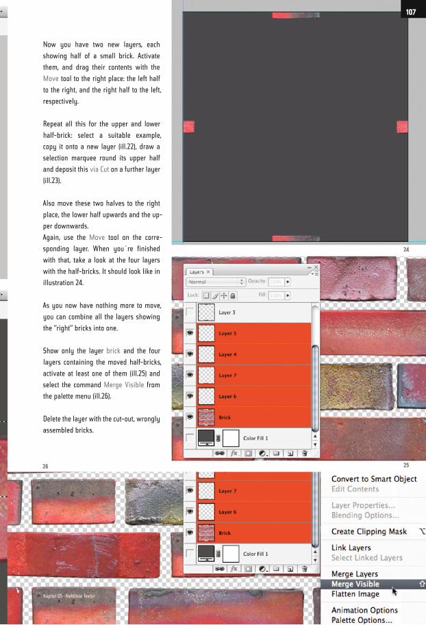
Now you have two new layers, each
showing half of a small brick. Activate
them, and drag their contents with the
Move tool to the right place: the left half
to the right, and the right half to the left,
respectively.
Repeat all this for the upper and lower
half-brick: select a suitable example,
copy it onto a new layer (ill.22), draw a
selection marquee round its upper half
and deposit this via Cut on a further layer
(ill.23).
Also move these two halves to the right
place, the lower half upwards and the up-
per downwards.
Again, use the Move tool on the corre-
sponding layer. When you´re finished
with that, take a look at the four layers
with the half-bricks. It should look like in
illustration 24.
As you now have nothing more to move,
you can combine all the layers showing
the “right“ bricks into one.
Show only the layer brick and the four
layers containing the moved half-bricks,
activate at least one of them (ill.25) and
select the command Merge Visible from
the palette menu (ill.26).
Delete the layer with the cut-out, wrongly
assembled bricks.
24
2526
107
Kapitel 05 · Nahtlose Textur
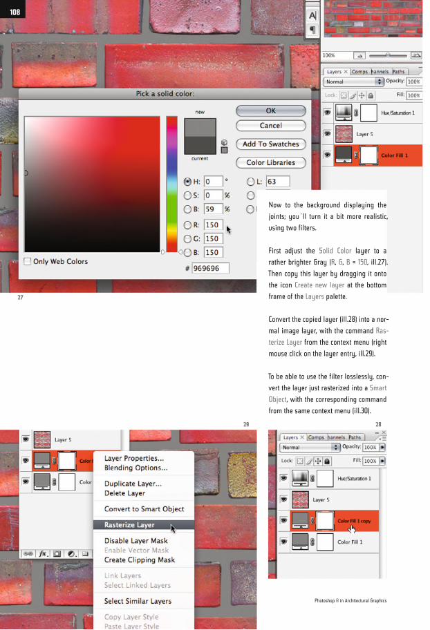
Now to the background displaying the
joints; you´ll turn it a bit more realistic,
using two filters.
First adjust the Solid Color layer to a
rather brighter Gray (R, G, B = 150, ill.27).
Then copy this layer by dragging it onto
the icon Create new layer at the bottom
frame of the Layers palette.
Convert the copied layer (ill.28) into a nor-
mal image layer, with the command Ras-
terize Layer from the context menu (right
mouse click on the layer entry, ill.29).
To be able to use the filter losslessly, con-
vert the layer just rasterized into a Smart
Object, with the corresponding command
from the same context menu (ill.30).
27
29 28
Photoshop ® in Architectural Graphics
108
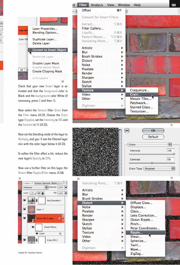
Check that your new Smart layer is ac-
tivated and that the foreground color is
Black and the background color White (if
necessary, press D and then X).
Now select the Texture filter Grain from
the Filter menu (ill.31). Choose the Grain
type Stippled, set the Intensity to 100 and
the Contrast to 50 (ill.32).
Now set the blending mode of the layer to
Multiply, and you´ll see the filtered layer
mix with the color layer below it (ill.33).
To soften the filter effect a bit, reduce the
new layer’s Opacity to 35%.
Now use a further filter on this layer, the
Distort filter Ripple (Filter menu, ill.34).
30
323433
31
Chapter 05 · Seamless Texture
109
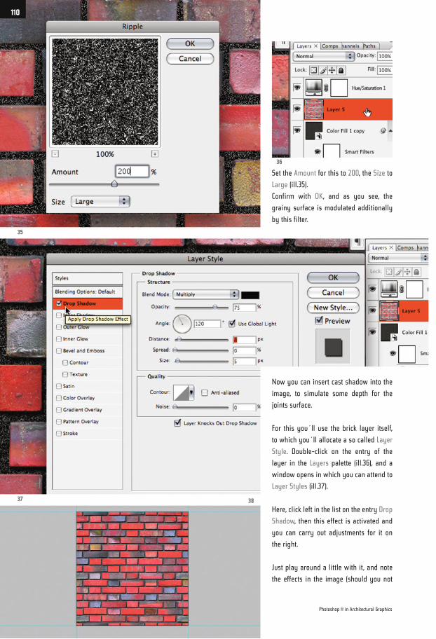
Now you can insert cast shadow into the
image, to simulate some depth for the
joints surface.
For this you´ll use the brick layer itself,
to which you´ll allocate a so called Layer
Style. Double-click on the entry of the
layer in the Layers palette (ill.36), and a
window opens in which you can attend to
Layer Styles (ill.37).
Here, click left in the list on the entry Drop
Shadow, then this effect is activated and
you can carry out adjustments for it on
the right.
Just play around a little with it, and note
the effects in the image (should you not
Set the Amount for this to 200, the Size to
Large (ill.35).
Confirm with OK, and as you see, the
grainy surface is modulated additionally
by this filter.
35
36
37 38
Photoshop ® in Architectural Graphics
110
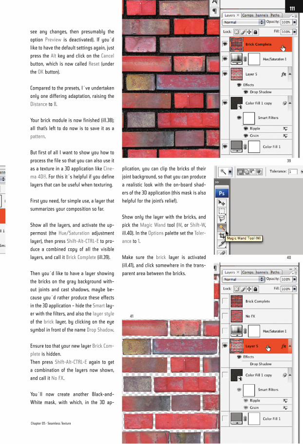
see any changes, then presumably the
option Preview is deactivated). If you´d
like to have the default settings again, just
press the Alt key and click on the Cancel
button, which is now called Reset (under
the OK button).
Compared to the presets, I´ve undertaken
only one differing adaptation, raising the
Distance to 8.
Your brick module is now finished (ill.38);
all that’s left to do now is to save it as a
pattern.
But first of all I want to show you how to
process the file so that you can also use it
as a texture in a 3D application like Cine-
ma 4D®. For this it´s helpful if you define
layers that can be useful when texturing.
First you need, for simple use, a layer that
summarizes your composition so far.
Show all the layers, and activate the up-
permost (the Hue/Saturation adjustment
layer), then press Shift-Alt-CTRL-E to pro-
duce a combined copy of all the visible
layers, and call it Brick Complete (ill.39).
Then you´d like to have a layer showing
the bricks on the gray background with-
out joints and cast shadows, maybe be-
cause you´d rather produce these effects
in the 3D application – hide the Smart lay-
er with the filters, and also the layer style
of the brick layer, by clicking on the eye
symbol in front of the name Drop Shadow.
Ensure too that your new layer Brick Com-
plete is hidden.
Then press Shift-Alt-CTRL-E again to get
a combination of the layers now shown,
and call it No FX.
You´ll now create another Black-and-
White mask, with which, in the 3D ap-
plication, you can clip the bricks of their
joint background, so that you can produce
a realistic look with the on-board shad-
ers of the 3D application (this mask is also
helpful for the joint’s relief).
Show only the layer with the bricks, and
pick the Magic Wand tool (W, or Shift-W,
ill.40). In the Options palette set the Toler-
ance to 1.
Make sure the brick layer is activated
(ill.41), and click somewhere in the trans-
parent area between the bricks.
39
40
41
Chapter 05 · Seamless Texture
111
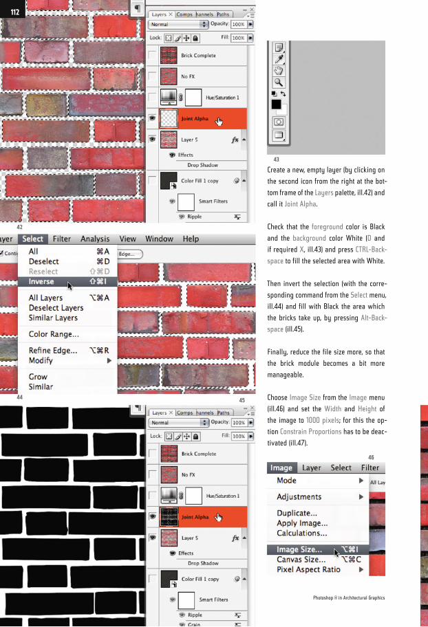
Create a new, empty layer (by clicking on
the second icon from the right at the bot-
tom frame of the Layers palette, ill.42) and
call it Joint Alpha.
Check that the foreground color is Black
and the background color White (D and
if required X, ill.43) and press CTRL-Back-
space to fill the selected area with White.
Then invert the selection (with the corre-
sponding command from the Select menu,
ill.44) and fill with Black the area which
the bricks take up, by pressing Alt-Back-
space (ill.45).
Finally, reduce the file size more, so that
the brick module becomes a bit more
manageable.
Choose Image Size from the Image menu
(ill.46) and set the Width and Height of
the image to 1000 pixels; for this the op-
tion Constrain Proportions has to be deac-
tivated (ill.47).
44
42
43
46
45
Photoshop ® in Architectural Graphics
112
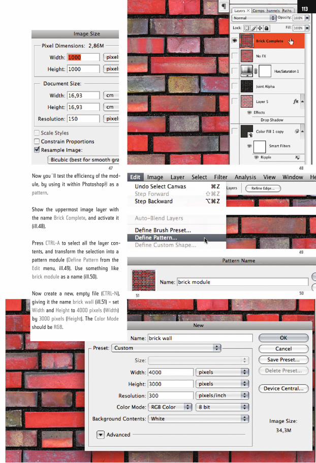
Now you´ll test the efficiency of the mod-
ule, by using it within Photoshop® as a
pattern.
Show the uppermost image layer with
the name Brick Complete, and activate it
(ill.48).
Press CTRL-A to select all the layer con-
tents, and transform the selection into a
pattern module (Define Pattern from the
Edit menu, ill.49). Use something like
brick module as a name (ill.50).
Now create a new, empty file (CTRL-N),
giving it the name brick wall (ill.51) – set
Width and Height to 4000 pixels (Width)
by 3000 pixels (Height). The Color Mode
should be RGB.
4847
49
5051
113
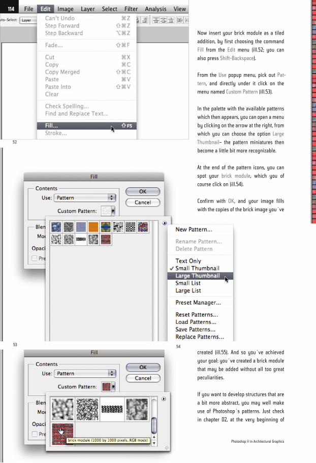
Now insert your brick module as a tiled
addition, by first choosing the command
Fill from the Edit menu (ill.52; you can
also press Shift-Backspace).
From the Use popup menu, pick out Pat-
tern, and directly under it click on the
menu named Custom Pattern (ill.53).
In the palette with the available patterns
which then appears, you can open a menu
by clicking on the arrow at the right, from
which you can choose the option Large
Thumbnail– the pattern miniatures then
become a little bit more recognizable.
At the end of the pattern icons, you can
spot your brick module, which you of
course click on (ill.54).
Confirm with OK, and your image fills
with the copies of the brick image you´ve
created (ill.55). And so you´ve achieved
your goal: you´ve created a brick module
that may be added without all too great
peculiarities.
If you want to develop structures that are
a bit more abstract, you may well make
use of Photoshop´s patterns. Just check
in chapter 02, at the very beginning of
52
53 54
Photoshop ® in Architectural Graphics
114
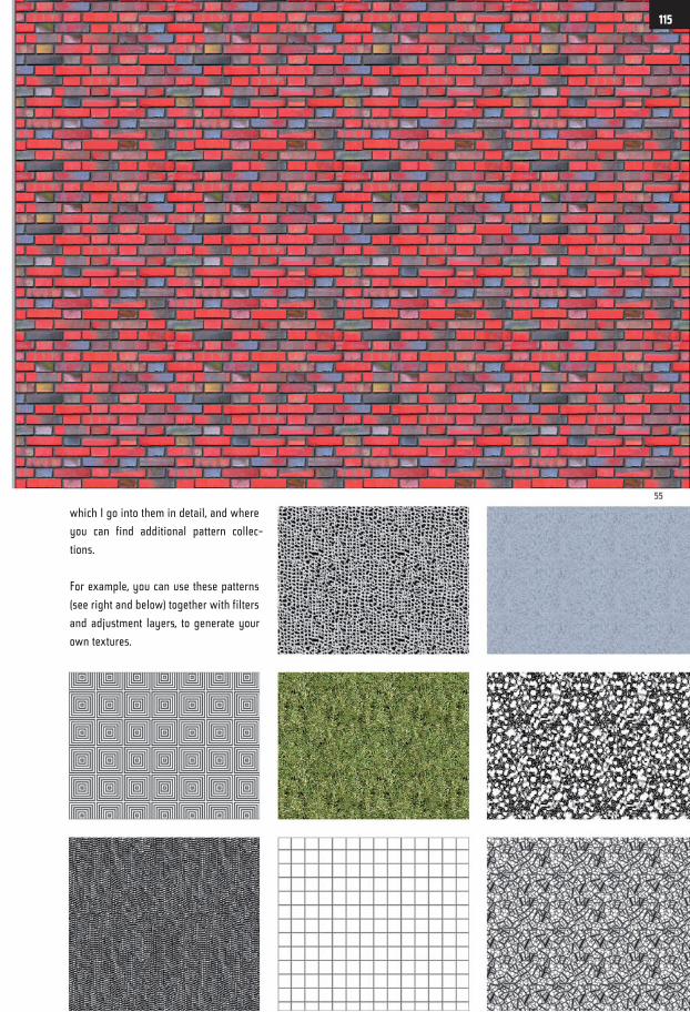
which I go into them in detail, and where
you can find additional pattern collec-
tions.
For example, you can use these patterns
(see right and below) together with filters
and adjustment layers, to generate your
own textures.
55
115
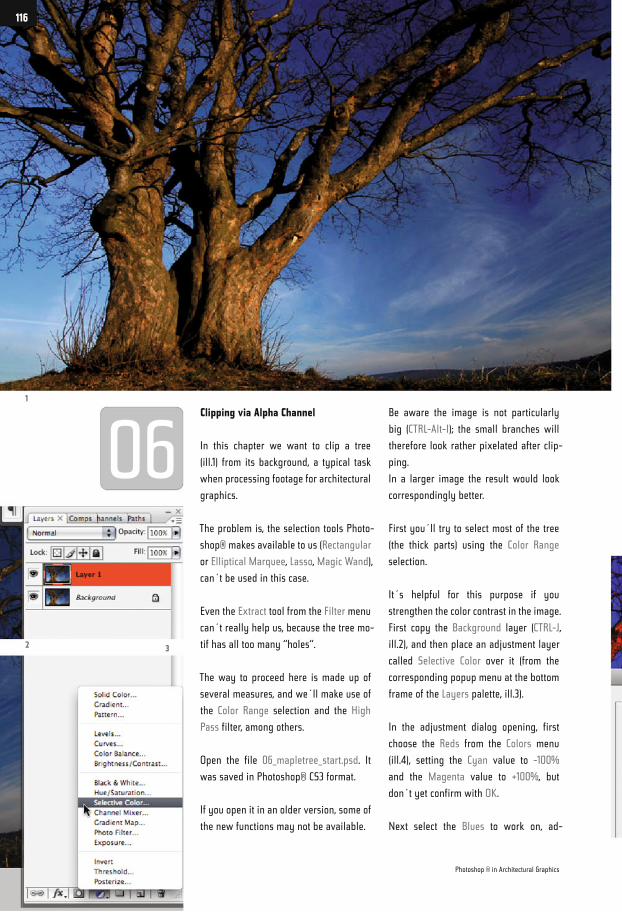
Clipping via Alpha Channel
In this chapter we want to clip a tree
(ill.1) from its background, a typical task
when processing footage for architectural
graphics.
The problem is, the selection tools Photo-
shop® makes available to us (Rectangular
or Elliptical Marquee, Lasso, Magic Wand),
can´t be used in this case.
Even the Extract tool from the Filter menu
can´t really help us, because the tree mo-
tif has all too many “holes“.
The way to proceed here is made up of
several measures, and we´ll make use of
the Color Range selection and the High
Pass filter, among others.
Open the file 06_mapletree_start.psd. It
was saved in Photoshop® CS3 format.
If you open it in an older version, some of
the new functions may not be available.
Be aware the image is not particularly
big (CTRL-Alt-I); the small branches will
therefore look rather pixelated after clip-
ping.
In a larger image the result would look
correspondingly better.
First you´ll try to select most of the tree
(the thick parts) using the Color Range
selection.
It´s helpful for this purpose if you
strengthen the color contrast in the image.
First copy the Background layer (CTRL-J,
ill.2), and then place an adjustment layer
called Selective Color over it (from the
corresponding popup menu at the bottom
frame of the Layers palette, ill.3).
In the adjustment dialog opening, first
choose the Reds from the Colors menu
(ill.4), setting the Cyan value to -100%
and the Magenta value to +100%, but
don´t yet confirm with OK.
Next select the Blues to work on, ad-
1
2 3
Photoshop ® in Architectural Graphics
116
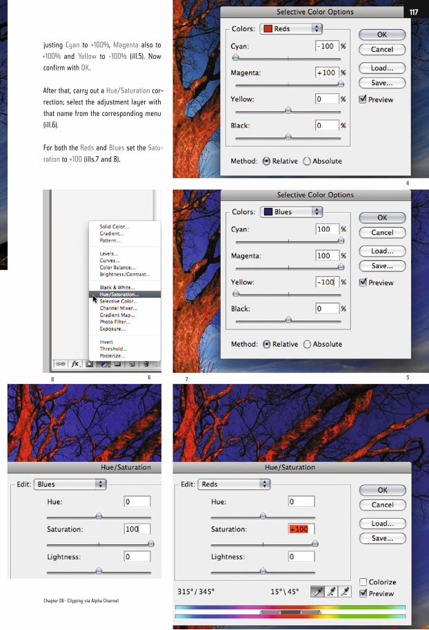
justing Cyan to +100%, Magenta also to
+100% and Yellow to -100% (ill.5). Now
confirm with OK.
After that, carry out a Hue/Saturation cor-
rection; select the adjustment layer with
that name from the corresponding menu
(ill.6).
For both the Reds and Blues set the Satu-
ration to +100 (ills.7 and 8).
4
568 7
Chapter 06 · Clipping via Alpha Channel
117
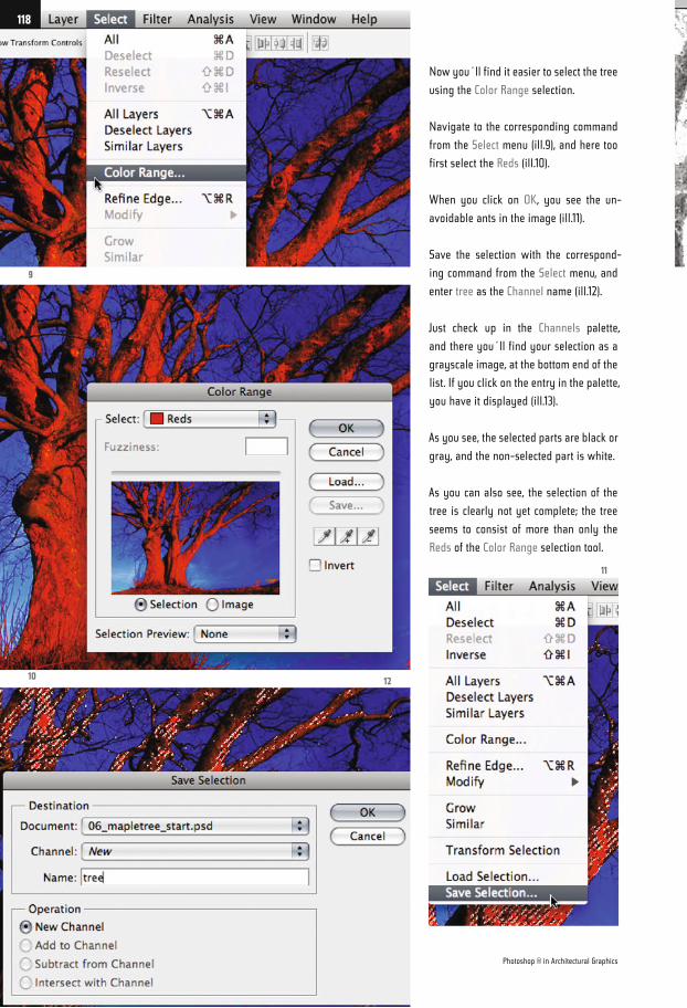
Now you´ll find it easier to select the tree
using the Color Range selection.
Navigate to the corresponding command
from the Select menu (ill.9), and here too
first select the Reds (ill.10).
When you click on OK, you see the un-
avoidable ants in the image (ill.11).
Save the selection with the correspond-
ing command from the Select menu, and
enter tree as the Channel name (ill.12).
Just check up in the Channels palette,
and there you´ll find your selection as a
grayscale image, at the bottom end of the
list. If you click on the entry in the palette,
you have it displayed (ill.13).
As you see, the selected parts are black or
gray, and the non-selected part is white.
As you can also see, the selection of the
tree is clearly not yet complete; the tree
seems to consist of more than only the
Reds of the Color Range selection tool.
9
1012
11
Photoshop ® in Architectural Graphics
118
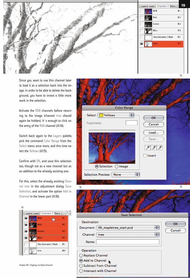
Since you want to use this channel later
to load it as a selection back into the im-
age, in order to be able to delete the back-
ground, you have to invest a little more
work in the selection.
Activate the RGB channels before return-
ing to the image (channel tree should
again be hidden). It´s enough to click on
the entry of the RGB channel (ill.14).
Switch back again to the Layers palette,
pick the command Color Range from the
Select menu once more, and this time se-
lect the Yellows (ill.15).
Confirm with OK, and save this selection
too, though not as a new channel but as
an addition to the already existing one.
For this, select the already existing Chan-
nel tree in the adjustment dialog Save
Selection, and activate the option Add to
Channel in the lower part (ill.16).
13
1516
14
Chapter 06 · Clipping via Alpha Channel
119
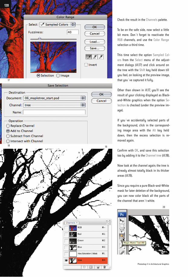
Check the result in the Channels palette.
To be on the safe side, now select a little
bit more. Don´t forget to reactivate the
RGB channels, and use the Color Range
selection a third time.
This time select the option Sampled Col-
ors from the Select menu of the adjust-
ment dialogs (ill.17) and click around on
the tree with the Shift key held down till
you feel, on looking at the preview image,
that you´ve captured it fully.
Other than shown in ill.17, you’ll see the
result of your clicking displayed as Black-
and-White graphics when the option Se-
lection is checked (under the preview im-
age).
If you´ve accidentally selected parts of
the background, click in the correspond-
ing image area with the Alt key held
down, then the excess selection is re-
moved again.
Confirm with OK, and save this selection
too by adding it to the Channel tree (ill.18).
Now look at the channel again; the tree is
already almost totally black in its thicker
areas (ill.19).
Since you require a pure Black-and-White
mask for later deletion of the background,
you can now color black all the parts of
the channel that aren´t white.
17
18 19
20
Photoshop ® in Architectural Graphics
120
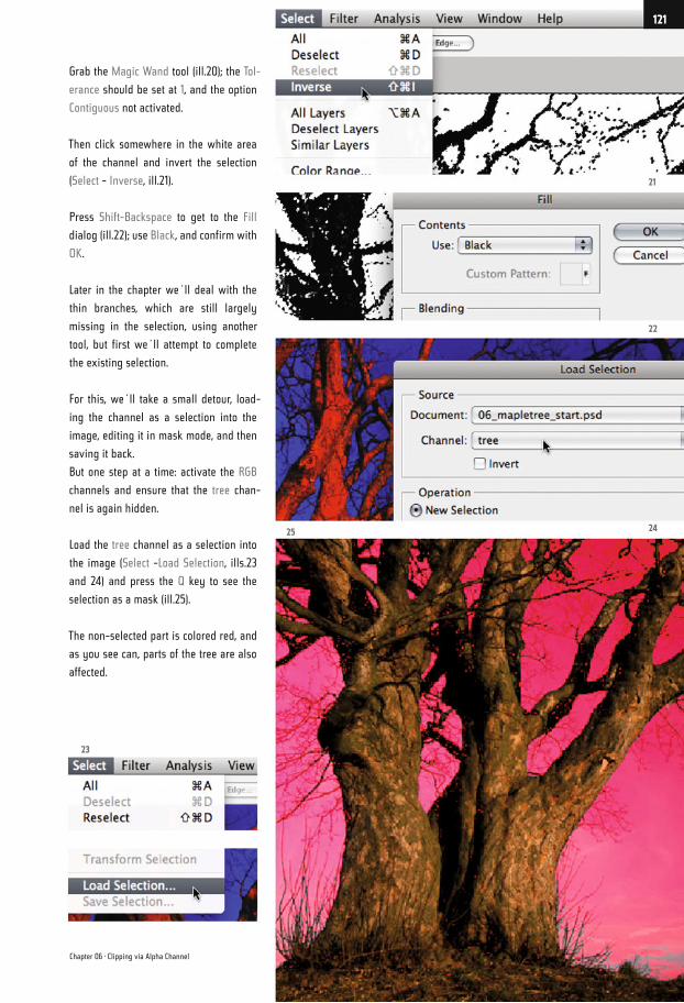
Grab the Magic Wand tool (ill.20); the Tol-
erance should be set at 1, and the option
Contiguous not activated.
Then click somewhere in the white area
of the channel and invert the selection
(Select - Inverse, ill.21).
Press Shift-Backspace to get to the Fill
dialog (ill.22); use Black, and confirm with
OK.
Later in the chapter we´ll deal with the
thin branches, which are still largely
missing in the selection, using another
tool, but first we´ll attempt to complete
the existing selection.
For this, we´ll take a small detour, load-
ing the channel as a selection into the
image, editing it in mask mode, and then
saving it back.
But one step at a time: activate the RGB
channels and ensure that the tree chan-
nel is again hidden.
Load the tree channel as a selection into
the image (Select -Load Selection, ills.23
and 24) and press the Q key to see the
selection as a mask (ill.25).
The non-selected part is colored red, and
as you see can, parts of the tree are also
affected.
21
22
2425
23
Chapter 06 · Clipping via Alpha Channel
121
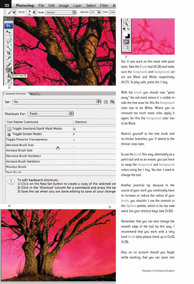
You´ll now work on this mask with paint
tools. Take the Brush tool (ill.26) and make
sure the foreground and background col-
ors are Black and White respectively
(ill.27). To play safe, press the D key.
With the brush you should now “paint
away“ the red mask where it´s visible in-
side the tree area; for this the foreground
color has to be White. Where you´ve
removed too much mask color, apply it
again; for this the foreground color has
to be Black.
Restrict yourself to the tree trunk and
its thicker branches; you´ll attend to the
thinner ones later.
To use the brush this way, alternately as a
paint tool and as an eraser, you just have
to swap the foreground and background
colors using the X key. You don´t need to
change the tool.
Another practical tip: because in the
course of your work you continually have
to increase or reduce the radius of your
brush, you shouldn´t use the controls in
the Options palette, which is far too awk-
ward, but your shortcut keys (see Ch.02).
Remember that you can also change the
smooth edge of the tool tip this way. I
recommend that you work with a very
hard brush (also please check up in Ch.02,
ill.28).
Also, on no account should you forget
while working, that you can zoom into
26
27
28 29
Photoshop ® in Architectural Graphics
122
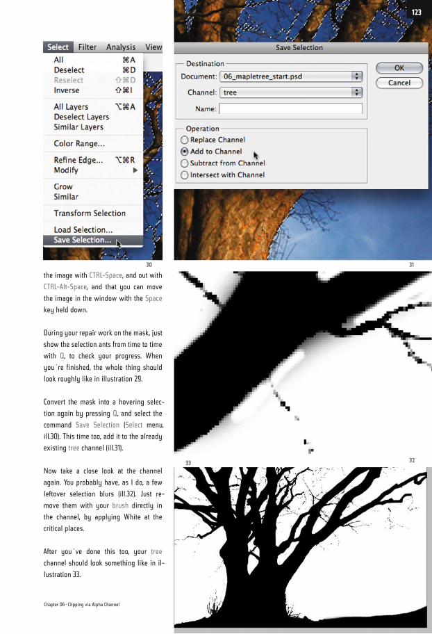
the image with CTRL-Space, and out with
CTRL-Alt-Space, and that you can move
the image in the window with the Space
key held down.
During your repair work on the mask, just
show the selection ants from time to time
with Q, to check your progress. When
you´re finished, the whole thing should
look roughly like in illustration 29.
Convert the mask into a hovering selec-
tion again by pressing Q, and select the
command Save Selection (Select menu,
ill.30). This time too, add it to the already
existing tree channel (ill.31).
Now take a close look at the channel
again. You probably have, as I do, a few
leftover selection blurs (ill.32). Just re-
move them with your brush directly in
the channel, by applying White at the
critical places.
After you´ve done this too, your tree
channel should look something like in il-
lustration 33.
3130
3233
Chapter 06 · Clipping via Alpha Channel
123
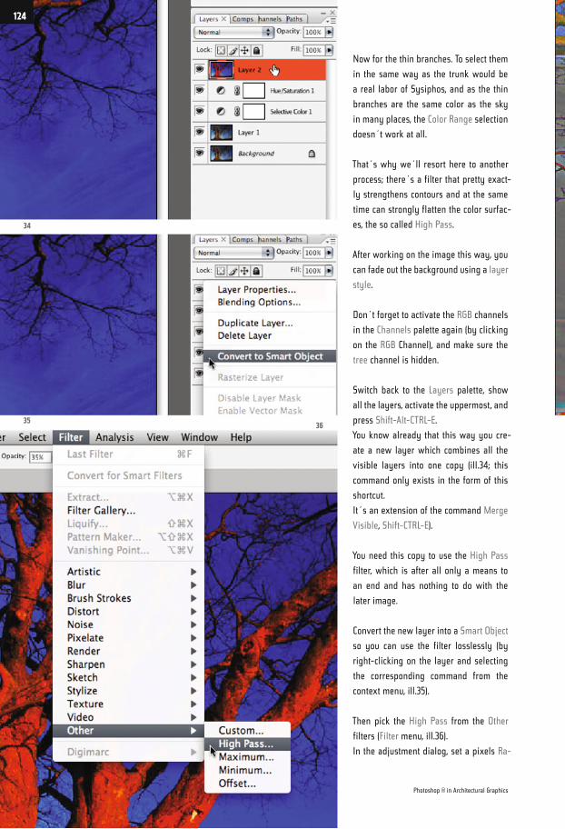
Now for the thin branches. To select them
in the same way as the trunk would be
a real labor of Sysiphos, and as the thin
branches are the same color as the sky
in many places, the Color Range selection
doesn´t work at all.
That´s why we´ll resort here to another
process; there´s a filter that pretty exact-
ly strengthens contours and at the same
time can strongly flatten the color surfac-
es, the so called High Pass.
After working on the image this way, you
can fade out the background using a layer
style.
Don´t forget to activate the RGB channels
in the Channels palette again (by clicking
on the RGB Channel), and make sure the
tree channel is hidden.
Switch back to the Layers palette, show
all the layers, activate the uppermost, and
press Shift-Alt-CTRL-E.
You know already that this way you cre-
ate a new layer which combines all the
visible layers into one copy (ill.34; this
command only exists in the form of this
shortcut.
It´s an extension of the command Merge
Visible, Shift-CTRL-E).
You need this copy to use the High Pass
filter, which is after all only a means to
an end and has nothing to do with the
later image.
Convert the new layer into a Smart Object
so you can use the filter losslessly (by
right-clicking on the layer and selecting
the corresponding command from the
context menu, ill.35).
Then pick the High Pass from the Other
filters (Filter menu, ill.36).
In the adjustment dialog, set a pixels Ra-
34
3536
Photoshop ® in Architectural Graphics
124
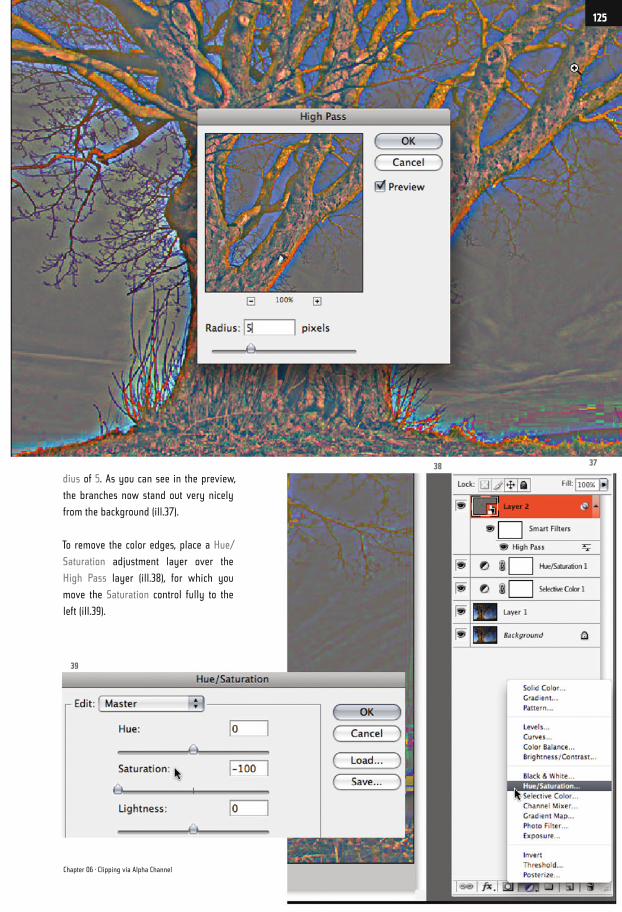
dius of 5. As you can see in the preview,
the branches now stand out very nicely
from the background (ill.37).
To remove the color edges, place a Hue/
Saturation adjustment layer over the
High Pass layer (ill.38), for which you
move the Saturation control fully to the
left (ill.39).
3738
39
Chapter 06 · Clipping via Alpha Channel
125
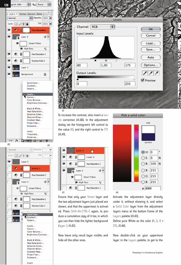
To increase the contrast, also insert a Lev-
els correction (ill.40). In the adjustment
dialog set the histogram’s left control to
the value 80, and the right control to 175
(ill.41).
Ensure that only your Smart layer and
the two adjustment layers just placed are
shown, and that the uppermost is activat-
ed. Press Shift-Alt-CTRL-E again, to pro-
duce a cumulative copy of it too, in which
you can then hide the lighter background
(layer 3, ill.42).
Now leave only result layer visible, and
hide all the other ones.
Activate the adjustment layer directly
under it, without showing it, and select
a Solid Color layer from the adjustment
layers menu at the bottom frame of the
Layers palette (ill.43).
Define pure White as the color (R, G, B =
255, ill.44).
Now double-click on your uppermost
layer in the Layers palette, to get to the
40
42
41
44
43
Photoshop ® in Architectural Graphics
126
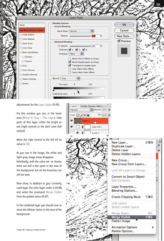
adjustments for the Layer Styles (ill.45).
Via this window you can, in the lower
area (Blend if: Gray - This Layer), hide
parts of this layer, either the bright ar-
eas (right control) or the dark ones (left
control).
Move the right control to the left till its
value is 120.
As you see in the image, the white and
light-gray image areas disappear.
Admittedly, with the value we´ve chosen
there are still a few spots in the area of
the background, but all the branches can
still be seen.
Now show, in addition to your currently
used layer, the color layer under it (ill.46),
and select the command Merge Visible
from the palette menu (ill.47).
In the combined layer you should now re-
move the leftover stains in the area of the
background.
45
4647
Chapter 06 · Clipping via Alpha Channel
127
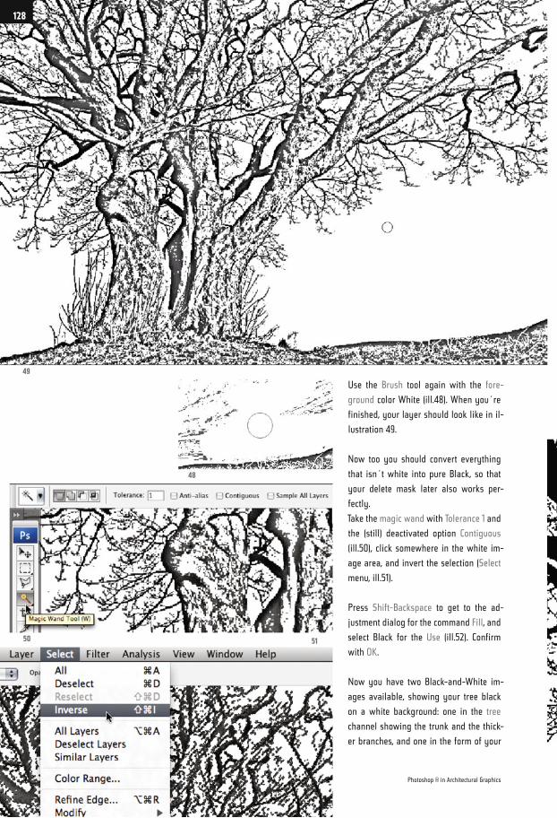
Use the Brush tool again with the fore-
ground color White (ill.48). When you´re
finished, your layer should look like in il-
lustration 49.
Now too you should convert everything
that isn´t white into pure Black, so that
your delete mask later also works per-
fectly.
Take the magic wand with Tolerance 1 and
the (still) deactivated option Contiguous
(ill.50), click somewhere in the white im-
age area, and invert the selection (Select
menu, ill.51).
Press Shift-Backspace to get to the ad-
justment dialog for the command Fill, and
select Black for the Use (ill.52). Confirm
with OK.
Now you have two Black-and-White im-
ages available, showing your tree black
on a white background: one in the tree
channel showing the trunk and the thick-
er branches, and one in the form of your
49
48
50 51
Photoshop ® in Architectural Graphics
128
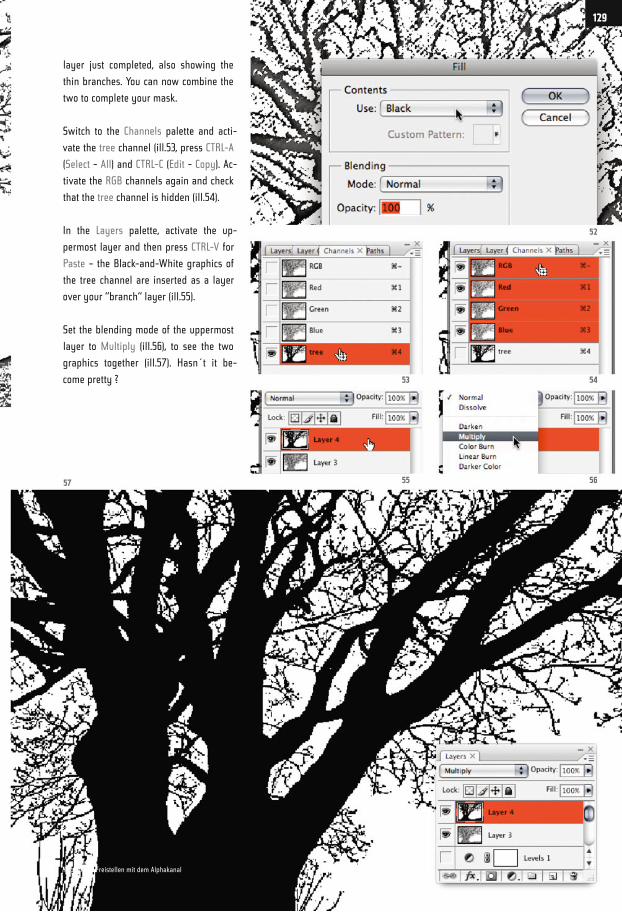
layer just completed, also showing the
thin branches. You can now combine the
two to complete your mask.
Switch to the Channels palette and acti-
vate the tree channel (ill.53, press CTRL-A
(Select - All) and CTRL-C (Edit - Copy). Ac-
tivate the RGB channels again and check
that the tree channel is hidden (ill.54).
In the Layers palette, activate the up-
permost layer and then press CTRL-V for
Paste – the Black-and-White graphics of
the tree channel are inserted as a layer
over your “branch“ layer (ill.55).
Set the blending mode of the uppermost
layer to Multiply (ill.56), to see the two
graphics together (ill.57). Hasn´t it be-
come pretty ?
52
54
56
53
5557
129
Kapitel 06 · Freistellen mit dem Alphakanal
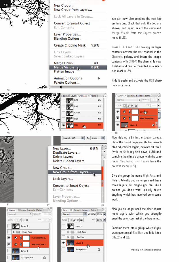
You can now also combine the two lay-
ers into one. Check that only the two are
shown, and again select the command
Merge Visible from the Layers palette
menu (ill.58).
Press CTRL-A and CTRL-C to copy the layer
contents, activate the tree channel in the
Channels palette, and insert the image
contents with CTRL-V. The channel is now
finished and can be consulted as a selec-
tion mask (ill.59).
Hide it again and activate the RGB chan-
nels once more.
Now tidy up a bit in the Layers palette.
Show the Smart layer and its two associ-
ated adjustment layers, activate all three
(with the Shift key held down, ill.60) and
combine them into a group (with the com-
mand New Group from Layers from the
palettes menu, ill.61).
Give the group the name High Pass, and
hide it. Actually you no longer need these
three layers, but maybe you feel like I
do and you don´t want to airily delete
anything which has involved quite some
work.
Also you no longer need the older adjust-
ment layers, with which you strength-
ened the color contrast at the beginning.
Combine them into a group, which if you
want you can call RedBlue, and hide it too
(Ills.62 and 63).
58
61
59
62 63
60
Photoshop ® in Architectural Graphics
130
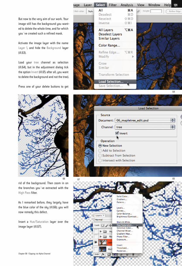
But now to the very aim of our work. Your
image still has the background you want-
ed to delete the whole time, and for which
you´ve created such a refined mask.
Activate the image layer with the name
Layer 1, and hide the Background layer
(ill.63).
Load your tree channel as selection
(ill.64), but in the adjustment dialog tick
the option Invert (ill.65; after all, you want
to delete the background and not the tree).
Press one of your delete buttons to get
rid of the background. Then zoom in on
the branches you´ve extracted with the
High Pass filter.
As I remarked before, they largely have
the blue color of the sky (ill.66); you will
now remedy this defect.
Insert a Hue/Saturation layer over the
image layer (ill.67).
64
6566 67
Chapter 06 · Clipping via Alpha Channel
131
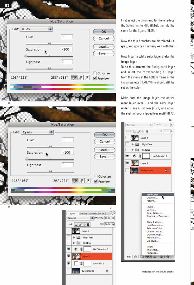
First select the Blues and for them reduce
the Saturation to -100 (ill.68), then do the
same for the Cyans (ill.69).
Now the thin branches are discolored, i.e.
gray, and you can live very well with that.
Now insert a white color layer under the
image layer.
To do this, activate the Background layer,
and select the corresponding fill layer
from the menu at the bottom frame of the
Layers palette (ill.70; White should still be
set as the color).
Make sure the image layer, the adjust-
ment layer over it and the color layer
under it are all shown (ill.71), and enjoy
the sight of your clipped tree motif (ill.72).
68
69 71
70
Photoshop ® in Architectural Graphics
132
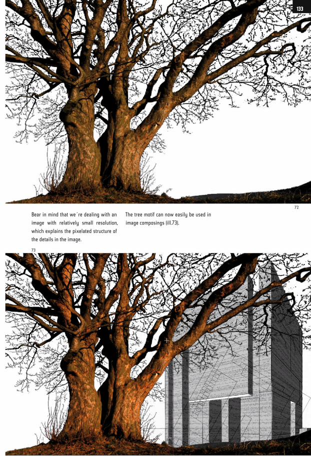
Bear in mind that we´re dealing with an
image with relatively small resolution,
which explains the pixelated structure of
the details in the image.
The tree motif can now easily be used in
image composings (ill.73).
72
73
133
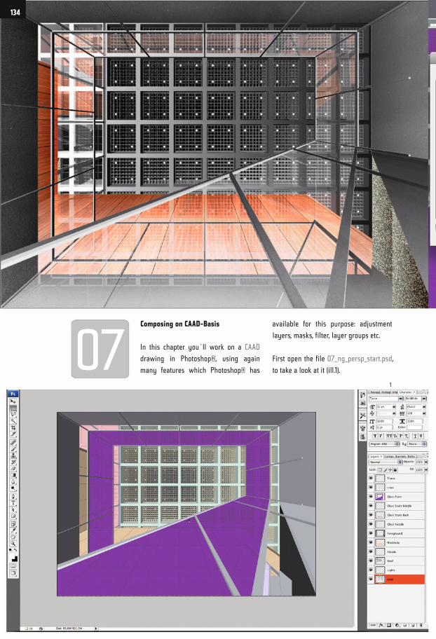
Composing on CAAD-Basis
In this chapter you´ll work on a CAAD
drawing in Photoshop®, using again
many features which Photoshop® has
available for this purpose: adjustment
layers, masks, filter, layer groups etc.
First open the file 07_ng_persp_start.psd,
to take a look at it (ill.1).
1
134
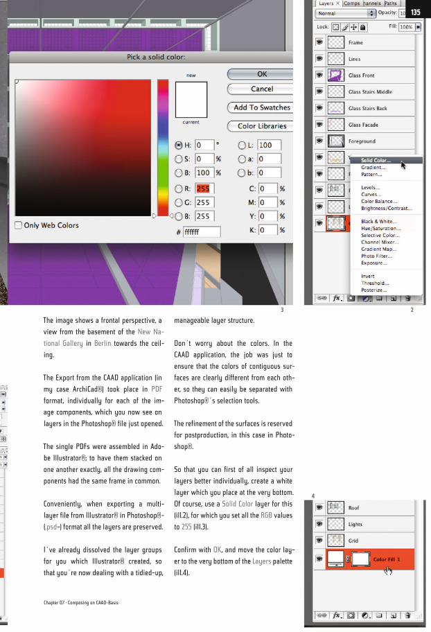
The image shows a frontal perspective, a
view from the basement of the New Na-
tional Gallery in Berlin towards the ceil-
ing.
The Export from the CAAD application (in
my case ArchiCad®) took place in PDF
format, individually for each of the im-
age components, which you now see on
layers in the Photoshop® file just opened.
The single PDFs were assembled in Ado-
be Illustrator®; to have them stacked on
one another exactly, all the drawing com-
ponents had the same frame in common.
Conveniently, when exporting a multi-
layer file from Illustrator® in Photoshop®-
(.psd-) format all the layers are preserved.
I´ve already dissolved the layer groups
for you which Illustrator® created, so
that you´re now dealing with a tidied-up,
manageable layer structure.
Don´t worry about the colors. In the
CAAD application, the job was just to
ensure that the colors of contiguous sur-
faces are clearly different from each oth-
er, so they can easily be separated with
Photoshop®´s selection tools.
The refinement of the surfaces is reserved
for postproduction, in this case in Photo-
shop®.
So that you can first of all inspect your
layers better individually, create a white
layer which you place at the very bottom.
Of course, use a Solid Color layer for this
(ill.2), for which you set all the RGB values
to 255 (ill.3).
Confirm with OK, and move the color lay-
er to the very bottom of the Layers palette
(ill.4).
3 2
4
Chapter 07 · Composing on CAAD-Basis
135
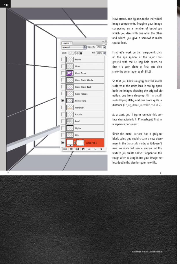
Now attend, one by one, to the individual
image components. Imagine your image
composing as a number of backdrops
which you deal with one after the other,
and which you give a somewhat realer,
spatial look.
First let´s work on the foreground; click
on the eye symbol of the layer Fore-
ground with the Alt key held down, so
that it´s seen alone at first, and also
show the color layer again (ill.5).
So that you know roughly how the metal
surfaces of the stairs look in reality, open
both the images showing the original sit-
uation, one from close-up (07_ng_detail_
metal01.psd, ill.6), and one from quite a
distance (07_ng_detail_metal02.psd, ill.7).
As a start, you´ll try to recreate this sur-
face characteristic in Photoshop®, first in
a separate document.
Since the metal surface has a gray-to-
black color, you could create a new docu-
ment in the Grayscale mode, so it doesn´t
need so much disk usage, and so that the
texture you create doesn´t appear all too
rough after pasting it into your image, se-
lect double the size for your new file.
5 6
136
Photoshop® ® in der Architekturgrafik
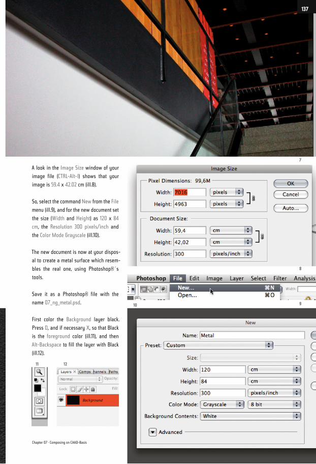
A look in the Image Size window of your
image file (CTRL-Alt-I) shows that your
image is 59.4 x 42.02 cm (ill.8).
So, select the command New from the File
menu (ill.9), and for the new document set
the size (Width and Height) as 120 x 84
cm, the Resolution 300 pixels/inch and
the Color Mode Grayscale (ill.10).
The new document is now at your dispos-
al to create a metal surface which resem-
bles the real one, using Photoshop®´s
tools.
Save it as a Photoshop® file with the
name 07_ng_metal.psd.
First color the Background layer black.
Press D, and if necessary X, so that Black
is the foreground color (ill.11), and then
Alt-Backspace to fill the layer with Black
(ill.12).
7
8
910
1211
Chapter 07 · Composing on CAAD-Basis
137
Copy the Background layer, and convert
it into a Smart Object (select this option
from the context menu that opens after
you right-click on the new layer in the
Layers palette, ill.13).
You can now reconstruct the real surface
you see in the image 07_ng_detail_met-
al01.psd by means of some filters. As
you´re using the filter in such a Smart
layer instead of in a normal one, you can
losslessly modify the filter adjustments
at any time.
To be able to compare your new image
with the detailed display of the real situ-
ation, first select Standard Screen Mode
from the View menu (ill.14; alternatively,
you can also press F till you see the fa-
miliar window display).
Then zoom the image to 50% display size
(first press Alt-CTRL-0, see above ill.15,
and then CTRL-- twice; in the window title,
the size is indicated in percents (ill.16).
Switch to your image 07_ng_detail_met-
al01.psd, and zoom it to 100% display size
(Alt-CTRL-0, see above).
Close all the other open files (apart from
07_ng_detail_metal01.psd and your new
file, of course), and then select the com-
mand Arrange – Tile Vertically from the
Window menu (ill.17). Both images, the
13
14
16 17
15
Photoshop ® in Architectural Graphics
138
real photo and your new, artificial prod-
uct, can now be compared well while you
work on them, as they´re beside each
other.
Your new image is at first created twice
as large as is later necessary, thus the
display in 50% (ill.18; you´ll see that this
large format results from the scaling of
the filter you´ll now use).
Make sure your new file is in front, and
that you´re in your newly created Smart
layer.
Now select the filter Add Noise from
the Filter menu (Noise filters, ill.19). In
the adjustment dialog that opens,set the
Amount to 15% and select Gaussian Dis-
tribution (ill.20).
18
1920
21
Chapter 07 · Composing on CAAD-Basis
139
Confirm with OK. Your filter is now stacked
in the Layers palette and can be opened
again at any time for eventual tunings, by
double-clicking on its name (ill.21).
Now it´s the turn of the next filter. Your
Smart layer is active as before; now
select Bas Relief from the Filter menu
(Sketch filters, ill.22). This time a rather
more ample window opens; for Detail set
22
2324
Photoshop ® in Architectural Graphics
140
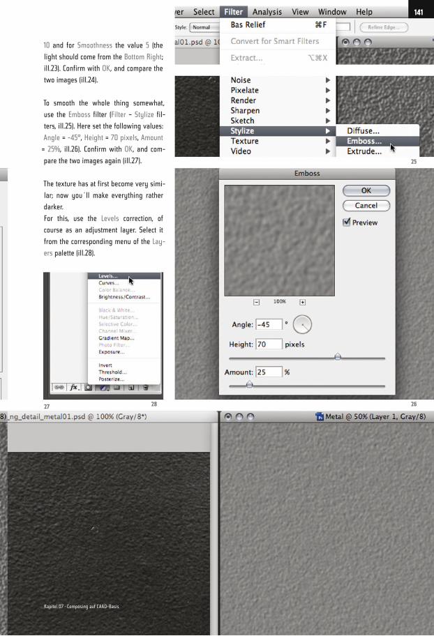
10 and for Smoothness the value 5 (the
light should come from the Bottom Right;
ill.23). Confirm with OK, and compare the
two images (ill.24).
To smooth the whole thing somewhat,
use the Emboss filter (Filter – Stylize fil-
ters, ill.25). Here set the following values:
Angle = -45°, Height = 70 pixels, Amount
= 25%, ill.26). Confirm with OK, and com-
pare the two images again (ill.27).
The texture has at first become very simi-
lar; now you´ll make everything rather
darker.
For this, use the Levels correction, of
course as an adjustment layer. Select it
from the corresponding menu of the Lay-
ers palette (ill.28).
25
2627 28
141
Kapitel 07 · Composing auf CAAD-Basis
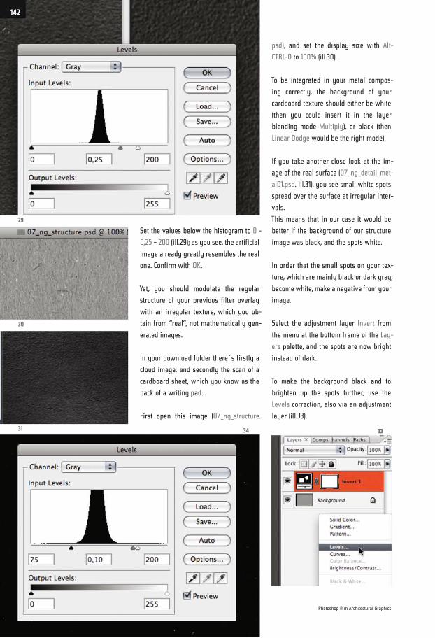
Set the values below the histogram to 0 -
0,25 – 200 (ill.29); as you see, the artificial
image already greatly resembles the real
one. Confirm with OK.
Yet, you should modulate the regular
structure of your previous filter overlay
with an irregular texture, which you ob-
tain from “real“, not mathematically gen-
erated images.
In your download folder there´s firstly a
cloud image, and secondly the scan of a
cardboard sheet, which you know as the
back of a writing pad.
First open this image (07_ng_structure.
psd), and set the display size with Alt-
CTRL-0 to 100% (ill.30).
To be integrated in your metal compos-
ing correctly, the background of your
cardboard texture should either be white
(then you could insert it in the layer
blending mode Multiply), or black (then
Linear Dodge would be the right mode).
If you take another close look at the im-
age of the real surface (07_ng_detail_met-
al01.psd, ill.31), you see small white spots
spread over the surface at irregular inter-
vals.
This means that in our case it would be
better if the background of our structure
image was black, and the spots white.
In order that the small spots on your tex-
ture, which are mainly black or dark gray,
become white, make a negative from your
image.
Select the adjustment layer Invert from
the menu at the bottom frame of the Lay-
ers palette, and the spots are now bright
instead of dark.
To make the background black and to
brighten up the spots further, use the
Levels correction, also via an adjustment
layer (ill.33).
29
30
31 34 33
Photoshop ® in Architectural Graphics
142
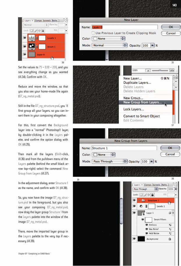
Set the values to 75 – 0.10 – 200, and you
see everything change as you wanted
(ill.34). Confirm with OK.
Reduce and move the window, so that
you also see your home-made file again
(07_ng_metal.psd).
Still in the file 07_ng_structure.psd, you´ll
first group all your layers, so you can in-
sert them in your composing altogether.
For this, first convert the Background
layer into a “normal“ Photoshop® layer,
by double-clicking it in the Layers pal-
ette, and confirm the option dialog with
OK (ill.35).
Then mark all the layers (Shift-click,
ill.36) and from the pulldown menu of the
Layers palette (behind the small black ar-
row top-right) select the command New
Group from Layers (ill.37).
In the adjustment dialog, enter Structure 1
as the name, and confirm with OK (ill.38).
So, you now have the image 07_ng_struc-
ture.psd in the foreground, but you also
see your composing 07_ng_metal.psd;
now drag the layer group Structure 1 from
the Layers palette into the window of the
image 07_ng_metal.psd.
There, move the imported layer group in
the Layers palette to the very top if nec-
essary (ill.39).
36
3839
37
35
Chapter 07 · Composing on CAAD-Basis
143
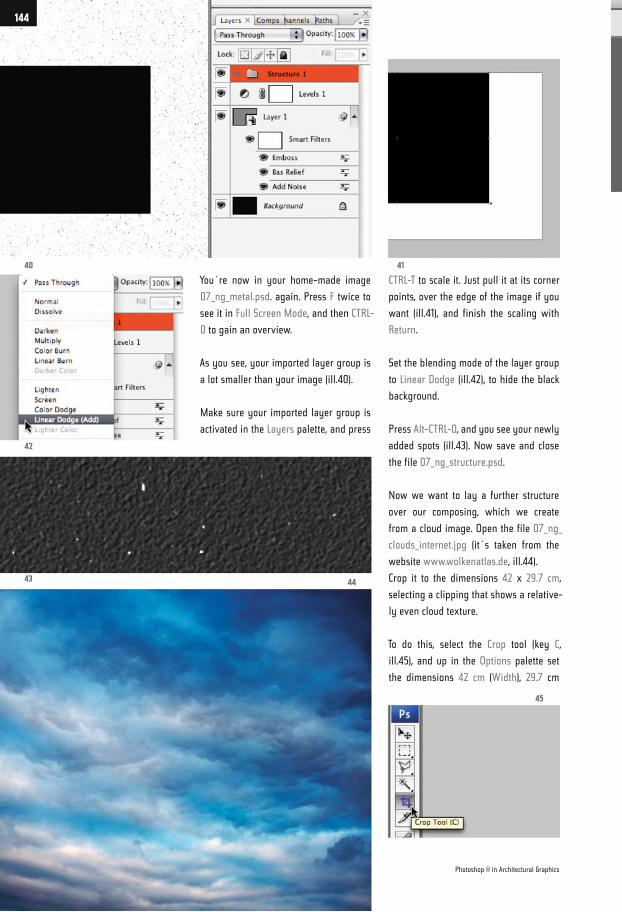
You´re now in your home-made image
07_ng_metal.psd. again. Press F twice to
see it in Full Screen Mode, and then CTRL-
0 to gain an overview.
As you see, your imported layer group is
a lot smaller than your image (ill.40).
Make sure your imported layer group is
activated in the Layers palette, and press
CTRL-T to scale it. Just pull it at its corner
points, over the edge of the image if you
want (ill.41), and finish the scaling with
Return.
Set the blending mode of the layer group
to Linear Dodge (ill.42), to hide the black
background.
Press Alt-CTRL-0, and you see your newly
added spots (ill.43). Now save and close
the file 07_ng_structure.psd.
Now we want to lay a further structure
over our composing, which we create
from a cloud image. Open the file 07_ng_
clouds_internet.jpg (it´s taken from the
website www.wolkenatlas.de, ill.44).
Crop it to the dimensions 42 x 29.7 cm,
selecting a clipping that shows a relative-
ly even cloud texture.
To do this, select the Crop tool (key C,
ill.45), and up in the Options palette set
the dimensions 42 cm (Width), 29.7 cm
40
42
43
45
41
44
Photoshop ® in Architectural Graphics
144
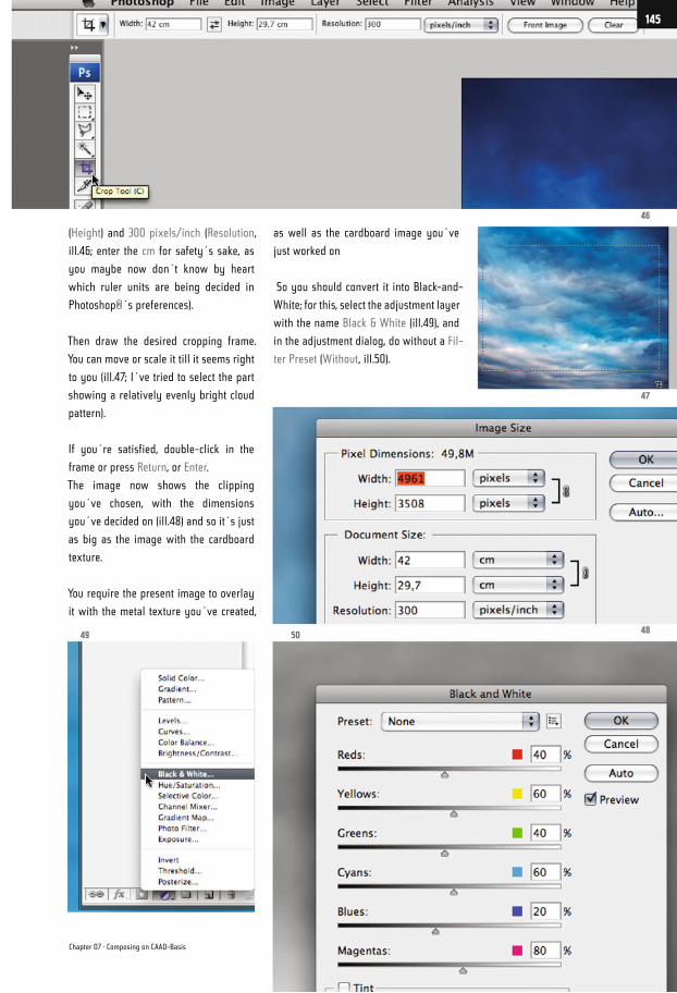
(Height) and 300 pixels/inch (Resolution,
ill.46; enter the cm for safety´s sake, as
you maybe now don´t know by heart
which ruler units are being decided in
Photoshop®´s preferences).
Then draw the desired cropping frame.
You can move or scale it till it seems right
to you (ill.47; I´ve tried to select the part
showing a relatively evenly bright cloud
pattern).
If you´re satisfied, double-click in the
frame or press Return, or Enter.
The image now shows the clipping
you´ve chosen, with the dimensions
you´ve decided on (ill.48) and so it´s just
as big as the image with the cardboard
texture.
You require the present image to overlay
it with the metal texture you´ve created,
as well as the cardboard image you´ve
just worked on
So you should convert it into Black-and-
White; for this, select the adjustment layer
with the name Black & White (ill.49), and
in the adjustment dialog, do without a Fil-
ter Preset (Without, ill.50).
46
47
485049
Chapter 07 · Composing on CAAD-Basis
145
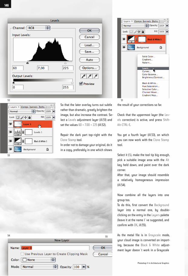
So that the later overlay turns out subtle
rather than dramatic, greatly brighten the
image, but also increase the contrast. Se-
lect a Levels adjustment layer (ill.51) and
set the values 60 – 7.00 – 225 (ill.52).
Repair the dark part top-right with the
Clone Stamp tool.
In order not to damage your original, do it
in a copy, preferably in one which shows
the result of your corrections so far.
Check that the uppermost layer (the Lev-
els correction) is active, and press Shift-
Alt-CTRL-E.
You get a fourth layer (ill.53), on which
you can now work with the Clone Stamp
tool.
Select it (S), make the tool tip big enough,
pick a suitable image area with the Alt
key held down, and paint over the dark
corner.
After that, your image should resemble
a relatively homogeneous impression
(ill.54).
Now combine all the layers into one
group too.
To do this, first convert the Background
layer into a normal one, by double-
clicking on the entry in the Layers palette
(leave it at the name I´ve suggested, and
confirm with OK, ill.55).
As the metal file is in Grayscale mode,
your cloud image is converted on import-
ing, because the Black & White adjust-
ment layer doesn´t work in a Grayscale
52
53
54
51
55
Photoshop ® in Architectural Graphics
146
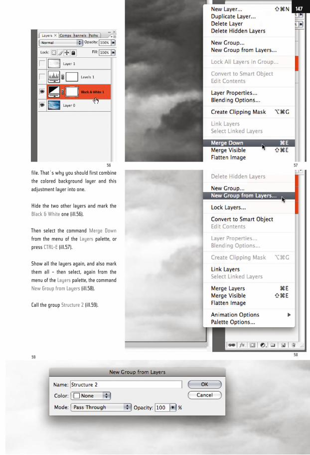
file. That´s why you should first combine
the colored background layer and this
adjustment layer into one.
Hide the two other layers and mark the
Black & White one (ill.56).
Then select the command Merge Down
from the menu of the Layers palette, or
press CTRL-E (ill.57).
Show all the layers again, and also mark
them all – then select, again from the
menu of the Layers palette, the command
New Group from Layers (ill.58).
Call the group Structure 2 (ill.59).
5756
5859
147
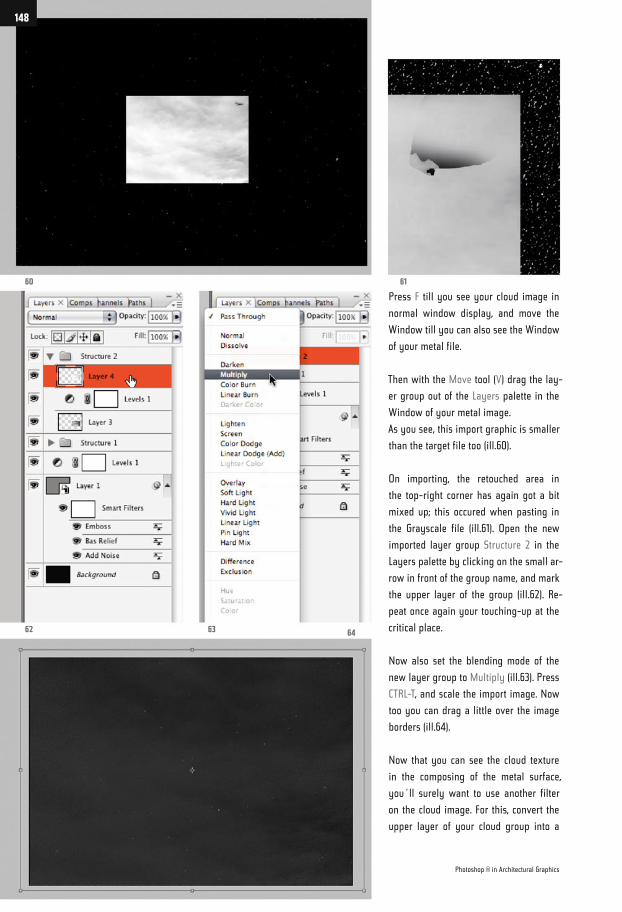
Press F till you see your cloud image in
normal window display, and move the
Window till you can also see the Window
of your metal file.
Then with the Move tool (V) drag the lay-
er group out of the Layers palette in the
Window of your metal image.
As you see, this import graphic is smaller
than the target file too (ill.60).
On importing, the retouched area in
the top-right corner has again got a bit
mixed up; this occured when pasting in
the Grayscale file (ill.61). Open the new
imported layer group Structure 2 in the
Layers palette by clicking on the small ar-
row in front of the group name, and mark
the upper layer of the group (ill.62). Re-
peat once again your touching-up at the
critical place.
Now also set the blending mode of the
new layer group to Multiply (ill.63). Press
CTRL-T, and scale the import image. Now
too you can drag a little over the image
borders (ill.64).
Now that you can see the cloud texture
in the composing of the metal surface,
you´ll surely want to use another filter
on the cloud image. For this, convert the
upper layer of your cloud group into a
60 61
62 63 64
Photoshop ® in Architectural Graphics
148
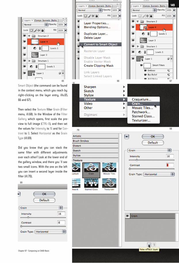
Smart Object (the command can be found
in the context menu, which you reach by
right-clicking on the layer entry, ills.65,
66 and 67).
Then select the Texture filter Grain (Filter
menu, ill.68). In the Window of the Filter
Gallery which opens, first scale the pre-
view to full image (CTRL-0), and then set
the values for Intensity to 16 and for Con-
trast to 0. Select Horizontal as the Grain
Type (ill.69).
Did you know that you can stack the
same filter with different adjustments
over each other? Look at the lower end of
the gallery window, and there you´ll see
two small icons. With the one on the left
you can insert a second layer inside the
filter (ill.70),
67666551
6870
69
Chapter 07 · Composing on CAAD-Basis
149
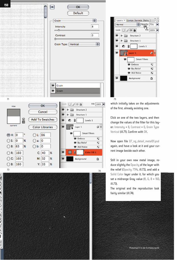
which initially takes on the adjustments
of the first, already existing one.
Click on one of the two layers, and then
change the values of the filter for this lay-
er: Intensity = 8, Contrast = 0, Grain Type
Vertical (ill.71). Confirm with OK.
Now open file 07_ng_detail_metal01.psd
again, and have a look at it and your cur-
rent image beside each other.
Still in your own new metal image, re-
duce slightly the Opacity of the layer with
the relief (Opacity 75%, ill.72), and add a
Solid Color layer under it, for which you
set a midrange Gray value (R, G, B = 160,
ill.73).
The original and the reproduction look
fairly similar (ill.74).
71 75
7374
150
Photoshop® ® in der Architekturgrafik
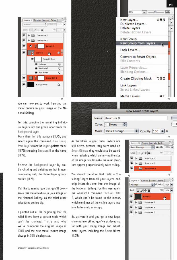
You can now set to work inserting the
metal texture in your image of the Na-
tional Gallery.
For this, combine the remaining individ-
ual layers into one group, apart from the
Background layer.
Mark them for this purpose (ill.75), and
select again the command New Group
from Layers from the Layers palette menu
(ill.76); choosing Structure 0 as the name
(ill.77).
Release the Background layer by dou-
ble-clicking and deleting, so that in your
composing only the three layer groups
are left (ill.78).
I´d like to remind you that you´ll down-
scale this metal texture in your image of
the National Gallery, as the relief other-
wise turns out too big.
I pointed out at the beginning that the
relief filters have a certain scale which
can´t be changed. That´s also why
we´ve compared the original image in
100% and the new metal texture image
always in 50% display size.
As the filters in your metal texture are
still active, because they were used on
Smart Objects, they would also be scaled
when reducing, which on halving the size
of the image would make the relief struc-
ture appear proportionately twice as big.
You should therefore first distil a “re-
sulting“ layer from all your layers, and
only insert this one into the image of
the National Gallery. For this, use again
the wonderful command Shift-Alt-CTRL-
E, which can´t be found in the menus,
which combines all the visible layers into
one, fortunately as a copy.
So, activate it and you get a new layer
showing everything you´ve achieved so
far with your many image and adjust-
ment layers, including the Smart filters
(ill.79).
77
7675
7879
Chapter 07 · Composing on CAAD-Basis
151
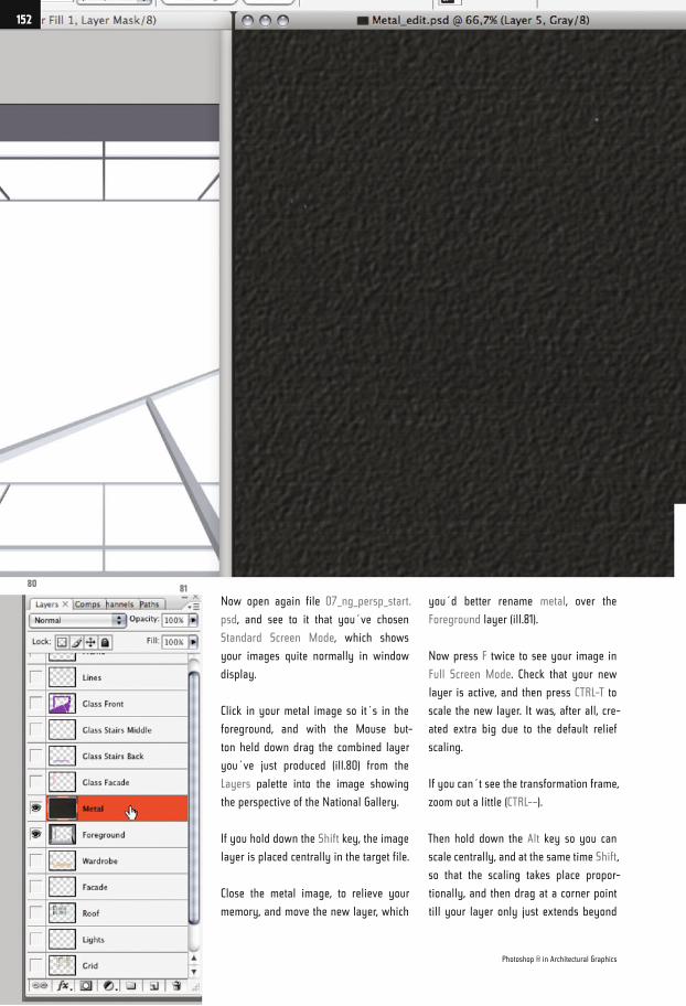
Now open again file 07_ng_persp_start.
psd, and see to it that you´ve chosen
Standard Screen Mode, which shows
your images quite normally in window
display.
Click in your metal image so it´s in the
foreground, and with the Mouse but-
ton held down drag the combined layer
you´ve just produced (ill.80) from the
Layers palette into the image showing
the perspective of the National Gallery.
If you hold down the Shift key, the image
layer is placed centrally in the target file.
Close the metal image, to relieve your
memory, and move the new layer, which
you´d better rename metal, over the
Foreground layer (ill.81).
Now press F twice to see your image in
Full Screen Mode. Check that your new
layer is active, and then press CTRL-T to
scale the new layer. It was, after all, cre-
ated extra big due to the default relief
scaling.
If you can´t see the transformation frame,
zoom out a little (CTRL-–).
Then hold down the Alt key so you can
scale centrally, and at the same time Shift,
so that the scaling takes place propor-
tionally, and then drag at a corner point
till your layer only just extends beyond
8081
Photoshop ® in Architectural Graphics
152
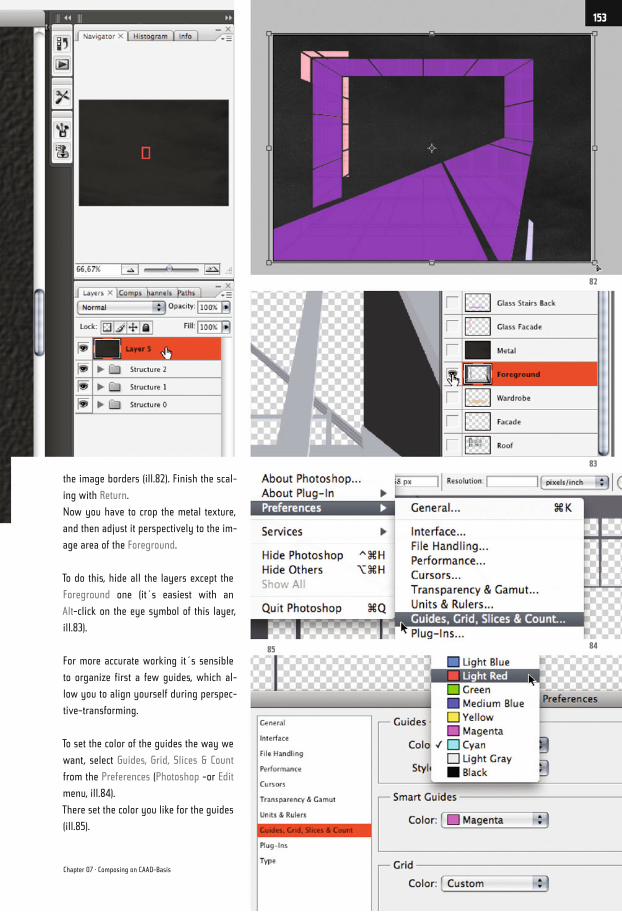
the image borders (ill.82). Finish the scal-
ing with Return.
Now you have to crop the metal texture,
and then adjust it perspectively to the im-
age area of the Foreground.
To do this, hide all the layers except the
Foreground one (it´s easiest with an
Alt-click on the eye symbol of this layer,
ill.83).
For more accurate working it´s sensible
to organize first a few guides, which al-
low you to align yourself during perspec-
tive-transforming.
To set the color of the guides the way we
want, select Guides, Grid, Slices & Count
from the Preferences (Photoshop -or Edit
menu, ill.84).
There set the color you like for the guides
(ill.85).
82
83
8485
Chapter 07 · Composing on CAAD-Basis
153
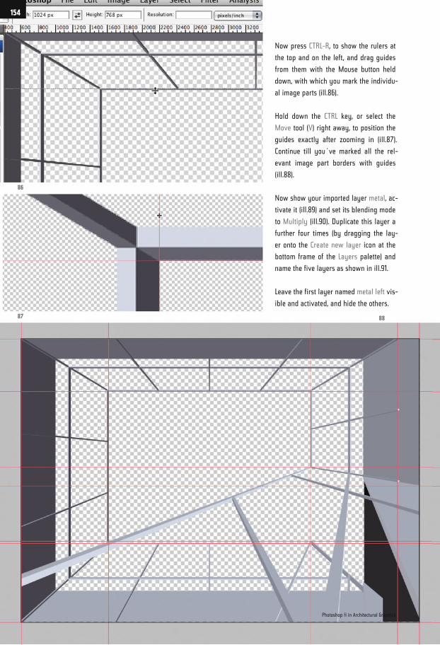
Now press CTRL-R, to show the rulers at
the top and on the left, and drag guides
from them with the Mouse button held
down, with which you mark the individu-
al image parts (ill.86).
Hold down the CTRL key, or select the
Move tool (V) right away, to position the
guides exactly after zooming in (ill.87).
Continue till you´ve marked all the rel-
evant image part borders with guides
(ill.88).
Now show your imported layer metal, ac-
tivate it (ill.89) and set its blending mode
to Multiply (ill.90). Duplicate this layer a
further four times (by dragging the lay-
er onto the Create new layer icon at the
bottom frame of the Layers palette) and
name the five layers as shown in ill.91.
Leave the first layer named metal left vis-
ible and activated, and hide the others.
86
87 88
Photoshop ® in Architectural Graphics
154
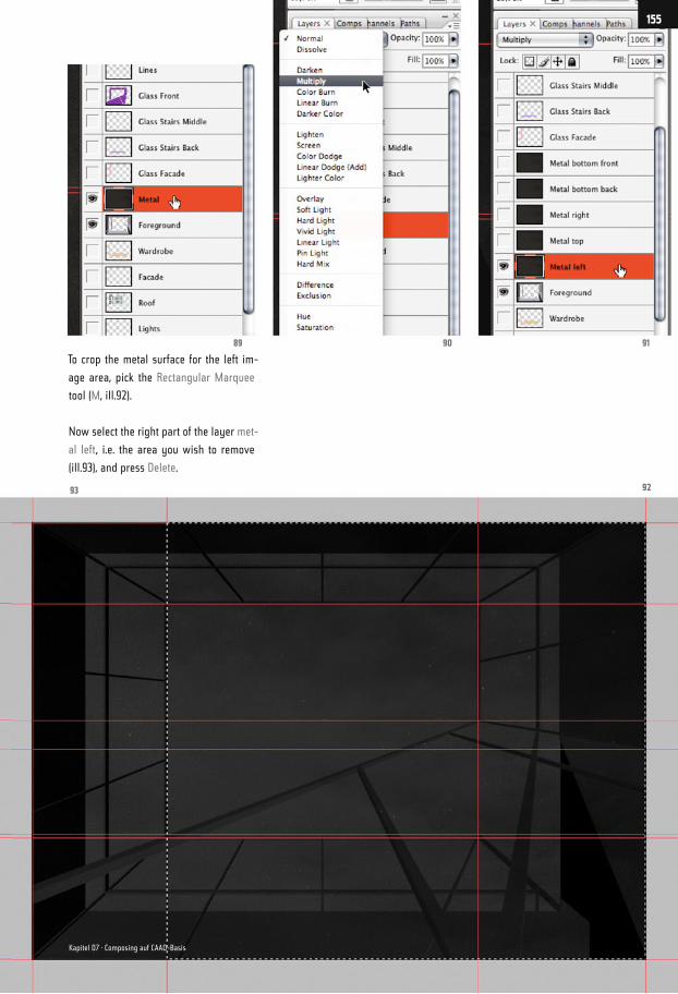
To crop the metal surface for the left im-
age area, pick the Rectangular Marquee
tool (M, ill.92).
Now select the right part of the layer met-
al left, i.e. the area you wish to remove
(ill.93), and press Delete.
919089
9293
155
Kapitel 07 · Composing auf CAAD-Basis
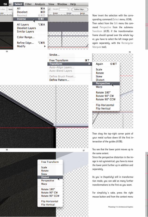
Now invert the selection with the corre-
sponding command (Select menu, ill.94).
Then select from the Edit menu the com-
mand Perspective from the submenu
Transform (ill.95; if the transformation
frame should spread over the whole lay-
er, you have to select the left image part
again separately, with the Rectangular
Marquee tool).
Then drag the top-right corner point of
your metal surface down till the first in-
tersection of the guides (ill.96).
You see that the lower point moves up to
the same extent.
Since the perspective distortion in the im-
age is not symmetrical, you have to move
the lower point further up in addition and
separately.
As you´re (hopefully) still in transforma-
tion mode, you can add as many further
transformations to the first as you want.
For simplicity´s sake, press the right
mouse button and from the context menu
94
96
95
97
Photoshop ® in Architectural Graphics
156
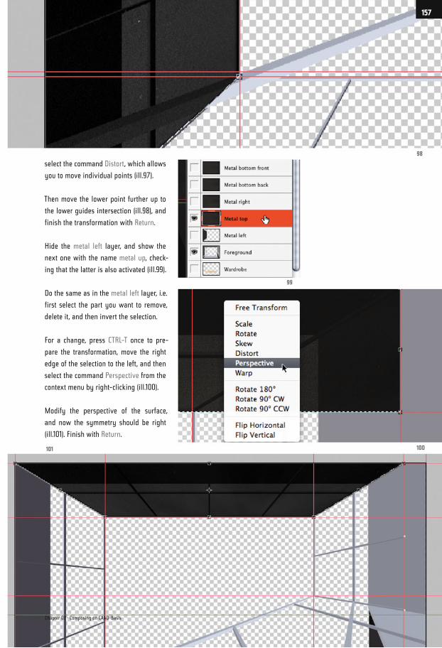
select the command Distort, which allows
you to move individual points (ill.97).
Then move the lower point further up to
the lower guides intersection (ill.98), and
finish the transformation with Return.
Hide the metal left layer, and show the
next one with the name metal up, check-
ing that the latter is also activated (ill.99).
Do the same as in the metal left layer, i.e.
first select the part you want to remove,
delete it, and then invert the selection.
For a change, press CTRL-T once to pre-
pare the transformation, move the right
edge of the selection to the left, and then
select the command Perspective from the
context menu by right-clicking (ill.100).
Modify the perspective of the surface,
and now the symmetry should be right
(ill.101). Finish with Return.
98
100101
99
Chapter 07 · Composing on CAAD-Basis
157
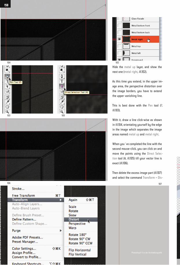
Hide the metal up layer, and show the
next one (metal right, ill.102).
As this time you extend, in the upper im-
age area, the perspective distortion over
the image borders, you have to extend
the upper vanishing line.
This is best done with the Pen tool (P,
ill.103).
With it, draw a line click-wise as shown
in ill.104, orientating yourself by the edge
in the image which separates the image
areas named metal up and metal right.
When you´ve completed the line with the
second mouse-click, you can click on and
move the points using the Direct Selec-
tion tool (A, ill.105) till your vector line is
exact (ill.106).
Then delete the excess image part (ill.107)
and select the command Transform - Dis-
104 102
103
106 107
105
158
Photoshop® ® in der Architekturgrafik
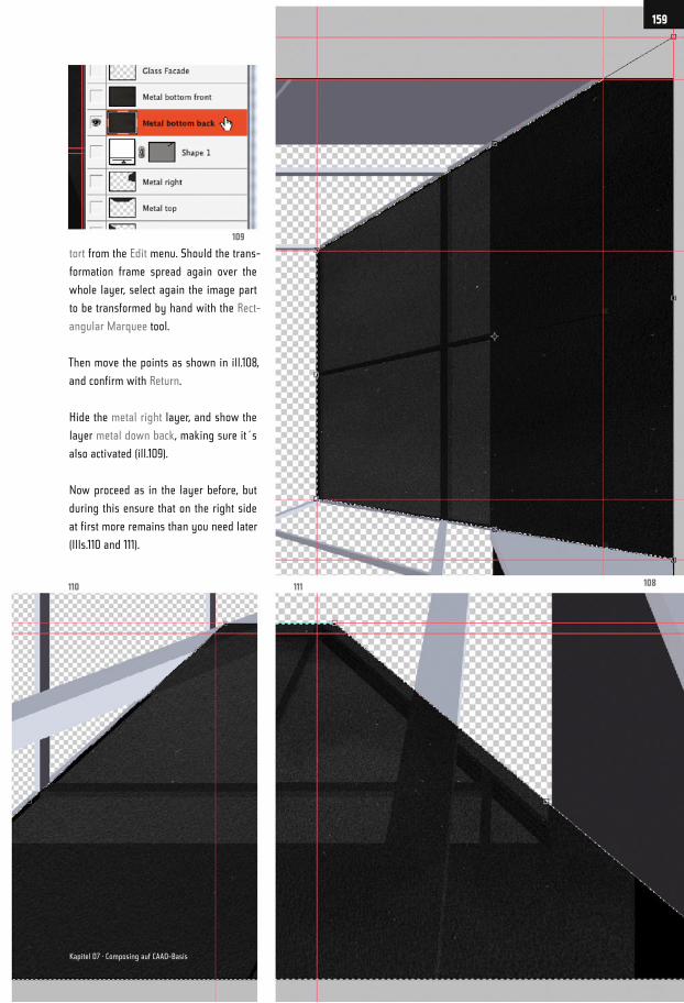
tort from the Edit menu. Should the trans-
formation frame spread again over the
whole layer, select again the image part
to be transformed by hand with the Rect-
angular Marquee tool.
Then move the points as shown in ill.108,
and confirm with Return.
Hide the metal right layer, and show the
layer metal down back, making sure it´s
also activated (ill.109).
Now proceed as in the layer before, but
during this ensure that on the right side
at first more remains than you need later
(Ills.110 and 111).
109
108111110
159
Kapitel 07 · Composing auf CAAD-Basis
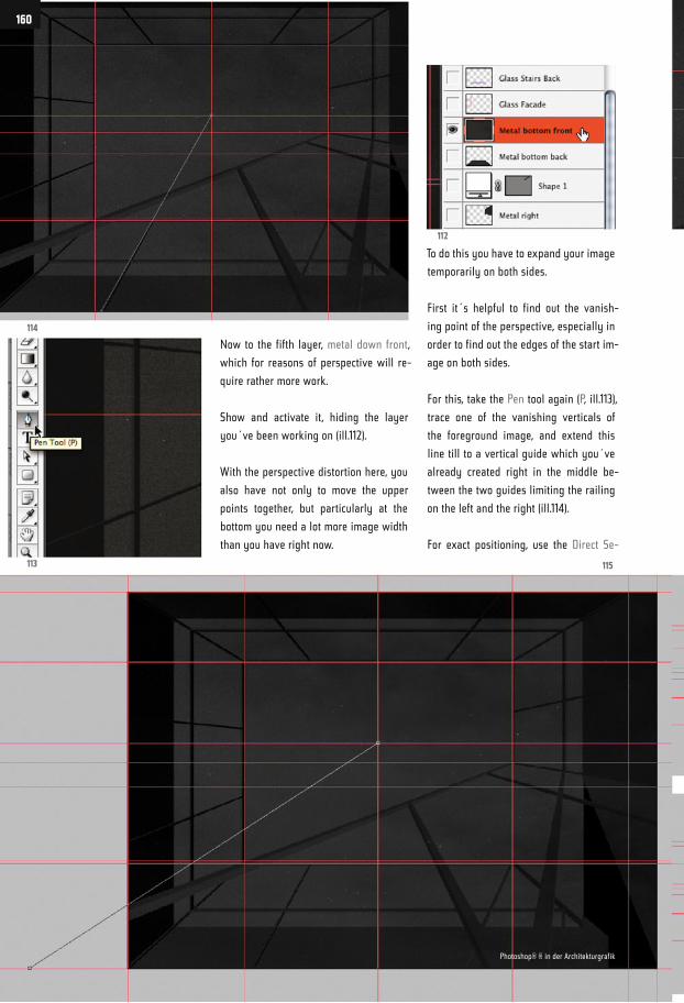
Now to the fifth layer, metal down front,
which for reasons of perspective will re-
quire rather more work.
Show and activate it, hiding the layer
you´ve been working on (ill.112).
With the perspective distortion here, you
also have not only to move the upper
points together, but particularly at the
bottom you need a lot more image width
than you have right now.
To do this you have to expand your image
temporarily on both sides.
First it´s helpful to find out the vanish-
ing point of the perspective, especially in
order to find out the edges of the start im-
age on both sides.
For this, take the Pen tool again (P, ill.113),
trace one of the vanishing verticals of
the foreground image, and extend this
line till to a vertical guide which you´ve
already created right in the middle be-
tween the two guides limiting the railing
on the left and the right (ill.114).
For exact positioning, use the Direct Se-
114
112
113 115
160
Photoshop® ® in der Architekturgrafik
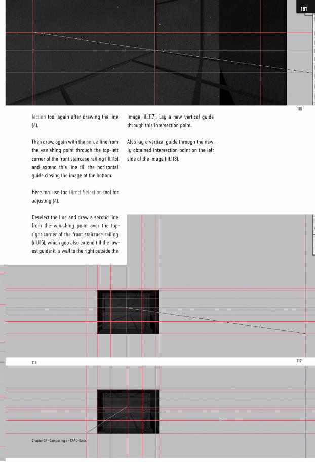
lection tool again after drawing the line
(A).
Then draw, again with the pen, a line from
the vanishing point through the top-left
corner of the front staircase railing (ill.115),
and extend this line till the horizontal
guide closing the image at the bottom.
Here too, use the Direct Selection tool for
adjusting (A).
Deselect the line and draw a second line
from the vanishing point over the top-
right corner of the front staircase railing
(ill.116), which you also extend till the low-
est guide; it´s well to the right outside the
image (ill.117). Lay a new vertical guide
through this intersection point.
Also lay a vertical guide through the new-
ly obtained intersection point on the left
side of the image (ill.118).
116
117118
Chapter 07 · Composing on CAAD-Basis
161
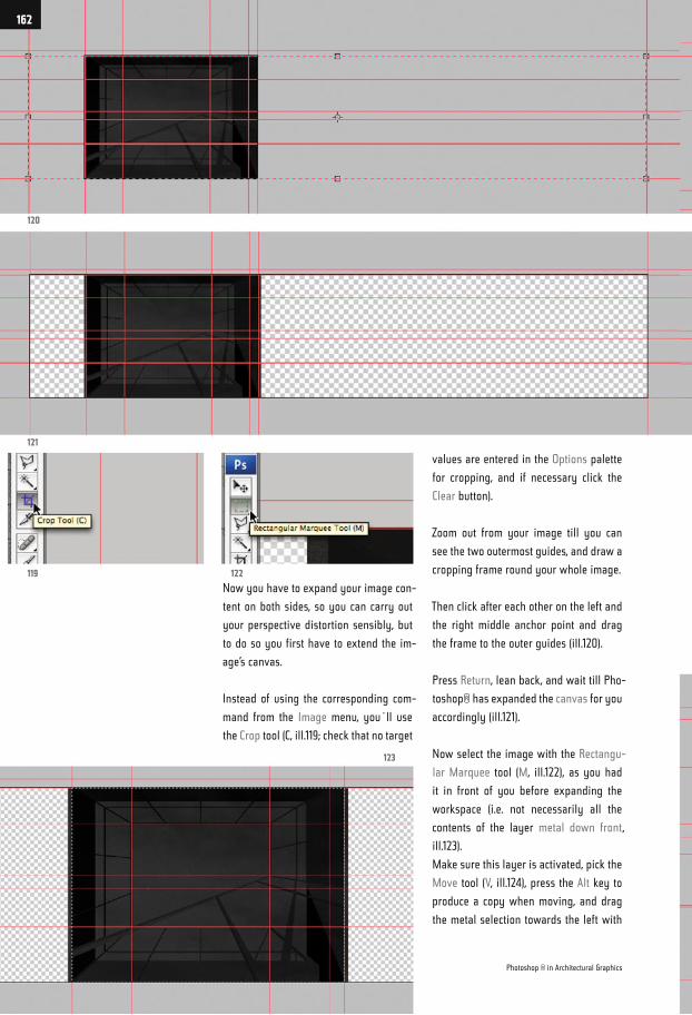
Now you have to expand your image con-
tent on both sides, so you can carry out
your perspective distortion sensibly, but
to do so you first have to extend the im-
age’s canvas.
Instead of using the corresponding com-
mand from the Image menu, you´ll use
the Crop tool (C, ill.119; check that no target
values are entered in the Options palette
for cropping, and if necessary click the
Clear button).
Zoom out from your image till you can
see the two outermost guides, and draw a
cropping frame round your whole image.
Then click after each other on the left and
the right middle anchor point and drag
the frame to the outer guides (ill.120).
Press Return, lean back, and wait till Pho-
toshop® has expanded the canvas for you
accordingly (ill.121).
Now select the image with the Rectangu-
lar Marquee tool (M, ill.122), as you had
it in front of you before expanding the
workspace (i.e. not necessarily all the
contents of the layer metal down front,
ill.123).
Make sure this layer is activated, pick the
Move tool (V, ill.124), press the Alt key to
produce a copy when moving, and drag
the metal selection towards the left with
120
122119
121
123
Photoshop ® in Architectural Graphics
162
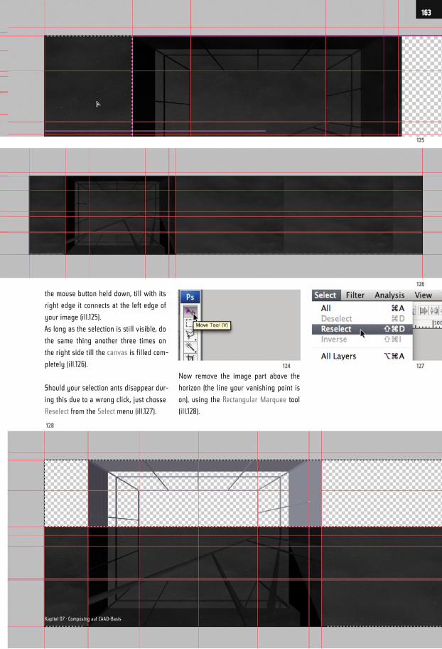
the mouse button held down, till with its
right edge it connects at the left edge of
your image (ill.125).
As long as the selection is still visible, do
the same thing another three times on
the right side till the canvas is filled com-
pletely (ill.126).
Should your selection ants disappear dur-
ing this due to a wrong click, just chosse
Reselect from the Select menu (ill.127).
Now remove the image part above the
horizon (the line your vanishing point is
on), using the Rectangular Marquee tool
(ill.128).
125
126
127124
128
163
Kapitel 07 · Composing auf CAAD-Basis
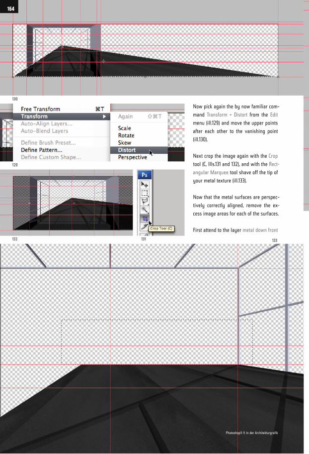
Now pick again the by now familiar com-
mand Transform - Distort from the Edit
menu (ill.129) and move the upper points
after each other to the vanishing point
(ill.130).
Next crop the image again with the Crop
tool (C, Ills.131 and 132), and with the Rect-
angular Marquee tool shave off the tip of
your metal texture (ill.133).
Now that the metal surfaces are perspec-
tively correctly aligned, remove the ex-
cess image areas for each of the surfaces.
First attend to the layer metal down front
130
129
132 131 133
164
Photoshop® ® in der Architekturgrafik
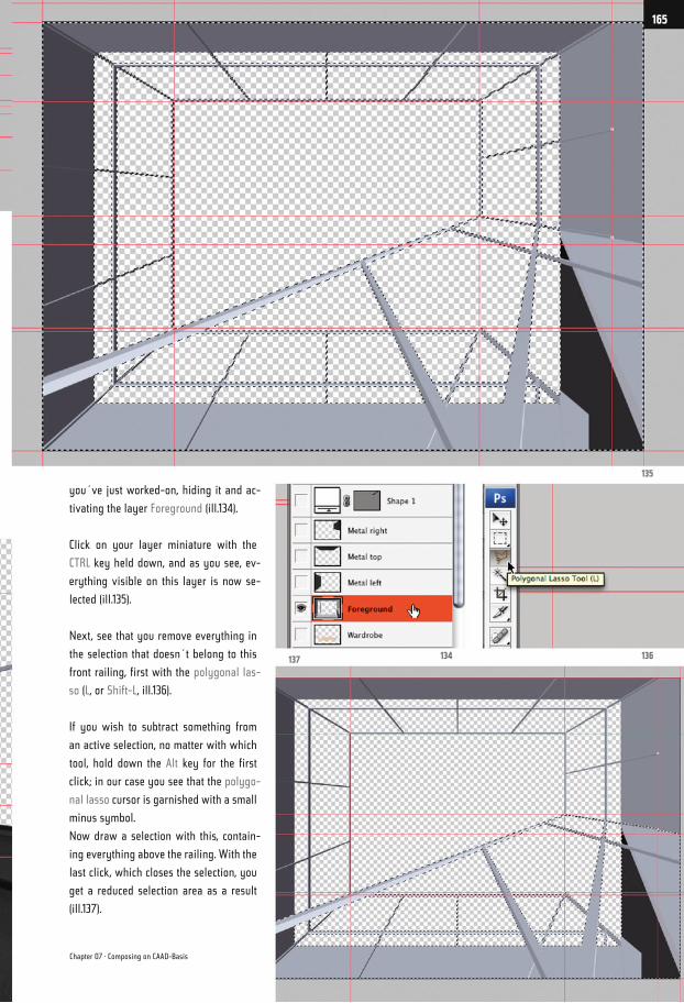
you´ve just worked-on, hiding it and ac-
tivating the layer Foreground (ill.134).
Click on your layer miniature with the
CTRL key held down, and as you see, ev-
erything visible on this layer is now se-
lected (ill.135).
Next, see that you remove everything in
the selection that doesn´t belong to this
front railing, first with the polygonal las-
so (L, or Shift-L, ill.136).
If you wish to subtract something from
an active selection, no matter with which
tool, hold down the Alt key for the first
click; in our case you see that the polygo-
nal lasso cursor is garnished with a small
minus symbol.
Now draw a selection with this, contain-
ing everything above the railing. With the
last click, which closes the selection, you
get a reduced selection area as a result
(ill.137).
135
136134137
Chapter 07 · Composing on CAAD-Basis
165
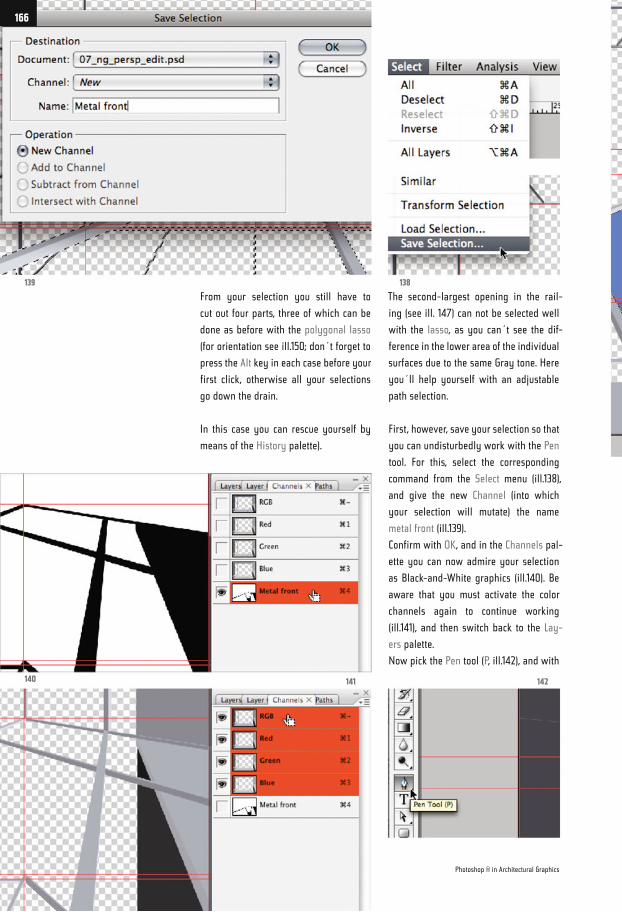
From your selection you still have to
cut out four parts, three of which can be
done as before with the polygonal lasso
(for orientation see ill.150; don´t forget to
press the Alt key in each case before your
first click, otherwise all your selections
go down the drain.
In this case you can rescue yourself by
means of the History palette).
The second-largest opening in the rail-
ing (see ill. 147) can not be selected well
with the lasso, as you can´t see the dif-
ference in the lower area of the individual
surfaces due to the same Gray tone. Here
you´ll help yourself with an adjustable
path selection.
First, however, save your selection so that
you can undisturbedly work with the Pen
tool. For this, select the corresponding
command from the Select menu (ill.138),
and give the new Channel (into which
your selection will mutate) the name
metal front (ill.139).
Confirm with OK, and in the Channels pal-
ette you can now admire your selection
as Black-and-White graphics (ill.140). Be
aware that you must activate the color
channels again to continue working
(ill.141), and then switch back to the Lay-
ers palette.
Now pick the Pen tool (P, ill.142), and with
139
140
138
141 142
Photoshop ® in Architectural Graphics
166
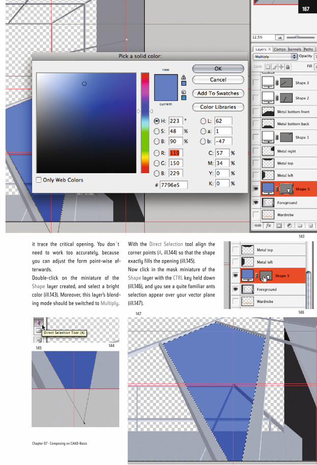
it trace the critical opening. You don´t
need to work too accurately, because
you can adjust the form point-wise af-
terwards.
Double-click on the miniature of the
Shape layer created, and select a bright
color (ill.143). Moreover, this layer’s blend-
ing mode should be switched to Multiply.
With the Direct Selection tool align the
corner points (A, ill.144) so that the shape
exactly fills the opening (ill.145).
Now click in the mask miniature of the
Shape layer with the CTRL key held down
(ill.146), and you see a quite familiar ants
selection appear over your vector plane
(ill.147).
143
146147
144145
Chapter 07 · Composing on CAAD-Basis
167
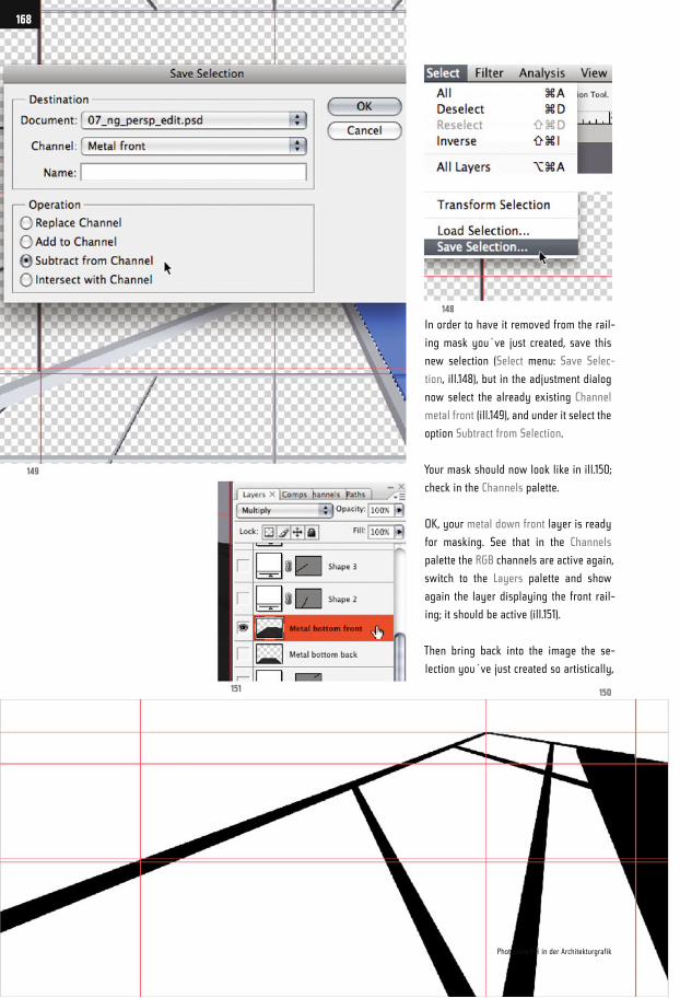
In order to have it removed from the rail-
ing mask you´ve just created, save this
new selection (Select menu: Save Selec-
tion, ill.148), but in the adjustment dialog
now select the already existing Channel
metal front (ill.149), and under it select the
option Subtract from Selection.
Your mask should now look like in ill.150;
check in the Channels palette.
OK, your metal down front layer is ready
for masking. See that in the Channels
palette the RGB channels are active again,
switch to the Layers palette and show
again the layer displaying the front rail-
ing; it should be active (ill.151).
Then bring back into the image the se-
lection you´ve just created so artistically,
149
151
148
150
168
Photoshop® ® in der Architekturgrafik
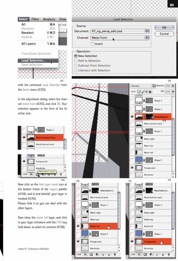
with the command Load Selection from
the Select menu (ill.152).
In the adjustment dialog select the chan-
nel metal front (ill.153), and click OK. Your
selection appears in the form of the fa-
miliar ants.
Now click on the Add layer mask icon at
the bottom frame of the Layers palette
(ill.154), and lo and behold!, your layer is
masked (ill.155).
Please hide it so you can deal with the
other layers.
Now show the metal left layer, and click
in your layer miniature with the CTRL key
held down, to select its contents (ill.156).
155
153152
154 156 157
Chapter 07 · Composing on CAAD-Basis
169
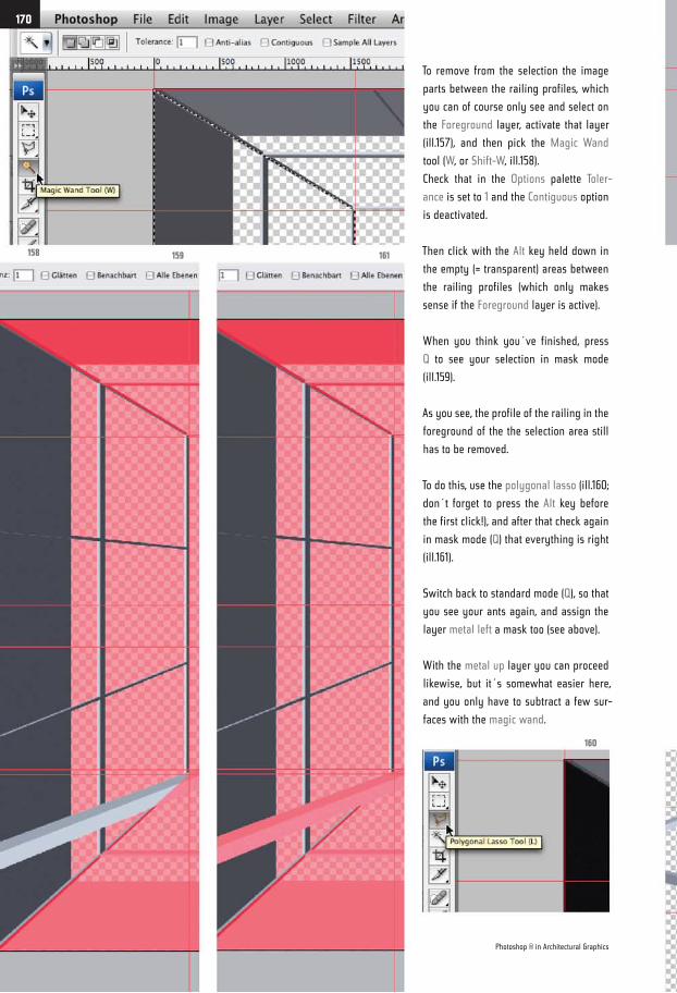
To remove from the selection the image
parts between the railing profiles, which
you can of course only see and select on
the Foreground layer, activate that layer
(ill.157), and then pick the Magic Wand
tool (W, or Shift-W, ill.158).
Check that in the Options palette Toler-
ance is set to 1 and the Contiguous option
is deactivated.
Then click with the Alt key held down in
the empty (= transparent) areas between
the railing profiles (which only makes
sense if the Foreground layer is active).
When you think you´ve finished, press
Q to see your selection in mask mode
(ill.159).
As you see, the profile of the railing in the
foreground of the the selection area still
has to be removed.
To do this, use the polygonal lasso (ill.160;
don´t forget to press the Alt key before
the first click!), and after that check again
in mask mode (Q) that everything is right
(ill.161).
Switch back to standard mode (Q), so that
you see your ants again, and assign the
layer metal left a mask too (see above).
With the metal up layer you can proceed
likewise, but it´s somewhat easier here,
and you only have to subtract a few sur-
faces with the magic wand.
158 159 161
160
Photoshop ® in Architectural Graphics
170
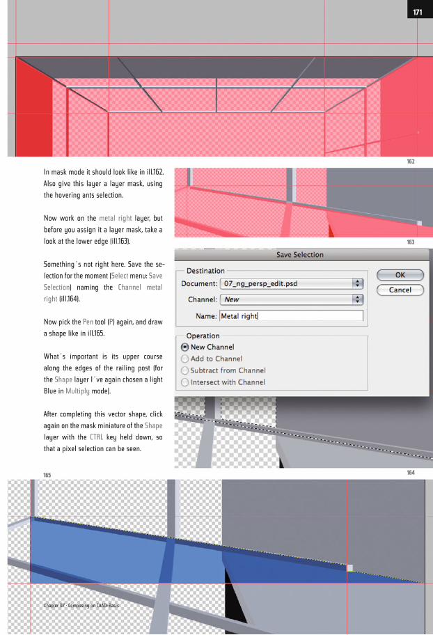
In mask mode it should look like in ill.162.
Also give this layer a layer mask, using
the hovering ants selection.
Now work on the metal right layer, but
before you assign it a layer mask, take a
look at the lower edge (ill.163).
Something´s not right here. Save the se-
lection for the moment (Select menu: Save
Selection) naming the Channel metal
right (ill.164).
Now pick the Pen tool (P) again, and draw
a shape like in ill.165.
What´s important is its upper course
along the edges of the railing post (for
the Shape layer I´ve again chosen a light
Blue in Multiply mode).
After completing this vector shape, click
again on the mask miniature of the Shape
layer with the CTRL key held down, so
that a pixel selection can be seen.
165 164
163
162
Chapter 07 · Composing on CAAD-Basis
171
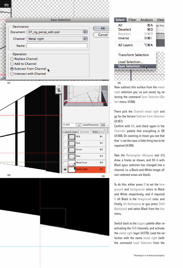
Now subtract this surface from the metal
right selection you´ve just saved, by se-
lecting the command Save Selection (Se-
lect menu, ill.166).
There pick the Channel metal right and
go for the Variant Subtract from Selection
(ill.167).
Confirm with OK, and check again in the
Channels palette that everything is OK
(ill.168). On zooming in closer you see that
that´s not the case; a little thing has to be
repaired (ill.169).
Take the Rectangular Marquee tool (M),
draw a frame as shown, and fill it with
Black (your selection has changed into a
channel, i.e. a Black-and-White image; all
non-selected areas are black).
To do this, either press D to set the fore-
ground and background colors to Black
and White respectively, and if required
X till Black is the foreground color, and
finally Alt-Backspace; or you press Shift-
Backspace and select Black from the Use
menu.
Switch back to the Layers palette after re-
activating the RGB channels, and activate
the metal right layer (ill.170). Load the se-
lection with the name metal right (with
the command Load Selection from the
167
168
166
169
Photoshop ® in Architectural Graphics
172
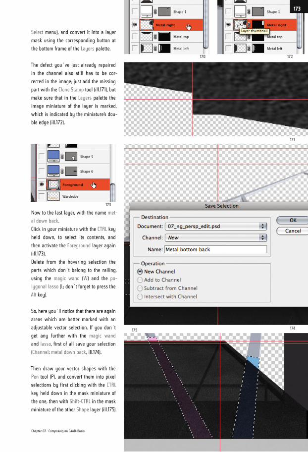
Select menu), and convert it into a layer
mask using the corresponding button at
the bottom frame of the Layers palette.
The defect you´ve just already repaired
in the channel also still has to be cor-
rected in the image; just add the missing
part with the Clone Stamp tool (ill.171), but
make sure that in the Layers palette the
image miniature of the layer is marked,
which is indicated by the miniature’s dou-
ble edge (ill.172).
Now to the last layer, with the name met-
al down back.
Click in your miniature with the CTRL key
held down, to select its contents, and
then activate the Foreground layer again
(ill.173).
Delete from the hovering selection the
parts which don´t belong to the railing,
using the magic wand (W) and the po-
lygonal lasso (L; don´t forget to press the
Alt key).
So, here you´ll notice that there are again
areas which are better marked with an
adjustable vector selection. If you don´t
get any further with the magic wand
and lasso, first of all save your selection
(Channel: metal down back, ill.174).
Then draw your vector shapes with the
Pen tool (P), and convert them into pixel
selections by first clicking with the CTRL
key held down in the mask miniature of
the one, then with Shift-CTRL in the mask
miniature of the other Shape layer (ill.175).
174
171
172170
173
175
Chapter 07 · Composing on CAAD-Basis
173
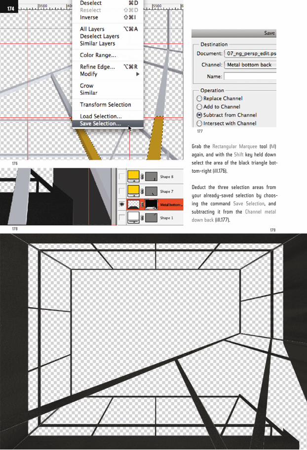
Grab the Rectangular Marquee tool (M)
again, and with the Shift key held down
select the area of the black triangle bot-
tom-right (ill.176).
Deduct the three selection areas from
your already-saved selection by choos-
ing the command Save Selection, and
subtracting it from the Channel metal
down back (ill.177).
176
178
177
179
174
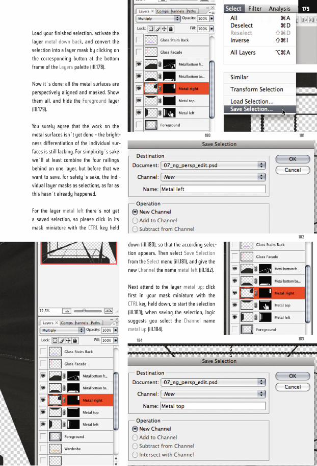
Load your finished selection, activate the
layer metal down back, and convert the
selection into a layer mask by clicking on
the corresponding button at the bottom
frame of the Layers palette (ill.178).
Now it´s done; all the metal surfaces are
perspectively aligned and masked. Show
them all, and hide the Foreground layer
(ill.179).
You surely agree that the work on the
metal surfaces isn´t yet done - the bright-
ness differentiation of the individual sur-
faces is still lacking. For simplicity´s sake
we´ll at least combine the four railings
behind on one layer, but before that we
want to save, for safety´s sake, the indi-
vidual layer masks as selections, as far as
this hasn´t already happened.
For the layer metal left there´s not yet
a saved selection, so please click in its
mask miniature with the CTRL key held
down (ill.180), so that the according selec-
tion appears. Then select Save Selection
from the Select menu (ill.181), and give the
new Channel the name metal left (ill.182).
Next attend to the layer metal up; click
first in your mask miniature with the
CTRL key held down, to start the selection
(ill.183); when saving the selection, logic
suggests you select the Channel name
metal up (ill.184).
182
181180
183184
175
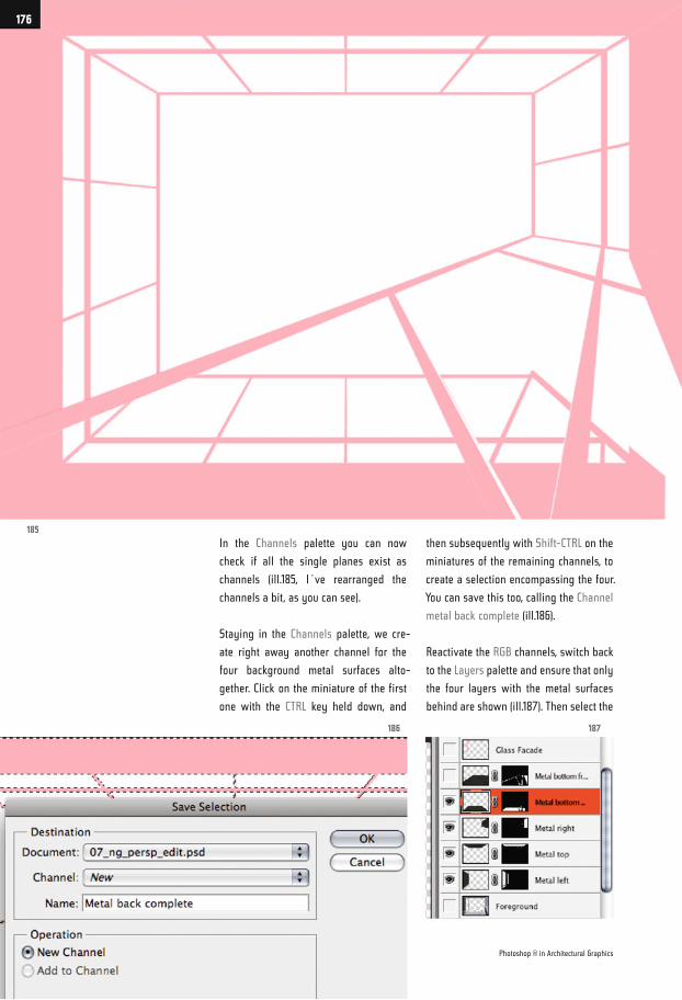
In the Channels palette you can now
check if all the single planes exist as
channels (ill.185, I´ve rearranged the
channels a bit, as you can see).
Staying in the Channels palette, we cre-
ate right away another channel for the
four background metal surfaces alto-
gether. Click on the miniature of the first
one with the CTRL key held down, and
then subsequently with Shift-CTRL on the
miniatures of the remaining channels, to
create a selection encompassing the four.
You can save this too, calling the Channel
metal back complete (ill.186).
Reactivate the RGB channels, switch back
to the Layers palette and ensure that only
the four layers with the metal surfaces
behind are shown (ill.187). Then select the
185
186 187
Photoshop ® in Architectural Graphics
176
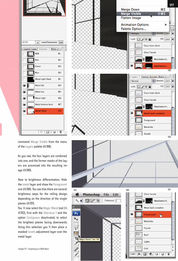
command Merge Visible from the menu
of the Layers palette (ill.188).
As you see, the four layers are combined
into one, and the former masks of the lay-
ers are processed into the resulting im-
age (ill.189).
Now to brightness differentiation. Hide
the metal layer and show the Foreground
one (ill.190). You see that there are several
brightness steps for the railing design,
depending on the direction of the single
planes (ill.191).
You´ll now select the Magic Wand tool (W,
ill.192), first with the Tolerance 1 and the
option Contiguous deactivated, to select
the brightest planes facing downwards.
Using this selection you´ll then place a
masked Levels adjustment layer over the
metal layer.
192 190 191
189
188
Chapter 07 · Composing on CAAD-Basis
177
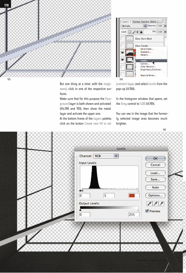
But one thing at a time: with the magic
wand, click in one of the respective sur-
faces.
Make sure that for this purpose the Fore-
ground layer is both shown and activated
(Ills.190 and 193), then show the metal
layer and activate the upper one.
At the bottom frame of the Layers palette,
click on the button Create new fill or ad-
justment layer, and select Levels from the
pop-up (ill.194).
In the histogram window that opens, set
the Gray control to 5,00 (ill.195).
You can see in the image that the former-
ly selected image area becomes much
brighter.
193 194
195
Photoshop ® in Architectural Graphics
178
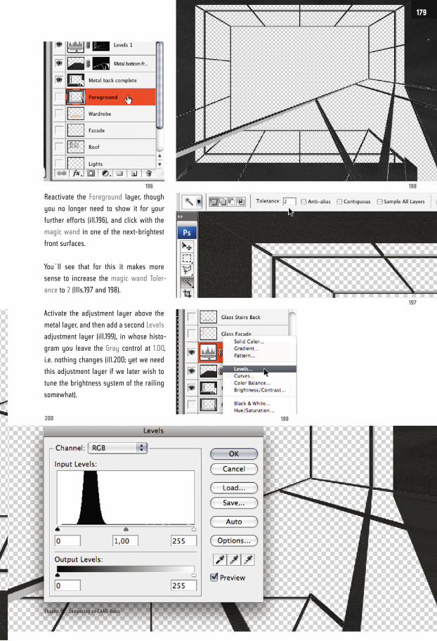
Reactivate the Foreground layer, though
you no longer need to show it for your
further efforts (ill.196), and click with the
magic wand in one of the next-brightest
front surfaces.
You´ll see that for this it makes more
sense to increase the magic wand Toler-
ance to 2 (Ills.197 and 198).
Activate the adjustment layer above the
metal layer, and then add a second Levels
adjustment layer (ill.199), in whose histo-
gram you leave the Gray control at 1.00,
i.e. nothing changes (ill.200; yet we need
this adjustment layer if we later wish to
tune the brightness system of the railing
somewhat).
197
198196
199200
Chapter 07 · Composing on CAAD-Basis
179
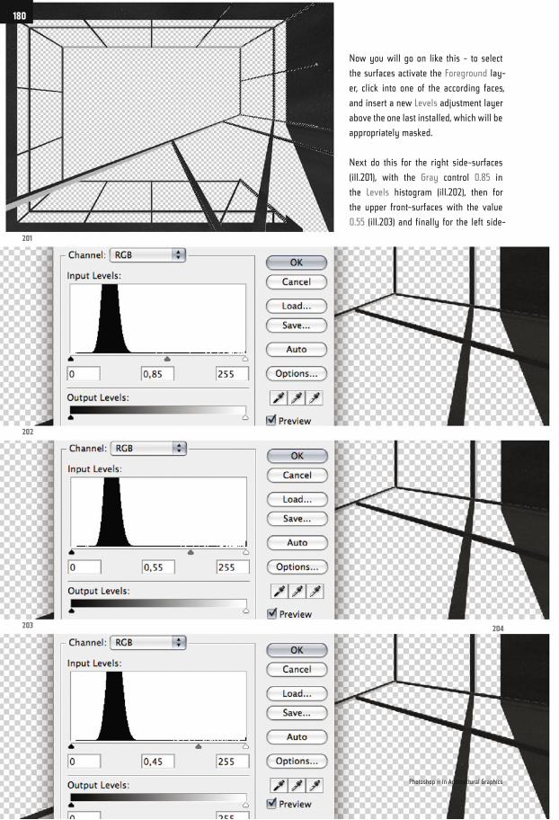
Now you will go on like this - to select
the surfaces activate the Foreground lay-
er, click into one of the according faces,
and insert a new Levels adjustment layer
above the one last installed, which will be
appropriately masked.
Next do this for the right side-surfaces
(ill.201), with the Gray control 0.85 in
the Levels histogram (ill.202), then for
the upper front-surfaces with the value
0.55 (ill.203) and finally for the left side-
201
202
203 204
Photoshop ® in Architectural Graphics
180
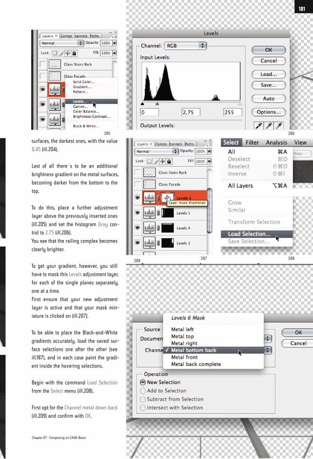
surfaces, the darkest ones, with the value
0.45 (ill.204).
Last of all there´s to be an additional
brightness gradient on the metal surfaces,
becoming darker from the bottom to the
top.
To do this, place a further adjustment
layer above the previously inserted ones
(ill.205) and set the histogram Gray con-
trol to 2.75 (ill.206).
You see that the railing complex becomes
clearly brighter.
To get your gradient, however, you still
have to mask this Levels adjustment layer,
for each of the single planes separately,
one at a time.
First ensure that your new adjustment
layer is active and that your mask min-
iature is clicked on (ill.207).
To be able to place the Black-and-White
gradients accurately, load the saved sur-
face selections one after the other (see
ill.187), and in each case paint the gradi-
ent inside the hovering selections.
Begin with the command Load Selection
from the Select menu (ill.208).
First opt for the Channel metal down back
(ill.209) and confirm with OK.
206
208207
205
209
Chapter 07 · Composing on CAAD-Basis
181
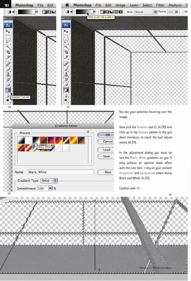
You see your selection hovering over the
image.
Now pick the Gradient tool (G, ill.210) and
click up in the Options palette in the gra-
dient miniature, to reach the tool adjust-
ments (ill.211).
In the adjustment dialog you must se-
lect the Black, White gradient, as you´ll
only achieve an optimal mask effect
with this one (don´t rely on your present
foreground and background colors being
Black and White, ill.212).
Confirm with OK.
210
212 213
211
Photoshop ® in Architectural Graphics
182
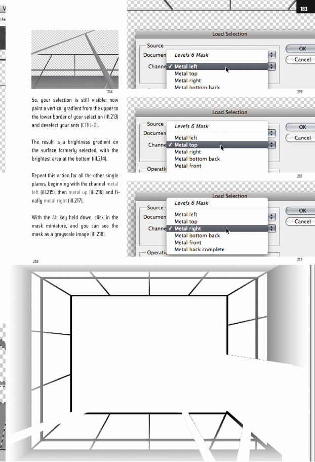
So, your selection is still visible; now
paint a vertical gradient from the upper to
the lower border of your selection (ill.213)
and deselect your ants (CTRL-D).
The result is a brightness gradient on
the surface formerly selected, with the
brightest area at the bottom (ill.214).
Repeat this action for all the other single
planes, beginning with the channel metal
left (ill.215), then metal up (ill.216) and fi-
nally metal right (ill.217).
With the Alt key held down, click in the
mask miniature, and you can see the
mask as a grayscale image (ill.218).
215
216
217218
214
183
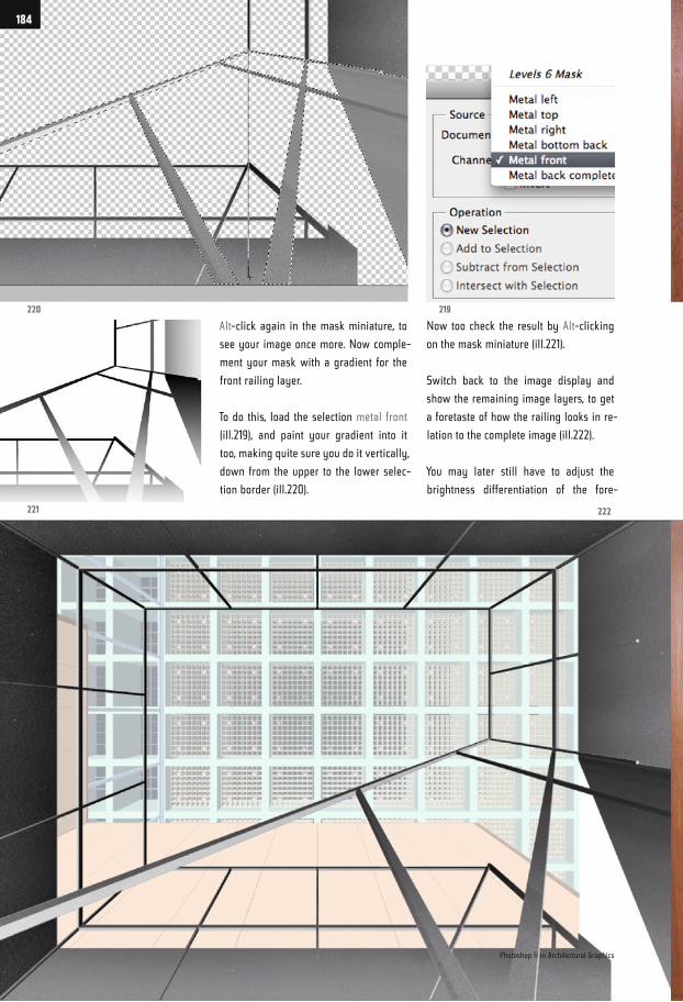
Alt-click again in the mask miniature, to
see your image once more. Now comple-
ment your mask with a gradient for the
front railing layer.
To do this, load the selection metal front
(ill.219), and paint your gradient into it
too, making quite sure you do it vertically,
down from the upper to the lower selec-
tion border (ill.220).
Now too check the result by Alt-clicking
on the mask miniature (ill.221).
Switch back to the image display and
show the remaining image layers, to get
a foretaste of how the railing looks in re-
lation to the complete image (ill.222).
You may later still have to adjust the
brightness differentiation of the fore-
220
221 222
219
Photoshop ® in Architectural Graphics
184
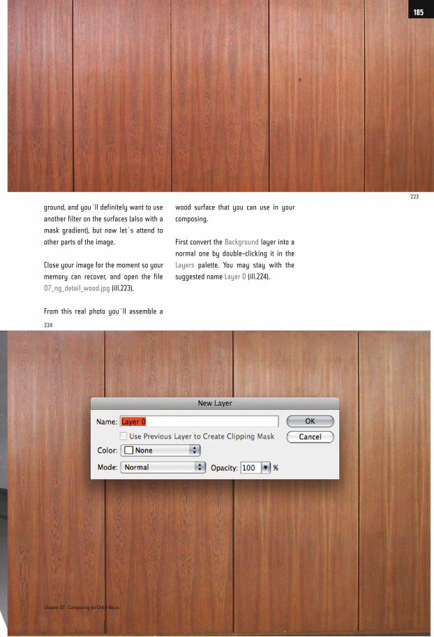
ground, and you´ll definitely want to use
another filter on the surfaces (also with a
mask gradient), but now let´s attend to
other parts of the image.
Close your image for the moment so your
memory can recover, and open the file
07_ng_detail_wood.jpg (ill.223).
From this real photo you´ll assemble a
wood surface that you can use in your
composing.
First convert the Background layer into a
normal one by double-clicking it in the
Layers palette. You may stay with the
suggested name Layer 0 (ill.224).
224
223
Chapter 07 · Composing on CAAD-Basis
185
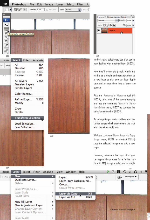
In the Layers palette you see that you’re
now dealing with a normal layer (ill.225).
Now you´ll select the panels which are
visible as a whole, and transport them to
a new layer so that you can later dupli-
cate and arrange them into a larger se-
quence.
Pick the Rectangular Marquee tool (M,
ill.226), select one of the panels roughly,
and use the command Transform Selec-
tion (Select menu, ill.227) to contract the
selection somewhat (ill.228).
By doing this you avoid conflicts with the
curved edges which arose due to the shot
with the wide-angle lens.
With the command New - Layer via Copy
(Layer menu, ill.229, or shortcut CTRL-J),
copy the selected image area onto a new
layer.
However, reactivate the Layer 0 so you
can repeat the process for a further sur-
face (ill.230). As your selection rectangle
226
227 229
228
225
Photoshop ® in Architectural Graphics
186
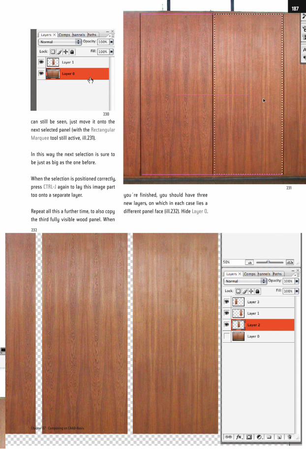
can still be seen, just move it onto the
next selected panel (with the Rectangular
Marquee tool still active, ill.231).
In this way the next selection is sure to
be just as big as the one before.
When the selection is positioned correctly,
press CTRL-J again to lay this image part
too onto a separate layer.
Repeat all this a further time, to also copy
the third fully visible wood panel. When
you´re finished, you should have three
new layers, on which in each case lies a
different panel face (ill.232). Hide Layer 0.
232
230
231
Chapter 07 · Composing on CAAD-Basis
187
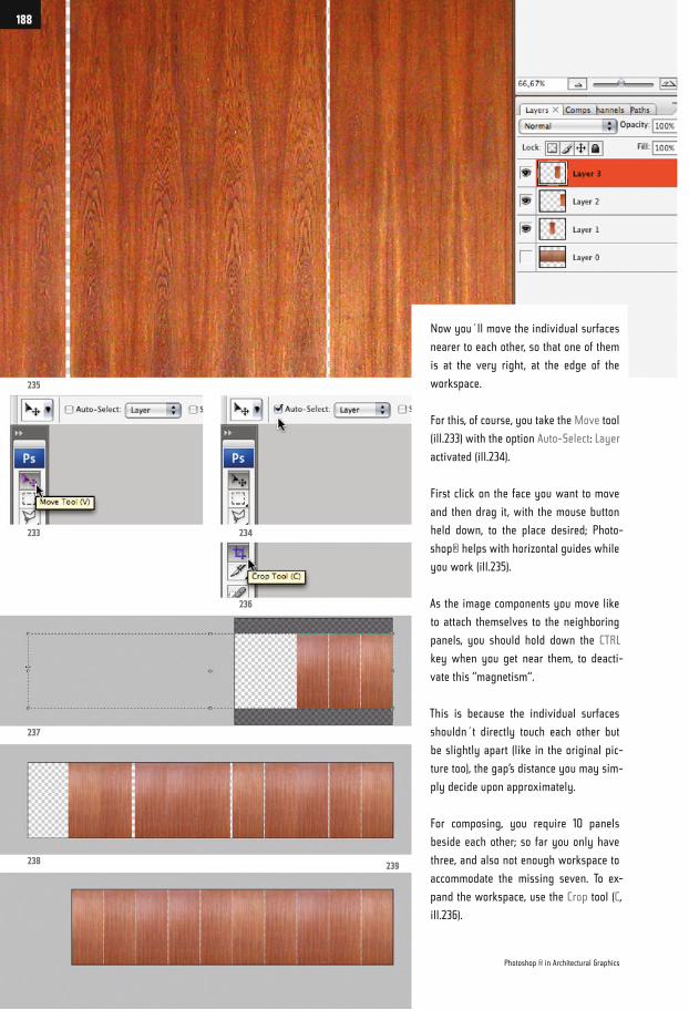
Now you´ll move the individual surfaces
nearer to each other, so that one of them
is at the very right, at the edge of the
workspace.
For this, of course, you take the Move tool
(ill.233) with the option Auto-Select: Layer
activated (ill.234).
First click on the face you want to move
and then drag it, with the mouse button
held down, to the place desired; Photo-
shop® helps with horizontal guides while
you work (ill.235).
As the image components you move like
to attach themselves to the neighboring
panels, you should hold down the CTRL
key when you get near them, to deacti-
vate this “magnetism“.
This is because the individual surfaces
shouldn´t directly touch each other but
be slightly apart (like in the original pic-
ture too), the gap’s distance you may sim-
ply decide upon approximately.
For composing, you require 10 panels
beside each other; so far you only have
three, and also not enough workspace to
accommodate the missing seven. To ex-
pand the workspace, use the Crop tool (C,
ill.236).
235
233
237
238239
234
236
Photoshop ® in Architectural Graphics
188
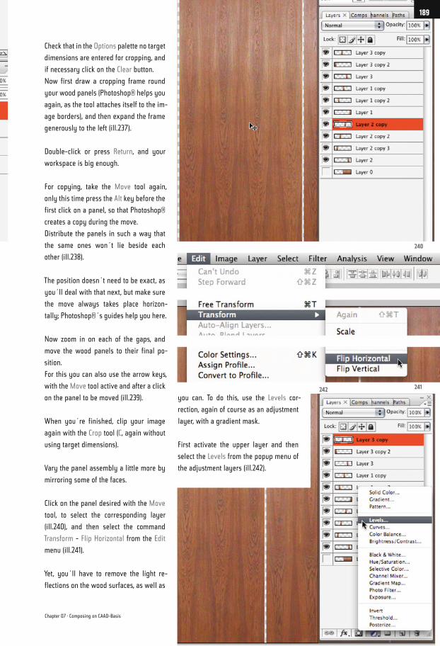
Check that in the Options palette no target
dimensions are entered for cropping, and
if necessary click on the Clear button.
Now first draw a cropping frame round
your wood panels (Photoshop® helps you
again, as the tool attaches itself to the im-
age borders), and then expand the frame
generously to the left (ill.237).
Double-click or press Return, and your
workspace is big enough.
For copying, take the Move tool again,
only this time press the Alt key before the
first click on a panel, so that Photoshop®
creates a copy during the move.
Distribute the panels in such a way that
the same ones won´t lie beside each
other (ill.238).
The position doesn´t need to be exact, as
you´ll deal with that next, but make sure
the move always takes place horizon-
tally; Photoshop®´s guides help you here.
Now zoom in on each of the gaps, and
move the wood panels to their final po-
sition.
For this you can also use the arrow keys,
with the Move tool active and after a click
on the panel to be moved (ill.239).
When you´re finished, clip your image
again with the Crop tool (C, again without
using target dimensions).
Vary the panel assembly a little more by
mirroring some of the faces.
Click on the panel desired with the Move
tool, to select the corresponding layer
(ill.240), and then select the command
Transform - Flip Horizontal from the Edit
menu (ill.241).
Yet, you´ll have to remove the light re-
flections on the wood surfaces, as well as
you can. To do this, use the Levels cor-
rection, again of course as an adjustment
layer, with a gradient mask.
First activate the upper layer and then
select the Levels from the popup menu of
the adjustment layers (ill.242).
240
241242
Chapter 07 · Composing on CAAD-Basis
189
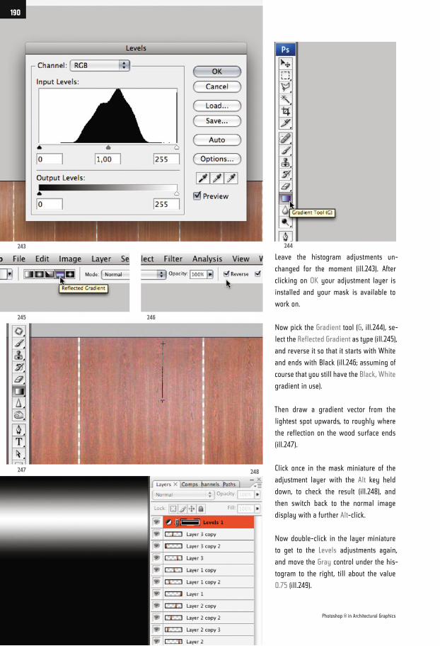
Leave the histogram adjustments un-
changed for the moment (ill.243). After
clicking on OK your adjustment layer is
installed and your mask is available to
work on.
Now pick the Gradient tool (G, ill.244), se-
lect the Reflected Gradient as type (ill.245),
and reverse it so that it starts with White
and ends with Black (ill.246; assuming of
course that you still have the Black, White
gradient in use).
Then draw a gradient vector from the
lightest spot upwards, to roughly where
the reflection on the wood surface ends
(ill.247).
Click once in the mask miniature of the
adjustment layer with the Alt key held
down, to check the result (ill.248), and
then switch back to the normal image
display with a further Alt-click.
Now double-click in the layer miniature
to get to the Levels adjustments again,
and move the Gray control under the his-
togram to the right, till about the value
0.75 (ill.249).
243
245
247 248
246
244
Photoshop ® in Architectural Graphics
190

In the image you can at the same time
follow how the brightness homogenizes
on the surfaces.
Should you still not be happy with the
result, you can change the gradient. Al-
ways start at the same place, but vary the
length of the gradient vector.
Now add a further Levels adjustment lay-
er over this one (ill.250), to enhance the
contrast in the entire image.
Set the left control of the histogram to
0.50, and the right one to 210 (ill.251).
In addition to the single panels you re-
quire a further layer, on which a large
wood surface the size of the entire image
is visible.
You will later need it for the background.
First combine your layers created so far
into one group, by marking them (ill.252),
and then select the command New Group
from Layers from the Layer menu (ill.253).
249
251252 253
250
Chapter 07 · Composing on CAAD-Basis
191
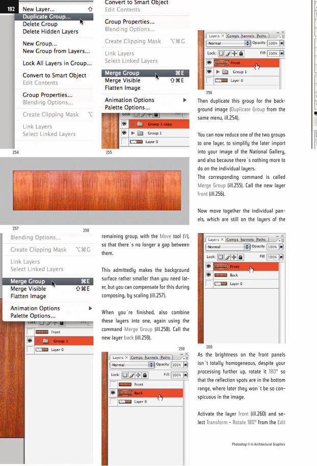
Then duplicate this group for the back-
ground image (Duplicate Group from the
same menu, ill.254).
You can now reduce one of the two groups
to one layer, to simplify the later import
into your image of the National Gallery,
and also because there´s nothing more to
do on the individual layers.
The corresponding command is called
Merge Group (ill.255). Call the new layer
front (ill.256).
Now move together the individual pan-
els, which are still on the layers of the
remaining group, with the Move tool (V),
so that there´s no longer a gap between
them.
This admittedly makes the background
surface rather smaller than you need lat-
er, but you can compensate for this during
composing, by scaling (ill.257).
When you´re finished, also combine
these layers into one, again using the
command Merge Group (ill.258). Call the
new layer back (ill.259).
As the brightness on the front panels
isn´t totally homogeneous, despite your
processing further up, rotate it 180° so
that the reflection spots are in the bottom
range, where later they won´t be so con-
spicuous in the image.
Activate the layer front (ill.260) and se-
lect Transform - Rotate 180° from the Edit
254
257
255
256
260259
258
Photoshop ® in Architectural Graphics
192
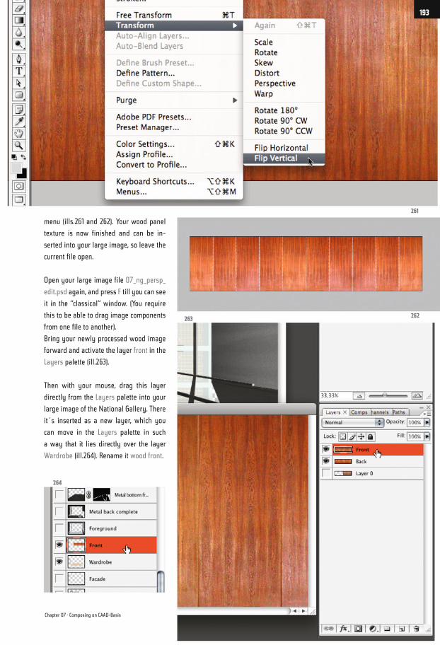
menu (ills.261 and 262). Your wood panel
texture is now finished and can be in-
serted into your large image, so leave the
current file open.
Open your large image file 07_ng_persp_
edit.psd again, and press F till you can see
it in the “classical“ window. (You require
this to be able to drag image components
from one file to another).
Bring your newly processed wood image
forward and activate the layer front in the
Layers palette (ill.263).
Then with your mouse, drag this layer
directly from the Layers palette into your
large image of the National Gallery. There
it´s inserted as a new layer, which you
can move in the Layers palette in such
a way that it lies directly over the layer
Wardrobe (ill.264). Rename it wood front.
261
262263
264
Chapter 07 · Composing on CAAD-Basis
193
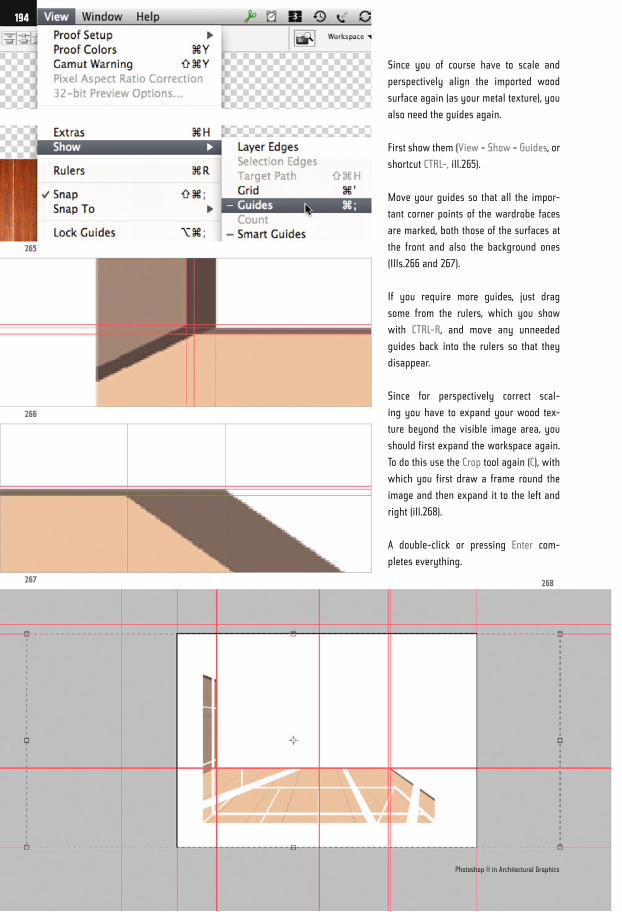
Since you of course have to scale and
perspectively align the imported wood
surface again (as your metal texture), you
also need the guides again.
First show them (View - Show - Guides, or
shortcut CTRL-, ill.265).
Move your guides so that all the impor-
tant corner points of the wardrobe faces
are marked, both those of the surfaces at
the front and also the background ones
(Ills.266 and 267).
If you require more guides, just drag
some from the rulers, which you show
with CTRL-R, and move any unneeded
guides back into the rulers so that they
disappear.
Since for perspectively correct scal-
ing you have to expand your wood tex-
ture beyond the visible image area, you
should first expand the workspace again.
To do this use the Crop tool again (C), with
which you first draw a frame round the
image and then expand it to the left and
right (ill.268).
A double-click or pressing Enter com-
pletes everything.
265
266
267 268
Photoshop ® in Architectural Graphics
194
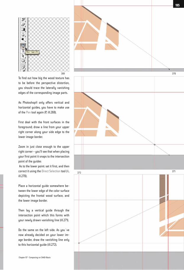
To find out how big the wood texture has
to be before the perspective distortion,
you should trace the laterally vanishing
edges of the corresponding image parts.
As Photoshop® only offers vertical and
horizontal guides, you have to make use
of the Pen tool again (P, ill.269).
First deal with the front surfaces in the
foreground; draw a line from your upper
right corner along your side edge to the
lower image border.
Zoom in just close enough to the upper
right corner - you’ll see that when placing
your first point it snaps to the intersection
point of the guides
As to the lower point: set it first, and then
correct it using the Direct Selection tool (A,
ill.270).
Place a horizontal guide somewhere be-
tween the lower edge of the color surface
depicting the frontal wood surface, and
the lower image border.
Then lay a vertical guide through the
intersection point which this forms with
your newly drawn vanishing line (ill.271).
Do the same on the left side. As you´ve
now already decided on your lower im-
age border, draw the vanishing line only
to this horizontal guide (ill.272).
272271
270269
Chapter 07 · Composing on CAAD-Basis
195
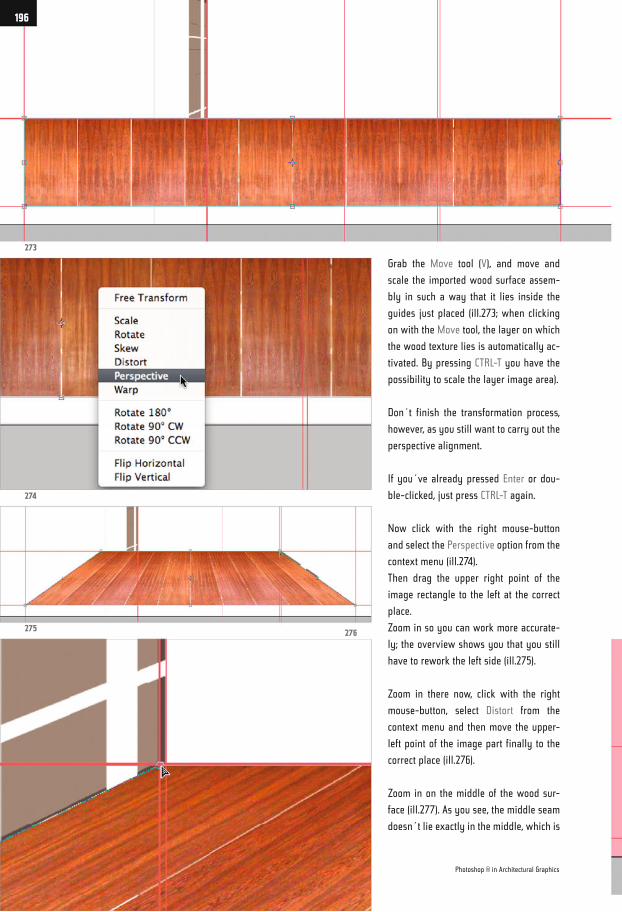
Grab the Move tool (V), and move and
scale the imported wood surface assem-
bly in such a way that it lies inside the
guides just placed (ill.273; when clicking
on with the Move tool, the layer on which
the wood texture lies is automatically ac-
tivated. By pressing CTRL-T you have the
possibility to scale the layer image area).
Don´t finish the transformation process,
however, as you still want to carry out the
perspective alignment.
If you´ve already pressed Enter or dou-
ble-clicked, just press CTRL-T again.
Now click with the right mouse-button
and select the Perspective option from the
context menu (ill.274).
Then drag the upper right point of the
image rectangle to the left at the correct
place.
Zoom in so you can work more accurate-
ly; the overview shows you that you still
have to rework the left side (ill.275).
Zoom in there now, click with the right
mouse-button, select Distort from the
context menu and then move the upper-
left point of the image part finally to the
correct place (ill.276).
Zoom in on the middle of the wood sur-
face (ill.277). As you see, the middle seam
doesn´t lie exactly in the middle, which is
273
274
275276
Photoshop ® in Architectural Graphics
196
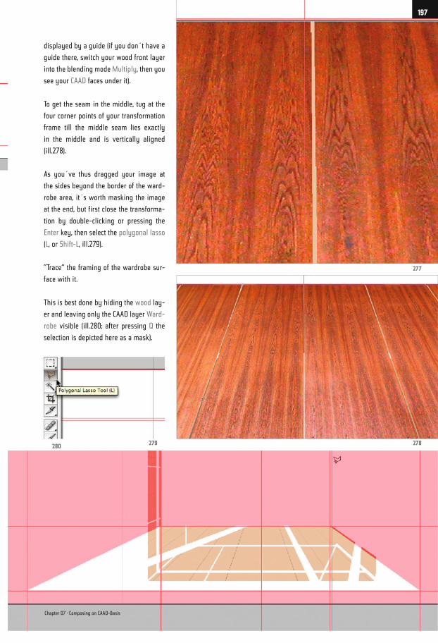
displayed by a guide (if you don´t have a
guide there, switch your wood front layer
into the blending mode Multiply, then you
see your CAAD faces under it).
To get the seam in the middle, tug at the
four corner points of your transformation
frame till the middle seam lies exactly
in the middle and is vertically aligned
(ill.278).
As you´ve thus dragged your image at
the sides beyond the border of the ward-
robe area, it´s worth masking the image
at the end, but first close the transforma-
tion by double-clicking or pressing the
Enter key, then select the polygonal lasso
(L, or Shift-L, ill.279).
”Trace“ the framing of the wardrobe sur-
face with it.
This is best done by hiding the wood lay-
er and leaving only the CAAD layer Ward-
robe visible (ill.280; after pressing Q the
selection is depicted here as a mask).
280279 278
277
Chapter 07 · Composing on CAAD-Basis
197
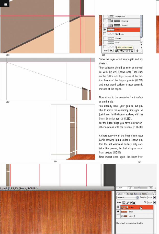
Show the layer wood front again and ac-
tivate it.
Your selection should be seen as normal,
i.e. with the well-known ants. Then click
on the button Add layer mask at the bot-
tom frame of the Layers palette (ill.281),
and your wood surface is now correctly
masked at the edges.
Now attend to the wardrobe front surfac-
es on the left.
You already have your guides, but you
should move the vanishing lines you´ve
just drawn for the frontal surface, with the
Direct Selection tool (A, ill.282).
For the upper edge you have to draw an-
other new one with the Pen tool (P, ill.283).
A short overview of the image from your
CAAD drawing lying under it shows you
that the left wardrobe surface only con-
tains five panels, i.e. half of your wood
front texture (ill.284).
First import once again the layer front
282 281
283
284 285
Photoshop ® in Architectural Graphics
198
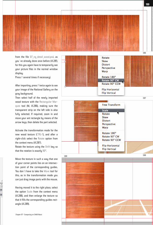
from the file 07_ng_detail_wood.psd, as
you´ve already done once before (ill.285;
for this you again have to temporarily see
your picture files in the normal window
display.
Press F several times if necessary).
After importing, press F twice again to see
your image of the National Gallery on the
gray background.
Then select half of the newly imported
wood texture with the Rectangular Mar-
quee tool (M, ill.286), making sure the
transparent strip on the left side is also
fully selected. If required, zoom in and
move your ant rectangle by means of the
arrow keys, then delete the part selected.
Activate the transformation mode for the
new wood texture (CTRL-T), and after a
right-click select the Rotate option from
the context menu (ill.287).
Rotate the texture using the Shift key so
that the rotation is exactly 90°.
Move the texture in such a way that one
of your corner points lies on an intersec-
tion point of the corresponding guides.
You don´t have to take the Move tool for
this, as in the transformation mode you
can just drag image parts with the mouse.
Having moved it to the right place, select
the option Scale from the context menu
(ill.288), and then enlarge the texture so
that it fills the corresponding guides rect-
angle (ill.289).
289 288
287
286
Chapter 07 · Composing on CAAD-Basis
199
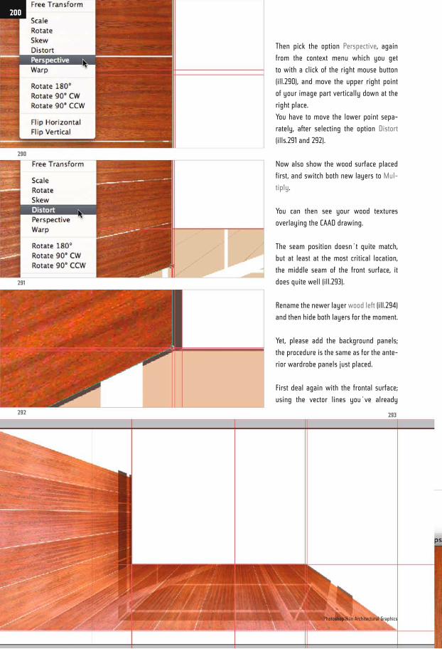
Then pick the option Perspective, again
from the context menu which you get
to with a click of the right mouse button
(ill.290), and move the upper right point
of your image part vertically down at the
right place.
You have to move the lower point sepa-
rately, after selecting the option Distort
(ills.291 and 292).
Now also show the wood surface placed
first, and switch both new layers to Mul-
tiply.
You can then see your wood textures
overlaying the CAAD drawing.
The seam position doesn´t quite match,
but at least at the most critical location,
the middle seam of the front surface, it
does quite well (ill.293).
Rename the newer layer wood left (ill.294)
and then hide both layers for the moment.
Yet, please add the background panels;
the procedure is the same as for the ante-
rior wardrobe panels just placed.
First deal again with the frontal surface;
using the vector lines you´ve already
290
291
292 293
Photoshop ® in Architectural Graphics
200
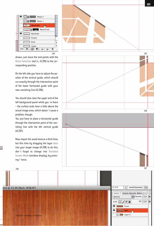
drawn, just move the end points with the
Direct Selection tool (A, ill.295) to the cor-
responding position.
On the left side you have to adjust the po-
sition of the vertical guide, which should
run exactly through the intersection point
of the lower horizontal guide with your
new vanishing line (ill.296).
You should also clear the upper end of the
left background panel while you´re there
- the surface ends here a little above the
actual image area, which doesn´t cause a
problem, though.
You just have to place a horizontal guide
through the intersection point of the van-
ishing line with the left vertical guide
(ill.297).
Now import the wood texture a third time,
but this time by dragging the layer back
into your target image (ill.298; to do this,
don´t forget to change into Standard
Screen Mode (window display), by press-
ing F twice.
295
296
297298
294
Chapter 07 · Composing on CAAD-Basis
201
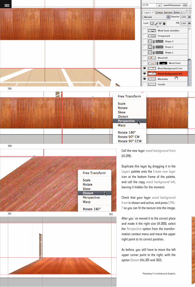
Call the new layer wood background front
(ill.299).
Duplicate this layer by dragging it in the
Layers palette onto the Create new layer
icon at the bottom frame of the palette,
and call the copy wood background left,
leaving it hidden for the moment.
Check that your layer wood background
front is shown and active, and press CTRL-
T so you can fit the texture into the image.
After you´ve moved it to the correct place
and made it the right size (ill.300), select
the Perspective option from the transfor-
mation context menu and move the upper
right point to its correct position.
As before, you still have to move the left
upper corner point to the right, with the
option Distort (ills.301 and 302).
299
300
301 302
Photoshop ® in Architectural Graphics
202
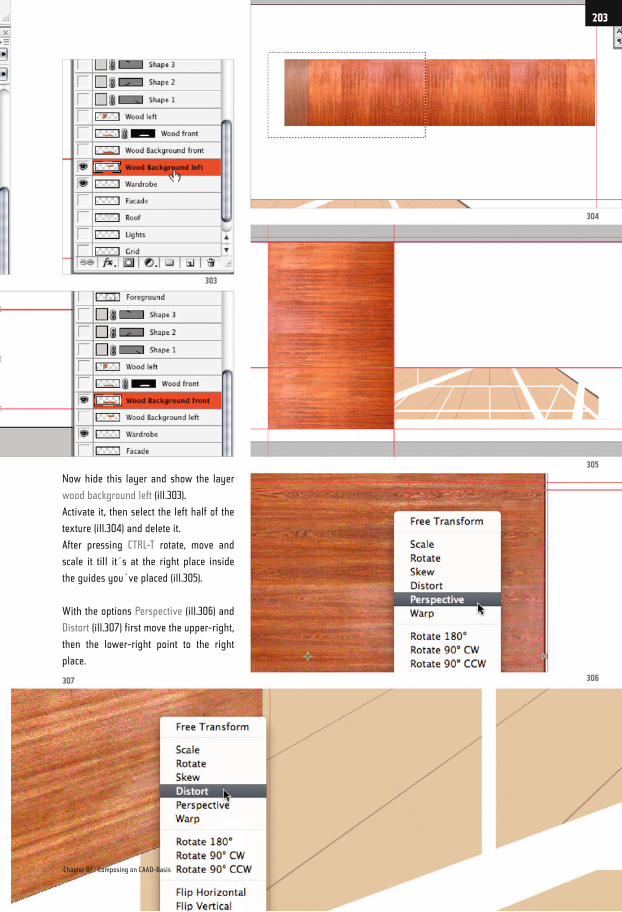
Now hide this layer and show the layer
wood background left (ill.303).
Activate it, then select the left half of the
texture (ill.304) and delete it.
After pressing CTRL-T rotate, move and
scale it till it´s at the right place inside
the guides you´ve placed (ill.305).
With the options Perspective (ill.306) and
Distort (ill.307) first move the upper-right,
then the lower-right point to the right
place.
307 306
305
304
303
Chapter 07 · Composing on CAAD-Basis
203
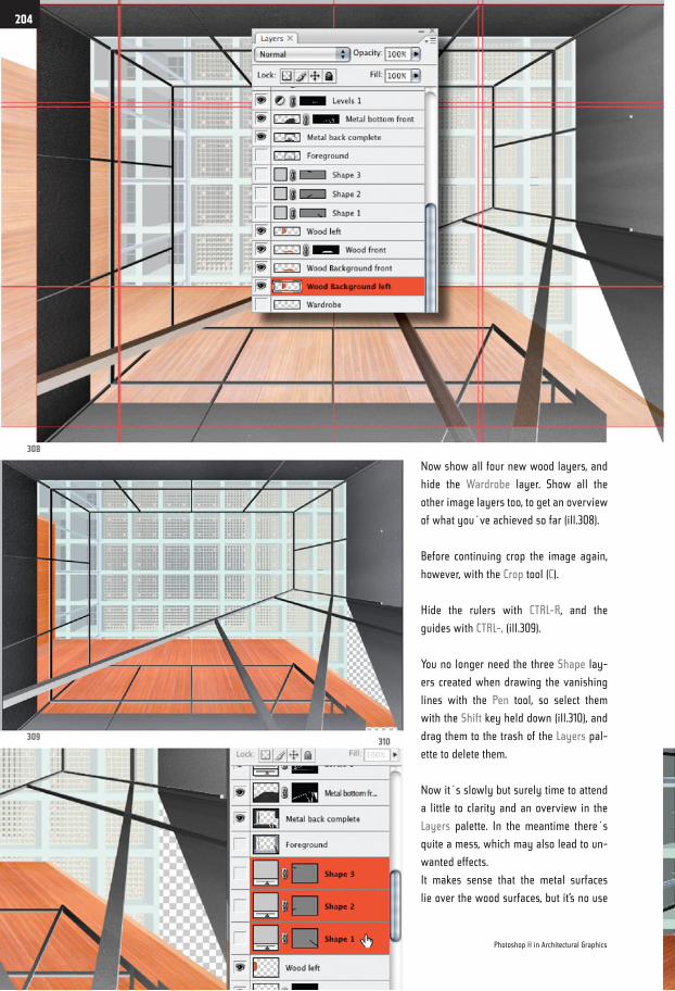
Now show all four new wood layers, and
hide the Wardrobe layer. Show all the
other image layers too, to get an overview
of what you´ve achieved so far (ill.308).
Before continuing crop the image again,
however, with the Crop tool (C).
Hide the rulers with CTRL-R, and the
guides with CTRL-, (ill.309).
You no longer need the three Shape lay-
ers created when drawing the vanishing
lines with the Pen tool, so select them
with the Shift key held down (ill.310), and
drag them to the trash of the Layers pal-
ette to delete them.
Now it´s slowly but surely time to attend
a little to clarity and an overview in the
Layers palette. In the meantime there´s
quite a mess, which may also lead to un-
wanted effects.
It makes sense that the metal surfaces
lie over the wood surfaces, but it’s no use
308
309310
Photoshop ® in Architectural Graphics
204
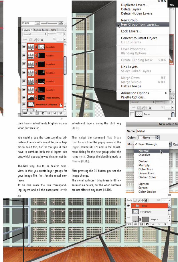
their Levels adjustments brighten up our
wood surfaces too.
You could group the corresponding ad-
justment layers with one of the metal lay-
ers to avoid this, but for that you´d then
have to combine both metal layers into
one, which you again would rather not do.
The best way, due to the desired over-
view, is that you create layer groups for
your image file, first for the metal sur-
faces.
To do this, mark the two correspond-
ing layers and all the associated Levels
adjustment layers, using the Shift key
(ill.311).
Then select the command New Group
from Layers from the popup menu of the
Layers palette (ill.312), and in the adjust-
ment dialog for the new group select the
name metal. Change the blending mode to
Normal (ill.313).
After pressing the OK button, you see the
image change.
The metal surfaces´ brightness is differ-
entiated as before, but the wood surfaces
are not affected any more (ill.314).
314 313
312311
Chapter 07 · Composing on CAAD-Basis
205
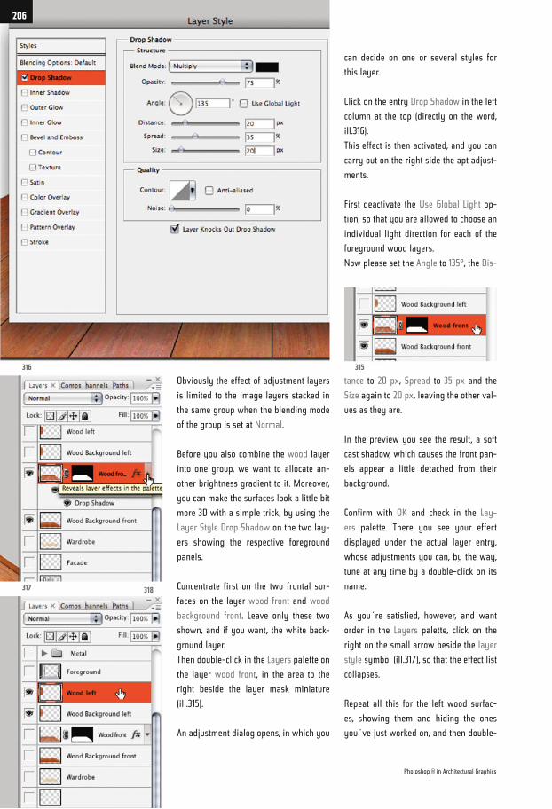
Obviously the effect of adjustment layers
is limited to the image layers stacked in
the same group when the blending mode
of the group is set at Normal.
Before you also combine the wood layer
into one group, we want to allocate an-
other brightness gradient to it. Moreover,
you can make the surfaces look a little bit
more 3D with a simple trick, by using the
Layer Style Drop Shadow on the two lay-
ers showing the respective foreground
panels.
Concentrate first on the two frontal sur-
faces on the layer wood front and wood
background front. Leave only these two
shown, and if you want, the white back-
ground layer.
Then double-click in the Layers palette on
the layer wood front, in the area to the
right beside the layer mask miniature
(ill.315).
An adjustment dialog opens, in which you
tance to 20 px, Spread to 35 px and the
Size again to 20 px, leaving the other val-
ues as they are.
In the preview you see the result, a soft
cast shadow, which causes the front pan-
els appear a little detached from their
background.
Confirm with OK and check in the Lay-
ers palette. There you see your effect
displayed under the actual layer entry,
whose adjustments you can, by the way,
tune at any time by a double-click on its
name.
As you´re satisfied, however, and want
order in the Layers palette, click on the
right on the small arrow beside the layer
style symbol (ill.317), so that the effect list
collapses.
Repeat all this for the left wood surfac-
es, showing them and hiding the ones
you´ve just worked on, and then double-
can decide on one or several styles for
this layer.
Click on the entry Drop Shadow in the left
column at the top (directly on the word,
ill.316).
This effect is then activated, and you can
carry out on the right side the apt adjust-
ments.
First deactivate the Use Global Light op-
tion, so that you are allowed to choose an
individual light direction for each of the
foreground wood layers.
Now please set the Angle to 135°, the Dis-
316
317 318
315
Photoshop ® in Architectural Graphics
206
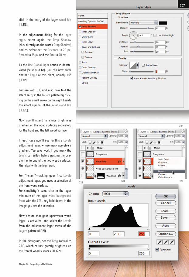
click in the entry of the layer wood left
(ill.318).
In the adjustment dialog for the layer
style, select again the Drop Shadow
(click directly on the words Drop Shadow)
and as before set the Distance to 20 px,
Spread to 35 px and the Size to 20 px.
As the Use Global Light option is deacti-
vated (or should be), you can now enter
another Angle at this place, namely 45°
(ill.319).
Confirm with OK, and also now fold the
effect entry in the Layers palette by click-
ing on the small arrow on the right beside
the effect symbol of the layer wood left
(ill.320).
Now you´ll attend to a nice brightness
gradient on the wood surfaces, separately
for the front and the left wood surface.
In each case you´ll use for this a Levels
adjustment layer, whose mask you give a
gradient. You save work if you mask the
Levels correction before pasting the gra-
dient onto one of the two wood surfaces.
First deal with the front part.
For “instant“-masking your first Levels
adjustment layer, you need a selection of
the front wood surface.
For simplicity´s sake, click in the layer
miniature of the layer wood background
front with the CTRL key held down; in the
image you see the selection.
Now ensure that your uppermost wood
layer is activated, and select the Levels
from the adjustment layer menu of the
Layers palette (ill.321).
In the histogram, set the Gray control to
2.00, which at first greatly brightens up
the frontal wood surfaces (ill.322).
322320 321
319
Chapter 07 · Composing on CAAD-Basis
207
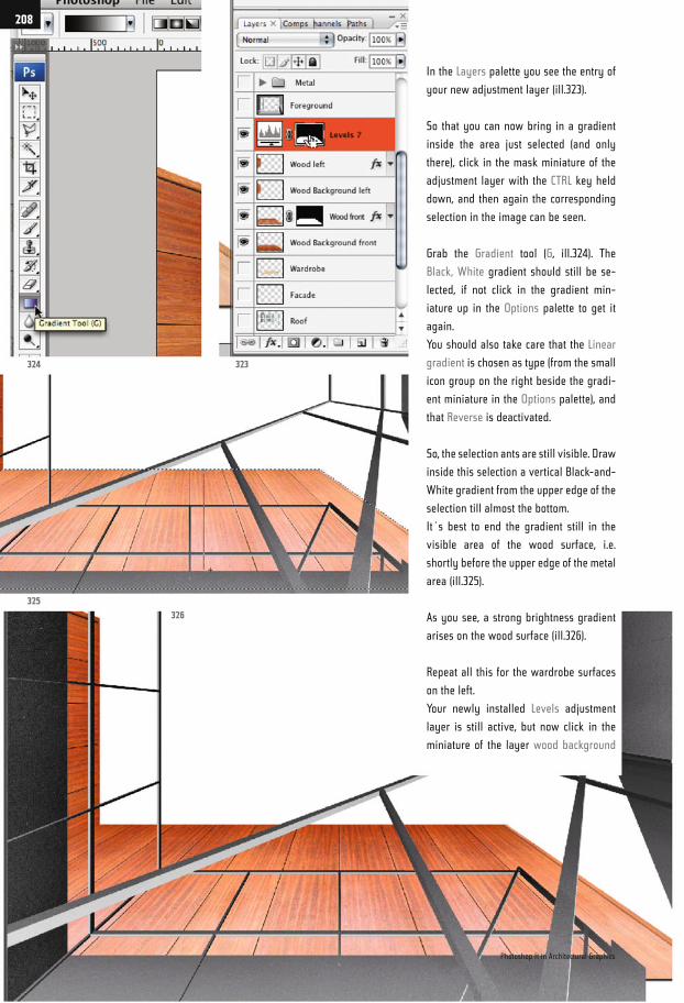
In the Layers palette you see the entry of
your new adjustment layer (ill.323).
So that you can now bring in a gradient
inside the area just selected (and only
there), click in the mask miniature of the
adjustment layer with the CTRL key held
down, and then again the corresponding
selection in the image can be seen.
Grab the Gradient tool (G, ill.324). The
Black, White gradient should still be se-
lected, if not click in the gradient min-
iature up in the Options palette to get it
again.
You should also take care that the Linear
gradient is chosen as type (from the small
icon group on the right beside the gradi-
ent miniature in the Options palette), and
that Reverse is deactivated.
So, the selection ants are still visible. Draw
inside this selection a vertical Black-and-
White gradient from the upper edge of the
selection till almost the bottom.
It´s best to end the gradient still in the
visible area of the wood surface, i.e.
shortly before the upper edge of the metal
area (ill.325).
As you see, a strong brightness gradient
arises on the wood surface (ill.326).
Repeat all this for the wardrobe surfaces
on the left.
Your newly installed Levels adjustment
layer is still active, but now click in the
miniature of the layer wood background
324 323
325
326
Photoshop ® in Architectural Graphics
208
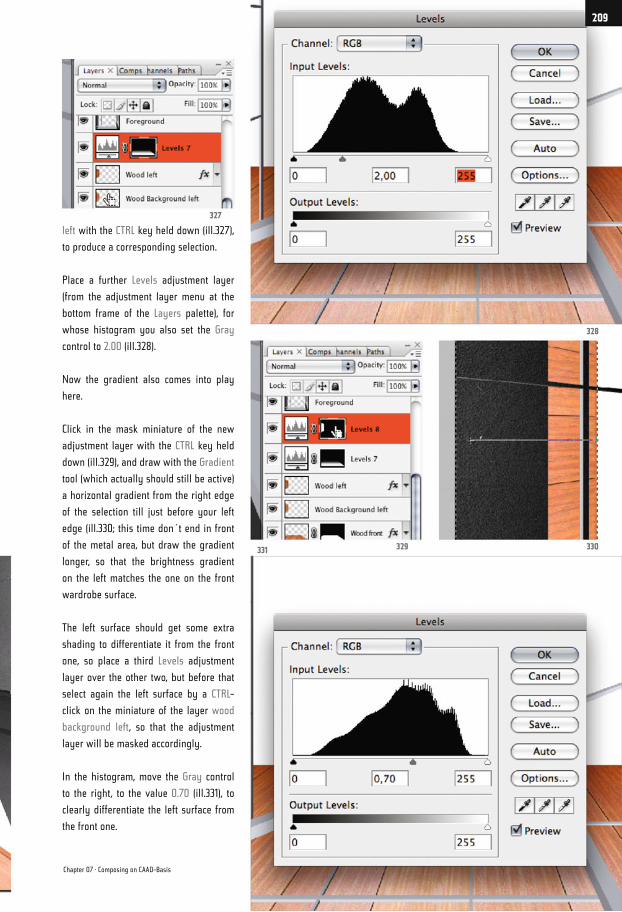
left with the CTRL key held down (ill.327),
to produce a corresponding selection.
Place a further Levels adjustment layer
(from the adjustment layer menu at the
bottom frame of the Layers palette), for
whose histogram you also set the Gray
control to 2.00 (ill.328).
Now the gradient also comes into play
here.
Click in the mask miniature of the new
adjustment layer with the CTRL key held
down (ill.329), and draw with the Gradient
tool (which actually should still be active)
a horizontal gradient from the right edge
of the selection till just before your left
edge (ill.330; this time don´t end in front
of the metal area, but draw the gradient
longer, so that the brightness gradient
on the left matches the one on the front
wardrobe surface.
The left surface should get some extra
shading to differentiate it from the front
one, so place a third Levels adjustment
layer over the other two, but before that
select again the left surface by a CTRL-
click on the miniature of the layer wood
background left, so that the adjustment
layer will be masked accordingly.
In the histogram, move the Gray control
to the right, to the value 0.70 (ill.331), to
clearly differentiate the left surface from
the front one.
331 330329
328
327
Chapter 07 · Composing on CAAD-Basis
209
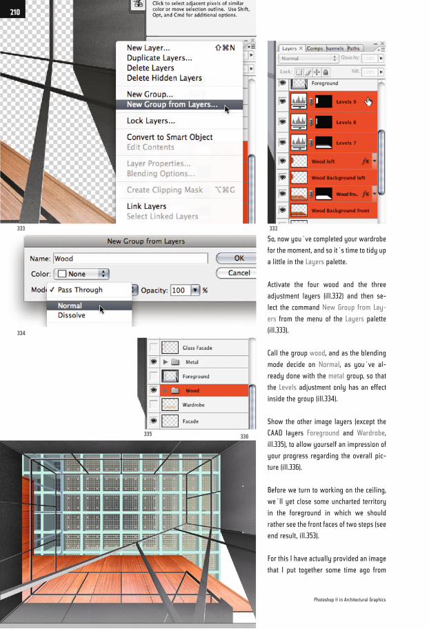
So, now you´ve completed your wardrobe
for the moment, and so it´s time to tidy up
a little in the Layers palette.
Activate the four wood and the three
adjustment layers (ill.332) and then se-
lect the command New Group from Lay-
ers from the menu of the Layers palette
(ill.333).
Call the group wood, and as the blending
mode decide on Normal, as you´ve al-
ready done with the metal group, so that
the Levels adjustment only has an effect
inside the group (ill.334).
Show the other image layers (except the
CAAD layers Foreground and Wardrobe,
ill.335), to allow yourself an impression of
your progress regarding the overall pic-
ture (ill.336).
Before we turn to working on the ceiling,
we´ll yet close some uncharted territory
in the foreground in which we should
rather see the front faces of two steps (see
end result, ill.353).
For this I have actually provided an image
that I put together some time ago from
333
334
335 336
332
Photoshop ® in Architectural Graphics
210
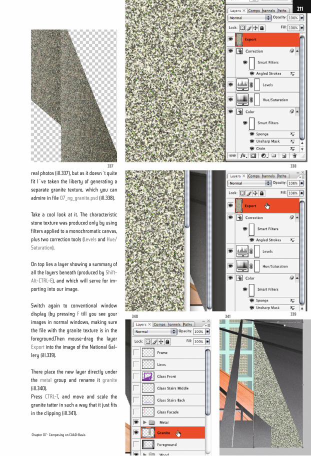
real photos (ill.337), but as it doesn´t quite
fit I´ve taken the liberty of generating a
separate granite texture, which you can
admire in file 07_ng_granite.psd (ill.338).
Take a cool look at it. The characteristic
stone texture was produced only by using
filters applied to a monochromatic canvas,
plus two correction tools (Levels and Hue/
Saturation).
On top lies a layer showing a summary of
all the layers beneath (produced by Shift-
Alt-CTRL-E), and which will serve for im-
porting into our image.
Switch again to conventional window
display (by pressing F till you see your
images in normal windows, making sure
the file with the granite texture is in the
foreground.Then mouse-drag the layer
Export into the image of the National Gal-
lery (ill.339).
There place the new layer directly under
the metal group and rename it granite
(ill.340).
Press CTRL-T, and move and scale the
granite tatter in such a way that it just fits
in the clipping (ill.341).
337 338
339341340
Chapter 07 · Composing on CAAD-Basis
211
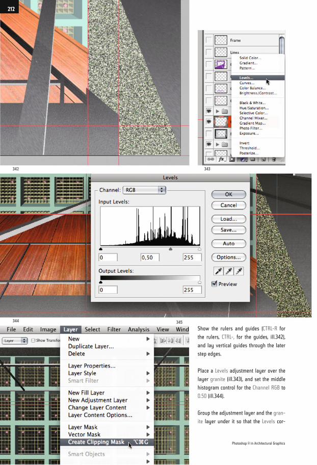
Show the rulers and guides (CTRL-R for
the rulers, CTRL-, for the guides, ill.342),
and lay vertical guides through the later
step edges.
Place a Levels adjustment layer over the
layer granite (ill.343), and set the middle
histogram control for the Channel RGB to
0.50 (ill.344).
Group the adjustment layer and the gran-
ite layer under it so that the Levels cor-
342
344 345
343
Photoshop ® in Architectural Graphics
212
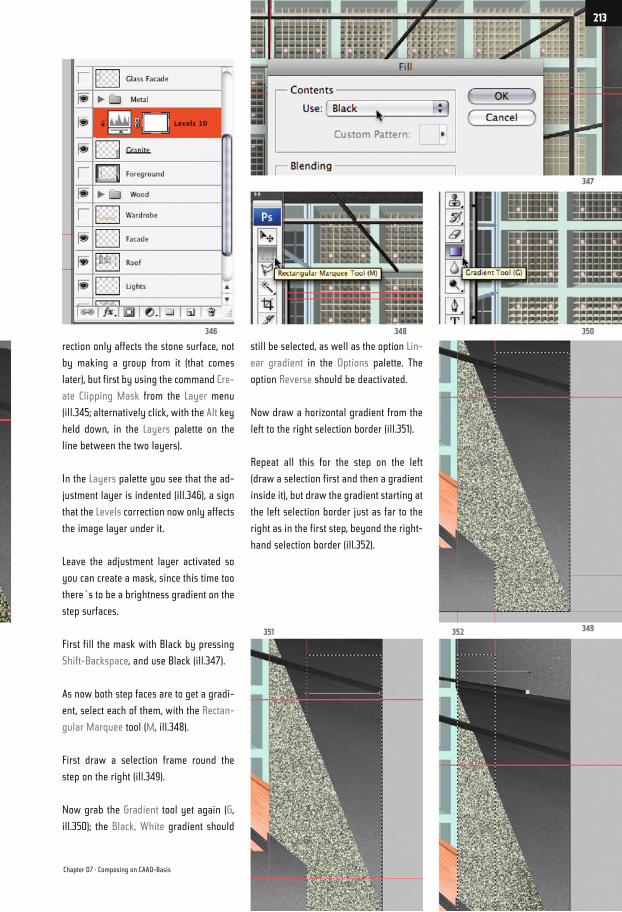
rection only affects the stone surface, not
by making a group from it (that comes
later), but first by using the command Cre-
ate Clipping Mask from the Layer menu
(ill.345; alternatively click, with the Alt key
held down, in the Layers palette on the
line between the two layers).
In the Layers palette you see that the ad-
justment layer is indented (ill.346), a sign
that the Levels correction now only affects
the image layer under it.
Leave the adjustment layer activated so
you can create a mask, since this time too
there´s to be a brightness gradient on the
step surfaces.
First fill the mask with Black by pressing
Shift-Backspace, and use Black (ill.347).
As now both step faces are to get a gradi-
ent, select each of them, with the Rectan-
gular Marquee tool (M, ill.348).
First draw a selection frame round the
step on the right (ill.349).
Now grab the Gradient tool yet again (G,
ill.350); the Black, White gradient should
still be selected, as well as the option Lin-
ear gradient in the Options palette. The
option Reverse should be deactivated.
Now draw a horizontal gradient from the
left to the right selection border (ill.351).
Repeat all this for the step on the left
(draw a selection first and then a gradient
inside it), but draw the gradient starting at
the left selection border just as far to the
right as in the first step, beyond the right-
hand selection border (ill.352).
346 348 350
347
349352351
Chapter 07 · Composing on CAAD-Basis
213
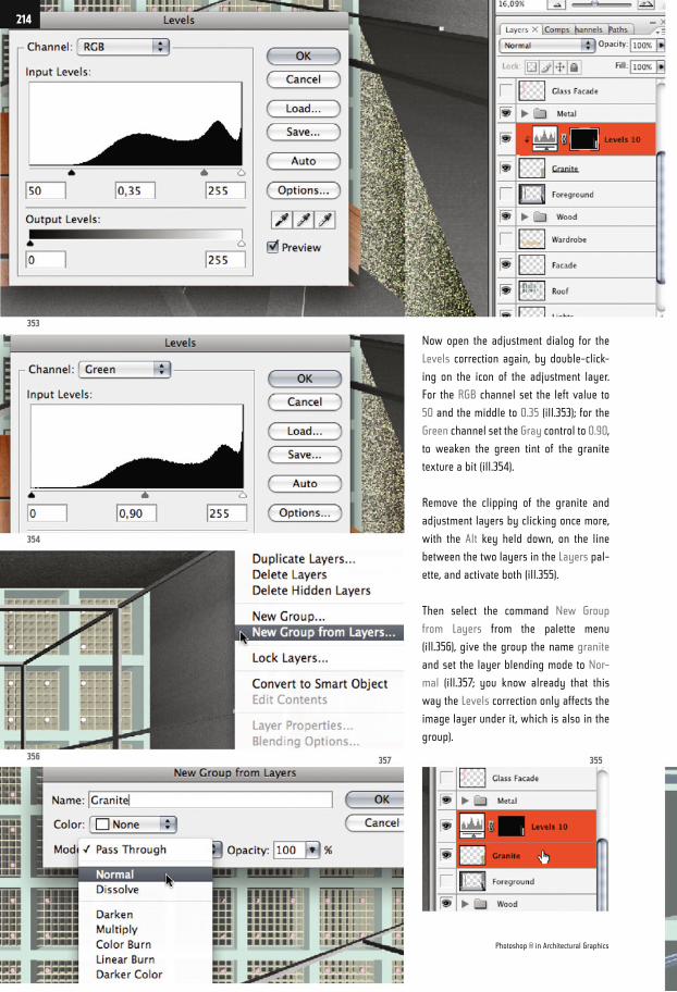
Now open the adjustment dialog for the
Levels correction again, by double-click-
ing on the icon of the adjustment layer.
For the RGB channel set the left value to
50 and the middle to 0.35 (ill.353); for the
Green channel set the Gray control to 0.90,
to weaken the green tint of the granite
texture a bit (ill.354).
Remove the clipping of the granite and
adjustment layers by clicking once more,
with the Alt key held down, on the line
between the two layers in the Layers pal-
ette, and activate both (ill.355).
Then select the command New Group
from Layers from the palette menu
(ill.356), give the group the name granite
and set the layer blending mode to Nor-
mal (ill.357; you know already that this
way the Levels correction only affects the
image layer under it, which is also in the
group).
353
354
356 357 355
Photoshop ® in Architectural Graphics
214
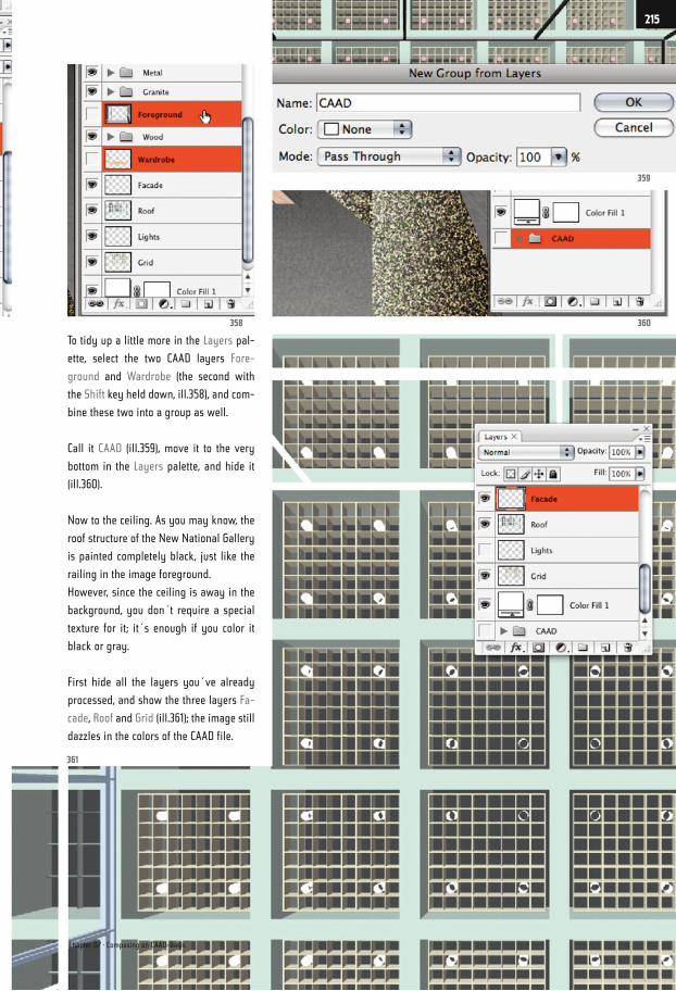
To tidy up a little more in the Layers pal-
ette, select the two CAAD layers Fore-
ground and Wardrobe (the second with
the Shift key held down, ill.358), and com-
bine these two into a group as well.
Call it CAAD (ill.359), move it to the very
bottom in the Layers palette, and hide it
(ill.360).
Now to the ceiling. As you may know, the
roof structure of the New National Gallery
is painted completely black, just like the
railing in the image foreground.
However, since the ceiling is away in the
background, you don´t require a special
texture for it; it´s enough if you color it
black or gray.
First hide all the layers you´ve already
processed, and show the three layers Fa-
cade, Roof and Grid (ill.361); the image still
dazzles in the colors of the CAAD file.
361
360358
359
Chapter 07 · Composing on CAAD-Basis
215
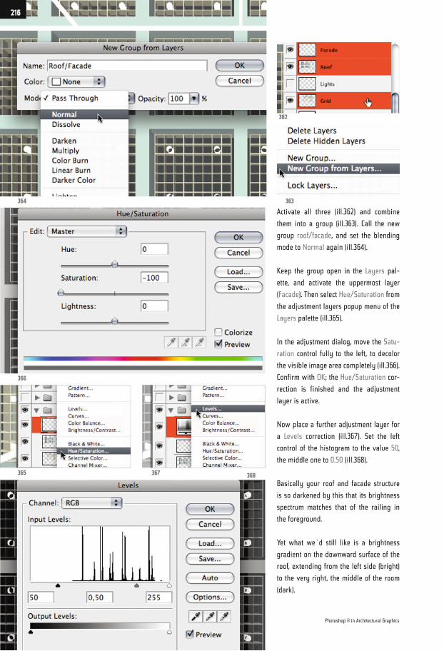
Activate all three (ill.362) and combine
them into a group (ill.363). Call the new
group roof/facade, and set the blending
mode to Normal again (ill.364).
Keep the group open in the Layers pal-
ette, and activate the uppermost layer
(Facade). Then select Hue/Saturation from
the adjustment layers popup menu of the
Layers palette (ill.365).
In the adjustment dialog, move the Satu-
ration control fully to the left, to decolor
the visible image area completely (ill.366).
Confirm with OK; the Hue/Saturation cor-
rection is finished and the adjustment
layer is active.
Now place a further adjustment layer for
a Levels correction (ill.367). Set the left
control of the histogram to the value 50,
the middle one to 0.50 (ill.368).
Basically your roof and facade structure
is so darkened by this that its brightness
spectrum matches that of the railing in
the foreground.
Yet what we´d still like is a brightness
gradient on the downward surface of the
roof, extending from the left side (bright)
to the very right, the middle of the room
(dark).
364
366
365 367 368
363
362
Photoshop ® in Architectural Graphics
216
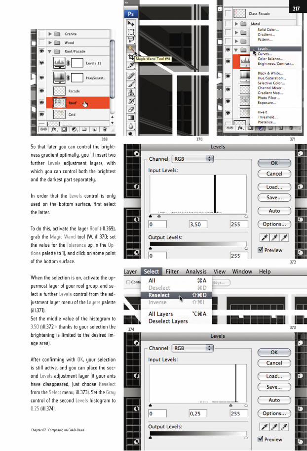
So that later you can control the bright-
ness gradient optimally, you´ll insert two
further Levels adjustment layers, with
which you can control both the brightest
and the darkest part separately.
In order that the Levels control is only
used on the bottom surface, first select
the latter.
To do this, activate the layer Roof (ill.369),
grab the Magic Wand tool (W, ill.370; set
the value for the Tolerance up in the Op-
tions palette to 1), and click on some point
of the bottom surface.
When the selection is on, activate the up-
permost layer of your roof group, and se-
lect a further Levels control from the ad-
justment layer menu of the Layers palette
(ill.371).
Set the middle value of the histogram to
3.50 (ill.372 - thanks to your selection the
brightening is limited to the desired im-
age area).
After confirming with OK, your selection
is still active, and you can place the sec-
ond Levels adjustment layer (if your ants
have disappeared, just choose Reselect
from the Select menu, ill.373). Set the Gray
control of the second Levels histogram to
0.25 (ill.374).
374 373
372
371370369
Chapter 07 · Composing on CAAD-Basis
217
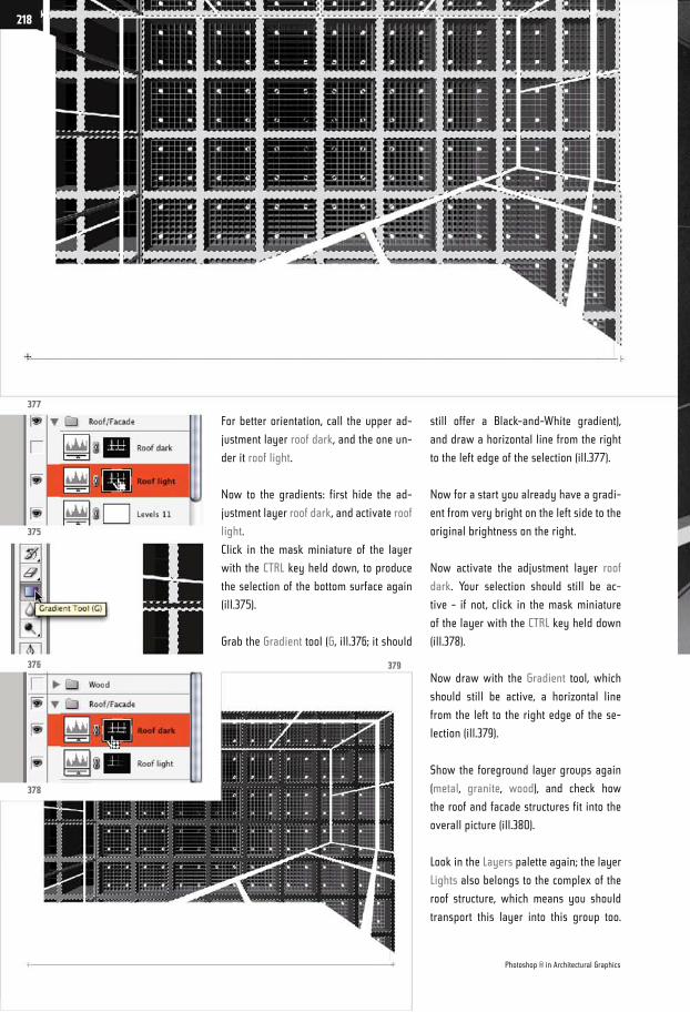
For better orientation, call the upper ad-
justment layer roof dark, and the one un-
der it roof light.
Now to the gradients: first hide the ad-
justment layer roof dark, and activate roof
light.
Click in the mask miniature of the layer
with the CTRL key held down, to produce
the selection of the bottom surface again
(ill.375).
Grab the Gradient tool (G, ill.376; it should
still offer a Black-and-White gradient),
and draw a horizontal line from the right
to the left edge of the selection (ill.377).
Now for a start you already have a gradi-
ent from very bright on the left side to the
original brightness on the right.
Now activate the adjustment layer roof
dark. Your selection should still be ac-
tive - if not, click in the mask miniature
of the layer with the CTRL key held down
(ill.378).
Now draw with the Gradient tool, which
should still be active, a horizontal line
from the left to the right edge of the se-
lection (ill.379).
Show the foreground layer groups again
(metal, granite, wood), and check how
the roof and facade structures fit into the
overall picture (ill.380).
Look in the Layers palette again; the layer
Lights also belongs to the complex of the
roof structure, which means you should
transport this layer into this group too.
377
375
376
378
379
Photoshop ® in Architectural Graphics
218
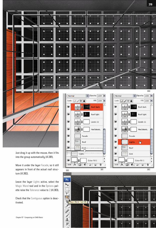
Just drag it up with the mouse, then it fits
into the group automatically (ill.381).
Move it under the layer Facade, so it still
appears in front of the actual roof struc-
ture (ill.382).
Leave the layer Lights active, select the
Magic Wand tool and in the Options pal-
ette raise the Tolerance value to 2 (ill.383).
Check that the Contiguous option is deac-
tivated.
380
382381383
Chapter 07 · Composing on CAAD-Basis
219
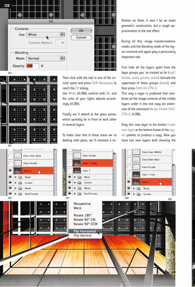
Then click with the tool in one of the cir-
cular spots and press Shift-Backspace to
reach the Fill dialog.
Use White (ill.384), confirm with OK, and
the color of your lights adjusts accord-
ingly (ill.385).
Finally we´ll attend to the glass panes,
which partially lie in front of each other
in several layers.
To make clear that in these areas we´re
dealing with glass, we´ll simulate a re-
flection on them. It won´t be an exact
geometric construction, but a rough ap-
proximation to the real effect.
During all this, image transformations,
masks and the blending mode of the lay-
ers involved will again play a particularly
important role.
First hide all the layers apart from the
layer groups you´ve created so far (roof/
facade, wood, granite, metal). Activate the
uppermost of these groups (metal), and
then press Shift-Alt-CTRL-E.
This way a layer is produced that com-
bines all the image contents of the visible
layers under it into one copy (an exten-
sion of the command Merge Visible Shift-
CTRL-E, ill.386).
Drag this new layer to the button Create
new layer at the bottom frame of the Lay-
ers palette, to produce a copy. Now you
have two new layers both showing the
384
385
386 387 388 389
220
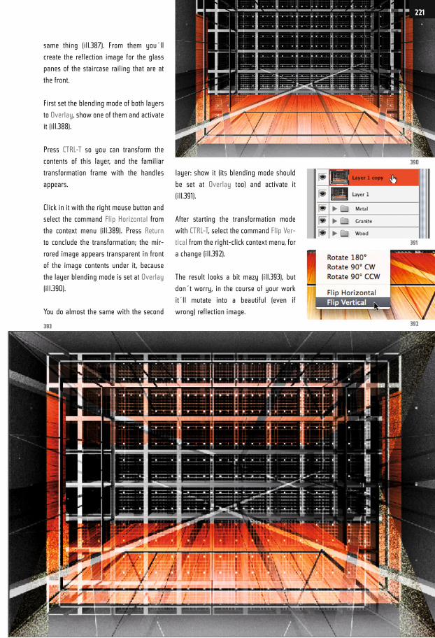
same thing (ill.387). From them you´ll
create the reflection image for the glass
panes of the staircase railing that are at
the front.
First set the blending mode of both layers
to Overlay, show one of them and activate
it (ill.388).
Press CTRL-T so you can transform the
contents of this layer, and the familiar
transformation frame with the handles
appears.
Click in it with the right mouse button and
select the command Flip Horizontal from
the context menu (ill.389). Press Return
to conclude the transformation; the mir-
rored image appears transparent in front
of the image contents under it, because
the layer blending mode is set at Overlay
(ill.390).
You do almost the same with the second
layer: show it (its blending mode should
be set at Overlay too) and activate it
(ill.391).
After starting the transformation mode
with CTRL-T, select the command Flip Ver-
tical from the right-click context menu, for
a change (ill.392).
The result looks a bit mazy (ill.393), but
don´t worry, in the course of your work
it´ll mutate into a beautiful (even if
wrong) reflection image.
393 392
391
390
221
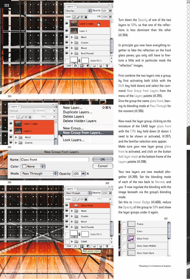
Turn down the Opacity of one of the two
layers to 50%, so that one of the reflec-
tions is less dominant than the other
(ill.394).
In principle you now have everything to-
gether to fake the reflection on the front
glass panes; you only still have to fine-
tune a little and in particular mask the
“reflection” images.
First combine the two layers into a group,
by first activating both (click with the
Shift key held down) and select the com-
mand New Group from Layers from the
menu of the Layers palette (ill.395).
Give the group the name glass front, leav-
ing its blending mode at Pass Through for
the moment (ill.396).
Now mask the layer group, clicking on the
miniature of the CAAD layer glass front
with the CTRL key held down (it doesn´t
need to be shown or activated, ill.397),
and the familiar selection ants appear.
Make sure your new layer group glass
front is activated, and click on the button
Add layer mask at the bottom frame of the
Layers palette (ill.398).
Your two layers are now masked alto-
gether (ill.399). Set the blending mode
of each of the two back to Normal, and
you´ll now regulate the blending with the
image beneath via the group’s blending
mode.
Set this to Linear Dodge (ill.400), reduce
the Opacity of the group to 50% and show
the layer groups under it again.
394
395
396 398
397
Photoshop ® in Architectural Graphics
222
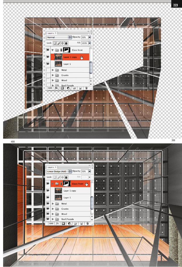
400399
Chapter 07 · Composing on CAAD-Basis
223
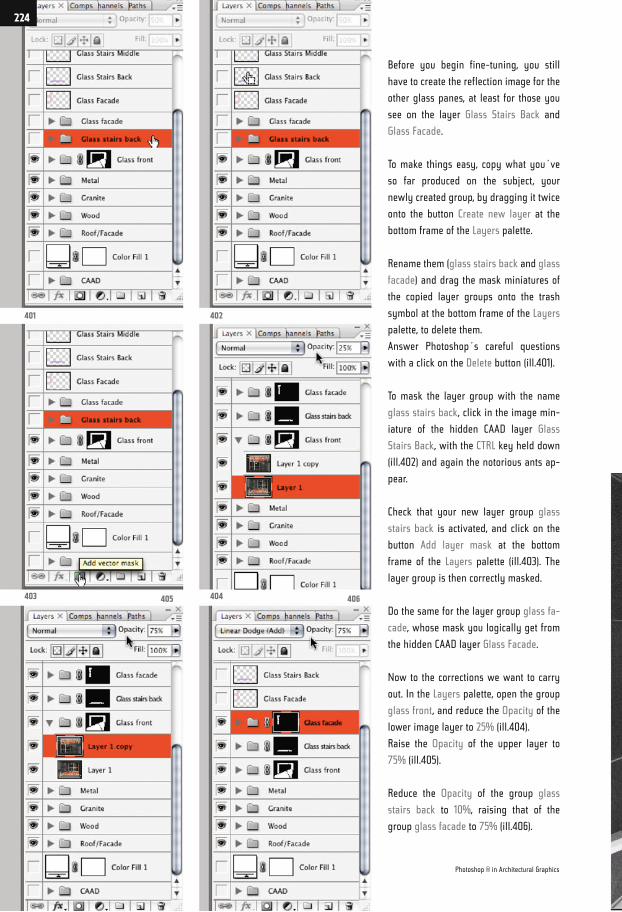
Before you begin fine-tuning, you still
have to create the reflection image for the
other glass panes, at least for those you
see on the layer Glass Stairs Back and
Glass Facade.
To make things easy, copy what you´ve
so far produced on the subject, your
newly created group, by dragging it twice
onto the button Create new layer at the
bottom frame of the Layers palette.
Rename them (glass stairs back and glass
facade) and drag the mask miniatures of
the copied layer groups onto the trash
symbol at the bottom frame of the Layers
palette, to delete them.
Answer Photoshop´s careful questions
with a click on the Delete button (ill.401).
To mask the layer group with the name
glass stairs back, click in the image min-
iature of the hidden CAAD layer Glass
Stairs Back, with the CTRL key held down
(ill.402) and again the notorious ants ap-
pear.
Check that your new layer group glass
stairs back is activated, and click on the
button Add layer mask at the bottom
frame of the Layers palette (ill.403). The
layer group is then correctly masked.
Do the same for the layer group glass fa-
cade, whose mask you logically get from
the hidden CAAD layer Glass Facade.
Now to the corrections we want to carry
out. In the Layers palette, open the group
glass front, and reduce the Opacity of the
lower image layer to 25% (ill.404).
Raise the Opacity of the upper layer to
75% (ill.405).
Reduce the Opacity of the group glass
stairs back to 10%, raising that of the
group glass facade to 75% (ill.406).
401
403 405
402
404 406
Photoshop ® in Architectural Graphics
224
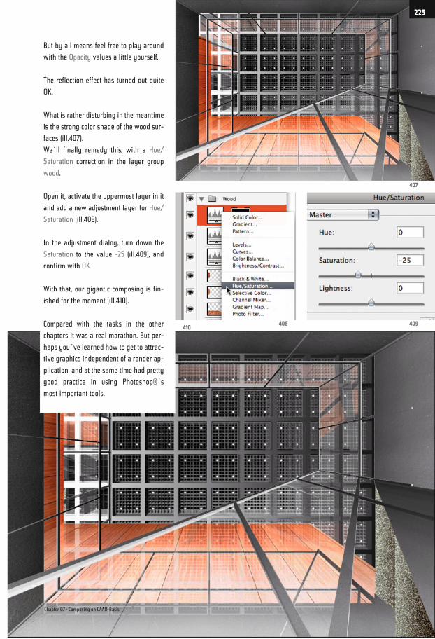
But by all means feel free to play around
with the Opacity values a little yourself.
The reflection effect has turned out quite
OK.
What is rather disturbing in the meantime
is the strong color shade of the wood sur-
faces (ill.407).
We´ll finally remedy this, with a Hue/
Saturation correction in the layer group
wood.
Open it, activate the uppermost layer in it
and add a new adjustment layer for Hue/
Saturation (ill.408).
In the adjustment dialog, turn down the
Saturation to the value -25 (ill.409), and
confirm with OK.
With that, our gigantic composing is fin-
ished for the moment (ill.410).
Compared with the tasks in the other
chapters it was a real marathon. But per-
haps you´ve learned how to get to attrac-
tive graphics independent of a render ap-
plication, and at the same time had pretty
good practice in using Photoshop®´s
most important tools.
410408 409
407
Chapter 07 · Composing on CAAD-Basis
225
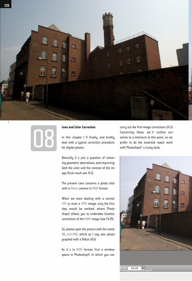
Lens and Color Correction
In this chapter I´ll finally, and briefly,
deal with a typical correction procedure
for digital photos.
Basically it´s just a question of remov-
ing geometric aberrations, and improving
both the color and the contrast of the im-
age (final result see ill.2).
The present case concerns a photo shot
with a Nikon camera in RAW format.
When we were dealing with a normal
TIFF or even a JPEG image, only the first
step would be omitted, where Photo-
shop® allows you to undertake lossless
corrections of the RAW image (see Ch.01).
So, please open the picture with the name
08_start.NEF, which as I say was photo-
graphed with a Nikon (ill.1).
As it´s in RAW format, first a window
opens in Photoshop®, in which you can
carry out the first image corrections (ill.3).
Concerning these, we´ll confine our-
selves to a minimum at this point, as we
prefer to do the essential repair work
with Photoshop®´s trusty tools.
1
226
Photoshop® ® in der Architekturgrafik
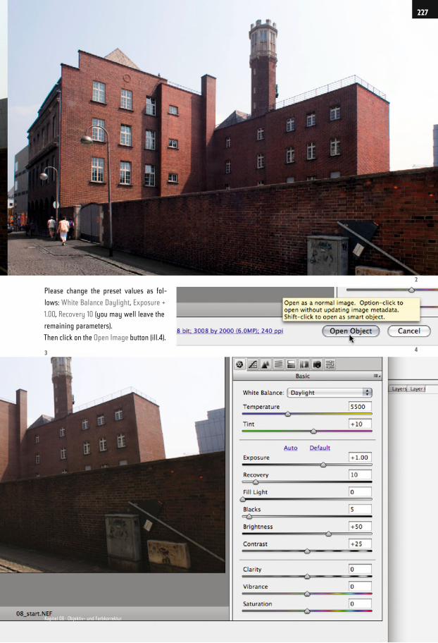
Please change the preset values as fol-
lows: White Balance Daylight, Exposure +
1.00, Recovery 10 (you may well leave the
remaining parameters).
Then click on the Open Image button (ill.4).
2
43
227
Kapitel 08 · Objektiv- und Farbkorrektur
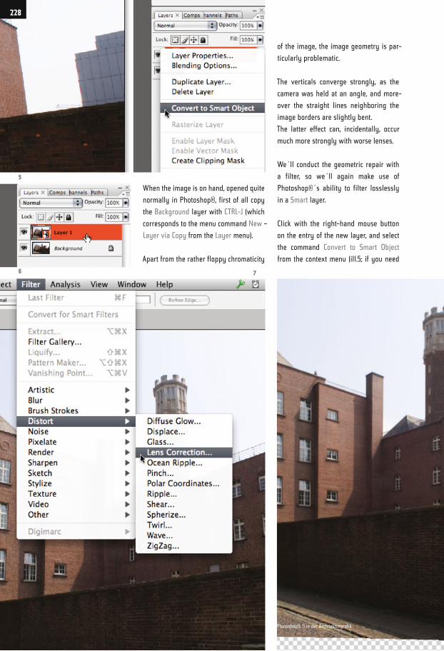
When the image is on hand, opened quite
normally in Photoshop®, first of all copy
the Background layer with CTRL-J (which
corresponds to the menu command New –
Layer via Copy from the Layer menu).
Apart from the rather floppy chromaticity
of the image, the image geometry is par-
ticularly problematic.
The verticals converge strongly, as the
camera was held at an angle, and more-
over the straight lines neighboring the
image borders are slightly bent.
The latter effect can, incidentally, occur
much more strongly with worse lenses.
We´ll conduct the geometric repair with
a filter, so we´ll again make use of
Photoshop®´s ability to filter losslessly
in a Smart layer.
Click with the right-hand mouse button
on the entry of the new layer, and select
the command Convert to Smart Object
from the context menu (ill.5; if you need
5
6 7
228
Photoshop® ® in der Architekturgrafik
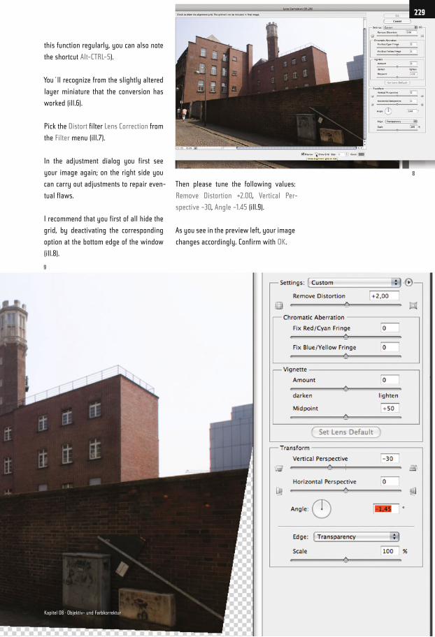
this function regularly, you can also note
the shortcut Alt-CTRL-S).
You´ll recognize from the slightly altered
layer miniature that the conversion has
worked (ill.6).
Pick the Distort filter Lens Correction from
the Filter menu (ill.7).
In the adjustment dialog you first see
your image again; on the right side you
can carry out adjustments to repair even-
tual flaws.
I recommend that you first of all hide the
grid, by deactivating the corresponding
option at the bottom edge of the window
(ill.8).
Then please tune the following values:
Remove Distortion +2.00, Vertical Per-
spective –30, Angle –1.45 (ill.9).
As you see in the preview left, your image
changes accordingly. Confirm with OK.
9
8
229
Kapitel 08 · Objektiv- und Farbkorrektur
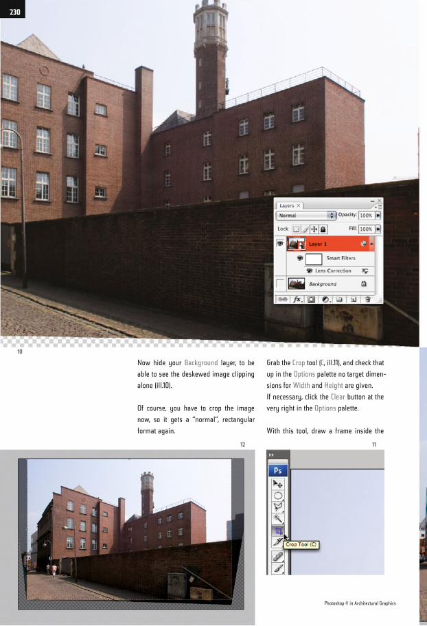
Now hide your Background layer, to be
able to see the deskewed image clipping
alone (ill.10).
Of course, you have to crop the image
now, so it gets a “normal“, rectangular
format again.
Grab the Crop tool (C, ill.11), and check that
up in the Options palette no target dimen-
sions for Width and Height are given.
If necessary, click the Clear button at the
very right in the Options palette.
With this tool, draw a frame inside the
10
12 11
Photoshop ® in Architectural Graphics
230
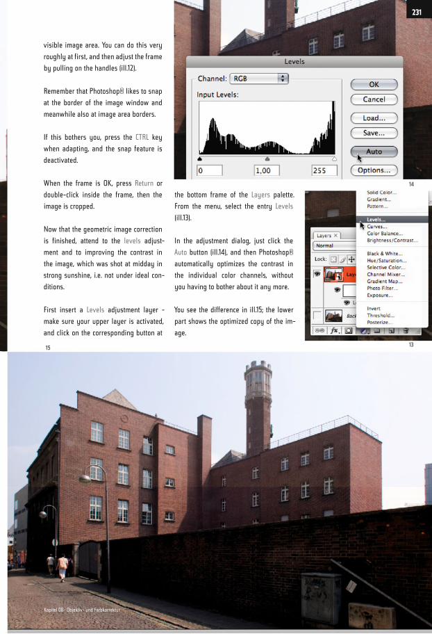
visible image area. You can do this very
roughly at first, and then adjust the frame
by pulling on the handles (ill.12).
Remember that Photoshop® likes to snap
at the border of the image window and
meanwhile also at image area borders.
If this bothers you, press the CTRL key
when adapting, and the snap feature is
deactivated.
When the frame is OK, press Return or
double-click inside the frame, then the
image is cropped.
Now that the geometric image correction
is finished, attend to the levels adjust-
ment and to improving the contrast in
the image, which was shot at midday in
strong sunshine, i.e. not under ideal con-
ditions.
First insert a Levels adjustment layer -
make sure your upper layer is activated,
and click on the corresponding button at
the bottom frame of the Layers palette.
From the menu, select the entry Levels
(ill.13).
In the adjustment dialog, just click the
Auto button (ill.14), and then Photoshop®
automatically optimizes the contrast in
the individual color channels, without
you having to bother about it any more.
You see the difference in ill.15; the lower
part shows the optimized copy of the im-
age.
14
1315
231
Kapitel 08 · Objektiv- und Farbkorrektur

As the wall in the foreground and the
house wall further behind on the left
are in the back light, it makes sense to
brighten up this area in addition.
For this you´ll carry out a further Levels
correction, again in the form of an adjust-
ment layer which is, however, masked in
the whole image area outside the critical
surfaces.
To prepare the masking, you´ll now first
select the critical area with the polygonal
lasso.
Grab the Polygonal Lasso tool (L, or
Shift-L, ill.17) and draw click-wise a cor-
responding selection (ill.18; for clarity´s
sake, the selection is shown here in mask
mode, after having pressed Q).
Don´t forget that while drawing you can
zoom into the image using CTRL-Space,
and out using Alt-CTRL-Space.
For using the lasso, it’s best to see the
image in the so called Full Screen Mode
With Menu Bar (View menu - Screen
Mode).
When your selection is on, you can insert
the new Levels adjustment layer. (Beware
that for doing this you should see your
selection not in mask but in “ants“ mode.)
Ensure that your first adjustment layer is
18
17 19
Photoshop ® in Architectural Graphics
232
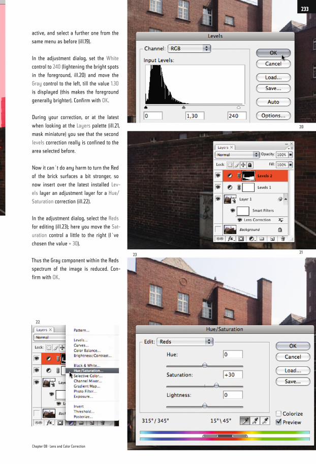
active, and select a further one from the
same menu as before (ill.19).
In the adjustment dialog, set the White
control to 240 (lightening the bright spots
in the foreground, ill.20) and move the
Gray control to the left, till the value 1.30
is displayed (this makes the foreground
generally brighter). Confirm with OK.
During your correction, or at the latest
when looking at the Layers palette (ill.21,
mask miniature) you see that the second
levels correction really is confined to the
area selected before.
Now it can´t do any harm to turn the Red
of the brick surfaces a bit stronger, so
now insert over the latest installed Lev-
els layer an adjustment layer for a Hue/
Saturation correction (ill.22).
In the adjustment dialog, select the Reds
for editing (ill.23); here you move the Sat-
uration control a little to the right (I´ve
chosen the value + 30).
Thus the Gray component within the Reds
spectrum of the image is reduced. Con-
firm with OK.
20
2123
22
Chapter 08 · Lens and Color Correction
233
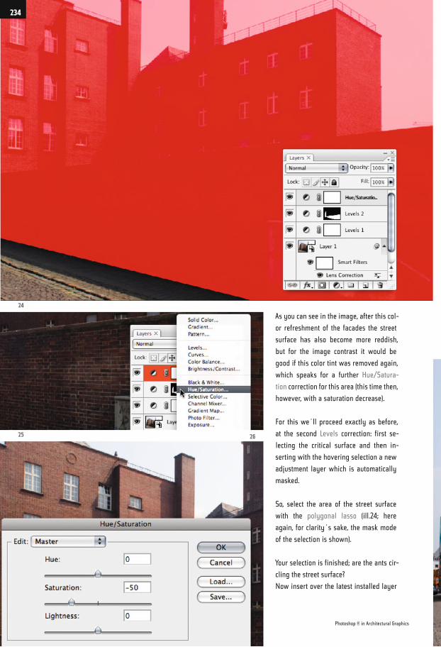
As you can see in the image, after this col-
or refreshment of the facades the street
surface has also become more reddish,
but for the image contrast it would be
good if this color tint was removed again,
which speaks for a further Hue/Satura-
tion correction for this area (this time then,
however, with a saturation decrease).
For this we´ll proceed exactly as before,
at the second Levels correction: first se-
lecting the critical surface and then in-
serting with the hovering selection a new
adjustment layer which is automatically
masked.
So, select the area of the street surface
with the polygonal lasso (ill.24; here
again, for clarity´s sake, the mask mode
of the selection is shown).
Your selection is finished; are the ants cir-
cling the street surface?
Now insert over the latest installed layer
24
25 26
Photoshop ® in Architectural Graphics
234
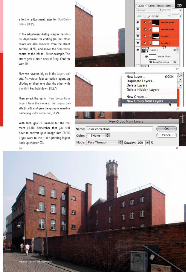
a further adjustment layer for Hue/Satu-
ration (ill.25).
In the adjustment dialog, stay in the Mas-
ter department for editing (so that other
colors are also removed from the street
surface, ill.26), and move the Saturation
control to the left, to –50 for example. The
street gets a more neutral Gray. Confirm
with OK.
Now we have to tidy up in the Layers pal-
ette. Activate all four correction layers, by
clicking on them one after the other with
the Shift key held down (ill.27).
Then select the option New Group from
Layers from the menu of the Layers pal-
ette (ill.28), and give the group a sensible
name (e.g. color correction, ill.29).
With that, you´re finished for the mo-
ment (ill.30). Remember that you still
have to convert your image into CMYK,
if you want to use it in a printing layout
(look up chapter 03).
27
28
30 29
235
Kapitel 08 · Objektiv- und Farbkorrektur
Software, Tutorial Files
Photoshop®, Bridge®, Illustrator® and InDesign® are registered trademarks of their
manufacturer Adobe Systems Incorporated. Bridge® comes along with Photoshop®,
which is available as a 30-day free trial version on the Adobe web site:
Photoshop® CS3: http://www.adobe.com/downloads/
The images 02_clouds_internet .jpg (p.49) and 07_ng_clouds_internet.jpg (p.144) come
from www.wolkenatlas.de (original name Sc mamma). The image 06_mapletree_start.
psd (p.116) comes from http://juergen-huefner.dietestdomain.de (original name ge-
brueder-ahorn-im-morgenli.jpg). I thank both owners for the right to present these im-
ages in my book.
For working yourself through my tutorials, you have to download the according files
from my web site:
http://cms.architecturalrendering.de/ps3/english
Name: bella
Password: pittura
You are welcome to use the contact sheet on my site for any questions, remarks, sug-
gestions or criticism.
Work on this book has taken much longer than I thought in the first place. In the begin-
ning, I couldn‘t make up my mind what to write on Photoshop® that might still be un-
known to professionals - in the end, however, so much material has emerged that there
is nearly enough for a second volume. During the process of writing, I‘m afraid people
around me had to suffer from my rather oscillating course of moods.
Thus, and first of all, I want to express my thanks to the editor Springer ViennaNewYork,
especially to David Marold, for their enormous patience and helpfulness.
Finally, I would like to pay tribute to Michael, a former friend of mine, who wittily initi-
ated me into the arcane world of computing many years ago, and with whom the strenu-
ous process of learning was so much more joyful. This book is dedicated to him.
236
Index
File
Batch 23
Batch Rename 18
Bridge® 8, 14, 15, 16, 17, 18, 22, 23
RAW 226
Save for Web & Devices 22
Edit
Brush Tool 24, 27, 28, 29, 30, 31, 51, 62, 63,
83
Color Settings 75
Convert Point Tool 33
Crop (Crop Tool and Canvas Size) 101, 102,
144, 162, 164, 188, 189, 194, 204, 230
Define Pattern 113
Eraser Tool 28, 30, 122
Fill 27, 114, 121, 128, 220
Gradient Tool 51, 52, 53, 74, 75, 78, 79, 171,
181, 182, 183, 184, 189, 190, 191, 207, 208,
209, 213, 218, 221
Keyboard Shortcuts 28, 122
Move Tool 104, 107, 148, 154, 162, 188, 189,
192, 196, 199
Pattern 25, 26, 27, 100, 111, 113, 114, 115
Pen Tool 31, 32, 33, 34, 158, 160, 161, 166, 171,
173, 195, 198, 204
Image
Canvas Size 162, 163, 188, 189, 194
CMYK 15, 54, 55, 56, 57, 58, 59, 60, 64, 66,
67, 70, 75, 76, 77, 235
Duplicate 60
Image Size 18, 21, 77, 83, 102, 112, 137
RGB 25, 44, 54, 55, 56, 57, 58, 59, 60, 64,
66, 69, 70, 71, 75, 76, 77, 80, 81, 84, 97, 113,
119, 120, 121, 124, 129, 130, 135, 168, 172, 176,
212, 214
Separation 58, 59
32-Bit 67, 68
Layer general
Create Clipping Mask 213
Layer Mask 24, 27, 29, 39, 49, 50, 52, 60, 61,
62, 74, 81, 82, 83, 88, 89, 91, 93, 96, 98, 103,
111, 120, 121, 122, 131, 168, 169, 170, 171, 173,
175, 177, 182, 183, 184, 185, 190, 197, 198, 207,
208, 220, 222
Merge Visible 21, 94, 107, 124, 127, 130, 177,
220
New Group from Layers 130, 143, 147, 151,
191, 205, 210, 214, 222, 235
New-Layer via Copy 105, 186, 228
New-Layer via Cut 48, 104, 105, 107
Shape Layer 35, 36, 167, 171, 173, 204
Smart Object 21, 72, 74, 76, 78, 84, 94, 98,
108, 124, 138, 149, 151
Layer Blending Options
Linear Dodge 144, 222
Multiply 142, 148, 154, 167, 171, 197, 200
Overlay 221
Adjustment Layers
Black & White 19, 145, 147
Gradient Map 78, 79
Hue/Saturation 48, 50, 64, 66, 67, 69, 70,
111, 117, 125, 131, 211, 216, 225, 233, 234, 235
Invert 64, 80, 131, 142, 208, 213
Levels 20, 53, 66, 69, 71, 80, 96, 97, 98, 126,
141, 142, 146, 177, 178, 179, 180, 181, 189, 191,
205, 207, 208, 209, 210, 211, 212, 213, 214,
216, 217, 231, 232, 233, 234
Solid Color 81, 88, 126, 135, 150
Select
Alpha Channel 116
Color Range 116, 118, 119, 120
Lasso Tool 10, 42, 43, 46, 49, 61, 116, 165,
166, 170, 173, 197, 232, 234
Magic Wand Tool 46, 47, 48, 49, 62, 82, 111,
116, 121, 128, 170, 173, 177, 178, 179, 180, 217,
219
Quick Selection Tool 47, 62, 63, 78, 82, 83,
89
Rectangular and Elliptical Marquee Tool
10, 36, 37, 40, 103, 104, 105, 155, 156, 159,
162, 163, 164, 172, 174, 186, 187, 199, 213
Refine Edge 37, 39
237

Filter
Add Noise 139
Bas Relief 140
Diffuse Glow 72, 73, 75
Emboss 141
Grain 73, 84, 109, 149
High Pass 116, 124, 125, 130, 131
Lens Correction 229
Offset 103
Ripple 94, 109
Unsharp Mask 21, 45, 75, 84, 98
Vanishing Point 78, 83, 90, 92
View
Gamut Warning 56, 58
Proof Colors 58, 67
Proof Setup 58
Window
Actions Panel 18, 19, 22, 23
Arrange 60, 138
Info Panel 56, 64
History Panel 11, 36, 166
Save Workspace 12
Workspace 12, 13, 14, 16
238