Embed Size (px)
Citation preview
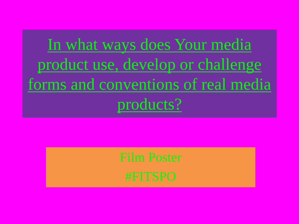
In what ways does Your media
product use, develop or challenge
forms and conventions of real media
products?
Film Poster
#FITSPO
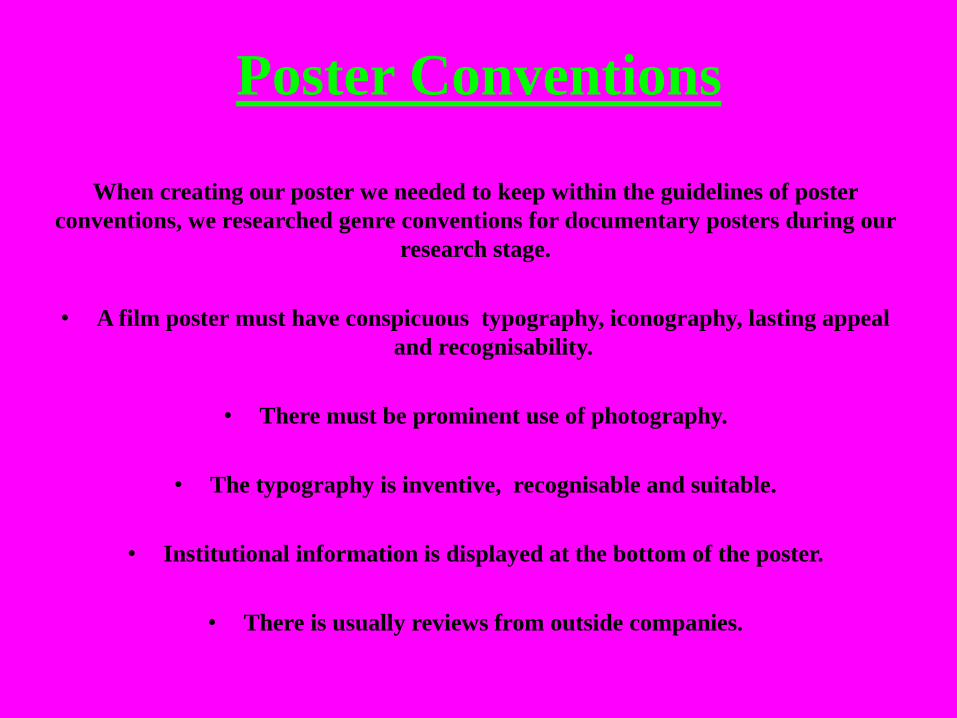
Poster Conventions
When creating our poster we needed to keep within the guidelines of poster
conventions, we researched genre conventions for documentary posters during our
research stage.
• A film poster must have conspicuous typography, iconography, lasting appeal
and recognisability.
• There must be prominent use of photography.
• The typography is inventive, recognisable and suitable.
• Institutional information is displayed at the bottom of the poster.
• There is usually reviews from outside companies.
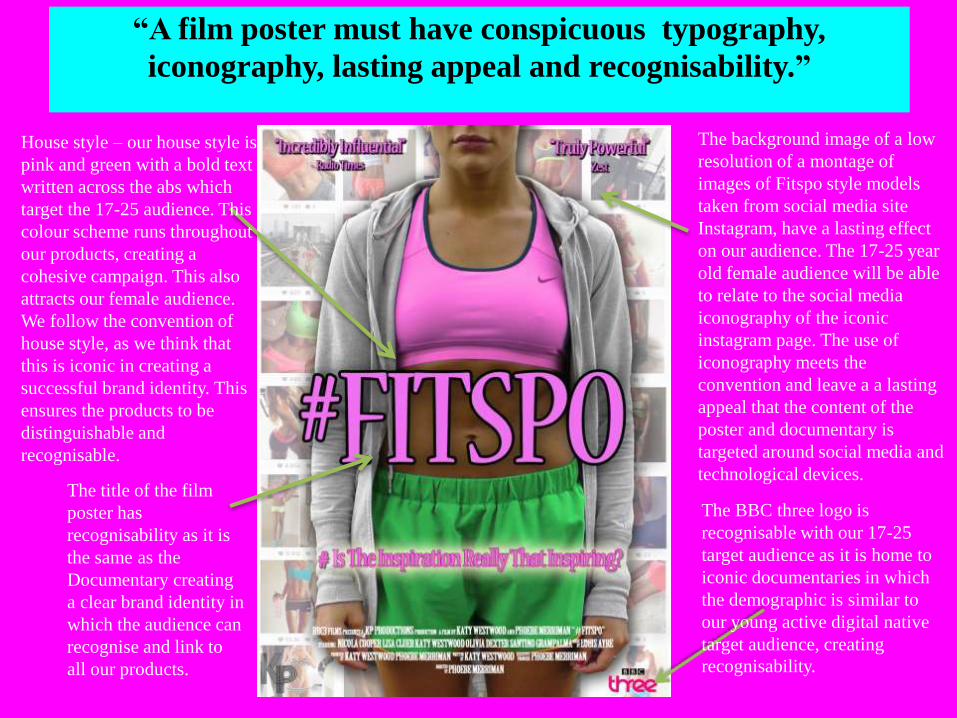
“A film poster must have conspicuous typography,
iconography, lasting appeal and recognisability.”
House style – our house style is
pink and green with a bold text
written across the abs which
target the 17-25 audience. This
colour scheme runs throughout
our products, creating a
cohesive campaign. This also
attracts our female audience.
We follow the convention of
house style, as we think that
this is iconic in creating a
successful brand identity. This
ensures the products to be
distinguishable and
recognisable.
The background image of a low
resolution of a montage of
images of Fitspo style models
taken from social media site
Instagram, have a lasting effect
on our audience. The 17-25 year
old female audience will be able
to relate to the social media
iconography of the iconic
instagram page. The use of
iconography meets the
convention and leave a a lasting
appeal that the content of the
poster and documentary is
targeted around social media and
technological devices. The title of the film
poster has
recognisability as it is
the same as the
Documentary creating
a clear brand identity in
which the audience can
recognise and link to
all our products.
The BBC three logo is
recognisable with our 17-25
target audience as it is home to
iconic documentaries in which
the demographic is similar to
our young active digital native
target audience, creating
recognisability.
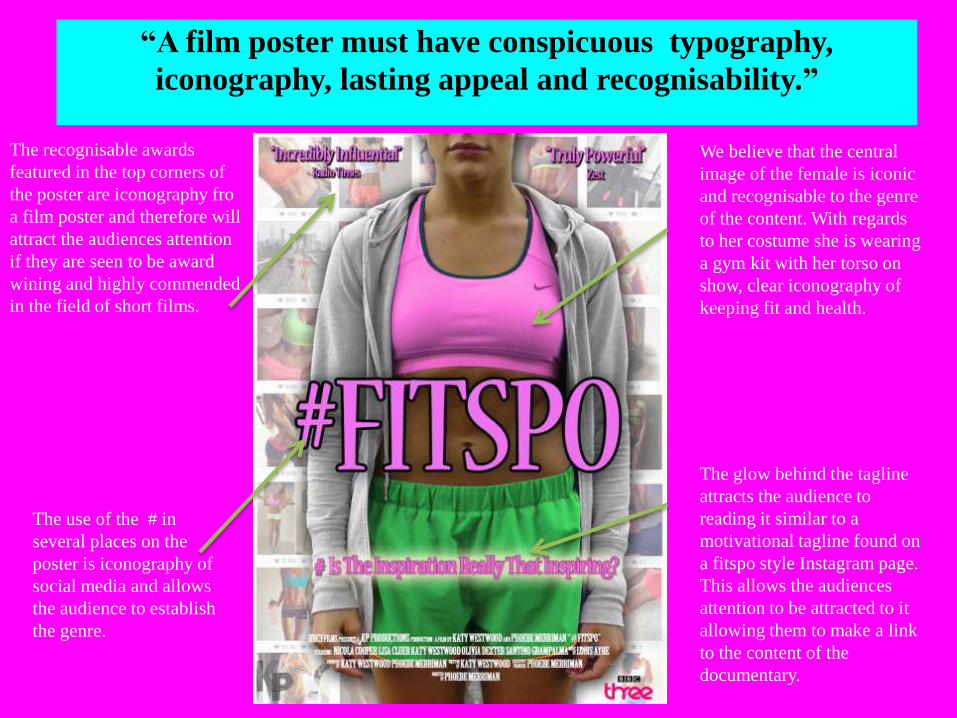
“A film poster must have conspicuous typography,
iconography, lasting appeal and recognisability.”
The recognisable awards
featured in the top corners of
the poster are iconography fro
a film poster and therefore will
attract the audiences attention
if they are seen to be award
wining and highly commended
in the field of short films.
We believe that the central
image of the female is iconic
and recognisable to the genre
of the content. With regards
to her costume she is wearing
a gym kit with her torso on
show, clear iconography of
keeping fit and health.
The glow behind the tagline
attracts the audience to
reading it similar to a
motivational tagline found on
a fitspo style Instagram page.
This allows the audiences
attention to be attracted to it
allowing them to make a link
to the content of the
documentary.
The use of the # in
several places on the
poster is iconography of
social media and allows
the audience to establish
the genre.
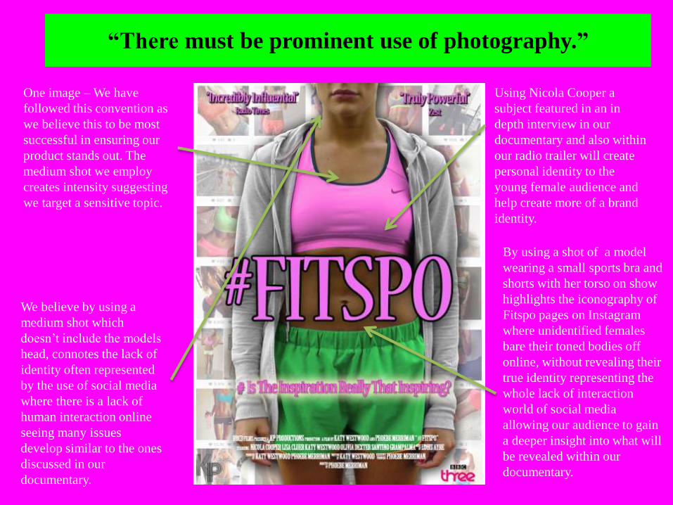
“There must be prominent use of photography.”
One image – We have
followed this convention as
we believe this to be most
successful in ensuring our
product stands out. The
medium shot we employ
creates intensity suggesting
we target a sensitive topic.
Using Nicola Cooper a
subject featured in an in
depth interview in our
documentary and also within
our radio trailer will create
personal identity to the
young female audience and
help create more of a brand
identity.
We believe by using a
medium shot which
doesn’t include the models
head, connotes the lack of
identity often represented
by the use of social media
where there is a lack of
human interaction online
seeing many issues
develop similar to the ones
discussed in our
documentary.
By using a shot of a model
wearing a small sports bra and
shorts with her torso on show
highlights the iconography of
Fitspo pages on Instagram
where unidentified females
bare their toned bodies off
online, without revealing their
true identity representing the
whole lack of interaction
world of social media
allowing our audience to gain
a deeper insight into what will
be revealed within our
documentary.
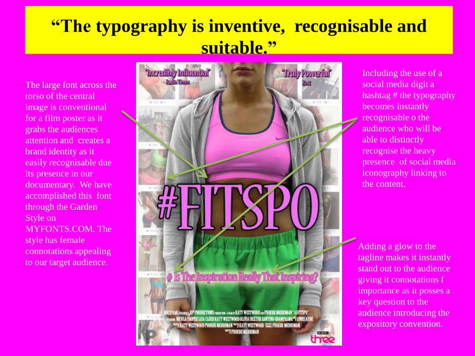
“The typography is inventive, recognisable and
suitable.”
The large font across the
torso of the central
image is conventional
for a film poster as it
grabs the audiences
attention and creates a
brand identity as it
easily recognisable due
its presence in our
documentary. We have
accomplished this font
through the Garden
Style on
MYFONTS.COM. The
style has female
connotations appealing
to our target audience.
Including the use of a
social media digit a
hashtag # the typography
becomes instantly
recognisable o the
audience who will be
able to distinctly
recognise the heavy
presence of social media
iconography linking to
the content.
Adding a glow to the
tagline makes it instantly
stand out to the audience
giving it connotations f
importance as it posses a
key question to the
audience introducing the
expository convention.
“Institutional information is displayed at the bottom of the
poster.”
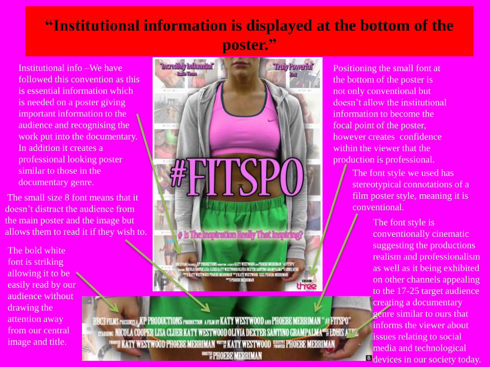
Institutional info –We have
followed this convention as this
is essential information which
is needed on a poster giving
important information to the
audience and recognising the
work put into the documentary.
In addition it creates a
professional looking poster
similar to those in the
documentary genre.
Positioning the small font at
the bottom of the poster is
not only conventional but
doesn’t allow the institutional
information to become the
focal point of the poster,
however creates confidence
within the viewer that the
production is professional.
The font style we used has
stereotypical connotations of a
film poster style, meaning it is
conventional.
The bold white
font is striking
allowing it to be
easily read by our
audience without
drawing the
attention away
from our central
image and title.
The small size 8 font means that it
doesn’t distract the audience from
the main poster and the image but
allows them to read it if they wish to. The font style is
conventionally cinematic
suggesting the productions
realism and professionalism
as well as it being exhibited
on other channels appealing
to the 17-25 target audience
creating a documentary
genre similar to ours that
informs the viewer about
issues relating to social
media and technological
devices in our society today.
“Institutional information is displayed at the bottom of the
poster.”
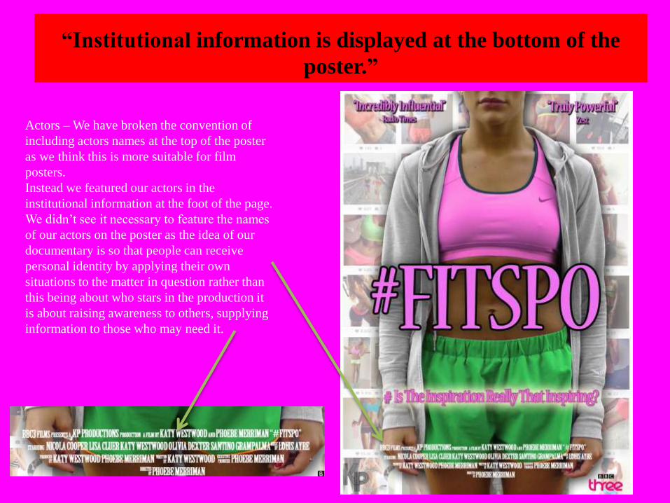
Actors – We have broken the convention of
including actors names at the top of the poster
as we think this is more suitable for film
posters.
Instead we featured our actors in the
institutional information at the foot of the page.
We didn’t see it necessary to feature the names
of our actors on the poster as the idea of our
documentary is so that people can receive
personal identity by applying their own
situations to the matter in question rather than
this being about who stars in the production it
is about raising awareness to others, supplying
information to those who may need it.
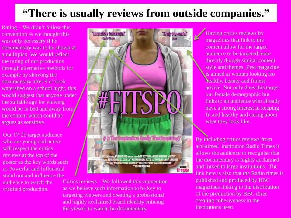
“There is usually reviews from outside companies.”Rating – We didn’t follow this
convention as we thought this
was only necessary if he
documentary was to be shown at
a multiplex. We would reflect
the rating of our production
through alternative methods for
example by showing the
documentary after 9 o’clock
watershed on a school night, this
would suggest that anyone under
the suitable age for viewing
would be in bed and away from
the content which could be
argues as sensitive.
Critics reviews – We followed this convention
as we believe such information to be key to
targeting viewers and creating a professional
and highly acclaimed brand identity enticing
the viewer to watch the documentary.
Our 17-25 target audience
who are young and active
will respect the critics
reviews at the top of the
poster as the key words such
as Powerful and Influential
stand out and influence the
audience to watch the
credited production.
By including critics reviews from
acclaimed institution Radio Times it
allows the audience to recognise that
the documentary is highly acclaimed
and linked to large institutions. The
link here is also that the Radio times is
published and produced by BBC
magazines linking to the distribution
of the production by BBC three
creating cohesiveness in the
institutions used.
Having critics reviews by
magazines that link to the
content allow for the target
audience to be targeted more
directly though similar content
style and themes. Zest magazine
is aimed at women looking fro
healthy, beauty and fitness
advice. Not only does this target
our female demographic but
links to an audience who already
have a strong interest in keeping
fit and healthy and caring about
what they look like.
Institutional conventions for BBC three
Posters
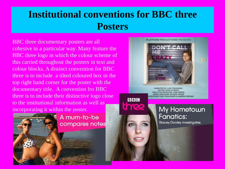
BBC three documentary posters are all
cohesive in a particular way. Many feature the
BBC three logo in which the colour scheme of
this carried throughout the posters in text and
colour blocks. A distinct convention for BBC
three is to include a tilted coloured box in the
top right hand corner for the poster with the
documentary title. A convention fro BBC
three is to include their distinctive logo close
to the institutional information as well as
incorporating it within the poster.
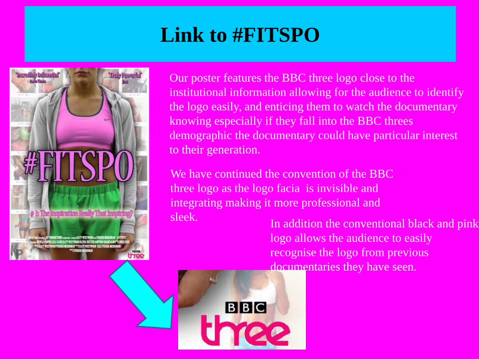
Link to #FITSPO
In addition the conventional black and pink
logo allows the audience to easily
recognise the logo from previous
documentaries they have seen.
Our poster features the BBC three logo close to the
institutional information allowing for the audience to identify
the logo easily, and enticing them to watch the documentary
knowing especially if they fall into the BBC threes
demographic the documentary could have particular interest
to their generation.
We have continued the convention of the BBC
three logo as the logo facia is invisible and
integrating making it more professional and
sleek.
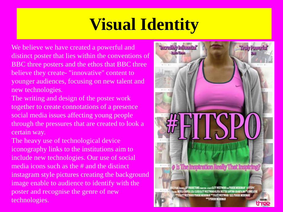
Visual Identity
We believe we have created a powerful and
distinct poster that lies within the conventions of
BBC three posters and the ethos that BBC three
believe they create- "innovative" content to
younger audiences, focusing on new talent and
new technologies.
The writing and design of the poster work
together to create connotations of a presence
social media issues affecting young people
through the pressures that are created to look a
certain way.
The heavy use of technological device
iconography links to the institutions aim to
include new technologies. Our use of social
media icons such as the # and the distinct
instagram style pictures creating the background
image enable to audience to identify with the
poster and recognise the genre of new
technologies.
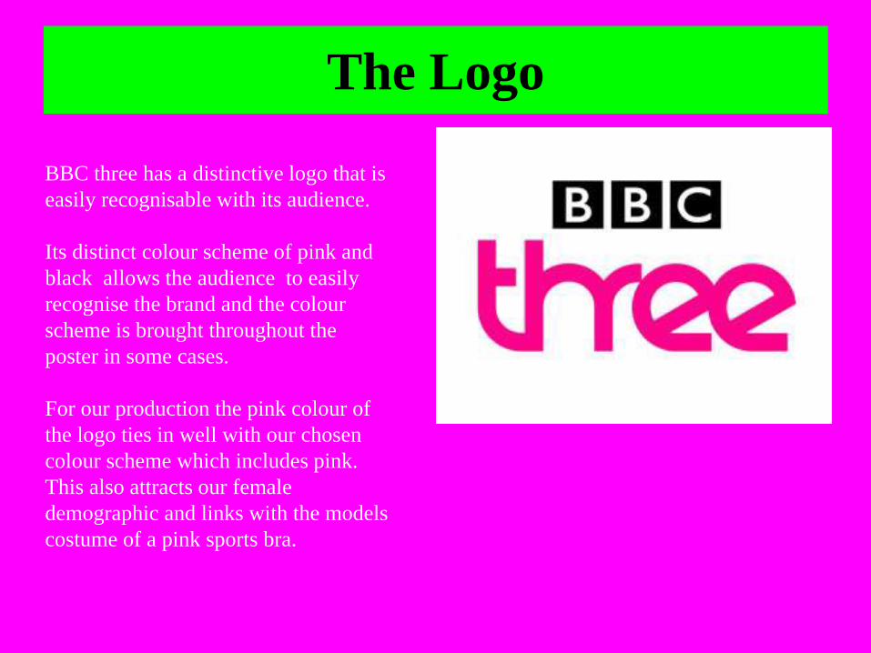
The Logo
BBC three has a distinctive logo that is
easily recognisable with its audience.
Its distinct colour scheme of pink and
black allows the audience to easily
recognise the brand and the colour
scheme is brought throughout the
poster in some cases.
For our production the pink colour of
the logo ties in well with our chosen
colour scheme which includes pink.
This also attracts our female
demographic and links with the models
costume of a pink sports bra.
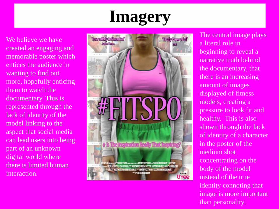
Imagery
We believe we have
created an engaging and
memorable poster which
entices the audience in
wanting to find out
more, hopefully enticing
them to watch the
documentary. This is
represented through the
lack of identity of the
model linking to the
aspect that social media
can lead users into being
part of an unknown
digital world where
there is limited human
interaction.
The central image plays
a literal role in
beginning to reveal a
narrative truth behind
the documentary, that
there is an increasing
amount of images
displayed of fitness
models, creating a
pressure to look fit and
healthy. This is also
shown through the lack
of identity of a character
in the poster of the
medium shot
concentrating on the
body of the model
instead of the true
identity connoting that
image is more important
than personality.