Embed Size (px)
Citation preview
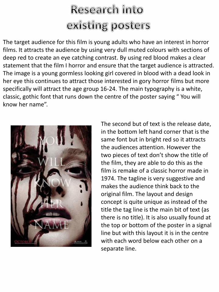
The target audience for this film is young adults who have an interest in horror films. It attracts the audience by using very dull muted colours with sections of deep red to create an eye catching contrast. By using red blood makes a clear statement that the film I horror and ensure that the target audience is attracted. The image is a young gormless looking girl covered in blood with a dead look in her eye this continues to attract those interested in gory horror films but more specifically will attract the age group 16-24. The main typography is a white, classic, gothic font that runs down the centre of the poster saying “ You will know her name”.
The second but of text is the release date, in the bottom left hand corner that is the same font but in bright red so it attracts the audiences attention. However the two pieces of text don’t show the title of the film, they are able to do this as the film is remake of a classic horror made in 1974. The tagline is very suggestive and makes the audience think back to the original film. The layout and design concept is quite unique as instead of the title the tag line is the main bit of text (as there is no title). It is also usually found at the top or bottom of the poster in a signal line but with this layout it is in the centre with each word below each other on a separate line.
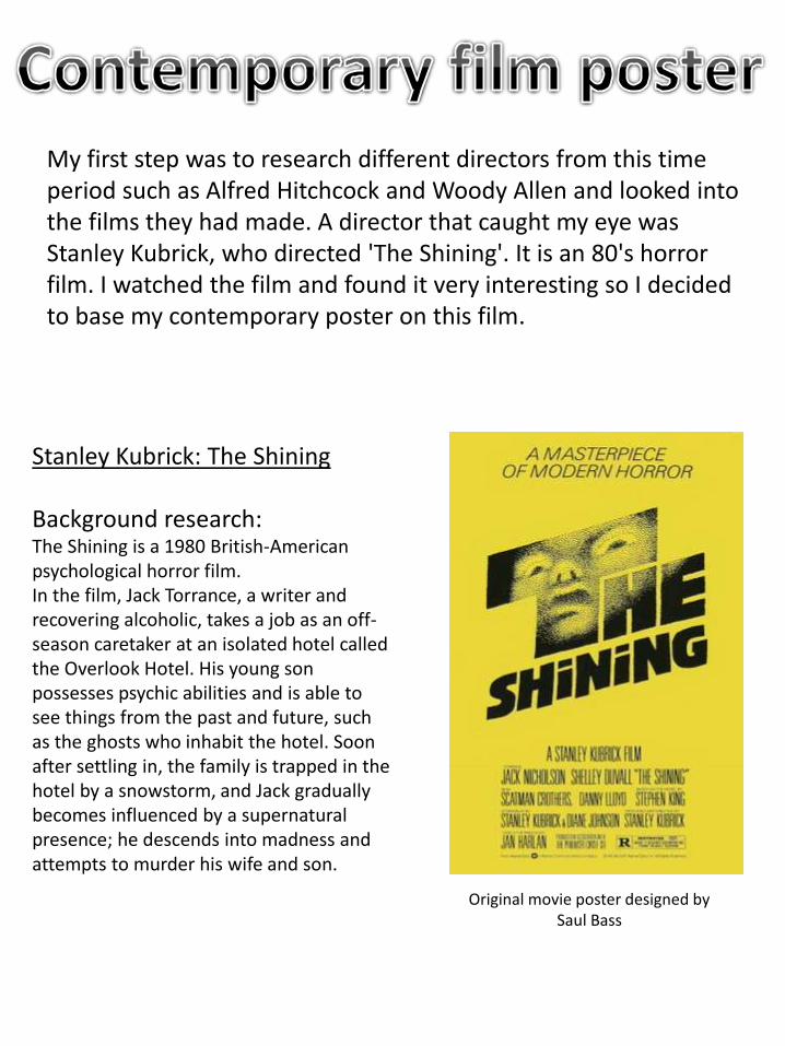
Stanley Kubrick: The Shining
Background research:The Shining is a 1980 British-American psychological horror film.In the film, Jack Torrance, a writer and recovering alcoholic, takes a job as an off-season caretaker at an isolated hotel called the Overlook Hotel. His young son possesses psychic abilities and is able to see things from the past and future, such as the ghosts who inhabit the hotel. Soon after settling in, the family is trapped in the hotel by a snowstorm, and Jack gradually becomes influenced by a supernatural presence; he descends into madness and attempts to murder his wife and son.
Original movie poster designed by Saul Bass
My first step was to research different directors from this time period such as Alfred Hitchcock and Woody Allen and looked into the films they had made. A director that caught my eye was Stanley Kubrick, who directed 'The Shining'. It is an 80's horror film. I watched the film and found it very interesting so I decided to base my contemporary poster on this film.
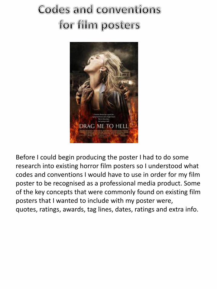
Before I could begin producing the poster I had to do some research into existing horror film posters so I understood what codes and conventions I would have to use in order for my film poster to be recognised as a professional media product. Some of the key concepts that were commonly found on existing film posters that I wanted to include with my poster were, quotes, ratings, awards, tag lines, dates, ratings and extra info.
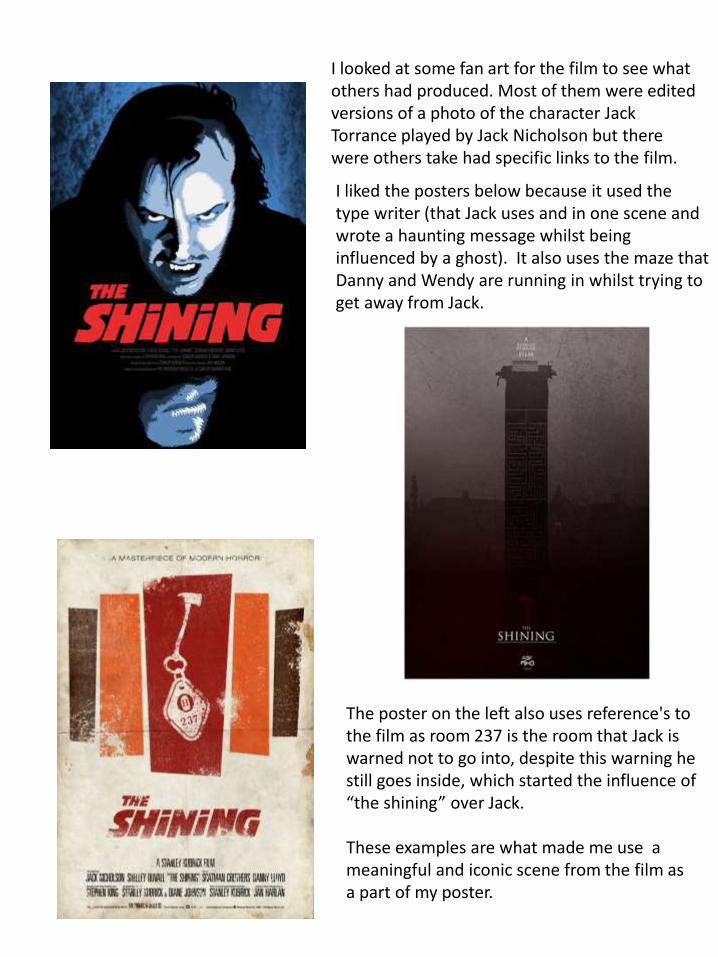
I looked at some fan art for the film to see what others had produced. Most of them were edited versions of a photo of the character Jack Torrance played by Jack Nicholson but there were others take had specific links to the film.
The poster on the left also uses reference's to the film as room 237 is the room that Jack is warned not to go into, despite this warning he still goes inside, which started the influence of “the shining” over Jack.
These examples are what made me use a meaningful and iconic scene from the film as a part of my poster.
I liked the posters below because it used the type writer (that Jack uses and in one scene and wrote a haunting message whilst being influenced by a ghost). It also uses the maze that Danny and Wendy are running in whilst trying to get away from Jack.
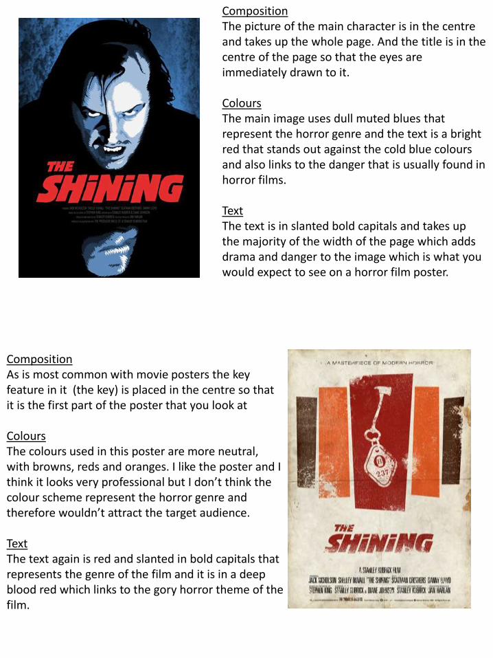
CompositionThe picture of the main character is in the centre and takes up the whole page. And the title is in the centre of the page so that the eyes are immediately drawn to it.
ColoursThe main image uses dull muted blues that represent the horror genre and the text is a bright red that stands out against the cold blue colours and also links to the danger that is usually found in horror films.
TextThe text is in slanted bold capitals and takes up the majority of the width of the page which adds drama and danger to the image which is what you would expect to see on a horror film poster.
CompositionAs is most common with movie posters the key feature in it (the key) is placed in the centre so that it is the first part of the poster that you look at
ColoursThe colours used in this poster are more neutral, with browns, reds and oranges. I like the poster and I think it looks very professional but I don’t think the colour scheme represent the horror genre and therefore wouldn’t attract the target audience.
TextThe text again is red and slanted in bold capitals that represents the genre of the film and it is in a deep blood red which links to the gory horror theme of the film.
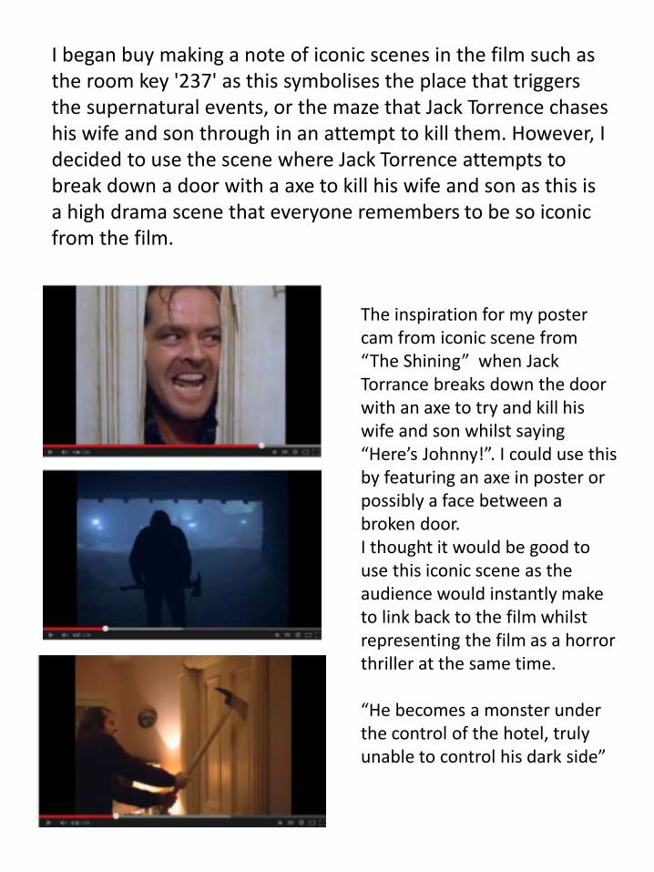
The inspiration for my poster cam from iconic scene from “The Shining” when Jack Torrance breaks down the door with an axe to try and kill his wife and son whilst saying “Here’s Johnny!”. I could use this by featuring an axe in poster or possibly a face between a broken door. I thought it would be good to use this iconic scene as the audience would instantly make to link back to the film whilst representing the film as a horror thriller at the same time.
“He becomes a monster under the control of the hotel, truly unable to control his dark side”
I began buy making a note of iconic scenes in the film such as the room key '237' as this symbolises the place that triggers the supernatural events, or the maze that Jack Torrence chases his wife and son through in an attempt to kill them. However, I decided to use the scene where Jack Torrence attempts to break down a door with a axe to kill his wife and son as this is a high drama scene that everyone remembers to be so iconic from the film.
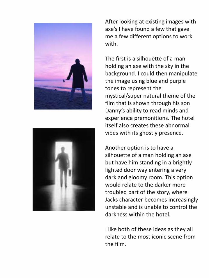
After looking at existing images with axe’s I have found a few that gave me a few different options to work with.
The first is a silhouette of a man holding an axe with the sky in the background. I could then manipulate the image using blue and purple tones to represent the mystical/super natural theme of the film that is shown through his son Danny’s ability to read minds and experience premonitions. The hotel itself also creates these abnormal vibes with its ghostly presence.
Another option is to have a silhouette of a man holding an axe but have him standing in a brightly lighted door way entering a very dark and gloomy room. This option would relate to the darker more troubled part of the story, where Jacks character becomes increasingly unstable and is unable to control the darkness within the hotel.
I like both of these ideas as they all relate to the most iconic scene from the film.
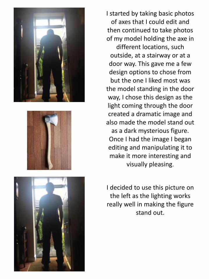
I started by taking basic photos of axes that I could edit and
then continued to take photos of my model holding the axe in
different locations, such outside, at a stairway or at a door way. This gave me a few design options to chose from but the one I liked most was
the model standing in the door way, I chose this design as the light coming through the door created a dramatic image and
also made the model stand out as a dark mysterious figure.
Once I had the image I began editing and manipulating it to make it more interesting and
visually pleasing.
I decided to use this picture on the left as the lighting works
really well in making the figure stand out.
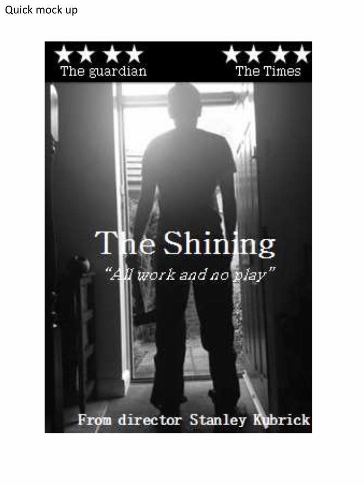
Quick mock up
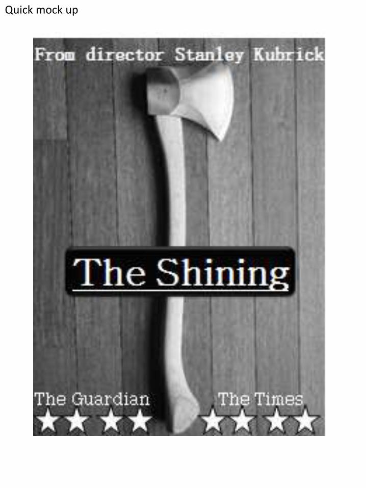
Quick mock up
Th Times
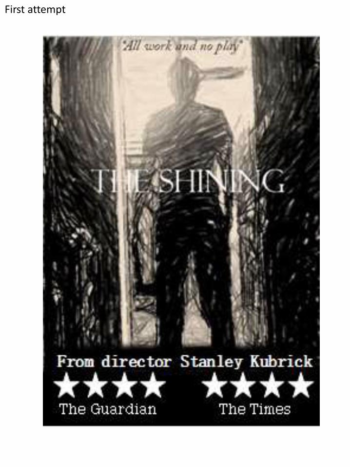
First attempt
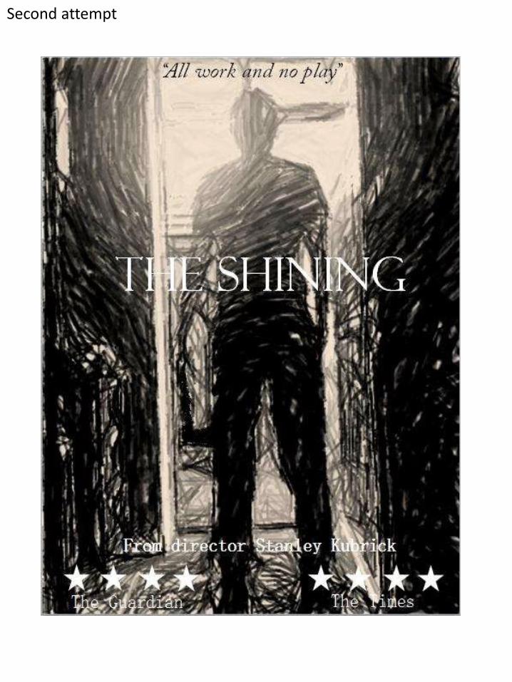
Second attempt
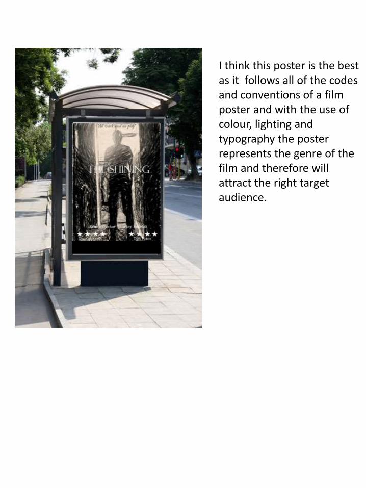
I think this poster is the best as it follows all of the codes and conventions of a film poster and with the use of colour, lighting and typography the poster represents the genre of the film and therefore will attract the right target audience.
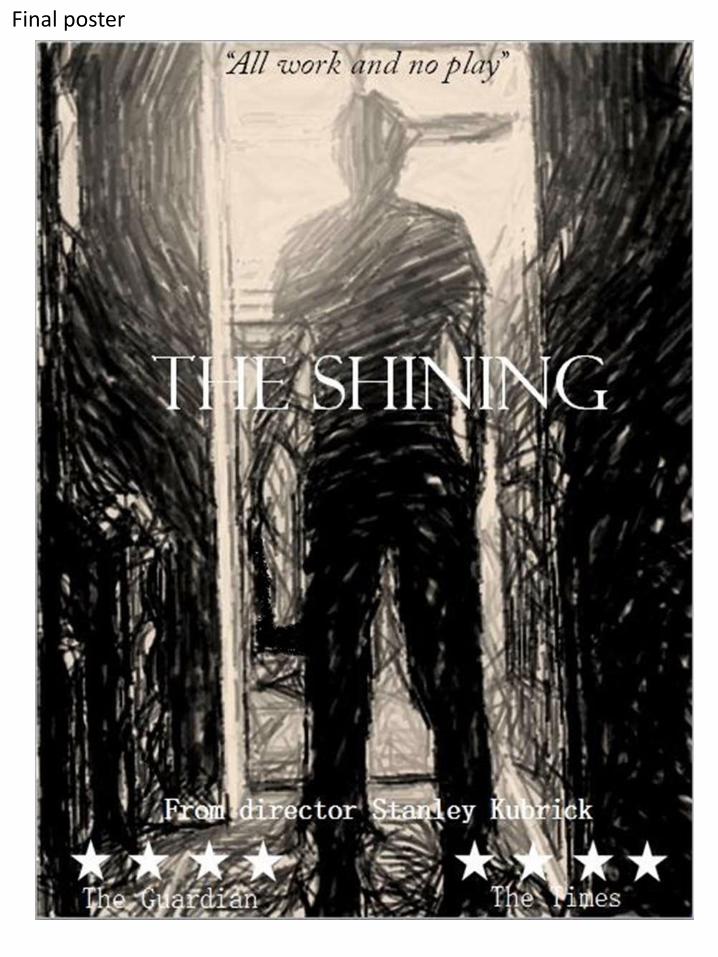
Final poster