Embed Size (px)
Citation preview
I started off by inserting my logo which was easy to make ( using the text tool ) I then opened the saved image of the barcode that I made using a website. I dragged it over to the document that I was using to make my second draft by using the ‘move tool’ I also used the text tool to insert the date of my magazine. I placed it on top of the barcode as from my research I found that this was a common place for the date to be found. The reason I placed my masthead vertically is I thought that it would look trending I put it to the right as the eye flows from the right to the left so this would be one of the first this that a reader would see and so it would be easier for the readers to identify.
I then inserted my background image using a photo that I took. I did this by using the ‘move tool’ The reason I decided to use this photo was because I look the photo using the thirds so that my subject of my photo was to a side/ third rather than in the middle. I thought that this photo represented my magazine well as she is obviously a musician as she is playing the guitar and I dressed my model up as if she was an Indi rocker. An issue I had with this was that my photo did not pit correctly with the A4 page so I had to crop a section of the brick wall using the ‘marquee tool’ and dragging it using the ‘move tool’ over to the document. I then had to try and make the brick work match so that you can not notice that I have copied the same bricks and shifted them to the right.
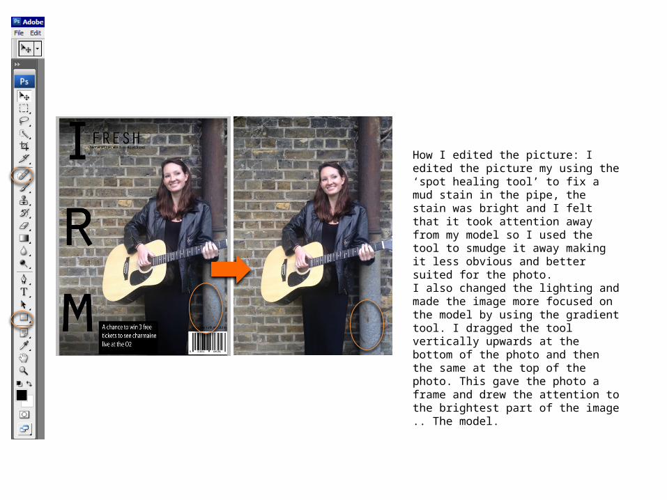
How I edited the picture: I edited the picture my using the ‘spot healing tool’ to fix a mud stain in the pipe, the stain was bright and I felt that it took attention away from my model so I used the tool to smudge it away making it less obvious and better suited for the photo. I also changed the lighting and made the image more focused on the model by using the gradient tool. I dragged the tool vertically upwards at the bottom of the photo and then the same at the top of the photo. This gave the photo a frame and drew the attention to the brightest part of the image .. The model.
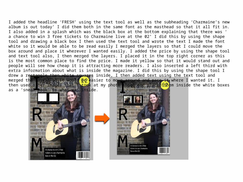
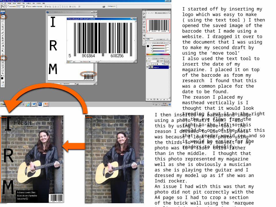
I added the headline ‘FRESH’ using the text tool as well as the subheading ‘Charmaine’s new album is out today’ I did them both in the same font as the masthead so that it all fit in. I also added in a splash which was the black box at the bottom explaining that there was ‘ a chance to win 3 free tickets to Charmaine live at the 02’ I did this by using the shape tool and drawing a black box I then used the text tool and wrote the text I made the font white so it would be able to be read easily I merged the layers so that I could move the box around and place it wherever I wanted easily. I added the price by using the shape tool and text tool also, I then merged the layers. I placed it in the top right corner as this is the most common place to find the price. I made it yellow so that it would stand out and people will see how cheap it is attracting more readers. I also inserted a left third with extra information about what is inside the magazine. I did this by using the shape tool I drew a rectangle then white squares inside, I then added text using the text tool and merged the layers so it would be easier to move around and pace it where I wanted it. I then used other images that I took at my photo shoot and placed them inside the white boxes as a ‘sneak peak’ to what was inside.
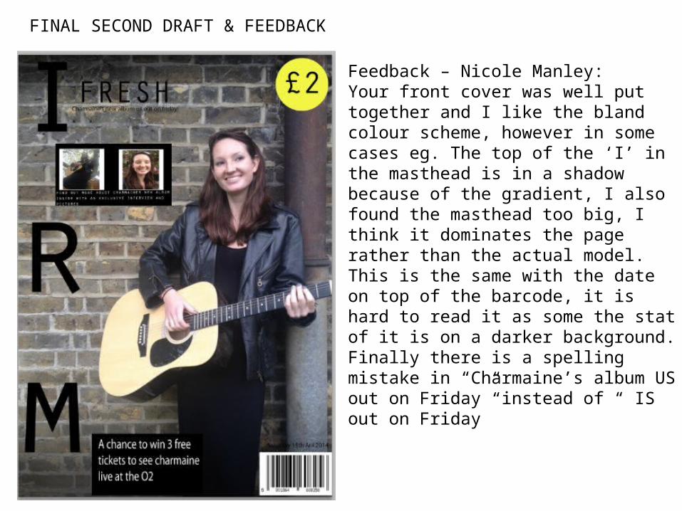
FINAL SECOND DRAFT & FEEDBACK
Feedback – Nicole Manley: Your front cover was well put together and I like the bland colour scheme, however in some cases eg. The top of the ‘I’ in the masthead is in a shadow because of the gradient, I also found the masthead too big, I think it dominates the page rather than the actual model. This is the same with the date on top of the barcode, it is hard to read it as some the stat of it is on a darker background. Finally there is a spelling mistake in “Charmaine’s album US out on Friday” instead of “ IS out on Friday”