Embed Size (px)
Citation preview
Step By Step -Making My Front Cover
By Ashley Billingham
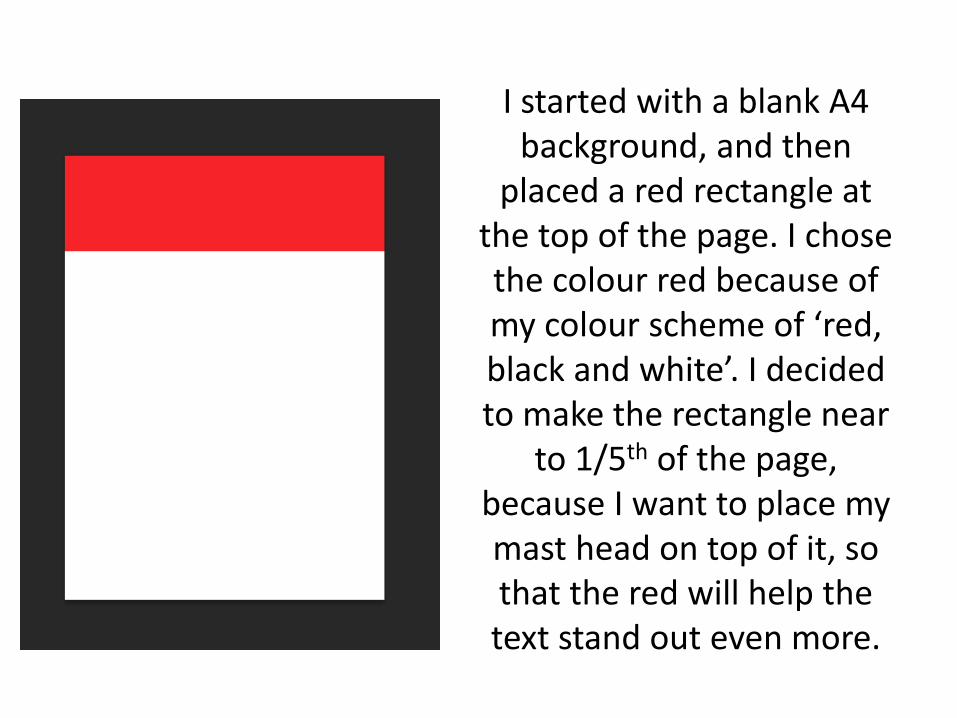
I started with a blank A4 background, and then
placed a red rectangle at the top of the page. I chose the colour red because of my colour scheme of ‘red,black and white’. I decided to make the rectangle near
to 1/5th of the page, because I want to place my mast head on top of it, so that the red will help the text stand out even more.
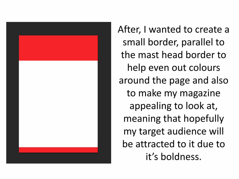
After, I wanted to create a small border, parallel to the mast head border to
help even out colours around the page and also
to make my magazine appealing to look at,
meaning that hopefully my target audience will be attracted to it due to
it’s boldness.
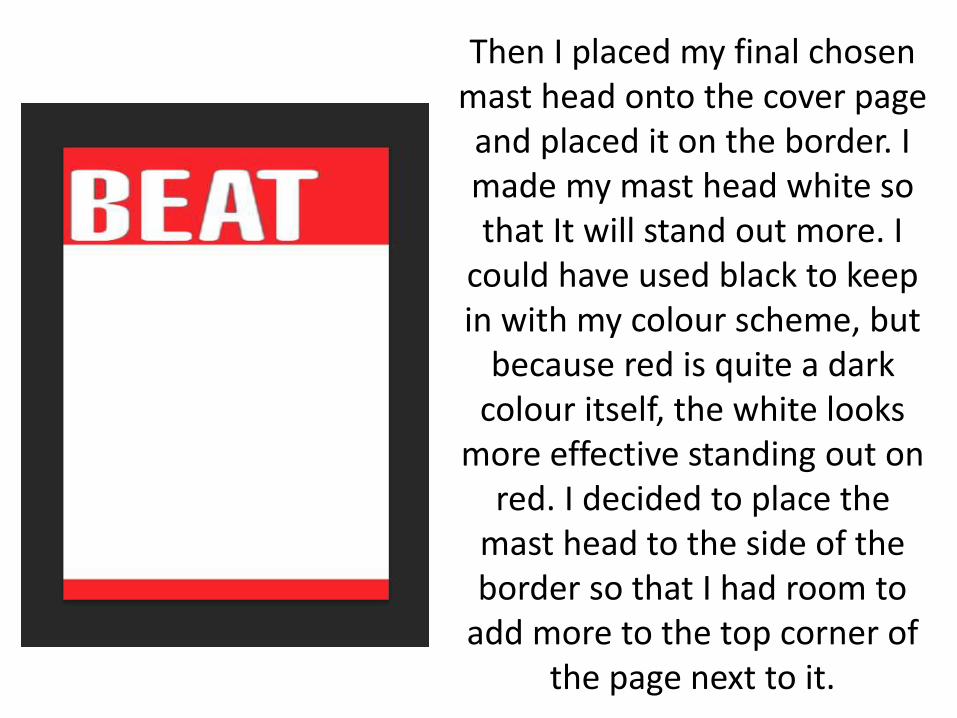
Then I placed my final chosen mast head onto the cover page and placed it on the border. I made my mast head white so that It will stand out more. I
could have used black to keep in with my colour scheme, but
because red is quite a dark colour itself, the white looks
more effective standing out on red. I decided to place the
mast head to the side of the border so that I had room to
add more to the top corner of the page next to it.
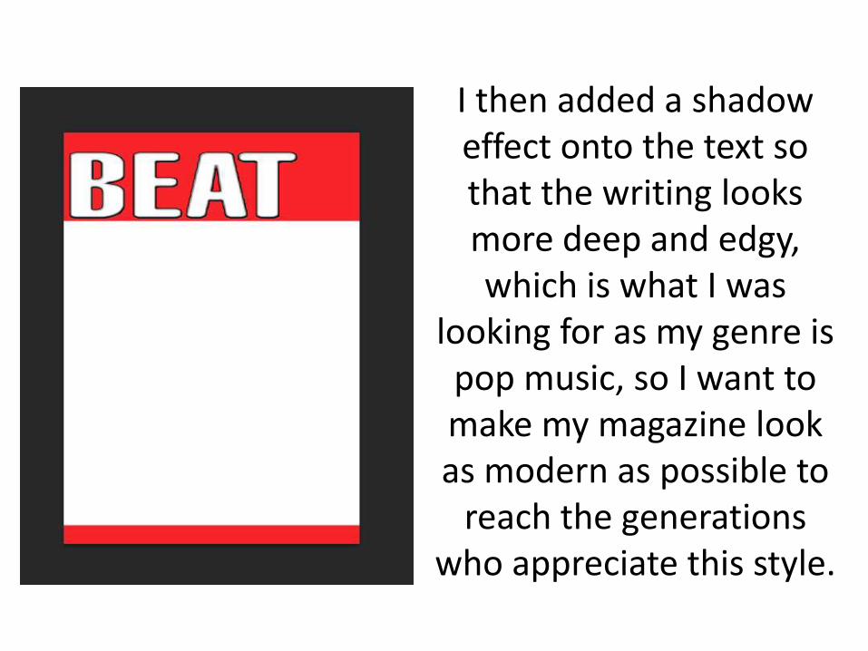
I then added a shadow effect onto the text so that the writing looks more deep and edgy, which is what I was
looking for as my genre is pop music, so I want to make my magazine look as modern as possible to
reach the generations who appreciate this style.
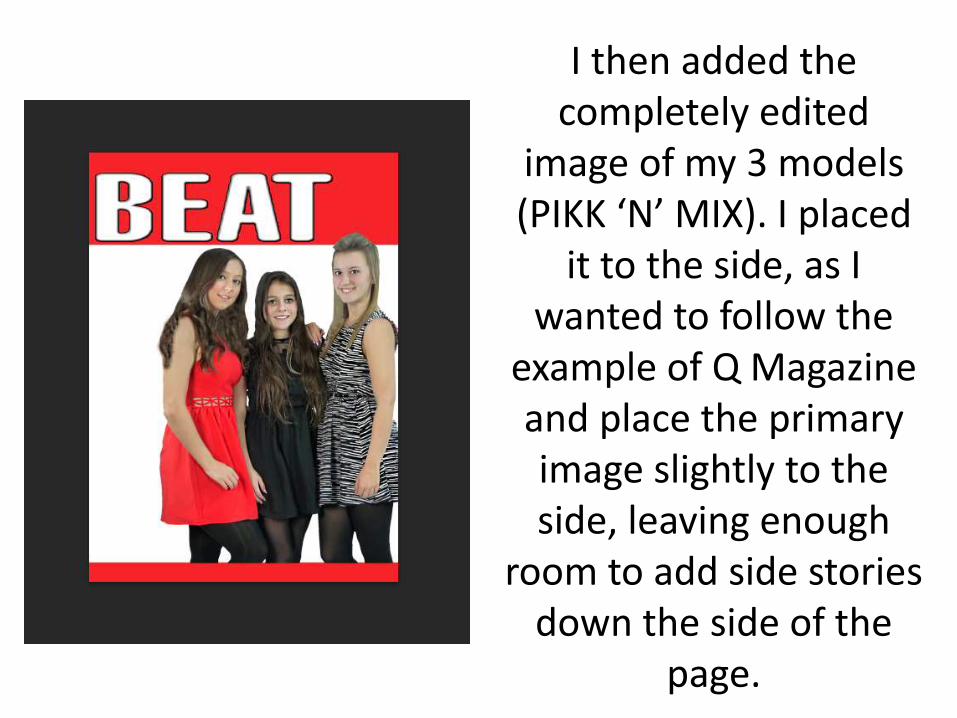
I then added the completely edited
image of my 3 models (PIKK ‘N’ MIX). I placed
it to the side, as I wanted to follow the
example of Q Magazine and place the primary image slightly to the side, leaving enough
room to add side stories down the side of the
page.
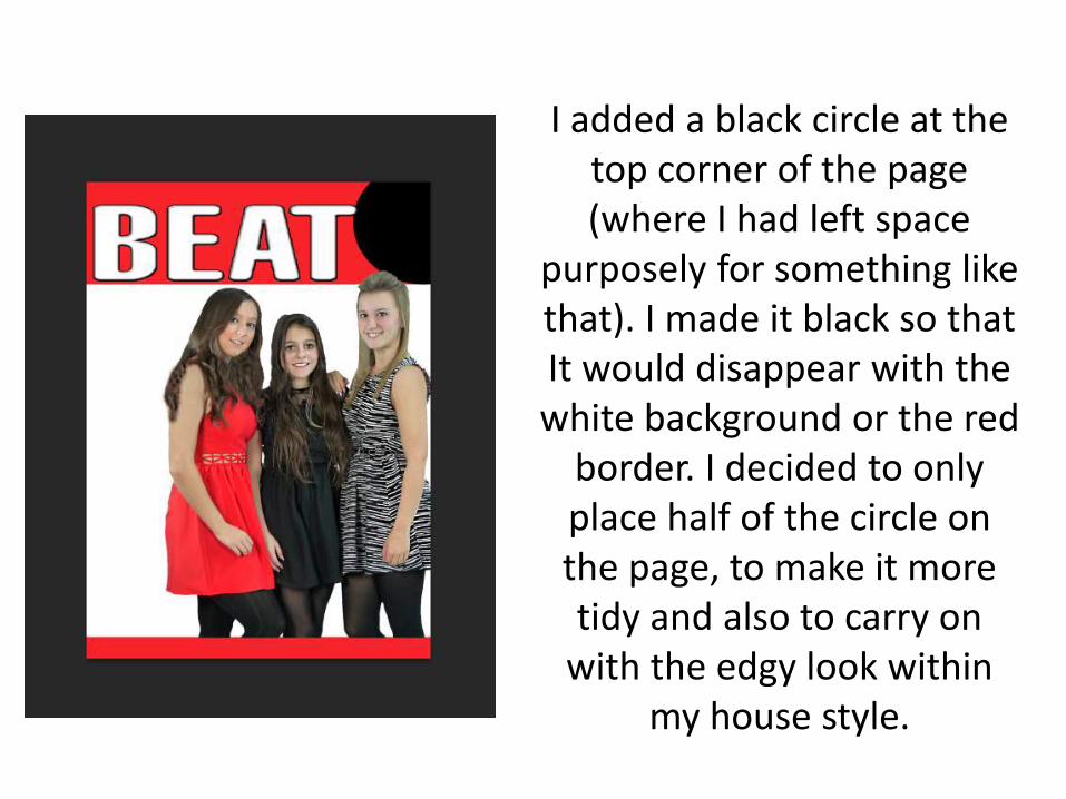
I added a black circle at the top corner of the page (where I had left space
purposely for something like that). I made it black so that It would disappear with the white background or the red
border. I decided to only place half of the circle on the page, to make it more tidy and also to carry on
with the edgy look within my house style.
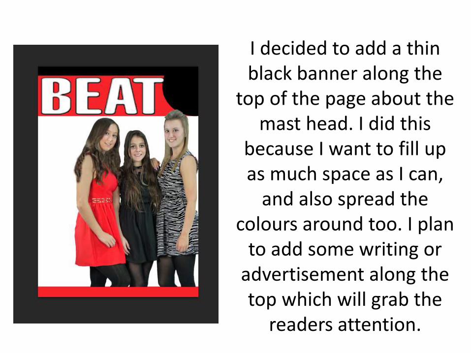
I decided to add a thin black banner along the
top of the page about the mast head. I did this
because I want to fill up as much space as I can,
and also spread the colours around too. I plan
to add some writing or advertisement along the top which will grab the
readers attention.
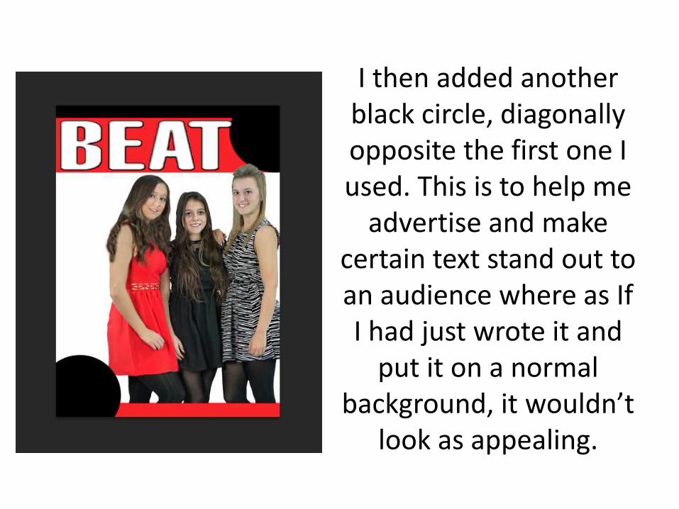
I then added another black circle, diagonally opposite the first one I used. This is to help me
advertise and make certain text stand out to an audience where as If I had just wrote it and
put it on a normal background, it wouldn’t
look as appealing.
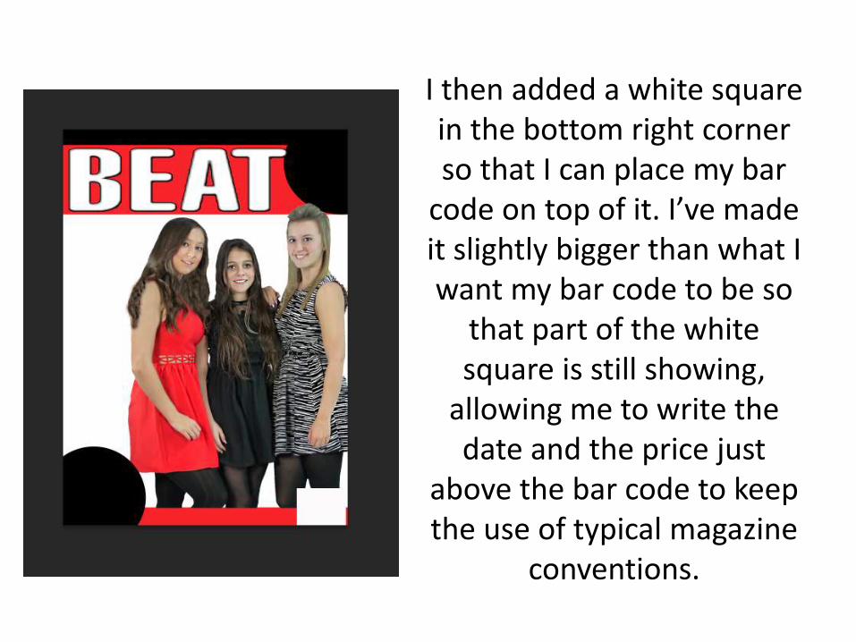
I then added a white square in the bottom right corner so that I can place my bar
code on top of it. I’ve made it slightly bigger than what I want my bar code to be so
that part of the white square is still showing,
allowing me to write the date and the price just
above the bar code to keep the use of typical magazine
conventions.
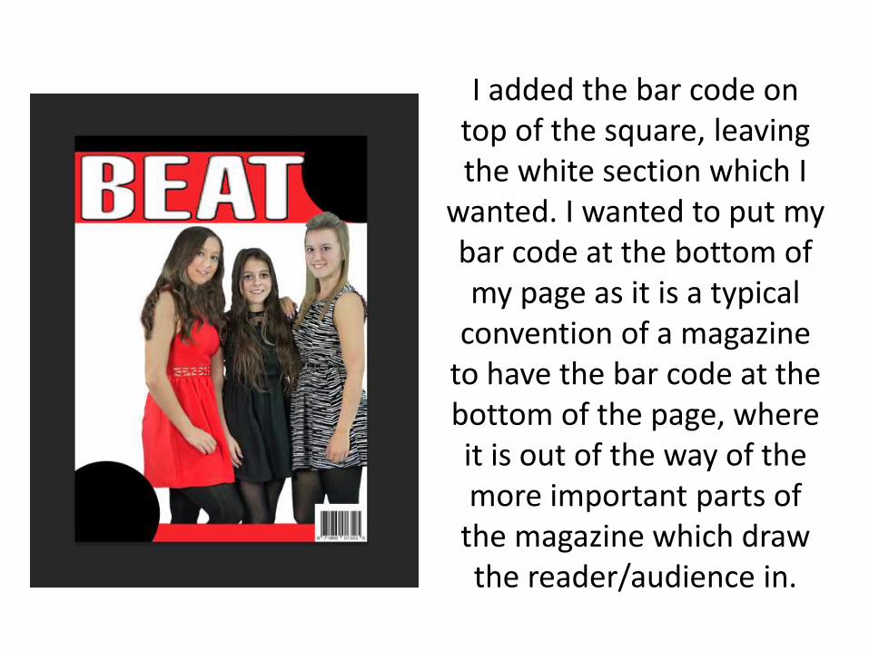
I added the bar code on top of the square, leaving the white section which I
wanted. I wanted to put my bar code at the bottom of my page as it is a typical
convention of a magazine to have the bar code at the bottom of the page, where it is out of the way of the more important parts of
the magazine which draw the reader/audience in.
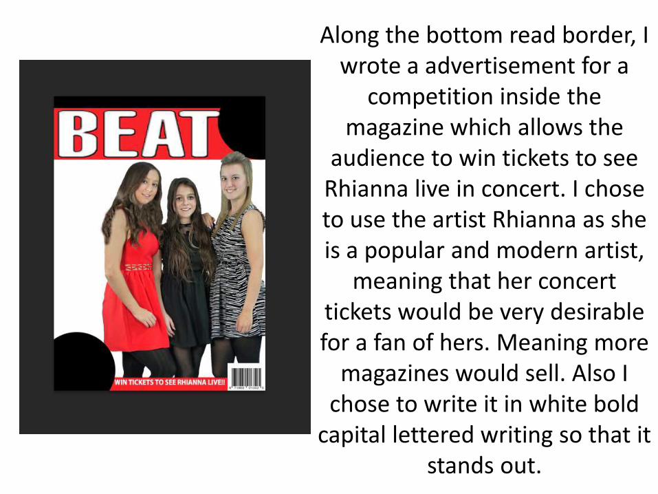
Along the bottom read border, I wrote a advertisement for a
competition inside the magazine which allows the
audience to win tickets to see Rhianna live in concert. I chose to use the artist Rhianna as she is a popular and modern artist,
meaning that her concert tickets would be very desirable for a fan of hers. Meaning more
magazines would sell. Also I chose to write it in white bold
capital lettered writing so that it stands out.
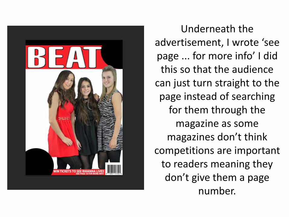
Underneath the advertisement, I wrote ‘see page ... for more info’ I did this so that the audience
can just turn straight to the page instead of searching
for them through the magazine as some
magazines don’t think competitions are important
to readers meaning they don’t give them a page
number.

In the second black circle (at the bottom left hand corner of the page) I wrote
another freebie advertisement, as everyone likes to be able to get things for free, and my magazine is offering a
free CD of Jay-Z and Beyoncé collaborating as they are also one of the worlds most famous artists and celebrity
couples, meaning they are loved by everyone, again leading to more people wanting to buy the magazine to be able to get the free CD. I wrote the ‘FREE CD’ part in red, as that is the important part that needs to stand out for the audience
to be interested, once they are interested, they will see the writing
underneath explaining who’s CD it is.
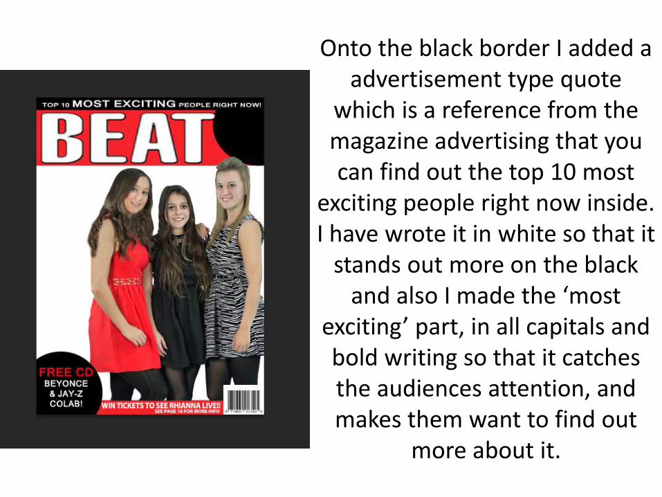
Onto the black border I added a advertisement type quote
which is a reference from the magazine advertising that you can find out the top 10 most
exciting people right now inside. I have wrote it in white so that it
stands out more on the black and also I made the ‘most
exciting’ part, in all capitals and bold writing so that it catches the audiences attention, and makes them want to find out
more about it.
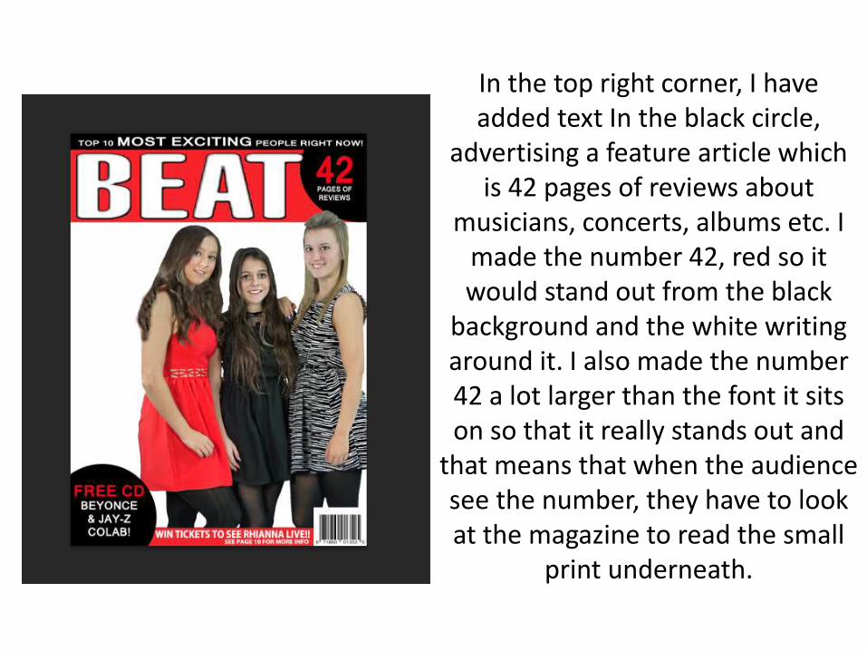
In the top right corner, I have added text In the black circle,
advertising a feature article which is 42 pages of reviews about
musicians, concerts, albums etc. I made the number 42, red so it would stand out from the black
background and the white writing around it. I also made the number 42 a lot larger than the font it sits on so that it really stands out and
that means that when the audience see the number, they have to look at the magazine to read the small
print underneath.
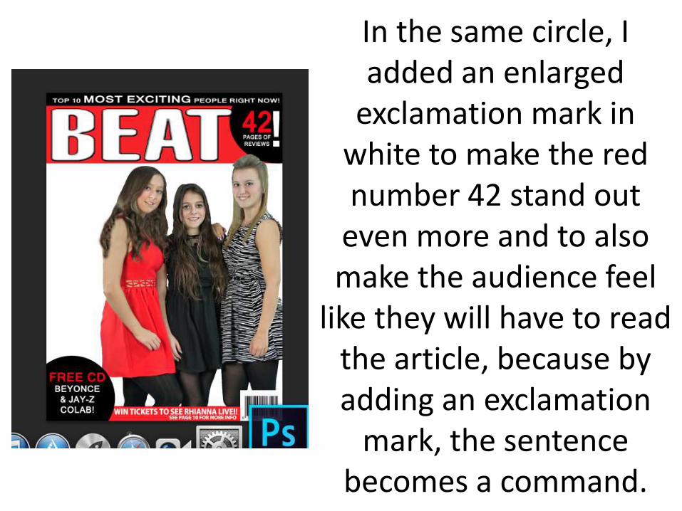
In the same circle, I added an enlarged
exclamation mark in white to make the red number 42 stand out
even more and to also make the audience feel
like they will have to read the article, because by adding an exclamation
mark, the sentence becomes a command.
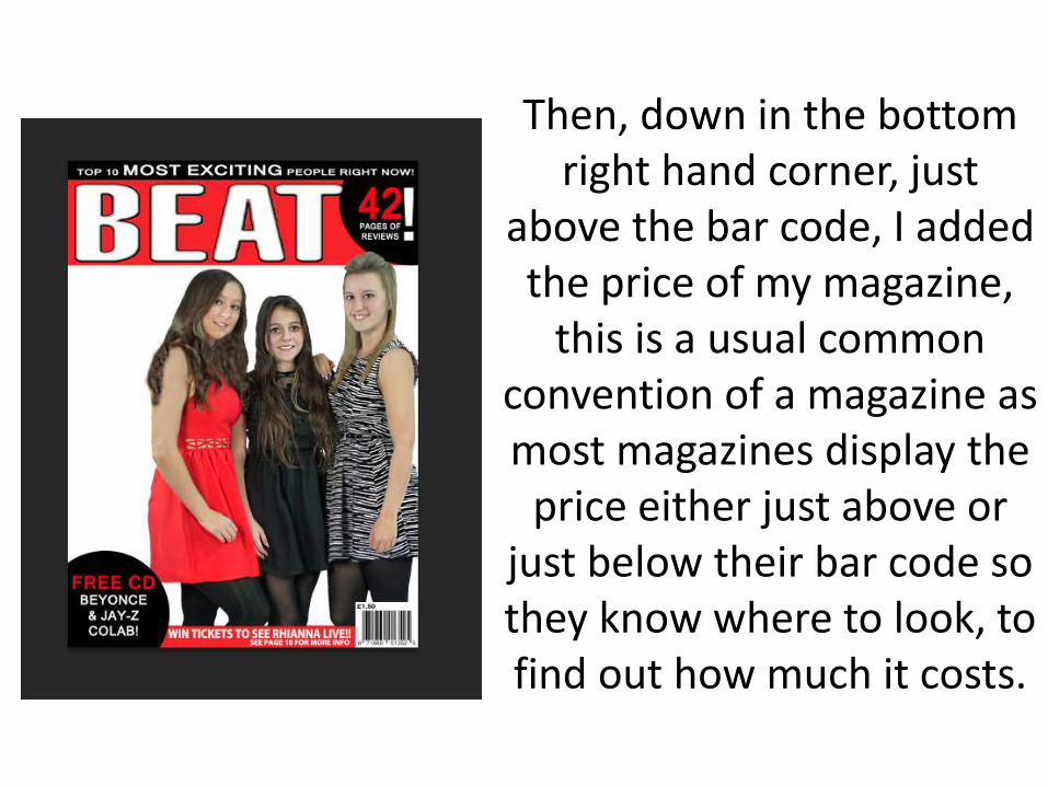
Then, down in the bottom right hand corner, just
above the bar code, I added the price of my magazine,
this is a usual common convention of a magazine as most magazines display the
price either just above or just below their bar code so they know where to look, to find out how much it costs.
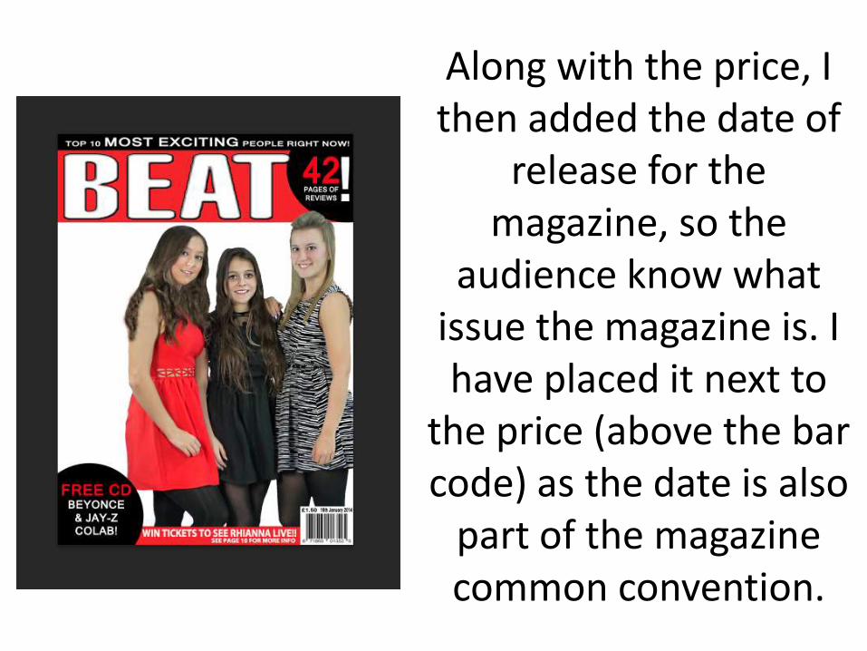
Along with the price, I then added the date of
release for the magazine, so the
audience know what issue the magazine is. I have placed it next to
the price (above the bar code) as the date is also
part of the magazine common convention.
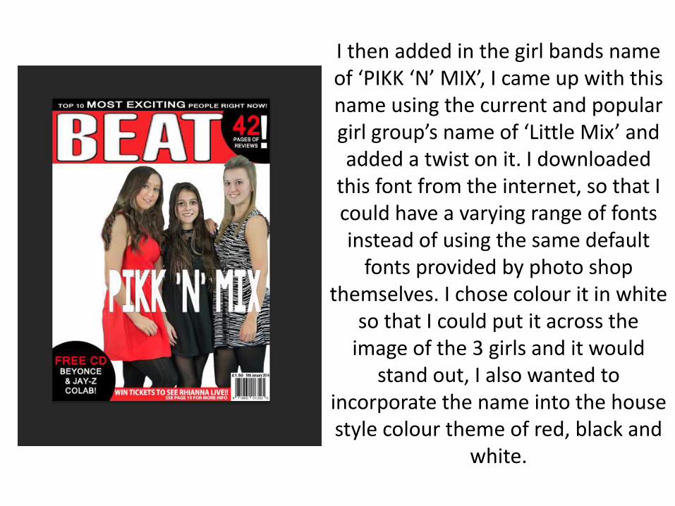
I then added in the girl bands name of ‘PIKK ‘N’ MIX’, I came up with this name using the current and popular girl group’s name of ‘Little Mix’ and added a twist on it. I downloaded
this font from the internet, so that I could have a varying range of fonts instead of using the same default
fonts provided by photo shop themselves. I chose colour it in white
so that I could put it across the image of the 3 girls and it would
stand out, I also wanted to incorporate the name into the house style colour theme of red, black and
white.
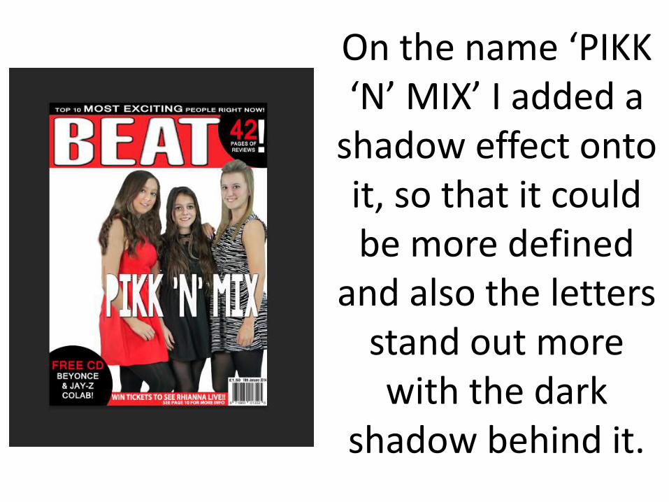
On the name ‘PIKK ‘N’ MIX’ I added a
shadow effect onto it, so that it could be more defined
and also the letters stand out more with the dark
shadow behind it.
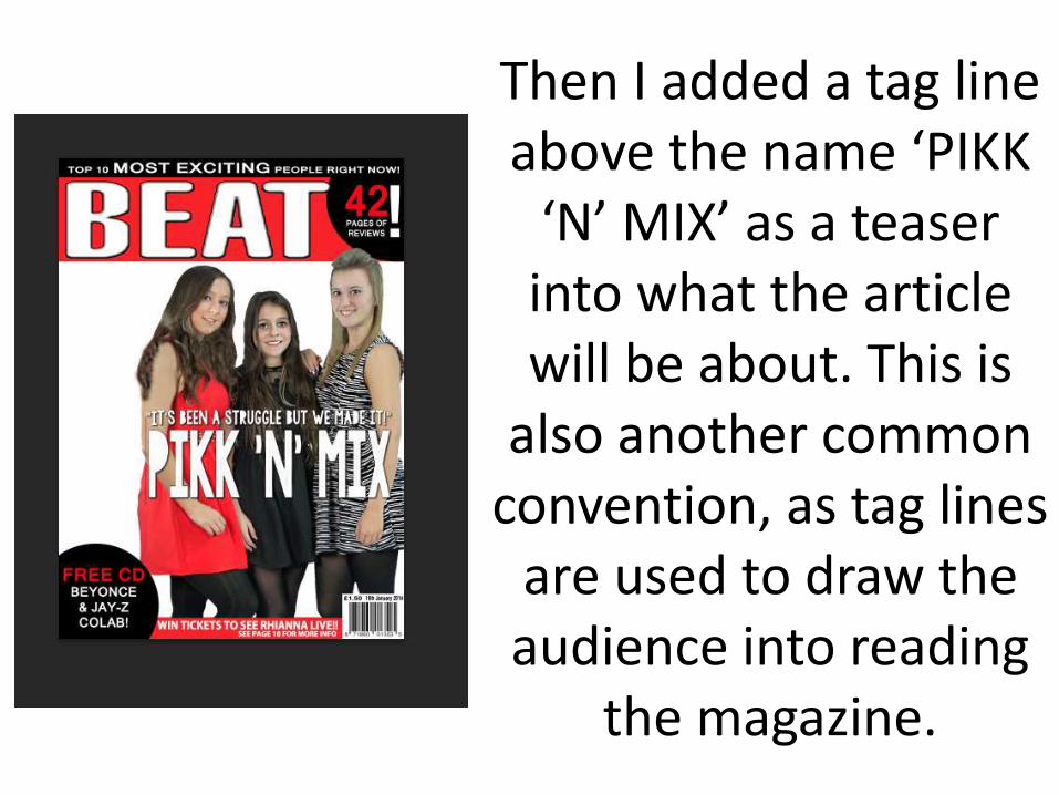
Then I added a tag line above the name ‘PIKK
‘N’ MIX’ as a teaser into what the article will be about. This is
also another common convention, as tag lines
are used to draw the audience into reading
the magazine.
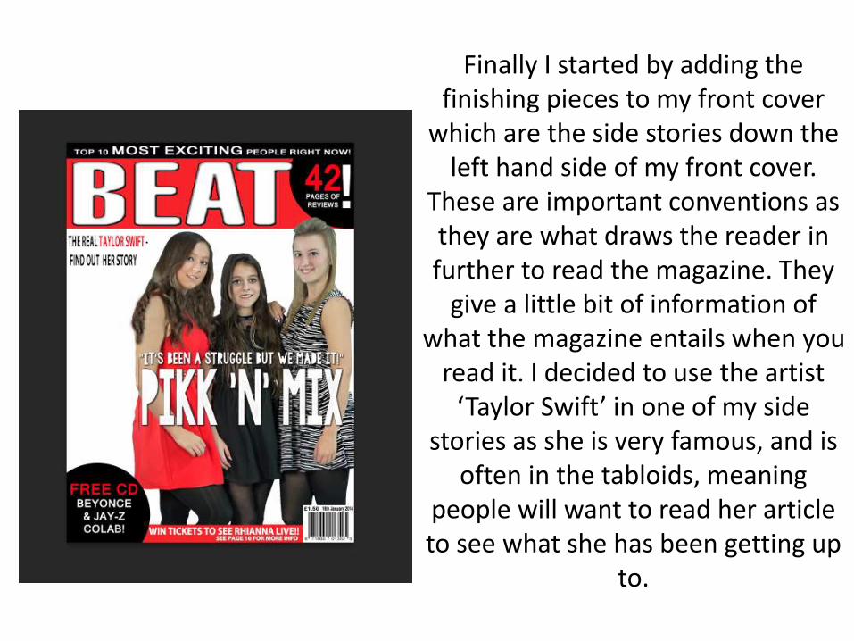
Finally I started by adding the finishing pieces to my front cover
which are the side stories down the left hand side of my front cover.
These are important conventions as they are what draws the reader in further to read the magazine. They
give a little bit of information of what the magazine entails when you
read it. I decided to use the artist ‘Taylor Swift’ in one of my side
stories as she is very famous, and is often in the tabloids, meaning
people will want to read her article to see what she has been getting up
to.
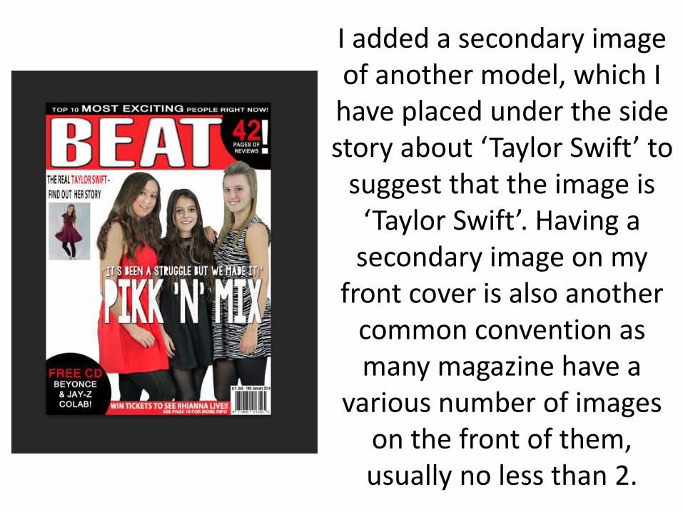
I added a secondary image of another model, which I
have placed under the side story about ‘Taylor Swift’ to
suggest that the image is ‘Taylor Swift’. Having a
secondary image on my front cover is also another
common convention as many magazine have a
various number of images on the front of them, usually no less than 2.
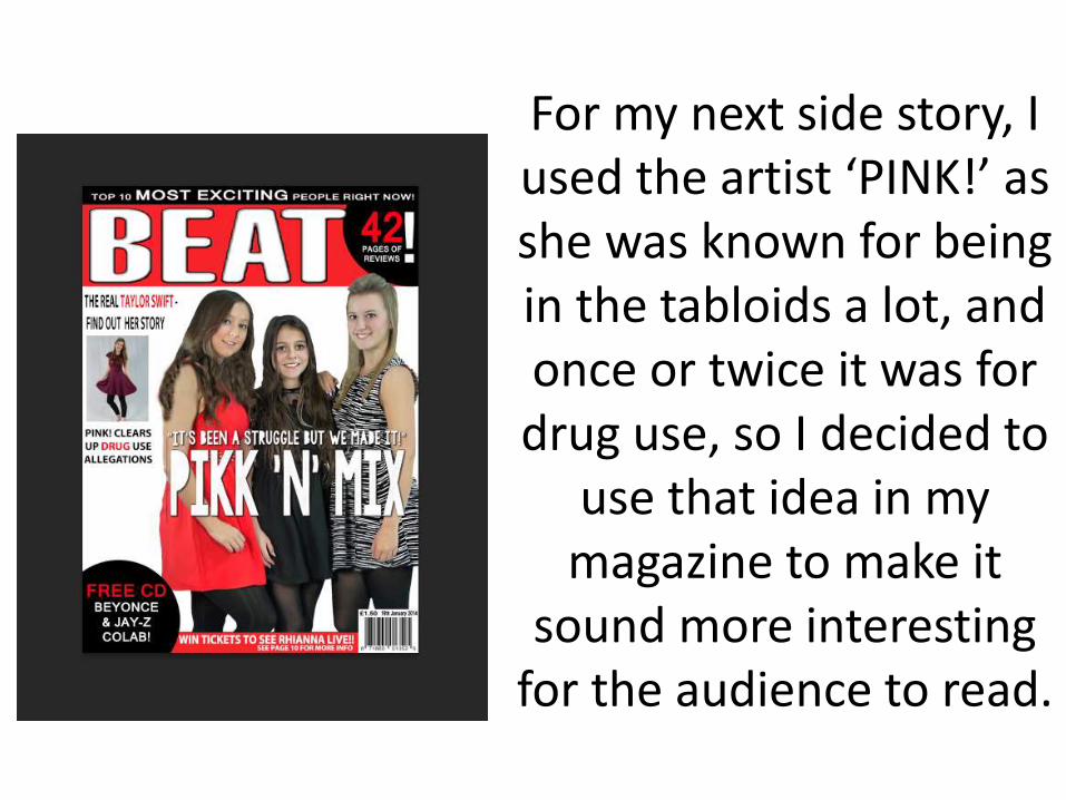
For my next side story, I used the artist ‘PINK!’ as she was known for being in the tabloids a lot, and once or twice it was for drug use, so I decided to
use that idea in my magazine to make it
sound more interesting for the audience to read.
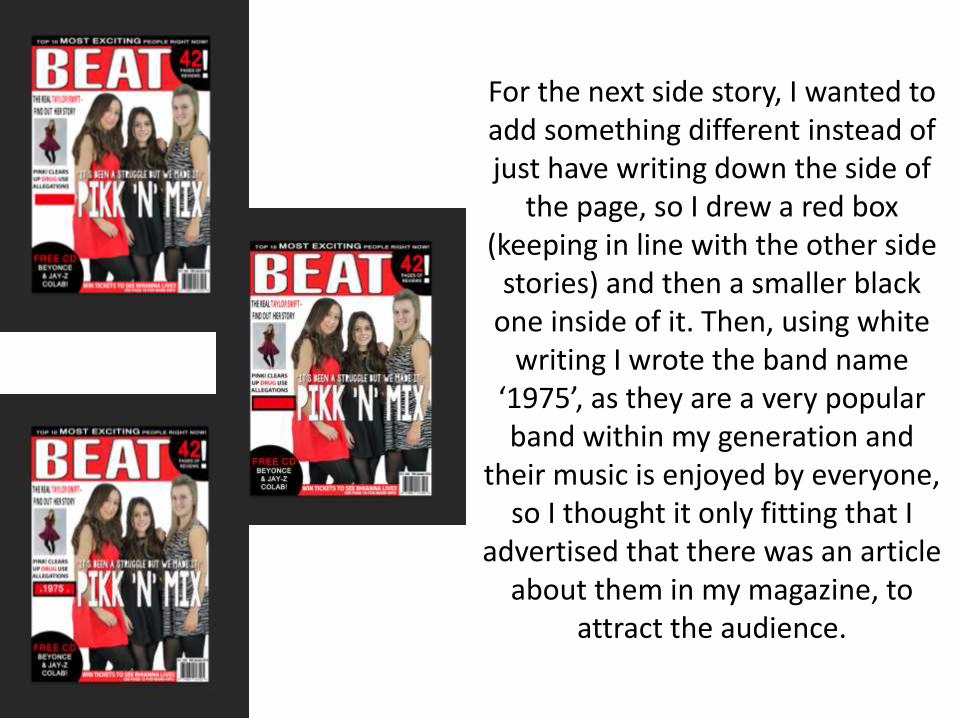
For the next side story, I wanted to add something different instead of just have writing down the side of
the page, so I drew a red box (keeping in line with the other side
stories) and then a smaller black one inside of it. Then, using white
writing I wrote the band name ‘1975’, as they are a very popular band within my generation and
their music is enjoyed by everyone, so I thought it only fitting that I
advertised that there was an article about them in my magazine, to
attract the audience.
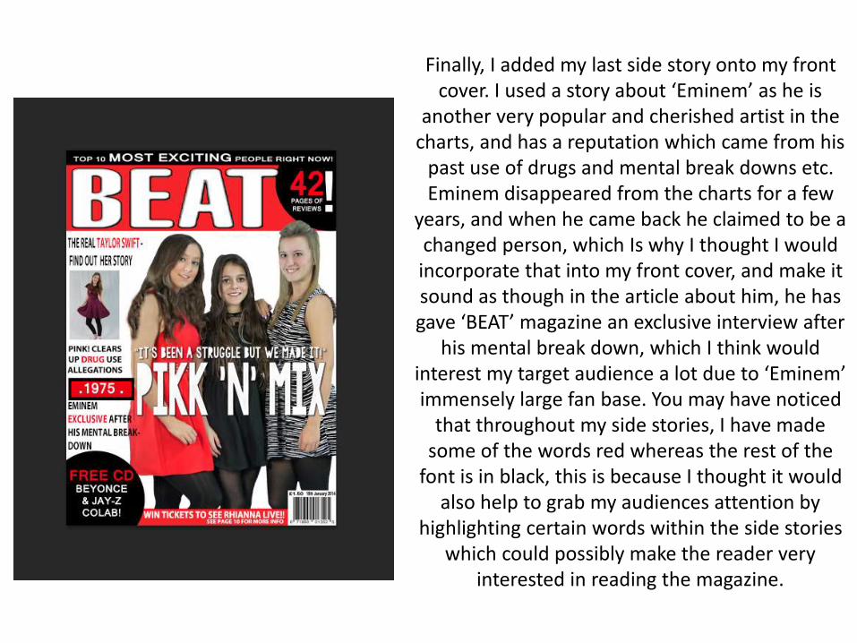
Finally, I added my last side story onto my front cover. I used a story about ‘Eminem’ as he is
another very popular and cherished artist in the charts, and has a reputation which came from his
past use of drugs and mental break downs etc. Eminem disappeared from the charts for a few
years, and when he came back he claimed to be a changed person, which Is why I thought I would incorporate that into my front cover, and make it sound as though in the article about him, he has gave ‘BEAT’ magazine an exclusive interview after
his mental break down, which I think would interest my target audience a lot due to ‘Eminem’ immensely large fan base. You may have noticed
that throughout my side stories, I have made some of the words red whereas the rest of the
font is in black, this is because I thought it would also help to grab my audiences attention by
highlighting certain words within the side stories which could possibly make the reader very
interested in reading the magazine.
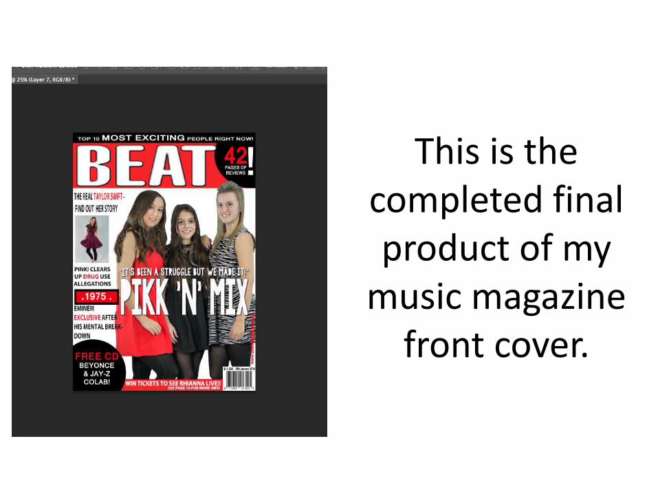
This is the completed final product of my
music magazine front cover.