Embed Size (px)
Citation preview
In what ways does your
media product use, develop
or challenge forms and
conventions of real media
products?
For my A2 media studies coursework, I had to make a film trailer accompanied by an ancillary
task of making a film poster and magazine cover for the film.
The genre of the film is a thriller, and so I combined the codes and conventions of a thriller,
the unique selling point of my film and the synergy campaign of my film into three different
products. I did this in order to make the film marketable and to keep the audience engaged and interested
in the film – of which makes the products as a package effective.
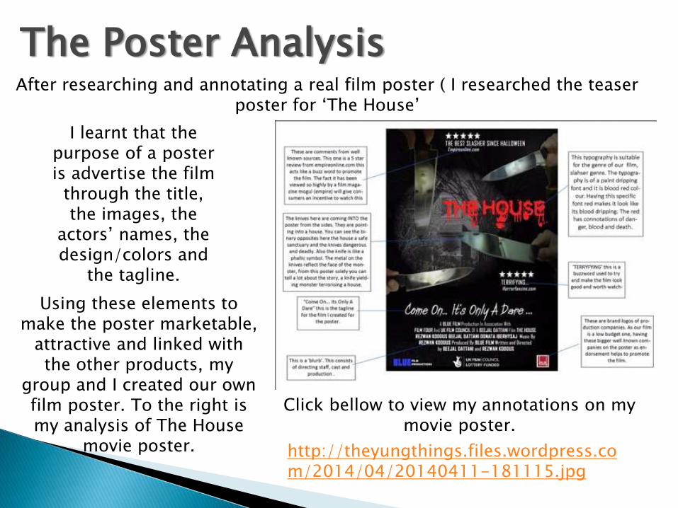
After researching and annotating a real film poster ( I researched the teaser poster for ‘The House’
I learnt that the purpose of a poster is advertise the film
through the title, the images, the
actors’ names, the design/colors and
the tagline.
Using these elements to make the poster marketable,
attractive and linked with the other products, my
group and I created our own film poster. To the right is my analysis of The House
movie poster. http://theyungthings.files.wordpress.com/2014/04/20140411-181115.jpg
Click bellow to view my annotations on my movie poster.
The Poster Analysis

Although the film poster is simple, it is effective as it attracts the audience
and links in with the trailer and magazine cover.
This is mainly done through the image of the close up of a man who looks
concerned or distressed, which stands out in the poster by being the central
image behind a lit match, and it stands out from the rest of the image
because of the size and effect blue/grey effect over his face.. This catches
the eye of the audience, and it provides synergy by being the image on the
magazine cover and featuring in the trailer.
However, to improve the
poster, I could have featured
images of other main
characters to create a ‘star’
appeal for the audience, and I
could of changed the
perspective of the victims
image and layout to make it
more interesting.
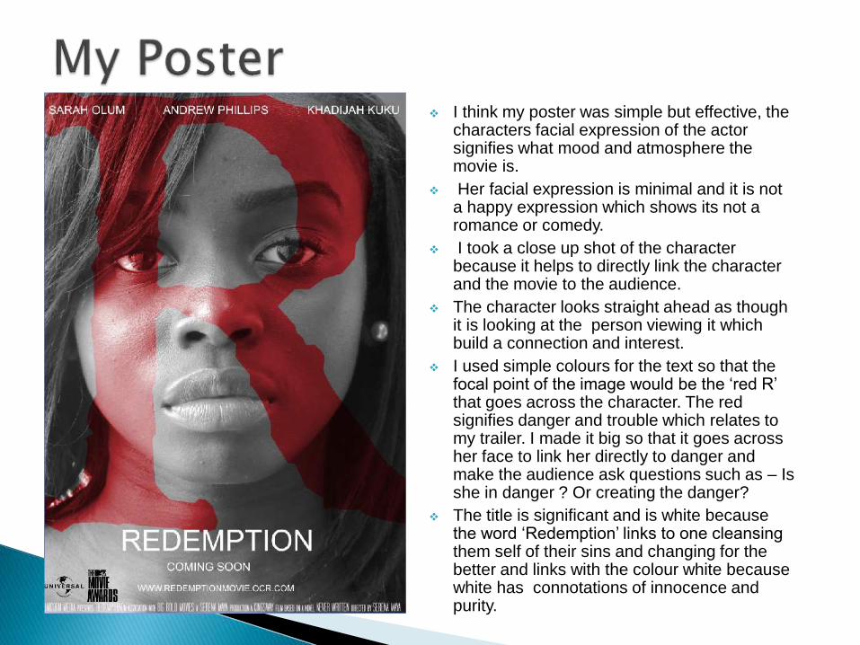
I think my poster was simple but effective, the characters facial expression of the actor signifies what mood and atmosphere the movie is.
Her facial expression is minimal and it is not a happy expression which shows its not a romance or comedy.
I took a close up shot of the character because it helps to directly link the character and the movie to the audience.
The character looks straight ahead as though it is looking at the person viewing it which build a connection and interest.
I used simple colours for the text so that the focal point of the image would be the ‘red R’ that goes across the character. The red signifies danger and trouble which relates to my trailer. I made it big so that it goes across her face to link her directly to danger and make the audience ask questions such as – Is she in danger ? Or creating the danger?
The title is significant and is white because the word ‘Redemption’ links to one cleansing them self of their sins and changing for the better and links with the colour white because white has connotations of innocence and purity.
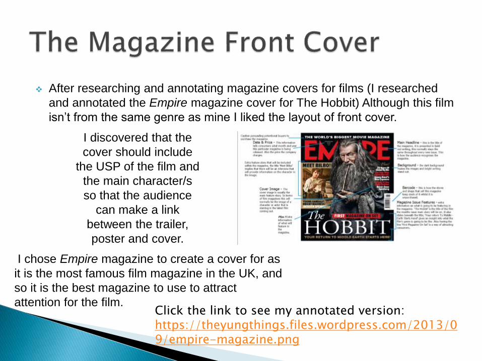
After researching and annotating magazine covers for films (I researched
and annotated the Empire magazine cover for The Hobbit) Although this film
isn’t from the same genre as mine I liked the layout of front cover.
I discovered that the
cover should include
the USP of the film and
the main character/s
so that the audience
can make a link
between the trailer,
poster and cover.
I chose Empire magazine to create a cover for as
it is the most famous film magazine in the UK, and
so it is the best magazine to use to attract
attention for the film.Click the link to see my annotated version: https://theyungthings.files.wordpress.com/2013/09/empire-magazine.png

My magazine front cover is effective because I used a similar image to my poster which will help the audience to identify and draw links between the poster and magazine. This is a good thing because it could lead to sales because if a consumer has seen the poster and link the poster to the magazine they may want to buy the magazine to find out more information at the movie.
The image I used is has slightly more character because although the actor has minimal facial expression, she is slightly smiling which relates to the character in the film but also helps the audience identify her as an actor/normal person rather than just the character she plays.
This is a selling technique because if she were a famous actor, consumers would automatically be attacked to the magazine because she if the focal point.
I used a limited amount of colors. For the title of my movie I used a similar red and made it transparent like the ‘Red R’ that went across my poster I it emphasizes the thriller genre of the film and it gives the reader incentives to buy the magazine.
However, to improve the magazine cover, I would make the magazine front cover, less crowded. I would also change the layout of the cover to make it more simple so that it is more eye catching and less crowded.
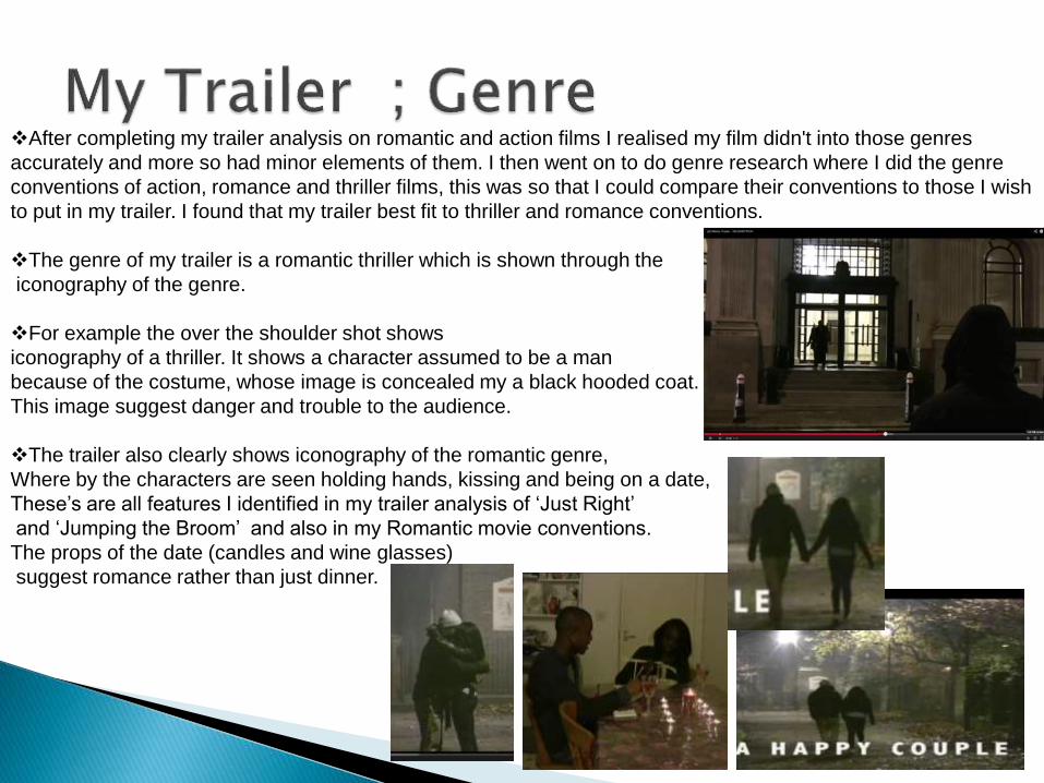
After completing my trailer analysis on romantic and action films I realised my film didn't into those genres
accurately and more so had minor elements of them. I then went on to do genre research where I did the genre
conventions of action, romance and thriller films, this was so that I could compare their conventions to those I wish
to put in my trailer. I found that my trailer best fit to thriller and romance conventions.
The genre of my trailer is a romantic thriller which is shown through the
iconography of the genre.
For example the over the shoulder shot shows
iconography of a thriller. It shows a character assumed to be a man
because of the costume, whose image is concealed my a black hooded coat.
This image suggest danger and trouble to the audience.
The trailer also clearly shows iconography of the romantic genre,
Where by the characters are seen holding hands, kissing and being on a date,
These’s are all features I identified in my trailer analysis of ‘Just Right’
and ‘Jumping the Broom’ and also in my Romantic movie conventions.
The props of the date (candles and wine glasses)
suggest romance rather than just dinner.
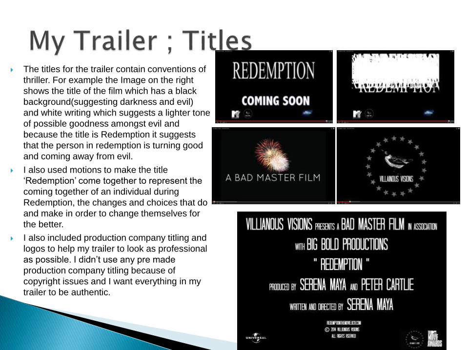
The titles for the trailer contain conventions of
thriller. For example the Image on the right
shows the title of the film which has a black
background(suggesting darkness and evil)
and white writing which suggests a lighter tone
of possible goodness amongst evil and
because the title is Redemption it suggests
that the person in redemption is turning good
and coming away from evil.
I also used motions to make the title
‘Redemption’ come together to represent the
coming together of an individual during
Redemption, the changes and choices that do
and make in order to change themselves for
the better.
I also included production company titling and
logos to help my trailer to look as professional
as possible. I didn’t use any pre made
production company titling because of
copyright issues and I want everything in my
trailer to be authentic.
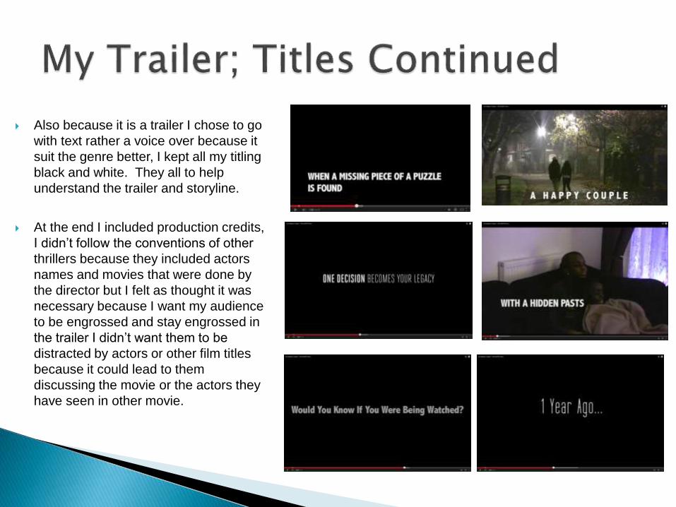
Also because it is a trailer I chose to go
with text rather a voice over because it
suit the genre better, I kept all my titling
black and white. They all to help
understand the trailer and storyline.
At the end I included production credits,
I didn’t follow the conventions of other
thrillers because they included actors
names and movies that were done by
the director but I felt as thought it was
necessary because I want my audience
to be engrossed and stay engrossed in
the trailer I didn’t want them to be
distracted by actors or other film titles
because it could lead to them
discussing the movie or the actors they
have seen in other movie.
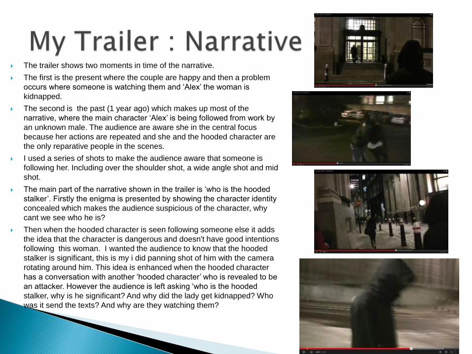
The trailer shows two moments in time of the narrative.
The first is the present where the couple are happy and then a problem
occurs where someone is watching them and ‘Alex’ the woman is
kidnapped.
The second is the past (1 year ago) which makes up most of the
narrative, where the main character ‘Alex’ is being followed from work by
an unknown male. The audience are aware she in the central focus
because her actions are repeated and she and the hooded character are
the only reparative people in the scenes.
I used a series of shots to make the audience aware that someone is
following her. Including over the shoulder shot, a wide angle shot and mid
shot.
The main part of the narrative shown in the trailer is ‘who is the hooded
stalker’. Firstly the enigma is presented by showing the character identity
concealed which makes the audience suspicious of the character, why
cant we see who he is?
Then when the hooded character is seen following someone else it adds
the idea that the character is dangerous and doesn't have good intentions
following this woman. I wanted the audience to know that the hooded
stalker is significant, this is my i did panning shot of him with the camera
rotating around him. This idea is enhanced when the hooded character
has a conversation with another ‘hooded character’ who is revealed to be
an attacker. However the audience is left asking ‘who is the hooded
stalker, why is he significant? And why did the lady get kidnapped? Who
was it send the texts? And why are they watching them?
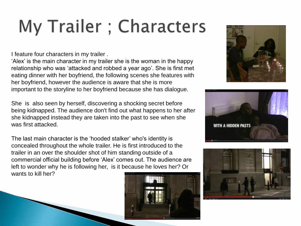
I feature four characters in my trailer .
‘Alex’ is the main character in my trailer she is the woman in the happy
relationship who was ‘attacked and robbed a year ago’. She is first met
eating dinner with her boyfriend, the following scenes she features with
her boyfriend, however the audience is aware that she is more
important to the storyline to her boyfriend because she has dialogue.
She is also seen by herself, discovering a shocking secret before
being kidnapped. The audience don't find out what happens to her after
she kidnapped instead they are taken into the past to see when she
was first attacked.
The last main character is the ‘hooded stalker’ who's identity is
concealed throughout the whole trailer. He is first introduced to the
trailer in an over the shoulder shot of him standing outside of a
commercial official building before ‘Alex’ comes out. The audience are
left to wonder why he is following her, is it because he loves her? Or
wants to kill her?
I think that the trailer contributes to an effective overall package, as it incorporates the same characters, colours and themes as the magazine cover and film poster.
For example for the magazine front cover and poster I used the main character from the trailer because she is the most identifiable and with each text you gain more information. By this I mean is a consumer sees the poster they will ask questions such as who is she? What is redemption affecting her? Is she a good character or not? The magazine makes the consumer link the poster to the magazine due to similar image use. But it also shows the character in a positive light because she is slightly smiling and the colours and effects of the image are bright and positive. Then by watching the trailer they gain more information, answer some of the questions they asked previously and form new ones because of the other characters.
Therefore, from the repetition of this image, the audience would know from the three media texts that they are part of the same film. Also, the font that is used in the titles of the trailer is the similar to the font used in the film poster, which also creates a link for the audience between the poster and trailer.
However, to make the overall package more effective, I should of used this same colour for the title of the magazine cover and poster in the film. Moreover, the dark tone of the trailer (mainly created by the lighting and colours) is replicated in the film poster is in black and white with a big bright red across her face.. Therefore the overall package of the film shows it to have a dark serious tone, which emphasizes it thriller – romance genre.
Overall…
I think that the combination of my main product and the ancillary texts is quite effective as it has made the film marketable and it would interest the audience by making it memorable through the synergy and USP of the film. If I were to make the improvements that I have suggested before, the combination would be even more effective.
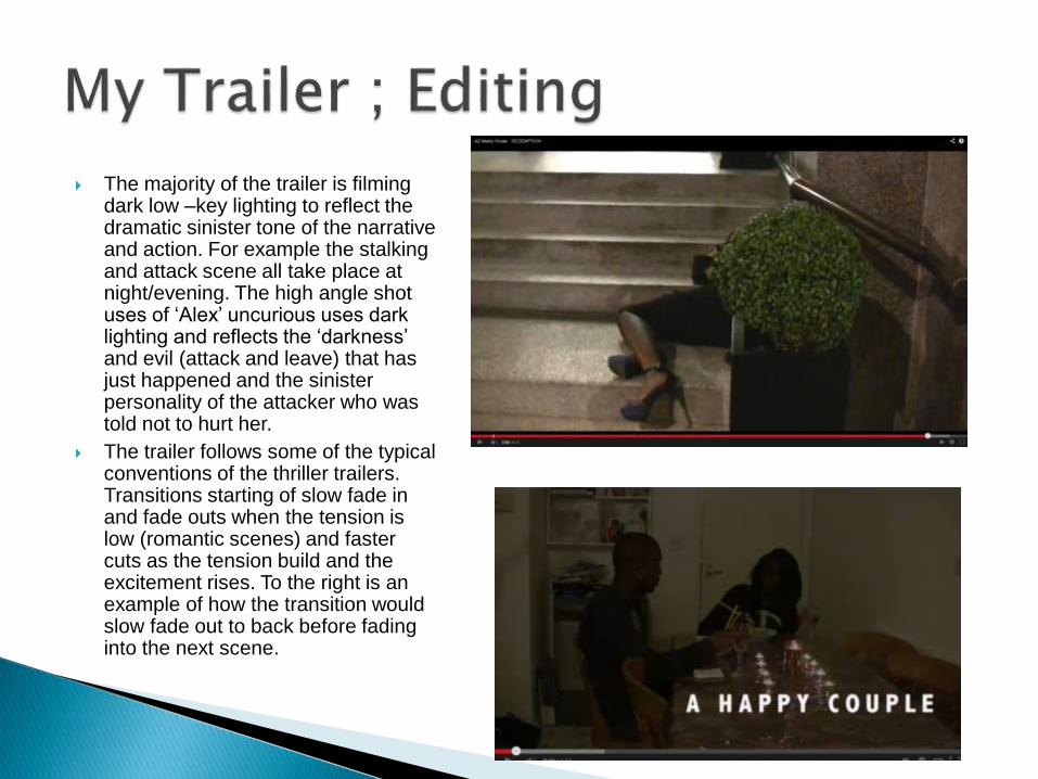
The majority of the trailer is filming dark low –key lighting to reflect the dramatic sinister tone of the narrative and action. For example the stalking and attack scene all take place at night/evening. The high angle shot uses of ‘Alex’ uncurious uses dark lighting and reflects the ‘darkness’ and evil (attack and leave) that has just happened and the sinister personality of the attacker who was told not to hurt her.
The trailer follows some of the typical conventions of the thriller trailers. Transitions starting of slow fade in and fade outs when the tension is low (romantic scenes) and faster cuts as the tension build and the excitement rises. To the right is an example of how the transition would slow fade out to back before fading into the next scene.