Embed Size (px)
Citation preview
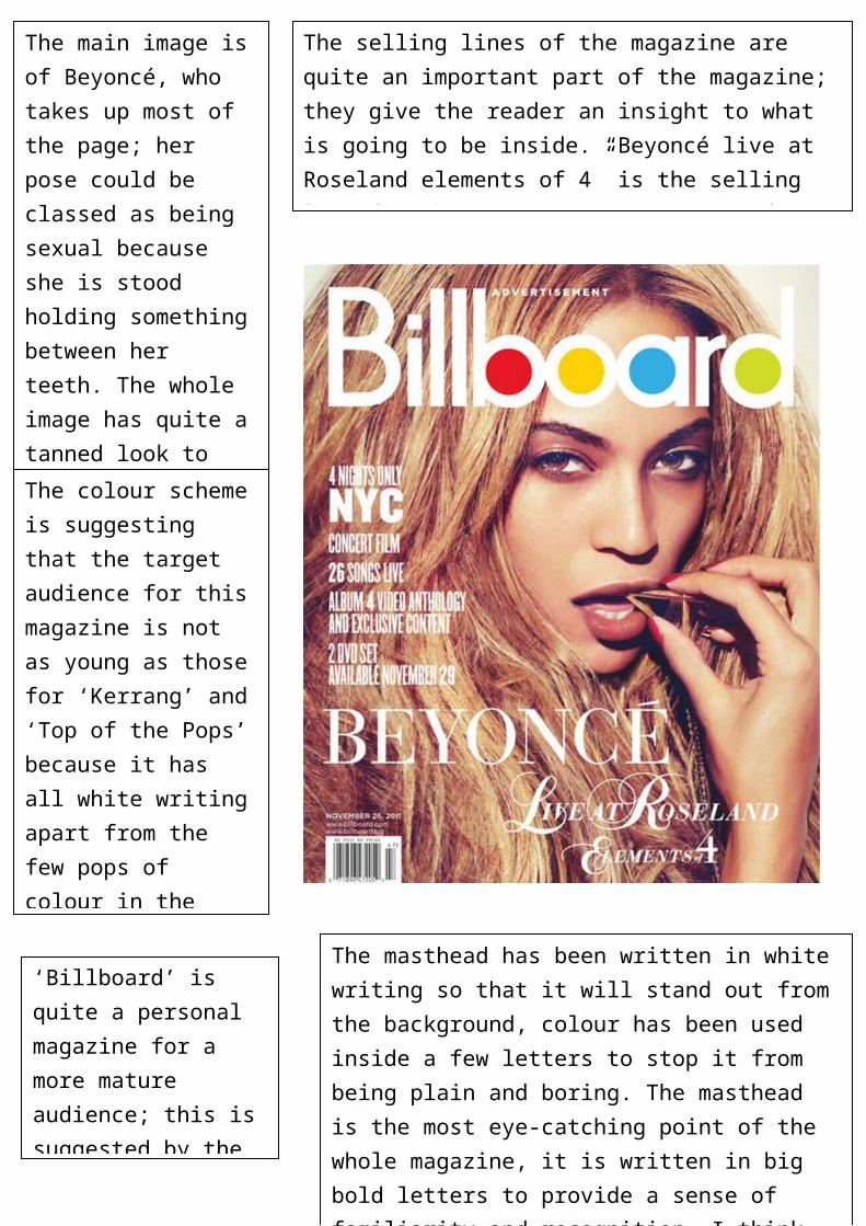
The main image is of Beyoncé, who takes up most of the page; her pose could be classed as being sexual because she is stood holding something between her teeth. The whole image has quite a tanned look to it, because of her makeup and her hair colour the image has quite a natural feel.
The colour scheme is suggesting that the target audience for this magazine is not as young as those for ‘Kerrang’ and ‘Top of the Pops’ because it has all white writing apart from the few pops of colour in the masthead. I think that the white writing has been used to balance out the darker colours of the artists’ make up.
‘Billboard’ is quite a personal magazine for a more mature audience; this is suggested by the direct eye contact image and the calm background.
The masthead has been written in white writing so that it will stand out from the background, colour has been used inside a few letters to stop it from being plain and boring. The masthead is the most eye-catching point of the whole magazine, it is written in big bold letters to provide a sense of familiarity and recognition. I think that the masthead being in lowercase makes it look more professional and sophisticated.
The selling lines of the magazine are quite an important part of the magazine; they give the reader an insight to what is going to be inside. “Beyoncé live at Roseland elements of 4” is the selling line for this magazine, as soon as fans of Beyoncé see her name printed in bold letters it will make them want to purchase the magazine.