Embed Size (px)
Citation preview
Question 1
In what ways does your media product use, develop or challenge
forms or conventions of real media products ?
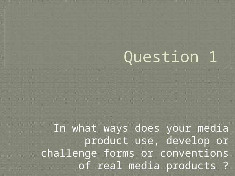
Use, Develop and Challenge
My group and I decided to go with the genre of Rock/Blues and within our video we wanted to subvert from the typical energetic crowd and the band playing their instruments to showing the video from the first person perspective but also displaying the third. Our creativity was highly influenced by “Prodigy - Smack Up” as we thought this concept was a good idea because it isn’t a typical convention which is displayed throughout music videos of today. It also comes across inviting to an audience as it’s a hybrid of concept and narrative and not many directors use this technique because they may only stick to one convention, so we thought it would be good to show our versatility within making our music video.
Music Video
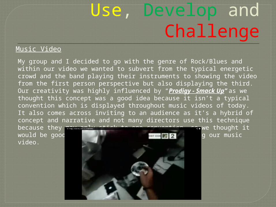
Use, Develop and Challenge
Conventions of a Rock video
Composition: smoky background &orange ambience (relating to title of song “sex on fire”)
Shots: mid close up main character in focus whilst band mates are blurred
Dark imagery: dark clothing with Shadows in the background
Symbols: may display certain religionsbut in a controversial way
Props: having half naked women surround them (groupies)
Use, Develop and Challenge
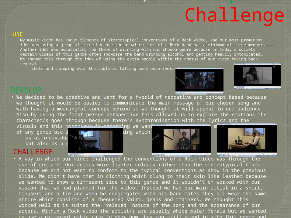
USE My music video has vague elements of stereotypical conventions of a Rock video, and our most prominent
idea was using a group of three because the usual epitome of a Rock band has a minimum of three members.
Another idea was associating the theme of drinking with our chosen genre because in today’s society certain videos of this genre often showcase the band drinking alcohol and getting heavily intoxicated. We showed this through the idea of using the extra people within the chorus of our video taking back several
shots and slumping over the table or falling back onto their chair.
DEVELOP• We decided to be creative and went for a hybrid of narrative and concept based because we thought it
would be easier to communicate the main message of our chosen song and with having a meaningful concept behind it we thought it will appeal to our audience. Also by using the first person perspective this allowed us to explore the emotions the character/s goes through because there’s synchronisation with the lyrics and the visuals and this technique is something we wanted to take on as not many music videos of any genre use it and it was something which challenged
us as individuals but also as a group.
CHALLENGE • A way in which our video challenged the conventions of a Rock video was through the use of costume.
Our actors wore lighter colours rather than the stereotypical black because we did not want to conform to the typical conventions as show in the previous slide. We didn’t have them in clothing which clung to their skin like leather because we wanted to show a different side to this genre and it wouldn’t of worked with our vision that we had planned for the video. Instead we had our main artist in a shirt, trousers and a tie and when he congregates with his band mates they all wear the same attire which consists of a chequered shirt, jeans and trainers. We thought this worked well as is suited the “relaxed” nature of the song and the appearance of our actors. Within a Rock video the artist/s are usually white male/ female but we wanted to use a different ethic race to show how they can still blend in with this genre and we also thought it would be something new to showcase to our audience.
Use, Develop and Challenge
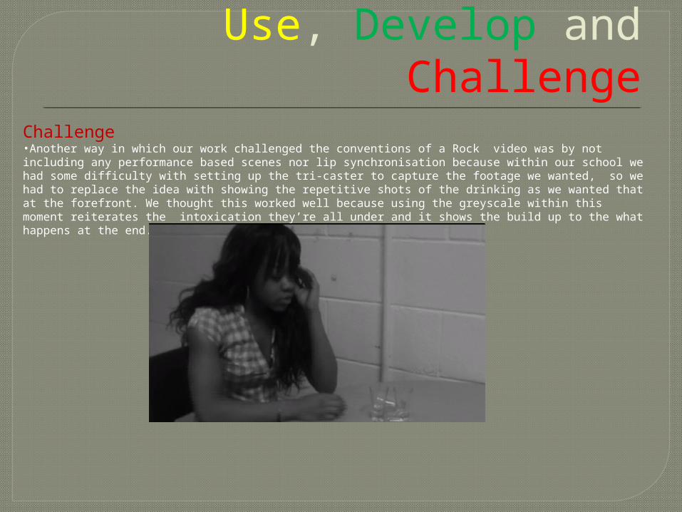
Challenge•Another way in which our work challenged the conventions of a Rock video was by not including any performance based scenes nor lip synchronisation because within our school we had some difficulty with setting up the tri-caster to capture the footage we wanted, so we had to replace the idea with showing the repetitive shots of the drinking as we wanted that at the forefront. We thought this worked well because using the greyscale within this moment reiterates the intoxication they’re all under and it shows the build up to the what happens at the end.
Use, Develop and Challenge
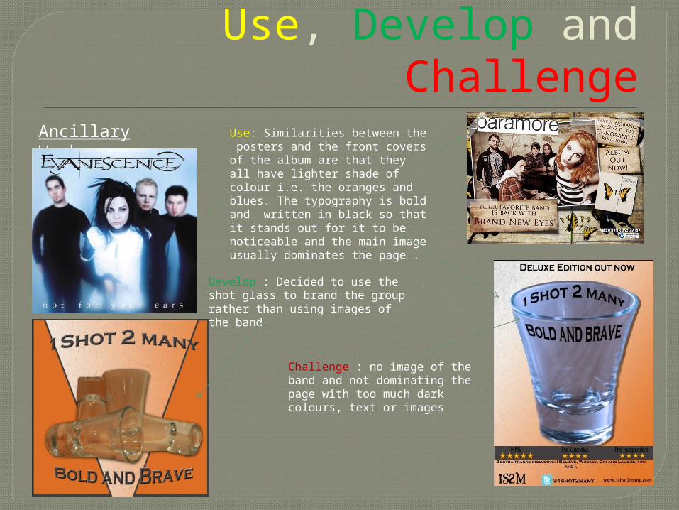
Ancillary Work Use: Similarities between the posters and the front covers of the album are that they all have lighter shade of colour i.e. the oranges and blues. The typography is bold and written in black so that it stands out for it to be noticeable and the main image usually dominates the page .
Develop : Decided to use the shot glass to brand the group rather than using images of the band
Challenge : no image of the band and not dominating the page with too much dark colours, text or images