Embed Size (px)
Citation preview
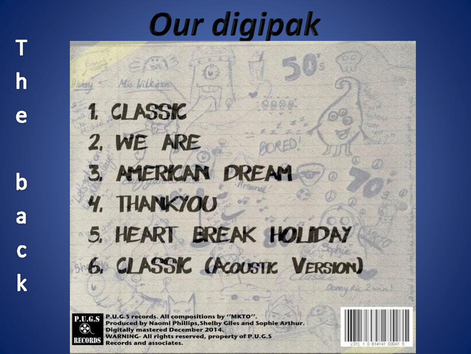
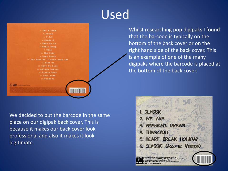
UsedWhilst researching pop digipaks I found that the barcode is typically on the bottom of the back cover or on the right hand side of the back cover. This is an example of one of the many digipaks where the barcode is placed at the bottom of the back cover.
We decided to put the barcode in the same place on our digipak back cover. This is because it makes our back cover look professional and also it makes it look legitimate.
Used
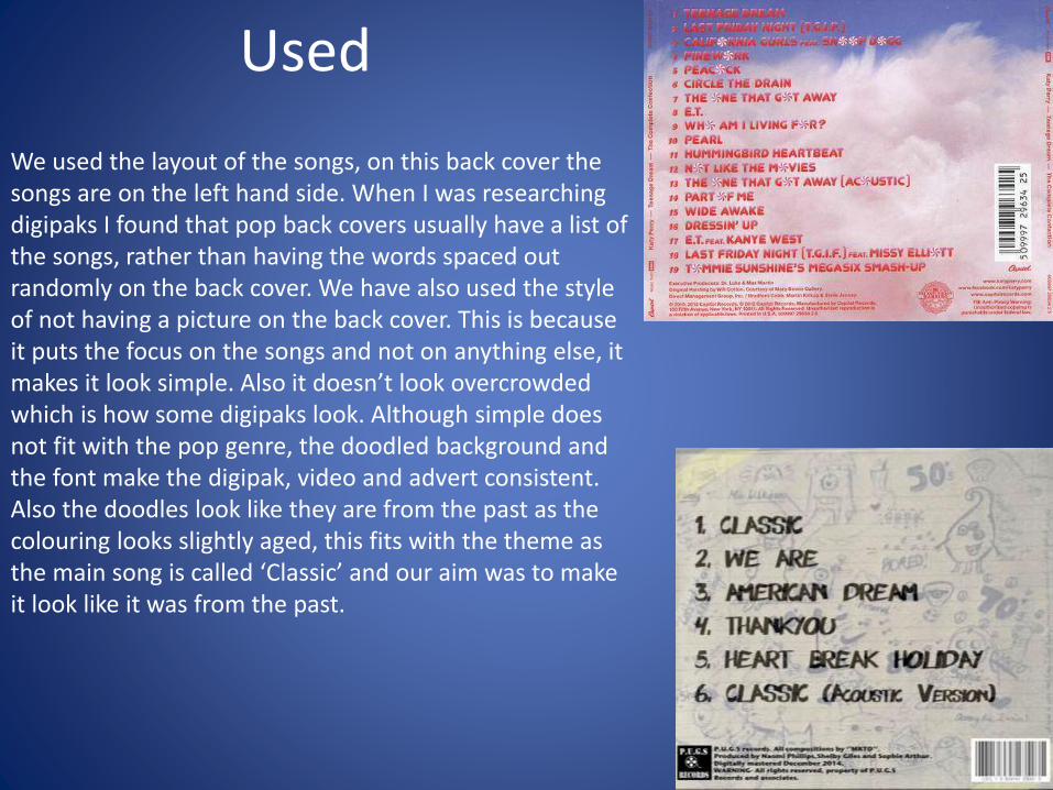
We used the layout of the songs, on this back cover the songs are on the left hand side. When I was researching digipaks I found that pop back covers usually have a list of the songs, rather than having the words spaced out randomly on the back cover. We have also used the style of not having a picture on the back cover. This is because it puts the focus on the songs and not on anything else, it makes it look simple. Also it doesn’t look overcrowded which is how some digipaks look. Although simple does not fit with the pop genre, the doodled background and the font make the digipak, video and advert consistent. Also the doodles look like they are from the past as the colouring looks slightly aged, this fits with the theme as the main song is called ‘Classic’ and our aim was to make it look like it was from the past.
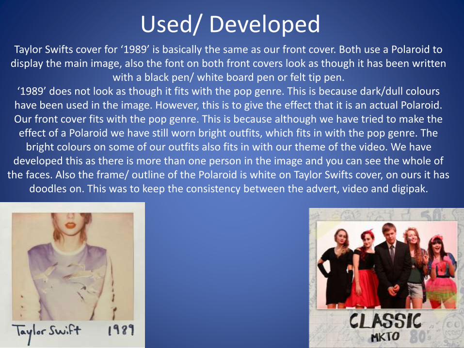
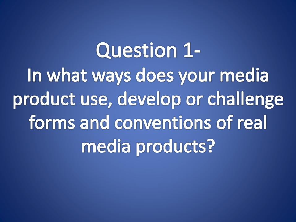
Used/ DevelopedTaylor Swifts cover for ‘1989’ is basically the same as our front cover. Both use a Polaroid to
display the main image, also the font on both front covers look as though it has been written with a black pen/ white board pen or felt tip pen.
‘1989’ does not look as though it fits with the pop genre. This is because dark/dull colours have been used in the image. However, this is to give the effect that it is an actual Polaroid. Our front cover fits with the pop genre. This is because although we have tried to make the effect of a Polaroid we have still worn bright outfits, which fits in with the pop genre. The
bright colours on some of our outfits also fits in with our theme of the video. We have developed this as there is more than one person in the image and you can see the whole of
the faces. Also the frame/ outline of the Polaroid is white on Taylor Swifts cover, on ours it has doodles on. This was to keep the consistency between the advert, video and digipak.
Used/ Developed
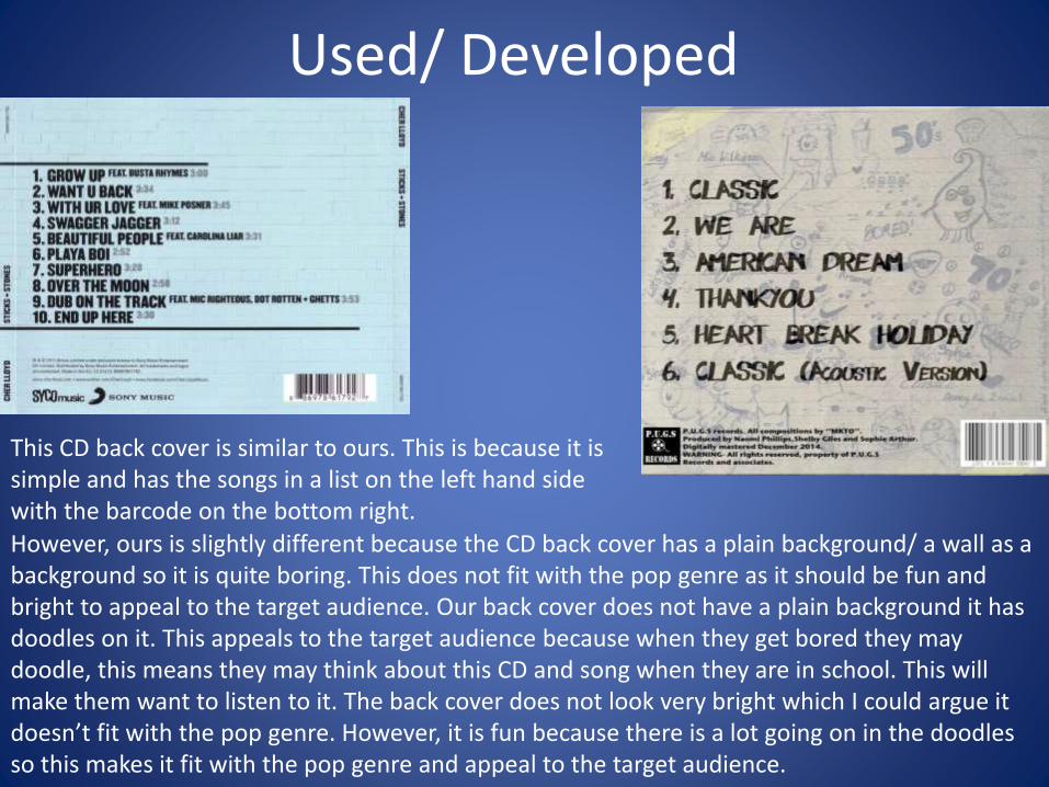
This CD back cover is similar to ours. This is because it is simple and has the songs in a list on the left hand side with the barcode on the bottom right.
However, ours is slightly different because the CD back cover has a plain background/ a wall as a background so it is quite boring. This does not fit with the pop genre as it should be fun and bright to appeal to the target audience. Our back cover does not have a plain background it has doodles on it. This appeals to the target audience because when they get bored they may doodle, this means they may think about this CD and song when they are in school. This will make them want to listen to it. The back cover does not look very bright which I could argue it doesn’t fit with the pop genre. However, it is fun because there is a lot going on in the doodles so this makes it fit with the pop genre and appeal to the target audience.
Developed
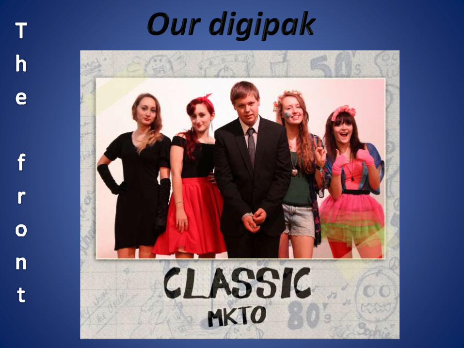
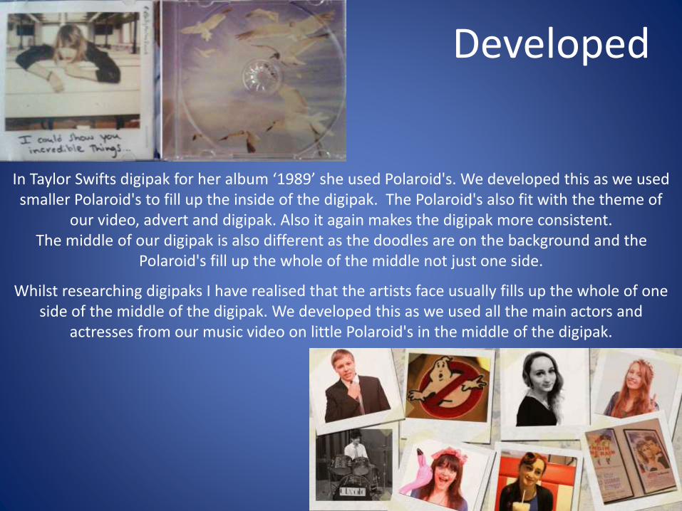
In Taylor Swifts digipak for her album ‘1989’ she used Polaroid's. We developed this as we used smaller Polaroid's to fill up the inside of the digipak. The Polaroid's also fit with the theme of
our video, advert and digipak. Also it again makes the digipak more consistent. The middle of our digipak is also different as the doodles are on the background and the
Polaroid's fill up the whole of the middle not just one side.
Whilst researching digipaks I have realised that the artists face usually fills up the whole of one side of the middle of the digipak. We developed this as we used all the main actors and
actresses from our music video on little Polaroid's in the middle of the digipak.
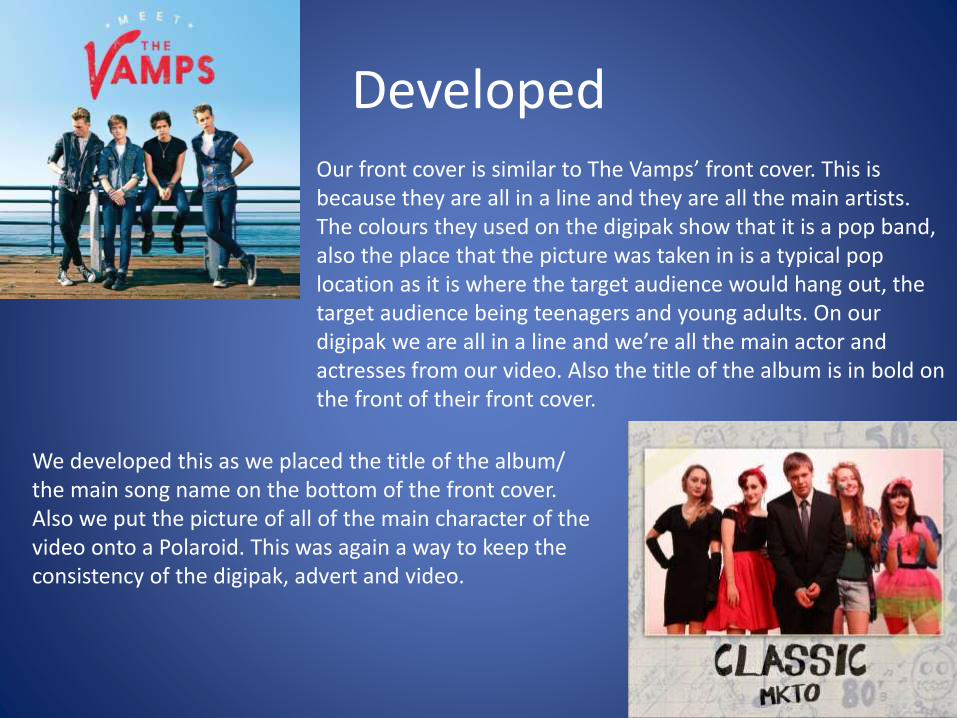
DevelopedOur front cover is similar to The Vamps’ front cover. This is because they are all in a line and they are all the main artists. The colours they used on the digipak show that it is a pop band, also the place that the picture was taken in is a typical pop location as it is where the target audience would hang out, the target audience being teenagers and young adults. On our digipak we are all in a line and we’re all the main actor and actresses from our video. Also the title of the album is in bold on the front of their front cover.
We developed this as we placed the title of the album/ the main song name on the bottom of the front cover. Also we put the picture of all of the main character of the video onto a Polaroid. This was again a way to keep the consistency of the digipak, advert and video.
Challenged
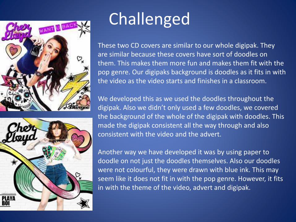
These two CD covers are similar to our whole digipak. They are similar because these covers have sort of doodles on them. This makes them more fun and makes them fit with the pop genre. Our digipaks background is doodles as it fits in with the video as the video starts and finishes in a classroom.
We developed this as we used the doodles throughout the digipak. Also we didn’t only used a few doodles, we covered the background of the whole of the digipak with doodles. This made the digipak consistent all the way through and also consistent with the video and the advert.
Another way we have developed it was by using paper to doodle on not just the doodles themselves. Also our doodles were not colourful, they were drawn with blue ink. This may seem like it does not fit in with the pop genre. However, it fits in with the theme of the video, advert and digipak.
Challenged
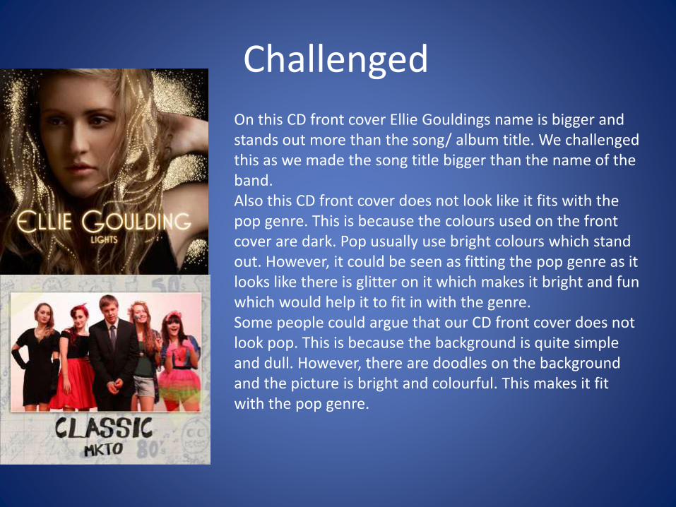
On this CD front cover Ellie Gouldings name is bigger and stands out more than the song/ album title. We challenged this as we made the song title bigger than the name of the band.Also this CD front cover does not look like it fits with the pop genre. This is because the colours used on the front cover are dark. Pop usually use bright colours which stand out. However, it could be seen as fitting the pop genre as it looks like there is glitter on it which makes it bright and fun which would help it to fit in with the genre.Some people could argue that our CD front cover does not look pop. This is because the background is quite simple and dull. However, there are doodles on the background and the picture is bright and colourful. This makes it fit with the pop genre.


![Poster evaluation question1[1][1]](https://img.pdfslide.net/doc/110x75/54826d90b4af9f8c0d8b47cb/poster-evaluation-question111.jpg)