Embed Size (px)
Citation preview
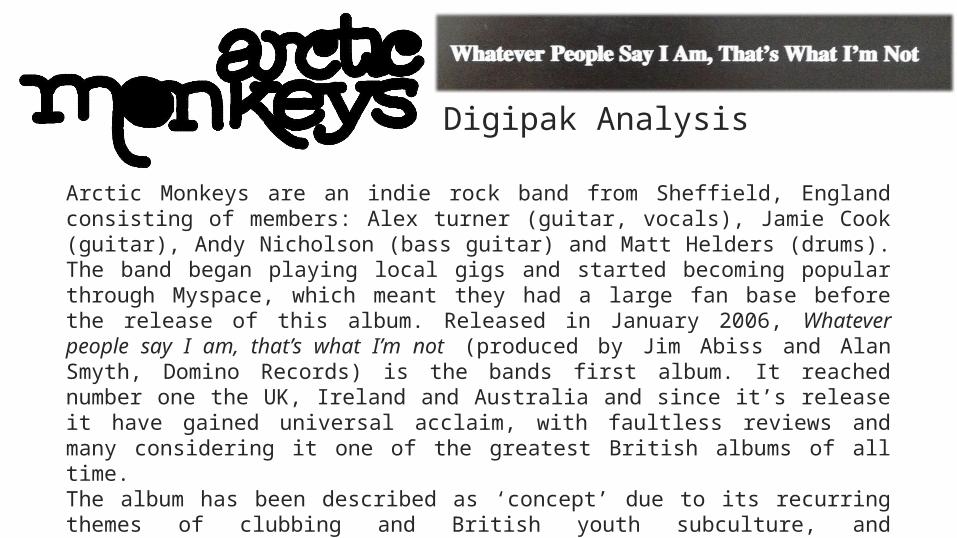
Digipak Analysis
Arctic Monkeys are an indie rock band from Sheffield, England consisting of members: Alex turner (guitar, vocals), Jamie Cook (guitar), Andy Nicholson (bass guitar) and Matt Helders (drums). The band began playing local gigs and started becoming popular through Myspace, which meant they had a large fan base before the release of this album. Released in January 2006, Whatever people say I am, that’s what I’m not (produced by Jim Abiss and Alan Smyth, Domino Records) is the bands first album. It reached number one the UK, Ireland and Australia and since it’s release it have gained universal acclaim, with faultless reviews and many considering it one of the greatest British albums of all time.The album has been described as ‘concept’ due to its recurring themes of clubbing and British youth subculture, and ‘observational’ because the first person narratives in the lyrics of the songs. These themes are reflected in the design of the digipak; it has a simple, austere vogue and a booklet of photographs depicting the mundane day to day life in a northern English town which parallels perfectly the ‘straight to the point’ and social realist-esque lyrics.
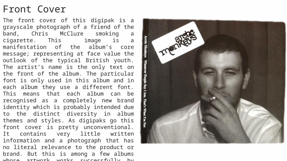
Front CoverThe front cover of this digipak is a grayscale photograph of a friend of the band, Chris McClure smoking a cigarette. This image is a manifestation of the album’s core message; representing at face value the outlook of the typical British youth. The artist’s name is the only text on the front of the album. The particular font is only used in this album and in each album they use a different font. This means that each album can be recognised as a completely new brand identity which is probably intended due to the distinct diversity in album themes and styles. As digipaks go this front cover is pretty unconventional. It contains very little written information and a photograph that has no literal relevance to the product or brand. But this is among a few albums whose artwork works successfully by flouting conventions. If we think about iconic albums like Nevermind by Nirvana or Dark Side of the Moon by Pink Floyd, we remember them for their distinct image on the cover. These images have much more resonating effect on the audience and it is solely because they are different, bold and unconventional.
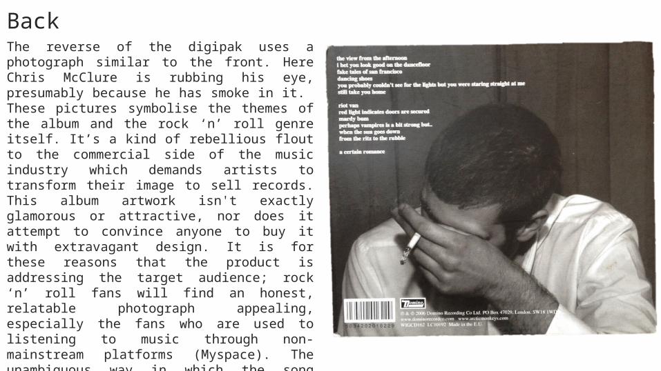
The reverse of the digipak uses a photograph similar to the front. Here Chris McClure is rubbing his eye, presumably because he has smoke in it. These pictures symbolise the themes of the album and the rock ‘n’ roll genre itself. It’s a kind of rebellious flout to the commercial side of the music industry which demands artists to transform their image to sell records. This album artwork isn't exactly glamorous or attractive, nor does it attempt to convince anyone to buy it with extravagant design. It is for these reasons that the product is addressing the target audience; rock ‘n’ roll fans will find an honest, relatable photograph appealing, especially the fans who are used to listening to music through non-mainstream platforms (Myspace). The unambiguous way in which the song titles are laid out resembles the pattern of a carefully structured poem. It implies that each line (song title) has deep meaning and connotations. This could be an incredibly obscure reference to Alex Turner’s lyrical style which is contains numerous metaphors, similes, connotations and meaningful themes which mirrors the aspects of a poem.
Back
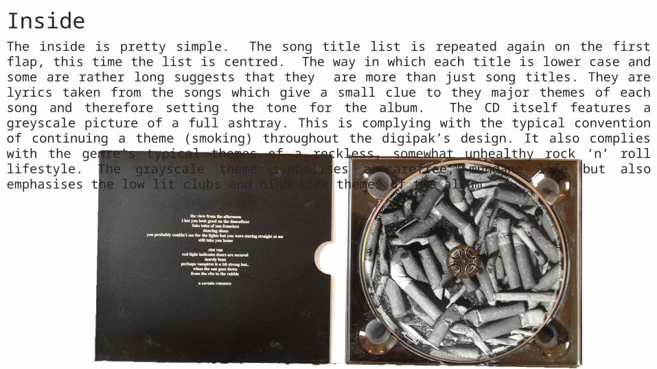
The inside is pretty simple. The song title list is repeated again on the first flap, this time the list is centred. The way in which each title is lower case and some are rather long suggests that they are more than just song titles. They are lyrics taken from the songs which give a small clue to they major themes of each song and therefore setting the tone for the album. The CD itself features a greyscale picture of a full ashtray. This is complying with the typical convention of continuing a theme (smoking) throughout the digipak’s design. It also complies with the genre’s typical themes of a reckless, somewhat unhealthy rock ‘n’ roll lifestyle. The grayscale theme symbolises a carefree, mundane life but also emphasises the low lit clubs and nightlife themes of the album.
Inside
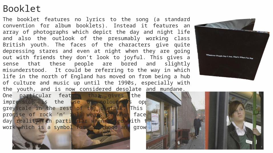
The booklet features no lyrics to the song (a standard convention for album booklets). Instead it features an array of photographs which depict the day and night life and also the outlook of the presumably working class British youth. The faces of the characters give quite depressing stares and even at night when they are going out with friends they don’t look to joyful. This gives a sense that these people are bored and slightly misunderstood. It could be referring to the way in which life in the north of England has moved on from being a hub of culture and music up until the 1990s, especially with the youth, and is now considered desolate and mundane. One particular feature that gives the booklet this impression is the use of colour as opposed to the greyscale in the rest of the digipak. This shows how the promise of rock ‘n’ roll wears of when faced with day to day reality, in particular when faced with the reality of work which is a symbol for adulthood and growing up.
Booklet