Embed Size (px)
Citation preview
10 KICKASS A/B TESTING CASE STUDIES
by VWO
“There is a tendency to think experimentation and testing is
optional. I fundamentally believe that is wrong.”
— Avinash Kaushik, Occam’s Razor
VWO offers more than 150 case studies on successful A/B tests performed by its clients.
Find the 10 most interesting case studies here.
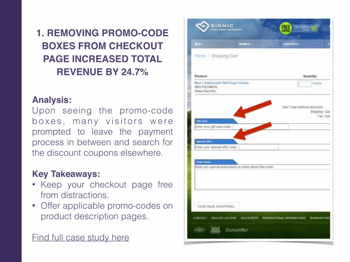
1. REMOVING PROMO-CODE BOXES FROM CHECKOUT PAGE INCREASED TOTAL
REVENUE BY 24.7%
Analysis:Upon seeing the promo-code b o x e s , m a n y v i s i t o r s w e re prompted to leave the payment process in between and search for the discount coupons elsewhere. Key Takeaways: • Keep your checkout page free
from distractions. • Offer applicable promo-codes on
product description pages. Find full case study here
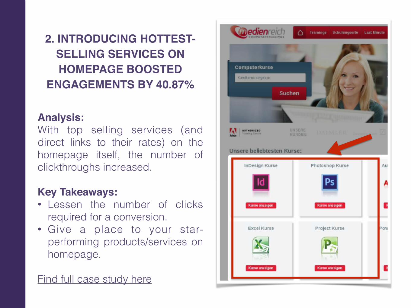
2. INTRODUCING HOTTEST-SELLING SERVICES ON HOMEPAGE BOOSTED
ENGAGEMENTS BY 40.87%
Analysis:With top selling services (and direct links to their rates) on the homepage itself, the number of clickthroughs increased. Key Takeaways: • Lessen the number of clicks
required for a conversion. • Give a place to your star-
performing products/services on homepage.
Find full case study here
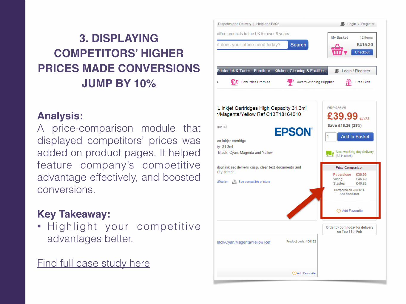
3. DISPLAYING COMPETITORS’ HIGHER
PRICES MADE CONVERSIONS JUMP BY 10%
Analysis:A price-comparison module that displayed competitors’ prices was added on product pages. It helped feature company’s competitive advantage effectively, and boosted conversions. Key Takeaway: • Highl ight your compet i t ive
advantages better.
Find full case study here
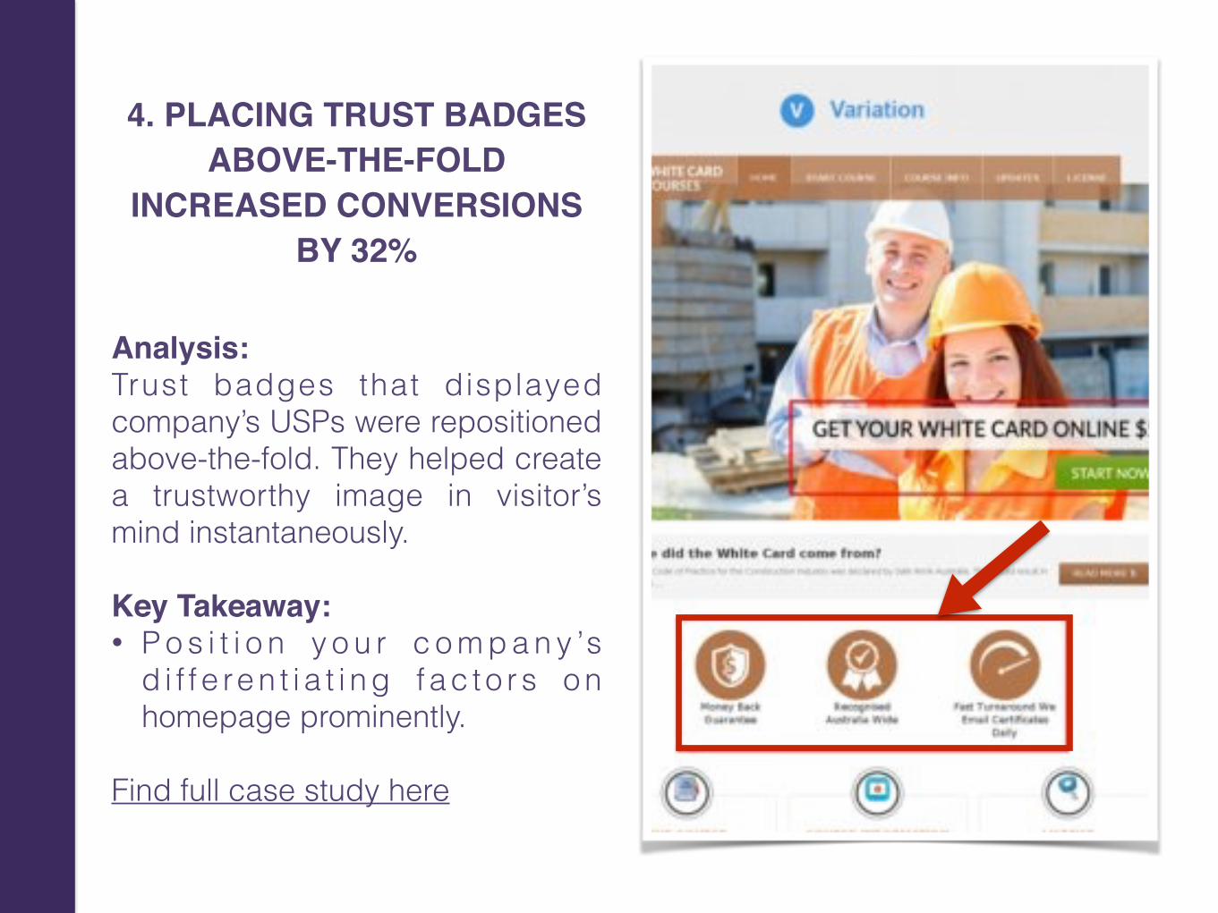
4. PLACING TRUST BADGES ABOVE-THE-FOLD
INCREASED CONVERSIONS BY 32%
Analysis:Trust badges that displayed company’s USPs were repositioned above-the-fold. They helped create a trustworthy image in visitor’s mind instantaneously. Key Takeaway: • P o s i t i o n y o u r c o m p a n y ’s
d i f f e re n t i a t i n g f a c t o r s o n homepage prominently.
Find full case study here
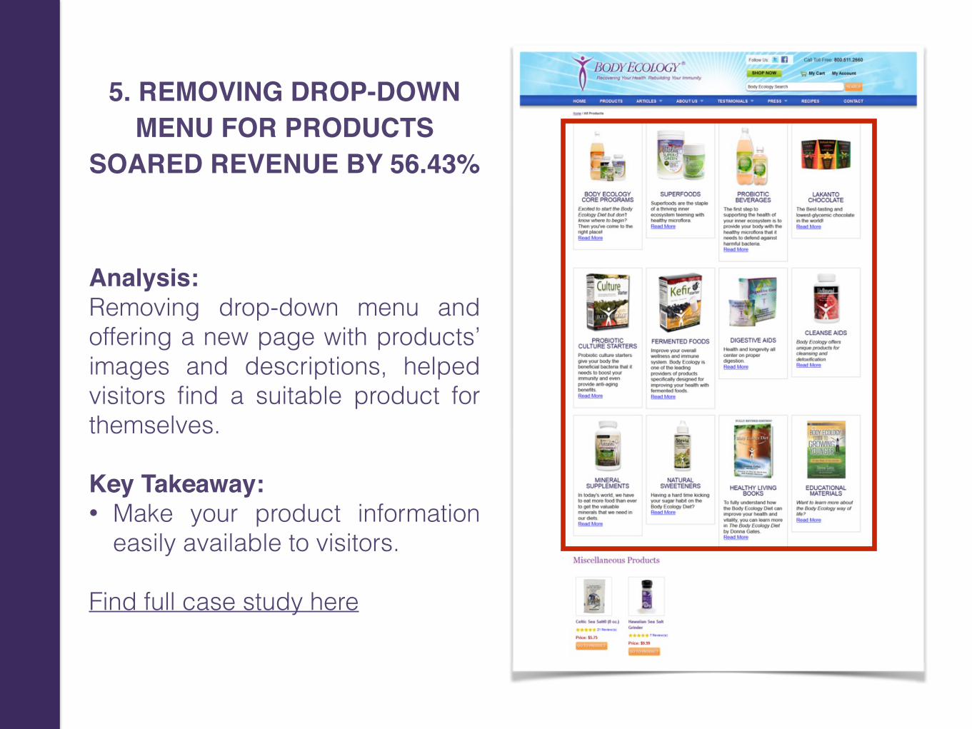
5. REMOVING DROP-DOWN MENU FOR PRODUCTS
SOARED REVENUE BY 56.43%
Analysis:Removing drop-down menu and offering a new page with products’ images and descriptions, helped visitors find a suitable product for themselves. Key Takeaway: • Make your product information
easily available to visitors.
Find full case study here
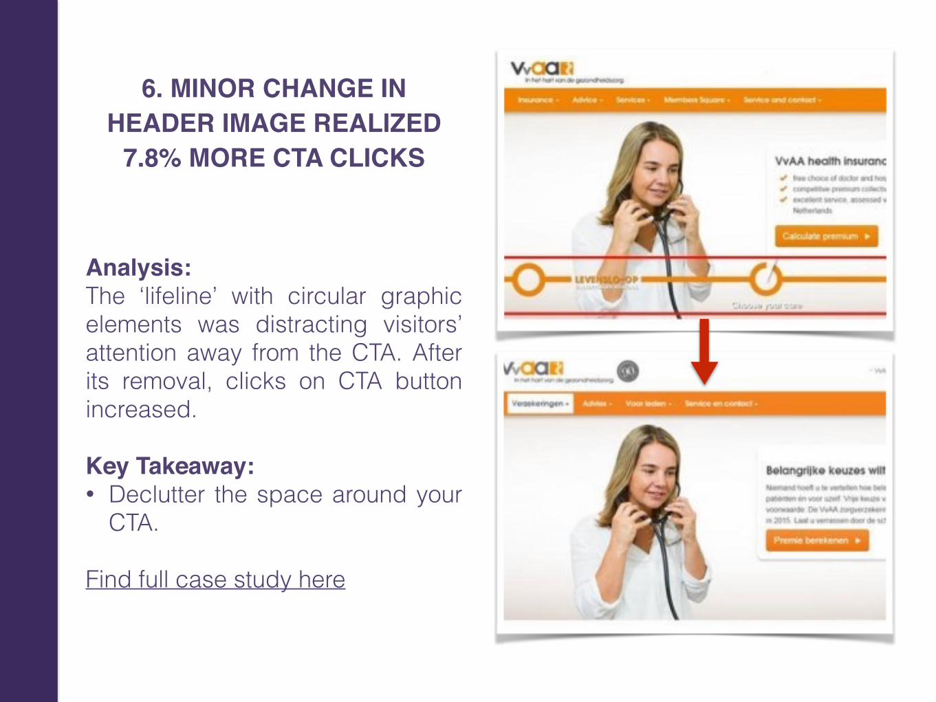
6. MINOR CHANGE IN HEADER IMAGE REALIZED
7.8% MORE CTA CLICKS
Analysis:The ‘lifeline’ with circular graphic elements was distracting visitors’ attention away from the CTA. After its removal, clicks on CTA button increased. Key Takeaway: • Declutter the space around your
CTA.
Find full case study here
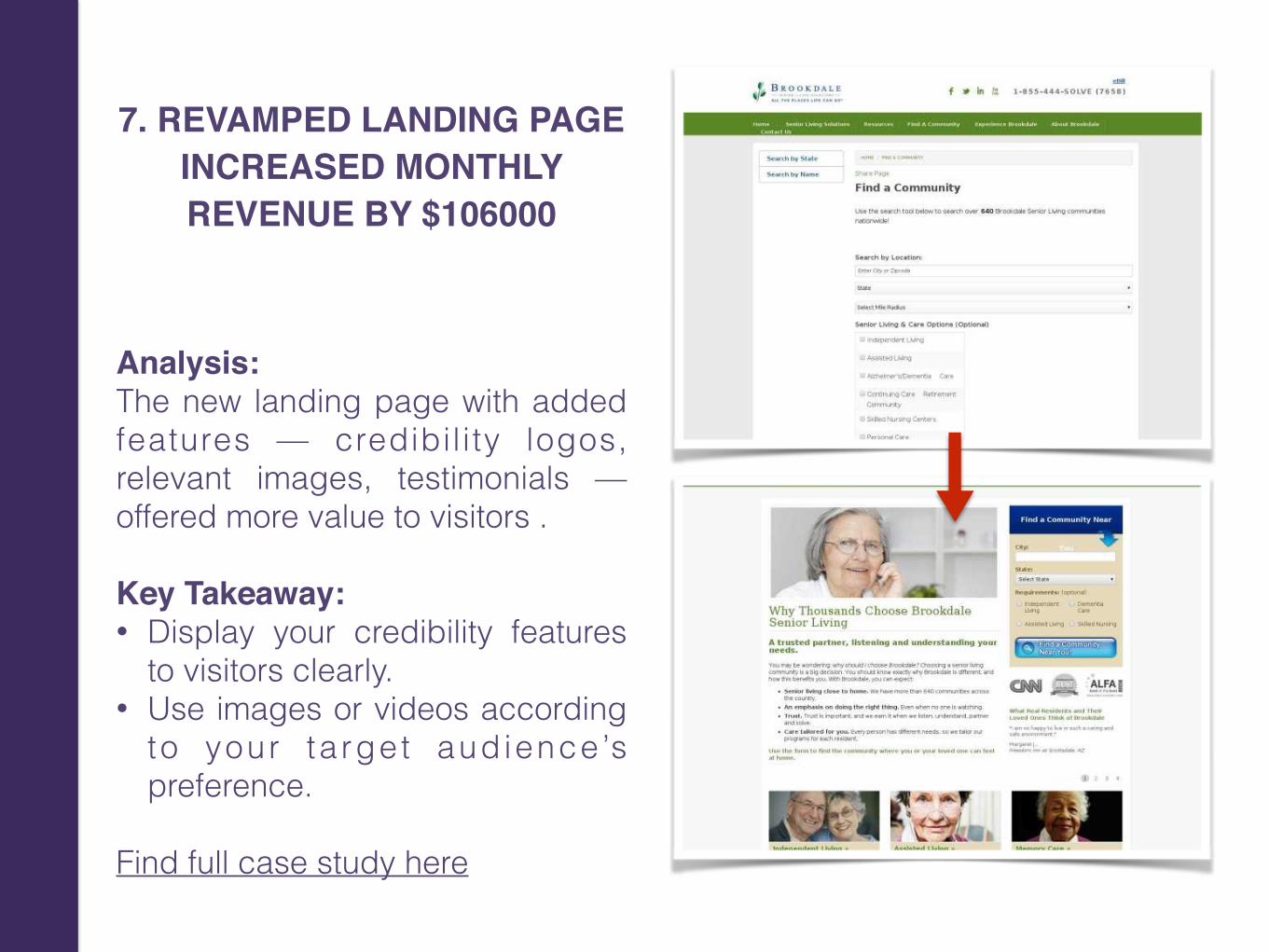
7. REVAMPED LANDING PAGE INCREASED MONTHLY REVENUE BY $106000
Analysis:The new landing page with added features — credibil ity logos, relevant images, testimonials — offered more value to visitors . Key Takeaway: • Display your credibility features
to visitors clearly. • Use images or videos according
to your ta rget aud ience ’s preference.
Find full case study here
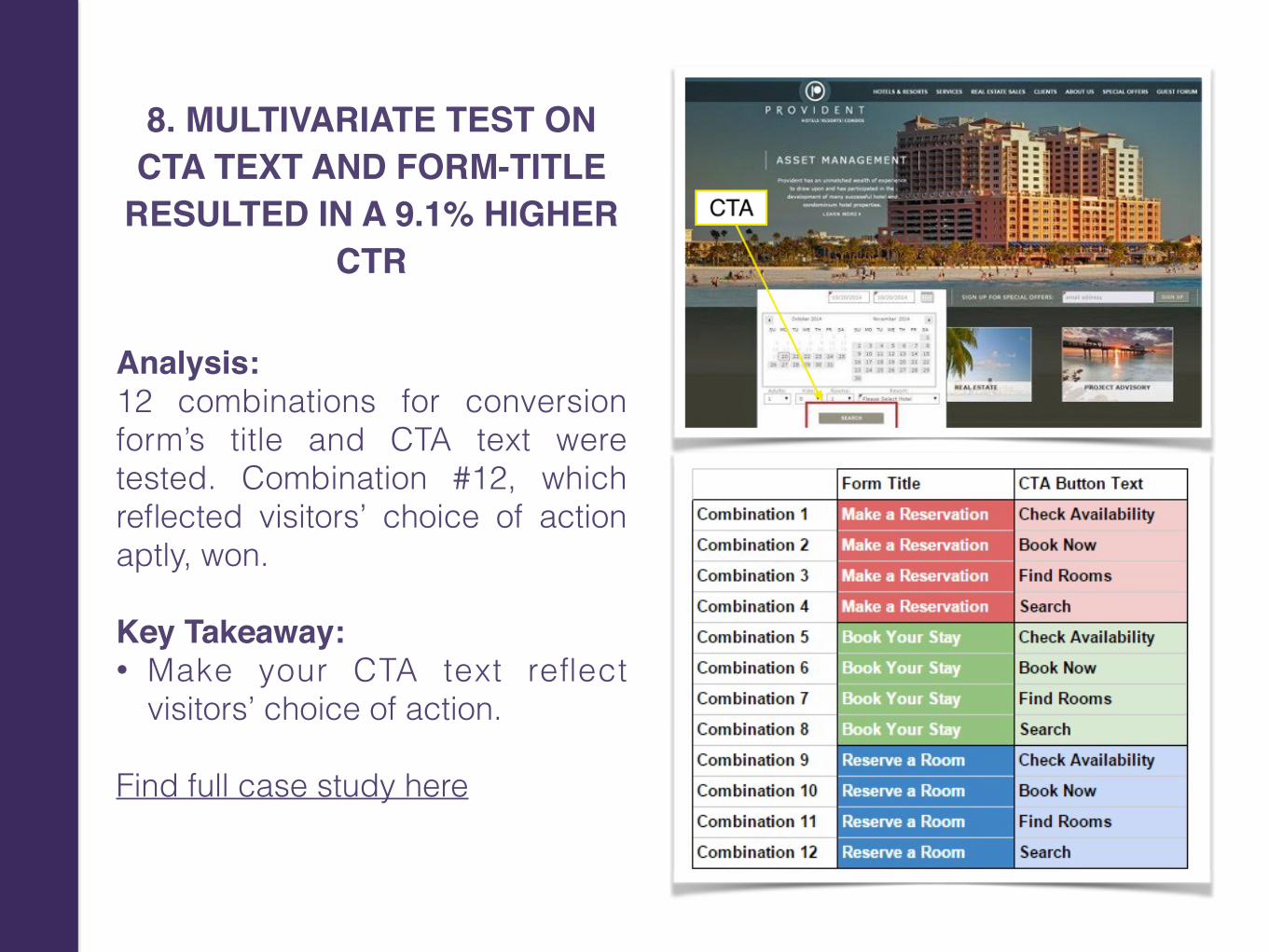
8. MULTIVARIATE TEST ON CTA TEXT AND FORM-TITLE
RESULTED IN A 9.1% HIGHER CTR
Analysis:12 combinations for conversion form’s title and CTA text were tested. Combination #12, which reflected visitors’ choice of action aptly, won. Key Takeaway: • Make your CTA text reflect
visitors’ choice of action.
Find full case study here
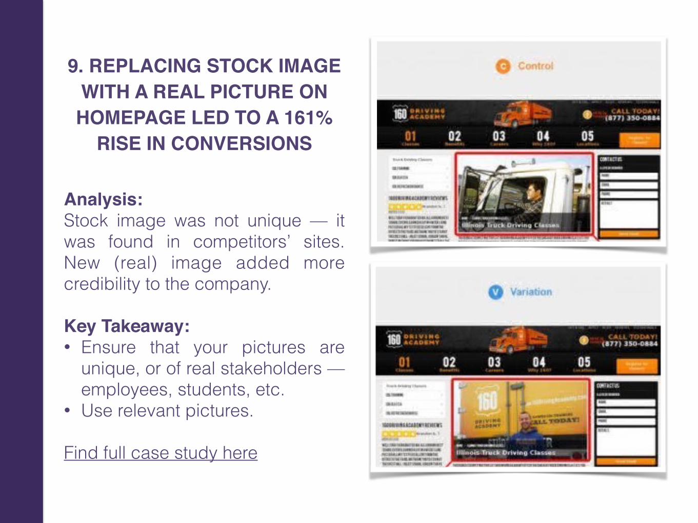
9. REPLACING STOCK IMAGE WITH A REAL PICTURE ON HOMEPAGE LED TO A 161%
RISE IN CONVERSIONS
Analysis:Stock image was not unique — it was found in competitors’ sites. New (real) image added more credibility to the company. Key Takeaway: • Ensure that your pictures are
unique, or of real stakeholders — employees, students, etc.
• Use relevant pictures.
Find full case study here
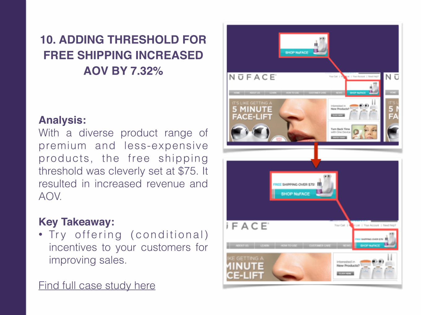
10. ADDING THRESHOLD FOR FREE SHIPPING INCREASED
AOV BY 7.32%
Analysis:With a diverse product range of premium and less-expensive products, the f ree shipping threshold was cleverly set at $75. It resulted in increased revenue and AOV. Key Takeaway: • Tr y o f f e r i n g ( c o n d i t i o n a l )
incentives to your customers for improving sales.
Find full case study here

Start your own A/B testat vwo.com
THANK YOU
Other intriguing posts from our Blog:
• 14 Ways to Reduce Bounce and Increase Engagement on Your eCommerce Site
• Removing Social Sharing Buttons Increases Conversions. Yes, You Heard That Right!
• 21 Tips to Make Your eCommerce Homepage a Conversion Magnet
• 14 Best Practices For Your eCommerce Product Pages
• 21 Conversion Rate Optimization Best Practices for Beginners