Embed Size (px)
Citation preview

Written By: Stephen GriffithsPublished: April 2015
Improving user experience and optimising conversion
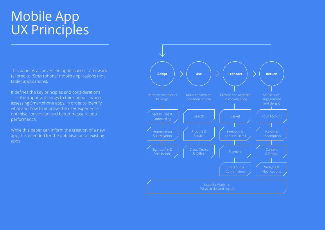
Mobile AppUX Principles
2
This paper is a conversion optimisation framework tailored to “Smartphone” mobile applications (not tablet applications).
It defines the key principles and considerations - i.e. the important things to think about - when assessing Smartphone apps, in order to identify what and how to improve the user experience, optimise conversion and better measure app performance.
While this paper can inform the creation of a new app, it is intended for the optimisation of existing apps.
Mobile App UX Principles
Adopt Use Transact Return
Remove roadblocks to usage
Provide the ultimate in convenience
Self service, engagement and delight
Make conversion decisions simple
Homescreen & Navigation
Product & Service
Personal &Address Detail
Passes & Redemption
Sign-up / in & Permissions PaymentCross Device
& Offline
Checkout &Confirmation
Widgets & Notifications
Content& Design
Splash, Tips & Onboarding
Search Basket Your Account
Usability Hygiene: What to do, and not do
3
Contents
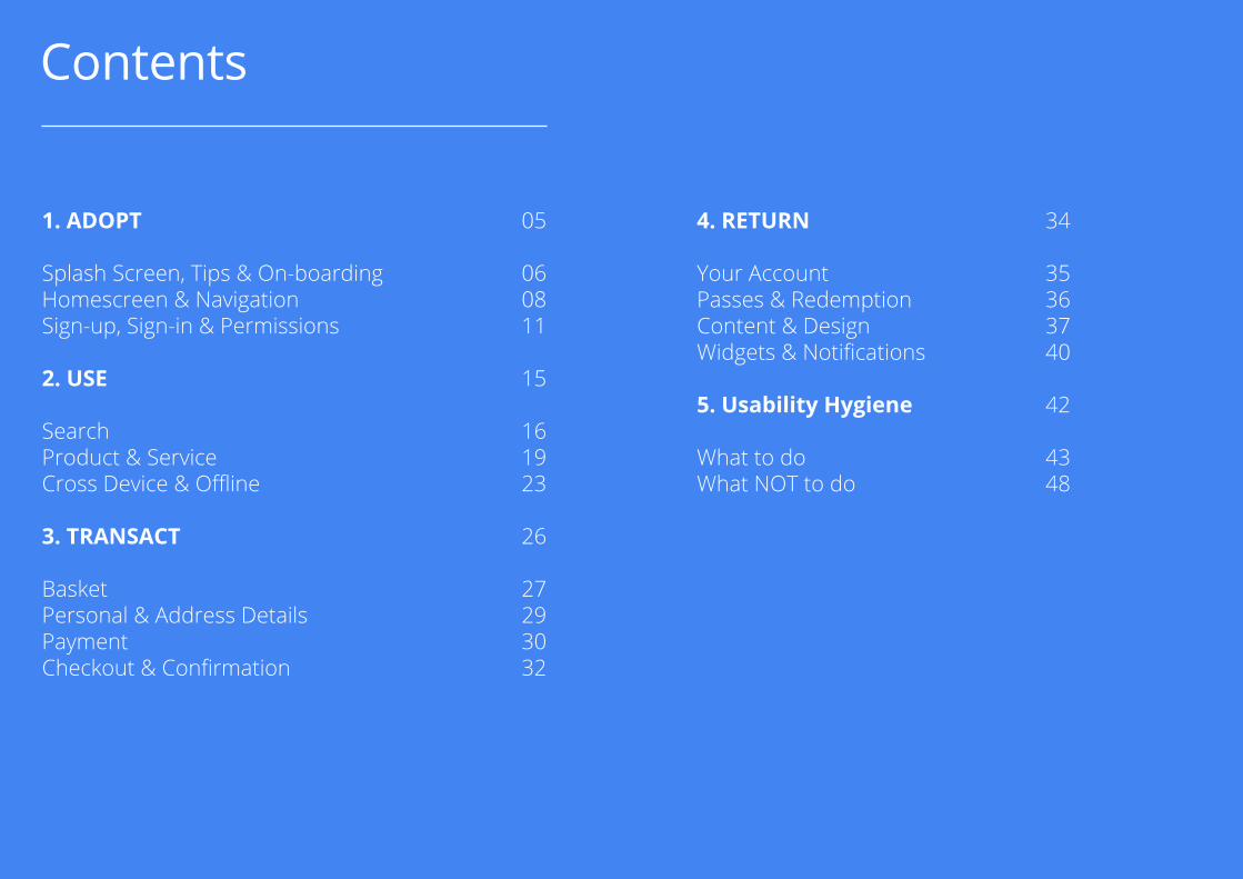
1. ADOPT Splash Screen, Tips & On-boarding Homescreen & Navigation Sign-up, Sign-in & Permissions
2. USE
SearchProduct & ServiceCross Device & Offline
3. TRANSACT
BasketPersonal & Address DetailsPaymentCheckout & Confirmation
4. RETURN
Your AccountPasses & RedemptionContent & DesignWidgets & Notifications
5. Usability Hygiene
What to doWhat NOT to do
05
060811
15
161923
26
27293032
34
35363740
42
4348
4
Considerations Reviewers
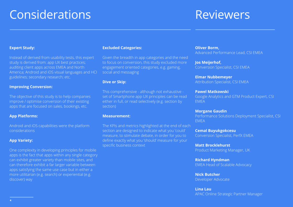
Expert Study:
Instead of derived from usability tests, this expert study is derived from: app UX best practices; auditing client apps across EMEA and North America; Android and iOS visual languages and HCI guidelines; secondary research; etc.
Improving Conversion:
The objective of this study is to help companies improve / optimise conversion of their existing apps that are focused on sales, bookings, etc.
App Platforms:
Android and iOS capabilities were the platform considerations
App Variety:
One complexity in developing principles for mobile apps is the fact that apps within any single category can exhibit greater variety than mobile sites, and can therefore exhibit a far larger variable between apps satisfying the same use case but in either a more utilitarian (e.g. search) or experiential (e.g. discover) way
Excluded Categories:
Given the breadth in app categories and the need to focus on conversion, this study excluded more engagement oriented categories, e.g. gaming, social and messaging
Dive or Skip:
This comprehensive - although not exhaustive - set of Smartphone app UX principles can be read either in full, or read selectively (e.g. section by section)
Measurement:
The KPIs and metrics highlighted at the end of each section are designed to indicate what you ’could’ measure, to stimulate debate, in order for you to define exactly what you ‘should’ measure for your specific business context
Oliver Borm,Advanced Performance Lead, CSI EMEA
Jos Meijerhof,Conversion Specialist, CSI EMEA
Elmar NubbemeyerAttribution Specialist, CSI EMEA
Pawel MatkowskiGoogle Analytics and GTM Product Expert, CSI EMEA
Morgane GaudinPerformance Solutions Deployment Specialist, CSI EMEA
Cemal BuyukgokcesuConversion Specialist, PerfX EMEA
Matt BrocklehurstProduct Marketing Manager, UK
Richard HyndmanEMEA Head of Scalable Advocacy
Nick ButcherDeveloper Advocate
Lina LauAPAC Online Strategic Partner Manager
5
01. ADOPT
Remove roadblocks to usage
6
Splash Screen, Tips & On-boarding
The focus at this stage is to remove all roadblocks to usage - and adoption - of your mobile app.
Get users into the content / substance as quickly as possible, so that they can use, assess and experience its value to them.
First impressions count, and a splash screen gives you a short but vital window to engage a user in your proposition. But, never make users wait.
Tips / help or an onboarding sequence should only be employed if necessary - so as not to interrupt users - but when used appropriately they can guide the user in their initial experience and adoption.
When asked if they’d prefer to click through to an app or a mobile website from mobile search results, more people prefer the app. Here’s why: Apps are quicker to load than mobile websites (46%).
App-Nesia in the UK: The Need forRe-Engagement Marketing, 2015
The app appears to load quickly
Set expectations immediately by ensuring the launch screen loads immediately and makes the app feel fast and responsive. Don’t waste users time at this critical adoption stage, before they’ve even tried to use your app.
Splash screen is consistent with brand (e.g. communicates the brand essence)
A splash screen should engage users and communicate the essence of the brand, but never keep the user waiting. Always put the user in control and able to execute their task ASAP.
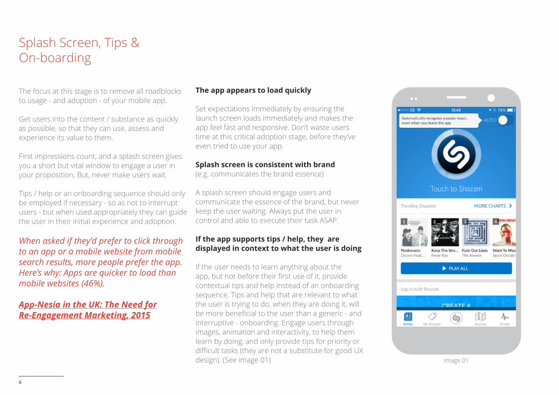
If the app supports tips / help, they are displayed in context to what the user is doing
If the user needs to learn anything about the app, but not before their first use of it, provide contextual tips and help instead of an onboarding sequence. Tips and help that are relevant to what the user is trying to do, when they are doing it, will be more beneficial to the user than a generic - and interruptive - onboarding. Engage users through images, animation and interactivity, to help them learn by doing, and only provide tips for priority or difficult tasks (they are not a substitute for good UX design). (See image 01) image 01
7
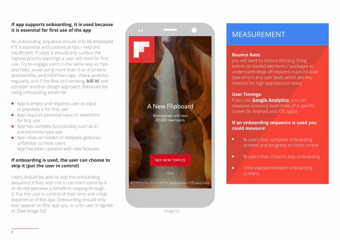
If app supports onboarding, it is used because it is essential for first use of the app
An onboarding sequence should only be employed if it is essential and contextual tips / help are insufficient. If used, it should only surface the highest priority learnings a user will need for first use. Try to engage users in the same way as ‘tips and help’, avoid using more than 3-or-4 screens and benefits, and minimise copy. Check analytics regularly, and if the flow isn’t working, kill it! and consider another design approach. Rationale for using onboarding would be:
App is empty and requires user to input to populate it for first useApp requires personal input or selections for first useApp has complex functionality such as in a productivity-type appApp relies on hidden or bespoke gestures unfamiliar to most usersApp has been updated with new features
If onboarding is used, the user can choose to skip it (put the user in control)
Users should be able to skip the onboarding sequence if they wish not to be interrupted by it or do not perceive a benefit in swiping through it. Put the user in control of their time and initial experience of the app. Onboarding should only ever appear on first app use, or until user is signed-in. (See image 02)
Bounce Rate:you will want to reduce this (e.g. firing events on loaded elements / packages to understand drop-off reasons; track on-load type errors at a user level, which are key reasons for high app bounce rates)
User Timings: if you use Google Analytics, you can measure resource load times of a specific screen (in Android and iOS apps)
If an onboarding sequence is used you could measure:
% users that complete onboarding screens and progress to home screen
% users that chose to skip onboarding
Time elapsed between onboarding screens
MEASUREMENT
image 02
8
Homescreen & Navigation
An app homescreen should provide the user with journey(s) and functionality to complete their priority tasks, and provide content that meets their needs and expectations. Navigation should be clear, task-oriented, logical (e.g. screen controls suggest how to use it), and navigation location (e.g. menu bar) consistent throughout. Only primary navigation and content should be visible by default, with secondary content hidden - but available via tap or swipe - off-screen.
When asked if they’d prefer to click through to an app or a mobile website from mobile search results, more people prefer the app. Here’s why: Apps are simpler to navigate than mobile websites (50%)”. App-Nesia in the UK: The Need forRe-Engagement Marketing, 2015
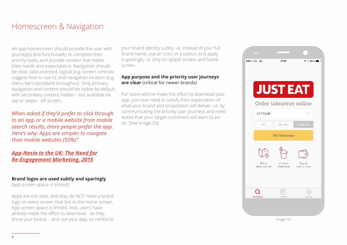
Brand logos are used subtly and sparingly (app screen space is limited)
Apps are not sites, and they do NOT need a brand logo on every screen that link to the home screen. App screen space is limited. And, users’ have already made the effort to download - so they know your brand - and use your app, so reinforce
your brand identity subtly, i.e. instead of your full brand name, use an icon, or a colour; and apply it sparingly, i.e. only on splash screen and home screen.
App purpose and the priority user journeys are clear (critical for newer brands)
For users who’ve make the effort to download your app, you now need to satisfy their expectation of what your brand and proposition will deliver, i.e. by communicating the priority user journeys and need states that your target customers will want to act on. (See image 03)
image 03
9
Reasons to buy / book are clear (to encourage usage and conversion)
This applies to all brands, whether they are unknown or renowned. Unknown brands need to give users reasons to adopt them and their new proposition, whereas well known brands need to create position themselves and differentiate from the competition. Reasons to believe could be related to things such as: price, discounts, features, fulfillment, customer service, luxury, heritage, etc
“Simple design, intense content.”
Edward Tufte
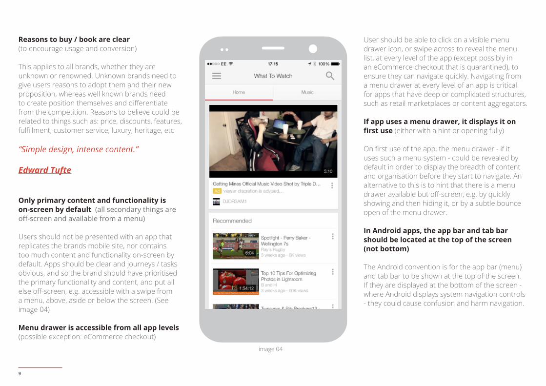
Only primary content and functionality is on-screen by default (all secondary things are off-screen and available from a menu)
Users should not be presented with an app that replicates the brands mobile site, nor contains too much content and functionality on-screen by default. Apps should be clear and journeys / tasks obvious, and so the brand should have prioritised the primary functionality and content, and put all else off-screen, e.g. accessible with a swipe from a menu, above, aside or below the screen. (See image 04)
Menu drawer is accessible from all app levels (possible exception: eCommerce checkout)
User should be able to click on a visible menu drawer icon, or swipe across to reveal the menu list, at every level of the app (except possibly in an eCommerce checkout that is quarantined), to ensure they can navigate quickly. Navigating from a menu drawer at every level of an app is critical for apps that have deep or complicated structures, such as retail marketplaces or content aggregators.
If app uses a menu drawer, it displays it on first use (either with a hint or opening fully)
On first use of the app, the menu drawer - if it uses such a menu system - could be revealed by default in order to display the breadth of content and organisation before they start to navigate. An alternative to this is to hint that there is a menu drawer available but off-screen, e.g. by quickly showing and then hiding it, or by a subtle bounce open of the menu drawer.
In Android apps, the app bar and tab bar should be located at the top of the screen (not bottom)
The Android convention is for the app bar (menu) and tab bar to be shown at the top of the screen. If they are displayed at the bottom of the screen - where Android displays system navigation controls - they could cause confusion and harm navigation.
image 04
10
Long app screens don’t have dead-ends (e.g. so the user continues to discover and explore)
If your app has long screens of content, make sure that when users reach the footer of the screen they can continue to discover and explore, and don’t encounter dead-ends that cause them to abandon the app. For example, at the footer of a long screen your app could provide a:
Back to TOP buttonSearch field if one was displayed at the top of the screenFew navigation options to encourage users to continue exploringOr, you could provide an infinitely scrolling screen, which is used by engagement-type apps (e.g. social, messaging, content), but is also used by some eCommerce apps to display items as part of a stream of content
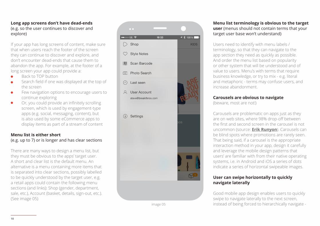
Menu list is either short (e.g. up to 7) or is longer and has clear sections
There are many ways to design a menu list, but they must be obvious to the apps’ target user. A short and clear list is the default menu. An alternative is a menu containing more items that is separated into clear sections, possibly labelled to be quickly understood by the target user, e.g. a retail apps could contain the following menu sections (and links): Shop (gender, department, sale, etc.), Account (basket, details, sign-out, etc.). (See image 05)
Menu list terminology is obvious to the target user (menus should not contain terms that your target user base won’t understand)
Users need to identify with menu labels / terminology, so that they can navigate to the app section they need as quickly as possible. And order the menu list based on popularity or other system that will be understood and of value to users. Menu’s with terms that require business knowledge, or try to mix - e.g. literal and metaphoric - terms may confuse users, and increase abandonment.
Carousels are obvious to navigate (beware, most are not!)
Carousels are problematic on apps just as they are on web sites, where 98% drop-off between the first and second screen in the carousel is not uncommon (source: Erik Runyon). Carousels can be blind spots where promotions are rarely seen. That being said, if a carousel is the appropriate interaction method in your app, design it carefully and leverage the mobile design patterns that users’ are familiar with from their native operating systems, i.e. in Android and iOS a series of dots indicate a series of horizontal swipeable images.
User can swipe horizontally to quickly navigate laterally
Good mobile app design enables users to quickly swipe to navigate laterally to the next screen, instead of being forced to hierarchically navigate - image 05
11
Sign-up, Sign-in & Permissions
One of the main points of difference between mobile apps and mobile sites, is that apps enable a user to be persistently logged-in (eliminating manual login effort and mistakes), to benefit from the level of convenience and personalisation only achievable from a persistently logged-in state, derived from apps that store and act on your details, behaviours and transaction history. To provide a user experience with the least barriers to conversion, mobile apps should:
Provide non-signed-in journeyRequest sign-up “only” when it is dependent on providing value, and then ... Request minimal data Display clear benefit statements
“The system should treat all user input as sacred.”
Jef Raskin
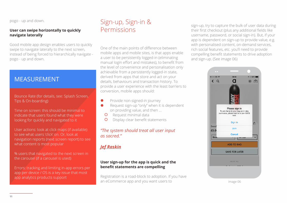
User sign-up for the app is quick and the benefit statements are compelling
Registration is a road-block to adoption. If you have an eCommerce app and you want users to
sign-up, try to capture the bulk of user data during their first checkout (plus any additional fields like username, password, or social sign-in). But, if your app is dependent on sign-up to provide value, e.g. with personalised content, on-demand services, rich social features, etc. you’ll need to provide compelling benefit statements to drive adoption and sign-up. (See image 06)
pogo - up and down.
User can swipe horizontally to quickly navigate laterally
Good mobile app design enables users to quickly swipe to navigate laterally to the next screen, instead of being forced to hierarchically navigate - pogo - up and down.
MEASUREMENT
Bounce Rate (for details, see: Splash Screen, Tips & On-boarding)
Time on screen: this should be minimal to indicate that users found what they were looking for quickly and navigated to it
User actions: look at click maps (if available) to see what users ‘click’ on. Or, look at navigation reports (next screen report) to see what content is most popular
% users that navigated to the next screen in the carousel (if a carousel is used)
Errors: tracking and limiting in-app errors per app per device / OS is a key issue that most app analytics products support
image 06
12
User sign-up for apps with sensitive / valuable data is quick and benefit statements are clear(e.g. apps by financial services or health record providers)
Registration is a familiar mandatory request for apps in highly regulated verticals (e.g. financial services) or those that store highly sensitive data (e.g. personal health records). These apps should still make sign-up quick, encourage it with clear benefit statements, and provide the level of reassurance that users expect from those that require a risk / benefit decision.
If app requests sign-up, the user can choose to continue as a guest (the user is in control)
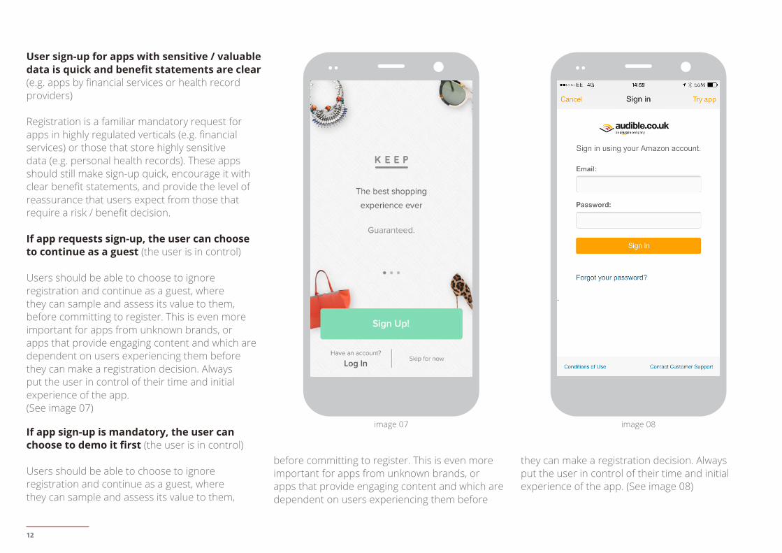
Users should be able to choose to ignore registration and continue as a guest, where they can sample and assess its value to them, before committing to register. This is even more important for apps from unknown brands, or apps that provide engaging content and which are dependent on users experiencing them before they can make a registration decision. Always put the user in control of their time and initial experience of the app.(See image 07)
If app sign-up is mandatory, the user can choose to demo it first (the user is in control)
Users should be able to choose to ignore registration and continue as a guest, where they can sample and assess its value to them,
before committing to register. This is even more important for apps from unknown brands, or apps that provide engaging content and which are dependent on users experiencing them before
they can make a registration decision. Always put the user in control of their time and initial experience of the app. (See image 08)
image 07 image 08
13
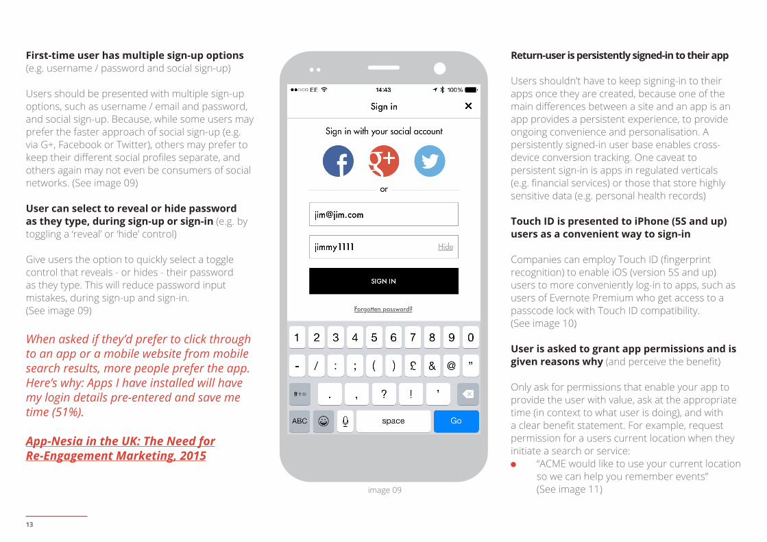
First-time user has multiple sign-up options (e.g. username / password and social sign-up)
Users should be presented with multiple sign-up options, such as username / email and password, and social sign-up. Because, while some users may prefer the faster approach of social sign-up (e.g. via G+, Facebook or Twitter), others may prefer to keep their different social profiles separate, and others again may not even be consumers of social networks. (See image 09)
User can select to reveal or hide password as they type, during sign-up or sign-in (e.g. by toggling a ‘reveal’ or ‘hide’ control)
Give users the option to quickly select a toggle control that reveals - or hides - their password as they type. This will reduce password input mistakes, during sign-up and sign-in.(See image 09)
When asked if they’d prefer to click through to an app or a mobile website from mobile search results, more people prefer the app. Here’s why: Apps I have installed will have my login details pre-entered and save me time (51%).
App-Nesia in the UK: The Need forRe-Engagement Marketing, 2015
Return-user is persistently signed-in to their app
Users shouldn’t have to keep signing-in to their apps once they are created, because one of the main differences between a site and an app is an app provides a persistent experience, to provide ongoing convenience and personalisation. A persistently signed-in user base enables cross-device conversion tracking. One caveat to persistent sign-in is apps in regulated verticals (e.g. financial services) or those that store highly sensitive data (e.g. personal health records)
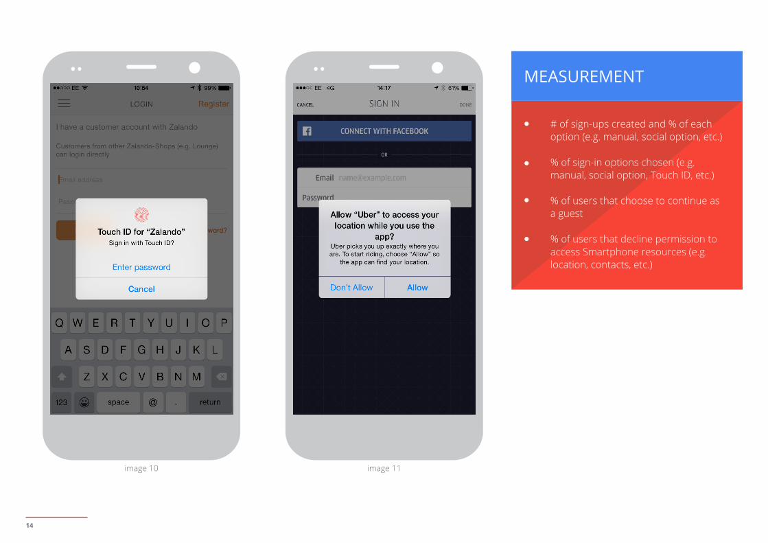
Touch ID is presented to iPhone (5S and up) users as a convenient way to sign-in
Companies can employ Touch ID (fingerprint recognition) to enable iOS (version 5S and up) users to more conveniently log-in to apps, such as users of Evernote Premium who get access to a passcode lock with Touch ID compatibility. (See image 10)
User is asked to grant app permissions and is given reasons why (and perceive the benefit)
Only ask for permissions that enable your app to provide the user with value, ask at the appropriate time (in context to what user is doing), and with a clear benefit statement. For example, request permission for a users current location when they initiate a search or service:
“ACME would like to use your current location so we can help you remember events”(See image 11)image 09
14
MEASUREMENT
# of sign-ups created and % of each option (e.g. manual, social option, etc.)
% of sign-in options chosen (e.g. manual, social option, Touch ID, etc.)
% of users that choose to continue as a guest
% of users that decline permission to access Smartphone resources (e.g. location, contacts, etc.)
image 11image 10
15
02. USE
Make conversion decisions simple
16
“Mobile is a transformative technology. As our percentage of customers adopting mobile continues to grow, mobile can no longer be a limited subset of features or products. And we think with clever use of functions and design, it is possible to give mobile customers 100%.”
Paul Cousineau, Director Mobile Shopping, Amazon.com, No. 1 in the Internet Retailer 2015 Mobile 500
“% of retail apps users who engaged in the type of activities in the past 30 days: Make a purchase online (58%); Look for info about a specific product / service (56%); Browsing (54%); Make a purchase offline (35%); Look for something nearby (35%); Find opinions of reviews from others (34%); Manage or check my account (21%).”
U.S. Consumer Mobile Apps Study, 2014, Google/Ipsos MediaCT
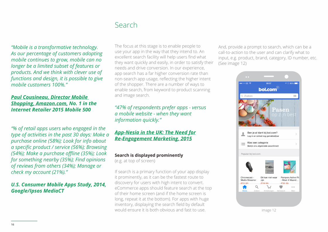
Search
The focus at this stage is to enable people to use your app in the way that they intend to. An excellent search facility will help users find what they want quickly and easily, in order to satisfy their needs and drive conversion. In our experience, app search has a far higher conversion rate than non-search app usage, reflecting the higher intent of the shopper. There are a number of ways to enable search, from keyword to product scanning and image search.
“47% of respondents prefer apps - versus a mobile website - when they want information quickly.”
App-Nesia in the UK: The Need forRe-Engagement Marketing, 2015
Search is displayed prominently (e.g. at top of screen)
If search is a primary function of your app display it prominently, as it can be the fastest route to discovery for users with high intent to convert. eCommerce apps should feature search at the top of their home screen (and if the home screen is long, repeat it at the bottom). For apps with huge inventory, displaying the search field by default would ensure it is both obvious and fast to use.
And, provide a prompt to search, which can be a call-to-action to the user and can clarify what to input, e.g. product, brand, category, ID number, etc. (See image 12)
image 12
17
The first few search results are highly relevant (mobile real-estate is limited!)
With Smartphone screens being so limited in the number of results they can display without the need for scrolling, ensure the user sees a set of - e.g. 3 to 5 - highly relevant results by default; and only after that do they need to scroll. As an ongoing activity, you should regularly check search result quality for top in-app search queries and adjust ranking if needed
Provide alternatives when there are no matching search results (no dead-ends)
Avoid giving users dead-ends in their experience when their search produces no matching results. Give them options, e.g. in flight booking suggest alternative airports, in car hire suggest alternative fleet, in retail suggest alternative products or categories. To assist the user further you could employ an ‘intelligent search’ feature that covers singular, plurals and misspellings, etc.
User can easily sort search results
Provide the user with sorting options that are relevant for their search. Do not hide the sort feature within the filtering feature - they are distinct tasks.
User can easily filter search results
Provide the user with filtering options that are relevant for their search, and enable them to select
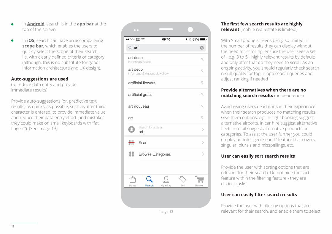
In Android, search is in the app bar at the top of the screen.
In iOS, search can have an accompanying scope bar, which enables the users to quickly select the scope of their search, i.e. with clearly defined criteria or category (although, this is no substitute for good information architecture and UX design).
Auto-suggestions are used (to reduce data entry and provide immediate results)
Provide auto-suggestions (or, predictive text results) as quickly as possible, such as after third character is entered, to provide immediate value and reduce their data entry effort (and mistakes they could make on small keyboards with “fat fingers”). (See image 13)
image 13
18
MEASUREMENT/ de-select multiple options each time they apply the filter to the results.
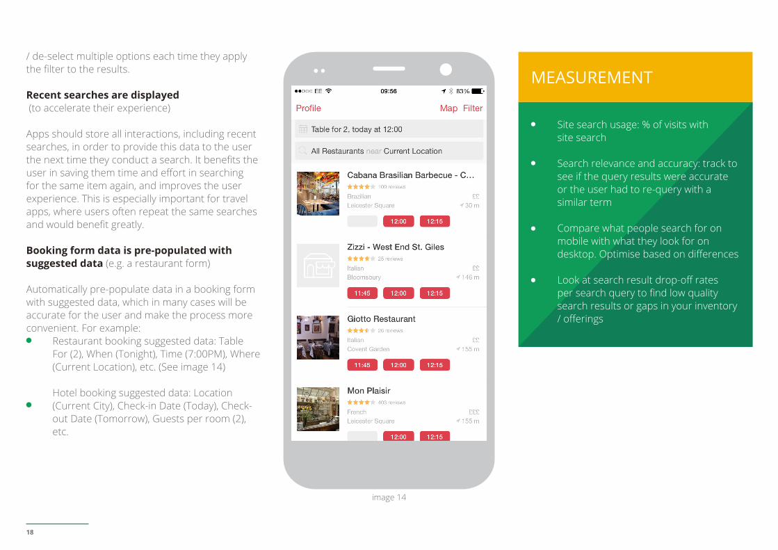
Recent searches are displayed (to accelerate their experience)
Apps should store all interactions, including recent searches, in order to provide this data to the user the next time they conduct a search. It benefits the user in saving them time and effort in searching for the same item again, and improves the user experience. This is especially important for travel apps, where users often repeat the same searches and would benefit greatly.
Booking form data is pre-populated with suggested data (e.g. a restaurant form)
Automatically pre-populate data in a booking form with suggested data, which in many cases will be accurate for the user and make the process more convenient. For example:
Restaurant booking suggested data: Table For (2), When (Tonight), Time (7:00PM), Where (Current Location), etc. (See image 14)
Hotel booking suggested data: Location (Current City), Check-in Date (Today), Check-out Date (Tomorrow), Guests per room (2), etc.
Site search usage: % of visits with site search
Search relevance and accuracy: track to see if the query results were accurate or the user had to re-query with a similar term
Compare what people search for on mobile with what they look for on desktop. Optimise based on differences
Look at search result drop-off rates per search query to find low quality search results or gaps in your inventory / offerings
image 14
19
Product & Service
Product screens are where users make key conversion decisions, e.g. add to basket, add to wish list, book now, call now, complete form, etc. Strong mobile app product screens enable users to quickly transact, save for later, and share the items they have to make decisions on.
“By far the largest revenue opportunity in the app economy up to 2017 is e-Commerce. Larger smartphone screens, improving mobile purchase flows on the web and dedicated native apps have already been shifting that behaviour. Removing payment friction will further accelerate the transition to mobile commerce.”
Vision Mobile, App Economy Forecasts 2014-2017
Product description is easy to scan (find specific info) and skim (get a general overview)
Product descriptions should be high-level (aim for brevity) and laid out clearly, such as in list or bullet-point format, so that it is easy to speed read. The
key features or buying dimensions of the product should be the focus, to encourage users’ to click on the product details button (for further information) or add to basket.
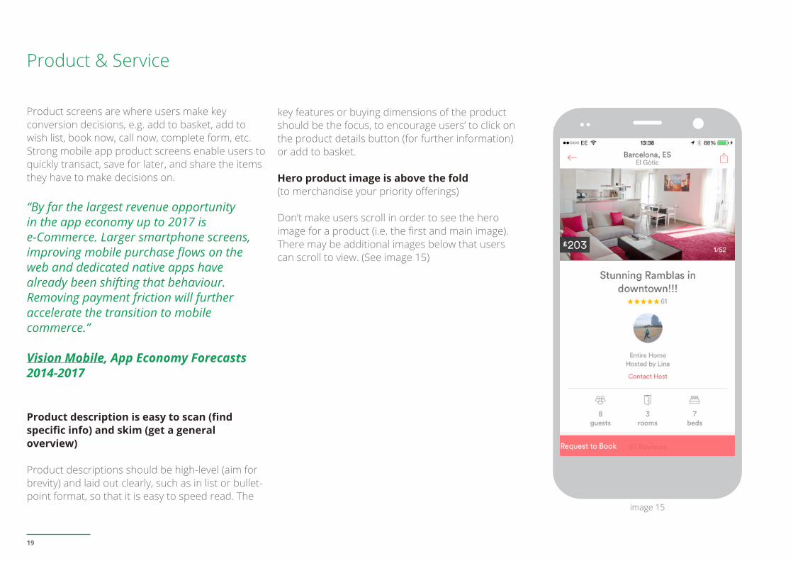
Hero product image is above the fold (to merchandise your priority offerings)
Don’t make users scroll in order to see the hero image for a product (i.e. the first and main image). There may be additional images below that users can scroll to view. (See image 15)
image 15
20
Product images are quick to swipe horizontally (and are not stacked in a vertical row)
Users should be able to quickly swipe through an items images horizontally, and not have to scroll down to view a series of images.
Product images / videos / other assets are high quality (to reassure new users)
Online and in-app, your images / videos / other assets are the product, since there is no physical dimension of the product. So, they should be high quality, to maximise the impact of merchandise and inventory, capture the attention of app users who may skim, and drive call-to-actions.
Android Graphic assets should be crisp: always provide XHDPI (and now XXHDPI)iOS recommends you supply @3x assets for iPhone 6 Plus and @2x assets for all other high-resolution iOS devices.
Product images can be easily zoomed into (and are still high quality)
Users should be able to easily zoom into a product image to inspect it in more detail, by double clicking or selecting a zoom button. The zoomed-in images need to maintain high quality. And to avoid making the user think, state the action required, e.g. Double Tap to Zoom.
“Self-help” is becoming the new norm 1-in-3 shoppers use their smartphones to
find information instead of asking store employees.
Mobile in Store Research, 2013, Google
Helpful product content is easy to find and is reassuring (e.g. product details, specs, FAQs)
Users expect to see product details, and the depth of content provided should be appropriate for each type of product, in order for the user to make a conversion decision. Specifications should be provided for products that customers may need to see in order to make a purchase decision, e.g. for large ticket items (like cars), technical items (like computers), complicated items (like insurance cover).
Customer reviews or testimonials are easy to find and are reassuring
At this key conversion point, users may need to further research the item or see related info, before making a decision. Such self serve content could be in the form of FAQs, a general help section in the app, a size guide overlay on the product screen, etc.
“28% of shoppers will abandon their shopping cart if presented with unexpected shipping costs.” VWO, eCommerce Survey 2014
Costs are transparent (including taxes)
Items should clearly display all costs and any associated taxes to reassure users. Unexpected shipping costs, taxes, etc. are the most cited reasons why users abandon shopping funnels.
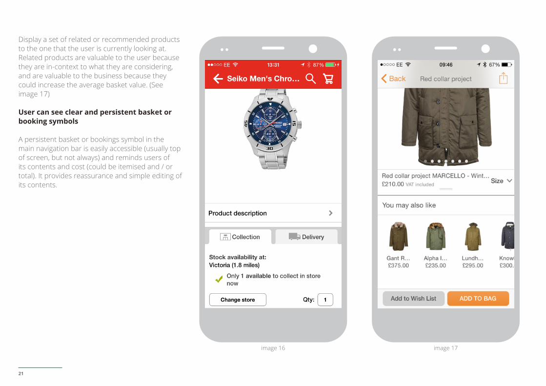
Stock / inventory (ideally local) availability information is provided (for impulse or last minute shoppers)
Availability of stock or inventory (e.g. hotel rooms) is important to app users, since they are the users that are most likely to purchase or book at the last minute or on impulse, and you need to satisfy their urgency. And “local” availability enables users to buy / book nearby and then collect / arrive immediately. (See image 16)
Primary call-to-action button is the most prominent on-screen element, and secondary call-to-action button is in close proximity to it
The primary CTA should be the most prominent button on screen, and your eyes should naturally be drawn to it, e.g. Add To Basket, Book Now, Submit Form, etc. And, secondary CTAs should be in close proximity to it, to satisfy cross-device behaviours (micro-conversions), via features such as Email Product, Add to Wish List, etc. (See image 17)
User can see suggested products or listings(e.g. similar or recommended products)
21
Display a set of related or recommended products to the one that the user is currently looking at. Related products are valuable to the user because they are in-context to what they are considering, and are valuable to the business because they could increase the average basket value. (See image 17)
User can see clear and persistent basket or booking symbols
A persistent basket or bookings symbol in the main navigation bar is easily accessible (usually top of screen, but not always) and reminds users of its contents and cost (could be itemised and / or total). It provides reassurance and simple editing of its contents.
image 16 image 17
22
Also measure:
# customer reviews or testimonials viewed (and for which products / categories)
# and type of helpful content viewed
# terms views (and for which, e.g. delivery, returns, cancellations, etc.)
# stock / inventory checks, and those that lead to conversions
# local stock / inventory checks, and those that lead to conversions
# and type of related or recommended products viewed, and those that lead to conversionsProduct to Cart rate
Segment product screens into four groups based on the volume of traffic they get (high or low) and their conversion rate (high or low), and for:
1. Low traffic / High CvR (Conversion Rate) products: pump in more traffic!
2. High traffic / High CvR: continue to promote (or do more), and ensure offer is available
3. Low traffic / Low CvR: look for a few rising stars and promote these
4. High traffic / Low CvR: start investigating! Are product images of high quality? Is price competitive? Are products in-stock? Do offers have strong descriptions? Etc.
MEASUREMENT
23
Cross Device & Offline
Consumers increasingly research and consider products and services across multiple touchpoints - devices, apps and browsers - and also offline touchpoints, such as telephony and retail stores. It is therefore paramount that brands enable users to transition from their Smartphone app to their next - digital or offline - touchpoint, as part of a seamless journey towards conversion. This will enable cross-device and offline conversions, and satisfy the behaviours of consumers today.
Smartphones are transforming the in-store shopping experience. 90% of smartphone shoppers use their phone for pre-shopping activities. 84% use their devices to help shop while in a store.
Mobile in Store Research, 2013, Google
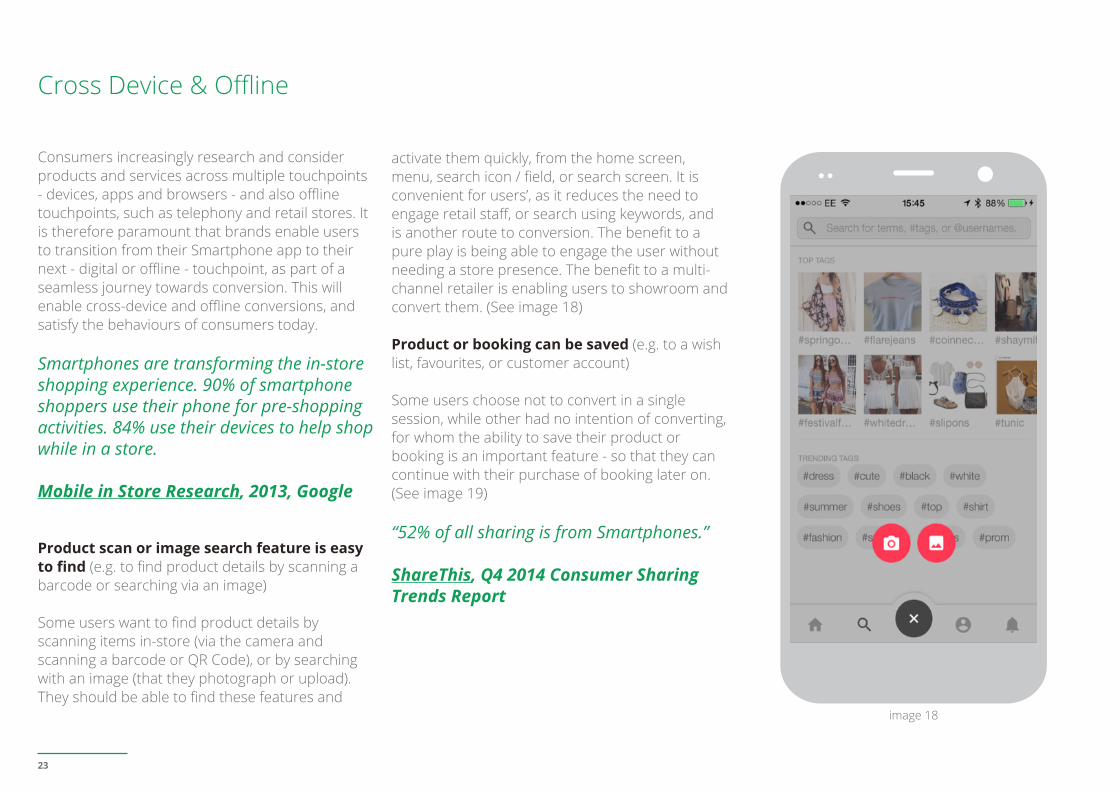
Product scan or image search feature is easy to find (e.g. to find product details by scanning a barcode or searching via an image)
Some users want to find product details by scanning items in-store (via the camera and scanning a barcode or QR Code), or by searching with an image (that they photograph or upload). They should be able to find these features and
activate them quickly, from the home screen, menu, search icon / field, or search screen. It is convenient for users’, as it reduces the need to engage retail staff, or search using keywords, and is another route to conversion. The benefit to a pure play is being able to engage the user without needing a store presence. The benefit to a multi-channel retailer is enabling users to showroom and convert them. (See image 18)
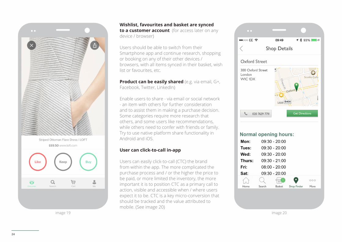
Product or booking can be saved (e.g. to a wish list, favourites, or customer account)
Some users choose not to convert in a single session, while other had no intention of converting, for whom the ability to save their product or booking is an important feature - so that they can continue with their purchase of booking later on. (See image 19)
“52% of all sharing is from Smartphones.”
ShareThis, Q4 2014 Consumer Sharing Trends Report
image 18
24
Wishlist, favourites and basket are synced to a customer account (for access later on any device / browser)
Users should be able to switch from their Smartphone app and continue research, shopping or booking on any of their other devices / browsers, with all items synced in their basket, wish list or favourites, etc.
Product can be easily shared (e.g. via email, G+, Facebook, Twitter, LinkedIn)
Enable users to share - via email or social network - an item with others for further consideration and to assist them in making a purchase decision. Some categories require more research that others, and some users like recommendations, while others need to confer with friends or family. Try to use native platform share functionality in Android and iOS.
User can click-to-call in-app
Users can easily click-to-call (CTC) the brand from within the app. The more complicated the purchase process and / or the higher the price to be paid, or more limited the inventory, the more important it is to position CTC as a primary call to action, visible and accessible when / where users expect it to be. CTC is a key micro-conversion that should be tracked and the value attributed to mobile. (See image 20)
image 20image 19
25
MEASUREMENT
User can find contact centre availability easily(e.g. on a Contact Us screen)
Users who choose not to CTC from a high-level icon or CTA (e.g. on home screen or primary menu bar), should be able to easily find the brands contact centre screen and availability information, e.g. days and hours (and special days like bank holidays); and what happens outside of that availability (e.g. call when next open, leave a message or call back, etc.).
“Shoppers who use mobile more, spend more in-store. Frequent mobile shoppers spend 25% more in-store than people who only occasionally use a mobile phone to help with shopping.”
Mobile in Store Research, 2013, Google
User can locate a business nearby using Smartphone location data (e.g. retail store)
Once users have confirmed the app can access the Smartphones’ location feature, they should be able to easily locate a nearby a brands’ physical business in-app (be it a retail store, car hire station, or hotel, etc.). The more complicated the purchase process and / or the higher the price to be paid, or more limited the inventory, or the more experiential the item, the more important it is to position a store locator as a primary call to action,
visible and accessible when / where users expect it to be. Mobile-to-offline is a key micro-conversion that should be tracked and the value attributed to mobile. (See image 20)
# of click-to-calls initiated, and those that lead to conversions
# stock / inventory checks, and those that lead to conversions
Estimated cross-device conversions in AdWords
Universal Analytics cross device measurement with USER ID
# of product detail scans initiated, and those that lead to conversions
# of image searches initiated, and those that lead to conversions
# of accounts created
# of favourites or wishlists created, and those that lead to conversions
# products shared via email or social channels, and those that lead to conversions
# of store locator initiated and store detail screens viewed, and those that lead to conversions
26
03. TRANSACT
Provide the ultimate in convenience
27
The focus at this stage is to help users progress through each checkout stage with minimal effort, with sufficient reassurance, and to convert without hesitation.
42% of all mobile sales generated by the leading 500 merchants in m-commerce in 2014 will come from mobile apps.”
Internet Retailer 2015 Mobile 500
“% of category apps users who have made app purchase in the last 30-days on products, services, and subscriptions: Retail (50%); Travel (44%); Local (48%); Technology (65%); Finance (38%).”
U.S. Consumer Mobile Apps Study, 2014, Google/Ipsos MediaCT
User is reassured at all checkout stages by relevant messaging that encourages them to proceed to the next stage (without hesitation!)
Provide visible and clear messaging specific to this stage of their transaction journey, which reassures and encourages them to progress to the next without hesitation. For example:
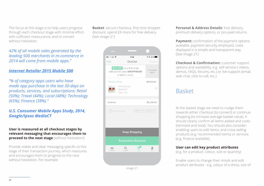
Basket: secure checkout, first time shopper discount, spend £X more for free delivery. (See image 21)
Personal & Address Details: free delivery, premium delivery options, or pre-paid returns.
Payment: confirmation of the payment options available, payment security employed, costs displayed in a simple and transparent way. (See image 21)
Checkout & Confirmation: customer support options and availability, e.g. self-service ( videos, demos, FAQs, forums, etc.) or live support (email, web chat, click-to-call, etc.)
Basket
At the basket stage we need to nudge them towards either checkout (to convert) or continue shopping (to increase average basket value). It should clearly confirm all items added and costs (itemised and total). You should also consider: enabling users to edit items; and cross-selling products (e.g. recommended items) or services (e.g. finance available).
User can edit key product attributes (e.g. for a product: colour, size or quantity)
Enable users to change their minds and edit product attributes - e.g. colour of a dress, size of
image 21
28
MEASUREMENT
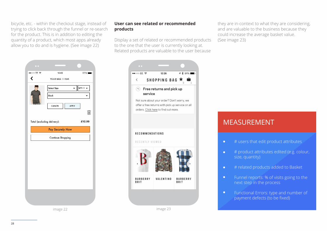
bicycle, etc. - within the checkout stage, instead of trying to click back through the funnel or re-search for the product. This is in addition to editing the quantity of a product, which most apps already allow you to do and is hygiene. (See image 22)
User can see related or recommended products
Display a set of related or recommended products to the one that the user is currently looking at. Related products are valuable to the user because
they are in-context to what they are considering, and are valuable to the business because they could increase the average basket value. (See image 23)
# users that edit product attributes
# product attributes edited (e.g. colour, size, quantity)
# related products added to Basket
Funnel reports: % of visits going to the next step in the process
Functional Errors: type and number of payment defects (to be fixed)
image 22 image 23
29
MEASUREMENT
Personal & Address Details
Give first time users sufficient reassurance so that they input their data and progress to the payment stage without hesitation, and pre-populate data for return user convenience.
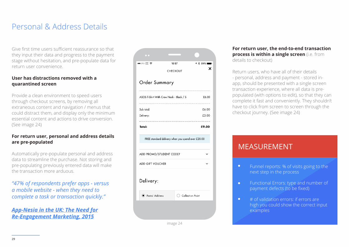
User has distractions removed with a quarantined screen
Provide a clean environment to speed users through checkout screens, by removing all extraneous content and navigation / menus that could distract them, and display only the minimum essential content and actions to drive conversion. (See image 24)
For return user, personal and address details are pre-populated
Automatically pre-populate personal and address data to streamline the purchase. Not storing and pre-populating previously entered data will make the transaction more arduous.
“47% of respondents prefer apps - versus a mobile website - when they need to complete a task or transaction quickly.”
App-Nesia in the UK: The Need forRe-Engagement Marketing, 2015
For return user, the end-to-end transaction process is within a single screen (i.e. from details to checkout)
Return users, who have all of their details - personal, address and payment - stored in-app, should be presented with a single screen transaction experience, where all data is pre-populated (with options to edit), so that they can complete it fast and conveniently. They shouldn’t have to click from screen to screen through the checkout journey. (See image 24)
Funnel reports: % of visits going to the next step in the process
Functional Errors: type and number of payment defects (to be fixed)
# of validation errors: if errors are high you could show the correct input examples
image 24
30
Payment
Maximise conversion at the payment stage by reassuring users, and employing convenient input methods, such as: scanning cards, payment options and express payment for first time users; and pre-populating data for return users; etc.
Costs are transparent (itemised and total costs)
Shopping baskets should display all of the items within it and their associates costs, discounts or savings, and total cost. Checkouts should also display the associated taxes, delivery costs and total costs.
For return user, payment details are pre-populated (for convenience)
Automatically pre-populate payment data, for the same benefits as above. The only field that requires manual entry each time - for security reasons - is the CVV field.
User is only presented with payment options accepted in their country
Provide users with payment methods appropriate to their country. Provide multiple options to users to ensure you capture the full range that users would pay with in each country, e.g. credit card, debit card, Paypal, etc.
Express payment / checkout option is provided (e.g. Google Wallet, PayPal, Apply Pay)
Some customers prefer express payment / checkout methods as a more convenient alternative to credit and debit cards and manually entering personal and address details. Certain types of goods also lend themselves more to these methods, such as low-cost or one-off purchases, which the user doesn’t have to consider too hard. Reducing the number of steps in the checkout process and amount of data input required will increase the app conversion rate. Alternative methods include PayPal, Apple Pay and Google Wallet.
With Apple Pay, avoid displaying the payment button if the user can’t pay that way (i.e. no authenticated card set-up or not on an Apple support device).
For first time user choosing a card payment, after entering the first four digits of the long card number, the Card Type is automatically detected (e.g. Visa debit card)
For first-time users or guest checkout, avoid asking users to choose their card type. After they’ve entered their cards’ first four digits the - credit or debit - card should be automatically recognised, and displayed for their recognition and reassurance.
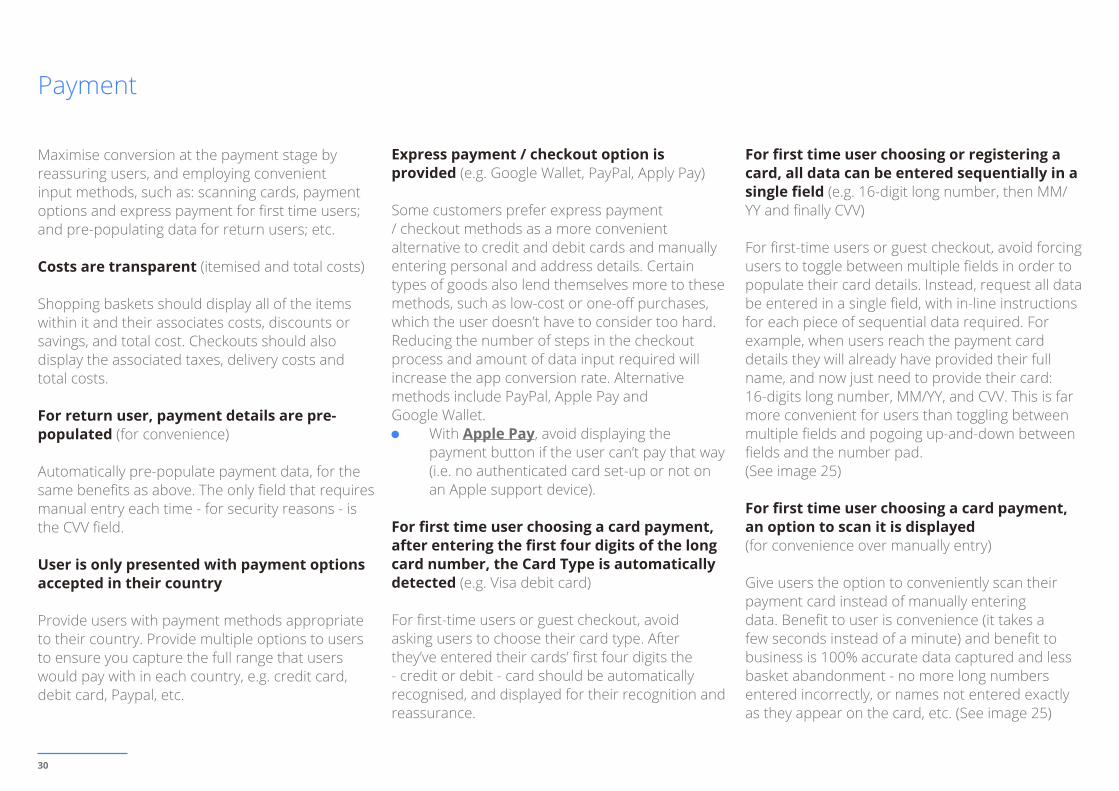
For first time user choosing or registering a card, all data can be entered sequentially in a single field (e.g. 16-digit long number, then MM/YY and finally CVV)
For first-time users or guest checkout, avoid forcing users to toggle between multiple fields in order to populate their card details. Instead, request all data be entered in a single field, with in-line instructions for each piece of sequential data required. For example, when users reach the payment card details they will already have provided their full name, and now just need to provide their card: 16-digits long number, MM/YY, and CVV. This is far more convenient for users than toggling between multiple fields and pogoing up-and-down between fields and the number pad.(See image 25)
For first time user choosing a card payment, an option to scan it is displayed (for convenience over manually entry)
Give users the option to conveniently scan their payment card instead of manually entering data. Benefit to user is convenience (it takes a few seconds instead of a minute) and benefit to business is 100% accurate data captured and less basket abandonment - no more long numbers entered incorrectly, or names not entered exactly as they appear on the card, etc. (See image 25)
31
MEASUREMENT
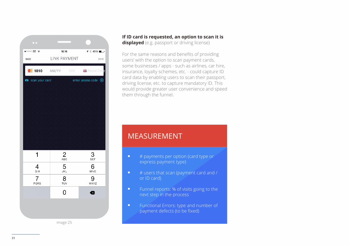
If ID card is requested, an option to scan it is displayed (e.g. passport or driving license)
For the same reasons and benefits of providing users’ with the option to scan payment cards, some businesses / apps - such as airlines, car hire, insurance, loyalty schemes, etc. - could capture ID card data by enabling users to scan their passport, driving license, etc. to capture mandatory ID. This would provide greater user convenience and speed them through the funnel.
# payments per option (card type or express payment type)
# users that scan (payment card and / or ID card)
Funnel reports: % of visits going to the next step in the process
Functional Errors: type and number of payment defects (to be fixed)
image 25
32
MEASUREMENT
Checkout & Confirmation
Maximise conversion at the final checkout stage with: the removal of all distractions (everything that doesn’t lead to a conversion decision); customer service reassurance; giving return users a single screen checkout experience; confirming the key transaction details; and contextual content that provides value beyond the immediate transaction (and contributes towards retention).
With new technologies, we may see mobile conversion exceed desktop conversion, which is why every company today needs to be mobile-first. There is absolutely no question smartphones and tablets will be central to web retailing moving forward, and that these mobile devices will be at the core of driving overall growth.”
Vishal Agarwal, EVP & CMO, Nomorerack.com Inc., No. 78 in the Internet Retailer 2015 Mobile 500
User can select their preferred delivery date / time
Allow users to select their preferred delivery date / time, and remove this unnecessary barrier to conversion. Users may not be able to make a pre-
selected date, due to work or family commitments, or holidays. Consider providing a range of options to meet all scenarios, and tiering delivery charges in order to fulfill that level of service quality.
If user closes the app during a partial checkout, when re-opened all form inputs are restored enabling them to continue conveniently
If a user chooses to close the app mid-way through a - partial - checkout, on re-opening the app, all of the form input data should be restored, allowing the user to continue where they left off conveniently.
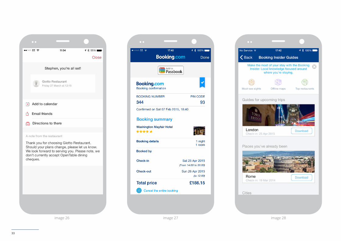
Confirmation screen reassures the customer with completed transaction information
Provide reassuring information related to the customer’s purchase or booking, e.g. the item(s), prices, taxes, delivery address, expected delivery date, print invoice, links to FAQs, customer service contact options, etc. These things will reassure customers, direct them to helpful self-service content, and reduce volume to the customer service centre. (See images 26, 27)
Confirmation screen provides contextual content (to provide value beyond the checkout)Post-payment or post-booking confirmation screens are an important stage to begin the retention effort, through contextual content that provides value beyond the transaction, and helps create differentiation. For example:
Retail transaction: send SMS reminder an hour before delivery
Car booking: address and map of collection station and drop-off stations
Event booking: Add to Calendar, Send to Passbook or TripIt(See image 28)
Funnel reports: % of visits going to the next step in the process
Functional Errors: type and number of checkout defects (to be fixed)
33
image 26 image 27 image 28
34
04. RETURN
Self service, engagement and delight
35
The focus at this stage is to be useful, to engage and delight, in order to retain customers or encourage member loyalty. Because, mobile apps are the most appropriate touchpoint for: repeat interactions and frequent transactions; customers and members already loyal to a brand; mobile first use cases (that couldn’t exist without unique Smartphone capabilities); services leveraging rich and contextual data; etc. Crucially, it costs less to retain a customer than acquire a new one.
App Retention Continues to Improve: During the last four years, the percentage of apps used 11 or more times increased 13%, climbing to 39% in 2014. These improvements can be attributed to an increased understanding of and focus on user engagement that has enabled developers to create more useful and personalized apps.
Localytics 2014
Your Account
Apps are the ideal touchpoint for customers and members to self serve, and manage their accounts and transactions with you, anytime and anywhere. Give customers control and the level of convenience that only apps afford.
44% customers download apps to keep track of order status. 38% customers download apps to review and manage a loyalty account.
Responsys, April 2014
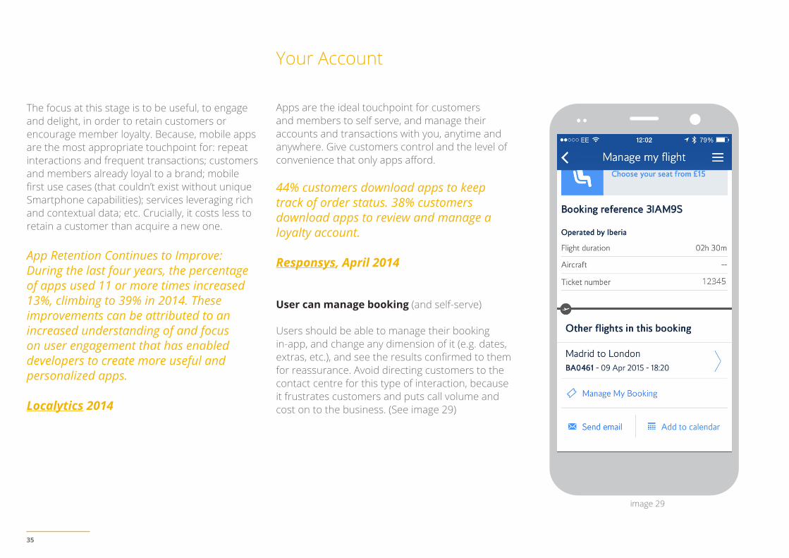
User can manage booking (and self-serve)
Users should be able to manage their booking in-app, and change any dimension of it (e.g. dates, extras, etc.), and see the results confirmed to them for reassurance. Avoid directing customers to the contact centre for this type of interaction, because it frustrates customers and puts call volume and cost on to the business. (See image 29)
image 29
36
MEASUREMENT
MEASUREMENT
User can cancel booking (and self-serve)
Users should be able to cancel their booking in-app, instead of searching through the app to find out what the process is to do so, or be requested to call or write to the business to do so. Cancelling should be as convenient as managing their booking. Avoid directing customers to the contact centre for this type of interaction (or, even worse, requesting they write to you!), because it frustrates customers and puts call volume and cost on to the business.
mark-up email notifications to users. See which schemas are supported: Google Now
In iOS, passes can be added Passbook, to be viewed / displayed at any time, and which you can also update at any time - crucial for time-sensitive bookings and events that may experience delays or cancellations.
If you have a loyalty scheme, enable iOS users to view their status and redeem rewards offline using their Passbook app (instead of needing to login via the web)
Irrespective of whether or not your own app contains your loyalty scheme, iOS users could view their loyalty pass and status directly in their Passbook app (alongside all of their other passes), and enable convenient viewing of their status, and redemption of rewards, etc. Passbook also enables you to update loyalty information at any time, which is important for time-sensitive status and rewards.
things change - and remove the need for them to print and carry physical collateral.
“50% customer download apps to access special or exclusive offers”
Responsys, April 2014
At roughly 10%, the redemption rate of mobile coupons crushes that of print coupons, which hovers around 1%.
Business Insider 2013
If you issue event or booking passes and / or coupons enable users to retrieve them from Passbook or Google Now for redemption offline (and eliminate physical passes and print-outs)
Users should be able to retrieve and view their booking pass in-app - instead of physical print-outs - and scan them for entry to events or facilities such as airport security, or to show at hotel check-in. Users should also be able to redeem coupons or vouchers for goods or events using Passbook and conveniently view and manage their passes in-app.
In Android, Google Now presents users with ‘cards’ with the right info at the right time - be it an event, flight, hotel or restaurant reservation - received in Gmail. You simply
Passes and Redemption
Enable customers to conveniently receive and redeem passes or vouchers in-app, view their loyalty status, or receive timely updates when
# orders / bookings viewed
# orders / bookings changed
# orders / bookings cancelled
Universal Analytics online-to-offline measurement with USER ID
37
Content & Design
Enhance user experience with appropriate content, tone of voice, visual design, the subtle use of motion, or ways to discover - and avoid dead-ends.
“% of app users say attributes that are associated with their frequently used apps: Always has new content (45%); Appealing app design and aesthetic (57%).”
U.S. Consumer Mobile Apps Study, 2014, Google/Ipsos MediaCT
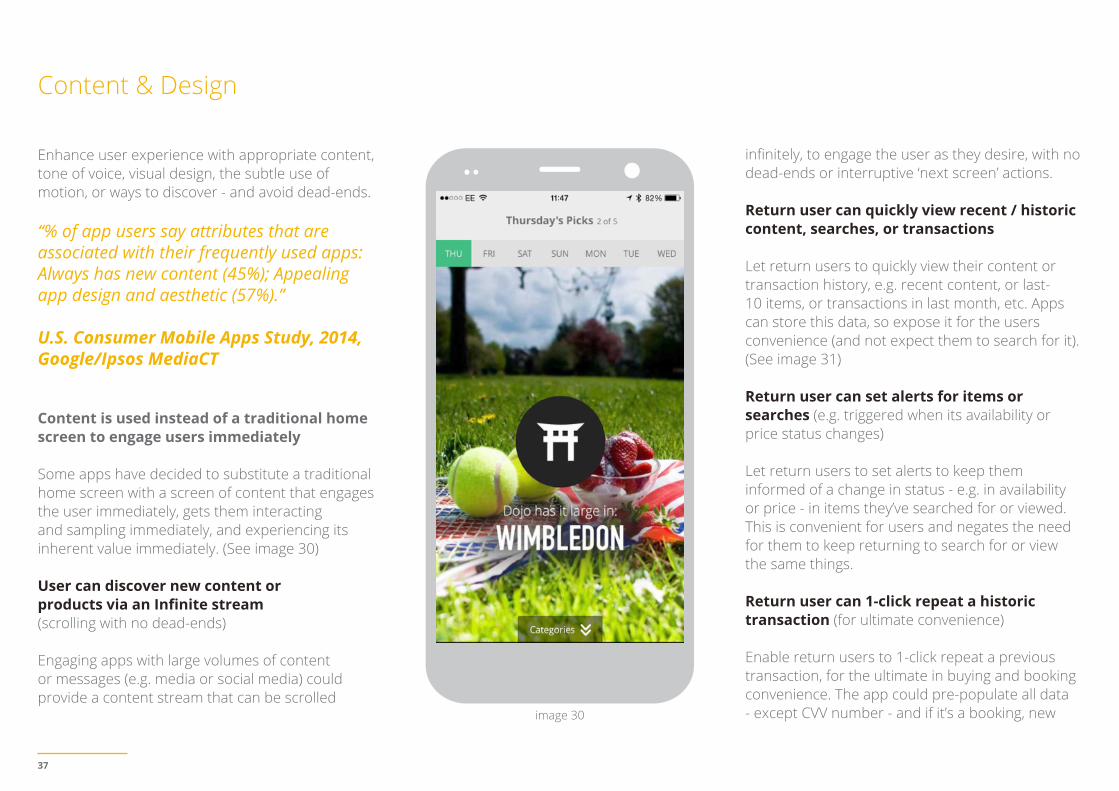
Content is used instead of a traditional home screen to engage users immediately
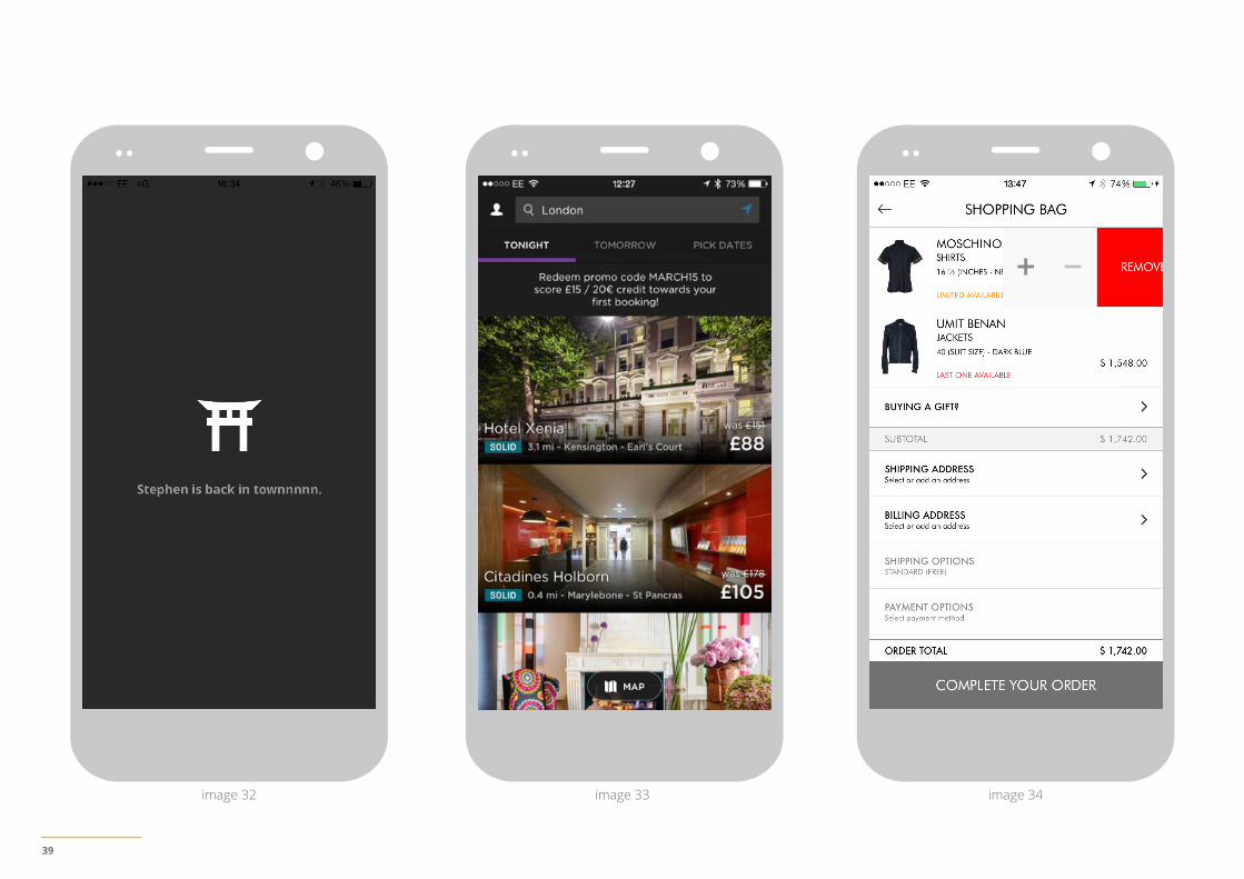
Some apps have decided to substitute a traditional home screen with a screen of content that engages the user immediately, gets them interacting and sampling immediately, and experiencing its inherent value immediately. (See image 30)
User can discover new content or products via an Infinite stream(scrolling with no dead-ends)
Engaging apps with large volumes of content or messages (e.g. media or social media) could provide a content stream that can be scrolled
infinitely, to engage the user as they desire, with no dead-ends or interruptive ‘next screen’ actions.
Return user can quickly view recent / historic content, searches, or transactions
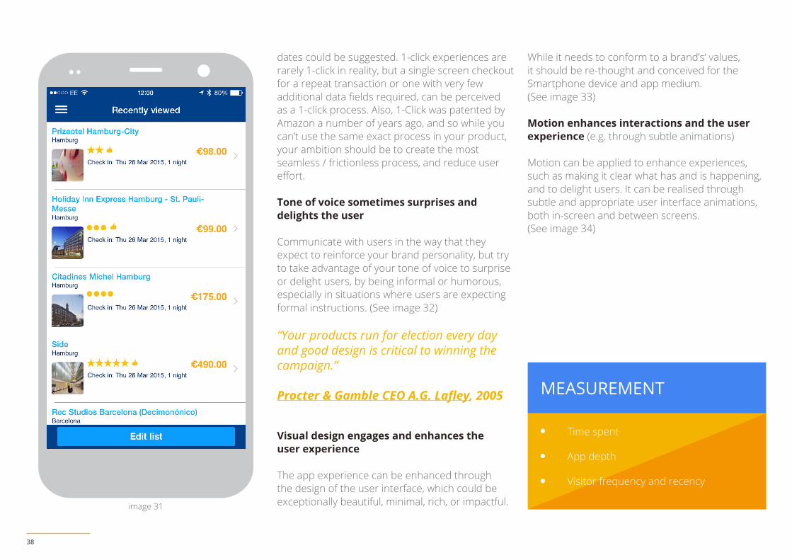
Let return users to quickly view their content or transaction history, e.g. recent content, or last-10 items, or transactions in last month, etc. Apps can store this data, so expose it for the users convenience (and not expect them to search for it). (See image 31)
Return user can set alerts for items or searches (e.g. triggered when its availability or price status changes)
Let return users to set alerts to keep them informed of a change in status - e.g. in availability or price - in items they’ve searched for or viewed. This is convenient for users and negates the need for them to keep returning to search for or view the same things.
Return user can 1-click repeat a historic transaction (for ultimate convenience)
Enable return users to 1-click repeat a previous transaction, for the ultimate in buying and booking convenience. The app could pre-populate all data - except CVV number - and if it’s a booking, new image 30
38
Time spent
App depth
Visitor frequency and recency
MEASUREMENT
dates could be suggested. 1-click experiences are rarely 1-click in reality, but a single screen checkout for a repeat transaction or one with very few additional data fields required, can be perceived as a 1-click process. Also, 1-Click was patented by Amazon a number of years ago, and so while you can’t use the same exact process in your product, your ambition should be to create the most seamless / frictionless process, and reduce user effort.
Tone of voice sometimes surprises and delights the user
Communicate with users in the way that they expect to reinforce your brand personality, but try to take advantage of your tone of voice to surprise or delight users, by being informal or humorous, especially in situations where users are expecting formal instructions. (See image 32)
“Your products run for election every day and good design is critical to winning the campaign.”
Procter & Gamble CEO A.G. Lafley, 2005
Visual design engages and enhances the user experience
The app experience can be enhanced through the design of the user interface, which could be exceptionally beautiful, minimal, rich, or impactful.
While it needs to conform to a brand’s’ values, it should be re-thought and conceived for the Smartphone device and app medium. (See image 33)
Motion enhances interactions and the user experience (e.g. through subtle animations)
Motion can be applied to enhance experiences, such as making it clear what has and is happening, and to delight users. It can be realised through subtle and appropriate user interface animations, both in-screen and between screens. (See image 34)
image 31
39
image 32 image 33 image 34
40
Widgets & Notifications
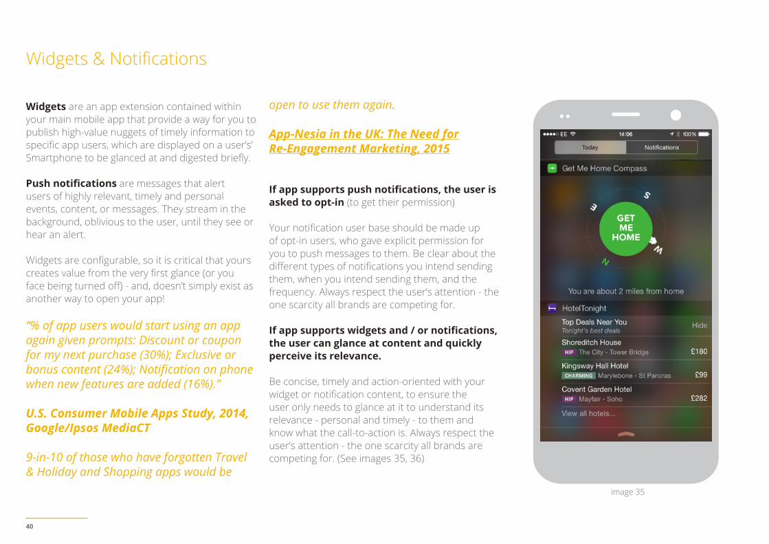
Widgets are an app extension contained within your main mobile app that provide a way for you to publish high-value nuggets of timely information to specific app users, which are displayed on a user’s’ Smartphone to be glanced at and digested briefly.
Push notifications are messages that alert users of highly relevant, timely and personal events, content, or messages. They stream in the background, oblivious to the user, until they see or hear an alert.
Widgets are configurable, so it is critical that yours creates value from the very first glance (or you face being turned off) - and, doesn’t simply exist as another way to open your app!
“% of app users would start using an app again given prompts: Discount or coupon for my next purchase (30%); Exclusive or bonus content (24%); Notification on phone when new features are added (16%).”
U.S. Consumer Mobile Apps Study, 2014, Google/Ipsos MediaCT
9-in-10 of those who have forgotten Travel & Holiday and Shopping apps would be
open to use them again.
App-Nesia in the UK: The Need forRe-Engagement Marketing, 2015
If app supports push notifications, the user is asked to opt-in (to get their permission)
Your notification user base should be made up of opt-in users, who gave explicit permission for you to push messages to them. Be clear about the different types of notifications you intend sending them, when you intend sending them, and the frequency. Always respect the user’s attention - the one scarcity all brands are competing for.
If app supports widgets and / or notifications, the user can glance at content and quickly perceive its relevance.
Be concise, timely and action-oriented with your widget or notification content, to ensure the user only needs to glance at it to understand its relevance - personal and timely - to them and know what the call-to-action is. Always respect the user’s attention - the one scarcity all brands are competing for. (See images 35, 36)
image 35
41
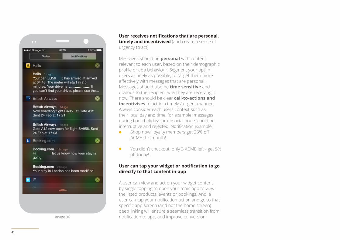
User receives notifications that are personal, timely and incentivised (and create a sense of urgency to act)
Messages should be personal with content relevant to each user, based on their demographic profile or app behaviour. Segment your opt-in users as finely as possible, to target them more effectively with messages that are personal. Messages should also be time sensitive and obvious to the recipient why they are receiving it now. There should be clear call-to-actions and incentivises to act in a timely / urgent manner. Always consider each users context such as their local day and time, for example: messages during bank holidays or unsocial hours could be interruptive and rejected. Notification example:
Shop now: loyalty members get 25% off ACME this month!
You didn’t checkout: only 3 ACME left - get 5% off today!
User can tap your widget or notification to go directly to that content in-app
A user can view and act on your widget content by single tapping to open your main app to view the listed products, events or bookings. And, a user can tap your notification action and go to that specific app screen (and not the home screen) - deep linking will ensure a seamless transition from notification to app, and improve conversionimage 36
42
05. UsabilityHygiene
What to do,and NOT do
43
What to do
This section focuses on usability hygiene, or the basics that need to addressed to optimise conversion, and avoid interrupting or forcing users to think about things that should be simple.
You need to work hard to meet the expectations of users who are becoming more accustomed to high quality apps, published by brands that invest time and effort creating, testing and optimising services, to deliver usable, robust, and sometimes delightful user experiences.
Text and content is easy to read (even outside in sunlight)
For text to always be legible you should use a font size at-or-above 11 points (even when users select a small text size); and the font used throughout the app should be consistent. Make sure there is sufficient perceivable contrast between the app content and the background, especially when used outside in sunlight.
In Android, type should be specified in scale-independent pixels (sp), and layouts supporting scalable types tested against these settings.
“34% prefer an app - versus a mobile website - when they have poor WiFi or 3G connection.”
Google App Re-engagement, UK, 2015
Content is accessible when user has no connection (i.e. no 3G or WiFi)
Make sure that key content within the customer journey is accessible - i.e. cached in-app - even when there is little or no data connection via either 3G or WiFi. This needs to be carefully identified and prioritised, to enable a seamless user experience and to avoid abandonment.
Spacing and size of content and controls make them easy to interact with
Make it easy for users to interact with app content and controls by providing sufficient spacing between all elements for controls to be easily touched / tappable. Design touch / tap elements that provide direct feedback when normal, pressed, disabled, etc. (e.g. Android uses illumination and dimming) to help the user see the whole tappable area and learn what the tappable elements are throughout the app.
Android recommends controls have a touch target size of 48dp for on screen elements such as buttons, icons, tabs with icons, etc.
iOS recommends tappable controls have a hit target of about 44 x 44 points.
Modal views are used for self-contained tasks within a multi-step process
When users need to achieve a simple self-contained task within a multistep process, and that task doesn’t belong in the app UI constantly, use a modal view.
iOS has two modal views: vertical and flip. They can either cover the whole or part of the screen, contain copy and functionality, and should be completed or cancelled, and exited easily
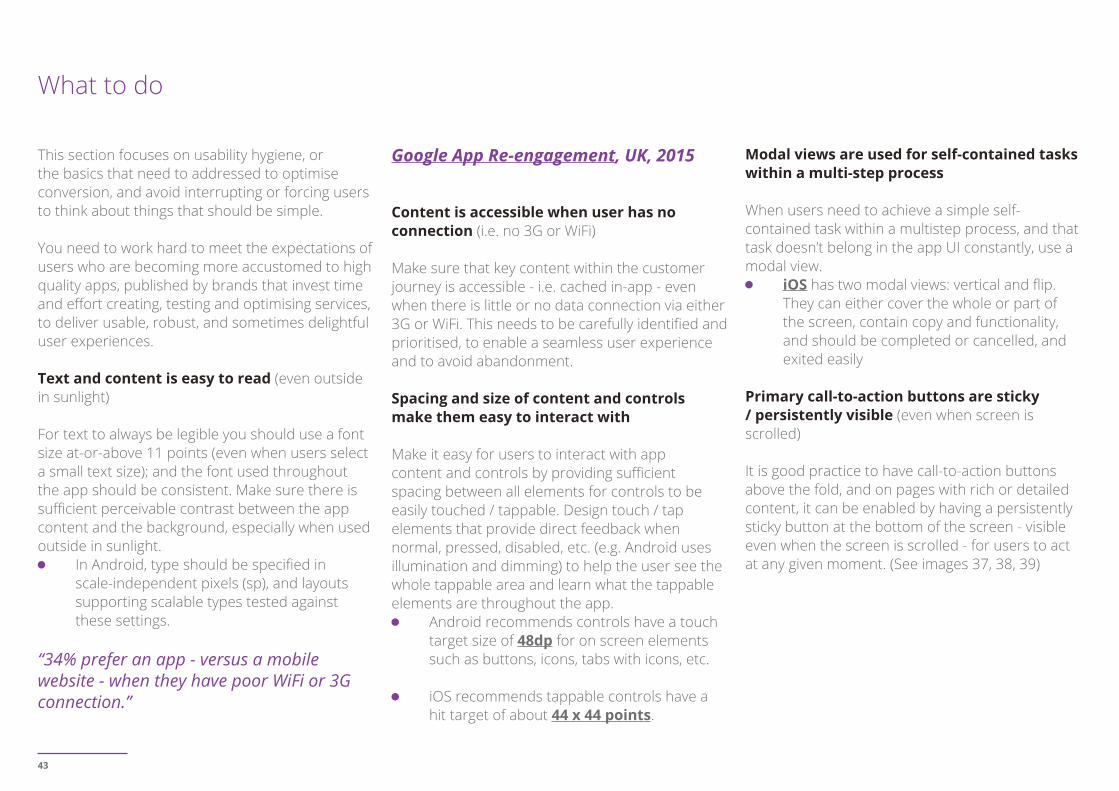
Primary call-to-action buttons are sticky / persistently visible (even when screen is scrolled)
It is good practice to have call-to-action buttons above the fold, and on pages with rich or detailed content, it can be enabled by having a persistently sticky button at the bottom of the screen - visible even when the screen is scrolled - for users to act at any given moment. (See images 37, 38, 39)
44
image 37 image 38 image 39
45
In forms, call-to-actions that are below the fold automatically scroll-up after the user has populated the necessary fields (users should never have to look for call-to-actions)
If a form has a call-to-action below the fold, make it easy for users to see and act on it, by automatically scrolling the button in to view once the user has populated the necessary fields
Form labels are either above form fields or are floating labels (in Android)
Form labels should be above form fields so that users can easily see what they are filling in and why. Form fields to the side greatly reduce the space available for the fields. Form field descriptions within the field disappear once text entry begins and if a user is then distracted they may not remember what they need to complete later.
In Android, instead of putting form labels above fields, a floating inline label can be used, e.g. when a user engages with a text input field it causes the label to move and float above the field, so as to guide the user whilst entering data.
Form submission errors are reduced through communication (explanations of what to put into specific form fields) Explain to users what you expect them to enter in each form field and in what format. This will reduce the amount of errors and increase the percentage
of users completing the process
Form input is validated in real-time (after field entry you will see if it is correct or not)
Warning people that they are making mistakes even as they make them will save them the time and frustration of submitting and then discovering mistakes.
In a form, cursor is placed in first field and the appropriate input is displayed by default
Reduce the number of form clicks and help focus the user, by placing the cursor in the first form field by default, and by displaying the appropriate input type (e.g. keyboard or dial-pad) by default. Make this effort on behalf of the user so that they can complete forms faster.
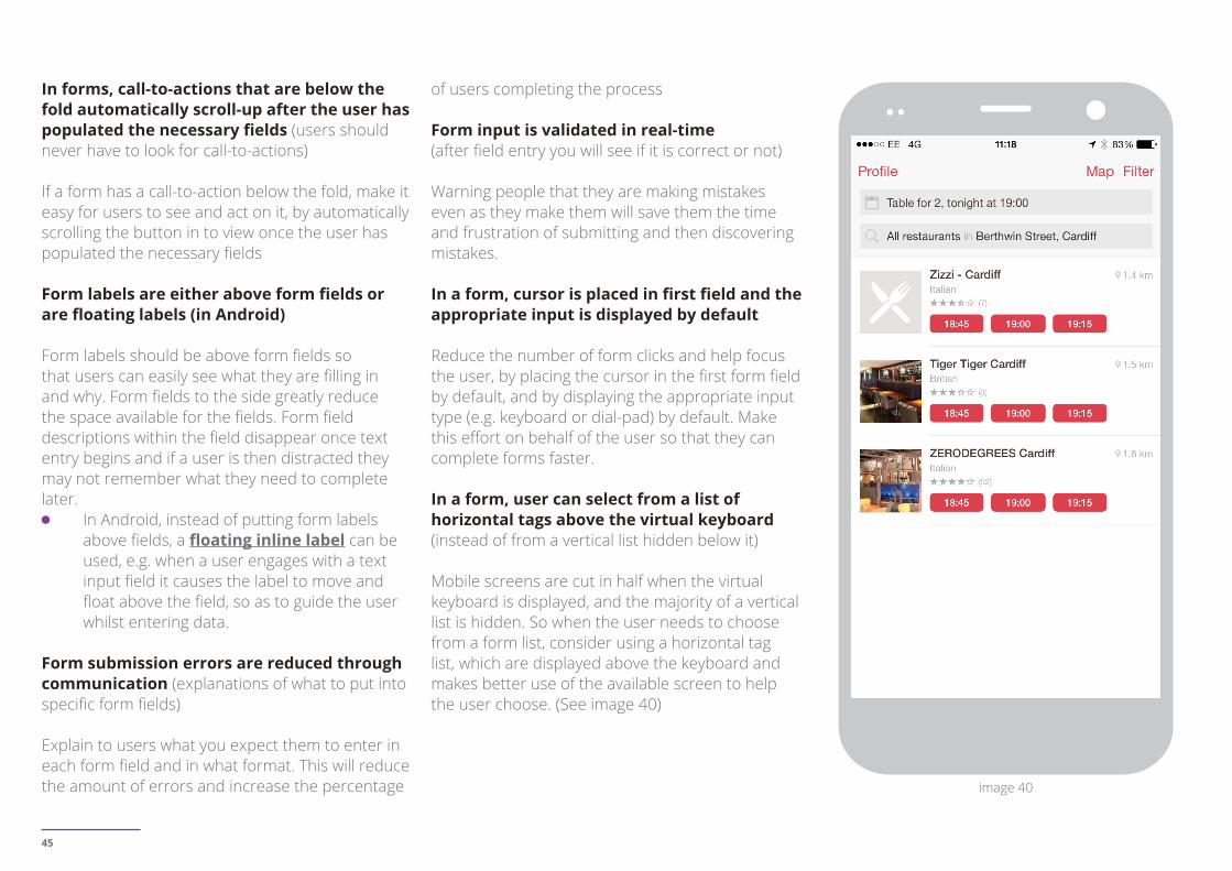
In a form, user can select from a list of horizontal tags above the virtual keyboard (instead of from a vertical list hidden below it)
Mobile screens are cut in half when the virtual keyboard is displayed, and the majority of a vertical list is hidden. So when the user needs to choose from a form list, consider using a horizontal tag list, which are displayed above the keyboard and makes better use of the available screen to help the user choose. (See image 40)
image 40
46
In a form, telephone number entry is restricted to a dial-pad (i.e. numbers only)
When users need to enter a telephone number, only display the dial-pad, to limit their input to numbers and not characters. This will reduce their choices and mistakes, and accelerate completion. Considerations include: display the number format that they need to input by default with an input mask - and not by gradual reveal - to assist them; don’t accept characters entered (mask them out).
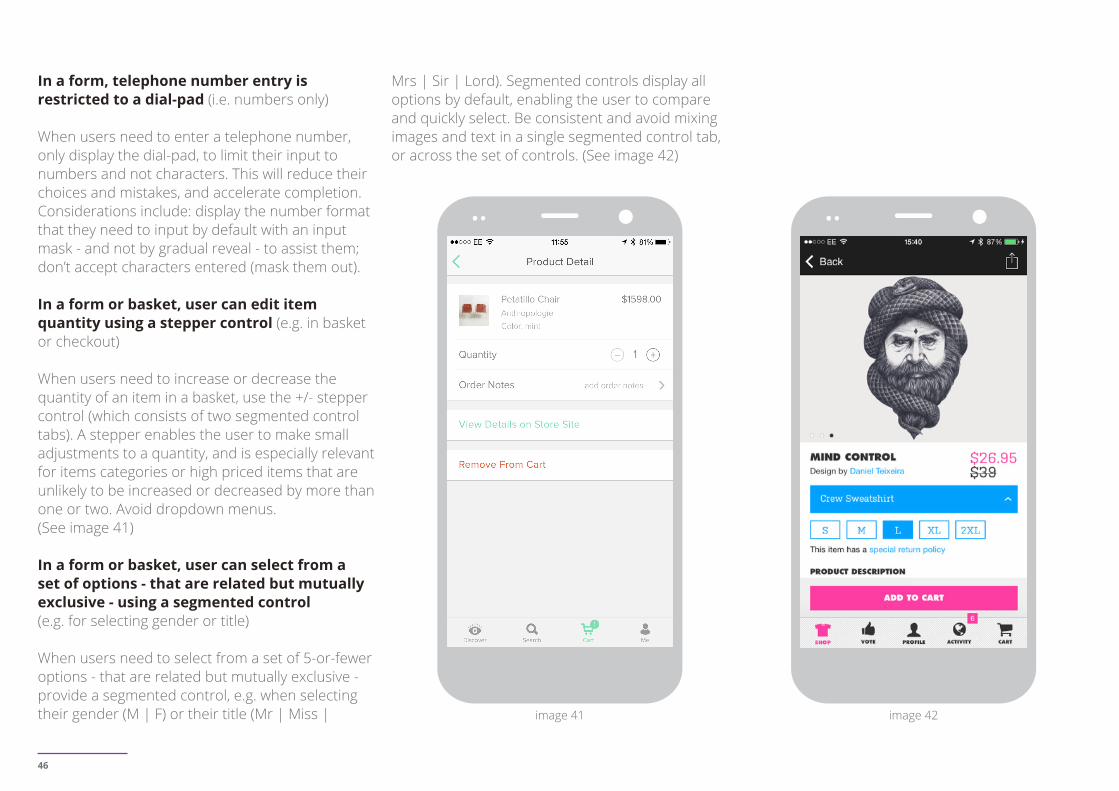
In a form or basket, user can edit item quantity using a stepper control (e.g. in basket or checkout)
When users need to increase or decrease the quantity of an item in a basket, use the +/- stepper control (which consists of two segmented control tabs). A stepper enables the user to make small adjustments to a quantity, and is especially relevant for items categories or high priced items that are unlikely to be increased or decreased by more than one or two. Avoid dropdown menus. (See image 41)
In a form or basket, user can select from a set of options - that are related but mutually exclusive - using a segmented control (e.g. for selecting gender or title)
When users need to select from a set of 5-or-fewer options - that are related but mutually exclusive - provide a segmented control, e.g. when selecting their gender (M | F) or their title (Mr | Miss |
Mrs | Sir | Lord). Segmented controls display all options by default, enabling the user to compare and quickly select. Be consistent and avoid mixing images and text in a single segmented control tab, or across the set of controls. (See image 42)
image 42image 41
47
MEASUREMENT
In a search or refine form, user can move a slider control to set a minimum / maximum range (e.g. for prices or budgets)
When users need to set a minimum / maximum price or budget range in order to search for - or refine search results - items, use the horizontal slider control. A slider is easy to swipe horizontally and provides simple visual cues to customise this action. Things to consider:
Values can be entered easily.Numbers aren’t hidden when slider is being operated (by fat fingers).For some range types a discrete slider with a set of stops with predefined values may be better than a continuous range - and, you could add a histogram to a discrete slider to illustrate inventory levels available in each stop.
In a form, user can select times or dates from a picker control (e.g. for entering travel dates, date of birth or time of arrival)
When users need to select times or dates provide a native time and date picker control, which make selection fast and familiar, and support multiple formats
Android can display up to 3 wheels concurrently
iOS up to four wheels concurrently (each wheel displaying a value in a single category, with formats such as Date and time, Time, Date, and Countdown).
In travel forms, user can select a date from a visual calendar
Especially when on mobile users are likely not to have a calendar at hand when quickly wanting to perform a task. Make it easy for them to select the correct dates by offering an actual calendar with days of the week from which they can pick.
When app crashes it re-starts and returns the user to the last screen used(to continue where they left off)
In the event of an app crash, ensure it restarts and returns its state to the last screen used, so that the user can continue where they left off - especially if their journey involved entering data and required effort. Don’t require users to re-enter data.
1-second delay in load time can mean a 16% decrease in customer satisfaction, and 7% loss in conversions.”
Akamai, 2013
On-screen content and transitions between screens appear fast and responsive (pauses frustrate and confuse users)
Ensure on-screen content and user actions - and transitions between screens - appear responsive, because unresponsive screens cause users to repeat actions or even close apps. And, if screens
are responsive you won’t need to use a progress indicator / loading spinner, which focus users on waiting instead of on the task or transition. On-screen considerations include:
Storing screen layout or skeletons locally (so they display immediately)Minimising on-screen content (that needs to load dynamically)Optimising backend processing (to load elements in priority order, or predict what a user will need / do next and execute that task)Using animation to create the effect of screens loading quickly and providing visual feedback of a user action
User timings: if you use Google Analytics, you can measure resource load times of a specific screen (in Android and iOS apps)
Analytics Mobile Device reports - check conversion rates for different Mobile operating systems and devices
48
What NOT to do
Design for each native mobile platform - Android and iOS - because each has unique capabilities and visual languages, don’t replicate the web experience to apps, and don’t interrupt users.
Do not mimic UI elements from other platforms (from Android to iOS and vice versa)
Each platform has a distinct set of conventions and qualities. If you replicate elements from one platform to another, you risk compromising the user experience and conversion. For example, some platforms support buttons with rounded corners, or actions may have different behaviours, and it is these details and affordances that provide the user with a familiar and consistent experience. (see: sample of UI elements, icons, tabs, etc. from Android, iOS, and Windows Phone)
Do not use underlined links (apps use buttons NOT links)
Avoid using text with underlined links, which are part of the web / browser / page model, and not part of the app / screen model. Apps use buttons, not links.
Do not hardcode links (to other sites or apps)Avoid hard-coding links in your app, both to sites and other apps. Hard coded links will need to be manually changed and cost you time and effort.
Users navigating to broken links will have a poor experience and may abandon.
Do not take users to the browser (users’ stay in-app at all times)
Keep users in-app at all times, to maintain their geography and to optimise conversion. If your app lacks a specific feature or content, try to use an in-app browser; but do not invoke the Smartphone browser, or you will cause users to lose their geography and not return to the app, which will increase abandonment and reduce conversion.
Do not ask users to rate your app too soon after downloading it (i.e. don’t interrupt users)
Avoid interrupting users by asking them to rate your app if they’ve only recently downloaded it or only used it a few times. Instead, wait until they prove to be repeat users and they’ll be more likely to rate your app favourably and provide more informed feedback (that you can act on). You could trigger the rating request after a specific number of app openings or tasks / goals have been completed. Also, never incentivise positive ratings, as this is against store rules.
Google App Re-engagement research (2015), base:N=1200 respondents with apps in one of three categories: shopping, restaurants & takeaways, travel & holidays
Research Background:Google partnered with Ipsos MediaCT on the Consumer Mobile Apps Study to uncover consumer smartphone app acquisition and usage behaviors. Online survey was conducted Sep. 12-22, 2014 in the U.S. among 8,470 smartphone users aged 18-64 who have used any smartphone apps in the past 7 days and have used Entertainment, Finance, Gaming, Local, Retail, Social, Tech, or Travel apps in the past 30 days.


![[UX Series] 6 - Animation principles](https://img.pdfslide.net/doc/110x75/58edc4531a28ab1b308b4585/ux-series-6-animation-principles.jpg)